Neil Dunlop
Neil Dunlop
Any source code or other supplementary material referenced by the author in this text is available to readers at www.apress.com. For additional information about how to locate and download your
book’s source code, go to www.apress.com/source-code/ .
ISBN 978-1-4842-0530-3 e-ISBN 978-1-4842-0529-7 DOI 10.1007/978-1-4842-0529-7
© Apress 2015
Beginning Big Data with Power BI and Excel 2013
Managing Director: Welmoed Spahr Lead Editor: Jonathan Gennick
Development Editor: Douglas Pundick Technical Reviewer: Kathi Kellenberger
Editorial Board: Steve Anglin, Mark Beckner, Gary Cornell, Louise Corrigan, Jim DeWolf, Jonathan Gennick, Robert Hutchinson, Michelle Lowman, James Markham, Susan McDermott, Matthew Moodie, Jeffrey Pepper, Douglas Pundick, Ben Renow-Clarke, Gwenan Spearing, Matt Wade, Steve Weiss
Coordinating Editor: Jill Balzano Copy Editor: Michael G. Laraque Compositor: SPi Global
Indexer: SPi Global Artist: SPi Global
Cover Designer: Anna Ishchenko
For information on translations, please e-mail [email protected], or visit www.apress.com.
Apress and friends of ED books may be purchased in bulk for academic, corporate, or promotional use. eBook versions and licenses are also available for most titles. For more
information, reference our Special Bulk Sales–eBook Licensing web page at www.apress.com/bulk-sales.
This work is subject to copyright. All rights are reserved by the Publisher, whether the whole or part of the material is concerned, specifically the rights of translation, reprinting, reuse of illustrations, recitation, broadcasting, reproduction on microfilms or in any other physical way, and transmission or information storage and retrieval, electronic adaptation, computer software, or by similar or
be obtained from Springer. Permissions for use may be obtained through RightsLink at the Copyright Clearance Center. Violations are liable to prosecution under the respective Copyright Law.
Trademarked names, logos, and images may appear in this book. Rather than use a trademark symbol with every occurrence of a trademarked name, logo, or image, we use the names, logos, and images only in an editorial fashion and to the benefit of the trademark owner, with no intention of
infringement of the trademak. The use in this publication of trade names, trademarks, service marks, and similar terms, even if they are not identified as such, is not to be taken as an expression of opinion as to whether or not they are subject to proprietary rights.
While the advice and information in this book are believed to be true and accurate at the date of publication, neither the authors nor the editors nor the publisher can accept any legal responsibility for any errors or omissions that may be made. The publisher makes no warranty, express or implied, with respect to the material contained herein.
1.
2.
3.
4.
Introduction
This book is intended for anyone with a basic knowledge of Excel who wants to analyze and
visualize data in order to get results. It focuses on understanding the underlying structure of data, so that the most appropriate tools can be used to analyze it. The early working title of this book was “Big Data for the Masses,” implying that these tools make Business Intelligence (BI) more accessible to the average person who wants to leverage his or her Excel skills to analyze large datasets.
As discussed in Chapter 1, big data is more about volume and velocity than inherent complexity. This book works from the premise that many small- to medium-sized organizations can meet most of their data needs with Excel and Power BI. The book demonstrates how to import big data file formats such as JSON, XML, and HDFS and how to filter larger datasets down to thousands or millions of rows instead of billions.
This book starts out by showing how to import various data formats into Excel (Chapter 2) and how to use Pivot Tables to extract summary data from a single table (Chapter 3). Chapter 5
demonstrates how to use Structured Query Language (SQL) in Excel. Chapter 10 offers a brief introduction to statistical analysis in Excel.
This book primarily covers Power BI—Microsoft’s self-service BI tool—which includes the following Excel add-ins:
PowerPivot. This provides the repository for the data (see Chapter 4) and the DAX formula language (see Chapter 7). Chapter 4 provides an example of processing millions of rows in multiple tables.
Power View. A reporting tool for extracting meaningful reports and creating some of the elements of dashboards (see Chapter 6)
Power Query. A tool to Extract, Transform, and Load (ETL) data from a wide variety of sources (see Chapter 8)
Power Map. A visualization tool for mapping data (see Chapter 9)
Chapter 11 demonstrates how to use HDInsight (Microsoft’s implementation of Hadoop that runs on its Azure cloud platform) to import big data into Excel.
This book is written for Excel 2013, but most of the examples it includes will work with Excel 2010, if the PowerPivot, Power View, Power Query, and Power Map add-ins are downloaded from Microsoft. Simply search on download and the add-in name to find the download link.
All links and screenshots were current at the time of writing but may have changed since
Acknowledgments
Contents
Chapter 1: Big Data
Big Data As the Fourth Factor of Production
Big Data As Natural Resource
Data As Middle Manager
Early Data Analysis
First Time Line
First Bar Chart and Time Series
Cholera Map
Internet of Things or Industrial Internet
Cutting Energy Costs at MIT
The Big Data Revolution and Health Care
The Medicalized Smartphone
Improving Reliability of Industrial Equipment
Big Data and Agriculture
Cheap Storage
Personal Computers and the Cost of Storage
Review of File Sizes
Data Keeps Expanding
Relational Databases
Normalization
Database Software for Personal Computers
The Birth of Big Data and NoSQL
Hadoop Distributed File System (HDFS)
Big Data
Chapter 2: Excel As Database and Data Aggregator
From Spreadsheet to Database
Interpreting File Extensions
Using Excel As a Database
Importing from Other Formats
Importing Data from XML
Importing XML with Attributes
Importing JSON Format
Using the Data Tab to Import Data
Importing Data from Tables on a Web Site
Data Wrangling and Data Scrubbing
Correcting Capitalization
Chapter 3: Pivot Tables and Pivot Charts
Recommended Pivot Tables in Excel 2013
Defining a Pivot Table
Defining Questions
Creating a Pivot Table
Changing the Pivot Table
Creating a Breakdown of Sales by Salesperson for Each Day
Showing Sales by Month
Creating a Pivot Chart
Analyzing Sales by Day of Week
Creating a Pivot Chart of Sales by Day of Week
Using Slicers
Adding a Time Line
Importing Pivot Table Data from the Azure Marketplace
Summary
Chapter 4: Building a Data Model
Enabling PowerPivot
Relational Databases
Database Terminology
Creating a Data Model from Excel Tables
Loading Data Directly into the Data Model
Creating a Pivot Table from Two Tables
Creating a Pivot Table from Multiple Tables
Adding Calculated Columns
Adding Calculated Fields to the Data Model
Summary
Chapter 5: Using SQL in Excel
Subtotals
Joining Tables
Importing an External Database
Specifying a JOIN Condition and Selected Fields
Using SQL to Extract Summary Statistics
Generating a Report of Total Order Value by Employee
Using MSQuery
Summary
Chapter 6: Designing Reports with Power View
Elements of the Power View Design Screen
Considerations When Using Power View
Types of Fields
Understanding How Data Is Summarized
A Single Table Example
Viewing the Data in Different Ways
Creating a Bar Chart for a Single Year
Summary
Chapter 7: Calculating with Data Analysis Expressions (DAX)
Understanding Data Analysis Expressions
DAX Operators
Summary of Key DAX Functions Used in This Chapter
Updating Formula Results
Creating Measures or Calculated Fields
Analyzing Profitability
Using the SUMX Function
Using the CALCULATE Function
Calculating the Store Sales for 2009
Creating a KPI for Profitability
Creating a Pivot Table Showing Profitability by Product Line
Summary
Chapter 8: Power Query
Installing Power Query
Key Options on Power Query Ribbon
Working with the Query Editor
Key Options on the Query Editor Home Ribbon
A Simple Population
Performance of S&P 500 Stock Index
Importing CSV Files from a Folder
Group By
Summary
Chapter 9: Power Map
Installing Power Map
Plotting a Map
Key Power Map Ribbon Options
Troubleshooting
Plotting Multiple Statistics
Adding a 2D Chart
Showing Two or More Values
Creating a 2D Chart
Summary
Chapter 10: Statistical Calculations
Recommended Analytical Tools in 2013
Customizing the Status Bar
Enabling the Excel Analysis ToolPak
A Simple Example
Using a Pivot Table to Create a Histogram
Scatter Chart
Summary
Chapter 11: HDInsight
Getting a Free Azure Account
Importing Hadoop Files into Power Query
Creating an Azure Storage Account
Provisioning a Hadoop Cluster
Importing into Excel
Creating a Pivot Table
Creating a Map in Power Map
Summary
Contents at a Glance
About the AuthorAbout the Technical Reviewer
Acknowledgments
Introduction
Chapter 1: Big Data
Chapter 2: Excel As Database and Data Aggregator
Chapter 3: Pivot Tables and Pivot Charts
Chapter 4: Building a Data Model
Chapter 5: Using SQL in Excel
Chapter 6: Designing Reports with Power View
Chapter 7: Calculating with Data Analysis Expressions (DAX)
Chapter 8: Power Query
Chapter 9: Power Map
Chapter 11: HDInsight
About the Author and About the Technical Reviewer
About the Author
Neil Dunlop
is a professor of business and computer information systems at Berkeley City College, Berkeley, California. He served as chairman of the Business and Computer Information Systems Departments for many years. He has more than 35 years’ experience as a computer programmer and software designer and is the author of three books on database management. He is listed in Marquis’s Who’s Who in America. Check out his blog at http://bigdataondesktop.com/ .
About the Technical Reviewer
Kathi Kellenberger
(1)
© Neil Dunlop 2015
Neil Dunlop, Beginning Big Data with Power BI and Excel 2013, DOI 10.1007/978-1-4842-0529-7_1
1. Big Data
Neil Dunlop
1CA, US
Electronic supplementary material
The online version of this chapter (doi:10.1007/978-1-4842-0529-7_1) contains supplementary material, which is available to authorized users.
The goal of business today is to unlock intelligence stored in data. We are seeing a confluence of trends leading to an exponential increase in available data, including cheap storage and the
availability of sensors to collect data. Also, the Internet of Things, in which objects interact with other objects, will generate vast amounts of data.
Organizations are trying to extract intelligence from unstructured data. They are striving to break down the divisions between silos. Big data and NoSQL tools are being used to analyze this avalanche of data.
Big data has many definitions, but the bottom line involves extracting insights from large amounts of data that might not be obvious, based on smaller data sets. It can be used to determine which
products to sell, by analyzing buying habits to predict what products customers want to purchase. This chapter will cover the evolution of data analysis tools from early primitive maps and graphs to the big data tools of today.
Big Data As the Fourth Factor of Production
Traditional economics, based on an industrial economy, teaches that there are three factors of
production: land, labor, and capital. The December 27, 2012, issue of the Financial Times included an article entitled “Why ‘Big Data’ is the fourth factor of production,” which examines the role of big data in decision making. According to the article “As the prevalence of Big Data grows, executives are becoming increasingly wedded to numerical insight. But the beauty of Big Data is that it allows both intuitive and analytical thinkers to excel. More entrepreneurially minded, creative leaders can find unexpected patterns among disparate data sources (which might appeal to their intuitive nature) and ultimately use the information to alter the course of the business.”
Big Data As Natural Resource
Much of IBM’s investment in big data has been in the development of Watson—a natural
language, question-answering computer. Watson was introduced as a Jeopardy! player in 2011, when it won against previous champions. It has the computing power to search 1 million books per second. It can also process colloquial English.
One of the more practical uses of Watson is to work on cancer treatment plans in collaboration with doctors. To do this, Watson received input from 2 million pages of medical journals and 600,000 clinical records. When a doctor inputs a patient’s symptoms, Watson can produce a list of recommendations ranked in order of confidence of success.
Data As Middle Manager
An April 30, 2015, article in the Wall Street Journal by Christopher Mims entitled “Data Is Now the New Middle Manager” describes how some startup companies are substituting data for middle
managers. According to the article “Startups are nimbler than they have ever been, thanks to a
fundamentally different management structure, one that pushes decision-making out to the periphery of the organization, to the people actually tasked with carrying out the actual business of the company. What makes this relatively flat hierarchy possible is that front line workers have essentially unlimited access to data that used to be difficult to obtain, or required more senior management to interpret.” The article goes on to elaborate that when databases were very expensive and business intelligence software cost millions of dollars, it made sense to limit access to top managers. But that is not the case today. Data scientists are needed to validate the accuracy of the data and how it is presented. Mims concludes “Now that every employee can have tools to monitor progress toward any goal, the old role of middle managers, as people who gather information and make decisions, doesn’t fit into many startups.”
Early Data Analysis
Data analysis was not always sophisticated. It has evolved over the years from the very primitive to where we are today.
First Time Line
In 1765, the theologian and scientist Joseph Priestley created the first time line charts, in which
Figure 1-1. An early time line chart
First Bar Chart and Time Series
The Scottish engineer William Playfair has been credited with inventing the line, bar, and pie charts. His time-series plots are still presented as models of clarity. Playfair first published The
Figure 1-2. Playfair’s balance-of-trade time-series chart
Cholera Map
Figure 1-3. Cholera map
Modern Data Analytics
The Internet has opened up vast amounts of data. Google and other Internet companies have designed tools to access that data and make it widely available.
Google Flu Trends
In 2009, Google set up a system to track flu outbreaks based on flu-related searches. When the H1N1 crisis struck in 2009, Google’s system proved to be a more useful and timely indicator than
Google Earth
The precursor of Google Earth was developed in 2005 by the computer programmer Rebecca Moore, who lived in the Santa Cruz Mountains in California, where a timber company was proposing a
logging operation that was sold as fire prevention. Moore used Google Earth to demonstrate that the logging plan would remove forests near homes and schools and threaten drinking water.
Tracking Malaria
A September 10, 2014, article in the San Francisco Chronicle reported that a team at the University of California, San Francisco (UCSF) is using Google Earth to track malaria in Africa and to track areas that may be at risk for an outbreak. According to the article, “The UCSF team hopes to zoom in on the factors that make malaria likely to spread: recent rainfall, plentiful vegetation, low elevations, warm temperatures, close proximity to rivers, dense populations.” Based on these factors, potential malaria hot spots are identified.
Big Data Cost Savings
According to a July 1, 2014, article in the Wall Street Journal entitled “Big Data Chips Away at Cost,” Chris Iervolino, research director at the consulting firm Gartner Inc., was quoted as saying “Accountants and finance executives typically focus on line items such as sales and spending, instead of studying the relationships between various sets of numbers. But the companies that have managed to reconcile those information streams have reaped big dividends from big data.”
Examples cited in the article include the following:
Recently, General Motors made a decision to stop selling Chevrolets in Europe based on an analysis of costs compared to projected sales, based on analysis that took a few days rather than many weeks.
Planet Fitness has been able to analyze the usage of their treadmills based on their location in reference to high-traffic areas of the health club and to rotate them to even out wear on the machines.
Big Data and Governments
Governments are struggling with limited money and people but have an abundance of data.
Unfortunately, most governmental organizations don’t know how to utilize the data that they have to get resources to the right people at the right time.
The US government has made an attempt to disclose where its money goes through the web site USAspending.gov. The city of Palo Alto, California, in the heart of Silicon Valley, makes its data available through its web site data.cityofpaloalto.org. The goal of the city’s use of data is to provide agile, fast government. The web site provides basic data about city operations, including when trees are planted and trimmed.
Predictive Policing
crime.
A Cost-Saving Success Story
A January 24, 2011, New Yorker magazine article described how 30-something physician Jeffrey Brenner mapped crime and medical emergency statistics in Camden, New Jersey, to devise a system that would cut costs, over the objections of the police. He obtained medical billing records from the three main hospitals and crime statistics. He made block-by-block maps of the city, color-coded by the hospital costs of the residents. He found that the two most expensive blocks included a large nursing home and a low-income housing complex. According to the article, “He found that between January 2002 and June of 2008 some nine hundred people in the two buildings accounted for more than four thousand hospital visits and about two hundred million dollars in health-care bills. One patient had three hundred and twenty-four admissions in five years. The most expensive patient cost insurers $3.5 million.” He determined that 1% of the patients accounted for 30% of the costs.
Brenner’s goal was to most effectively help patients while cutting costs. He tried targeting the sickest patients and providing preventative care and health monitoring, as well as treatment for substance abuse, to minimize emergency room visits and hospitalization. He set up a support system involving a nurse practitioner and a social worker to support the sickest patients. Early results of this approach showed a 56% cost reduction.
Internet of Things or Industrial Internet
The Internet of Things refers to machine to machine (M2M) communication involving networked connectivity between devices, such as home lighting and thermostats. CISCO Systems uses the term Internet of Everything.
An article in the July/August 2014 issue of Fast Company magazine described how General Electric Corporation (GE) is using the term Industrial Internet, which involves putting intelligence into machines to collect and analyze their data in order to predict failure, so that problems can be anticipated and corrected. One example is the GE jet engine. GE plans to use data generated from engines to predict when an engine part requires repairs, so that the problem can be corrected before a failure occurs. GE’s assumption is that small gains in productivity and reliability can drive massive economic benefits.
GE is also working on trip-optimizer, an intelligent cruise control for locomotives, which use trains’ geographical location, weight, speed, fuel consumption, and terrain to calculate the optimal velocity to minimize fuel consumption.
Cutting Energy Costs at MIT
An article in the September 28, 2014, Wall Street Journal entitled “Big Data Cuts Buildings’ Energy Use” describes how cheap sensors are allowing collection of real-time data on how energy is being consumed. For example, the Massachusetts Institute of Technology (MIT) has an energy war room in which energy use in campus buildings is monitored. Energy leaks can be detected and corrected.
The Big Data Revolution and Health Care
1.
2.
3.
4.
care: Accelerating value and innovation” describes how a big data revolution is occurring in health care, based on pharmaceutical companies aggregating years of research into medical databases and health care providers digitizing patient records. There is a trend toward evidence-based medicine based on data. Big data algorithms are being used to provide the best evidence.
Health care spending currently accounts for more than 17% of US gross domestic product (GDP). McKinsey estimates that implementation of these big data strategies in health care could reduce health expenses in the United States by 12% to 17%, saving between $300 billion to $450 billion per year.
“Biological research will be important, but it feels like data science will do more for medicine than all the biological sciences combined,” according to the venture capitalist Vinod Khosla,
speaking at the Stanford University School of Medicine’s Big Data in Biomedicine Conference (quoted in the San Francisco Chronicle, May 24, 2014). He went on to say that human judgment cannot compete against machine learning systems that derive predictions from millions of data points. He further predicted that technology will replace 80%–90% of doctors’ roles in decision making.
The Medicalized Smartphone
A January 10, 2015, Wall Street Journal article reported that “the medicalized smartphone is going to upend every aspect of health care.” Attachments to smartphones are being developed that can measure blood pressure and even perform electrocardiograms. Wearable wireless sensors can track blood-oxygen and glucose levels, blood pressure, and heart rhythm. Watches will be coming out that can continually capture blood pressure and other vital signs. The result will be much more data and the potential for virtual physician visits to replace physical office visits.
In December 2013, IDC Health Insights released a report entitled “U.S. Connected Health 2014 Top 10 Predictions: The New Care Delivery Model” that predicts a new health care delivery model involving mobile health care apps, telehealth, and social networking that will provide “more efficient and cost-effective ways to provide health care outside the four walls of the traditional healthcare setting.” According to the report, these changes will rely on four transformative technologies:
Mobile
Big data analytics
Social
Cloud
The report cites the Smartphone Physical project at Johns Hopkins. It uses “a variety of
1.
2.
3.
4.
5.
electrocardiogram, heart and lung sounds and ultrasound visualization (such as carotid artery imaging).”
According to the report, “With greater consumer uptake of mobile health, personal health, and fitness modeling, and social technologies, there will be a proliferation of consumer data across diverse data sources that will yield rich information about consumers.”
A May 2011 paper by McKinsey & Company entitled “Big data: The next frontier for innovation, competition, and productivity” posits five ways in which using big data can create value, as follows: Big data can unlock significant value by making information transparent and usable in much higher frequency.
As organizations create and store more transactional data in digital form, they can collect more accurate and detailed performance information on everything from product inventories to sick days, and therefore boost performance.
Big data allows ever-narrower segmentation of customers and, therefore, much more precisely tailored products or services.
Sophisticated analytics can substantially improve decision making.
Big data can be used to improve the development of the next generation of products and services.
Improving Reliability of Industrial Equipment
General Electric (GE) has made implementing the Industrial Internet a top priority, in order to improve the reliability of industrial equipment such as jet engines. The company now collects 50 million data points each day from 1.4 million pieces of medical equipment and 28,000 jet engines. The goal is to improve the reliability of the equipment. GE has developed Predix, which can be used to analyze data generated by other companies to build and deploy software applications.
Big Data and Agriculture
modeling is used to plan when to irrigate and harvest. The goal is to increase crop yields, decrease costs, save time, and use less water.
Cheap Storage
In the early 1940s, before physical computers came into general use, computer was a job title. The first wave of computing was about speeding up calculations. In 1946, the Electrical Numerical Integrator and Computer (ENIAC)—the first general purpose electronic computer—was installed at the University of Pennsylvania. The ENIAC, which occupied an entire room, weighed 30 tons, and used more than 18,000 vacuum tubes, had been designed to calculate artillery trajectories. However, World War II was over by 1946, so the computer was then used for peaceful applications.
Personal Computers and the Cost of Storage
Personal computers came into existence in the 1970s with Intel chips and floppy drives for storage and were used primarily by hobbyists. In August 1981, the IBM PC was released with 5¼-inch floppy drives that stored 360 kilobytes of data. The fact that IBM, the largest computer company in the world, released a personal computer was a signal to other companies that the personal computer was a serious tool for offices. In 1983, IBM released the IBM-XT, which had a 10 megabyte hard drive that cost hundreds of dollars. Today, a terabyte hard drive can be purchased for less than $100. Multiple gigabyte flash drives can be purchased for under $10.
Review of File Sizes
Over the history of the personal computer, we have gone from kilobytes to megabytes and gigabytes and now terabytes and beyond, as storage needs have grown exponentially. Early personal computers had 640 kilobytes of RAM. Bill Gates, cofounder of Microsoft Corporation, reportedly said that no one would ever need more than 640 kilobytes. Versions of Microsoft’s operating system MS-DOS released during the 1980s could only address 640 kilobytes of RAM. One of the selling points of Windows was that it could address more than 640 kilobytes. Table 1-1 shows how data is measured.
Table 1-1. Measurement of Storage Capacity
Unit Power of 2 Approximate Number
Kilobytes 2^10 Thousands
1.
2.
We are also dealing with exponential growth in Internet connections. According to CISCO
Systems, the 15 billion worldwide network connections today are expected to grow to 50 billion by 2020.
Relational Databases
As computers became more and more widely available, more data was stored, and software was needed to organize that data. Relational database management systems (RDBMS) are based on the relational model developed by E. F. Codd at IBM in the early 1970s. Even though the early work was done at IBM, the first commercial RDBMS were released by Oracle in 1979.
A relational database organizes data into tables of rows and columns, with a unique key for each row, called the primary key. A database is a collection of tables. Each entity in a database has its own table, with the rows representing instances of that entity. The columns store values for the attributes or fields.
Relational algebra, first described by Codd at IBM, provides a theoretical foundation for
modeling the data stored in relational databases and defining queries. Relational databases support selection, projection, and joins. Selection means selecting specified rows of a table based on a condition. Projection entails selecting certain specified columns or attributes. Joins means joining two or more tables, based on a condition.
As discussed in Chapter 5, Structured Query Language (SQL) was first developed by IBM in the early 1970s. It was used to manipulate and retrieve data from early IBM relational database
management systems (RDBMS). It was later implemented in other relational database management systems by Oracle and later Microsoft.
Normalization
Normalization is the process of organizing data in a database with the following objectives: To avoid repeating fields, except for key fields, which link tables
To avoid multiple dependencies, which means avoiding fields that depend on anything other than the primary key
There are several normal forms, the most common being the Third Normal Form (3NF), which is based on eliminating transitive dependencies, meaning eliminating fields not dependent on the
primary key. In other words, data is in the 3NF when each field depends on the primary key, the whole primary key, and nothing but the primary key.
Figure 1-4, which is the same as Figure 4-11, shows relationships among multiple tables. The lines with arrows indicate relationships between tables. There are three primary types of
1.
2.
3.
Figure 1-4. Showing relations among tables
One to one (1-1) means that there is a one-to-one correspondence between fields. Generally, fields with a one-to-one correspondence would be in the same table.
One to many means that for each record in one table, there are many records in the corresponding table. The many is indicated by an arrow at the end of the line. Many means zero to n. For
example, as shown in Figure 1-4, for each product code in the products table, there could be many instances of Product ID in the order details table, but each Product ID is associated with only one product code in the products table.
Many to many means a relationship from many of one entity to many of another entity. For example, authors and books: Each author can have many books, and each book can have many authors. Many means zero to n.
Database Software for Personal Computers
In the 1980s, database programs were developed for personal computers, as they became more widely used. dBASE II, one of the first relational programmable database systems for personal
In the early 1980s, he partnered with George Tate to form the Ashton-Tate company to market dBASE II, which became very successful. In the mid-1980s, dBASE III was released with enhanced features.
dBASE programs were interpreted, meaning that they ran more slowly than a compiled program, where all the instructions are translated to machine language at once. Clipper was released in 1985 as a compiled version of dBASE and became very popular. A few years later, FoxBase, which later became FoxPro, was released with additional enhanced features.
The Birth of Big Data and NoSQL
The Internet was popularized during the 1990s, owing in part to the World Wide Web, which made it easier to use. Competing search engines allowed users to easily find data. Google was founded in 1996 and revolutionized search. As more data became available, the limitations of relational databases, which tried to fit everything into rectangular tables, became clear.
In 1998, Carlo Strozzi used the term NoSQL. He reportedly later regretted using that term and thought that NoRel, or non-relational, would have been a better term.
Hadoop Distributed File System (HDFS)
Much of the technology of big data came out of the search engine companies. Hadoop grew out of Apple Nutch, an open source web search engine that was started in 2002. It included a web crawler and search engine, but it couldn’t scale to handle billions of web pages.
A paper was published in 2003 that described the architecture of Google’s Distributed File System (GFS), which was being used by Google to store the large files generated by web crawling and indexing. In 2004, an open source version was released as the Nutch Distributed File System (NDFS).
In 2004, Google published a paper about MapReduce. By 2005, MapReduce had been
incorporated into Nutch. MapReduce is a batch query process with the ability to run ad hoc queries against a large dataset. It unlocks data that was previously archived. Running queries can take several minutes or longer.
In February 2006, Hadoop was set up as an independent subproject. Building on his prior work with Mike Cafarella, Doug Cutting went to work for Yahoo!, which provided the resources to turn Hadoop into a system that could be a useful tool for the Web. By 2008, Yahoo! based its search index on a Hadoop cluster. Hadoop was titled based on the name that Doug Cutting’s child gave a yellow stuffed elephant. Hadoop provides a reliable, scalable platform for storage and analysis running on cheap commodity hardware. Hadoop is open source.
Big Data
There is no single definition of big data, but there is currently a lot of hype surrounding it, so the meaning can be diluted. It is generally accepted to mean large volumes of data with an irregular structure involving hundreds of terabytes of data into petabytes and higher. It can include data from financial transactions, sensors, web logs, and social media. A more operational definition is that organizations have to use big data when their data processing needs get too big for traditional relational databases.
1.
stores have loyalty cards to track consumer purchases, and people are wearing health-tracking devices. Generally, big data is more about looking at behavior, rather than monitoring transactions, which is the domain of traditional relational databases. As the cost of storage is dropping, companies track more and more data to look for patterns and build predictive models.
The Three V’s
One way of characterizing big data is through the three V’s: Volume: How much data is involved?
Velocity: How fast is it generated?
Variety: Does it have irregular structure and format?
Two other V’s that are sometimes used are
Variability: Does it involve a variety of different formats with different interpretations?
Veracity: How accurate is the data?
The Data Life Cycle
The data life cycle involves collecting and analyzing data to build predictive models, following these steps:
Collect the data.
Store the data.
Query the data to identify patterns and make sense of it.
5.
1.
2.
Predict future consumer behavior based on the data.
Apache Hadoop
Hadoop is an open source software framework written in Java for distributed storage and processing of very large datasets stored on commodity servers. It has built-in redundancy to handle hardware failures. Hadoop is based on two main technologies: MapReduce and the Hadoop Distributed File System (HDFS). Hadoop was created by Doug Cutting and Mike Cafarella in 2005.
MapReduce Algorithm
MapReduce was developed at Google and released through a 2004 paper describing how to use parallel processing to deal with large amounts of data. It was later released into the public domain. It involves a two-step batch process.
First, the data is partitioned and sent to mappers, which generate key value pairs.
The key value pairs are then collated, so that the values for each key are together, and then the reducer processes the key value pairs to calculate one value per key.
One example that is often cited is a word count. It involves scanning through a manuscript and counting the instances of each word. In this example, each word is a key, and the number of times each word is used is the value.
Hadoop Distributed File System (HDFS)
HDFS is a distributed file system that runs on commodity servers. It is based on the Google File System (GFS). It splits files into blocks and distributes them among the nodes of the cluster. Data is replicated so that if one server goes down, no data is lost. The data is immutable, meaning that tables cannot be edited; it can only be written to once, like CD-R, which is based on write once read many. New data can be appended to an existing file, or the old file can be deleted and the new data written to a new file. HDFS is very expandable, by adding more servers to handle more data.
Some implementations of HDFS are append only, meaning that underlying tables cannot be edited. Instead, writes are logged, and then the file is re-created.
Commercial Implementations of Hadoop
companies include Cloudera and MapR. Another Hadoop implementation is Microsoft’s HD Insight, which runs on the Azure cloud platform. An example in Chapter 11 shows how to import an HD Insight database into Power Query.
CAP Theorem
An academic way to look at NoSQL databases includes the CAP Theorem. CAP is an acronym for Consistency, Availability, and Partition Tolerance. According to this theorem, any database can only have two of those attributes. Relational databases have consistency and partition tolerance. Large relational databases are weak on availability, because they have low latency when they are large. NoSQL databases offer availability and partition tolerance but are weak on consistency, because of a lack of fixed structure.
NoSQL
As discussed elsewhere in this book, NoSQL is a misnomer. It does not mean “no SQL.” A better term for this type of database might be non-relational. NoSQL is designed to access data that has no relational structure, with little or no schema. Early versions of NoSQL required a programmer to write a custom program to retrieve that data. More and more implementations of NoSQL databases today implement some form of SQL for retrieval of data. A May 29, 2015, article on Data Informed by Timothy Stephan entitled “What NoSQL Needs Most Is SQL” ( http://data-informed.com/what-nosql-needs-most-is-sql/) makes the case for more SQL access to NoSQL databases.
NoSQL is appropriate for “web scale” data, which is based on high volumes with millions of concurrent users.
Characteristics of NoSQL Data
NoSQL databases are used to access non-relational data that doesn’t fit into relational tables.
Generally, relational databases are used for mission-critical transactional data. NoSQL databases are typically used for analyzing non-mission-critical data, such as log files.
Implementations of NoSQL
There are several categories of NoSQL databases:
Key-Value Stores: This type of database stores data in rows, but the schema may differ from row to row. Some examples of this type of NoSQL database are Couchbase, Redis, and Riak. Document Stores: This type of database works with documents that are JSON objects. Each document has properties and values. Some examples are CouchDB, Cloudant, and MongoDB. Wide Column Stores: This type of database has column families that consist of individual column of key-value pairs. Some example of this type of database are HBase and Cassandra. Graph: Graph databases are good for social network applications. They have nodes that are like rows in a table. Neo4j is an example of this type of database.
Spark
Another technology that is receiving a lot of attention is Apache Spark—an open source cluster
computing framework originally developed at UC Berkeley in 2009. It uses an in-memory technology that purportedly provides performance up to 100 times faster than Hadoop. It offers Spark SQL for querying. IBM recently announced that it will devote significant resources to the development of Spark.
Microsoft Self-Service BI
Most of these big data and NoSQL technologies came out of search engine and online retailers that process vast amounts of data. For the smaller to medium-size organizations that are processing
thousands or millions of rows of data, this book shows how to tap into Microsoft’s Power BI running on top of Excel.
Much has been written about the maximum number of rows that can be loaded into PowerPivot. The following link to a blog post at Microsoft Trends documents loading 122 million records:
www.microsofttrends.com/2014/02/09/how-much-data-can-powerpivot-really-manage-how-about-122-million-records .
Summary
This chapter provides a brief history of the evolution of data analysis, culminating with the big data tools of today. It covers the evolution of data structures, from relational databases to the less
(1)
© Neil Dunlop 2015
Neil Dunlop, Beginning Big Data with Power BI and Excel 2013, DOI 10.1007/978-1-4842-0529-7_2
2. Excel As Database and Data Aggregator
Neil Dunlop
1CA, US
Spreadsheets have a long history of making data accessible to ordinary people. This chapter
chronicles the evolution of Excel from spreadsheet to powerful database. It then shows how to import data from a variety of sources. Subsequent chapters will demonstrate how Excel with Power BI is now a powerful Business Intelligence tool.
From Spreadsheet to Database
The first spreadsheet program, VisiCalc (a contraction of visible calculator), was released in 1979 for the Apple II computer. It was the first “killer app.” A saying at the time was that “VisiCalc sold more Apples than Apple.” VisiCalc was developed by Dan Bricklin and Bob Franken. Bricklin was attending Harvard Business School and came up with the idea for the program after seeing a
professor manually write out a financial model. Whenever the professor wanted to make a change, he had to erase the old data and rewrite the new data. Bricklin realized that this process could be
automated, using an electronic spreadsheet running on a personal computer.
In those days, most accounting data was trapped in mainframe programs that required a
programmer to modify or access. For this reason, programmers were called the “high priests” of computing, meaning that end users had little control over how programs worked. VisiCalc was very easy to use for a program of that time. It was also very primitive, compared to the spreadsheets of today. For example, all columns had to be the same width in the early versions of VisiCalc.
Success breeds competition. VisiCalc did not run on CP/M computers, which were the business computers of the day. CP/M, an acronym originally for Control Program/Monitor, but that later came to mean “Control Program for Microcomputers,” was an operating system used in the late 1970s and early 1980s. In 1980, Sorcim came out with SuperCalc as the spreadsheet for CP/M computers. Microsoft released Multiplan in 1982. All of the spreadsheets of the day were menu-driven.
When the IBM PC was released in August 1981, it was a signal to other large companies that the personal computer was a serious tool for big business. VisiCalc was ported to run on the IBM PC but did not take into account the enhanced hardware capabilities of the new computer.
Seeing an opportunity, entrepreneur Mitch Kapor, a friend of the developers of VisiCalc, founded Lotus Development to write a spreadsheet specifically for the IBM PC. He called his spreadsheet program Lotus 1-2-3. The name 1-2-3 indicated that it took the original spreadsheet functionality and added the ability to create graphic charts and perform limited database functionality such as simple sorts.
1-2-3 became popular hand-in-hand with the IBM PC, and it was the leading spreadsheet through the early 1990s.
Microsoft Excel was the first spreadsheet using the graphical user interface that was popularized by the Apple Macintosh. Excel was released in 1987 for the Macintosh. It was later ported to
Windows. In the early 1990s, as Windows became popular, Microsoft packaged Word and Excel together into Microsoft Office and priced it aggressively. As a result, Excel displaced Lotus 1-2-3 as the leading spreadsheet. Today, Excel is the most widely used spreadsheet program in the world.
More and more analysis features, such as Pivot Tables, were gradually introduced into Excel, and the maximum number of rows that could be processed was increased. Using VLOOKUP, it was
possible to create simple relations between tables. For Excel 2010, Microsoft introduced
PowerPivot as a separate download, which allowed building a data model based on multiple tables. PowerPivot ships with Excel 2013. Chapter 4 will discuss how to build data models using
PowerPivot.
Interpreting File Extensions
The file extension indicates the type of data that is stored in a file. This chapter will show how to import a variety of formats into Excel’s native .xlsx format, which is required to use the advanced features of Power BI discussed in later chapters. This chapter will deal with files with the following extensions:
.xls: Excel workbook prior to Excel 2007
.xlsx: Excel workbook Excel 2007 and later; the second x was added to indicate that the data is stored in XML format
.xlsm: Excel workbook with macros .xltm: Excel workbook template .txt: a file containing text
.xml: a text file in XML format
Using Excel As a Database
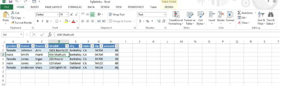
By default, Excel works with tables consisting of rows and columns. Each row is a record that includes all the attributes of a single item. Each column is a field or attribute.
Figure 2-1. An Excel table
Note that, with the current version of Excel, if you sort on one field, it is smart enough to bring along the related fields (as long as there are no blank columns in the range), as shown in Figure 2-2, where a sort is done by last name. To sort by first and last name, sort on first name first and then last name.
Figure 2-2. Excel Table sorted by first and last name
Importing from Other Formats
tables on a web site, data in XML files, and data in JSON format. This chapter will show you how to import some of the more common formats. Chapter 4 will cover how to link multiple tables using Power BI.
Opening Text Files in Excel
Excel can open text files in comma-delimited, tab-delimited, fixed-length-field, and XML formats, as well as in the file formats shown in Figure 2-3. When files in any of these formats are opened in Excel, they are automatically converted to a spreadsheet.
Figure 2-3. File formats that can be imported into Excel
When importing files, it is best to work with a copy of the file, so that the original file remains unchanged in case the file is corrupted when it is imported.
Figure 2-4 shows a comma-delimited file in Notepad. Note that the first row consists of the field names. All fields are separated by commas. Excel knows how to read this type of file into a
Figure 2-4. Comma-separated values format
Importing Data from XML
Extensible Markup Language (XML) is a popular format for storing data. As in HTML, it uses paired tags to define each element. Figure 2-5 shows the data we have been working with in XML format. The first line is the declaration that specifies the version of XML, UTF encoding, and other
information. Note the donors root tag that surrounds all of the other tags.
The data is self-descriptive. Each row or record in this example is surrounded by a donor tag. The field names are repeated twice for each field in the opening and closing tags. This file would be saved as a text file with an .xml extension.
An XML file can be opened directly by Excel. On the first pop-up after it opens, select “As an XML table.” Then, on the next pop-up, click yes for “Excel will create the schema.”
As shown in Figure 2-6, XML files can be displayed in a web browser such as Internet Explorer. Note the small plus and minus signs to the left of the donor tab. Click minus to hide the details in each record. Click plus to show the details.
Figure 2-6. XML file displayed in a web browser
Importing XML with Attributes
Figure 2-7. XML with attributes
<donor gender = "female">
...
</donor>
Figure 2-8. XML with attributes imported into Excel
Importing JSON Format
Much NoSQL data is stored in JavaScript Object Notation (JSON) format. Unfortunately, Excel does not read JSON files directly, so it is necessary to use an intermediate format to import them into Excel. Figure 2-9 shows our sample file in JSON format. Note the name-value pairs in which each field name is repeated every time there is an instance of that field.
1.
2.
Because Excel cannot read JSON files directly, you would have to convert this JSON-formatted data into a format such as XML that Excel can read. A number of free converters are available on the Web, such as the one at http://bit.ly/1s2Oi6L.
The interface for the converter is shown in Figure 2-10. (Remember to work with a copy of the file, so that the original will not be corrupted.) The JSON file can be pasted into the JSON window and then converted to XML by clicking the arrow. The result is an XML file having the same name and that you can open directly from Excel.
Figure 2-10. XML and JSON
Using the Data Tab to Import Data
So far, we have been importing data from text files directly into Excel to create a new spreadsheet. The options on the Data tab can be used to import data from a variety of formats, as part of an existing spreadsheet.
Importing Data from Tables on a Web Site
As an example, let’s look at importing data from a table on a web site. To import data from a table on a web site, do the following:
Click the Data tab to display the Data ribbon.
3.
4.
A browser window will appear. Type in the address of the web site you want to access. We will access a Bureau of Labor Statistics example of employment based on educational attainment. For this example, we will use http://www.bls.gov/emp/ep_table_education_summary.htm .
As shown in Figure 2-11, a black arrow in a small yellow box will appear next to each table. Click the black arrow in the small yellow box at the upper left-hand corner of the table, and it will change to a check mark in a green box. Click Import. The Import Data dialog will appear as shown in Figure 2-12.
5.
Figure 2-12. Import Data dialog
Select new Worksheet and then OK. The table will be imported, as shown in Figure 2-13. Some formatting may be required in Excel to get the table to be precisely as you want it to be for further analysis.
1.
2.
3.
Data Wrangling and Data Scrubbing
Imported data is rarely in the form in which it is needed. Data can be problematic for the following reasons:
It is incomplete. It is inconsistent.
It is in the wrong format.
Data wrangling involves converting raw data into a usable format. Data scrubbing means correcting errors and inconsistencies. Excel provides tools to scrub and format data.
Correcting Capitalization
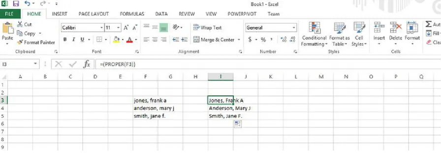
One of the functions that Excel provides to correct capitalization is the Proper() function. It
capitalizes the first letter of each word and lowercases the rest. Figure 2-14 shows some text before and after executing the function. To use the Proper() function, as shown in Figure 2-14, perform the following steps:
Figure 2-14. Use of the Proper() function
In a new column, type “=Proper(.”
Click the first cell that you want to apply it to and then type the closing parentheses ()). Then press Enter.
4.
5.
6.
1.
2.
corner of the cell, to copy the formula down the column.
Convert the content of the cells from formulas to values. For a small number of cells, do that by selecting each cell, pressing F2 to edit, then pressing F9 to convert to values, and then pressing Enter.
For a larger number of cells, select the column, right-click, and select copy. Then select the top cell in the range to be copied to, press Ctrl+Alt+V, to open the Paste Special Box, select Values, and click OK.
Then you can delete the original column by right-clicking anywhere in the column and selecting Delete ➤ Entire Column.
Splitting Delimited Fields
In some cases, first and last names are included in the same field and are separated by commas. These and similar fields can be split using the Text to Columns option on the Data tab.
Highlight the range of cells that you want to convert.
3.
Figure 2-15. Convert Text to Columns Dialog
4.
Figure 2-16. Data preview of Text to Columns
Figure 2-17. Last step of Convert Text to Columns
Splitting Complex, Delimited Fields
More complex cases involving multiple data elements in a single field can often be solved through using Excel’s built-in functions. Some of the functions that are available for string manipulation are shown in Table 2-1.
Table 2-1. Available Functions for String Manipulation
Function Description
LEN(text) Returns the number of characters in the text string
LEFT(text,num_chars) Returns the leftmost number of characters specified by num_chars RIGHT(text,num_chars) Returns the rightmost number of characters specified by num_chars
MID(text,start,num_chars) Returns the number of characters specified by num_chars, starting from the position
specified by start
reading from left to right. Not case sensitive. start_num specifies the occurrence of the
text that you want. The default is 1.
TRIM(text) Removes all leading and trailing spaces from a text string, except single spaces between words
CLEAN(text) Removes all non-printable characters from a text string
LOWER(text) Returns string with all characters converted to lower case
UPPER(text) Returns string with all characters converted to upper case
PROPER(text) Returns string with first letter of each word in upper case
Functions can be nested. For example, we could extract the last name by using the following formula:
=LEFT(F7,SEARCH(",",F7)-1)
This function would extract the leftmost characters up to the position of the comma. To extract the first name and middle initial, use the following:
=RIGHT(F7,SEARCH(", ",F7)+1)
Removing Duplicates
It is not unusual for imported data to include duplicate records. Duplicate records can be removed by using the Remove Duplicates option on the Data tab.
It is always a good idea to work with a copy of the original files, to prevent valid data from being deleted. To delete duplicates, simply highlight the columns that contain duplicate values and click Remove Duplicates, as shown in Figure 2-18. Confirm the columns that contain duplicates and click OK. Only the rows in which all the values are the same will be removed.
Input Validation
Excel provides tools to check for valid input. If data is not valid, the result can be Garbage In,
Garbage Out (GIGO). Excel provides data validation tools that are usually associated with data entry; however, they can be used to flag cells from data that has already been entered. In the example shown in Figure 2-19, the valid range for sales figures is 0 to $20,000, as defined through the Data
Validation option on the Data tab.
Figure 2-19. Data Validation dialog
Any values outside of the range can be highlighted by selecting the Circle Invalid Data option under Data Validation on the Data tab. The result is shown in Figure 2-20.
1.
2.
Working with Data Forms
One of the hidden and less documented features in Excel is the Data Forms feature. Sometimes it is easier to read data in which each record is displayed as a form rather than just in tabular format. By default, there is no Data Forms icon on the toolbars. Data Forms can be accessed by clicking a cell in a table with row headings and pressing Alt+D and then O (as in Oscar). Data Forms can also be
added to the Quick Access Toolbar. This can be done via the following steps:
Click the down arrow at the rightmost end of the Quick Access Toolbar (located at the top-left section of the screen) and click More Commands, as shown in Figure 2-21.
Figure 2-21. Customize Quick Access Toolbar menu
3.
Figure 2-22. Customize the Quick Access Toolbar menu
To use data forms, click the row that contains the data to be viewed in the form. Then click the Form icon in the Quick Access Toolbar to see the display shown in Figure 2-23. Fields can be edited in the data form. Click the Find Next and Find Previous buttons to move through the records.
1.
2.
3.
4.
Selecting Records
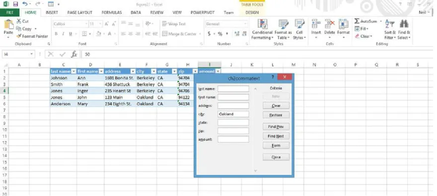
Data forms can be used to selectively look at certain records based on a criterion by following these steps:
Click a cell in the table.
Click the Form icon in the Quick Access Toolbar or press Alt+D, then O.
In the form, click Criteria and enter the criteria you want to use, such as City=Oakland, as shown in Figure 2-24.
Figure 2-24. Using a data form to select records based on a criterion
Then click Find Next, and Find Previous will only show rows that meet the designated criteria.
(1)
© Neil Dunlop 2015
Neil Dunlop, Beginning Big Data with Power BI and Excel 2013, DOI 10.1007/978-1-4842-0529-7_3
3. Pivot Tables and Pivot Charts
Neil Dunlop
1CA, US
This chapter covers extracting summary data from a single table, using Pivot Tables and Pivot Charts. The chapter also describes how to import data from the Azure Data Marketplace, using Pivot Tables.
Chapter 4 will show how to extract summary data from multiple tables, using the Excel Data Model.
Recommended Pivot Tables in Excel 2013
Excel 2013 tries to anticipate your needs by recommending conditional formatting, charts, tools, and Pivot Tables. When data is highlighted or Ctrl+Q is pressed with any cell in the data range selected, a Quick Analysis Lens button is displayed at the lower right of the range. Clicking the lens will show the Analysis Tool window, which displays various conditional formatting options, as shown in Figure 3-1. Moving the cursor over a conditional formatting option will show a preview of that conditional formatting in the data. Clicking the Tables tab at the top right of the Analysis Tool
Figure 3-1. Analysis Tool window
Figure 3-2. Pivot Table preview
Defining a Pivot Table
1.
2.
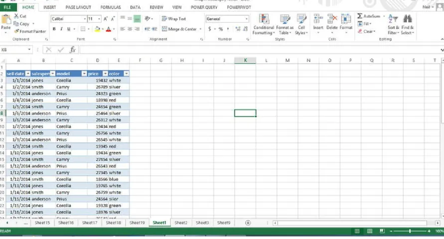
Figure 3-3. Auto sales transaction table
Creating a Pivot Table doesn’t change the underlying data; rather, it takes a snapshot of the data. When the underlying data is changed, the Pivot Table does not automatically refresh. To refresh, click anywhere within the Pivot Table to highlight the Pivot Table Tools Analyze tab and click Refresh.
Defining Questions
It is good practice to think through what questions you want answered by the Pivot Table. Some typical questions would be the following:
What are the average sales per day? Who is the best performing salesperson? What days of the week have the most sales? What months have the highest sales?
Creating a Pivot Table
The steps to define a Pivot Table are as follows:
Make sure that the underlying data is in table format, with the first row showing the field names, and that the data is surrounded by blank rows and columns or starts in row 1 or column A. Press Ctrl+T to define the data, as a table as shown in Figure 3-3.
3.
in Figure 3-4 will appear. Note that the current table is selected and that by default, the Pivot Table will be placed in a new worksheet. Click OK.
Figure 3-4. Create PivotTable dialog
4.
Figure 3-5. Basic Pivot Table showing count of car sales by model
Figure 3-6. Pivot Table showing value of car sales by model
Changing the Pivot Table
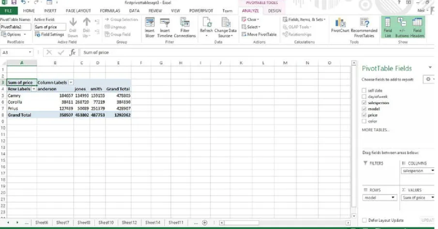
It is very easy to make changes to the Pivot Table. To change the horizontal axis from dates to
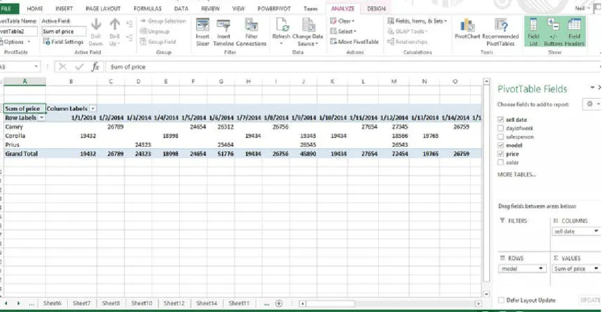
salesperson, simply click sell date from the Columns box back and select “remove field.” Then drag salesperson from the Fields list to the Columns box. The result is shown in Figure 3-7.
Figure 3-7. Pivot Table showing sales by model and salesperson
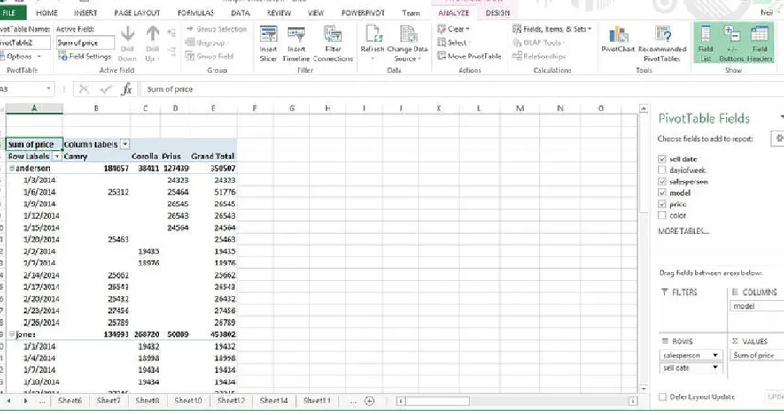
Creating a Breakdown of Sales by Salesperson for Each Day
Figure 3-8. Pivot Table showing breakdown by salesperson and model for each day
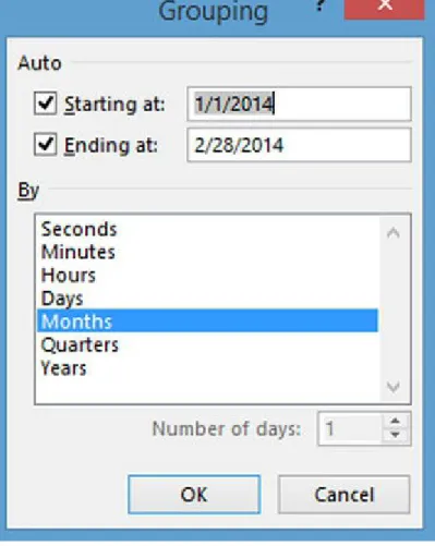
Showing Sales by Month
Figure 3-9. Dialog to select grouping by month
The resulting Pivot Table is shown in Figure 3-10.
1.
2.
Creating a Pivot Chart
To create a Pivot Chart from a Pivot Table, with the Pivot Table displayed on the screen, do the following:
Go to the Pivot Table Tools Analyze tab and select Pivot Chart.
From the Insert Chart pop-up shown in Figure 3-11, select the type of chart desired and click OK. For this example, we will use a stacked column chart.
3. The result will be displayed as shown in Figure 3-12.
Figure 3-12. Pivot Chart with Pivot Table
Adjusting Subtotals and Grand Totals
The subtotals can be adjusted on the Pivot Table Tools Design tab. Click Subtotals to see the options. Do not show subtotals
Show all subtotals at bottom of group Show all subtotals at top of group
Click Grand Totals to see the following options: Off for rows and columns
On for rows and columns On for rows only
On for columns only
Analyzing Sales by Day of Week
1.
2.
3.
4.
5.
6.
Insert a column to the left of salesperson. Name the new column “day of week.”
Enter the following formula in cell B3, to extract the day of week: =TEXT(A3,"dddd")
The formula will be automatically copied down the column, because this is a table. The result is as shown in Figure 3-13.
Figure 3-13. Extracting day of week
Save the spreadsheet.
On the Insert tab, click PivotTable. Click OK in the Create PivotTable pop-up window to accept the default.
7.
1.
2.
On the PivotTable Fields tab, drag model to the Columns box, day of week to Rows, and Sum of price to Values to get the Pivot Table shown in Figure 3-14.
Figure 3-14. Pivot Table of sales by day of week and model
Creating a Pivot Chart of Sales by Day of Week
To get a visual representation of sales by day of the week, create a Pivot Chart from a Pivot Table. With the Pivot Table displayed on the screen, do the following:
Go to the Pivot Table Tools Analyze tab and select Pivot Chart.
3.
Figure 3-15. Insert Chart dialog
1.
2.
3.
Figure 3-16. Pivot Chart for sales by day of week
Using Slicers
Slicers can be used to filter data and to zoom in on specific field values in the Pivot Table. To set up a slicer, do the following:
Go to the Pivot Table Tools Analyze tab and select Insert Slicer.
From the Insert Slicers pop-up window, select the fields that you want to slice, such as salesperson and date, and click OK.
1.
2.
Figure 3-17. Filtering results using salesperson slicer
Adding a Time Line
A time line can be added to slice by time intervals. To add a time line, do the following:
From the Pivot Table Tool Analyze tab, select Insert Timeline. Select sell date in the Insert Timeline window and click OK. The time period for the time line can be selected by clicking the down arrow at the upper right of the Timeline window to select years, quarters, months, or days.
1.
Figure 3-18. Filtering data with a time line plus salesperson slicer
Importing Pivot Table Data from the Azure Marketplace
Data can be imported into a Pivot Table from the Azure Marketplace, which includes a wide variety of data, such as demographic, environmental, financial, retail, and sports. Some of the data is free, and some is not. The following example shows how to access free data.
2.
3.
Figure 3-19. Azure data market browse screen
The first time you use the site, you may be asked to fill in account information and to create a free account ID. If you already have a free Microsoft account, such as a Hotmail.com or Outlook.com account, you can use that.
4.
5.
Figure 3-20. Azure Marketplace
Scroll through the data sources. You may have to go through an additional sign-up process to use free data.
6.
7.
Figure 3-21. Real GDP all industries per state database
Click Explore this Dataset in the middle of the screen.
The data will be displayed, as shown in Figure 3-22. Note, in the upper-right corner of the screen, the Download Options of Excel (CSV), PowerPivot 2010, and PowerPivot 2013. Select
8.
9.
Figure 3-22. Display of real GDP per capita records
You will be prompted to save the file. Click OK. The file will appear in the download section of your web browser. What you will see now depends on which web browser you are using. To save the file and open in Excel, click whatever prompts appear. If using Firefox, double-click the file name to start the process. If you are prompted to select the program to use to open the file, choose Excel.
10.
11.
Figure 3-23. Import Data dialog
If a pop-up appears asking for your account key, enter your Microsoft username (e.g., a Hotmail or Outlook.com e-mail address).
12.
Figure 3-24. Real GDP data imported into Excel
To use a slicer to filter the data, click Insert Slicer on the Pivot Table Tools Analyze tab. Select the Area field and click OK. On the Slicer menu, select a state, such as California, to view its real GDP per capita, as shown in Figure 3-25.