APPLIED STATISTICS FOR EDUCATIONAL
RESEARCH
Dr. Dadan Rosana, M.Si.
FACULTY OF MATEMATHICS AND NATURAL SCIENCES YOGYAKARTA STATE UNIVERSITY
PREFACE
This is an introductory textbook for a first course in applied statistics and probability for un
dergraduate students in the physics education. Statistical methods are an important tool in these
activities because they provide the education researcher with both descriptive and analytical
methods for dealing with the variability in observed data. Although many of the methods we
present are fundamental to statistical analysis in other disciplines, such as education and
management, the life sciences, and the social sciences, we have elected to focus on an physics
education students-oriented audience. We believe that this approach will best serve students in
physics education and will allow them to concentrate on the many applications of statistics in these
disciplines. This book can be used for a single course, although we have provided enough material
for two courses in the hope that more students will see the important applications of statistics in
their everyday work and elect a second course. We believe that this book will also serve as a useful
reference.
ORGANIZATION OF THE BOOK
Chapter 1 is an introduction to the field of statistics and how engineers use statistical methodology as part of the science education problem-solving process. This chapter also introduces
the reader to some science education applications of statistics, including building empirical
models,designing engineering experiments, and monitoring manufacturing processes. These topics
are discussed in more depth in subsequent chapters.
Chapters 2, 3, 4, and 5 cover the basic concepts of probability, discrete and continuous random
variables, probability distributions, expected values, joint probability distributions, and
independence. We have given a reasonably complete treatment of these topics but have avoided
many of the mathematical or more theoretical details.
Chapter 6 begins the treatment of statistical methods with random sampling; data summary
and description techniques, including stem-and-leaf plots, histograms, box plots, and probability
plotting; and several types of time series plots. Chapter 7 discusses point estimation of parameters.
This chapter also introduces some of the important properties of estimators, the method of
Chapter 8 discusses interval estimation for a single sample. Topics included are confidence
intervals for means, variances or standard deviations, and proportions and prediction and tolerance
intervals. Chapter 9 discusses hypothesis tests for a single sample. Chapter 10 presents tests and
confidence intervals for two samples. This material has been extensively rewriteten and
reorganized. There is detailed information and examples of methods for determiningappropriate
sample sizes. We want the student to become familiar with how these techniques are used to solve
real-world engineering problems and to get some understanding of the con-cepts behind them. We
give a logical, heuristic development of the procedures, rather than a formal mathematical one.
Chapters 11 present simple and multiple linear regression. We use matrix algebra throughout
the multiple regression material because it is the only easy way to understand the concepts
presented. Scalar arithmetic presentations of multiple regression are awkward at best, and we have
found that undergraduate engineers are exposed to enoughmatrix algebra to understand the
TABLE OF CONTENT
PREFACE i
ORGANIZATION OF THE BOOK i TABLE OF CONTENT
iii
i
CHAPTER 1. The Role of Statistics in Educational Research 1
A. Learning Objectives 1
B. The Nature of Data 2
C. Analysis of Individual Observations 8
CHAPTER 2 Descriptive Statistics 11
A. Introductiom 11
B. Univariate Analysis 16
C. Descriptive statistics for measurements of a single variable 19 D. Summary: descriptive statistics function 29
CHAPTER 3 Probability 31
A. Introduction 31
B. Sample Spaces and Events 31
C. Basic Probability Theory 35
D. Conditional Probability and Independence 38
E. Random Variable 39
F. Distribution Functions 40
G. Density and Mass Function 41
CHAPTER 4 Probability Distributions 1 (Discrete Random Variables) 43
A. Discrete Random Variables 43
B. Distribution Function 53
C. Discrete Random Variable 56
E. Expectation of a Function of a Random Variable 60
F. Variance 64
G. The Bernoulli and Binomial Random Variables 66
H. The Poisson Random Variable 69
CHAPTER 5 Probability Distributions 2 (Continuous Random Variables) 71
A. Introduction 71
B. Normal Distributions 72
C. The Standard Normal Distribution 74
D. Calculating Probabilities for a Normal Random Variable 76 E. Calculating Values Using the Standard Normal Table 76
F. The Central Limit Theorem 76
CHAPTER 6 Point Estimation Of Parameters 79
A. Introduction 79
B. Properties of Point Estimators and Methods of Estimation 86
C. The Rao-Blackwell Theorem 90
D. The Method of Moments 91
E. Method of Maximum Likelihood 92
F. The Factorization Theorem 93
CHAPTER 7 Tests of Hypotheses for a Single Sample 95
A. Hypothesis Testing 95
B. General Statistical Tests 104
C. Tests on a Population Proportion 118
D. Testing for Goodness of Fit 122
CHAPTER 8 Statistical Inference for Two Samples 130
A. Introduction 130
B. One- and Two-Sample Estimation Problems 130 C. Single Sample: Estimating the Mean 134 D. Two Samples: Estimating the Difference Between Two Means 145 E. Single Sample: Estimating a Proportion (probability of a success) 151 F. Two Samples: Estimating the Difference Between Two Proportions 153
CHAPTER 9 Simple Linear Regression and Correlation 155
A. Introduction 155
B. Difference between correlation and regression 156 C. Assumptions of the linear regression model
(The Gauss-Markov Theorem) 159
serial correlation of error terms 161 E. When Linear Regression Does Not Work 167
F. Linear Correlation 168
CHAPTER 10 Multiple Linear Regression 172
A. Introduction 172
B. Least Squares Estimation 174
C. Assumptions 182
D. Multivariat Linear Regression Models 188
REFERENCE 213
GLOSSARY 218
CHAPTER 1
THE ROLE OF STATISTICS IN EDUCATIONAL RESEARCH
The issue of the quality of education is increasingly becoming an area of interest and concern to many nations of the developing world, especially in Indonesian. This is so because many countries in this region have realized that education plays a crucial and pivotal role in development at national, regional and international levels. There is concern because quality of education seems to be either stagnating or deteriorating. It is also generally accepted that educational development in Indonesia has remained low in comparison with other regions of the world. There is interest in the issue of quality because it is an integral part of the development and monitoring of education systems the world over. There can be no argument over the fact that quality assessments have frequently been made on the basis of key indicators generated through the analysis of the statistics available. What has frequently not been appreciated, however, is that statistics is one of the essential, key instruments for the promotion of quality in education. This presentation attempts to highlight some points on how statistics has been, and can be used, to improve quality in education. So the paper is not meant to tell you anything new, but rather to rai se awareness on the importance and value of statistics in the development of quality in education
A. Learning Objectives
After careful study of this chapter you should be able to do the following:
1. Identify the role that statistics can play in the science education problem-solving process 2. Discuss how variability affects the data collected and used for making educational
research decisions
4. Discuss the different methods that scientist use to collect data
5. Identify the advantages that designed experiments have in comparison to other methods of collecting science education data
6. Explain the differences between mechanistic models and empirical models 7. Discuss how probability and probability models are used in science education
An Physicians is someone who solves problems of interest to society with the efficient application of scientific principles by:
• Refining existing products
• Designing new products or processes
Statistical techniques are useful for describing and understanding variability. By variability, we mean successive observations of a system or phenomenon do not produce exactly the same result. Statistics gives us a framework for describing this variability and for learning about potential sources of variability.
Basic Types of Studies
Three basic methods for collecting data:
1. A retrospective study using historical data
• Data collected in the past for other purposes. 2. An observational study
• Data, presently collected, by a passive observer. 3. A designed experiment
• Data collected in response to process input changes.
Anything that can be counted or measured is called a variable. Knowledge of the different types of variables, and the way they are measured, play a crucial part in choice of coding and data collection. The measurement of variables can be categorized as categorical (nominal or ordinal scales) or continuous (interval or ratio scales).
Categorical measures can be used to identify change in a variable, however, should you wish to measure the magnitude of the change you should use a continuous measure.
A nominal scale allows for the classification of objects, individual and responses based on a common characteristic or shared property. A variable measured on the nominal scale may have one, two or more sub-categories depending on the degree of variation in the coding. Any number attached to a nominal classification is merely a label, and no ordering is implied: social worker, nurse, electrician, physicist, politician, teacher, plumber, etc.
An ordinal scale not only categorizes objects, individuals and responses into sub-categories on the basis of a common characteristic it also ranks them in descending order of magnitude. Any number attached to an ordinal classification is ordered, but the intervals between may not be constant: GCSE, A-level, diploma, degree, postgraduate diploma, higher degree, and doctorate.
The interval scale has the properties of the ordinal scale and, in addition, has a commencement and termination point, and uses a scale of equally spaced intervals in relation to the range of the variable. The number of intervals between the commencement and termination points is arbitrary and varies from one scale to another. In measuring an attitude using the Likert scale, the intervals may mean the same up and down the scale of 1 to 5 but multiplication is not meaningfulμ a rating of ‘4’ is not twice as ‘favourable’ as a rating of ‘2’.
In addition to having all the properties of the nominal, ordinal and interval scales, the ratio scale has a zero point. The ratio scale is an absolute measure allowing multiplication to be
meaningful. The numerical values are ‘real numbers’ with which you can conduct
mathematical procedures: a man aged 30 years is half the age of a woman of 60 years.
I.1.1.1.1.1.1.1.1 Categorical I.1.1.1.1.1.1.1.2 ontinuous
Unitary Dichotomous Polytomous Interval or Ratio Scale
Name
Occupation
Location
Site
[1] . . . Yes [0] . . . No
[1] . . . Good [0] . . . Bad
[1] . . . Female [0] . . . Male
Attitudes (Likert Scale): [5] . . . strongly agree [4] . . . agree
[3] . . . uncertain [2] . . . disagree [1] . . . strongly disagree
Age: [4] . . . Old
Income (£000s per annum)
Age (in years)
Reaction Time (in seconds)
[1] . . . Right [0] . . . Wrong
[1] . . . Extrovert [0] . . . Introvert
[1] . . . Psychotic [0] . . . Neurotic
[1] . . . Assertive [0] . . . Passive
[1] . . . Present [0] . . . Absent
[3] . . . Middle-aged [2] . . . Young [1] . . . Child
Income: [3] . . . High [2] . . . Medium [1] . . . Low
Socio-Economic Status:
[5] . . . A [4] . . . B [3] . . . C1 [2] . . . C2 [1] . . . D [0] . . . E
Distance (in kilometres)
Length (metres)
Attitude (Thurstone & Cheve)
I.1.1.1.1.1.1.1.3Qualitative I.1.1.1.1.1.1.1.4 Quantitative
Sex (Male/Female) Age (Old/Young)
Attitude (Favourable/Unfavourable) Attitude (Likert scale)
Achieved Educational Level (High/Low)
Style (Autocratic/Participative) Location (Urban/Rural)
Performance (Good/Bad)
Age (in years)
Attitude (Guttman scale)
Attitude (Thurstone & Cheve scale) Performance (errors or faults per minute)
Achieved Educational Level (number of years post-secondary school education)
Table I
A Two-Way Classification of Variables
1. Methods of Data Collection
The major approaches to gathering data about a phenomenon are from primary
sources: directly from subjects by means of experiment or observation, from informants by
means of interview, or from respondents by questionnaire and survey instruments. Data
necessarily directly related to the phenomenon under study. Examples of secondary
sources include published academic articles, government statistics, an organization’s archival records to collect data on activities, personnel records to obtain data on age, sex,
qualification, length of service, and absence records of workers, etc. Data collected and
analyzed from published articles, research papers and journals may be a primary source if
the material is directly relevant to your study. For instance, primary sources for a study
conducted using the Job Descriptive Index may be Hulin and Smith (1964-68) and Jackson
(1986-90), whereas a study using an idiosyncratic study population, technique and
assumptions, such as those published by Herzberg, et alia (1954-59), would be a secondary
source.
Primary Sources Secondary Sources
Interview Survey Census
Observation Experiment Instruments
Archives Other records
Stuctured Participant True Captive
Previous unrelated
studies
Unstructured Non-participant Quasi Mailed
Methods of Data Collection
Data not primarily or directly gathered for the purposes of the study Data primarily and directly gathered
1.1.1.1.1.1.1.2 Figure 2 Classification of Methods of Data Collection
1.1.1.1.1.1.1.3
2. Procedures for Coding Data
A coding frame is simply a set of instructions for transforming data into codes and for identifying the location of all the variable measured by the test or instrument. Primary data gathered from subjects and informants is amenable to control during the data collection phase. The implication is that highly structured data, usually derived from tests, questionnaires and interviews, is produced directly by means of a calibrated instrument or is readily produced from raw scores according to established rules and conventions. Generally, measures such as physical characteristics such as height and weight are measured on the ratio scale. Whereas psychological attributes such as measures of attitude and standard dimensions of personality are often based on questions to which there is no appropriate response. However, the sum of the responses is interpreted according to a set of rules and provides a numerical score on the interval scale but is often treated as though the measures relate the ratio scale. Norms are available for standard tests of physical and psychological attributes to establish the meaning of individual scores in terms of those derived from the general population. A questionnaire aimed at determining scores as a measure of a psychological attribute are said to be pre-coded; that is, the data reflects the
coder’s prior structuring of the population. The advantages of pre-coding are that it reduces time, cost and coding error in data handling. Ideally, the pre-coding should be sufficiently robust and discriminating as to allow data processing by computer.
A coding frame should include information for the variable to be measured:
• the source data (e.g. Question 7 or ‘achieved educational level’)ν
• a list of the codes (e.g. number of years post-secondary school education);
• column location of the variable on the coded matrix.
Example 1:
The following numbers represent students’ scores on a physics testμ 19,23,17,27,21,20,17,22,19,17,25,21,29,24
A frequency table shows the distribution or number of students who achieved a particular score on the physics test. In Example 1, three students achieved a score of 17
Physics Score Frequency Percent Percentile
19 2 14.3 35.7
20 1 7.1 42.9
21 2 14.3 57.1
22 1 7.1 64.3
23 1 7.1 71.4
24 1 7.1 78.6
25 1 7.1 85.7
27 1 7.1 82.9
29 1 7.1 100.0
Totals 14 100.0
The following are the most common statistics used to describe frequency distributions:
N– the number of scores in a population
n– the number of scores in a sample
Percent – the proportion of students in a frequency distribution who had a particular score. In Example 1, 21% of the students achieved a score of 17.
Percentile – The percent of students in a frequency distribution who scored at or below a particular score (also referred to as percentile rank). In Example 1, 79% of the students achieved a score of 24 or lower, so a score of 24 is at the 79th percentile.
Mean – The average score in a frequency distribution. In Example 1, the mean score is 21.5.
(Abbreviations for the mean are M if the scores are from a sample of participants and if the
scores are from a population of participants.)
Median – The score in the middle of frequency distribution, or the score at the 50th percentile. In Example 1, the median score is 21.
Mode – The score that occurs most frequently in the distribution. In Example 1, the mode is 17.
Range – The difference between the highest and lowest score in the distribution. In Example 1, the range is 12.
Standard Deviation – A measure of how much the scores vary from the mean. In the sample, the standard deviation is 3.76, indicating that the average difference between the scores and mean is around 4 points. The higher the standard deviation, the more different the scores are from one another and from the mean. (Abbreviations for the standard deviation are SD if the
scores are from a sample and Σ if the scores are from a population.)
The design of a coding frame is also determined by the approach we take in respect of the data: what the data signifies, and useful ways of understanding the data once collected. After Swift (1996), three approaches can be identified:
a. Representational Approach
The response of the informant is said to express the surface meaning of what is “out there” requiring the researcher to apply codes to reduce the data, whilst at the same time, reflecting this meaning as faithfully as possible. At this stage of the process, the data must be treated independently from any views the researcher may hold about underlying variables and meanings.
b. Anchored-in Approach
The researcher may view the responses as having additional and implicit meanings that come from the fact that the responses are dependent on the data-gathering context. For example, in investigating worker involvement, we might want to conduct this with a framework comprising of types of formal and informal worker/manager interactions. As a consequence, the words given by informants can be interpreted to produce codes on more than one dimension relating to the context: (1) nature of the contact: formal versus informal, intermittent versus continuous contact, etc. (2) initiator of contact: worker versus
manager. The coding frame using this approach takes into account “facts” as being
anchored to the situation, rather than treating the data as though they are context-free.
c. Hypothesis-Guided Approach
Although similar to the second approach, we may view the data as having multiple meanings according the paradigm or theoretical perspective from which they are approached (e.g. phenomenological or hermeneutic approach to investigating a human or social phenomenon). The hypothesis-guided approach recognizes that the data do not have just one meaning which refers to some reality approachable by analysis for the surface
meaning of the wordsμ words have multiple meanings, and “out there” is a multiverse rather
than a universe. In the hypothesis-guided approach, the researcher might use the data, and other materials, to create or investigate variables that are defined in terms of the theoretical perspective and construct propositions. For example, a data set might contain data on illness and minor complaints that informants had experienced over a period of say, one year. Taking the hypothesis-guided approach, the illness data might be used as an indicator of occupational stress or of a reaction to transformational change. Hence, the coding
frame is based on the researcher'’ views and hypotheses rather than on the surface meanings
C. Analysis of Individual Observations
In the analysis of individual observations, or ungrouped data, consideration will be given to all levels of measurement to determine which descriptive measures can be used, and under what conditions each is appropriate.
One of the most widely used descriptive measures is the ‘average’. One speaks of the ‘average age’, average response time’, or ‘average score’ often without being very specific as
to precisely what this means. The use of the average is an attempt to find a single figure to describe or represent a set of data. Since there are several kinds of 'average', or measures of
central tendency, used in statistics, the use of precise terminology is importantμ each ‘average’
must be clearly defined and labelled to avoid confusion and ambiguity. At least three kinds
of common uses of the ‘average’ can be describedμ
1. An average provides a summary of the data. It represents an attempt to find one figure that tells more about the characteristics of the distribution of data than any other. For example, in a survey of several hundred undergraduates the average intelligence quotient was 105: this one figure summarizes the characteristic of intelligence.
2. The average provides a common denominator for comparing sets of data. For example, the average score on the Job Descriptive Index for British managers was found to be 144, this score provides a quick and easy comparison of levels of felt job satisfaction with other occupational groups.
3. The average can provide a measure of typical size. For example, the scores derived for a range of dimensions of personality can be compared to the norms for the group the sample was taken from; thus, one can determine the extent to which the score for each dimension is above, or below, that to be expected.
1. The Mode
The mode can be defined as the most frequently occurring value in a set of data; it may be viewed as a single value that is most representative of all the values or observation in the distribution of the variable under study. It is the only measure of central tendency that can be appropriately used to describe nominal data. However, a mode may not exist, and even if it does, it may not be unique:
1 2 3 4 5 6 7 8 9 10 . . . . . . . . . . . . No mode Y Y N Y N N N N Y . . . . . . . . . . . . Unimodal (N) 1 2 2 3 4 4 4 4 5 5 . . . . . . . . . . . . Unimodal (4) 1 2 2 2 3 4 5 5 5 6 . . . . . . . . . . . . Bimodal (2, 5) 1 2 2 3 4 4 5 6 6 7 . . . . . . . . . . . . Multimodal (2, 4, 6)
Subject Reaction Time Array (in m/seconds)
000123 625 460
000125 500 480
000126 480 500
000128 500 500
000129 460 500
000131 500 500 Mode
000134 575 510
000137 530 525
000142 525 530
000144 500 575
000145 510 625
2. The Median
When a measurement of a set of observation is at least ordinal in nature, the observations can be ranked, or sorted, into an array whereby the values are arranged in order of magnitude with each value retaining its original identity. The median can be defined as the value of the middle item of a set of items that form an array in ascending or descending order of rank: the [N+1}/2 position. In simple terms, the median splits the data into two equal parts, allowing us to state that half of the subjects scored below the median value and half the subjects scored above the median value. If an observed value occurs more than once, it is listed separately each time it occurs:
Subject
Reaction Time in
m/secs
Reaction Time shown in array: shortest to
longest
Reaction Time shown in array: longest to shortest
000123 625 460 625
000125 500 480 575
000126 480 500 530
000128 500 500 525
000129 460 500 510
000131 500 500 500 Median
000134 575 510 500
000137 530 525 500
000142 525 530 500
000144 500 575 480
3. The Arithmetic Mean
Averages much more sophisticated than the mode or median can be used at the interval and ratio level. The arithmetic mean is widely used because it is the most commonly known, easily understood and, in statistics, the most useful measure of central tendency. The arithmetic mean is usually given the notion ∑ and can be computed:
∑ [x1 + x2 + x3 + x4 + x5 + x6 + x7 + x8 + . . . xn] / N
where, x1, x2, x3 . . . xn are the values attached to the observations; and, N is the total number of observations:
Subject 000123 x1
000125 x2
000126 x3
000128 x3
000129 x4
000131 x5
000134 x6 Reaction Time
(m/secs)
625 500 480 500 460 500 575
Using the above formula, the arithmetic mean can be computed:
�̅ = ∑ (x)/N = 4695/8 = 586.875 m/secs.
The fact that the arithmetic mean can be readily computed does not mean that it is meaningful or even useful. Furthermore, the arithmetic mean has the weakness of being unduly influenced by small, or unusually large, values in a data set. For example: five subjects are observed in an experiment and display the following reaction times: 120, 57, 155, 210 and 2750 m/secs. The arithmetic mean is 658.4 m/secs, a figure that is hardly typical of the distribution of reaction times.
CHAPTER 2
DESCRIPTIVE STATISTICS
A. Introduction
reporting on a study involving human subjects, there typically appears a table giving the overall sample size, sample sizes in important subgroups (e.g., for each treatment or exposure group), and demographic or clinical characteristics such as the average age, the proportion of subjects of each sex, and the proportion of subjects with related comorbidities.
Descriptive statistics are used to describe the basic features of the data in a study. They provide simple summaries about the sample and the measures. Together with simple graphics analysis, they form the basis of virtually every quantitative analysis of data.
Descriptive statistics are typically distinguished from inferential statistics. With descriptive statistics you are simply describing what is or what the data shows. With inferential statistics, you are trying to reach conclusions that extend beyond the immediate data alone. For instance, we use inferential statistics to try to infer from the sample data what the population might think. Or, we use inferential statistics to make judgments of the probability that an observed difference between groups is a dependable one or one that might have happened by chance in this study. Thus, we use inferential statistics to make inferences from our data to more general conditions; we use descriptive statistics simply to describe what's going on in our data.
Descriptive Statistics are used to present quantitative descriptions in a manageable form. In a research study we may have lots of measures. Or we may measure a large number of people on any measure. Descriptive statistics help us to simply large amounts of data in a sensible way. Each descriptive statistic reduces lots of data into a simpler summary. For instance, consider a simple number used to summarize how well a batter is performing in baseball, the batting average. This single number is simply the number of hits divided by the number of times at bat (reported to three significant digits). A batter who is hitting .333 is getting a hit one time in every three at bats. One batting .250 is hitting one time in four. The single number describes a large number of discrete events. Or, consider the scourge of many students, the Grade Point Average (GPA). This single number describes the general performance of a student across a potentially wide range of course experiences.
Every time you try to describe a large set of observations with a single indicator you run the risk of distorting the original data or losing important detail. The batting average doesn't tell you whether the batter is hitting home runs or singles. It doesn't tell whether she's been in a slump or on a streak. The GPA doesn't tell you whether the student was in difficult courses or easy ones, or whether they were courses in their major field or in other disciplines. Even given these limitations, descriptive statistics provide a powerful summary that may enable comparisons across people or other units.
Descriptive statistics (DS) characterize the shape, central tendency, and variability of a set of data. When referring to a population, these characteristics are known as parameters; with sample data, they are referred to as statistics.
(b) Examination of the overall shape of the graphed data for important features, including symmetry or departures from it.
(c) Scanning the graphed data for any unusual observation that seems to stick far out from the major mass of the data.
(d) Computation of numerical measures for a typical or representative value of the center of the data.
(e) Measuring the amount of spread or variation present in the data.
Data (plural) are the measurements or observations of a variable. A variable is a characteristic that can be observed or manipulated and can take on different values.
1. The Population and the Sample
1.1.1.1.2Population: A population is a complete collection of all elements (scores, people measurements, and so on). The collection is complete in the sense that it includes all subjects to be studied.
Sample: A sample is a collection of observations representing only a portion of the population.
Simple Random Sample: A Simple Random Sample (SRS) of measurements from a population is the one selected in such a manner that every sample of size n from the population has equal chance (probability) of being selected, and every member of the population has equal chance of being included in the sample.
Example 2.1 To draw a SRS, consider the data below as our population. In a study of wrap breakage during the weaving of fabric (Technometrics, 1982, p63), one hundred pieces of yarn were tested. The number of cycles of strain to breakage was recorded for each yarn and the resulting data are given in the following table.
86 146 251 653 98 249 400 292 131 169 175 176 76 264 15 364 195 262 88 264 157 220 42 321 180 198 38 20 61 121 282 224 149 180 325 250 196 90 229 166 38 337 66 151 341 40 40 135 597 246 211 180 93 315 353 571 124 279 81 186 497 182 423 185 229 400 338 290 398 71 246 185 188 568 55 55 61 244 20 284 393 396 203 829 239 236 286 194 277 143 198 264 105 203 124 137 135 350 193 188
2. Graphical Description of Data a. Stem-and-Leaf Plot
One useful way to summarize data is to arrange each observation in the data into
two categories “stems and leaves”. First of all we represent all the observations by the
observation as needed, or by rounding. If there are r digits in an observation, the first x (1≤x≤r) of them constitute stems and last (rx) digits called leaves are put against stems. If there are many observations in a stem (in a row), they may be represented by two rows by defining a rule for every stem.
Example 1.2 Weaver (1990) examined a galvanized coating process for large pipes. Standards call for an average coating weight of 200 lbs per pipe. These data are the coating weights for a random sample of 30 student.
216 202 208 208 212 202 193 208 206 206 206 213 204 204 204 218 204 198 207 218 204 212 212 205 203 196 216 200 215 202
b. Frequency Tables
When summarizing a large set of data it is often useful to classify the data into classes or categories and to determine the number of individuals belonging to each class, called the class frequency. A tabular arrangement of data by classes together with the corresponding frequencies is called a frequency distribution or simply a frequency table. Consider the following definitions:
Class Width: The difference between the upper and lower class limit of a given class. Frequency: The number of observations in a class.
Relative Frequency: The ratio of the frequency of a class to the total number of observations in the data set.
Cumulative Frequency: The total frequency of all values less than the upper class limit. Relative Cumulative Frequency: The cumulative frequency divided by the total frequency.
1.1.2Example 1.3 Consider the data in Example1.2. The steps needed to prepare a frequency distribution for the data set are described below:
Step 1: Range = Largest observation – Smallest observation =21819325.
Step 2: Divide the range between into classes of (preferably) equal width. A rule of thumb for the number of classes is n.
Class width
classes of
Number Range
Since we have a sample of size 30, the number of classes in the histogram should be
around 30 5.48. In this case, the class width would be approximately
5 56 . 4 48 . 5 /
25 . The smallest observation is 193. The first class boundary may well start at 193 or little below it say at 190 (just to avoid the smallest observation, in general, falling on the class boundary). Thus the first class is given by (190, 195]. The second class is given by (195, 200]. Complete the class boundaries for all classes. In Statistica, the lower boundary of the first class is called the starting point, the class width or step size.
Step 3: For each class, count the number of observations that fall in that class. This number is called the class frequency.
Step 4: The relative frequency of a class is calculated by f/n where f is the frequency of the class and n is the number of observations in the data set.
Cumulative Relative Frequency of a class, denoted by F, is the total of the relative frequencies up to that class. To avoid rounding in every class, one may cumulate the frequencies up to a class and then divide by n. The resulting quantity Relative Cumulative Frequency (F/n) is just the same as Cumulative Relative Frequency. It is desirable in a frequency table. For the data in Example 2.2, we have the following frequency distribution:
Class Count f F Relative f Relative F (190, 195]
(195, 200] (200, 205] (205, 210] (210, 215]
(215, 220] ///// //// ///// /// ///// ///// // / 5 4 8 10 2 1 30 25 21 13 3 1 ... 166 . 0 ... 133 . 0 ... 266 . 0 ... 333 . 0 ... 066 . 0 ... 033 . 0 000 . 1 833 . 0 700 . 0 433 . 0 100 . 0 033 . 0 30 1
c. Graphs with Frequency Distributions 1) Frequency Histogram
A frequency histogram is a bar diagram where a bar against a class represents frequency of the class.
2) Frequency Plots
another column to enter the count (frequency) of each interval (relative frequencies, cumulative relative frequencies can also be entered in two other columns).
Use frequency or relative frequency or cumulative relative frequency as vertical axis as needed by the graph.
(a) Frequency Plot: If frequencies of classes are plotted against the mid values of respective classes, the resulting scatter graph is called a Frequency Plot.
(b) Frequency Curve: If the dots of the frequency plot are joined by a smooth curve the resulting curve is called a frequency curve.
(c) Frequency Polygon: If the dots in a frequency plot are joined by lines, the resulting graph is called a Frequency Polygon. The polygon is sometimes extended to the midpoints of extreme adjacent classes (in both sides) with no frequencies.
d.Bar Chart and Pie Chart
Both bar and pie charts are used to represent discrete and qualitative data. A bar graph is a graphical representation of a qualitative data set. It gives the frequency (or relative frequency) corresponding to each category, with the height or length of the bar proportional to the category frequency (or relative frequency). The relative frequency of a category is calculated by f/n where f is the frequency of a category and n is the number of observations in the data set.
1) Bar Chart
To make a bar chart, the classes are marked along the horizontal axis and a vertical bar of height equal to the class frequency is erected over the respective classes.
2) Pie chart
A Pie chart is made by representing the relative frequency of a category by an angle of a circle determined by:
Angle of a category = Relative frequency of the category 360
e. Numerical Measures
Sometimes we are interested in a number which is representative or typical of the data set. Sample mean or median is such a number. Similarly, we define the range of the sample which gives some idea about the variation or dispersion of observations in the sample. The most important measure for dispersion is the sample standard deviation.
A box aligned with first and the third quartiles as edges, median at the appropriate place in the scale is called a box plot. It is extended to both directions up to the smallest and the largest values. These extensions may be called arms. This technique displays the structure of the data set by using the quartiles and the extreme values of a sample. The qurartiles
1, 2 and 3
Q Q Q are three values that divide the ordered sample observations in 4 quarters approximately.
B. Univariate Analysis
Univariate analysis involves the examination across cases of one variable at a time. There are three major characteristics of a single variable that we tend to look at:
the distribution
the central tendency
the dispersion
In most situations, we would describe all three of these characteristics for each of the variables in our study.
The Distribution. The distribution is a summary of the frequency of individual values or ranges of values for a variable. The simplest distribution would list every value of a variable and the number of persons who had each value. For instance, a typical way to describe the distribution of college students is by year in college, listing the number or percent of students at each of the four years. Or, we describe gender by listing the number or percent of males and females. In these cases, the variable has few enough values that we can list each one and summarize how many sample cases had the value. But what do we do for a variable like income or GPA? With these variables there can be a large number of possible values, with relatively few people having each one. In this case, we group the raw scores into categories according to ranges of values. For instance, we might look at GPA according to the letter grade ranges. Or, we might group income into four or five ranges of income values.
Table 1. Frequency distribution table.
One of the most common ways to describe a single variable is with a frequency distribution.
Depending on the particular variable, all of the data values may be represented, or you may
group the values into categories first (e.g., with age, price, or temperature variables, it would
usually not be sensible to determine the frequencies for each value. Rather, the value are
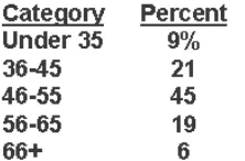
in two ways, as a table or as a graph. Table 1 shows an age frequency distribution with five
categories of age ranges defined. The same frequency distribution can be depicted in a graph
as shown in Figure 2. This type of graph is often referred to as a histogram or bar chart.
Figure 2. Frequency distribution bar chart.
Distributions may also be displayed using percentages. For example, you could use percentages to describe the:
percentage of people in different income levels
percentage of people in different age ranges
percentage of people in different ranges of standardized test scores
Central Tendency. The central tendency of a distribution is an estimate of the "center" of a distribution of values. There are three major types of estimates of central tendency:
Mean
Median
Mode
The Mean or average is probably the most commonly used method of describing central tendency. To compute the mean all you do is add up all the values and divide by the number of values. For example, the mean or average quiz score is determined by summing all the scores and dividing by the number of students taking the exam. For example, consider the test score values:
15, 20, 21, 20, 36, 15, 25, 15 The sum of these 8 values is 167, so the mean is 167/8 = 20.875.
The Median is the score found at the exact middle of the set of values. One way to compute the median is to list all scores in numerical order, and then locate the score in the center of the sample. For example, if there are 500 scores in the list, score #250 would be the median. If we order the 8 scores shown above, we would get:
15,15,15,20,20,21,25,36
The mode is the most frequently occurring value in the set of scores. To determine the mode, you might again order the scores as shown above, and then count each one. The most frequently occurring value is the mode. In our example, the value 15 occurs three times and is the model. In some distributions there is more than one modal value. For instance, in a bimodal distribution there are two values that occur most frequently.
Notice that for the same set of 8 scores we got three different values -- 20.875, 20, and 15 -- for the mean, median and mode respectively. If the distribution is truly normal (i.e., bell-shaped), the mean, median and mode are all equal to each other.
Dispersion. Dispersion refers to the spread of the values around the central tendency. There are two common measures of dispersion, the range and the standard deviation. The range is simply the highest value minus the lowest value. In our example distribution, the high value is 36 and the low is 15, so the range is 36 - 15 = 21.
The Standard Deviation is a more accurate and detailed estimate of dispersion because an outlier can greatly exaggerate the range (as was true in this example where the single outlier value of 36 stands apart from the rest of the values. The Standard Deviation shows the relation that set of scores has to the mean of the sample. Again lets take the set of scores:
15,20,21,20,36,15,25,15
to compute the standard deviation, we first find the distance between each value and the mean. We know from above that the mean is 20.875. So, the differences from the mean are:
15 - 20.875 = -5.875 20 - 20.875 = -0.875 21 - 20.875 = +0.125 20 - 20.875 = -0.875 36 - 20.875 = 15.125 15 - 20.875 = -5.875 25 - 20.875 = +4.125 15 - 20.875 = -5.875
Notice that values that are below the mean have negative discrepancies and values above it have positive ones. Next, we square each discrepancy:
-5.875 * -5.875 = 34.515625 -0.875 * -0.875 = 0.765625 +0.125 * +0.125 = 0.015625
-0.875 * -0.875 = 0.765625 15.125 * 15.125 = 228.765625
-5.875 * -5.875 = 34.515625 +4.125 * +4.125 = 17.015625
-5.875 * -5.875 = 34.515625
take the square root of the variance (remember that we squared the deviations earlier). This would be SQRT(50.125) = 7.079901129253.
Although this computation may seem convoluted, it's actually quite simple. To see this, consider the formula for the standard deviation:
√
∑ �−�̅�−1 2(2.1) X= each score
�̅ = the mean or average n = the number of values
∑ means we sum across the valuaes
In the top part of the ratio, the numerator, we see that each score has the the mean subtracted from it, the difference is squared, and the squares are summed. In the bottom part, we take the number of scores minus 1. The ratio is the variance and the square root is the standard deviation. In English, we can describe the standard deviation as:
the square root of the sum of the squared deviations from the mean divided by the number of scores minus one
Although we can calculate these univariate statistics by hand, it gets quite tedious when you have more than a few values and variables. Every statistics program is capable of calculating them easily for you. For instance, I put the eight scores into SPSS and got the following table as a result:
N 8
Mean 20.8750
Median 20.0000
Mode 15.00
Std. Deviation 7.0799
Variance 50.1250
Range 21.00
which confirms the calculations I did by hand above.
The standard deviation allows us to reach some conclusions about specific scores in our distribution. Assuming that the distribution of scores is normal or bell-shaped (or close to it!), the following conclusions can be reached:
approximately 68% of the scores in the sample fall within one standard deviation of the mean
approximately 95% of the scores in the sample fall within two standard deviations of the mean
For instance, since the mean in our example is 20.875 and the standard deviation is 7.0799, we can from the above statement estimate that approximately 95% of the scores will fall in the range of 20.875-(2*7.0799) to 20.875+(2*7.0799) or between 6.7152 and 35.0348. This kind of information is a critical stepping stone to enabling us to compare the performance of an individual on one variable with their performance on another, even when the variables are measured on entirely different scales.
C. Descriptive statistics for measurements of a single variable
1. The basic idea
We now deal with descriptive statistics for measurements of a single variable. It is imagined that we have a large population of values from which we take samples. The population could consist of the diameters of automobile drive shafts produced in a given plant. To make sure the manufacturing equipment continues to operate satisfactorily, we measure the diameter of every tenth drive shaft.1 The measurements over a given time period are called “samples” of the “population” of all drive shafts. The measurements will vary somewhat,
both because of finite tolerances in the manufacturing equipment and because of uncertainties in the measurements themselves. From the samples, we wish to make judgments about the underlying population, i.e. the actual diameters of all drive shafts made. For example, the mean (average) of the samples is expected to be approximately the true unknown mean of the population. The accuracy of this sample estimate of the population mean would be expected to improve as the sample size is increased. For example, if we measured every other drive shaft, we would expect the mean of our measurements to become closer to the actual average diameter of all drive shafts than when we measured only 1/10 of them.
One of the primary objectives of statistics is to make quantitative statements. For example, rather than just saying that the average drive shaft diameter is approximately equal to the
sample mean, we’d like to give a range of diameters within which the true mean lies with a
probability of 95%.
2. The normal distribution
The most common assumption made in statistical treatments of data is that the probability of a particular value x deviating from the population mean is inversely proportional to the
square of its deviation from the mean. This gives rise to the familiar “bell-shaped curve” normal probability density function:
e (x )2/2 2 2
1 ) x (
f
(2.2)
where 2 the population variance, which is the mean of all values of (x - )2. The factor
2
/
1 was chosen so that
1 dx ) x (
f . The probability that a given sample x lies
between a and b is
b adx ) x (
f ,2 which gives the fundamental meaning of the probability
density function f.
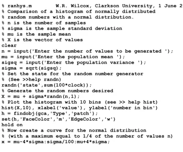
To illustrate the normal distribution, we present on the next page a MATLAB program to generate normally-distributed random numbers and compare the resulting histogram with equation 2.2. To save time, you can cut and paste this program into MATLAB’s Editor,
save in your working directory as ranhys.m, and then execute in MATLAB’s Command
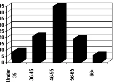
window by typing >> ranhys. Try it for several values of the mean, variance and number of values, n. Notice how the histogram approaches the shape3 of the normal distribution better and better as n is increased. A histogram for = 5, 2 = 2 and n = 500 is given as Figure 2.1 on the next page.
% ranhys.m W.R. Wilcox, Clarkson University, 1 June 2004. % Comparison of a histogram of normally distributed
% random numbers with a normal distribution. % n is the number of samples
% sigma is the sample standard deviation % mu is the sample mean
% X is the vector of values clear
n = input('Enter the number of values to be generated '); mu = input('Enter the population mean ');
sigsq = input('Enter the population variance '); sigma = sqrt(sigsq);
% Set the state for the random number generator % (See >>help randn)
randn('state',sum(100*clock));
% Generate the random numbers desired X = mu + sigma*randn(n,1);
% Plot the histogram with 10 bins (see >> help hist) hist(X,10), xlabel('value'), ylabel('number in bin') h = findobj(gca,'Type','patch');
set(h,'FaceColor','m','EdgeColor','w') hold on
% Now create a curve for the normal distribution
% (with a maximum equal to 1/4 of the number of values n) x = mu-4*sigma:sigma/100:mu+4*sigma;
2 That is, the area under the f(x) curve between a and b.
f = 0.25*n*exp(-(x-mu).^2/2/sigma.^2);
plot(x,f), legend('random number', 'normal distribution')
title('Comparison of random number histogram with normal distribution shape')
hold off
Do you get the same histogram if you use the same values again for , 2 and n? Examine the code until you understand why.
Figure 3. Sample histogram for = 5, 2 = 2 and n = 500.
See http://www.shodor.org/interactivate/activities/NormalDistribution/ for a graphical
illustration of the influence of population standard deviation on the normal distribution and
the influence of bin size on a histogram.
Although normally distributed populations are common, many other distributions are known.
If you have a set of data, how can you determine if the underlying population is normally
distributed? The short answer is that you cannot be 100% sure, as is typical of questions in
statistics. But there are several tests you can use to see if the answer is probably “yes.”
Method 1: Prepare a histogram and see if it looks normal. This is only effective if the sample size is very large.
Method 2: A better method, particularly for smaller sample sizes, is to prepare a cumulative distribution plot. The cumulative distribution is the fraction F of the sample
values that are less than or equal to each particular value x. A plot of F versus x
can be compared to the cumulative distribution for a normal probability density
function. Integrating equation 2.1 we obtain:
x
2 x erf 1 2 1 dt ) t ( f F
(2.3)
where t is a dummy variable for integration and
z
0 t dt
e 2 ) z (
erf 2 is called the error
function, and is calculated by MATLAB using the command, for example, >> erf(0.5) .
Beginning below is a MATLAB program to generate normally distributed random numbers
and plot the cumulative distribution versus that given by equation 2.2. Copy this into your
MATLAB Editor, save it in your working directory as cumdist.m and execute >> cumdist
in the MATLAB Command window. Test the program for different values of the mean,
variance and number of values. Note how the resulting values become nearer and nearer the
curve for a normal distribution (equation 2.2) as the number of values is increased.
% cumdist.m W.R. Wilcox, Clarkson University, 2 June 2004. % Comparison of cumulative distribution
% for normally distributed random numbers % with integrated normal distribution % mu = population mean
% sigma = square root of population variance % n = number of samples from population % X = vector of sample values
clear, clc
% Input the desired values of n, mu, sigma
sigsq = input('Desired population variance: '); sigma = sqrt(sigsq);
% Set the state for the random number generator % (See >>help randn)
randn('state',sum(100*clock));
% Generate the random numbers desired X = mu + sigma*randn(n,1);
% Sort the numbers X = sort(X);
j = 1:n;
% Generate the cumulative normal distribution curve: x = mu-4*sigma:sigma/100:mu+4*sigma;
F = 1/2*(1+erf((x-mu)/sqrt(2)/sigma)); plot(X,(j-0.5)/n,x,F);
xlabel('x');
ylabel('fraction of values < x')
legend('samples','normal distribution','Location','SouthEast') title('Cumulative distribution')
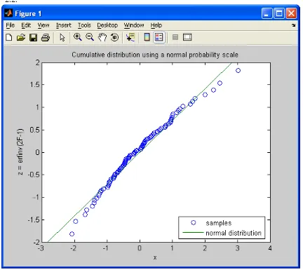
Method 3: An even better method is to plot the cumulative distribution on a scale that would give a straight line if the distribution were normal. This is done by making the vertical scale erfinv(2*F-1), where erfinv is the inverse error function (i.e., x = erfinv(y) satisfies y = erf(x)). Below is a MATLAB program that is the same as that above, except for the vertical scale. Copy it into your MATLAB Editor, save it in your working directory as cumdistp2.m and execute >> cumdistp2 in the MATLAB Command window. Test the program for different values of the mean, variance and number of values. Note the resulting values become nearer and nearer the straight line for a normal distribution (equation 2.2) as the number of values is increased, except for the very high and the very low values.
% cumdistp2.m W.R. Wilcox, Clarkson University, 2 November 2002. % Plot of cumulative distribution
% for normally distributed random numbers % on normal distribution probability scale % mu = mean
% sigma = population standard deviation % n = number of samples from population % X = vector of sample x values
% F = fraction of values < x (cumulative distribution) % z = erfinv(2F-1) (search erfinv in MATLAB help)
% For normal distribution get straight line for z versus x % Note that F =(1 + erf z)/2
clear, clc
% Input the desired values of n, mu, sigma
n = input('Number of values to be generated: '); mu = input('Desired population mean: ');
sigsq = input('Desired population variance: '); sigma = sqrt(sigsq);
% Set the state for the random number generator % (See >>help randn)
randn('state',sum(100*clock));
% Generate the random numbers desired X = mu + sigma*randn(n,1);
% Generate z
j=(1:n)'; F=(j-1/2)/n; z=erfinv(2*F-1);
% Calculation of the normal distribution line: Xn(1)=mu-2*sqrt(2)*sigma; Xn(2)=mu+2*sqrt(2)*sigma; zn=[-2,2];
plot(X,z,'o',Xn,zn);
xlabel('x'); ylabel('z = erfinv(2F-1)');
title('Cumulative distribution using a normal probability scale') legend('samples','normal distribution','Location','SouthEast')
[image:31.612.92.524.209.594.2]An example for 100 values with a population mean of 0 and a variance of 1 is given in Figure 2.2.
Figure 5. Normally distributed "data" from a population with a mean of 0 and a variance of 1.
"Skewness is a lack of symmetry in a distribution. Data from a positively skewed (skewed to the right) distribution have values that are bunched together below the mean, but have a long tail above the mean. (Distributions that are forced to be positive, such as annual income, tend to be skewed to the right.) Data from a negatively skewed (skewed to the left) distribution have values that are bunched together above the mean, but have a long tail below the mean."
"Kurtosis is a measure of the heaviness of the tails in a distribution, relative to the normal distribution. A distribution with negative kurtosis (such as the uniform distribution) is light-tailed relative to the normal distribution, while a distribution with positive kurtosis (such as the Cauchy distribution) is heavy-tailed relative to the normal distribution."
Mathematically, skewness and kurtosis are measured via:4
skewness = g1 k3/k23/2 = k3/s3 and kurtosis = g2 k4/k22= k3/s4
(2.3)
where s = k21/2 is the standard deviation and
) 1 n ( n S nS k 2 1 2 2 (2.4) ) 2 n )( 1 n ( n S 2 S nS 3 S n k 3 1 1 2 3 2
3
(2.5) ) 3 n )( 2 n )( 1 n ( n S 6 S nS 12 S ) n n ( 3 S S ) n n ( 4 S ) n n ( k 4 1 2 1 2 2 2 2 1 3 2 4 2 3
4
(2.2)
n 1 i r i r x S (2.7)with xi being the ith value of n samples from the population.
d. Confidence limits on the mean
From a sample, we can calculate the upper and lower limits for the unknown population mean with desired probability 1- using the following equation:4
n ts x (2.8)
4 From
function t(nu,alpha)
where x is the sample mean, s is the sample standard deviation, and t is Student's t, which is a function of and the degrees of freedom (nu). For a single variable, as considered here, =n-1. The relationship between , and t is given by the Incomplete Beta Function, which in MATLAB is called by the name betainc (see >> help betainc) and is, specifically:5
2 1 , 2 , t betainc 2 (2.9) To test your understanding, find for t = 2.2281 for a sample of 11 values.
Unfortunately, MATLAB does not have an inverse incomplete beta function that would allow one to find t for a given and . Consequently, the following MATLAB function was created that gives t to within 0.001.
% Calculation of Student's t from nu and alpha % W.R. Wilcox, Clarkson University, April 2005 % nu is the degrees of freedom
% alpha is the fractional uncertainty
% A normal distribution of possible values is assumed % Accurate to within 0.001
tp = 0.2:0.001:200;
res = abs(betainc(nu./(nu+tp.^2),nu/2,1/2)-alpha); [minres,m]=min(res);
if tp(m) == 200
fprintf('Student''s t is >= 200. Choose a larger alpha.\n') elseif tp(m) == 0.2
fprintf('Student''s t is <= 0.2. Choose a smaller alpha.\n') else fprintf('Student''s t is %4.3f\n', tp(m));
end end
This function was used to prepare Figure 2.3. The curve for = 1000 is indistinguishable from that for a normal distribution, which corresponds to = and in MATLAB is given by:
) 1 ( erfinv 2
t
(2.10)
It is interesting to compare the customary bell-shaped normal probability density function given
by Equation 2.1 with that for Student’s t, which is given by 2 , 2 1 sB t 1 ) x ( f 2 / 1 2 (2.11) where s x x
t , x is the sample mean, = n – 1 is known as the degrees of freedom, and
1
0
1 w 1
z 1 y dy
y w , z
B
(2.12) is the beta function, which MATLAB calculates using the function beta(z,w). The program on the next page permits one to input arbitrary values of the mean and standard deviation. The output is
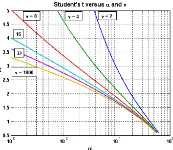
the probability density function for normal distribution and for selected values of (i.e., sample size minus 1). Figure 2.4 shows the result. Again note that the Student’s t distribution has broader
[image:34.612.129.483.195.502.2]tails and approaches the normal distribution as the sample size increases.
Figure 2.3. Plot of Student's t versus and
% Norm_vs_stud_t.m
% William R. Wilcox, Clarkson University, November 2002
%Comparison of the probability density function for a normal distribution %with that for a Student's t distribution, with a population mean mu % and standard deviation sigma input.
mu = input('Enter the mean: ');
sigma = input('Enter the standard deviation: '); x=mu-4*sigma:sigma/10:mu+4*sigma;
fx_norm = (1/sigma/sqrt(2*pi))*exp(-(x-mu).^2/2/sigma^2); t=(x-mu)/sigma;
nu = 2;
fx_stud2 = 1/sigma*(1 + t.^2/nu).^(-(nu+1)/2)/sqrt(nu)/beta(1/2,nu/2); nu = 4;
fx_stud8 = 1/sigma*(1 + t.^2/nu).^(-(nu+1)/2)/sqrt(nu)/beta(1/2,nu/2); nu = 12;
fx_stud12 = 1/sigma*(1 + t.^2/nu).^(-(nu+1)/2)/sqrt(nu)/beta(1/2,nu/2); nu = 32;
fx_stud32 = 1/sigma*(1 + t.^2/nu).^(-(nu+1)/2)/sqrt(nu)/beta(1/2,nu/2); plot(x,fx_norm,x,fx_stud2,x,fx_stud4,x,fx_stud8,x,fx_stud12,x,fx_stud32); xlabel('x'); ylabel('f(x)');
titletext=['Probability density functions for mean of ',num2str(mu),' and SD of ',num2str(sigma)];
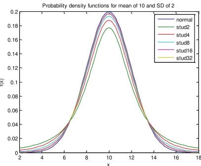
[image:35.612.95.502.271.607.2]title(titletext); legend('normal','stud2','stud4','stud8','stud12','stud32')
Figure 2.4. Comparison of probability density function f(x) for a normal probability (Eq 2.1) with that for Student’s t (Eq 2.11) with sample sizes of 3, 5, 9, 17 and 33.
D. Summary: descriptive statistics function
2 4 6 8 10 12 14 16 18
0 0.02 0.04 0.06 0.08 0.1 0.12 0.14 0.16 0.18 0.2
x
f(
x
)
Probability density functions for mean of 10 and SD of 2
The descriptive statistics function has been prepared to make it easy for you to do these calculations using MATLAB. Click on descriptive statistics function and go to File, Save as to save it in your working directory. To execute it, >> descript(X), where X is the variable vector containing the data. To illustrate the use of this function, we consider the weight of adult field mice in St. Lawrence County. We trap mice using a Have-a-heart trap, weigh them, and then release them. The resulting data are contained in mouse weights for sample sizes of 2, 3, 4, 5, 10 and 100 (that's a lot of mice!). Save this file in your working directory.
Now test the function descript. Load mouse.mat into MATLAB by File, Import Data, mouse, and then Finish in the Import Wizard window. Then the following:
>> descript(M2) >> descript(M3) >> descript(M4) >> descript(M5) >> descript(M10) >> descript(M100)
What can you conclude from these results? 6
A google search reveals that there are a variety of textbooks and websites dealing with statistics, ranging from theory to history to on-line computational engines. A couple of particularly useful web sites are:
Web Pages that Perform Statistical Calculations
NIST/SEMATECH e-Handbook of Statistical Methods
Statistics is a deep subject of great usefulness for engineers and scientists. Hopefully, you will want to learn more.
CHAPTER 3
PROBABILITY
A. Introduction
After careful study of this chapter you should be able to do the following:
a. Understand and describe sample spaces and events for random experiments with graphs,
tables, lists, or tree diagrams
b. Interpret probabilities and use probabilities of outcomes to calculate probabilities of events
in discrete sample spaces
c. Calculate the probabilities of joint events such as unions and intersections from the
probabilities of individual events
d. Interpret and calculate conditional probabilities of events
e. Determine the independence of events and use independence to calculate probabilities
f. Use Bayes’ theorem to calculate conditional probabilities
g. Understand random variables
B. Sample Spaces And Events
The sample space of a random experiment is a set S that includes all possible outcomes
experiment. For simple experiments, the sample space may be precisely the set of possible
outcomes. More often, for complex experiments, the sample space is a mathematically
convenient set that includes the possible outcomes and perhaps other elements as well. For
example, if the experiment is to throw a standard die and record the outcome, the sample space
is S = {1, 2, 3, 4, 5, 6}, the set of possible outcomes. On the other hand, if the experiment is to
capture a cicada and measure its body weight (in milligrams), we might conveniently take the
sample space to be S = [0, ), even though most elements of this set are practically impossible.
Certain subsets of the sample space of an experiment are referred to as events. Thus, an
event is a set of outcomes of the experiment. Each time the experiment is run, a given
event A either occurs, if the outcome of the experiment is an element of A, or does not occur,
if the outcome of the experiment is not an element of A. Intuitively, you should think of an
event as a meaningful statement about the experiment.
The sample space S itself is an event; by definition it always occurs. At the other extreme,
the empty set Ø is also an event; by definition it never occurs. More generally, if A and B are
events in the experiment and A is a subset of B, then the occurrence of Aimplies the occurrence
of B.
Set theory is the foundation of probability, as it is for almost every branch of
mathematics. In probability, set theory is used to provide a language for modeling and
describing random experiments.
Definition S: sample space, all possible outcomes Example: tossing a coin, S {H,T}
Example: reaction time to a certain stimulus, S (0,)
Sample space: may be countable or uncountable
Countable: put 1-1 correspondence with a subset of integers
Finite elements countable
Infinite elements countable or uncountable
Fact: There is only countable sample space since measurements cannot be made with infinite
accuracy
Definition event: any measurable collection of possible outcomes, subset of S
) (A
P : probability of an event (rather than a set)
Theorem A,B,C: events on S
(1).Commu