ISBN: 978-1-449-32051-5 [LSI]
HTML5 and JavaScript Web Apps by Wesley Hales
Copyright © 2013 Hales Consulting, Inc.. All rights reserved. Printed in the United States of America.
Published by O’Reilly Media, Inc., 1005 Gravenstein Highway North, Sebastopol, CA 95472.
O’Reilly books may be purchased for educational, business, or sales promotional use. Online editions are also available for most titles (http://my.safaribooksonline.com). For more information, contact our corporate/ institutional sales department: 800-998-9938 or [email protected].
Editors: Simon St. Laurent and Meghan Blanchette Production Editor: Christopher Hearse
Copyeditor: Linda Laflamme
Proofreader: Linley Dolby Indexer: Meghan Jones Cover Designer: Randy Comer Interior Designer: David Futato Illustrator: Rebecca Demarest
October 2012: First Edition
Revision History for the First Edition:
2012-10-26 First release
See http://oreilly.com/catalog/errata.csp?isbn=9781449320515 for release details.
Nutshell Handbook, the Nutshell Handbook logo, and the O’Reilly logo are registered trademarks of O’Reilly Media, Inc. HTML5 and JavaScript Web Apps, the image of a cornetfish, and related trade dress are trade‐ marks of O’Reilly Media, Inc.
Many of the designations used by manufacturers and sellers to distinguish their products are claimed as trademarks. Where those designations appear in this book, and O’Reilly Media, Inc., was aware of a trade‐ mark claim, the designations have been printed in caps or initial caps.
Table of Contents
Preface. . . vii
1. Client-Side Architecture. . . 1
Before HTML5 2
More Code on the Client 3
The Browser as a Platform 4
Conclusion 5
2. The Mobile Web. . . 7
Mobile First 8
Deciding What to Support 8
Mobile Web Browsers 9
Mobile Browser Market Share 13
Browser Grading 14
HTML5 in the Enterprise 15
Graceful Degradation 16
QA and Device Testing 16
3. Building for the Mobile Web. . . 19
Mobile Web Look and Feel 19
The Look 20
The Feel 21
Interactions and Transitions 23
Sliding 23
Flipping 27
Rotating 29
Debugging Hardware Acceleration 31
Memory Consumption 36
Fetching and Caching 37
Frameworks and Approaches 46
Single Page 48
No Page Structure 51
100% JavaScript Driven 52
Mobile Debugging 59
4. The Desktop Web. . . 63
The Browser as a Platform 64
Client Versus Server HTML Generation 64
Device and Feature Detection 66
Client-Side Feature Detection 67
Client-Side userAgent Detection 69
Server-Side userAgent Detection 71
Compression 72
GZIP Versus DEFLATE 73
Minification 77
JavaScript MVC Frameworks and the Server 83
The Top Five Frameworks 84
Backbone 85
Ember 87
Angular 89
Batman 90
Knockout 92
5. WebSockets. . . 95
Building the Stack 95
On the Server, Behind the Scenes 96
Programming Models 96
Relaying Events from the Server to the Browser 97
Binary Data Over WebSockets 102
Managing Proxies 103
Frameworks 106
6. Optimizing with Web Storage. . . 111
The Storage API 112
The StorageEvent API 114
What’s Racy and What’s Not? 114
Using JSON to Encode and Decode 115
Security and Private Browsing 115
Security 116
Private Browsing 116
Using Web Storage Today 119
Syncing Data from the Client Side 120
Database Syncing with Backbone 121
Using Web Storage in Any Browser 123
Frameworks 125
LawnChair 125
persistence.js 126
7. Geolocation. . . 129
A Practical Use Case: User Tracking 132
A Practical Use Case: Reverse Geocoding 133
Frameworks 134
geo-location-javascript 134
Webshims lib 135
8. Device Orientation API. . . 137
A Practical Use Case: Scrolling with Device Movement 140
9. Web Workers. . . 143
A Practical Use Case: Pooling and Parallelizing Jobs 145
Other Uses 149
Preface
HTML5 and JavaScript Web Apps is about building web applications with HTML5 and
W3C specifications that are widely supported across all devices and browsers. It is in‐ tended for programmers who are facing the challenges of moving more code to the frontend with JavaScript, CSS, and HTML, while at the same time providing a backend infrastructure that is loosely coupled and supportive of offline clients.
My goal is to take you through, from beginning to end, each step of research and de‐ velopment for building a web application in today’s new, brave world of mobile-first, responsive, progressive, and MVwhatever JavaScript-based applications. Each chapter contains real-world examples and uses of each specification discussed.
A few core W3C specifications are considered the cornerstones of today’s “enterprise” web apps: Web Storage, Web Workers, Geolocation, Device Orientation, and Web Sock‐ ets. In the chapters that follow, you’ll learn how to use these specifications in both mobile and desktop environments, as well as how to deal with fragmentation. Along the way, you’ll also discover the hidden details and intricacies that you must know to create the most amazing application the universe has ever seen.
Who This Book Is For
The way we write web apps is changing—and it will always change. This book attempts to capture a snapshot in time of the HTML5 revolution and covers topics from beginner to advanced. Maybe you’re a novice who’s just starting to learn web application devel‐ opment, or maybe you’re an expert fine-tuning your existing stack. Either way, HTML5
and JavaScript Web Apps will give you a baseline for building advanced client-side web
applications.
If you’re a developer aiming to write lightning-fast, HTML5-driven applications, as well as to understand how the server interacts with today’s newer client-side concepts and technologies, then this book is for you.
Who This Book Is Not For
If you’re just starting to learn JavaScript, CSS, or HTML, then this book is not for you. Consult one of the many books that cover the basics of web application development before you begin reading HTML5 and JavaScript Web Apps. This book assumes you understand how to build a web application and have written one before with such li‐ braries as jQuery, Prototype, or plain old DOM APIs.
Also, if you are convinced that server-side generated markup is the way of the future, then chances are you won’t enjoy this book. The topics covered here are mostly directed toward developers who think “offline first” and write modern web applications that start out not worrying about the server. The main idea driving this book is to use the web browser as a platform.
Finally, this book is geared toward the UI. There are a few examples of server-side code, mainly in Chapter 5, but everything else is client-side code with JavaScript and CSS.
What You’ll Learn
The world of HTLM5 and mobile is moving at light speed, and we are witnessing a revolution and shift from traditional server-side concepts to heavier client-side ideas. In this environment, building a web app purely from HTML5 and related specifications is complicated and challenging, to say the least. These standards can adapt gracefully across mobile and desktop browsers, however, and this book will help you shoulder the challenge.
Chapter 3 jumps straight into developing a mobile web application with HTML5. This chapter will give you a starting point for building an application with native-like touch events and transitions. You’ll also learn to add offline support with the AppCache and dynamically enhance your app based on the type of network the user is on (3G, WiFi, an so on).
Chapter 4 introduces you to concepts and features that apply to all browsers, both mobile and desktop. This chapter covers advanced server-side topics, such as compression and minification, along with frameworks that can help you develop a build process. This chapter also compares today’s top five JavaScript MVC frameworks and how they in‐ teract with the server. Unlike other books that cover only the basics of JavaScript MVC,
Chapter 4 takes a heavier look at how these frameworks interact with the server. The remaining chapters go into detail on the five main HTML5 specifications. You’ll learn about the raw implementation of each specification, as well as how it’s used in real-world scenarios and use cases. Each chapter ends with a look at the frameworks available that support each technology.
For example, Chapter 5 takes a broad look at WebSockets and how you can use it on the client and server. This is the only chapter that goes into detail on server-side code. You’ll set up a simple WebSocket server and compare frameworks that can be used across mobile and desktop browsers. The chapter also contains a detailed comparison of Sock‐ et.IO, Vert.x, and Atmosphere.
Chapter 6 goes into detail on Web Storage. You’ll see how today’s top sites like Google, Yahoo!, Twitter, and Amazon are storing data on the client side and investigate the best ways to store data along with a breakdown of available frameworks.
Next, Chapter 7 looks at Geolocation and discusses real-world uses of tracking users with mobile web browsers and other concepts. This chapter outlines how to use the technology and where you might encounter pitfalls in various implementations.
Chapter 8 covers the Device Orientation API. Although it’s not the most glorious spec‐ ification in existence, it has extremely valuable and valid uses, as you’ll learn. This chap‐ ter ends with an implementation using orientation for page navigation on mobile de‐ vices.
Focused on Web Workers, Chapter 9 goes into practical uses of threading in the browser, delving into more detail than simply processing prime numbers in a separate thread. The chapter provides real-world examples of using Web Workers for processing image data and shows you how to create your own thread pool.
About the Code
The examples in this book are maintained at http://github.com/html5e. The JavaScript and CSS are self-contained in a simple framework called slidfast.js and slidfast.css. The JavaScript was purposely created to have no dependencies on any other libraries or frameworks. It is built specifically to showcase core JavaScript and DOM APIs that are provided by the browsers covered in each chapter. It’s a learning framework not intended for public consumption, but by all means, learn from it and use it wherever you feel necessary.
Conventions Used in This Book
The following typographical conventions are used in this book:
Italic
Indicates new terms, URLs, email addresses, filenames, and file extensions.
Constant width
Used for program listings, as well as within paragraphs to refer to program elements such as variable or function names, databases, data types, environment variables, statements, and keywords.
Constant width bold
Shows commands or other text that should be typed literally by the user.
Constant width italic
Shows text that should be replaced with user-supplied values or by values deter‐ mined by context.
This icon signifies a tip, suggestion, or general note.
This icon indicates a warning or caution.
Using Code Examples
Selling or distributing a CD-ROM of examples from O’Reilly books does require per‐ mission. Answering a question by citing this book and quoting example code does not require permission. Incorporating a significant amount of example code from this book into your product’s documentation does require permission.
We appreciate, but do not require, attribution. An attribution usually includes the title, author, publisher, and ISBN. For example: “HTML5 and JavaScript Web Apps by Wesley Hales (O’Reilly). Copyright 2013 Hales Consulting, Inc., 978-1-449-32051-5.”
If you feel your use of code examples falls outside fair use or the permission given above, feel free to contact us at [email protected].
Safari® Books Online
Safari Books Online (www.safaribooksonline.com) is an on-demand digital library that delivers expert content in both book and video form from the world’s leading authors in technology and business.
Technology professionals, software developers, web designers, and business and creative professionals use Safari Books Online as their primary resource for research, problem solving, learning, and certification training.
Safari Books Online offers a range of product mixes and pricing programs for organi‐ zations, government agencies, and individuals. Subscribers have access to thousands of books, training videos, and prepublication manuscripts in one fully searchable database from publishers like O’Reilly Media, Prentice Hall Professional, Addison-Wesley Pro‐ fessional, Microsoft Press, Sams, Que, Peachpit Press, Focal Press, Cisco Press, John Wiley & Sons, Syngress, Morgan Kaufmann, IBM Redbooks, Packt, Adobe Press, FT Press, Apress, Manning, New Riders, McGraw-Hill, Jones & Bartlett, Course Technol‐ ogy, and dozens more. For more information about Safari Books Online, please visit us
online.
How to Contact Us
Please address comments and questions concerning this book to the publisher:
O’Reilly Media, Inc.
1005 Gravenstein Highway North Sebastopol, CA 95472
800-998-9938 (in the United States or Canada) 707-829-0515 (international or local)
707-829-0104 (fax)
To comment or ask technical questions about this book, send email to bookques [email protected].
For more information about our books, courses, conferences, and news, see our website at http://www.oreilly.com.
Find us on Facebook: http://facebook.com/oreilly
Follow us on Twitter: http://twitter.com/oreillymedia
Watch us on YouTube: http://www.youtube.com/oreillymedia
Acknowledgments
This book is dedicated to my incredible wife, Kristen, and our beautiful children, Adam and Stella. I also thank and dedicate this effort to Jesus Christ, who has given me the talent and ability to write this book.
The book would not have been possible without Meghan Blanchette and Simon St. Laurent continually pushing me to do better. I’m not a super easy guy to work with and can be quite lazy at times ☺, so they deserve serious props.
Also, many, many thanks to Douglas Campos, Brian Leroux, Divya Manian, Jason Por‐ ter, Shelley Powers, and Darren Nelsen for taking the time to review this book. I sought out the best developers, authors, and speakers in the industry to provide feedback, and they pushed me to places I did not think about. They gave me great perspective on the different aspects of HTML5 and today’s Web. It was an honor to work with them and have their input.
CHAPTER 1
Client-Side Architecture
Today, client-side development clearly requires more thought and investment in the architecture of HTML-driven applications. As web applications evolve, we are witness‐ ing a serious shift from traditional server-side frameworks with tightly coupled tem‐ plating logic and heavy backend processing to loosely coupled JavaScript clients that can go on- and offline at any time.
But is all of this just a repeat of the past? Haven’t we already gone through the fat-client phases of the ’80s and ’90s, illustrated in Figure 1-1?
Unlike 20 years ago, browsers—the client-side platforms of today—are much more powerful, not to mention mobile. Plus, today’s clients can report all kinds of interesting data, such as your location’s latitude and longitude, through the browser and over a cell network.
One other small fact that’s pushing the browser as a platform is that multiple companies —Google, Apple, Mozilla, and Microsoft—are pushing thousands of commits per week into improving their hybrid, thick-client technology platforms.
In the past, building applications that were heavily tied to the server made perfect sense. This gave hardcore, backend developers the freedom not to worry about DOM manip‐ ulation and CSS. If you could get a data grid or paging component that tied into your backend code and generated IE6- through IE8-compatible markup, then you were gold‐ en. (See Figure 1-2.)
Figure 1-2. Output of a JSF data grid component
This autogenerated markup comes at a cost, however, especially in today’s world of fast moving, fragmented browsers. The need for flexible, controllable markup is at an all-time high. The Open Web is moving faster than ever, and user interfaces can no longer allow the server to be the bottleneck between stale ideas of the past and lightning-fast, scalable, frontend code. Developers have never been more concerned with performance in the browser. How markup is rendered and asynchronous resources are loaded can make or break your application. Faster and leaner frontends equal more lead conver‐ sions, better SEO rankings, and lower costs in the data center.
Before HTML5
prietary plug-ins. Many developers focused on supporting browsers like IE6, Firefox, Safari, and maybe a few others. They wrote clean, semantic markup and worried about how valid their XHTML was. They imported the occasional JavaScript library to create some nice effects, and prototype.js or jQuery was the backbone (no pun intended) of the application.
Once developers worked around the browser quirks and bugs of a given application, things pretty much stayed the same. The architecture of advanced web applications was mostly managed on the server. Applications were dependent on how fast the incoming HTTP request could be handled and how fast markup could be rendered back to the user’s web browser. With server-side templating and component frameworks, the server parsed the template and data was interlaced with regular XHTML or HTML markup. For Java, you might have used JSP, Velocity, Tiles, GWT, or JSF to achieve this. For Ruby, it was ERB, HAML, or RedCloth, and the list goes on. Every server-side web framework had an accompanying UI templating engine to go along with it or to choose from. This was the way of UI development for the past 10 years or more, and it probably will continue for a while yet. But it doesn’t have to. The time has come to rethink how we build our new generation of web applications.
You might ask, “Why do we need to change the way in which our frontend is generated?” or “Why are we moving all our code to run inside the web browser and not on the server?” The first answer that comes to mind is that the web browser is becoming a platform. Our applications now live inside of platforms (or browsers) that are orders of magnitude more capable than their ancestors. Today’s web applications are just that: they’re apps. We’re not creating sites anymore; we’re creating robust applications with HTML5, CSS, and JavaScript at the core, as you can see in the HTML5 badge shown in
Figure 1-3.
Figure 1-3. HTML5 badge
It’s time to take a step back and look at how we’re building our applications and level the client-side playing field. Developers must understand which frameworks and ap‐ proaches are needed to build a scalable, rock-solid user interface for any given applica‐ tion.
More Code on the Client
going a little overboard, but this is what happens as technology shifts and then finds a decent balance. The technology that drives our UI is changing as browsers become more mobile and as they’re given more hardware access through JavaScript APIs. To some degree, the concept of building a user interface remains the same across both client and server approaches. They all have data that needs to be presented and data that needs to be gathered. We’re still adding framework-specific tags or attributes to our code so that the data knows where to be displayed, but the dependence on the server is gone. We are now getting objects and data back from intermittent RESTful or WebSocket connections, which are automatically bound to the UI through a client-side, JavaScript framework. Our applications now have the ability to occasionally sync data and the power to func‐ tion offline.
To harness this power and to handle the different states of our applications, we must consider new approaches for managing client-side code. JavaScript libraries like jQuery and prototype must not define our frontend development models. Cross-browser DOM manipulation libraries should be taken very seriously, but the complexities of a scalable client-side architecture deserve much more attention than they have been given in the past. Organizing code and your application structure with mature techniques gathered from the classic Design Patterns: Elements of Reusable Object-Oriented Software by Erich Gamma, et al., (Addison-Wesley Professional, 1995), is just the beginning. More than 40 MVC JavaScript frameworks now claim to be MVC, but they should be called MV*. They all use different techniques for managing models, views, and controllers, and many seriously depart from the original Smalltalk MVC concepts. And even though JavaScript frameworks give us a nice way to organize and structure our code, we must deal with browser APIs that expose hardware-level access, such as Geolocation or Web Workers, on our own. The architecture of heavy, HTML5-driven user interfaces is still in its in‐ fancy, but fortunately you have this book to help light your path.
The Browser as a Platform
The web browser is becoming, or already is, an additional platform for our application stacks. It gets just as much, if not more, consideration than the server-side when choos‐ ing what our applications must support. Our frontend code is now packaged in native apps, extensions, and operating systems that are all driven by HTML5. As we are seeing with Google’s Chrome OS and Mozilla’s Boot 2 Gecko projects, the Open Web is very clearly being considered the platform for which web applications should and will be written.
The good thing is that there are workarounds in the majority of cases and browser vendors such as Microsoft, Opera, Google, Apple, and Mozilla are clearly taking the stance of providing a platform for developers with their respective browsers (see
Figure 1-4).
Figure 1-4. Potential upcoming browser platforms
Conclusion
Whether you work for a large company or a budding startup, you must hone your skills, look past shiny home pages, look past top rankings on Hacker News or reddit, and make decisions that are valuable to your current project. You must set up and maintain work‐ flows for writing, testing, and debugging code and the frameworks you choose. These workflows may consist of many libraries and processes, from enforcing automatic IDE inspections with JSHint to testing your code with a minified, concatenated version of all the JavaScript contained within your application. Overall, it’s incredibly valuable to understand and embrace the tools that will help you deliver an amazing web application or enhance an existing one.
CHAPTER 2
The Mobile Web
Consumers are on track to buy one billion HTML5-capable mobile devices in 2013. Today, half of US adults own smartphones. This comprises 150 million people, and 28% of those consider mobile their primary way of accessing the Web. The ground swell of support for HTML5 applications over native ones is here, and today’s developers are flipping their priorities to put mobile development first.
Even in large enterprise environments, mobile browser statistics are on the rise and starting to align with their desktop cousins. We are still faced, however, with the fact that one third of the Internet is using a version of Internet Explorer older than 9. Even more sobering, in some cases, these early IE users can make up two thirds of the visitors to our sites. This will get better over time, and desktop users will upgrade to newer versions and better browsers, but as we push the Web forward and create amazing ap‐ plications across all browsers, we must also create a solid architecture that will account for all users and give them the best experience possible.
The capabilities of web browsers mean everything to the success of our web projects and products. Whether for fun, profit, or the overall betterment of mankind, it’s im‐ portant to understand how data should be served up for both desktop and mobile users. Finding the common ground across all browsers and figuring out which pieces should be used in the construction of today’s web applications is the goal of this chapter.
The Mobile Web refers to browser-based applications created for mobile devices, such
Whether you’re an HTML5, W3C standards-loving, Open Web expert or just coming fresh off HTML 1, this chapter will equip you with the latest code, trends, and market research to guide you through making the right decision for your next web project. So what are you waiting for? Level up!
Mobile First
First, let’s get our priorities straight. Prioritizing mobile design and development over the desktop was once laughable. In just a few years, the idea of “mobile first” has taken over, giving web developers a breath of fresh air in terms of HTML5-based APIs toward hardware access on mobile devices.
Apart from the obvious, here are multiple reasons for thinking mobile first:
• Developing sites for constrained devices and resolutions will force you to create more fluid and flexible content.
• Device features, such as accelerometer and geolocation hardware, present new business opportunities with technologies like Augmented Reality.
• Overall, mobile first requires you to think in a code-quality mindset. Today, it’s required for developers to worry about things like battery life when doing hardware-accelerated animations with CSS. This quality of development not only brings better performing apps, but it also encourages you to focus on cleaner semantics.
• As you wean yourself off of desktop-focused web development, mobile browsers give you a glimpse into the future. This allows you to stay on the bleeding edge and in touch with new specifications and features.
Unfortunately the Mobile Web isn’t write-once-run-anywhere yet. As specifications be‐ come final and features are implemented, interoperability will be achieved. In today’s world of mobile browsers, however, we don’t have a largely consistent implementation across all browsers. Even though new tablets and phones are constantly being released to achieve a consistent level of HTML5 implementation, we all know that we’re stuck supporting the older, fragmented devices for a set amount of time. So, needless to say, such devices as the iPhone 3G and any device that hasn’t upgraded past Android 4 will be the IE6s of this mobile era.
Deciding What to Support
Writing mobile web apps that span all platforms and all browsers can be a huge under‐ taking. Previously, web app developers didn’t care if a desktop computer had a camera or accelerometer attached to it. The web applications of yesterday were not tied to the operating system and the capabilities of desktop hardware. Now, the Mobile Web adds another dimension of support to the apps we build, and the fragmentation across browsers and devices is mind-blowing. We must now create applications to be compat‐ ible across browsers, platforms, and devices. For example, Android’s WebKit-based browser supported Web Workers in version 2.1, but later disabled support in version 2.2, 3.0, and 4.0. Then, support of Web Workers was fixed and turned back on in 4.1! Confusing, right? This is what I mean by another dimension of support or fragmenta‐ tion. You’re not only supporting browsers, but the operating system the browser is tied to as well.
How do you sort it all out? Not to worry, the remainder of the chapter examines the various mobile browsers, discusses the commonly supported APIs of each device, and identifies a core set of features from which you can build a solid enterprise mobile web app.
You can find the latest matrix of HTML5 support across all rendering engines on the HTML5 engine comparison page on Wikipedia.
Mobile Web Browsers
Take a moment to review the various mobile browsers and their respective communities. As developers, we must try to embrace all platforms and develop applications that span all of the following browsers—and more if needed. For example, your users should not be limited to a WebKit-only mobile application in which your code runs on iOS and Android only.
WebKit
WebKit is the browser engine behind Mobile Safari, Android, and Chrome, to name a few. This open source project is constantly pushing the open web envelope, adapting to the latest W3C specifications as they’re published. The recent explosion of interest in WebKit can be attributed to the fact that it powers many of the leading mobile platform browsers.
Figure 2-1. WebKit revisions
Mobile Safari (iOS6).
Apple’s adoption and implementation of early HTML5 specifica‐ tions has been impressive. The company has been an obvious force in pushing the Web forward. With standard hardware and multicore technology, iPhones and iPads have been a great platform for HTML5 development. But, it’s not all ponies and rainbows in iOS land, as each mobile browser has its share of quirks and bugs. Earlier iOS versions suffered from a bug with JavaScript’s innerHTML() and forced developers to think of new ways to insert dynamic content. You’ll see the solution to this problem in the next chapter—as for now, we’ll focus on the big picture.Apple’s community process around iOS progression and filing bugs is bound and limited to the way Apple chooses to do things. You can file bugs with its BugReporter (http:// bugreport.apple.com), but you can search through issues that you submit only. Luckily, once again, the community has stepped up to give Apple a hand in allowing nonconfi‐ dential data from customers to be openly searched. To see if your bug has already been filed, you can visit http://openradar.appspot.com/faq.
Android.
Even though the Android default browser is based on WebKit, as of this writ‐ ing, its implementation of HTML5 specifications is just starting to beef up in version 4. As Android evolves, we can rest assured that the coming HTML5 implementations will evolve with its community (http://source.android.com/community). For now, however, Android devices are horribly fragmented, and HTML5 support varies on devices and OS versions.As for Android’s future, the newer Dolphin browser (http://dolphin-browser.com) prom‐ ises to deliver major advances in browser technology:
• 5 to 10 times faster than the default Android browser
• 100% faster than Chrome (at times)
Figure 2-2. Performance test results from http://html5test.com/results/mobile.html
Mobile Firefox
Mozilla has been around for a while and is stronger than ever in focusing on community efforts and pushing the Web forward. As of this writing, Mobile Firefox is in third place for the best HTML5 implementation (Figure 2-3) and has trumped Mobile Safari (iOS) in terms of implemented HTML5 features.
This swapping of the throne will continue as the Mobile Web moves forward and evolves —and that’s a good thing. We want competition and standards progression. Mozilla is no stranger to the evolution of the Mobile Web with its ambitious new project called WebAPI (https://wiki.mozilla.org/WebAPI). The WebAPI project is a set of APIs for accessing device functionality usually accessible only for native applications. In sum‐ mary, it’s an OS based on HTML, CSS, and JavaScript for mobile devices. It’s yet another effort to move the Web forward and enable developers to write web applications once for all mobile operating systems. Estimated delivery for the WebAPI project is mid-2012 through the Boot to Gecko project (B2G). Figure 2-4 shows a screenshot of B2G’s Gaia UI.
Opera Mobile
Opera (http://www.opera.com/mobile) has two separate browsers for mobile phones: Opera Mobile and Opera Mini. In Opera Mini, the Opera Presto browser engine is located on a server. In Opera Mobile, it is installed on the phone. Currently, Opera Mini holds a large percentage of market share among other browsers, but for enterprise HTML5 applications, Opera Mobile supports the core specifications we need, such as Web Storage, Web Workers, and Geolocation.
Internet Explorer Mobile
Windows Phone 7.5 features a version of Internet Explorer Mobile with a rendering engine that is based on Internet Explorer 9. So the simplest way of explaining what Windows Phone supports is to say that it supports what IE9 supports, including Web Storage and Geo location. The supported specifications for IE9 Mobile can be found at http://windowsteamblog.com/windows_phone/b/wpdev/archive/2011/09/22/ie9-mobile-developer-overview.aspx.
On a better note, Windows Phone 8 supports IE10. Internet Explorer 10 includes much better support for such HTML5 features as WebSockets, Web Workers, Application Cache, and IndexedDB.
Mobile Browser Market Share
As of the latest worldwide report on browser market share, WebKit-based browsers are clearly in the lead with over 80% of the market (Figure 2-5). Right now, Android and iOS dominate, but as new operating systems, such as Mozilla’s HTML5-based mobile B2G project, emerge we could see another shift of power in the ongoing “browser war.”
Things are moving fast already. During the months that it took me to write this book, WebKit-based browsers grew from a 75% market share in October 2011 to more than 80% in 2012. Opera Mini shrunk from 18.65% to 12%. IE browsers grew from .16% to . 58%, but Microsoft is just starting up its marketing machine for the Windows Phone platform in 2012—so expect that IE number to grow.
Figure 2-5. Worldwide market share by browser; May 2012 data provided by Net Appli‐ cations
Browser Grading
All of this information leads into the important topic of browser grading. Browser grad‐ ing is a must for any mobile web project. It gives developers and QA a way to keep sane while developing and testing your application. It also sets forth a specific support sched‐ ule for your users and an overall target for your mobile web app’s capabilities. Table 2-1
illustrates a sample browser grading sheet from QuirksMode.
Table 2-1. Browser grading example Grade Description
A: High Quality A high-quality browser with notable market share. A must-target browser for a mobile web developer. B: Medium Quality Either a lower quality browser with high market share or a high-quality browser with low market share.
Depending upon your capabilities, you should work to support these browsers, as well.
HTML5 in the Enterprise
With a clearer picture of the mobile device and browser landscape, you next need to determine which W3C specifications the various browsers support and how you can use them today. In terms of enterprise development, certain client-side APIs are con‐ sidered the advanced building blocks of today’s mobile web applications: Geolocation, WebSocket, Web Storage, Device Orientation, and Web Workers. These are the speci‐ fications on last call from the W3C; close to finalized, they are stable (for the most part) and adopted in today’s mobile browsers. Of course, you can find many other great spec‐ ifications like the Media Capture API, which allows access to the device audio, video, and images, but this book tries to stay focused on specifications that are widely sup‐ ported across all browsers today.
Table 2-2 details the support of the building-block APIs in the five leading or upcoming mobile platforms. All of these mobile browsers are considered grade A, B, or C. Throughout the book and at http://html5e.org, I will refer to this group of specifications and browsers as HTML5 Enterprise or HTML5e to easily identify and build upon the same specifications and browsers across mobile and desktop environments.
Table 2-2. HTML5 Enterprise (HTML5e) mobile support
Browser Geolocation WebSocket Web Storage Device Orientation Web Workers
Mobile Safari Yes Yes Yes Yes Yes
Android Yes No Yes Yes No
Mobile IE Yes Yesa Yes No Yesa
Opera Mobile Yes Mixedb Yes Mixedc Yes
Mobile Firefox Yes Mixedb Yes Yes Yes
a Mobile IE from Windows Phone 7.5 does not support these, but Windows 8 and above does. b Both Mozilla and Opera have temporarily disabled WebSockets due to security issues with the protocol. c Opera Mobile for Android has experimental support.
As you can see in Table 2-2, Mobile Firefox and Safari are the clear winners in terms of broad support, with Opera Mobile coming in at a close third. Android still has some work to do, and version 4 is looking much better. Likewise, Mobile IE has much better HTML5 support in IE10, but IE9 focused mainly on the “same markup” approach: trying to get things right in regard to HTML5-related markup and the IE rendering engine.
Graceful Degradation
So you’ve decided which browsers you’re going to support (all of them hopefully), but now you must polyfill or gracefully degrade, your apps where certain HTML5e specifi‐ cations are not implemented. The premise for graceful degradation is to first build for the latest and greatest, then add polyfills, or handlers, for less capable devices. How can you create a development environment that will service your enterprise project needs and give you an API that works and degrades gracefully across multiple mobile brows‐ ers? At the end of each subsequent chapter, we’ll look at approaches to handling these issues and identify projects that could possibly provide an open source solution.
You now have a starting point: a decent view of which HTML5 APIs are supported within mobile device browsers. In terms of the future, W3C, spec-driven, device features are only guaranteed to get better as new device operating systems are released and the specifications themselves become final. The following chapters will examine and rate available frameworks to form a reusable API for your project.
QA and Device Testing
In addition to deciding which browsers you are going to support, you need an easy way to develop and test across them. Enterprise development and QA cycles can get expen‐ sive depending on the scale of your project. So setting up the proper rapid development and testing environment is critical to success.
Because the current mobile market is mostly owned by Android and iOS, WebKit-based testing is fairly easy. You can test things out as you normally do on your desktop browser, then run them on a targeted mobile device that is backed by a version of WebKit. Just because you tested your app on the desktop version of Chrome or Safari, however, does not mean that everything will work properly across all WebKit-based mobile browsers. Nor does it mean that WebKit is the perfect representation of the Mobile Web. You should test across as many target platforms as possible based on W3C standards.
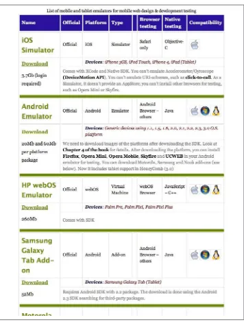
The best way to test your mobile HTML5-based application is to use the actual physical device you are targeting (or an emulator). As a service to developers, Max Firtman, the author of Programming the Mobile Web (O’Reilly) does a great job of identifying available emulators and maintains an up-to-date list, which you can find at mobilexweb and preview in Figure 2-6.
CHAPTER 3
Building for the Mobile Web
The success of any mobile web application relies on two factors: design and performance. For mobile app design, we must have a consistent look and feel across all platforms. For better performance, we must have offline capabilities, animations on the UI, and back‐ end services that retrieve and send data via RESTful or WebSocket endpoints. To put it simply, your app is constrained by two ever-changing speeds: the speed of the device CPU/GPU and the speed of the Internet. The UI is handled by device hardware, such as the GPU, when doing native-like animations and transitions through CSS, and your backend services are limited to the current Internet connection speed of the mobile device.
In this chapter, we’ll discuss how to design, create, and tune your mobile web app to be better looking and more performant. The chapter starts with a brief explanation of how apps should look for mobile devices then jumps into a low-level explanation of hardware-accelerated CSS and how to debug it. From there, you’ll learn what it takes to build an offline mobile application and how to bring all the code together into one application to create a native-like mobile web app that is capable of handling intermittent Internet connections. Lastly, you’ll examine today’s most popular mobile frameworks to get an understanding of when or if you should add a community-supported frame‐ work to your project.
Mobile Web Look and Feel
The “native versus Mobile Web” debate isn’t about which programming model will win. It’s about what we can build until HTML5-like technologies catch up. We have three choices:
• Hybrid approaches and frameworks, which try to bridge the gap of HTML5 and native
• True, bleeding edge, mobile web frameworks, which are trying to conquer the native feel with markup, JavaScript, and CSS
Couple a fast and responsive mobile web app with your existing enterprise infrastruc‐ ture, and let the games begin. Web standards are quickly closing the gap on missing native features, and device makers are catching up on implementing them. As of Android 3.1, for example, you can capture photos and videos due to the Media Capture API specification.
The W3C is a busy place these days, and developers are moving specifications and better use cases forward. Projects like jQuery are calling on the open source community to participate in these specifications and to submit their ideas for a better Web.
It only makes sense that mobile developers are leaning in favor of writing once, and running their app anywhere. Write once, run anywhere, or WORA, received a lot of fanfare after Sun’s JVM started to emerge in the enterprise. With HTML5, WORA ba‐ sically means you can use standard JavaScript and CSS to access all of the device features that a native application can (the device GPS, camera, accelerometer, etc.). This ap‐ proach has given new life to browsers and a language (HTML) that was once only used to serve up documents—not apps.
The Look
To truly achieve that native look and feel, not only does your app need to respond quickly, but it must also look good. These days, the big secret to getting your native app listed in an App Store Top 10 list is to have a good-looking design. That’s all it takes. If you have a killer data-driven application using all the latest device bells and whistles, it will not make it very far without a good clean design.
Overall, the Web has its own look and feel, and everyone knows that. There isn’t a default look that will make all your users happy, however, so the burden is on you and your design team to create an attractive user experience.
iOS definitely has its own Mobile Web look and feel that mimics its native apps, but what about Android, Windows Mobile, Kindle, and all the other devices? Even if you could get your web app to respond like a native application, how do you conquer making it look like one? Because you are most concerned with only the three or four leading platforms, you could create three native skins for your target platforms and a default web look and feel for all the others.
Figure 3-1. The Mobile Design Pattern Gallery website
The Feel
Spinning refreshes, choppy page transitions, and periodic delays in tap events are just a few of the headaches you face when attempting to create a mobile web app that behaves like a native one. Developers are trying to get as close to native as they possibly can, but are often derailed by hacks, resets, and rigid frameworks.
Hardware acceleration
Memory allocation and computational burden
If you go around compositing every element in the DOM just for the sake of hard‐ ware acceleration, the next person who works on your code may chase you down and beat you severely.
Power consumption and battery life
Obviously, when hardware kicks in, so does the battery. Developers are forced to take the wide array of device constraints into consideration while writing mobile web apps. This will be even more prevalent as browser makers start to enable access to more and more device hardware. Luckily, we will soon have an API for checking the status of the device battery.
Conflicts
You will encounter glitchy behavior when applying hardware acceleration to parts of the page that were already accelerated. So knowing if you have overlapping ac‐ celeration is very important.
To make user interaction smooth and as close to native as possible, you must make the browser work for you. Ideally, you want the mobile device CPU to set up the initial animation, and then have the GPU responsible for only compositing different layers during the animation process. This is what translate3d, scale3d, and translateZ do: they give the animated elements their own layer, thus allowing the device to render everything together smoothly.
CSS features can come at a cost on low-end devices. When using CSS gradient, box-shadow, borders, and background-repeat , you are using the device GPU to paint your images on the fly. CSS can be very powerful for rendering a nice user interface, but you should avoid doing this type of work in software when it can be prebaked in images. This means you should use sprites so the device downloads only a single image and embed data URIs in your CSS files for smaller images.
A few animations that don’t require repaints are:
• transition-property
• opacity
• transform
CSS selector performance can cripple older mobile browsers. Using selectors like: div[style*='foo']
Interactions and Transitions
Take a look at three of the most common user-interaction approaches when developing a mobile web app: slide, flip, and rotation effects. First, we’ll dissect the slide, flip, and rotation transitions and how they’re accelerated. Notice how each animation requires only three or four lines of CSS and JavaScript. The examples don’t use any additional frameworks, only DOM and vendor prefixed APIs.
You can view this code in action at http://html5e.org/example. The demo is built for a mobile device, so fire up an emulator, use your phone or tablet, or reduce the size of your browser window to 1024px or less.
Sliding
The most common of the three approaches, sliding page transitions, mimics the native feel of mobile applications. The slide transition is invoked to bring a new content area into the view port.
For the slide effect, first you declare your markup: <divid="home-page"
class="page">
<h1>Home Page</h1> </div>
<divid="products-page" class="page stage-right">
<h1>Products Page</h1> </div>
<divid="about-page"class="page stage-left">
<h1>About Page</h1> </div>
Notice that the pages are staged left and right. You could place them in any direction, but this is most common.
We now add animation plus hardware acceleration with just a few lines of CSS. The actual animation happens when we swap classes on the page div elements.
.page {
position: absolute;
width: 100%;
height: 100%;
/*activate the GPU for compositing each page */
Although translate3d(0,0,0) is known as the silver bullet approach for WebKit, other browser engines like fennec (Mobile Firefox) and Opera Mobile do not support, or are just implementing, translate3d as of this writing. They do support 2D transformations, which cut out the Z-axis, so to support these browsers, you need to change:
transale3d(X,Y,Z); // or
translateX(X), translateY(Y), translateZ(Z);
to:
translate(X,Y);
The one downside to 2D transforms is that, unlike 3D transforms, they are not GPU accelerated.
Hardware acceleration tricks do not provide any speed improvement under Android Froyo 2.2 and beyond. All composition is done within the software.
When the user clicks a navigation element, we execute the following JavaScript to swap the classes. We’re not using any third-party frameworks yet, this is straight up JavaScript!
function slideTo(id) {
//1.) the page we are bringing into focus dictates how
// the current page will exit. So let's see what classes
// our incoming page is using.
//We know it will have stage[right|left|etc...]
var classes = getElement(id).className.split(' ');
//2.) decide if the incoming page is assigned to right or left
// (-1 if no match)
var stageType = classes.indexOf('stage-left');
//3.) on initial page load focusPage is null, so we need
// to set the default page which we're currently seeing.
if (FOCUS_PAGE == null) {
// use home page
FOCUS_PAGE = getElement('home-page');
}
//4.) decide how this focused page should exit.
if (stageType > 0) {
FOCUS_PAGE.className = 'page transition stage-right';
} else {
FOCUS_PAGE.className = 'page transition stage-left';
}
//5. refresh/set the global variable
//6. Bring in the new page.
FOCUS_PAGE.className = 'page transition stage-center'; }
stage-left or stage-right becomes stage-center and forces the page to slide into the center view port. We are completely depending on CSS3 to do the heavy lifting.
.stage-left {
left: 100%; }
.stage-right{
left: 100%; }
.stage-center {
top: 0;
left: 0; }
By controlling the animations through swapping the stage classes in JavaScript, we are decoupling the CSS implementations from JavaScript. We could, however, control all the presentation logic within JavaScript by using:
FOCUS_PAGE.style.transform = "translate(X,Y)";
Each browser vendor may be using a specific vendor prefix for the transform capabilities. One quick way of checking to see what your target browser supports is to use:
var getTransformProperty = function(node) {
var properties = [
'transform',
'WebkitTransform',
'msTransform',
'MozTransform',
'OTransform'
];
var p;
while (p = properties.shift()) {
if (typeof node.style[p] != 'undefined') {
document.
querySelector("#log").innerHTML += p + "<br/>";
}
}
return false;
};
Figure 3-3. Slide transitions running on Opera Mobile 12
Flipping
When dealing with touch events and transitions, the first thing you’ll want is to get a handle on the current position of the element. Thanks to the CSSMatrix interface, which is implemented by WebKit only at the time of this writing, you can get an instance of
WebKitCSSMatrix by passing the current transform’s computed style.
function pageMove(event) {
// get position after transform
var curTransform =
new WebKitCSSMatrix(window.getComputedStyle(page).webkitTransform);
var pagePosition = curTransform.m41; }
Because we are using a CSS3 ease-out transition for the page flip, the usual element.off setLeft will not work.
For more information on WebKitCSSMatrix, go to Apple’s developer page.
Next we want to figure out which direction the user is flipping and set a threshold for an event (page navigation) to take place.
if (pagePosition >= 0) {
//moving current page to the right //so means we're flipping backwards
if ((pagePosition > pageFlipThreshold) ||
(swipeTime < swipeThreshold)) {
//user wants to go backward
slideDirection = 'right';
} else {
slideDirection = null;
} } else {
//current page is sliding to the left
if ((swipeTime < swipeThreshold) ||
(pagePosition < pageFlipThreshold)) {
//user wants to go forward
slideDirection = 'left';
} else {
slideDirection = null;
} }
You’ll also notice that we are measuring the swipeTime in milliseconds as well. This allows the navigation event to fire if the user quickly swipes the screen to turn a page.
function positionPage(end) {
page.style.webkitTransform = 'translate3d('+ currentPos + 'px, 0, 0)';
if (end) {
page.style.WebkitTransition = 'all .4s ease-out';
//page.style.WebkitTransition = 'all .4s cubic-bezier(0,.58,.58,1)'
} else {
page.style.WebkitTransition = 'all .2s ease-out';
}
For this example, ease-out did the trick, but for your own projects, play around with
cubic-bezier to give the best native feel to your transitions.
Finally, to make the navigation happen, we must call the previously defined slide To() methods used in the last example.
track.ontouchend = function(event) {
pageMove(event);
if (slideDirection == 'left') {
slideTo('products-page');
} else if (slideDirection == 'right') {
slideTo('home-page');
} }
Rotating
Next, take a look at the rotate animation being used in this demo. At any time, you can rotate the page you’re currently viewing 180 degrees to reveal the reverse side by tapping on the Contact menu option. Again, this only takes a few lines of CSS and some Java‐ Script to assign a transition class onclick.
The rotate transition isn’t rendered correctly on most versions of An‐ droid, because it lacks 3D CSS transform capabilities. Unfortunately, instead of ignoring the flip, Android makes the page “cartwheel” away by rotating instead of flipping. I recommend using this transition spar‐ ingly until support improves.
Here’s the full source, but here’s the markup (basic concept of front and back): <divid="front"
class="normal">
...
</div>
<divid="back" class="flipped">
<div id="contact-page" class="page">
<h1>Contact Page</h1>
The JavaScript you need is: function flip(id) {
// get a handle on the flippable region
var front = getElement('front');
var back = getElement('back');
// again, just a simple way to see what the state is
var classes = front.className.split(' ');
var flipped = classes.indexOf('flipped');
if (flipped >= 0) {
// already flipped, so return to original
front.className = 'normal';
back.className = 'flipped';
FLIPPED = false;
} else {
// do the flip
front.className = 'flipped';
back.className = 'normal';
FLIPPED = true;
} }
Finally, here is the relevant CSS: #back,
#front {
position: absolute;
width: 100%;
height: 100%;
-webkit-backface-visibility: hidden;
-webkit-transition-duration: .5s;
-webkit-transform-style: preserve-3d;
-moz-backface-visibility: hidden;
-moz-transform-style: preserve-3d;
-moz-transition-duration: .5s; }
.normal {
-webkit-transform: rotateY(0deg);
-moz-transform: rotateY(0deg); }
.flipped {
-webkit-user-select: element;
-webkit-transform: rotateY(180deg);
Debugging Hardware Acceleration
With the code of the basic transitions covered, take a look at the mechanics of how the transitions run on the device and are composited. Here are a few tips to remember when using accelerated compositing:
• Reduce the quantity of layers
• Keep layers as small as possible
• Update layers infrequently
• Tailor layer compositing to your purpose
• Use trial and error; testing is important
To begin debugging, fire up a couple of WebKit-based browsers and your IDE of choice.
Using Safari
First, start Safari from the command line to make use of some debugging environment variables. I use a Mac, so the example commands might differ from those for your OS. Open the Terminal, and type the following (or just skip Safari and use the Chrome settings in next section):
$> export CA_COLOR_OPAQUE=1 $> export CA_LOG_MEMORY_USAGE=1
$> /Applications/Safari.app/Contents/MacOS/Safari
These lines start Safari with a couple of debugging helpers. CA_COLOR_OPAQUE shows you which elements are actually composited or accelerated, while CA_LOG_MEMORY_USAGE
shows you how much memory you are using when sending drawing operations to the backing store. This tells you exactly how much strain you are putting on the mobile device and possibly give hints to how your GPU usage might be draining the target device’s battery.
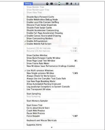
You may also start Safari after running the following command, which gives you a full Debug menu with all available options, as shown in Figure 3-4:
Using Chrome
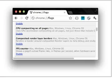
Now fire up Chrome to see some good frames per second (FPS) information and borders around the composited layers:
1. Open the Google Chrome web browser. 2. In the URL bar, type about:flags.
[image:47.504.74.434.184.437.2]3. Scroll down a few items, and click Enable for the FPS counter as shown in Figure 3-5.
Figure 3-5. The Chrome about:flags tab
Do not enable the “GPU compositing on all pages” option. The FPS counter appears in the left corner only if the browser detects compo‐ siting in your markup—and that is what you want in this case.
Figure 3-6. The Chrome FPS meter
This is how you know hardware acceleration is turned on. It also gives you an idea of how the animation runs and whether you have any leaks (continuous running anima‐ tions that should be stopped).
Another way to visualize the hardware acceleration is to open the same page in Safari with the environment variables mentioned above. Every accelerated DOM element will have a red tint to it. This shows you exactly what is being composited by each layer, or accelerated div element. Notice in Figure 3-7, the white navigation is not red because it is not accelerated.
Figure 3-7. Debugging acceleration of the demo app
A similar setting for Chrome is also available in the about:flags tab: Click Enable for “Composited render layer borders.”
Memory Consumption
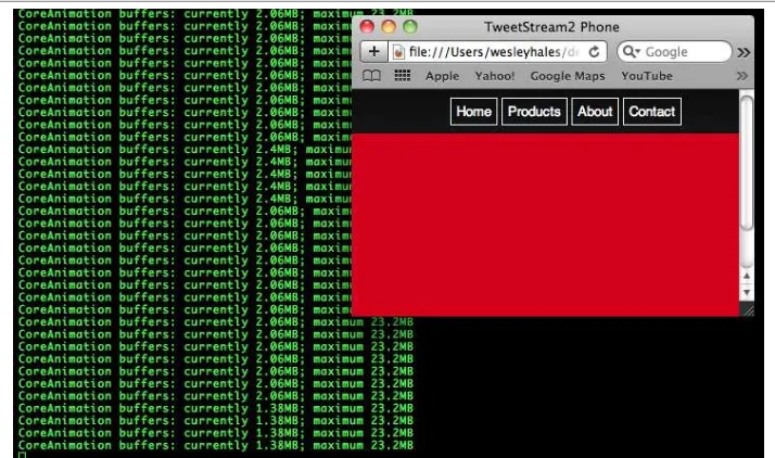
[image:50.504.73.430.153.364.2]Finally, to truly understand the graphics hardware performance of an application, look at how memory is being consumed. Here you can see that the app is pushing 1.38MB of drawing instructions to the CoreAnimation buffers on Mac OS. The CoreAnimation memory buffers are shared between OpenGL ES and the GPU to create the final pixels you see on the screen (Figure 3-9).
Figure 3-9. CoreAnimation debug session (small screen)
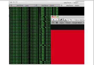
When you simply resize or maximize the browser window, you can see the memory expand as well (Figure 3-10).
Using the previous debugging techniques gives you an idea of how memory is being consumed on your mobile device only if you resize the browser to the correct dimen‐ sions. When debugging or testing for iPhone environments, for example, resize to 480 by 320 pixels.
Figure 3-10. CoreAnimation debug session (enlarged screen)
Fetching and Caching
Now it’s time to take your page and resource caching to the next level. Much like the approach that jQuery Mobile and similar frameworks use, you can prefetch and cache your pages with concurrent AJAX calls. A few core mobile web challenges highlight the reasons why following this approach makes sense:
Fetching
Prefetching your pages allows users to take the app offline and also eliminates wait‐ ing between navigation actions. Of course, you don’t want to choke the device’s bandwidth when the device comes online, so you need to use this feature sparingly.
Caching
You want a concurrent or asynchronous approach when fetching and caching pages. Because it’s well supported among devices, you also need to use localStorage, which unfortunately isn’t asynchronous.
AJAX and parsing the response
mechanism for AJAX response insertion and handling concurrent calls (https:// community.jboss.org/people/wesleyhales/blog/2011/08/28/fixing-ajax-on-mobile-devices). You also can leverage some new features of HTML5 for parsing the xhr.re sponseText.
You can build on the code from the slide, flip, and rotate demos by adding some sec‐ ondary pages and linking to them. You can then parse the links and create transitions on the fly.
<divid="home-page" class="page">
<h1>Home Page</h1>
<a href="demo2/home-detail.html" class="fetch">
Find out more about the home page! </a>
</div>
As you can see, this snippet leverages semantic markup with a link to another page. The child page follows the same node/class structure as its parent. You could take this a step further and use the data-* attribute for page nodes, and the like.
Here is the detail page (child) located in a separate HTML file (
/demo2/home-detail.html), which will be loaded, cached, and set up for transition on app load.
<div id="home-page-detail" class="page">
<h1>Home Page Details</h1>
<p>Here are the details.</p> </div>
Now take a look at the JavaScript. For simplicity’s sake, I’m leaving any helpers or op‐ timizations out of the code. The code is looping through a specified array of DOM nodes to dig out links to fetch and cache. For the complete source, see https://github.com/ html5e/slidfast/blob/master/slidfast.js#L264.
var fetchAndCache = function() {
// iterate through all nodes in this DOM to
//find all mobile pages we care about
var pages = document.getElementsByClassName('page');
for (var i = 0; i < pages.length; i++) {
// find all links
var pageLinks = pages[i].getElementsByTagName('a');
for (var j = 0; j < pageLinks.length; j++) {
var link = pageLinks[j];
if (link.hasAttribute('href') &&
//'#' in the href tells us that this page is
//already loaded in the DOM - and
!(/[\#]/g).test(link.href) &&
//check for an explicit class name setting to fetch this link
(link.className.indexOf('fetch') >= 0)) {
//fetch each url concurrently
var ai = new ajax(link,function(text,url){
//insert the new mobile page into the DOM
insertPages(text,url);
});
ai.doGet();
}
}
} };
The use of the AJAX object ensures proper asynchronous post-processing. In this ex‐ ample, you see the basic use of caching on each request and of providing the cached objects when the server returns anything but a successful (200) response.
function processRequest () {
if (req.readyState == 4) {
if (req.status == 200) {
if (supports_local_storage()) {
localStorage[url] = req.responseText;
}
if (callback) callback(req.responseText,url);
} else {
// There is an error of some kind, use our
//cached copy (if available).
if (!!localStorage[url]) {
// We have some data cached, return that to the callback.
callback(localStorage[url],url);
return;
}
}
} }
Unfortunately, because localStorage uses UTF-16 for character encoding, each single byte is stored as 2 bytes, bringing our storage limit from 5MB to 2.6MB total. Fetching and caching these pages/markup outside of the application cache scope allows you to take advantage of all the storage space provided by the device.
With the recent advances in the iframe element with HTML5, you now have a simple and effective way to parse the responseText you get back from an AJAX call. There are plenty of 3,000-line JavaScript parsers and regular expressions that remove script tags and so on. But why not let the browser do what it does best? The next example writes the responseText into a temporary hidden iframe. This uses the HTML5 sandbox
To quote the HTML5 spec: “The sandbox attribute, when specified, en‐ ables a set of extra restrictions on any content hosted by the iframe. Its value must be an unordered set of unique space-separated tokens that are ASCII case-insensitive. The allowed values are forms, allow-same-origin, allow-scripts, and allow-top-navigation. When the attribute is set, the content is treated as being from a unique origin, forms and scripts are disabled, links are prevented from targeting other browsing contexts, and plug-ins are disabled. To limit the damage that can be caused by hostile HTML content, it should be served using the text/html-sandboxed MIME type.”
var getFrame = function() {
var frame = document.getElementById("temp-frame");
if (!frame) {
// create frame
frame = document.createElement("iframe");
frame.setAttribute("id", "temp-frame");
frame.setAttribute("name", "temp-frame");
frame.setAttribute("seamless", "");
frame.setAttribute("sandbox", "allow-same-origin");
frame.style.display = 'none';
document.documentElement.appendChild(frame);
}
// load a page
return frame.contentDocument; };
var insertPages = function(text, originalLink) {
var frame = getFrame();
//write the ajax response text to the frame and let
//the browser do the work
frame.write(text);
//now we have a DOM to work with
var incomingPages = frame.getElementsByClassName('page');
var pageCount = incomingPages.length;
for (var i = 0; i < pageCount; i++) {
//the new page will always be at index 0 because
//the last one just got popped off the stack with
//appendChild (below)
var newPage = incomingPages[0];
//stage the new pages to the left by default
newPage.className = 'page stage-left';
//find out where to insert
try {
// mobile safari will not allow nodes to be transferred from one
// DOM to another so we must use adoptNode()
document.getElementById(location).
appendChild(document.adoptNode(newPage));
} catch(e) {
// todo graceful degradation?
}
} };
The target browser (Mobile Safari) correctly refuses to implicitly move a node from one document to another. An error is raised if the new child node was created in a different document. So this example uses adoptNode, and all is well.
So why iframe? Why not just use innerHTML? Even though innerHTML is now part of the HTML5 spec, it is a dangerous practice to insert the response from a server (evil or good) into an unchecked area. innerHTML has also been noted to fail intermittently on iOS (just do a Google search on “ios innerhtml” to see the latest results) so it’s best to have a good workaround when the time comes.
Network Type Detection and Handling
Now that we have the ability to buffer (or predictive cache) the example web app, we must provide the proper connection detection features to make the app smarter. This is where mobile app development gets extremely sensitive to online/offline modes and connection speed. Enter the Network Information API. With it, you can set up an ex‐ tremely smart mobile web app.
When would this be useful? Suppose someone on a high-speed train is using your app to interact with the Web. As the train rushes along, the network may very well go away at various moments, and various locales may support different transmission speeds (HSPA or 3G might be available in some urban areas, while remote areas might support much slower 2G technologies only). Not only does the following code address connec‐ tion scenarios like this, it also:
• Provides offline access through applicationCache
• Detects if bookmarked and offline
• Detects when switching from offline to online and vice versa
• Detects slow connections and fetches content based on network type
Again, all of these features require very little code. The first step is detect the events and loading scenarios (see https://github.com/html5e/slidfast/blob/master/slidfast.js#L536):
window.addEventListener('load', function(e) { if (navigator.onLine) {
// new page load
processOnline(); } else{
// the app is probably already cached and (ma