•Slicinganddicingmetricsdeliversinteractiveinsight
For your convenience Apress has placed some of the front
matter material after the index. Please use the Bookmarks
Contents at a Glance
Chapter 3: Filtering Data in Power View
■
...
57
Chapter 4: Charts in Power View
■
...
85
Chapter 5: Advanced Charting with Power View
■
...
119
Chapter 6: Interactive Data Selection
■
...
141
Chapter 7: Images and Presentation
■
...
173
Chapter 8: Mapping Data in Power View
■
...
201
Chapter 9: PowerPivot Basics
■
...
221
Chapter 10: Extending the Excel Data Model Using PowerPivot
■
...
269
Chapter 11: PowerPivot for Self-Service BI
■
...
305
Chapter 12: Discovering and Loading Data with Power Query
■
...
329
vi
Chapter 14: Power Map
■
...
397
Chapter 15: Self-Service Business Intelligence with Power BI
■
...
443
Appendix A: Sample Data
■
...
505
Introduction
Business intelligence (BI) is a concept that has been around for many years. Until recently, it has too often been a domain reserved for large corporations with teams of dedicated IT specialists. All too frequently, this has meant developing complex solutions using expensive products on timescales that did not meet business needs.
All this has changed with the advent of self-service business intelligence. Now a user with a reasonable knowledge of Microsoft Excel can leverage their skills to produce their own analyses with minimal support from central IT. Then they can deliver their insights to colleagues safely and securely via the cloud.
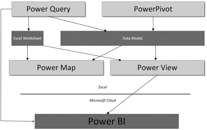
This democratization has been made possible by four Excel add-ins that combine to revolutionize the way in which data is discovered, captured, structured, and shaped so that it can be sliced, diced, chopped, queried, and presented in an interactive and intensely visual way.
The four Excel add-ins that together make up the Excel BI toolkit are these:
Power Query
• —to find and load external data
PowerPivot
• —to design a coherent data model for analysis
Power View
• —to present your findings visually and interactively
Power Map
• —to display insights with a geographical slant
They are completed by Power BI—a simple way of sharing your analyses and insights on PCs and mobile devices from the Microsoft cloud.
Some of these tools (Power Query and Power Map, for instance) are relatively new. Others, such as Power View, have been around as part of SharePoint for a short while. PowerPivot, indeed, has been a dependable Excel add-in for four years or so. Yet it is when these elements are integrated that their combined strengths take business intelligence to a whole new level. When used together, these tools empower the user as never before. They provide you with the capability to analyze and present your data and to shape and deliver your results easily and impressively. All this can be achieved in a fraction of the time that it would take to specify, develop, and test a corporate solution. To cap it all off, self-service BI produces reports at a fraction of the cost of more traditional solutions, with far less rigidity and overhead.
The aim of this short book is to introduce the reader to the brave new world of self-service business intelligence. This will involve a complete tour of the Excel BI toolkit and Power BI. Although it assumes a basic knowledge of Excel, this book presumes that you have little or no knowledge of the Microsoft self-service business intelligence suite of products. These tools are therefore explained from the ground up. The aim is, nonetheless, to provide the most complete coverage possible of each facet of the entire Microsoft self-service BI toolkit, and the way in which its components work together to deliver user-driven business intelligence. Hopefully if you read the book and follow the examples given, you will arrive at a level of practical knowledge and confidence that you can subsequently apply to your own BI requirements.
xxx
Although you can read this book from start to finish, it is not designed to be a progressive self-tutorial. The Microsoft self-service BI suite consists of multiple tools that can be used completely independently, and so the same applies to this book. Consequently, you are free to dip only into the chapters that cover the aspect of the self-service BI suite that interests you. You can consider this book as consisting of five independent parts, each of which you can read without needing any of the others. Each part covers one aspect of the self-service BI product suite. These five parts map to the following chapters:
Power View
• —Chapters 2 through 8
PowerPivot
• —Chapters 9 through 11
Power Query
• —Chapters 12 and 13
Power Map
• —Chapter 14
Power BI
• —Chapter 15
This book comes with a small sample data set that you can use to follow the examples that are provided. It may seem paradoxical to use a tiny data sample when explaining a product suite that is capable of analyzing medium and large data sets. However, I prefer to use an extremely simplistic data structure so that the reader is free to focus on the essence of what is being explained, and not the data itself.
Inevitably, not every question can be answered and not every issue can be resolved in one book. I truly hope that I have answered many of the essential self-service BI questions that you will face and have provided ways of solving a reasonable number of the challenges that you may encounter.
I wish you good luck in using the Microsoft self-service business intelligence suite to prepare and deliver your insights. And I sincerely hope that you have as much fun with it as I had writing this book.
Self-Service Business Intelligence
If you are reading this book, it is most likely because you need to use data. More specifically, it may be that you need to take a journey from data to insight in which you have to take quantities of facts and figures, shape them into comprehensible information, and give them clear and visual meaning.
This book is all about that journey. It covers the many ways that you, an Excel user, can transform raw data into high-impact analyses delivered by Microsoft’s new self-service business intelligence (BI) paradigm. This fresh approach presumes presumes that you are not dependent on central IT nor do you need their help on a regular basis It is based on enabling the user to handle industrial-strength quantities of data using familiar tools and to share stunning output in the shortest possible timeframe.
The keywords in this universe are
Using the tools and techniques described in this book, you can discover and load your data, create all the calculations you need, and then develop and share stylish interactive presentations.
It follows that this book is written from the perspective of the user. Essentially it is all about
empowerment—letting users define their own requirements and satisfy their own needs simply and efficiently by building on their existing skills.
The Microsoft Self-Service Business Intelligence Solution
It is important to understand from the start that Microsoft’s self-service business intelligence solution is a constantly evolving process. It has been assembled from a series of parallel technologies and is in a continuous state of flux. Fortunately this perpetual motion is now at a peak of readiness, and although it is still undergoing some enhancements and revisions, it is already in a state in which you can use it with confidence.
The Microsoft self-service business intelligence solution has two parts
• The Excel BI Toolkit—Allows users to import and model data then create jaw-dropping visualizations.
2
By combining these technologies, Microsoft has made an amazingly powerful set of tools available that you can use to find and mash up data that you can then display in crisply interactive reports. Let’s take a more in-depth look at this solution.
The Excel BI Toolkit
At the core of Microsoft’s self-service BI is the Excel BI Toolkit. This consists of Excel (inevitably) and four add-ins that allow you to import, model, prepare, and display your analyses. These elements are
• Power Query—To import and transform data
• PowerPivot—To model data and carry out all necessary calculations
• Power View—To display your results interactively
• Power Map—To show your data from a geographical perspective
You may find that you do not need all these products all the time. Indeed, you may find that you use them independently or in certain combinations. This is because self-service business intelligence is designed to be flexible and respond to a variety of needs. Nonetheless, we will be exploring all of these tools in the course of this book so that you can handle most, if not all, of the challenges that you may meet.
Power BI
Once you have developed reports (or presentations, if you prefer to call them that) using PowerPivot and Power View, you will probably want to share your insights with your colleagues. This is where Power BI enters the equation. Power BI, which technically is an aspect of SharePoint online, lets you load Excel workbooks into the cloud and share them with a chosen group of co-workers. Not only that, but your colleagues can interact with your reports to apply filters and slicers and to highlight data. Power BI also lets information workers share the queries and, possibly complex, data ingestion routines that they have created using Power Query. This way your organization can avoid the duplication of effort that can arise when staff work in “data silos.” In addition, you can validate certain data sources as being the key route to an approved data set. Power BI can also ensure that the Excel workbooks that have been shared are updated automatically and regularly so that users are always looking at the most recent data.
Note
■
There is no Power BI for on-premises SharePoint sites at the time of writing.
Taken together, this combination of tools and technologies creates a unique solution to the challenges of creating and sharing analytical insights. However, let me say again that you may not need all that the solution can offer. If all you need to do is share workbooks, then you do not need to share queries. The advantage of self-service BI is that it is a smorgasbord of potential solutions, where each department or enterprise can choose to implement the tools and technologies that suit its specific requirements.
The Excel BI Toolkit and Power BI
Power Query
Power Query is one of the most recent additions to the self-service BI toolkit. It allows you to discover, access, and consolidate information from varied sources. Once your data is selected, cleansed, and transformed into a coherent table, you can then place it in an Excel worksheet, or better still, load it directly into PowerPivot, which is a natural source for data when you are using Power View and Power Map.
Power Query allows you to do many things with source data, but the four main steps are likely to be
• Import data from a wide variety of sources. This covers corporate databases to files, and social media to big data.
• Merge data from multiple sources into a coherent structure.
• Shape data into the columns and records that suit your uses.
• Cleanse your data to make it reliable and easy to use.
There was a time when these processes required dedicated teams of IT specialists. Well, not any more. With Power Query, you can mash up your own data so that it is the way you want it and is ready to use as part of your self-service BI solution.
Power Query is discussed in more depth Chapters 12 and 13.
PowerPivot
PowerPivot is essentially the data store for your information. Indeed, many people refer to the Excel Data Model when they talk about data in PowerPivot. Power Query lets you import data and make it useable; PowerPivot then takes over and lets you extend and formalize the cleansed data. More specifically, it allows you to
Create a data model by joining tables to develop a coherent data structure from multiple
•
separate sources of data. This data model will then be used by Power View, Power Map, and the Power BI natural language querying engine.
Enrich the data model by applying coherent names and data types.
•
Create calculations and prepare the core metrics that you want to use in your analyses and
•
presentations.
Add hierarchies to enhance the user experience and guide your users through complex data sets.
•
Create KPIs (Key Performance Indicators) to allow benchmarking.
•
It is worth noting that you can load data into PowerPivot directly without using Power Query. As you will see in this book, you have the choice. Whether you want or need to use Power Query at all will depend on the complexity of the source data and whether or not you need to cleanse and shape the data first.
4
Power View
I think of Power View as the “jewel in the crown” of self-service business intelligence. It is a dynamic analysis and presentation tool that lets you create professional-grade
Tables
Not only that, but it is incredibly fast and highly intuitive. It provides advanced interactivity through the use of Slicers
A Power View report is only a special type of Excel worksheet, and you can have many reports in an Excel file. In most cases, users tend to create Power View reports using a PowerPivot data model, but you can also create Power View reports using data tables in an Excel worksheet if you prefer. However (at the risk of laboring the point), a PowerPivot data set can be tweaked to make Power View reports much easier to create and modify than can a table in Excel.
Power View is discussed in Chapters 2 through 8.
Power Map
Power Map is, as its name implies, a mapping tool. As long as your data contains some form of geographical data, and you can connect to Bing Maps, you can use Power Map to create geographical representations of the data.
The types of presentation that you can create with Power Map include Maps
As is the case with Power View, Power Map is at its best when you use the data in a PowerPivot data set. However, you can use data in Excel if you prefer.
Power Map is discussed in Chapter 14.
Power BI
Power BI is a cloud-based data sharing environment. Power BI leverages existing Excel 2013 PowerPivot, Power Query, and Power View functionality and adds new features that allow you to
Share presentations and queries with your colleagues.
•
Update your Excel file from data sources that can be on-site or in the cloud.
•
Display the output on multiple devices. This includes PCs, tablets, and HTML 5-enabled
•
mobile devices as well as Windows tablets that use the Power BI app. Query your data using natural language processing (or Q&A, as it is known).
•
Preparing the Self-Service BI Environment
Before you can begin to use the Excel BI Toolkit you need to make sure that your PC is set up correctly and that everything is in place. This is not difficult, but it is probably less frustrating if you get everything set up correctly before you leap into the fray rather than get annoyed if things do not work flawlessly first time. If you are working in a corporate environment where these add-ins are the norm, then all your problems are probably solved already. If not, you might have a few tweaks to perform. So let’s see how to ensure that your version of Excel is ready to fly with self-service BI.
PowerPivot
To begin with, PowerPivot is only available in Microsoft Office Professional Plus, Office 365 Professional Plus, and in a standalone edition of Excel 2013. It is not available in Office on a Windows RT PC. PowerPivot does exist in Excel 2010, but it uses a different version of the Excel Data Model (which can be converted to the 2013 data model). So if you open an Excel 2013 workbook containing a data model created with Excel 2010, you will get a warning that you will have to convert the data model and that this step is irreversible. Note also that a data model created with the 2013 version of Excel is not backward compatible with the previous version
You will know if PowerPivot is enabled if you can see a PowerPivot menu and ribbon in Excel. If this ribbon is not available, you will have to enable it like this:
1. In the File menu click Options.
6
5. Check the Microsoft Office PowerPivot For Excel 2013 check box. 6. Click OK.
The PowerPivot menu and ribbon should now be available in Excel.
Note
■
Depending on your exact configuration of Excel, you may see more or fewer add-ins displayed in the COM
Add-ins dialog on your PC.
Power View
Power View is also currently only available in Office Professional Plus 2013 and Office 365 Professional Plus, as well as in the standalone edition of Excel 2013. Power View is not available in Office on a Windows RT PC. Not only that, but you will have to install Microsoft Silverlight 5 for Power View to work. Fortunately, however, Power View will detect if you have Silverlight installed and if it is not present, Power View will install it the first time that it is run.
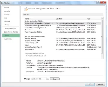
Normally Power View is an integral part of Excel. Indeed, if you open Excel and activate the Insert ribbon, you will see the Power View button, as shown in Figure 1-3.
3. In the Manage popup list, and select COM Add-ins.
4. Click Go. The COM Add-ins dialog will appear as shown in Figure 1-2.
Figure 1-2. The COM Add-ins dialog
There may be times when the Power View button is grayed out. If this is the case, you will need to enable the Power View add-in. You can do this almost exactly as I described in the previous section for PowerPivot, except that at step 5, you need to check the Power View box, which you can see in Figure 1-2.
You should then see that the Power View button in the Insert ribbon is no longer grayed out.
Note
■
Power View is also available in SharePoint and is virtually identical to the Excel version. If you need an
introduction to this version of Power View, refer to Chapters 2–8, which will cover most of your requirements. I will not,
however, be discussing SharePoint BI in this book.
Power Query
Power Query is currently an optional add-in for Excel—providing that you are using one of the following versions: Microsoft Office 2010 Professional Plus with Software Assurance
•
Since it is optional, you may have to download and install the add-in. If it is already installed, you will see a Power Query ribbon available in Excel. If you do not, here is how you can install it:
1. Close Microsoft Excel.
2. Download the Power Query install file. At the time of writing this is available at the following URL: http://www.microsoft.com/en-gb/download/details.aspx?id=39379. 3. On the download page click Download. You will see the Choose The Download That You
Want page.
4. On this page, ensure that you select the correct version for your version of Excel (32-bit or 64-bit).
5. Click Next and select a directory to which you want to download the .msi file. The March 2014 file is named PowerQuery_2.10.3598.81 (64-bit) [en-US].msi.
8
Figure 1-4. The security warning dialog
Figure 1-5. The Power Query Setup dialog
8. Click Next. The License Terms dialog will be displayed. You can see this in Figure 1-6.
9. Check the I Accept The Terms In The License Agreement box. 10. Click Next. The Destination Folder dialog will appear as in Figure 1-7.
Figure 1-6. The License Terms dialog for Power Query
10
11. Leave the suggested destination folder unless you have a specific reason to select another and click Next. The final installation dialog will be displayed, as shown in Figure 1-8.
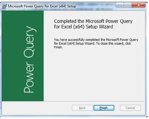
12. Click Install. The install process will run. You may see a User Account Control dialog requesting permission to run the install program. If you do, click Yes. Once the process has finished you will see the completion dialog, as in Figure 1-9.
Figure 1-8. The final installation dialog for Power Query
Figure 1-9. The completion dialog once Power Query is installed
13. Click Finish.
Figure 1-10. The Power Map button in the Excel Insert ribbon
Power Map
As of Microsoft Office 2013 Service Pack 1, Power Map is now an integral part of Excel. If you are running an older version of Excel, then you may have to download the add-in and install it separately. Since this process is virtually identical to the process I just described for Power Query, I will not reiterate all the details here. Suffice it to say that you follow all the steps you followed for Power Query, except that at step 2, you use the following URL instead (as at April 2014): http://www.microsoft.com/en-gb/download/details.aspx?id=38395. If you have Power Map already installed, you will have an active Map button in the Excel Insert ribbon, as shown in Figure 1-10.
Power BI
Power BI is the online solution that enables you to share the presentations and queries that you have created using the Excel BI Toolkit. It is an enhancement to SharePoint online and requires a subscription to use. As things stand, Power BI does not include Excel (unless you have a Power BI with Office 365 subscription), and at the time of writing there are three different pricing plans. As this state of affairs could evolve over time, I will not go into the details here, but I suggest that you see what is available on the Microsoft web site if you are considering a Power BI subscription.
One you have taken out a subscription to Power BI—and you have a valid Excel license—you can use the SharePoint online Power BI site application to add a robust, dynamic location where you can share Excel workbooks in the Microsoft cloud.
Note
■
At the time of writing there is a free trial offer for Power BI. I can only recommend that you take advantage of
this if you want to test out all that it can deliver.
Adding a Power BI Site
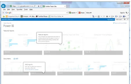
To take full advantage of the enhanced functionality that Power BI can bring to SharePoint online, you will need to add a Power BI site to your cloud-based portal. This only takes a few clicks, but it will enable you to
View workbooks up to 250 MB in a browser on Office 365 if you save and enable them on the
•
Power BI site.
Highlight certain spreadsheets as “Featured Reports.”
•
Display thumbnail images of Power View reports in a spreadsheet in the Power BI site.
12
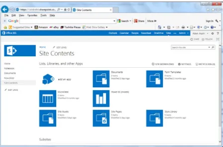
Assuming that you have a working subscription to Office 365 with Power BI and you also have a starter site, you now need to create the Power BI site To do this,
1. In the navigation bar on the left of the portal window, click Site Contents. The Site Contents page will be displayed, as in Figure 1-11.
Figure 1-11. Adding the Power BI app
It really is that simple to enable the Power BI site on your portal. Once this is done, you should see Power BI listed in the navigation bar on the left of the portal window when you use your site.
The Windows Power BI App
If you are using a Windows 8.1 tablet, then you may well want to download and install the Power BI app for Windows. This app is available for free in the Windows App store; the current URL is
http://apps.microsoft.com/windows/en-gb/app/b7e7c94d-2ea3-4fa6-a277-9d19a1f697ba. This app will allow you to view and interact with Power View reports from multiple Power BI sites. A version of this app for the iPad has been promised for mid 2014, and could be available by the time that you are reading this book. An Android version is rumoured to be in the works.
Corporate BI or Self-Service BI?
This book is all about self-service business intelligence. Although this concept stands in opposition to corporate business intelligence, the two interact and relate. However, the distinctions are not only blurred, they are evolving along continually changing lines.
14
In any case, I do not want to describe these two approaches as if they are mutually antagonistic. They are both in the service of the enterprise, and both exist to provide timely analysis. The two can, and should, work together as much as possible. After all, much self-service business intelligence needs corporate data, which is often the result of many months (or years) of careful thought and intricate data processing and cleansing. So it is really not worth rejecting all that a corporate IT department can provide for avid users of self-service BI. At the same time, the speed at which a purely self-service approach can deliver rapid discovery, analysis, and presentation can relieve hard-pressed IT departments from the kind of ad-hoc jobs that distract from larger projects. So it pays for central IT to see self-service BI as a friend, and for users to appreciate all the support and assistance that an IT department can provide.
Self-service business intelligence, then, is part of an equation. It is not a total solution—and neither is it a panacea. Anarchic implementation of self-service BI can lead to massive data duplication and so many versions of “the truth” that all facts become mere opinions. Consequently, I advise a measured response. When managers, users, or, heaven forbid, external consultants announce in tones of hyperactive excitement that Microsoft have produced a new miracle-working solution to replace all your existing BI solutions, I suggest you take a step backward and a deep calming breath. I would never imply that you use Power BI to replace “canned” corporate reports, for instance (to solve this requirement see Pro SQL Server 2012 Reporting Services [Apress 2012] by Rodney Landrum, Brian McDonald, and Shawn McGehee). Yet if you need interactive reports based on volatile and varied data sources, then the Excel BI Toolkit and Power BI could be a perfect solution.
The Excel Data Model
When introducing PowerPivot toward the start of this chapter I made a passing reference to the Excel Data Model. As this is fundamental to the practice of self-service BI using Excel and Power BI, you really need to understand what this data model is, and how it helps you to create valid analyses.
The data model is a collection of one or more tables of data that are loaded into PowerPivot and then joined together in a coherent fashion. The data can come via Power Query, be obtained from existing Excel tables or worksheets, or be imported from a variety of sources. There can only be a single data model for an Excel file.
Admittedly, you can place all your data in a single “flat” table in Excel and use that as the basis for Power View reports and Power Map output. However, it is highly likely that you will want to develop a data model using PowerPivot if you intend to use data sets of any complexity. There are occasions when building a good data model can take awhile to get right, but there are many valid justifications for spending the time required to build a coherent data model using PowerPivot. The reasons for this investment include
You can go way beyond the million-row limit of an Excel worksheet if you are using the Excel Data
•
Model in PowerPivot. Indeed, in PowerPivot tables of tens of millions of rows are not unknown. A coherent data model makes understanding and visualizing your data easier.
•
A well thought out data model means less redundant information stored in a single table when
•
it can be referenced from another table rather than repeated endlessly.
PowerPivot saves space on disk and in memory because it uses a highly efficient data
•
compression algorithm to store the data set. This means that a workbook using a data set will take up considerably less space than storing data in Excel worksheets.
Since a data set is loaded entirely into the PC’s memory, calculations are faster.
•
A data model can be prepared for data output. More specifically, you can apply formatting and
•
define data types (such as geographical types, for instance) for specific columns so that Power View and Power Map will recognize them instantly and make the correct deductions as to the best ways to use them.
A data model can contain certain calculations (some of which can get fairly complex) that
•
A data model can contain hierarchies and KPIs.
•
A data model can be used to create complex pivot tables in Excel if you not want to use Power
•
View or Power Map.
A data model can be the basis, or the proof of concept, for a fully-fledged SSAS (SQL Server
•
Analysis Services) tabular data warehouse.
As an example of a data set, this book will use a simple model that uses the sales data for an imaginary company that sells classic and modern British sports cars throughout Europe and that is starting to expand into the United States. This fictitious corporation is called Brilliant British Cars, and it has been going for a couple of years. Their data is relatively simple, and the data model for the company can be seen in Figure 1-13.
Figure 1-13. The Excel Data Model used by Brilliant British Cars
The art and science of developing data models could easily be the subject of a separate tome. It is, in fact, not unrelated to basic relational database design, which has been described exhaustively in dozens (or hundreds) of books over the last couple of decades. As a reader, you can breathe a sigh of relief as I have no intention of attempting to cover this subject in this book. As far as our sample data model is concerned, I will just take it as is and suggest that you consult one of the many excellent resources already available should you need further guidance when developing your own specific data model.
Throughout this book I will be using the established best practice, which is to use the Excel Data Model as the basis for self-service BI. However, as I remarked earlier, you can use plain old Excel tables as a source of data for both Power View reports and Power Map deliverables if you wish.
How This Book Is Designed to Be Read
The suite of technologies that makes up the Microsoft self-service business intelligence offering are essentially independent products. It follows that you may need only to focus on one or two of them to solve a particular problem. Or it may be that you already know how to use part of the toolset but need to learn, or revise, other elements.
Because we are looking at a set of tools, each of which can be learned individually, this book is not designed to be read only in a linear fashion. Given that the primary focus of this text is on delivering output that has the “wow” factor, it begins with Power View to show what can be done with the new presentation tool that is now integrated into Excel.
16
Frequently PowerPivot is all you need to connect to source data. Yet sometimes you need something more advanced to load and prepare data from multiple varied sources. If this is the case, you can learn how to perform these tasks using Power Query in the couple of chapters that follow the three on PowerPivot.
You can then see all that Power Map can do for you in the penultimate chapter and learn, in the final chapter, how to pull it all together by sharing your data and insights with Power BI.
There are, however, other possible reading paths, if you prefer. So, depending on your requirements, you may wish to try one of the following approaches.
Discovering Data
If your primary focus is on discovering data and then preparing it for later use—that is, you need to load, mash up, rationalize, and cleanse data from multiple diverse sources—then Chapters 13 and 14, which introduce Power Query, should be your first port of call. Chapter 13 explains how to connect to many of the data sources that Power Query can read, and Chapter 14 gives the reader a thorough grounding in how to process and transform source data to make it coherent and usable by PowerPivot as part of a logical data set.
Creating a Data Model
Conversely, if the source data that you are using is already clean and accessible, then you may be more interested in learning how to create a valid and efficient data model that is clean and comprehensible and contains all the calculations that you need for your presentations. In this case, you should start by reading Chapters 9 through 11.
Taking Data and Preparing It for Output
If you are faced with the task of finding, cleansing, and modeling data that is ready to be used for reporting, then you will probably need to use both Power Query and PowerPivot. If this is the case, you may be best served by reading Chapters 13 and 14 on Power Query (to import and shape the source data) and then Chapters 9, 10, and 11 on PowerPivot (to model the data).
Taking Existing Excel BI and Sharing It
You may well be a PowerPivot expert already and have possibly learned to use Power View in its initial incarnation as part of SharePoint. If this describes your situation, you may want to move straight to the part where you learn to share your reports in the cloud. This means that Chapter 15 on Power BI is for you. Here you will learn how best to load and share Excel BI workbooks and Power Query queries as well as how to update workbooks in the cloud with the latest data from on-premises data sources.
Delivering Geodata
It is not just tables and charts that create the “Eureka!” moment. Sometimes an insight can come from seeing how data is dispersed geographically, or how geographic data evolves over time. If this is what you are looking for, then you need to look at Chapter 8 (which covers maps in Power View) and Chapter 14 (which covers Power Map) to learn how these two tools can create and deliver new insights into your data.
Delivering Excel BI to Mobile Devices
Figure 1-14. The self-service business intelligence universe
To Learn the Product Suite Following a Real-World Path
If you are coming to self-service BI as a complete novice, then one way to learn it is by taking the path that you could need to follow in a real-world situation. If this suits you, then you could try reading the entire book, but in this order:
• Discover and prepare data—Start with Chapters 13 and 14 on Power Query.
• Create and enhance a data model—Next, read Chapters 9, 10, and 11 on PowerPivot.
• Create visualizations—Continue with Chapters 2–7 on Power View.
• Add geodata outputs—Move on to Chapter 8 and Chapter 12, which cover maps in Power
View and Power Map.
• Share your insights—Finish with Chapter 15 on Power BI.
Anyway, these proposed reading paths are only suggestions. Each chapter is designed to cover a complete aspect of self-service BI in as thorough a fashion as is possible. Feel free to jump in and pick and choose the path that best suits you.
The Self-Service Business Intelligence Universe
The amalgam of products and technologies that make up the world of Microsoft self-service business intelligence can seem complex and even confusing at first glance. This is, to some extent, because some Excel add-ins seem to have overlapping aims, or that the interface between creating reports and sharing them is not always immediately clear.
18
Conclusion
Microsoft self-service business intelligence, then, is not an application, but a suite of tools and technologies that allow you to find, import, join, and structure data that you then extend with any necessary calculations; you then use this data as the basis for interactive presentations that you can subsequently share in the cloud and access using a variety of devices.
More precisely, you will be using a set of Excel add-ins and a cloud-based subscription service to create and share data and high-impact analyses with your colleagues. The output can be viewed using a PC or a mobile device and can allow your public to select and filter the reports to discover their own insights.
Power View and Tables
Welcome to Power View! This chapter, along with the next six, aims to give you a comprehensive introduction to Microsoft's new presentation and analysis add-in for Excel. You will learn how to use this incredible tool to
Delve deep into data and produce valuable information from the mass of facts and figures
•
available.
Create interactive views of your insights, where you can test your analyses quickly and easily.
•
Enhance the presentation of your results to grab your audience’s attention.
•
Power View may be easy to use, but it can present your insights in many and varied ways. So, to provide some structure, I have decided on an approach that mimics the analysis and presentation process (for many of us, at least). As data analysis often begins with a look at the data itself, presenting the facts will be the immediate focus. More precisely, what you will be seeing in this chapter is
How to use the Power View interface.
•
How to create and enhance tabular visualizations of your data. This covers simple lists and
•
more advanced matrix-style tables.
How to drill down into your tables to dig into the meaning of the numbers.
•
How to use cards as a new and innovative way to display facts and figures.
•
How to display tabular KPIs (Key Performance Indicators).
•
I realize that it may seem contradictory to spend time on things that are generally described as intuitive. I can only say to this that while getting up and running is easy, attaining an in-depth understanding of all of the potential of this powerful tool does require some explanation. The approach in this book is to go through all the possibilities of each aspect being handled as thoroughly as possible. So feel free to jump ahead (and back) if you don’t need all the detail just yet.
In the chapters on Power View I will be using a set of data from an Excel data model. This data is in the sample Excel worksheet CarSales.xlsx in the directory C:\HighImpactDataVisualizationWithPowerBI (assuming that you have followed the instructions in Appendix A). As I explained in Chapter 1, accessing the right source data, and ensuring that this data is coherent and in a valid data model, is vital for successful self-service business intelligence. However, I feel that preparing the data is a separate (although clearly related) subject, and so I will be treating it separately in Chapters 9, 10, and 11. For the moment I want to concentrate on all that Power View has to offer, and so I will use this sample data set as a basis for all the data visualizations that you will learn to produce in the next few chapters.
20
The Power View Experience
I realize that you probably just want to start creating punchy presentations straight away. Well, that is fair enough. So feel free to jump ahead to the next section if you can’t wait. However, if you are the sort of person who prefers to have concepts and terms explained first, then this section will describe the Power View interface so you know what is available, what it does, and possibly most important of all, what everything is called. Of course, you can always refer back to this section at a later time, whatever your approach to learning Power View.
Adding a Power View Sheet to an Excel Workbook
Assuming that you have launched Excel and that Power View is enabled (as described in Chapter 1), then this is how you start using Power View:
1. Open the CarSales.xlsx sample workbook (or any workbook where you have prepared a data model).
2. Click Insert to activate the Insert ribbon. 3. Click Power View.
You will find yourself face to face with an empty Power View report.
The Power View Interface
The Power View interface—as with everything about it—is designed for simplicity so that you can use it almost instantaneously rather than learn how to use it. However, as you can see, being simple does not make it austere. Essentially you are looking at four main elements, as illustrated in Figure 2-1:
The
• Power View report (where most things happen) in the center of the screen. The
• Filters Area, to the right of the Power View report. This lets you select the data that will appear in the report and even in specific parts of the report.
The
• Field List, at the right of the screen. Here you will see all the available data for your report abd any data that you re using for a selected visualization.
Finally—not to say inevitably—the
Now that you have an overall feeling for the Power View interface, two initial aspects need some further explanation: the Ribbon and the Field List.
The Power View Ribbon
The Power View ribbon is something that you will be seeing a lot of, so it is probably worth getting to know it sooner rather than later. Table 2-1 describes the buttons in the Power View ribbon. Don’t worry, I will not be explaining what each one can do in detail straight away, as I prefer to let you see how they can be used in the context of certain operations; you will see what each one can do over the course of the next few chapters.
Figure 2-1. The Power View interface
Table 2-1. Buttons Available in the Power View Ribbon
Button
Description
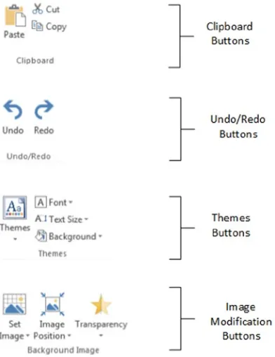
Paste Pastes a copied element from the clipboard
Cut Removes the selected element and places it in the clipboard Copy Copies the selected element and places it in the clipboard Undo Undoes the last action
Redo Undoes the last undo action
Themes Lets you select a theme (color palette and font) for your report Font Lets you choose a font from the popup menu of those available Text Size Allows you to set a text size percentage
22
Figure 2-2 shows you how the buttons are grouped in the Power View ribbon:
Figure 2-2. The buttons available in the Power View ribbon
Button
Description
Image Position Lets you alter the dimensions of the background image in the report Transparency Sets the transparency of an image
Refresh Refreshes the source data for a Power View report
Relationships Enables you to add, modify, or delete joins between source data tables Fit To Window Fits the report to the screen window
Field List Displays or hides the list of data fields Filters Area Displays or hides the Filter Area Power View Inserts a new, blank, Power View report Text Box Adds a freeform text box to the report Picture Lets you add a freeform image into the report
Arrange Allows you to alter the way in which objects are placed on top of each other in the report
The Power View ribbon can be minimized just like any other MS Office ribbon to increase the screen space available for report creation. To hide the ribbon.
1. Click on the Minimize icon (the small upward facing caret at the bottom right of the ribbon).
Once the Power View ribbon has been minimized, all Excel ribbons are minimized. You can, however, make a ribbon reappear temporarily by clicking on the ribbon name in the Menu bar at the top of the Excel application. Once you have finished with a Ribbon option, the ribbon will be minimized once more.
To make the ribbon reappear permanently, just click on the small pin icon which has replaced the initial caret at the bottom right of any ribbon.
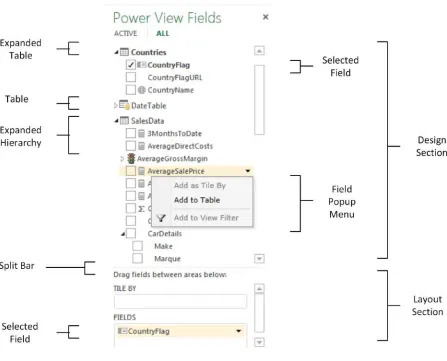
The Field List
The Field List, as I mentioned earlier, is where you can see and select all the fields that contain the data in the underlying data model.
To display the Field List
1. In the Power View ribbon, click the Field List icon. The field list will (re)appear to the right of the Power View canvas.
The Field List icon will also hide the field list—it is a simple on/off switch. The Field List also has a Close icon, just like a normal window. So you can hide the Field List by clicking the Close button (the small X at the top right corner of the Field List) if you wish.
You can also adjust the width of the Field List. While the default width is probably suitable in most circumstances, you may wish to
Widen the Field List to display particularly long field names.
•
Narrow the Field List to increase the size of the Power View canvas.
•
To resize the Field List
1. Place the mouse pointer over the left-hand border of the Field List. The cursor will become a two-headed lateral arrow.
2. Drag the mouse pointer left or right until the Field List is the width you want.
Once you have resized the Field List, it will remember the size that you set, even if you hide and redisplay it. Remember that to create any visualization, or to modify the data behind an existing visualization, you will need to have the Field List visible. My advice is to leave it visible, at least in the initial stages of developing Power View reports.
Using the Field List
The Field List is quite probably one of the most fundamental parts of Power View. Consequently, it is well worth making its acquaintance earlier rather than later.
24
The Field List is divided into two parts. The upper part (known as the Design section) is the available data, seen as tables that you can expand in order to view the fields, and possibly any hierarchies that they contain. The lower part is the Layout section, which contains any selected fields. The Layout section will change considerably depending on which visualization is being used. You can alter the relative sizes of the upper and lower parts of the Field List by dragging the Split Bar up and down.
Note
■
You can see if you are using data from a data table in the current report, as the name of the table will be in
bold in the Field List.
Renaming or Deleting a Power View Report
So you have created a Power View report. This new report has been added as a new Excel sheet, as you can guess from looking at the tabs at the bottom of the screen. This report is now part and parcel of the Excel workbook in which it was created. You can save it with the Excel .xlsx file extension (indeed it cannot be saved independently). A Power View report is an Excel sheet like any other (worksheet, chart, etc…) and can be manipulated like any other sheet. This means that it can be hidden, deleted, or renamed using standard Excel techniques. Just in case, here is a quick refresher on deleting or renaming an Excel tab:
1. Right-click on the tab at the bottom of the screen. 2. Select Rename (for instance).
3. Enter the new Power View Sheet name. 4. Press Enter to confirm.
If you chose to delete the Power View report, then you will see a dialog asking for confirmation that you really want to delete the report.
Tables in Power View
Now that you understand the Power View interface, let’s look at getting some data from the data model into a report. I suggest a progression that begins with the simplest type of list first—a standard table. From there we will move on to matrix tables and, finally, cards and Key Performance Indicators (KPIs). Tables are an essential starting point for any PowerPivot visualization. Indeed, everything that is based on data (which is to say virtually everything) in Power View starts out as a table. So it is worth getting to know how tables work—and how to get them into action the fastest possible way.
Let’s start with the simplest possible type of table: a list. This is what you could well find yourself using much of the time to create visualizations in your Power View reports.
Adding a Table
Adding a basic table is probably the simplest thing that you can do in Power View. After all, a table is the default visualization that Power View will create. So, here is how you can create a table that shows total sales to date by make of car from the sample dataset:
1. Display the Field List, unless it is already visible.
2. Expand the table containing the field that you wish to display (SalesData to begin with). You do this by clicking on the hollow triangle to the left of the table name. The triangle becomes a black triangle, and the field names are displayed, slightly indented, underneath the table name.
3. Find the hierarchy named CarDetails and expand this, too, by clicking the triangle to its left. The fields that make up the hierarchy will be displayed.
4. Select the check box to the left of the field name for the first field that you wish to display in a table. In our example this is Make. When you do this, a table containing a list of all the makes of car in the dataset appears in the Power View canvas. The field that you selected will also appear in the FIELDS box in the Layout section (the lower part) of the Field List. 5. Repeat steps 2 through 4 for all the fields that you wish to display. In this simple example,
26
The table immediately displays the data that is available from the source, and all new fields appear to the right of any existing fields. If there is a lot of data to display, then a vertical scroll bar appears at the right of the table, allowing you to scroll up and down to view the data. Totals will be added automatically to the bottom of the table—though you may have to scroll down to see them. The basic list-type table that you created is shown in Figure 2-4.
Figure 2-4. A first table
This is, self-evidently, a very tiny table. In the real world you could be looking at tables that contain thousands, or tens of thousands, of records. Power View accelerates the display of large data sets by only loading the data that is required as you scroll down through a list. So you might see the scroll bar advance somewhat slowly as you progress downward through a large table.
Note
■
In this example, we leapt straight into a concept that might be new to you—that of hierarchies. These are
essentially an organizational technique you can use to help you manage access to data. You will learn how to
create them in Chapter 11.
As befits such a polished product, Power View does not limit you to just one way of adding fields to a table. Other ways in which you can add fields to a table are
By dragging the field name into the Fields section at the bottom of the Field List.
•
By hovering the mouse pointer over a field in the Fields section (the upper part) of the Field
•
List. When you do this, the field is highlighted and a down-facing triangle appears on the right of the field name. You can then click on the down-facing triangle and select Add To Table from the popup menu.
You can add further fields to an existing table at any time. The key thing to remember (if you are using the two techniques just described) is that you must select the table that you want to modify first. This is as simple as clicking inside it. After you click, you instantly see that the table is active because tiny handles appear at the corners of the table as well as in the middle of each side of the table.
28
Note
■
If you do not select an existing table before adding a field, Power View will create a new table using the field
that you are attempting to add to a table.
To create another table, all you have to do is click outside any existing visualizations in the Power View report and begin selecting fields as described earlier. A new table will be created as a result. Power View will always try to create new tables in an empty part of the canvas. You will see how to rearrange this default presentation shortly.
Deleting a Table
Suppose that you no longer need a table in a Power View report. Well, that is simple, just
1. Select the table. You can do this by hovering the pointer over any of the table borders (in practice the left, right, and bottom borders are easiest).
2. Click to select; the table will briefly flash another color, and the borders will remain visible, even if you move the mouse pointer away from the table.
3. Press Delete.
Another way to select a table is to click inside it. This is a bit like selecting a cell in Excel. You will even see the “cell” that you selected appear highlighted.
If you are used to controlling your software through avid use of the right mouse button, then you can also remove a table by right-clicking on it. You will not get a Delete menu choice, but you can use the Cut option. This will store the table in the clipboard for later use, leaving it deleted if you choose not to reuse it.
Deleting a table is so easy that you can do it by mistake, so remember that you can restore an accidentally deleted table by pressing Ctrl-Z, or clicking the Undo icon (the very large left-turning arrow) in the Power View ribbon. And, yes, you guessed it, you can undo an Undo action by clicking the Redo icon (the very large right-turning arrow) in the Power View ribbon.
Note
■
You will have to return to the Power View ribbon to use the Power View Undo and Redo buttons. Interestingly,
the Excel Undo and Redo buttons in the Quick Access toolbar do not work with Power View.
Changing the Table Size and Position
A table can be resized just like any other visualization in a Power View report. All you have to do is to click on any of the table handles and drag the mouse.
Moving a table is as easy as placing the pointer over the table so that the edges appear and, once the cursor changes to the hand shape, dragging the table to its new position. You will know that the table is correctly selected as it will be highlighted in its entirety as long as the mouse button is depressed.
Changing Column Order
If you have built a Power View table, you are eventually going to want to modify the order in which the columns appear from left to right. To do this
1. Activate the Field List—unless it is already displayed.
3. Drag the field vertically to its new position. This can be between existing fields, at the top or at the bottom of the Field List. A thick gray line indicates where the field will be positioned. A small right-facing blue arrow icon under the field name tells you that the field can be moved there.
Figure 2-6 shows how to drag a field from one position to another.
Figure 2-6. Changing column order by moving fields
Note
■
You cannot change the position of a column in a table by dragging it sideways inside the table itself.
Removing Columns from a Table
Another everyday task in Power View is removing columns from a table when necessary. As is the case when
rearranging the order of columns, this is not done directly in the table but is carried out using the Field List. There are, in fact, at least four ways of removing columns from a table, so I will begin with the way that I think is the fastest and then describe the others.
1. Activate the Field List—unless it is already displayed.
2. Uncheck the field name in the Design section of the Field List. The other three ways to remove a field are
Hover the mouse pointer over the field you want to remove. Click on the popup menu icon
•
(the downward-facing triangle at the right of the field name) and select Remove Field. Drag the field from the FIELDS box back up into the upper area (the Design section) of the
•
Field List. You will see that the field name is dragged with the mouse pointer and that the pointer becomes a cross (×) when you are over the Field List. Just release the mouse button to remove the field.
Click, in the FIELDS box in the lower area (the Layout section) of the Field List on the name of
•
the field (or column) that you wish to remove; then press the Delete key.
30
Types of Data
Not all data is created equal, and the data model that underlies Power View will provide you with different types of data. The initial two data types are
Descriptive (non-numeric) attributes
•
Values (or numeric measures)
•
Power View indicates the data type by using a descriptive icon beside many of the fields that you can see when you expand a data table in the Field List. These data types are described in Table 2-2.
Note
■
Numeric fields are not the only ones that can be added as aggregates. If you add an attribute field by clicking
on its popup triangle in the Field List and then selecting Add To Table As Count, you will get the number of elements for
this attribute.
Data and Aggregations
When you create a table, Power View will always aggregate the data to the highest possible level. Not only will it do this, but it will add up (sum) the data, if it can, by default. This is not, however, the only possible way to aggregate data in Power View.
Selecting the type of aggregation required is a useful way to fine-tune the final output. As this is done on a column by column basis, you will need to
1. Click inside the column whose aggregation you wish to change.
2. Display the popup menu for the relevant field name in the Fields section at the bottom of the Field List by clicking on the small black triangle at the right of the field.
3. Select the type of aggregation you want.
There are seven available aggregation types. These are explained in Table 2-3.
Table 2-2. Data Types
Data Type
Icon
Comments
Attribute None This is a descriptive element and is non-numeric. It can be counted but not summed or averaged.
Aggregates This is a numeric field whose aggregation type can be changed.
Calculation This is a numeric field whose aggregation type cannot be changed as it is the result of a specific calculation.
Geography This field can potentially be used in a map to provide geographical references.
Binary Data This field contains data such as images.
Hierarchy This indicates that a hierarchy needs to be expanded to see any fields that it contains.
32
Table 2-3. Data Aggregation Options
Aggregation Type
Description
Do not Summarize No aggregation is applied and every record is displayed. Sum The total of the values is displayed.
Average The average of the values is displayed. Minimum The smallest value is shown.
Maximum The largest value is shown.
Count (Not Blank) The number of all records/rows/elements is displayed, providing that there is data available. Count (Distinct) The number of all unique data elements in the column is returned.
Enhancing Tables
So you have a basic table set up and it has the columns you want in the correct order. Quite naturally, the next step is to want to spice up the presentation of the table a little. So let’s see what Power View has to offer here. Specifically, we will look at
Sorting rows by the data in a specific column
•
A few other aspects of table formatting
•
The Design Ribbon
The starting point for modifying the appearance of a table is the Design ribbon. You will be using this much of the time to tweak the presentation of your tables, so it is well worth getting to know. This ribbon will appear whenever a visualization is selected. It is likely to become your first port of call when you are enhancing the look and feel of Power View reports.
Figure 2-8. The Design ribbon
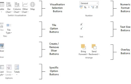
It is not my intention to go through all the options that the Design ribbon offers in detail straight away. I prefer to explain things as required over the course of the next few chapters. Nonetheless, as a succinct overview (and as a reference, should you require it), the options available in all the Design ribbon buttons are explained in Table 2-4.
Table 2-4. Buttons Available in the Design Ribbon
Button
Description
Table Lets you select the table type, including the card type of visualization. Bar Chart Converts the visualization to one of the available Bar Chart types. Column Chart Converts the visualization to one of the available Column Chart types. Other Chart Displays the other available chart types.
Map Converts the visualization to a map.
34
Row Totals
Row totals are added automatically to all numeric fields. You may, however, wish to remove the totals. Conversely, you could want to add totals that were removed previously. In any case, to remove all the totals from a table.
1. Select the table, or click anywhere inside it. In this example I will use the table you saw earlier in Figure 2-4.
2. Click Totals - None in the ribbon.
To add totals where there are none, merely click Totals - Rows in the Design ribbon (with the table selected). You can see the table you created previously—without totals—in Figure 2-9.
Figure 2-9. The initial table without totals
Button
Description
Number Format Selector Lets you select a number format for a column from the popup list of those available.
Currency Applies the Currency format. Percentage Applies the Percentage format. Thousands Separator Adds a thousands separator.
Increase Number of Decimal places Increases the number of decimal places displayed. Decrease Number of Decimal places Decreases the number of decimal places displayed. Increase Text Size Increases the text size in the selected visualization. Decrease Text Size Decreases the text size in the selected visualization
Bring Forward Brings a visualization, text, image or other object to the top/front. Send Backward Sends a visualization, text, image or other object to the bottom/back.
Note
■
You can only add or remove totals if a table displays multiple records. If a table is displaying the highest level
of aggregation for a value, then no totals can be displayed, as you are looking at the grand total already. In this case, the
Totals button will be grayed out.
Formatting Columns of Numbers
Power View will make an educated guess as to the correct type of numeric formatting to apply to a column of numbers in a table based on the source data type. More specifically, if you have applied a format in an Excel table that has been added to the data model, or if you have formatted a column in the data model using PowerPivot, then these formats will be carried into Power View. However, there could well be times when you wish to override the formatting that Power View has chosen and apply your own. Once again, this is an extremely intuitive process, which consists of doing the following:
1. Click anywhere in the column you wish to reformat—except on the title. 2. Switch to the Design ribbon (unless it is already active).
3. Click on one of the available formatting icons (or click the popup menu in the Number section of the Design ribbon and select the type of formatting you require).
Power View will apply the formatting to the entire column, including totals if there are any. You can then increase or decrease the number of decimal places displayed by clicking on the Increase Decimal places and Decrease Decimal places icons.
Tip
■
Clicking the Increase Decimal places or Decrease Decimal places icons will apply the Number style if the current
style is General. Any other style will remain in force if these icons are clicked—but the number of decimal places will be
changed, of course.
You may well be familiar with the available number formatting options, as they are essentially a subset of the Excel formatting options, and you may be extremely well acquainted with this tool already. Alternatively, if you have used PowerPivot, then you could have a strong sense of déjà vu. In the interest of completeness the available options are described in Table 2-5.
Table 2-5. Number Formatting Options
Format Type
Icon
Description
Example
General Does not apply any uniform formatting and leaves the current number of decimal places in place.
100000.011
Number Adds a thousands separator and two decimal places. This is also called Comma style.
100,000.01
Currency Adds a thousands separator and two decimal places as well as the current monetary symbol.
£100,000.01
Accounting Adds a thousands separator and two decimal places as well as the current monetary symbol at the left of the column.
36
Default Formatting
Power View will apply the Date, Time, and Currency formats that are set for your PC. For an Excel-based Power View worksheet, you can use Control Panel to set the regional defaults and select the appropriate settings for the Long Date, Short Date, and Time (Short Time) format. Remember that
Altering the Date, Time, and Number formats using Control Panel will only take effect once
•
you close and reopen any open Power View reports.
Modifying the default Date, Time, and Number formats using Control Panel will affect all
•
applications that use these formats—that is, not just all past and future Power View reports, but many other applications as well.
Changing Column Widths
Power View will automatically set the width of a column so that all the data is visible. Here also, at times you may wish to narrow or widen columns to suit the aesthetics of a particular table or report.
To alter the column widths, which is shown in Figure 2-10.
Figure 2-10. Altering column width
Format Type
Icon
Description
Example
Percentage Multiplies by 100, adds two decimal places and prefixes with the percentage symbol.
28.78%
Scientific Displays the numbers in Scientific format. 1.00E+05 Long Date Displays a date column as a long date, that is, with the month
name in full.
25 July 2014
Short Date Displays a date column as short date, that is, in figures. 25/07/14 Time Displays the time part of a date or date/time field. 16:55:01 Increase Decimal places Adds another decimal place to the display of the figure.
Decrease Decimal places Removes a decimal place from the figure’s display.
1. Hover the mouse pointer over the column title. The column title will be highlighted. 2. Place the mouse pointer on the right edge of the column. The pointer will become a
two-headed sideways arrow.
3. Drag left or right to increase or decrease the column width.
There are, inevitably, a few points to take on board once you start overriding Power View’s default column sizing: If you widen one or more columns to the point that all the columns of data are not visible in
•
the table, then the horizontal scroll bar will appear at the bottom of the table. Power View will
not resize the table as you resize a column.
If you reduce a column’s width so that text or numbers will no longer fit, then Power View will
•
add ellipses (...) to indicate that data has been truncated.
You cannot reduce a column’s width to zero and hide the column, as Power View will always
•
leave a narrow sliver of a column (and its contents) visible.
Double-clicking the right edge of the column will set the column width automatically to the
•
width of the widest element that is currently visible. If there is a wider element further up or down in the data set, then you might have to re-widen the column again.
You can, of course, adjust the width of your table to take the new column widths into account
•
by making the table larger; this is done by dragging the left or right lateral handles or the corner handles.
If you subsequently change the size of the text in a table, then the column widths will not
•
change. You may have to resize certain columns, however, if you feel that this is required for the general appearance of the report.
Applying a different theme from the Power View ribbon can apply different fonts to the table,
•
and thus cause the column widths to change, as Power View will continue to display the same number of characters per column as were visible using the previous theme. For more information on themes, please see Chapter 7.
Font Sizes in Tables
You may prefer to alter the default font size that Power View applies when a table is first created. This is easy: 1. Click anywhere inside the table (or select the table).
2. Switch to the Design ribbon if it is not active already.
38
I really should add a couple of points to conclude on font sizes in tables:
You cannot select a font size; you can only use the Increase Font Size and Decrease Font Size
•
icons until you have found a size that suits you. My impression is that the available range is from 6 to 36 point.
Altering the font size can cause the table to grow or shrink, as Power View will continue to
•
display the same number of characters per column as were visible using the previous font size. So you may end up having to alter the column widths or the table size (as described previously) to make your table look exactly the way you want it.
Copying a Table
You will need to copy tables on many occasions. There could be several reasons for this:
You are creating a new visualization on the Power View report and need the table as a basis for
•
the new element, such as a chart, for instance. You are copying visualizations between reports.
•
You want to keep an example of a table and try some fancy tricks on the copy, but you want to
•
keep the old version as a failsafe option. In any case, all you have to do is
1. Select the table (as described previously). 2. Right-click and select Copy (or press Ctrl-C).
To paste a copy, click outside any visualization in a current or new Power View report, right-click, and select Paste (or press Ctrl-V).


![Beginning Big Data With Power BI and Excel 2013 by Neil Dunlop(pradyutvam2)[cpul] pdf pdf](data:image/gif;base64,R0lGODlhAQABAIAAAP///wAAACH5BAEAAAAALAAAAAABAAEAAAICRAEAOw==)