VISA: AN AUTOMATIC AWARE AND VISUAL AIDS MECHANISM FOR
IMPROVING THE CORRECT USE OF GEOSPATIAL DATA
J.H. Honga, Y.T. Sua*
a Dept. of Geomatics, National Cheng Kung University, No.1, Daxue Rd., East Dist., Tainan City 701, Taiwan (R.O.C.) – (junghong, p66044049)@mail.ncku.edu.tw
Commission II, TeS: WG II/6 Geovisualization and Virtual Reality
KEY WORDS: Interface design, Visualization, Metadata, quality, decision making, uncertainty
ABSTRACT:
With the fast growth of internet-based sharing mechanism and OpenGIS technology, users nowadays enjoy the luxury to quickly locate and access a variety of geospatial data for the tasks at hands. While this sharing innovation tremendously expand the possibility of application and reduce the development cost, users nevertheless have to deal with all kinds of “differences” implicitly hidden behind the acquired georesources. We argue the next generation of GIS-based environment, regardless internet-based or not, must have built-in knowledge to automatically and correctly assess the fitness of data use and present the analyzed results to users in an intuitive and meaningful way. The VISA approach proposed in this paper refer to four different types of visual aids that can be respectively used for addressing analyzed results, namely, virtual layer, informative window, symbol transformation and augmented TOC. The VISA-enabled interface works in an automatic-aware fashion, where the standardized metadata serve as the known facts about the selected geospatial resources, algorithms for analyzing the differences of temporality and quality of the geospatial resources were designed and the transformation of analyzed results into visual aids were automatically executed. It successfully presents a new way for bridging the communication gaps between systems and users. GIS has been long seen as a powerful integration tool, but its achievements would be highly restricted if it fails to provide a friendly and correct working platform.
1. INTRODUCTION
With the fast growth of internet-based sharing mechanism and OpenGIS technology, users nowadays enjoy the luxury to quickly locate and access a variety of geospatial data for the tasks at hands. This sharing mechanism tremendously expands the development of innovated applications and reduces the unnecessary duplicated cost. Despite the data transfer via internet is no longer a barrier, users nevertheless have to deal with all kinds of “differences” implicitly hidden behind the acquired georesources. The tremendous volume of available data and the complexity of data content may be on the contrary becomes a major obstacle for correct decision making. Unfortunately users are not aware of this problem most of the time. Especially for GIS-based applications, the reading of map and attached information has become natural practice to most of the users. But the illustration may in fact come from georesources independently created by different organizations without any coherent and comprehensive design. This certainly increases the risk of wrong decision making while users may never know. What’s worse is users can easily search, acquire and overlay datasets to generate a “map” in the future as more and more georesources will be openly available in the internet.
It is impractical to assume that every users can master the skill and knowledge to interpret and comprehend the data they acquire, we argue the next generation of GIS-based environment, regardless internet-based or not, must have built-in knowledge to automatically and correctly assess the fitness of data use and present the analysis results to users in an intuitive and meaningful way. With such capability, “professional aids”
indicating the “risk of use” are prompted to users based on expertise of data and application knowledge. The “quality-aware” GIS (Yang, 2007; Devillers et al., 2005; Devillers and Zargar, 2009) can thus help users to avoid wrong decision making from a data intelligence perspective.
Data quality has been recognized as an essential and necessary factor when determining the use of data. As each dataset is created according to its intended applications, data that meet the needs and criteria of one agency may fail to meet the requirements of others (Goodchild, 1995). The mutual communication between the two groups of people who produce and use data is thus mandatory. In the past decades, metadata has been widely used for describing the various characteristics of geospatial resources and facilitate the development of discovering, cataloguing and sharing mechanism. To enable the interoperable use, metadata has to be “standardized” to ensure the establishment, management and distribution of metadata can successfully implemented with common frameworks to conquer the differences between participating agencies and organizations. ISO 19115 from the International Organization for Standardization (ISO) have been widely adopted by many countries as the foundations of developing national metadata profiles. ISO19115 uses a package-based framework to address different aspects of georesources, e.g., identification, extent, quality, distribution, content, the spatial reference, portrayal, etc (ISO 19115-1, 2014). ISO 19157 is developed to address the needs of describing data quality. Combined from ISO 19113, ISO 19114 and ISO 19138, ISO 19157 includes the principles for describing the quality for geographic data, concepts for handling quality information for geographic data, and a
consistent and standard manner to determine and report a data set’s quality information. It also aims to provide guidelines for evaluation procedures of quantitative quality information for geographic data (ISO 19157, 2013). ISO 19157 identifies six categories of geospatial data quality, namely, completeness, logical consistency, positional accuracy, thematic accuracy, temporal quality and usability. In addition, a variety of measure for each category of data quality was proposed. Every data quality descriptions refer to a specific spatial and temporal extent. This scope information, commonly known as the hierarchy of dataset series, dataset, feature type, attribute type, feature instance and attribute instance, is very important when dealing with data from different resources.
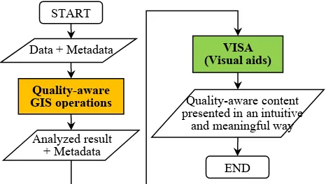
In this paper, the quality-aware GIS assumes all the available data already has standardized quality information and can be imported into the developed prototype system. Our discussion will concentrate on how to assimilate the data quality consideration into the GIS visual interface design, so that the visualization can truly and automatically present the impacts of data quality heterogeneity of the datasets. To meet the illustration demands of different types of analysis information, we propose the VISA approach, which is designed to intelligently consume the data quality analysis results and transform to meaningful visual aids with four major strategies, namely, virtual layer, informative window, symbol transformation and augmented TOC. Figure 1 shows the flowchart of how VISA-enabled interface works.
Figure 1. Flowchart of VISA-enabled interface
The reminder of this paper is organized as follows: section 2 first examines the fundamental characteristics of the four VISA strategies and summarizes their applicable scenarios. Section 3 demonstrates how the VISA can work in an integrated fashion to make users aware of the data quality heterogeneity. Finally, section 4 concludes our major findings.
2. VISA
2.1 Integrated interface design
Regardless the platforms, GIS-based systems use interface to interact with the users. The interface is designed to enable users
to specify their requests via GIS built-in operations and visually inspect the outcomes of their operations. Even with standardized metadata, the support of reading metadata is not a common feature to commercial GIS software, let alone with the integration with the interface design. The VISA-enabled interface is intended to work in an automatic-aware fashion, where the standardized metadata serve as the known facts about the selected geospatial resources, algorithms for analyzing the differences of temporality and quality of the geospatial resources were designed and the transformation of analyzed results into visual aids were automatically executed. Our design is still based upon the frequently adopted window-based environment, but specific perspectives regarding the illustration of data quality information is assimilated into the interface design.
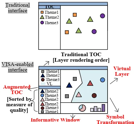
Figure 2 compares the traditional and VISA-enabled GIS interface. As can be seen in the upper part of Figure 2, the traditional GIS interface normally use map window and Table of Content (TOC) to display and control the selected datasets. This typically works in a map overlay fashion, where the selected datasets are superimposed with each other following the order specified in the TOC. Users’ action is simplified to be the selection and adjusting the order of datasets. A strong linkage exists between these two components, where users know what datasets are selected, what map symbols are used for the datasets and the display order of the datasets. Except for datasets that come with cartographic design already, users normally can freely select map symbols to fit their visual purposes. Despite of this convenience, this design fails to provide an effective mechanism to display of quality information and therefore a new approach is needed.
The VISA-enabled interface consists of four major components to address specific types of quality information. In addition to the TOC, augmented TOC is designed to additionally present a quick overview about the data quality of selected based on a selected measure. The layers in augmented TOC can be thus ordered according to the value of measures to simplify users’ interpretation, i.e., identifying datasets without data quality information and comparing the good and bad of the data quality of selected datasets. Informative window, on the other hand, uses a dashboard concept to present a variety of quality information with tables, graphs or charts. Virtual layers are designed to present auxiliary and mappable quality information without changing the map symbol design of features. Since the illustrated contents of virtual layers are not real features, they are meant to visually help assessing the fitness of data used from a data quality perspective. Finally, symbol transformation presents quality information by dynamically changing the map symbol design of selected features according to the selected quantitative quality measure. These four components are designed in an integrated fashion to simultaneously provide different types of visual aids for users’ reference.
START
Data + Metadata
Quality-aware GIS operations
Analyzed result + Metadata
VISA (Visual aids)
Quality-aware content presented in an intuitive
and meaningful way
END
Figure 2. Comparison of traditional GIS interfaces and VISA-enabled interface
Theoretically, we can classify VISA tools into two categories based on their presentation forms, namely, showing quality information in additional windows or visualize in the map interface directly. In Figure 3, the augmented TOC and Informative window belong to the additional window category. The additional windows occupy a certain space in the map interface and may limit the use of other visual components. The technique of scroll bar or tags may help to constraint the size of these two types of visual aids while still meet the demands of illustration. The use of virtual layer and symbol transformation has direct impacts on the illustration in the map interface. As they are simultaneously displayed with the selected features, they need to be easily recognizable, distinguishable and controllable (e.g., switching on/off). The major difference between these two categories is that the window-based technique is suitable for presenting the descriptive quality information or numeric calculation on the basis of individual datasets; while the map-interface-based technique can present quality information for both datasets and individual features and make them visually comparable.
Figure 3. Two categories of VISA tools
From an application viewpoint, these four types of visual aids are not mutual exclusive, i.e., a measure of a certain kind of quality can be presented by more than one type of visual aid(s) of VISA. Nevertheless, it is still necessary to further explore the
applicable scenario of the VISA approach, so that more interface design strategies can be formalized.
2.2 Characteristics of each visual aid in VISA
Every type of visual aids has their own distinguishing characteristics. As the VISA-enabled interface has more complex design, choose wrong visual aids may on the contrary confuse users’ interpretation about data quality. The following discussion further examines their design principles and unique characteristics:
Virtual layer
(1). The addition of virtual layer introduces visual impacts on the map interface, but will not directly influence the illustration of selected features.
(2). Contents of virtual layers are mappable, so map symbol design for each type of quality information is necessary.
(3). Virtual layers are layers in TOC that can be switch on/off when necessary. The name of the virtual layers should be predetermined and precisely explained to avoid confusion.
(4). A virtual layer represents only one type of data quality each time. Multiple types of virtual layers
respectively addressing different types of data quality information are allowed.
(5). The choices of visual variables design for virtual layers are predetermined and the map symbols of selected features shall avoid using the same visual variables.
(6). A virtual layer can present not only the quality information of a certain layer, but also the analyzed quality result from several layers.
Informative window
(1). Informative window provides reference information about another window.
(2). Its content may continuously change according to the selected datasets.
(3). Showing the overall quality information by charts (e.g. pie chart and bar chart) and text.
(4). Plain-text or table data is used to explain the overall status of the chosen measures (e.g., the positional accuracy of the selected datasets)
(5). Pie chart is appropriate for presenting the relative ratio of mutual exclusive attribute, such as the percentages.
(6). Bar chart is appropriate for presenting the values of measures for the selected datasets.
(7). An informative window may simultaneously include different types of quality information.
Symbol transformation
(1). Symbol transformation directly changes the symbols of selected features to present a direct visual impact. (2). This is mainly used for users to temporarily inspect VISA
the quality difference of selected datasets or features. (3). How symbol is transformed is based on the measures
of individual features. The visual variable design of all selected datasets is following the same set of visual variables.
(4). Changing the map symbol design of features directly.
Augmented TOC
(1). Augmented TOC shows the data quality for the selected datasets according to the selected measure. (2). The comparisons are usually dataset-based. It is not
good for indicating the quality different on the basis of individual features.
(3). Based on the chosen measure, layers in the augmented TOC are ordered to simplify users’ decision making. (4). The title of augmented TOC should indicate the
ordering basis of layers.
(5). More than one types of augmented TOC can be designed and displayed in the interface.
From the above discussion, the choice of an appropriate visual aid to present a certain kind of data quality information must consider many issues, for example, which level of measurement (i.e. nominal, ordinal, interval and ratio level) of data is? What type of data quality is concerned? And what kind of measure for describing data quality is used? Different combinations of scenarios may need different types of visual aids to correctly present the data quality status.
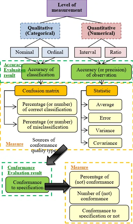
Because GIS is an abstraction of reality and error hidden in data is inevitable, recording the quality of geospatial data should be always rated as a job with high priority. Based on ISO19157 and ISO19115, we have a solid foundation and standardized framework for establishing data quality report and present it in a standardized fashion in metadata. Figure 4 explains the developing logic of the VISA-enabled interface. We start with datasets whose quality is presented by the same measure, and we examine how the use of operations may be influenced by the quality of the datasets and develop algorithms to evaluate their influences. The quantitative and mappable quality information is then further examined from a cartographic perspective to determine the best visualization strategies. Finally, the analysis results are shown in the interface via the four major strategies in the VISA approach. Measures of (geospatial) data quality are different along with different levels of measurement of data. Psychologist Stanley Smith Stevens developed the best known classification with four levels, namely, nominal, ordinal, interval and ratio (Stevens, 1946). The combination scenario of different measure levels and different types of data quality must be examined to determine the appropriate set of measures that can be used for visually presenting quality information. Figure 5 summarizes two major categories of quality measures: “accuracy of classification” and “accuracy (or precision) of observation” respectively. Based on the characteristic of quality evaluation result, two different types are further proposed: accuracy evaluation result and conformance evaluation result.
Figure 4. Detailed flowchart of VISA-enabled interface
Figure 5. Relationship between levels of measurement, quality evaluation result and possible measures
Level of
Nominal Ordinal Interval Ratio
Accuracy of
Measure conformance Sources of
quality type
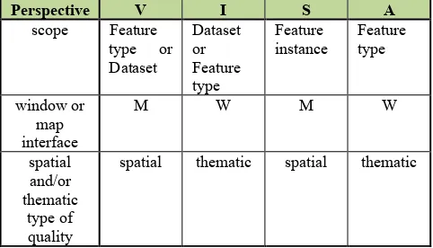
Since the level of measurement for describing a certain characteristic (attribute) of phenomenon is already determined by its schema, data quality measures can be respectively used for different levels of geospatial data. If all features of a dataset share the same data quality description, we can see this data quality information as a dataset or feature type level information. On the other hand, if all features in a dataset have different quality measure results (e.g., the positional accuracy of individual features are different from one to another), then unless an overall measures (e.g., average) can be developed, it can only be presented by specific type of visual aids symbol transformation Based on the discussion above, the four different types of visual aids in VISA can be summed up with some properties and appropriate scenarios in Table 1:
Perspective V I S A
spatial thematic spatial thematic
Table 1. Comparison table of each visual aid in VISA
3. IMPLEMENTATION
In this section, we present the preliminary implementation result and demonstrate how the VISA-enabled interface works. As mentioned above, the VISA-enabled interface works in an automatic-aware fashion, where the standardized metadata are directly imported and visual aids about quality evaluation results were automatically prompted.
3.1 Workflow of VISA-enabled interface
In quality-aware GIS operation stage, the design of operation must take data quality into consideration. As the purposes and algorithms of each operation are different, the design strategies need to be formed on a customary basis. For example, select by region is an operation allowing users to specify a region and retrieve a subset of features that meets the within or intersection constraints. When data quality is considered, we first notice that there may be feature missing (omission error) or wrong included (commission error), therefore the operation outcomes cannot be ensured to be correct if data completeness information is not considered. Furthermore, the outcomes also depends on the determination of topological relationships, positional accuracy thus also plays an important role to the operation outcomes. Moreover, the temporal difference and accuracy between the valid time of data and the time of the ROI
(region of interest) should be also taken into account in time-sensitive applications. To simply put, there are many additional principles need to be carefully examined from a data quality perspective to increase the awareness of the map interface.
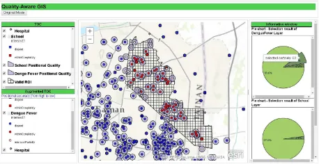
Figure 6 shows the flowchart of quality-aware select by region operation. In the process of select by region operation, there’re many virtual layer created for providing additional information, such as the survey area of each selected dataset, the valid extent (area with full data completeness) following the data completeness concepts from Incorporating visualized data completeness information in an open and interoperable GIS map interface (Hong and Liao, 2011) etc. To evaluate the quality of the outcomes, the ROI given by users or other dataset and valid ROI (ROI should be completely within the valid extent) are also modelled as virtual layers. Augmented TOC order layers according to specific measure (positional accuracy measure in this case). Informative window presents statistical information by charts, text or table. In this case, it presents percentage of each type of selection result for each dataset by using pie chart and provides users with precise value of positional accuracy. Furthermore, Warnings are issued to get users’ attentions about the datasets without positional quality information. This will reduce risks for evaluate the operation outcomes. Symbol transformation presents the different selection type of each feature by directly changing the visual variables of symbols. The outcomes of the select-by-region operation are recorded in the output dataset, with the category information being recorded as feature attributes and the selection criteria being recorded as metadata.
3.2 Scenario
In section 3.2, we choose datasets about dengue fever cases from November 2015 to March 2016, hospitals and schools in Taiwan to demonstrate how the VISA-enabled interface works. Table 2 summarized the information of datasets used in this test scenario. The geometry type of all datasets is point. Two datasets have positional accuracy information evaluated by the same measure (i.e., standard deviation). The survey area of all datasets are available, two of them are the same.
Dataset Geometry Positional accuracy
hospital point none whole Tainan
county in Taiwan
school point 50m whole Tainan
county in Taiwan Table 2. Datasets used in the scenario
Figure 6. Flowchart of quality-aware select by region operation
Figure 7 shows the presentation of traditional GIS interface. With no quality information, the interface simply illustrates the location of the features and lists the title and symbol of the selected datasets in TOC. After changing to the quality-aware mode, virtual layers for presenting survey area of each datasets are created and datasets are displayed according to the measured values of positional accuracy automatically in the augmented TOC to give users an overview of positional quality in dataset level (Figure 8). Valid extent is also automatically calculated based on the available surveyed area information and presented as a virtual layer (Figure 9). We know the data in grey area have risk of data incompleteness and the decision made on the illustration in the green area is safe from the viewpoint of data completeness.
Figure 7. Traditional GIS interface
Figure 8. Survey areas of all datasets (gray filling with yellow, green and red outlines)
Figure 9. Valid extent (green area)
After specifying a ROI in the select-by-region operation, it is ideal that the ROI is within the valid extent to ensure that all features within the ROI can be found. Except the ROI is modelled as a virtual layer, the spatial overlay scenario START
Input Data, Metadata (spatial extent, temporal extent,
quality information)
Compute valid extent (overlapping area of all datasets)
Buffer features according positional accuracy
Virtual layer: survey area for each dataset
& valid extent Information of survey area?
Informative window (text)
aware user Change to
traditional mode
Positional accuracy using same measure?
Virtual layer: Positional quality layer Input
ROI
Compute valid ROI (overlapping area of valid extent & ROI)
Virtual layer: Valid ROI
Positional accuracy?
Intersect valid ROI & positional quality layer
Within completely
Intersect
partially Disjoint
Informative window (pie chart) show percentage of each kind of selection result
Symbol transformation present selection type
of each feature
Output selected features of each layer and record selection state &
valid ROI & valid extent
END
Augmented TOC order layers by positional
accuracy measure Y
N
Y
Y N
N
(geometric intersection) of the ROI and valid extent should also be recorded as a virtual layer (Figure 10 and figure 11), so that users immediately have a correct visual inspection about the operation outcomes. In this case, the valid extent only covers a portion of the ROI, so there are risks to interpret the selected features as “all the features within the ROI”.
Figure 10. ROI (yellow area) and Valid extent (green area)
Figure 11. Valid extent of ROI (grass green filling with cross line pattern)
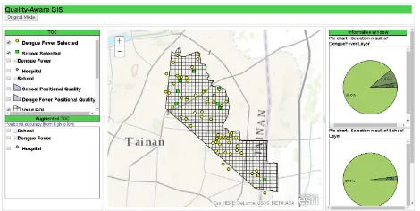
With valid ROI given and positional accuracy information of each datasets available (i.e. create virtual layers of buffered features according to the given positional accuracy) (Figure 12), we can execute quality-aware select by region operation and get improved design of operation outcomes based on data quality consideration. The outcomes include three categories of features: the first category includes features where both the feature locations and buffers are within the ROI. The second category includes feature whose location is within the ROI, its buffer overlaps the ROI. The final category includes feature whose location is outside the ROI, but the buffer overlaps the ROI. The output of traditional select-by-region operations is the union of the first two categories. But after positional accuracy consideration, features belong to the second category has chances to be outside the ROI and those belong to the third category may be within the ROI. Users can thus take this analysis results into consideration while making final decisions. This analysis result can be presented by visual aids, e.g., using symbol transformation strategy to distinguish these three types of categories of features in the map interface (Figure 13) and present the percentage of each category of features by using pie chart in informative window (Figure 14). As for datasets not involved in the execution (due to the lack of positional quality), we show it in the informative window by highlight text (e.g., red) as warnings to users. Moreover, the measured values of positional accuracy of each dataset are also shown in the informative window for users’ reference (Figure 15).
Figure 12. Virtual layers for presenting positional accuracy (translucent purple area)
Figure 13. Result of select by region operation (with positional accuracy consideration) – symbol transformation
Figure 14. Result of select by region operation (with positional accuracy consideration) – informative window (pie chart)
Figure 15. Result of select by region operation (with positional accuracy consideration) – informative window (text)
Finally, we can output the analysis result and document the type of selection as lineage information in the metadata or as one of
the attributes of datasets. Figure 16 shows the final operation outcomes.
Figure 16. Output of selected datasets
4. CONCLUSION
Regardless it is based on desktop or web, GIS has emerged as a powerful mechanism to integrate and present data from different resources and facilitate the development of applications. With the convenient and friendly design, users can easily complete their missions, but are unfortunately often unaware of the risks hidden among the heterogeneous data. An innovated VISA approach, namely, virtual layer, informative window, symbol transformation and augmented TOC, is proposed to enhance the understanding about the quality of illustrated datasets in this paper. For each type of visual aids, we summarized its assumption, requirements, applicable scenario, analysis algorithm and the illustration strategies. Compared with the current interface design, we successfully demonstrate the new design of visual aids can serve as the foundation for designing quality-aware GIS and enable the development of interoperable applications. With the steadily increasing of available georesources, the integration of knowledge about data and application is key factor for future development, this is, however, impossible without the consideration of data quality. This proposed mechanism effectively improves the abilities of intuitively interpreting quality information, increases the level of intelligence for decision making and avoid the wrong use of inappropriate datasets. More scenario of integrating visualization strategies and quality measures are expected in the future to continuously expand the applications of the VISA approach.
ACKNOWLEDGEMENTS
This paper is partial result from the research project (MOST 104-2221-E-006-222-MY2) granted by the Ministry of Science and Technology in Taiwan.
REFERENCES
Devillers, R., Bédard, Y., & Jeansoulin, R., 2005. Multidimensional management of geospatial data quality
information for its dynamic use within GIS. Photogrammetric Engineering & Remote Sensing, 71(2), pp.205-215.
Devillers, R. and Zargar, A., 2009. Towards quality-aware GIS: Operation-based retrieval of spatial data quality information. Report Spatial Knowledge and Information (SKI) Conference, Fernie (BC), Canada.
Goodchild, M. F., 1995. Sharing Imperfect Data. Report Global Resource Information Database Information Series (UNEP). Hong, J. H., & Huang, M. L., 2013. The Design of Intelligent Workflow for GIS Functions: a Data Quality Perspective. In: The International Archives of the Photogrammetry, Remote Sensing and Spatial Information Sciences, Hong Kong , China, Vol. XL-2/W1, pp.47-52.
Hong, J. H., & Liao, H. P., 2011. Incorporating visualized data completeness information in an open and interoperable GIS map interface. Journal of the Chinese Institute of Engineers, 34(6), pp.733-745.
ISO/TC-211, ISO/TC 19157 Geographic information – Data quality, 2013.
ISO/TC-211, ISO/TC 19115 Geographic information – Metadata – Part 1: Fundamentals, 2014.
Stevens, S. S., 1946. On the theory of scales of measurement. Science, New Series, Vol. 103, No. 2684, pp. 677-680.
Yang, T., 2007. Visualisation of spatial data quality for distributed GIS. Report The University of New South Wales, Australia.
Zargar, A., & Devillers, R., 2009. An operation-based communication of spatial data quality. In: GEOWS '09 Proceedings of the 2009 International Conference on Advanced Geographic Information Systems & Web Services, Cancun, Mexico, pp. 140-145.