n
Michael Alexander
Learn to:
•
Analyze data and report it in a way
that makes sense
•
Slice and dice data from different
perspectives
•
Create eye-catching and
understandable reports,
visualizations, and dashboards
•
Automate redundant reporting
Excel
®
Dashboards
& Reports
2nd Edition
Making Everyth
ing Easier!
™
• Make the move to dashboards
make great reports, and build super models
• Build the basics
conditional formatting, and dynamic labeling
• Get advanced — dig into the powerful components of Excel, including those that show trending, display performance, group data, and more
• Share your work — use external data for dashboards and reports and share your work with the world
• Go further — take things up a notch with more extensive chart design principles and safeguards to follow before distributing
Start with
FREE
Cheat Sheets
Cheat Sheets include
• Checklists
• Charts
• Common Instructions
• And Other Good Stuff!
Get Smart at Dummies.com
Dummies.com makes your life easier with 1,000s
of answers on everything from removing wallpaper
to using the latest version of Windows.
Check out our
• Videos
• Illustrated Articles
• Step-by-Step Instructions
Plus, each month you can win valuable prizes by entering
our Dummies.com sweepstakes. *
Want a weekly dose of Dummies? Sign up for Newsletters on
• Digital Photography
• Microsoft Windows & Office
• Personal Finance & Investing
• Health & Wellness
• Computing, iPods & Cell Phones
• eBay
• Internet
• Food, Home & Garden
Find out “HOW” at Dummies.com
*Sweepstakes not currently available in all countries; visit Dummies.com for official rules.
To access the Cheat Sheet created specifically for this book, go to
www.dummies.com/cheatsheet/exceldashboardsandreports
Excel
®
Dashboards &
Reports
2nd Edition
Copyright © 2014 by John Wiley & Sons, Inc., Hoboken, New Jersey
Media and software compilation copyright © 2014 by John Wiley & Sons, Inc. All rights reserved. Published simultaneously in Canada
No part of this publication may be reproduced, stored in a retrieval system or transmitted in any form or by any means, electronic, mechanical, photocopying, recording, scanning or otherwise, except as permitted under Sections 107 or 108 of the 1976 United States Copyright Act, without the prior written permission of the Publisher. Requests to the Publisher for permission should be addressed to the Permissions Department, John Wiley & Sons, Inc., 111 River Street, Hoboken, NJ 07030, (201) 748-6011, fax (201) 748-6008, or online at
http://www.wiley.com/go/permissions.
Trademarks: Wiley, For Dummies, the Dummies Man logo, Dummies.com, Making Everything Easier, and related trade dress are trademarks or registered trademarks of John Wiley & Sons, Inc. and may not be used without written permission. Microsoft and Excel are registered trademarks of Microsoft Corporation. All other trademarks are the property of their respective owners. John Wiley & Sons, Inc. is not associated with any product or vendor mentioned in this book.
LIMIT OF LIABILITY/DISCLAIMER OF WARRANTY: THE PUBLISHER AND THE AUTHOR MAKE NO REPRESENTATIONS OR WARRANTIES WITH RESPECT TO THE ACCURACY OR COMPLETENESS OF THE CONTENTS OF THIS WORK AND SPECIFICALLY DISCLAIM ALL WARRANTIES, INCLUDING WITHOUT LIMITATION WARRANTIES OF FITNESS FOR A PARTICULAR PURPOSE. NO WARRANTY MAY BE CREATED OR EXTENDED BY SALES OR PROMOTIONAL MATERIALS. THE ADVICE AND STRATEGIES CONTAINED HEREIN MAY NOT BE SUITABLE FOR EVERY SITUATION. THIS WORK IS SOLD WITH THE UNDERSTANDING THAT THE PUBLISHER IS NOT ENGAGED IN RENDERING LEGAL, ACCOUNTING, OR OTHER PROFESSIONAL SERVICES. IF PROFESSIONAL ASSISTANCE IS REQUIRED, THE SERVICES OF A COMPETENT PROFESSIONAL PERSON SHOULD BE SOUGHT. NEITHER THE PUBLISHER NOR THE AUTHOR SHALL BE LIABLE FOR DAMAGES ARISING HEREFROM. THE FACT THAT AN ORGANIZATION OR WEBSITE IS REFERRED TO IN THIS WORK AS A CITATION AND/OR A POTENTIAL SOURCE OF FURTHER INFORMATION DOES NOT MEAN THAT THE AUTHOR OR THE PUBLISHER ENDORSES THE INFORMATION THE ORGANIZATION OR WEBSITE MAY PROVIDE OR RECOMMENDATIONS IT MAY MAKE. FURTHER, READERS SHOULD BE AWARE THAT INTERNET WEBSITES LISTED IN THIS WORK MAY HAVE CHANGED OR DISAPPEARED BETWEEN WHEN THIS WORK WAS WRITTEN AND WHEN IT IS READ.
For general information on our other products and services, please contact our Customer Care Department within the U.S. at 877-762-2974, outside the U.S. at 317-572-3993, or fax 317-572-4002. For technical support, please visit www.wiley.com/techsupport.
Wiley publishes in a variety of print and electronic formats and by print-on-demand. Some material included with standard print versions of this book may not be included in e-books or in print-on-demand. If this book refers to media such as a CD or DVD that is not included in the version you purchased, you may download this material at http://booksupport.wiley.com. For more information about Wiley products, visit www.wiley.com.
Library of Congress Control Number: 2013954103
ISBN 978-1-118-84224-9 (pbk); ISBN 978-1-118-84242-3 (ebk); ISBN 978-1-118-84236-2 (ebk) Manufactured in the United States of America
Table of Contents
Introduction ... 1
About This Book ... 2
Foolish Assumptions ... 3
Icons Used In This Book ... 3
Beyond the Book ... 4
Where to Go from Here ... 5
Part I: Getting Started with Excel Dashboards and Reports ...7
Chapter 1: Getting in the Dashboard State of Mind . . . . 9
Defining Dashboards and Reports ... 9
Defining reports ... 10
Defining dashboards... 11
Preparing for Greatness ... 12
Establish the audience and purpose for the dashboard ... 12
Delineate the measures for the dashboard ... 13
Catalog the required data sources ... 14
Define the dimensions and filters for the dashboard ... 15
Determine the need for drill-down features ... 15
Establish the refresh schedule ... 16
A Quick Look at Dashboard Design Principles ... 16
Rule number 1: Keep it simple ... 17
Use layout and placement to draw focus ... 18
Format numbers effectively ... 19
Use titles and labels effectively ... 20
Chapter 2: Building a Super Model . . . . 21
Data Modeling Best Practices ... 22
Separating data, analysis, and presentation ... 22
Starting with appropriately structured data ... 25
Avoiding turning your data model into a database ... 28
Using tabs to document and organize your data model ... 29
Testing your data model before building reporting components on top of it ... 31
Excel Functions That Really Deliver ... 32
The VLOOKUP function... 32
The HLookup function... 36
Part II: Building Basic Dashboard Components ... 47
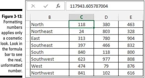
Chapter 3: Dressing Up Your Data Tables . . . . 49
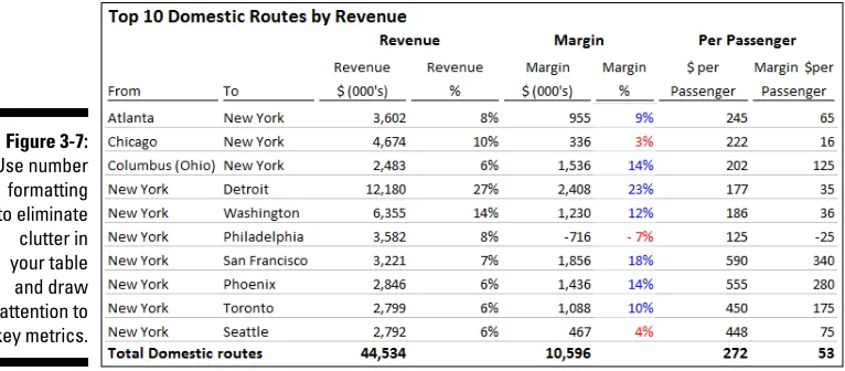
Table Design Principles ... 49
Use colors sparingly ... 50
De-emphasize borders ... 52
Use effective number formatting ... 54
Subdue your labels and headers... 55
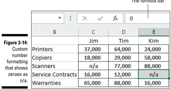
Getting Fancy with Custom Number Formatting ... 57
Number formatting basics ... 57
Formatting numbers in thousands and millions ... 59
Hiding and suppressing zeroes ... 62
Applying custom format colors ... 62
Formatting dates and times ... 63
Chapter 4: Sparking Inspiration with Sparklines . . . . 65
Introducing Sparklines ... 65
Understanding Sparklines ... 67
Creating sparklines ... 68
Understanding sparkline groups ... 70
Customizing Sparklines ... 71
Sizing and merging sparkline cells... 71
Handling hidden or missing data ... 72
Changing the sparkline type ... 73
Changing sparkline colors and line width ... 73
Using color to emphasize key data points ... 73
Adjusting sparkline axis scaling ... 74
Faking a reference line ... 75
Specifying a date axis ... 77
Autoupdating sparkline ranges ... 78
Chapter 5: Formatting Your Way to Visualizations . . . . 79
Enhancing Reports with Conditional Formatting ... 79
Applying basic conditional formatting ... 80
Adding your own formatting rules manually... 88
Show only one icon ... 91
Show Data Bars and icons outside of cells ... 94
Representing trends with Icon Sets ... 96
Using Symbols to Enhance Reporting ... 98
The Magical Camera Tool ... 102
Finding the Camera tool ... 102
Using the Camera tool ... 103
v
Table of Contents
Chapter 6: The Pivotal Pivot Table . . . . 107
An Introduction to the Pivot Table ... 107
The Four Areas of a Pivot Table ... 108
Values area ... 108
Row area ... 109
Column area... 109
Filter area ... 110
Creating Your First Pivot Table ... 111
Changing and rearranging your pivot table ... 114
Adding a report filter ... 115
Keeping your pivot table fresh ... 116
Customizing Your Pivot Table Reports ... 119
Changing the pivot table layout ... 119
Customizing field names ... 120
Applying numeric formats to data fields ... 122
Changing summary calculations ... 122
Suppressing subtotals ... 124
Showing and hiding data items ... 127
Hiding or showing items without data ... 128
Sorting your pivot table ... 132
Creating Useful Pivot-Driven Views ... 133
Producing top and bottom views ... 133
Creating views by month, quarter, and year ... 137
Creating a percent distribution view... 139
Creating a YTD totals view ... 141
Creating a month-over-month variance view ... 142
Part III: Building Advanced Dashboard Components .... 145
Chapter 7: Char ts That Show Trending . . . . 147
Trending Dos and Don’ts ... 147
Using chart types appropriate for trending ... 148
Starting the vertical scale at zero ... 150
Leveraging Excel’s logarithmic scale ... 151
Applying creative label management ... 153
Comparative Trending ... 156
Creating side-by-side time comparisons ... 156
Creating stacked time comparisons ... 158
Trending with a secondary axis ... 160
Emphasizing Periods of Time ... 163
Formatting specific periods ... 163
Using dividers to mark significant events ... 165
Representing forecasts in your trending components ... 166
Chapter 8: Grouping and Bucketing Data . . . . 173
Creating Top and Bottom Displays ... 173
Incorporating top and bottom displays into dashboards ... 174
Using pivot tables to get top and bottom views ... 175
Using Histograms to Track Relationships and Frequency ... 178
Adding formulas to group data ... 179
Adding a cumulative percent ... 183
Using a pivot table to create a histogram ... 185
Emphasizing Top Values in Charts ... 187
Chapter 9: Displaying Performance against a Target . . . . 191
Showing Performance with Variances ... 191
Showing Performance against Organizational Trends ... 193
Using a Thermometer-Style Chart ... 194
Using a Bullet Graph ... 195
Creating a bullet graph ... 196
Adding data to your bullet graph ... 200
Final thoughts on formatting bullet graphs ... 200
Showing Performance against a Target Range ... 203
Part IV: Advanced Reporting Techniques ... 207
Chapter 10: Macro-Charged Dashboarding . . . . 209
Why Use a Macro? ... 209
Recording Your First Macro ... 210
Running Your Macros ... 214
Enabling and Trusting Macros ... 217
Macro-enabled file extensions ... 217
Enabling macro content ... 217
Setting up trusted locations ... 218
Excel Macro Examples ... 219
Building navigation buttons ... 219
Dynamically rearranging pivot table data ... 220
Offering one-touch reporting options ... 221
Chapter 11: Giving Users an Interactive Interface . . . . 223
Getting Started with Form Controls ... 223
Finding Form controls ... 224
Adding a control to a worksheet... 226
Using the Button Control ... 227
Using the Check Box Control ... 228
vii
Table of Contents
Using the Option Button Control ... 232
Option Button Example: Showing Many Views through One Chart ... 233
Using the Combo Box Control ... 236
Combo Box Example: Changing Chart Data with a Drop-Down Selector ... 237
Using the List Box Control ... 239
List Box Example: Controlling Multiple Charts with One Selector ... 241
Chapter 12: Adding Interactivity with Pivot Slicers . . . . 245
Understanding Slicers ... 245
Creating a Standard Slicer ... 247
Formatting Slicers ... 250
Size and placement ... 250
Data item columns ... 250
Slicer color and style ... 251
Other slicer settings ... 252
Controlling Multiple Pivot Tables with One Slicer ... 253
Creating a Timeline Slicer ... 254
Using Slicers as Form Controls ... 256
Part V: Working with the Outside World ... 261
Chapter 13: Using External Data for Your Dashboards
and Reports . . . . 263
Importing Data from Microsoft Access ... 263
The drag-and-drop method ... 264
The Microsoft Access Export wizard ... 265
The Get External Data icon ... 266
Importing Data from SQL Server ... 271
Chapter 14: Sharing Your Workbook with the Outside World . . . . . 275
Protecting Your Dashboards and Reports ... 275
Securing access to the entire workbook ... 275
Limiting access to specific worksheet ranges ... 279
Protecting the workbook structure ... 283
Linking Your Excel Dashboards to PowerPoint ... 284
Creating a link between Excel and PowerPoint... 284
Manually updating links to capture updates ... 286
Automatically updating links... 288
Distributing Your Dashboards via a PDF ... 289
Distributing Your Dashboards to SkyDrive ... 291
Part VI: The Part of Tens ... 295
Chapter 15: Ten Chart Design Principles . . . . 297
Avoid Fancy Formatting ... 297
Skip the Unnecessary Chart Junk ... 299
Format Large Numbers Where Possible ... 301
Use Data Tables instead of Data Labels ... 302
Make Effective Use of Chart Titles ... 304
Sort Your Data before Charting ... 304
Limit the Use of Pie Charts ... 305
Don’t Be Afraid to Parse Data into Separate Charts ... 306
Maintain Appropriate Aspect Ratios ... 307
Don’t Be Afraid to Use Something Other Than a Chart ... 308
Chapter 16: Ten Questions to Ask Before Distributing
Your Dashboard . . . . 309
Does My Dashboard Present the Right Information? ... 309
Does Everything on My Dashboard Have a Purpose? ... 309
Does My Dashboard Prominently Display the Key Message? ... 310
Can I Maintain This Dashboard? ... 310
Does My Dashboard Clearly Display Its Scope and Shelf Life? ... 311
Is My Dashboard Well Documented? ... 311
Is My Dashboard Overwhelmed with Formatting and Graphics? ... 312
Does My Dashboard Overuse Charts When Tables Will Do? ... 312
Is My Dashboard User-Friendly? ... 313
Is My Dashboard Accurate? ... 314
Introduction
T
he term business intelligence (BI), coined by Howard Dresner of the Gartner Inc., describes the set of concepts and methods to improve business decision-making by using fact-based support systems. Practically speaking, BI is what you get when you analyze raw data and turn that analysis into knowl-edge. BI can help an organization identify cost-cutting opportunities, uncover new business opportunities, recognize changing business environments, iden-tify data anomalies, and create widely accessible reports.Over the last few years, the BI concept has overtaken corporate executives who are eager to turn impossible amounts of data into knowledge. As a result of this trend, whole industries have been created. Software vendors that focus on BI and dashboarding are coming out of the woodwork. New consult-ing firms toutconsult-ing their BI knowledge are poppconsult-ing up virtually every week. And even the traditional enterprise solution providers like Business Objects and SAP are offering new BI capabilities.
This need for BI has manifested itself in many forms. Most recently, it has come in the form of dashboard fever. Dashboards are reporting mechanisms that deliver business intelligence in a graphical form.
Maybe you’ve been hit with dashboard fever. Or maybe your manager is hit-ting you with dashboard fever. Nevertheless, you’re probably holding this book because you’re being asked to create BI solutions (that is, dashboards) in Excel.
Although many IT managers would scoff at the thought of using Excel as a BI tool, Excel is inherently part of the enterprise BI tool portfolio. Whether or not IT managers are keen to acknowledge it, most of the data analysis and reporting done in business today is done by using a spreadsheet. There are several significant reasons to use Excel as the platform for your dashboards and reports, including the following:
✓ Built-in flexibility: With most enterprise dashboarding solutions, the capability to perform analyses outside the predefined views is either dis-abled or unavailable. How many times have you dumped enterprise-level data into Excel so you can analyze it yourself? I know I have. You can bet that if you give users an inflexible reporting mechanism, they’ll do what it takes to create their own usable reports. In Excel, features such as pivot tables, autofilters, and Form controls allow you to create mecha-nisms that don’t lock your audience into one view. And because you can have multiple worksheets in one workbook, you can give them space to do their own side analysis as needed.
✓ Rapid development: Building your own reporting capabilities in Excel can liberate you from the IT Department’s resource and time limitations. With Excel, you can not only develop reporting mechanisms faster, but you also have the flexibility to adapt more quickly to changing requirements.
✓ Powerful data connectivity and automation capabilities: Excel is not the toy application some IT managers make it out to be. With its own native programming language and its robust object model, Excel can be used to automate processes and even connect to various data sources. With a few advanced techniques, you can make Excel a hands-off reporting mechanism that practically runs on its own.
✓ Little to no incremental costs: Not all of us can work for multibillion dollar companies that can afford enterprise-level reporting solutions. In most companies, funding for new computers and servers is limited, let alone funding for expensive BI reporting packages. For those companies, leveraging Microsoft Office is frankly the most cost-effective way to deliver key business reporting tools without compromising too deeply on usability and functionality.
All that being said, there are so many reporting functions and tools in Excel that it’s difficult to know where to start. Enter your humble author, spirited into your hands via this book. Here, I show you how you can turn Excel into your own personal BI tool. With a few fundamentals and some of the new BI functionality Microsoft has included in this latest version of Excel, you can go from reporting data with simple tables to creating meaningful reporting components that are sure to wow management.
About This Book
3
Introduction
that help you create better reporting components — components that can be used for both dashboards and reports. It’s important to note that this book is not a guide to visualizations or dashboarding best practices — although those subjects are worthy of their own book. This book is focused on the technical aspects of using Excel’s various tools and functionality and applying them to reporting.
The chapters in this book are designed to be stand-alone chapters that you can selectively refer to as needed. As you move through this book, you’ll be able to create increasingly sophisticated dashboard and report components. After reading this book, you’ll be able to:
✓ Analyze large amounts of data and report them in a meaningful way
✓ Get better visibility into data from different perspectives
✓ Quickly slice data into various views on the fly ✓ Automate redundant reporting and analyses
✓ Create interactive reporting processes
Foolish Assumptions
I make three assumptions about you as the reader:
✓ I assume you’ve already installed Microsoft Excel.
✓ I assume you have some familiarity with the basic concepts of data analysis such as working with tables, aggregating data, and performing calculations.
✓ I assume you have a strong grasp of basic Excel concepts such as man-aging table structures, creating formulas, referencing cells, filtering, and sorting.
Icons Used In This Book
As you read this book, you’ll see icons in the margins that indicate material of interest (or not, as the case may be).This section briefly describes each icon in this book.
Try to avoid doing anything marked with a Warning icon, which (as you might expect) represents a danger of one sort or another.
Whenever you see this icon, think advanced tip or technique. You might find these tidbits of useful information just too boring for words, or they could contain the solution you need to get a program running. Skip these bits of information whenever you like.
If you don’t get anything else out of a particular chapter or section, remember the material marked by this icon. This text usually contains an essential process or a bit of information you ought to remember.
Beyond the Book
A lot of extra content that you won’t find in this book is available at www.dummies.com. Go online to find the following:
✓ Excel files used in the examples in this book can be found at
www.dummies.com/extras/exceldashboardsandreports This book contains a lot of exercises in which you create and modify
tables and Excel workbook files. If you want to follow the exercise but don’t have time to, say, create your own data table, just download the data from the Dummies.com website at www.dummies.com/extras/
exceldashboardsandreports. The files are organized by chapter.
✓ Online articles covering additional topics at
www.dummies.com/extras/exceldashboardsandreports
Here you’ll find out how to use conditional formatting to build a simple but effective waffle chart, add an extra dynamic layer of analysis to your charts, and create dynamic labels, among other details to aid you in your Excel dashboards journey.
✓ The Cheat Sheet for this book is at
www.dummies.com/cheatsheet/exceldashboardsandreports Here you’ll find an extra look at how you can use fancy fonts like
Wingdings and Webdings to add visualizations to your dashboards and reports. You’ll also find a list of websites you can visit to get ideas and fresh new perspectives on building dashboards.
✓ Updates to this book, if we have any, are also available at
5
Introduction
Where to Go from Here
Part I
✓ Discover how to think about your data in terms of creating effective dashboards and reports.
✓ Get a solid understanding of the fundamentals and basic ground rules for creating effective dashboards and reports.
✓ Uncover the best practices for setting up the source data for your dashboards and reports.
Chapter 1
Getting in the Dashboard
State of Mind
In This Chapter
▶ Comparing dashboards to reports ▶ Getting started on the right foot
▶ Dashboarding best practices
I
n his song, “New York State of Mind,” Billy Joel laments the differences between California and New York. In this homage to the Big Apple, he implies a mood and a feeling that comes with thinking about New York. I admit it’s a stretch, but I’ll extend this analogy to Excel — don’t laugh.In Excel, the differences between building a dashboard and creating standard table-driven analyses are as great as the differences between California and New York. To approach a dashboarding project, you truly have to get into the dashboard state of mind. As you’ll come to realize in the next few chapters, dashboarding requires far more preparation than standard Excel analyses. It calls for closer communication with business leaders, stricter data modeling techniques, and the following of certain best practices. It’s beneficial to have a base familiarity with fundamental dashboarding concepts before venturing off into the mechanics of building a dashboard.
In this chapter, you get a solid understanding of these basic dashboard concepts and design principles as well as what it takes to prepare for a dashboarding project.
Defining Dashboards and Reports
Now this may all seem like semantics to you, but it’s helpful to clear the air a bit and understand the core attributes of what are considered to be reports and dashboards.
Defining reports
Reports are probably the most common application of business intelligence. A report can be described as a document that contains data used for reading or viewing. It can be as simple as a data table or as complex as a subtotaled view with interactive drill downs, similar to Excel’s Subtotal or pivot table functionality.
The key attribute of a report is that it doesn’t lead a reader to a predefined conclusion. Although a report can include analysis, aggregations, and even charts, reports often allow for the end users to apply their own judgment and analysis to the data.
To clarify this concept, Figure 1-1 shows an example of a report. This report shows the National Park overnight visitor statistics by period. Although this data can be useful, it’s clear this report isn’t steering the reader in any predefined judgment or analysis; it’s simply presenting the aggregated data.
11
Chapter 1: Getting in the Dashboard State of Mind
Defining dashboards
A dashboard is a visual interface that provides at-a-glance views into key measures relevant to a particular objective or business process. Dashboards have three main attributes:
✓ Dashboards are typically graphical in nature, providing visualizations that help focus attention on key trends, comparisons, and exceptions.
✓ Dashboards often display only data that are relevant to the goal of the dashboard.
✓ Because dashboards are designed with a specific purpose or goal, they inherently contain predefined conclusions that relieve the end user from performing his own analysis.
Figure 1-2 illustrates a dashboard that uses the same data shown in Figure 1-1. This dashboard displays key information about the National Park overnight visitor stats. As you can see, this presentation has all the main attributes that define a dashboard. First, it’s a visual display that allows you to quickly recognize the overall trending of the overnight visitor stats. Second, you can see that not all the detailed data is shown here — only the key pieces of information relevant to support the goal of this dashboard. Finally, by virtue of its objective, this dashboard effectively presents you with analysis and conclusions about the trending of overnight visitors.
Preparing for Greatness
Imagine your manager asks you to create a dashboard that tells him everything he should know about monthly service subscriptions. Do you jump to action and slap together whatever comes to mind? Do you take a guess at what he wants to see and hope it’s useful? These questions sound ridiculous, but such situations happen more than you think. I’m constantly called to create the next great reporting tool but am rarely provided the time to gather the true requirements for it. Between limited information and unrealistic deadlines, the end product often ends up being unused or having little value.
This brings me to one of the key steps in preparing for dashboarding — collecting user requirements.
In the non-IT world of the Excel analyst, user requirements are practically useless because of sudden changes in project scope, constantly changing priorities, and shifting deadlines. The gathering of user requirements is viewed to be a lot of work and a waste of valuable time in the ever-changing business environment. But as I mention at the start of this chapter, it’s time to get into the dashboard state of mind.
Consider how many times a manager has asked you for an analysis and then said “No, I meant this.” Or, “Now that I see it, I realize I need this.” As frustrat-ing as this can be for a sfrustrat-ingle analysis, imagine runnfrustrat-ing into it again and again during the creation of a complex dashboard with several data integration processes. The question is, would you rather spend your time on the front end gathering user requirements or spend time painstakingly redesigning the dashboard you’ll surely come to hate?
The process of gathering user requirements doesn’t have to be an overly complicated or formal one. Here are some simple things you can do to ensure you have a solid idea of the purpose of the dashboard.
Establish the audience and purpose
for the dashboard
13
Chapter 1: Getting in the Dashboard State of Mind
If a dashboard is indeed warranted, talk about who the end users are. Take some time to meet with a few of the end users to talk about how they’d use the dashboard. Will the dashboard be used as a performance tool for regional managers? Will the dashboard be used to share data with external customers? Talking through these fundamentals with the right people helps align your thoughts and avoids the creation of a dashboard that doesn’t fulfill the necessary requirements.
Delineate the measures for the dashboard
Most dashboards are designed around a set of measures, or key performance indicators (KPIs). A KPI is an indicator of the performance of a task deemed to be essential to daily operations or processes. The idea is that a KPI reveals performance that is outside the normal range for a particular measure, so it therefore often signals the need for attention and intervention. Although the measures you place into your dashboards may not officially be called KPIs, they undoubtedly serve the same purpose — to draw attention to problem areas.
The topic of creating effective KPIs for your organization is a subject worthy of its own book and is out of the scope of this endeavor. For a detailed guide on KPI development strategies, pick up David Parmenter’s Key Performance Indicators: Developing, Implementing, and Using Winning KPIs (John Wiley & Sons, Inc.). This book provides an excellent step-by-step approach to developing and implementing KPIs.
The measures used on a dashboard should absolutely support the initial purpose of that dashboard. For example, if you’re creating a dashboard focused on supply chain processes, it may not make sense to have human resources headcount data incorporated. It’s generally good practice to avoid nice-to-know data in your dashboards simply to fill white space or because the data is available. If the data doesn’t support the core purpose of the dashboard, leave it out.
Figure 1-3: Each box in this dash-board layout
mockup represents a component and the type of data required to create the measures.
Each box in this dashboard layout mockup represents a component on the dashboard and its approximate position. The questions within each box provide a sense of the types of data required to create the measures for the dashboard.
Catalog the required data sources
When you have the list of measures that need to be included on the dashboard, it’s important to take a tally of the available systems to determine if the data required to produce those measures are available. Ask yourself the following questions:
✓ Do you have access to the data sources necessary?
✓ How often are those data sources refreshed?
✓ Who owns and maintains those data sources?
✓ What are the processes to get the data from those resources?
✓ Does the data even exist?
These are all questions you need answered when negotiating dashboard development time, data refresh intervals, and change management.
15
Chapter 1: Getting in the Dashboard State of Mind
If your organizational strategy requires that you collect and measure data that is nonexistent or not available, press pause on the dashboard project and turn your attention to creating a data collection mechanism that will get the data you need.
Define the dimensions and filters
for the dashboard
In the context of reporting, a dimension is a data category used to organize business data. Examples of dimensions are Region, Market, Branch, Manager, or Employee. When you define a dimension in the user requirements stage of development, you’re determining how the measures should be grouped or distributed. For example, if your dashboard should report data by employee, you need to ensure that your data collection and aggregation processes include employee detail. As you can imagine, adding a new dimension after the dashboard is built can get complicated, especially when your processes require many aggregations across multiple data sources. The bottom line is that locking down the dimensions for a dashboard early in the process definitely saves you headaches.
Along those same lines, you want to get a clear sense of the types of filters that are required. In the context of dashboards, filters are mechanisms that allow you to narrow the scope of the data to a single dimension. For example, you can filter on Year, Employee, or Region. Again, if you don’t account for a particular filter while building your dashboarding process, you’ll likely be forced into an unpleasant redesign of both your data collection processes and your dashboard.
If you’re confused by the difference between dimensions and filters, think about a simple Excel table. A dimension is like a column of data (such as a column containing employee names) in an Excel table. A filter, then, is the mechanism that allows you to narrow your table to show only the data for a particular employee. For example, if you apply Excel’s AutoFilter to the employee column, you are building a filter mechanism into your table.
Determine the need for drill-down features
Many dashboards provide drill-down features that allow users to “drill” into the details of a specific measure. You want to get a clear understanding of the types of drill-downs your users have in mind.
Establish the refresh schedule
A refresh schedule refers to the schedule by which a dashboard is updated to show the latest information available. Because you’re the one responsible for building and maintaining the dashboard, you should have a say in the refresh schedules — your manager may not know what it takes to refresh the dash-board in question.
While you’re determining the refresh schedule, keep in mind the refresh rates of the different data sources whose measures you need to get. You can’t refresh your dashboard any faster than your data sources. Also, negotiate enough development time to build macros that aid in automation of redundant and time-consuming refresh tasks.
A Quick Look at Dashboard
Design Principles
When collecting user requirements for your dashboarding project, there’s a heavy focus on the data aspects of the dashboard: The types of data needed, the dimensions of data required, the data sources to be used, and so on. This is a good thing — without solid data processes, your dashboards won’t be effec-tive or maintainable. That being said, here’s another aspect to your dashboard-ing project that calls for the same fervor in preparation: the design aspect.
Excel users live in a world of numbers and tables, not visualization and design. Your typical Excel analysts have no background in visual design and are often left to rely on their own visual instincts to design their dash-boards. As a result, most Excel-based dashboards have little thought given to effective visual design, often resulting in overly cluttered and ineffective user interfaces.
The good news is that dashboarding has been around for such a long time that there’s a vast knowledge base of prescribed visualization and dashboard design principles. Many of these principles seem like common sense; even so, these are concepts that Excel users don’t often find themselves thinking about. Because this chapter is about getting into the dashboard state of mind, I break that trend and review a few dashboard design principles that improve the look and feel of your Excel dashboards.
17
Chapter 1: Getting in the Dashboard State of Mind
Rule number 1: Keep it simple
Dashboard design expert, Stephen Few, has the mantra, “Simplify, Simplify, Simplify.” The basic idea is that dashboards cluttered with too many mea-sures or too much eye candy can dilute the significant information you’re trying to present. How many times has someone told you that your reports look “busy”? In essence, this complaint means that too much is going on in the page or screen, making it hard to see the actual data.
Here are a few actions you can take to ensure simpler and more effective dashboard designs.
Don’t turn your dashboard into a data repository
Admit it. You include as much information onto a report as possible, primarily to avoid being asked for additional information. We all do it. But in the dash-board state of mind, you have to fight the urge to force every piece of data available onto your dashboards.
Overwhelming users with too much data can cause them to lose sight of the primary goal of the dashboard and focus on inconsequential data. The measures used on a dashboard should support the initial purpose of that dashboard. Avoid the urge to fill white space for the sake of symmetry and appearances. Don’t include nice-to-know data just because the data is avail-able. If the data doesn’t support the core purpose of the dashboard, leave it out.
Avoid the fancy formatting
The key to communicating effectively with your dashboards is to present your data as simply as possible. There’s no need to wrap it in eye candy to make it more interesting. It’s okay to have a dashboard with little to no color or formatting. You’ll find that the lack of fancy formatting only serves to call attention to the actual data. Focus on the data and not the shiny happy graphics. Here are a few guidelines:
✓ Avoid using colors or background fills to partition your dashboards.
Colors, in general, should be used sparingly, reserved for providing information about key data points. For example, assigning the colors red, yellow, and green to measures traditionally indicates performance level. Adding these colors to other sections of your dashboard only serves to distract your audience.
✓ Avoid applying fancy effects such as gradients, pattern fills, shadows, glows, soft edges, and other formatting. Excel 2007 makes it easy to apply effects that make everything look shiny, glittery, and generally happy. Although these formatting features make for great marketing tools, they don’t do your reporting mechanisms any favors.
✓ Don’t try to enhance your dashboards with clip art or pictures. Not only do they do nothing to further data presentation, they often just look tacky.
Limit each dashboard to one printable page
Dashboards, in general, should provide at-a-glance views into key measures relevant to particular objectives or business processes. This implies that all the data is immediately viewable on the one page. Although including all your data on one page isn’t always the easiest thing to do, there’s much ben-efit to being able to see everything on one page or screen. You can compare sections more easily, you can process cause and effect relationships more effectively, and you rely less on short-term memory. When a user has to scroll left, right, or down, these benefits are diminished. Furthermore, users tend to believe that when information is placed out of normal view (areas that require scrolling), it’s somehow less important.
But what if you can’t fit all the data on one sheet? First, review the measures on your dashboard and determine if they really need to be there. Next, format your dashboard to use less space (format fonts, reduce white space, and adjust column and row widths). Finally, try adding interactivity to your dashboard, allowing users to dynamically change views to show only those measures that are relevant to them.
Use layout and placement to draw focus
As I discuss earlier in this chapter, only measures that support the dashboard’s utility and purpose should be included on the dashboard. However, it should be said that just because all measures on your dashboard are significant, they may not always have the same level of importance. In other words, you’ll frequently want one component of your dashboard to stand out from the others.
Instead of using bright colors or exaggerated sizing differences, you can leverage location and placement to draw focus to the most important components on your dashboard.
19
Chapter 1: Getting in the Dashboard State of Mind
priority zones. Regions with the number 1 in the diagram seem to have high prominence, attracting the most attention for longer periods of time. Meanwhile, number 3 regions seem to have low prominence.
Figure 1-4: Studies show that users pay particular attention to the upper-left and mid-dle-left of a
document.
You can leverage these priority zones to promote or demote certain components based on significance. If one of the charts on your dashboard warrants special focus, you can simply place that chart in a region of prominence.
Note that surrounding colors, borders, fonts, and other formatting can affect the viewing patterns of your readers, de-emphasizing a previously high prominence region.
Format numbers effectively
There will undoubtedly be lots of numbers on your dashboards. Some of them will be in charts, and others will be in tables. Remember that every piece of information on your dashboard should have a reason for being there. It’s important that you format your numbers effectively to allow your users to understand the information they represent without confusion or hindrance. Here are some guidelines to keep in mind when formatting the numbers on your dashboards and reports:
✓ Always use commas to make numbers easier to read. For example, instead of 2345, show 2,345.
✓ Only use the dollar symbol when you need to clarify that you’re referring to monetary values. If you have a chart or table that contains all revenue values, and there’s a label clearly stating this, you can save room and pixels by leaving out the dollar symbol.
✓ Format very large numbers to the thousands or millions place. For instance, instead of displaying 16,906,714, you can format the number to read 17M.
In Chapter 3 of this book, you explore how to leverage number formatting tricks to enhance the readability of your dashboards and reports.
Use titles and labels effectively
It’s common sense, but many people often fail to label items on dashboards effectively. If your manager looks at your dashboard and asks you, “What is this telling me?” you likely have labeling issues. Here are a few guidelines for effective labeling on your dashboards and reports:
✓ Always include a timestamp on your reporting mechanisms. This minimizes confusion when distributing the same dashboard or report in monthly or weekly installments.
✓ Always include some text indicating when the data for the measures was retrieved. In many cases, the timing of the data is a critical piece of information when analyzing a measure.
✓ Use descriptive titles for each component on your dashboard. This allows users to clearly identify what they’re looking at. Be sure to avoid cryptic titles with lots of acronyms and symbols.
Chapter 2
Building a Super Model
In This Chapter
▶ Understanding the best data modeling practices ▶ Leveraging Excel functions to deliver data
▶ Creating smart tables that expand with data
O
ne of Excel’s most attractive features is its flexibility. You can create an intricate system of interlocking calculations, linked cells, and format-ted summaries that work together to create a final analysis. However, years of experience has brought me face to face with an ugly truth: Excel is like the cool gym teacher that lets you do anything you want — the freedom can be fun, but a lack of structure in your data models can lead to some serious headaches in the long run.What’s a data model? A data model provides the foundation upon which your reporting mechanism is built. When you build a spreadsheet that imports, aggregates, and shapes data, you’re essentially building a data model that feeds your dashboards and reports.
Creating a poorly designed data model can mean hours of manual labor maintaining and refreshing your reporting mechanisms. On the other hand, creating an effective model allows you to easily repeat monthly reporting processes without damaging your reports or your sanity.
Data Modeling Best Practices
Building an effective model isn’t as complicated as you may think. It’s pri-marily a matter of thinking about your reporting processes differently. Most people spend very little time thinking about the supporting data model behind a reporting process. If they think about it at all, they usually start by imagining a mockup of the finished dashboard and work backward from there.
Instead of seeing just the finished dashboard in your head, try to think of the end-to-end process. Where will you get the data? How should the data be structured? What analysis will need to be performed? How will the data be fed to the dashboard? How will the dashboard be refreshed?
Obviously the answers to these questions are highly situation specific. However, some data modeling best practices will guide you to a new way of thinking about your reporting process. These are discussed in the next few sections.
Separating data, analysis,
and presentation
One of the most important concepts in a data model is the separation of data, analysis, and presentation. The fundamental idea is that you don’t want your data to become too tied into any one particular way of presenting that data.
To get your mind around this concept, think about an invoice. When you receive an invoice, you don’t assume the financial data on that invoice is the true source of your data. It’s merely a presentation of data that’s actually stored in some database. That data can be analyzed and presented to you in many other manners: in charts, in tables, or even on websites. This sounds obvious, but Excel users often fuse data, analysis, and presentation together.
For instance, I’ve seen Excel workbooks that contain 12 tabs, each represent-ing a month. On each tab, data for that month is listed along with formulas, pivot tables, and summaries. Now what happens when you’re asked to pro-vide summary by quarter? Do you add more formulas and tabs to consoli-date the data on each of the month tabs? The fundamental problem in this scenario is that the tabs actually represent data values that are fused into the presentation of your analysis.
23
Chapter 2: Building a Super Model
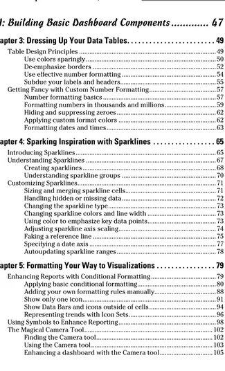
Figure 2-1:
The alternative is to create three layers in your data model: a data layer, an analysis layer, and a presentation layer. You can think of these layers as three different spreadsheets in an Excel workbook. One sheet to hold the raw data that feeds your report, one sheet to serve as a staging area where the data is analyzed and shaped, and one to serve as the presentation layer. Figure 2-2 illustrates the three layers of an effective data model.
As you can see in Figure 2-2, the raw dataset is located on its own sheet. Although the dataset has some level of aggregation applied to keep it manageably small, no further analysis is done on the data sheet.
The analysis layer consists primarily of formulas that analyze and pull data from the data layer into formatted tables commonly referred to as staging tables. These staging tables ultimately feed the reporting components in your presentation layer. In short, the sheet that contains the analysis layer becomes the staging area where data is summarized and shaped to feed the reporting components. Notice in the analysis tab in Figure 2-2, the for-mula bar illustrates that the table consists of forfor-mulas that reference the data tab.
There are a couple of benefits to this setup. First, the entire reporting model can be refreshed easily by simply replacing the raw data with an updated dataset. The formulas in the analysis tab continue to work with the latest data. Second, any additional analysis can easily be created by using different combinations of formulas on the analysis tab. If you need data that doesn’t exist in the data sheet, you can easily append a column to the end of the raw dataset without disturbing the analysis or presentation sheets.
Note that you don’t necessarily have to place your data, analysis, and presen-tation layers on different spreadsheets. In small data models, you may find it easier to place your data in one area of a spreadsheet while building your staging tables in another area of the same spreadsheet.
25
Chapter 2: Building a Super Model
Wherever you choose to place the different layers, keep in mind that the idea remains the same. The analysis layer should primarily consist of formulas that pull data from the data sheets into staging tables used to feed your pre-sentation. Later in this chapter, you explore some of the formulas that can be used in your analysis sheets.
Starting with appropriately
structured data
Not all datasets are created equal. Although some datasets work in a stan-dard Excel environment, they may not work for data modeling purposes. Before building your data model, ensure your source data is appropriately structured for dashboarding purposes.
At the risk of oversimplification, I assert that datasets typically used in Excel come in three fundamental forms:
✓ The spreadsheet report
✓ The flat data file
✓ The tabular dataset
The punch line is that only flat data files and tabular datasets make for effec-tive data models. I review and discuss each of these different forms in the next few sections.
Spreadsheet reports make for ineffective data models
Spreadsheet reports display highly formatted, summarized data and are often designed as presentation tools for management or executive users. A typi-cal spreadsheet report makes judicious use of empty space for formatting, repeats data for aesthetic purposes, and presents only high-level analysis. Figure 2-3 illustrates a spreadsheet report.
Although a spreadsheet report may look nice, it doesn’t make for an effective data model. Why? The primary reason is that these reports offer you no sepa-ration of data, analysis, and presentation. You’re essentially locked into one analysis.
With this setup, you’re forced into very manual processes that are difficult to maintain month after month. Any analysis outside the high-level ones already in the report is basic at best — even with fancy formulas. Furthermore, what happens when you’re required to show bike sales by month? When your data model requires analysis with data that isn’t in the spreadsheet report, you’re forced to search for another dataset.
Flat data files lend themselves nicely to data models
The next type of file format is a flat file. Flat files are data repositories orga-nized by row and column. Each row corresponds to a set of data elements, or a record. Each column is a field. A field corresponds to a unique data element in a record. Figure 2-4 contains the same data as the report in Figure 2-3 but expressed in a flat data file format.
Notice that every data field has a column, and every column corresponds to one data element. Furthermore, there’s no extra spacing, and each row (or record) corresponds to a unique set of information. But the key attribute that makes this a flat file is that no single field uniquely identifies a record. In fact, you’d have to specify four separate fields (Region, Market, Business Segment, and a month’s sales amount) before you could uniquely identify the record.
Flat files lend themselves nicely to data modeling in Excel because they can be detailed enough to hold the data you need and still be conducive to a wide array of analysis with simple formulas — SUM, AVERAGE, VLOOKUP, and SUMIF, just to name a few. Later in this chapter, you explore formulas that come in handy in a reporting data model.
27
Chapter 2: Building a Super Model
Tabular datasets are perfect for pivot table–driven data models
Many effective data models are driven primarily by pivot tables. Pivot tables (which I cover in Chapter 3) are Excel’s premier analysis tools. For those of you who have used pivot tables before, you know they offer an excellent way to summarize and shape data for use by reporting components, such as charts and tables.
Tabular datasets are ideal for pivot table–driven data models. Figure 2-5 illus-trates a tabular dataset. Note that the primary difference between a tabular dataset, as shown in Figure 2-5, and a flat data file is that in tabular datasets the column labels don’t double as actual data. For instance, in Figure 2-4, the month identifiers are integrated into the column labels. In Figure 2-5, the Sales Period column contains the month identifier. This subtle difference in structure is what makes tabular datasets optimal data sources for pivot tables. This structure ensures that key pivot table functions, such as sorting and grouping, work the way they should.
The attributes of a tabular dataset are as follows:
✓ The first row of the dataset contains field labels that describe the infor-mation in each column.
✓ The column labels don’t pull double-duty as data items that can be used as filters or query criterion (such as months, dates, years, regions, mar-kets, and so on).
✓ There are no blank rows or columns — every column has a heading, and a value is in every row.
✓ Each column represents a unique category of data. Figure 2-4:
Avoiding turning your data model
into a database
In Chapter 1, you might have read that measures used on a dashboard should absolutely support the initial purpose of that dashboard. The same concept applies to the back-end data model. You should only import data that’s necessary to fulfill the purpose of your dashboard or report.
In an effort to have as much data as possible at their fingertips, many Excel users bring into their spreadsheets every piece of data they can get their hands on. You can spot these people by the 40 megabyte files they send through e-mail. You’ve seen these spreadsheets — two tabs that contain presentation and then six hidden tabs that contain thousands of lines of data (most of which isn’t used). They essentially build a database in their spreadsheet.
What’s wrong with utilizing as much data as possible? Well, here are a few issues:
✓ Aggregating data within Excel increases the number of formulas. If you’re bringing in all raw data, you have to aggregate that data in Excel. This inevitably causes you to exponentially increase the number of formulas you have to employ and maintain. Remember that your data model is a vehicle for presenting analyses, not processing raw data. The data that works best in reporting mechanisms is what’s already been aggregated and summarized into useful views that can be navigated and fed to dashboard components. Importing data that’s already been aggre-gated as much as possible is far better. For example, if you need to report Figure 2-5:
29
Chapter 2: Building a Super Model
on Revenue by Region and Month, there’s no need to import sales trans-actions into your data model. Instead, use an aggregated table consisting of Region, Month, and Sum of Revenue.
✓ Your data model will be distributed with your dashboard. In other words, because your dashboard is fed by your data model, you need to maintain the model behind the scenes (likely in hidden tabs) when distributing the dashboard. Besides the fact that it causes the file size to be unwieldy, including too much data in your data model can actually degrade the performance of your dashboard. Why? When you open an Excel file, the entire file is loaded into memory or RAM to ensure quick data processing and access. The drawback to this behavior is that Excel requires a great deal of RAM to process even the smallest change in your spreadsheet. You may have noticed that when you try to perform an action on a large formula-intensive dataset, Excel is slow to respond, giving you a Calculating indicator in the status bar. The larger your data-set is, the less efficient the data crunching in Excel is.
✓ Large datasets can cause difficulty in scalability. Imagine that you’re working in a small company and you’re using monthly transactions in your data model. Each month holds 80,000 lines of data. As time goes on, you build a robust process complete with all the formulas, pivot tables, and macros you need to analyze the data that’s stored in your neatly maintained tab. Now what happens after one year? Do you start a new tab? How do you analyze two datasets on two different tabs as one entity? Are your formulas still good? Do you have to write new macros?
These are all issues that can be avoided by importing only aggregated and summarized data that’s useful to the core purpose of your reporting needs.
Using tabs to document and
organize your data model
Wanting to keep your data model limited to one worksheet tab is natural. In my mind, keeping track of one tab is much simpler than using different tabs. However, limiting your data model to one tab has its drawbacks, including the following:
✓ Too much on one tab makes for a confusing data model. When work-ing with large datasets, you need plenty of stagwork-ing tables to aggregate and shape the raw data so that it can be fed to your reporting compo-nents. If you use only one tab, you’re forced to position these staging tables below or to the right of your datasets. Although this may provide all the elements needed to feed your presentation layer, a good deal of scrolling is necessary to view all the elements positioned in a wide range of areas. This makes the data model difficult to understand and maintain. Use separate tabs to hold your analysis and staging tables, particularly in data models that contain large datasets occupying a lot of real estate.
✓ Using one tab limits the amount of documentation you can include.
You’ll find that your data models easily become a complex system of intertwining links among components, input ranges, output ranges, and formulas. Sure, it all makes sense while you’re building your data model, but try coming back to it after a few months. You’ll find you’ve forgot-ten what each data range does and how each range interacts with the final presentation layer. To avoid this problem, consider adding a model map tab to your data model. The model map tab essentially summarizes the key ranges in the data model and allows you to document how each range interacts with the reporting components in the final presentation layer. As you can see in Figure 2-6 the model map is nothing fancy, just a table that lists some key information about each range in the model.
You can include any information you think appropriate in your model map. The idea is to give yourself a handy reference that guides you through the elements in your data model.
Figure 2-6: A model map allows you to
31
Chapter 2: Building a Super Model
Testing your data model before building
reporting components on top of it
This best practice is simple. Make sure your data model does what it’s sup-posed to do before building dashboard components on top of it. In that vein, here are a few things to watch for:
✓ Test your formulas to ensure they’re working properly: Make sure your formulas don’t produce errors and that each formula outputs expected results.
✓ Double-check your main dataset to ensure it’s complete: Check that your data table has not truncated when transferring to Excel. Also, be sure that each column of data is present with appropriate data labels.
✓ Make sure all numeric formatting is appropriate: Be sure that the formatting of your data is appropriate for the field. For example, check to see that dates are formatted as dates, currency values are formatted properly, and that the correct number of decimal places is displayed where needed.
The obvious goal here is to eliminate easily avoidable errors that may cause complications later.
Speaking of documenting your data model . . .
Another way to document the logic in your datamodel is to use comments and labels liberally. It’s amazing how a few explanatory comments and labels can help clarify your spreadsheets. The general idea here is that the logic in your model should be clear to you even after you’ve been away from your data model for a long time. Also, consider using colors to identify the ranges in your data model. Using colors in your data model enables you to quickly look at a range of cells and get a basic indication of what that range does. The general concept
behind this best practice is that each color rep-resents a range type. For example, you could use yellow to represent staging tables used to feed the charts and the tables in your presenta-tion layer. You could use gray to represent for-mulas that aren’t to be altered or touched, or purple to represent reference tables used for lookups and drop-down lists.
Excel Functions That Really Deliver
As you discover in this chapter, the optimal data model for any reporting mechanism is one in which data, analysis, and presentation are separated into three layers. Although all three layers are important, the analysis layer is where the real art comes into play. The fundamental task of the analysis layer is to pull information from the data layer and then create staging tables that feed your charts, tables, and other reporting components. To do this effec-tively, you need to employ formulas that serve as data delivery
mechanisms — formulas that deliver data to a destination range.
You see, the information you need lives in your data layer (typically a table containing aggregated data). Data delivery formulas are designed to get that data and deliver it to the analysis layer so it can be analyzed and shaped. The cool thing is that after you’ve set up you data delivery formulas, your analy-sis layer automatically updates each time your data layer is refreshed.
Confused? Don’t worry — in this section, I show you a few Excel functions that work particularly well in data delivery formulas. As you go through the examples here, you’ll start to see how these concepts come together.
The VLOOKUP function
The VLOOKUP function is the king of all lookup functions in Excel. I’d be willing to bet you’ve at least heard of VLOOKUP, if not used it a few times yourself. The purpose of VLOOKUP is to find a specific value from a column of data where the leftmost row value matches a given criterion.
VLOOKUP basics
Take a look at Figure 2-7 to get the general idea. The table on the left shows sales by month and product number. The bottom table translates those prod-uct numbers to actual prodprod-uct names. The VLOOKUP function can help in associating the appropriate name to each respective product number.
To understand how VLOOKUP formulas work, take a moment to review the basic syntax. A VLOOKUP formula requires four arguments:
VLOOKUP(Lookup_value, Table_array, Col_index_num, Range_lookup)
33
Chapter 2: Building a Super Model
Table_array: The Table_array argument specifies the range that contains the lookup values. In Figure 2-7, that range is D16:E22. Here are a couple points to keep in mind with this argument. First, for a VLOOKUP to work, the leftmost column of the table must be the matching value. For instance, if you’re trying to match product numbers, the leftmost column of the lookup table must contain product numbers. Second, notice that the reference used for this argument is an absolute reference. This means the column and row references are prefixed with dollar ($) signs — as in $D$16:$E$22. This ensures that the references don’t shift while you copy the formulas down or across.
Col_index_num: The Col_index_num argument identifies the column number in the lookup table that contains the value to be returned. In the example in Figure 2-7, the second column contains the product name (the value being looked up), so the formula uses the number 2. If the product name column was the fourth column in the lookup table, the number 4 would be used.
Range_lookup: The Range_lookup argument specifies whether you’re looking for an exact match or an approximate match. If an exact match is needed, you’d enter FALSE for this argument. If the closest match will do, you’d enter TRUE or leave the argument blank.
Applying VLOOKUP formulas in a data model
As you can imagine, there are countless ways to apply a VLOOKUP formula in your data model. No reason to start bland though. One of the more intriguing ways is to implement VLOOKUPs.
Figure 2-8: Using the VLOOKUP function to extract and shape data.
To see this effect in action, get the Chapter 2Samples.xlsx workbook from this book’s companion website. Open that workbook to see a
VLOOKUP1 tab.
The data layer in the model shown in Figure 2-8 resides in the range
A9:F209. The analysis layer is held in range E2:F6. The data layer consists of all formulas that extract and shape the data as needed. As you can see, the VLOOKUP formulas use the Customer Name value in cell C3 to look up the appropriate data from the data layer. So, if you entered Chevron in cell C3, the VLOOKUP formulas would extract the data for Chevron.
You may have noticed that the VLOOKUP formulas in Figure 2-8 specify a Table_array argument of $C$9:$F$5000. This means that the lookup table they’re pointing to stretches from C9 to F5000. That seems strange because the table ends at F209. Why would you force your VLOOKUP formulas to look at a range far past the end of the data table?
35
Chapter 2: Building a Super Model
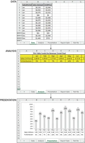
Later in this chapter, I show you how to automatically keep up with growing data tables by using smart tables.
Using data validation drop-down lists in your data model
In the example illustrated in Figure 2-8, the data model allows you to select customer names from a drop-down list when you click cell C3. The customer name serves as the lookup value for the VLOOKUP formulas. Changing the customer name extracts a new set of data from the data layer. This allows you to quickly switch from one customer to another without having to remember and type the customer name.
Now, as cool as this seems, the reasons for this setup aren’t all cosmetic. There are practical reasons for adding drop-down lists to your data models.
Many of your models consist of multiple analytical layers in which each shows a different set of analyses. Although each analysis layer is differ-ent, they often need to revolve around a shared dimension, such as the same customer name, the same market, or the same region. For instance, when you have a data model that reports on Financials, Labor Statistics, and Operational Volumes, you want to make certain that when the model is reporting financials for the South region, the Labor Statistics are for the South region as well.
An effective way to ensure this happens is to force your formulas to use the same dimension references. If cell C3 is where you switch customers, every analysis that is customer-dependent should reference cell C3. Drop-down lists allow you to have a predefined list of valid variables located in a single cell. With a drop-down list, you can easily switch dimensions while building and testing multiple analysis layers.
Adding a drop-down list is relatively easy with Excel’s Data Validation func-tionality. To add a drop-down list, follow these steps:
1. Select the Data tab on the Ribbon. 2. Click the Data Validation button.
3. Select the Settings tab in the newly activated Data Validation dialog box; see Figure 2-9.
4. In the Allow drop-down list, choose List.
5. In the Source input box, reference the range of cells that contain your predefined selection list.