Anomaly Detection for Monitoring
A Statistical Approach to Time Series Anomaly Detection
Anomaly Detection for Monitoring
by Preetam Jinka and Baron Schwartz
Copyright © 2015 O’Reilly Media, Inc. All rights reserved. Printed in the United States of America.
Published by O’Reilly Media, Inc., 1005 Gravenstein Highway North, Sebastopol, CA 95472. O’Reilly books may be purchased for educational, business, or sales promotional use. Online editions are also available for most titles (http://safaribooksonline.com). For more information, contact our corporate/institutional sales department: 800-998-9938 or [email protected] .
Editor: Brian Anderson
The O’Reilly logo is a registered trademark of O’Reilly Media, Inc. Anomaly Detection for Monitoring, the cover image, and related trade dress are trademarks of O’Reilly Media, Inc. While the publisher and the authors have used good faith efforts to ensure that the information and instructions contained in this work are accurate, the publisher and the authors disclaim all
responsibility for errors or omissions, including without limitation responsibility for damages
resulting from the use of or reliance on this work. Use of the information and instructions contained in this work is at your own risk. If any code samples or other technology this work contains or describes is subject to open source licenses or the intellectual property rights of others, it is your responsibility to ensure that your use thereof complies with such licenses and/or rights.
Foreword
Monitoring is currently undergoing a significant change. Until two or three years ago, the main focus of monitoring tools was to provide more and better data. Interpretation and visualization has too often been an afterthought. While industries like e-commerce have jumped on the data analytics train very early, monitoring systems still need to catch up.
These days, systems are getting larger and more dynamic. Running hundreds of thousands of servers with continuous new code pushes in elastic, self-scaling server environments makes data
interpretation more complex than ever. We as an industry have reached a point where we need software tooling to augment our human analytical skills to master this challenge.
At Ruxit, we develop next-generation monitoring solutions based on artificial intelligence and deep data (large amounts of highly interlinked pieces of information). Building self-learning monitoring systems—while still in its early days—helps operations teams to focus on core tasks rather than trying to interpret a wall of charts. Intelligent monitoring is also at the core of the DevOps movement, as well-interpreted information enables sharing across organisations.
Whenever I give a talk about this topic, at least one person raises the question about where he can buy a book to learn more about the topic. This was a tough question to answer, as most literature is
targeted toward mathematicians—if you want to learn more on topics like anomaly detection, you are quickly exposed to very advanced content. This book, written by practitioners in the space, finds the perfect balance. I will definitely add it to my reading recommendations.
Alois Reitbauer,
Chapter 1. Introduction
Wouldn’t it be amazing to have a system that warned you about new behaviors and data patterns in time to fix problems before they happened, or seize opportunities the moment they arise? Wouldn’t it be incredible if this system was completely foolproof, warning you about every important change, but never ringing the alarm bell when it shouldn’t? That system is the holy grail of anomaly detection. It doesn’t exist, and probably never will. However, we shouldn’t let imperfection make us lose sight of the fact that useful anomaly detection is possible, and benefits those who apply it appropriately. Anomaly detection is a set of techniques and systems to find unusual behaviors and/or states in systems and their observable signals. We hope that people who read this book do so because they believe in the promise of anomaly detection, but are confused by the furious debates in thought-leadership circles surrounding the topic. We intend this book to help demystify the topic and clarify some of the fundamental choices that have to be made in constructing anomaly detection mechanisms. We want readers to understand why some approaches to anomaly detection work better than others in some situations, and why a better solution for some challenges may be within reach after all.
This book is not intended to be a comprehensive source for all information on the subject. That book would be 1000 pages long and would be incomplete at that. It is also not intended to be a step-by-step guide to building an anomaly detection system that will work well for all applications—we’re pretty sure that a “general solution” to anomaly detection is impossible. We believe the best approach for a given situation is dependent on many factors, not least of which is the cost/benefit analysis of building more complex systems. We hope this book will help you navigate the labyrinth by outlining the
tradeoffs associated with different approaches to anomaly detection, which will help you make judgments as you reach forks in the road.
We decided to write this book after several years of work applying anomaly detection to our own problems in monitoring and related use cases. Both of us work at VividCortex, where we work on a large-scale, specialized form of database monitoring. At VividCortex, we have flexed our anomaly detection muscles in a number of ways. We have built, and more importantly discarded, dozens of anomaly detectors over the last several years. But not only that, we were working on anomaly detection in monitoring systems even before VividCortex. We have tried statistical, heuristic, machine learning, and other techniques.
We have also engaged with our peers in monitoring, DevOps, anomaly detection, and a variety of other disciplines. We have developed a deep and abiding respect for many people, projects and products, and companies including Ruxit among others. We have tried to share our challenges, successes, and failures through blogs, open-source software, conference talks, and now this book.
Monitoring, the practice of observing systems and determining if they’re healthy, is hard and getting harder. There are many reasons for this: we are managing many more systems (servers and
applications or services) and much more data than ever before, and we are monitoring them in higher resolution. Companies such as Etsy have convinced the community that it is not only possible but desirable to monitor practically everything we can, so we are also monitoring many more signals from these systems than we used to.
Any of these changes presents a challenge, but collectively they present a very difficult one indeed. As a result, now we struggle with making sense out of all of these metrics.
Traditional ways of monitoring all of these metrics can no longer do the job adequately. There is simply too much data to monitor.
Many of us are used to monitoring visually by actually watching charts on the computer or on the wall, or using thresholds with systems like Nagios. Thresholds actually represent one of the main reasons that monitoring is too hard to do effectively. Thresholds, put simply, don’t work very well. Setting a threshold on a metric requires a system administrator or DevOps practitioner to make a decision about the correct value to configure.
The problem is, there is no correct value. A static threshold is just that: static. It does not change over time, and by default it is applied uniformly to all servers. But systems are neither similar nor static. Each system is different from every other, and even individual systems change, both over the long term, and hour to hour or minute to minute.
The result is that thresholds are too much work to set up and maintain, and cause too many false alarms and missed alarms. False alarms, because normal behavior is flagged as a problem, and missed alarms, because the threshold is set at a level that fails to catch a problem.
You may not realize it, but threshold-based monitoring is actually a crude form of anomaly detection. When the metric crosses the threshold and triggers an alert, it’s really flagging the value of the metric as anomalous. The root of the problem is that this form of anomaly detection cannot adapt to the system’s unique and changing behavior. It cannot learn what is normal.
Another way you are already using anomaly detection techniques is with features such as Nagios’s flapping suppression, which disallows alarms when a check’s result oscillates between states. This is a crude form of a low-pass filter, a signal-processing technique to discard noise. It works, but not all that well because its idea of noise is not very sophisticated.
A common assumption is that more sophisticated anomaly detection can solve all of these problems. We assume that anomaly detection can help us reduce false alarms and missed alarms. We assume that it can help us find problems more accurately with less work. We assume that it can suppress noisy alerts when systems are in unstable states. We assume that it can learn what is normal for a system, automatically and with zero configuration.
able to understand the capabilities and limitations of anomaly detection, and to select the right tool for the task at hand.
The Many Kinds of Anomaly Detection
Anomaly detection is a complicated subject. You might understand this already, but nevertheless it is probably still more complicated than you believe. There are many kinds of anomaly detection
techniques. Each technique has a dizzying number of variations. Each of these is suitable, or
unsuitable, for use in a number of scenarios. Each of them has a number of edge cases that can cause poor results. And many of them are based on advanced math, statistics, or other disciplines that are beyond the reach of most of us.
Still, there are lots of success stories for anomaly detection in general. In fact, as a profession, we are late at applying anomaly detection on a large scale to monitoring. It certainly has been done, but if you look at other professions, various types of anomaly detection are standard practice. This applies to domains such as credit card fraud detection, monitoring for terrorist activity, finance, weather, gambling, and many more too numerous to mention. In contrast to this, in systems monitoring we generally do not regard anomaly detection as a standard practice, but rather as something potentially promising but leading edge.
The authors of this book agree with this assessment, by and large. We also see a number of obstacles to be overcome before anomaly detection is regarded as a standard part of the monitoring toolkit:
It is difficult to get started, because there’s so much to learn before you can even start to get results.
Even if you do a lot of work and the results seem promising, when you deploy something into production you can find poor results often enough that nothing usable comes of your efforts.
General-purpose solutions are either impossible or extremely difficult to achieve in many domains. This is partially because of the incredible diversity of machine data. There are also apparently an almost infinite number of edge cases and potholes that can trip you up. In many of these cases, things appear to work well even when they really don’t, or they accidentally work well, leading you to think that it is by design. In other words, whether something is actually working or not is a very subtle thing to determine.
There seems to be an unlimited supply of poor and incomplete information to be found on the Internet and in other sources. Some of it is probably even in this book.
Anomaly detection is such a trendy topic, and it is currently so cool and thought-leadery to write or talk about it, that there seem to be incentives for adding insult to the already injurious amount of poor information just mentioned.
unintuitive, and often have surprising outcomes. In the authors’ experience, few things can lead you astray more quickly than applying intuition to statistics.
As a result, anomaly detection seems to be a topic that is all about extremes. Some people try it, or observe other people’s efforts and results, and conclude that it is impossible or difficult. They give up hope. This is one extreme. At the other extreme, some people find good results, or believe they have found good results, at least in some specific scenario. They mistakenly think they have found a general purpose solution that will work in many more scenarios, and they evangelize it a little too much. This overenthusiasm can result in negative press and vilification from other people. Thus, we seem to veer between holy grails and despondency. Each extreme is actually an overcorrection that feeds back into the cycle.
Sadly, none of this does much to educate people about the true nature and benefits of anomaly detection. One outcome is that a lot of people are missing out on benefits that they could be getting. Another is that they may not be informed enough to have realistic opinions about commercially available anomaly detection solutions. As Zen Master Hakuin said,
Not knowing how near the truth is, we seek it far away.
Conclusions
If you are like most of our friends in the DevOps and web operations communities, you probably picked up this book because you’ve been hearing a lot about anomaly detection in the last few years, and you’re intrigued by it. In addition to the previously-mentioned goal of making assumptions
explicit, we hope to be able to achieve a number of outcomes in this book.
We want to help orient you to the subject and the landscape in general. We want you to have a frame of reference for thinking about anomaly detection, so you can make your own decisions.
We want to help you understand how to assess not only the meaning of the answers you get from anomaly detection algorithms, but how trustworthy the answers might be.
We want to teach you some things that you can actually apply to your own systems and your own problems. We don’t want this to be just a bunch of theory. We want you to put it into practice.
We want your time spent reading this book to be useful beyond this book. We want you to be able to apply what you have learned to topics we don’t cover in this book.
If you already know anything about anomaly detection, statistics, or any of the other things we cover in this book, you’re going to see that we omit or gloss over a lot of important information. That is inevitable. From prior experience, we have learned that it is better to help people form useful thought processes and mental models than to tell them what to think.
you already do, and learn a new trick or two, rather than solving world hunger. If you ask, “what can I do that’s a little better than Nagios?” you’re on the right track.
Anomaly detection is not a black and white topic. There is a lot of gray area, a lot of middle ground. Despite the complexity and richness of the subject matter, it is both fun and productive. And despite the difficulty, there is a lot of promise for applying it in practice.
Chapter 2. A Crash Course in Anomaly
Detection
This isn’t a book about the overall breadth and depth of anomaly detection. It is specifically about applying anomaly detection to solve common problems that the DevOps community faces when trying to monitor the types of systems that we manage the most.
One of the implications is that this book is mostly about time series anomaly detection. It also means that we focus on widely used tools such as Graphite, JavaScript, R, and Python. There are several reasons for these choices, based on assumptions we’re making.
We assume that our audience is largely like ourselves: developers, system administrators, database administrators, and DevOps practitioners using mostly open source tools.
Neither of us has a doctorate in a field such as statistics or operations research, and we assume you don’t either.
We assume that you are doing time series monitoring, much like we are.
As a result of these assumptions, this book is quite biased. It is all about anomaly detection on metrics, and we will not cover anomaly detection on configuration, comparing machines amongst each other, log analysis, clustering similar kinds of things together, or many other types of anomaly detection. We also focus on detecting anomalies as they happen, because that is usually what we are trying to do with our monitoring systems.
A Real Example of Anomaly Detection
Around the year 2008, Evan Miller published a paper describing real-time anomaly detection in operation at IMVU.1 This was Baron’s first exposure to anomaly detection:
At approximately 5 AM Friday, it first detects a problem [in the number of IMVU users who invited their Hotmail contacts to open an account], which persists most of the day. In fact, an external service provider had changed an interface early Friday morning, affecting some but not all of our users.
They detected an unusual change in a really erratic signal. Mind. Blown. Magic!
The anomaly detection method was Holt-Winters forecasting. It is relatively crude by some standards, but nevertheless can be applied with good results to carefully selected metrics that follow predictable patterns. Miller went on to mention other examples where the same technique had helped engineers find problems and solve them quickly.
How can you achieve similar results on your systems? To answer this, first we need to consider what anomaly detection is and isn’t, and what it’s good and bad at doing.
What Is Anomaly Detection?
Anomaly detection is a way to help find signal in noisy metrics. The usual definition of “anomaly” is an unusual or unexpected event or value. In the context of anomaly detection on monitoring metrics, we care about unexpected values of those metrics.
Anomalies can have many causes. It is important to recognize that the anomaly in the metric that we are observing is not the same as the condition in the system that produced the metric. By assuming that an anomaly in a metric indicates a problem in the system, we are making a mental and practical leap that may or may not be justified. Anomaly detection doesn’t understand anything about your systems. It just understands your definition of unusual or abnormal values.
with “statistically improbable.” This is common practice and often implicit, but you should be aware of the difference.
A common confusion is thinking that anomalies are the same as outliers (values that are very distant from typical values). In fact, outliers are common, and they should be regarded as normal and
expected. Anomalies are outliers, at least in most cases, but not all outliers are anomalies.
What Is It Good for?
Anomaly detection has a variety of use cases. Even within the scope of this book, which we previously indicated is rather small, anomaly detection can do a lot of things:
It can find unusual values of metrics in order to surface undetected problems. An example is a server that gets suspiciously busy or idle, or a smaller than expected number of events in an interval of time, as in the IMVU example.
It can find changes in an important metric or process, so that humans can investigate and figure out why.
It can reduce the surface area or search space when trying to diagnose a problem that has been detected. In a world of millions of metrics, being able to find metrics that are behaving unusually at the moment of a problem is a valuable way to narrow the search.
It can reduce the need to calibrate or recalibrate thresholds across a variety of different machines or services.
It can augment human intuition and judgment, a little bit like the Iron Man’s suit augments his strength.
Anomaly detection cannot do a lot of things people sometimes think it can. For example: It cannot provide a root cause analysis or diagnosis, although it can certainly assist in that.
It cannot provide hard yes or no answers about whether there is an anomaly, because at best it is limited to the probability of whether there might be an anomaly or not. (Even humans are often unable to determine conclusively that a value is anomalous.)
It cannot prove that there is an anomaly in the system, only that there is something unusual about the
metric that you are observing. Remember, the metric isn’t the system itself.
It cannot detect actual system faults (failures), because a fault is different from an anomaly. (See the previous point again.)
It cannot understand the meaning of metrics.
And in general, it cannot work generically across all systems, all metrics, all time ranges, and all frequency scales.
This last item is quite important to understand. There are pathological cases where every known method of anomaly detection, every statistical technique, every test, every false positive filter,
everything, will break down and fail. And on large data sets, such as those you get when monitoring lots of metrics from lots of machines at high resolution in a modern application, you will find these pathological cases, guaranteed.
In particular, at a high resolution such as one-second metrics resolution, most machine-generated metrics are extremely noisy, and will cause most anomaly detection techniques to throw off lots and lots of false positives.
ARE ANOMALIES RARE?
Depending on how you look at it, anomalies are either rare or common. The usual definition of an anomaly uses probabilities as a proxy for unusualness. A rule of thumb that shows up often is three standard deviations away from the mean. This is a technique that we will discuss in depth later, but for now it suffices to say that if we assume the data behaves exactly as expected, 99.73% of observations will fall within three sigmas. In other words, slightly less than three observations per thousand will be considered anomalous.
That sounds pretty rare, but given that there are 1,440 minutes per day, you’ll still be flagging about 4 observations as anomalous every single day, even in one minute granularity. If you use one second granularity, you can multiply that number by 60. Suddenly these rare events seem incredibly common. One might even call them noisy, no?
Is this what you want on every metric on every server that you manage? You make up your own mind how you feel about that. The point is that many people probably assume that anomaly detection finds rare events, but in reality that assumption doesn’t always hold.
How Can You Use Anomaly Detection?
To apply anomaly detection in practice, you generally have two options, at least within the scope of things considered in this book. Option one is to generate alerts, and option two is to record events for later analysis but don’t alert on them.
Generating alerts from anomalies in metrics is a bit dangerous. Part of this is because the assumption that anomalies are rare isn’t as true as you may think. See the sidebar. A naive approach to alerting on anomalies is almost certain to cause a lot of noise.
Our suggestion is not to alert on most anomalies. This follows directly from the fact that anomalies do not imply that a system is in a bad state. In other words, there is a big difference between an
anomalous observation in a metric, and an actual system fault. If you can guarantee that an anomaly reliably detects a serious problem in your system, that’s great. Go ahead and alert on it. But
otherwise, we suggest that you don’t alert on things that may have no impact or consequence.
case it is interesting. For example, during diagnosis of a problem that you have detected.
One of the assumptions embedded in this recommendation is that anomaly detection is cheap enough to do online in one pass as data arrives into your monitoring system, but that ad hoc, after-the-fact anomaly detection is too costly to do interactively. With the monitoring data sizes that we are seeing in the industry today, and the attitude that you should “measure everything that moves,” this is
generally the case. Multi-terabyte anomaly detection analysis is usually unacceptably slow and requires more resources than you have available. Again, we are placing this in the context of what most of us are doing for monitoring, using typical open-source tools and methodologies.
Conclusions
Although it’s easy to get excited about success stories in anomaly detection, most of the time someone else’s techniques will not translate directly to your systems and your data. That’s why you have to learn for yourself what works, what’s appropriate to use in some situations and not in others, and the like.
Our suggestion, which will frame the discussion in the rest of this book, is that, generally speaking, you probably should use anomaly detection “online” as your data arrives. Store the results, but don’t alert on them in most cases. And keep in mind that the map is not the territory: the metric isn’t the system, an anomaly isn’t a crisis, three sigmas isn’t unlikely, and so on.
“Aberrant Behavior Detection in Time Series for Monitoring Business-Critical Metrics”
Chapter 3. Modeling and Predicting
Anomaly detection is based on predictions derived from models. In simple terms, a model is a way to express your previous knowledge about a system and how you expect it to work. A model can be as simple as a single mathematical equation.
Models are convenient because they give us a way to describe a potentially complicated process or system. In some cases, models directly describe processes that govern a system’s behavior. For example, VividCortex’s Adaptive Fault Detection algorithm uses Little’s law1 because we know that the systems we monitor obey this law. On the other hand, you may have a process whose mechanisms and governing principles aren’t evident, and as a result doesn’t have a clearly defined model. In these cases you can try to fit a model to the observed system behavior as best you can.
Why is modeling so important? With anomaly detection, you’re interested in finding what is unusual, but first you have to know what to expect. This means you have to make a prediction. Even if it’s implicit and unstated, this prediction process requires a model. Then you can compare the observed behavior to the model’s prediction.
Almost all online time series anomaly detection works by comparing the current value to a prediction based on previous values. Online means you’re doing anomaly detection as you see each new value appear, and online anomaly detection is a major focus of this book because it’s the only way to find system problems as they happen. Online methods are not instantaneous—there may be some delay— but they are the alternative to gathering a chunk of data and performing analysis after the fact, which often finds problems too late.
Online anomaly detection methods need two things: past data and a model. Together, they are the essential components for generating predictions.
There are lots of canned models available and ready to use. You can usually find them implemented in an R package. You’ll also find models implicitly encoded in common methods. Statistical process control is an example, and because it is so ubiquitous, we’re going to look at that next.
Statistical Process Control
Statistical process control (SPC) is based on operations research to implement quality control in engineering systems such as manufacturing. In manufacturing, it’s important to check that the assembly line achieves a desired level of quality so problems can be corrected before a lot of time and money is wasted.
SPC describes a framework behind a family of methods, each progressing in sophistication. The
Engineering Statistics Handbook is an excellent resource to get more detailed information about process control techniques in general.2 We’ll explain some common SPC methods in order of complexity.
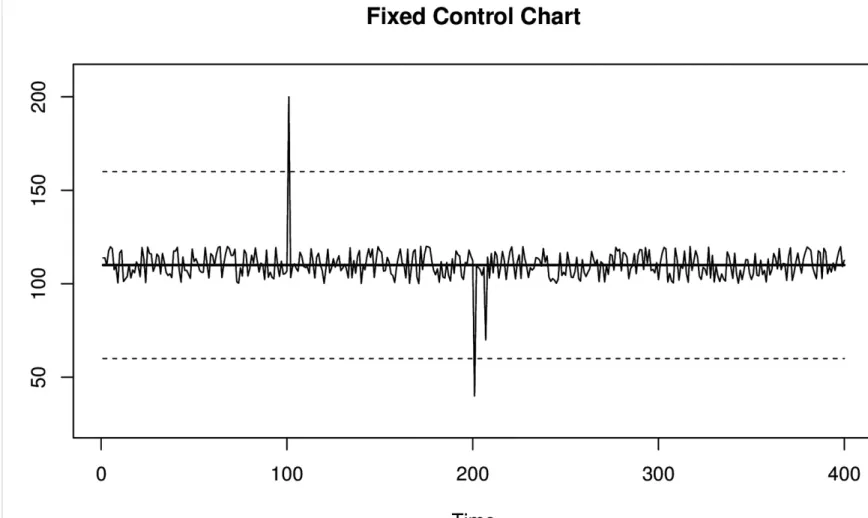
Basic Control Chart
The most basic SPC method is a control chart that represents values as clustered around a mean and control limits. This is also known as the Shewhart control chart. The fixed mean is a value that we expect (say, the size of the drill bit), and the control lines are fixed some number of standard
deviations away from that mean. If you’ve heard of the three sigma rule, this is what it’s about. Three sigmas represents three standard deviations away from the mean. The two control lines surrounding the mean represent an acceptable range of values.
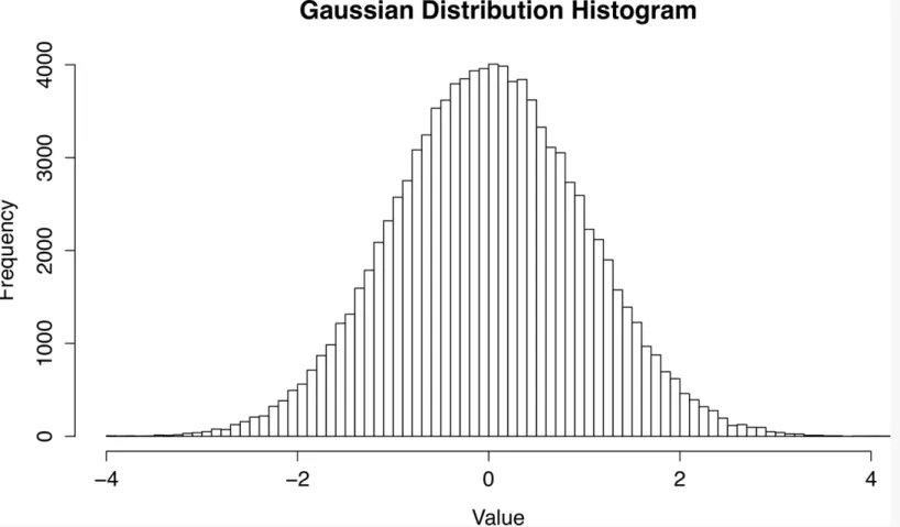
THE GAUSSIAN (NORMAL) DISTRIBUTION
A distribution represents how frequently each possible value occurs. Histograms are often used to visualize distributions. The Gaussian distribution, also called the normal distribution or “bell curve,” is a commonly used distribution in statistics that is also ubiquitous in the natural world. Many natural phenomena such as coin flips, human characteristics such as height, and astronomical observations have been shown to be at least approximately normally distributed.3 The Gaussian distribution has many nice
mathematical properties, is well understood, and is the basis for lots of statistical methods.
Figure 3-1. Histogram of the Gaussian distribution with mean 0 and standard deviation 1.
spread of values is constant. As a formula, this set of assumptions can be expressed as: y = μ + ɛ. The letter μ represents a constant mean, and ɛ is a random variable representing noise or error in the system.
In the case of the basic control chart model, ɛ is assumed to be a Gaussian distributed random variable.
Control charts have the following characteristics:
They assume a fixed or known mean and spread of values.
The values are assumed to be Gaussian (normally) distributed around the mean.
They can detect one or multiple points that are outside the desired range.
Figure 3-2. A basic control chart with fixed control limits, which are represented with dashed lines. Values are considered to be anomalous if they cross the control limits.
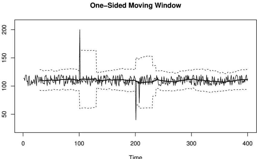
Moving Window Control Chart
anomalies. To fix this problem, the control chart needs to adapt to a changing mean and spread over time. There are two basic ways to do this:
Slice up your control chart into smaller time ranges or fixed windows, and treat each window as its own independent fixed control chart with a different mean and spread. The values within each window are used to compute the mean and standard deviation for that window. Within a small interval, everything looks like a regular fixed control chart. At a larger scale, what you have is a control chart that changes across windows.
Use a moving window, also called a sliding window. Instead of using predefined time ranges to construct windows, at each point you generate a moving window that covers the previous N points. The benefit is that instead of having a fixed mean within a time range, the mean changes after each value yet still considers the same number of points to compute the mean.
Moving windows have major disadvantages. You have to keep track of recent history because you need to consider all of the values that fall into a window. Depending on the size of your windows, this can be computationally expensive, especially when tracking a large number of metrics. Windows also have poor characteristics in the presence of large spikes. When a spike enters a window, it causes an abrupt shift in the window until the spike eventually leaves, which causes another abrupt shift.
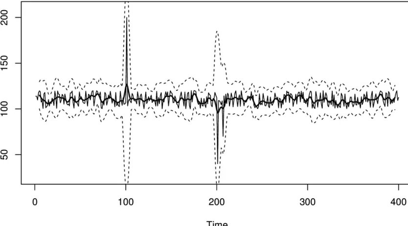
Figure 3-3. A moving window control chart. Unlike the fixed control chart shown in Figure 3-2, this moving window control chart has an adaptive control line and control limits. After each anomalous spike, the control limits widen to form a noticeable
Moving window control charts have the following characteristics:
They require you to keep some amount of historical data to compute the mean and control limits.
The values are assumed to be Gaussian (normally) distributed around the mean.
They can detect one or multiple points that are outside the desired range.
Spikes in the data can cause abrupt changes in parameters when they are in the distant past (when they exit the window).
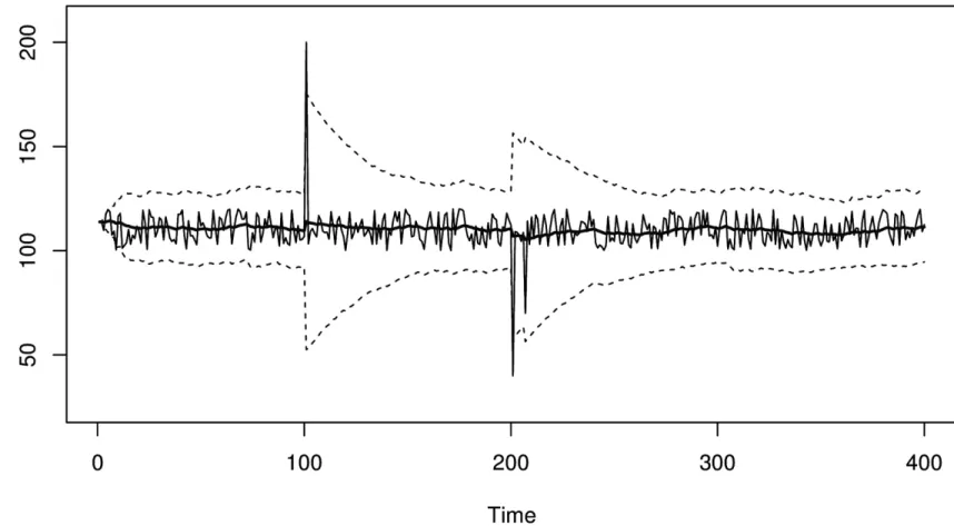
Exponentially Weighted Control Chart
An exponentially weighted control chart solves the “spike-exiting problem,” where distant history influences control lines, by replacing the fixed-length moving windows with an infinitely large,
gradually decaying window. This is made possible using an exponentially weighted moving average.
EXPONENTIALLY WEIGHTED MOVING AVERAGE
An exponentially weighted moving average (EWMA) is an alternative to moving windows for computing moving averages. Instead of using a fixed number of values to compute an average within a window, an EWMA considers all previous points but places higher weights on more recent data. This weighting, as the name suggests, decays exponentially. The implementation, however, uses only a single value so it doesn’t have to “remember” a lot of historical data.
EWMAs are used everywhere from UNIX load averages to stock market predictions and reporting, so you’ve probably had at least some experience with them already! They have very little to do with the field of statistics itself or Gaussian distributions, but are very useful in monitoring because they use hardly any memory or CPU.
One disadvantage of EWMAs is that their values are nondeterministic because they essentially have infinite history. This can make them difficult to troubleshoot.
EWMAs are continuously decaying windows. Values never “move out” of the tail of an EWMA, so there will never be an abrupt shift in the control chart when a large value gets older. However,
because there is an immediate transition into the head of a EWMA, there will still be abrupt shifts in a EWMA control chart when a large value is first observed. This is generally not as bad a problem, because although the smoothed value changes a lot, it’s changing in response to current data instead of very old data.
Using an EWMA as the mean in a control chart is simple enough, but what about the control limit lines? With the fixed-length windows, you can trivially calculate the standard deviation within a
Figure 3-4. An exponentially weighted moving window control chart. This is similar to Figure 3-3, except it doesn’t suffer from the sudden change in control limit width when an anomalous value ages.
Exponentially weighted control charts have the following characteristics: They are memory- and CPU-efficient.
The values are assumed to be Gaussian (normally) distributed around the mean.
They can detect one or multiple points that are outside the desired range.
A spike can temporarily inflate the control lines enough to cause missed alarms afterwards.
They can be difficult to debug because the EWMA’s value can be hard to determine from the data itself, since it is based on potentially “infinite” history.
Window Functions
Sliding windows and EWMAs are part of a much bigger category of window functions. They are window functions with two and one sharp edges, respectively.
Figure 3-5. A window function control chart. This time, the window is formed with values on both sides of the current value. As a result, anomalous spikes won’t generate abrupt shifts in control limits even when they first enter the window.
The downside to window functions is that they require a larger time delay, which is a result of not knowing the smoothed value until enough future values have been observed. This is because when you center a bidirectional windowing function on “now,” it extends into the future. In practice, EWMAs are a good enough compromise for situations where you can’t measure or wait for future values. Control charts based on bidirectional smoothing have the following characteristics:
They will introduce time lag into calculations. If you smooth symmetrically over 60
second-windows, you won’t know the smoothed value of “now” until 30 seconds—half the window—has passed.
Like sliding windows, they require more memory and CPU to compute.
Like all the SPC control charts we’ve discussed thus far, they assume Gaussian distribution of data.
More Advanced Time Series Modeling
There are entire families of time series models and methods that are more advanced than what we’ve covered so far. In particular, the ARIMA family of time series models and the surrounding
introduction to statistical time series. These models express more complicated characteristics, such as time series whose current values depend on a given number of values from some distance in the past. ARIMA models are widely studied and very flexible, and form a solid foundation for advanced time series analysis. The Engineering Statistics Handbook has several sections4 covering ARIMA models, among others. Forecasting: principles and practice is another introductory resource.5 You can apply many extensions and enchancements to these models, but the methodology generally stays the same. The idea is to fit or train a model to sample data. Fitting means that parameters (coefficients) are adjusted to minimize the deviations between the sample data and the model’s
prediction. Then you can use the parameters to make predictions or draw useful conclusions. Because these models and techniques are so popular, there are plenty of packages and code resources
available in R and other platforms.
The ARIMA family of models has a number of “on/off toggles” that include or exclude particular portions of the models, each of which can be adjusted if it’s enabled. As a result, they are extremely modular and flexible, and can vary from simple to quite complex.
In general, there are lots of models, and with a little bit of work you can often find one that fits your data extremely well (and thus has high predictive power). But the real value in studying and
understanding the Box-Jenkins approach is the method itself, which remains consistent across all of the models and provides a logical way to reason about time series analysis.
PARAMETRIC AND NON-PARAMETRIC STATISTICS AND METHODS
Perhaps you have heard of parametric methods. These are statistical methods or tools that have coefficients that must be specified or chosen via fitting. Most of the things we’ve mentioned thus far have parameters. For example, EWMAs have a decay
parameter you can adjust to bias the value towards more recent or more historical data. The value of a mean is also a parameter. ARIMA models are full of parameters. Common statistical tools, such as the Gaussian distribution, have parameters (mean and spread).
Non-parametric methods work independently of these parameters. You might think of them as operating on dimensionless quantities. This makes them more robust in some ways, but also can reduce their descriptive power.
Predicting Time Series Data
Although we haven’t talked yet about prediction, all of the tools we’ve discussed thus far are
designed for predictions. Prediction is one of the foundations of anomaly detection. Evaluating any metric’s value has to be done by comparing it to “what it should be,” which is a prediction.
For anomaly detection, we’re usually interested in predicting one step ahead, then comparing this prediction to the next value we see. Just as with SPC and control charts, there’s a spectrum of prediction methods, increasing in complexity:
doesn’t work well if systems aren’t stable (stationary) over time.
2. The next level of sophistication is to predict that the next value will be the same as the recent central tendency instead. The term central tendency refers to summary statistics: single values that attempt to be as descriptive as possible about a collection of data. With summary statistics, your prediction formula then becomes something like “the next value will be the same as the current average of recent values.” Now you’re predicting that values will most likely be close to what they’ve typically been like recently. You can replace “average” with median, EWMA, or other descriptive summary statistics.
3. One step beyond this is predicting a likely range of values centered around a summary statistic. This usually boils down to a simple mean for the central value and standard deviation for the spread, or an EWMA with EWMA control limits (analogous to mean and standard deviation, but exponentially smoothed).
4. All of these methods use parameters (e.g., the mean and standard deviation). Non-parametric methods, such as histograms of historical values, can also be used. We’ll discuss these in more detail later in this book.
We can take prediction to an even higher level of sophistication using more complicated models, such as those from the ARIMA family. Furthermore, you can also attempt to build your own models based on a combination of metrics, and use the corresponding output to feed into a control chart. We’ll also discuss that later in this book.
Prediction is a difficult problem in general, but it’s especially difficult when dealing with machine data. Machine data comes in many shapes and sizes, and it’s unreasonable to expect a single method or approach to work for all cases.
In our experience, most anomaly detection success stories work because the specific data they’re using doesn’t hit a pathology. Lots of machine data has simple pathologies that break many models quickly. That makes accurate, robust6 predictions harder than you might think.
Evaluating Predictions
One of the most important and subtle parts of anomaly detection happens at the intersection between predicting how a metric should behave, and comparing observed values to those expectations.
In anomaly detection, you’re usually using many standard deviations from the mean as a replacement for very unlikely, and when you get far from the mean, you’re in the tails of the distribution. The fit tends to be much worse here than you’d expect, so even small deviations from Gaussian can result in many more outliers than you theoretically should get.
after all!
As a result, there’s a good chance your anomaly detection techniques will sometimes give you more false positives than you think they will. These problems will always happen; this is just par for the course. We’ll discuss some ways to mitigate this in later chapters.
Common Myths About Statistical Anomaly Detection
We commonly hear claims that some technique, such as SPC, won’t work because system metrics are not Gaussian. The assertion is that the only workable approaches are complicated non-parametric methods. This is an oversimplification that comes from confusion about statistics.
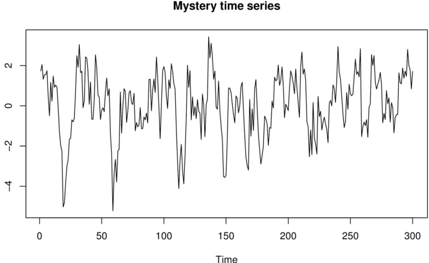
Here’s an example. Suppose you capture a few observations of a “mystery time series.” We’ve plotted this in Figure 3-6.
Figure 3-6. A mysterious time series about which we’ll pretend we know nothing.
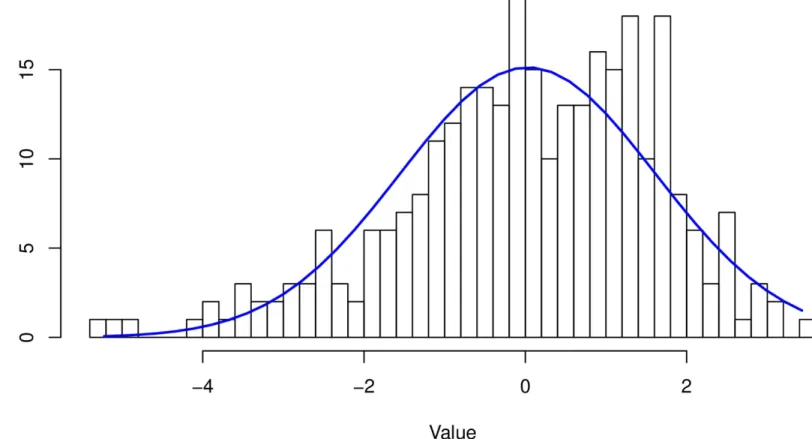
Figure 3-7. Histogram of the mystery time series, overlaid with the normal distribution’s “bell curve.”
Uh-oh! It doesn’t look like a great fit. Should you give up hope? No. You’ve stumbled into statistical quicksand:
It’s not important that the data is Gaussian. What matters is whether the residuals are Gaussian.
The histogram is of the sample of data, but the population, not the sample, is what’s important.
Let’s explore each of these topics.
The Data Doesn’t Need to Be Gaussian
The residuals, not the data, need to be Gaussian (normal) to use three-sigma rules and the like. What are residuals? Residuals are the errors in prediction. They’re the difference between the predictions your model makes, and the values you actually observe.
If you measure a system whose behavior is log-normal, and base your predictions on a model whose predictions are log-normal, and the errors in prediction are normally distributed, a standard SPC control chart of the results using three-sigma confidence intervals can actually work very well.
Likewise, if you have multi-modal data (whose distribution looks like a camel’s humps, perhaps) and your model’s predictions result in normally distributed residuals, you’re doing fine.
are Gaussian. This is super-important to understand. Every type of control chart we discussed previously actually works like this:
It models the metric’s behavior somehow. For example, the EWMA control chart’s implied model is “the next value is likely to be close to the current value of the EWMA.”
It subtracts the prediction from the observed value.
It effectively puts control lines on the residual. The idea is that the residual is now a stable value, centered around zero.
Any control chart can be implemented either way:
Predict, take the residual, find control limits, evaluate whether the residual is out of bounds
Predict, extend the control lines around the predicted value, evaluate whether the value is within bounds
It’s the same thing. It’s just a matter of doing the math in different orders, and the operations are commutative so you get the same answers.7
The whole idea of using control charts is to find a model that predicts your data well enough that the residuals are Gaussian, so you can use three-sigma or similar techniques. This is a useful framework, and if you can make it work, a lot of your work is already done for you.
Sometimes people assume that any old model automatically guarantees Gaussian residuals. It doesn’t; you need to find the right model, and check the results to be sure. But even if the residuals aren’t Gaussian, in fact, a lot of models can be made to predict the data well enough that the residuals are very small, so you can still get excellent results.
Sample Distribution Versus Population Distribution
The second mistake we illustrated is not understanding the difference between sample and population statistics. When you work with statistics you need to know whether you’re evaluating characteristics of the sample of data you have, or trying to use the sample to infer something about the larger
population of data (which you don’t have). It’s usually the latter, by the way.
We made a mistake when we plotted the histogram of the sample and said that it doesn’t look Gaussian. That sample is going to have randomness and will not look exactly the same as the full population from which it was drawn. “Is the sample Gaussian” is not the right question to ask. The right question is, loosely stated, “how likely is it that this sample came from a Gaussian population?” This is a standard statistical question, so we won’t show how to find the answer here. The main thing is to be aware of the difference.
Nearly every statistical tool has techniques to try to infer the characteristics of the population, based on a sample.
from any population will be normally distributed, no matter what the population’s distribution is. This is a misreading of the theorem, and we assure you that machine data is not automatically Gaussian just because it’s obtained by sampling!
Conclusions
All anomaly detection relies on predicting an expected value or range of values for a metric, and then comparing observations to the predictions. The predictions rely on models, which can be based on theory or on empirical evidence. Models usually use historical data as inputs to derive the parameters that are used to predict the future.
We discussed SPC techniques not only because they’re ubiquitous and very useful when paired with a good model (a theme we’ll revisit), but because they embody a thought process that is tremendously helpful in working through all kinds of anomaly detection problems. This thought process can be applied to lots of different kinds of models, including ARIMA models.
When you model and predict some data in order to try to detect anomalies in it, you need to evaluate the quality of the results. This really means you need to measure the prediction errors—the residuals —and assess how good your model is at predicting the system’s data. If you’ll be using SPC to determine which observations are anomalous, you generally need to ensure that the residuals are normally distributed (Gaussian). When you do this, be sure that you don’t confuse the sample distribution with the population distribution!
In statistics, robust generally means that outlying values don’t throw things for a loop; for example, the median is more robust than the mean.
Chapter 4. Dealing with Trends and
Seasonality
Trends and seasonality are two characteristics of time series metrics that break many models. In fact, they’re one of two major reasons why static thresholds break (the other is because systems are all different from each other). Trends are continuous increases or decreases in a metric’s value. Seasonality, on the other hand, reflects periodic (cyclical) patterns that occur in a system, usually rising above a baseline and then decreasing again. Common seasonal periods are hourly, daily, and weekly, but your systems may have a seasonal period that’s much longer or even some combination of different periods.
Another way to think about the effects of seasonality and trend is that they make it important to consider whether an anomaly is local or global. A local anomaly, for example, could be a spike during an idle period. It would not register as anomalously high overall, because it is still much lower than unusually high values during busy times. A global anomaly, in contrast, would be anomalously high (or low) no matter when it occurs. The goal is to be able to detect both kinds of anomalies. Clearly, static thresholds can only detect global anomalies when there’s seasonality or trend. Detecting local anomalies requires coping with these effects.
Many time series models, like the ARIMA family of models, have properties that handle trend. These models can also accomodate seasonality, with slight extensions.
Dealing with Trend
Trends break models because the value of a time series with a trend isn’t stable, or stationary, over time. Using a basic, fixed control chart on a time series with an increasing trend is a bad idea because it is guaranteed to eventually exceed the upper control limit.
A trend violates a lot of simple assumptions. What’s the mean of a metric that has a trend? There is no single value for the mean. Instead, the mean is actually a function with time as a parameter.
What about the distribution of values? You can visualize it using a histogram, but this is misleading. Because the values increase or decrease over time due to trend, the histogram will get wider and wider over time.
What about a simple moving average or a EWMA? A moving average should change along with the trend itself, and indeed it does. Unfortunately, this doesn’t work very well, because a moving average
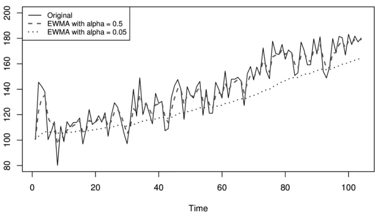
Figure 4-1. A time series with a linear trend and two exponentially weighted moving averages with different decay factors, demonstrating that they lag the data when it has a trend.
How do you deal with trend? First, it’s important to understand that metrics with trends can be
considered as compositions of other metrics. One of the components is the trend, and so the solution to dealing with trend is simple: find a model that describes the trend, and subtract the trend from the metric’s values! After the trend is removed, you can use the models that we’ve previously mentioned on the remainder.
There can be many different kinds of trend, but linear is pretty common. This means a time series increases or decreases at a constant rate. To remove a linear trend, you can simply use a first difference. This means you consider the differences between consecutive values of a time series rather than the raw values of the time series itself. If you remember your calculus, this is related to a derivative, and in time series it’s pretty common to hear people talk about first differences as
derivatives (or deltas).
Dealing with Seasonality
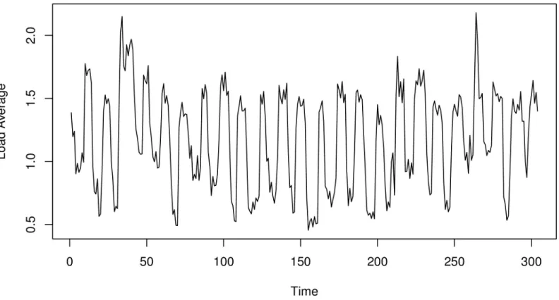
Figure 4-2. A server’s load average, showing repeated cycles over time.
Seasonality has very similar effects as trend. In fact, if you “zoom into” a time series with seasonality, it really looks like trend. That’s because seasonality is variable trend. Instead of
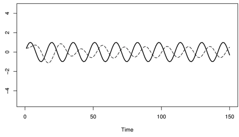
Figure 4-3. A sine wave and a EWMA of the sine wave, showing how a EWMA’s lag causes it to predict the wrong thing most of the time.
Coping with seasonality is exactly the same as with trend: you need to decompose and subtract. This time, however, it’s harder to do because the model of the seasonal component is much more
complicated. Furthermore, there can be multiple seasonal components in a metric! For example, you can have a seasonal trend with a daily period as well as a weekly period.
Multiple Exponential Smoothing
Multiple exponential smoothing was introduced to resolve problems with using a EWMA on metrics with trend and/or seasonality. It offers an alternative approach: instead of modifying a metric to fit a model by decomposing it, it updates the model to fit the metric’s local behavior. Holt-Winters (also known as the Holt-Winters triple exponential smoothing method) is the best known implementation of this, and it’s what we’re going to focus on.
have their own smoothing factors. Typically they’re denoted as β (beta) for trend and γ (gamma) for seasonality.
Predicting the current value of a metric is similar to the previous models we’ve discussed, but with a slight modification. You start with the same “next = current” formula, but now you also have to add in the trend and seasonal terms. Multiple exponential smoothing usually produces much better results than naive models, in the presence of trend and seasonality.
Multiple exponential smoothing can get a little complicated to express in terms of mathematical formulas, but intuitively it isn’t so bad. We recommend the “Holt-Winters seasonal method” section1 of the Forecasting: principles and practice for a detailed derivation. It definitely makes things harder, though:
You have to know the period of the seasonality beforehand. The method can’t figure that out itself. If you don’t get this right, your model won’t be accurate and neither will your results.
There are three EWMA smoothing parameters to pick. It becomes a delicate process to pick the right values for the parameters. Small changes in the parameters can create large changes in the predicted values. Many implementations use optimization techniques to figure out the parameters that work best on given sample data.
With that in mind, you can use multiple exponential smoothing to build SPC control charts just as we discussed in the previous chapter. The advantages and disadvantages are largely the same as we’ve seen before.
Potential Problems with Predicting Trend and Seasonality
In addition to being more complicated, advanced models that can handle trend and seasonality can still be problematic in some common situations. You can probably guess, for example, that outlying data can throw off future predictions, and that’s true, depending on the parameters you use:An outage can throw off a model by making it predict an outage again in the next cycle, which results in a false alarm.
Holidays often aren’t in-sync with seasonality.
There might be unusual events like Michael Jackson’s death. This actually might be something you want to be alerted on, but it’s clearly not a system fault or failure.
There are annoying problems such as daylight saving time changes, especially across timezones and hemispheres.
robust and you miss them.
Another issue is that their predictive power operates at large time scales. In most systems you’re likely to work with, the seasonality is hourly, daily, and/or weekly. If you’re trying to predict things at higher resolutions, such as second by second, there’s so much mismatch between the time scales that they’re not very useful. Last week’s Monday morning spike of traffic may predict this morning’s spike pretty well in the abstract, but not down to the level of the second.
Fourier Transforms
It’s sometimes difficult to determine the seasonality of a metric. This is especially true with metrics that are compositions of multiple seasonal components. Fortunately, there’s a whole area of time series analysis that focuses on this topic: spectral analysis, which is the study of frequencies and their relative intensities. Within this field, there’s a very important function called the Fourier transform,
which decomposes any signal (like a time series) into separate frequencies. This makes use of the very interesting fact that any signal can be broken up into individual sine waves.
The Fourier transform is used in many domains such as sound processing, to decompose, manipulate, and recombine frequencies that make up a signal. You’ll often hear people mention an FFT (Fast Fourier Transform). Perfectionists will point out that they probably mean a DFT (Discrete Fourier Transform).
Using a Fourier transform, it’s possible to take a very complicated time series with potentially many seasonal components, break them down into individual frequency peaks, and then subtract them from the original time series, keeping only the signal you want. Sounds great, pun intended! However, most machine data (unlike audio waves) is not really composed of strong frequencies. At least, it isn’t unless you look at it over long time ranges like weeks or months. Even then, only some metrics tend to have that kind of behavior.
One example of the Fourier transform in action is Netflix’s Scryer,2 which is used to predict (or forecast) demand based on decomposed frequencies along with other methods. That said, we haven’t seen Fourier transforms used practically in anomaly detection per se. Scryer predicts, it doesn’t detect anomalies.
In our opinion, the useful things that can be done with a DFT, such as implementing low- or high-pass filters, can be done using much simpler methods. A low-pass filter can be implemented with a moving average, and a high-pass filter can be done with differencing.
Conclusions
Once you’ve done that, you have essentially gotten rid of the non-stationary parts of the signal, and, in theory, you should be able to apply standard techniques to the stationary signal that remains.
https://www.otexts.org/fpp/7/5 http://bit.ly/netflixscryer 1
Chapter 5. Practical Anomaly Detection for
Monitoring
Recall that one of our goals for this book is to help you actually get anomaly detection running in production and solving monitoring problems you have with your current systems.
Typical goals for adding anomaly detection probably include:
To avoid setting or changing thresholds per server, because machines differ from each other
To avoid modifying thresholds when servers, features, and workloads change over time
To avoid static thresholds that throw false alerts at some times of the day or week, and miss problems at other times
In general you can probably describe these goals as “just make Nagios a little better for some checks.”
Another goal might be to find all metrics that are abnormal without generating alerts, for use in diagnosing problems. We consider this to be a pretty hard problem because it is very general. You probably understand why at this point in the book. We won’t focus on this goal in this chapter,
although you can easily apply the discussion in this chapter to that approach on a case by case basis. The best place to begin is often where you experience the most painful monitoring problem right now. Take a look at your alert history or outages. What’s the source of the most noise or the place where problems happen the most without an alert to notify you?
Is Anomaly Detection the Right Approach?
Not all of the alerting problems you’ll find are solvable with anomaly detection. Some come from alerting on the wrong thing, period. Disks running out of space is a classic noisy alert in a lot of environments, for example. Disks reach the typical 95% threshold and then drop back below it by themselves multiple times every day, or they stay at 98% forever and that’s okay, or they go from 5% to 100% in a matter of minutes. But these problems are not because you’re setting the threshold to the wrong value or you need adaptive self-learning behavior. The problem is that you need to alert on predicted time to running out of space instead of alerting on fullness. This isn’t about anomalies. Another common source of monitoring noise is a non-actionable alert. If the alert signals a problem that might not even be a real issue, or has no solution or remedy, and doesn’t imply the need for someone to actually do something, the solution is to delete the alert. Or at least rethink it completely. Replication delay in databases is an example we’ve seen a lot. If you have no good answer to
a.m., you might not have a good alert. This implies three important things:
You need a clear and unambiguous definition of the problem you’re trying to detect. It is also best if there are direct ways to measure it happening.
The best indicators of problems are usually directly related to one or more business goals or desired outcomes. KPIs (key performance indicators) that relate to actual impact, in other words.
To detect a more complicated problem, you might need to relate the system behavior to a known model, such as physical laws or queueing theory or the like. If you have no model that describes how the system should behave, how do you know that your definition of a problem is correct?
If you can get close to that, you might have a pretty good shot at using anomaly detection to solve your alerting problem.
Choosing a Metric
It’s important to be sure that the problem you’re trying to detect has a reliable signal. It’s not a good idea to use anomaly detection to alert on metrics that looked weird during that one outage that one time. One of the things we’ve learned by doing this ourselves is that metrics are weird constantly during normal system operation. You need to find metrics (or combinations of metrics) that are always normal during healthy system behavior, and always abnormal when systems are in trouble. Here “normal” and “abnormal” are in comparison with the local behavior of the metric, because if there were a reliable global good/bad you could just use a threshold.
It’s usually best to look at a single, specific API endpoint, web page or other operation. You could detect anomalies globally—for example, over all API endpoints—but this causes two problems. First, a single small problem can be lost in the average. Second, you’ll get multi-modal distributions and other complex signals. It’s better to check each different kind of thing individually. If this is too much, then just pick one to begin with, such as the “add to cart” action for example.
Example metrics you could check include: Error rate
Throughput
Latency (response time), although this is tricky because latency almost always has a complex multi-modal distribution
The Sweet Spot
Now that you’ve chosen a metric you want to check for anomalies, you need to analyze its behavior and see if you can do that with relatively simple tools in your toolbox. You’re free to do something more sophisticated if you want, but our suggestions in this chapter are geared toward getting useful results with low effort, not inventing something patentable.
The easiest tools to apply are, in order, exponentially weighted moving control charts1 and Holt-Winters prediction “out of the box.” You can get a lot done with these methods if you either choose the right metrics or apply them to the output of a simple model.
Both rely on the residuals being Gaussian distributed, so you need to begin by checking for that. Run an appropriate amount of the metric’s history, such as a week or so, through the tool of choice to create a new series, then subtract this new series from the original to get the residuals and check the distribution of the result.
In some cases you will almost certainly not get usable results. Concurrency, for example, tends to look log-normal in our experience2 This leads to an easy transformation: just take the log of
concurrency, and try again.
Another simple technique is to look at the first difference (derivative) of the metric. Subtract each observation from the next and try again. Recall that this essentially asserts that the metric’s behavior can be predicted with the equation: next=current+noise. One downside of this technique, however, is that it transforms the shape of sudden changes in the metric’s value. Consider a metric that’s always 500, then drops to 200 for one observation and back to 500 again. That’s a single sharp downward spike. If you difference this metric, the result will be a metric that stays at 0, spikes down to -200, flips up to +200, and then back again. Differencing causes spikes to turn into zigzags, which might be more complicated to analyze.
You can also try finer or coarser time resolution, such as five minute intervals instead of second by second or minute by minute. This is a low-pass filter that removes noise, at the cost of discarding potentially useful information too.
We previously discussed how frequent anomalies are when detected with standard three sigma math. Because of this, it is pretty common for people to suppress anomalies unless they occur at a given frequency within an interval. Say, five or more anomalies at one minute resolution in a 30 minute period.
Finally, you can look at simple models such as linear relationships between multiple metrics. For example, if a database’s query throughput is closely correlated to the server’s CPU utilization, you can try to divide utilization by throughput and look for anomalies in the result. This is a simple way to check whether CPU utilization is abnormal relative to the work the server is being asked to do.
Servers and their metrics are as different as fingerprints. One of these suggestions might work for you and completely fail for your friend.
observations to nearby ones, past behavior at a seasonal interval, other metrics, or combinations of these.
Provided that you can find a usable combination of metrics and methods or models, you can just sprinkle three sigmas on it and you’re done. To repeat, the key is to be sure that:
The metric reliably indicates a condition that matters
The model produces Gaussian distributed residuals, so the three sigma method actually works
Out of bounds values pass the “so what?” test, i.e., abnormal is bad
A final note to add to the last point. Do you care about abnormal values in general, or only
abnormally large or small values? Abnormally small error rates probably aren’t a problem. Make sure you don’t blindly use three sigma tests if you only care about half of the results.
A Worked Example
In this section, we’ll go through a practical example demonstrating some of the techniques we’ve covered so far. We’re going to use a database’s throughput (queries per second) as our metric. To summarize our thought process, we’ve created the following flowchart that you can use as a decision tree. This is an extreme simplification, and a little bit biased towards our own experiences, but it should be enough to get you started and orient yourself in the space of anomaly detection
First, observe how odd this metric is on this server. On a database server like this, throughput is the best metric to represent the work being done. You can see that it would be difficult to describe what normal throughput would look like on this server because its workload is dynamic. Sometimes it’s doing nothing, and sometimes it’s doing a lot. Is the giant spike near the right an anomaly? Probably. Is it “bad?” Well… it’s doing the work it’s been asked to do, isn’t it? So is it an anomaly or not? You can’t just ask “where are the anomalies?” on this data set. That’s not a well-posed question, not even for a human. We need more context to form a better question.
One more specific question that we could answer about this dataset with anomaly detection is “when does throughput drop significantly low for short periods of time?” This simple behavior on a metric can have many causes, such as resource contention or locking. We can answer this question by finding
local anomalies in the metric. This is more doable.
In this plot, you’ll notice that throughput increases with an approximately linear trend, with a slight drop around the two-thirds mark. In the middle of the plot, you can see large drops in throughput. These drops, which happen on a short timescale, are the anomalies that we’ve decided to try detecting.
Now that we know the scope of our anomaly detection problem, let’s try to use the decision tree to determine what kinds of methods might be useful. For “Detection Time,” we know we’re interested in a short timescale method so we’ll follow the path on the right. With a linear trend, we don’t have a fixed mean, so we’ll follow the “no” path for “Known mean.” Now we’re down to “Variability.” The metric is highly variable, and exponential smoothing tends to generate better results in situations like this.
Here’s what the histogram of residuals with a Gaussian distribution curve looks like.
Where would we signal anomalies? It’s not so easy to tell when the metric has short, significant drops. When throughput drops abnormally low and then returns to its original value, the differenced metric has zigzags, which are complicated to inspect. So although differencing takes care of the linear trend, it makes prediction a bit harder.
Perhaps, instead of differencing, we should try an alternative: multiple exponential smoothing on the original metric. This should cope well with the trend and avoid transforming the metric as
Figure 5-2. Histogram of residuals from the exponential smoothing control chart on the raw data.
Now it’s easy to see throughput drops when the metric falls below the lower control line. It’s much easier to interpret, visually at least.
Multiple exponential smoothing is a little more complicated, but produces much better results in this example. It has a trend component built into its model, so you don’t have to do anything special to handle metrics with trend; it trains itself, so to speak, on the actual data it sees.
This is a tradeoff. You can either transform your data to use a better model, which may hurt interpretability, or try to develop a more complicated model.
It’s worth noting that based on Figure 5-1 and Figure 5-2, neither method seems to produce perfectly Gaussian residuals. This is not a major issue. At least with the exponential smoothing control chart, we’re still able to reasonably predict and detect the anomalies we’re interested in.
Keep in mind that this is a narrowly focused example that only demonstrates one path in our decision tree. We started with a very specific set of requirements (short timescale with significant spikes) that made our final solution work, but it won’t work for everything. If we wanted to look at a larger time scale, like the full data set, we’d have to look at other techniques.