Web Design Before & After Makeovers™
Published by
Wiley Publishing, Inc.
111 River Street Hoboken, NJ 07030-5774 www.wiley.com
Copyright © 2006 by Wiley Publishing, Inc., Indianapolis, Indiana Published by Wiley Publishing, Inc., Indianapolis, Indiana Published simultaneously in Canada
No part of this publication may be reproduced, stored in a retrieval system or transmitted in any form or by any means, electronic, mechanical, pho-tocopying, recording, scanning or otherwise, except as permitted under Sections 107 or 108 of the 1976 United States Copyright Act, without either the prior written permission of the Publisher, or authorization through payment of the appropriate per-copy fee to the Copyright Clearance Center, 222 Rosewood Drive, Danvers, MA 01923, (978) 750-8400, fax (978) 646-8600. Requests to the Publisher for permission should be addressed to the Legal Department, Wiley Publishing, Inc., 10475 Crosspoint Blvd., Indianapolis, IN 46256, (317) 572-3447, fax (317) 572-4355, or online at http://www.wiley.com/go/permissions.
Trademarks:Wiley, the Wiley Publishing logo, and related trade dress are trademarks or registered trademarks of John Wiley & Sons, Inc. and/or its affiliates in the United States and other countries, and may not be used without written permission. Photoshop is a registered trademark of Adobe Systems Incorporated. All other trademarks are the property of their respective owners. Wiley Publishing, Inc., is not associated with any product or vendor mentioned in this book.
LIMIT OF LIABILITY/DISCLAIMER OF WARRANTY: THE PUBLISHER AND THE AUTHOR MAKE NO REPRESENTATIONS OR WARRANTIES WITH RESPECT TO THE ACCURACY OR COMPLETENESS OF THE CONTENTS OF THIS WORK AND SPECIFICALLY DISCLAIM ALL WAR-RANTIES, INCLUDING WITHOUT LIMITATION WARRANTIES OF FITNESS FOR A PARTICULAR PURPOSE. NO WARRANTY MAY BE CRE-ATED OR EXTENDED BY SALES OR PROMOTIONAL MATERIALS. THE ADVICE AND STRATEGIES CONTAINED HEREIN MAY NOT BE SUITABLE FOR EVERY SITUATION. THIS WORK IS SOLD WITH THE UNDERSTANDING THAT THE PUBLISHER IS NOT ENGAGED IN REN-DERING LEGAL, ACCOUNTING, OR OTHER PROFESSIONAL SERVICES. IF PROFESSIONAL ASSISTANCE IS REQUIRED, THE SERVICES OF A COMPETENT PROFESSIONAL PERSON SHOULD BE SOUGHT. NEITHER THE PUBLISHER NOR THE AUTHOR SHALL BE LIABLE FOR DAMAGES ARISING HEREFROM. THE FACT THAT AN ORGANIZATION OR WEBSITE IS REFERRED TO IN THIS WORK AS A CITATION AND/OR A POTENTIAL SOURCE OF FURTHER INFORMATION DOES NOT MEAN THAT THE AUTHOR OR THE PUBLISHER ENDORSES THE INFORMATION THE ORGANIZATION OR WEBSITE MAY PROVIDE OR RECOMMENDATIONS IT MAY MAKE. FURTHER, READERS SHOULD BE AWARE THAT INTERNET WEBSITES LISTED IN THIS WORK MAY HAVE CHANGED OR DISAPPEARED BETWEEN WHEN THIS WORK WAS WRITTEN AND WHEN IT IS READ.
For general information on our other products and services, please contact our Customer Care Department within the U.S. at 800-762-2974, outside the U.S. at 317-572-3993, or fax 317-572-4002.
For technical support, please visit www.wiley.com/techsupport.
Wiley also publishes its books in a variety of electronic formats. Some content that appears in print may not be available in electronic books. Library of Congress Control Number: 2006920619
ISBN-13: 978-0-471-78323-7 ISBN-10: 0-471-78323-4
Manufactured in the United States of America 10 9 8 7 6 5 4 3 2 1
Meet the Author
Richard Wagneris an experienced Web designer and author of several Web technology books, including Yahoo SiteBuilder For Dummies, XSLT For Dummies, XML All-in-One Desk Reference For Dummies, andJavaScript Unleashed. He is the former Vice President of Product Development at NetObjects and inventor of the award-winning NetObjects ScriptBuilder Web tool. In his non-tech life, Richard is also author ofC.S. Lewis & Narnia For Dummies, Christianity For Dummies, and The Gospel Unplugged. His online home is at Digitalwalk.com.
Author’s Acknowledgments
Special thanks go to Steve Hayes, for giving me the opportunity to work on this book project; Paul Levesque, for your direction and guidance throughout the process; Andy Hollandbeck, for your editing feedback and suggestions; and Dennis Cohen, for your keen attention to the technical details throughout the book.
Dedication
Publisher’s Acknowledgments
We’re proud of this book; please send us your comments at www.wiley.com/.
Some of the people who helped bring this book to market include the following:
Acquisitions, Editorial, and Media Development
Senior Project Editor: Paul Levesque
Acquisitions Editor: Steve Hayes
Copy Editor: Andy Hollandbeck
Technical Editor: Dennis Cohen
Editorial Manager: Leah P. Cameron
Media Development Manager: Laura VanWinkle
Media Development Supervisor: Richard Graves
Editorial Assistant: Amanda Foxworth
Composition Services
Book Designer: LeAndra Hosier
Project Coordinator: Adrienne Martinez
Layout and Graphics: Lauren Goddard, Denny Hager, Heather Ryan
Proofreaders: Debbye Butler, Jessica Kramer
Indexer: Rebecca R. Plunkett
Publishing and Editorial for Technology Dummies
Richard Swadley, Vice President and Executive Group Publisher
Andy Cummings,Vice President and Publisher
Mary Bednarek,Executive Acquisitions Director
Mary C. Corder,Editorial Director
Publishing for Consumer Dummies
Diane Graves Steele,Vice President and Publisher
Joyce Pepple,Acquisitions Director
Composition Services
Gerry Fahey,Vice President of Production Services
Table of Contents
Introduction 1
1 MAKEOVER ESSENTIALS
5
Macromedia Dreamweaver: Your Command
and Control Design Center 6
Adobe Photoshop: Your Visual Sidekick 7
Web Browsers: Your Test Suite 8
Web Developer Extension for Firefox: Your Interactive
Debugging Environment 10
2 PAGE LAYOUT MAKEOVERS
13
Moving from Table Layout to DIVs 14
Boxing in Your Page’s Content 21
Adding a Page Heading 24
Centering Your Pages 27
Adding Curves to Your Edges 29
3 NAVIGATION MAKEOVERS
37
Reorganizing Your Site for Easier Navigation 38
Creating a Top-Level Menu Bar 41
Creating a Vertical Navigation List 49
Adding a Pathway to Your Pages 52
Adding a Quick Links Drop-Down Menu 54
4 PAGE ELEMENT MAKEOVERS
59
Enhancing the Look of Table Borders 60 Offsetting Page Elements to Avoid Eye Competition 63
Using iframes to Package Your Content 68
vi
Table of Contents
5 TEXT MAKEOVERS
75
Selecting Fonts that Complement Your Site 76
Replacing Normal Text with Anti-Aliased Text 81 Replacing Plain Bullets with Images 86
6 IMAGE MAKEOVERS
89
Creating an Image Rollover 90
Cropping Images to Shed the Useless Stuff 95
Thumbnailing Images 99
Displaying Multiple Images with an Image Scroller 106 Displaying a “Lightbox” Overlay Image 113
7 IMAGE PERFORMANCE MAKEOVERS
117
Resizing Images Yourself 118
Reducing Your Image’s File Size, Not Its Quality 121
Preloading Images 124
8 HOME PAGE MAKEOVERS
127
Messaging Your Home Page 128
Making Your Home Page Feel Alive 134
Adding a Splash Introduction 137
9 CONTENT MAKEOVERS
143
Writing Web-Savvy Text 144
Creating Intuitive and Usable Links 148 Adding an Alternate Print Version of Your Web Page 150
Table of Contents
vii
10 FORM MAKEOVERS
163
Validating Your Forms 164
Controlling Tab Order 172
Using CSS to Transform the Look of Form Elements 175
Creating Graphical Buttons 179
11 ADD-ON MAKEOVERS
187
Adding Maps and Directions 188
Adding a Site Search 192
Making Your Blog Part of Your Web Site 195
12 SITE MAKEOVERS
203
Linking to Other Sites without Losing Your Visitors 204 Creating Your Own Favorites Icon 206
Improving Your Search Engine Ranking 209 Converting Your Web Page to XHTML 212
13 EXTREME MAKEOVERS
215
Allowing Visitors to Adjust the Font Size 216 Scrambling Your E-mail Links to Avoid Spam 220
Displaying Different Content Based on the
Frequency of the Visitor 224
Adding an RSS Feed to Your Web Site 227
Introduction
The Metamorphosis. The Transformation. The Makeover.
From fairy tales to Walt Disney cartoons to diet pill ads to home improvement television shows, we all have a natural interest in witnessing change taking place before our eyes. The ugly duckling becomes the swan. The neglected step-sister is transformed into a gorgeous beauty at the prince’s ball. The rundown house is made over into the jewel of the neighborhood. When we see these metamorphoses happening to others, we are inspired to emulate these same kinds of changes in our lives.
This desire for transformation extends into cyberspace as well. You create or maintain a Web site that you put a lot of work into, but you see how poorly it compares to other sites you visit on the Internet. You real-ize that what your Web site really needs is a makeover.
Before & After Makeover: The Concept
Web Design Before & After Makeoversis written to enable you to make over your Web site. With this book, you get a chance to work with dozens of mini-projects that parallel the sorts of improvements you’ll encounter as you revamp and overhaul the design of your Web site. These challenges include such tasks as making your home page a compelling place that visitors will want to bookmark and return to often, placing great content on your pages without cramming it in, making your site easy and intuitive to navigate, and ensuring your pages load blazingly fast.
Before
After
How to Get Around in This Book
The makeovers contained in the book are divided into 12 distinct areas. Here’s a chapter-by-chapter overview of what you can expect:
Chapter 1: Makeover Essentials
2
Introduction
Chapter 2: Page Layout Makeovers
This chapter explores the physical layout of a Web page, examining how to size and arrange content on the page. You also look at how to center your pages within the browser.
Chapter 3: Navigation Makeovers
In this chapter, you focus on the challenge of making your site easy to navigate, whether it has 5, 50, or 500 pages. You look at how to create top and sidebar navigation using CSS and a drop-down combo box for quick links.
Chapter 4: Page Element Makeovers
You get to dive into the design of the elements you place on a page in this chapter. Tables and their borders are looked at first; then you examine how to space elements so that they coexist well on a page. Finally, iframes are explored as a great way to package content on your site.
Chapter 5: Text Makeovers
Communication is the raison d’êtrefor the Web, so text is arguably the most important element on your Web pages. And yet, howyou present that textual information is often even more important than the content itself. This chapter examines how to work with typefaces and font sizes by using CSS. It then focuses on how you can use text as an image to present page headings, headlines, or other eye-grabbing needs.
Chapter 6: Image Makeovers
This chapter shows you how to give your Web site a face-lift by improving the way you use images on it. You explore how to create an image rollover, crop an image, and create thumbnail images. And, if you need to display several images on a single page, be sure to check out the Image Scroller makeover in this chapter.
Chapter 7: Image Performance Makeovers
Just having nice images on your Web site is not enough. Unless they are small enough to be downloaded quickly, no one will stick around long enough to see your wonderwork. Therefore, in this chapter, you explore tricks that shorten your image download time without losing image quality.
Chapter 8: Home Page Makeovers
In this chapter, you focus on transforming your Web site’s most important page — the home page. You look at how to target the content of your page for the type of visitors who come to it. You also explore how to make your home page come alive with fresh, dynamic content.
Chapter 9: Content Makeovers
While much of the book’s focus is on the design and look of the Web site, this chapter looks at makeovers of your site’s content. You discover how to transform the content of your Web site to better communicate with your visitors. Also, explore how to write Web-savvy text, how to place links in the best locations, and how to add alternate printable versions of your pages.
Chapter 10: Form Makeovers
Introduction
3
Chapter 11: Add-On Makeovers
This chapter shows you how to use various add-ons to increase the functionality of your site’s offerings. Explore how to add maps, directions, a site search feature, and a blog page.
Chapter 12: Site Makeovers
This chapter examines makeovers that impact your whole site. You look at how to link to other sites without losing your visitors. Then you find out how to create your own Favorites icon. Finally, you discover how to make over your Web site to maximize your search engine ranking.
Chapter 13: Extreme Makeovers
It’s time to get radical in the final chapter. You explore how to perform some extreme makeovers that will transform your site into something state-of-the-art. Check out how to let your visitors control the size of the font on your site and how to customize the content based on the type of visitor. Finally, add the latest technology — RSS feeds — to your Web site to better communicate with your visitors.
Essential Makeover Tools
The makeovers covered in this book are written specifically for our recommended tools of choice: Macromedia Dreamweaver and Adobe Photoshop. However, the makeovers are designed to be flexible enough to be performed using most any HTML editor and image software.
Companion Web Site
Many of the makeovers covered in the book have accompanying HTML or image files that you can work with to more easily follow along with the makeover instructions. If you want to download these files, go to
www.wiley.com/go/makeovers.
Your Invitation to Participate!
After
A
lmost all those household makeovers you see on TV
are within the realm of the possible, given a little
know-how and the right tools. Web Design Before & After
Makeovers
is going to help equip you with the information
you need to successfully make over your Web site. But you’ll
want to be sure to gather the right tools for the job before
you start.
In this chapter, you explore the essential software tools
that you need for getting the most from your makeovers.
These tools help you design, lay out, and manage your Web
site, create textual and graphical content to place on it, and
test and debug your pages. While many quality software
applications can handle these sorts of jobs, here are my
rec-ommendations as you assemble tools for your Web
makeover toolbox. These are the tools I swear by for all of
my Web design work.
MAKEOVER
ESSENTIALS
6
Let Macromedia Dreamweaver (or a compa-rable alternative tool) serve as your “com-mand and control” center throughout your Web site design and development process.
Available for both Mac and Windows, Dreamweaver’s integrated design environ-ment packs in all of the page-design and site-management accessories you need with a mouse click.
A powerful Web page editor is crucial to performing great makeovers. After all, whether you are working with textual or graphical content, Cascading Stylesheets (CSS), JavaScript code, or DHTML, when all is said and done, you are always working with an HTML file. Dreamweaver sports a powerful page-design environment that allows you to work with a page visually and on the underlying code itself.
However, in addition to page editing, Dreamweaver helps you manage your entire Web site and its assets.
Alternatives
Microsoft FrontPage is a secondary option that some Windows users may prefer, espe-cially for those experienced Microsoft Office product users.
No matter what tool you use, opt for a tool that provides both visual and code views of the Web page and that has the site support features you need as you design pages.
Nice-looking, optimized graphics are an essential component to nearly every well-designed, professional-caliber Web site. As such, even if you don’t consider yourself a graphic artist, you’ll still want to opt for a professional-grade image editor. The hands-down winner in this category is Adobe Photoshop. Even though you may use only a small percentage of its expansive functional-ity, Photoshop is well worth the time and monetary investment you’ll spend in order to get quality results for your Web site.
Photoshop and its trusty sidekick ImageReady handle all of the essential image-related tasks you need to perform with your Web site. Common tasks you’ll perform include the following:
➤Cropping and resizing an image ➤Optimizing the file size of an
image
➤Overlaying anti-aliased text on an
image
➤Slicing up a large image into a set
of smaller ones
➤Adjusting an image’s brightness,
sharpness, or color
➤Transforming an image through
special filters
8
Every Web designer has his favorite browser. Mainstreamers opt for thestandard, the lat-est version of Microsoft Internet Explorer for Windows. Underdogs, on the other hand, root for Firefox, the “Young Turk” of the browser world. Mac fans love Safari, while others — particularly nonconformists or purists — opt for one of the many niche browsers available.
The problem comes in when you begin to unconsciously design a Web site specifically for your browser of choice, ignoring the idio-syncrasies and differences that exist with the others. For example, the figures on the right show the same HTML file in two browsers. Safari displays the Web page as intended, while Internet Explorer for Mac doesn’t cor-rectly display the menu or header.
Therefore, you want to be sure to test your made-over Web site on multiple browsers before going live. The more browsers you test on, the better. But, if you choose only two, be sure to choose Internet Explorer (80–85% market share) and Firefox (10%).
Rich’s Take:
If you use Windows exclu-sively and don’t have access to a Mac, you can still perform a sanity check to ensure that your Web site displays properly with Mac’s Safari browser. Go to www.danvine. com/icaptureto use the free iCapture service. iCapture looks at the URL you submit and creates a JPG image of the Web page based on how the Web page dis-plays in Safari. You can then view or down-load the resulting image.Safari
Web Browsers: Your Test Suite
Web Browsers
The following list shows the approximate market share of the most widely used browsers on the market.
Internet Explorer (Windows) 85% Firefox 10% Safari (Mac) 2%
Netscape 1%
AOL Browser 1% MSN Explorer .5%
Opera .5%
10
For much of the lifespan of the Web, debug-ging Web pages has been a trial-and-error process. It usually goes something like this: You do your best to design and code your page and then open it in your browser to test it. If something displays or executes incorrectly, then you redo the process.
However, a third-party extension available for the Firefox browser provides a “makeover of sorts” to the debugging process. The Web Developer extension is the handiest interactive debugging tool I’ve come across that takes much of the guesswork out of debugging.
For example, trying to debug CSS styles can be a painful and laborious process because of the cascading effects of the tech-nology. Web Developer allows you to work with and modify CSS styles within the “live” browser environment itself.
Second, trying to understand the layout of a Web page can be confusing when work-ing with multiple divelements or tables. The Web Developer extension allows you to easily label your block elements and provide outlines for these regions on your page.
Third, the Web Developer extension pro-vides one-click access to several online analy-sis tools. You can view a speed report of your page, validate a page’s HTML, links, CSS, and more.
These examples are just a small sampling of the many features and capabilities of the Web Developer extension.
After
W
here do I begin? That’s the question you have to answer before
you can start any project, whether it’s for your home, garage,
or Web site. Obviously, you want to begin by focusing your efforts on
the base or bottom level and then work your way up from there. If, for
example, you are doubling the size of your living room, you wouldn’t
want to begin by hanging new pictures. Instead, you’d knock out the
unwanted wall, perform the necessary plaster work, paint the walls, and
then consider which pictures to hang. In the same way, while I focus on
many visual makeovers for your Web site in this book, you will want to
make sure that your foundation — the page layout itself — is
con-structed to handle the makeovers you perform throughout the rest of
the book.
In this chapter, you explore five makeovers that deal with the layout
of your Web page. I begin by swapping out a table-based HTML page
structure in favor of
divelements, which offers a structure that is far
eas-ier and more efficient to work with. I then explore how to box in your
page’s content to give it the focus it needs, followed by a standardized
way to offset the page header from the rest of your text. Next, you do a
mini-makeover that centers your content in a user’s browser, regardless
of the browser’s width. Finally, although HTML
divelements are
rec-tangular, I “round out” the chapter by showing you a nifty trick in
Photoshop that makes your border corners look, well, rounded.
You can follow along in the chapter by applying the makeovers to
your own Web pages. However, you can also feel free to work with the
HTML files and images that I highlight in this chapter’s makeovers. Each
of the files and images that I use as examples in this chapter is available
for download from the book’s Web site.
Note:
In this chapter, each of the makeovers builds upon the previous
ones. Therefore, I recommend working through this chapter in sequence
PAGE LAYOUT
MAKEOVERS
14
Until recently, whether you created a Web page by hand or through a visual Web page builder, chances are you used tables to lay out your Web page. For much of the Web’s history, HTML tables were a useful way to precisely position a page’s layout. The prob-lem is that table-based layouts are kludgy: Tables were meant to display spreadsheet-like data, not to be used as the primary build-ing block for Web design. (Not sure what is meant by kludgy? Check out the Web site to the right.) Although you can get the visual results you want with tables, they are hard to work with and are difficult to tweak.
In recent years, the divelement was introduced into HTML as a new block for-matting element. Fortunately, the div ele-ment is now supported by all the major browsers and is the preferred way to lay out your Web design. Much like a table cell, the divelement defines a rectangular block of your document. However, a divgives you far more control over where you place and format it.
Here’s how to convert the table-based lay-out of a page into one that uses div ele-ments and Cascading Stylesheets (CSS) to position the divelements.
1
Start out with a new, basic
HTML page.
Because you’re going to throw away all of the table-based layout code, it’s much easier to start with a fresh, clean HTML docu-ment. You can then copy and paste the text in from the old document after your layout is configured.
If you’re using Dreamweaver, choose File➪New and then select HTML from the Basic Page pane. Click the Create button to create the new document.
2
Save the page.
The newly created page is automatically named Untitled-1. Before continuing, it is a good idea to save the file with a real file-name. Choose File➪Save and have at it.
If you’re working through the examples, save it under the name makeover_02_ 01.html.
3
Create a basic CSS page.
You’ll define the divelements and their content inside of the HTML page, but you’ll use an external stylesheet to define the posi-tioning and formatting of the divelements.In Dreamweaver, once again choose File➪New and then select CSS from the Basic Page pane. Click the Create button to create the new stylesheet.
4
Save the stylesheet.
Choose File➪Save and save the stylesheet. I recommend placing it in a subfolder named cssunderneath the base HTML directory.
External Stylesheets
Although you can embed CSS instructions inside your HTML page header, it’s a good practice to keep your CSS code separate from your HTML page. Not only does this enable you to easily reuse the same CSS stylesheet for other pages on your site, but it also lets you modify your pages’ formatting without even touch-ing the Web page itself. Suppose, for example, that
you wish to tweak the default typeface across your Web site. Without a centralized way to update this set-ting, you’d have to open up each of the pages on your site to make the change. However, with an external CSS stylesheet referenced by each of your pages, you need to make only one tweak to update the formatting of your entire Web site.
16
If you’re following this example to the letter, save it as makeover_02_01.css.
5
Activate the HTML Page window
and go into Code view.
In Dreamweaver, click the HTML page’s tab and then click the Code button on the Document toolbar.
If you use Dreamweaver, you’ll notice that basic document meta data is already added at the top of the page.
When you’re inside the code itself, you are ready to set up the divelements inside your Web page. For those of you wanting a score card, you use the header divto dis-play a logo graphic, and the container divserves as a wrapper containing all of the page’s content. Inside of container, the content divcontains the main page’s con-tent, while the rightColumn divis a col-umn for sidebar elements. A footer divis added to the bottom of the page.
6
Type the
div
element code into
the document body.
Enter divelements for each of the sections of the document, identifying them with id attributes, as shown here to the right. These unique identifiers will be used for customiz-ing the formattcustomiz-ing for each of these block elements.
You’ll come back and add content to the contentand rightColumn divelements later, but first you need to set up the stylesheet.
Before leaving the HTML page, link the CSS stylesheet you’ll be working with by adding the following code to the document head:
7
Activate the CSS Page window.
In Dreamweaver, click the CSS page’s tab.You use the CSS stylesheet to specify the shape, size, and other formatting instruc-tions for the individual divelements.
8
Enter id selectors for each of
the
div
elements.
An idselector contains a #symbol followed by the idvalue of the div. It is used to specify the formatting for elements with the associated id. Enter the selectors based on the example shown to the right.
In my example, the headerelement has a fixed height of 80px, a 20px left margin, and 90% width.
The containerelement expands to 90% of the browser window, but always has a 20px left margin.
The contentelement adds padding around its content and specifies a right mar-gin of 175px, which will be taken up by the rightColumnelement.
The rightColumnelement sets the floatstyle to float:right. This style specifies which side the divelement is aligned to so that other content wraps around it. The widthstyle is set to 150px, enabling it to fit comfortably within the margin set by the content div. Other margin and padding styles are also set.
A basic footerelement is also defined here. I talk more about the footerelement in Chapter 3.
18
Note:
In this makeover, the layout stretches and contracts based on the size of the browser window. In the next makeover, you explore a fixed-width layout.9
Add general HTML styles.
Although the focus of this makeover is on the layout, take a moment to add two gen-eral HTML styles for the bodyand p ele-ments. The margin-toprule for the body sets the top margin to 0 pixels, while the other two rules set basic text formatting. I talk more about text makeovers in Chapter 5.0
Still in the CSS page, add id
selectors for those
p
and
h2
elements that appear in your
rightColumn div.
Add these id selectors after the footerid selector, which you added in Step 8.
For the pelements, specify the top and bottom margins. For h2elements, define the font, margin, and bottom border to help offset an h2caption title from the normal text.
!
Choose File
➪
Save to save
changes to the CSS page.
Get in the habit of saving early and often.
Now that your CSS styles are defined, you are ready to add the Web page’s content to your newly created HTML page.
To save time on the chore of typing, lift whatever text you can from your original Web page. To that end, you’ll want to open the original page in your browser of choice.
@
Open your original Web page in
your browser.
#
Copy the text you wish to use
as your new page’s main content.
Select the text in your browser and then choose Edit➪Copy.$
Paste the text inside the
content div
element.
In Dreamweaver, activate the HTML page’s editing window, place the text cursor just after the <div id=”content”>tag, and then choose Edit➪Paste.
%
Repeat Steps 13 and 14 for any
text you wish to place in the
rightColumn div
.
The right-hand sidebar column is often used for special notices or additional navigation options.
^
Add your logo or other banner
image inside your
header div
.
Position your text cursor just after the <div id=”header”>tag. Enter an <img> ele-ment referencing the desired graphic to dis-play in the header. Or, in Dreamweaver, choose Insert➪Image and select the image from the Select Image Source dialog box.&
Edit and format your document
text as desired.
Before finishing the makeover, you may wish to edit and format the page’s text.
*
Save changes to your HTML
page.
After you complete these steps, the content of your Web page is surprisingly ready to go. (In Dreamweaver, you just choose File➪
20
(
View your new layout in your
browser.
Take a look at your new page layout in your default browser. (In Dreamweaver, for exam-ple, pressing F12 takes you right there.)
Note:
In addition to the changes discussed in the makeover, you’ll notice the banner graphic and background are different as well. While the end result to this makeover looks somewhat plain, the makeovers that follow help enhance what you started here.B
efore
Moving from Table Layout to DIVs
(continued)
After
After
Liquid vs. Fixed Layouts
Layouts that adjust their sizes automatically based on the dimensions of the browser window are often called liquid layouts. Fixed layouts, on the other hand, have a permanent size, regardless of the size of the browser window itself or the video resolution of the computer. Liquid layouts are flexible; they make effective use of all of the real estate in the browser window. In contrast,
fixed layouts give you precise control over how the page is presented in all circumstances. Liquid layouts work ideally for sites like Amazon.com that have so much content that they need to use every pixel of the screen they can. However, fixed layouts can be the best choice if you want to have greater control over the site’s look and overall user experience.
When you frame an 8 x 10 photograph, you often overlay the picture with a matte.
A matte is used to complement the picture and to naturally steer the eye toward the photo itself.
You can achieve a similar result on your Web site by adding a border around your page’s content and then giving your Web page’s background a color that complements your overall design.
You can perform this makeover on a page that expands and contracts based on the size of the browser. However, for greater control, you’ll want to fix the size of your content’s area to a width under 800 pixels. I recom-mend 756 pixels.
Note:
This makeover assumes you are using divelements to enclose your page’s content and CSS to format these elements. Therefore, be sure you work through the first makeover in this chapter before you continue.Here’s how to perform this makeover. (You can see an example of a page in need of a virtual “matte” here to the right.)
1
Open the CSS stylesheet that
contains the HTML page’s
format-ting instructions.
If you are using the book’s example files, open the makeover_02_02.cssfile.
2
Add a background color to the
body
selector.
Locate the bodyselector in the CSS stylesheet and add a background-colorstyle and a valid color specification.
For the book example, specify the follow-ing background color:
background-color: #697172;
22
In your project, choose a color that com-plements your overall color scheme without drawing attention to itself. For most purposes, you’ll want to choose a dark, non-bright color.
3
Specify the exact width for the
container div
element.
Locate the #containerselector in the CSS stylesheet. Change the width from 90%to a pixel-based size:
width:756px;
Regardless of the size of the browser window, the page’s content will now be enclosed within the fixed width of the con-tainer div.
4
Specify a white background for
the
container div
element.
By default, divelements have a transparent background. In order to offset the con-tainer div’s content from the background color of the page, you need to specify a background color for the container div as well.In order to maximize readability, a white or off-white background is often the best color to use as the background for your con-tent. For the book example, I chose white, which is specified with the following style:
background-color: #FFFFFF;
5
Change the size of the
header
div
element.
Locate the #headerselector in the CSS stylesheet. Just like container, change its width to a pixel-based size:
width:756px;
6
Add a background color to the
header div
element.
The header also needs to have a distinct color to separate it from the page’s
background. You may wish to have it the same color as your container. Or, as in the book’s example, you may want to offset it as a different color.
Enter a color style in the #headerselector:
background-color:#1D6963;
7
Save changes to your CSS
stylesheet.
Choose File➪Save to save your changes. Because all of your formatting is done through CSS, you don’t have to alter the content of the HTML page at all.
8
View your new page look in
your browser.
Open your HTML page in your browser to view the results of the makeover. If you are following along with the book’s examples, open makeover_02_02.html.
B
efore
24
For many Web page layouts, an important component is a heading that identifies the content of your page. h1elements are often used, but I show you a makeover that allows for even greater flexibility by using div elements.
On occasion, you may wish to embed text inside of a graphic for a more eye-grabbing page header. Chapter 4, in fact, shows just such an example. However, ordinary text is usually the best option. It’s more accessible and easier to manage.
Check out the steps for this makeover.
1
Open an HTML page that you
wish to add a page header to.
Choose File➪Open in Dreamweaver.If you’re working through the examples I’ve come up with, open makeover_02_03. html.
2
View the HTML code for the
page.
In Dreamweaver, click the Code button on the Document toolbar.
3
Scroll down to the
content
div
element.
In the basic five-divlayout structure, you’ll find it easiest to place the header inside the content div.
4
Locate the existing page
head-ing and enclose the text with the
necessary tags for a
div
element.
Using a divelement enables you to set up an idselector that is customized for just the page heading, rather than targeting all h1 elements on a page.Replace any tags that you may have around your heading text with this (where
Headingis your text):
<div
id=”pageheading”>Heading</div>
5
Add a new
headingspacer
div
element.
Below the page heading, add a new div ele-ment called headingspacer. You’ll define a spacing graphic that helps offset the heading from the rest of the page. Here’s the code:
<div id=”headingspacer”></div>
6
Choose File
➪
Save to save
changes to your HTML page.
No sense taking chances on losing all that work, right?7
Open your CSS stylesheet.
Once again, choose File➪Open and use the dialog box to open up the stylesheet you are using that defines your site design.For the book’s example, locate and open the makeover_02_03.cssfile (you know, the one with header, container, content, rightColumn, and footer).
8
Add an id selector for the
pageheading div
.
You usually want the page heading text to be noticeably larger than your normal text — larger than any other headings that you may have, as a matter of fact. To do that, you should define your page heading as being 3.25emin size, with a font-weightof bold. (I’d also add padding to the top and bottom of the div.)
26
9
Add an id selector for the
headingspacer div
.
The headingspacer divdisplays a hori-zontal line graphic below the page heading. Using a graphic here helps visually offset the page heading from the rest of the page.
The background-image, with background-repeat:no-repeat;, is a great way to place an image into your divelement without directly adding it into your HTML code.
You can use any graphic you like, but make its dimensions 581 x 22 pixels.
The book example uses pagetitle spacer.gif, located in the Images subfolder.
Enter the selector code as shown to the right.
0
When you have finished
enter-ing both selectors, choose File
➪
Save.
Doing so saves the CSS stylesheet.
!
View your new page heading in
your browser.
Activate your HTML file in Dreamweaver by clicking its document tab. Then, press F12 to display the page heading in your default browser.
Adding a Page Heading
(continued)
Before
If everyone had the same browser size and screen resolution, you could align your page layout to the center of the screen simply by positioning it at the appropriate pixel posi-tion. However, because the resolution could be as small as 800 x 600 (on some older sys-tems) to as large as 1280 x 1024 or higher, you never know exactly the correct screen coordinates beforehand. In the earlier makeovers, I use a 10px left margin. But a left-aligned page usually doesn’t look as nice as a center-aligned one. (Check out the Web page to the right to see what I mean.) Here’s a makeover that tweaks a couple styles in your stylesheet to center your pages.
1
Open the CSS stylesheet that
contains your HTML page’s
format-ting instructions.
If you’re using the book’s example files, open the makeover_02_04.cssfile.
2
Change the margin style of the
#header
selector.
Locate the #headerselector in your CSS stylesheet and then change the margin to
margin: 0 auto;
This declaration sets the horizontal align-ment to the center.
3
Add a text-align style to the
#header
selector.
Add this code:text-align: center;
28
4
Repeat steps 2 and 3 for the
#container
selector.
You want to be sure all of your primary div elements are centered in the browser.
5
Add a text-align style to the
#content
and
rightColumn
selectors.
In order to ensure that your text-align workaround for Internet Explorer’s quirks mode doesn’t impact your other content, add the following line to your #content and #rightColumnselectors:
text-align: left;
6
Save your CSS stylesheet.
After you’ve finished adding these styles, choose File➪Save to save your changes.7
View your new page look in
your browser.
Open your HTML page in your browser to view the results of the makeover. If you are following along with the book’s examples, open makeover_01_04.html.
Centering Your Pages
(continued)
B
efore
When you design for the Web, you normally assemble a set of rectangular blocks — either divor tableelements — in a certain manner to achieve the look you’re after. While the “rectangular blocks” approach (see the page to the right) is great for creat-ing sharp-lookcreat-ing square edges, the “sharp look” may not necessarily be what you’re after. One makeover you can perform to your pages is to round the corners of your page borders. Rounded corners add a subtle touch of style and help “round out” your page layout design.
Unfortunately, nothing in the block-based worlds of HTML and CSS can give you rounded corners. You have to create them on your own in Photoshop (or another graphics editor) and then seamlessly add them into your page layout.
Here’s how to perform this makeover:
1
In Photoshop, choose File
➪
New
and create a new document.
Go for one with dimensions of 758 x 8 pix-els, a resolution of 72 pixels per inch, and sporting a transparent background.
Using a transparent background enables you to use rounded corners no matter what the background color of your page is.
2
Create a new layer by choosing
Layer
➪
New
➪
Layer.
Name the layer Borderin the New Layer dialog box and then click OK.
30
3
Double-click the Foreground
Color box in the Tools palette.
The Color Picker dialog box makes an appearance.You want to match the color of your border to that of your header div back-ground color so that your rounded border blends in perfectly with the header.
If you are following along with the book example, enter 59A09Ain the hex color box provided and then click OK to close out the Color Picker.
4
Choose the Rounded Rectangle
tool from the Tools palette.
Doing so calls up the Options bar for the tool.
5
In the Options bar, enter the
amount of curve you want in the
Radius field.
The Radius property sets the amount of curve used in the rounded corners. Use 10pxto achieve the intended look.
6
Enlarge the document window
as needed to display the gray area
outside the canvas.
You need to be able to see space beyond the canvas when you size the rounded rectangle.
7
Draw a rounded rectangle with
dimensions of 756 x 43px.
Click the down arrow on the Options bar to display the Rounded Rectangle Options box. Click the Fixed Sized option and then enter 756in the W box and 43in the H box.
Starting near the top-left side of the can-vas, draw the fixed-size rounded rectangle. Obviously, most of the height of the rectan-gle will extend below the canvas.
8
Align the top of the rectangle
with the top of the canvas.
The rectangle shape should have a Y coordi-nate of 0.
9
Reposition the rectangle to
have a 1px margin on the left and
right.
The shape should have an X coordinate of 1.
0
Save your working file.
You export the graphic as a GIF file for use on your Web site in the next step, but be sure to first save your working file.
Choose File➪Save and name the file topborder.psdor another descriptive filename.
!
Save as a GIF file for use on
your Web site.
32
Select GIFfrom the Optimized File Format drop-down list. Note:Because of the transparent background, be sure to save the image either in GIF or PNG format. JPG images do not support transparency.
Check the Transparency checkbox if it is not selected already.
@
Click the Save button in the
Save for Web dialog box.
The Save Optimized As dialog box makes an appearance.
#
Save your top border image.
Navigate to your Images directory for your Web site, enter topborder.gifin the File Name box, and click Save.Your top border is now ready. You now need to create a rounded border for the bot-tom of the page.
$
Choose Image
➪
Duplicate from
the menu.
You use the image copy to create the bot-tom border.
%
Choose Image
➪
Rotate
Canvas
➪
Flip Canvas Vertical.
This command flips the image upside down, exactly as you want the bottom border to look.You now need to color the border to match the background color of your footer div. If the color is identical to your top border, then you can skip Step 15. Otherwise proceed.
If you are working through the book’s example, you need to perform Steps 16 and 17.
^
Double-click the Border layer’s
thumbnail in the Layers palette.
The Color Picker is displayed.&
Select the correct color for the
bottom border.
If you are following along with the book example, enter FFFFFFin the hex color box provided.
Click OK to close out the Color Picker.
*
Save a working file (in
Photoshop format) for your bottom
border file.
Choose File➪Save As and name the file botborder.psdor another descriptive filename.
(
Save as a GIF file for use on
your Web site.
Choose File➪Save for Web from the Photoshop menu.
Once again, select GIF from the Optimized File Format drop-down menu.
Check the Transparency checkbox if it is not selected already.
)
Click the Save button in the
Save for Web dialog box.
The Save Optimized As dialog box is displayed.q
Save the file.
Navigate to your Images directory for your Web site and enter botborder.gifin the File Name box.
Your bottom border is now ready.
34
w
Open an HTML page in which
you wish to add rounded corners to
the page border.
In Dreamweaver, you choose File➪Open. If you are working through the book examples, open makeover_02_05.html.
e
View the HTML code for the
page.
In Dreamweaver, click the Code button on the Document toolbar.
r
Add a new
div
element called
topBorder
before the header div.
Locate the header divin your HTML page (just after the opening <body>tag). Add the following code before it:<div id=”topBorder”></div>
This divelement will house the upper rounded corners.
t
Add a new
div
element called
bottomBorder
after the footer
element.
Locate the footer divand add the follow-ing line of code after it:
<div id=”bottomBorder”></div>
This divcontains the lower rounded corners.
y
Open the CSS stylesheet that
contains the HTML page’s
format-ting instructions.
You need to specify the top and bottom bor-der graphics as backgrounds for the div elements you just defined.
If you’re using the book’s example files, open the makeover_02_05.cssfile.
u
Add id selectors for the
topBorder
and
bottomBorder
div
elements.
In the stylesheet, add #topBorderand #bottomBorderselectors by typing the code exactly as it appears in the figure to the right.
These selectors define the margin, dimensions, and background image for your borders.
i
Choose File
➪
Save to save your
stylesheet.
It’s no good to you if you don’t save it.
o
View your new page look in
your browser.
Open the HTML page in your browser to view the final results of the makeover. If you are following along with the book’s examples, open makeover_02_05.html.
B
efore
After
A
well-organized Web site is much like a GPS for your
car: It lays out an appropriate amount of information
based on your context to help you navigate to your desired
destination. A GPS never attempts to overload you with
directions coming up 100 miles down the road. Instead, it
focuses on where you are at a specific geographic point.
Similarly, in order for visitors to effectively navigate your
Web site, you need to make it easy for them to find the
infor-mation they need without overloading them with too many
choices.
Unfortunately, many Web sites are about as easy to
navi-gate as Boston with your eyes closed. Sometimes the
prob-lem is poor organization; other times it’s a confusing menu
system. Still other sites have no visual way of
communicat-ing exactly where you are on the site itself.
In this chapter, you explore five makeovers that will make
your Web site easier for your visitors to navigate. You begin
by reorganizing an existing Web site into one that flows
much more logically. You then roll that hierarchy into a
CSS-based, multi-level top menu system. Next, you explore a
side-bar navigation makeover that transforms a simple bulleted
list into something far more eye-appealing. Even if you have
a well-organized site and easy-to-use menu, visitors can still
lose their place in your site. The next makeover explores a
simple technique that puts each page in its proper context.
Finally, I show you how you can add a drop-down combo box
list of your favorite site links.
NAVIGATION
MAKEOVERS
38
Some Web sites have a natural hierarchy to them, with their pages effortlessly falling into place. Others, however, take a bit of “elbow grease” to mold into a structure that makes sense for visitors navigating the site.
Here’s a makeover in which you reorgan-ize your Web site and transform it into a structure that your visitors don’t need to be Magellans to navigate.
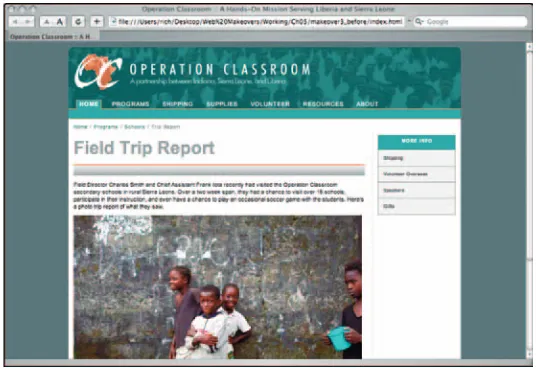
For the book example, I reorganize the Web site of a nonprofit organization known as Operation Classroom. (The Web site’s Can’t-See-the-Forest-for-the-Trees look is captured in the schematic diagram to the right.) Feel free to follow along with this example.
1 On paper or on your computer,
list all of your Web pages.
Forget whatever existing structure you have in place. Simply write out each page in a flat list. You can leave out the home page because that is the obvious first level in your hierarchy.
2 Arrange pages in natural
topic-oriented clusters.
Your pages usually fall into broader topics. Think about each page from a visitor’s perspective and begin to arrange them accordingly.
In the book example, the pages fall into four clusters: about the organization, description of programs, getting involved, and resources available.
3 Give each cluster a
“down-to-earth” name in which its contents
can be easily understood.
One potential downside to hierarchies is that you can come up with categories of pages that are too general, abstract, or vague. Therefore, make sure that visitors coming to your site can intuitively under-stand the labels you use for these clusters.
These category names will be the second-level headings in your navigation menu on your Web site.
Note:
Don’t get cute when naming the sec-tions of your pages. For example, if your company sells products and services, label the associated page clusters “products” and “services” rather than terms that can be con-fusing for people unfamiliar with your com-pany’s offerings.4 Within the clusters, look for
possible sub-clusters.
If you have similar topics that fit into a sub-category, arrange these together and label the sub-cluster based on the issues discussed in Step 3.
Avoiding Glazed Eyes
Guard against placing too many topics at the first level of your hierarchy. I recommend choosing a more lim-ited number of 5–8 clearly defined and distinct topical categories. For example, the original Operation Classroom Web site had 24 pages defined at that level, which is simply too many for a visitor to scan
through and know where to go. Case in point, the Books page, which lists several West African-related books. Rather than linking that secondary priority page directly from the home page, a much better solution would be to place it inside of a Resources section of the Web site.
40
Note:
Aim to keep your Web site to 2 or 3 heading levels under the home page if at all possible. Studies show that visitors get lost when they have to dive any deeper into a site’s hierarchy than three levels.5 Re-examine your clusters to
see whether any pages should be
linked directly from the home page,
even if it doesn’t make perfect
sense from a hierarchical
perspective.
Although Web sites usually work best when you have an organized hierarchy, don’t let neatness and order become a burden to the site’s effectiveness. Check to see whether any topics inside your categories are important enough to your visitors to warrant separat-ing out and addseparat-ing as separate first-level categories.
In the book example, the Operation Classroom Web site had a topic (Shipping) that, purely from a hierarchical perspective, fell into the Getting Involved category. However, because many people visit the existing Web site specifically for information on shipping, I raised that topic to a first-level category and tweaked the “Getting Involved” label to something more appropriate for the remaining pages (Volunteer).
6 Restructure your Web site with
your new hierarchy.
After you finish this organizational exercise, you’re ready to begin the task of structuring your site, which is discussed in the next makeover.
Reorganizing Your Site for Easier Navigation
(continued)
Before
The structure of a Web site is shown to the visitor through your navigation. By and large, the most popular form of navigation is a top-level horizontal menu.
Here’s a makeover for quickly adding a two-tier menu bar to your Web site.
Download menubar.cssand menubar. jsfrom the book’s Web site and copy them into your Web site’s css subfolder. Follow these instructions to add the menu bar to your site.
1 Open an HTML page to which
you wish to add a top-level menu
bar.
In Dreamweaver, you do that by choosing File➪Open.
If you’re working with the book exam-ples, open the makeover_03_03.htmlfile.
2 View the HTML code for the
page.
In Dreamweaver, click the Code button on the Document toolbar.
3 Add a
link
element in your
document header connecting the
tabmenu.css
stylesheet with
your HTML page.
Type the following code in your document header:
<link rel=”stylesheet”
rev=”stylesheet” href=”css/tab-menu.css” type=”text/css”
media=”screen” charset=”utf-8” />
The tabmenu.cssprovides formatting instructions for your menu bar.
42
4 Add a
script
element
con-necting
tabmenu.js
with your
HTML page.
Add the following HTML into the docu-ment header:
<script src=”css/tabmenu.js” type=”text/javascript” lan-guage=”Javascript1.2”
charset=”utf-8”></script>
The tabmenu.jscode provides the inter-activity for the menu bar.
5 Just inside the
container
div
, add a new
mainMenu div
.
The mainmenu divdisplays all of the first-level items on your menu bar. Begin by adding the div element:
<div id=”mainMenu”> </div>
6 Add an
a
element inside the
mainMenu div
for each first-level
menu item.
Use the following code line as a model for your entries:
<a class=”inactiveMenuItem” style=”left: 15px;”
id=”mainMenuItem1”
href=”index.html”>Home</a>
The classattribute receives a value of either inactiveMenuItem oractiveMenuItem. (Only one item should be initially set to active. This value is dependent on the context of the page you are working with.)
The styleattribute assigns the left posi-tion for each entry. Begin with 15pxand increment each successive aelement by 85px.
Assign a unique identifier to the id attribute.
Add a URL to jump to in the href attrib-ute in case the menu item is clicked.
Finally, add a value for the aelement — Programs, Shipping, Supplies, whatever — which serves as the visual text that appears for the menu item.
If you’re working through the book exam-ple, enter the code as shown to the right.
7 Just below the
mainMenu div
,
add a subMenu div container to
house all of the submenu items for
each main menu item.
The subMenu divserves as a containing element for the submenu items. Type in the following code:
<div id=”subMenu”> </div>
8 Inside the
subMenu div
con-tainer, add a
div
for each of the
submenu item groups.
All of the submenu items associated with a top-level menu item need to be grouped together in a divelement. The name of the divis submenu_plus a sequential number (submenu_1, submenu2, . . .).
Here’s the HTML code for the initial div:
<div style=”padding-left: 15px; position: static; display: none;” id=”submenu_1”> </div>
The styleattribute defines the formatting used to display the div. Leave display: nonefor each element, except for the sub-menu item group that is associated with the activeMenuItemmarked in Step 5.
Repeat for each submenu item cluster.
44
9 Inside each of these
div
ele-ments, add an
a
element for each
item in the submenu.
The aelements inside the submenu are plain, ordinary aelements. Here’s an example:
<div style=”padding-left: 15px; position: static; display: none;” id=”submenu_2”>
<a href=”programs/schools.html” >Schools</a> |
<a href=”programs/vocational. html”>Vocational</a> |
<a href=”programs/training. html/”>WATTS</a> |
<a href=”programs/medical. html”>Operation Doctor</a> </div>
You’ll notice that I add a vertical bar (|) between each aelement. This optional sym-bol provides a visual separator between the submenu items.
If you’re working with the example from the book, here’s the entire submenu code:
<div id=”submenu”>
<div style=”padding-left: 15px; position: static; dis-play: none;” id=”submenu_1”>
</div>
<div style=”padding-left: 15px; position: static; dis-play: none;” id=”submenu_2”>
<a
href=”../programs/schools.html”> Schools</a> |
<a
href=”../programs/vocational.htm l”>Vocational</a> |
<a
href=”../programs/training.html” >WATTS</a> |
<a href=”../programs/med-ical.html”>Operation Doctor</a>
</div>
<div style=”padding-left: 15px; position: static; dis-play: none;” id=”submenu_3”>
<a
href=”../shipping/howto.html”>In structions</a> |
<a
href=”../shipping/shipform.html” >Shipping Form</a>
</div>
<div style=”padding-left: 15px; position: static; dis-play: none;” id=”submenu_4”>
<a
href=”../supplies/kits.html”>Kit s</a> |
<a
href=”../supplies/needs.html”>Su pplies Needed</a> |
<a href=”../supplies/alt-gifts.html”>Alternative
Christmas Gifts</a> </div>
<div style=”padding-left: 15px; position: static; dis-play: none;” id=”submenu_5”>
<a
href=”../volunteer/workteams.htm l”>Overseas Workteams</a> |
<a
href=”../volunteer/indy.html”>Ov erseas Individuals</a> |
<a
href=”../supplies/domestic.html” >Get Involved in the U.S.</a>
46
<div style=”padding-left: 15px; position: static; dis-play: none;” id=”submenu_6”>
<a
href=”../resources/blackboard.ht ml”>Blackboard</a> |
<a
href=”../resources/speakers.html /”>Speakers</a> |
<a
href=”../resources/studies.html/ ”>Studies</a> |
<a
href=”../resources/consult.html/ ”>Consultations</a> |
<a
href=”../resources/books.html/”> Books</a> |
<a
href=”../resources/ocgear.html/” >Promotional</a> |
<a 15px; position: static; dis-play: none;” id=”submenu_7”>
<a href=”../about/contac-tus.html/”>Contact Us</a> |
<a href=”../about/his-tory.html/”>History</a>
</div> </div>
0 Save your changes to the HTML
page.
In Dreamweaver, choose File➪Save from the main menu.
! Open the
tabmenu.css
file.
Choose File➪Open and select tabmenu. cssto open for editing inside of
Dreamweaver.
The tabmenu.cssstylesheet sets the color and other formatting properties for your menu bar. You’ll want to customize the colors to match your Web site color scheme.
If you’re working through the book exam-ple, you don’t need to make any changes to the stylesheet. However, follow along to see the kind of changes you can make.
@ Specify the background color or
image for the
#mainMenu
selector.
Adjust the background color or image as needed to match your HTML page design.
In the book example, I could use either a background color of #1D6963or an image. However, the 756 x 30px image I created in Photoshop in Chapter 2 makes for a seam-less transition between the background of my header divelement and the menu itself.
# Specify the background color
for the
#mainMenu
.activeMenuItem
selector.
Locate the #mainMenu .activeMenuItem selector in the stylesheet and set its back-ground color to something that contrasts with the background color or image you set in Step 12.
For the book example, I set it to #59A09A.
$ Specify the background color
for the
#submenu
selector.
48
below the mainMenu div. Locate the selec-tor in your stylesheet code and then alter the background color as needed.
The book example uses the hex color code #59A09A, which complements the background used in the mainMenu div.
% If needed, adjust the color style
in the
#mainMenu
,
#mainMenu a
,
#submenu
, and
#mainMenu.
inactiveMenuItem
selectors.
The font color is initially set to white in the tabmenu.cssstylesheet. However, if the colors you selected in Steps 12–14 are light, you may need to darken the font color.
^ Save the changes to your CSS
stylesheet.
Choose File➪Save in Dreamweaver.
& View the new menu bar in your
browser.
After you save changes to the stylesheet, open your HTML page in a browser to view the final results of the makeover.
The book’s example file for this makeover is makeover_03_02.html.