Photoshop
®
Photoshop
®
for
Right-Brainers
The Art of Photo Manipulation
Third Edition
Production Editor: Melissa Lopez
Copy Editors: Elizabeth Welch and Linda Recktenwald Production Manager: Tim Tate
Vice President and Executive Group Publisher: Richard Swadley Vice President and Publisher: Neil Edde
Media Project Supervisor: Laura Moss-Hollister Media Development Specialist: Josh Frank Media Quality Assurance: Angie Denny
Compositors: Chris Gillespie and Maureen Forys, Happenstance Type-O-Rama Proofreader: Candace English
Indexer: Ted Laux
Cover Designer: Nadia Chung, winner of the 2008 Wiley Design Challenge
Copyright © 2009 by Wiley Publishing, Inc., Indianapolis, Indiana
Published simultaneously in Canada
ISBN: 978-0-470-39701-5
No part of this publication may be reproduced, stored in a retrieval system or transmitted in any form or by any means, electronic, mechanical, photocopying, recording, scanning or otherwise, except as permitted under Sections 107 or 108 of the 1976 United States Copyright Act, without either the prior written permission of the Publisher, or authorization through payment of the appropriate per-copy fee to the Copyright Clearance Center, 222 Rosewood Drive, Danvers, MA 01923, (978) 750-8400, fax (978) 646-8600. Requests to the Publisher for permission should be addressed to the Permissions Department, John Wiley & Sons, Inc., 111 River Street, Hoboken, NJ 07030, (201) 748-6011, fax (201) 748-6008, or online at http://www.wiley.com/go/permissions.
Limit of Liability/Disclaimer of Warranty: The publisher and the author make no representations or warranties with respect to the accuracy or completeness of the contents of this work and specifically disclaim all warranties, including without limitation warranties of fitness for a particular purpose. No warranty may be created or extended by sales or promotional materials. The advice and strategies contained herein may not be suit-able for every situation. This work is sold with the understanding that the publisher is not engaged in rendering legal, accounting, or other profes-sional services. If profesprofes-sional assistance is required, the services of a competent profesprofes-sional person should be sought. Neither the publisher nor the author shall be liable for damages arising herefrom. The fact that an organization or Web site is referred to in this work as a citation and/or a poten-tial source of further information does not mean that the author or the publisher endorses the information the organization or Web site may provide or recommendations it may make. Further, readers should be aware that Internet Web sites listed in this work may have changed or disappeared between when this work was written and when it is read.
For general information on our other products and services or to obtain technical support, please contact our Customer Care Department within the U.S. at (877) 762-2974, outside the U.S. at (317) 572-3993 or fax (317) 572-4002.
Wiley also publishes its books in a variety of electronic formats. Some content that appears in print may not be available in electronic books.
Library of Congress Cataloging-in-Publication Data
Ward, Al.
Photoshop for right-brainers : the art of photo manipulation / Al Ward. — 3rd ed. p. cm.
ISBN-13: 978-0-470-39701-5 (paper/CD-ROM) ISBN-10: 0-470-39701-2 (paper/CD-ROM)
1. Computer graphics. 2. Adobe Photoshop. 3. Photography—Digital techniques. 4. Photography—Retouching—Data processing. I. Title.
T385.W369 2009 006.6’86—dc22
2008052148
TRADEMARKS: Wiley, the Wiley logo, and the Sybex logo are trademarks or registered trademarks of John Wiley & Sons, Inc. and/or its affili-ates, in the United States and other countries, and may not be used without written permission. Photoshop is a registered trademark of Adobe Systems Incorporated. All other trademarks are the property of their respective owners. Wiley Publishing, Inc., is not associated with any product or vendor mentioned in this book.
Dear Reader,
Thank you for choosing Photoshop for Right-Brainers: The Art of Photo Manipulation, 3rd Edition. This book is part of a family of premium-quality Sybex books, all of which are written by outstanding authors who combine practical experience with a gift for teaching.
Sybex was founded in 1976. More than thirty years later, we’re still committed to pro-ducing consistently exceptional books. With each of our titles we’re working hard to set a new standard for the industry. From the paper we print on, to the authors we work with, our goal is to bring you the best books available.
I hope you see all that reflected in these pages. I’d be very interested to hear your com-ments and get your feedback on how we’re doing. Feel free to let me know what you think about this or any other Sybex book by sending me an email at [email protected], or if you think you’ve found a technical error in this book, please visit http://sybex.custhelp.com. Customer feedback is critical to our efforts at Sybex.
Best regards,
Neil Edde
ix
Acknowledgments
As with every book I write, I find writing this section to be the most difficult. There are so many good, hardworking people behind a book project such as this that some invariably fall through the cracks. Not to mention loved ones, friends, and influential people whom I relate to or who have been an integral part of my life and thus affect my thought process… there are far too many to mention but who deserve to be acknowledged in this section. If anyone reading this feels you should have been included but fails to see your name here, consider yourself included.
I have to start with my wife Tonia and my children Noah and Ali. They are the reason I get out of bed in the morning and the joy in my life. Without them I’d be truly lost and alone… with them I’m complete. What else can I say? I love you all dearly.
Special thanks to Mariann, Tom, Pete, Kelly, and the entire team at Sybex. I appreci-ate your hard work, your faith in me, and definitely your patience during this project. Life threw a few curves during the course of this book, but you managed to get me back on track when needed and made this project a joy.
Thanks to Melissa Lopez and the production team at Wiley, who expertly put the words and images into the pages found here.
I cannot express enough my thanks to my good friend Kim Smith. Kim took over a lot of the day-to-day managing of my forum, helped with my website advertising, and cracked the whip when I fell behind in my various projects… all with patience and a smile. I’ve never met Kim in person, but I feel we’ve been great friends for a long, long time. Thanks again, Kim… I don’t simply appreciate the things you do, but I appreciate you. Say “hi” to your parents for me.
Thanks to my good friend and fellow designer/author Colin Smith. No matter how often my wife tries to get him married off, he still keeps accepting our calls and coming to visit. Now that’s friendship!
I can’t thank Colin without also mentioning his website (www.photoshopcafe.com) and all the people who find solace in the forum there. PhotoshopCAFE has developed into a great source of inspiration and friendship where Photoshop users of all stripes can find acceptance. The coffee is always hot and fresh; I’ll see you there.
To Richard Lynch, a good friend (and an excellent author/teacher) and trusted sound-ing board when I need him most. You need to head out west one of these days and pay me a visit. Thanks, buddy!
To the people who know my work and keep coming back anyway; those who both visit and join my website (www.actionfx.com). If you keep visiting, I’ll keep working to make your life in Photoshop a bit easier, fun, and hopefully profitable.
To my dear friends at the Missoula Landmark Missionary Baptist Church: Pastor Mike and Vicki Maney; Pastor Phil, Deborah, Rachel, and Zion Maney; Scott and Lana Weeks; Andrew, Hannah, Asher, and Lydia Maney (and the wee one on the way as of this writing); and again my in-laws Ole and Linda Field, my wife and children. We walk the same road, and I’m honored to share it with you.
The greatest thanks and highest praise go to my God and Savior, without whom none of this would be possible or worthwhile. He saw fit to allow this Montana boy to realize his dream.
xi
About the Author
xiii
Contents
Introduction xvii
Chapter 1 Tools for Building Your Masterpiece 1
Using Blending Modes 2
Blending Landscapes 2
Experimenting with Blending Modes 3
Extracting an Image from a Background 5
Removing Objects from Their
Background 6
A New Home 8
Working with Layer Masks 11
Dynamic Masking 12
Absurd Symmetry 15
Shades of Gray 18
Including Adjustment Layers 19
Correcting without Corrupting 19
Quick Cartoons 21
Displacement Mapping 22
Need Direction? Use a Map 22
A Peek into a Later Chapter 24
Discovering the Power of Blend If 26
Summary 29
Chapter 2 Techniques for Embellishing Portraits 31
Enhancing Eye Color 32
Altering Eye Color 34
Altering Hair Color 36
Enhancing Lip Color 40
Whitening Teeth 43
Removing Acne and Blemishes 44
Erasing Wrinkles 48
Digital Liposuction 49
Digital Face-Lift 53
Summary 59
Chapter 3 A Few Right-Brained Special Effects 61
Creating a Glass Sphere 62
Forming the Sphere 62
Enhancing with Light and Shadows 64
Including Imperfections 66
Intertwining Objects 67
Creating Patterns from Photos:
Victorian-Style Patterns 70
Time to Mask 72
Digitized Symmetry 74
Generating Metal Objects and Text 76
Heavy Metal Text 76
Quick and Painless Variations 78
Make It Shine 80
Generating Plastic or Glass from
Scratch 82
Summary 87
Chapter 4 Texture, Color, and Layer Effects 89
Using Apply Image: Why I Love It 89
Enhancing Emotion 90
Applying a Technical Background 93
Applying a Montage Effect 96
Adding Color to Black-and-White
Images 98
Method 1: Adding a Color Cast 98
Method 2: Re-creating the Hand-Tinted
Look 102
■ Contents xv
Maps 106
Aged Paint on a Rough Surface 106
Adding Real-World Texture to Skin 111
Lightening, Darkening, and Coloring 115
Summary 117
Chapter 5 Effects in the Real World 119
Symmetrical Landscaping 120
Symmetry in the Sky 120
Patterns in the Sky 124
Nature Patterns: Apply Image 126
Creating a Neon Reflection on Water 128
Blending the Photos into a
New Scene 131
Adding Liquid Transparency 133
Changing the Mood 134
From Calm to Creepy: The
Graveyard 135
Darkening Another Calm Scene 137
Summary 139
Chapter 6 Animals 141
Comical Critter Alteration 141
Attack of the Giant Bug—in 3D! 146
Creature out of Place 151
Crossbreeding Species:
Human Lioness 155
Crossbreeding Species 2: Pegasus 159
Summary 163
Chapter 7 Digital Alterations and Manipulations 165
Digital Woman 166
Beginning the Process 166
Adding the Logo 169
Common Images in Art 171
Chapter 8 Going Beyond Canned Filters 181
Retro Photo: Aging 182
Creating Surface Cracks 186
Finishing It Up 187
Photo to Line Art: Sketching 188
Power of the Brush: Creating and
Painting with Custom Brushes 191
Painting with Flowers 191
Testing the Brush 193
Portrait to Painting: Artistic 195
Summary 199
Chapter 9 People as Art: Digital Manipulation 201
Checkered Woman 202
Zebra-Woman 206
Cyborg: Digital Distortions 209
Preparing the Head 209
Relocating the Subject 212
Flesh to Stone 214
Summary 219
Chapter 10 Digital Intensive:
Fast and Furious Projects 221
Project 1: Photorealistic Framing 222
Layering the Frame Elements 224
Project 2: Changing Photos into
Photoshop Presets 230
Project 3: Little Monsters 237
Parting Thoughts 239
Appendix A Accessing Additional Resources 243
Appendix B About the Companion CD 247
xvii
Introduction
Photoshop for Right-Brainers : The Art of Photo Manipulation, 3rd Edition, is a guide to using Photoshop CS4’s toolkit to unlock your own creativity, as I’ve used it to unlock mine. The Pause button in my brain evidently ceased working from overuse during my Navy days, and now there is no stopping the cartoons, dramas, and horror movies broadcasting in my head. I’ll wake on occasion with some incredible insight and be overcome with an urge to share this unrefined gem of intellectual acrobatics with my wife. She can barely contain her joy; you can see it in the way she smiles, nods, and says, “Would you like bacon for break-fast?” or “Stop jumping around and talking nonsense or you’ll scare the kids!”
For me, Photoshop CS4, as well as every other incarnation since Photoshop 4 sooooo many years ago, has opened pathways for creativity that I had always known were in my head but that I had no way to translate to the real world. What originally attracted me to the program was not the capability to correct photographs but the power to warp photo-graphs into something else. This journey started as an experiment in creating something from nothing (I think the first effect that I tried to master was creating fire from thin air) and developed into a career based on corrections, distortions, and manipulations.
Photoshop gives me the ability to take the critters in my head and make them a visual real-ity. Teaching the program and writing about those discoveries was an unexpected, but extremely appreciated, bonus. It’s sort of like writing a great (or even mediocre) novel; the novelist doesn’t simply shelve the reams of paper to read to himself from time to time but rather tries to put the book into print so others can appreciate the story. Photoshop is my typewriter, and the entities and scenes that form on my screen are the novel. I share it in hopes that someone out there in the big old world will appreciate it. More often than not people do; occasionally I’ll get an email asking me if I want bacon for breakfast. Some folks are just odd.
Why I Wrote This Book
imagination, what does it look like? And last, what tools in Adobe Photoshop CS4 can be used to make those scenes or creatures take on new life on the computer?
Right Brain? Left Brain?
About 30 years ago, the artist and educator Betty Edwards wrote a book that has become a classic and that is indirectly an inspiration for this one: Drawing on the Right Side of the Brain. At that time, it wasn’t widely understood by the general public that the right and left hemispheres of the brain function differently and control different kinds of intelligence, so Edwards devoted a chapter to explaining her premise: The left side is logical, analytical, sequential, and verbal, and it tends to break things down into parts rather than look at wholes. The right side is intuitive, synthesizing, spatial, and holistic. It is, in short, the source of visual imagination and creativity. Today, that understanding is much more wide-spread, to the point where right-brained and left-brained have become a kind of shorthand for different ways of looking at the world.
My book, although targeted at right-brained designers and photographers, is not simply for them. I suspect that more than a few left-brained people (who I affectionately call left-ies) are really closet right-brained people, waiting for someone to lead the way past their math, science, and politics and into the realm of artistic expression. My aim is not that the content appeal to only the right-brained crowd. Rather, I hope that the book may also serve in some small way as a beacon that guides lefties through the dismal smog of facts and fig-ures and into the Technicolor world that righties have lived in and appreciated for genera-tions. Even a lefty can be a right-brainer; the world could use a few creative politicians, after all.
What Should You Know Already?
Photoshop users are generally lumped into three main categories (not my doing): beginner, intermediate, and advanced. This tends to paint Photoshop users with an extremely broad brush, not taking into account the many genres of digital manipulation for which Photoshop is used. For instance, a person can be exceptional at special effects but not have the slightest clue about how images are prepared for print.
■ How the Book Is Organized xix
becoming familiar with the interface and terms used. The Help files will help you immensely here. You should also be familiar with following tutorial-style instructions. If you have just purchased the software and have absolutely no clue what a pixel is, then you should prob-ably pass on this book for now and come back to it after trying something a bit more intro-ductory. If you have some experience with the program and have a keen desire to try things in new and interesting ways, then this is the book for you.
How the Book Is Organized
The book is organized in what I call a progressive format. That is to say, the chapters are complete unto themselves, but later chapters refer to and/or include techniques used in ear-lier chapters. As a result, the earear-lier chapters serve as building blocks for what you will see later. This helps avoid reviewing a series of commands multiple times, allowing space for more techniques.
Chapter 1, “Tools for Building Your Masterpiece,” focuses on the most important tools and concepts underlying the techniques you’ll explore throughout the book: blending modes, layer masks, adjustment layers, Blend If, removing subjects from their backgrounds, and displacement maps.
Chapter 2, “Techniques for Embellishing Portraits,” presents basic and advanced cos-metic corrections and enhancements that portrait subjects may often request, such as deep-ening (or completely changing) eye color, covering up old acne scars, and the like. Why stop there? This chapter also covers radical techniques for more-dramatic changes, such as digi-tal liposuction and face-lifts.
Chapter 3, “A Few Right-Brained Special Effects,” ventures into the realm of special effects—that is to say, techniques for art creation that are not specifically photo-related. This chapter looks at the creation of glass spheres, chrome objects, plastic—I even show you how to turn your photos into unique Victorian-style seamless patterns.
Chapter 4, “Texture, Color, and Layer Effects,” explores a few tools and techniques that will enhance the art of any designer and help you achieve those tricky, elusive results you have been looking for. Apply Image is demonstrated, and you will also learn to add color to black-and-white images, apply textures by using displacement maps, and even enhance old paintings by using common Photoshop tools.
Chapter 5, “Effects in the Real World,” leads you through transforming natural and human-made forms. You’ll mirror rock formations, create neon reflections on rainy streets, and turn sunny landscapes into nightmare scenes.
Chapter 7, “Digital Alterations and Manipulations,” ventures into the realm of graphic arts: digital manipulation for use in advertising, macro-enhancement, and other interesting areas.
Chapter 8, “Going Beyond Canned Filters,” works with a Photoshop feature that is often misused. The projects here show that applying a filter should be a starting point, not a finished product. For example, you’ll “age” a new photograph for a retro effect, turn photo-graphs into line drawings, and work to make dynamic brushes for use in your work.
Chapter 9, “People as Art: Digital Manipulation,” treats the human body as a canvas. You will color it, texture it, melt it, and mold it—painting a checkered flag onto a swimsuit model and turning flesh into stone.
Chapter 10, “Digital Intensive: Fast and Furious Projects,” takes bits of techniques learned throughout the book and utilizes them in completely different ways. You’ll learn to create photorealistic digital frames for your photos, turn your pictures into all manner of Photoshop presets for use in other projects or for distribution, and use some lighting and coloring tricks to generate your very own monster.
Appendix A, “Accessing Additional Resources,” provides some helpful links and resources for you to explore more right-brained worlds.
Appendix B, “About the Companion CD” provides more useful information about the accompanying CD.
Using the CD Files
The images used in this book are also provided for your use on the accompanying CD. Some were taken by the author, but the majority are provided by Photos.com. Please note that these photos are for your use with this book only; they are not in the public domain and may not be redistributed in any way, shape, or form.
■ Feedback xxi
Feedback
Both the author and the publisher encourage you to offer feedback on this text. Was it use-ful to you? What did you learn that you did not know previously? You may leave your com-ments with the publisher at www.sybex.com or send the author a note through his website at www.actionfx.com.
xxiii
Photoshop
®
C
H
A
P
on
T
E
R
Tools for Building Your Masterpiece
Right-brainers are typically artistic
in
some fashion, and this book is for people who, like me, enjoy the journey.
Although right-brainers are constantly chiding left-brained people to
think outside the proverbial box, a right-brainer who works with a piece
of software such as Adobe Photoshop CS4 needs to spend some time
in
the box, getting to know the tools and techniques that will lead to
masterpieces at some future date.
This chapter discusses a few of the most important techniques and
tools that are used throughout the book, as well as some that are just
plain good to know: blending modes, extractions, layer masks, those
all-powerful adjustment layers (made even more powerful in CS4 than
in earlier releases), displacement maps, and the Blend If feature. I can’t
teach you to be an artist, but I certainly can show you some of the tools
I use that you might find helpful in your own work. Let’s take a look at
some of these key techniques.
Using Blending Modes
For right-brainers, blending modes open entirely new doors that perhaps you haven’t con-sidered. For example, you can quickly collage two images by placing them in layers and experimenting with the blending modes for just the right mix.
Blending modes for layers simply tell Photoshop how the pixels in one layer will inter-act with the pixels in the layers beneath. You knew that already, though, right? Sure you did; at least, you probably already know if you have spent any time with Photoshop. As you work through the next few chapters, you’ll use various blending modes. For each new mode that’s introduced, you’ll find a short definition.
Instead of rambling on about how you should use them, I’ll show a few examples of how you can use them to your advantage.
Blending Landscapes
From this book’s CD-ROM, open the images mesa.jpg and sunset.jpg (see Figures 1.1 and 1.2). Here you have two images of similar tone and theme. You might consider what these two photos would look like merged. To check that out, have one photo serve as the founda-tion image, and paste the other photo into a new layer in that document (see Figure 1.3).
Each blending mode, when applied to the sunset layer, will give a different result. You might think that the Overlay mode would produce a good mix of the two images, so check it out! Figure 1.4 shows the image with the sunset layer set to Overlay.
Personally I love the results of this blend: the addition of the clouds and color varia-tion to the mesa’s backdrop is simply stunning. This wouldn’t be much of an experiment if we stopped here, however.
Figure 1.3 Place both images into the same document for merging. Figure 1.1 Choose images to blend together. Here’s the
first image.
■ Using Blending Modes 3
Figure 1.4 Sunset layer blending mode set to Overlay
Experimenting with Blending Modes
Try another test, this time selecting Darken for the blending mode of the sunset layer (see Figure 1.5). This results in a very deep melding of the two images. The outline of the mesa is clearly defined still, but we see more characteristics and features of the sunset layer. The primary thing that strikes me as being wrong with this version is it is simply too dark. It makes sense: the sunset layer is in Darken mode, so those areas that are darker than the layer beneath will be darkened. Those lighter will not. The clouds are better defined, but we lose the bright appeal of the previous example.
Let’s give it another shot. Follow along and see what you come up with. Change the blend-ing mode for the sunset layer to Soft Light (see Figure 1.6). That is a good mix for achieving defi-nition between the two photos. The colors are less harsh, and we still have good definition in both the mesa and the clouds.
Figure 1.6 Another version using Soft Light blending mode
The Soft Light blending mode takes a look at the blend color and either lightens or darkens that portion of the image, depending on whether the color is lighter or darker, respectively, than 50% gray. If the light source, or blend color, is lighter than 50% gray, the effect is as though that portion of the image were dodged—darker makes it look as though it were burned. Painting with Black or White in the Soft Light blending mode will darken or lighten, but will not result in true black or white. Rather, it will result in an increase of light or shadow.
When you find a blending mode that does basically what you want it to accomplish, as I’ve done with this example, you may want to keep the blending mode and finish the correc-tions with other Photoshop features. No one tool or technique is a cure-all: it usually takes a combination of tools and commands working together to get what you are looking for.
Notice the jet stream trailing off in the upper-left corner. This can be wiped away to help maintain the Old West feel of the final shot. One of the quickest ways to isolate and replace the offending area is to use the Spot Healing tool on the mesa layer (see Figure 1.7). Figure 1.8 shows out final blended image.
■ Extracting an Image from a Background 5
Figure 1.8 Final blended image
As you work through the book, blending modes will become second nature. What I want you to take away from these brief examples, in particular for merging layers, is that your choice of blending mode will dictate whether a piece fails or succeeds. You have many to choose from, but usually one or two come close. You want to get to the point where you intuitively know what additional tools in conjunction with the blending mode will give you the results you are looking for. Photoshop isn’t out to get you: it is only as smart and creative as you allow it to be. Photoshop is the toolbox; you are the artist.
Extracting an Image from a Background
I belong to several Photoshop-related forums and lists online (a favorite hangout of mine is PhotoshopCAFE at www.photoshopcafe.com), and it amazes me how many posts start with the heading “How do I extract an image from a background?” Indeed, Photoshop doesn’t give the casual user an easy answer, as there is a number of ways to perform this very task. The best method for the task depends on a couple of factors: the job at hand (the object being extracted, the background the object resides in) and the user’s knowledge of the soft-ware or preferred method.
If the background is a solid color, you can use the Background Eraser tool with pass-able results, but many in the graphics world consider this approach to be cheating in some way. If it works, I say go for it, but rarely does that method work to satisfaction.
Removing Objects from Their Background
Let’s get started and remove an object from its background. Open the image apple.jpg from this book’s CD (see Figure 1.9).
Let’s pull the apple off the background and give it a new home. Duplicate the Background layer. Create a new layer between the two apple layers and fill it with white. Rename the Background Copy Extract(see Figure 1.10).
Figure 1.9 The apple will serve as our extraction model.
Select the Pen tool in the Toolbar. On the Options bar click the Paths icon; it is the sec-ond icon from the left at the top of the screen (see Figure 1.11). Click the mouse anywhere along the edge of the subject (in this case, the apple) to serve as a starting point. Move along the edge of the object a short distance in either direction and click to add another point. If the path between the two points rests on a curve on the object’s edge, hold down the mouse when you create the second point and drag it further along the edge a short distance. This will cause the straight path to slowly conform to the curve of the apple’s edge.
Figure 1.11 Creating a path can be tricky but gets easier with practice.
■ Extracting an Image from a Background 7
Work your way around the entire apple, including the stem. You may have to exercise a little guesswork in the areas of extreme highlight or shadow, so work the path to make the shape appear natural. When you have reached the starting point, click on the first point to close the path (see Figure 1.12).
After you have outlined the entire apple, open the Paths panel. You will see a new Work Path resident in the shape of your apple (see Figure 1.13). The next step is to convert the path into a selection, which you do by click-ing the Load Path As A Selection icon at the bottom of the Paths panel (the third icon from the left) or by open-ing the Paths panel menu and selectopen-ing Make Selection from the list (see Figure 1.14).
Once the “marching ants” appear around the apple, you can copy the apple and paste it into a new doc-ument for later use. To copy the apple, press F/Ctrl+C or select Edit → Copy. Create a new document (File → New or F/Ctrl+N), which will be the size of the apple by default. Ensure the Background is set to Transparent to avoid having to extract the apple again in the future in case you save it in a nonlayered format (see Figure 1.15).
Figure 1.13 The new path resides in the Paths panel.
Figure 1.15 When you copy the object and create a new document to place it in, by default the new document fits the dimensions of the object.
Figure 1.12 After working the path around the object, click the starting point to close the path.
Paste the apple into the new document (F/Ctrl+V; see Figure 1.16). If you would like to save this image for later use, I recommend saving it as a PNG file. This format will retain the transparent background so you can easily drag and drop the object into any photo envi-ronment you choose as well as resize it to fit your needs.
Figure 1.16 The apple in a new transparent background
Have you ever created a new document with a transparent background and find it appears all white? Where are the tiny gray squares that we all know and love? The checker pattern expected to delineate transparency is actually still there. Photoshop CS4 at times defaults to a variation of light gray/dark gray squares so it is difficult to see that the document back-ground is indeed transparent. To change this, select Edit → Preferences → Transparency And Gamut; Mac users will find Preferences under the Photoshop menu. From here, you can change the color of the squares simply by clicking on one (there are two shown) and selecting a slightly darker shade of gray. Now your transparent backgrounds will have the little alternating checkers once again.
A New Home
■ Extracting an Image from a Background 9
Figure 1.17 Eight ball, corner pocket
Figure 1.18 The apple in a new environment
Choose Edit → Transform → Scale and resize the apple to better conform to the size of the eight ball without leaving any of the ball showing (see Figure 1.19). Once it's in place, accept the transformation.
Let’s do one more little trick before we move on. As the apple leaves a shadow on the grass, the grass in turn should leave a reflec-tion on the apple. We can simulate this by generating a feathered selection on the right side of the apple with the Lasso tool, then cre-ating a Hue/Saturation adjustment layer and forcing a green tonal change to that area.
To see what I mean, select the Lasso tool. On the Options bar change the Feather radius to 20px. Draw a selection along the lower-right region of the apple’s edge, as seen in Figure 1.21. You can move the selection into place with the arrow keys so the selec-tion roughly follows along the edge of the object.
At the bottom of the Layers panel, click the Create New Fill Or Adjustment Layer icon. Choose Hue/Saturation from the menu. Any adjustments will be focused on the selected area thanks to the adjustment layer’s mask (see Figure 1.22).
New in Photoshop CS4 are the Adjustments and
Masks panels, which give you more control over the adjustments made and the areas of the layer affected.
With the adjustment layer in place, double-click it in the Layers panel to open the Adjustments panel. Move the Hue slider until you get a subtle green reflection (see Figure 1.23). Once the adjustment is made, you should have replaced the eight ball with the apple, complete with enhanced shadows and colored reflection (see Figure 1.24). Figure 1.19 Resize as needed. Figure 1.20 Shadowing with the Burn tool
Figure 1.21 Create a feathered selection.
Figure 1.23 The Adjustments panel gives you great control over your edits.
■ Working with Layer Masks 11
Figure 1.24 The apple in its new home
Granted, the final image is a bit “far out,” but the extraction itself worked like a charm. The Path tool does take a bit of practice, but there is nothing like it for giving you crisp, clear edges for your extracted objects.
Working with Layer Masks
As you delve into all the nifty things Photoshop allows you to do to your images, you may have already played a bit with layer masks. Layer masks, at their most basic, are simple bit-maps attached to a layer. The black in the bitmap, or mask, hides the pixels of the standard layer, and the white reveals those pixels.
As mentioned in the previous section, Photoshop CS4 has added a Masks panel that allows you to control density, feather, color range, and other mask features. We will be looking at these features throughout the book.
First, let’s look at some possible uses of masks. What benefit do you see from being able to hide portions of a layer? Here’s one practical application using two layers with the same pixel information: you could correct the top layer or do some fancy special effect to it and then mask away portions of the layer so the correction or effect seems to occur only on certain portions of the image. Layer masks are also excellent for merging photos, either gradually or starkly, so collages are a breeze. Masks even go so far as to allow a savvy right-brainer to turn any photograph into a seamless pattern or a floor tile.
Dynamic Masking
I’ll begin with a practical example. If you have perused any medium to large electronics store online, in particular those that sell mid- to high-end televisions or computers, you may have noted that many display their products with an image on the screen. It is difficult to take a photograph of a television with the screen active and have it turn out with ad-quality resolution on the display. Rather than leave the screen blank, many retailers will use Photoshop to place an image on the screen to make the product shot more compelling. Layer masks can achieve this goal in quick order.
For this example, open monitor.jpg (Figure 1.25) and tech.jpg (Figure 1.26).
Figure 1.26 A techno-collage to fill the screen
To see how masks can help when working with these two images, you first need to place them in the same document. To do this, simply copy the second photo and paste it into the first. They are different sizes, so choose Edit → Transform → Scale and resize the new layer to match the size of the first. In this instance, you need to be concerned only that the monitor screen is overlaid with the second image (see Figure 1.27).
When working with a lot of layers, it is smart to give your layers descriptive names. You’re working with only two layers in this example, but it is still a good habit to establish, so rename the layers Monitor (the base layer) and Tech. The top layer is where the masking will take place; you can create that mask now by selecting the Tech layer and clicking the Add Layer Mask icon at the bottom of the Layers panel (see Figure 1.28).
■ Working with Layer Masks 13
Figure 1.27 Transform the top layer to match the monitor screen size.
As a demonstration of how masks help in this instance, you can quickly place the techno-collage on the monitor without overlapping beyond the screen’s border. This is a piece of cake because the monitor face is roughly the same color across the object.
There are a few tools you can use to generate a selection of the screen. The Polygonal Lasso and Magnetic Lasso tools are safe bets, and even using the
Select → Color Range dialog box would provide mod-erate success. Looking at the monitor, with its clear, concise edges on the border of the screen, you might see that the quickest and easiest way to generate the needed selection most likely resides in the Magic Wand tool and its default settings. Ensure that the Monitor layer is active in the Layers panel and use the Magic Wand to generate your selection by click-ing directly on the screen. If the entire screen doesn’t select, increase the Tolerance value in the Options bar to 40 or so (see Figure 1.29).
When the selection is generated, return to the Tech layer and create the mask. The black in the mask hides the portions of the layer outside the screen area, while the white area in the mask reveals the Tech layer. The effect is that the image is now displayed on the screen, as you can see in
Figure 1.30.
Figure 1.28 Renaming layers can help organize your edits.
Figure 1.30 The only area in the mask that should be filled with white is the monitor screen.
If you have performed the masking technique properly, you will have a final product image with the Tech image resident only on the monitor. Any additional corrections to the mask that may be required can be performed by using the paint tools with either white or black to correct and clean up areas of the masked layer (see Figure 1.31).
■ Working with Layer Masks 15
Absurd Symmetry
For the digital artist, masks are frequently used to generate symmetry in a photo or working piece of art. Photographers may use masks for fine-tuning the appearance of a model; a wacky right-brainer may take things to the extreme and use one photo to create a perfect, albeit improbable, vision of beauty. Figure 1.32 (ModelShot.jpg on the CD) shows a young lady who has absolutely nothing wrong with her. Well, in the real world maybe. In the digi-tal world, however, we can use Photoshop to give perfect symmetry. In other words, Photoshop masks can be utilized in such a way as to make the right side of the face the exact, if mirror opposite, twin of the left.
Let’s see what a mask can do to enhance this photo. With a photo open in Photoshop, duplicate the Background layer. Name both layers accordingly: in this example name the layers Model-01 for the foundation and Model-02 for the layer to be manipulated with the mask. With the Model-02 layer selected, choose Edit → Transform → Flip Horizontal to
rotate the image, and then click the Add Layer Mask icon at the bottom of the Layers panel (see Figure 1.33). By drawing a standard Black to White gradient across the mask and using the default settings (that is, a gradual change from black to white), you’ll see the photo take on charac-teristics of both layers (see Figure 1.34). The condition of the layer mask at this stage can be seen in Figure 1.35.
Figure 1.33 Model-02 layer flipped and the mask firmly in place
Figure 1.34 A standard Black to White gradient in the mask gives the model a surreal appearance.
The result is interesting but we can make it more so by shortening the length of the gradient to a very small area in the center of the photo rather than across the entire image. For instance, redraw the same gradient in the same
mask, but this time span the width of the mouth (Figure 1.36). The result has less faded blending and gives the model the appearance of being a computer-generated female in some 3D rendering program rather than a living, breathing human (see Figure 1.37).
Figure 1.35 The Layers panel should look like this in this step.
■ Working with Layer Masks 17
Reversing the colors in the mask creates an entirely different rendition of the model, though in this case it tends to make her look a bit masculine (see Figure 1.38). This can be altered by moving the top layer toward the right to “pinch” her face and neck back to a more femi-nine appearance. You may then use the paint brush on the Layer Mask, alternating with black, white, and shades of gray, to remove or enhance certain areas such as hair, the clothing, the neckline, and so forth (see Figure 1.39). The end result will still appear a bit “out of this world,” but you get the point. This is simply an exer-cise in masking… and it does create some pretty interest-ing results!
Figure 1.37 CGI… without rendering it in a 3D program
Shades of Gray
One final example demonstrates how shades of gray can be used in a mask to create charac-ter in your collages or backgrounds (see Figure 1.40). In this instance, I’ve taken tech-02.jpg and tech-03.jpg, and placed them in new layers in the file circuit.jpg. Grayed masks (or layer masks filled with gray) have been applied to the top two layers.
When you look at the image with a mask applied, you’ll see elements of both photos overlaying the original (see Figure 1.41). Basically this is the same effect as if you were reducing opacity or altering blending modes; how-ever, you can use this effect in conjunction with opacity changes and blending-mode changes for variations you may not expect. I have said that before, I will say this now, and I promise I will say it again: experiment! You’ll never know the effects you could have created unless you try subtly (or extremely, for that matter) altering settings in your images dreamed up by you. I can show you only a
couple of variations in a few pages, but I really want you to explore your own creativity by using the tools at your disposal.
I will go deeper in detail concerning the new mask-ing features as you proceed through the book. With such a powerful tool, you will have incredible digital art in short order.
Figure 1.41 This tech background will fit in with almost any trendy, modern website. Figure 1.40 Using gray tones
■ Including Adjustment Layers 19
Including Adjustment Layers
Something I have found to be incredibly useful for the past few versions of Photoshop was the inclusion of adjustment layers. Because of my interest in adding a personal touch to per-fectly good photos, the final image often doesn’t resemble the original except in passing. A long, long time ago, say three or four versions of Photoshop in the past, altering layer infor-mation was almost always “destructive.” The actual pixels were altered, which could be troublesome if you forgot to save the original photo.
Adjustment layers have taken this concern, wrestled it to the floor, and given it a much-needed wedgie. You can now make adjustments to an entire image or aspects of cer-tain layers without worrying about destroying the original document. You can always back-track in the history, providing you remembered to take snapshots along the way. Who has time for snapshots? Bah, humbug!
Adjustment layers work simply by creating a new layer, separate from the other layers, that will let you make your tweaks. Each adjustment layer has a mask attached so that you can “paint away” the adjustments from areas of the image where you don’t want them to apply. New to Photoshop CS4 is the ability to alter the mask density, isolate colors, and even feather and further refine the mask. You can alter the mask, and thereby the adjustment layer, by painting with black, white, or gray in the mask itself. Better yet, you can go back at any time, reopen the adjustment layer, and change the settings as you like—a particularly easy task with Photoshop CS4’s new Adjustments panel. Adjustment layers each have the appropriate adjustment’s dialog box attached. If you adjust levels by using a Levels adjust-ment layer, you do so the same way you do a standard Levels adjustadjust-ment. The only difference is that you are making the changes to a nondestructive layer as opposed to actual pixels.
Correcting without Corrupting
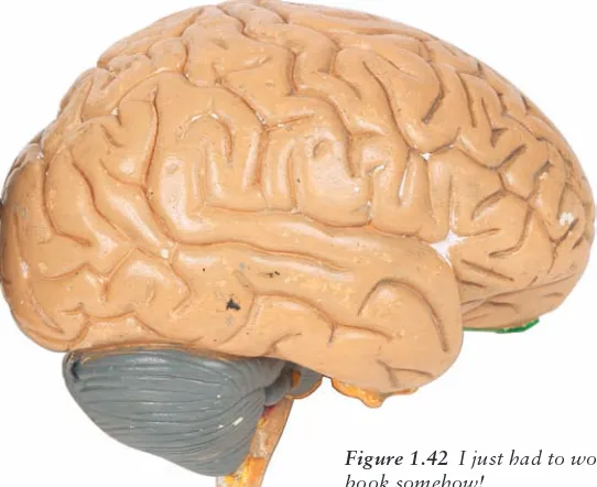
To demonstrate correcting or editing an image in a non-destructive manner, or in such a way that the original pixels are not altered, I have chosen an image reflecting the theme of this book: a model of the human brain. Open the image RightBrain.jpg (see Figure 1.42).
With the image open, click the Create New Fill Or Adjustment Layer icon at the bot-tom of the Layers panel. A menu will appear with a series of selections representing the types of adjustments you can make.
Choose Levels from the menu. A Levels adjustment layer will appear in the Layers panel (see Figure 1.43).
Select the Levels adjustments, and the Adjustments panel will change to give you a standard levels layout; you can make your Levels adjustment as you would if you were oper-ating from the Image → Adjustments → Levels dialog box. Figure 1.44 shows a standard adjustment, moving the left slider to where the color information begins. Click OK to accept the adjustment.
I use this particular adjustment to darken the washed-out area of the brain, in particu-lar the pink fleshy parts. I’m not sure that I want to adjust the gray area. By painting in the white mask with a black brush, you can wipe away the adjustment to that area, leaving the rest of the brain corrected (see Figure 1.45).
Let’s say you would like to create a mock-up of this brain for a presentation of some sort. You have found the gray just doesn’t cut it, and the brain seems flat on the projector. It’s time for a color overhaul. By adding a Hue/Saturation adjustment layer that effectively colors the entire brain blue (see Figure 1.46) but then hiding most of the image except those areas you want to have colored with the mask, you can dramatically alter the appearance of the piece (see Figures 1.47 and 1.48).
Figure 1.43 The Levels adjustment layer is in position and ready to go to work.
■ Including Adjustment Layers 21
Quick Cartoons
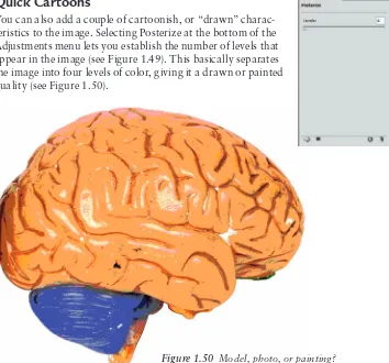
You can also add a couple of cartoonish, or “drawn” charac-teristics to the image. Selecting Posterize at the bottom of the Adjustments menu lets you establish the number of levels that appear in the image (see Figure 1.49). This basically separates the image into four levels of color, giving it a drawn or painted quality (see Figure 1.50).
Figure 1.48 Break out the model paint! We need to give this gray matter an overhaul.
Figure 1.49 A Posterize adjustment layer gives the image a quick “painterly” quality.
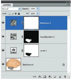
Keep in mind that all of these adjustments have in no way altered the original photo layer. Simply by adding three adjustment layers, you have been able to enhance the color, repaint an area of the image, and convert it to an artist’s rendering. Figure 1.51 shows the Layers panel with all four layers in place.
As mentioned in the preceding section, “Working with Layer Masks,” you can fade the effects of your adjustments with gray shades, rendering the adjustment semitransparent. Adjustment layers also have to heed the rules of blending modes, so play around a bit and have fun with them. Trust me; you have not seen the last of them in this book!
Displacement Mapping
Have you ever looked at an image created by someone else who seems quite proud of it, but it just doesn’t look right to you? You hate to say anything that could be taken as a brutal kick to their ego, but you know deep inside that if they had just taken a few extra steps—a tweak here, an adjustment there—they could have a piece that really boggles the eye. This often occurs when people try to overlay an image on top of another. If the curves and con-tours of the two images match, the artist is well on the way to creating art that doesn’t appear “thrown together.”
Displacement maps can help. These are designed to help you conform one image to the shape of another, using the shades of gray in the image to create the distortions in the sec-ond. Displacement maps play a part in several of the techniques found later in this book, so a quick hands-on tutorial is in order for you to get up to speed.
Need Direction? Use a Map
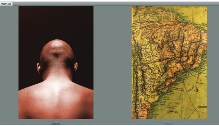
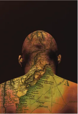
Open the images Back.jpg and Map.jpg (see Figure 1.52).
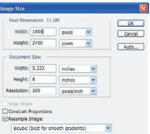
The foundation image for this technique is the photo of a man’s back. The thought here is to give him a map tattoo across his shoulders and the back of his head. The second image should work fine, but it first needs to be molded and stretched to match the highlights and shadows on the foundation image.
The best displacement maps tend to be those with the greatest variation in lights and darks. They are created from a channel that you select. Select the Back.jpg image. I’ve cho-sen to duplicate the blue channel and use it as the base for my map because it gives the best white-to-black ratio across the image. The highlights are brighter and the shadows are darker than the other channels. Of course, I can tweak these further by using Dodge and Burn, Brightness/Contrast, and so forth, but I prefer to choose the channel that will require a minimal amount of adjusting.
■ Displacement Mapping 23
Figure 1.52 The two images as seen in Bridge
You can duplicate the blue channel by clicking and dragging it to the Create New Channel icon at the bottom of the Channels panel (second from the right, next to the Trash). A quick Contrast adjustment will help separate the whites and blacks further. I’ve chosen +25.
Next apply a Gaussian blur to the map channel so that, when it is used to distort the second image, there are no sharp changes and the alterations appear smoother and more transitional (see Figure 1.53).
The last link in the creation of the displacement map is to save it as a new .psd file. To do this, right-click the chan-nel and select Duplicate Chanchan-nel. In the dialog box that appears, name the new image and be sure to set the Destination setting to New (see Figure 1.54). When the file
opens as a new image in Photoshop, choose File → Save As and save the new .psd file to your hard disk. Remember where you placed it, because you will need it again shortly. When you have saved the new map, you can close it in Photoshop. Return to the Back.jpg photo and delete the extra channel, as it is no longer needed.
Figure 1.54 Save the new displacement map as a new document on your hard drive.
A Peek into a Later Chapter
I’m going to take this opportunity to discuss Apply Image, something I’ll cover in depth in Chapter 4, “Texture, Color, and Layer Effects.” Apply Image has to be one of my all-time favorite adjustments in Photoshop. I’ll reserve most of my praise until later, but because it works for this effect I’ll dip into it just a bit here.
Apply Image allows you to blend two images together. Sounds simple enough, until you discover the number of ways you can blend those images. The effects can be rather astounding. For this example, however, all you need to know is that both images must have the exact same dimensions in pixels. I’ll discuss why in Chapter 4, but for now simply adjust the size of the Map.jpg image to match the size in pixels of Back.jpg (see Figure 1.55).
Figure 1.55 For Apply Image to work, both documents (or all that will be used in creating your final image) need to have the exact same dimensions in pixels.
You may now use the displacement map to warp the Map.jpg image. Select the map photo and choose Filter → Distort → Displace. The Displace dialog box will then ask you to what Horizontal and Vertical scale you would like the warp to take place. A setting of 10 for each should work fine in this instance, because the images are both 300 ppi. If they were of lower resolution, then lower Scale settings would be in order.
The Displace filter uses a second image (displacement map) to determine how a layer or selection will be distorted.
Also in the Displace dialog box you are asked to choose either Stretch To Fit or Tile. Stretch To Fit works best here, because there is no need to have the edges repeat. For the same reason, Wrap Around should be selected under Undefined Areas (see Figure 1.56). After these settings are selected, click OK to apply the filter.
■ Displacement Mapping 25
But wait; there’s more! Now Photoshop will ask you what .psd image it should use as a map. By default it will take you to the location on your hard disk where you saved the dis-placement map: simply select it and click OK. The Map.jpg image will warp to conform to the contours of the Back.jpg photo.
Now on to Apply Image. After you choose Image → Apply Image, you use the Source drop-down list at the top of the dialog box to select the image you would like to apply to your photo. For instance, say you would like a darker, more color-rich version of your current image. You could use Apply Image with the same photo set as the Source, and the Blending mode set to Darken to accomplish this (see Figure 1.57). I’ve applied the map to the photo of the back (see Figure 1.58).
The combination of displacement maps and Apply Image are only the tip of the iceberg. I’d
love to continue this topic now, but I’ll force myself to wait until Chapter 4. In the mean-time, I have one more cool item to demonstrate in this chapter.
Figure 1.58 Applying an image to itself can have the effect of richer, more vibrant colors.
Discovering the Power of Blend If
My good friend Richard Lynch, whom you may know from his Hidden Power books, also published by Sybex, started talking to me about Blend If a few years ago. A typical conver-sation may have sounded like a Laurel and Hardy routine:
RL: Al, you’ve got to try Blend If. AW: Blend what?
RL: Blend If.
AW: Blend if what? What am I blending and why?
RL: Blend If, man! It’s the newest thing out there… you’re nobody until you get on the Blend If bandwagon!
AW: Dude, I don’t know what you’re selling, but get it outta here or I’ll call the cops. If it’s that cool, it can’t be legal.
Well, maybe the conversation didn’t go exactly like that. But it did pique my interest, especially because his books were the only ones I’d found that even broached the topic. So after much experimenting, head-scratching, and throwing digital paper balls in the cyber-trash, I think (think, mind you) that I’m starting to grasp what he’s been telling me all these years. At least from a right-brained point of view, I’ve found a few cool tricks that Blend If can be used for.
Blend If allows you to manipulate how certain colors will react to the color beneath them. Granted, this sounds similar to blending modes, but Blend If is a bit more powerful in that it gives the user control over specific colors in the layer, and not over the entire layer.
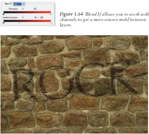
For this example, open the image Wall.jpg. I’ve already taken care of generating a dis-placement map of the wall and applied it to a rasterized type layer. The result is seen in Figure 1.59. Just to prove it to you, Figure 1.60 shows the Layers panel, complete with ras-terized text.
Blend If is found in the Blending options of the layer styles, at the top of the left-hand Layer Style dialog box. Not only can you use this cool feature to make the text appear painted onto the wall, but with a little Photoshop magic you can make it appear as though it has aged with the wall, even wiping away those areas of text where the bricks have broken and worn away.
Figure 1.59 Wall photo with a rasterized type layer, pre-distorted with a displacement map
■ Discovering the Power of Blend If 27
To follow along, create a displacement map as we did in the previous tutorial. Generate a text layer, rasterize it, and displace it with the map. Now you are at the point I am with this project.
With the text layer selected, click the FX icon at the bottom of the Layers panel. When the styles menu expands, select Blending Options from the top of the menu. The dialog box in Figure 1.61 appears.
Figure 1.61 Default Layer Style dialog box with no style settings yet in place
You need not worry about drop shadows or bevels for this technique. On the lower half of the current window is an area called Advanced Blending. This is where all of the cool Blend If things take place. For instance, I’ve set Knockout to Shallow. Blend If defaults to gray, so that drop-down can be left alone for now; it is the highlights and shadows I’m con-cerned with.
At the very bottom is a slider area called Underlying Layer. This means is that if the Wall layer is black, white, or a varying shade of gray, moving the sliders will render portions of the type visible, semitransparent, or invisible. Each slider (right and left) can be split in two by holding down the Option/Alt key and click-sliding it either left or right. This allows you to control the intensity and separation of the blend on your text as it attempts to match the luminosity of the wall. With the sliders in the positions shown in Figure 1.62, the type takes on the faded and aged characteristics shown in Figure 1.63.
Figure 1.63 The text takes on the aged characteristics of the wall beneath.
You can also manipulate the color channels with Blend If. For instance, there is a hint of red in the bricks. You can further age the text by selecting Blend If: Red and adjusting the Underlying Layer sliders as seen in Figure 1.64. Figure 1.65 shows a close-up of the text after this adjustment. You could almost swear that the text was paint that has been around nearly as long as the building, and not simply a type layer altered by Photoshop!
Figure 1.64 Blend If allows you to work with channels to get a more sincere meld between layers.
■ Summary 29
Summary
I’ve in no way covered every cool tool you will explore in this book on your way to the per-fect masterpiece, but I’ve covered a few of the most important ones, or at least those that will show up frequently. Again, please don’t be content to simply use the images supplied with the book.
I encourage you to try these techniques on your own photos, stimulating those right-brain cells and creating your own art. In the next chapter we’ll look at editing, correcting, or otherwise altering portraits, so the techniques found in these two chapters should play well together when you sit down with your own photos. I assure you it will be far more grat-ifying to you, and for me as well, when you have achieved some level of joy when watching your own images come to life using a technique or two you read in these pages.
I can’t turn you into an artist, but I suspect there is already one inside you, lurking just beneath the surface and ready to make itself known. If I can help you to realize at least that much by showing you these techniques, then I am indeed a happy man.
Techniques for Embellishing Portraits
Very few people like the way
they look in
photographs. In this chapter you’re going to learn how to help with that.
This chapter deals specifically with the alteration of people—from
light portrait retouching to drastic alterations. However, the techniques
demonstrated are in no way restricted to images of people; these few
examples of corrections and alterations have thousands of possible
applications that aren’t exclusive to a specific photo type. What the
techniques will do is help you work through a process (or at least
demonstrate one way of doing things), and after you’ve learned a
procedure, you can then find ideas for applying it to your own artistic
renderings. Even better, after the right side of your head is tingling with
ideas, you will soon find that you can subtly or drastically alter the steps
in a technique to generate some pretty amazing results. Who knows; you
could revolutionize a new artistic form—or at least generate some
interesting pictures to e-mail to family members.
Enhancing Eye Color
I love working with eyes. They’ve been called windows to the soul, and this is close to the truth. You can discern many things from a person’s eyes, from emotional state to truthful-ness (or lack thereof). I’ve known people who swear their eye color changes depending on their mood, and after experiencing a couple of foul tempers, I learned to discern those ill moods just by checking to see whether the eyes were a soothing hazel or a wicked shade of green. Green is rarely good—any fan of comics can tell you that.
Fortunately for me, my love for tweaking eyes works well here, as eye manipulation is a popular topic in the Photoshop community.
The most popular question about working with Photoshop, and therefore the most often answered, is how to solve the red-eye problem. Because that information can be found nearly everywhere, I’m not going to get into it directly; after you are done with this chap-ter, you will have figured it out; trust me.
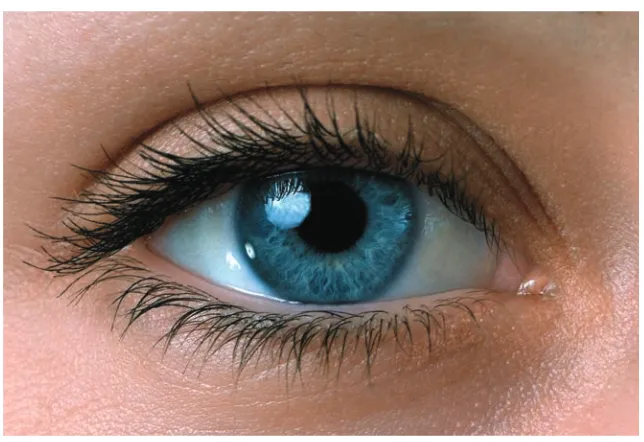
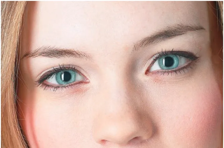
What I’ll show you first is one way to enhance the existing eye character in a photo. Take a look at Figure 2.1. This is the image eye.jpg from this book’s source files; it should be open in Photoshop as you begin. The enhancement you’ll add here is to make this mixed color richer and brighter. To do that, you’ll use duplicated layers, layer masks, and a couple of blending modes.
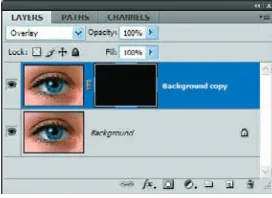
Duplicate the Background layer and change the blending mode of the new layer to Overlay. Note that the entire image becomes a bit darker as the new layer blends with the background. This does help enhance the color of the eye, but the skin around the eye becomes darker also. A mask will alleviate this problem quite nicely.
Overlay blending mode either screens or multiplies the pixel information, depending on the base color. Even when colors or patterns overlay pixel information, the highlights and shadows of the original pixels are maintained. The base color is not replaced; rather, it is blended into another form of the original color.
■ Enhancing Eye Color 33
At the bottom of the Layers panel, click the Add Layer Mask icon. By default the mask is filled with white, allowing the contents of the entire layer to be seen. You do not want all of the pixels to be seen, however; just those of the iris and pupil. With the layer mask selected, choose Edit → Fill and fill the mask with black set to 100% opacity
and Blending Mode set to Normal. Figure 2.2 shows the Layers panel at this point in the process.
Set white as the foreground color. Select the Brush tool, and with a soft-edged round brush, paint over the iris and pupil. Adjust the brush size accord-ingly so that you are painting only within the diameter of the iris. Although it’s not necessary to have a steady hand, you may want to create a selection of the area. In this instance the Elliptical Marquee tool will work just fine, because the area being enhanced is round. As you paint, the pixels on this layer will be revealed. The layer is still set to Overlay, so the color of the blended layers comes through (see Figure 2.3).
Figure 2.3 Painting in the mask
To brighten the eye a bit (the goal is to brighten the colors without darkening the eye), create a new layer above the Background Copy layer and set the blending mode to Soft Light. With the foreground color still set to white, paint over the iris in this layer also. The change is subtle yet effective. Figures 2.4 and 2.5 show before and after shots. See the difference?
Figure 2.4 Before lightening
Figure 2.2 New layer and mask in place
Altering Eye Color
Altering eye color is simpler than it has ever been, thanks to the Color Replacement tool. This is grouped with the Brush tool and the Pencil tool in the Photoshop CS4 toolbar (Photoshop CS grouped it with the Healing Brush and Patch tools). This powerful and easy-to-use tool relieves a lot of the stress suffered by both amateurs and pros alike, who used to spend a lot of time wishing such a tool existed.
Before I get into the nuts and bolts of this cool feature, let me say that it still has a drawback: it is destructive to the layer (meaning that it alters the pixels), so it is not a miracle cure for every recoloring ailment. In the next variation I’ll take you through another process that allows you to preserve the original layer. But first let’s do some painting!
Open blue_eyes.jpg (see Figure 2.6) and find the Color Replacement Brush in the toolbar.
Figure 2.6 Window to the mind
As with other tools, this one has settings that can be changed on the Options bar. For this technique, set the blending mode to Hue and ensure that Find Edges is selected for the Limits setting. Brush Diameter should be 20, Sampling Mode should be Continuous, Tolerance should be 30%, and Anti-alias should be checked. With the Find Edges setting, Photoshop will look for boundaries to paint within while the new color is being applied, thus allowing only the hue of the iris and not the areas outside it to change.