Designing for Respect
Designing for Respect by David Hindman
Copyright © 2016 O’Reilly Media, Inc. All rights reserved. Printed in the United States of America.
Published by O’Reilly Media, Inc., 1005 Gravenstein Highway North, Sebastopol, CA 95472. O’Reilly books may be purchased for educational, business, or sales promotional use. Online editions are also available for most titles (http://safaribooksonline.com). For more information, contact our corporate/institutional sales department: 800-998-9938 or [email protected].
Editor: Angela Rufino
The O’Reilly logo is a registered trademark of O’Reilly Media, Inc. Designing for Respect and related trade dress are trademarks of O’Reilly Media, Inc.
While the publisher and the author have used good faith efforts to ensure that the information and instructions contained in this work are accurate, the publisher and the author disclaim all
responsibility for errors or omissions, including without limitation responsibility for damages
resulting from the use of or reliance on this work. Use of the information and instructions contained in this work is at your own risk. If any code samples or other technology this work contains or describes is subject to open source licenses or the intellectual property rights of others, it is your responsibility to ensure that your use thereof complies with such licenses and/or rights.
Introduction
“It is forbidden to kill; therefore all murderers are punished unless they kill in large numbers and to the sound of trumpets.”
Voltaire
Today, designers have a lot of power. We are responsible for orchestrating innumerable interactions that transpire daily on a wide variety of digital devices. And sometimes we forget the influence we have on fellow citizens as we fall into the routine of executing our work and packaging the next deliverable. Often, our sense of accomplishment is rooted in satisfying business requirements for clients or internal strategy teams. When we do stick around to gauge the success of a design, it’s often measured in business terms: engagement, conversion, click-through rates, and so on. But what if we also measured success in more human terms, such as hours saved or smiles invoked? It is uncommon to attribute a portion of a product’s success to how it makes users feel. Apart from providing basic utility, did it speak to users’ human needs? Did it bring them joy? Was it patronizing or
condescending? What if the end experience, while deemed successful from a business perspective, causes additional stress or confusion, or wastes a user’s time? If one moment is deceitful or wasteful, when multiplied by potentially millions of users, we realize designers have a responsibility that borders on the domain of public health. Two years ago, 67% of Americans were estimated to spend an average of 34 hours a month on smartphones alone. That’s a lot of interactions—we don’t need to do the math to realize that one design decision goes a long way.
I propose that at the core of our interactions with technology, as with one another, is the desire for a simple but crucial attribute: respect. When users are respected, it’s because we have acknowledged their efforts, their time, and their feelings. We’ve told the truth, listened, and given them space. And the scaled effect of many happy, respected users has a global impact because of the sheer scale to which digital interactions pervade our lives today. The reverse is also true for stressed or frustrated users.
Defining Respect
Many have written and spoken about design ethics. Jackson Fox has written about designing for politeness and Tristan Harris has spoken about design that makes a good relationship. For our
purposes, we will focus mostly on the degree to which a user’s experience with digital technology is respectful. The most applicable definition of respect is “to have due regard for the feelings, wishes, rights, or traditions of (someone).” To evaluate respect in user experience, I’d like to examine three elements embedded in this definition: trust, time, and emotional effect. Trust arises as a result of transparency and straightforwardness. Time refers to time wasted or spent productively. Emotional effect is the emotional response that an interaction elicits in the user.
If we satisfy these parameters, then we can argue that our digital conversations meet the demands of businesses as well as their users. As designers, we should reflect on the interactions that we create and ask ourselves Did I waste someone’s time? Did I tell the truth in a straightforward way? Did I avoid criticizing or confusing the user? Was I polite? These are the questions we will focus on with regard to respectful design.
Who This Report Is For
Preface
Conventions Used in This Book
The following typographical conventions are used in this book:
Italic
Indicates new terms, URLs, email addresses, filenames, and file extensions.
NOTE
This element signifies a general note.
Safari® Books Online
NOTE
Safari Books Online is an on-demand digital library that delivers expert content in both book and video form from the world’s leading authors in technology and business.
Technology professionals, software developers, web designers, and business and creative professionals use Safari Books Online as their primary resource for research, problem solving, learning, and certification training.
Safari Books Online offers a range of plans and pricing for enterprise, government, education, and individuals.
Members have access to thousands of books, training videos, and prepublication manuscripts in one fully searchable database from publishers like O’Reilly Media, Prentice Hall Professional, Addison-Wesley Professional, Microsoft Press, Sams, Que, Peachpit Press, Focal Press, Cisco Press, John Wiley & Sons, Syngress, Morgan Kaufmann, IBM Redbooks, Packt, Adobe Press, FT Press, Apress, Manning, New Riders, McGraw-Hill, Jones & Bartlett, Course Technology, and hundreds more. For more information about Safari Books Online, please visit us online.
How to Contact Us
Please address comments and questions concerning this book to the publisher: O’Reilly Media, Inc.
Sebastopol, CA 95472
800-998-9938 (in the United States or Canada) 707-829-0515 (international or local)
707-829-0104 (fax)
To comment or ask technical questions about this book, send email to [email protected]. For more information about our books, courses, conferences, and news, see our website at
http://www.oreilly.com.
Find us on Facebook: http://facebook.com/oreilly
Follow us on Twitter: http://twitter.com/oreillymedia
Chapter 1. Examining the Challenge:
Evidence of the Problem
What happens when an interaction with a digital service falls short from an ethical standpoint? In this chapter, we explore some real-world examples that could benefit from a more respectful design approach.1 By studying these phenomena, we can be wiser about our next design choices, and have a better idea of how ethical interfaces can impact three key stakeholders: users, businesses, and
society.
Impact on Users
The Introduction described elements of respect as they relate to user experience. To best understand the impact of design on users, we will look at some real-world examples and their impact on core building blocks of respect: trust, time, and mood.
Trust
“I’m not upset that you lied to me, I’m upset that from now on I can’t believe you.” Friedrich Nietzsche
Perhaps the most important element of a respectful conversation, digital or otherwise, is trust. When users are deceived, intentionally or accidentally, their experience suffers. The following sections review some examples of deceitful patterns. Some of these are officially referred to as Dark Patterns—intentional UI paradigms meant to deceive. Others are simply deceptive regardless of intention. What is the cost of deception? We can argue that users’ money, time, trust, and customer morale all suffer at the hand of deceptive UI.
Fake Navigation
Many of us have fallen victim to this before. It’s especially prevalent in slide shows, articles, and top ten lists—experiences that hinge upon a prominent Next or Previous button. We know that designers often use placeholder areas for advertising in their wireframes and often don’t know what the ads that will take their place will look like. As UX designers, we should strive to understand the potential ad content ahead of time because it does end up being a major part of the user’s experience. In the
Figure 1-1. This example from Livestrong.com contains an ad that displays two arrows that are easily confused as actual site navigation
Hide and Seek
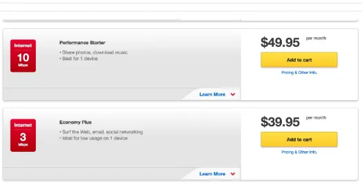
Burying key functionality is an effective way to betray a user’s trust. This example comes to us from the Comcast user account portal. We notice that customers who may want to cancel or downgrade their service have an uphill battle. At the top level of Comcast’s site, there are no tabs for changing your service, only for upgrading (Figure 1-2). Of course, this is understandable from a marketing standpoint—it’s certainly OK to try and sell customers more and better service. However, the counterintuitive element of this experience is that it actually is possible to downgrade digitally, but downgrades are accessible under the Upgrade tab. The two options shown in Figure 1-3 represent downgrades from my current service, but are accessible only in the Upgrade section.
Figure 1-2. Comcast’s website provides only a clear method to upgrade but not necessarily change or downgrade service
Figure 1-3. Downgrades that are only available in the Upgrade section
This is an example of how business intent impairs a user experience and ultimately ends up being deceptive and counterproductive.
is in an unconventional location. The ad also does not adhere to modern conventions which allow users to close the ad by clicking anywhere in the shadowed area, making it even more difficult to dismiss. Devious? Maybe. Respectful? Not likely.
Figure 1-4. Quick quiz: can you quickly find the close button in this screenshot? Hint: it’s not where your muscle memory for dismissing popup ads thinks it is. See for yourself at Technewsworld.
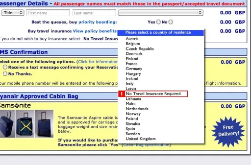
Flagrant Trickery
The winner for deceptive UI in Harry Brignull’s Dark Patterns talk is brought to us by RyanAir. The image from the Dark Patterns blog shows the option to decline travel insurance hidden in a list of countries that you have to choose in order to get travel insurance (Figure 1-5).
Sandwiched between Latvia and Lithuania is the No Travel Insurance Required option. By clearly hiding a valuable option for customers, they lose our trust.
NOTE
Figure 1-5. RyanAir’s previous website hides the opt-out for travel insurance in a list of countries for which to select travel insurance (source: Dark Patterns via Alan Colville)
Sneaky Defaults
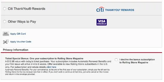
Another example from the Dark Patterns blog is a design paradigm in which merchandise is sneakily added to a user’s shopping cart. The example in Figure 1-6, taken from the Livenation website, shows a magazine that has been added to a cart that you must decline to avoid being charged. Having to
Figure 1-6. In this example from LiveNation.com, can you spot the upsell? Did you even notice it?
Changing the Rules
Figure 1-7. This symbol is a source of confusion in some circumstances
In this case, I felt deceived because I paid for and downloaded music, but wasn’t clearly informed that it would not actually be available on my device and accessible offline. Others have had similar issues with iCloud and iTunes. This situation was probably not intentionally deceptive, but clearer messaging around the storage location of music purchases would have helped prepare me. It’s not just removing music that caused anxiety. When iTunes coercively gifted U2 to all of its users, customers were mostly outraged. The feeling of invasion and disregard for our own personal curatorial efforts damaged trust.
Time
“We only get one life. Wasting someone’s time is the subtlest form of murder.” Lindy West
There has recently been some great work on the influence of design on users’ time. Specifically, Tristan Harris’ work, Time Well Spent, addresses the issue of addictive interfaces versus mindful engagement with digital services. Here, we will look at some experiences that could stand to be more respectful of users’ time.
indifference and greed.
Indifference
Examples in this section are indifferent to users’ time—they aren’t necessarily asking for more of it but end up using it anyway.
System updates
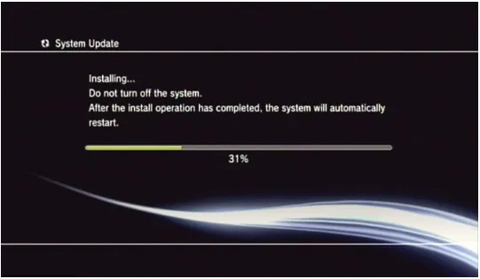
System updates are a necessary evil for many of our modern electronic devices, but fewer of us find or want to make time to upgrade the software on our various operating systems. One example of this pain point comes to us from console gaming systems. If you are a cord cutter, you may fuel your living room entertainment via a PlayStation or Xbox console. You may be able to relate to coming home after a long day, eager to catch up on the latest episode of your favorite series only to have to sit through 15 minutes of system updates (Figure 1-8).
Figure 1-8. Look familiar? System updates from a PS3 require user attention and initiation
Many other devices have their share of required updates—but the difference on smartphones and desktop computers is that updates are optional and the apps are still usable, just in less recent
versions. While the PS3 does provide for automatic updates, the feature is not enabled by default and requires a separate subscription service. Out of respect for users’ time, the paradigm that services should emulate is similar to Google chrome—automatic and in the background.
You’ve called your credit card company and entered your card number and personal information during the automated portion of the call, only to have the customer service representative ask for the same information when you’re finally speaking with one of them. This is not a digital UI example, but illustrates the need for efficiency. A recent statistic states that 72% blamed their bad customer service interaction on having to explain their problem to multiple people. Regardless of the medium—digital, phone, or in person—designers should strive to minimize the amount of data entry required of the customer. If we can abolish redundant data entry, we probably will have saved the world lots of lost minutes.
Letting systems do the designing
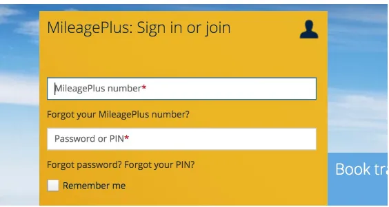
It was quite surprising to see that one aspect of the new United Airlines website actually takes a step backward in terms of respecting the customer’s time (Figure 1-9). While many features of the new design are quite welcome, such as the cleaner and more breathable layout, one element feels like it could be a victim of a rigid underlying architecture.
Now, in order to log in, a frequent flyer number must be entered. Unless you fly very often or have a great memory, it’s likely that you can’t recall this number. So in order to sign in, you’ll have to click Forgot, check your email and/or search for your number, then copy and paste. Our guess is that United is attempting to simplify the sign-in process, but the ideal credential would be a customers’ name or email simply because we remember what those are. Signing in with a name is also more human. In this example, the system’s needs appear to have won out over the user’s needs, and the result will probably impact lots of customers.
Settings fatigue
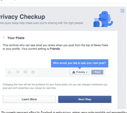
Back in 2011, Facebook changed its privacy policy a lot—so much so that many users had a hard time keeping up. Part of the power of Facebook is the ability to customize privacy in an extremely granular way, but it comes at the expense of users’ ability to stay abreast of the changes. For the sake of
everyone’s time, changing the rules should be reserved for special cases and fully communicated. To its credit, Facebook has improved its UX for privacy settings a lot—it now feels conversational and friendly (Figure 1-10).
Figure 1-10. This example represents efforts by Facebook to make privacy settings more understandable and manageable—a great improvement from earlier times
Greed
Examples in this section compete for and try to intentionally consume our time and attention.
Notification inflation
dollar to be worth less. A similar phenomenon is happening with digital notifications. We’re
drowning in them, yet the really important messages get lost in a sea of triviality. It is time to admit, for the betterment of everyone’s time and attention, that push notifications, left unchecked, have the power to divert countless people’s attention on a daily basis. This is a difficult problem to solve for designers who may be tasked with creating a communications method for one app in particular. The designer might not be thinking about the totality of the user’s experience across all apps and devices. With regard to notifications, we are all yearning for them to be subtler, smarter, and more
considerate. I think we’re all looking for the app that only contacts us at the exact right time. In my case, that might be when (1) I’m commuting, and (2) not already listening to Pandora.
Unexpected advertising
Advertisers will always be hungry for our valuable time and attention, but there are some forms of this greed emerging lately that cross over into disrespectful territory. For those of us old enough to remember what it was like to only experience advertising via commercials on TV, we are perhaps conditioned to expect advertising. However, on network television, ads were predictable. We could plan on when the commercials would be aired, so at least we could make use of them to take breaks and refill the popcorn, should we so choose. On our modern equivalent of cable TV, Facebook and Internet surfing, we often get cornered with ads at unexpected times. The most disrespectful, and now common, versions of these unexpected ads occur a few seconds after you’ve already started engaging with content. This article on new smartphone glass is a good demonstration of this common paradigm. Another recent example was a Pandora ad that occurred right in the middle of a song. Of course, advertisers need to help generate revenue, but are there ways that are more respectful of users’ time? For example, users might still want to read articles from some sources that tend to trigger ads, but imagine if article links or headlines were labeled with a small “contains popup ad” logo—a warning label of sorts. This design convention would allow us to choose how to spend our time, before we click.
Mood
“Each one of us has the power to make others feel better or worse. Making others feel better is much more fun than making others feel worse.”
Ralph Waldo Emerson
Perhaps the element of design that is most difficult to measure is the impact it has on the way users feel. Did a digital experience make me feel dumb? Was it frustrating? Some of these phenomena are subtle, but differ from trust and time in that the clearest impact is on our emotions. Some of these judgments are personal, but usually if one person has a particular reaction to a service, they are in good company. Before we look at designs to help uplift us, let’s look at some frameworks for how design can negatively impact mood.
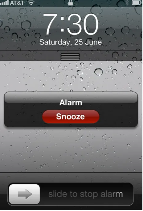
Figure 1-11. What’s the problem with this design, keeping in mind that at this moment, the alarm is sounding, and you have just woken up?
This design was changed to fit within a design framework rather than place the user’s needs at the forefront. Since iOS7, virtual buttons have been replaced in many cases with instructional text. . The issue is that, for someone that has just awakened, the snooze tap zone is awfully hard to find and very small—tapping snooze successfully on the first try can prove challenging and frustrating. It would be preferable to have a design with a full-screen takeover tap zone with just one word:
Figure 1-12. Pre-iOS7 snooze features minimal text and clearly defined tap area
alarm, it’s about temporarily overlooking the user in order to fit within a design framework. For those of you that never snooze, well, this example is not for you.
Punitive UI
Here’s another example from iCloud. Many agree that iCloud is confusing, and in this specific example there’s a tone of language and persistence with the communication around storage that has, over time, increasingly felt like a lecture. For those users that don’t want to manage their photos using iCloud, or find it confusing, the context of this message feels a bit punitive. iPhone users have
Figure 1-13. For users that don’t understand iCloud, this alert could cause digital anxiety
While this message may provide valuable communication, the frequency with which it appears along with a somewhat punitive text, over time, wears on the user’s psyche. What did I do wrong? or
What’s wrong with my phone? are thoughts that come to mind. As with the alarm example, when we stop to think about the number of users who might be feeling confused based on the number of devices out there, we could safely guess that at least thousands of people might experience this type of digital anxiety.
Impact on Businesses
We’ve looked at a number of ways that UX can impact a user’s well-being, but why should
businesses care? Beyond the obvious desire to provide efficient paths for users, how does respectful design impact business?
Today, digital touchpoints are the face of innumerable businesses, and we should acknowledge that the digital “conversations” that they facilitate should be subject to the same quality and respect as actual conversations in a physical environment. In other words, customer service begins on the landing page, not at a call center.
Once you think about interaction problems as customer service problems, you can start to realize the value of keeping these interactions respectful. In the RyanAir example, it’s hard to say whether the extra travel insurance revenue made up for the cost of confused and deceived customers, but we do know that customer service is a key reason why people choose one service over another. A recent study found that 2/3 of customers would spend 13% more with a company following an excellent customer service experience, and 55% of customers would cease buying from a company with poor customer service. Furthermore, each interaction counts—it takes 12 positive experiences to make up for one unresolved negative experience.
Not only do negative experiences influence customer behavior more than positive ones, they are also more likely to be shared. A study from the White House Office of Consumer Affairs found that news about bad customer experiences is shared twice as often as positive experiences. One avenue for sharing dissatisfaction is through reviews, which are increasingly a fundamental gateway for
attracting or turning off customers. Recent statistics show that 85% of customers say they will read up to 10 reviews before deciding whether to trust a local business. And negative reviews matter. In a recent study, Glassdoor found that 60% of job seekers would not apply to companies with low reviews.
While UX designers are not always tasked with creating the retention script for a cable company or strategy for dodging emissions standards (thank goodness), as designers become more and more
involved in more aspects of businesses, we should take our sense of ethics and respectful design with us to different disciplines within our companies and clients.
At the heart of this argument is the idea that user experience is part of customer service—the main difference today is that most of the conversations we have are with pixels instead of people. Either way, customer service is a key measure of business success. And studies show that if we respect the user, business success will follow.
Impact on Society
So, why should everyone care about respectful design? The reason becomes clear when we simply think about the sheer scale of our daily digital interactions. Essentially, how many opportunities do our digital services give us to waste time, feel deceived, interrupted, or confused? To put things into perspective, recent Nielsen research estimates that at the end of 2014, Americans used electronic media over 11 hours a day. Another 2014 study estimates that Americans spend 162 minutes on their mobile devices per day. And a most recent study estimates that in the United Kingdom, the average person spends more than 8 hours on their phone and laptop combined—more than the average night’s sleep.
Knowing these statistics, we invite you to participate in an exercise. Stop for a minute and think about your daily digital usage. Think about your digital interactions when you wake up, commute, work, communicate, and recreate. Think about the various devices that you call on to broker your digital conversations: smartphones, TVs, laptops, desktops, tablets, smartwatches, fitness trackers... Where do you think you fall on the digital usage spectrum?
If you’re like most people these days, you have more conversations with your digital services than you do with your loved ones. Another UK study suggests that in 2013, people spent more time with their smartphones than with their significant others. And while that is a social problem in and of itself, the relevant point here is that we spend a lot of time on our devices, manipulating glowing UI, tapping virtual buttons, waiting for screens to load, responding to digital bids for our attention. Even if we might not be comfortable admitting it, many of us know it to be true that we indeed live digital lives. We have way more digital conversations than actual conversations, which makes it important that our digital conversations be effortless, polite, even enjoyable. In this regard, respectful design is crucial to our public health.
The studies referenced here are from the United States and the United Kingdom, which accounts for a fraction of global digital usage. When put into perspective, we realize that designers are in a position of power that comes with the responsibility to insert as much civility into our work as possible. We aren’t just impacting the well-being of one user or a handful of users, but millions. Beyond satisfying business goals, we should keep in mind how our decisions on usability will affect not only one
Some examples in this chapter were chosen because I encountered them in my own life. Many of the pain points cited here represent edge cases and I noticed them simply because I use these products and services so frequently. Many other aspects of these same products are great, which is why I use them in the first place.
Chapter 2. What We Can Do: Design
Principles for a Respectful Future
“The journey of a thousand miles begins with a single step.” Lao Tzu
We’ve looked at a number of examples of what not to do, but what should we do instead? What single steps can designers take?
Pretend your UI is human
If we were to follow only one rule to establish ethical and respectful UX, this would be it. Many of us have seen the skit in which Google is replaced with a real person. Joking aside, the general concept of imagining that the UI is human provides a useful litmus test for whether an interaction is respectful. If this was a human interaction, would you tolerate it? Don’t worry, in case you have forgotten about how to achieve a civil human-to-human conversation, here are some guidelines:
Be polite
Don’t be demanding. Use language that a user expects. Say hello, please, thank you, and
goodbye.
Listen and respond
Don’t make users wait excessively while you “load” the answer. Provide many avenues for them to communicate with you: text search, messaging, chatting, and voice control.
Tell the truth
A user will always find out if you are lying, so save everyone time and be transparent. Consider the Comcast example of only providing an Upgrade tab. The functionality to make other service changes is there, but you have to dig.
Put users before trends
Whether or not you agree with the iOS Alarm UI example, the idea that designers sometimes forget the user’s needs in favor of supporting a design trend is very real. When we forget the user, we have lost our mission. Design fads and trends will come and go, but what is most important is that we remember the goal of respecting the user and solving the problem.
Leverage your data
we’re late on a credit card payment. If we were to log in to our credit card portal, the first thing we would expect is for the UI to display something like Hi there, did you know you’re late on your payment?.
Acknowledge the entire experience
Often when we work on designing a website or app, we forget to acknowledge that the user engages with many other services too, sometimes immediately before and after ours. It’s easy to fall into the trap of thinking the user is only involved with our service and we make decisions that contribute negatively to the user’s overall experience. For example, every app wants to send users notifications, but if every app has their way, the user will be overwhelmed with
interruptions. As we design and build services that have the capability of reaching out to customers directly, we should keep in mind all the other apps trying to do the same thing, and reach out in the smartest, not most frequent way.
Anticipate the ads
The example of advertising with click-bait navigation exposes a vulnerability in our design process. Much of the time, we design around ad space. In our wireframes, the ad space is kind of a placeholder, and in our visual designs, it’s usually a best guess. Ad services fill in the
necessary gaps with content of their own, often out of the control of the designer. We can agree that this example isn’t a good user experience and that the ad designers are mostly responsible for these shortcomings. But moving forward, what control can we take back to ensure a great
Chapter 3. Looking Forward
So what might some of these principles look like put into action? Here are a few thoughts, concepts, and scenarios that could help provide for a more ethical and respectful future:
Messaging is the new medium
The world is moving toward messaging and conversations as ways of transacting. Imagine if canceling a service was as simple as sending a text message. There are already some services that are beginning to base themselves entirely on messaging. Magic and Facebook’s M are a couple of services that take the idea of conversation as service to the next level. Apart from these personal assistant solutions, can businesses leverage conversation as a new way of servicing customers?
I know you know me
Given all the data that businesses have on their users, can’t they guess why we are probably calling, or signing in? Let’s build a system that makes some smart guesses. Similar to the credit card example from before, can we save users time by proactively making guesses about what they are most likely curious about? The key here is that the user often knows what data the business knows, so why not use it? Imagine if the next time you log into your bank’s website, a chat box pops up and says, Hi, thanks for your recent payment. I see that there was a strange charge on your card—would you like to investigate that?. This ideal experience could be a recording or a human; the key is, given all the data we know they know, it’s possible to save time and get to the heart of the issue more quickly.
HI is the new AI
There is an opportunity for human intelligence to come back where it has been replaced. Is there a future where we interact less with our digital interfaces and more with people, because
employees of the future are augmented with knowledge and tools that outpace users’ ability to self-serve? Amazon’s mechanical Turk is a very compelling example of leveraging large numbers of actual people to deliver answers and solutions. What if the respectful designs of the future don’t involve self-serve UI at all, but involve phone and chat experiences with informationally-fortified humans that are extremely responsive, helpful and efficient?
Updates, outdated
Imagine a world without system or software upgrades. What if you subscribed to a service that provided upgrades piece-by-piece and always in the background? Google Chrome seems to accomplish this already. Imagine the time the world would save with no more OS downloads or Saturday mornings spent upgrading to the latest version of app version x or OS z.
Crowdsourcing honesty
forward, let’s remain vigilant and contribute to these archives. By raising awareness and demanding respect, we can create a world that expects quality and civil digital conversations.
The Notification Police
Let’s make it easy for users to take control of incoming bids for attention. How about, when a notification comes in, the OS gives a prompt asking Was this a good time to contact you?. Then we can choose to work with the OS and help arrive at an algorithm together that benefits both of us. Similar to Pandora’s thumbs up/thumbs down paradigm, a quick preference expressed, over time, can build a more respectful notifications service.
Emotional response
There have been some recent advances in real-time emotional recognition by analyzing facial expression. In the near future, how about creating digital experiences that respond to our
expressions, the way people would? What if new options are displayed, in real time, that respond to my dissatisfaction? Perhaps we should leverage this technology to make interfaces more
Chapter 4. For Inspiration
So as we begin to think about our next design project, it will help to view a few quick examples of services that in some way or another, make us feel like our time, feelings, and trust matter:
Some examples that respect time
Google Chrome can automatically update in the background and requires no effort from the user.
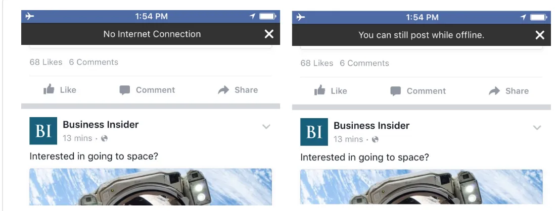
In offline mode, Facebook’s app clearly states that you can continue to post. This saves users time by allowing them to continue interacting while not connected (Figure 4-1).
Figure 4-1. Facebook app clearly messages offline capabilities
Figure 4-2. Call to action sets user expectations for what comes next
Some examples that earn trust
Although this example doesn’t fix our notification overload problem, the App Store messaging shown in Figure 4-3 provides a useful warning when about to download files over cellular. This builds trust that Apple is on our side with regard to data and cellular fees.
Figure 4-3. Messaging that may save us money helps to build trust
Those of us who use Gmail place a large amount of trust in Google, so it is appreciated when some of its efforts further that trust. While not revolutionary functionality, Google and a
number of services will let you know when suspicious logins to your account occur. For
the event (Figure 4-4). While the sign-in was innocuous, it is comforting to know there are systems in place that allow further trust in Google’s products.
Figure 4-4. Google’s notification service communicates that it has the user’s best interests in mind
Some examples that improve mood
Figure 4-5. Whimsical and helpful messaging lightens the mood and provides a conversational element
The Google homepage has a customized message and design if it’s your birthday. Not necessary, but very welcoming and respectful (Figure 4-6).
Chapter 5. For Designers: Choosing the
Right Work
There are additional steps you can take to bring ethics and respect to your work. One of those steps is simply choosing respectful projects to work on. When making this decision, it may help to have an ethical compass for determining which companies will receive your skills and perspectives.
I will often ask designers to identify their dream clients or projects. After reflecting on this myself, I created a framework for how I choose ideal projects. Not everyone has the privilege to choose projects, but it’s helpful to know, if given the choice, how you would go about making the best decision. Of the millions of design problems that need solving, what calls to you and why?
Figure 5-1. A useful chart to gauge potential work
“Good” means: Is it good for the world? Will helping client x or y have an end result that will eliminate some human suffering, even if on a tiny scale?
“Interesting” means: Is it stimulating for you as a designer? Is it a new problem? Will it help grow your skills and keep you engaged? Of the many combinations possible within this framework, I strive to work in the upper-right quadrant, as it yields the most rewarding work (Figure 5-2).
Figure 5-2. Rewarding work is both “good” and “interesting”
Now, imagine which companies and projects might fall into the other zones.
Chapter 6. Final Thoughts
The Internet now permeates our daily lives on a massive scale. We rely on it for work, to
communicate with our loved ones, make travel arrangements, pay our bills—and that’s usually just in the first hour of our day. And right now, the portals to connectivity—our digital devices and the
Appendix A. Further Reading
The goal of this report is to raise awareness for the value of respectful digital design, but it only scratches the surface. Many others are working in depth on the subject of ethics and UX, so I encourage further reading and involvement. Out of respect for your time, I’ve compiled some key references:
Reference Focus Area
Ethics of UX Research Research
Software Engineering Code of Ethics Software development
Dark Patterns UX—Catalog of deceitful designs
Time Well Spent UX—On engaging with technology meaningfully
Designing For Politeness UX—Design and etiquette
The Ethics Of User Experience UX—An overview
About the Author
David Hindman is Interaction Design Director at Fjord in San Francisco. Throughout his career, he has helped solve problems and design digital services for some of the world’s most recognizable brands. David began his career in design after studying a wide range of academic subjects and after a decade of training in classical guitar performance. He draws upon this diverse background to tackle problems from a unique and well-rounded perspective. He holds a BA in economics from
Colophon