The Professional Geographer, 54(3) 2002, pages 318–331 © Copyright 2002 by Association of American Geographers. Initial submission, August 2000; revised submission, September 2001; final acceptance, November 2001. Published by Blackwell Publishing, 350 Main Street, Malden, MA 02148, and 108 Cowley Road, Oxford, OX4 1JF, UK.
Urban Environmental Justice Indices
John Harner, Kee Warner, John Pierce, and Tom Huber
University of Colorado at Colorado Springs
Environmental justice is the principle that environmental costs and amenities ought to be equitably distributed within society. Due to the ethical, political, and public-health implications, and because many choices confront those re-searching environmental justice, standardized measures are needed to inform public dialogue and policy. We develop and test seven indices on three Colorado cities to measure the relationship between the distribution of environmental hazards and minority and poverty-stricken populations, and recommend the Comparative Environmental Risk Index as a preliminary, standardized measure for comparing urban areas. This index is particularly relevant to disadvantaged communities, regional planning organizations, environmental-justice networks and scholars, and state and federal agencies. Key Words: Colorado, environmental justice, GIS.
he Environmental Protection Agency (EPA) website (EPA 2001) defines environmental justice (EJ) as the “fair treatment for people of all races, cultures, and incomes, regarding the development of environmental laws, regula-tions, and policies.” EJ policies seek to create environmental equity: the concept that all people should bear a proportionate share of environmental pollution and health risk and enjoy equal access to environmental amenities. EJ policies are intended to overcome environ-mental racism caused by racial and economic advantages built into policy-making, enforce-ment, and locating of waste disposal and polluting industries.
Executive Order 12898, passed in 1994, re-quires each federal agency to adopt the princi-ple of environmental justice in policy develop-ment. As a result, there is an increasing need for a single quantitative EJ measurement method to help federal and state policymakers in their decision processes. To date, EJ has been measured in many different ways, often with contradictory results (Mohai 1996; Wein-berg 1998; Lester and Allen 1999; Williams 1999; Holifield 2001). Researchers have de-bated such issues as the most appropriate scale, the spatial units of analysis, the selection of so-cioeconomic variables, statistical techniques, the definition of facilities or physical features that pose a threat, selection of at-risk popula-tions, and demographic characteristics of areas at the time noxious facilities were sited. Stan-dardized methodologies are needed in order to compute benchmark measures against which
other results can be compared (Cutter 1995; Mohai 1995; Cutter, Holm, and Lloyd 1996; McMaster, Leitner, and Sheppard 1997). In this article we develop seven EJ indices using geographic information systems (GIS). We evaluate these measures using data from three Colorado metropolitan statistical areas (MSAs) and propose a standardized measure that is a preliminary indicator of environmental justice.
Developing Indices
Researchers and policymakers have long recog-nized the value of trying to measure EJ. Prior work has explored using various geographic units of analysis, types of statistical tests, and risk indicators. The geographic units of analysis used in previous research include states (Lester and Allen 1999), counties (Stockwell et al. 1993; Cutter, Holm, and Lloyd 1996), zip codes (United Church of Christ 1987), census tracts (Cutter, Holm, and Lloyd; Yandle and Burton 1996), and census block groups (Cutter, Holm, and Lloyd; Chakraborty and Armstrong 1997; Sheppard et al. 1999). Demographic variables used to measure EJ include median family in-come (Yandle and Burton), nonwhite popula-tion (Yandle and Burton), percent nonwhite (Glickman 1994; Chakraborty and Armstrong), percent below poverty level (Cutter, Holm, and Lloyd; Chakraborty and Armstrong; Sheppard et al.), African-American and Hispanic (Lester and Allen), and median household income and percent black (Cutter, Holm, and Lloyd). Statistical tests assessing the magnitude of
Urban Environmental Justice Indices
319
disparities in the distribution of environmental hazards include chi-square and Cramers V (Yandle and Burton), multiple regression (Mohai and Bryant 1992), and t-tests (Cutter, Holm, and Lloyd). The EPA (1994) has also developed an EJ index in which categorical rankings for de-gree of exposure (based on population density) are multiplied by degree of vulnerability (based on minority and economically stressed rank-ings). The source of environmental threat con-sidered has included waste disposal facilities (United Church of Christ; Yandle and Burton;), transport, storage, and disposal (TSD) sites monitored under the Research Conservation and Recovery Act (RCRA) (Mohai and Bryant), the Toxic Release Inventory (TRI) (Stockwell et al; Glickman; Scott and Cutter 1997; Sheppard et al), and TSD, TRI, and Superfund sites (Cut-ter, Holm, and Lloyd). Research also has at-tempted to improve upon the problem of under- or overestimating those at risk due to discrete boundary changes between the units of analysis by employing buffers around toxic sites (Glickman; Anderton 1996), a series of buffers (Mohai and Bryant; Glickman; Sheppard et al.), a combination of buffers and plume analysis (Chakraborty and Armstrong), and a cumula-tive distance decay function (Cutter, Hodgson, and Dow 2001).
In addition to inconsistencies in measure-ment and analysis, researchers have conducted longitudinal case studies to determine demo-graphic characteristics at the time of hazardous waste facility siting (Yandle and Burton 1996; Boone and Modarres 1999), addressed prob-lems with the conceptualization of racism (Pulido 2001), explored the definition of “com-munity” (Williams 1999), and examined the treatment of EJ in local sustainability efforts (Warner 2002). Research into EJ has also con-fronted such issues as unequal enforcement of environmental laws, exclusionary decision-making processes, and discriminatory zoning (Bullard 1996). These and other research projects address different dimensions of EJ and its determinants, including procedural inequi-ties, generational inequiinequi-ties, and outcome in-equities (Cutter 1995).
The focus of this project is quite specific: to develop an EJ index that is conceptually valid and easily computed for any city. Our goal is to develop a standard index that is relatively sim-ple to calculate and interpret.
Although many hazardous waste sites occur in rural areas (Bullard 1996), this study is con-fined to urban areas. Toxic sites tend to be cor-related with low income and minority areas in urban areas (Cutter 1995), and most toxic re-lease and transfer sites are near large popula-tion centers (Stockwell et al. 1993). We look at potential exposure to toxic sites only, but our tests are flexible enough to expand the analysis to certain other environmentally sensitive is-sues. Provided an environmental threat or amenity has a known location, such as a flood-plain, a zone of urban blight, open space pre-serves, or transportation corridors, these fea-tures could substitute for the toxic sites used in this study, thereby broadening the usual con-ception of “environment” and opening new possibilities for EJ research (Holifield 2001). We measure outcome equity between MSAs, a comparative measure for one point in time only. We do not attempt to determine the causes of environmental inequity or policy dis-crimination, we do not perform longitudinal case studies, and we do not delve into the socio-logical constructs of race, ethnicity, or commu-nity. The indices we develop are tools, and should be useful for researchers to address the nuances of specific locales (Mohai and Bryant 1992; McMaster, Leitner, and Sheppard 1997) and explore the relationship of EJ to such top-ics as political culture, sustainability, segrega-tion, economic base, growth, and community. Our results will provide a benchmark for fur-ther scholarly research, a practical community indicator of environmental justice, and an ini-tial comparison measure between cities.
Conclusions often vary among EJ studies be-cause the research questions differ. We address four EJ dimensions of toxic siting that have concerned scholars, officials, and affected pop-ulations: (1) the likelihood of exposure for different groups, (2) demographic differences between at-risk and not-at-risk populations, (3) the relationship of concentration of toxic sites to social characteristics, and (4) the relationship of the toxicity of sites to social characteristics. The following indices address these dimensions:
320
Volume 54, Number 3, August 2002
2a. Toxic Demographic Difference Index (TDDI): Do the demographics for areas of the city that are vulnerable to toxic hazards differ significantly from those for other areas of the urban region?
2b.Toxic Demographic Quotient Index (TDQI): Are the proportions of racial minori-ties and low-income people in the at-risk areas greater than in not-at-at-risk areas?
3a. Toxic Concentration Equity Index (TCEI): Are the numbers of toxic sites more con-centrated in minority and low-income areas?
3b. Concentration Risk Comparison Index (CRCI): Are racial minorities and low-income people more likely to live near areas of high toxic concentrations than the rest of the population?
3c. Concentration Demographics Index (CDI): Do the demographic characteristics of areas of the city with high toxic concen-trations differ significantly from other areas of the urban region?
4. Toxicity Equity Index (TEI): Do minority and low-income areas contain more po-tentially dangerous types of toxic sites?
We use accepted GIS algorithms in our analy-sis, which introduce a higher degree of objec-tivity (Glickman 1994) and are recognized to be the tools now needed to address current problems in EJ analysis (Cutter, Holm, and Clark 1996).
Our units of analysis are census block groups. These are the smallest unit for which the Census Bureau reports the necessary socio-economic information, ensuring the best pos-sible degree of representativeness in geo-graphic areas (Cutter, Holm, and Clark 1996; Yandle and Burton 1996; McMaster, Leitner, and Sheppard 1997; Sheppard et al. 1999). With the GIS we generate buffers around toxic
sites (when appropriate) to select block groups (buffer distances are discussed below) to best define at-risk and not-at-risk populations (Mohai 1995). Numerous people recognize the need to use buffers around toxic sites so as to avoid the boundary problem associated with the units of analysis and to avoid undercount-ing those at risk (Glickman 1994; Mohai 1995; Anderton 1996; Bullard 1996).
Where possible, we define toxic sites com-prehensively as any location included in federal and state databases (Table 1). The need for measures that treat toxic sites comprehensively, rather than particular subsets of toxic sites, is well known (Mohai 1995; McMaster, Leitner, and Sheppard 1997). Furthermore, state and regional databases are frequently superior to federal records (Anderton 1996). We therefore use a comprehensive list that includes state data in addition to federal data. We use the Envi-ronmental Geographics™ data from VISTA Information Solutions, Inc., a GIS data vendor that provides continually updated and reliable locations of toxic sites from all known sources (VISTA 1998, 2000). These toxic sites are represented as both point and polygon (area) features.
While it is often desirable to assign some level of potential threat to each site (Stockwell et al. 1993; Glickman 1994; Cutter, Hodgson, and Dow 2001), several factors preclude this for six of our seven indices. Much of the data concerning the exact volume and chemical makeup of toxins in these sites are unavailable for all of the datasets. Also, on-site toxins vary greatly on a daily basis for most sites, which means the risk at a site is never stable. Having acknowledged this, we still want to incorporate some measure that addresses the discrepancies in the level of potential threat each type of site poses. Even this proves difficult, however, be-cause the levels of toxins between sites for even one type, such as RCRA large generators, vary
Table 1 Data Sources for Toxic Sites
•National Priorities List (NPL) superfund sites •All other superfund sites (Comprehensive Environmental Response Compensation and Liability Act/CERCLIS)
•Research Conservation and Recovery Act (RCRA)
Corrective Actions sites (CORRACTS) •RCRA large generators
•RCRA small generators •RCRA Transport, Storage, and Disposal Facilities (TSDFs)
•State-level equivalents of the federal data sets •Toxic Release Inventory sites (TRIs).
Urban Environmental Justice Indices
321
greatly. The only realistic ranking scheme we can use for a comprehensive list of toxic sites concerning the level of potential threat these datasets contain is that the Superfund sites are probably worse than the rest (Superfunds are the only confirmed polluted sites in the database, while many other types of sites may use and store toxins but never release them, or may re-lease toxins within allowable specifications). We account for this by generating larger buffer distances around Superfund National Priority List (NPL) and Comprehensive Environmen-tal Response Compensation and Liability In-formation System (CERCLIS) sites (one mile) than the rest (one-half mile) in those tests where buffers are used.
The choice of buffer distances is also a con-tested issue (Bowen 1999). Landfill impact on housing values range from 2 to 2.5 miles (Mohai 1995). Glickman (1994) claims the radius of an area affected by a major chemical release often exceeds one mile. Zimmerman (1994) uses a one-mile buffer around NPL sites, while Chakraborty and Armstrong (1997) use both one-half- and one-mile buffers around TRI sites. Sheppard and colleagues (1999) use 100-, 500-, and 1000-yard buffers around TRI sites. The EPA (1989) has determined “inner zones,” or zones of plausible exposure, for their Hazard Ranking System (HRS) for NPL sites: one mile for air; four miles for surface water; and for land, twelve feet for the depth to aquifer, one mile for the distance to the nearest well, and one-half mile for down-gradient runoff. These EPA figures are only guides, because the HRS is a peer-reviewed process of NPL sites that accounts for site-specific characteristics about volume and type of toxins present. Cutter and colleagues (2001) avoid buffers altogether by using a distance-decay function—a thorough yet computationally intense method. We chose one-half- and one-mile buffers to be on the
conservative side, because the comprehensive nature of our toxic-site data includes many sites that probably never actually release contami-nants, such as the RCRA sites, and are thus only potential threats.
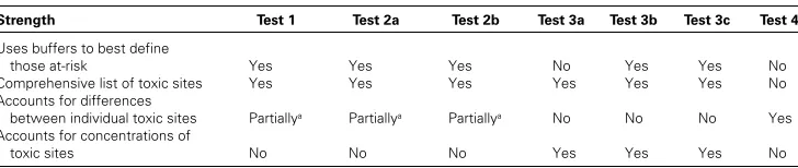
While we feel using two buffer distances is the best method by which to address variations in the level of toxicity associated with different types of sites at this time, our last measure spe-cifically addresses discrepancies in the level of toxicity—but in TRI sites only. Here we em-ploy a measure for the total emissions from these sites, weighted by a toxicity ranking for the type of chemicals emitted. The drawback is that the sites are not comprehensive to all toxic datasets, but the severity of risk is factored in (see Table 2 for a summary of the strengths of each test).
Methods to select the geographical areas at risk still cause considerable variation in the at-risk population even when an acceptable buffer distance is determined. Buffers are only used to select the underlying units of analysis, because these are the units at which socioeconomic data are reported. This again shows the value of using the smallest possible unit of analysis (block groups) in order to best approximate the actual buffer radius used. Buffers can be used to select all block groups that intersect the buff-ers, all that have their centroid within the buffer, or only those that are completely within the buffer. Alternatively, the population for each block group that intersects the at-risk buffers can be estimated by using the propor-tion of the block group that lies within the buffer (buffer containment method—see Sheppard et al. 1999). Chakraborty and Arm-strong (1997) estimated the at-risk population in this way, but found almost identical values between the centroid containment method and the buffer containment approximation method. Because we want to best approximate the buffer
Table 2 Strengths of Tests
Strength Test 1 Test 2a Test 2b Test 3a Test 3b Test 3c Test 4
Uses buffers to best define
those at-risk Yes Yes Yes No Yes Yes No
Comprehensive list of toxic sites Yes Yes Yes Yes Yes Yes No
Accounts for differences
between individual toxic sites Partiallya Partiallya Partiallya No No No Yes
Accounts for concentrations of
toxic sites No No No Yes Yes Yes No
322
Volume 54, Number 3, August 2002
radius and minimize computations, we select only those block groups that have their cen-troid within the buffer, eliminating those with large spatial extent for which the majority of the area lies outside of the toxic site buffer.
The discussion thus far on use of buffers, buffer distances, measures of toxicity, and spa-tial units of analysis requires a clarification about the underlying assumptions in these tests and the usefulness of the results. We recognize that equating proximity (however defined) with risk is a crude measure. Bowen (1999) recog-nizes that proximity has become the standard proxy for risk, but attacks this assumption as far too simplistic. The complexities of each site— issues such as toxin doses, exposure times, and synergistic effects of simultaneous multiple chemical exposure, as well as details on wind, atmospheric, and hydrographic conditions— must be fully analyzed before a definitive state-ment of risk can be made. Only this level of detail will define risk. It is not our intent to provide the methodology needed to accurately measure risk in any specific place, but to find a preliminary indicator that is easy to perform and compares relative conditions between places. We do not specifically equate proximity with risk. Our indices reveal inequalities in potential risk. Furthermore, our analysis should clarify confusion as to why EJ studies often generate conflicting results, and it provides a necessary step toward standardization (Szasz and Meuser 1997). Researchers can use our measure as a starting point, then proceed into local histories and local conditions as needed.
We perform all tests for race, ethnicity, and poverty level from the 1990 Census (U.S. Bu-reau of the Census 1990). Race is measured by using the nonwhite populations. Because “His-panic” can include all racial categories, Hispan-ics are treated separately from race.1 We also use persons below poverty level for the low-income index: some of our tests generate mean values, so we cannot use median or mean Cen-sus values, such as median household income, to generate our mean values. We therefore generate an EJ index measured against racial minorities, Hispanics, and the poor for each MSA. We then average these indices and nor-malize by the rate of toxic sites in the MSA using the formula:
(number of toxic sites/population) 1000 (1)
This normalized composite index controls for variations in the overall burden an MSA popu-lation bears in terms of toxic sites. We do this because some cities have relatively low overall environmental dangers, with few toxic sites per capita, while others have a higher per-capita number of toxic sites. Normalizing the indices allows for direct comparison of the EJ index between cities, where cities with greater levels of environmental risk score higher.
Case-Study Cities
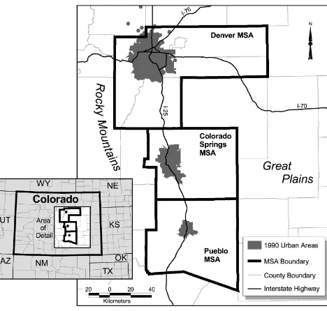
The three cities chosen for this analysis are Pueblo, Colorado Springs, and Denver (Figure 1). All are located along the front range of Col-orado, a high-growth corridor. Each city has unique characteristics that should be reflected in the EJ indices. We chose these cities for their proximity and diversity. The purpose is not to determine the specifics of EJ in these cities per se, but to test between these cities in order to correlate the best EJ index. Our familiarity with these cities and ready access for field ob-servations allows ongoing “reality checks” for our EJ calculations.
Colorado Springs is the second-largest city in Colorado, with a 2000 MSA (El Paso County) population of 516,929. Founded by General William Jackson Palmer in 1871, the city was neither the typical Western boomtown nor a transportation hub. Rather, it was explic-itly founded to be a blue-blood resort town, a clean getaway for elites from the East Coast. Dubbed “Newport in the Rockies,” Colorado Springs was initially a dry town with many mil-lionaires, a wide representation of churches, and the moral values of its founder stamped on the social space. The Cripple Creek gold rush of the 1890s brought more wealth to the city, but also changed the ambiance with the intro-duction of gold smelters and more heavy indus-try. Today the city hosts a strong military pres-ence (typically an important player for local environmental concerns), plus a concentration of high-tech industries, including silicon-chip manufacturers. Minority percentages match the national averages, but are low for an urban area.
Urban Environmental Justice Indices
323
city with a large Hispanic population, many of whom are migrants from neighboring New Mexico (with more recent Mexican immi-grants) who worked in the Colorado Fuel and Iron Company steel mill. Pueblo has a rich di-versity of other European ethnic groups, ances-tors of earlier immigrants who came to work in the mills. The steel mill, now called Rocky Mountain Steel, still operates today but em-ploys far fewer workers than its 1920 peak of over 6,500. General Palmer chose the site of the mill to build rails for his Denver and Rio Grande Railroad because of the availability of water, nearby coal, and limestone, but also to ensure that the noxious industry was not lo-cated in his beloved Colorado Springs, where the high society lived.
Denver, the central place for a vast “empire” of mountains and plains, is the dominant urban player in the region. The MSA consists of five counties (Denver, Arapahoe, Adams, Jefferson, and Douglas) with a 2000 population of 2,109,282. The city has a large Hispanic popu-lation and a diversity of other racial and ethnic types. In addition, it has a large manufacturing sector, which historically included ore smelters and later nuclear arsenal plants, but is domi-nated today by the telecommunications industry and other high-tech offices. Denver is
experi-encing rapid urban sprawl, which may have the effect of leaving disadvantaged groups behind in the potentially noxious industrial locations.
In order to compare results between cities, we normalize our composite indices by the rate of toxic sites. The toxic site rate is highest for Denver (1.21948 toxic sites per 1000 people), next highest in Colorado Springs (0.85891), and lowest in Pueblo (0.72480). Denver, therefore, has the highest overall number of toxic sites per capita, so its normal-ized composite indices will be scaled higher than the other cities.
Test 1: Comparative Environmental
Risk Index
The first index measures whether minorities and low-income people are more likely to be exposed to environmental hazards than are the rest of the population. This measure selects all block groups that have their centroid within a one-mile buffer around NPL/CERCLIS sites and a one-half-mile buffer around all other toxic sites to define the at-risk population.
To generate the race index, we sum the non-whites in at-risk block groups and divide by the total MSA nonwhites, then do the same for the whites. The index is a quotient (a ratio of
324
Volume 54, Number 3, August 2002
ratios) of the two, or percent of nonwhites at risk divided by the percent of whites at risk. We repeat this measure for Hispanics and persons below poverty level.2 To calculate an overall CERI, we then average the three individual quotients and normalize by multiplying by the total MSA toxicity rate to account for the per capita number of toxic sites.
The results show that in Pueblo and Denver, the poor as a group are at greater toxic risk than nonwhites (Table 3). In Colorado Springs, nonwhites are at highest risk (but all 3 indices are similar). The highest risk for all groups and all cities is on the poor in Denver, who are 33.8 percent more likely to be at risk than are the non-poor. In Colorado Springs, nonwhites are 33 percent more likely to be at risk than are whites. Pueblo has the lowest levels of inequal-ity for the three cities.
Overall, much higher percentages of all three groups (nonwhite, poor, and Hispanic) are at risk in Denver than in the other two cit-ies. This higher overall risk in Denver is accen-tuated by the fact that Denver has a higher rate of toxic sites than do the other two cities (ac-counted for in our normalization procedure). The normalized composite index ranks Denver as most severe, Colorado Springs second, and Pueblo the least severe.
Test 2a: Toxic Demographic
Differences Index
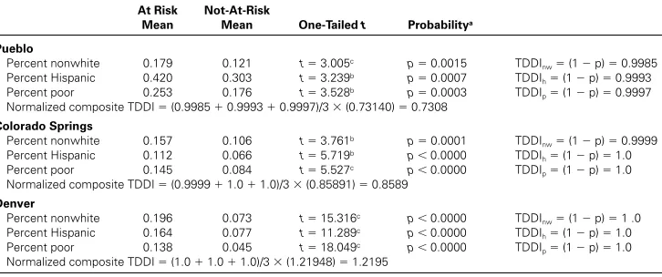
This index determines if there are statistically significant differences between nonwhite, His-panic, and poor populations near toxic sites (at-risk) and away from toxic sites (not-at-(at-risk). To do so, we first determine the at-risk and not-at-risk populations with the same buffer distances and block group selection method as above, then calculate the mean number of nonwhites, Hispanics, and persons below poverty level in both populations. Since the two populations are mutually exclusive, independence is main-tained. The t-score from the difference of means between these populations indicates the probability of this inequality occurring at ran-dom, and one minus the significance level (1
p) is the index for each variable.3
Results show that differences in the popula-tions for all three variables in each city are highly significant (Table 4). On average, at-risk areas have higher proportions of non-whites, Hispanics, and low-income people. In Denver, the percent poor in at-risk areas is over three times that of not-at-risk areas, and differences between the percent nonwhite is nearly as great. Pueblo again shows the small-est differences between at-risk and not-at-risk
Table 3 Comparative Environmental Risk Indices (Test 1)
Pueblo
CERInw
(at risk nonwhites/total MSA nonwhites)
0.49261 1.137
(at risk whites/total MSA whites) 0.43316
CERIh
(at risk Hispanic/total MSA Hispanic)
0.48443 1.157
(at risk non-Hispanic/total MSA non-Hispanic) 0.41874
CERIp
(at risk poor/total MSA poor)
0.52019 1.229
(at risk non-poor/total MSA non-poor) 0.42300 Normalized composite CERI (1.137 1.157 1.229)/3 (0.73140) 0.8555
Colorado Springs
CERInw
(at-risk nonwhites/total MSA nonwhites)
0.64966 1.331
(at-risk whites/total MSA whites) 0.48804
CERIh
(at-risk Hispanic/total MSA Hispanic) 0.63478
1.272 (at-risk non-Hispanic/total MSA non-Hispanic) 0.49896
CERIp
(at-risk poor/total MSA poor)
0.64093 1.292
(at-risk non-poor/total MSA non-poor) 0.49596 Normalized composite CERI (1.331 1.272 1.292)/3 (0.85891) 1.1143
Denver
CERInw
(at-risk nonwhites/total MSA nonwhites)
0.81796 1.308
(at-risk whites/total MSA whites) 0.62529
CERIh
(at-risk Hispanic/total MSA Hispanic)
0.79929 1.266
(at-risk non-Hispanic/total MSA non-Hispanic) 0.63120
CERIp
(at-risk poor/total MSA poor)
0.84605 1.338
Urban Environmental Justice Indices
325
populations; nonetheless, the differences are significant.
The normalized composite index is the aver-age of the three indices, again normalized by the rate of toxic sites in the MSA. As with test 1, Denver showed the highest inequality, Colo-rado Springs second, and Pueblo third.
Test 2b: Toxic Demographics
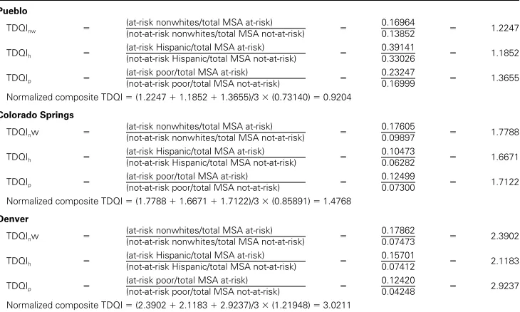
Quotient Index
We can also measure inequality by comparing the proportions of racial minorities and poor in at-risk areas to their proportions in not-at-risk areas. The index is the quotient between the at-risk percentages and the not-at-at-risk percentages. We use the same selection method to define the at-risk population as in the two previous tests.
As expected, the minority and poor propor-tions of the population in at-risk areas are higher than their proportions in not-at-risk areas for each city (Table 5). The highest ineq-uity shows that the proportion of poor people in the at-risk population in Denver is nearly three times higher than the proportion of poor people in the not-at-risk population. The Den-ver at-risk areas also have oDen-ver two times the proportions of minorities of the not-at-risk areas. Colorado Springs indices show that at-risk areas have over one and a half times higher proportions of minorities and poor than not-at-risk areas. Pueblo again shows the least inequality. When the individual indices are
normalized by the MSA toxic site rates, Denver has the highest composite index of 3.0211, Col-orado Springs the next, and Pueblo the lowest.
Test 3a: Toxic Concentration
Equity Index
This procedure generates an index indicating the degree to which toxic sites are concentrated within nonwhite, Hispanic, and low-income areas. The previous tests found at-risk popula-tions near toxic sites, but gave no indication as to the number of toxic sites nearby. To generate this index, we compare two distributions: the percent of an MSA’s toxic sites in each block group, and the percent of the MSA population in each block group. The assumption is that eq-uity occurs when a block group’s proportion of the MSA’s toxic sites equals that block group’s proportion of the MSA population. The ratio of disadvantage, or the percentage of toxic sites divided by the percentage of the population, indicates the relative burden for each block group. Numbers greater than 1.0 indicate a disproportionate burden of toxic sites given their share of the population, numbers less than 1.0 have less than their fair share.
A Gini coefficient (G) tells the degree of in-equality between the two distributions (percent of toxic sites and percent of the MSA population):
G .5 兩(percent of toxic sites)
(percent of total population)兩 (2)
Table 4 Toxic Demographic Differences Indices (Test 2a)
At Risk Mean
Not-At-Risk
Mean One-Tailed t Probabilitya
Pueblo
Percent nonwhite 0.179 0.121 t 3.005c p 0.0015 TDDI
nw (1 p) 0.9985
Percent Hispanic 0.420 0.303 t 3.239b p 0.0007 TDDI
h (1 p) 0.9993
Percent poor 0.253 0.176 t 3.528b p 0.0003 TDDI
p (1 p) 0.9997
Normalized composite TDDI (0.9985 0.9993 0.9997)/3 (0.73140) 0.7308
Colorado Springs
Percent nonwhite 0.157 0.106 t 3.761b p 0.0001 TDDI
nw (1 p) 0.9999
Percent Hispanic 0.112 0.066 t 5.719b p 0.0000 TDDI
h (1 p) 1.0
Percent poor 0.145 0.084 t 5.527c p 0.0000 TDDI
p (1 p) 1.0
Normalized composite TDDI (0.9999 1.0 1.0)/3 (0.85891) 0.8589
Denver
Percent nonwhite 0.196 0.073 t 15.316c p 0.0000 TDDI
nw (1 p) 1 .0
Percent Hispanic 0.164 0.077 t 11.289c p 0.0000 TDDI
h (1 p) 1.0
Percent poor 0.138 0.045 t 18.049c p 0.0000 TDDI
p (1 p) 1.0
Normalized composite TDDI (1.0 1.0 1.0)/3 (1.21948) 1.2195
aAll probabilities are significant.
bEqual variance assumed.
326
Volume 54, Number 3, August 2002
Gini coefficients vary from 0 (complete equality) to 100 (complete inequality). The calculated Gini coefficient shows that Pueblo has the most unequal burden between toxic concentrations and the overall population
concentrations—fully 75 percent of the toxic sites would need to be redistributed to achieve equity (Table 6). However, this measure says nothing about the population that is adversely affected by inequality. To generate an EJ index,
Table 5 Toxic Demographic Quotient Indices (Test 2b)
Pueblo
TDQInw
(at-risk nonwhites/total MSA at-risk)
0.16964 1.2247
(not-at-risk nonwhites/total MSA not-at-risk) 0.13852
TDQIh
(at-risk Hispanic/total MSA at-risk)
0.39141 1.1852
(not-at-risk Hispanic/total MSA not-at-risk) 0.33026
TDQIp
(at-risk poor/total MSA at-risk) 0.23247
1.3655 (not-at-risk poor/total MSA not-at-risk) 0.16999
Normalized composite TDQI (1.2247 1.1852 1.3655)/3 (0.73140) 0.9204
Colorado Springs
TDQInw
(at-risk nonwhites/total MSA at-risk) 0.17605
1.7788 (not-at-risk nonwhites/total MSA not-at-risk) 0.09897
TDQIh
(at-risk Hispanic/total MSA at-risk)
0.10473 1.6671
(not-at-risk Hispanic/total MSA not-at-risk) 0.06282
TDQIp
(at-risk poor/total MSA at-risk)
0.12499 1.7122
(not-at-risk poor/total MSA not-at-risk) 0.07300 Normalized composite TDQI (1.7788 1.6671 1.7122)/3 (0.85891) 1.4768
Denver
TDQInw
(at-risk nonwhites/total MSA at-risk)
0.17862 2.3902
(not-at-risk nonwhites/total MSA not-at-risk) 0.07473
TDQIh
(at-risk Hispanic/total MSA at-risk)
0.15701 2.1183
(not-at-risk Hispanic/total MSA not-at-risk) 0.07412
TDQIp
(at-risk poor/total MSA at-risk) 0.12420
2.9237 (not-at-risk poor/total MSA not-at-risk) 0.04248
Normalized composite TDQI (2.3902 2.1183 2.9237)/3 (1.21948) 3.0211
Table 6 Toxic Concentration Equity Index (Test 3a)
Pueblo
Percent nonwhite RD 13.31 27.836 (%nw) R2 0.038 F 1.476 p 0.232 TCEI
nw (1 p) 0.768
Percent Hispanic RD 11.83 6.240 (%Hispanic) R2 0.009 F 0.345 p 0.561 TCEI
h (1 p) 0.439
Percent poor RD 2.35 14.060 (%poor) R2 0.142 F 6.126 p 0.018a TCEI
p (1 p) 0.982
Multiple regression
RD 6.719 7.65 (%nw) 32.27 (%Hispanic) 59.47 (%poor) R2 0.280 F 4.535 p 0.009
Normalized composite TCEIb (1 0.009) (0.73140) 0.7248
Colorado Springs
Percent nonwhite RD 4.37 2.875 (%nw) R2 0.005 F 0.500 p 0.481 TCEI
nw (1 p) 0.519
Percent Hispanic RD 4.17 2.487 (%Hispanic) R2 0.001 F 0.135 p 0.714 TCEI
h (1 p) 0.286
Percent poor RD 1.695 15.240 (%poor) R2 0.102 F 12.405 p 0.001a TCEI
p (1 p) 0.999
Multiple regression
RD 2.975 4.92 (%nw) 13.49 (%Hispanic) 22.07 (%poor) R2 0.162 F 6.920 p 0.000
Normalized composite TCEIb (1 0.000) (0.85891) 0.8589
Denver
Percent nonwhite RD 3.94 7.795 (%nw) R2 0.009 F 4.950 p 0.026a TCEI
nw (1 p) 0.974
Percent Hispanic RD 4.40 5.567 (%Hispanic) R2 0.004 F 2.432 p 0.119 TCEI
h (1 p) 0.881
Percent poor RD 4.50 5.420 (%poor) R2 0.002 F 1.305 p 0.254 TCEI
p (1 p) 0.746
Multiple regression
RD 3.99 8.06 (%nw) 2.58 (%Hispanic) 3.52 (%poor) R2 0.010 F 1.794 p 0.147
Normalized composite TCEIb (1 0.147) ( 1.21948) 1.0402
Note: Pueblo: Gini 74.76; Colorado Springs: Gini 65.70; Denver: Gini 69.35.
aSignificant relationships.
Urban Environmental Justice Indices
327
we use simple linear regression to regress the ratio of disadvantage on the percent nonwhite, then on percent Hispanic, and finally on the percent poor for each block group. Each index is one minus the probability associated with each regression equation (the linear relation-ship between areas with disproportionate num-bers of toxic sites and each demographic vari-able). We excluded all block groups that had zero toxic sites because the dependent variable (ratio of disadvantage) is highly skewed when all block groups are included (as many block groups have no toxic sites). We are therefore testing whether, for the population at risk, higher percentage of poor, nonwhite, or His-panic explain higher concentrations (burdens) of toxicity.
Although Pueblo has an unequal distribution of toxic sites compared to population, only the percent poor is significantly related to this in-equality, explaining 14.2 percent of the varia-tion in the burden ratio. Colorado Springs also has a strong relationship between percent poor and toxic concentrations (R2 0.102), while the percent nonwhite explains almost 1 percent of the variation in toxic concentrations in Denver.
To generate a composite index, we first run a multiple regression with all three variables in the equation, then calculate a normalized
com-posite index by multiplying one minus the mul-tiple regression probability times the MSA toxic site rate. Once again, Denver has the highest composite index, Colorado Springs the second, and Pueblo the lowest.
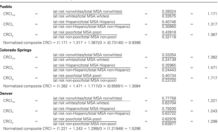
Tests 3b and 3c
Using the ratio of disadvantage from test 3a al-lows a new method to define those areas at-risk. We first select all block groups that bear more than five times their fair burden (ratio of dis-advantage 5.0), then include all block groups
whose centroid is within one-half mile of this selected set. This selection method defines at-risk areas as only those block groups near areas of high burden (toxic-site concentrations higher than population concentrations). Once this selection method is completed, we com-pare the demographics for those areas to the remainder of the population with a compara-tive-risk test similar to test 1 and a difference-of-means test similar to Test 2a.
Normalized composite indices for test 3b show the same trend in rankings, with Denver the highest EJ index, Colorado Springs second, and Pueblo third (Table 7). However, within the cities, likelihoods of living near concentra-tions of toxic sites for the demographic groups
Table 7 Concentration Risk Comparison Indices (Test 3b)
Pueblo
CRCInw
(at risk nonwhites/total MSA nonwhites)
0.39324 1.171
(at risk whites/total MSA whites) 0.33575
CRCIh
(at risk Hispanic/total MSA Hispanic)
0.40746 1.317
(at risk non-Hispanic/total MSA non-Hispanic) 0.30950
CRCIp
(at risk poor/total MSA poor)
0.43918 1.367
(at risk non-poor/total MSA non-poor) 0.32118 Normalized composite CRCI (1.171 1.317 1.367)/3 (0.73140) 0.9398
Colorado Springs
CRCInw
(at risk nonwhites/total MSA nonwhites)
0.33354 1.382
(at risk whites/total MSA whites) 0.24139
CRCIh
(at risk Hispanic/total MSA Hispanic) 0.35965
1.471 (at risk non-Hispanic/total MSA non-Hispanic) 0.24443
CRCIp
(at risk poor/total MSA poor)
0.40734 1.717
(at risk non-poor/total MSA non-poor) 0.23720 Normalized composite CRCI (1.382 1.471 1.717)/3 (0.85891) 1.3084
Denver
CRCInw
(at risk nonwhites/total MSA nonwhites)
0.77758 1.221
(at risk whites/total MSA whites) 0.63704
CRCIh
(at risk Hispanic/total MSA Hispanic)
0.79200 1.243
(at risk non-Hispanic/total MSA non-Hispanic) 0.63722
CRCIp
(at risk poor/total MSA poor)
0.82976 1.299
328
Volume 54, Number 3, August 2002
are greater than those seen in test 1. For exam-ple, in Colorado Springs, the poor are 72 per-cent more likely to live near toxic-site concen-trations than are the non-poor; Hispanics are 47 percent more likely to do so, and nonwhites are 38 percent more likely to do so.
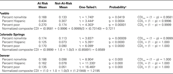
Like test 2a, test 3c shows highly significant differences between the at-risk populations of nonwhites, Hispanics, and poor and the not-at-risk populations. On average, there are much higher percentages for each of these groups near toxic site concentrations (Table 8). Again, Denver has the highest level of inequality, Colorado Springs the second, and Pueblo the lowest.
Test 4: Toxicity Equity
For the final test, we want to better account for the degree of severity, or actual threat, between toxic sites, rather than to treat all toxic sites within a certain database as equal. We thefore employ a measure of total emission re-leases for sites in the TRI database. The emis-sion releases are then weighted by the level of toxicity for each chemical released, as devel-oped by the Office of Pollution Prevention and Toxics in the Risk Screening Environmental Indi-cators CD (EPA 1999). This measure discrimi-nates between toxic sites, rather than treating them all the same, but only includes TRI sites (as opposed to a comprehensive list, in the pre-vious tests).
For this method, we query the EPA index
[(emissions) (toxicity value)] for each TRI
site in the three MSAs, then regress its log transformation (because the range of values, a unitless measure, is very large) on the three demographic variables. Pueblo is excluded from this test because only two TRI sites were iden-tified with the EPA toxicity index. Colorado Springs is included, but only has a sample size of eleven. No significant results occurred, so no linear relationship exists between the toxicity index for TRI emissions and the demographic variables (Table 9). Denver again has a higher composite EJ index than Colorado Springs.
Test Comparisons and Conclusions
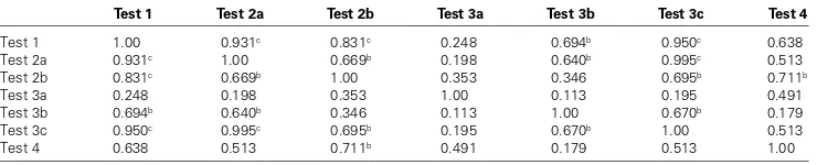
While the indices we generated indicate vary-ing degrees of environmental injustice, the end results are remarkably similar. All tests show that Denver has the highest levels of injustice, while Pueblo has the lowest. The similarities between indices are encouraging, showing that contradictory results between EJ measures are probably not as common as some claim, al-though investigators could substitute other variables or at-risk selection methods that may alter results.
When comparing the similarities between indices, test 1 shows up as most similar to the others (Table 10). Test 1 and test 3b employ the same statistical test, but with a different method to select those at-risk (as is also true between tests 2a and 3c). It is not surprising
Table 8 Concentration Demographics Indices (Test 3c)
At Risk Mean
Not-At-Risk
Mean One-Tailed t Probabilitya
Pueblo
Percent nonwhite 0.168 0.133 t 1.740b p 0.0419 CDI
nw (1 p) 0.9581
Percent Hispanic 0.434 0.307 t 3.444b p 0.0004 CDI
h (1 p) 0.9996
Percent poor 0.270 0.174 t 4.303b p 0.00001 CDI
p (1 p) 0.9999
Normalized composite CDI (0.9581 0.9996 0.9999)/3 (0.73140) 0.7211
Colorado Springs
Percent nonwhite 0.174 0.113 t 3.837c p 0.00009 CDI
nw (1 p) 0.9999
Percent Hispanic 0.125 0.073 t 5.391c p 0.0000 CDI
h (1 p) 1.000
Percent poor 0.170 0.090 t 6.099c p 0.0000 CDI
p (1 p) 1.000
Normalized composite CDI (0.9999 1.0 1.0)/3 (0.85891) 0.8589
Denver
Percent nonwhite 0.186 0.098 t 8.904c p 0.000 CDI
nw (1 p) 1.000
Percent Hispanic 0.162 0.078 t 11.330c p 0.000 CDI
h (1 p) 1.000
Percent poor 0.135 0.051 t 16.460c p 0.000 CDI
p (1 p) 1.000
Normalized composite CDI (1.0 1.0 1.0)/3 (1.21948) 1.2195
aAll probabilities are significant.
bEqual variance assumed.
Urban Environmental Justice Indices
329
then that these indices are highly correlated. Test 1 is also highly correlated with tests 2a and 3c. The index most unlike the others was test 3a, where we regressed the ratio of disadvan-tage on the demographic variables.
The two tests that calculate quotients, tests 1 and 2b, produce numbers that are most mean-ingful. They are also simple to calculate and easily interpretable. Test 1 calculations show the percentage of each demographic group that is at risk in an urban area, and how much more likely that group is to live in at-risk areas than is the remainder of the population. Test 2b shows the proportion of the at-risk population that is comprised of each demographic group, the same for not-at-risk areas, and the ratio (in-equality) between these proportions.
The remaining tests are less easy to inter-pret, or the methods to produce the indices have shortcomings. Tests 2a and 3c only deter-mine whether a statistical difference occurs be-tween populations, a conclusion that is not as useful as the results from tests 1 or 2b. The dif-ference of means for tests 2a and 3c also have
very low probability values (for instance, p
.0000000000 for all demographic groups in test 3c for Denver); hence, the indices equal 1.0, and the normalized composite index is reduced to simply the toxicity rate for that MSA.
The goal of keeping the index simple disfa-vors tests 3a, 3b, and 3c because they require more calculations for little to no extra benefit. The measures of concentration used in those tests are simply a refinement on tests 1 and 2a, a different method to determine the at-risk groups. The normalized composite indices cal-culated using multiple regression (tests 3a and 4) are also somewhat flawed. Since some, if not all three, of the demographic variables are not linearly related to the dependent variable in these tests, several actually have a negative co-efficient in the multiple regression equation. This occurs even though the mean value for all demographic variables in the at-risk group is significantly higher and the likelihood of being exposed is greater.
Test 4 is the only measure that accounts for toxicity levels, a point many researchers claim
Table 9 Toxicity Equity Index (Test 4)
Pueblo N/A
Colorado Springs
Percent nonwhite logtox 8.57 6.240(%nw) R2 0.075 F 0.725 p 0.417 TEI
nw (1 p) 0.583
Percent Hispanic logtox 7.50 1.056(%Hispanic) R2 0.001 F 0.005 p 0.944 TEI
h (1 p) 0.056
Percent poor logtox 6.86 4.493(%poor) R2 0.067 F 0.648 p 0.442 TEI
p (1 p) 0.558
Multiple regression
logtox 8.95 6.38 (%nw) 22.44 (%Hispanic) 13.36 (%poor) R2 0.288 F 0.943 p 0.470
Normalized composite TEIa (1 0.470) (0.85891) 0.4552
Denver
Percent nonwhite logtox 6.03 0.505(%nw) R2 0.006 F 0.327 p 0.570 TEI
nw (1 p) 0.430
Percent Hispanic logtox 6.27 4.200(%Hispanic) R2 0.002 F 0.097 p 0.757 TEI
h (1 p) 0.243
Percent poor logtox 5.58 2.892(%poor) R2 0.047 F 2.639 p 0.110 TEI
p (1 p) 0.890
Multiple regression
logtox 5.76 0.64 (%nw) 2.09 (%Hispanic) 5.09 (%poor) R2 0.085 F 1.575 p 0.207
Normalized composite TEIa (1 0.207) (1.21948) 0.9670
aNormalized Composite (TEI) 1 (p value of multiple regression) (number of toxic sites)/(total population) 1000.
Table 10 Correlations between Indicesa
Test 1 Test 2a Test 2b Test 3a Test 3b Test 3c Test 4
Test 1 1.00 0.931c 0.831c 0.248 0.694b 0.950c 0.638
Test 2a 0.931c 1.00 0.669b 0.198 0.640b 0.995c 0.513
Test 2b 0.831c 0.669b 1.00 0.353 0.346 0.695b 0.711b
Test 3a 0.248 0.198 0.353 1.00 0.113 0.195 0.491
Test 3b 0.694b 0.640b 0.346 0.113 1.00 0.670b 0.179
Test 3c 0.950c 0.995c 0.695b 0.195 0.670b 1.00 0.513
Test 4 0.638 0.513 0.711b 0.491 0.179 0.513 1.00
an 12 for all tests except test 4, where n 8.
bSignificant at the 0.05 level (2-tailed).
330
Volume 54, Number 3, August 2002
is necessary. Relying on TRI data for this mea-sure excludes a comprehensive set of toxic sites, so this test is only applicable to larger urban areas. While we agree that the level of toxicity is an important variable that could be used in defining an EJ index, at this time adequate data are not available. Should more thorough mea-sures of site toxicity become available in the fu-ture, indices could be developed using regres-sion (as we attempted), or by ranking sites into toxicity categories and comparing the demo-graphics between them. Certainly using level of toxicity is an avenue that should be explored more thoroughly in the future, when it can be better measured.
Given the ease of calculation, the interpret-ability of the numbers, and the high correlation to other measures, we conclude that test 1 is the best measure, and the normalized composite is the best candidate for a preliminary standard-ized EJ indicator. Test 2b is also a valuable quo-tient, but it measures a different aspect of EJ. Where test 1 captures comparative risk, test 2b reveals the relative burden a group bears. We feel the latter is less useful than test 1’s informa-tion about the likelihood that each demo-graphic group will be located in an at-risk area. While we recommend the adoption of our CERI as a standardized indicator, investigators may have a specific research question that re-quires some other index. Our results can be used to clarify the strengths and relationships between other EJ indices and the standardized measure we propose. Note again that this mea-sure does not adequately meamea-sure risk, but is a preliminary indicator that can be used to com-pare places. By substituting, for toxic sites, natural hazards that have a known location, transportation corridors, or environmental ame-nities such as parks or open space, the same in-dex can be expanded to measure environmental justice in other dimensions. It is our hope that this index will have a direct impact on commu-nity groups and government agencies by mak-ing a contribution towards buildmak-ing sustainable communities in poor and minority neighbor-hoods in U.S. cities and providing benchmarks for detailed, site-specific analysis.䊏
Notes
1EJ analyses typically measure inequity for
minori-ties and/or the poor. We initially wanted to develop
only two indices, one for minorities and one for poor, but we did not find an easy way to combine race and Hispanic variables at the block-group level.
2Poverty level is calculated annually by the Census
Bureau based on a ratio of income to costs of an eco-nomic food plan. Number of family members is in-cluded in the calculation to determine the total number of persons below poverty level.
3We subtract p from 1.0 so that this index “reads” in
a comparable form—i.e., a higher number means more inequality.
Literature Cited
Anderton, Douglas L. 1996. Methodological issues in the spatiotemporal analysis of environmental equity. Social Science Quarterly 77 (3): 508–15. Boone, Christopher G., and Ali Modarres. 1999.
Creating a toxic neighborhood in Los Angeles County: A historical examination of environmen-tal inequity. Urban Affairs Review 35 (2): 163–87. Bowen, William M. 1999. Comments on “‘Every
Breath You Take . . .’: The demographics of toxic air releases in Southern California.” Economic
De-velopment Quarterly 13 (2): 124–34.
Bullard, Robert D. 1996. Environmental justice: It’s more than waste facility siting. Social Science Quar-terly 77 (3): 493–99.
Chakraborty, Jayajit, and Marc P. Armstrong. 1997. Exploring the use of buffer analysis for the identi-fication of impacted areas in environmental equity assessment. Cartography and Geographic
Informa-tion Systems 24 (3): 145–57.
Cutter, Susan L. 1995. Race, class, and environmen-tal justice. Progress in Human Geography 19 (1): 111–22.
Cutter, Susan L., Michael E. Hodgson, and Kirstin Dow. 2001. Subsidized inequities: The spatial pat-terning of environmental risks and federally as-sisted housing. Urban Geography 22 (1): 29–53. Cutter, Susan L., Danika Holm, and Lloyd Clark.
1996. The role of scale in monitoring environ-mental justice. Risk Analysis 16 (4): 517–26. Environmental Protection Agency (EPA). 1989. EPA
risk screening guide. Vol. 1, The process. U.S. EPA 5 60/2–89–002, Pesticides and Toxic Substances. Washington, DC: Federal Printing Office. ———. 1994. Computer-assisted environmental justice
methodology. Dallas: Office of Planning and
Analy-sis, U.S. EPA Region 6.
———. 1999. Risk-screening environmental indicators. CD-ROM, version 1.0. Washington, DC: Office of Pollution Prevention and Toxics.
———. 2001. http://www.epa.gov/swerosps/ej/ index.html (last accessed 25 March 2002). Glickman, Theodore S. 1994. Measuring
Urban Environmental Justice Indices
331
Holifield, Ryan. 2001. Defining environmental jus-tice and environmental racism. Urban Geography 22 (1): 78–90.
Lester, James P., and David. W. Allen. 1999. Envi-ronmental justice in the U.S.: Myths and realities. Paper read at the 1999 Western Political Science Association Annual Meeting, Seattle, WA, 25–27 March.
McMaster, Robert B., Helga Leitner, and Eric Shep-pard. 1997. GIS-based environmental equity and risk assessment: Methodological problems and prospects. Cartography and Geographic Information
Systems 24 (3): 172–89.
Mohai, Paul. 1995. The demographics of dumping revisited: Examining the impact of alternate meth-odologies in environmental justice research.
Vir-ginia Environmental Law Journal 13 (4): 615–53.
———. 1996. Environmental justice or analytic jus-tice? Reexamining historical hazardous waste landfill siting patterns in metropolitan Texas. So-cial Science Quarterly 77 (3): 500–7.
Mohai, Paul, and Bunyan Bryant. 1992. Race and the
in-cidence of environmental hazards. Boulder: Westview.
Pulido, Laura. 2000. Rethinking environmental rac-ism: White privilege and urban development in southern California. Annals of the Association of
American Geographers 90 (1): 12–40.
Scott, Michael S., and Susan L. Cutter. 1997. Using relative risk indicators to disclose toxic hazard in-formation in communities. Cartography and
Geo-graphic Information Systems 24 (3): 158–71.
Sheppard, Eric, Helga Leitner, Robert B. McMaster, and Hongguo Tian. 1999. GIS-based measures of environmental equity: Exploring their sensitivity and significance. Journal of Exposure Analysis and
Environmental Epidemiology 9:18–28.
Stockwell, John R., Jerome W. Sorensen, James W. Eckert, Jr., and Edward M. Carreras. 1993. The U.S. EPA geographic information system for mapping environmental releases of Toxic Chemi-cal Release Inventory (TRI) chemiChemi-cals. Risk Anal-ysis 13 (2): 155–64.
Szasz, Andrew, and Michael Meuser. 1997. Environ-mental inequalities: Literature review and propos-als for new directions in research and theory. Current Sociology 45 (3): 99–120.
United Church of Christ. 1987. Toxic wastes and race
in the United States. New York: United Church of
Christ, Commission for Racial Justice.
U.S. Bureau of the Census. 1990. Census of population and housing, STF-3, census block groups. Washing-ton, DC: Department of Commerce.
VISTA. 1998. Environmental geographics data for GIS, Pueblo and El Paso Counties, Colorado. San Diego: VISTA Information Solutions, Inc.
———. 2000. Environmental geographics data for GIS, Adams, Arapahoe, Denver, Douglas, and Jefferson
Counties, Colorado. San Diego: VISTA Information
Solutions, Inc.
Warner, Kee. 2002. Linking local sustainability initi-atives with environmental justice. Local Environ-ment 7 (1): 35–47.
Weinberg, Adam S. 1998. The environmental justice debate: New agendas for a third generation of research. Society and Natural Resources 11:605–14. Williams, Robert W. 1999. The contested terrain of environmental justice research: Community as unit of analysis. The Social Science Journal 36 (2): 313–28.
Yandle, Tracy, and Dudley Burton. 1996. Reexamin-ing environmental justice: A statistical analysis of historical hazardous waste landfill siting patterns in metropolitan Texas. Social Science Quarterly 77 (3): 477–92.
Zimmerman, R. 1994. Issues of classification in envi-ronmental equity: How we manage is how we measure. Fordham Urban Law Journal 29 (3): 633– 69.
JOHN HARNER is an Assistant Professor in the Department of Geography and Environmental Studies at the University of Colorado at Colorado Springs, Colorado Springs, CO 80918. E-mail: [email protected]. His research interests are in urban landscapes, GIS, and U.S.-Mexico interactions.
KEE WARNER is an Associate Professor in the De-partment of Sociology at the University of Colorado at Colorado Springs, Colorado Springs, CO 80918. E-mail: [email protected]. His research interests are in urban political economy, environmental jus-tice, and sustainable development.
JOHN PIERCE is Vice Chancellor for Academic Affairs Emeritus and Professor Emeritus of the Po-litical Science Department at the University of Colorado at Colorado Springs, Colorado Springs, CO 80918. E-mail: [email protected]. His research inter-ests focus on the impact of social capital on the qual-ity of urban public life.