CHALLENGES OF A MODERN ATLAS OF THE AGEING SOCIETY
S. Bleisch a *, D. Hil b, S. Korkut b, P. Meyer a
a
FHNW University of Applied Sciences and Arts Northwestern Switzerland, Institute of Geomatics Engineering, Muttenz, Switzerland – (susanne.bleisch, philipp.meyer)@fhnw.ch
b
FHNW University of Applied Sciences and Arts Northwestern Switzerland, School of Business, Institute for Information Systems, Basel, Switzerland – (darjan.hil, safak.korkut)@fhnw.ch
Commission II, TeS: WG II/6 Geovisualization and Virtual Reality
KEY WORDS: Atlas, Visualization, Framework, Interactivity, Engagement, Storytelling, Stakeholders
ABSTRACT:
Atlases are collections of illustrated data, often maps, which give an overview - as well as some details - of one or several topic areas. We noted that this description serves well especially for traditional paper and digital atlases. However, in our today's world of entertainment it might give a somewhat dated impression. For the topic area 'Ageing Society' we aim to visualise age related data in an interactive digital way that supports not only the content but also engages the users, offers opportunities for different stakeholders and levels of interest, and is able to accommodate a range of data as well as future updates. A set of guiding principles for the development process addresses these challenges. First implementations show that following the principles is feasible but expensive in terms of time and attention to detail needed. For each selected topic, a story guides the users through the data and highlights interesting aspects. The user can interrupt the story at any time and explore the data further through interacting with the detailed data representations, and switch back to the story when needed. This allows different levels of access which in combination with the specifically designed navigation concept as well as through the adherence to user aware design principles are very promising for the future developments of the Atlas of the Ageing Society and potentially other atlas products.
* Corresponding author
1. INTRODUCTION
Atlases have traditionally been a way to make spatial data and information in graphical form, often maps, available to a larger audience. The term atlas is often defined as "a bound collection of maps" (e.g., Merriam-Webster, 2016) and also often illustrated with tables and charts But an atlas may alternatively consist of a collection of data and information in a database (e.g., Craig et al., 2015) without a explicit spatial reference. We noted that especially outside of the cartographic community atlases, even digital ones, are giving a rather out-dated impression. They are often seen as a collection of maps for the (cartographic) specialist rather than information visualizations and thus information communication for a broader audience.
1.1 Aims
For the topic area 'Ageing Society' we aim to bring the atlas idea to a more modern context. The goal is to provide the necessary content with regard to selected topics but also to fulfil the expectations of today's audiences regarding engagement, entertainment and even experience. The modern atlas of the ageing society thus aims to visualize age related data and topics in an interactive digital way that suits the content, is extendable to future topics and data sets, is accessible by and useful to a wide range of stakeholders, and is engaging. These aims pose several challenges, which we discuss in reverse order in section 2. Section 3 presents a set of guiding principles aimed at addressing the challenges. The presentation of a prototypal implementation process is found in section 4. A discussion and on-going and future work conclude the paper in section 5.
1.2 Related Work
A range of atlases exists that either have a specific focus on the ageing population or present data and information about age, ageing and the ageing society as part of their spectrum of subjects. In Switzerland the "Atlas über das Leben nach 50" (BFS, 2016a) covers a range of subjects from ageing to living situations and mobility with a specific focus on the population aged 50+. It is based on census data from 2000. Also the more general purpose "Atlas of Switzerland" (AdS, 2016) includes age related topics mostly based on census data. As the ageing population, including its challenges and opportunities for the society in general, is a key topic around the world, it is not surprising that many countries and states established information collections, often called atlases, on the topic: For example the Interactive Online Ageing Atlas of South Australia (SA, 2013) or The Dartmouth Atlas of Health Care (Bynum, Meara, Chang, & Rhoads, 2016). Similarly, atlases of other topic areas embraced new technologies and forms of interaction to communicate the information to the users (e.g., GenderATlas, 2015).
2. CHALLENGES
Before creating yet another information collection or set of representations about topics concerning the ageing population, we discuss three challenges that seem key in updating the somewhat dated impression the term atlas often evokes. The three challenges are 1) engaging the user, 2) designing for a range of stakeholders, 3) while respecting the content and allowing for extensibility.
2.1 Engagement of the user
Today's users and consumers expect to varying degrees that they are engaged and entertained by representations and communications. However, atlases are not about entertainment primarily. Also the principles of presenting data truthfully shall be adhered to (e.g. Cairo, 2016). Traditional atlases are strong in providing an overview of the data and topics and often try to be as general-purpose as possible by showing all the data but avoiding presenting the data from a specific perspective. General-purpose representations, however, have more difficulties to engage the audience. Focussing the representations on selected topics and contents and telling stories that guide the users through the content have a potential to support more engagement.
Wolodtschenko (2012) proposed the term atlassing to denote the process of the user participating in the creation of a representation rather than understanding an atlas as a final product. However, the participation of the users in the atlas creation is complex and needs motivation and potentially training of the user. Traditional atlases used so-called narrative concepts, such as arranging the maps according to scale, topic, area covered, or using consistent symbology, to support comparison between maps (Hruby, 2015). Truly narrative representations such as Story Maps (ESRI, 2016) or Infographics - "modern storytelling" (Cairo, 2013) – are supposed to be able to do more. The concept of telling stories allows guiding the users through the content, engaging them and at the same time inviting them to explore the content further through suitably interactive graphical interfaces with detailed data. Recent and fast advancements in technologies and methods for digital storytelling, and especially also in the development and design of information graphics, provide large resources to address the challenge of user engagement.
2.2 Diversity of stakeholders
The stakeholders of a modern atlas of the ageing society range from experts to laypersons with a range of abilities and needs. Experts in research into ageing may want to use the atlas or selected contents for the exploration of age related data and topics, and potentially include their own data or compare data. Additionally, they may use representations and visualizations of the atlas to facilitate communication to policy makers. Laypersons may use the atlas to learn about and explore age related topics and issues. Those and potential further stakeholders, all need what we call 'translations' of the content into visual forms, which suit their specific needs. Considering the age range of interested stakeholders, the atlas needs to cater at least for some reduced abilities regarding vision and hearing. This is achieved through designs that keep usability in mind. An universal design (Story, Mueller, & Mace, 1998) is difficult to achieve for visual representations. However, a variety of options and tested strategies exist to design for decreased physical and cognitive abilities (e.g., Leporini & Paternò, 2008). For example, text elements can be allowed to be resized while the overall layout of a representation is kept.
2.3 Content and extensibility
Not all data and topics lend themselves for the same types of visualizations and representations. Overall, the content is the most important part of the atlas and thus should never be obscured or changed to fit a specific purpose. A balance has to be found to engage the users and design for different users without trivialising the content or leaving out crucial data.
A first version of the atlas of the ageing society is planned for November 2017. It will not be able to cover all available age related data and topics at several levels of granularity. Thus, it is key that the atlas development is based on open technologies, is well documented and employs reusable representation and visualization concepts. Such concepts can be used again later for updates when newer data is available, similar data at different granularities, or for different data that fits one of the concepts. Obviously, the atlas should also be extendable with new forms of visualizations and additional topics.
3. ATLAS OF AGEING SOCIETY FRAMEWORK
The atlas of the ageing society addresses the aforementioned challenges and includes a wide range of topics but does not claim to be complete. To ensure a balance, as well as a broad coverage of topics for the first limited edition of the atlas, focus themes are selected from the age-adapted perspectives of the sociological principle 'Lebenslagen' (life circumstances) (Voges, Jürgens, Mauer, & Meyer, 2003). Different 'Lebenslagen' cover conditions and options someone may encounter at a specific stage in life, in different situations, and under different circumstances.
Three main data sources are identified: the available statistical data at different granularities from the country, the states and the municipalities; data and information from concurrent projects on the ageing society under the same strategic initiatives (see Acknowledgements); as well as data from a in a different project concurrently developed and implemented age survey. The most extensive data source is the statistical data mentioned first. It is thus especially important not to reproduce the atlases and data collections that already exist based on those data sets (see also section 1.2).
We propose an atlas framework that addresses the challenges discussed in section 2. The framework comprises the following set of guiding principles:
• Representations are interactive.
• Representations support story telling and allow exploration (at least two levels of access).
• The interface is developed based on user-aware responsive design principles.
• The development process from data to representation (including decisions and limitations) is documented, possibly automated, and thus reproducible for updated or new data.
• Access is facilitated through adherence to the mentioned principles as well as through the specifically designed navigation concept. Experts and laypersons have customized/prioritized navigation options based on their specific interests and needs.
Open web technologies were chosen for the implementation, specifically D3.js (Bostock et al., 2015) for the interactive visualizations. Digital access to the representations of the atlas shall be possible cross platform online and offline. Potentially also print by-products are feasible by selecting and re-formatting suitable contents.
4. EXEMPLARY IMPLEMENTATION PROCESS
We started the implementation experiments with the population pyramid. This chapter presents the underlying historical background of the population pyramid and shows how we The International Archives of the Photogrammetry, Remote Sensing and Spatial Information Sciences, Volume XLI-B2, 2016
experimented with the graphical representation in the form of pyramids of the population age data through analogue and digital reflections.
4.1 Historical Background
The origins of demography as a science date back to 1662 (Caselli et al., 2005) with the early use of techniques for detailed analysis, although demographers only started to effectively use graphical representations in the 18th century (Friendly & Denis, 2009). Among the many scientists who were presented in the “Milestones” project of Friendly and Denis (ibid.), William Playfair plays an important role in statistical representations. In 1876 and 1801 Playfair introduced several graphical representation forms, such as line graph, bar chart and pie chart. The scope had always been to communicate large and systematic information to a broader public to support understanding.
Almost a century later, in 1874, General Francis Walker (Caselli et al. 2005) grounded the idea of the population pyramid for the 1870 Census in the United States. This visualization method shows the population in age groups along the x-axis (rate) over the y-axis (age groups). It is transposed along the y-axis for age comparison between genders (left side for men and right side for women). Essentially, it consists of two bar charts for the population of men and women in different age groups, which are positioned back-to-back. This enables direct comparison between gender in different age groups while maintaining the effectiveness of length as visual variable (Cleveland & McGill, 1984).
The Statistical Atlas of the United States (1870) uses the age pyramids to show the aggregated population and how the population is distributed in various states (Figure 1). For instance, the imbalance of 20-30 years old men/women population in some states (see last row in Figure 1) hints how the type of work (i.e. mining) attracted more men who left their families and moved to these states where in consequence women were few.
Figure 1: Age pyramids for different states (Plate 91, Statistical Atlas of the United States, 1870)
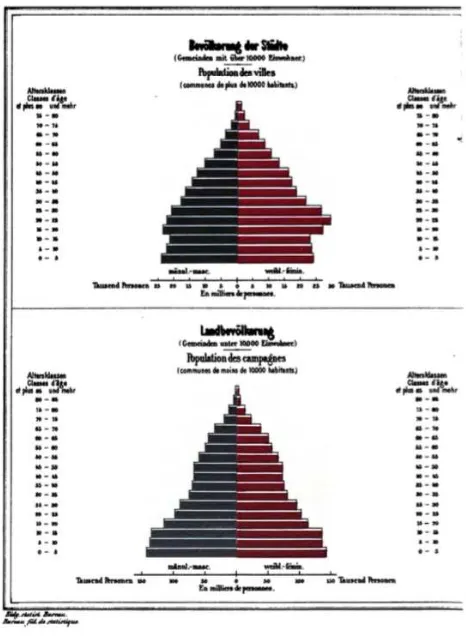
The population pyramid has been adopted broadly in Europe. The "Graphisch-statistischer Atlas der Schweiz" (Graphic-statistical Atlas of Switzerland) (1897) is the first Swiss Atlas, which featured population pyramids for urban and rural areas (Figure 2). This example illustrates the migration from rural to urban areas for the given year.
A more recent example is the Population Pyramids of the World from 1950 to 2100 (Populationpyramind.net, 2015). It indicates world population predictions year-by-year (Figure 3). The website uses World Population Prospect reports (United Nations, 2015) and applies the population pyramid principle to visualize the yearly changes in the information as slides.
The usage of population pyramids has increased within the past century. Its displays include age groups per gender for different locations. This comparison is three-dimensional (age/ gender/ location) but does not naturally support the analysis of the development of the age distribution in the population over several years in a single view. Therefore, we performed a series of 'experiments' to explore and finally address this issue.
Figure 2: Age pyramids for urban (top) and rural (bottom) areas (Page 138, Graphisch-statistischer Atlas der Schweiz, 1897)
Figure 3: Age pyramid for the World Population in 2066. (Populationpyramid.net, 2015)
4.2 Analogue experiments
The experiments aimed at finding new arrangements and combinations based on the population pyramid as a visualization method, specifically supporting the comparison through the years. In order to conduct the experiment, we printed exemplary pyramids with real population data retrieved from the Federal Statistical Office of Switzerland. The data set (BFS, 2016b) contains population data by canton (area), gender, and age (from 0 to 99+) between 1981 and 2010. The team was asked to cut, paste, fold and compose creatively (see example of the process in Figure 4). This exercise supported detailed discussions of the opportunities and challenges of the age pyramid method before carrying the implementation process to the digital medium.
Figure 4: Set of experimental pyramid visualization examples.
The results are potential combinations for comparative studies of data based on the population pyramid. The examples given here are a selected subset of the results that were produced during the Analogue Experiments phase. In detail, on the upper-left image in Figure 4, the population pyramid is split in half to focus on only one gender and overlapped with four locations. The upper-right image flips the pyramid downwards and introduces year-by-year comparison in one location and one gender; 1981, 1991, 2001, and 2011 clockwise. It highlights the first and the last value, indicating in-between values as silhouettes only. The lower-left image introduces two different locations and one gender in comparison with year-by-year changes. Lastly, the lower-right image shows one location and two genders in comparison with year-by-year changes. Currently more analogue experiments are being carried out with new forms and formations. The presented preliminary results led the project to accomplish the first implementation proposal by using population pyramids and investigating story telling and interaction dimensions of digital tools.
4.3 Digital experiments
Digital experiments were conducted with the idea of implementing data storytelling and to integrate the data visualization through suitable interaction with the relevant information in written passages. The developed prototype guides the user through the data by telling a story and highlighting relevant aspects in the data visualization while the user is reading (i.e. scrolling) the written story.
Figure 5. Prototype for “data storytelling mode” from the digital experiments.
Figure 6: Prototype for “expert mode”.
The example (Figure 5) shows the age pyramids for the area "Basel-Stadt" in Northwestern Switzerland (BFS, 2016b). A text block is combined with the visualization in the layout to allow tight integration of story and data visualization. The general layout for a story includes a text block explaining the The International Archives of the Photogrammetry, Remote Sensing and Spatial Information Sciences, Volume XLI-B2, 2016
featured topic of interest and an introduction and interesting highlights integrated in a structured story. In the text block there are connections (links) to the data graph (currently highlighted with square brackets, i.e. [anzeigen]). Clicking those links highlights the parts of the data graphic that further explain the statements made in the story. This way, each story statement is supported by highlighted views of relevant data. The first analysis has shown that this solidifies the understanding of both a complex story and a complex data set. Data and story complement each other.
Additionally, the users can always leave the "data story telling" mode and switch to an "expert mode" to explore the data freely in all its details (Figure 6). In the expert mode no data is highlighted and through user interactions (i.e mouse over, dropdown selections) the data values can be explored and different areas and years be selected for comparison.
5. CONCLUSIONS AND OUTLOOK
The first few implementation examples show that adherence to the guiding principles is expensive in terms of time, attention to detail needed as well as implementation effort. However, the resulting topic displays look interesting; tell stories and support engaging guided or individual exploration of the data sets. This is work in progress and it is too early to say how well the approach will address all of the challenges. Specifically, an evaluation with potential stakeholders is planned but missing as yet. The analogue and digital experiments will continue to pose more critical questions on data visualizations during the course of the project. Through them we aim to build a bridge between theory and practice of data visualization and finally implement a range of visualizations and data stories built up to a useful and engaging Atlas of the Ageing Society.
ACKNOWLEDGEMENTS
The work presented here is part of and supported by the Strategic Initiative Ageing Society (Strategische Initiative Alternde Gesellschaft) of the FHNW University of Applied Sciences and Arts Northwestern Switzerland (http://www.fhnw.ch/forschung-und-entwicklung/strategische-initiativen/alternde-gesellschaft).
REFERENCES
AdS. (2016). Atlas der Schweiz. http://www.atlasderschweiz.ch/
BFS Bundesamt für Statistik (Swiss Federal Statistical Office). (2016a). Atlas über das Leben nach 50. http://www.bfs.admin. ch/bfs/portal/de/index/regionen/thematische_karten/atlas_de_la _vie_apres_50_ans.html
BFS Bundesamt für Statistik (Swiss Federal Statistical Office). (2016b). Periodensterbetafeln für die Schweiz (1900-2150) nach Jahr, Geschlecht und Alter. https://www.pxweb.bfs.admin.ch/ Selection.aspx?px_language=de&px_db=px-x-0102020300_ 102&px_tableid=px-x-0102020300_102\px-x-0102020300 _102.px&px_type=PX
Bostock, M. Ogievetsky V. Heer, J. (2011). D3 Data-Driven Documents. IEEE Transactions on Visualization and Computer Graphics, v.17 n.12, p.2301-2309.
Bynum, J. P. W., Meara, E., Chang, C.-H., & Rhoads, J. M. (2016). Our Parents, Ourselves: Health Care for an Aging
Population. http://www.dartmouthatlas.org/
Cairo, A. (2013). The functional art: An introduction to information graphics and visualization. Berkeley: New Riders.
Cairo, A. (2016). The Truthful Art: Data, Charts, and Maps for Communication. Berkley: New Riders.
Cleveland, W. S., & McGill, R. (1984). Graphical Perception : Theory , Experimentation , and Application to the Development of Graphical Methods. Journal of the American Statistical Association, 79(387), 531–554. Population (pp. 775). Washington, DC: Academy Press.
ESRI. (2016). Story Maps. https://storymaps.arcgis.com/de/
Friendly, M., Denis D. J. (2001). Milestones in the history of thematic cartography, statistical graphics, and data visualization (pp. 13-14). http://www.math.yorku.ca/SCS/Gallery/milestone/.
GenderATlas. (2015). genderATlas. http://genderatlas.at/
Graphisch-Statistischer Atlas der Schweiz (1897). Web document. Bern: Stämpfi & cie. https://archive.org/details/ graphischstatis00unkngoog.
Hruby, F. (2015). Vom analogen Atlas zum cloud-basierten Atlassing. Kartographische Nachrichten, 5, 265–271.
Leporini, B., & Paternò, F. (2008). Applying Web Usability Criteria for Vision-Impaired Users: Does It Really Improve Task Performance? International Journal of Human-Computer Interaction, 24(1), 17–47.
Merriam-Webster. (2016). atlas. http://www.merriam-webster.com/dictionary/atlas
Populationpyramid.net. (2015). Website. http://population pyramid.net/
SA. (2013). Interactive Online Ageing Atlas Tutorial & Overview. https://www.sa.gov.au/__data/assets/pdf_file/ 0015/21084/Ageing-Atlas-Tutorial.pdf
Statistical Atlas of the United States (1870). Library of Congress, Geography & Map Division. http://bkbrains.ga nnett.s3.amazonaws.com/upload/pages/91/larger_b85671b5.jpg.
Story, M. F., Mueller, J., & Mace, R. L. (1998). The Universal Design File: Designing for People of All Ages and Abilities. NC State University, Center for Universal Design.
United Nations, Department of Economic and Social Affairs, Population Division (2015). World Population Prospects: The 2015 Revision. http://esa.un.org/unpd/wpp/Graphs/Demo graphicProfiles/
Voges, W., Jürgens, O., Mauer, A., & Meyer, E. (2003). Methoden & Grundlagen des Lebenslagenansatzes. Universität Bremen - Zentrum für Sozialpolitik - Endbericht. Bremen.
Wolodtschenko, A. S. (2012). On the new generation of digital mini-atlases. In AutoCarto 2012, September 16-18, 2012. Columbus, Ohio, USA.