About This E-Book
EPUB is an open, industry-standard format for e-books. However, support for EPUB and its many features varies across reading devices and applications. Use your device or app settings to customize the presentation to your liking. Settings that you can customize often include font, font size, single or double column, landscape or portrait mode, and figures that you can click or tap to enlarge. For additional
information about the settings and features on your reading device or app, visit the device manufacturer’s Web site.
Many titles include programming code or configuration examples. To optimize the presentation of these elements, view the e-book in single-column, landscape mode and adjust the font size to the smallest
Data Visualization Toolkit
Using JavaScript, Rails™, and Postgres to Present Data and
Geospatial Information Barrett Clark
Boston • Columbus • Indianapolis • New York • San Francisco • Amsterdam • Cape Town Dubai • London • Madrid • Milan • Munich • Paris • Montreal • Toronto • Delhi • Mexico City
Many of the designations used by manufacturers and sellers to distinguish their products are claimed as trademarks. Where those designations appear in this book, and the publisher was aware of a trademark claim, the designations have been printed with initial capital letters or in all capitals.
The author and publisher have taken care in the preparation of this book, but make no expressed or implied warranty of any kind and assume no responsibility for errors or omissions. No liability is assumed for incidental or consequential damages in connection with or arising out of the use of the information or programs contained herein.
For information about buying this title in bulk quantities, or for special sales opportunities (which may include electronic versions; custom cover designs; and content particular to your business, training goals, marketing focus, or branding interests), please contact our corporate sales department at
[email protected] or (800) 382-3419.
For government sales inquiries, please contact [email protected]. For questions about sales outside the U.S., please contact [email protected]. Visit us on the Web: informit.com/aw
Library of Congress Control Number: 2016944665 Copyright © 2017 Pearson Education, Inc.
All rights reserved. Printed in the United States of America. This publication is protected by copyright, and permission must be obtained from the publisher prior to any prohibited reproduction, storage in a retrieval system, or transmission in any form or by any means, electronic, mechanical, photocopying, recording, or likewise. For information regarding permissions, request forms and the appropriate contacts within the Pearson Education Global Rights & Permissions Department, please visit
www.pearsoned.com/permissions/. ISBN-13: 978-0-13-446443-5 ISBN-10: 0-13-446443-5
Contents
Foreword Preface
Acknowledgments About the Author
Part I ActiveRecord and D3 Chapter 1 D3 and Rails
Your Toolbox—A Three-Ring Circus Database
Application Server Graphing Library
Maryland Residential Sales App Evaluating Data
Data Fields Simple Pie Chart Summary
Chapter 2 Transforming Data with ActiveRecord and D3
Pie Chart Revisited Legible Labels Mouseover Effects You Can Function Bar Chart
New Views, New Routes Bar Chart Controller Actions Bar Chart JavaScript
Scatter Plot Scatter Plot?
Scatter Plot Controller Actions Scatter Plot Views and Routes Scatter Plot JavaScript
Scatter Plot Revisited Box Plot
Quartiles
Box Plot Data and Views Box Plot JavaScript Summary
Chapter 3 Working with Time Series Data
Historic Daily Weather Data Weather Rails App
Weather Readings Model Weather Readings Import Weather Stations Model Weather Stations Import Simple Line Graph
Weather Controller Fetch the Data The View Files Draw the Line Graph
Tweak 1: Simple Multiline Graph
Tweak 2: Add Circle to Highlight the Maximum Temperature Tweak 3: Add Circle to Highlight the Minimum Temperature Tweak 4: Add Text to Display the Temperature Change Tweak 5: Add a Line Between the Focus Circles
Summary
Chapter 4 Working with Large Datasets
Git and Large Files The Cloud
Hotlinking Benchmarking
Benchmark and Compare Benchmark All the Things Querying “Big Data”
Using Scopes in the Model Adding Indices
When Benchmarks and Statistics Lie Summary
Part II Using SQL in Rails
Chapter 5 Window Functions, Subqueries, and Common Table Expression
Database Portability Is a Lie Tripping Over ActiveRecord User-Defined Functions
Why? Heresy! How?
How to Use SQL in Rails
Scatter Plot with Mortgage Payment Window Functions
Window Functions Greatest Hits Lead and Lag
Partitions
First Value and Last Value Row Number
Using Subqueries
Common Table Expression CTE and the Heatmap
The Query
The Controller and View The JavaScript
Summary
Chapter 6 The Chord Diagram
The Matrix Is the Truth Flight Departures Data Departures App
Airports Carriers Departures
Transforming the Data Fetching the Data Generating the Matrix Finalizing the Matrix Create the Views
Departures Controller and Routes Departures View
Draw the Chord Diagram Disjointed City Pairs
Using the Lead Window Function to Find Empty Leg Flights Optimizing Slow Queries with the Materialized View
Draw the Disjointed City Pairs Chord Diagram Summary
Chapter 7 Time Series Aggregates in Postgres
Finding Flight Segments Creating a Series of Time
Turning Data into Time Series Data Graphing the Timeline
Basic Timeline Fancy Timeline Summary
Chapter 8 Using a Separate Reporting Database
Transactional versus Reporting Databases Worker Processes
Postgres Schemas
Working with Multiple Schemas in Rails Defining the Schema Connection Creating a New Schema
Creating Objects in the Reporting Schema Materialized View in the Reporting Schema Tables in the Reporting Schema
Summary
Part III Geospatial Rails
Chapter 9 Working with Geospatial Data in Rails
GIS Primer
It’s (Longitude, Latitude) Not (Latitude, Longitude) Decimal Degrees
Degrees, Minutes, Seconds (DMS) Datum
Map Projection
Spatial Reference System Identifier (SRID) Three Feature Types
Postgres Contrib Modules Installing PostGIS
PostGIS Functions ActiveRecord and PostGIS
ActiveRecord PostGIS Adapter Rails PostGIS Configuration PostGIS Hosting Considerations Using Geospatial Data in Rails
Creating Geospatial Table Fields Latitude and Longitude
Simple GIS Calculation Working with Shapefiles
Shapefile Import Schema Importing from a Shapefile Shapefile ETL
Update Missing lonlat Data Summary
Chapter 10 Making Maps with Leaflet and Rails
Leaflet
Map Tiles Map Layers
Incorporating Leaflet into Rails to Visualize Weather Stations Using a Separate Rails Layout for the Map
Map Controller Map Index
Map Data GeoJSON View Mapping the Weather Stations Visualizing Airports
Markers
Marker Cluster
Drawing Flight Paths Visualizing Zip Codes
Updating the Maryland Residential Sales App for PostGIS Zip Code Geographies
Choropleth Summary
Chapter 11 Querying Geospatial Data
Finding Items within a Bounding Box What Is a Bounding Box?
Writing a Bounding Box Query
Writing a Bounding Box Query Using SQL and PostGIS Writing a Bounding Box Query Using ActiveRecord Finding Items within the Bounding Box
Finding Items Near a Point Writing the Query
Using ActiveRecord Calculating Distance Summary
Afterword
Appendix A Ruby and Rails Setup
Install Ruby Create the App More Gems Config Files Finalize the Setup
Appendix B Brief Postgres Overview
Installing Postgres From Source Package Manager Postgres.app SQL Tools
Command Line GUI Tool
Bulk Importing Data
COPY SQL Statement
\copy PSQL Command
pg_restore
The Query Plan
Join Example Database Setup Inner Join
Left Outer Join Right Outer Join Full Outer Join Cross Join Self Join
Foreword
I pitched Addison-Wesley on the idea of a Professional Ruby Series way back in 2005. As research for this foreword, I dug up the original proposal and looked at the list of titles that I envisioned would make up the series in the future. Wow, what an exercise. Out of a dozen, only one of those original ideas became reality, the fantastic Design Patterns in Ruby book by my old friend Russ Olsen. Literally none of the others have seen the light of day, including Extending Rails into the Enterprise, Behavior Driven Development in Ruby, Software Testing with Ruby, and AJAX on Rails.
Okay, I admit that some of those ideas kind of sucked. However, one of them definitely did not suck and I’ve been holding out for it since the beginning: Processing and Displaying Data in Ruby. The reason is that as series editor, a big part of my job is to make sure that we publish books that stand the test of time. That’s no small feat given the accelerating pace of change in technology. But I absolutely know that the need to collect, transform, and intelligently display data is an eternal problem in computing. I was positive that if we published an awesome book covering that topic, it would fill a vital need in the marketplace and sell many copies year after year.
That need was still apparent a few years later when I led a team wrangling terabytes of credit card transaction records using Ruby domain-specific languages at Barclays Bank. It was there for many of my clients at Hashrocket, and it was there in every one of my subsequent startups.
The fact is, our world is being systematically flooded by data. Never mind the normal domain datasets for most of the apps we write, it’s event data and time-series logging that is really exploding. Not only that, but the looming IoT (Internet of Things) revolution will dramatically increase the amount of
information we need to deal with, probably by orders of magnitude. Which means more and more of us will be asked to participate in making sense of that data by transforming and visualizing it in a way that makes sense for stakeholders.
In other words, I’ve been waiting over ten years for this book and can barely wait any longer! Luckily, Barrett Clark has made that wait worthwhile. He’s got over ten years of experience with Ruby on Rails, and the depth of his knowledge shines through in his writing, which I’m glad to report is clear, concise, and confident. There are also three (count ‘em) sample applications from which to draw examples—I’m sure that readers who are newer to programming will appreciate the abundance of working code as starting points for their own projects.
This isn’t the biggest book in the series, but it covers a lot of ground. I was actually a little worried that it might cover too much ground when I first saw the outline. But it works, and as I was able to make my way through the manuscript I realized why. Barrett has been practicing all of this stuff in his day job for many years—Postgres, D3, GIS, all of it! The knowledge in this book is not just pulled together from reference material and blog posts, it’s real-world and hard-earned.
Best of all, this book flows. Like I did with my own contribution to the series, The Rails Way, Barrett has made a noble effort to make the book readable from front to back. Each chapter builds on the previous one, so that by the time you finish it you can go out and land a high-paying job as a Data Specialist! Well, your mileage may vary, but you think I’m joking? Don’t tell anyone, but I got my first professional job as a Java programmer back in 1996 after reading Java in 21 Days!
Let me know if you try it. And let’s see here, let me know if you know anyone that can write some of these series books from my list, especially Domain Specific Languages in Ruby. That would be truly epic!
Preface
I love data.
I have spent several years working with a lot of different types of data. Sometimes you control the data collection, and sometimes you have to hunt down the data you need. Sometimes the data is clean and orderly, and sometimes it requires a lot of work to clean it up.
What makes data interesting to me is that each project is different. They each ask something different of you to bring their stories to life. As I worked through these visualizations I was reminded just how many different skills and techniques come into play. Everything is aimed at a singular goal, though—to cut through the clutter and let the data say what it has to say.
That is what this book is about—giving data a voice.
Audience
This book focuses on looking at data from the perspective of a web developer. More specifically, I’ll speak from the perspective of a developer writing Ruby on Rails apps.
This book will make use of the following languages and tools: • Ruby on Rails (Rails 4.2.6) • jQuery
• D3.js • Leaflet.js • PostgreSQL • PostGIS
Do not worry if you are not too comfortable with something on that list or even anything on the list. I will guide you through the process so that by the end of the book you feel comfortable with all of them.
Organization
I wrote with the intent of each chapter building on the previous chapter. You can see in “Structure and Content” how the sections and chapters are broken up. My goal for readers who want to read the book linearly from cover to cover is that by the end you feel like you have a solid foundation for working with data, including geospatial data.
You could also approach this book from the perspective of wanting to see how to do something. In that case you could look to the Index to find what you are looking for. You could also look at the
“Supplementary Materials” to see the commits for the three applications that are built through the course of the book. Feel free to look through the source code and play with it
(https://github.com/DataVizToolkit/).
Structure and Content
The book is broken into three parts. In Part I, “ActiveRecord and D3,” we use ActiveRecord to retrieve the data we need to implement several different types of charts. This part includes the following chapters:
• Chapter 1: D3 and Rails—This first chapter introduces you to the technology stack, takes you through the thought process and steps involved in importing data, and shows you how to build a pie chart using D3.
make it interactive, and then walks you through how to build a bar chart, scatter plot, and box plot. • Chapter 3: Working with Time Series Data—This chapter looks at historic weather readings and
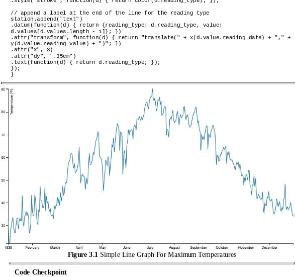
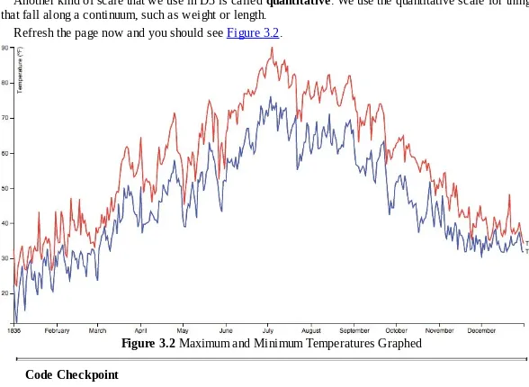
shows you how to build an interactive multi-line chart that displays the maximum and minimum temperatures from a weather station for a year.
• Chapter 4: Working with Large Datasets—This chapter discusses working with large data files, how to benchmark Ruby and SQL, and tweaks we can make to gain performance.
Part II, “Using SQL in Rails,” gets a little more SQL-centric. We will use window functions,
subqueries, and Common Table Expression to retrieve data: • Chapter 5: Window Functions, Subqueries, and Common Table Expression—This chapter begins the discussion of how and when to use raw SQL in your Rails app.
• Chapter 6: The Chord Diagram—In this chapter we create a new app for flight departures and build a chord diagram to look at the origin-destination city-pairs for AA flights in 1999.
• Chapter 7: Time-Series Aggregates in Postgres—In this chapter we take the flight departure data and convert it from transactional to time-series data to build a timeline diagram.
• Chapter 8: Using a Separate Reporting Database—This chapter discusses how to use a separate database or database schema for a reporting database.
In Part III, “Geospatial Rails,” we will take a look at the geospatial aspects of the data with PostGIS. We will draw maps with markers, import shapefiles, and query geo data.
• Chapter 9: Working with Geospatial Data in Rails—In this chapter you learn geospatial concepts and begin looking at geographic data through the lens of geospatial SQL queries.
• Chapter 10: Making Maps with Leaflet and Rails—In this chapter we add maps to all three applications using Leaflet.
• Chapter 11: Querying Geospatial Data—In this chapter we talk more about geospatial SQL
queries, and I discuss both the “Rails way” and the raw SQL way, to present both options to you so you can choose the one that works best for you.
Appendixes include the following: • Appendix A: Ruby and Rails Setup
• Appendix B: Brief Postgres Overview
• Appendix C: SQL Joins
Supplementary Materials
Throughout the course of this book we will build three Rails applications. The source code is available so that you verify that you are following along correctly. The applications are broken up as follows:
Maryland Residential Sales
The first app is residential_sales. It looks at recent real estate data from the state of Maryland. The repository is available on GitHub at https://github.com/DataVizToolkit/residential_sales.
Chapter 1: D3 and Rails
• Initial setup
• Import residential sales • Draw the pie chart
• Legible labels and mouseover effects • You can function • Bar chart
• Scatter plot
• Scatter plot revisited • Box plot
Chapter 5: Window Functions, Subqueries, and Common Table Expression
• Scatter Plot with mortgage pmt
• row_number() window function in console (not in app) Chapter 10: Making Maps with Leaflet and Rails
• Import zip code shapefile and map zip codes • Choropleth
Chapter 11: Querying Geospatial Data
• Bounding box in console (not in app) • Items near a point in console (not in app) • Calculating distance in console (not in app)
NOAA Weather Readings
The second app is weather. It looks at historic weather station readings from NOAA. The repository is available on GitHub at https://github.com/DataVizToolkit/weather.
Chapter 3: Working with Time Series Data
• Initial setup
• Weather reading + weather station import • Line graph • Chapter 3 tweak 1
• Chapter 3 tweak 2 • Chapter 3 tweak 3 • Chapter 3 tweak 4 • Chapter 3 tweak 5
Chapter 4: Working with Large Datasets
• Import large file via HTTP • Benchmarking
• Scopes in the WeatherReading model • Add WeatherReading index Chapter 5: Window Functions, Subqueries, and Common Table Expression
• lead() window function in console (not in app) • Subquery, Common Table Expression in console (not in app) • Common Table Expression + heatmap
Chapter 10: Making Maps with Leaflet and Rails
• Weather stations map
Flight Departures
The third app is departures. It looks at historic flight departure data. The repository is available on GitHub at https://github.com/DataVizToolkit/departures.
Chapter 6: The Chord Diagram
• Import airports and carriers • Import flight departures
• Add foreign keys to departures
• Chord diagram • Disjointed city pair chord diagram Chapter 7: Time-Series Aggregates in Postgres
• Timeline • Fancy timeline
Chapter 8: Using a Separate Reporting Database
• Create reporting schema
• Scenic gem and materialized view
• Bulk insert into table in reporting schema Chapter 9: Working with Geospatial Data in Rails
• Add PostGIS to departures app
• Shapefile import and upsert airports Chapter 10: Making Maps with Leaflet and Rails
• Map California airports • Airport marker clusters
• Flight path from CEC to BLH
Conventions
Code in this book appears in a monospaced font. Code lines that are too wide for the page use the code continuation character ( ) at the beginning of the continuation of the line.
Register your copy of Data Visualization Toolkit at informit.com for convenient access to downloads, updates, and corrections as they become available. To start the registration process, go to informit.com/register and log in or create an account. Enter the product ISBN (9780134464435) and click Submit. Once the process is complete, you will find any
Acknowledgments
The cover of this book has my name on it, but there are so many people who helped directly and
indirectly. This is a collection of most of the things I’ve learned to do with Ruby and data over the years. There have been a handful of people who were particularly instrumental in my becoming the programmer I am today.
First and foremost, I appreciate all the love and support that my wife Allison has given me. I am often distracted by whatever problem I am trying to solve. Thank you for putting up with me, and for being so patient as I worked through this book and also tolerating the travel and conferences.
Many years ago I was a QA analyst. Two women I worked with suggested I become a programmer. I thought that was too hard and that I couldn’t possibly do that. Thank you Paula Reidy and Cynthia Belknap for the initial encouragement.
I did eventually start writing more scripts, and then I started making websites. One thing led to another, and I was introduced to Ruby. Thank you Pete Sharum for showing me the Dave Thomas book (Agile Web Development with Rails) that changed my life. We’ve been coworkers twice and friends for a long time. Thank you for being a sounding board while I worked through this book and for helping review it.
I’ve been lucky to have some great managers who gave me space to learn and entrusted their businesses to my code. I am especially grateful to Curtis Summers for taking a flyer on me when I didn’t know GIS and teaching me this wonderful world. Thank you to Mark McSpadden for being so understanding as I wrote this book.
This book was born out of a talk that I gave at RailsConf 2015 in Atlanta. Debra Williams Cauley was in the audience and approached me afterward. Thank you for being there and asking me to undertake this project. I made several new friends at that RailsConf who have enriched my life. It began when Nadia Odunayo replied to a tweet asking if anyone wanted to run. Thank you for becoming my friend and having such great feedback on my talks and on this book.
Speaking of feedback, there are several people who have helped make sure that my thoughts made sense and my words were coherent. Thank you Mary Katherine McKenzie for bringing your energy and perspective to the project. Thank you Chris Zahn for your statistics knowledge and editing prowess. Thank you Joe Merante for double-checking my code. Thanks also to Tiffany Peon for your feedback and for asking great clarifying questions.
When I got into the GIS section I reached out to Emma Grasmeder and Julian Simioni to make sure the foundational GIS concepts were sound. Thank you for not only checking the concepts but also helping make the chapters flow better.
As the deadline drew near I reached out to a few friends to help read select chapters. Thank you Jessica Suttles, Charles Maresh, and Coraline Ada Ehmke for taking chapters at the last minute and providing good feedback. I also had the support of friends throughout the project. Thank you David Czarnecki for talking me through the proposal process and helping me get my bearings when I started writing.
I’ve met so many wonderful people through the Ruby community. There are so many generous people who are willing to listen and help. I wish I could thank you all personally. I love this community.
About the Author
Barrett Clark has nearly 20 years of experience in software development. He started writing Perl, PHP, and TCL while working at AOL. One day a friend and coworker showed him Ruby, and it changed
everything. Ten years later he’s still writing (and loving) Ruby.
Barrett learned PostGIS while working at Geoforce, a company that does asset tracking. He currently works at Sabre Labs where he is trying to make meaningful change in the travel industry.
Barrett loves the Ruby community and works to give back to it. He is a conference speaker, mentor, and book club participant.
Part I: ActiveRecord and D3
Data is everywhere. Can you see it?
You have a treasure trove of data in your application and on your server. Knowing how often something happens could be priceless. Looking at the variance in occurrences of something could help you tighten a process or save money on inventory.
Chapter 1. D3 and Rails
Your Rails app generates a lot of data and probably also contains a lot of data. I want to be able to
identify and analyze that data, and be able to quickly see what it says—and I want to show you to how to do that too.
Before we jump into all of that, let’s first take a step back and look at the various moving parts in a Rails app. These are the tools that you have in your toolbox to wrestle data into meaningful information. There are three key aspects to focus on, so maybe it’s more of a three-ring circus, at least at times.
Your Toolbox—A Three-Ring Circus
The three key aspects involve these technologies: • A database to store and query data (PostgreSQL) • An application server to broker requests (Rails) • A JavaScript graphing library (D3)
Database
The default database for development in Rails on your local machine is SQLite, but that’s not a database that you would use in production. I prefer to use PostgreSQL in production, as well as in development on my machine. Luckily, you can specify what database you want to use when you create a Rails app.
Why PostgreSQL?
PostgreSQL, or Postgres, is a robust open source relational database. It has flexible data types, including
JSON, DATERANGE, and ARRAY (to name a few) in addition to the more standard CHARACTER VARYING (VARCHAR), INTEGER, etc., that enable you to store data easily and with flexibility
Postgres has advanced features, such as window functions, transactions, PL/pgSQL (SQL Procedural Language), and inheritance (yes, like you have in OO programming, but with table definitions). These help you ask interesting and sophisticated questions of the data.
Being open source, Postgres has a user community that adds to, debugs, and generally improves the database. For that reason, Postgres is easily expandable using extensions that the community creates, such as PostGIS for geospatial data, HSTORE for key-value pairs, and DBLINK or postgres_fdw for connecting to other databases. We talk more specifically about extensions and PostGIS in Part III, “Geospatial Rails.”
Postgres is easy to install. It’s the default database that Heroku uses, and Amazon offers Postgres in RDS.
I could go on even more about what makes Postgres so great. It’s a fantastic database, and I really enjoy using it. In fact, if you put “postgres is amazing” into the search engine of your choice you’ll find lots of tweets and blog posts from other people who are also really excited about Postgres talking about some little nugget that they either just discovered or continue to find valuable in their work.
Database Alternatives
There are also non-relational databases, nicknamed noSQL such as MongoDB, Cassandra, and Redis to name a few.
Application Server
There are lots of ways to write web apps. I like Rails as a technology and for its community.
Why Rails?
Well, I will give you that there is a fair amount of subjectivity here. I have used Ruby and Ruby on Rails since 2007, so it is something that I feel very comfortable with.
Rails is a framework that gives a programmer a lot of helpers and conveniences. Once you understand the conventions you can get an app up and running quickly. It’s also easy to maintain the database with ActiveRecord migrations.
Ruby is an enjoyable language. It was created with developer happiness in mind. I find the Ruby community to be pretty incredible on the whole.
With Ruby and Rails you can write expressive code that reveals the developer’s intentions. There is not a lot of boilerplate, and it is not a compiled language. The language gets out of the developer’s way, which enables them to solve problems more easily.
App Server Alternatives
There are a lot of other languages. They all have strengths and weaknesses. Ruby is not the fastest language. Compiled languages will be faster. Ruby does not have a strong concurrency model either.
Java is the industry workhorse. Clojure and Scala run on the JVM. Go, Rust, and Elixir are a few other relatively new languages on the scene. They’re all a lot of fun, and I recommend taking a look at them at some point.
Graphing Library
I love what Mike Bostock has done and continues to do with D3.
Why D3?
D3 is an incredibly powerful JavaScript library for creating Scalable Vector Graphics (SVG). That’s fancy jargon that means you can draw shapes, and they can scale without distortion. D3 enables you to draw any data visualization you can imagine. You’re not locked into a handful of stock chart types.
The documentation is very good. There are also hundreds of examples on the D3 website and many more in blogs and on Stack Overflow. That makes it easy to find inspiration and also to learn how to make your own visualizations.
Graphing Library Alternatives
Maryland Residential Sales App
Our first app addresses residential home sales data from the state of Maryland. We will set up a standard Rails app that uses Postgres as the database. We do that using this command:
Click here to view code image
rails new residential_sales --skip-bundle -d postgresql
Details on how I set up a Rails app can be found in Appendix A, “Ruby and Rails Setup.” Details on getting Postgres set up on your computer (or host server) can be found in Appendix B, “Brief Postgres Overview.”
All of the data in this book is freely available from Data.gov. This dataset can be found at:
http://catalog.data.gov/dataset/maryland-total-residential-sales-pfa-2012-zipcode-00dc0 or on the Maryland Open Data Portal at https://data.maryland.gov/d/ag7x-nwtv. Download the CSV file. You can also download it directly from the command line using cURL:
Click here to view code image
curl -o data.csv https://data.maryland.gov/api/views/ag7x-nwtv/rows.csv? accessType=DOWNLOAD
Code Checkpoint
To see the code at this stage, go to
https://github.com/DataVizToolkit/residential_sales/tree/ch01.1.
Evaluating Data
Getting clean data is a rare thing. Look at the file to see the following: • In what format is the data?
• If you downloaded a CSV file, is the data actually comma-delimited?
• If the file is JSON I will generally try to prettify the file. This makes it easier to look at the data, and will also tell you if the JSON is valid. The jq command-line tool is great for this.
• What are the fields and data types?
• Do any of the fields have more than one piece of data in them?
• If you have start and end dates, think about taking advantage of the DATE-RANGE datatype. You can index DATERANGE and TSRANGE fields with an index that is optimized for that data, and there are also special search operators that make it easy to find the right records based on your date or time needs.
• If you have geographic data (latitude and longitude) think about whether you will need to do geo queries. If so, plan to use PostGIS. This may have a bearing on your hosting options.
• Do any of the fields contain data that needs to be cleaned?
Don’t create new data. Let the data stand on its own. If you need to add to it, and sometimes you may have multiple sources to tie together, try to let each source have its own voice (database table).
Data Fields
Sometimes you get a data dictionary that defines the fields in the dataset. We don’t have one in the
Maryland Residential Sales data, so we need to make one. Table 1.1 lists out the headings from the CSV file and also assigns a datatype to the data. The Ruby Float datatype is represented as Double
Precision in Postgres. The Ruby String datatype is represented as Character Varying in Postgres.
Table 1.1 Maryland Residential Sales Data Dictionary
Looking at the data dictionary and the data, I see a few things that need to be tidied up. The field names are inconsistent. I also prefer my database field names to be all lowercase.
It’s idiomatic to use lowercased, snake-cased field names. Snake case means that field names with multiple words are separated with an underscore, like geo_code. This enables us to distinguish between keywords, which are in all caps, and field names. You can see an idiomatic example in the following raw SQL query:
Click here to view code image
SELECT field, another_field FROM some_table;
We also have some data that needs to be cleaned up a little. We don’t want the dollar signs, so we need to strip those out. The data in the Zipcode field looks good. Always remember to check those. Zip codes will sometimes be treated as numeric data. When that happens you lose the leading zeros from Eastern zip codes.
codes. So we just need to grab the latitude and the longitude and store them in their own (separate) fields.
Modified Data Dictionary
Now we are ready to think about importing the data into a Rails app. Table 1.2 shows the data dictionary for the fields that we want to create. I included both the Postgres datatype as well as the Ruby datatype because we are about to create a database migration.
Table 1.2 Maryland Residential Sales Data Dictionary, Take 2
The ActiveRecord migration will translate String to Character Varying and Float to
Double Precision.
The Migration
Now that we know what we want to do with the data we can generate the migration and write the import process. You can find the steps to create the Rails app in Appendix A, “Ruby and Rails Setup.”
Click here to view code image
rails generate model sales_figure \
year:integer geo_code:string jurisdiction:string \ zipcode:string total_sales:integer median_value:float \ mean_value:float sales_inside_pfa:integer \
median_value_in_pfa:float mean_value_in_pfa:float \ sales_outside_pfa:integer median_value_out_pfa:float \ mean_value_out_pfa:float latitude:float longitude:float
The backslash at the end of each line in that command is how we tell the Unix command line that a command continues on the next line.
a look at the files that are created.
When you are ready to create the table you can run the database migrations with bundle exec rake db:migrate.
Custom Rake Task
Rake is a build tool for Ruby. It can help us streamline tedious or repetitive tasks. You can use rake in any Ruby project, and Rails ships with several tasks available to you. You can also write your own rake tasks.
I like to create rake tasks in the db:seed namespace for importing data, such as
db:seed:import_foo. This is an action that will load (seed) the database with the data from this file, so it makes sense to me for it to be in the db:seed namespace.
The following line shows the generator command to create the shell of a new rake task.
Click here to view code image
rails generate task seed import_maryland_residential_sales
That adds a file at lib/tasks/seeds.rake and gives you a task in the seed namespace, but we want that nested inside the db namespace. We need to update the new rake task manually. You can see the updated code in the following snippet.
Click here to view code image
namespace :db do namespace :seed do desc "TODO"
task import_maryland_residential_sales: :environment do end
end end
Writing the ETL
ETL stands for Extract, Transform, Load. In this case, we have a file, so the data has already been
extracted. We need to transform the data to clean it up as we identified earlier in this section, and we need to load it into the database. Listing 1.1 shows the full rake task to import the Maryland Residential Sales data.
I like what Avdi Grimm advocates in Confident Ruby for type checking and error handling. We don’t want to accidentally coerce an invalid value to 0, like we would if we called to_i, so instead we use
Kernel#Integer. That way we get an exception when the data is invalid, and we can figure out what to do from there rather than accidentally load bad data without knowing. That is a bad lesson to learn the hard way.
You’ll also note that this expects there to be a file in the db/data_files direc-tory, which you can create now and move the CSV file into. If the data file is too big or if you don’t want to have it in the repo you can also store it in S3 or stream it from the original source. I’ll discuss this strategy more in Chapter 4, “Working with Large Datasets.”
Also note that none of the transform logic lives in the SalesFigure model. This is not business logic that the app will depend on. There’s no need to clutter up the object model with it.
Click here to view code image
require 'csv' namespace :db do namespace :seed do
desc "Import Maryland Residential Sales CSV"
task :import_maryland_residential_sales => :environment do def float(string)
return nil if string.nil? Float(string.sub(/\$/, '')) end
filename = File.join(Rails.root, 'db', 'data_files','data.csv') CSV.foreach(filename, :headers => true) do |row|
puts $. if $. % 10000 == 0
regex = /.*(\d{2}\.\d*), (-\d{2}\.\d*).*/
latlng = row['Zip Code (Geocoded)'].match(regex) values = {
Don’t be scared by the regular expression or the match. Here’s how that works.
Click here to view code image
>> zipcoded = "Maryland 21502 (39.64, -78.77)" => "Maryland 21502 (39.64, -78.77)"
>> latlng = zipcoded.match(/.*(\d{2}\.\d*), (-\d{2}\.\d*).*/)
=> #<MatchData "Maryland 21502 (39.64, -78.77)" 1:"39.64" 2:"-78.77"> >> latlng[1]
=> "39.64"
In the regex we create two buffers with one for the latitude and one for the longitude. The match just looks for that pattern in the string. If it finds the pattern, it returns the match and exposes the buffers (1, 2, 3... n). You access those buffers by their buffer number. The latitude is in the first buffer, so it’s latlng[1]. The full string parsed by the regex is available in latlng[0].
Now run the task from the command line:
Click here to view code image
Logging
Visibility is a good thing. Look at any logs automatically generated. I like to make sure there are no errors first and foremost. I also like to see what is executed. For example, I like to see what SQL is generated by ActiveRecord and how long it takes to execute. For any web request you can see how long the total
response took, and how long each component of the request took. The database and view generation times are both broken out and the total request time is also logged.
You can also log your own output. In a Rails app you can log to the Rails log file using the
Rails.logger command. Using puts will print to STDOUT rather than to a log file. This is
beneficial in local development, but you won’t be able to see that when you deploy to Heroku and run the task there. Learn more at http://guides.rubyonrails.org/debugging_rails_applications.html.
Alternative Ways to Import Data
Importing a file record-by-record using ActiveRecord is convenient, but it’s also resource expensive. You can also use the Postgres COPY or \copy commands. This does a bulk import of the data, so the data needs to be clean and have the same fields as the destination table. You may have to create an import-friendly version of the data file.
Do note that COPY and \copy are different. From the Postgres documentation:
Files named in a COPY command are read or written directly by the server, not by the client application. Therefore, they must reside on or be accessible to the database server machine, not the client. They must be accessible to and readable or writable by the PostgreSQL user (the user ID the server runs as), not the client. COPY naming a file is only allowed to database superusers, since it allows reading or writing any file that the server has privileges to access.
Do not confuse COPY with the psql instruction \copy. \copy invokes COPY FROM STDIN or COPY TO STDOUT, and then fetches/stores the data in a file accessible to the psql client. Thus, file accessibility and access rights depend on the client rather than the server when \copy is used.
In other words, you can use COPY on your localhost or when you have shell access to the database server. Otherwise you have to use \copy from the command line of your host. To do this in production you would typically write a script or shell out to the command, and you would have to have the Postgresql client library installed.
I talk more about bulk importing in Appendix B.
Confirm the Data
Log into the database or use Rails console to look at the imported data to make sure that there were no error messages or issues with data being converted incorrectly. If there were, you can drop the table (or rerun the migration) and rerun the import task. Listing 1.2 shows an example of fetching the first record and printing it out using Ruby’s pretty print (pp) command. You can see in the first line that we can enter the Rails console by typing rails c from the command line. The Rails console is an enhanced version of Ruby’s irb REPL with the Rails app’s environment loaded.
If you have not seen the ; nil at the end of the statement before, that’s a way to have the statement return nil rather than the object, so that you don’t get the unformatted version of the object in addition to the pretty printed version.
Listing 1.2 Confirming the Imported Data from Rails Console
$ rails console
>> pp SalesFigure.first; nil
SalesFigure Load (0.6ms) SELECT "maryland_residential_sales_figures".* FROM
"maryland_residential_sales_figures" ORDER BY "maryland_residential_sales_figures"."id"
created_at: Fri, 11 Sep 2015 17:25:02 UTC +00:00, updated_at: Fri, 11 Sep 2015 17:25:02 UTC +00:00> => nil
I also like to run a count on the table to make sure it lines up with what I expected to be imported. You can use wc -l on the command line to get the number of lines in a file. Subtract one if there is a header row in the file.
Code Checkpoint
To see the code at this stage, go to
https://github.com/DataVizToolkit/residential_sales/tree/ch01.2.
Simple Pie Chart
Now that we have some data, let’s see what it really looks like—visually. To do that we need to create a view and write a little bit of JavaScript.
Including the D3 JavaScript Library
There are a handful of ways to include a JavaScript file or library in a Rails app. • You can download the source and put it in app/assets/javascripts or
app/vendor/javascripts, then reference it in your layout or template, or include it in your
application.js file.
• You can use Bower or Gulp to manage front-end dependencies.
• Sometimes there is a gem available that wraps up a library. Rails includes the jquery-rails
gem to give us the jQuery source, for example. There is also a gem available for the D3 source:
d3-rails.
• You can link to a CDN in your application layout or a specified template. This is my preferred method.
javascript_include_tag for application:
Click here to view code image
<%= javascript_include_tag 'https://cdnjs.cloudflare.com/ajax/libs/d3/3.5.17/d3.min.js' %>
The Residential View
With the help from the Rails generators we can quickly and easily create the pieces that we need to make our first pie chart. In the following we use the Rails generator to create a controller with a single action that will correspond to our “view”.
Click here to view code image
rails g controller residential index
That will give you the controller, route, and view files that you need to serve an index page. Delete the placeholder text in app/views/residential/index.html.erb. This file can be completely empty. We are going to generate the content with JavaScript!
And speaking of the JavaScript, we need to add another route for the script to request the data we need for the pie chart. Manually add another route, so that config/routes.rb looks like this:
Click here to view code image
Rails.application.routes.draw do get 'residential/index'
get 'residential/data', :defaults => { :format => 'json' } root :to => 'residential#index'
end
I deleted all the example routes from my version, but it doesn’t hurt anything to leave them in. I also like to define the root route to be whatever makes the most sense. In this case it is the residential index
action.
The last view-related thing we need to do is add some CSS to style the pie chart. Place this code in
app/assets/stylesheets/residential.scss:
.arc text {
font: 10px sans-serif; text-anchor: middle; }
.arc path { stroke: #fff; }
The Residential Controller
We just deleted everything from the view, so it doesn’t require that we do anything in the controller for the
index action. We will make a separate AJAX call to get the data, which is why we added the
residential/data route.
We will use ActiveRecord to pull the data and group it by jurisdiction (county) so that we can get the sum of the total_sales field by county.
Here is the controller:
Click here to view code image
end def data
totals = SalesFigure.group(:jurisdiction).sum(:total_sales) render :json => { :totals => totals }
end end
The data action asks the database for the sum of the total_sales column, and it wants that sum
grouped by jurisdiction. In other words, we ask the database for the total sales by county. The SQL generated by that ActiveRecord grouping and calculation will look something like this:
Click here to view code image
SELECT SUM("maryland_residential_sales_figures"."total_sales") AS sum_total_sales, jurisdiction AS jurisdiction
FROM "maryland_residential_sales_figures"
GROUP BY "maryland_residential_sales_figures"."jurisdiction"
Pie Chart JavaScript
Now all we have to do is write a little bit of D3-flavored JavaScript. Mike Bostock, the creator of D3, has created hundreds of examples to draw inspiration from. I grabbed the example in Listing 1.3 from
http://bl.ocks.org/mbostock/3887235.
You’ll note that this is written in JavaScript rather than CoffeeScript. You can rename any file that Rails creates with a .coffee extension to have a .js extension. I put this code in
app/assets/javascripts/residential.js.
Listing 1.3 Pie Chart
Click here to view code image
$(function() {
// From: http://bl.ocks.org/mbostock/3887235 // Set the dimensions
var width = 960, height = 500,
radius = Math.min(width, height) / 2; var totals = {};
var color = d3.scale.category20b();
// This is the circle that the pie will fill in var arc = d3.svg.arc()
.outerRadius(radius - 10) .innerRadius(0);
// D3 provides a helper function for creating the pie and slices var pie = d3.layout.pie()
.sort(null)
.value(function(d) { return totals[d]; });
// Add an SVG element to the page and append a G element for the pie var svg = d3.select("body").append("svg")
.attr("width", width) .attr("height", height) .append("g")
$.getJSON('/residential/data', function(data) { totals = data.totals;
// enter is how we tell D3 to generate the SVG elements for the data var g = svg.selectAll(".arc")
.data(pie(d3.keys(totals))) .enter().append("g")
.attr("class", "arc");
// color the pie slices using the color pallet g.append("path")
.attr("d", arc)
.style("fill", function(d) { return color(d.data); }); // add the jurisdiction name
g.append("text")
.attr("transform", function(d) {
return "translate(" + arc.centroid(d) + ")"; })
.attr("dy", ".35em")
.style("text-anchor", "middle")
.text(function(d) { return d.data; }); });
});
Ship It
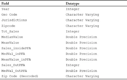
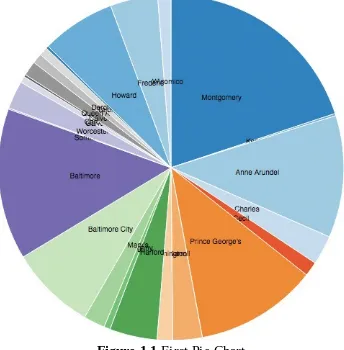
If everything goes according to plan, when you run the server and go to http://localhost: 3000 you will be able to marvel at your amazing pie chart, which you can also see in Figure 1.1.
Code Checkpoint
To see the code at this stage, go to
https://github.com/DataVizToolkit/residential_sales/tree/ch01.3.
Summary
We covered a lot of ground in this first chapter. Good, clean data is fundamentally important. Taking the time to understand your data and work around the limitations that it brings with it will save you an immense amount of frustration later.
This chapter was focused on giving you a taste of the three key components of a Rails data visualization app: the database, the Rails app, and D3. Refer to Appendix A for more information on setting up your Rails environment, and Appendix B for more information on setting up Postgres.
We created our first Rails app and loaded a data file. We also created our first visualization—a pie chart that shows the total sales by county for home sales in Maryland.
Chapter 2. Transforming Data with ActiveRecord and D3
There are so many good examples of D3 charts ranging from very simple to very intricate. My typical workflow is to find an existing example that does generally what I am looking for and use that as my foundation or inspiration. That’s what we did in the previous chapter.
Once I have the data lined up and the graph in place I can start tweaking it. That’s exactly what we are going to do with the simple pie chart we made in the previous chapter.
Pie Chart Revisited
The labels in our pie chart are a bit jumbled. We have a lot more slices in our pie than the example, and there are too many slices that are small and have similar colors. It is not very clear at a glance exactly what the chart is saying. We need to do something to make our chart as useful as possible.
Legible Labels
I would prefer to have all the labels visible in or near the pie slices. I want to avoid having a legend with 24 items in it for this pie chart. That would be a big legend that would steal focus from the chart itself.
We can move the labels outside the pie chart fairly easily, and we can even highlight a slice (and its label) when you hover over the slice with your mouse. That’s pretty helpful. If you wanted to go even further you could add a tooltip that appears and gives even more information, but we are going to hold off on that for now.
In the section of the JavaScript where we add the labels (inside the $.getJSON block toward the bottom) we need to create another arc outside the existing arc that we’ve drawn for the pie chart. Attach the label to the new arc rather than the pie chart’s arc. We do that by replacing the existing label creation code with the following:
Click here to view code image
// put the labels outside the pie (in a new arc/circle)
var pos = d3.svg.arc().innerRadius(radius + 20).outerRadius(radius + 20); g.append("text")
.attr("transform", function(d) {
return "translate(" + pos.centroid(d) + ")"; })
.attr("dy", ".35em")
.style("text-anchor", "middle")
.text(function(d) { return d.data; });
Admittedly, it is a very naive implementation. Also, notice that it causes some of the labels to be cut off at the bottom of the canvas. We’ll handle that later. The labels are still a bit jumbled. We could add some collision detection, and having lines that connect the label to the slice would probably be where I would want to go next with this. There is definitely still room for improvement.
Beware of Misleading Charts
It should be very clear at a glance what your chart is communicating. You can use graphs in very deceptive ways. You may see this especially in the political arena. Adding 3D effects and cutouts can make it difficult to discern the details. Pie charts are bad at communicating finer details, too. Can you visibly see the difference between 20% and 30% slices? Clear labels can transform a pie chart from “cute picture” to “useful visualization.” You should always have clearly labeled axes. Truncating an axis, or having too many axes will generally add confusion to your graph.
Mouseover Effects
One last thing that we can do with the slices and labels to help them stand out is to add some mouseover effects. Adding an effect to the pie slice is as easy as adding a little CSS to
app/assets/stylesheets/residential.scss.
g.arc { &:hover { opacity: .55; }
}
With the CSS in place you can see that the opacity of the pie pieces changes as you move the mouse around the pie chart.
To make the label stand out I want to make the text a little larger. To do that we add some mouseover
and mouseout event handlers to the section of the function where we generate the pie slices. The bold part is the new code.
Click here to view code image
// make each pie piece
var g = svg.selectAll(".arc") .data(pie(d3.keys(totals))) .enter().append("g")
.attr("class", "arc")
.on("mouseover", function(d) {
d3.select(this).select("text").style("font-weight", "bold") d3.select(this).select("text").style("font-size", "1.25em") })
.on("mouseout", function(d) {
d3.select(this).select("text").style("font-weight", "normal") d3.select(this).select("text").style("font-size", "1em") })
;
With those two tweaks you will now see the color fade a little for each slice as you hover, and the label will also stand out a little more.
Code Checkpoint
To see the code at this stage, go to
https://github.com/DataVizToolkit/residential_sales/tree/ch02.1.
You Can Function
There is one last change that we need to make before we can move on from this pie chart example. The code to generate the chart is sitting in the open on the global scope. When the main document is ready, all the JavaScript on the global scope will be called. That’s not what we want. We want the view to decide when it is ready to ask for a chart and which chart it wants to ask for.
We need to wrap the JavaScript in a function of its own, and we need to update the view to ask for that function. The function does not need to take any parameters, so let’s just call it makePie, and then we have the view ask for makePie() when the page has loaded. You can see the final index.html.erb
in the next listing.
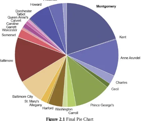
The final version of the pie chart can be seen in Figure 2.1.
Click here to view code image
<!-- A pie chart will magically appear here --> <script>
$(document).on('ready page:load', function(event) { // apply non-idempotent transformations to the body makePie();
});
Figure 2.1 Final Pie Chart The final JavaScript to render the pie chart is shown in Listing 2.1.
Listing 2.1 Final makePie() JavaScript
Click here to view code image
function makePie() {
// From: http://bl.ocks.org/mbostock/3887235 // Start by defining some basic variables var width = 600,
height = width,
radius = width / 2.5, totals = {},
// D3 provides a handful of color pallets color = d3.scale.category20b();
// This is the circle that the pie will fill in var arc = d3.svg.arc()
.outerRadius(radius - 10) .innerRadius(0);
// D3 provides a helper function for creating the pie and slices var pie = d3.layout.pie()
.sort(null)
.value(function(d) { return totals[d]; });
.attr("width", width) .attr("height", height) .append("g")
.attr("transform", "translate(" + width / 2 + "," + height / 2 + ")"); // Get the data and draw the slices
$.getJSON('/residential/data', function(data) { totals = data.totals;
// enter is how we tell D3 to generate the SVG elements for the data var g = svg.selectAll(".arc")
// color the pie slices using the color pallet g.append("path")
.attr("d", arc)
.style("fill", function(d) { return color(d.data); }); // put the labels outside the pie (in a new arc/circle)
var pos = d3.svg.arc().innerRadius(radius + 20).outerRadius(radius + 20); g.append("text")
.attr("transform", function(d) { return "translate(" + pos.centroid(d) + ")"; }) .attr("dy", ".35em")
.style("text-anchor", "middle")
.text(function(d) { return d.data; }); });
}
The G Element
You may be wondering what that G element that we added to the page along with the SVG element is all about.
The <g> element is just an SVG element that is used to group shapes together. You can transform the whole group as a single shape. In the case of the pie chart before, we added the individual pie slices to that G element. As we build more complex charts the transformations will apply more broadly, such as moving all shapes to allow room for a wider axis label.
Code Checkpoint
To see the code at this stage, go to
https://github.com/DataVizToolkit/residential_sales/tree/ch02.2.
Bar Chart
New Views, New Routes
To get started we can simply copy the index file and update the comment and function to be called. It’s not necessarily DRY, but we are in speculative investigation mode here, exploring various chart types. The updated code for bar_chart.html.erb looks like this (the updated pieces are highlighted in bold):
Click here to view code image
<!-- A bar chart will magically appear here -->
<div id="chart"></div>
<script>
$(document).on('ready page:load', function(event) { // apply non-idempotent transformations to the body
makeBar(); });
</script>
Next, you’ll need to add these routes for the view and the data.
Click here to view code image
get 'residential/bar_chart'
get 'residential/bar_data', :defaults => { :format => 'json' }
The final view-related piece that we need to add is some style to make the bar chart look nice. Add this to
app/assets/stylesheets/residential.scss:
Click here to view code image
// Bar Chart
We need to write the ActiveRecord finder call to get the data for our bar chart, which you can see in the following. At first I had the data sorted just by zip code, which gives you a jagged bar chart. I think it’s probably easier to see the bars in order of median value (the Y-axis). Feel free to play with the query and see what works for you.
Click here to view code image
def bar_chart; end def bar_data
select(:id, :zipcode, :median_value). where(:jurisdiction => 'Baltimore'). order('median_value DESC, zipcode')
render :json => { :bar_data => bar_data } end
Bar Chart JavaScript
Now that we have the structure in place we need to create the makeBar() function, which you can see in Listing 2.2.
I found an example that served as a good starting point (http://bl.ocks.org/mbostock/5977197). As is typically the case, there were a handful of necessary tweaks to get the chart to work for my data:
• Our X-axis labels are longer than a single character, so the bottom margin needs to be bigger. • Our X-axis labels need to be rotated so they don’t run into each other. We need to add the rotate
transform in the X-axis.
• We are not looking at percent, so we do not need the number formatter.
• We have different names in our data objects, so those selectors need to be updated. • Rather than read a static CSV file I am making an AJAX call using jQuery.
• We use the same hover CSS to highlight a bar when you mouse over it.
The final version of the bar chart can be seen in Figure 2.2. Run rails server and go to http://localhost:3000/residential/bar_chart to see your bar chart.
Listing 2.2makeBar() Function
Click here to view code image
function makeBar() {
// From: http://bl.ocks.org/mbostock/5977197
var margin = {top: 20, right: 20, bottom: 50, left: 50}, width = 960 - margin.left - margin.right,
height = 500 - margin.top - margin.bottom; // data -> value
var xValue = function(d) { return d.zipcode; }, // value -> display
xScale = d3.scale.ordinal().rangeRoundBands([0, width], .1),
// data -> display
xMap = function(d) { return xScale(xValue(d)); }, xAxis = d3.svg.axis().scale(xScale).orient("bottom"); // data -> value
var yValue = function(d) { return d.median_value; }, // value -> display
yScale = d3.scale.linear().range([height, 0]), // data -> display
yMap = function(d) { return yScale(yValue(d)); }, yAxis = d3.svg.axis().scale(yScale).orient("left"); var svg = d3.select("#chart").append("svg")
.attr("width", width + margin.left + margin.right) .attr("height", height + margin.top + margin.bottom) .append("g")
$.getJSON('/residential/bar_data', function(data) { data = data.bar_data;
xScale.domain(data.map(xValue));
yScale.domain([0, d3.max(data, yValue)]); svg.append("g")
.attr("class", "x axis")
.attr("transform", "translate(0," + height + ")") .call(xAxis)
.selectAll("text") .attr("x", 8) .attr("y", -5)
.style("text-anchor", "start") .attr("transform", "rotate(90)"); svg.append("g")
.attr("class", "y axis") .call(yAxis)
.append("text")
.attr("transform", "rotate(-90)") .attr("y", 6)
.attr("dy", ".71em")
.style("text-anchor", "end") .text("Median Value");
svg.selectAll(".bar") .data(data)
.enter().append("rect") .attr("class", "bar") .style("fill", "blue") .attr("x", xMap)
.attr("width", xScale.rangeBand) .attr("y", yMap)
.attr("height", function(d) { return height - yMap(d); }); });
}
Pie, bar, and line charts are the charts you will see most commonly. I don’t think the pie chart is a great representation for this data. The bar may or may not be, depending on what you’re trying to show and what your audience understands about the data.
Since I’m not quite sure that we have a solid visual representation of the data, we should dig a little deeper than the pie, bar, or line graphs. Fortunately, we have more charts that we can use to help us visualize this data.
Code Checkpoint
To see the code at this stage, go to
https://github.com/DataVizToolkit/residential_sales/tree/ch02.3.
Scatter Plot
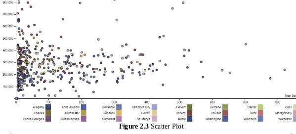
Pie and bar charts are pretty standard fare. They’re like the glazed and chocolate donuts in the donut store. You have to have them, and they see a lot of action. They aren’t always quite what you’re looking for, though. Sometimes you want a donut with sprinkles. Enter the scatter plot.
The scatter plot uses Cartesian coordinates to display values for two variables. If you don’t recognize “Cartesian coordinates” by name, it refers to x, y coordinate pairs.
Scatter Plot?
A scatter plot helps you see the relationship, if any, between two continuous variables. Unlike other charts where the X-axis is treated as the independent variable (the variable that has an effect on the other
variable) and the Y-axis shows the dependent variable, the scatter plot simply shows correlation. If there is also causation you would follow the dependent/independent axis convention and probably add a line of best fit such as a regression line. In a simple scatter plot, the X and Y axes have no particular meaning— either one could be used for either variable.
Scatter Plot Controller Actions
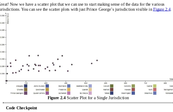
We zoomed in and looked at all the zip codes for a single jurisdiction with the bar chart. Let’s take a higher-level view and look at all the zip codes. We can color-code the dots in the scatter plot, so let’s use jurisdiction as our color key.
We are measuring the median value, so it goes on the Y-axis. That stays nice and consistent with the bar chart, too. The number of occurrences of each value goes on the X-axis. You could make the dot sizes indicate something, but we won’t do that in this scatter plot.
The controller methods look like this:
Click here to view code image
def scatter_chart; end def scatter_data
data = SalesFigure.
select(:id, :zipcode, :jurisdiction, :median_value, :total_sales). order(:jurisdiction)
Scatter Plot Views and Routes
I’m not showing the routes or the view ERB because they’re consistent with the previous examples, but don’t forget to add them.
We do not need a lot of new CSS for the scatter plot. You can see in the following that we have a style for a tooltip. You’ve seen how easy mouseover highlighting is in the pie chart. Now we are going to take the mouseover iteration a step further with a tooltip to show some additional data when you hover over one of the points.
The code to generate our scatter plot can be seen in Listing 2.3. We did not need to stray too far from the example. Our version is a little simpler because we don’t need to transform our data. One key difference is that our legend has 24 entries and is therefore too long to have in the top right corner. We break the legend into multiple columns with the help of a function nested within the transform attribute for the
legend. I know I said that a legend with 24 items was too big for a chart, but the scatter plot is a lot bigger than the pie chart. The legend doesn’t steal the focus in this case.
Listing 2.3makeScatter() JavaScript
Click here to view code image
function makeScatter() {
// From http://bl.ocks.org/weiglemc/6185069
var margin = {top: 20, right: 20, bottom: 100, left: 150}, width = 960,
height = 500 - margin.top - margin.bottom; /*
* value accessor - returns the value to encode for a given data object. * scale - maps value to a visual display encoding, such as a pixel position. * map function - maps from data value to display value
* axis - sets up axis */
// setup x
// data -> value
var xValue = function(d) { return d.total_sales;}, // value -> display
xScale = d3.scale.linear().range([0, width]), // data -> display
xMap = function(d) { return xScale(xValue(d));}, xAxis = d3.svg.axis().scale(xScale).orient("bottom"); // setup y
var yValue = function(d) { return d.median_value;}, // value -> display
yScale = d3.scale.linear().range([height, 0]), // data -> display
yMap = function(d) { return yScale(yValue(d));}, yAxis = d3.svg.axis().scale(yScale).orient("left"); // setup fill color
var cValue = function(d) { return d.jurisdiction;}, color = d3.scale.category20b();
// add the graph canvas to the body of the webpage var svg = d3.select("#chart").append("svg")
.attr("width", width + margin.left + margin.right) .attr("height", height + margin.top + margin.bottom) .append("g")
.attr("transform", "translate(" + margin.left + "," + margin.top + ")"); // add the tooltip area to the webpage
var tooltip = d3.select("body").append("div") .attr("class", "tooltip")
.style("opacity", 0);
$.getJSON('/residential/scatter_data', function(data) { data = data.scatter_data;
// don't want dots overlapping axis, so add in buffer to data domain xScale.domain([d3.min(data, xValue)-1, d3.max(data, xValue)+1]); yScale.domain([d3.min(data, yValue)-1, d3.max(data, yValue)+1]); // x-axis
svg.append("g")
.attr("class", "x axis")
.attr("transform", "translate(0," + height + ")") .call(xAxis)
tooltip.transition() .duration(200)
.style("opacity", .9);
tooltip.html(d.zipcode + "<br/> (" + xValue(d) + ", $" + yValue(d) + ")")
.style("left", (d3.event.pageX + 5) + "px") .style("top", (d3.event.pageY - 28) + "px"); })
.on("mouseout", function(d) { tooltip.transition()
.duration(500)
.style("opacity", 0); });
// draw legend
var legend = svg.selectAll(".legend") .data(color.domain())
.enter().append("g") .attr("class", "legend")
.attr("transform", function(d, i) { numCols = 8;
xOff = (i % numCols) * 120 + 50; yOff = Math.floor(i / numCols) * 20
return "translate(" + xOff + "," + yOff + ")" });
// draw legend colored rectangles legend.append("rect")
.attr("x", margin.left - 100) .attr("y", height + margin.top) .attr("width", 18)
.attr("height", 18) .style("fill", color); // draw legend text legend.append("text")
.attr("x", margin.left - 100) .attr("y", height + 29)
.attr("dy", ".35em")
.style("text-anchor", "end") .text(function(d) { return d; }) });
}