Use r I n t e r fa ce D e sign for Pr ogr a m m e r s
by Joel Spolsky ISBN:1893115941 Apress © 2001 (144 pages)
The aut hor of t his book proposes sim ple, logical rules t hat can be applied wit hout any art ist ic t alent t o im prove any user int erface, from t radit ional GUI applicat ions t o Web sit es t o consum er elect ronics.
Ta ble of Con t e n t s
User Interface Design for
Programmers
Joel Spolsky
Apress™
Copyright © 2001 Joel Spolsky
All rights reserved. No part of this work may be reproduced or transmitted in any form or by any means, electronic or mechanical, including photocopying, recording, or by any
information storage or retrieval system, without the prior written permission of the copyright owner and the publisher.
1-893115-94-1 12345678910
Trademarked names may appear in this book. Rather than use a trademark symbol with every occurrence of a trademarked name, we use the names only in an editorial fashion and to the benefit of the trademark owner, with no intention of infringement of the trademark.
Editorial Directors: Dan Appleman, Gary Cornell, Karen Watterson
Technical Editor: Allen Holub
Artist and Cover Designer: Karl Miyajima
Interior Book Designer: Diana Van Winkle, Van Winkle Design Group
Distributed to the book trade in the United States by Springer-Verlag New York, Inc.,175 Fifth Avenue, New York, NY, 10010
and outside the United States by Springer-Verlag GmbH & Co. KG, Tiergartenstr. 17, 69112 Heidelberg, Germany
In the United States, phone 1-800-SPRINGER; [email protected];
http://www.springer-ny.com
Foreword
Dave Winer, CEO, UserLand Software
I remember as if it were yesterday my first experience with a user. I had been developing a software product for three years, all the while thinking it was easy to use. A friend who had been listening to me gush about how great it was asked if he could try it. Hesitantly, I said yes.
I launched the program and we switched seats. I tried to say nothing as he wondered what to do. The software didn't have anything to say. "What should I do?" he asked. I thought to myself, "I have some work to do."
This is the moment of truth for any software developer, and one we avoid. In The Soul of a New Machine, Tracy Kidder tells about the first problem report from "the field" about a computer system developed at Data General in the late 1970s.The lead developer was surprised. In his mind the computer was a development project; that real people would try to
use it attacked his perception of his own product.
We all go through this; at a superficial level we think we're designing for users, but no matter how hard we try, we're designing for who we think the user is, and that means, sadly, that we're designing for ourselves. Until you prove that it's usable by other people, your software is certainly not designed for them.
Until you make the shift and let the users tell you how your software works, it simply can't be usable. Every successful software product is proof of this, as is every failure. How many times have you installed some software or visited a Web site and wondered, "What does this do?" Now, understand that other people are asking the same question about your software. It's a puzzle, to solve it you must figure out how to get your software into a user's mind, and to learn how to do that, you must learn how that mind works.
Joel's book is a milestone built on a strong foundation of practical experience. He's
absolutely right that user testing is easy.You don't need a lab to do it, although many people think you do.You just need a computer and a person who doesn't know your software. It's an iterative process. Do it once, it'll change your whole perspective. Do some engineering. Do it again with a new person. Repeat the process until the first-time user knows what to do and can actually use the software to do what it was designed to do.
Joel's book is about more than software design and user-centricity. Once you learn how to communicate with users through software, it's inevitable that all your communication will improve. The central "aha" is to realize that other people use your software, and they don't know what you know, and they don't think like you think they do.
There are some very simple truths in this book, and sometimes the simplest truths can be most difficult. But Joel makes it so easy! His stories are clear and human and fun. And that may be the biggest lesson, if you haven't been designing for users, you're not having as much fun doing software as you could.
Introduction
Most of the hard core C++ programmers I know hate user interface programming.This surprises me because I find UI programming to be quintessentially easy, straightforward, and fun.
It's easy because you usually don't need algorithms more sophisticated than how to center one rectangle in another. It's straightforward because when you make a mistake, you can see it right away and correct it. It's fun because the results of your work are immediately visible.You feel like you are sculpting the program directly.
I think most programmers' fear of UI programming comes from their fear of doing UI design. They think that UI design is like graphic design: that mysterious process by which creative, latte-drinking, all-dressed-in-black people with interesting piercings produce cool-looking artistic stuff. Programmers see themselves as analytic, logical thinkers: strong at reasoning, weak on artistic judgment. So they think they can't do UI design.
Actually, I've found UI design to be quite easy and quite rational. It's not a mysterious matter that requires an art school degree and a penchant for neon-purple hair. There is a rational way to think about user interfaces with some simple, logical rules that you can apply anywhere to improve the interfaces of the programs you work on.
This book is not Zen and the Art of UI Design. It's not art, it's not Buddhism, it's just a set of rules. A way of thinking rationally and methodically. This book is designed for programmers. I assume you don't need instructions for how to make a menu bar; rather, you need to think about what to put in your menu bar (or whether to have one at all).You'll learn the primary axiom which guides all good UI design and some of the corollaries.We'll look at some examples from real life, modern GUI programs.When you're done, you'll know enough to be a significantly better UI designer.
Acknowledgments
I would like to thank Gary Cornell at Apress for making this book possible and Allen Holub for reviewing it.Without the encouragement of Noah Tratt, I never would have started writing down my experiences in the software trenches, and without the support of Dave Winer and his public EditThisPage.com system, I wouldn't have had a forum for writing the original online version of this book. Many thanks also to the hundreds of readers of Joel on Software (http://joel.editthispage.com) who responded to the original articles, proposed numerous corrections and enhancements, and whose frequent fan mail kept me going. I also want to thank Andrew Kwatinetz at Microsoft who taught me a lot of what I know about UI design; Ken Dye, who taught me most of what I know about usability testing; and Joseph Roberts, who taught me all the tricks of localization. I am also grateful to Jared Samet for
Chapter 1:
Controlling Your Environment Makes
You Happy
My first real job was in a big industrial bakery that churned out hundreds of thousands of loaves of bread every night. The bakery was designed to have six bread production lines. For every two production lines, there was a dough mixer, which produced these gigantic 180 kg lumps of dough that could be dumped to the left or the right, as shown in Figure 1-1.
Figure 1-1: The bakery, as designed
Well, this was the design. In reality, Mixer C hadn't been built yet, nor had lines three or five. So the arrangement was more like Figure 1-2.
Figure 1-2: The bakery, as implemented
Alert readers will be wondering, "how did the dough get from Mixer B to production line six?" Well, that's where Wee Joel came in. My job, if you can believe this, was to stand to the left of Mixer B, then catch these walrus-sized lumps of dough as they flew out of the mixer in a big bathtub with wheels, then roll the bathtub over to production line six, and using a
winchlike device, heave the dough onto the line. I had to do this once every ten minutes from about 10 P.M. until 4 A.M.
The first few days, of course, I was terrible at this job. It seemed nearly impossible. Every bone in my body ached. My blisters had blisters. I had aches in places where I didn't know I had places.
At first I just couldn't keep line six supplied with dough. Every time I got behind in supplying the dough, there was a big gap on the assembly line. When the gap rolled into the oven, the oven (expending a constant amount of energy over a reduced amount of dough) started to heat up more, which burnt the bread.
Sometimes line six would get gummed up and stop running, but the mixer went right on ahead producing dough for me and I ran the risk of running out of enough bathtubs-with-wheels to store the dough in. When this happened, I had to clean and oil the floor and actually dump the dough onto the floor to be scraped up later. Not that this worked very well, because if the dough got older than about thirty minutes it would ferment into unintentional sourdough. If this happened, you had to chop it up into five kg pieces and put one piece into the mixture for each future batch.
After a week or so, I became good enough at the routine that I actually had, if I remember correctly, two minutes free for every ten-minute dough-cycle to rest. I figured out a precise schedule and learned how to tell the mixer to skip a batch when the production line stopped. And I started to think about why, as the beer commercial asks, some days are better than others.
One day, thinking about this problem, I noticed that one of the bathtubs-with-wheels had pretty lousy wheels that wouldn't turn well. Sometimes this bathtub did not go where I pushed it, and bumped into things. This was a small frustration. Sometimes, as I was pulling the chain to winch up the bathtub, I scraped myself—just a little bit— on a splinter of metal on the chain. Another small frustration. Sometimes, as I ran with an empty bathtub to catch a dough emission about to fly out of the mixer, I slipped on a little bit of oil on the floor. Not enough to fall, mind you, just a tiny slip producing a tiny frustration.
Other times, I would have tiny victories. I learned to time the dough production perfectly so that fresh dough would arrive just seconds before the previous batch ran out. This
guaranteed the freshest dough and made the best bread. Some of the victories were even tinier: I would spot a strawberry-sized blob of dough that had flung off of the mixer and attached itself to the wall, and I would scrape it off with a paint scraper I carried in my back pocket and throw it in the trash. Yes! When slicing the dough into pieces, sometimes it just sliced really nicely and easily. These were tiny moments of satisfaction when I managed to control the world around me, even in the smallest way.
So that's what days were like. A bunch of tiny frustrations, and a bunch of tiny successes. But they added up. Even something that seems like a tiny, inconsequential frustration affects your mood. Your emotions don't seem to care about the magnitude of the event, only the quality.
When you find yourself frustrated, angry, and upset, it's probably because something happened that you could not control: even something small. The space bar on your keyboard is not working well. When you type, some of the words are stuck together. This gets frustrating, because you are pressing the space bar and nothing is happening. The key to your front door doesn't work very well. When you try to turn it, it sticks. Another tiny frustration. These things add up; these are the situations that make us unhappy on a day-to-day basis. Even though they seem too petty to dwell on (I mean, there are people starving in Africa, for heaven's sake, I can't get upset about space bars), nonetheless, they change our moods.
Let's pause for a minute and go back to computers.
We're going to invent a typical Windows power user named Pete. When you're thinking about user interfaces, it helps to keep imaginary users in mind. The more realistic the imaginary user is, the better you'll do in thinking about how they use your product.
Pete is an accountant for a technical publisher who has used Windows for six years at the office and a bit at home. He is fairly competent and technical. He installs his own software; he reads PC Magazine; and he has even programmed some simple Word macros to help the secretaries in his office send invoices. He's getting a cable modem at home. Pete has never used a Macintosh. "They're too expensive," he'll tell you. "You can get a 733 MHz PC with 128 Meg RAM for the price of…" OK, Pete. We get it.
One day, Pete's friend Gena asks him for some computer help. Now, Gena has a Macintosh iBook because she loves the translucent boxes. When Pete sits down and tries to use the Macintosh, he quickly becomes frustrated. "I hate these things," he says. He is finally able to help Gena, but he's grumpy and unhappy. "The Macintosh has such a clunky user interface." Clunky? What's he talking about? Everybody knows that the Macintosh has an elegant user interface, right? The very paradigm of ease-of-use?
Here's my analysis of this mystery.
On the Macintosh, when you want to move a window, you can grab any edge with the mouse and move it. On Windows, you must grab the title bar. If you try to grab an edge, the window will be reshaped. When Pete was helping Gena, he tried to widen a window by dragging the right edge. Frustratingly, the whole window moved rather than resizing as he expected.
On Windows, when a message box pops up, you can hit Enter or the space bar to dismiss the message box. On the Mac, space doesn't work. You usually need to click with the mouse. When Pete got alerts, he tried to dismiss them using the space bar like he's been doing subconsciously for the last six years. The first time, nothing happened. Without even being aware of it, Pete banged the space bar harder since he thought that the problem must be that the Mac did not register his tapping the space bar. Actually, it did—but it didn't care! Eventually he used the mouse. Another tiny frustration.
Pete has also learned to use Alt+F4 to close windows. On the Mac, this actually changes the volume of the speakers. At one point, Pete wanted to click on the Internet Explorer icon on the desktop, which was partially covered by another window. So he hit Alt+F4 to close the window and immediately double-clicked where the icon would have been. The Alt+F4
went to the Help button in the toolbar on the window (which he wanted closed anyway), and that started bringing up a help window, painfully slowly, so now he's got two windows open that he has to close. Another small frustration, but, boy, does it add up.
At the end of the day, Pete is grumpy and angry. When he tries to control things, they don't respond. The space bar and the Alt+F4 key "don't work"—for all intents and purposes it's as if those keys were broken. The window disobeys when he tries to make it wider by playing a little prank: it just moves over instead of widening. Bad window. Even if the whole thing is subconscious, the subtle feeling of being out of control translates into helplessness, which translates into unhappiness. "I like my computer," Pete says. "I have it all set up so that it works exactly the way I like it. But these Macs are clunky and hard to use. It's an exercise in frustration. If Apple had been working on MacOS all these years instead of messing around with Newtons, their operating system wouldn't be such a mess."
Right, Pete. We know better. His feelings come despite the fact that the Macintosh really is quite easy to use—for Mac users. To close a window, it's totally arbitrary which key you press. The Microsoft programmers who were, presumably, copying the Mac interface probably thought that they were adding a cool new feature in letting you resize windows by dragging any edge. And the MacOS 8 programmers probably thought that they were adding a cool new feature when they let you move windows by dragging any edge.
Most flame wars you read about user interface issues focus on the wrong thing. Windows is better because it gives you more ways to resize the window. So what? That's missing the point. The point is, does the UI respond to the user in the way in which the user expected it to respond? If it didn't, the user is going to feel helpless and out of control, the same way I felt when the wheels of the dough-bathtub didn't turn the way I pushed them, and I bumped into a wall. Bonk.
UI is important because it affects the feelings, the emotions, and the mood of your users. If the UI is wrong and the user feels like they can't control your software, they literally won't be happy and they'll blame it on your software. If the UI is smart and things work the way the user expected them to work, they will be cheerful as they manage to accomplish small goals. Hey! I ripped a CD! It just worked! Nice software!!
To make people happy, you have to let them feel like they are in control of their environment. To do this, you need to correctly interpret their actions. The interface needs to behave in the way they expect it to behave.
Thus, the cardinal axiom of all user interface design:
A user interface is well designed when the program behaves exactly how the user thought it would.
Chapter 2:
Figuring Out What They Expected
Overview
When I was in college many years ago, a friend of mine down the hall pulled an all-nighter. A critical term paper was due the next day, and he stayed up until 6 A.M. banging away on his Macintosh. Finally, bleary-eyed, he turned off the computer and tried to catch a couple of hours of sleep before the paper was due.
Yep.
He turned off the computer.
Notice I didn't say that he saved his work and turned off the computer. At 6 A.M., he forgot about that little thing.
At about 7:45 A.M., he came knocking on my dorm room door in despair. "Um, you know computers," he was practically crying. "Can't I get my paper back?"
"You didn't save it at all?" I asked. "Nope."
"Never? All night long you never once hit ‘Save?’"
"No. It was still called ‘Untitled.’ But it's in there somewhere, isn't it?"
The Macintosh in its WYSIWYG glory simulates the act of typing on a piece of paper so perfectly that nothing interfered with my friend's sad idea that his paper was in there,
somewhere. When you write on a piece of paper, that's it! Done! The paper is now written. There's no Save operation for paper.
A new user who sits down to use a program does not come with a completely blank slate. They have some expectations of how they think the program is going to work. This is called the user model: it is their mental understanding of what the program will do for them.
If they've never used a computer before, and the computer shows them what looks like a piece of paper and lets them type on it, then they are completely justified in assuming that they won't need to save their work.
Experienced users have user models, too: if they've used similar software before, they will assume it's going to work like that other software. If you've used WordPerfect but not Word, when you sit down to use Word, you assume that you must save.
The program, too, has a model, only this one is encoded in bits and will be faithfully
executed by the CPU. This is called the program model, and it is The Law. Nothing short of electrical storms and cosmic rays can convince a CPU to disobey the program model.
Now, remember the cardinal axiom from Chapter 1? You should have memorized it by now: A user interface is well designed when the program behaves exactly how
the user thought it would.
A user interface is well designed when the program model conforms to the user model.
That's it. Almost all good user interface design comes down to bringing the program model and the user model in line. The Macintosh UI would have been more successful (especially for my poor friend) if it saved your "unsaved" work for you. Of course, in 1985, the slow speed of floppy disks made this impractical. But in 1988, by which time everybody had hard drives, this became inexcusable. To this day, most popular software doesn't automatically save your work.
Let's look at another example. In Microsoft Word (and most word processors), when you put a picture in your document, the picture is actually embedded in the same file as the
document itself. You can create the picture, drag it into the document, then delete the original picture file, but the picture will still remain in the document.
Now, HTML doesn't let you do this. HTML documents must store their pictures in a separate file. If you take a user who is used to word processors and doesn't know anything about HTML, then sit them down in front of a nice WYSIWYG HTML editor like Microsoft FrontPage, they will almost certainly think that the picture is going to be stored in the file. Call this user model inertia, if you will.
So, we have an unhappy conflict of user model (the picture will be embedded) versus program model (the picture must be in a separate file), and the UI is bound to cause problems.
If you're designing a program like FrontPage, you've just found your first UI problem. You can't really change HTML; after all, it's an international standard. Something has to give to bring the program model in line with the user model.
You have a couple of choices. You can try to change the user model. This turns out to be remarkably hard. You could explain things in the manual, but everybody knows that users don't read manuals, and they probably shouldn't have to. Or, you can pop up a little dialog box explaining that the image file won't be embedded—but this has two problems: it's annoying to sophisticated users; and users don't read dialog boxes, either. We'll talk more about this in Chapter 9.
So, if the mountain won't come to Muhammad, Muhammad must go to the mountain. Your best choice is almost always going to be to change the program model, not the user model. Perhaps when the user inserts picture, the program should make a copy of the picture in a subdirectory beneath the document file—this, at least, conforms to the user's idea that the picture is copied (and the original can safely be deleted).
How Do I Know What the User Model Is?
once. There are a lot of ways he could do this. They could all be stored in one large file called Thumbnails in someplace annoying like C:\. They could all be stored in separate files in a subdirectory called Thumbnails. They might be marked as hidden files in the operating system so that users don't know about them. My friend chose one way of doing it that he thought was the best tradeoff: he stored the thumbnail of each picture,
picture.JPG, in a new file named picture_t.JPG within the same directory. If you made an album with thirty pictures, when you were finished, there would be sixty files in the
directory including the thumbnails!
You could argue for weeks about the merits and demerits of various picture-storing
schemes, but as it turns out, there's a more scientific way to do it. Just ask a bunch of users where they think the thumbnails are going to be stored. Of course, many of them won't know or won't care, or they won't have thought about this. But if you ask a lot of people, you'll start to see some kind of consensus. As it turns out, not very many people expected the
picture_t.JPG file, so he changed the program to create a Thumbnails subdirectory. The popular choice is the best user model, and it's up to you to make the program model match it.
The next step is to test your theories. Build a model or prototype of your user interface and give some people tasks to accomplish. The model can be extremely simple: sometimes it's enough to draw a sloppy picture of the user interface on a piece of paper and walk around the office asking people how they would accomplish x with the "program" you drew.
As they work through the tasks, ask them what they think is happening. Your goal is to figure out what they expect. If the task is to "insert a picture," and you see that they are trying to drag the picture into your program, you'll realize that you had better support drag and drop. If they go to the Insert menu, you'll realize that you had better have a Picture choice in the Insert menu. If they go to the Font toolbar and replace the word "Times New Roman" with the words "Insert Picture", you've found one of those old relics who hasn't been introduced to GUIs yet and is expecting a command-line interface.
How many users do you need to test your interface on? The scientific approach seems like it would be "the more, the better." If testing on five users is good, testing on twenty users is
better!
But that approach is flat-out wrong. Almost everybody who does usability testing for a living agrees that five or six users is all you need. After that, you start seeing the same results again and again, and any additional users are just a waste of time. The reason being that you don't particularly care about the exact numerical statistics of failure. You simply want to discover what "most people" think.
You don't need a formal usability lab, and you don't really need to bring in users "off the street"—you can do "fifty-cent usability tests" where you simply grab the next person you see and ask them to try a quick usability test. Make sure you don't spill the beans and tell them how to do things. Ask them to think out loud and interview them using open questions to try to discover their mental model.
If Your Program Model Is Nontrivial, It's Probably Not the Same
As the User Model
correlation between the keys on the keypad and the individual elements of the LED display, which happened to produce mathematically correct results. (Hey, I was six.)
An important rule of thumb is that user models aren't very complex. When people have to guess how a program is going to work, they tend to guess simple things rather than complicated things.
Sit down at a Macintosh. Open two Excel spreadsheet files and one Word document file, as shown in Figure 2-1.
Figure 2-1: Guess what happens when you click on Spreadsheet 1?
Almost any novice user would guess that the windows are independent. They look
independent.
The user model says that clicking on Spreadsheet 1 will bring that window to the front. What
Figure 2-2: Wrong! Microsoft Excel's program model includes the bizarre and unlikely concept of an invisible sheet that all the other sheets are glued onto.
As it turns out, Microsoft Excel's program model says, "you have these invisible sheets, like cellophane, one for each application. The windows are ‘glued’ to those invisible sheets. When you bring Excel to the foreground, you are really clicking on the cellophane, so all the other windows from Excel should move forward too without changing their order."
Riiiiiiiiight. Invisible sheets. What are the chances that the user model included the concept of invisible sheets? Probably zero. The user model is a lot simpler: "The windows are like pieces of paper on a desk." End of story. So new users are inevitably surprised by Excel's behavior.
Another example from the world of Microsoft Windows concerns the Alt+Tab key
combination, which switches to the "next" window. Most users would probably assume that it simply rotates among all available windows. If you have windows A, B, and C, with A active, Alt+Tab should take you to B. Pressing Alt+Tab again would take you to C. Actually, what happens is that the second Alt+Tab takes you back to A. The only way to get to C is to
hold downAlt and press Tabtwice. It's a nice way to toggle between two applications, but almost nobody figures it out because it's a slightly more complicated model than the rotate-among-available-windows model.
Users will assume the simplest model possible.
Chapter 3:
Choices
When you go into a restaurant and see a sign that says "No Dogs Allowed," you might think that sign is purely proscriptive: Mr. Restaurant doesn't like dogs around, so when he built the restaurant he put up that sign.
If that was all that was going on, there would also be a "No Snakes" sign; after all, nobody likes snakes. And a "No Elephants" sign, because they break the chairs when they sit down. The real reason that sign is there is historical: it is a historical marker that indicates that people used to try to bring their dogs into the restaurant.
Most prohibitive signs are there because the proprietors of an establishment were sick and tired of people doing x, so they made a sign asking them to please not. If you go into one of those fifty-yearold Ma-and-Pa diners like the Yankee Doodle in New Haven, the walls are
covered with signs saying things like "Please don't put your knapsack on the counter"—more anthropological evidence that people used to put their knapsacks on the counter a lot. By the yellowing of the sign, you can figure out when knapsacks were popular among local
students.
Sometimes it's a bit tricky to figure out the history behind the sign. "Please do not bring glass bottles into the park" must mean that somebody cut themselves stepping on broken glass while walking barefoot through the grass once. It's a good bet they sued the city, and now the city puts up signs.
Figure 3-1: Most signs, especially handwritten ones, are historical records.
to hurt anyone's feelings, the programmer puts in an #ifdef in self-defense while the designers fight it out. Eventually they just decide to make it an option. One more thing in Tools Options can't hurt, can it?
It doesn't even have to be a debate between two people: it can be an internal dilemma. "I just can't decide if we should optimize the database for size or optimize for speed." Either way, you wind up with things like what is unequivocally the most moronic "wizard" dialog in the history of the Windows operating system. This dialog is so stupid that it deserves some kind of award. A whole new category of award. It's the dialog that comes up when you try to find something in Help, as shown in Figure 3-3.
Figure 3-3: The most moronic wizard dialog Microsoft has ever shipped
The first problem with this dialog is that it's distracting. You are trying to find help in the help file. You do not, at that particular moment, give a hoot whether the database is small, big, customized, or chocolate-covered. In the meanwhile, this wicked, wicked dialog is giving you pedantic little lectures that it must create a list (or database). There are about three
paragraphs there, most of which are completely confusing. There's the painfully awkward phrase "your help file(s)". You see, you may have one or more files. As if you cared at this point that there could be more than one. As if it made the slightest amount of difference. But the programmer who worked on that dialog was obviously distressed beyond belief at the possibility that there might be more than one help file(s) and it would be incorrect to say help file, now, wouldn't it?
Don't even get me started about how most people who want help are not the kinds of people who understand these kinds of arcana. Or that even advanced users, programmers with Ph.D.s in Computer Science who know all about full text indexes, would not be able to figure out just what the heck they are really being asked to choose from.
To add insult to injury, this isn't even a dialog… it's a wizard (the second page of which just says something like "thank you for submitting yourself to this needless waste of your time," to paraphrase). And it's pretty obvious that the designers had some idea as to which choice is best; after all, they've gone to the trouble of recommending one of the choices.
Which brings us to our second major rule of user interface design:
second level of interrupting is completely unrelated to birthday invitations, and it's simply guaranteed to perplex and eventually piss off the user.
And believe you me, users care about a lot fewer things than you might think. They are using your software to accomplish a task. They care about the task. If it's a graphics program, they probably want to be able to control every pixel to the finest level of detail. If it's a tool to build a Web site, you can bet that they are obsessive about getting the Web site to look exactly the way they want it to look.
They do not, however, care one whit if the program's own toolbar is on the top or the bottom of the window. They don't care how the help file is indexed. They don't care about a lot of things, and it is the designers' responsibility to make these choices for them so that they don't have to. It is the height of arrogance for a software designer to inflict a choice like this on the user simply because the designer couldn't think hard enough to decide which option is really better. (It's even worse when you try to cover up the fact that you're giving the user a difficult choice by converting it to a wizard, as the WinHelp people did. As if the user is a moron who needs to take a little two-step mini-course in the choice they are being offered so that they can make an educated decision.)
It has been said that design is the art of making choices. When you design a trash can for the corner, you have to make choices between conflicting requirements. It needs to be heavy so it won't blow away. It needs to be light so the trash collector can dump it out. It needs to be large so it can hold a lot of trash. It needs to be small so it doesn't get in
peoples' way on the sidewalk. It needs to be open so people can throw trash in it. It needs to be closed so trash doesn't blow out on windy days.
When you are designing and you try to abdicate your responsibility by forcing the user to decide something, you're not doing your job. Someone else will make an easier program that accomplishes the same task with fewer intrusions, and most users will love it.
When Microsoft Excel 3.0 came out in 1990, it was the first Windows application to sport a new feature called a toolbar. It was a sensible feature, people liked it, and everybody copied it—to the point that it's unusual to see an application without one any more.
The toolbar was so successful that the Excel team did field research using a special version of the software which they distributed to a few friends; this version kept statistics on what the most frequently used commands were and reported them back to Microsoft. For the next version, they added a second row of toolbar buttons, this time containing the most frequently used commands. Great.
The trouble was, they never got around to disbanding the toolbar team, who didn't seem to know when to leave good enough alone. They wanted you to be able to customize your toolbar. They wanted you to be able to drag the toolbar anywhere on the screen. Then, they started to think about how the menu bar is really just a glorified tool-bar with words instead of icons, so they let you drag the menu bar anywhere you wanted on the screen, too.
Figure 3-4: Miss the File menu by a couple of pixels and the whole menu bar comes flying off.
How many times have you seen that? And once you've done this by mistake, it's not clear what you did or how to fix it. So, here we have an option (moving the menu bar) that nobody wants (ok, maybe 0.1% of all humans want it) but which gets in the way for almost
everybody.
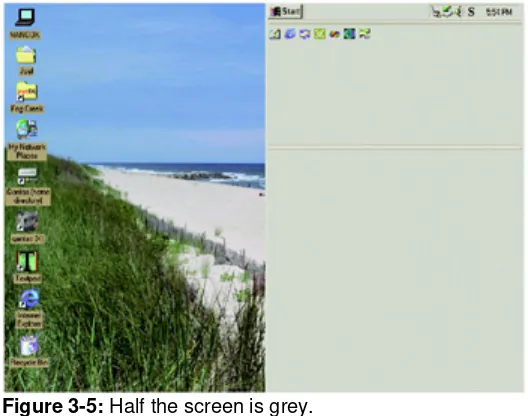
One day a friend called me up. She was having trouble sending email. "Half the screen is grey," she said.
Half the screen is grey?
It took me five minutes over the phone to figure out what had happened. She had
Figure 3-5: Half the screen is grey.
This is the kind of thing that nobody does on purpose. And there are a lot of computer users out there who can't get themselves out of this kind of mess. Almost by definition, when you accidentally reconfigure one of the options in your program, you don't know how to re-reconfigure it. It's sort of shocking to see how many people uninstall and then reinstall their software when things start behaving wrong, because at least they know how to do that. (They've learned to uninstall first, because otherwise all the broken customizations are likely to just come back).
"But wait!" you say. "It's important to have options for advanced users who want to tweak their environments!" In reality, it's not as important as you think. This reminds me of when I tried to switch to a Dvorak keyboard. The trouble was, I don't use one computer. I use all kinds of computers. I use other people's computers. I use three computers fairly regularly at home and three at work. I use computers in the test lab at work. The trouble with
customizing your environment is that it just doesn't propagate, so it's not even worth the trouble.
Most advanced users use several computers regularly; they upgrade their computer every couple of years, and they reinstall their operating system every three weeks. It's true that the
first time they realized they could completely remap the keyboard in Word, they might have changed everything around to be more to their taste. But as soon as they upgraded to Windows 95, those settings were lost. Besides, they weren't the same at work. So eventually they just stopped reconfiguring things. I've asked a lot of my power user friends about this; hardly any of them do any customization other than the bare minimum necessary to make their system behave reasonably.
Every time you provide an option, you're asking the user to make a decision. This means that they will have to stop and think. That's not necessarily a bad thing, but in general, you should always try to minimize the number of decisions that people have to make.
This doesn't mean eliminate all choice. There are enough choices that users will have to make anyway: the way their document will look, the way their Web site will behave, or anything else that is integral to the work that the user is doing. In these areas, go crazy: it's great to give people choices; by all means, the more the merrier.
Chapter 4:
Affordances and Metaphors
Overview
Developing a user interface where the program model matches the user model is not easy. Sometimes, your users might not have a concrete expectation of how the program works and what it's supposed to do. There is no user model.
When the user model is incomplete or wrong, the program can use affordances or metaphors to show the user its model.
In these cases, you are going to have to find ways to give the user clues about how something works. With graphical interfaces, a common way to solve this problem is with
metaphors. But not all metaphors are created equal, and it's important to understand why
metaphors work so you know if you've got a good one.
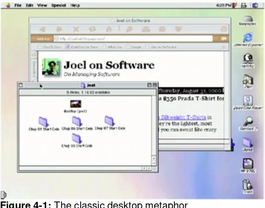
The most famous metaphor is the "desktop metaphor" used in Windows and the Macintosh (see Figure 4-1). The computer screen behaves something like a real world desk. You have these little folders with little files in them, which you can drag around into trash cans, and cute little pictures of real world objects like printers. To the extent that this metaphor works, it's because the little pictures of folders actually remind people of folders, which makes them realize that they can put documents into them.
Figure 4-1: The classic desktop metaphor
Figure 4-2: Can you guess how to zoom in with Kai's Photo Soap?
It's not very hard. The magnifying glass is a real world metaphor. People know what magnifying glasses do. And there's no fear that the zoom operation is actually changing the size of the underlying image, since that's not what magnifying glasses do.
A metaphor, even an imperfect one, works a lot better than none at all. Can you figure out how to zoom in with Microsoft Word, as shown in Figure 4-3?
Figure 4-3: OK, now how do you zoom in with Microsoft Word?
Well-designed objects make it clear how they work just by looking at them. Some doors have big metal plates at arm-level. The only thing you can do to a metal plate is push it. You can't pull it. You can't rotate it. In the words of usability expert Donald Norman, the plate affords
pushing. Other doors have big, rounded handles that just make you want to pull them. They even imply how they want you to place your hand on the handle. The handle affords pulling. It makes you want to pull it.
Other objects aren't designed so well and you can't tell what you're supposed to do. The quintessential example is the CD jewel case, which requires you to place your thumbs just so and pull in a certain direction. Nothing about the design of the box would indicate how you're supposed to open it. If you don't know the trick, it's very frustrating, because the box just won't open.
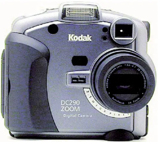
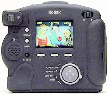
The best way to create an affordance is to echo the shape of the human hand in "negative space." Look closely at the (excellent) Kodak DC-290 digital camera, shown in Figures 4-4
and 4-5.
Figure 4-5: Back view. See the thumbprint in the lower left?
On the front, you can see a big rubber grip that looks like your right fingers should fit there. Even smarter, on the back in the lower left corner you can see an indent that looks uncannily like a thumbprint. When you put your left thumb there, your left index finger curls snugly on the front of the camera, between the lens and another rubber nubbin. It provides a kind of comforting feeling you haven't felt since you sucked your thumb (and curled your index finger around your nose).
The Kodak engineers are just trying to persuade you to hold the camera with both hands, in a position that ensures the camera will be more stable and even keeps stray fingers from blocking the lens by mistake. All this rubber is not functional; its sole purpose is to encourage you to hold the camera correctly.
Good computer UI uses affordances, too. About ten years ago, most push buttons went "3D." Using shades of grey, they appear to pop out of the screen. This is not just to look cool: it's important because 3D buttons afford pushing. They look like they stick out and they look like the way to operate them is by clicking on them. Unfortunately, many Web sites these days (unaware of the value of affordances) would rather have buttons that look cool
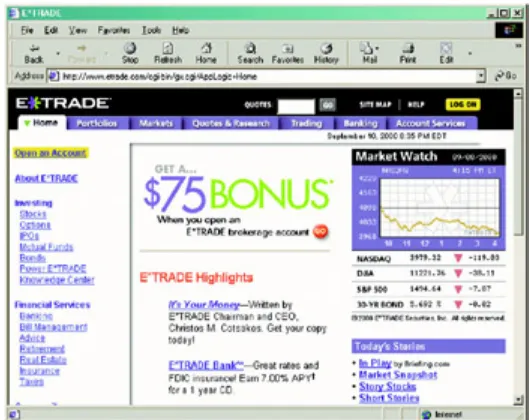
Figure 4-6: The E*TRADE home page.Which parts of the black banner are clickable? On the black banner at the top, The GO and LOG ON buttons pop out and look like you can click on them. The SITE MAP and HELP buttons don't look so clickable; in fact, they look exactly like the QUOTES label, which isn't clickable.
About four years ago, many windows started sprouting three little ridges that look like a grip on the lower right corner (see Figure 4-7).
Figure 4-7: The grip in the lower right corner affords dragging.
It looks like the kind of thing somebody would put on a slide switch to increase the friction. It
affords dragging. It just begs to be dragged to stretch the window.
Tabbed Dialogs
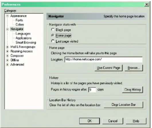
Figure 4-8: Netscape's way of dealing with too many options.
Now, you and I are elite programming hackers with a lot of experience with these kinds of dialogs. So when we look at Figure 4-8, we immediately understand that choosing one of the categories from the left hand part of the screen is going to magically change which options are available on the right hand part of the screen.
For some reason, this type of indirection was incredibly logical to the programmers who designed it, but many users didn't understand it. The problem? Well, most people are not elite programming hackers.
Most people would never guess that choosing something from the list on the left is supposed to change the contents of the dialog on the right: there's no visual reason to think that. In fact, what most people think is that the list on the left is nothing more than another setting, and they are afraid to touch it because it seems like a pretty scary setting that they don't understand.
When you do usability tests with dialogs like that, and you ask people to change one of the settings not actually shown on the main page (in this case, "Navigator"), you'll find that a remarkable number of people just can't figure out how to do it. When Microsoft did a usability test with a similar dialog from an old version of Microsoft Word, only 30% of the users succeeded at the task. A full 70% simply gave up without accomplishing the task they were given.
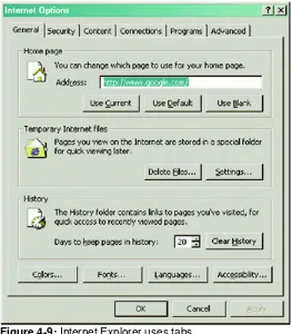
So, the Microsoft Word team switched to the famous tabbed dialogs like the one shown in
Figure 4-9: Internet Explorer uses tabs.
When they tried the tabbed dialogs in the usability lab, usability shot up from 30% to 100%. Let me tell you from experience that there are just not a whole lot of things that you can do that will improve your usability from 30% all the way to 100%.
Chapter 5:
Broken Metaphors
Overview
Remember the briefcase from Windows 95? (See Figure 5-1.) That cute little icon that occupied a square inch or so on everybody's desktop for a few years until Microsoft realized that nobody wanted one? Nobody wanted one because it was a broken metaphor. It was supposed to be a "briefcase" where you put files to take home. But when you took the files home, you still had to put them on a floppy disk. So, do you put them in the briefcase or on a floppy disk? I'm not sure. I never could get it to work.
Figure 5-1: Windows' unloved briefcase
A metaphor badly chosen is worse than no metaphor at all. Unfortunately, desktop user interface designers feel that they're breaking some kind of law if they don't use metaphors, so they would rather pick a wrong metaphor than go without.
When you use metaphors, try to make them behave in predictable ways like objects in the real world.Violating reality is just confusing.
What's the purpose of a metaphor in the first place? To teach users what the program model is so that the program model and the user model come into agreement. If you use the wrong metaphor, you are actually teaching the user the wrong thing about how the program works, so you're creating more trouble than you're solving. There's some historical evidence that the Windows 95 briefcase metaphor just didn't work: later versions of Windows have tried to compensate for the bad metaphor by forcing you to read a screen full of instructions whenever you drag files into that dang doohickey.
Guess what? Nobody reads instructions. My new Cuisinart food processor must have three hundred stickers on it that say "Do Not Even Think of Operating This Device without Reading the Instructions, and That Means You!" Which, we know as anthropologists, actually means that millions of people use Cuisinarts without reading the instructions. I'll go into that more soon. For now, I'd like to talk about broken metaphors like the briefcase and what a doggone nuisance they can be.
In Chapter 4, I talked about how nifty tabbed dialogs are. Microsoft Excel uses tabs to store multiple sheets in a workbook as shown in Figure 5-2.
Figure 5-2: Microsoft Excel uses tabs to show multiple pages.
Tabs are kind of small, so people don't necessarily notice them there, but everyone knows how they are expected to work and nobody has trouble using them. For example, in Figure 5-2 it's obvious that the "Income" sheet doesn't live in its own file. It's also obvious that there is no sheet called "Wombats." And it's obvious that the way to see the "Income" sheet is to click on the tab that says "Income." Am I boring you with obvious facts? The great thing about metaphors is that they allow you to "borrow" a part of the user's mental model of the nature of physical objects in the real world.
When you're using metaphors, it's very helpful if the computer program obeys the physical laws of the real world object. Many broken metaphors are the result of a failure to adhere to the "laws of nature," that is, the laws of the real world object that they are emulating.
Figure 5-3: Microsoft Word for Windows has three small, adjustable doohickeys that can be dragged to adjust the paragraph indenting.
People find these a bit hard to use. Here's why: if you drag the top doohickey, which represents the first line indent (as shown in Figure 5-4), only the top doohickey moves. That's what you would expect. But if you drag the bottom doohickey, representing the overall indent, all three doohickeys move, as shown in Figure 5-5. It's not just an inconsistency— it's a violation of the laws of nature! In nature, things are either connected or they're not. If I move my fork, I don't expect the knife and spoon to move, too!
Figure 5-4: Dragging the top doohickey moves it. So far so good.
Figure 5-5: Dragging the bottom doohickey moves all three, thus violating a "law of nature."
Multiple Rows of Tabs
When I first posted Chapter 4 on the Web, many readers emailed me to say that tabbed dialogs are all well and fine, but they're terrible as soon as you have more than one row of tabs. Indeed, they're right. The biggest problem has to do with the way multiple rows of tabs always seem to violate physics: when you click on a tab from another row, the tabs all shuffle around like restless schoolchildren on Class Photo Day, as shown in Figures 5-6a
Figure 5-6
This violation of realism is distressing enough that the designers of Microsoft's Visual C++ IDE went to a great deal of trouble to implement scrolling tabs. These have tiny arrows to control which tabs are visible and a neat "torn tab" effect so you notice that there are tabs missing to the right (see Figure 5-7).
Figure 5-8
Those Pesky Navigation Tabs
Tabs seem to be pretty popular on Web pages, too. Look at Figure 5-9, the Urbanfetch Web site. It's pretty obvious from the appearance of the page that the tabs represent different sections of the Web site.
Figure 5-9: Click on the Electronics tab, wait five seconds…
story in all of this: The Princess and the High Latency Internet Connection. In this story, Prince Webby and his mother, the Mouse Queen, convince themselves that the poor child who knocked on their door in a rainstorm is a real princess, because she's used to a personal T-1 line in the castle, and when she's forced to use a 28.8 modem, she complains
and complains…
Anyway. What was I talking about? Oh, yeah. Tabs on a Web page. When you actually click on a tab in a computer program, the screen responds immediately, obeying the laws of the real world. But when you click on a tab on a Web page, even a fast Web page, you wait at least three seconds until a new page slowly comes up showing you something that is as likely as not to be completely different. When you click on the tab on the Urbanfetch Web site in Figure 5-9, five things happen that violate physics:
1. Nothing happens for a few seconds while the new page is fetched. 2. Then the whole page goes white for a while.
3. Then, finally, a new page appears.
4. But now all the tabs are in a different place (the row of tabs shifts upward due to a lack of attention to detail on the part of the site designers).
5. The whole color scheme has changed now, including the color of the Urbanfetch logo, which is not supposed to be a part of the tab area anyway.
Some of these quirks are intrinsic to all Web sites; there's nothing that can be done about latency or the way pages refresh (short of using JavaScript and Dynamic HTML, which isn't quite standard enough yet). And some of these quirks are specific to Urbanfetch's site.
Microsoft Outlook introduced a new UI concept they called the "Outlook Bar." Located on the left side of the window, it is probably the most confusing part of a rather confusing interface.
Look at Figure 5-11. Yeah, I know, you're dying to see what's in my Inbox, but ignore that for a moment and focus on the left edge of the screen where it says Outlook Shortcuts. Just by looking at it, can you figure out how to use it? What happens if you click on the button that says Outlook Shortcuts? Or the button that says My
Shortcuts? Are you supposed to click on them or drag them? Nothing about the visual appearance gives you any clues about how the thing works.
Chapter 6:
Consistency and Other Hobgoblins
The main programs in the Microsoft Office suite, Word and Excel, were developed from scratch at Microsoft. Others were bought from outside companies, notably FrontPage (bought from Vermeer) and Visio, bought from Visio. You know what FrontPage and Visio have in common? They were originally designed to look and feel just like Microsoft Office applications.
The decision to emulate the Office UI wasn't merely to suck up to Microsoft or to position the companies for acquisition. Indeed, Charles Ferguson, who developed FrontPage, does not hesitate to admit his antipathy for Microsoft; he repeatedly begged the Justice Department to
do something about the Redmond Beasties (until he sold his company to them, after which his position became a lot more complicated). In fact, Vermeer and Visio seem to have copied the Office UI mainly because it was expedient: it was easier and quicker than reinventing the wheel.
When Mike Mathieu, a group program manager at Microsoft, downloaded FrontPage from Vermeer's Web site and tried it out, it worked a whole lot like Word. Since it worked so much like he expected a program to work, it was easier to use. The program model matched the user model. When he tried to do things, they worked. And this ease of use made him happy and gave him a favorable impression of the program right off the bat.
Now, when Microsoft gets a favorable impression of a program right off the bat, they shell out $150 million or so. Your goal is probably more modest; you want your customers to get a favorable impression and shell out maybe $39. But it's the same idea: consistency causes
ease of use, which, in turn, causes good feelings and results in more money for you.
It's hard to underestimate just how much consistency helps people to learn and use a wide variety of programs. Before GUIs, every program reinvented the very fundamentals of the user interface. Even a simple operation like "exit," which every program had to have, was completely inconsistent. In those days, people made a point of memorizing, at the very least, the exit command of common programs so they could exit and run a program they
understood. Emacs fanatics memorized :q! (and nothing else) in case they ever found themselves stuck in vi by mistake, while vi users memorized C-x C-c (Emacs even has its own way to represent control characters). Over in DOS land, you couldn't even use
WordPerfect unless you had one of those dorky plastic keyboard templates that reminded you what Alt+Ctrl+F3 did. I just memorized F7, which got me the heck outta there so I could run something intelligent like edlin.
Even tiny inconsistencies in things like the default typing behavior (overwrite or insert) can drive you crazy. I've gotten so used to Ctrl+Z meaning "undo" in Windows applications that when I use Emacs I am constantly minimizing the window (Ctrl+Z) by mistake. (The joke of it is, the very reason Emacs interprets Ctrl+Z as minimize is for "consistency" with that terrific user interface, csh, the C shell from UNIX.) This is one of those minor frustrations that add up to a general feeling of unhappiness.
To take an even smaller example, Pico and Emacs both use Ctrl+K to delete lines, but with a slightly different behavior that usually mauls my document whenever I find myself in Pico. I'm sure you have a dozen examples of your own.
Mac programs worked the same way, it was easy to learn a new one, so Mac users learned and used a larger number of programs.
Consistency is a fundamental principle of good UI design, but it's really just a corollary of the axiom "make the program model match the user model," because the user model is likely to reflect the way that users see other programs behaving. If the user has learned that double-clicking text means select word, you can show them a program they've never seen before and they will guess that the way to select a word is to double-click it. And now that program had better select words when they double-click (as opposed to, say, looking the word up in the dictionary), or else you'll have a usability problem.
If consistency is so obviously beneficial, why am I wasting your time and mine evangelizing it? Unhappily, there is a dark force out there that fights consistency. That force is the natural tendency of designers and programmers to be creative.
I hate to be the one to tell you "don't be creative," but unfortunately, to make a user interface easy to use, you are going to have to channel your creativity into some other area. In most UI decisions, before you design anything from scratch, you absolutely must look at what other popular programs are doing and emulate that as closely as possible. If you're creating a document-editing program of some sort, it better look an awful lot like Microsoft Word, right down to the accelerators on the common menu items. Some of your users will be used to
Ctrl+S for save; some of them will be used to Alt+F,S for save, and still others will be used to Alt,F,S (releasing the Alt key). Another group will look for the floppy disk icon in the top left area of the window and click it. All four had better work or your users are going to get something they don't want. If you think that running the spell-checker should be Ctrl+S, you're going to annoy an awful lot of people who are just trying to save their work.
I've seen companies where management prides themselves on doing things deliberately
different from Microsoft. "Just because Microsoft does it, doesn't mean it's right," they brag, and then proceed to create a gratuitously different user interface from the one that people are used to. Before you start chanting the mantra "just because Microsoft does it, doesn't mean it's right," please consider two things.
One, even if it's not right, if Microsoft is doing it in a popular program like Word, Excel, Windows, or Internet Explorer, millions of people are going to think that it's right, or at least fairly standard. They are going to assume that your program works the same way. Even if you think that Alt+Left is not a good shortcut key for "Back," there are literally millions of people out there who will try to use Alt+Left to go back, and if you refuse to do it on some general religious principle that Bill Gates is the evil Smurf arch-nemesis Gargamel, then you are just gratuitously ruining your program so that you can feel smug and self-satisfied, and your users will not thank you for it.
If you're making a high-end photo editor for graphics professionals, I assure you that 90% of your users are going to know Adobe Photoshop, so you better behave a heck of a lot like Photoshop in the areas where your program overlaps. If you don't, people are going to say that your program is hard to use even if you think it's easier to use than Photoshop, because it's not behaving the way they expect it to.
There is another popular tendency to reinvent the common controls that come with
Windows. (Don't even get me started about Netscape 6.) There was a time when you could tell which programs were compiled with Borland's C++ compiler because they used big fat
OK buttons with giant green checkboxes. This wasn't nearly as bad as Kai's Photo Soap.
Look at Figure 6-1. Fine, so it's stunningly beautiful, but look closely at the exit dialog. To me, the O with a line through it (which actually means "no") reminds me of "OK." The standard on Windows is to have OK on the left, so I wind up hitting the wrong button a lot. The only benefit to having funny symbols instead of "OK" and "Cancel" like everyone else is that you get to show off how creative you are. If people make mistakes because of Kai's creativity, well, that's just the price they have to pay for being in the presence of an artist. (Another problem with this "dialog" is that it doesn't have a standard title bar to move the dialog around onscreen. If the dialog gets in the way of something you want to see in order to answer the question in the dialog, you are out of luck.)
Figure 6-1: Kai's Photo Soap does everything differently.
Now, there's a lot to be gained by having a slick, cool-looking user interface. Good graphic design like Kai is pleasing and will attract people to your program. The trick is to do it without
breaking the rules. You can change the visual look of dialogs a bit, but don't break the functionality.
When the first version of Juno was written, it had the standard log-on dialog that prompted you for a user name and a password. After you entered the user name, you were supposed to press Tab to go to the password field and type in a password.
Now, this distressed one of the managers at Juno who had a lot more experience with UNIX than with Windows. He was used to typing the user name, then pressing Enter to jump to the password field (instead of Tab). When you're writing a program targeted at nonexpert
doing the Windows-standard "OK" thing. "Just because Microsoft does it, doesn't mean it's right," he chirped.
So, the programmers spent a remarkable amount of time writing some amazingly complicated dialog-box handling-code to work around the default behavior of Windows. (Being inconsistent is almost always more work than simply acting like your platform expects you to act). This code was a maintenance nightmare; it didn't port so well when we moved from 16-bit to 32-bit Windows. It didn't do what people expected. And as new programmers joined the team, they didn't understand why there was this strange subclass for dialogs.
Over the years, an awful lot of programmers have tried to reimplement various common Windows controls, from buttons to scrollbars, toolbars, and menu bars (the Microsoft Office team's favorite thing to reimplement). Netscape 6 goes so far as to reimplement every single common Windows control. This usually has some unforeseen bad effects. The best example is with the edit box. If you reimplement the edit box, there are a lot of utilities that you've never even heard of (like Chinese language editing add-ins, and bidirectional versions of Windows that support right-to-left text) that are going to stop working because they don't recognize your nonstandard edit box. Some reviewers of the Netscape 6 preview releases complained that the URL box, using a nonstandard Netscape edit control, does not support common edit control features like right-clicking to get a context menu.
When you find yourself arguing with an anti-Microsoft fundamentalist or a creative graphic designer about consistency, they're apt to quote Ralph Waldo Emerson incorrectly: "Consistency is the hob-goblin of little minds…" Emerson's real quote is "A foolish
consistency is the hobgoblin of little minds."
Chapter 7:
Putting the User in Charge
Overview
The history of user interfaces—from the early 1970s when interactive systems first appeared, to today's most modern GUI interfaces—has followed a pendulum. Each generation of user interface designers collectively changes its mind about whether users need to be guided through a program or whether they should be left alone to control the program as they see fit. Following trends in user control is a bit like following the hemlines at the Milan fashion shows. Plus ça change, plus c'est la même chose. Here's a bird's-eye view of what happened.
The first computer systems weren't very interactive at all. You created a program by
punching holes on eighty-column cards using a giant hole-punching machine that looked like something from the ship in Lost in Space and made an incredibly satisfying clacking sound. Of course, there was no way to fill in a hole you made by mistake— so if you made even one mistake you had to repunch the whole card. Then you carefully took your deck of cards over to a large machine called a hopper and piled the cards in. (It was called a hopper because it would hop all over the floor doing a happy overstuffed-washingmachine dance unless you bolted it down.)
The hopper ate most of your cards, choking on a few, but eventually, begrudgingly, it accepted your program. On a good day, it wouldn't even chew up any of your cards, forcing you to painstakingly repunch them.
Once the hopper successfully choked down your card deck, you walked across campus to the student union and got some lunch. If you lingered a bit in the comic book store after lunch, by the time you got back to the Computer Center your program would have worked its way halfway up the queue. Every ten minutes or so, the computer operator printed out the status of the queue and pinned it up to the bulletin board near the Card Mangler. Eventually your program would run and a printout would appear in your cubbyhole telling you that there was a syntax error on line 32, that it took four seconds of CPU time to run, and that you now had fourteen seconds of CPU time left out of your monthly budget.
Interactive Computing
All of this changed dramatically when the first interactive computer systems started showing up. They introduced the famous command-line interface (CLI). You literally sat down, typed a one-line request to the computer, and when you hit the enter key, you got your response
right then and there. No more time for lunch. No comic books. It was a sad day. When you sat down with a command-line interface, you stared at a prompt. "READY," said some of the systems, "C:\>," said others (that's a picture of an ice-cream cone that fell over). In a fit of stinginess, some systems managed to squeeze their prompt down to one character. "$", said the UNIX shell. Presumably, UNIX programmers had to pay for their computer time by the letter.
Now what do you do? Well, that's entirely up to you. You can ask for a listing of files; you can look at the contents of a file; you can run a program to calculate your biorhythms; whatever you want. The method by which you completed tasks as disparate as sending an email or deleting a file was exactly the same: you typed in a previously-memorized
command.
learnable. You basically need to memorize all the frequently used commands, or you need to constantly consult a reference manual to get your work done. Everybody's first reaction to being sat down in front of a CLI is, "OK, now what do I do?" A typical computer session from 1974 is shown in Figure 7-1.
Figure 7-1: If you didn't have the manual, you had to guess or ask a guru.
Soon another style of interface developed: more of a question and answer model. When you sat down to a program, it asked you questions. You never had to remember a thing. See
Figure 7-2: An excellent example of one of the great, lost interactive computer programs of the early 1970s, reconstructed here from memory. Notice that the program helpfully asks you questions, so you never need to remember a command.
Interface designers of the Middle Command Line Era eventually realized that people didn't want to sit with a manual in their lap to get things done. They created question-and-answer programs, which basically combined the manual with the program itself by showing you what to do as you went along.
Soon, programs starting sprouting more and more features. The silly biorhythm programs sprouted features to tell you what day of the week you were born on. The more serious Star Trek games (where you chased a little Klingon ship around a 10 × 10 grid) gave you
choices: you could fire photon torpedoes or move your ship. Pretty soon, the newest innovation was having a menu-driven program. This was thought to be the height of UI coolness. Computer software advertisements bragged about menu-driven interfaces (see