Fausto Pedro García Márquez
Benjamin Lev
Editors
Big Data
Benjamin Lev
Editors
Big Data Management
Fausto Pedro García Márquez ETSI Industriales de Ciudad Real University of Castilla-La Mancha Ciudad Real
Spain
Benjamin Lev Drexel University Philadelphia, PA USA
ISBN 978-3-319-45497-9 ISBN 978-3-319-45498-6 (eBook) DOI 10.1007/978-3-319-45498-6
Library of Congress Control Number: 2016949558 © Springer International Publishing AG 2017
This work is subject to copyright. All rights are reserved by the Publisher, whether the whole or part of the material is concerned, specifically the rights of translation, reprinting, reuse of illustrations, recitation, broadcasting, reproduction on microfilms or in any other physical way, and transmission or information storage and retrieval, electronic adaptation, computer software, or by similar or dissimilar methodology now known or hereafter developed.
The use of general descriptive names, registered names, trademarks, service marks, etc. in this publication does not imply, even in the absence of a specific statement, that such names are exempt from the relevant protective laws and regulations and therefore free for general use.
The publisher, the authors and the editors are safe to assume that the advice and information in this book are believed to be true and accurate at the date of publication. Neither the publisher nor the authors or the editors give a warranty, express or implied, with respect to the material contained herein or for any errors or omissions that may have been made.
Printed on acid-free paper
This Springer imprint is published by Springer Nature The registered company is Springer International Publishing AG
my beloved wife of 51 years Debbie Lev
2/12/1945
–
4/16/2016
Big Data and Management Science has been designed to synthesize the analytic principles with business practice and Big Data. Specifically, the book provides an interface between the main disciplines of engineering/technology and the organi-zational, administrative, and planning abilities of management. It is complementary to other sub-disciplines such as economics,finance, marketing, decision and risk analysis.
This book is intended for engineers, economists, and researchers who wish to develop new skills in management or for those who employ the management discipline as part of their work. The authors of this volume describe their original work in the area or provide material for case studies that successfully apply the management discipline in real-life situations where Big Data is also employed.
The recent advances in handling large data have led to increasingly more data being available, leading to the advent of Big Data. The volume of Big Data runs into petabytes of information, offering the promise of valuable insight. Visualiza-tion is the key to unlocking these insights; however, repeating analytical behaviors reserved for smaller data sets runs the risk of ignoring latent relationships in the data, which is at odds with the motivation for collecting Big Data. Chapter “Visualizing Big Data: Everything Old Is New Again”focuses on commonly used tools (SAS, R, and Python) in aid of Big Data visualization to drive the formulation of meaningful research questions. It presents a case study of the public scanner database Dominick’s Finer Foods, containing approximately 98 million observa-tions. Using graph semiotics, it focuses on visualization for decision making and explorative analyses. It then demonstrates how to use these visualizations to for-mulate elementary-, intermediate-, and overall-level analytical questions from the database.
The development of Big Data applications is closely linked to the availability of scalable and cost-effective computing capacities for storing and processing data in a distributed and parallel fashion, respectively. Cloud providers already offer a portfolio of various cloud services for supporting Big Data applications. Large companies such as Netflix and Spotify already use those cloud services to operate
their Big Data applications. Chapter“Managing Cloud-Based Big Data Platforms: A Reference Architecture and Cost Perspective” proposes a generic reference to architecture that implements Big Data applications based on state-of-the-art cloud services. The applicability and implementation of our reference to architecture is demonstrated for three leading cloud providers. Given these implementations, we analyze how main pricing schemes and cost factors can be used to compare respective cloud services. This information is based on a Big Data streaming use case. Derivedfindings are essential for cloud-based Big Data management from a cost perspective.
Most of the information about Big Data has focused on the technical side of the phenomenon. Chapter“The Strategic Business Value of Big Data”makes the case that business implications of utilizing Big Data are crucial to obtain a competitive advantage. To achieve such objective, the organizational impacts of Big Data for today’s business competition and innovation are analyzed in order to identify different strategies a company may implement, as well as the potential value that Big Data can provide for organizations in different sectors of the economy and different areas inside such organizations. In the same vein, different Big Data strategies a company may implement toward its development are stated and sug-gestions regarding how enterprises such as businesses, nonprofits, and governments can use data to gain insights and make more informed decisions. Current and potential applications of Big Data are presented for different private and public sectors, as well as the ability to use data effectively to drive rapid, precise and profitable decisions.
Chapter “A Review on Big Data Security and Privacy in Healthcare Applications” considers the term Big Data and its usage in healthcare applica-tions. With the increasing use of technologically advanced equipment in medical, biomedical, and healthcare fields, the collection of patients’ data from various hospitals is also becoming necessary. The availability of data at the central location is suitable so that it can be used in need of any pharmaceutical feedback, equip-ment’s reporting, analysis and results of any disease, and many other uses. Collected data can also be used for manipulating or predicting any upcoming health crises due to any disaster, virus, or climate change. Collection of data from various health-related entities or from any patient raises serious questions upon leakage, integrity, security, and privacy of data. The questions and issues are highlighted and discussed in the last section of this chapter to emphasize the broad pre-deployment issues. Available platforms and solutions are also discussed to overcome the arising situation and question the prudence of usage and deployment of Big Data in healthcare-relatedfields and applications. The available data privacy, data security, users’ accessing mechanisms, authentication procedures, and privileges are also described.
electric power of Big Data systems. The next section describes the necessity of Big Data. This is a view that applies aspects of macroeconomics. In service science capitalism, measurements of values of products need Big Data. Service products are classified into stock, flow, and rate of flow change. Immediacy of Big Data implements and makes sense of each classification. Big Data provides a macroeconomic model with behavioral principles of economic agents. The prin-ciples have mathematical representation with high affinity of correlation deduced from Big Data. In the last section, we present an explanation of macroeconomic phenomena in Japan since 1980 as an example of use of the macroeconomic model. Chapter “Big Data for Conversational Interfaces: Current Opportunities and Prospects” is on conversational technologies. As conversational technologies develop, more demands are placed upon computer-automated telephone responses. For instance, we want our conversational assistants to be able to solve our queries in multiple domains, to manage information from different usually unstructured sources, to be able to perform a variety of tasks, and understand open conversa-tional language. However, developing the resources necessary to develop systems with such capabilities demands much time and effort. For each domain, task, or language, data must be collected and annotated following a schema that is usually not portable. The models must be trained over the annotated data, and their accuracy must be evaluated. In recent years, there has been a growing interest in investigating alternatives to manual effort that allow exploiting automatically the huge amount of resources available in the Web. This chapter describes the main initiatives to extract, process, and contextualize information from these Big Data rich and heterogeneous sources for the various tasks involved in dialog systems, including speech processing, natural language understanding, and dialog management.
In Chapter “Big Data Analytics in Telemedicine : A Role of Medical Image Compression,”Big Data analytics which is one of most rapidly expandingfields has started to play a vital role in thefield of health care. A major goal of telemedicine is to eliminate unnecessary traveling of patients and their escorts. Data acquisition, data storage, data display and processing, and data transfer represent the basis of telemedicine. Telemedicine hinges on transfer of text, reports, voice, images, and video between geographically separated locations. Out of these, the simplest and easiest is through text, as it is quick and simple to use, since sending text requires very little bandwidth. The problem with images and videos is that they require a large amount of bandwidth for transmission and reception. Therefore, there is a need to reduce the size of the image that is to be sent or received, i.e., data compression is necessary. This chapter deals with employing prediction as a method for compression of biomedical images. The approach presented in this chapter offers great potential in compression of the medical image under consid-eration, without degrading the diagnostic ability of the image.
minimize total travel delay. A bi-level network design model is presented for RISCO subject to equilibrium flow. A weighted sum risk equilibrium model is proposed in Chapter“A Bundle-Like Algorithm for Big Data Network Design with Risk-Averse Signal Control Optimization”to determine generalized travel cost at lower level problem. Since the bi-objective signal control optimization is generally non-convex and non-smooth, a bundle-like efficient algorithm is presented to solve the equilibrium-based model effectively. A Big Data bounding strategy is devel-oped in Chapter “A Bundle-Like Algorithm for Big Data Network Design with Risk-Averse Signal Control Optimization” to stabilize solutions of RISCO with modest computational efforts. In order to investigate the computational advantage of the proposed algorithm for Big Data network design with signal optimization, numerical comparisons using real data example and general networks are made with current best well-known algorithms. The results strongly indicate that the proposed algorithm becomes increasingly computationally comparative to best known alternatives as the size of network grows.
Chapter“Evaluation of Evacuation Corridors and Traffic Management Strategies for Short-Notice Evacuation”presents a simulation study of the large-scale traffic data under a short-notice emergency evacuation condition due to an assumed chlorine gas spill incident in a derailment accident in the Canadian National (CN) Railway’s railroad yard in downtown Jackson, Mississippi by employing the dynamic traffic assignment simulation program DynusT. In the study, the effective evacuation corridor and traffic management strategies were identified in order to increase the number of cumulative vehicles evacuated out of the incident-affected protective action zone (PAZ) during the simulation duration. An iterative three-step study approach based on traffic control and traffic management considerations was undertaken to identify the best strategies in evacuation corridor selection, traffic management method, and evacuation demand staging to relieve heavy traffic con-gestions for such an evacuation.
Chapter“Analyzing Network Log Files Using Big Data Techniques”considers the service to 26 buildings with more than 1000 network devices (wireless and wired) and access to more than 10,000 devices (computers, tablets, smartphones, etc.) which generate approximately 200 MB/day of data that is stored mainly in the DHCP log, the Apache HTTP log, and the Wi-fi log files. Within this context, Chapter“Analyzing Network Log Files Using Big Data Techniques”addresses the design and development of an application that uses Big Data techniques to analyze those logfiles in order to track information on the device (date, time, MAC address, and georeferenced position), as well as the number and type of network accesses for each building. In the near future, this application will help the IT department to analyze all these logs in real time.
and time and unifies them in a common framework that allows evaluation of project health. Chapter“Big Data and Earned Value Management in Airspace Industry” aims to integrate the project management and the Big Data. It proposes an EVM approach, developed from a real case study in aerospace industry, to simultaneously manage large numbers of projects.
Ciudad Real, Spain Fausto Pedro García Márquez
Visualizing Big Data: Everything Old Is New Again. . . 1 Belinda A. Chiera and Małgorzata W. Korolkiewicz
Managing Cloud-Based Big Data Platforms: A Reference
Architecture and Cost Perspective. . . 29 Leonard Heilig and Stefan Voß
The Strategic Business Value of Big Data. . . 47 Marco Serrato and Jorge Ramirez
A Review on Big Data Security and Privacy in Healthcare
Applications. . . . 71 Aqeel-ur-Rehman, Iqbal Uddin Khan and Sadiq ur Rehman
What Is Big Data . . . 91 Eizo Kinoshita and Takafumi Mizuno
Big Data for Conversational Interfaces: Current Opportunities
and Prospects . . . 103 David Griol, Jose M. Molina and Zoraida Callejas
Big Data Analytics in Telemedicine: A Role of Medical Image
Compression . . . 123 Vinayak K. Bairagi
A Bundle-Like Algorithm for Big Data Network Design
with Risk-Averse Signal Control Optimization. . . 161 Suh-Wen Chiou
Evaluation of Evacuation Corridors and Traffic Big
Data Management Strategies for Short-Notice Evacuation . . . 201 Lei Bu and Feng Wang
Analyzing Network Log Files Using Big Data Techniques. . . . 227 Víctor Plaza-Martín, Carlos J. Pérez-González, Marcos Colebrook,
José L. Roda-García, Teno González-Dos-Santos and José C. González-González
Big Data and Earned Value Management in Airspace Industry. . . 257 Juan Carlos Meléndez Rodríguez, Joaquín López Pascual,
Prof. Fausto Pedro García Márquez obtained his European Doctorate in 2004 at the University of Castilla-La Mancha (UCLM), Spain with the highest distinction. He has been honored with the Runner-up Prize (2015) Advancement Prize (2013), and Silver Prize (2012) by the International Society of Manage-ment Science and Engineering ManageManage-ment. He is a senior lecturer at UCLM (with tenure, accredited as full professor), honorary senior research fellow at Birmingham University, UK, lecturer at the Postgrad-uate European Institute, and he was senior manager in Accenture (2013–14). Fausto has managed a great number of projects as either principal investigator (PI) or researcher: five Europeans and four FP7 framework program (one Euroliga, three FP7); he is PI in two national projects, and he has participated in two others; four regional projects; three university projects; and more than 100 joint projects with research institutes and industrial companies (98 % as director). He has been a reviewer in national and international programs. He has published more than 150 papers (65 % in ISI journals, 30 % in JCR journals, and 92 % internationals), being the main author of 68 publications. Some of these papers have been especially recognized, e.g., by “Renewable Energy” (as “Best Paper Award 2014”); “International Society of Management Science and Engineering Management” (as “excellent”), and by the “International Journal of Automation and Computing” and “IMechE Part F: Journal of Rail and Rapid Transit” (most downloaded). He is the author/editor of 18 books (published by Elsevier, Springer, Pearson, McGraw-Hill, Intech, IGI, Marcombo, and AlfaOmega), and he is the inventor offive patents. He is an associate editor of three international journals: Engineering Management Research; Open Journal of Safety Science and Technology; and International Journal of Engineering and Technolo-gies, and he has been a committee member of more than 25 international confer-ences. He is a director of Ingenium Research Group (www.uclm.es/profesorado/ fausto).
Is New Again
Belinda A. Chiera and Małgorzata W. Korolkiewicz
Abstract Recent advances have led to increasingly more data being available, lead-ing to the advent of Big Data. The volume of Big Data runs into petabytes of infor-mation, offering the promise of valuable insight. Visualization is key to unlocking these insights, however repeating analytical behaviors reserved for smaller data sets runs the risk of ignoring latent relationships in the data, which is at odds with the motivation for collecting Big Data. In this chapter, we focus on commonly used tools (SAS, R, Python) in aid of Big Data visualization, to drive the formulation of meaningful research questions. We present a case study of the public scanner data-base Dominick’s Finer Foods, containing approximately 98 million observations. Using graph semiotics, we focus on visualization for decision-making and explo-rative analyses. We then demonstrate how to use these visualizations to formulate elementary-, intermediate- and overall-level analytical questions from the database.
Keywords Visualisation
⋅
Big Data⋅
Graph semiotics⋅
Dominick’s Finer Foods (DFF)1
Introduction
Recent advances in technology have led to more data being available than ever before, from sources such as climate sensors, transaction records, cell phone GPS signals, social media posts, digital images and videos, just to name a few. This phenomenon is referred to as ‘Big Data’. The volume of data collected runs into petabytes of information, thus allowing governments, organizations and researchers to know much more about their operations, thus leading to decisions that are increas-ingly based on data and analysis, rather than experience and intuition [1].
B.A. Chiera (
✉
)⋅M.W. KorolkiewiczUniversity of South Australia, Adelaide, Australia e-mail: [email protected]
M.W. Korolkiewicz
e-mail: [email protected]
© Springer International Publishing AG 2017
F.P. García Márquez and B. Lev (eds.),Big Data Management, DOI 10.1007/978-3-319-45498-6_1
Big Data is typically defined in terms of itsVariety, VelocityandVolume. Vari-ety refers to expanding the concept of data to include unstructured sources such as text, audio, video or click streams. Velocity is the speed at which data arrives and how frequently it changes. Volume is the size of the data, which for Big Data typi-cally means ‘large’, given how easily terabytes and now petabytes of information are amassed in today’s market place.
One of the most valuable means through which to make sense of Big Data is visualization. If done well, a visual representation can uncover features, trends or pat-terns with the potential to produce actionable analysis and provide deeper insight [2]. However Big Data brings new challenges to visualization due to its speed, size and diversity, forcing organizations and researchers alike to move beyond well-trodden visualization paths in order to derive meaningful insights from data. The techniques employed need not be new—graphs and charts can effectively be those decision mak-ers are accustomed to seeing—but a new way to look at the data will typically be required.
Additional issues with data volume arise when current software architecture becomes unable to process huge amounts of data in a timely manner. Variety of Big Data brings further challenges due to unstructured data requiring new visualization techniques. In this chapter however, we limit our attention to visualization of ‘large’ structured data sets.
There are many visualization tools available; some come from established analyt-ics software companies (e.g. Tableau, SAS or IBM), while many others have emerged as open source applications.1For the purposes of visualization in this chapter, we
focus on SAS, R and Python, which together with Hadoop, are considered to be key tools for Data Science [3].
The use of visualization as a tool for data exploration and/or decision-making is not a new phenomenon. Data visualization has long been an important component of data analysis, whether the intent is that of data exploration or as part of a model building exercise. However the challenges underlying the visualization of Big Data are still relatively new; often the choice to visualize is between simple graphics using a palette of colors to distinguish information or to present overly-complicated but aesthetically pleasing graphics, which may obfuscate and distort key relationships between variables.
Three fundamental tenets underlie data visualization: (1) visualization for data exploration, to highlight underlying patterns and relationships; (2) visualization for decision making; and (3) visualization for communication. Here we focus predomi-nantly on the first two tenets. In the case of the former, previous work in the literature suggests a tendency to approach Big Data by repeating analytical behaviors typically reserved for smaller, purpose-built data sets (e.g. [4–6]). There appears, however, to be less emphasis on the exploration of Big Data itself to formulate questions that drive analysis.
In this chapter we propose to redress this imbalance. While we will lend weight to the use of visualization of Big Data in support of good decision-making processes, our main theme will be on visualization as a key component to harnessing the scope and potential of Big Data to drive the formulation of meaningful research questions. In particular, we will draw upon the seminal work of Bertin [7] in the use of graph semiotics to depict multiple characteristics of data. We also explore the extension of this work [8] to apply these semiotics according to data type and perceived accuracy of data representation and thus perception. Using the publicly available scanner data-base Dominick’s Finer Foods, containing approximately 98 million observations, we demonstrate the application of these graph semiotics [7, 8] for data visualiza-tion. We then demonstrate how to use these visualizations to formulate elementary-, intermediate- and overall-level analytical questions from the database, before pre-senting our conclusions.
2
Case Study Data: Dominick’s Finer Foods
To illustrate Big Data visualization, we will present a case study using a publicly available scanner database from Dominick’s Finer Foods2 (DFF), a supermarket
chain in Chicago. The database has been widely used in the literature, ranging from consumer demand studies through to price point and rigidity analysis, as well as consumer-preferences studies. The emphasis in the literature has been on using the data to build analytical models and drive decision-making processes based on empir-ically driven insights [4–6,9–12].3
The DFF database contains approximately nine years of store-level data with over 3,500 items, all with Unique Product Codes (UPC). Data is sampled weekly from September 1989 through to May 1997, totaling 400 weeks of scanner data and yield-ing approximately 98 million observations [13]. The sample is inconsistent in that there is missing data and data that is non-homogeneous in time, for a selection of supermarket products and characteristics. The database is split across 60 files, each of which can be categorized broadly as either:
1. General files: files containing information on store traffic such as coupon usage and store-level population demographics (cf. Table1); and
2. Category-specific files: grocery items are broadly categorized into one of 29 cat-egories (e.g.Analgesics, Bath Soap, Beer, and so forth) and each item category is associated with a pair of files. The first file of the pair contains product descrip-tion informadescrip-tion such as the name and size of the product and UPC, for all brands of that specific category. The second file contains movement information for each UPC, pertaining to weekly sales data includingstore, item price, units sold, profit margin, total dollar salesandcoupons redeemed(cf. Table2).
2http://edit.chicagobooth.edu/research/kilts/marketing-databases/dominicks/dataset.
Table 1 Sample of customer information recorded in the DFF database. Coupon information was recorded only for those products offering coupon specials
Variable Description Type
Date Date of observation Date (yymmdd)
Week Week number Quantitative
Store Unique store ID Quantitative
Bakcoup Bakery coupons redeemed Quantitative Bakery Bakery sales in dollars Quantitative Beer Beer sales in dollars Quantitative
. . . .
Wine Wine sales in dollars Quantitative
Table 2 Sample of demographic information recorded in the DFF database. A total of 510 unique variables comprise the demographic data. This brief excerpt gives a generalized overview
Variable Description Type
Name Store name Qualitative
City City in which store is located Qualitative Zone Geographic zone of store Quantitative
Store Unique store ID Quantitative
Age60 Percentage of population over 60
Quantitative
Hsizeavg Average household size Quantitative
. . . .
In total, across the general and category-specific files there are 510 store-specific demographic variables and 29 item categories recorded as 60 separate data sets. A 524-page data manual and codebook accompanies the database. Given the amount of information recorded in the database, we are able to present abreadth-and-depth
data overview. Specifically, we will demonstrate data visualization across a range of characteristics of a single supermarket product, to provide a summary of the breadth of the data set, as well as an in-depth analysis of beer products to demonstrate the ability of visualization to provide further insight into big databases.
3
Big Data: Pre-processing and Management
prohibitive size of Big Data. What is ordinarily a rudimental step of any statistical analysis — checking data validity and cleaning — is now a difficult exercise, fraught with multiple challenges. Thus alternative approaches need to be adopted to prepare the data for visualization.
The two main areas which need to be addressed at this stage are:
1. Data pre-processing; and 2. Data management.
Of the three software platforms considered here, the Python programming language provides tools which are both flexible and fast, to aid in both data pre-processing and manipulation, a process referred to as eitherdata mungingorwrangling.
Data munging encompasses the process of data manipulation from cleaning through to data aggregation and/or visualization. Key to the success of any data munging exercise is the flexibility provided by the software to manipulate data. To this end, Python contains the specializedPandaslibrary (PANel DAta Structures), which provides thedata framestructure. A data frame allows for the creation of a data table, mirroring e.g. Tables1and2, in that variables of mixed type are stored within a single structure.
The advantage of using a Python data frame is that this structure allows for data cleaning, merging and/or concatenation, plus data summarization or aggregation, with a necessarily fast and simple implementation. It should be noted that R, and to an extent SAS, also offer a data frame structure which is equally easy to use and manipulate, however Python is preferred for Big Data as the Pandas data frame is implemented using a programming construct calledvectorization,which allows for faster data processing over non-vectorized data frames [14]. R also provides vector-ization functionality, however it is somewhat more complicated to use than Pandas. For this reason we will use Python for data pre-processing and management.
3.1
Data Pre-processing
We first addressed the general store files individually (Tables1and2) to perform an initial investigation of the data. The two files were read into separate Python data frames, namedccountanddemo, and were of dimension 324,133×62 and 108× 510 respectively, with columns indicating unique variables and rows giving obser-vations over those variables. A sample of each data frame was viewed to compare the database contents with the data manual, at which time it was determined that the store data was not perfectly mirrored in the manual. Any variable present in the database that did not appear in the manual was further investigated to resolve ambi-guity around the information recorded, and if a resolution could not be achieved, the variable was removed from the analysis.
we identified common variables appearing inccountanddemoand used these vari-ables for the merging procedures, as will be discussed in what follows. We removed missing values using Python’sdrop.na()function, which causes the listwise removal for any record containing at least one missing value. We opted for listwise deletion since the validation of imputed data would be difficult due to inaccessibility of the original data records, and sample size was not of concern. Other operations per-formed included the removal of duplicate records and trailing whitespace characters in variable names, since statistical software could potentially treat these whitespaces as unique identifiers, and introduce erroneous qualitative categories.
In what follows, rather than attempt to read the database as a whole, category-specific files for a selection of products were processed and held in computer memory only as needed. All three software applications considered here—SAS, Python and R—are flexible and allow easy insertion of data, thus supporting the need to keep the data frames as small as possible, with efficient adaptation on-the-fly.
We focused on a single product item for visualization, in this caseBeer, as given the scope of the data there was a plethora of information available for a single prod-uct and the data was more than sufficient for our purposes here. Each prodprod-uct was represented by two files, as was the case for Beer. The first captured information such as the Unique Product Code, name, size and item coding. The second file contained movement information indicating price, profit margins, sales amounts and codes, as well as identifying information such as the store ID and the week in which the data was recorded. We elected to use the movement data only, since: (1) the information contained therein was more suited to meaningful visualization; and (2) the informa-tion in the movement data overlapped with theccountanddemodata frames, namely the variablesstore(a number signifying the store ID) andweek, allowing for potential merging of the data frames. Finally, a map was made available on the DFF website, containing geographic information of each store (City, Zone, Zip code) as well as the ID and thePrice Tierof each store, indicating the perceived socio-economic status of the area in which each store was located. In what follows,Store, ZoneandPrice Tierwere retained for the analysis.
3.2
Data Management
An attraction of using Python and R is that both languages allow the manipu-lation of data frames in the same manner as a database. We continued to work in Python during the data management phase for reasons cited above, namely the fast implementation of Python structures for data manipulation. It should be noted how-ever, the functionality discussed below applies to both Python and R. While not all database functionality is implemented, key operations made available include:
∙ concat: appends columns or rows from one data frame to another. There is no requirement for a common variable in the data frames.
∙ merge: combines data frames by using columns in each dataset that contain com-mon variables.
∙ groupby: provide a means to easily generate data summaries over a specified char-acteristic.
The database-style operationconcatconcatenates two data frames by adding rows and/or columns, the latter occurring when data frames are merged and each structure contains no variables in common. Python will automatically insert missing values into the new data frame when a particular row/column combination has not been recorded, to pad out the concatenated structure. Thus care needs to be taken when treating missing values in a concatenated data frame—a simple call to drop.na()
can at times lead to an empty data frame. It is suggested that only those variables immediately of interest for visualization should be treated for missing data.
Themergeoperation joins two or more data frames on the basis of at least one common variable—called ajoin key—in the data frames [14]. For example, the data framesccountanddemoboth contain the numerical variablestore, which captures each Store ID. Merging thedemoandccountdata frames would yield an expanded data frame in which the observations for each store form a row in the data frame while the variables for each store form the columns.
There is some flexibility as to how to join data frames, namelyinnerandouter
joins. An innerjoin will merge only those records which correspond to the same value of the join key in the data frame. For example, whileStoreappears inccount
anddemo, not every unique store ID necessarily appears in both data frames. An inner join on these data frames would merge only those records for which the store ID appears in bothccountanddemo. Other inner join operations include merging data by retaining all information in one data frame and extending it by adding data from the second data frame, based on common values of the join key. For example, thedemodata frame can be extended by adding columns of variables fromccount
which can then be visualized. Thegroupbyoperation also has the flexibility to group at multiple levels simultaneously. For example, it might be of interest to group by the socioeconomic status of the store location, and then for each store in each of the socioeconomic groups, compute store profits. Providing the data used to define the levels of aggregation can be treated as categorical,groupbycan perform any of these types of aggregation procedures in a single calculation. Asgroupbyis defined over the Python data frame structure, this operation is performed quickly over large amounts of data.
It should be noted that SAS also provides database-style support for data manipu-lation through Structured Query Language (SQL), which is a widely-used language for retrieving and updating data in tables and/or views of those tables. PROC SQL is the SQL implementation within the SAS system. Prior to the availability of PROC SQL in Version 6.0 of the SAS System, DATA step logic and several utility proce-dures were the only tools available for creating, joining, sub-setting, transforming and sorting data. Both non-SQL base SAS techniques or PROC SQL can be utilized for the purposes of creating new data sets, accessing relational databases, sorting, joining, concatenating and match-merging data, as well as creating new and sum-marizing existing variables. The choice of approach—PROC SQL or DATA step— depends on the nature of the task at hand and could be also accomplished via the so-called Query Builder, one of the most powerful ‘one stop shop’ components of the SAS®Enterprise Guide user interface.
4
Big Data Visualization
The challenge of effective data visualization is not new. From as early as the 10th century data visualization techniques have been recorded, many of which are still in use in the current day, including time series plots, bar charts and filled-area plots [15]. However in comparatively more recent years, the perception of effective data visualization as being not only a science, but also an art form, was reflected in the seminal work on graph semiotics [7] through to later adaptations in data visualization [8,16,17]. Further influential work on statistical data displays was explored in [15] with an emphasis on avoiding data distortion through visualization, to more recent approaches [18] in which a tabular guide of 100 effective data visualization displays, based on data type, has been presented.
4.1
Visualization Semiotics
Table 3 Retinal variables for the effective communication of data visualization [7,19]
Variable Description Best for data type
Position Position of graphing symbol relative to axes Quantitative, qualitative Size Space occupied by graphing symbol Quantitative, qualitative Color value Varied to depict weight/size of observation Quantitative differences Texture Fill pattern within the data symbol Qualitative, quantitative
differences
Color hue Graduated RGB color to highlight differences Qualitative differences Orientation Used to imply direction Quantitative
Shape Graphic symbol representing data Quantitative
work [7]. It is thus in the same spirit we adopt graphic semiotics and reference the fundamental data display principles, in the visualization that follows.
At the crux of the works on visualization and graphic semiotics are the retinal variables identified in [7]. These variables are manipulated to encode information from data for effective communication via visualization (Table3) with application to data type as indicated [19].
The usefulness of the retinal variables was experimentally verified in subsequent research [20]. The authors focused solely on the accurate perception of visualiza-tion of quantitative data and developed a ranking system indicating the accuracy with which these variables were perceived. The variablesPositionandSizewere the most accurately understood in data visualizations, whilstShapeandColorwere the least accurate, with area-based shapes somewhat more accurate than volume-based shapes [20]. This work was later extended to include qualitative data in the heavily cited research of [8], in which further distinction was made between the visualiza-tion of ordinal and nominal categorical variables and is an approach which we adopt here. The revised ordering, including an extended list of retinal variables and their associated accuracy, is depicted in Fig.1. The extended list centers around the origi-nal retiorigi-nal variables introduced in [7]—for exampleShapewas extended to consider area- and volume-based representations whileColorwas considered in terms of sat-uration and hue.
The retinal variables are typically related to the components of the data that are to be visualized. Even from the smaller set of the event retinal variables in Table3, there is a large choice of possible graphical constructions, with the judicious selection of several retinal variables to highlight data characteristics being perceived as more effective than use of the full set [7]. In the visualizations presented here, we opt to avoid the use of different colors and instead focus on color hue and saturation. Often in the literature there is a restriction to grayscale printing; we wish to demonstrate the ability to effectively visualize aspects of Big Data in these circumstances.
Fig. 1 Accuracy of the perception of the retinal variables by data type [8].Positionis the most accurate for all data types, whilst items in gray are not relevant to the specified data type
Fig. 2 Elementary-, intermediate- and overall-level questions, based on data [7]. Thefilled circles indicate the number of data points involved in the answer to each question type
type, the suggestion is that there are at least as manytypesof questions as physical dimensions used to construct the graphic in the first place. However, [7] derived these conclusions on the basis of temporal data only, while [21] demonstrated that for spatio-temporal data, the distinction between question types can be independently applied to both the temporal and spatial dimensions of the data.
Questions about the data can be defined at an elementary-, intermediate- or
Questions combining spatio-temporal scales could be phrased as, e.g.What is the trend of sales for Store 2?, which is elementary-level with regards to the spatial component, but an overall-level question with regards to the temporal component. We will further elucidate on these question types in what follows, in which we present visualization of the DFF Database by question level as defined in [7] and indicate combinations between spatio- and temporal-scales as appropriate.
4.2
Visualization of the DFF Database
To achieve data visualization in practical terms, all three software systems consid-ered here (SAS, Python, R) allow for graphical representation of data, however while Python is the preferred choice for data wrangling, we have selected R and SAS for data visualization, as they offer a comprehensive suite of graphical display options that are straightforward to implement. In contrast, data visualization in Python is typically not as straightforward and in practice it has been the case that, e.g. several lines of code in R are reproduced by over tens of lines of code in Python. Although Python generally boasts faster processing speeds due to the data frame structure, once data has been pre-processed as described in Sect.3, the resulting data set is typically much smaller than the original, thus R and SAS are able to produce graphics with efficiency.
The introduction of Statistical Graphics (SG) Procedures and Graph Template Language (GTL) as part of the ODS Graphics system in SAS®9.2 has been a great
leap forward for data presentation using SAS. The SG procedures provide an easy to use, yet flexible syntax to create most commonly-used graphs for data analysis and presentation in many domains, with visualization options including the SGPLOT, SGSCATTER and SGPANEL procedures. In subsequent SAS releases more fea-tures were added that make it easy to customize graphs, including setting of group attributes, splitting axis values, jittering, etc. for SAS users of all skill levels.
The Graph Template Language allows the creation of complex multi-cell graphs using a structured syntax, and thus provides highly flexible ways to define graphs that are beyond the abilities of the SG procedures. Alternatively, SAS now offers SAS®
Visual Analytics, which is an autocharting solution with in-memory processing for accelerated computations, aimed at business analysts and non-technical users. In this chapter, SG procedures and GTL were used in SAS®Enterprise Guide to generate
selected visualizations.
and thus manageable for file input/output operations. It is also worth noting that R has the facility to read SAS files, and the latest releases of SAS include the facility to process R code, for added flexibility.
There are four primary graphical systems in R:base, grid, latticeandggplot2, each of which offers different options for data visualization:
1. base: produces a basic range of graphics that are customizable;
2. grid: offers a lower-level alternative to the base graphics system to create arbi-trary rectangular regions. Does not provide functions for producing statistical graphics or complete plots;
3. lattice: implements trellis graphics to provide high-level data visualization to highlight meaningful parts of the data. Useful for visualizing data that can be naturally grouped; and
4. ggplot2: creates graphics using alayeringapproach, in which elements of the graph such as points, shape, color etc. are layered on top of one another. Highly customizable and flexible.
Of the four graphic systems, only the library ggplot2 needs to be explicitly installed in R, however this is readily achieved through the in-built installation man-ager in R with installation a once-for-all-time operation, excepting package updates. In this work we have predominantly used theggplot2library to produce data visual-izations as well as thelatticelibrary. The lattice package allows for easy representa-tion of time series data, while the layering approach of ggplot2 naturally corresponds with the retinal variables for visualization [7,8].
Next we present a small selection of elementary-level questions to highlight the use of the retinal variables [7,8], as these types of questions are the most straightfor-ward to ask and resolve, even with regards to Big Data. The bulk of the visualization following elementary-level questions will be on the most challenging aspects with regards to visualization; intermediate- and overall-level questions.
4.2.1 Elementary-Level Question Visualizations
To produce an elementary-level question from a visualization, the focus on the data itself needs to be specific and quite narrow. In this regard, it is straightforward to produce one summary value of interest, per category.
Fig. 3 Dot plot of beer sales by store
Fig. 4 Rainfall plot for elementary questions regarding beer sales by zone
was the case in Fig.3. All stores have been included in Fig.4for all weeks of the data set, however the introduction of the qualitative variable Zone also increases the opportunity to pose informative, elementary questions, e.g.Which zone has the largest variability in beer sales?orWhich zone sells the largest volume of beer?
On the other hand, Fig.5depicts a somewhat more intricate 100 % stacked bar chart of the average beer price in each store over time, with the chart showing two types of categorical information: the year and the Price Tier of all stores. It is now also possible to observe missing data in the series, represented as vertical white bars, with four weeks starting from the second week of September in 1994 and the last two weeks of February in 1995. In our exploration of the database we noted that the same gaps appear in records for other products, suggesting a systematic reason for reduced or no trading at Dominick’s stores during those weeks.
The retinal variables used in Fig.5include Position, Color Saturation, Color Hue and Length. The graph varies over both the temporal and spatial dimensions and besides conveying information about a quantitative variable (average beer price), two types of qualitative variables (ordinal and nominal) are included as well. Thus questions can be formulated over either or both of these dimensions, for instance:
Which Price Tier sets the highest average beer price? In 1992, in which Price Tier do stores set the highest average price for beer?andIn which year did stores in the “High” Price Tier set the lowest average price for beer?
4.2.2 Intermediate-Level Question Visualizations
While elementary-level questions are useful to provide quick, focused insights, intermediate-level questions can be used to reveal a larger amount of detail about the data even when it is unclear at the outset what insights are being sought. Given data visualizations take advantage of graph semiotics to capture a considerable amount of information in a single graphic, it is reasonable to expect that it would be possible to extract similarly large amounts of information to help deepen an understanding of the database. This is particularly valuable as Big Data is prohibitive in size and viewing the database as a whole is not an option. While visualizations supporting intermediate-level questions do not capture the entire database, they do capture a considerable amount of pertinent information recorded in the database.
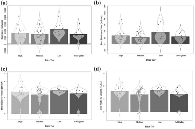
Figure6 depicts total beer sales for all stores across geographic zones. This graphic resembles a box plot however is somewhat more nuanced, with the inclusion of ‘notches’, clearly indicating the location of the median value. Thus not only does Fig.6capture the raw data, it provides a second level of detail by including descrip-tive summary information, namely the median, the interquartile range and outliers. Much information is captured using the retinal variables Position, Shape, Length and Size, meaning that more detailed questions taking advantage of the descriptive statistics can now be posed. For example,Which zones experience the lowest and highest average beer sales, respectively? Which zones show the most and least vari-ability in beer sales?andWhich zones show unusually high or low beer sales?Due
Fig. 7 Violin plot for elementary questions regarding beer sales by zone
to the shape of the notched boxes, comparisons between zones are enabled as well, e.g.How do stores in Zones 12 and 15 compare in terms of typical beer sales?
Adjusting this visualization slightly leads to the violin plot of Fig.7, which is cre-ated for the same data as in Fig.6. However while a similar set of retinal variables are used in this case, Fig.7captures complementary information to that captured by Fig.6. In particular, the retinal variableShapehas been adjusted to reflect the distri-bution of the data, while notches still indicate the location of the average (median) quantity of beer sales. What is gained, however, in terms of data distribution, is lost in terms of detailed information about the stores themselves, namely the exact outliers captured in Fig.6versus the more generic outliers, depicted in Fig.7.
Fig. 8 RDI (raw data/description/inference) plots of beer price, profit and movement
Fig. 9 A swarm plot of beer sales by price tier. The plot in (a) has been altered for visually aesthetic purposes, distorting the true nature of the data while the plot in (b) shows the true data, however is not easily readable
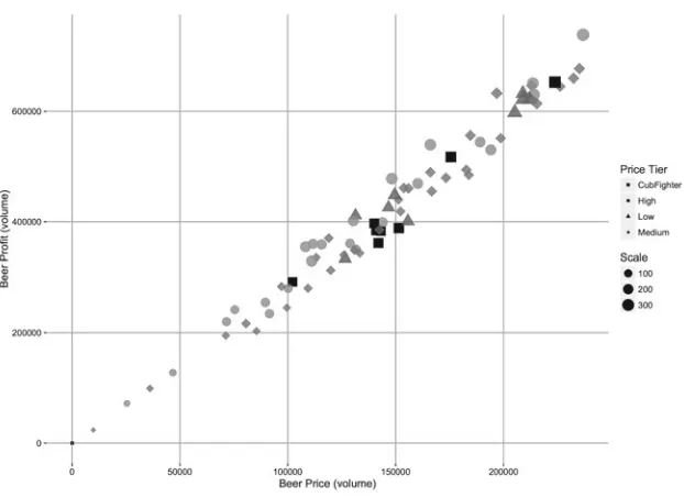
Fig. 10 Bubble plot of beer price versus profit, relative to product sales, over each price tier
Thus far, questions have been formulated about characteristics of a single vari-able, however it is also often of interest to determine the association between two variables. Figure10depicts a bubble plot, in which the retinal variables Position, Color Hue, Color Saturation, Shape, Density and Size are used to convey information about two quantitative variables (beer profit and price), summarized over a qualita-tive variable (Price Tier). Questions about the relationship between the quantitaqualita-tive variables can be posed, e.g.Are beer prices and profits related? Is the relationship between beer price and profit consistent for lower and higher prices?Or including the qualitative variable: e.g.Are beer prices and profits related across price tiers? Which price tier(s) dominate the relationship between high prices and profits?
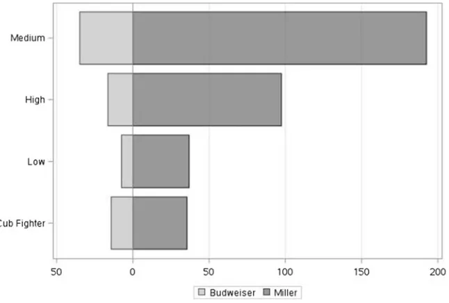
A complementary focus for intermediate-level questions is the interplay between specific and general information. Figure11depicts this juxtaposition via a bubble plot, however now focusing on two beer brands and their weekly sales across the four price tiers, using the retinal variables Color Hue, Shape, Size, Position and Length. Questions that can be posed include e.g.Amongst which price tiers is Miller the most popular beer? Is Budweiser the most popular beer in any price tier?Alternatively, the focus can instead be on the second qualitative variable (price tier) e.g.Which is the most popular beer in the Low price tier?
Fig. 11 Bubble plot of beer sales of two popular brands over four store price tiers
Fig. 12 A box plot of beer sales of two popular brands, over the four price tiers
Fig. 13 A butterfly plot of beer sales of two popular brands, over the four price tiers
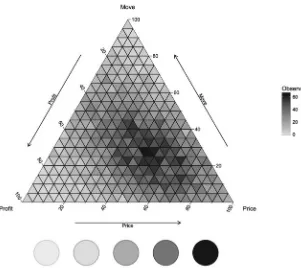
A useful extension to intermediate-level questions comes from using the retinal variables Color Hue and Orientation, to produce a ternary plot [22]. In Fig.14the palette used to represent Hue is shown at the base of a ternary heat map, with the interplay between the three quantitative variables Beer movement (sales), price and profit being captured using shades from this palette.
Intermediate-level questions can now focus on the combination of quantitative variables and can either be specific e.g. For beer sold in the top 20 % of prices, what percentage profit and movement (sale) are they experiencing?or generic, so as to uncover information, e.g.do stores that sell beer at high prices make a high profit? Is it worth selling beer at low prices? The power of question formulation based solely on the judicious selection of retinal variables makes extracting insights from Big Data less formidable than original appearances may suggest, even when combined with standard graphical representations.
4.2.3 Overall-Level Question Visualizations
Fig. 14 Ternary plot for intermediate questions about beer over three quantitative variables: price, profit and move (sales). Thecolor hue paletteis shown at the base of the plot and is reflected in the plot and legend
Fig. 15 Time series plot of the distribution of weekly beer sales in each store
Horizon plots are a variation on the standard time series plot by deconstructing a data set into smaller subsets of time series that are visualized by stacking each series upon one another. Figure16demonstrates this principle using beer profit data for all stores between the years 1992–1996. In this case the shorter time interval was chosen to present easily comparable series that each span a single year. Even so, similar questions to those posed for Fig.15apply in this case. The attraction of the horizon plot lies however in the easy comparison between years and months which is not facilitated by the layout of Fig.15.
Interpretation of the beer data is improved again when the overall time series is treated as an RDI plot (Fig.17) and information about each store can be clearly ascertained over the entire time period, with the focus now on spatial patterns in the data, rather than temporal.
In contrast, the same information is depicted in Fig.18however through the addi-tion of the retinal variable Colour Hue, the data presentaaddi-tion allows for easier inter-pretation and insight. In this case questions such asWhen were beer profits at a low and when were they at a high? What is the general trend of beer profits between 1991 and 1997?can be asked. Similar questions can also be asked of the data in the time series RDI plot (Fig.17) however the answer will necessarily involve the stores, providing alternative insight to the same question.
An alternative representation of overall trends in the data come from a treemap visualization, which aims to reflect any inherent hierarchy in the data. Treemaps are flexible as they can be used to not only capture time series data, but also separate data by a qualitative variable of interest, relying on the retinal variables Size and Colour
Fig. 17 Time series RDI plot of weekly beer sales in each store
Fig. 18 Calendar heat map of beer profit over all stores in each week
Hue to indicate differences between and within each grouping. The advantage of such a display is the easy intake of general patterns that would otherwise be obfuscated by data volume. For this reason, treemaps are often used to visualize stock market behavior [23].
Fig. 19 A treemap showing the relationship between beer price and profit across price tiers and at each individual store
and a second quantitative variable assigns the colour hue to each tile. Figure19 dis-plays a treemap of the beer data using the qualitative variables Store and Price Tier and the quantitative variables Beer Price and Beer Profit. Each store corresponds to a single tile in the map while Price Tier is used to divide the map into four separate areas. The size of each tile corresponds to the price of beer at a given store, while the color hue represents the profit made by each store, with the minimum and maxi-mum values indicated by the heat map legend. Questions postulated from a treemap includeWhich stores are generating high profits? What is the relationship between beer price and profit? Which price tiers make the largest profit by selling beer? Do stores within a price tier set the price of beer consistently against one another?
Fig. 20 Streamgraph of beer profit over all stores in each week
Fig. 21 Streamgraph of beer profit for store 103 in each week
retinal variable Color Saturation. The R streamgraph is interactive, with a drop-down menu to select a particular store of interest (labeledTickerin Fig.20). The stream-graph is also sensitive to cursor movements running over the stream-graph, and will indicate in real time over which store the cursor is hovering. Figure21demonstrates the selec-tion of Store 103 and how the modernizaselec-tion of an ‘old’ technique further enhances the types of insights that can be drawn from this graph.
Thus questions that can be asked about the data based on streamgraphs include
Color Saturation to select a store of interest,What is the overall trend of beer prices at a particular store? Does the trend of this store behave similarly to the overall pat-tern?and so forth, allowing for overall-level questions that compare specific item behavior (e.g. a store) with the overall trend in the data.
5
Conclusions
Visualization of data is not a new topic—for centuries there has been a need to sum-marize information graphically for succinct and informative presentation. However recent advances have challenged the concept of data visualization, through the col-lection of ‘Big Data’, that is data characterized by its variety, velocity and volume and is typically stored within databases that run to petabytes in size.
In this chapter, we postulated that while there have been advances in data col-lection, it is not necessarily the case that entirely new methods of visualization are required to cope. Rather, we suggested that tried-and-tested visualization techniques can be adopted for the representation of Big Data, with a focus on visualization as a key component to drive the formulation of meaningful research questions.
We discussed the use of three popular software platforms for data processing and visualization, namely SAS, R and Python and how they can be used to manage and manipulate data. We then presented the seminal work of [7] in the use of graph semi-otics to depict multiple characteristics of data. In particular, we focused on a set of retinal variables that can be used to represent and perceive information captured by visualization, which we complemented with a discussion of the three types of ques-tions that can be formulated from such graphics, namely elementary-, intermediate-and overall-level questions.
We demonstrated application of these techniques using a case study based on Dominick’s Finer Foods, a scanner database containing approximately 98 million observations across 60 relational files. From this database, we demonstrated the derivation of insights from Big Data, using commonly known visualizations and also presented cautionary tales as a means to navigate graphic representation of large data structures. Finally, we also showcased modern graphics designed for Big Data, how-ever with foundations still traceable to the retinal variables of [7], in support of the view that in terms of data visualization, everything old is new again.
References
1. McAfee A, Brynjolfsson E (2012) Big data: the management revolution. Harvard Bus Rev 90(10):60–68
2. SAS (2014) Data visualization techniques: from basics to big data with SAS visual analytics. SAS: White Paper
4. Gelper S, Wilms I, Croux C (2015) Identifying demand effects in a large network of product categories. J Retail 92(1):25–39
5. Toro-González D, McCluskey JJ, Mittelhammer RC (2014) Beer snobs do exist: estimation of beer demand by type. J Agric Resour Econ 39(2):1–14
6. Huang T, Fildes R, Soopramanien D (2014) The value of competitive information in forecasting FMCG retail product sales and the variable selection problem. Eur J Oper Res 237(2):738–748 7. Bertin J (1967) Semiology of graphics: diagrams, networks, maps. The University of
Wiscon-sin Press, Madison, WisconWiscon-sin, p 712
8. Mackinlay J (1986) Automating the design of graphical presentations of relational information. ACM Trans Graph 5(2):110–141
9. Eichenbaum M, Jaimovich N, Rebelo S (2011) Reference prices, costs, and nominal rigidities. Am Econ Rev 101(1):234–262
10. Chen Y, Yang S (2007) Estimating disaggregate models using aggregate data through augmen-tation of individual choice. J Mark Res 44(4):613–621
11. Chintagunta PK, Vishal J-PDS (2003) Balancing profitability and customer welfare in a super-market chain. Quant Mark Econ 1:111–147
12. Nevo A, Wolfram C (2002) Why do manufacturers issue coupons? An empirical analysis of breakfast cereals. RAND J Econ 33(2):319–339
13. Levy D, Lee D, Chen HA, Kauffman RJ, Bergen M (2011) Price points and price rigidity. Rev Econ Stat 93(4):1417–1431
14. McKinney W (2012) Python for data analysis. O’Reilly Media, p 466
15. Tufte ER (1983) The visual display of quantitative information. Graphics Press, Cheshire, Con-necticut, p 197
16. Card S (2009) Information visualisation. In: Sears A, Jacko JA (eds) Human-computer inter-action handbook. CRC Press, Boca Raton, pp 181–215
17. Card SK, Mackinlay JD, Shneiderman B (1999) Readings in information visualization: using vision to think. Morgan Kaufmann Publishers Inc., San Francisco
18. Lengler R, Eppler MJ (2007) Towards a periodic table of visualization methods of manage-ment. In: Proceedings of graphics and visualization in engineering (GVE 2007), Florida, USA, ACTA Press, Clearwater, pp 1–6
19. Krygier J, Wood D (2011) Making maps a visual guide to map design for GIS, 2nd edn. Guilford Publications, New York, p 256
20. Cleveland WS, McGill R (1984) Graphical perception: theory, experimentation and application to the development of graphical methods. J Am Stat Assoc 79(387):531–554
21. Koussoulakou A, Kraak MJ (1995) Spatio-temporal maps and cartographic communication. Cartographic J 29:101–108
22. Breckon CJ (1975) Presenting statistical diagrams. Pitman Australia, Carlton, Victoria, p 232 23. Jungmeister W-A (1992) Adapting treemaps to stock portfolio visualization. Technical report
Platforms: A Reference Architecture
and Cost Perspective
Leonard Heilig and Stefan Voß
Abstract The development of big data applications is closely linked to the
avail-ability of scalable and cost-effective computing capacities for storing and processing data in a distributed and parallel fashion, respectively. Cloud providers already offer a portfolio of various cloud services for supporting big data applications. Large com-panies like Netflix and Spotify use those cloud services to operate their big data appli-cations. In this chapter, we propose a generic reference architecture for implementing big data applications based on state-of-the-art cloud services. The applicability and implementation of our reference architecture is demonstrated for three leading cloud providers. Given these implementations, we analyze main pricing schemes and cost factors to compare respective cloud services based on a big data streaming use case. Derived findings are essential for cloud-based big data management from a cost per-spective.
Keywords Big data management
⋅
Cloud-based big data architecture⋅
Cloudcomputing
⋅
Cost management⋅
Cost factors⋅
Cost comparison⋅
Provider selection⋅
Case study1
Introduction
The cloud market for big data solutions is growing rapidly. Besides full-service cloud providers that offer a large portfolio of different infrastructure as a service (IaaS), platform as a service (PaaS), and software as a service (SaaS) solutions, there are also some niche providers focusing on specific aspects of big data applications. In general, such big data applications are highly dependent on a scalable computing infrastructure, programming tools, and applications to efficiently process large data
L. Heilig (
✉
)⋅S. VoßInstitute of Information Systems (IWI), University of Hamburg, Hamburg, Germany e-mail: [email protected]
S. Voß
e-mail: [email protected]
© Springer International Publishing AG 2017
F.P. García Márquez and B. Lev (eds.),Big Data Management, DOI 10.1007/978-3-319-45498-6_2
sets and extract useful knowledge [17]. In this regard, cloud computing represents an attractive technology-delivery model as it promises the reduction of capital expenses (CapEx) and operational expenses (OpEx) [11] and further moves CapEx to OpEx, closely correlating expenses with the actual use of tools and computing resources [5]. A recent scientometric analysis of cloud computing literature further indicates that there is a huge research interest in scalable analytics and big data topics [10]. As cloud-based big data applications are usually composed of several managed cloud services, it becomes increasingly important to identify important cost factors in order to evaluate potential use cases and to make strategic decisions, for instance, concern-ing the choice of a cloud provider (for an extensive overview on decision-oriented cloud computing, the reader is referred to Heilig and Voß [9]). The variety of possible configurations and pricing schemes makes it difficult for consumers to estimate over-all costs of cloud-based big data applications. Often, consumers appear in the form of cloud application providers, as companies like Netflix and Spotify, outsourcing operations of their services to third-party cloud infrastructures. To benefit from big data technologies and applications in companies, it is meanwhile essential to address the economic perspective and provide means to evaluate the promises cloud com-puting gives with regard to the use of highly scalable comcom-puting infrastructures in order to unlock competitive advantages and to maximize value from the application of big data [18]. To the best of our knowledge, a cost perspective for implementing big data applications in cloud environments has not yet been addressed in the current literature.
In this chapter, we propose a generic reference architecture for implementing big data applications in cloud environments and analyze pricing schemes and impor-tant cost factors of related cloud services. The cloud reference architecture considers state-of-the-art technologies and facilitates the main phases of big data processing including data generation, data ingestion, data storage, and data analytics. Both batch and stream processing of big data is supported. We demonstrate the applicability and implementation of the proposed architecture by specifying it for the cloud services of the, according to Gartner’s magic quadrant [6], three leading cloud providers, namely
Amazon Web Service,Google Cloud, and Microsoft Azure. Practical
implementa-tions of large companies like Netflix and Spotify verify the relevancy of the defined architectures. The individual architectures provide a basis for evaluating important cost factors. For each of the main phases of big data processing, we identify and analyze the scope and cost factors of relevant cloud services based on a case study. In cases a comparison is useful, we compare cloud services of the different cloud providers and derive important implications for decision making. Thus, the contribu-tion of this chapter is twofold. First, the chapter provides a blueprint for implement-ing state-of-the-art cloud-based big data applications and gives an overview about available cloud services and solutions. Second, the main part is concerned with pro-viding a cost perspective on cloud-based big data applications, which is essential for big data management for cloud consumers.
leading cloud providers. For each big data processing phase, cloud pricing schemes and relevant cost factors of those cloud services are analyzed based on a case study focusing on streaming analytics in Sect.3. In Sect.4, we discuss main findings and implications. Finally, we draw conclusions and identify activities for further research.
2
Big Data Processing in Cloud Environments
The calculation of costs is highly dependent on the utilized cloud services. Major cloud service providers offer a plethora of different tools and services to address big data challenges. In this section, we define a common reference architecture for big data applications. The reference architecture corresponds to the state-of-the-art and supports main phases of big data processing from data generation to the presentation of extracted information, as depicted in Fig.1. After briefly explaining these phases and the corresponding reference architecture, we give an overview on its implemen-tations with cloud services of the three leading cloud service providers.
2.1
Generic Reference Architecture
The processing of big data can be divided into five dependent phases. In the first phase, data is generated in various applications and systems. This might include internal and external data in various forms and formats. Depending on the rate of occurrence and purpose of collected data, velocity requirements may differ among data sources. The second phase involves all steps to retrieve, clean, and transform the data from different sources for further processing. This may include, for instance, data verification, the extraction of relevant data records, and the removal of dupli-cates in order to ensure efficient data storage and exploitation [3]. Typically, the data is permanently stored in a file system or database. In some cases of streaming appli-cations, however, value can only be achieved in the first seconds after the data is pro-duced, making a persistent storage obsolete. Nevertheless, information and results being extracted during processing and analysis usually need to be stored and man-aged permanently. In the fourth phase, different methods, techniques, and systems are used to analyze and utilize the data in order to extract information relevant for
Data Generation
Data Ingestion
Data Storage
Data
Analytics Presentation
![Fig. 2Elementary-, intermediate- and overall-level questions, based on data [7]. The filled circlesindicate the number of data points involved in the answer to each question type](https://thumb-ap.123doks.com/thumbv2/123dok/3935337.1878757/24.439.56.382.51.256/elementary-intermediate-overall-questions-lled-circlesindicate-involved-question.webp)