Janine Warner
Author of Web Sites Do-It-Yourself
For Dummies
David LaFontaine
Creator of Mobile Web Design Blog
digitalfamily.com/mobilewebdesign
Learn to:
•
Plan an effective mobile Web site
•
Create your design with XHTML MP
and CSS2 or HTML5 and CSS3
•
Add audio, video, social media,
and m-commerce functions
•
Build a site that works well on all
mobile devices
Mobile
Web Design
Making Everythi
ng Easier!
Start with FREE Cheat Sheets
Cheat Sheets include
•
Checklists
•
Charts
• Common Instructions
• And Other Good Stuff!
Get Smart at Dummies.com
Dummies.com makes your life easier with 1,000s
of answers on everything from removing wallpaper
to using the latest version of Windows.
Check out our
•
Videos
• Illustrated Articles
• Step-by-Step Instructions
Plus, each month you can win valuable prizes by entering
our Dummies.com sweepstakes. *
Want a weekly dose of Dummies? Sign up for Newsletters on
• Digital Photography
• Microsoft Windows & Office
• Personal Finance & Investing
• Health & Wellness
• Computing, iPods & Cell Phones
•
eBay
•
Internet
• Food, Home & Garden
Find out “HOW” at Dummies.com
To access the Cheat Sheet created specifically for this book, go to
Mobile Web
Design
FOR
by Janine Warner and David LaFontaine
Mobile Web
Design
FOR
Hoboken, NJ 07030-5774
www.wiley.com
Copyright © 2010 by Wiley Publishing, Inc., Indianapolis, Indiana Published by Wiley Publishing, Inc., Indianapolis, Indiana
Published simultaneously in Canada
No part of this publication may be reproduced, stored in a retrieval system or transmitted in any form or by any means, electronic, mechanical, photocopying, recording, scanning or otherwise, except as permit-ted under Sections 107 or 108 of the 1976 Unipermit-ted States Copyright Act, without either the prior written permission of the Publisher, or authorization through payment of the appropriate per-copy fee to the Copyright Clearance Center, 222 Rosewood Drive, Danvers, MA 01923, (978) 750-8400, fax (978) 646-8600. Requests to the Publisher for permission should be addressed to the Permissions Department, John Wiley & Sons, Inc., 111 River Street, Hoboken, NJ 07030, (201) 748-6011, fax (201) 748-6008, or online at http:// www.wiley.com/go/permissions.
Trademarks: Wiley, the Wiley Publishing logo, For Dummies, the Dummies Man logo, A Reference for the Rest of Us!, The Dummies Way, Dummies Daily, The Fun and Easy Way, Dummies.com, Making Everything Easier,and related trade dress are trademarks or registered trademarks of John Wiley & Sons, Inc. and/ or its affi liates in the United States and other countries, and may not be used without written permission. All other trademarks are the property of their respective owners. Wiley Publishing, Inc., is not associated with any product or vendor mentioned in this book.
LIMIT OF LIABILITY/DISCLAIMER OF WARRANTY: THE PUBLISHER AND THE AUTHOR MAKE NO REPRESENTATIONS OR WARRANTIES WITH RESPECT TO THE ACCURACY OR COMPLETENESS OF THE CONTENTS OF THIS WORK AND SPECIFICALLY DISCLAIM ALL WARRANTIES, INCLUDING WITH-OUT LIMITATION WARRANTIES OF FITNESS FOR A PARTICULAR PURPOSE. NO WARRANTY MAY BE CREATED OR EXTENDED BY SALES OR PROMOTIONAL MATERIALS. THE ADVICE AND STRATEGIES CONTAINED HEREIN MAY NOT BE SUITABLE FOR EVERY SITUATION. THIS WORK IS SOLD WITH THE UNDERSTANDING THAT THE PUBLISHER IS NOT ENGAGED IN RENDERING LEGAL, ACCOUNTING, OR OTHER PROFESSIONAL SERVICES. IF PROFESSIONAL ASSISTANCE IS REQUIRED, THE SERVICES OF A COMPETENT PROFESSIONAL PERSON SHOULD BE SOUGHT. NEITHER THE PUBLISHER NOR THE AUTHOR SHALL BE LIABLE FOR DAMAGES ARISING HEREFROM. THE FACT THAT AN ORGANIZA-TION OR WEBSITE IS REFERRED TO IN THIS WORK AS A CITAORGANIZA-TION AND/OR A POTENTIAL SOURCE OF FURTHER INFORMATION DOES NOT MEAN THAT THE AUTHOR OR THE PUBLISHER ENDORSES THE INFORMATION THE ORGANIZATION OR WEBSITE MAY PROVIDE OR RECOMMENDATIONS IT MAY MAKE. FURTHER, READERS SHOULD BE AWARE THAT INTERNET WEBSITES LISTED IN THIS WORK MAY HAVE CHANGED OR DISAPPEARED BETWEEN WHEN THIS WORK WAS WRITTEN AND WHEN IT IS READ.
For general information on our other products and services, please contact our Customer Care Department within the U.S. at 877-762-2974, outside the U.S. at 317-572-3993, or fax 317-572-4002. For technical support, please visit www.wiley.com/techsupport.
Wiley also publishes its books in a variety of electronic formats. Some content that appears in print may not be available in electronic books.
Library of Congress Control Number: 2010933465 ISBN: 978-0-470-56096-9
About the Authors
Since 1996, Janine Warner has written more than a dozen books about the Internet, including Web Sites Do-It-Yourself For Dummies, Dreamweaver For Dummies (all eight editions), the last fi ve editions of Teach Yourself Dreamweaver Visually, and the Digital Family Album book series (Amphoto Books).
Janine is the host of a growing collection of training videos for KelbyTraining. com in Web design, Adobe Dreamweaver, and Cascading Style Sheets. She’s also a regular columnist for Layers magazine.
A popular speaker, Janine offers training in techy topics, such as Web design, and gives keynotes on Internet trends, the growing importance of the mobile Web, social media, and online reputation. Janine is fl uent in Spanish and has given many speeches in Latin America and Spain.
Janine has worked on large and small Web sites. From 1994 to 1998, she ran Visiontec Communications, a Web design fi rm in Northern California, where she worked for a diverse group of clients including Levi Strauss & Co., AirTouch Communications, and many other small- and medium-size businesses.
From 1998 to 2000, she worked for The Miami Herald, fi rst as its Online Managing Editor and later as Director of New Media. She left that position to serve as Director of Latin American Operations for CNET Networks, an inter-national technology media company.
Since 2001, Janine has run her own business as a writer, speaker, and consul-tant. To fi nd out more about Janine, fi nd free Web design training materials, and get answers to common questions, visit DigitalFamily.com.
David LaFontaine’s fi rst cellphone came in a backpack and weighed about 20 pounds, and the closest he got to using gestures to control the phone came when it fell on his toe. Despite this early mishap, Dave remains fascinated with the promise of these little portable pieces of technology.
To all those who venture on the mobile Web, and to all who are working to make sure they fi nd something of value when they get there.
Authors’ Acknowledgments
Janine Warner: Over the years, I’ve thanked many people in my books — family, friends, teachers, and mentors — but I have been graced by so many wonderful people now that no publisher will give me enough pages to thank them all. In this book, I focus on the people who contributed directly to these pages, start-ing with the fantastic editorial team at Wiley Publishstart-ing: Rebecca Huehls, Leah Cameron, Jennifer Riggs, Susan Pink, Jeff Noble, and Steven Hayes.
Above all, I have to thank my brilliant coauthor and partner in all things digi-tal and analog, David LaFontaine. Your sense of humor, your ability to tell a great story, and your passion for technology and communication have made this a better book, and me, a better person.
A heartfelt thanks to David Mitchell for providing the haven we escape to after impossible deadlines are fi nally done. And to my family, my parents, Malinda, Janice, Robin, and Helen, my brother Brian, and my brother Kevin and his family, Stephanie, Mikayla, Savannah, Jessica, and Calahan, for all their love and support.
Special thanks to Gail Rahn Frederick who wrote the section on HTML5 in Chapter 5. Gail is a mobile Web enthusiast, instructor of standards-based mobile Web development, and the creator of the site Learn the Mobile Web (http://learnthemobileweb.com). She’s also the author of Beginning Smartphone Web Development: Building JavaScript, CSS, HTML and Ajax-Based Applications for iPhone, Android, Palm Pre, BlackBerry, Windows Mobile, and Nokia S60 (Apress), an introduction to building standards-compliant Mobile Web sites for any mobile device.
Thanks to Jonathan Thaler (www.whenimmobile.com) for sharing his expe-rience creating multimedia sites for Tori Sparks (www.torisparks.com) and Radio Paradise (www.radioparadise.com). Thanks to Andrew Taylor (www.taopro.com) for his help with ecommerce site research. And thanks to Mark Jenkins (www.mobilynx.net) for his expertise in mobile devices and testing.
Most of all, I want to thank all the people who have read my books or watched my videos over the years and gone on to create Web sites. You are my greatest inspiration and I sincerely enjoy it when you send me links to your Web sites. You can always fi nd me at www.DigitalFamily.com. Thank you, thank you, thank you.
David LaFontaine: I want to thank my parents, Gail and Dave, for making trips to the library such a treat when I was young (and for the lifelong love of the written word that those trips engendered), and my sisters Linda, Beth, and Sara for the lively (ahem) discussions that taught me to always be pre-pared to examine and logically defend my conclusions.
A big shout-out goes to all the other ink-stained wretches of the Fourth Estate working at newspapers all over the world, laboring to produce the daily miracle; I hope that the spread of mobile content helps them regain so much of what has been lost these past few years. I also want to thank all the panel members, attendees, and innocent bystanders at industry events including the Online News Association, OMMA, and Digital Hollywood that I have pes-tered over the years; some of their patient wisdom is contained in this book.
outside the U.S. at 317-572-3993, or fax 317-572-4002.
Some of the people who helped bring this book to market include the following:
Acquisitions and Editorial Project Editor: Rebecca Huehls Executive Editor: Steve Hayes Copy Editor: Jen Riggs Technical Editor: Jeff Noble Editorial Manager: Leah P. Cameron Editorial Assistant: Amanda Graham Sr. Editorial Assistant: Cherie Case Cartoons: Rich Tennant
(www.the5thwave.com)
Composition Services
Sr. Project Coordinator: Kristie Rees Layout and Graphics: Amy Hassos,
Ronald G. Terry
Proofreaders: Laura Bowman, Jessica Kramer, Lauren Mandelbaum
Indexer: Infodex Indexing Services, Inc. Special Help: Annie Sullivan, Stephen Worden
Publishing and Editorial for Technology Dummies
Richard Swadley, Vice President and Executive Group Publisher Andy Cummings, Vice President and Publisher
Mary Bednarek, Executive Acquisitions Director Mary C. Corder, Editorial Director
Publishing for Consumer Dummies
Diane Graves Steele, Vice President and Publisher
Composition Services
Contents at a Glance
Introduction ... 1
Part I: Designing for Mobile Devices ... 7
Chapter 1: Understanding What Makes the Mobile Web Different... 9
Chapter 2: Designing for the Mobile Web ... 35
Part II: Following Mobile Web Standards ... 59
Chapter 3: Creating a Simple Mobile Site... 61
Chapter 4: Understanding XHTML and CSS ... 79
Chapter 5: Comparing Mobile Markup Languages ... 97
Chapter 6: Delivering Different Designs to Different Devices ... 119
Chapter 7: Testing and Publishing Mobile Web Sites ... 139
Part III: Multimedia, Marketing, and E-Commerce... 171
Chapter 8: Using Images and Multimedia in Mobile Designs ... 173
Chapter 9: Making Your Blog Mobile-Friendly ... 209
Chapter 10: Mobile Marketing and Social Media ... 231
Chapter 11: Adding Mobile Commerce ... 263
Part IV: The Part of Tens ... 295
Chapter 12: Ten Quick Tips for Mobile Design ... 297
Chapter 13: Ten Great Mobile Sites ... 305
Appendix A: Interviews with Mobile Experts ... 321
Appendix B: Optimizing Graphics
for the Mobile Web ... 335
Table of Contents
Introduction ... 1
About This Book ... 1
Conventions Used in This Book ... 2
Foolish Assumptions ... 3
How This Book Is Organized ... 3
Part I: Designing for Mobile Devices ... 4
Part II: Following Mobile Web Standards ... 4
Part III: Multimedia, Marketing, and E-Commerce ... 4
Part IV: The Part of Tens ... 5
Icons Used in This Book ... 5
Where to Go from Here ... 6
Part I: Designing for Mobile Devices ... 7
Chapter 1: Understanding What Makes the Mobile Web Different . . .9
Introducing the Mobile Web Audience ... 10
Your audience is growing ... 10
Your audience wants to save time, kill time, or socialize... 10
Your audience uses different mobile devices ... 11
Your audience may be any age ... 11
Evolving Standards: WAP, WML, and the Mobile Web ... 12
Sizing up WAP, WML, and XHTML ... 12
Designing low-end mobile Web sites: Like Mozart forced to play a kazoo ... 14
Assessing the Current State of the Web ... 18
Understanding the iPhone factor ... 19
The siren song of “apps” ... 22
Seizing the power of geolocation ... 23
Offering deals and data with QR codes ... 24
Watching video anywhere, anytime ... 26
Appreciating privacy issues ... 27
Planning for the Future ... 29
Saving time or money with targeted searches ... 30
Killing time with multimedia ... 31
Connecting with people on social networking sites ... 32
Chapter 2: Designing for the Mobile Web . . . .35
Avoiding Unpredictable Mobile Designs ... 36
Transcoding: Forcing full-sized Web pages into tiny mobile spaces ... 36
Creating a mobile CSS fi le is not enough ... 38
Picking a Strategy for Different Devices ... 39
Create a simple version of your site ... 39
Design multiple versions... 41
Design one high-end version ... 43
Optimizing Mobile Web Site Designs ... 44
Designing for small screens ... 45
Sticking to bandwidth limitations ... 45
Navigating on mobile devices ... 46
Considering Device Differences ... 48
Apple iPhone: The game changer ... 48
Google Android: Catching on fast ... 49
RIM BlackBerry: So many to choose from ... 50
Palm: A great OS with a little audience ... 52
Windows Mobile: The Microsoft advantage ... 53
The Motorola RAZR and other feature phones ... 53
Symbian: The global phenomenon ... 54
Finding specifi cations for nearly any device at DeviceAtlas ... 54
Beware of dumbphones ... 55
Making a Mobile Site Search-Engine-Friendly ... 55
Part II: Following Mobile Web Standards ... 59
Chapter 3: Creating a Simple Mobile Site . . . .61
Planning a Simple Mobile Design ... 61
Streamlining the content on your pages ... 62
Making ruthless decisions ... 62
Guiding visitors through a mobile site ... 63
Creating a Simple Mobile Page Design ... 64
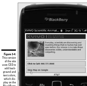
Case study: A simple mobile site for a multimedia company ... 65
Using XHTML MP to create a simple mobile design... 68
Making it easy for people to call ... 73
Writing the XHTML MP code ... 74
Adding links to maps and multimedia ... 76
Chapter 4: Understanding XHTML and CSS. . . .79
HTM-What? Exploring HTML and XHTML ... 80
Creating Page Designs with HTML Tables ... 82
Designing with Cascading Style Sheets ... 85
Appreciating the advantages of CSS ... 85
Combining CSS and XHTML ... 87
xiii
Table of Contents
Understanding style selectors ... 88
Understanding rule defi nition options ... 93
Looking at the code behind the scenes ... 96
Chapter 5: Comparing Mobile Markup Languages . . . .97
Reviewing Markup Languages ... 98
Comparing WML and XHTML MP ... 99
Replacing WML with XHTML MP ... 100
Following the rules of XHTML MP ... 102
Avoiding tags not included in XHTML MP ... 109
Styling with Cascading Style Sheets ... 111
Working within the limitations of CSS on mobile devices ... 111
Using internal, external, or inline style sheets ... 112
Identifying levels of support for CSS ... 113
Using HTML5 with Mobile Browsers ... 113
Killer features for mobile Web design ... 114
HTML5 supplants XHTML ... 115
Motherhood, apple pie, and HTML5... 115
HTML5 on smartphones and dumbphones ... 115
Keeping up with the future ... 116
Using Mobile-Specifi c Doctypes ... 116
Chapter 6: Delivering Different Designs to Different Devices . . . .119
Detecting and Directing Mobile Devices ... 120
Developing a device detection system... 122
Using open-source device detection scripts and services ... 123
Designing for Different Devices ... 125
Designing for content adaptation ... 126
Creating different versions of a site ... 127
Planning a Mobile Web Project ... 128
Creating wireframes ... 130
Stepping through the development process ... 132
Considering the designer’s perspective ... 136
Chapter 7: Testing and Publishing Mobile Web Sites. . . .139
Comparing Mobile Testing Solutions ... 140
Installing Mobile Add-Ons for Firefox ... 141
User Agent Switcher ... 143
Small Screen Renderer ... 145
XHTML Mobile Profi le ... 147
wmlbrowser ... 147
Using Mobile Emulators ... 147
Testing with online mobile emulators in a Web browser ... 148
Downloading mobile emulators and SDKs... 149
Testing with more sophisticated services ... 151
Testing with Adobe’s Device Central ... 153
Testing Your Site Code with the W3C Tools ... 155
Choosing a Mobile Domain ... 156
Publishing Your Mobile Web Site ... 157
Setting up Dreamweaver’s FTP features ... 159
Publishing fi les to a Web server with FTP ... 162
Finding and Fixing Broken Links ... 164
Checking for broken links ... 165
Fixing broken links and missing images... 166
Testing Your Work with Dreamweaver’s Site Reporting Feature ... 167
Part III: Multimedia, Marketing, and E-Commerce ... 171
Chapter 8: Using Images and Multimedia in Mobile Designs . . . .173
Understanding Screen Resolution and Color Depth ... 174
Color depth ... 174
Screen resolution ... 175
Aspect ratios and orientations ... 175
Optimizing Images for the Mobile Web ... 176
Sizing images for small screens ... 176
Choosing an image format ... 178
Keeping fi le sizes small ... 178
Resizing images in WordPress ... 180
Automating image resizing in Adobe Photoshop ... 181
Inserting Images into Mobile Page Designs ... 182
Creating Mobile-Friendly Galleries and Slide Shows ... 183
Finding a gallery plug-in or service... 184
Creating mobile slide shows in the 3GP format ... 186
Mapping a photo gallery ... 188
Optimizing Audio for the Mobile Web ... 191
Figuring out formats, fi le size, and more ... 192
Streaming audio versus downloads versus podcasts ... 193
E-mailing audio fi les to get around mobile problems and restrictions ... 196
Adding Video to Your Mobile Web Site ... 199
Comparing CDNs with video-sharing sites ... 200
Hosting mobile video on YouTube ... 204
Inserting a YouTube video directly into a mobile Web page ... 204
Inserting video hosted on your server into a mobile Web page ... 207
Designing your mobile site so users watch your video ... 207
Chapter 9: Making Your Blog Mobile-Friendly. . . .209
Prioritizing Your Blog Features ... 210
Adding the dotMobi Plug-in to Your WordPress Blog ... 212
Installing the dotMobi plug-in ... 214
Tweaking the mobile switcher ... 216
Customizing your mobile theme ... 219
xv
Table of Contents
Blogging from a Mobile Device ... 223
Creating a secret e-mail address ... 224
Converting e-mails into WordPress posts ... 224
Chapter 10: Mobile Marketing and Social Media . . . .231
Understanding Mobile’s Advertising Advantage ... 232
Checking Out the Types of Mobile Ads ... 234
Assessing the Impact of Mobile Advertising ... 235
Creating Banner Ads for Mobile Sites ... 236
Reaching Out with Text Messaging (SMS) ... 239
Finding an SMS campaign provider ... 240
Launching a free SMS advertising campaign ... 242
Connecting with Customers via Short Codes ... 244
Offering Links and More with QR Codes ... 245
Handing Out Coupons via the Mobile Web ... 249
Scanning mobile coupons ... 250
Sharing coupons with mobile technology ... 251
Creating free mobile coupons ... 251
Sharing Offers via Image Recognition ... 255
Advertising via the Power of Mobile Social Media ... 256
Exploring Video and Other Rich Media Ads ... 257
Advertising via Apps and Immersive Environments ... 259
Chapter 11: Adding Mobile Commerce. . . .263
Looking at How Users Adapt to Mobile Commerce ... 264
Understanding the Basic Building Blocks of an M-Commerce Solution ... 265
Creating a mobile shopping experience: The front end ... 265
Working behind the scenes: The back end... 270
Comparing Mobile Commerce Solutions ... 274
Choosing from four main fl avors of mobile commerce solutions ... 274
Checking out m-commerce payment solutions... 276
Setting Up Commerce on Your Mobile Site ... 283
Creating a simple PayPal Buy button ... 284
Creating a simple shopping cart with Google Checkout... 286
Adding a shopping cart to WordPress ... 289
Adding a shopping cart with Dreamweaver ... 292
Part IV: The Part of Tens ... 295
Chapter 12: Ten Quick Tips for Mobile Design . . . .297
Design for Distracted Surfers ... 297
Surf the Web on Many Mobile Devices ... 298
Set Up Mobile Web Addresses ... 299
Create a Virtual Demo or Showcase ... 299
Optimize for Low Bandwidth ... 300
Follow the YouTube Mobile Video Model ... 301
Follow Standards and Use Style Sheets ... 301
Don’t Make Anyone Type or Click Much ... 302
Prepare for Fast Updates ... 303
Chapter 13: Ten Great Mobile Sites . . . .305
Facebook Keeps You Connected ... 306
BBC Sends News Around the Globe ... 308
Google Wants to Know Where You Are ... 309
Dictionary.com ... 310
Discovery Channel Creates a Sense of Wonder on Any Platform ... 312
The Wall Street Journal Serves Its Well-Heeled Audience on Any Phone ... 313
Share Photos with Anyone on Flickr ... 314
YouTube Brings Video to (and from) the Masses ... 315
Checking Flights on American Airlines ... 316
Mobile Web Design Blog ... 318
Appendix A: Interviews with Mobile Experts ... 321
Patrick Collins, CEO, 5th Finger ... 321
Niles Lichtenstein, Director, Velti Plc, formerly Managing Director, Ansible ... 323
Ajay Luthra, Senior Director of Advanced Technology, Home and Networks Mobility, Motorola ... 324
Thomas Ellsworth, CEO, GoTV ... 326
Soren Schafft, General Manager of North America, Fox Mobile Distribution, a Unit of Fox Mobile Group (FMG) ... 328
Greg Pinter, Founder/Director, NetInformer ... 329
Chris Cunningham, Co-Founder and CEO, appssavvy ... 331
Tom Limongello, Head of Business Development, Crisp Wireless ... 333
Appendix B: Optimizing Graphics
for the Mobile Web ... 335
Creating and Optimizing Web Graphics ... 335
Resizing graphics and photos ... 337
Using Actions to automatically resize images in Photoshop ... 340
Choosing the best image format ... 343
Saving images for the Web: The basics ... 343
Optimizing JPEG images for the Web ... 344
Optimizing images in GIF and PNG formats ... 346
Introduction
I
n the nearly 15 years that we’ve written about Web design, we’ve seen many changes — from the early days when you could create only simple pages with HTML 1.0, to the elaborate interactive designs you can create today.But just as the Web seemed to finally be coming of age, the rapid growth of cellphones and other mobile devices that connect to the Internet is simulta-neously propelling everyone forward (because these devices make the Web available everywhere, all the time) and setting everyone back (because of the design limitations of small screens, the limited bandwidth, and other limita-tions most thought were left behind by now).
One of the challenges of Web design is that Web pages aren’t only displayed on different kinds of computers; pages are also downloaded to computers with monitors that are as big as widescreen televisions and to devices as small as cellphones. As a result, creating Web sites that look good to all visi-tors is a lot more complex than it used to be, and standards have become a lot more important. That’s why in this book, you find out not only how to use all the great features in Dreamweaver, but also how to determine which flavor of markup language best serves your goals and your audience when designing for the wide variety of screen sizes and display limitations of mobile Web browsers.
About This Book
We designed Mobile Web Design For Dummies to help you find the answers you need when you need them. You don’t have to read this book cover to cover, and you certainly don’t have to memorize it. Consider this a quick study guide and a reference you can return to. Each section stands alone, giving you easy answers to specific questions and step-by-step instructions for common tasks.
getting sand on this book at the beach or coffee spilled on the pages at break-fast. We know that with your mobile device, you can read this book and test your Web pages anywhere, and we promise this book (and its authors) won’t complain if you take it with you.
Conventions Used in This Book
Keeping things consistent makes them easier to understand. In this book, those consistent elements are conventions. Notice how conventions is in ital-ics? We frequently put new terms in italics and then define them so that you know what they mean.
When we include URLs (Web addresses) or e-mail addresses within regu-lar paragraph text, they look like this: www.mobilewebdesignblog.com. Sometimes, however, we set URLs on their own line, like this:
www.mobilewebdesignblog.com
That’s so you can easily spot them on a page if you want to type them into your browser to visit a site. You can type domain names with all lower-case letters, all upperlower-case, or a mix. Domain names aren’t lower-case sensitive, but remember that you must match the case exactly for any part of a Web address that comes after the extension, such as .com or .net. So for an address, such as www.digitalfamily.com/videos, you must type videos
in all lowercase.
We also assume that your Web browser doesn’t require the introductory http:// for Web addresses. If you use a really, really old browser, remem-ber to type this before the address (also make sure you include the http:// of the address when you’re creating links in Dreamweaver).
Even though Dreamweaver makes knowing HTML code unnecessary, you may want to wade into HTML waters occasionally. We include HTML code in this book when we think it can help you better understand how things work in design view. Sometimes it’s easier to remove or edit a tag in Dreamweaver’s code view than in design view. When we provide examples, such as the fol-lowing code which links a URL to a Web page, we set off the HTML in the same monospaced type as URLs:
<A HREF=”http://www.mobilewebdesignblog.com”>Janine’s Blog about Mobile Web Design</A>
3
Introduction
Foolish Assumptions
Most of the Web pages on the Internet don’t work well on mobile phones, a limitation that’s increasingly important as more and more people surf the Web on BlackBerrys, iPhones, Droids, and other mobile devices.
If this is your first foray into Web design, this book may not be the best place to start. We’ve written several guides to Web design that are designed for beginners, including Web Sites Do-It-Yourself For Dummies and Dreamweaver CS5 For Dummies.
This book is designed for Web designers who already have a basic under-standing of Web design and want to develop new skills for designing pages for the mobile Web. That said, we don’t expect you to be a professional devel-oper or to know everything there is about Web design. To make sure that you can follow along even with just a basic grasp of Web design, we include some basic material, such as an overview of XHTML and Cascading Style Sheets (CSS) in Chapter 4, to give you a review and to make sure you have a solid foundation before you move on to the more advanced chapters on which markup languages work best on mobile devices and how to work around the limitations of CSS on many cellphones.
We don’t assume you’re a pro — at least not yet. In keeping with the phi-losophy behind the For Dummies series, this book is an easy-to-use guide designed for readers with a wide range of experience.
If you’re an experienced Web designer, Mobile Web Design For Dummies is an ideal reference for you because it gets you working quickly, starting with basic mobile Web pages and progressing to more advanced page features.
How This Book Is Organized
Part I: Designing for Mobile Devices
Part I introduces you to how designing for mobile devices is different from designing for the Web, and helps you appreciate what makes mobile dif-ferent and why following Web development standards is so important. In Chapter 1, you find an overview of the mobile Web and the trends that are shaping how — and why — Web designers are adapting their sites to so many devices. In Chapter 2, we give you an overview of the many approaches to mobile Web design, cover a range of design challenges, and introduce you to some of the common differences among mobile devices.
Part II: Following Mobile Web Standards
Chapter 3 shows you how to create a simple version of your Web site that will work on most mobile devices. Chapter 4 provides an introduction to using XHTML with CSS. CSS is the way to create Web page designs.
In Chapter 5, we take you further into markup languages and CSS, delving into the many challenges specific to mobile Web design with a review of WML, XHTML MP, and HTML 5.
In Chapter 6, we focus on the high-end of mobile Web design and feature a real-world case study on a complex mobile launch. We also review how device detection works and how you can automatically redirect visitors to the mobile version of your site.
In Chapter 7, we take you on a tour of the many ways you can test your mobile Web designs with online emulators and programs, such as Adobe Device Central, that make it possible to view how a design will look on a mobile phone, even if you don’t have the phone. You also find out how to publish the mobile version of your Web site by using FTP features in Dreamweaver to put your site online.
Part III: Multimedia, Marketing,
and E-Commerce
5
Introduction
and multimedia more adaptable. In Chapter 9, you find out what it takes to make a blog mobile-friendly and discover the best mobile templates for WordPress and other blogging tools. In Chapter 10, we explore some of the best ways to market your mobile site after you launch it. From advertising to social media, mobile offers many new advantages with the ability to reach people based on geographic location, time of day, and more. In Chapter 11, you find out what it takes to make e-commerce work on the mobile Web and how Google Checkout makes it easy for anyone to add a mobile-friendly shopping cart to their site.
Part IV: The Part of Tens
Part IV features two quick references to help you develop the best mobile Web sites possible. In Chapter 12, you find ten design tips to help you over-come the challenges and take advantage of the best that mobile design has to offer. And finally, in Chapter 13, you find reviews of ten great mobile Web sites with screenshots that show how they look across multiple devices.
Icons Used in This Book
This icon reminds you of an important concept or procedure that you want to store away in your memory bank for future use.
This icon signals technical stuff that you may find informative and interesting but that isn’t essential for designing a mobile Web site. Feel free to skip over this information.
This icon indicates a tip or technique that can save you time and money — and a headache — later.
Where to Go from Here
Part I
I
n this part, we discuss how the mobile Web is different from the standard Internet. We also discuss how to design for the mobile Web with those differences in mind.Chapter 1
Understanding What Makes the
Mobile Web Different
In This Chapter
▶ Getting an introduction to the mobile Web audience
▶ Brushing up with a mobile Web history lesson
▶ Assessing where the mobile Web is now
▶ Planning for the mobile Web future
T
rying to predict the future is always dangerous, particularly when it comes to the mobile Web. Experts have been predicting that “this is the year of mobile” pretty much every year for the last decade. Cynics point to this as proof that the mobile Web is merely a mirage — that the iPhone, Droid, and their smartphone brethren are fun little toys, but that they’ll never rival the Internet on a computer screen.The problem with this pessimism is that it doesn’t take into account all the advantages that come with the mobile Web, just the obvious limitations.
People put up with all the problems associated with the Internet, on top of the uncertain wireless connections, because the power and possibilities of having access to all the information — instantly available wherever you are, whenever you want — outweigh the little inconveniences. Although trying to use most current Web sites on the mobile platform can be an exercise in pain, frustration, and the barely suppressed urge to hurl an expensive device into the nearest junkyard car-crusher, the pace of technology puts the com-puting power that used to cost $10 million and fill an entire building at MIT into an 8-ounce chunk of plastic that fits in your shirt pocket.
Introducing the Mobile Web Audience
Designing for your audience has always been important, but designing for the mobile Web is even more complex because you have to design for so many different audiences and mobile devices — and do it all in a tiny space.
Your audience is growing
The sheer size of the potential audience for the mobile Web is staggering. Selling the first billion cellphones took 20 years; the next billion sold in 4 years; and the third billion sold in only 2. The next billion will be sold in a year, so that by 2011, more people on earth will have cellphones than those who don’t.
Most of these last billion cellphones will be bought by people living in rural areas of developing countries; people who have never owned any phone in their lives, and for whom the prospect of being connected to the larger world is absolutely life-changing. This part of the audience will probably experience the Web for the first time on the 3-inch screen of a mobile device.
Already, sites like ESPN.com report that on weekends during football season, they receive more traffic to their Web site from mobile phones than they do from computers. Market researchers for Yahoo! find that in sports bars, sur-rounded by dozens of giant-screen high-definition (HD) TVs with 5.1 Dolby sound, fans had their heads bowed, looking at their cellphones — following the up-to-the-minute point totals of their fantasy football teams.
The convergence of this explosive growth in audience size and the restric-tions (and amazing possibilities) of the mobile Web pose a unique challenge for Web designers.
Your audience wants to save time,
kill time, or socialize
If the Internet was driven by the ability to access words, pictures, videos, and sounds, the mobile Web is driven by even more immediate needs. Speaking on a panel for the Online News Association, Nick Montes, president of the mobile gaming company VivaVision, told the audience that people are driven to use the mobile Web for three primary reasons:
✓ To connect with their friends and social group
✓ To save time or money
11
Chapter 1: Understanding What Makes the Mobile Web Different
When users come to your site, they’re reacting to one of these needs. If you want them to find you, to be able to use the content that you’ve so painstak-ingly crafted, and to use the two-way communication of the Web to interact with what you’ve done, you need to have a site optimized for the mobile Web. This means not only offering the right content, but also employing mobile Web design standards to organize that content in ways that mobile Web users will be able to use, which we cover throughout this book.
Your audience uses different
mobile devices
Our goal is to help you design the best Web site you can to deliver the right resources in the right place at the right time. We say “the best Web site you can” because designing for the mobile Web is still an imperfect science and how far you go in making sure your site is optimized for all the mobile devices that might ever visit will depend on your budget, skills, time, and the return you can expect on your investment. As a result, we include a range of options and approaches in this book with the goal of helping point you in the right direction to make the best choice for you.
For many graphic artists and experienced Web designers, the restrictions imposed to create Web pages that work at the lowest end of the mobile Web can make them feel like Picasso being asked to paint bar charts and pie graphs using crayons.
But today, the biggest challenge of the mobile Web is not just designing within the constraints of the low end, it’s designing mobile sites that take best advantage of both the low end and the high end of the mobile spectrum, which now includes iPhones, and even iPads, capable doing almost every-thing that works on the desktop Web, as well as many every-things that are only possible on a mobile device. (We explore some of the design challenges of the mobile Web in Chapter 2.)
Your audience may be any age
Evolving Standards: WAP, WML,
and the Mobile Web
The first mobile Internet experience was very slow and came with hideously expensive digital data plans that were available only in certain large markets, and even then only in the densely populated areas with clear wireless signals.
Basically, the early mobile Web looked a lot like Prodigy, if you remember that early online service. Prodigy had eight bland colors, tiny photos, and only a few lines of text per screen. Paging through a story — or, if you were really daring and had a high pain threshold, a photo gallery — took both saintly patience and deep pockets.
Although the mobile Web seems to be forever moving forward, understand-ing how early mobile Web sites worked and the technology those sites were based on is helpful. You may run into the terms WAP and WML if you’re rede-signing an old mobile site, and the technologies in use today have evolved from these early technologies. The following sections explain what you need to know as you begin designing mobile Web sites.
Sizing up WAP, WML, and XHTML
The earliest mobile sites looked a little bit like pictures drawn on the old dot-matrix printers. The pages were designed within the limitations of Wireless Access Protocol (WAP 1.0) in the late ’90s, when programmers first started thinking about cramming Web page functionality onto the cellphones of the time. (And no, WAP isn’t the sound of designers slapping themselves on the forehead when confronted with the restrictions of the day.)
This is where things get a little confusing. Many mobile Web designers and experts (who should know better) have gotten into the habit of referring to anything related to the mobile Web as WAP. Others use WAP only to refer to the simplest, most bare-bones sites, calling them “WAP sites” because they were designed using the Wireless Markup Language (WML), which was part of WAP 1.0.
13
Chapter 1: Understanding What Makes the Mobile Web Different
To make things even more confusing, very few mobile devices in use today support only WML content. Many mobile phones sold today support both WML and some variation of XHTML. At the high end, sophisticated smart-phones like the iPhone display Web pages pretty well even if they’re not designed with WAP standards. You could say that most mobile Web design-ers now work in a WAP 3.0 environment, but that term hasn’t caught on, and clear standards for WAP 3.0 have not been agreed upon.
In this book, we decided to avoid all the confusion around the term WAP. Instead, when we distinguish between Web sites that are designed for mobile devices and those designed for computer screens, we use the phrases mobile Web and desktop Web, respectively. See the glossary in the “Mobile alphabet soup” sidebar in this chapter for a better explanation of these and some of the other terms we use throughout this book.
The browser wars and WAP
The browser wars on the desktop Web greatly shaped the development of the mobile Web. In the late ’90s, Netscape Navigator leapt out to an early lead in market share — at one point, nearly 80 percent of the people accessing the Internet did so through Netscape. Then Microsoft started bundling Internet Explorer for free with every copy of Windows. The two companies struggled to dominate the market and competed to add features to their Web browsers (“Look! Here’s a command to make the text blink on and off! Obnoxiously! How cool is that?”) without paying attention to the security holes and bugs that often caused the program or the entire operating system to crash. Chaos, wild swings in stock prices, and antitrust lawsuits ensued. The early mobile Web designers looked upon this carnage and shuddered. If that kind of Wild West mentality were to take hold on the mobile plat-form, it could strangle this new medium in the crib. Broadly speaking, WAP 1.0 sites were all about functionality. The WAP 1.0 protocol was invented when phones had a minimum of but-tons to use; trackballs or rocker switches were rare, and touch screens like on the iPhone were barely a gleam in Apple’s eye. If you think of the kind of navigation controls you’d find on your
ATM screen, well, that’s a pretty good approxi-mation of what early mobile Web design and use is like; there’s a numbered menu, you press on keys to move up and down or input very basic data. Or you can press a 0–9 button to highlight the choices, and then press another button to select and move to the next screen. Additionally, a lot of sites that were designed under the restrictions of WAP 1.0 were what are known as “walled gardens,” maintained by the wireless carriers. Instead of being able to type a URL into an address bar to access the news site of their choosing, users were restricted to the con-tent that the carriers allowed them to see, usually from content providers that had signed deals with the carrier. So while you’d be able to “Push 3 for Sports News” and get a list of the latest college football scores, you’d never be able to access a smaller, more specialized site like “Mid-Atlantic Hamster Racing Results” that wasn’t part of the content mix the carrier figured would appeal to the widest possible demographic.
Designing low-end mobile Web sites:
Like Mozart forced to play a kazoo
Much of the look and feel of the mobile Web was established before touch screens and was designed to work within the limitations of up/down and for-ward/back navigation options. Unfortunately, there are still quite a few low-end feature phones on the market with these limitations, and although many of us hope they’ll disappear completely in the next few years, it’s too early to give up on them completely if you want to reach the broadest audience.
Navigation menus designed for feature phones often look a bit like the color-coded Homeland Security terror-alert charts. Multicolored bars are stacked horizontally; you either highlight the link you want to follow by pressing the buttons (or use a central rocker switch that you can push right/left or up/ down) to move around the screen. If the Web designer was smart enough to use Access Keys (covered in Chapter 5), you might also have the option of pressing a number key to trigger the link you want.
Although the touch screens of today’s high-end phones are vastly superior, the legacy of these early devices lives on. Thus, if you want to reach the broadest audience on the mobile Web, don’t let your iPhone spoil you. Many people on the mobile Web today still suffer with very limited ways of interact-ing with Web pages.
When you review the statistics from many popular mobile sites today, you find that traffic comes from many different kinds of devices. For example, the Microsoft Cloud Site, featured in the case study in Chapter 6, attracts an audi-ence of relatively high-end users, and not surprisingly, more than 40 percent of the audience views the site on a touch-screen device — iPhone (about 20 percent), iPod (about 10 percent, and nearly 10 percent more arrive via phones that use the Android operating system, which also supports many high-end Web features. After those three devices, however, the numbers drop off sharply and the list of more than 400 devices that represent less than 1 percent of the traffic to the site continues for seven pages of 10-point type, single spaced.
“The long tail is ridiculous when it comes to mobile devices,” said Lee Andron, Director of Creative Development for Ansible Mobile, the company that built the Microsoft Cloud site. “We took the top 10 devices visiting across all of Microsoft sites and tested on those. We can assure you the site will look good on those 10 devices, but after that, you can expect dimin-ishing results.”
15
Chapter 1: Understanding What Makes the Mobile Web Different
mobile sites for a long time and clearly understands how to create sites that look great at the high end and still work at the low end. (Read the full case study in Chapter 6.)
If you’ve only surfed the mobile Web on an iPhone, iPod, Droid, or other high-end mobile device, you probably can’t appreciate just how challenging it is to surf the Web on a feature phone.
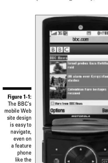
To help you appreciate what it takes to design a site that works within the limitations, consider how the British Broadcasting Corporation (BBC) cre-ated a design that is optimized for the limited navigation options of low-end devices. On a well-designed mobile site like the one created by the BBC (shown in Figure 1-1), this is the kind of user experience you can expect:
Figure 1-1:
The BBC’s mobile Web site design is easy to navigate, even on a feature phone like the Motorola RAZR shown here.
The BBC site is designed with multiple mobile URLs, including bbc. com/mobile/i for the iPhone version. But like many well-designed mobile sites, if you enter the main URL (bbc.com or bbc.co.uk) into a mobile device, the server automatically redirects you to the best version of the site for the phone you’re using.
On the main page of the BBC news site, you find the three top stories of the day/hour with tiny images and links, optimized to fit well, even on the 240-pixel-wide screen of the Motorola RAZR V9 shown in Figure 1-1.
2. Scroll down a little further, and you find a few more links with familiar section names, including More News, Sports, World, and Weather.
Using short words as links and sticking to common, easily recognized terms are good practices on the mobile Web because you need to convey a lot of information in a very small space.
3. Click any section name to summon a submenu with links to a few more items in that category.
4. Clicking those links, in turn, leads you to more links or to the text and photos of each story.
In this way, a well-designed mobile site guides you to the information you seek quickly because you only need to click links to two or three fast-loading pages to reach your destination.
5. If the story is long, you may have to scroll down a page or two or follow a link to continue reading.
The amount of text on each screen is limited because scrolling can be challenging on low-end feature phones, such as the RAZR shown in Figure 1-1. On a RAZR, like many feature phones, you can only scroll a few tedious pixels at a time.
6. To move on to another story or another section, you can click the back button on the handset of most phones (even feature phones) to return to the previous list of links or move on if additional navigation links are provided, as they are on the BBC site.
It’s good practice to offer at least a few navigation options on any mobile page. As the designer, you must find a delicate balance between enabling a visitor to easily find what they want and overloading each page with so many links that users have to wait a long time to load the content when they get to it.
17
Chapter 1: Understanding What Makes the Mobile Web Different
Mobile alphabet soup
Some handy definitions to keep in mind:
✓ Feature phone: An industry term that was originally used to distinguish mobile phones that had such advances as cameras or MP3 players built into them from the first wave of mobile phones that were only capable of sending and receiving calls. The term feature phone is now generally used to describe the simplest, low-end phones on the market, those that lack typewriter-like QWERTY keyboards, large display screens, or other more advanced technologies.
✓ Smartphone: When technology companies like Palm and RIM (the official name of the company that makes BlackBerry phones) rolled out devices that brought together the mini-computer functions of PDAs like the Palm Pilot with wireless phone functional-ity, the industry called them smartphones to differentiate them from the more limited feature phones. While the lines between “smart” and “feature” are blurring, broadly speaking, a smartphone is one with strong computer-like capabilities. It has a color screen, a keyboard that looks like a type-writer, and storage for music or video, and it can run applications or “apps” that allow it to do complicated tasks.
✓ Touch-screen phone: The most famous example is the iPhone, but in the years since Apple launched this device, many others with a dizzying array of capabilities have hit the market. Their distinguishing feature is that they have large, high-resolu-tion color screens. Also, you can use your fingers to tap on the screen to type on a vir-tual keyboard, use two or more fingers to click and drag items or pinch and expand images, or flick your fingers to make Web pages scroll.
✓ Dumbphone: An industry term used for mobile phones that look like they have the hardware features of an iPhone, but lack the software to back it. A touch screen without a sophisticated Web browser, like the Safari browser on the iPhone, can be especially misleading because mobile sites designed for touch-screen phones won’t work well on these poorly designed knockoffs.
✓ Mobile Web: Anything on the World Wide Web that can be viewed on a mobile device.
✓ Desktop Web: Used to describe Web pages designed to be viewed in Web browsers, such as Firefox and Internet Explorer, on desktop computers.
✓ Open Mobile Alliance (OMA): In June 2002, this international organization formed to develop specifications for the mobile Web. One of the things that distinguishes the OMA is that they bring together repre-sentatives from every aspect of the mobile industry, including mobile operators, device and network suppliers, information technol-ogy companies, and content and service providers. The goal, according to the OMA Web site, is to create “interoperable mobile data service enablers that work across devices, service providers, operators, net-works, and geographies.” Essentially, they want to create standards that work across all devices and services, a lofty goal that would definitely make the mobile Web a better place.
✓ Wireless Access Protocol (WAP): WAP basically sets down what a mobile Web browsing session is, how the phone is allowed to talk to the network, how the network is allowed to talk back, and how
(continued)
that communication is to be kept (reason-ably) secure. WAP 1.0, which restricted the mobile Web to very limited technologies, such as WML, has been replaced by WAP 2.0, which supports more advanced tech-nologies, including XHTML.
✓ Wireless Markup Language (WML): The first of many programming languages used to design mobile Web pages. Documents in WML are known as decks, and the data in each deck is broken down into cards (or pages). WML allows information in a Web page to interact with the mobile phone, such as clicking a phone number on a WML page causes the mobile phone functions to wake up, kick in, and call that phone number. (You find more information about WML and other mobile markup languages in Chapter 5.)
✓ eXtensible Markup Language (XML): A set of rules governing how documents are encoded, with the goal of allowing docu-ments created by different programs on dif-ferent platforms to share data (such as Excel on a Mac sharing data with Word on a PC).
✓ Wireless Universal Resource File (WURFL):
A configuration file that contains informa-tion about the capabilities of nearly every mobile device on the planet. You can download the WURFL file for free from
www.SourceForge.net and use it to help you direct mobile phones to the best version of your site. (You learn more about WURFL and developing for multiple devices in Chapter 6.)
✓ eXtensible Hypertext Markup Language (XHTML): This is a stricter standard for HTML, which is the language that Web pages are created in. The goal of XHTML is to organize the chaos of the Web into a stricter set of standards that prevent pages from displaying so differently across brows-ers. (You find an introduction to XHTML and CSS in Chapter 3.)
✓ XHTML Mobile Profile (XHTML MP): A variation of XHTML designed specifically for mobile phones. (You learn more about XHTML MP and other mobile markup lan-guages in Chapter 5.)
Assessing the Current State of the Web
If the early years of the mobile revolution were marked by a kind of bemused dazzlement that had people using early cellphones to call from unusual places (“Hey, I’m standing in the surf on the beach!”), the massive adoption of cellphones since then has made people regard them as essential to their survival. More than 40 percent of Americans have said that “they could not live without” their cellphones; these little devices are integral to life as we know it.
There’s only one choice for the device most responsible for taking the mobile Web from the Nerds Only Clubhouse into the popular consciousness. And this device is the elephant in the room in any discussion of the mobile Web.
19
Chapter 1: Understanding What Makes the Mobile Web Different
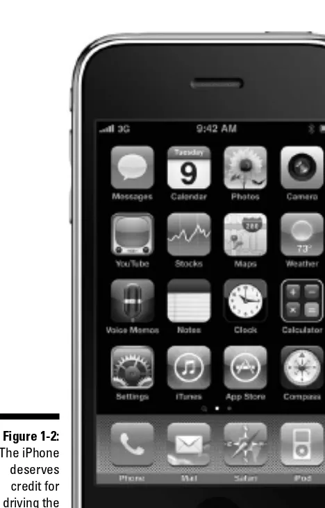
Understanding the iPhone factor
From the moment Apple CEO Steve Jobs strode out on stage to introduce the iPhone (shown in Figure 1-2), a kind of over-the-top techno-frenzy enveloped the mobile phone industry. Lines of eager Mac fans crawled around city blocks waiting for Apple stores to open and sell iPhones on June 29, 2007. Before iPhones became available outside the United States, enterprising trav-elers could buy the iPhone for $300 and sell it on the streets of Moscow or Bangkok for $2,000 or more.
Figure 1-2:
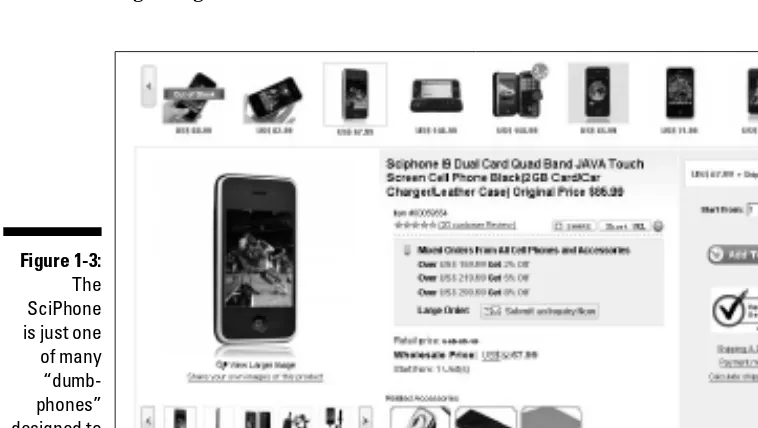
Within weeks of the iPhone’s launch, copycat HiPhones appeared in the gray-market stalls all over China. Later models, such as the SciPhone shown in Figure 1-3, adapted Apple’s design to the Chinese market, putting in slots for two SIM cards so that the owner could have, in essence, two separate phone lines in his pocket — one for business and one for personal use. The SciPhone costs a fraction of what the iPhone costs; however, like many other phones, dubbed “dumphones” by developers, it suffers from uneven quality.
Although those who style themselves to be true “mobile Web purists” often sneer at the iPhone as being more hype than substance, the iPhone really kick-started the mobile Web revolution into high gear. Apple applied for 200 patents for new technology for the iPhone. Obviously, something was break-ing new ground.
Figure 1-3:
The SciPhone is just one of many “dumb-phones” designed to look like the iPhone.
Compared to the clunky navigation of early mobile sites, the iPhone creates a new and delightful user experience for mobile content:
✓ The multi-touch screen wows people with game-changing interactive
fea-tures, such as the ability to use pinching or opening motions with your fingers to shrink or enlarge Web pages, photos, and text.
21
Chapter 1: Understanding What Makes the Mobile Web Different
✓ An accelerometer (a tiny gyroscope) can tell when the phone was
moved, and in what direction, so shaking the phone can be used to do things, like randomly changing the song you listen to on the built-in iPod. The accelerometer also determines whether the phone is being held in portrait or landscape mode.
✓ The iPhone doesn’t come with a manual. It’s so easy to use, that most people learn by just playing around with it and figure out things as they go along.
The iPhone can be credited with a 500 percent increase in traffic to the mobile Web. It was the first mobile device that could display desktop Web pages as well as most desktop computers (except for the inability to play Flash or other rich-media video technologies). According to AdMob, by November 2009, the iPhone and iPod touch accounted for more than 40 percent of mobile data traffic worldwide — this despite the fact that the iPhone still wasn’t available in most markets, and even in the United States, it accounted for less than 10 percent of the total phones in use.
Every other month, Apple’s competitors roll out a phone that’s billed as “the iPhone killer,” with about as much success (so far) as the challengers to the iPod in the digital music-player space. If imitation is the sincerest form of flattery, the efforts to replicate Apple’s success are almost embarrassingly fawning.
What this means to Web designers is that the other phone manufacturers, who have already copied the touch-screen format of the iPhone, want to rep-licate its browsing capabilities, in the hopes of draining some of its market share. And, as is inevitable in the technology world, what was once prohibi-tively expensive quickly becomes affordable — and eventually cheap.
Cellphone technology is a perfect example of this class-to-mass movement because the early “brick” phones (so called because the clunky things were the approximate size, shape, and weight of a brick) that were such rarities in the early ’90s and cost a relative fortune have given way to disposable phones that are half the size of a deck of cards and so cheap you can throw them away when you’re done with them. Most disposable phones are feature phones with shoddy construction that can be purchased without a service plan.
The siren song of “apps”
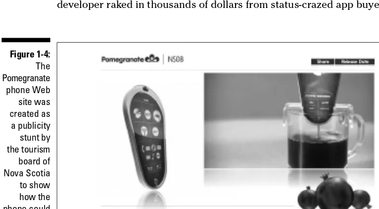
Apple’s ubiquitous marketing campaigns have ensured that anyone more connected than a Patagonian llama herder has heard of its App Store (www. apple.com/iphone/apps-for-iphone); no matter what you want to do, you hear, “There’s an app for that.” These commercials promising near-divine powers were even successfully parodied by the tourism board of Nova Scotia, which faked a Web site for its Pomegranate phone that purported to include a video projector, live voice translator, harmonica, coffee maker, and shaving razor (see Figure 1-4 or visit the site at www.pomegranate.com). Although the phone was completely fictitious, it’s not hard to image that all these features are in some stage of development in some mobile testing lab even as we write this.
An app is a small computer program that runs on your cellphone and causes it to do things that the phone normally can’t do. For instance, you can play games, use light versions of software programs (such as Word, Excel, or Photoshop), or use any of the more than 200,000 apps and counting to wow your friends and kill time.
Developers can give away apps for free, hoping to pay for the development cost through advertising, or they can charge for it. One early iPhone app — I Am Rich — cost $1,000 and did . . . nothing. Well, other than serve to prove that you had enough money to be able to waste $1,000 just to brag to other people that you could. Apple quickly killed the application but not before the developer raked in thousands of dollars from status-crazed app buyers.
Figure 1-4:
23
Chapter 1: Understanding What Makes the Mobile Web Different
Still, the media has been alight with stories about 14 year olds making a mil-lion dollars in a month from the sale of quirky apps. The iFart prank applica-tion made $10,000 a day, and it spawned other apps, such as Pull My Finger, and a long list of updates, including the Rock Band Fart Pack, which features the sounds of Fartwood Mac.
The revenues are no laughing matter. Within the first nine months of opening the App Store, Apple had 1 billion downloads, of which they take a hefty 30 percent cut.
The Android Market (www.android.com/market) and BlackBerry App
World (http://na.blackberry.com/eng/services/appworld) app
stores are hot on Apple’s heels, and you can expect to hear a lot more about apps for the next year or so as developers chase this brand-new revenue stream.
But already there’s backlash against apps; advertising agencies host How to Talk Your Client Out of Wasting Money on an App seminars. More than 200,000 apps are swimming around the App Store, with the number growing exponentially. This means that as the novelty factor wears off, people will realize that they’re paying a premium to build what’s essentially a Web-based experience that works only on one kind of phone. Similar to software pro-grams that can work only on a Mac or PC, separate apps must be designed for each kind of phone. Thus, if you want to reach a broad audience with an app, you need to create one for the iPhone, another for the BlackBerry, another for Droid, and so on.
If you work the numbers, you quickly realize that it’s much more cost-effective to create one Web site than to have an app or apps, even if you design differ-ent versions of your Web site for each phone. The bottom line is this: Apps are great for games and other highly complex programs, such as Photoshop for the iPhone, but for just about anything else, you’re almost certain to get a better return on investment by creating a mobile version of your Web site.
Seizing the power of geolocation
Now that GPS receivers are becoming as standard in cellphones as cameras are, the business opportunities inherent in local searches are exciting. One of the most persistent examples of what this could mean is the scenario in which a Web-enabled cellphone user walks through a mall, and her phone lights up and shows her special offers from stores nearby. Dozens of mobile consultants have trotted out footage from the movie Minority Report where the character played by Tom Cruise walks through a shopping mall and video screens in the shop windows start calling to him by name, telling him about specials tailored to his shopping history, his needs, and other data that is stored in a big database. The mobile consultants like to say that this is a preview of how the stores of the future will send ads, directly to your mobile phone, that use your name and mention that they noticed you were looking at new shoes recently. Groups concerned with consumer privacy and govern-mental agencies like the FCC have held hearings about the dangers of having companies know who you are, where you’ve been, who you’ve been with, and how long you spent with them. All this information is available to mobile car-riers, who have solemnly promised that they will safeguard its use.
At this time, leveraging GPS data is a pretty advanced feature, and one that the iPhone, for example, has restricted by allowing only native apps to use this data. However, the much-anticipated HTML5 standards do include a <location> tag to take advantage of this function. It is expected that the next few years will see mobile device manufacturers rush to ensure that their products will be able to work with this advanced function.
The ability to add geolocation features is one of the most exciting additions of the latest markup language, HTML5, covered in Chapter 5. But even if you’re not pushing the bleeding edge of Web design with the not-yet-fully-supported HTML5 specification, you can take advantage of the fact that most people with mobile devices are on the move, and many have maps in their pockets thanks to the basic features of their phones and Google Maps. In Chapter 2, you dis-cover how even if you only create one simple mobile design, you should make sure to include your address and a link to a Google map.
Offering deals and data with QR codes
25
Chapter 1: Understanding What Makes the Mobile Web Different
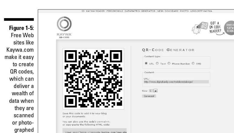
note of QR codes because they can free up users from having to type in com-plex and lengthy data on the small keypads of mobile devices. You can create your own QR code quickly and easily via free Web sites, such as http:// qrcode.kaywa.com, shown in Figure 1-5, or Microsoft Tag, which provides similar functions, and is covered in Chapter 10.
Figure 1-5:
Free Web sites like Kaywa.com make it easy to create QR codes, which can deliver a wealth of data when they are scanned or photo-graphed by mobile devices.
To use a QR code, you generally have to download a small application capa-ble of interpreting the data. Then just point your phone’s camera at the QR code and the application on the phone reads the code and automatically con-nects to the Web to unlock special content. Here are a few examples of how people use QR codes around the world:
✓ In Japan, QR codes are printed on escalator handrails in malls; you can point your phone at any code and get messages and discounts, like an offer for 20 percent off a haircut at a salon a couple of floors up.
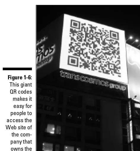
✓ QR codes are huge, literally. In Figure 1-6, you see a QR code that was printed on the side of a skyscraper so you can easily access the Web site of the company that owns the building.
✓ In San Francisco, restaurants put the QR codes in their windows.
Figure 1-6:
This giant QR codes makes it easy for people to access the Web site of the com-pany that owns the building.
Photo by Nicolas Raoul
✓ In England, Ford organized a mobile campaign to publicize its new Ka
car. They printed stickers with QR codes on them, and when users pointed their phone cameras at them, up popped an image of the car on the phone’s screen. As the users twisted and turned the phone, the car on the screen rotated and eventually revealed a secret code that led users on a scavenger hunt.
You learn more about QR codes and a similar technology by Microsoft called Tags in Chapter 10.
Watching video anywhere, anytime
The mobile phone has been termed the third screen, with television as the first and the computer monitor as the second. Already ads promise seamless experience of movies and TV shows from one screen to another — so that you can start watching a TV show on your big-screen HD monitor at home, walk out the door, keep watching it on your phone, and finish by gazing at the computer screen in your office or on your laptop at a coffee shop.