Tableau Dashboard
Cookbook
Over 40 recipes on designing professional dashboards
by implementing data visualization principles
Jen Stirrup
BIRMINGHAM - MUMBAI
Tableau Dashboard Cookbook
Copyright © 2014 Packt Publishing
All rights reserved. No part of this book may be reproduced, stored in a retrieval system, or transmitted in any form or by any means, without the prior written permission of the publisher, except in the case of brief quotations embedded in critical articles or reviews.
Every effort has been made in the preparation of this book to ensure the accuracy of the information presented. However, the information contained in this book is sold without warranty, either express or implied. Neither the author, nor Packt Publishing, and its dealers and distributors will be held liable for any damages caused or alleged to be caused directly or indirectly by this book.
Packt Publishing has endeavored to provide trademark information about all of the companies and products mentioned in this book by the appropriate use of capitals. However, Packt Publishing cannot guarantee the accuracy of this information.
First published: May 2014
About the Author
Jen Stirrup
is an award-winning, internationally recognized business intelligence and data visualization expert, author, data strategist, and technical community advocate. She has been repeatedly honored, along with peer recognition, as one of the top 100 most globally influential tweeters on Big Data topics. Jen has over 16 years of experience in delivering Business Intelligence and data visualization projects for companies of various scales across the world.I want to thank the most important person in my life, my son Matthew. I love him to the moon and back…a millionty times. I dedicate this book to him.
I have been inspired by the genius of other people. In the words of Sir Isaac Newton, I stand on the shoulders of giants. My gratitude to Stephen Few, Edward Tufte, Raj M. Ratwani, and Ben Schneiderman. The Tableau community has boundless enthusiasm and a sense of fun, which has helped me to keep going. A special shout out to Jacqui, Ian Taylor, Dan Murray, and Tom Brown. I'd like to thank the great folks at Tableau, especially, Andy Cotgreave and Pat Hanrahan.
I would also like to thank the following people for their support and love; I appreciate it more than I can say. Toby, Gill, and Pippa Smith; Charlie and Joe Withey; Allan, Lesley, and Ewan Mitchell; my parents; and my brother.
I'd also like to thank the "SQLFamily"—those in the global SQL Server and Microsoft Data Platform community, and of course, the "softies" themselves. They are just simply amazing, amazing people. They brighten my days and nights more than they know. Thank you!
About the Reviewers
Nuno Faustino
has worked in data visualization, harvesting data from all kinds of web sources and databases since 2007. He specializes in QlikView and Tableau for dashboard production, usually after performing statistical analysis/modeling with tools such as R and SPSS.He has mainly worked in the pharmaceutical industry for companies such as Cegedim and Johnson & Johnson. His skills have also been tested in the banking and insurance market during the challenge he took up to evaluate consumer intelligence in the UK.
At the academic level, Nuno published his thesis in 2009, in which he analyzed the efficiency of Portuguese pharmacies using Data Envelopment Analysis.
Mike Janecek
has an undergraduate degree in Economics and MBA and has been providing analytical services for nearly 20 years in various institutes such as hospitals and insurance and investment companies. He has been following the data visualization movement since 2005 and using Tableau as his main tool of choice to generate visual analysis since early 2007.Nathan Krisanski
is a data analyst, consultant, and entrepreneur with over 10 years of industry experience and five years of experience working with Tableau Desktop and Server applications. He currently consults for several large-scale Australian companies, building and maintaining Tableau visualizations and installations for these clients.Nathan graduated in 2007 with a Bachelor's degree in Information Technology, majoring in Software Development and Network Communications. He has worked in the health, real-estate, and banking and finance sectors, among many others.
Nathan is a Tableau partner and organizer for the Brisbane Tableau User Group. He was also a customer speaker at the 2012 European Tableau User Conference in Barcelona, Spain, and discussed the topic of dashboard integration and automation and spacial techniques.
Thank you to my girls, Kendall and Isabella. You'll are always in my thoughts and heart.
Patrick Spedding
is a thought leader, evangelist, and strategic advisor in the area of Business Intelligence and Analytics. Over the 22 years of his career with IBM – Cognos Business Intelligence, SAS Institute, and See-Change Solutions, Patrick had the opportunity to work in a number of roles, both functionally and geographically. These include the roles of the Director of Product Management for Cognos Asia-Pacific, Director of Field Marketing for Cognos West US, Area Technical Manager for Cognos West US, and SAS Solution Manager for Business Intelligence and Strategy Management.Patrick is the Founder of See-Change Solutions, a Business Intelligence strategic advisory firm and a Tableau business partner. See-Change Solutions specializes in complex Business Intelligence deployments, including SAS/Tableau and Cognos/Tableau integration.
www.PacktPub.com
Support files, eBooks, discount offers, and more
You might want to visit www.PacktPub.com for support files and downloads related to your book. Did you know that Packt offers eBook versions of every book published, with PDF and ePub files available? You can upgrade to the eBook version at www.PacktPub.com and as a print book customer, you are entitled to a discount on the eBook copy. Get in touch with us at service@ packtpub.com for more details.At www.PacktPub.com, you can also read a collection of free technical articles, sign up for a range of free newsletters and receive exclusive discounts and offers on Packt books and eBooks.
TM
http://PacktLib.PacktPub.com
Do you need instant solutions to your IT questions? PacktLib is Packt's online digital book library. Here, you can access, read and search across Packt's entire library of books.
Why subscribe?
f Fully searchable across every book published by Packt
f Copy and paste, print and bookmark content
f On demand and accessible via web browser
Free access for Packt account holders
If you have an account with Packt at www.PacktPub.com, you can use this to access PacktLib today and view nine entirely free books. Simply use your login credentials for immediate access.
Instant updates on new Packt books
Get notified! Find out when new books are published by following @PacktEnterprise on Twitter, or the Packt Enterprise Facebook page.
Table of Contents
Preface 1
Chapter 1: A Short Dash to Dashboarding!
5
Introduction 5
Preparing for your first dashboard 6
Showing the power of data visualization 12 Connecting to data sources 21 Introducing the Tableau interface 28
Interacting with your first data visualization 34 Sharing your visualization with the world 41
Chapter 2:
Summarizing Your Data for Dashboards
49
Introduction 49
Arithmetic – the queen of mathematics! 50 Dashboards and dates 58
Grouping your data with calculations 64
Correlation with calculations 72
Using cross-tabs flexibly 79
Simplifying your business rules with customer calculations 83
Chapter 3: Interacting with Data for Dashboards
91
Introduction 91
Fun with filters – grouping your data with clarity 92 Hierarchies for revealing the dashboard message 109 Classifying your data for dashboards 114
Actions and interactions 120
Drilling into the details 124
Working with input controls 135
Table of Contents
Chapter 4: Using Dashboards to Get Results
141
Introduction 141
Enriching data with mashups 142
Page trails 149
Guided analytics with Tableau 157 Sharing your results in a meeting 171 Notes and annotations 177
Using external data to enrich your dashboard 181
Chapter 5: Putting the Dash into Dashboards
185
Introduction 185
Choosing your visualization 186
Using parameters in dashboards 196 Using custom geocoding in Tableau 206 Profiting from Big Data to rev your visualization 211
Filtering your data for focus 217
Creating choices in dashboards using conditional logic 224
Chapter 6: Making Dashboards Relevant
231
Introduction 231
Adding an infographic to your Tableau dashboard 233 String manipulation in dashboards 240 Correcting data exports from Tableau to Excel 244
Blending data 246
Optimizing tips for efficient, fast visualization 249
Chapter 7:
Visual Best Practices
263
Introduction 263
Coloring your numbers 264
Dueling with dual axes 273
Where is the three dimensional data? 281 Eating humble pie – pie charts or not? 285
Sizing to make a data story 289
Chapter 8:
Tell the World! Share Your Dashboards
293
Introduction 293
Packaging workbooks with data 294
Publishing dashboards to Tableau Server 298 Publishing dashboards to Tableau Public 301
Mobilizing your dashboards 305
Mixing Tableau with SharePoint 2013 Power BI 309 Wrapping up with R – dashboards as a tool 312
Preface
Tableau Dashboard Cookbook is an introduction to the theory and practice of delivering dashboards using Tableau. The recipes take you through a step-by-step process of creating the building blocks of a dashboard and then proceed towards the design and principles of putting the dashboard items together. This book also covers certain features of Tableau such as calculations, which are used to drive the dashboard in order to make it relevant to the business user. The book will also teach you how to use key advanced string functions to play with data and images. Finally, this book will help you consider what to do next with your dashboard, whether it's on a server or in collaboration with other tools.
What this book covers
Chapter 1, A Short Dash to Dashboarding!, takes you through an introduction of the Tableau interface while ensuring that you are producing dashboards quickly.
Chapter 2, Summarizing Your Data for Dashboards, teaches you how to summarize data as a way of conveying key messages on your dashboards for top-down analysis. It also introduces you to calculations with a particular focus on using dates for analysis and comparison.
Chapter 3, Interacting with Data for Dashboards, will guide you through to the next stage after summarizing your data, interacting with your data, and providing more details where appropriate to enhance the story on the dashboard.
Chapter 4, Using Dashboards to Get Results, presents ways to make your dashboards actionable for the dashboard viewer. We will look at a guided analysis in Tableau as a way of facilitating structured investigation of data. We will also research the ways of enhancing your data via mashups and external data sources, all in your dashboard.
Chapter 5, Putting the Dash into Dashboards, focuses on graphically presenting the data with Tableau dashboards in mind. We will look at sparklines, KPIs, small multiples, and maps, to name a few.
Chapter 6, Making Dashboards Relevant, guides you through the ways in which you can make the dashboards relevant to your organization. We will look at theming and adding more details to the dashboard.
Chapter 7, Visual Best Practices, provides examples of more advanced features of Tableau, such as calculations. The recipe exercises are underpinned by an explanation of the visual best practices as we proceed through the chapter.
Chapter 8, Tell the World! Share Your Dashboards, shows different ways to share your dashboards with different audiences, both inside and outside of your organization.
What you need for this book
You need the following in order to work with Tableau:f Tableau Version 8.1
f Windows Live login ID and password
f Microsoft Excel
f Internet access
Who this book is for
If you are a business user or a developer who wants to create Tableau dashboards quickly and easily while learning about data visualization theory and techniques as you go along, then this book is for you. This book applies the practice and theory of data visualization to dashboards while helping you to deliver effective Tableau dashboards.
Conventions
In this book, you will find a number of styles of text that distinguish between different kinds of information. Here are some examples of these styles, and an explanation of their meaning.
Code words in text, database table names, folder names, filenames, file extensions, pathnames, dummy URLs, user input, and Twitter handles are shown as follows: "Open a copy of the
Chapter Eight workbook."
A block of code is set as follows:
IF ( SUM([SalesAmount]) - WINDOW_AVG(SUM([SalesAmount]), First(), Last() ) < 0 )
Then Below Average
3 New terms and important words are shown in bold. Words that you see on the
screen, in menus, or dialog boxes for example, appear in the text like this: "Navigate to Server | Publish Workbook."
Warnings or important notes appear in a box like this.
Tips and tricks appear like this.
Reader feedback
Feedback from our readers is always welcome. Let us know what you think about this book—what you liked or may have disliked. Reader feedback is important for us to develop titles that you really get the most out of.
To send us general feedback, simply send an e-mail to [email protected], and mention the book title via the subject of your message.
If there is a topic that you have expertise in and you are interested in either writing or contributing to a book, see our author guide on www.packtpub.com/authors.
Customer support
Now that you are the proud owner of a Packt book, we have a number of things to help you to get the most from your purchase.
Downloading the example code
You can download the example code files for all Packt books you have purchased from your account at http://www.packtpub.com. If you purchased this book elsewhere, you can visit http://www.packtpub.com/support and register to have the files e-mailed directly to you.
Downloading the color images of this book
The screenshots given in this book explain how data from Excel can be displayed in Tableau using dashboards. They also explain how we can modify the design of the data in dashboards to facilitate easier analysis. To view the images in more detail, please visit the following link:
https://www.packtpub.com/sites/default/files/downloads/7906EN_ ColoredImages.pdf
Errata
Although we have taken every care to ensure the accuracy of our content, mistakes do happen. If you find a mistake in one of our books—maybe a mistake in the text or the code—we would be grateful if you would report this to us. By doing so, you can save other readers from frustration and help us improve subsequent versions of this book. If you find any errata, please report them by visiting http://www.packtpub.com/submit-errata, selecting your book, clicking on the erratasubmissionform link, and entering the details of your errata. Once your errata are verified, your submission will be accepted and the errata will be uploaded on our website, or added to any list of existing errata, under the Errata section of that title. Any existing errata can be viewed by selecting your title from http://www.packtpub.com/support.
Piracy
Piracy of copyright material on the Internet is an ongoing problem across all media. At Packt, we take the protection of our copyright and licenses very seriously. If you come across any illegal copies of our works, in any form, on the Internet, please provide us with the location address or website name immediately so that we can pursue a remedy.
Please contact us at [email protected] with a link to the suspected pirated material.
We appreciate your help in protecting our authors, and our ability to bring you valuable content.
Questions
A Short Dash to
Dashboarding!
In this chapter, we will cover:
f Preparing for your first dashboard
f Showing the power of data visualization
f Connecting to data sources
f Introducing the Tableau interface
f Interacting with your first data visualization
f Sharing your visualization with the world
Introduction
This chapter starts with you being a Tableau beginner, then quickly moves you forward to creating your own visualizations and explains how to interact with the Tableau sample dashboards—how to find, open, and interact with them.
We can create visualizations by using Tableau in order to produce meaningful dashboards that communicate clearly. The six recipes in this chapter will explain how we can get up to speed with Tableau very quickly in order to produce dashboards that facilitate and expedite the decision-making process for strategic decision makers and operational team members within your organization.
For this book, we will be using version 8.1 to work with Tableau.
1
Preparing for your first dashboard
The following definition has been taken from the Intelligent Enterprise magazine's March 2004 issue:
A dashboard is a visual display of the most important information needed to achieve one or more objectives; consolidated and arranged on a single screen so the information can be monitored at a glance.
-Stephen Few
For an enterprise, a dashboard is a visual tool to help team members throughout the ranks of the organization to track, monitor, and analyze the information about the organization in order to make decisions to support its current and future prosperity. In this recipe, we will interact with Tableau's sample dashboards, which are constructed from worksheets. People often learn by example, and this is a straightforward way of inspiring you with dashboard samples while also learning about Tableau.
What do dashboards help you to do?
f Evaluate: Dashboards answer questions such as "Have the goals and objectives been
met? Are we on track?"
f Reveal: Dashboards help you view and digest information very quickly, which means
you have more time for strategic planning.
f Communicate: Using a visual tool can help to get the message across in a common format and create impact.
f Certainty: Dashboards help you to have confidence in your insights.
Dashboards help key team members to gain insights and discern the health of the organization very quickly. Tracking, monitoring, and analyzing the organization's data is an essential part of making accurate decisions.
Tableau provides a number of example dashboards, both online and as part of the Tableau Desktop installation. We will find, open, and interact with sample Tableau dashboards. We can also use the example dashboards as a basis to make our own dashboards. They can form a source of inspiration to make your own compelling visualizations. For the purpose of this recipe, we will focus on the sample Sales workbook.
7
Fortunately, it is straightforward to interact with a dashboard that has been implemented in Tableau.
How to do it...
We will perform the following steps to see how we can interact with a dashboard:
1. Open up the Tableau Desktop and you can see the Getting Started page. The following screenshot is an example:
2. At the bottom of the entry page, you can see a section called Sample Workbooks
that contains some examples.
3. Let's take a look at the Sales dashboard. If you double-click on the Sales example, it will open and you will see the sample Sales dashboard, as shown in the following screenshot:
9
When you click on the middle item, denoted as % quota descending, you can see that the horizontal bar charts in the main area of the dashboard change very quickly in response to the user interaction. The dashboard now looks quite different from the previous Tableau example, where the bars were sorted by Names. The rapidity of the change means that decision makers can "think as they click" in order to focus on their analysis.
There are a number of different ways in which Tableau can offer useful interactivity for dashboards. For example, we can include sliders, filtering by color, moving from dashboard to dashboard, radio buttons, drop-down lists, and timelines. For example, another interesting feature is that users can enter values into parameters in order to see the impact of their activity. A parameter is a dynamic value that responds to user input. In this example, we use it to filter the data by replacing constant values in calculations. We use the following steps to view the interactivity:
1. Let's see the impact of interactivity on the performance information given by the dashboard. In the Sales dashboard, increase the New quota level to $1,000,000. 2. Next, increase the value in the Commission rate textbox to 15.0% by moving the
slider to the right.
3. Decrease the base salary to $40,000 by inserting this value in the Base salary textbox. Note that the estimated results are now quite different. You can see from the following screenshot that the number of people making the sales target decreases, and the chart now shows a significant increase in the number of people nearing their target or missing it altogether:
11
How it works…
Tableau gives you a series of sample dashboards as part of the installation. You can also see more samples online. Some samples are provided by Tableau team members, and you can also visit the Tableau website for samples submitted by keen data visualization fans from around the world. These samples can help to inspire your own work.
In this topic, we compared the changes on a dashboard in order to see how Tableau responded to changes. We noted that the color has changed along with the values. The dashboard provides quick feedback that the values do not change favorably for the new quotes, commissions, and base salary. When decision makers are interacting with dashboards, they are expecting quick-as-a-flash responsiveness from the dashboard, and the sample Tableau dashboards meet this expectation well.
See also
Tableau offers a number of sample dashboards on its website, and it is worthwhile to check the site for ideas and brainstorming for your own dashboards. Please take a look at www.tableausoftware.com for examples. If you are interested in dashboard theory in general, then you can look at the following references:
f Dashboard Confusion by Stephen Few, Intelligent Enterprise, 2004
f 5 Best Practices for Creating Effective Dashboards by Tableau Software ( http://www.tableausoftware.com/learn/whitepapers/5-best-practices-for-effective-dashboards)
Showing the power of data visualization
Dashboards rely on the power of visualization in order to let people see the message of the data to make effective decisions. How can you show the power of a dashboard when compared to a crosstab table?In this recipe, we will see how a data visualization can have more impact than a straightforward crosstab. We will make a crosstab table in Tableau and then turn it into a data visualization to see the impact in action!
Understanding your data is an essential part of data visualization, regardless of the technology you are using. Tableau can help you to understand your data by automatically distinguishing between measures and dimensions. How do you know which are which? Look at the title of a report or dashboard. For example, if a dashboard is called Sales by Country, then anything that comes after the by word is a dimension and the item being counted is a measure. Dimensions and measures are explained as follows:
f Dimensions: Dimensions describe data
f Measures: Measures are usually numbers
13
Getting ready
Let's start by opening up Tableau to get ready for your first visualization. We will need to get some data. To obtain some sample, download the Unicef Report Card spreadsheet from the following link: http://bit.ly/ TableauDashboardChapter11Unicef
It will have the following columns:
f Country
f Average ranking position (for all 6 dimensions) f Material well-being
f Health and Safety
f Educational well-being
f Family and peer relationships
f Behaviors and risks f Subjective well-being
How to do it…
1. In Tableau, click on File in the top left-hand corner and click on New. You can see this in the following screenshot:
2. When you've clicked on New, you will get a blank Tableau workbook. This is shown in the following screenshot:
3. Let's insert our downloaded data. To do this, go to the Excel spreadsheet and select all of the data by pressing CTRL + A.
15
The following points describe the different panels in Tableau:
f Data window: This holds the measures, dimensions, and calculations in the data f The Tableau view: This shows the items held in the Rows, Columns, Marks, Pages,
or Filters shelf
f Shelf: This is a place where you drag a measure or a dimension The following steps can be performed to create a quick visualization:
1. When you paste the data, it appears as a crosstab. We can see the data, but it is quite difficult to see any patterns in the data.
2. Using the preceding list as a basis, it is very simple to create a quick visualization.
3. Let's take a copy of our work so that we can compare before and after. To do this, click on the Sheet 1 tab at the bottom of the worksheet. Right-click on the worksheet tab at the bottom of the Tableau interface and a pop-up menu appears.
4. Select the option Rename Sheet and rename the worksheet as Before.
5. Then, choose the option Duplicate Sheet, as shown in the following screenshot, to take a copy of the worksheet, and rename the new copy as After.
17
7. Using the Afterworksheet, click on the first Measures column called Average
ranking position_(for all 6 dimensions) to select it. Right-click on the column and choose Keep Only. This excludes the rest of our measures, retaining only this column. The result can be seen in the following screenshot:
8. When we exclude the other options, the Show Me toolkit changes in response to the amendments that have been made in the data table. Now, the map options are available to us. The Show Me toolkit changes can be seen in the following screenshot:
When we select the filled maps option, which is bordered with a heavy line at the top right-hand side row, our screen now changes to look like a filled map, in which each color corresponds to the average rank of each country. An example is shown in the following screenshot:
We have Denmark ranked as 7 and the United Kingdom is ranked at 18. Denmark is considered as having a higher ranking, even though it has a lower number.
19
The Edit Colors dialog box appears. An example can be found in the next screenshot:
10. Using the square box, you can change the color. Here, it has been changed to blue. The important item to note here is the Reversed option. This option allows us to reverse the color so that lower numeric values are represented by higher intensities. When we click on Ok, we get the final result as shown in the following screenshot:
How it works…
The Show Me toolkit takes the guesswork out of what data visualization tool to choose by offering you a selection of visualizations that are based on your data types.
The Show Me button helps you to choose which data visualization is most suited to your data. It does this using an in-built, intelligent, knowledge-based system that is part of Tableau. This helps to take the guesswork out of selecting a data visualization, which can often be a contentious issue among data consumers and business intelligence professionals alike.
Data visualization is telling a story; the value is depicted by a corresponding color intensity. This example topic involved ranking data. Therefore, the higher the number, the lower the value actually is. Here, the value refers to the country rank.
21
There's more…
Color theory is a topic in itself, and you will see practical applications as we proceed throughout this book. For further references, please see the See also section.
See also
f Data visualizations can also be known as dataviz for short. On Twitter, #dataviz is a well-used hashtag
Connecting to data sources
In the previous recipe, we inserted data into the Tableau workbook by simply copying and pasting. In the real world, however, we need to be able to connect to different data sources that may contain large amounts of data.
We will now look at connecting to multiple data sources at a time. This is a useful way of enriching our data. We have access to multiple data sources. We can open up Tableau and connect numerous data sources.
First, we will see how we can connect to the Windows Azure Datamarket cloud data source, and then continue to connect to the local Excel file. Windows Azure Marketplace is an online market to buy and sell finished Software as a Service (SaaS) applications and premium data. Some data on Windows Azure Datamarket is free. We will be using one of the free data samples, which will give us a lot of information about individual countries, such as the country code, population, size, and so on. In data warehousing terminology, this data can be considered as a dimension, which is another way of describing data. In this definition, it is a field that can be considered an independent variable, regardless of the datatype. Tableau has a more specific definition of a dimension. Tableau treats any field containing qualitative, categorical information as a dimension, such as a date or a text field.
To connect the online data and local data, we will connect to Windows Azure Datamarket using OData, which is a standardized protocol to provide Create, Read, Update, Delete
(CRUD) access to a data source via a website. It is the data API for Microsoft Azure, but other organizations use it as well, such as eBay, SAP, and IBM.
Getting ready
Before you start, you need to create a folder where you can download data to run through the examples. You should pick a folder name that is meaningful for you. Also, be sure to select a location that has plenty of space. In this example, we will use the following location to store data: D:\Data\TableauCookbook. For the example in this chapter, we will create a folder called Chapter 1.
How to do it…
1. To connect to Windows Azure Datamarket, please sign up for a free account using a Windows Live ID. To do this, please visit https://datamarket.azure.com/ and follow the instructions. This may involve activating your account via a link, so please follow the instructions carefully.
2. Sign in to Windows Azure Datamarket and navigate to the following URL:
https://datamarket.azure.com/dataset/oh22is/countrycodes#schema
3. About half way down the page, look for the Sign Up button and click on it.
4. This will take you to a terms and conditions page. After you've read the terms and conditions, and, if you agree with them, tick the box to specify that you agree and click on Sign Up.
23
6. When you click on EXPLORE THIS DATASET, you will be able to see the data appear in the browser, which you can slice and dice. Here is an example screenshot:
7. In this example, we will load the data in Tableau rather than in the Data Explorer URL. To do this, we need the primary account key. In Windows Azure Datamarket, this is easy to obtain. From the previous example, we can see a feature called
Primary Account Key. If you click on the Show link next to Primary Account Key, then your primary account key will appear.
8. Copy the primary account key to your clipboard by selecting it and pressing the CTRL
+ C keys. You will need the primary account key to access the data using Tableau.
9. You will also need to get the OData feed for the Country Codes data of the Windows Azure Datamarket Country Codes store. To get the OData feed, you can see it under the sentence URL for current expressed query, and you should copy this information.
10. Before you proceed, you should note the OData URL and the primary account key. Select them and press the CTRL + C keys simultaneously. The following table shows an example of how your data might look:
OData URL https://api.datamarket.azure.com/oh22is/ CountryCodes/v1/CountryCodes
Primary account key
Aaa0aaAa0aAa00AAaAAA0aaA0AaaOa0aAaeAaA1AAA
11. To connect to Windows Azure Datamarket, let's open up Tableau and open the Chapter 1 Demo workbook that we started in the Getting ready section of the
Showing the power of data visualization recipe.
12. Go to the Data menu item and choose Connect to Data….
13. This action takes you to the Connect to Data window, and you can see that there are a variety of data sources for you to choose from! A sample of the list can be seen in the next screenshot:
25
15. Insert the OData URL into the textbox labeled Step 1: Select or enter a URL. 16. Next, take a look at the step labeled Step 2: Enter authentication information,
select the radio button next to the option Use an Account key for Windows Azure Marketplace DataMarket, and insert the account key into the textbox. Then, click on the Connect button.
17. All being well, the data connection will be successful and we can save the Tableau workbook before proceeding to connect to the Excel data source.
18. We will download the GNI data from the World Bank. The URL is as follows:
http://data.worldbank.org/indicator/NY.GNP.PCAP.CD?page=1
19. To do this, open an Internet browser and navigate to the URL. You can see the web page in the following screenshot:
20. You will see a button called DOWNLOAD DATA, which is on the right-hand side. 21. Click on this button and you will be presented with two options: EXCEL and XML.
We will download all of the data in Excel format.
22. Before accessing the data source, let's save the file into the directory that you created earlier.
23. Once the file is saved, open it in Excel and take a look. If you don't see any data, don't be alarmed.
You will see that there are three sheets and the workbook may open on Sheet 2. This will only provide metadata about the data held in the worksheet, and we need to look at Sheet 1. Then, we'll perform the following steps:
1. Let's rename Sheet 1 to something more meaningful. Right-click on the sheet tab name and rename it as GNI.
2. Remove the first two rows of the file. They will only add noise to the import.
3. Once you've done this, save the workbook. Now, you can exit Excel. We will go back to Tableau to connect to the data.
4. To connect to the Excel file, go to the Data menu item. Select Connect to Data… and a browser will appear.
5. Navigate to the location where the files are stored.
6. Select the worksheet to analyze and double-check whether you are looking at the correct file.
7. We are given the option of selecting a single file, multiple files, or a custom SQL.
8. At step 3, labelled Does the data include field names in the first row?, select the option No.
27
10. We can now decide whether to import the data or to connect live. We will connect live
to the Excel workbook.
11. Now, we can see the Tableau workbook in the following screenshot. In the Data view at the top, we can see two connections: our Windows Azure Datamarket connection and our Excel file connection.
12. If we want to flip between each data source, we can click on each connection and see that the dimensions and measures change in response.
How it works…
Tableau connects to each data source and talks to it using drivers that are specific to each datatype. For example, Tableau has some connectors to popular programs, such as R, Google Analytics, and Salesforce.
You can find more information about drivers on the Tableau website at the following link:
http://www.tableausoftware.com/support/drivers
There's more…
Tableau will connect to each data source independently. Even though they are different types of data sources, they appear to look the same in Tableau. From the user perspective, this is very useful since they should not be distracted by the differences in the underlying data source technologies. This means that the user can focus on the data rather than trying to put the data into one data source. Further more, it means that the sources of data can be refreshed easily because the Tableau visualization designer is able to connect directly to the source, which means that the data visualization will always be up to date.
See also
f Tableau can import data into its own in-memory engine. We will look at this in a later section.
Introducing the Tableau interface
In this recipe, we will look at the components of the Tableau interface and use these features in order to create a simple Tableau visualization. In the previous recipe, we connected to data in Windows Azure Datamarket and a local Excel spreadsheet. We will use these data sources in our example here in order to produce a quick and easy data visualization.
Getting ready
Make sure that you have a copy of the Chapter 1 Tableau data visualization open. You should be able to access both data sources. To do this, click on the Tableau Data
connection that you will see in the top left-hand corner of the Tableau interface, as shown in the following screenshot:
29
How to do it…
1. In the Chapter 1 Tableau data visualization, click on the GNI data source. This will change the dimensions and measures, which you can see in the left-hand side column of the Tableau interface. An example is shown in the next screenshot:
2. You might notice that some of the dimensions are called 1960 and 1961, but the rest are considered to be metrics.
3. Fortunately, this is very easy to change. You can simply drag the 1960 and 1961 dimensions down to the Measures area. The Tableau interface now looks like the following screenshot:
31
5. Fortunately, this is also very easy to change. If you right-click on the measure 1960, a pop-up menu will appear. You can see an example of the pop-up menu in the next screenshot:
6. If you do this for both 1960 and 1961, you can change both the datatypes to number. The result can be seen in the next screenshot:
7. Now that the data has been prepared, let's move to visualizing the data.
8. Earlier, we were introduced to the Show Me panel. Before we use the Show Me panel, however, we need to put some data on the shelves. This is a location where we drag-and-drop the dimensions and metrics in order to make them part of the data visualization.
9. Pick the dimension Country Name and drag it onto the Rows shelf. 10. Pick the metric 2012 and place it on the Columns shelf.
11. You can now see that the data visualization has changed from a table to a horizontal bar chart. We can make it look better by sorting the bars in descending order. This allows us to quickly identify the highest GNI amounts for the top n countries.
33
Once you've sorted the data, it will look neater and easier to understand. We can see this in the following screenshot:
How it works…
One of Tableau's features is that it works out automatically whether the data is a dimension or a measure. Tableau does this by looking at the datatype in the columns. So, for example, in this case, it has identified text and geographical types as dimensions and integers as measures.
You may be wondering why we have data that has a year for each column rather than a column Year. This is a good question to ask, and we will look at different ways of shaping the data and how that affects the resulting visualization throughout the course of this book.
Tableau has an internal knowledge base that it uses in order to determine the most appropriate visualization for the data that it sees. Initially, in this case, it has suggested a horizontal bar chart in blue. Why is this the case?
We have a horizontal bar chart rather than vertical because we can read more easily along rather than up and down. For people in the West, we tend to read left to right, so we see the country name on the left followed by the bar and the value on the right.
By having horizontal bars, it is easy to see how the bars compare within the chart itself. We have the visual information from the bar itself as well as the metrics labelled at the end of the bar.
See also
f A book list will be provided at the end of the book for people who are interested in research on data visualization
Interacting with your first data visualization
In this recipe, we will learn about interacting with your first visualization and look at different visualizations that are available to you in Tableau. The Show Me panel provides you with a range of options to create data visualizations. Some of these can be adapted so that they pack a lot of information into a very small space, which is ideal for dashboarding. In this recipe, we will look at creating a bullet chart, which has been designed to retain a balance between packing the maximum amount of information into the minimum amount of space while also retaining clarity.The bullet chart was devised by a data visualization expert and thought leader, Stephen Few. It is designed to replace charts and graphs that show a lot of ink or take up a lot of space on the page but do not show a lot of data. The bullet graph is effective because it takes up little space and allows the viewer to see whether the actual data is comparable to the target by reading from left to right along the bar. Playing with the colors on the bullet chart is a useful way to understand this useful chart better.
We are using a very simple dataset as a starting point, and we will move towards more complexity in terms of data and visualizations for dashboarding as we proceed throughout the book.
Getting ready
Before we open Tableau, let's download the data from a Google Docs spreadsheet provided by the Guardian Datastore, which is provided by The Guardian newspaper that is published in the UK. You can visit the following link:
http://bit.ly/TableauCh1TargetData.
35
Select the table of data as in the preceding screenshot, copy it using Ctrl + C, and then paste it into Tableau. This will import the copied data into the model contained in the Tableau worksheet. Alternatively, you could download the Google spreadsheet as an Excel spreadsheet by navigating to File | Download as | Microsoft Excel (.xlsx). Since we will be changing the original visualization in the Chapter 1 workbook, it is good practice to take a copy of your current visualization and work on the copy. When you work in Tableau, it is very easy to keep clicking around and changing visualizations. However, if you want to roll back to an earlier point, you might find that you've easily clicked away quite far from your preferred point.
In this example, we will work on a copy of the Chapter 1 workbook so we can compare our progress from start to finish quite easily. We will use data from the Guardian Datastore which shows whether countries are on target to meet their environmental targets according to the Kyoto agreement. This is a good preliminary example of dashboard data, because we are displaying the actual versus target data, and this is a common dashboarding scenario.
How to do it...
1. Once the data is copied into Tableau, the workbook will appear as follows:
2. If the years appear as dimensions, then drag them to the Measures pane on the left-hand side.
37
4. Once you have selected the horizontal bars option, your screen will look like the following screenshot:
5. We are interested in the target data. To show the scenario of comparing actual data with target data, remove all of the green pills from the Columns shelf, except
SUM(2010) and SUM(2020 Target).
6. Once these columns have been removed, the Show Me panel will show more options. We will choose the bullet graphs option, which is highlighted with a blue box in the following screenshot:
39
8. The result can be seen in the next screenshot, which shows rows of bullet charts:
9. This is still a lot of data to show on a dashboard and still be sure that the data consumer is able to remember and understand it quickly. The idea is that the thick horizontal line displays the actual data and the vertical line on each row displays the target. We can resize it so that the rows are smaller in height. To do this, you can resize by grabbing the bottom of the white canvas and pulling it upwards. This will make the data visualization smaller.
10. We could filter this further in order to show the top five countries who have the greatest share of renewable energy sources in 2010. To do this, drag the Country
dimension from the left-hand side of the Tableau workbook to the Filter panel located just above the Marks panel. The following wizard will appear:
11. Select the Top tab and select the By Field radio button.
12. Then, put the number 5 into the textbox and select the 2010 column from the drop-down list.
13. Click on OK to clear the Filter wizard.
14. Then, right-click on Country in the visualization and select the option Hide Field Labels for Rows, as shown in the following screenshot. This will remove unnecessary ink from the screen, which means that there are fewer unnecessary items to distract the viewer.
41
How it works…
Copying and pasting the data into Tableau is a great way of importing data quickly. Note, however, that this data is static and will not change with any changes in the data source.
There's more…
Removing unnecessary ink from the screen is a useful way of cutting down the items displayed on the dashboard. In this example, the label was redundant and its removal made the graphic neater.
If you require more information on the bullet chart, please visit the following link:
http://bit.ly/BulletGraphbyStephenFew
Sharing your visualization with the world
In the first recipe, we specified communication as one of the key features of a dashboard. We need to be able to share the information to the right audience at the right time, to the right people in the right format.Tableau offers a number of different ways to share the dashboard in order to help team members throughout the organization to track, monitor, and analyze the metrics about their organization, and we will look at these in the current section.
Given that Tableau offers a number of ways to share a dashboard, what is the best way to do this? The best way to decide which method to use to share your information fundamentally rests on the user requirements. These are listed in the following table:
Objective Method
For other Tableau users who don't have access to the data
Exporting a Tableau packaged workbook
To view data online and share the data
Sharing your workbook with Tableau Public
For Tableau users who do have access to the data
Sharing your workbook with Tableau Server
In this recipe, we will look at the first two methods of sharing data: exporting a Tableau packaged workbook and sharing your workbook with Tableau Public. When we export a workbook as a packaged workbook, it wraps up the data as part of the Tableau workbook. Why would you want to do this? The following are some reasons:
f You may want to send the workbook to someone who does not have access to the data source
f You may be prototyping a workbook with some sample data
f You may find it quicker to develop offline
When we save a file as a packaged workbook, the workbook points at its own internal copy of the data via the data source connection. If it is a packaged workbook with a data extract, then it no longer references the data from the original data source. Instead, all of the references point to the workbook's internal version of the data via the data source connection, not the original source. Logo images, for example, that are part of the dashboard, are stored as part of the packaged workbook rather than externally referenced.
The workbook is now insulated from changes in the data source, and it won't be impacted by changes in the data source. Individuals who do not have access to the original data source can still see the workbook and manipulate the data, but cannot impact the data source in any way.
If you want to save a workbook to Tableau Public, then you must use a workbook that has a packaged data source. There are a number of criteria which must be met in order to publish the dashboard to Tableau Public. The data extract may not include more than 1 million rows. Only workbooks with a data extract will be published to Tableau Public. Finally, if the workbook has multiple data connections, then you will need an extract for each data connection.
We will look at this issue first, and then we will look at uploading this workbook to Tableau Public.
Getting ready
Check that your workbook has less than 1 million rows. In this example, it does. So, we can proceed. However, for your own work, you may find that this is not always the case.
43
How to do it…
1. To save a workbook in order to upload it to Tableau Public, you need to save it as a packaged workbook. To do this, go to the File menu item and choose the option
Save As….
2. Enter the filename in the File Name textbox.
3. Go to the Save As option from the drop-down list, choose Tableau Packaged Workbook, and then click on Save.
4. Now, go to the Server menu item and you will see one option called Tableau Public. From here, you can get to a small menu which is called Save to Web As…. You can see an example of this in the following screenshot:
5. You will get the following dialog box:
6. You will get a message asking you to log in to Tableau Public with your login ID and password. When you have entered these details, click on OK.
7. Next, you will get the message shown in the following screenshot:
8. Select the link Create Data Extract.
45
10. Now, you will see your results in an Internet browser, as shown in the following screenshot:
11. If you want to share your visualization, you can use the links to share your work, as shown in the next screenshot:
Tableau-packaged workbooks have the file extension *.twbx. Tableau workbooks have the extension *.twb.
47
Then, you will be asked where you would like to unpackage the workbook. Select a location on your computer to unpackage the workbook; for example, you could use the location that we created at the beginning of this chapter: D:\Data\ TableauCookbook\Chapter 1. We will keep the filename as it is.
How it works…
You can publish your workbook to the whole world using Tableau Public. The data is saved to Tableau's data centers and you can access the workbook from anywhere in the world via the Internet.
Tableau allows you to publish easily from your desktop. However, there are a few restrictions on using Tableau Public. Also, be careful about sharing your work; once the Tableau workbook is published to Tableau Public, anybody can download the data.
There's more…
At the end of your first chapter, you've moved from learning about the Tableau interface to creating your own dashboards and even publishing them on the Internet. The next chapters of this book will help you to create dashboards that fulfill the requirement to answer the business questions and increase the productivity and interactivity of the dashboards. We will look at ways to enhance understanding and also tips and tricks on how to make the dashboards look compelling in the next chapter.
Summarizing Your Data
for Dashboards
In this chapter, we will cover:
f Arithmetic – the queen of mathematics!
f Dashboards and dates
f Grouping your data with calculations
f Correlations with calculations
f Using cross-tabs flexibly
f Simplifying your business rules with custom calculations
Introduction
It isn't enough just to make data look beautiful; we know that we can do that with Tableau. The data has to be accurate as well in terms of the business rules of an organization.
Calculations make things easier for the business user. The idea of "intelligent laziness" is often ascribed to Napoleon Bonaparte. The core idea is that people put effort where it is most needed rather than wasting time and resources. Calculations can help you in many ways, such as removing the implementation of repeatable calculations through automation. They also allow you to implement your business calculations so that they are consistently used in your dashboards.
2
Arithmetic – the queen of mathematics!
This recipe explains how to use simple descriptive statistics and arithmetic as the first step toward analyzing your data. We will also look at ways to import data into Tableau. When we import data, Tableau will create a Tableau Data Extract file behind the scenes. This is also known as a TDE file for short.
Descriptive statistics are a great starting point when analyzing data. They are very helpful in delivering an initial overview of the data to help you interpret it. We can glean information about the spread of the distribution of the data, measures of variability around the mean, and measures of deviation from the normal curve. Descriptive statistics have a variety of uses, for example, to help you identify outliers, which are unusual cases in the data that may warrant further investigation. Missing data points are important as well because missing data can mislead our analysis, and data visualization can help us to profile the data to check for potential instances of missing data.
How do we calculate descriptive statistics? Once the FactInternetSales data has been imported, we will calculate its mean, median, and mode. These are measures of central tendency that allow us to see the shape of the data. Many business questions are quite simple: what are my average sales? What are my total costs? How well can a dataset be summarized by one number?
We can look at the data in order to see how well it can be described by a single number; this is called the measure of central tendency. Often, when we talk about business questions, people listening to us would want to know the average of something. However, when we look at the average, things become more complex. The average may be skewed, for example, by an outlier. We need to know whether our average is a representative of a dataset.
The average, median, and mode tell us about the symmetry of our data in terms of its distribution. They give us an initial picture of the data, a simple summary. Further, knowing about the symmetry of the data can help us look at important factors such as probability, which may form part of your analysis.
As you might expect, there are many ways to perform descriptive statistics in Tableau. This recipe will show you how to perform simple and quick descriptive statistics that will help you begin analyzing your data; this will be useful in understanding whether the average is effective in describing the data overall.
51
Getting ready
For this recipe and future recipe, you will need to download a mix of Excel and CSV files. Perform the following steps:
1. Set up a folder on your computer where you can store the files. As an example, you could call it TableauCookbookData and locate it on D:. The path for the folder would be D:\TableauCookbookData.
2. Go to http://bit.ly/TableauDashboardCookbookSampleData and download the ZIP file.
3. Right-click on the ZIP file and select Extract To.
4. Extract the files to your folder. So, in our example, you would extract the files to D:\TableauCookbookData.
How to do it...
1. Open up Tableau and navigate to File | New. 2. Save the file as Chapter 2.
3. We will connect to the data and import it into Tableau's internal data store mechanism. To do this, click on Connect to Data.
4. Then, select the link Text File and a file browser will appear. Navigate to the folder where you stored the CSV files.
5. Navigate to the FactInternetSales.csv file and select it to open it.
6. Tableau will ask you to save the connection and give it a name. You can see this in the dialog box named Text File Connection, as shown in the following screenshot:
7. If you look at the name in Step 4 of the Text File Connection dialog box, you will see that it is not very user-friendly. It reads FactInternetSales#csv (FactInternetSales.
53
8. Tableau will then ask you how you would like to connect to the data, or whether you'd like to import some or all of the data. We will import all of the data as per the Data Connection dialog box that is shown in the following screenshot. Select the Import All Data option.
9. Once the data is imported, Tableau will ask where you would like to store the Tableau Data Extract file.
If you store the TDE file in a location that is synchronized with SkyDrive, you will need to rename the file to remove the # file since SkyDrive will not save the file due to the presence of this character.
55
11. We would like to see the actual figure, so we will turn the data into a table. To do this, go to the Show Me panel and select the table. The SalesAmount pill will disappear from the Rows shelf and will reappear in the textbox in the Marks shelf, since Tableau is now showing a number.
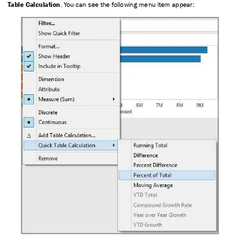
The first visualization that Tableau selects is a sum of SalesAmount. However, since we are interested in the measures of central tendency, we are interested in the average, median, and mode. We will calculate these values to perform a quick summary of the data and also to understand how much we can rely on one number, the mean, to summarize the data.
12. To calculate the average, simply click on the SalesAmount lozenge in the Rows shelf and click on the down arrow to show the menu. You can see this in the following screenshot:
13. The average sales amount is $486.09.
14. The average is calculated and visualized in a table. However, we would like to see the median as well. To do this, make sure that the SalesAmount pill is on the Rows shelf. 15. Right-click on the pill and select Median. The median SalesAmount is given
as 29.99.
16. Next, remove SalesAmount so that we have a clean canvas again.
17. Then, we need to calculate the mode, which can be defined as the number that occurs most frequently. To calculate the mode, we need to make a copy of
SalesAmount and make it a dimension. This is a workaround to help the Tableau user to work out how many times each price occurred. To do this, right-click on the
SalesAmount column in the Measures window and select Duplicate. You can see the menu item in the following screenshot:
18. Once you have duplicated the SalesAmount figure, you will see that the duplicate is
called SalesAmount (copy).
19. Next, drag SalesAmount (copy) to the Dimensions shelf in the Data sidebar so that the table works properly.
20. Drag the SalesAmount (copy) item to the Rows shelf.
57
22. This will give us the number of records for each sales amount. However, it is quite difficult to work out the most commonly-occurring sales amount from the table simply by looking at it. What we can do instead is sort the data so that the maximum is at the top, and the top item provides us with the mean.
23. To sort the data, go to the top of the Tableau interface and look for the horizontal bar chart symbol with the downward arrow. This will sort the data by the number of records in descending order. You can see this under the Server menu item, as highlighted in the following screenshot:
24. Once you've done this, drag the Number of Records item on to the Color shelf of the
Marks shelf. Once this is done, your screen should resemble the following screenshot:
25. The mode is actually the topmost number; the highest frequently occurring
SalesAmount is $4.99.
How it works…
To summarize, in this section, we learned the following:
f Basic calculations
f Changing the color
f Basic sorting
We can see that the average and median values are quite different. The mode is $4.99, but the median is $29.99. Since the average is much higher than the median and the mode is different from the other two numbers, the data is not symmetrical. Often, when business analysts look at data, they try to find out whether the data is close to a normal curve or not. The average, median, and mode help us to determine whether the data is close to a normal distribution or whether the data is shaped. Therefore, we can't just simply use the average to summarize the data; we need to know about the other items too. This helps us understand the skewedness of the data, or how far it is from the central measures.
There's more…
If you are interested in learning more about analyzing data and the normal curve, then you can take a look at http://en.wikipedia.org/wiki/Normal_curve.
If statistics interest you, why not look at doing a Khan Academy course? This is a free facility for learning statistics yourself online; refer to https://www.khanacademy.org/.
Dashboards and dates
In Business Intelligence, dates are an essential part of analysis, and they are an important part of Business Intelligence projects. Data warehouses, for example, have a Date dimension as a way of helping business users to describe their data by date. People's business questions often include a when element. Additionally, dashboards will often reference dates.
Comparison is fundamental to analysis. Time is a fundamental part of comparison.
Dashboards will often display comparisons between periods of time, so time is an essential part of the dashboard display. It is easy to envisage the following business questions that involve time:
f What are my numbers compared to last year?
f How did my sales region perform this month as compared to the last month?
59
This recipe explains how to use dates in order to analyze your data using the Dates functionality in Tableau. In the last recipe, we imported the FactInternetSales table. Once the FactInternetSales data has been imported, we will also do the same for the DimDate table. To analyze our data, we will perform the following actions:
f Join data together
f Activate links in relationships
f Date analysis in Tableau
Getting ready
We will continue to use the same Tableau workbook we set up in the first recipe. It was called Chapter 2.
How to do it...
1. We will connect to an Excel file called DimDate.xls and import it into Tableau's internal data store mechanism. To do this, navigate to Data | Connect to Data. 2. Then, select the link Microsoft Excel and a file browser will appear. Navigate to the
folder where you stored the downloaded Excel and CSV files. 3. Navigate to the DimDate.xls file and select it.
4. In the Excel Workbook Connection dialog box, change the Step 4 name so that it reads Connection_DimDate.
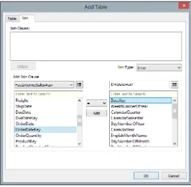
5. We have two data sources which will need to be joined together so that the data can be analyzed by date. We can join the DateKey and OrderDateKey columns together for the DimDate and FactInternetSales tables respectively. Make sure that the DateKey and OrderDateKey columns are both dimensions, not measures. So, ensure that both fields are contained in the Dimensions field; if not, drag them
from the Measures pane to the Dimensions pane. If they are measures, then we cannot join them.
6. To do this, we edit the relationship between the two tables. Ensure that you have selected the Connection_DimDate data source in the Data pane in the sidebar.
7. Next, go to the Data menu item and select Edit Relationships. You can see this illustrated in the following screenshot:
8. You can now see the Relationships dialog box. Click on Custom and then click on Add.
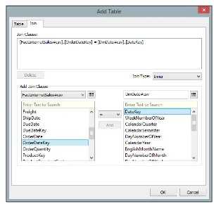
9. Next, you will see two columns: one for the DimDate columns and the other for the FactInternetSales columns. Each column represents a table, and the items in the list are source fields.
61
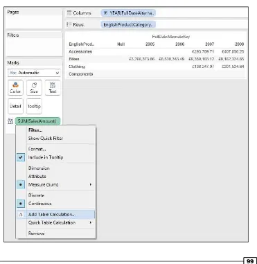
11. Let's create a new sheet by going to the tab at the foot of the worksheet with the worksheet name on it. Right-click to select Duplicate Sheet. Let's make the canvas clean again by removing all of the pills from the Columns, Rows, and Marks shelves. 12. Let's use the new worksheet to proceed.
13. In the Data pane, select the Connection_DimDate dimension. Select Calendar Year and drag it into the Rows shelf. Make sure it is set to the String data type by right-clicking on Calendar Year on the Data pane, then navigating to Change Data Type, and finally selecting String.
14. Next, click on the Connection_FactInternetSales connection and you will see a broken link symbol next to OrderDateKey. You can see this in the following screenshot:
15. We need to make the relationship between the data sources active. If we don't, then the data sources will not be related to one another and our analysis will not make sense. To activate the link, click on the broken chain; it will go red and change to a whole link. The following is an example:
16. Staying in the FactInternetSales table, drag the SalesAmount column from the
63
17. If you break the link by clicking on it again, then you will notice that the figures change. Each calendar year is now set to 29,358,677, rather than the figures shown in the previous screenshot. This is because the link between the tables is now broken, so Tableau cannot sum the data according to the years; instead, it issues a query to both data sources and simply returns the product of the total.
18. Let's look at what happens if we use a different aggregation, count distinct. This returns a count of the distinct SalesAmount values. When we link the
OrderDateKey column and select Count Distinct for the SalesAmount figure,
Tableau turns the SalesAmount pill to red and grays out the whole screen. You can see an example of this in the following screenshot:
19. In Tableau 8, the aggregation is considered not valid, so Tableau saves the user from themselves by graying out the screen until it is fixed. You have the facility to undo the last step. To do this, press Ctrl + Z.
How it works…
Tableau allows business users to enrich their data through the addition of calculations that get stored as part of the workbook. This is useful for data analysis, since we can look and see how simple steps can quickly affect the data.