Japikse
ay
•WhatWindows8.1andWinRTarecapableofandwhytheyarespecial
•WaystouseadvancedfeaturestocreateimmersiveandengagingWindows8.1applications •Howtocreateapplicationsthatworkseamlesslyontabletsandcomputers
For your convenience Apress has placed some of the front
matter material after the index. Please use the Bookmarks
Contents at a Glance
About the Authors ... xvii
About the Technical Reviewers ... xix
Acknowledgments ... xxi
Chapter 1: Getting Started
■
...1
Chapter 2: Building Your First Windows 8 App
■
...25
Chapter 3: Themes, Panels, and Controls
■
...45
Chapter 4: Binding
■
...79
Chapter 5: Views
■
...99
Chapter 6: Local Data
■
...131
Chapter 7: Remote Data and Services
■
...159
Chapter 8: Search and Share Contracts
■
...187
Chapter 9: Notifications
■
...209
Chapter 10: Application Life Cycle
■
...261
Chapter 11: Making Money
■
...277
Chapter 12: Publishing Your App
■
...295
1
Getting Started
Windows 8.1 development with C# and XAML carries a lot of similarities with developing Windows Presentation Foundation (WPF) applications. Well, they both use XAML and C#. And many of your existing skills with user interfaces (UIs) and program code can be leveraged for Windows 8.1 apps. But there are a lot of differences, as well. Windows 8.1 apps are touch-centric (but also support mouse and keyboard interactions). There are specific design guidelines, quite contrary to WPF development. The isolation level for Windows 8.1 apps is much higher than WPF, presenting a new level of safety and security, as well as unique challenges when working with data. Apps are deployed through a central store (as opposed to click-once deployment or Microsoft Installer packages).
Not a WPF developer? No worries! This book will take you through everything you need to know to build Windows 8.1 apps.
Background
Microsoft released the latest revision of its Windows operating system, Windows 8.0, on October 26, 2012. This release was groundbreaking for several reasons, but at the top of the list were the dual interfaces of Windows 8 and support for ARM devices.
Dual User Interfaces
The original release of Windows 8.0 introduced two UIs—the desktop for Intel-based hardware and the tiled interface (formerly called Metro) not only for Intel-based hardware, but also ARM-based hardware, a first for Windows.
The desktop UI, simply put, is a better version of Windows 7. The install is much smaller (I regained 6 GB of hard disk space when I upgraded), it’s even more secure, and it runs faster on the same hardware that was supported by Windows 7.
The tiled UI was completely reimagined for Windows 8.0. Although the same type of tiled interface had
previously been used in the Windows Phone operating system, this was the first time that a non-phone-based version of Windows had a major change in many, many years.
ARM Support
Acceptance
How did this dramatic change go over in the first year? If you listen to the press and the analysts, terrible. Not with the operating system itself, but with the response from the masses. From “Where is my Start menu?” to “How do I print?,” there were outcries about moved cheese and change. Were they legitimate complaints? It depends on your point of view, but the quick release of Windows 8.1 bringing back the Start button and addressing some of the most common complaints certainly adds credence to those people who weren’t happy with the original version.
Interestingly enough, in looking at the numbers from several different sites, Windows 8 adoption in the first year rivals that of XP adoption in its first year. And if you are old enough to remember the Windows 95 revolution and the outcry at that release, this is same old same old. Things change, people freak out, and then after the initial shock, they settle down and start using the new software.
Fast-Release Cycle
Less than one year after the release of Windows 8, Microsoft released Windows 8.1 on October 17, 2013. Much more than a service pack, this release addressed many of the issues that people were complaining about, such as the return of the Start button and the ability to boot straight to desktop mode. Made freely available through the Microsoft Store, the install rate for Windows 8.1 has been extremely high.
The Microsoft Store
How many times have you had to do tech support for a family member because he clicked on some random pop-up on the Internet, or installed some software that a friend told him about? The main mechanism for getting apps is from the Microsoft Store. Having that one central place to get apps for Windows 8/8.1 helps prevent rogue software from getting installed, increasing the security and reliability of the device. It also provides a centralized location for developers to place their app for others to find. For more information about submitting your app to the Microsoft Store, please see Chapter 12.
What’s New in Windows 8.1
There are a lot of changes between Windows 8.0 and Windows 8.1. At the top of each chapter in this book, look for the “What’s New in Windows 8.1” sidebar to get a high-level overview of the changes in Windows 8.1 concerning the chapter’s topic. The chapters themselves are dedicated to using Visual Studio 2013 and Windows 8.1, with detailed information is included in the body of each chapter.
Windows Design Guidelines
In order to get your apps accepted into the store, you must make sure they meet the seven traits of a great app and also follow the five Microsoft design principles. There are additional technical requirements that will be discussed in Chapter 11.
3
Feel like it is connected and alive
•
Modern apps can be run on a variety of devices with a wide range of capabilities. While Microsoft has set minimum standards for all hardware that carries the Windows 8 logo, it’s important for the success of your app (as well as the success of Windows 8) that your app doesn’t perform poorly or cause the hardware to perform poorly. You will see as you work your way through this book that in order to develop Windows 8.1 applications, you must use asynchronous programming to ensure a responsive UI. Additionally, the very design of the Windows 8.1 process lifetime
management cycle ensures that background apps don’t drain the battery or use up precious system resources. Use the async pattern liberally. If your app is taking a long time to load or to run, people will uninstall it. Or, worse yet, they will write a scathing review and then uninstall it.
Sizing Beautifully
Windows 8 devices come in a variety of sizes and screen resolutions. Apps can be run in a landscape or portrait view as well as resized to share the screen with other apps. Your app needs to able to adjust to different layouts and sizes, not only in appearance but also in usability. For example, if you have a screen showing a lot of data in a grid, when your app gets pinned to one side or the other, that grid should turn into a list.
Using the Right Contracts
Windows 8 introduces a completely new way to interact with the operating system and other applications. Contracts include Search, Share, Settings. By leveraging these contracts, you expose additional capabilities into your app in a manner that is very familiar to your users.
Investing in a Great Tile
Tiles are the entry point into your applications. A live tile can draw users into an app and increase the interest and time spent using it. Too-many updates can lead them to turn off updates, or worse yet, uninstall your app.
Secondary tiles are a great way for users to pin specific information to their Start screen to enable quick access to items of their interest.
Feeling like It Is Connected and Alive
Roaming to the Cloud
Windows 8 allows the user the capability to share data between devices. Not only can application settings be synced but so can the application data. Imagine the surprise for a user who enters some data into your app at work and then picks up another Windows 8 device at home, starts your app, and the data is right there.
It is important to leverage the cloud whenever possible to make transitioning from one device to another as seamless as possible.
Embracing the Modern App Design Principles
In addition to the traits just mentioned, your app must meet the modern app design principles. Microsoft’s full list can be found here: http://go.microsoft.com/fwlink/p/?linkid=258743. A brief summary of the five principles follows:
• Show pride in craftsmanship: This is fairly simple. Pardon the vernacular, but just don’t build crappy software. Build software that you would be willing to list on your resume. If you’re making an app in order to make money, you will want people to use it, to “like” it on social media, to show it off to their friends. These things are important unless you have a huge marketing budget, but even then that will only get first-time users. Once word gets out that the app isn’t very good (and remember there is a rating system in the Microsoft Store), your app is done.
So, make sure it works. Consider hiring a graphic designer if you’re not design inclined. Let users test it (consider friends and family). Get feedback. Fix the problems—whether the problems are bugs or user-experience issues.
• Be fast and fluid: Microsoft is serious about this one, having listed it here and in the traits for a great app. In addition to the traits previously listed, design for touch and intuitive interaction. Be responsive to user interaction, and make a UI that is immersive and compelling.
• Be authentically digital: Take full advantage the capabilities of the device. Use bold colors, beautiful typography, and animations. Of course, use all of the effects (especially motion) with purpose. Just because you can add flaming arrows shooting across the screen doesn’t mean you should!
• Do more with less: Chrome may look great on a motorcycle, but in software, it just distracts users from what they care about, which is the data. Instead of buttons and tabs, leverage the app bar and nav bar. Take advantage of the charms and contracts to reduce even more chrome. Focus the functionality of your app. Don’t try to solve all problems. Just solve one or two really well. Be focused on that solution, and do your best to immerse your users in their data, not the app.
• Win as one: Work with the Windows 8 paradigm. Leverage common touch gestures and familiar mouse and keyboard themes so your users can leverage what they already know. Work with other apps through contracts so that your app can become bigger than just the sum of its parts.
UX Guidelines
There are many more guidelines suggested by Microsoft. For the full guidelines,
5
Tooling
While you can certainly remain in Visual Studio the entire time you are developing your app, leveraging a
combination of the available tooling provides the best experience. For developing Windows 8 applications, the two main tools you will use are Visual Studio 2013 and Blend for Visual Studio 2013.
Visual Studio 2013
In November of 2013, Microsoft released Visual Studio 2013. Among the changes in the latest version of Visual Studio is support for creating Windows 8.1 apps. This is a mandatory upgrade, as Visual Studio 2012 will not support building apps for Windows 8.1.
Versions
If you are reading this book, then you are probably very familiar with Visual Studio. In this section, I’ll talk about the different versions of Visual Studio 2013 available to you and some of the differences between them. If you aren’t very familiar with Visual Studio, don’t worry. As we move through the chapters of this book, the relevant features will be discussed in greater detail.
Visual Studio Express
Visual Studio Express 2013 is now separated by the target platform. Although I haven’t seen any official
communication as to why, I think it was just too big to keep it in one free download, and people who were new to Visual Studio were getting lost in all of the features.
The available versions are:
• Visual Studio 2013 Express for Web: for ASP.NET developers
• Visual Studio 2013 Express for Windows: for Windows 8.1 app developers
• Visual Studio 2013 Express for Windows Desktop: for Windows Client application developers using Windows Presentation Foundation (WPF) or WinForms
For the purposes of this book (and creating Windows 8.1 apps), you will need Visual Studio Express 2013 for Windows.
Visual Studio with MSDN
There are essentially three paid versions of Visual Studio 2013 for developers: Professional, Premium, and Ultimate. All of them are part of MSDN and provide everything you need for developing Windows 8.1 apps plus a whole lot more. Note that there is also a fourth version, Visual Studio for Test Professional, but it doesn’t apply to building Windows 8.1 apps, so we don’t discuss it here. For all of the nitty-gritty details of what’s in each version, see the documentation on the Visual Studio site here: www.visualstudio.com/products/compare-visual-studio-products-vs.
The Windows 8.1 Simulator
Creating Your First Windows 8.1 App
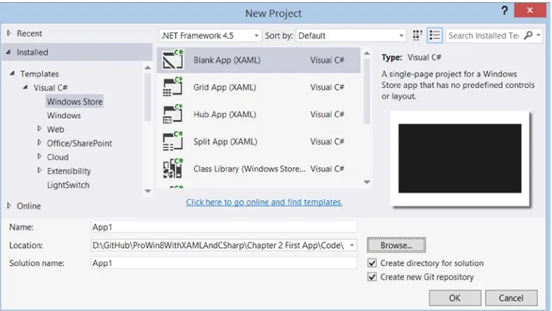
To create a Windows 8.1 app, create a new project in Visual Studio 2013 by selecting File ➤ New ➤ Project. In the left rail, you will see all of the installed templates for your Visual Studio installation (your mileage may vary based on version you installed and what third-part products you use). Select Installed ➤ Templates ➤ Visual C#➤ Windows Store, and you will be presented with the dialog shown in Figure 1-1.
Figure 1-1. New Project templates for Windows 8.1 apps
In Chapter 4, we will go into great detail for all of the project templates, so for now, just select Blank App (XAML). In fact, this will be the starting template for most of our projects in this book, and is the template I typically start with when I develop Windows 8.1 apps. You can leave the project name as the default App1.
7
To run the app, you can press F5 (to start with debugging), Ctl-F5 (to start without debugging), click on Debug in the menu (to be presented with the same options), or click the toolbar item with the green arrow (as shown in Figure 1-3).
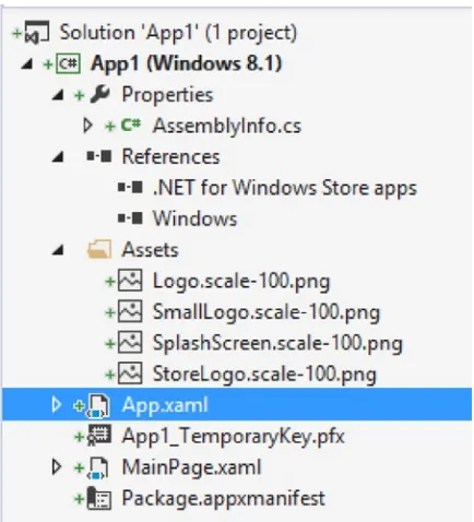
Figure 1-2. Default Solution Explorer files
Figure 1-3. Run toolbar utility
Turning this off is very simple—you just open App.xaml.cs, and in the OnLaunched event handler, comment out this line of code:
this.DebugSettings.EnableFrameRateCounter = true;
so that it looks like this:
//this.DebugSettings.EnableFrameRateCounter = true;
Now, when you run you app in debug mode, the numbers are no longer displayed.
Adding a Basic Page
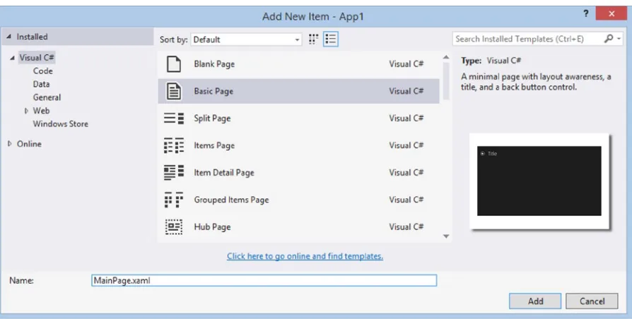
Even though I typically start with the Blank App template, I rarely keep the supplied MainPage.xaml (and its code behind file MainPage.xaml.cs). Visual Studio provides a Basic Page file template that provides a lot of necessary functionality. Delete the MainPage.xaml (we will be replacing this), and right-click your project and select Add ➤ New Item. From the Add New Item—App 1 dialog, select the Basic Page and name the page MainPage.xaml, as shown in Figure 1-5.
9
Note
■
We call it
MainPage.xamlso we don’t have to change
App.xaml.cs. If you want to call the files something else
(or change the page that gets loaded when an app first starts, open
App.xaml.cs, navigate to the end of the OnLaunched
event handler, and change the following line to the name of the page you added:
rootFrame.Navigate(typeof(MainPage), e.Arguments);
Figure 1-5. Adding a new Basic Page
The Simulator Controls
Most of the simulator controls are very self-explanatory, but I struggled in my early days of Windows 8 apps to remember what each icon stood for, so I’ve listed the explanations here to help you out.
Minimize the simulator
Always keep the simulator on top
The touch modes in the simulator are important to be able to test your app’s responsiveness to touch if you don’t own (or develop on) a touch device. The mouse mode button takes you back out of touch mode to keyboard and mouse mode.
Mouse mode
11
Basic touch mode, pinch/zoom touch mode, rotation touch mode
The rotation and resolution controls help testing by responding to different orientations and form factors.
Rotate clockwise (90 degrees)/rotate counterclockwise (90 degrees)
Change the resolution
If you are building a location-aware application, you can test that by setting the location that is sent to the app from the hardware.
Set location
The screenshot commands are invaluable for the submission process, as you will see in Chapter 12. They are also useful to create screenshots for building documentation, advertising your app on your website, and so on.
Copy screenshot/screenshot settings
The network control allows for testing occasionally connected scenarios, bandwidth usage, and making other networks variables.
Change network properties
Blend for Visual Studio 2013
Expression Blend has long been a staple of the WPF developer. Long sold as a separate product from Visual Studio, it was part of the Expression suite. Starting with Visual Studio 2012, Blend for Visual Studio was released as a free companion application for Visual Studio. Unfortunately, the first iteration left the XAML developer behind in the dust and completely focused on the HTML/JavaScript developers for Windows 8 apps.
That has been fixed, and Blend for Visual Studio 2013 is now back with a vengeance to help XAML developers. To open your project in Blend, you can right-click on any XAML file in Visual Studio 2013 and select Open in Blend. This will open not just the file that you selected but also the entire project/solution.
Many of the features of Blend are covered in subsequent chapters, but some of the biggest benefits of using Blend are: Full control of your UI in a compact layout—the Visual Studio XAML designer pales in
•
comparison to what can be accomplished in Blend. While I am not a designer (and don’t make any claims to having design skills), Blend has enabled me to make much-better-looking UIs as well as to make changes much faster than in Visual Studio (regardless of being in design or XAML mode in Visual Studio).
The ability to easily add animations, gradients, and styles to your app/page
•
The ability to quickly add states to your page (for layout updates) and state recording
•
The ability to view your page in many layouts and form factors (much like the Simulator, but
•
without the benefit of the page running—WinJS/HTML developers still have the advantage here) Additionally, Visual Studio and Blend for Visual Studio keep your files in sync. If you have your project open in both, when you make changes (and save them) to your app/pages in one program, switching to the other program will prompt you to reload. Make sure that you actually save the changes, as making changes in both without saving will result in concurrency problems.
Opening Your Project in Blend for Visual Studio
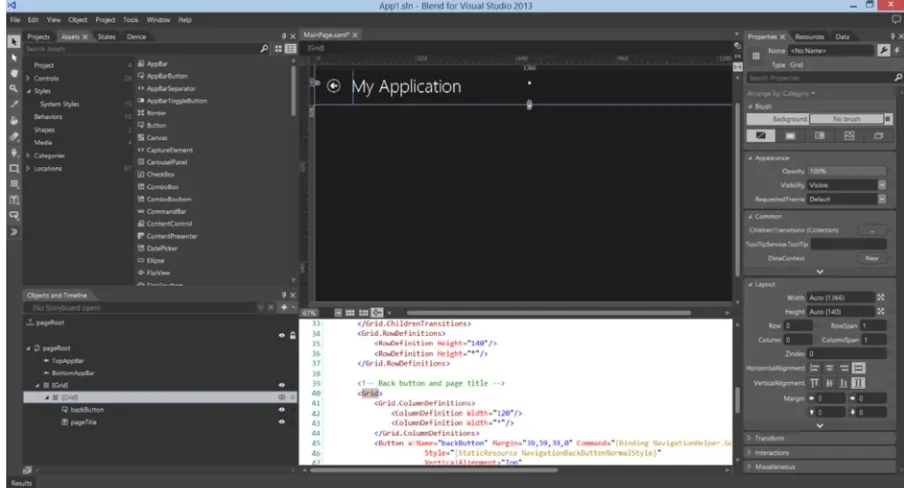
Visual Studio and Blend work extremely well together. To open your project in Blend, right-click on the
MainPage.xaml in your project and select Open in Blend (see Figure 1-7).
Figure 1-7. Opening a file in Blend
13
That’s a lot of windows, but at least in the default layout (much like Visual Studio, you can change the layout to suit your needs). Let’s look at them in a little more detail.
Projects, Assets, States, and Device Tabs
The top-left corner of the window contains the Projects, Assets, States, and Device tabs, which allow you to do the following processes:
The Projects tab shows all of the files in your solution (much like Solution Explorer in Visual
•
Studio). Nothing too exciting to report here.
The Assets tab lists all of the assets available to add to your page. Think of this as a
•
turbo-charged Visual Studio Toolbox. In addition to controls and panels that you can add to your page, you can also add (and modify) styles, behaviors, and media.
The States tab allows you to add the Visual State Manager XAML as well as Visual State groups
•
to your page. It also allows for easy addition of transitions for your visual states.
The Device tab allows you to change the resolution and orientation as well as connected edges
•
(more on this in subsequent chapters). You can also change the theme (between light and dark) as well as the minimum width.
Objects and Timeline
The Objects and Timeline panel (lower left) provides the document outline as well as the ability to add and modify storyboards (to be used in conjunction with the Visual State Manager).
Page Designer, Markup, and Code
The center of the workspace is the designer and code editor. Just like in Visual Studio, you can have a split view, all design, or all markup. You can also load code files into the center pane. While you get features like Intellisense, the development experience doesn’t contain all of the great features of Visual Studio like navigation and refactoring. Plus, you lose any productivity plug-ins like Telerik’s JustCode that you might have installed in Visual Studio.
Properties, Resources, and Data Tabs
The right rail of the workspace contains the Properties, Resources, and Data tabs, which can be described as follows: The Properties tab is where I spend a significant portion of my time in Blend. In addition to
•
the simple items like Name and Layout and properties like Width and Height, there are a host of properties that are difficult to set by hand in markup. Brushes, Transforms, and Interactions can all be set using the Properties panel.
The Resources tab contains all of the application and page-level resources as well the option
•
to edit and add more resources.
The Data tab allows you to set the data context for your page, create sample data, and create
•
different data sources. This is helpful to see what the page will look like with data at design time instead of always having to run the app.
Blend for Visual Studio is an extremely powerful tool and it would take an entire book to discuss all of the features. My development workflow involves keeping both Visual Studio and Blend open at the same time, and I switch back and forth depending on what I am trying to accomplish. Explore Blend, and see what works best for you.
Git
Software version control has been around for a long time. If you have been in the Microsoft space for a significant length of time, you might remember Visual Source Safe. In the .NET world, the MS developer was left with Team Foundation Server (TFS) as the only integrated source-code-management (SCM) system.
TFS is a powerful application lifecycle management (ALM) tool (including project management, bug tracking, SCM, and other components). That is a lot of tooling when you are only looking for SCM. The SCM portion of TFS is Team Foundation Version Control (TFVC) and is a centralized SCM system. This means that a single repository is the source of record, and all developers check their code in and out of this single repository. Later versions of TFVC have included the capability to shelve work and create branches, providing some isolation for work in progress.
Git, developed by Linus Torvalds in 2005 for the Linux kernel, is a distributed version control system (DVCS). This means that every developer using Git has a full-fledged repository on his local machine with complete history and tracking capabilities. Many Git users (especially in a team environment) have a central repository in addition to their local repository. This frees the developer to spike different ideas, work on features independent of the rest of the team, and check in rapidly as often as they like without worrying about network latency or affecting other team members.
Which SCM system you choose to use is completely up to you. They both have their merits (and there are many other SCM systems available to you as well that are very effective in what they do). It’s more how you work and whom you work with that usually determines which system to use. So why do I bring up Git specifically in this book? Because if you are a single developer creating a Windows 8 app, Git is custom tailored to you, and with Visual Studio 2013 (and updated to Visual Studio 2012), Git support is now included.
There are entire books written about effectively using Git, so this is just a quick look into the Visual Studio integration, and not a treatise on DVCS.
Using Git in Visual Studio
15
GitHub for Windows
The easiest way to start working with Git if you are new to the system is to install GitHub for Windows, which is available from https://windows.github.com/. Creating a new repository is as easy as clicking on the Create button in GitHub for Windows. Once Visual Studio is configured to use Git, any projects created inside an existing repo will automatically tie into the Git repo.
Enabling Git in Visual Studio 2013
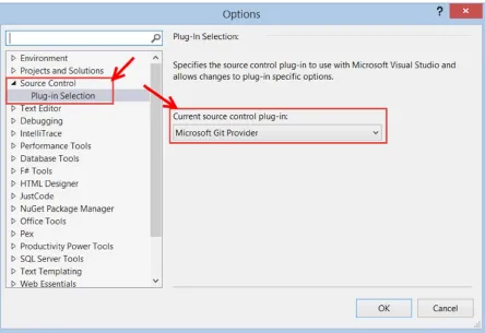
The first step to using Git with your project is to enable the Microsoft Git Provider. Do this by selecting Tools ➤
Options ➤ Source Control ➤ Plug-in Selection, and then select the Microsoft Git Provider for the Current source control plug-in, as in Figure 1-9.
Figure 1-9. Selecting the Microsoft Git Provider
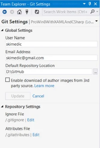
Selecting Team Explorer (View ➤ Team Explorer) in the right rail of Visual Studio (the default location) allows you to manage your local Git repository. By default, VS 2013 creates the appropriate Git ignore files so local files such as
This is also where you enter your username and e-mail address as well as the default Git directory, as shown in Figure 1-11.
Figure 1-10. Accessing the Git repository settings
17
Checking in Changes
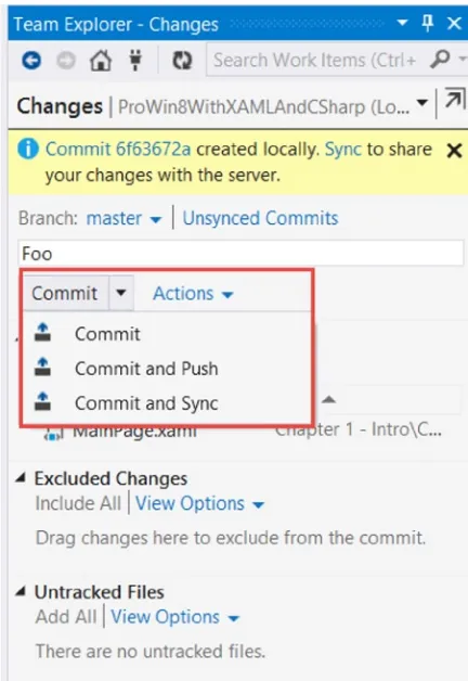
To check in changes, select Changes from the same menu, as shown in Figure 1-10. You will see changes that will be included in this check-in and excluded changes as well as untracked files. To commit the changes, enter a comment in the text box with the watermark “Enter a commit message <Required>” and click on Commit. You can also Commit and Push to a remote repository to share your changes, or Commit and Sync with a remote repository to share your changes and get the latest version from the remote repository as shown in Figure 1-12.
Figure 1-12. Committing changes to the local repository
Remote Repositories
There are many places where you can host remote Git repositories, with the most popular being GitHub
Reverting Changes
If you totally mess up while developing, Git makes it very easy to restore from the repository. Right-click on your file in Solution Explorer and you will see the Git features exposed: Undo, View History, Compare with Unmodified, and Commit (see Figure 1-14). Undo does just what it says—it throws away your changes and restores the file from the repository. It’s like your own personal security blanket!
Figure 1-13. Publishing to a remote repository
Figure 1-14. Git functions exposed through Solution Explorer
19
NuGet
From the official NuGet site (www.nuget.org): “NuGet is the package manager for the Microsoft development platform including .NET. The NuGet client tools provide the ability to produce and consume packages. The NuGet Gallery is the central package repository used by all package authors and consumers.”
Instead of scouring the web for tools to add into Visual Studio, you can use NuGet as a single source to get a wide variety of add-ins for your solution. Rather than installing the tools on your development machine, the packages are installed at the solution level. This permits different versions to coexist on the same developer machine.
Another very large advantage to NuGet is that each package lists its dependencies within its package manifest. When a package is installed through NuGet, all of its dependencies get installed as well.
Yet another benefit of NuGet is the ability to create private NuGet package sources. To change the source, select Tools ➤ Options ➤ NuGet Package Manager ➤ Package Sources, as in Figure 1-15.
Figure 1-15. NuGet Package Source dialog
Installing NuGet
In the off chance that NuGet wasn’t preinstalled with Visual Studio, installation is easy. It’s available in the Visual Studio Extension Gallery (accessible from Tools ➤ Extensions and Updates).
Enabling Package Restore
Package Restore is a feature that can significantly decrease the size of your project when shipping source code (note that this doesn’t affect checking in/out of your SCM system). All of the NuGet packages are contained in a folder in your solution aptly named “Packages.” By default, Windows 8.1 projects don’t have many packages installed, but if you create an ASP.NET project, you will see a lot of packages, only some of which are used by default.
To enable Package Restore, right-click on your solution (note that it is not the project file) and select Enable NuGet Package Restore. You will be prompted with a series of dialogs. as shown in Figures 1-17 through 1-19.
Figure 1-16. Installing NuGet Package Manager
21
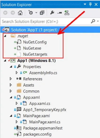
Once you have enabled Package Restore, you will see the changes to your project as shown in Figure 1-20.
Figure 1-19. Confirmation dialog
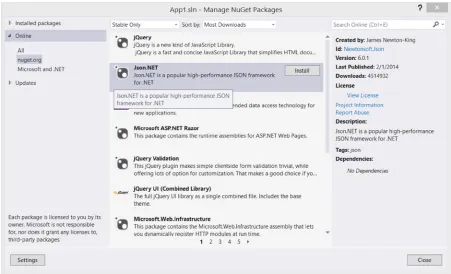
Installing Your First Package
One of the “Can’t live without” packages for developing Windows 8.1 apps is Newtonsoft’s Json.NET. We’ll use Json. NET later in this book, but for now, let’s just get it installed. There are two ways to install packages—by using the Package Manager Console command line or by using the Package Manager GUI.
Installing from the Command Line
Access the Package Manager Console by selecting View Ȩ Other Windows Ȩ Package Manager Console if it isn’t currently visible in the bottom rail of Visual Studio.
Type “install-package newtonsoft.json” and you’ll see the dialog shown in Figure 1-21. At the time of this writing, 6.0.1 is the current version. NuGet will install the current version unless you specify a version. Another benefit of using NuGet.
23
Select Online in the left rail and enter Json.NET in the search dialog. You will see results similar to Figure 1-23. Merely click install to install Json.NET.
Figure 1-21. Command line installation of Json.NET
Figure 1-22. Launching the NuGet GUI
Installing from the Graphical User Interface
Installing from the graphical user interface (GUI) is very simple, and provides a search mechanism if you don’t know the exact name of the package that you are looking for. For example, everyone refers to the package as “Json.NET.” The actual package name in NuGet is “newtonsoft.json.” This is a great example of where the search in the NuGet GUI is very helpful.
Summary
Windows 8 apps represent a very large paradigm shift from traditional Windows desktop applications (such as WPF or WinForm) or web apps (such as ASP.NET Webforms or MVC). Whereas traditional applications were developed with a wide range of tools but no real design guidelines and no expectations of performance, Windows 8.1 apps must meet a series of expectations, both in terms of UI design and app performance. They are distributed through the Microsoft Store after a stringent certification process.
Developing Windows 8 apps involves a lot more than just Visual Studio. Blend for Visual Studio helps build compelling UIs, Git provides security for your source code, and NuGet enables easy addition of packages and add-ons to Visual Studio.
Now that you know the tools to use, let’s build that first app!
25
Building Your First Windows 8 App
Chapter 1 covered the design guidelines as well as the tooling commonly used to build Windows 8.1 apps. In this chapter, we will cover some of the core principles of Windows 8.1, including its architecture, all of the many parts of its apps in Visual Studio, the Model-View-ViewModel pattern, and navigation. All in the context of building your first Windows 8.1 app.
Windows Architecture (For Developers)
There are many options when choosing how to develop apps that can run on Windows 8.1 machines as you can see in Figure 2-1, and even more options when those Windows 8.1 machines are based on the x86 or x64 chipset.
Figure 2-1. Windows architecture
You can also develop applications for the desktop mode of Windows 8 on non-ARM-based devices (such as the Surface Pro). In desktop mode, you can still develop “traditional” applications such as smart client and browser-based ones, using all of the tools that you are familiar with such as Windows Presentation Foundation, ASP.NET, and even Silverlight and Winforms. For all of these topics, Apress has many books that can help you become even better with many great books on these subjects. (See www.apress.com for the full Apress catalog.)
Creating Your First App
To create our first app, let’s start Visual Studio and select File ➤ New ➤ New Project, and then select Templates ➤
Visual C# ➤ Windows Store. We’ll talk about the different templates in later chapters, but for now just select the Blank App and leave the default name as App1, as in Figure 2-2.
Figure 2-2. Creating a new Windows 8.1 app
Let’s look at the nodes and files that are created as part of the template. Much of the project should be familiar to you.
App Project Overview
27
Properties
Under the Properties node in the New Project template is the AssemblyInfo.cs file, the standard metainformation container for C# projects. Feel free to update the information such as description, copyright, and so on. Most of this information isn’t necessary for modern apps, but I tend to update the information anyway out of habit.
References
The template also includes the standard References node, which is prepopulated with two references: .NET for Windows Store apps and Windows. These references provide that vast majority of functionality, as diagrammed in Figure 2-1, and must be included. Throughout this book, we will add additional references to supplement the default features available to us.
Assets
There is also the Assets folder, which contains all of the images that are part of your application. The tile images and splash screen graphics go in this folder as well as any other images or assets that need to be packaged with your app when it gets deployed. Click on one of the images in Solution Explorer (such as Logo.scale-100.png) and press F4 to view the properties. The Build Action for the images is set to Content and set not to copy to the Output directory, as in Figure 2-4. Alternatively, you can have the content copied to the Output directory or run a custom tool, although you will not want to do that for the images.
App1_TemporaryKey.pfx
App1_TemporaryKey.pfx (named after the app name—App1 in our case) is the developer license information for the app. We’ll update this when we work with push notifications as well as when we get ready to submit our app to the Microsoft Store later in this book.
Package.appxmanifest
Package.appxmanifest contains six tabs that describe your application that we will go on to look at. The actual manifest file is an XML file, but Visual Studio provides a nice GUI to work with the elements in the file, saving us from having to memorize the format or definitions. Double-click on the Package.appxmanifest file to open it up in the Visual Studio editor.
The Application Tab
The Application tab largely replaces the AssemblyInfo.cs, but also provides many more options, as shown in Figure 2-5. The top section includes the Display Name, Entry Point, Default Language, and Description.
29
The next section under the tab is for the supported rotations, or the layout. You can select the rotations as well as the minimum width. For the layout preferences, if all of the options are checked (or none of them checked, as in the default), then all rotations are supported. If only some of the layouts are checked, such as Portrait and Portrait-Flipped, the app will not rotate when a tablet is changed from Portrait to Landscape. If the hardware does not support rotation (such as a traditional laptop), then the setting is essentially meaningless. The following section, Minimum Width, will be covered in detail in Chapter 5.
The first category, Notifications, has two sections, Toast Capable and Lock Screen notifications, which are covered in Chapter 9. The next category, Tile Update, provides a mechanism to enter Uri details for the source for notifications using a polling mechanism (instead of push notifications).
The Visual Assets Tab
The Visual Assets tab (shown in Figure 2-6) is where you set the Tile Images and Logo, Splash Screen, and Badge Logo, as well as text that can appear on the different tiles. The splash screen is what is shown as your app is activated. The default image is the white box on a dark screen. Select Splash Screen in the left rail to set a new splash screen for your app. By default, any images specified here should be stored in the Assets folder previously discussed. The other features of this screen are covered in detail in Chapter 9.
The Capabilities Tab
The Capabilities tab (shown in Figure 2-7) is where you specify what features you would like the user to allow when she installs your app. By default, Internet (Client) is checked and doesn’t require the user to accept the capability (it’s assumed that Windows 8.1 apps can connect to the Internet).
Figure 2-6. Visual Assets tab
31
When users install your app, they will be prompted to allow or deny all of the Capabilities (such as the webcam, the libraries, and so forth). Those Capabilities will also get placed into the settings charm under permissions so that users can change their mind after installation.
The Declarations Tab
The Declarations tab (shown in Figure 2-8) adds additional capabilities to your app, such as Background Tasks and File Open and Save pickers, as well as Search and Share Target. Note that Share Target is just below Search, but due to scrolling doesn’t appear in the image. Many of these features are also covered in later chapters.
Figure 2-8. Declarations tab
The Content URIs Tab
The Content URIs tab is where you can specify an external web page that is permitted to fire the ScriptNotify event. Although we cover push notifications in Chapter 9, we use Azure Mobile Services instead of the mechanisms provided here, so this tab isn’t covered in this book.
The Packaging Tab
App.xaml
The App.xaml file (and the related App.xaml.cs code behind file) is the entry point for your application. We will spend a lot of time in the code behind file throughout this book. For this example, we will simply comment out the following line of code in the OnLaunched event handler to turn off the frame rate counter.
this.DebugSettings.EnableFrameRateCounter = true;
Open up App.xaml.cs, navigate to the OnLaunched event handler, and add two slashes to the beginning of the line as such:
//this.DebugSettings.EnableFrameRateCounter = true;
MainPage.xaml
MainPage.xaml is a blank page, and is the default UI page. As in Chapter 1, we want to delete this page and add a new Basic Page to provide us the additional benefits of the SuspensionManager, NavigationHelper, and more. Remember to add the new Basic Page with the name MainPage.xaml, or alternatively update App.xaml.cs to load your new page in the OnLaunched event handler; for example, if you named your new page NewPage.xaml, change this line
rootFrame.Navigate(typeof(MainPage), e.Arguments);
to this:
rootFrame.Navigate(typeof(NewPage), e.Arguments);
Model View ViewModel (MVVM)
The Model-View-ViewModel (MVVM) pattern is wildly popular among XAML developers. Derived from Martin Fowler’s Presentation Model pattern, it leverages many Windows 8.1- and XAML-specific capabilities to make development cleaner. It is so popular that there are a host of open-source frameworks available, and the pattern has even spilled over from XAML to web developers.
The Pattern
The goal of MVVM is to increase the separation of concerns between the layers of your app, increase testability, and promote code reuse. In this chapter, we will just scratch the surface of the pattern, starting with a brief explanation of the parts.
Model
33
View
The view is the window (such as MainPage.xaml). The view shows data to the user and also takes input from the user. Beyond that, there shouldn’t be any other intelligence behind the view. Often, MVVM proponents strive for zero code behind. My opinion (and this is not meant to start an architectural debate) is that removing code from the code behind is a pleasant side effect of implementing MVVM properly, but not the goal. But, either way, the view becomes very lightweight.
ViewModel
The ViewModel performs two functions in the MVVM pattern in an XAML world (it’s a bit different in the web world): The first function is to be a transport mechanism for the model required for the window.
•
There is typically a one-to-one correlation between windows and ViewModels in my code, but architectural differences exist, and your mileage may vary.
The second job is to act as the controller for the view and the model, receiving the user actions
•
from the view and brokering them accordingly.
ViewModels should also be very lightweight and leverage other classes such as commands and repositories to handle the heavy lifting.
Creating a Model
Let’s start with the model. Add a new folder to your app named Models by right-clicking your project and selecting Add ➤ New Folder. Next, add a new Class file named Customer by right-clicking on the new project and selecting Add ➤ New Item, as in Figure 2-9.
Adding Customer Properties
For this simple example, we are only going to have two properties, a first name and a last name. We need to have backing properties to handle INotifyPropertyChanged events (as we will see in the next section). To create these properties, open up Customer.cs and add the following code:
public class Customer
In the setters, we check to see w the value is different before setting it and updating the backing property. This is to save on calls to the PropertyChanged event as we will see in the next subsection.
INotifyPropertyChanged
35
namespace System.ComponentModel {
public interface INotifyPropertyChanged {
event PropertyChangedEventHandler PropertyChanged; }
}
To implement this interface, add a using for System.ComponentModel to the Customer class, and then add the interface and the event. The resulting code is shown next with the property setters and getters omitted for brevity:
using System.ComponentModel;
public class Customer : INotifyPropertyChanged {
// omitted for brevity
public event PropertyChangedEventHandler PropertyChanged; }
Next, we need to implement the event, and we want to make sure something is listening before firing the event off. Add a using for System.Runtime.CompilerServices as follows:
using System.Runtime.CompilerServices;
Then, add the code for the OnPropertyChanged method:
internal void OnPropertyChanged([CallerMemberName] string member = "") {
if (PropertyChanged != null) {
PropertyChanged(this, new PropertyChangedEventArgs(member)); }
}
The PropertyChanged event informs the binding engine to reinspect the data source for the property sent in the event arguments. You can also include the empty string, which will ask the binding engine to refresh all bindings on the Custom object. The attribute CallerMemberName will pass in the method name that executed the OnPropertyChanged method. For our purposes, we want the setters for each of the properties to call
OnPropertyChanged when a value on the model is updated (but not when it is set to the same value; hence the added check that we did in the previous step). The full code is listed here:
set
PropertyChanged(this, new PropertyChangedEventArgs(member)); }
}
public event PropertyChangedEventHandler PropertyChanged; }
Creating the ViewModel
We are going to create a very simple ViewModel that starts by wrapping a Customer instance. In real-world examples, you would have ObservableCollections (discussed later in the book) and probably more than one model type in your window. As we are just showing the pattern here, we are going to keep things very simple.
Create a new folder called ViewModels (just like before) and then add a new class called MainPageViewModel. Note that there aren’t firm rules around naming your ViewModels, but a popular convention is to add ViewModel to the end of the view that will be using it.
37
using App1.Models;
And then create the ViewModel:
public class MainPageViewModel {
public Customer MyCustomer { get; set; } public MainPageViewModel()
Next, we will create the RelayCommand. The RelayCommand class was added to our project when we added the Basic Page, and it takes care of a lot of plumbing that we would have to do ourselves if we created an instance of
ICommand manually. The command (as you will soon see) gets tied to an actionable UI element, such as a button or a menu option. We will bind the command in the next section.
When you create a RelayCommand, it takes two parameters: The first is the delegate that gets executed when the action is taken. The second is optional and determines if the command is allowed to execute. We are only going to use the first parameter in this example. Add the namespace for the RelayCommand, App1.Common:
using App1.Common;
And then add the following code into the MainPageViewModel class:
private RelayCommand _updateNameCommand;
if (_updateNameCommand == null) {
_updateNameCommand = new RelayCommand(UpdateName); }
return this._updateNameCommand; }
set {
this._updateNameCommand = value; }
}
Updating the Code Behind
Open up MainPage.xaml.cs and add the following using statements:
using App1.Models; using App1.ViewModels;
Then add the following line of code to the constructor:
this.DataContext = new MainPageViewModel();
This creates a new instance of our ViewModel and sets the DataContext for the entire view to the ViewModel. Data binding needs two things—the object that is the source of the data and the path to the property that is being bound to. If a binding statement doesn’t include a DataContext, the element will look up the element tree (to all of its parents, in order) to find a DataContext. Once it finds one, it stops and then attempts to bind the element based on the Path and the found DataContext. When we assign the DataContext to the entire view, everything will then use that specified source object.
That’s it. No more code is necessary in the code behind!
Creating the View
For the view, we are going to create a very simple form that displays the first and last name and has a button to execute the name change. The finished view is shown in Figure 2-10. One thing you’ll notice is the button right in the middle of the view, after all of that talk about content over chrome in Chapter 1. Yes, I broke the rules, but we are going to talk about command bars and app bars later in the book, and I didn’t want to throw too much new content at you.
Figure 2-10. View for the MVVM example
Open up MainPage.xaml and add in the following XAML just before the final closing </Grid> tag:
<Grid Grid.Column="0" Grid.Row="1" Margin="120,0,0,0" Width="Auto"> <Grid.ColumnDefinitions>
39
<Grid.RowDefinitions>
<RowDefinition Height="Auto"/> <RowDefinition Height="Auto"/> <RowDefinition Height="Auto"/> </Grid.RowDefinitions>
<TextBlock Grid.Row="0" Grid.Column="0">First Name</TextBlock> <TextBlock Grid.Row="1" Grid.Column="0">Last Name</TextBlock> <TextBox Grid.Row="0" Grid.Column="1"
Text="{Binding Path=MyCustomer.FirstName}"></TextBox> <TextBox Grid.Row="1" Grid.Column="1"
Text="{Binding Path=MyCustomer.LastName}"></TextBox> <Button Grid.Row="2" Grid.Column="1"
Content="Update Name" Command="{Binding Path=UpdateNameCommand}"/> </Grid>
We will cover the controls and layouts in depth later in this book, so I just want to focus on the binding for the TextBox elements as well as the Command property of the Button element. The TextBox controls have a binding statement of Path=MyCustomer.FirstName and Path=MyCustomer.LastName. Each of these controls will look at the
MainPageViewModel for the property MyCustomer and then look to the correct property on that object. This then binds these controls to the first and last name of the Customer.
Buttons also can leverage the command pattern. Instead of double-clicking on a button to create an event handler in the code behind, we bind the button’s click action to a command. In this case, it’s the UpdateNameCommand
we created in the ViewModel. This gives a very clean implementation of the view and allows for separation of concerns all the way down.
Testing the App
Press F5 to run the app (either in the Simulator or on your local machine), and click the button. The First Name is changed to Sue (as in Figure 2-11), and the view is automatically updated! That is because TextBox bindings, by default, are TwoWay. If the source changes, the view is updated; if the view changes, the source is updated.
Guidance
The MVVM pattern is very popular and extremely powerful, but it isn’t for every app (or every developer). The rest of the code in this book does not use the pattern to keep the examples simple and clean, but I recommend that you spend some time learning the pattern so you can make an educated decision for yourself as to when it will help your architecture.
Navigation
The next topic that we will explore is Navigation. All Windows 8.1 apps are single-page apps. In XAML, this is implemented by creating a Frame that all subsequent pages get loaded into. This code was written for us when we created the new project from the Blank App template.
Open up App.xaml.cs and examine the following code (much of it I omitted to just show the relevant parts):
protected override void OnLaunched(LaunchActivatedEventArgs e) {
Frame rootFrame = Window.Current.Content as Frame; if (rootFrame == null)
{
rootFrame = new Frame();
rootFrame.NavigationFailed += OnNavigationFailed; Window.Current.Content = rootFrame;
}
if (rootFrame.Content == null) {
rootFrame.Navigate(typeof(MainPage), e.Arguments); }
Window.Current.Activate(); }
After creating a Frame when the app is launched, the method determines if there is anything in the frame. If it is null, then the app was started fresh (and not resumed or restored from termination, as we discuss in Chapter 10, and a new frame is created. The current window’s content is then assigned this frame. If the content is still null, the app navigates to the Main Page (the default start page for the app).
Navigation is a bit of a misnomer here. This is not like going from one web page to another. It is really swapping out the contents of the frame with the contents of the new page.
To see how this works, we are going to add a new Basic Page to the sample app we started to show the MVVM pattern.
Creating a New Page
41
Creating the UI
The UI for the second page will just be a copy of the MainPage without the buttons, as shown in Figure 2-13. Notice the back button? That comes along for free as part of the Basic Page template. More on that shortly.
Figure 2-12. Adding PageTwo.xaml
Figure 2-13. PageTwo UI
To create this page, open PageTwo.xaml and enter the following XAML just before the final closing </Grid> tag:
<Grid Grid.Column="0" Grid.Row="1" Margin="120,0,0,0" Width="Auto"> <Grid.ColumnDefinitions>
<Grid.RowDefinitions>
<RowDefinition Height="Auto"/> <RowDefinition Height="Auto"/> </Grid.RowDefinitions>
<TextBlock Grid.Row="0" Grid.Column="0">First Name</TextBlock> <TextBlock Grid.Row="1" Grid.Column="0">Last Name</TextBlock> <TextBox Grid.Row="0" Grid.Column="1"
Text="{Binding Path=FirstName}"></TextBox> <TextBox Grid.Row="1" Grid.Column="1" Text="{Binding Path=LastName}"></TextBox> </Grid>
Notice that the binding statements are exactly the same. This is the advantage of setting the DataContext at the window level instead of for each control. We can pass in any data object that has those properties and it will just simply work.
Adding Navigation to the MainPage
Navigation commands belong in the top app bar (or command bar), but for this example, we’ll create a button on the Main Page to trigger the navigation. To do so, open up MainPage.xaml and add the following lines to the grid that we added for the previous example (the last grid in the XAML).
In the RowDefinitions block, add:
<RowDefinition Height="Auto"/>
At the end of the XAML (before the closing </Grid> tag for the same grid we’ve been working with), add:
<Button Name="NavigateBtn" Grid.Row="3" Grid.Column="1" Content="Navigate" Click="NavigateBtn_Click"/>
The full XAML looks like this:
<Grid Grid.Column="0" Grid.Row="1" Margin="120,0,0,0" Width="Auto"> <Grid.ColumnDefinitions>
<ColumnDefinition Width="Auto"/> <ColumnDefinition Width="Auto"/> </Grid.ColumnDefinitions>
<Grid.RowDefinitions>
<RowDefinition Height="Auto"/> <RowDefinition Height="Auto"/> <RowDefinition Height="Auto"/> <RowDefinition Height="Auto"/> </Grid.RowDefinitions>
<TextBlock Grid.Row="0" Grid.Column="0">First Name</TextBlock> <TextBlock Grid.Row="1" Grid.Column="0">Last Name</TextBlock> <TextBox Grid.Row="0" Grid.Column="1"
Text="{Binding Path=MyCustomer.FirstName}"></TextBox> <TextBox Grid.Row="1" Grid.Column="1"
43
<Button Grid.Row="2" Grid.Column="1"
Content="Update Name" Command="{Binding Path=UpdateNameCommand}"/> <Button Name="NavigateBtn" Grid.Row="3" Grid.Column="1"
Content="Navigate" Click="NavigateBtn_Click"/> </Grid>
We now need to add the event handler for the button click event. Note that if we were sticking with MVVM, we would add a command for this, but to keep things simple (and to match the rest of the examples in this book), we are just going to add an event handler in the code behind.
To do this, open up MainPage.xaml.cs and add this code:
private void NavigateBtn_Click(object sender, RoutedEventArgs e) {
this.Frame.Navigate(typeof(PageTwo),
((this.DataContext as MainPageViewModel)!=null) ? (this.DataContext as MainPageViewModel).MyCustomer: (new Customer() {FirstName="Jane", LastName="Doe"})); }
First and foremost, the code calls the Navigate method on the frame. This is the same frame that was created in
App.xaml.cs (and previously explained in the text). The first parameter is required, and it requires the type of page that is to be loaded into the frame. In our case, it is typeof(PageTwo). The navigation framework will take this type, use reflection to create an instance of the page, and load it into the frame.
The second parameter is optional, and will be passed into the page that is being navigated to as the Parameter
property of the NavigationEventArgs. In our case, we want to grab the Customer out of the ViewModel, and the easiest way to do that is to use the window’s DataContext. If all went well, the DataContext is an instance of the
MainPageViewModel, and we can call the MyCustomer property once we convert it back to the MainPageViewModel
type. We added some defensive programming to pass in a new Customer instance in case there would be an error along the way.
Handling the NavigatedTo Event
Open up PageTwo.xaml.cs and navigate to the OnNavigatedTo event handler. You will have to expand the
NavigationHelper registration region to find it. This and the other handlers in this region are provided for us when we load a Basic Page instead of using a Blank Page in our app.
Add the following code to the OnNavigatedTo event handler:
this.DataContext = e.Parameter as Customer;
This sets the data context for the window as the Customer that was passed in from the page that navigated to
The Back Button
Now to the back button. Open up PageTwo.xaml and examine the XAML that created the back button, as shown here:
<Button x:Name="backButton" Margin="39,59,39,0" Command="{Binding NavigationHelper.GoBackCommand, ElementName=pageRoot}"
Style="{StaticResource NavigationBackButtonNormalStyle}" VerticalAlignment="Top" AutomationProperties.Name="Back" AutomationProperties.AutomationId="BackButton"
AutomationProperties.ItemType="Navigation Button"/>
The command is bound to the NavigationHelper class (added to our project when we added the first Basic Page). It handles everything for us. If the navigation back stack is empty, the button is hidden. If the back stack is not empty, clicking on the button will then reload the previous page. All of the styling is done for us, and the default layout of the Basic Page makes sure the back button is in the correct location on the screen.
As you can see, the navigation framework supplied for us by Microsoft and the Basic Page makes it super simple to load new pages into the mainframe, pass values from page to page, and ensure that users can navigate back through your app.
Summary
In this chapter, we looked at the anatomy of a Windows 8 app project in the myriad of options available to you. We touched on the MVVM pattern and data binding. Finally, we covered the single-page nature of Windows 8 apps and using navigation framework to load different pages into your app.
45
Themes, Panels, and Controls
WHAT’S NEW IN WINDOWS 8.1
Windows 8.1 brings several new controls as well as updates existing controls. The new controls that we will be
discussing in this chapter are the
DatePicker,
TimePicker,
Flyout, and
MenuFlyoutcontrols.
Updates include the ability to add a
Headerto the
DatePicker,
TimePicker,
TextBox,
PasswordBox,
RichEditBox,
ComboBox, and
Slider, and also add
PlaceholderText(watermarks) to the
TextBox,
PasswordBox,
RichEditBox,
and
ComboBox.
Themes provide a consistent display for all of the pages within your app. Controls provide a way for users to interact with your app. Panels hold the controls. Together, they help you define your UI. This chapter takes a quick look at the theme options and then dives deep into the panels and controls offered out of the box for the Windows 8.1 app.
Choosing a Theme
Windows 8 and Windows 8.1 applications use a Dark theme by default. Using a Dark theme is typically more user- and battery-friendly for tablet-based applications. However, based on your application, the Light theme might create a better user experience.
The best way to understand the themes is see them in action. To do so, open Visual Studio, select
In Windows 8, the application theme can be changed in App.xaml by specifying RequestedTheme="Light || Dark"
as in the following code:
<Application
x:Class="Controls1.App"
xmlns="http://schemas.microsoft.com/winfx/2006/xaml/presentation" xmlns:x="http://schemas.microsoft.com/winfx/2006/xaml"
xmlns:local="using:Controls1" RequestedTheme="Light">
In Windows 8.1 applications, setting the RequestedTheme in App.xaml changes the foreground theme but not the background theme for panels.
To see the Dark and Light themes in action, add a TextBlock to the Grid in MainPage.xaml, add a style for
HeaderTextBlockStyle, and set the Text to "Hello, World". The resulting code is shown here:
<Grid>
<TextBlock Text="Hello, World"
Style="{StaticResource HeaderTextBlockStyle}" />
</Grid>
47
In App.xaml, add RequestedTheme="Light" to the <Application /> tag to switch to the Light theme:
<Application
x:Class="Controls1.App"
xmlns="http://schemas.microsoft.com/winfx/2006/xaml/presentation" xmlns:x="http://schemas.microsoft.com/winfx/2006/xaml"
xmlns:local="using:Controls1" RequestedTheme="Light"> <!-- Omitted for brevity --> </Application>
When you run the program again, all that shows is a dark screen. This is because the control is set to use the Light theme. In the Light theme, controls are expecting a light background, so they are configured to use dark fonts. Panels (covered in the next section) must have their background set to use the ApplicationPageBackgroundThemeBrush in order for the RequestedTheme to take effect.
To do so, change the Grid it uses the ApplicationPageBackgroundThemeBrush as in the following code:
<Grid Background="{ThemeResource ApplicationPageBackgroundThemeBrush}"> <TextBlock Text="Hello, World"/>
</Grid>
Run the application again, and you will see dark text on a light background, as in Figure 3-3.
Using Panels
You can’t discuss controls without first discussing panels. Panels are a special kind of UI control that “hold” other controls, supply a place to put your controls, and help with managing the layout of them. Panels are not new to Windows 8.1; they have been in XAML since the beginning, with WPF and Silverlight. The type of panel determines the behavior of the contained controls (as will be described). Conceptually, they are very similar to ASP.NET placeholder controls in that they contain other controls and they can both have controls added through code during runtime.
When you run the program, “Hello, World” is shown in light text on a dark background, as shown in Figure 3-2.
Figure 3-2. A text block with the default Dark theme
However, while ASP.NET placeholder controls are just another option for creating UIs, the XAML containers are the key components of creating UIs. There are a number of types of panels available out of the box with Windows 8.1, the most important of which are:
Canvas
The Canvas is used primarily in games and other applications where you need precise (to the pixel) control over the placement of every object in your application. We’ll show how to use the Canvas, but then we won’t return to it for the rest of the book, as our focus is not on games.
To start, open MainPage.xaml and remove the Grid and the TextBlock. Next, add a Canvas. Again, to add a
Canvas (or any other control), you can drag it from the toolbox onto the design surface or the XAML, or you can enter it by hand by typing the following where the Grid used to be:
<Canvas> </Canvas>
METHODS FOR ADDING CONTROLS
Depending on how you add controls to your page, the resulting XAML can be very different. If you do so by
dragging a control from the toolbox directly into the XAML editor, the resulting XAML will be very clean:
<Canvas/>
If you do so by dragging a control from the toolbox onto the design surface in Visual Studio, there will be a lot-more
attributes set on the control, as the design surface interprets where on the design surface the control is dropped.
For example, in my test app, dragging a control onto the design surface resulted in the following XAML:
<Canvas HorizontalAlignment="Left" Height="100" Margin="221,399,0,0" Grid.Row="1" VerticalAlignment="Top" Width="100"/>
There are advantages and disadvantages to the different methods of adding controls. The best option is to try
them all and determine what works best for you.
You’ll place controls within the Canvas (that is, between the opening and closing tags). If you drag an Ellipse
onto the design surface, Visual Studio will fill in a number of properties for you so that the Ellipse is visible:
49
Setting the Height and Width to the same value (in this case, 100) makes the Ellipse into a circle. The properties
Canvas.Left and Canvas.Top set the location of the Ellipse with respect to the left and top boundaries of the Canvas. In this case, the Ellipse is 205 pixels to the right of the left margin and 111 pixels down from the top boundary.
Change the Fill property to "Red" to see the circle more clearly.
You can place as many objects as you like onto the Canvas. Try the following XAML:
<Canvas>
Figure 3-4. Two Rectangles and an Ellipse
Normally, this would create two rectangles and an ellipse (appearing as a circle since the height and the width are set to the same value). The second rectangle would partially cover the ellipse since it was declared after the Ellipse
in the XAML. In this case, however, the ellipse occludes the rectangle because the ZIndex was set higher for the
The Canvas really comes into its own when you work with animation, a topic beyond the scope of this book.
The Grid
The Grid is the workhorse panel of Windows 8.1. It is so commonly used that Microsoft made it the default panel for a new window.
Defining Rows and Columns
As one might expect, Grids are composed of rows and/or columns. You can define them using various measurements. The most common way is to define the actual size,
<RowDefinition Height="50" />
or to define the relative size of two or more rows,
<RowDefinition Height="*" /> <RowDefinition Height="2*" />
This code indicates that the second row will be twice as big as the first (and will take up two-thirds of the available space). An asterisk alone indicates 1*.
The last way to define them is by declaring a size to be "Auto," in which case it will size to the largest object in that row or column.
To see this all at work, create a new project named Controls2 and add the following code within the Grid that is provided:
<Grid Background="{StaticResource ApplicationPageBackgroundThemeBrush}"> <Grid.RowDefinitions>
<RowDefinition Height="100" /> <RowDefinition Height="Auto" /> <RowDefinition Height="*" /> <RowDefinition Height="2*" /> </Grid.RowDefinitions>
y
x
z
51
<Grid.ColumnDefinitions> <ColumnDefinition /> <ColumnDefinition /> </Grid.ColumnDefinitions> <Rectangle Fill="Red" Height="40"
Width="20" Grid.Row="0" Grid.Column="0" /> <Rectangle Fill="Blue" Height="40"
Width="20" Grid.Row="1" Grid.Column="0" /> <Rectangle Fill="Green" Height="40"
Width="20" Grid.Row="2" Grid.Column="0" /> <Rectangle Fill="Yellow" Height="40"
Width="20" Grid.Row="3" Grid.Column="0" /> </Grid>