Photoshop curves
Understanding the subtle diferences betweenLightoom and Photoshop curve adjustments
Lightroom vs. Photoshop curves
On the face of it, the Tone Curve panel in Lightroom appears to work the same way as the Curves adjustment in Photoshop. If you use the Tone Curve controls in Lightroom to edit a color image, a steep curve increases the tonal contrast but also boosts the saturation as well. The same thing happens when you use Photoshop curves to increase the contrast of a color image. Now in Photoshop you can use the Luminosity blend mode to fade a curves adjustment (or if using an adjustment layer, set the layer blend mode to Luminosity). This applies the curve adjustment to the image luminance only, without affecting the color information. It is a useful technique to be aware of and can often be used in Photoshop when you wish to apply a contrast correction without affecting the color. However, although the Luminosity curve method might seem to be the “correct” way to go about applying curves, your photographs will tend to look unnaturally dull if you use the Luminosity curve approach when carrying out global adjustments.
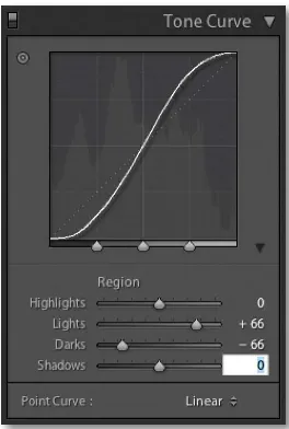
1. To replicate a Lightroom tone curve in Photoshop, I made a virtual copy of a color image and converted it to black and white in Lightroom. I then exported two versions: one with a neutral linear point curve and one using the high-contrast Tone curve setting shown in Figure 1.
2. In Photoshop I placed the Linear Tone Curve image as a layer above the High Contrast Tone Curve layer and placed it inside a new layer group. I then added a Curves adjustment layer above the Linear Tone Curve layer and set the layer group
Linear Tone Curve High Contrast Tone Curve
4. I was now able to test the difference in the hue and saturation response of a Lightroom Tone Curve compared to a curve that had been applied to an image in Photoshop. I repeated Steps 1 and 2, but this time I processed the image in full color. I then used the Eyedropper tool to measure and compare the colors in the image and compile the table of measurements shown in Figure 2.
3. Once I had made a perfect matching curve, I saved it as a new preset and named it High contrast.acv.
About the curve comparison creation method
For the first step, I deliberately processed the image in black and white mode, because at this stage I wanted only to compare the tone curve luminosity. Once I had discovered the Photoshop curve setting that exactly matched the Lightroom black and white tone curve adjusted image, I had a Photoshop curve, which when applied to any black and white mode image would match Lightroom exactly. Note that it did not matter which image I used to test with at steps 1 and 2, just as long as it was an image that had been converted to black and white mode in Lightroom. When I started putting the curve to use and tested the difference between the Lightroom and Photoshop curves using color images, I was able to confirm that the brightness values did indeed always match wherever I sampled in the image area using the eyedropper tool. This then allowed me to look for the variations in the hue and saturation between the Lightroom and Photoshop curve methods.
NOTE
These steps for creating matching
Photoshop curves are specific to the RGB space you export the files to. In
this particular example I exported the images from Lightroom to the
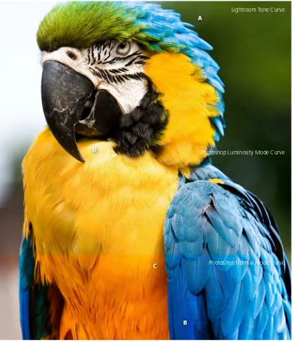
Lightroom Tone Curve
Photoshop Luminosity Mode Curve
Photoshop Normal Mode Curve A
B C
Figure 4 This table shows a comparison between the Photoshop HSB values for points A, B, C, and D in Figure 2. These figures show the differences between the original values and those for the image after it has been processed in Lightroom and in Photoshop using a normal blend and a Luminosity blend mode curve.
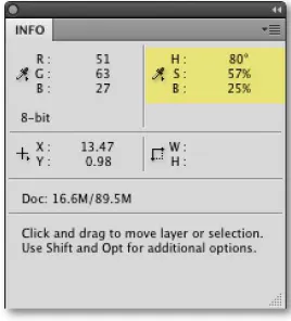
Figure 3 The HSB values shown in Figure 2 were recorded using Photoshop Info panel readings. I went to the Info panel preferences (via the fly-out menu) and altered the coordinate second color readouts to show HSB values.
Comparing the different curve methods
In Figure 2 the Photoshop HSB values at points A, B, C, and D were read using the HSB readouts from the Photoshop Info panel (Figure 3). The HSB values were then compiled in the table shown below in Figure 4. These numbers allowed me to analyze the differences between the three curve methods used here and help understand why they each produce slightly different results. The Hue value is expressed in degrees (°) on a scale of 0–360, while the Saturation and Brightness values are expressed as percentages.
Compare the Lightroom adjusted Hue values with the original image and you will notice that there is only a small difference after applying the high contrast Lightroom Tone Curve. Now compare these values with the Photoshop Normal blend mode values and you will see a much wider variance in the Hue values. However, when the Luminosity blend mode is applied to the Photoshop-adjusted curve the Hue values are preserved exactly.
If you now look at the Saturation values, you will note that the Saturation is almost the same for both the Lightroom and Photoshop curves. In the testing I’ve done, however, the Lightroom curve saturation is on average slightly less than a Normal mode Photoshop curve (by about 1–2%). Sometimes it is higher, but mostly it’s less. But what is interesting about the Photoshop luminosity curve is its tendency to produce a much less saturated result; the figures in the Luminosity curve Saturation column back this up. Try comparing these values with the Saturation values for the Lightroom and Photoshop normal blend curves.
The Brightness columns confirm that the luminance values are identical for both the Lightroom and Photoshop Normal blend mode curves, but the Luminosity mode curve values do end up being different.
Conclusions
It is all very well running involved tests like the one described here to calculate the numeric differences between Lightroom and Photoshop curves. At the end of the day, the only way to judge anything is to let your eyes compare the results visually. The differences between the two curve methods can be quite subtle, but where it is noticeable, I would say the Lightroom/Camera Raw curve result always looks more pleasing. The testing data kind of backs this up, because as I mentioned earlier, the figures show that there is a much finer tolerance in the amount of hue shift you get with a Lightroom curve. This is why the colors tend to be preserved better when edited using a Lightroom Tone Curve adjustment.
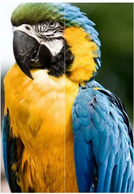
It is interesting to examine what happens when you apply a Luminosity blend mode to a Photoshop curve. The accepted wisdom here is that a Luminosity curve only affects the luminance values of the image and the color values are preserved. At least that is what I have written in the past. If you compare a contrast-increasing Luminosity curve with a Normal mode curve, the Luminosity curve will look flatter in color, which you might assume is because the curve has been filtered to target the luminance only. While a Luminosity curve may always preserve the hue, it can still have a marked effect on the saturation values. And whereas the luminance values always match between a Lightroom curve and a Photoshop curve in Normal mode (using the test method described here), the Luminosity mode curve brightness values can actually deviate quite a bit from these two other curve methods. The conclusion I draw here is that Photoshop Luminosity curves are useful for preventing unwanted hue shifts and taming saturation boosts, but you should be aware that the saturation values can shift up or down, and there will not be an exact tonal match between the effect of a Luminosity and a Normal mode curve. This last point should not necessarily represent a problem. It should not matter whether the curve outcome is different because you can always manipulate a curve in Photoshop to get the luminance balance you like. For Photoshop users it could be argued that what is needed is a slider control in the Curves dialog that goes from a Normal mode to a Luminosity mode curve adjustment. That way, you could tweak the way the curve is applied to the image from within the Curves dialog. That might work, but if we go back to the subject of tone curves in Lightroom there is already an easy method for taming the saturation boost: the Vibrance and Saturation sliders. You can easily take the Vibrance or Saturation down if you find that the Lightroom tone curve has made a photo look too colorful (see Figure 5).
For further reading on this subject, I recommend a PDF article written by Mark Segal that was published on the Luminous Landscape Web site: