A HEURISTIC TEST TO UNDERSTAND USER MENTAL MODEL OF
A FLIGHT SCHEDULE SEARCH FORM
a
Paulus Insap Santosa,
bRianto
a,bDepartment of Electrical Engineering & Information Technology, UGM
Jalan Grafika No. 2, Yogyakarta 55281, Indonesia E-Mail: ainsap@jteti.gadjahmada.edu
Abstrak
Situs web yang bagus adalah situs yang sederhana dan berguna bagi penggunanya. Antarmuka merupakan salah satu aspek penting yang menentukan keberhasilan suatu situs web. Makalah ini ini melaporkan hasil sebuah studi untuk mengevaluasi ransangan situs tiket online. Secara khusus, studi ini berfokus pada kombinasi warna dan kebiasaan pengguna. Test kebergunaan dilakukan dengan membandingkan situs web Garasitiket (Form1) aktif dengan rancangan alternatifnya (Form2). Form 1 dan Form2 dirancang secara berbeda dalam hal cara memilih jadwal penerbangan. Metode riset yang digunakan dalam studi ini adalah uji heuristik. Responden, berjumlah 99 orang, berasal dari anggota Garasitiket. Uji sampel-berpasangan (paired-sample test) digunakan untuk menentukan apakah Form1 berbeda dengan Form2. Hasil penelitian menunjukkan bahwa kebiasaan responden mempengaruhi pilihan antarmuka yang digunakan. Ada kecenderungan dari anggota Garasitiket untuk tidak tertarik pada kombinasi warna. Mereka lebih fokus pada hasil pencarian dan kesederhanaan rancangan situs. Analisis statistis menunjukkan bahwa ada perbedaan signifikan antara Form1 dan Form2. Lebih lanjut, responden lebih memilih Form1 dibandingkan dengan Form2.
Kata kunci: Model Mental, Kebergunaan, Jadwal Penerbangan, Uji Heuristik.
Abstract
A great web site should be simple and usable to its users. Interface design is one important aspect that determine the success of certain website. This paper reports the result of a study to evaluate the design of an online ticket website. In particular, the study focuses on color combination, and uses’s habit. Usability test was done by comparing the published Garasitiket Website (Form1) and its alternative (Form2). Form 1 and Form2 were designed differently in term of the way respondents determined their flight schedule. Research method used for this study was heuristic test. Respondents, 99 people, were from members of Garasitiket. Paired-sample test was used to determine whether Form1 differs from Form2. The results indicated that members’ habit influences user interface selection. There was a tendency of Garasitiket members to not interested in color combinations. Rather, they were more focus on the search results and Web design simplicity. Statistical analyses indicated that there was significant difference between Form1 and Form2. Furthermore, Form1 was more preferable.
INTRODUCTION
The Internet has revolutionized the way people run their businesses as well as their live. Since 1997, Website has been developed into a media for conducting business. The usega of Web site for e-commerce continues to grow and now become an irresistable option for marketing strategy. Along with such a
development, users are now more
knowledgeable of what and how a good Website should be designed. At the same time, users are often confronted with a high expectation to find information as quickly as possible and without much effort. Website design that ignore user expectations can result in users abandoning his visit, and its owner will lose the opportunity of users’ revisit that it is an important indicator to some extend [1].
A research conducted by [2] stated that users could not find what they want in the mentioned Website. This was due to the non-compliance to the standard of services. As a result, the communication between users and web site is not optimal. In another study stated that the user left the Website because they confused and had difficulties in using it. In a research conducted by [3], 496 respondents were asked to test 20 different Websites. The result showed that only 56% of respondents said that those Websites were easy to use. Santosa [4] conducted a research to show how Website design elements may influence users’ intention to purchase online. In his study, Website design elements were grouped into two categories: motivators and hygiene factors. Motivators are the elements that can motivate users to visit and revisit certain Website. Hygiene factors are the elements that must present in order for a Website to operate normally.
In order for the user interface to be accepted by its users is by providing an appropriate structure between user interface and user’s cognitive known as cognitive compatibility [5]. Usability testing is needed to determine the level of ease of use, suitability, and how usable is the system when it is operated by its users. Usability is the extent to which a product can be used to achieve the goals that have been determined to be effective, efficient and satisfying [6]. It is an important Web success factor [7].
This paper reports the result of an empirical study to test the design of a form used in
Garasitiket Website that sells online airplane ticket to see whether it is easy to use and its suitability toward users. The form is to find the suitable schedule based on certain date and airplane.
MENTAL MODEL THEORY
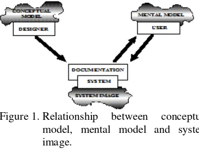
Norman [8] defined three different concepts related to the system being considered: two mental (abstract) and one physical concepts (Figure 1). The first model is the model held by the designer of the system, the second model is the model constructed by the users when they are using the systems, and the third is physical image of the system from which the users develop their conceptual model. Since there are three different models, which need clear distinction, the following terms will be used. Model held or developed by the designer, teachers, scientists, or engineers is called conceptual model, model constructed by the users about the system under observation is called (user) mental model, and the physical image is called system image. During the design phase of application development, designers often draw several diagrams, namely use case diagram, data flow diagram, entity relationship diagram, system flowchart, screen design, and so on. These are examples of conceptual model.
Figure 1. Relationship between conceptual model, mental model and system image.
[10]. They are “the bridge between the work word processor, experienced users will simply move the cursor, highlight the text being copied, press Ctrl-C (or Command-C for Mac), move the cursor to the designated position, then press Ctrl-P (ot Command-P) to paste the text. For a novice user, the same activity will probably take longer steps, i.e. move the cursor, highlight the text being copied, choose menu Edit followed by submenu Copy, move the cursor to the designated position, choose menu Edit followed by submenu Paste.
System image is what actually seen to the users, and it includes all of the documentations and instructions that come together with the system. Whatever seen by users when they activate certain system is called system image. System image helps users in perfecting their know anything about the system, eventually they will master the system after being exposed to the system for frequent usage.
The importance of mental model in necessary for the web designers, especially those who design an e-Commerce websites, to understand and apply different models of information presentation that will enable a more intuitive and compelling online experience.
HEURISTIC EVALUATION
There are four diferrent methods to test user interface usability: formal test by using certain analisys technique, automatic test by using computerized procedure, and heuristic test by simply looking at the user interface and give judgement according to users’ opinion [14]. The goal of heuristic evaluation method (HEM) is to identify certain usability problem in a user interface. HEM is not appropriate for testing usability of a prototype [15].
HEM is cheap. It does not need complicated testing plan, and can be used at the initial stage of the application development. However, HEM is also has drawback. It cannot be used to correct the identified problems. The idenfied problems can only be used as a basis for revision [14].
Molich and Nielsen [16] classified usability problems into nine different categories: 1. Simple and natural dialogue: any dialogue
used in the user interface should not contain irrelevant and/or rarely used information
2. Speak the user’s language: user interface must use user-oriented terms
3. Minimize the user’s overload: user should not have to remember lots of terms that will overload his short term memory easily 4. Be consistent: using the same color
scheme, font and font size, and other design elements’ properties for the same control over different pages
5. Provide feedback: user must be informed about what is going on in the system 6. Provide clearly marked exits: user must be
provided with certain ways to escape from certain cituation
7. Provide shortcuts: user must be provided with features that will allow him to certain things as quickly as possible
8. Provide good error message: when user makes mistakes, he is provided with defensive, precise, and constructive error message
9. Error prevention: system is designed in such a way that prevents a problem from occuring at the first place.
and documentation was an additional categories of Molich and Nielsen’s [16].
Al-Khalifa [18] tested 14 Saudi Arabia Government Websites. The usability test involved two experts in web design and usability. The test was based on 57 questions from six different usability problem categories, i.e. design consistency, navigation, form filling, search functionality, correctness of content and information, and help. The study showed that there were major and minor design problems.
RESEARCH METHOD
Usability Categorization
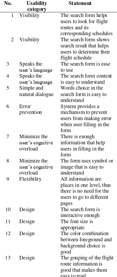
This study mainly discussed about web design reflected in term of color scheme, font, and information grouping. Of the nine categories of usability problem, provide clearly marked exits was not included in the study. The rest of the categories were renamed accordingly. Table 1 shows the categories of usability problem used in this study along with the corresponding statement.
The statement of each corresponding catagories of usability problems was measured using 5-poin Likert scale in which 1 means “strongly disagree”, 2 means “disagree”, 3
means “do not know”, 4 means “agree”, and 5
means “strongly agree”.
Respondents
Respondents of this study were the member of Garasitiket who were participated voluntarily after being informed via email. The number of respondents was 99. The study did not taking into account gender difference, thus the respondents were not asked their gender.
The Experiment Scenario
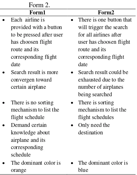
Due to the spread location of respondents, the scenario of the experiment was done as follow. Basically the experiment consisted of two session using the same respondents. The task was basically to find certain flight schedule. In the first session all respondents were asked to find a flight schedule using Form1 (Figure 2). This form is actually the published Garasitiket Website. In the second session, one week apart from the first one, the same difference between Form1 and Form2 is stated in Table 2.
Table 1. Categories of usability problems for the current study
No. Usability category
Statement
1 Visibility The search form helps users to look for flight routes and its
corresponding schedules 2 Visibility The search form shows
search result that helps users to determine their flight schedule 3 Speaks the
user’s language The search form is ease to use 4 Speaks the
user’s language The search form content is easy to understand 5 Simple and
natural dialogue
Words choice in the search form is easy to understand when user filling in the form users in filling in the form
8 Minimize the
user’s cognitive
overload
The form uses symbol or image that is easy to understand 9 Flexibility All information are
places in one level, thus there is no need for the users to go to different pages
10 Design The search form is interactive enough 11 Design The font size is
appropriate
Figure 2. The published form (Form1)
Figure 3. The alternative form (Form2)
RESULT AND DISCUSSION
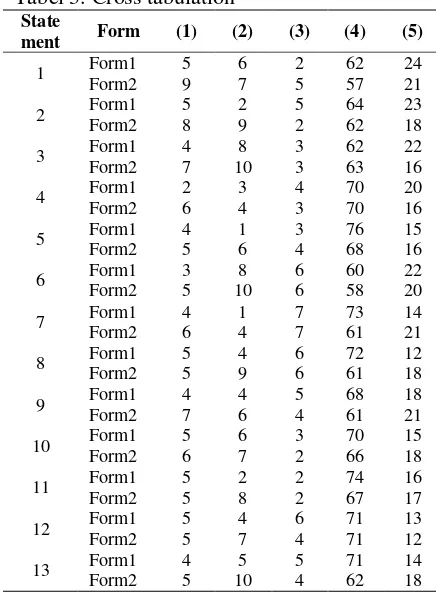
To see the inclination distribution of the respondents’ answers, cross tabulation is used [19], as depicted in Table 3. Column (1), (2), (3), (4), and (5) is stands for ‘strongly disagree’, ‘disagree’, ‘do not know’, ‘agree’, and ‘strongly agree’, respectively. The paired samples correlation between the two forms is 0.598 with α = 0.031.
Column (4) or ‘Agree’ and column (5) or
‘Strongly Agree’ in Table 3 present the suitability indicators among two different forms. It can be seen from Table 3 that respondents prefered Form1 to Form2 from 10 statements out of 13. The other two statements (statement 4 and 12) have the same responses, and one statement (statement 3) obtain an opposite response. The paired samples test gave the following value: mean difference = 5.077, standard deviation = 4.310, t-value = 4.247, and significant level α= 0.001. These values shows that the two forms are statistically different.
Table 2. The difference between Form1 and Form 2.
Form1 Form2
Each airline is provided with a button to be pressed after user has choosen flight route and its corresponding flight date
There is one button that will trigger the search for all airlines after user has choosen flight route and its
corresponding flight date
Search result is more convergen toward certain airplane
Search result could be exhausted due to the number of airplanes being searched There is no sorting
mechanism to list the flight schedule
There is sorting mechanism to list the flight schedules Demand certain
knowledge about airplane and its corresponding schedule
Only need the destination
The dominant color is orange
The dominant color is blue
Tabel 3. Cross tabulation interface. On the positive side, when users are exposed with new user interface, by using their prior knowledge, their mental model are shapped toward the more complete one. Thus, they are able to use the new user interface with ease. On the negative side, since the new user interface is not designed according to their needs, users will have difficulty in dealing with the new user interface [21]. Thus, it is important that users and application developers share the same knowledge about what users needs and what can be done by the developers. If this situation can be achieved, it will be easier for the developers to develop application with high degree of cognitive compatibility [5].
This research has a drawback. Since the same respondents were employed for two different forms, it rises the bias in the collected data. In order to understand whether prior knowldedge was implicitly involved, further research involving more respondents who are not the member of Garasitiket is needed. Thus, the future research should be directed toward the independent groups of respondents.
CONCLUSSION difficulties at the beginning of their activities. This is due to the fact that users must develop initial mental model in order for them to operate a new Website with ease. Thus, it needs time for the users to create cognitive compatibility.
Statistically, this study showed that the published Garasitiket Website differ from its alternative in term of their designs. The values obtained from the paired-sample test shows that the two forms are statistically different. Another interesting finding shows that respondents were not pay attention to the color schemes used in both designs. They were more concerned toward the final result and how easy the forms were operated.
REFERENCES
[1] Nah F and David S. HCI Research Issue In e-Commerce. Journal of Electronic Commerce Research. 3: 98-113. 2002.
[2] Purwati Y. Standart Features of e-Com-merce User Interface for The Web. Journal of Arts, Science & Commerce. 2: 77-87. 2011.
[3] Al-Qaed F and Sutcliffe A. Adaptive Decision Support System (ADSS) for B2C e-Commerce. ICEC '06 Proceedings of the 8th international conference on Electronic commerce: The new e-commerce: innovations for conquering current barriers, obstacles and limitations to conducting successful business on the internet. 492-503. Fredericton, Canada. 2006.
[5] Frohnhofen PF, Hartmann EA, Brandt D, and Weydandt D. Designing Human Machine Interfaces To Match The User's Mental Model. Control Engineer-ing Practice.4: 13-18. 1996.
[6] Abran A, Khelifi A, and Suryn W. Usability Meanings and Interpretations in ISO Standards. Soft-ware Quality Journal. 11: 325–338. 2003.
[7] Yen B, Hwa Hu PJ, and Wang M. Toward An Analytical Approach for Effective Web Site Design: A Framework for Modeling, Evaluation and Enhance-ment. Electronic Commerce Research and Applications. 6: 159–170. 2007.
[8] Norman DA. Cognitive Engineering. In Norman DA and Draper SW (Eds.). User Centered System Design, New Perspect-ives on HCI. Hillsdale, New Jersey:
Lawrence Erlbaum Associates,
Publishers. 1986.
[9] Fein RM, Olson GM, and Olson JS. A Mental Model Can Help Learning To Operate A Complex Device. Interact’93 and CHI’93 Conference Companion on Human Factors in Computing Systems. 157-158. Amsterdam, The Netherland. 1993.
[10] Norman DA. Some Observations on Men-tal Models”. in Gentner, D. and Stevens, A.L. (Eds.), Mental models. Hillsdale,
New Jersey: Lawrence Erlbaum
Associates, Publishers. 1983.
[11] Rasmussen J. Mental Models and the Control of Action in Complex Environ-ments. In Ackerman, D. and Tauber, M.J. (Eds.). Mental Models and Human Computer Interaction I. North-Holland: Elsevier Science Publisher B.V. 1990
[12] Puntambekar S, Stylianou A, and
Hubscher R. Improving Navigation and Learning in Hypertext Environment with Navigable Concept Maps. Human Com-puter Interaction. 18: 395-428. 2003.
[13] Stibel JM. Mental Models and Online Consumer Behaviour. Behaviour & Information Technology. 24: 147-150, 2005.
[14] Nielsen J and Molich R. Heuristic Evaluation of User Interfaces. CHI’90 Proceedings of the SIGCHI Computing Systems. 249-256. 1990.
[15] Nielsen J. Finding usability problems through Heuristic Evaluation. CHI’92 Proceedings of the SIGCHI Computing Systems. 373-380. 1992.
[16] Molich R and Nielsen J. Improving a Human Computer Dialogue. Communi-cation of the ACM. 33: 338-348. 1990.
[17] Chen SY and Macredie RD. The Assessment of Usability of Electronic Shopping: A Heuristic Evaluation. Inter-national Journal of Information Management. 25: 516–532. 2005.
[18] Al-Khalifa HS. Heuristic Evaluation of The Usability of e-Government Websites: A Case from Saudi Arabia. Proceedings of the ICEGOV. Beijing. 2010.
[19] Santosa, S. Mengolah Data Statistik Secara Profesional. Jakarta: Elex Media Komputindo. 2001.
[20] Satzinger JW and Olfman L. User Interface Consistency Across End User Application: The Effect on Mental Model. Journal of Management Information Systems. 14: 167-193. 1998.