AND TRANSITIONS
for the Modern Web
AND TRANSITIONS
for the Modern Web
STEVEN BRADLEY
Adobe Press books are published by Peachpit, a division of Pearson Education.
For the latest on Adobe Press books, go to www.adobepress.com. To report errors, please send a note to [email protected].
Acquisitions Editor: Victor Gavenda
Development Editor: Robyn G. Thomas
Production Editor: David Van Ness
Technical Editors: Virginia DeBolt and Terry Noel
Copyeditor: Robyn G. Thomas
Proofreader: Liz Welch
Compositor: Danielle Foster
Indexer: Rebecca Plunkett
Cover and Interior Design: Mimi Heft
Notice of Rights
All rights reserved. No part of this book may be reproduced or transmitted in any form by any means, elec-tronic, mechanical, photocopying, recording, or otherwise, without the prior written permission of the pub-lisher. For information on getting permission for reprints and excerpts, contact [email protected].
Notice of Liability
The information in this book is distributed on an “As Is” basis, without warranty. While every precaution has been taken in the preparation of the book, neither the author nor Peachpit shall have any liability to any person or entity with respect to any loss or damage caused or alleged to be caused directly or indirectly by the instructions contained in this book or by the computer software and hardware products described in it.
Trademarks
Adobe, the Adobe logo, Photoshop, and Illustrator are registered trademarks of Adobe Systems Incorpo-rated in the United States and/or other countries.
Many of the designations used by manufacturers and sellers to distinguish their products are claimed as trademarks. Where those designations appear in this book, and Peachpit was aware of the trademark claim, the designations appear as requested by the owner of the trademark. All other product names and services identified throughout the book are used in an editorial fashion only and for the benefit of such companies with no intention of infringement of the trademark. No such use, or the use of any trade name, is intended to convey endorsement or other affiliation with this book.
Printed and bound in the United States of America
ISBN-13: 978-0-133-98050-9 ISBN-10: 0-133-98050-2
Acknowledgments
This book is the work of many people. I’d like to thank the fine people at Adobe Press. Thank you Victor, Robyn, David, Virginia, and Terry. Many more peo-ple, who I’ll never know, have had a hand in producing this book—thank you.
About the Author
Steven Bradley is a freelance web designer and WordPress devel-oper who traded the hustle and bustle of his origins in New York for the blue skies and mountains of Boulder, Colorado. He’s the author of Design Fundamentals: Elements, Attributes, & Princi-ples, which is available as an ebook at www.vanseodesign.com/ downloads/learn-design-fundamentals.
In addition to designing and developing websites, he blogs regularly at Van-seo Design (www.vanVan-seodesign.com/blog) and runs a small business forum (www.small-business-forum.net) to help freelancers and entrepreneurs get started on their journey.
Table of Contents
getting Started x
Chapter 1 Introduction 1
design Layers 2
Animation 3
Transitions 5
Why Transitions and CSS Animation? 6
browser Support/Polyfills 7
Ready to get Started? 10
Chapter 2 Transforms 11
browser Support and Vendor Prefixes 13
2-dimensional Transforms 14
transform-origin Property 16
2-dimensional Transform Functions 21
Nested Transforms 28
Adding Multiple Transforms to an Element 29
The Transform Rendering Model 30
3-dimensional Transforms 33
perspective Property 34
perspective-origin Property 37
transform-style() Property 39
backface-visibility() Property 43
3-dimensional Transform Functions 52
Chapter
3 Transitions 57
browser Support 58
Transitions 59
transition-property Property 62
transition-duration Property 66
transition-timing-function Property 68
transition-delay Property 79
transition shorthand Property 81
Starting and Reversing Transitions 82
Transition Events 84
Animatable Properties 89
Animatable Property List Resources 91
Summary 92
Chapter
4 Animations 93
browser Support 95
Detecting Browser Support 95
Finding JavaScript Libraries for Animation 95
CSS Animations 96
CSS Positioning 96
Smoothing the Animation 98
The @keyframes Rule 101
animation-* Properties 104
animation-name Property 104
animation-duration Property 106
animation-timing-function Property 107
animation-iteration-count Property 114
animation-direction Property 119
animation-delay Property 125
animation-fill-mode Property 128
animation Shorthand Property 131
Animation Events 131
Types of Animation Events 132
Transition or Animation 141
Similarities 141
Differences 142
Choosing Transitions or Animations 143
Performance 143
Summary 146
Chapter 5 More Realistic Animation 147
disney’s 12 Principles of Animation 148
Squash and Stretch 149
Anticipation 158
Staging 164
Straight-Ahead Action and Pose-to-Pose Action 168
follow-through and overlapping Action 168
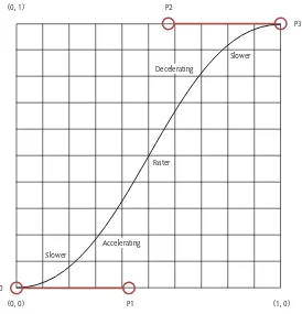
Slow In and Slow out (Ease In and out) 182
Arcs 182
Secondary Action 195
Timing 196
Exaggeration 197
Solid drawing 206
Appeal 207
beyond the 12 Principles 208
Chapter
6 Examples 211
How to Use the Examples 212
Navigation bar 213
Modal Windows 224
off-canvas Sidebar Navigation 242
Off-canvas Navigation/Sidebar: Take 1 243
Off-canvas Navigation/Sidebar: Take 2 259
Content Switcher 269
Summary 286
Chapter 7 Closing Thoughts 287
Progressive Enhancement 288
Trends 289
Next Steps 290
Thanks 290
Appendix Resources 291
Chapter 1: Introduction 292
Browser Support 292
Polyfills 292
Chapter 2: Transforms 292
Visual Formatting Model 293
Transform Matrix 293
Chapter 3: Transitions 293
Timing Functions 293
Transition Events 293
Chapter 4: Animation 294
Animation Events 294
Transitions vs. Animations 294
Performance 294
Chapter 5: More Realistic Animation 295
Disney’s 12 Principles of Animation 295
Applying Animation Principles to User Interface Design 296
Chapter 6: Examples 296
Effects 296
getting Started
CSS continues to evolve as a language, and as it does it gives us a greater abil-ity to create with code. Transforms, transitions, and CSS animations are good examples of things we could create only in graphics and animation editors. The file size of a few lines of code is measured in bytes. The size of a file containing a moving graphic is measured in megabytes and requires an additional request to the server. For the sake of performance, look first to doing things with code.
The recent design trend has been to remove signals of depth and other details used to mimic realistic objects on the screen. Unfortunately, some of those details also serve a purpose in communicating information in websites and web apps. Motion is replacing depth as the way to communicate what’s been removed and adding back delight in a way that’s more in tune with the fluid and dynamic nature of the web.
This book will start you on your path to adding motion to your designs. It will show you how to work with transforms, transitions, and CSS animations in modern browsers, and it will show you how to make changes to CSS proper-ties over time instead of instantly.
The basics covered in this book will help you understand how to create more realistic animation and present some practical examples you can apply to the websites you design and develop.
What’s Inside This Book
Animation is about showing changes over time. We’ll look at some of the things we can change, namely CSS transforms. Transforms give us the ability to modify things like the size and position of an element. They do this in a way that doesn’t interrupt the document flow. In other words, when the element changes, other elements on the page don’t react. They treat the transformed element as though it were still in the original state.
over which these changes occur so they appear more natural. Subtle changes will add a touch of realism and not be so jarring.
Transitions have a couple of limitations. First, they occur in response to some action, such as hovering over an element. We can’t initiate a transition with-out some interaction by a site visitor. Second, you have only a single starting point and a single end point.
CSS animation isn’t bound by either of these limitations. You can set an ani-mation to start on its own (or in response to user action). Using keyframes, you can add as many or as few points between the beginning and end where you can make additional changes.
At times, you’ll want to use transitions and at other times you’ll prefer anima-tion. I’ll mention some of these throughout the book.
Once you understand how to work with transforms, transitions, and anima-tions, and have some idea when to use them in real-world projects, we’ll take a look at the real world again and think about how you can make your ani-mation more realistic.
A Note About Images and Examples
One limitation of print is that it’s static. We won’t be able to show actual transi-tions and animatransi-tions in this book. The figures in this book show before, after, and during moments and describe the movement.
However, every example presented in this book has a corresponding live exam-ple, which you can download, experiment with, and use. Each example is iden-tified by number in the text, and you can view each in action as a demo to see what’s being discussed or as a way to double-check your code.
How to Download Code and Example Files
Along with the examples, you’ll be able to download all the code used in this book.
1. Go to www.peachpit.com/register and create or log in to your account.
2. Enter the book’s ISBN (978-0-133-98050-9), and click Submit.
Who Is This Book For?
We assume that you’ve picked up this book because you’re interested in learn-ing about animatlearn-ing web pages. You should already know how to build web pages and websites. You might be new to web design, or perhaps you’ve been developing websites for years. As long as you can create an HTML document and know how to work with CSS, you’ll be able to follow along and work through the examples.
Knowing—or at least being able to read—JavaScript will be helpful, although not necessary. Some of the examples in this book use JavaScript to read and modify the CSS properties of some HTML elements. The scripts are short and not too difficult to understand. I’ll explain each when you encounter them.
Most importantly, you should use your imagination. You can combine the things you learn in this book in multiple ways to create a variety of effects. I can show you only so many in one book. I’ll point you to resources for more examples, but you’ll get the most from this book if you experiment on your own and see what effects you can create.
How Do You Use This Book?
We designed this book to be used in a couple of ways. Naturally you should read through the text as you would any book. The text will present new infor-mation and help you understand it. Just as important are the examples accom-panying the text.
You’ll get more from this (or any technical book) by typing the code in a text editor. Open your favorite code editor or grab one from the list in the follow-ing section. Open a few browsers (you should have as many available as pos-sible). Then start coding and checking to see how your code works.
In code listings throughout the book, a single line of code onscreen might wrap to two lines in the book. If this happens, the continued line will start with an arrow, so it might look like this:
The beginning of the code starts here, p but it continues on this line.
Code that you should type or modify or that you should pay particular atten-tion to appears highlighted.
-webkit-transform: translateY(0px) scale(1,1); -ms-transform: translateY(0px) scale(1,1); transform: translateY(0px) scale(1,1);
You’ll find step-by-step instructions to show you how to complete a process. Note that instruction appears as the numbered step, and a description follows it, like this:
1. Add a div to your HTML with a class of ball and wrap another div with a class of stage around it.
<div class="stage">
<div class="ball"></div> </div>
The reason for the .stagediv is to provide a frame for the animation. Because you and I are probably looking at browsers open to different widths and heights, it would be hard to use the browser’s edge as the thing the ball bounces against. By creating a stage for the ball, we can including it in the animation and make it more likely we’re both seeing the same thing.
Each example that has a matching file containing all the code is identified in the text:
Tools Required
Although tools like Adobe’s Edge Animate or Tumult’s Hype 2 can create ani-mation for us, we won’t be using them in this book. We won’t be using Photo-shop or Maya or any other tool that can create movement. These are all great tools, but we’re going to create movement by writing code.
That means that the tool requirements are minimal and you should already have everything you need. You’ll need a code editor, a modern browser, and working knowledge of HTML and CSS. Oh, and bring your imagination.
If you build websites with any regularity, you probably have a favorite code editor, and you’re free to use it. In the following sections, you’ll find a few you can try if you don’t yet have a favorite or just want to try a few new ones. All the editors listed can be downloaded and used for free.
Brackets isn’t limited to running on a single platform. It works on Windows, Mac, and Linux, so if you switch operating systems between home and work, you can still use it. It has some additional features such as live reload, so you don’t have to keep refreshing your browser to see the effect of your changes.
Brackets can be extended and already has an active community building exten-sions for it. Brackets is built using the same technologies you use to develop websites. It’s built with HTML, CSS, and JavaScript, so you may not need to wait for someone else to develop an extension. You probably have all the skills needed to create it yourself.
Brackets isn’t your only choice. The following sections list free editors that you can use regardless of which platform you use and some specific to an operat-ing system.
Universal
Brackets: http://brackets.io
jEdit: www.jedit.org
Komodo Edit: http://komodoide.com/komodo-edit
KompoZer: http://kompozer.net
Sublime Text: www.sublimetext.com (free if you don’t mind a little nagging)
Aptana Studio: www.aptana.com/products/studio3
Eclipse: www.eclipse.org
Emacs: www.gnu.org/software/emacs
Vim: www.vim.org
Bluefish: http://bluefish.openoffice.nl/index.html
oS X
Text Wrangler: www.barebones.com/products/textwrangler
Windows
Notepad++: http://notepad-plus-plus.org
EditPad Lite: www.editpadlite.com
HTMLKit: www.chami.com/html-kit
Linux
Gedit: https://wiki.gnome.org/Apps/Gedit
INTRODUCTION
Not long after people began designing web pages, they looked for ways to make static HTML elements more dynamic. Designers change background colors when hovering over an element or hide and show content when an ele-ment is clicked. We’ve known since the early days of the web that the pages we designed could do more than display statically.
Many of the changes we’ve wanted to include have required JavaScript, which is fine if you know JavaScript, but what if you don’t? What if your skills include HTML and CSS but don’t include programming?
Design Layers
Designing a positive experience on your website has several layers:
Functional—First and foremost your design needs to be functional. You’re building it for a purpose, and it has some functional requirements to meet before it can be considered a working website.
The function might be as simple as presenting articles to be read, or it might be as complex as selling hundreds or thousands of products through an ecommerce system. Before anything else, your site has to work.
Reliable—Assuming your site is functional, it needs to be reliable. It can’t function only here and there. It should meet its functional needs always. The site should be stable and have consistent performance.
Usable—Next on the list is making the site usable. It’s all well and good if your site is working reliably, but if no one can understand how to use it, what does it matter? Visitors to the site shouldn’t have to work too hard to find the content they want or complete a purchase.
Proficient—You don’t have to dumb down your design. You likely have users of different skill sets and experience. What a less savvy user finds easy, a power user might find slow and in the way. A good design helps make all users more proficient. It should help lead beginners who want to learn more down the path of becoming expert, and it should get out of the way of the experts.
Creative—This is the layer on top of everything. It’s the layer where aesthet-ics rule. It’s where you can make a design beautiful. This is the layer that delights and wows, and it’s probably the one viewers will remember most. This is the layer where you can connect emotionally with your audience and share the personality of the site and the people behind it.
Figure 1.1 summarizes these layers.
Creative
The design has stable and consistent performance.
The design works and meets basic functional needs.
Animation
Where does animation fit? It won’t make your site functional or more reliable, but it can contribute to the creative, proficient, and usable layers—the three layers on top. You can easily see how animation adds to the creative layer and how it can delight audiences. Who doesn’t enjoy well-done animation?
What might not be as easy to see is how animation can make a site more usable and help users become more proficient. Animation can show instead of tell. Subtle movements can offer feedback that lets viewers know when they’ve done something correctly and when they haven’t. It’s an attention-getting, visual cue that leads users through a design and indicates where they can go next to learn more.
Movement is simply one more element you can use to improve the design of a website. It might be just another design element, but it’s one that can do quite a lot. Adding movement to a design
Grabs attention
Adds polish
Wows visitors
Adds personality
Keeps visitors more engaged
Creates a memorable and lasting impression
Figure 1.1
Connects with visitors emotionally
Provides feedback
Allows for interaction
Creates a sense of realism
Indicates changes over time
Build stronger relationships with an audience
Provides another layer of information
If a picture is worth 1000 words, what’s a moving picture worth? 1000 pictures? Animation communicates more, and it communicates more quickly, saving your visitors time. Something they’ll no doubt appreciate. While words and picture can communicate similar information, people will more likely watch a short animation than read a lengthy piece of text.
Graphic design is fundamentally about telling a story. It’s about communica-tion. Animation shows change over time and helps tell your story through that layer of time. Animation can make sequences and connections clearer and can help create a narrative flow.
Great! Animation can do a lot.
It’s also likely to become the next trend in web design. If you look back at the list of things that movement can add to a site, you might realize that move-ment is not the only way to add them. Designers have many other ways to grab attention, create realism, and wow an audience.
For years, designers have been using depth cues to make their designs more realistic. Drop shadows, textures, and gradients help mimic real-world objects. For a while these things delighted us and impressed us the same way a realis-tic painting might delight and impress.
However, two problems were lying in wait:
Mimicking real-world objects doesn’t take advantage of what the web can do. Designers were treating the web as a static, printable document. The web is fluid. It’s dynamic. The way something looks at one moment doesn’t have to be the way it looks a moment later. We weren’t playing to the web’s strengths; we were playing to its weaknesses.
These problems contributed to the recent trend toward flat design. We became so saturated with depth and skeuomorphic realism that web designers did a complete 180 and removed what had become little more than ornamenta-tion—designs became flat.
In the last couple of years, many of the details we had been relying on to communicate have been removed. It’s given the web a fresh look, but it’s also reduced the effectiveness of our communication to some degree. The details we removed were providing visual cues that helped make sites usable.
I’ve no doubt that depth cues will return. They’re useful. I hope when they do they’ll be more subtle. Until then, animation will fill the gap.
Transitions
Changes over time are going to be the next trend and that means we’ll be trans-forming design elements through subtle transitions and keyframe animation. It’s already starting.
Information slides in from the left and right as you scroll down a page.
Buttons pulse to draw attention or provide feedback to users.
Background colors change not in an instant but over a few milliseconds.
Progress indicators show continuous progress.
Diagrams and infographics are interactive.
Skillful designers are creating longer animations to illustrate difficult concepts and engage us in ways that static pictures can’t. I call it a trend, but I expect it’ll last long beyond the trend stage. Movement is coming, and it’s here to stay.
I want to offer one last reason for learning to work with animation. It’s just plain fun. By the time you finish this book, I hope you’ll see how relatively easy it is to set up some simple transitions and animation and how rewarding and enjoyable it is to see your code come to life in a browser. Remember the first time you wrote some HTML and a little CSS and then checked a browser to see what you’d done? Well, this is like that except better. Before, you placed things on a web page. Now you’ll move them around.
Why Transitions and CSS Animation?
I’ve been talking about animation as though it’s one thing. However, there are different kinds of animation and different ways to create them. When you hear the word animation, you might think of Disney movies or Looney Toons and Hanna-Barbera cartoons of your youth. Maybe you think of SpongeBob or Bugs Bunny or Anime.
They are one kind of animation, and the techniques in this book can be used to create something similar online. I don’t know that you’d want to code a two-hour animated movie, but I suppose you could. However, if you did, many tools could do this efficiently and effectively—you work visually, and the tool produces the code. Tools don’t always produce the most performant code, though. They often leave behind bloat. For simpler animations that you use on a website, the better choice is to write your own code.
The animation we’re talking about here will be far more subtle with simple changes over time. Animation doesn’t have to be a full-length movie or a 10-minute cartoon. It can be a small and subtle change to a link when you hover over it. We’ll be more concerned with these smaller changes over short durations of time throughout this book, although by the time we’re finished, you will have the knowledge to create far more.
Today’s libraries, such as jQuery, make animating with JavaScript easier, but some of these libraries can be very large and include much more than we need.
We’ve used Flash, which looked great, but it was slow to load and often inac-cessible. Flash content isn’t seen by search engines, and it requires plug-ins to run. Flash also doesn’t work by default with today’s touch devices like smart-phones and tablets.
Scalable Vector Graphics, WebGL, and HTML Canvas are also technologies that you can use in the creation of animation, but these aren’t quite as ready as we’d like, and they are a little harder to work with at the moment.
We’ll be sticking with something you already know, CSS. We’ll use CSS to transform elements, and we’ll use CSS to transition these transformations as well as a number of other CSS properties over time. We’ll then build on what we learn to create keyframe animations that allow more granular control over both the changes and the time over which they change.
This will lead to smaller files and less HTTP requests, and best of all, it’s easy to learn. You already know how to code CSS. What’s learning a few more prop-erties? We’ll use transitions and animations in a way to enhance our designs progressively. Our code will also be easy to modify, letting us quickly alter the animation or create something new.
We’re going to add back some of the wow we’ve taken away as we’ve moved toward flat designs. Our animations won’t be mission critical, but they’ll be fun.
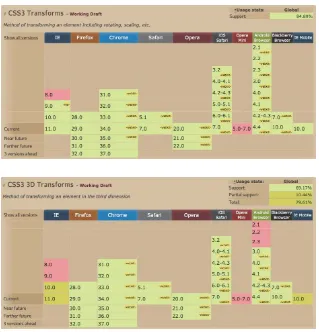
Browser Support/Polyfills
One question about the latest and greatest web technologies is whether or not browsers support them. We’re in luck. Browser support is very good for trans-forms, transitions, and animations. It’s not perfect, but it’s very good. Where sup-port isn’t present, JavaScript polyfills can help you mimic the unsupsup-ported CSS.
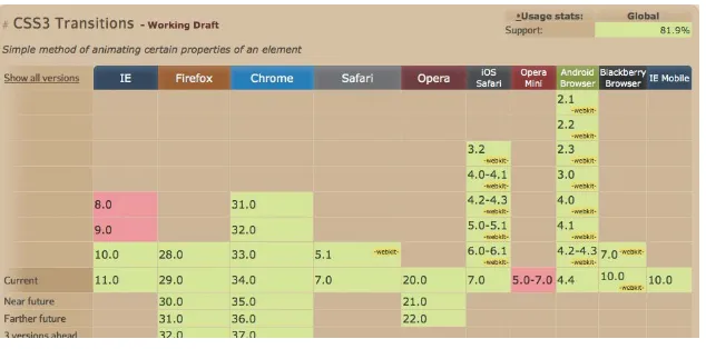
Support for transitions (Figure 1.4) is similar. Once again, you’ll need to use vendor prefixes for some browser versions, and IE9 and earlier don’t support transitions. A polyfill doesn’t exist that you can use, but you do have some clear trending to consider. Both IE9 and IE8 are being used less and less each month. IE9 will fall away quicker as no version of Windows calls IE9 the best version to use. IE8 might stick around a little longer because it’s the end of the XP upgrade path. You’ll have to think about whether you need to support these versions at all, and you’ll have to use transitions in a way that won’t break your web pages in case you do need to support them.
Figure 1.2
browser support for 2-dimensional CSS Transforms (http://caniuse. com/#feat=transforms2d)
Figure 1.3
The situation is exactly the same with animation (Figure 1.5) as it is for tran-sitions. The same browsers and versions support animations, and once again you don’t have a polyfill fallback. As long as you don’t use animation to sup-ply critical visual information, you’ll be OK. Your fallback should be to make sure any browser that doesn’t support animation will still work as intended. Users will miss out on the added things that animation and transitions bring, but your site will still function as it should.
Figure 1.4
browser support for CSS Transitions (http://caniuse. com/#feat=css-transitions)
Figure 1.5
Ready to Get Started?
CSS transforms, transitions, and animation are fun to work with. There’s something about seeing the results of your code move around on screen that recalls the feeling you probably had the first time you looked at a web page you developed in a browser.
All are fairly easy to understand, and with a little practice you’ll find them easy to work with. Even better, you’ll gain the practice you need going through this book. I’ve created plenty of simple and more complex examples you can use to start your own exploration.
TRANSFORMS
The CSS visual formatting model determines how elements are laid out visu-ally in a document. Each element in the document tree generates zero, one, or more rectangular boxes according to the box model. Several things determine the layout of these boxes:
Box dimensions
Relationships to other elements
Size of the viewport
Intrinsic dimensions of media and images
Type of box (block, inline, inline-block)
The CSS visual formatting model also defines a coordinate space (Figure 2.1). All elements in a document are positioned within this coordinate space, and the position and size of these elements are expressed in some dimension. The top-left corner of each element is the origin of that element with positive val-ues moving to the right and down from the origin. Negative valval-ues are allowed and move the element up and to the left.
Edge of containing block Content
Padding x-axis origin (0.0) of the
coordinate system
y-axis
border
Margin origin of the element
Transforms allow designers to modify the coordinate space and change the appearance of elements styled with CSS. You can translate the element to move it to a new location, rotate it, skew it, or scale it in 2-dimensional and 3-dimensional space.
Transforms offer you a way to make changes to HTML elements dynamically through CSS alone.
Figure 2.1
Browser Support and Vendor Prefixes
Browser support for 2-dimensional and 3-dimensional transforms is quite good. It’s not perfect, but it’s good enough that you can use transforms in production today. The browser support figures in Chapter 1 showed that many browsers still require vendor prefixes to display transforms properly.
Fortunately, not every browser needs vendor prefixes, and the majority of browser versions that do, need the same one: -webkit. However, IE9 needs the -ms prefix. That leaves Opera Mini and IE8 and below without support for 2-dimensional transforms.
We’re in luck when it comes to IE. Older versions of IE support a Microsoft filter property. It works only in IE, but that’s OK. A couple of JavaScript librar-ies do the work to convert CSS transforms to IE filters.
Transformie is a lightweight JavaScript polyfill that maps transforms to IE filters (http://paulbakaus.com/2008/08/16/bringing-CSS-transform- to-internet-explorer).
CSSSandpaper is a polyfill that maps transforms to filters (www.useragentman.com/blog/2010/03/09/cross-browser-CSS- transforms-even-in-ie).
Support for 3-dimensional transforms is nearly, though not quite, as good. IE9
and IE10+ don’t support them, and IE10+ doesn’t support the preserve-3d
property either. Fortunately, there’s a workaround, which we’ll get to later in this chapter.
Before you jump on one of the polyfills, ask yourself if you really need one. The use of IE7 and below is declining. Most sites can ignore these browsers, although you should check your site analytics to be certain which browsers your visitors are using.
IE9 use is falling quickly as people upgrade to IE10 and IE11. That leaves IE8. It’s the most modern browser you can get on Windows XP. Microsoft has stopped supporting XP, but people continue to use it.
A Word About JavaScript
The examples as written in this chapter vary a little from the example files you’ll find online. to understand conceptually what’s going on with transforms, I thought it would be best if you could see the before and after states of the transformation when looking at the example files in a browser. to improve them as demos, I added one or more buttons to let you turn the transformation on and off.
The buttons rely on Javascript to work, but I didn’t want to introduce Javascript into the code in this chapter. The examples as written in this chapter won’t match the source code exactly in the files. The files have a few lines of Javascript code and use a third-party library. The code adds and removes a class named
.transformed from the htML element that’s being transformed. The specific code to make the transform work was moved from the element to the .transformed class.
follow the code as written here in the text, and view the examples in this specific chapter for a demonstration.
2-dimensional Transforms
The main property you’ll use with transforms is the well-named transform
property. It can take a value of either none or one of several transform func-tions. We’ll get to those functions momentarily, but for now let’s take a look at a simple example showing a transform (Example 2.1).
1. Create a standard HTML document, and inside the body add a div with a class of box.
<!doctype html>
<html lang="en">
<head>
<title>Transform Example</title>
<meta name="description" content="A simple example
p showing how to rotate an element" />
<style>
/* We'll add our css here */
</style>
</head>
<body>
<div class="box"></div>
</body>
</html>
2. In your CSS, give the box a width, height, and background color so you can see it.
.box {
width: 200px;
height: 200px;
background: #575;
}
If you stop here, you’ll see a medium green square on the page. Let’s trans-form the square by rotating it 45 degrees.
3. Add the following code to your CSS to implement the rotation. Notice that I’ve used both the -webkit and -ms prefixes in additional to the default CSS.
.box {
-webkit-transform: rotate(45deg);
-ms-transform: rotate(45deg);
transform: rotate(45deg);
Your .boxdiv should be rotated 45 degrees (Figure 2.2).
.box { width: 200px; height: 200px; background: #575; }
Before
.box {
-webkit-transform: rotate(45deg); -ms-transform: rotate(45deg); transform: rotate(45deg); }
After
Pretty easy, wouldn’t you agree? Let’s look at what’s going on in a bit more detail. First you created a div with a class of box. You styled the box to give it a height, width, and background color so you could see it on the page. None of this should be new to you.
To transform the box, you use a named transform property and the associ-ated vendor prefixes. The value of the transform property is always a trans-form function. Here you used the rotate() function and gave the function a value of 45deg.
There are a few more transform functions available to use, but before we get to them, there’s one more property we need to cover.
transform-origin Property
The other property you can use with 2-dimensional transforms is the
transform-origin property. This property sets a fixed point around which the transform
occurs. The default value for transform-origin is 50%50%, which is the center of the object being transformed.
Figure 2.2
You aren’t limited to using percent values. You can specify a length in pixels (px) or any other unit of measure. You can also use any of the following keywords:
top—0% in the vertical
right—100% in the horizontal
bottom—100% in the vertical
left—0% in the horizontal
center—50% horizontal and 50% vertical
Let’s expand the previous example by setting a new transform-origin
(Example 2.2).
1. Wrap .boxdiv in a .containerdiv. This will create a reference point to see the change in origin.
<div class="container">
<div class="box"></div>
</div>
You need to style the .container enough to see it.
2. Give it the same dimensions as the .box, and then add an outline.
.container {
width: 200px;
height: 200px;
outline: 1px solid red;
}
Now you’ll change the origin by setting the transform-origin property.
3. Add the following to your CSS styles for the .boxdiv.
.box {
-webkit-transform-origin: 0 0;
-ms-transform-origin: 0 0;
transform-origin: 0 0;
You’re moving the origin, the point around which your box will rotate. You’ve moved it from its center to the top-left corner of the .box by set-ting transform-origin to 00. The first value represents the horizontal origin, and the second value represents the vertical origin.
Figure 2.3 shows the results of changing the value of transform-origin. On the left, the .boxdiv rotates about the default origin, which is the cen-ter of the .box. On the right, the transform-origin coordinates are (0 0). You can see the point about which the .box rotates changes.
transform-origin: 50% 50% transform-origin: 0 0;
Origin
Origin
You can set the origin in any of the following ways:
transform-origin:lefttop;
transform-origin:topleft;
transform-origin:0%0%;
transform-origin:00;
All these options set the same origin point at the top-left corner of the element.
The transform-origin property isn’t inherited. In other words, if you
have one box inside another and you set a transform-origin value on
the parent box, the child box still has the default transform-origin. You have to set it on the child if you want a new origin for child elements.
Figure 2.3
Note that the transform-origin property value is in relation to the bound-ing box of the element and not the element itself. For some elements the two will be the same, but they don’t have to be. For example, let’s say the box is a circle. You can easily set up that by giving the box a border-radius of
50%. Adding an outline lets you see the bounding box.
4. Add the following lines of CSS to your .box class (Example 2.3).
.box {
border-radius: 50%;
outline: 1px solid blue;
}
The before and after images (Figure 2.4) make it clear that the circle is still rotating around a point at the top-left corner of the bounding box and not some point on the circle.
.box { width: 200px; height: 200px; background: #575; border-radius: 50%;
outline: 1px solid blue; }
Before
.box {
-webkit-transform: rotate(45deg); -ms-transform: rotate(45deg);
transform: rotate(45deg); }
After
transform-origin transform-origin
Let’s make one more change to the example. This time instead of turning the square box into a circle, you’re going to add some padding and change what part of the background is painted. The latter is accomplished by
set-ting the background-clip property to content-box, meaning only the
content part of the element gets the background color.
5. Remove the border-radius on the .box class, and add the lines of high-lighted code (Example 2.4).
.box {
width: 200px;
height: 200px;
background: #575;
outline: 1px solid blue;
padding: 30px;
background-clip: content-box;
}
Once again the before and after images (Figure 2.5) show that the origin around which the object is rotating is still the bounding box.
.box { width: 200px; height: 200px; background: #575; padding: 30px;
background-clip: content-box; }
Before
.box {
-webkit-transform: rotate(45deg); -ms-transform: rotate(45deg);
transform: rotate(45deg); }
After
transform-origin transform-origin
2-dimensional Transform Functions
By now you’d probably like to know how else you can transform elements other than rotating them, so let’s take a look at the available 2-dimensional transform functions. Table 2.1 shows all the transform functions along with examples values you might give each.
Table 2.1 2-dimensional Transform Functions
FUNCTION EXAMPLE
translate() translate( 25%, 50px )
translateX() translateX( 5cm )
translateY() translateX( 1.75em )
scale() scale( 1.5, 0.3 )
scaleX() scaleX( 4 )
scaleY() scaleY( 3.25 )
rotate() rotate( 45deg )
skew() skew( 30deg, 0.5rad )
skewX() skewX( 60deg )
skewY() skewY( 1.2rad )
matrix() matrix( 1, 2, 3, 5, 8, 13 )
As you can see, there are four sets of named functions (translate, scale,
rotate, and skew) and one matrix function. Let’s consider each in a bit more detail—we’ll save matrix() for the end.
translate() function
Translating an element means moving it to a different location. You can translate elements horizontally using translateX(), vertically using translateY(), or both at the same time using translate().
For example, to move an element to the right 100 pixels and down 50 pixels (Example 2.5) you could specify each move with separate functions:
transform: translateX( 100px ) translateY( 50px );
Or you could set both values using a single function:
Either approach leads to the same result (Figure 2.6).
before translation transform: translate(100px, 50px); 50px
100px
You aren’t limited to using px. Any measurement will work: px, em, %, cm, and in are all acceptable. Note that when you use percentages, the measurement is a percent of the element being moved and not the element’s container, which might be contrary to your first instinct.
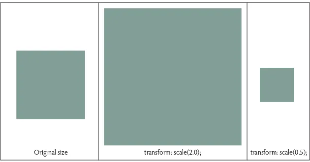
scale() function
Scaling an element (Example 2.6) simply makes it larger or smaller. Work-ing with the scale transform functions is similar to workWork-ing with the translate transform functions. The available scale functions are scaleX(), scaleY(), and the generic scale().
If you want to scale an element to twice its current size, you can specify each axis separately:
transform: scaleX(2) scaleY(2);
Or you can use a single function:
transform: scale(2,2);
The second value in the single function isn’t required if it is the same as the first. You could have written:
transform: scale(2);
and still end up with the same result.
Figure 2.6
The values given to the scale() function should be a unit-less number—you can use decimals. For example:
transform: scale(1.5);
is valid. So is
transform: scale(0.5);
To make an element smaller, you might think you would use a negative num-ber, but negative numbers aren’t allowed. If you want to scale down something, you scale it by a value less than 1.0. In other words, scale(0.5) makes some-thing half its initial size in each of the horizontal and vertical dimensions, or one fourth its overall size (Figure 2.7).
original size transform: scale(2.0); transform: scale(0.5);
rotate() function
We’ve already seen rotate in action (Figure 2.2). In 2-dimensional transforms, there are no x and y variations, which makes sense. You rotate objects around an axis perpendicular to the 2-dimensional plane. This means all 2-dimen-sional rotation is around an axis parallel to the z-axis.
Objects rotate around a single point, which you set with the
transform-origin property, and by default the element rotates around its center.
rotate() takes an angle value: degrees (deg) or radians (rad).
transform: rotate(45deg);
transform: rotate(1.07rad);
Figure 2.7
skew() function
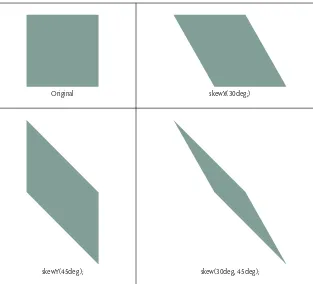
To skew an object means to distort its shape. Skew behaves like translation and scaling with functions in both directions, skewX(), skewY(), as well as the generic skew().
To skew an element 30 degrees horizontally and 45 degrees vertically, you can specify each with separate functions (Example 2.7):
transform: skewX(30deg) skewY(45deg);
Or you can use a single function:
transform: skew(30deg, 45deg);
Figure 2.8 shows the results of skewing in each direction and also both direc-tions at the same time. As with rotate, the values for the skew funcdirec-tions will always be an angle in units of either deg or rad.
original
skewY(45deg);
skewX(30deg;)
skew(30deg, 45deg); Figure 2.8
matrix() function
Every one of the transform functions covered so far is really a specific matrix function. The named functions exist to make things easier, but they can be represented by a matrix.
A matrix is simply a rectangular array of numbers that use specific matrix math for adding, subtracting, multiplying, and dividing matrices. In comput-er graphics, matrices are used for linear transformations as well as projecting 3-dimensional images onto the 2-dimensional plane of the screen, which is why they come into play here.
It’s been a long time since I performed matrix math. My guess is that unless you regularly use matrix math you’ve probably forgotten how it works, if you ever knew. Transforms deal only with matrix multiplication, so I’ll skip the rest and offer a very quick explanation of how matrix multiplication works.
Don’t worry. You won’t need to perform any of this math in practice, although you could if you choose. I’m presenting it to demonstrate that matrices and matrix multiplication are behind the simpler transform functions.
Equation 2.1
How did I arrive at the answer for this matrix? Take the first row in the first matrix, multiply each value by the corresponding values in the first column of the second matrix, and add the results of each multiplication together.
(1 * 5) + (2 * 7) = 19
This becomes the value in the first row and first column of the resulting matrix. Next, multiply the second row of the first matrix by the first column of the second matrix, and add the results. The result becomes the value that goes in the second row and first column of the resulting matrix.
The math for the second column in the resulting matrix is similar.
(1 * 6) + (2 * 8) = 22
(3 * 6) + (4 * 8) = 50
That’s all the math you need to know to follow what’s going on—don’t worry, you won’t be using this math in practice. You’ll probably use one of the named functions.
Remember that we’re working in a coordinate system as defined by the CSS visual formatting model (Figure 2.1). The origin (0,0) in the coordinate space is at the top left. Positive values for the first value move to the right, and posi-tive values for the second value move down a point.
When a transform is applied to an element, it creates a local coordinate sys-tem with a new origin at the center (50%, 50%) of the element being
trans-formed. We saw this when we talked about the transform-origin property.
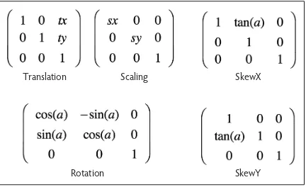
Here’s how we represent a 2-dimensional transformation matrix.
Equation 2.1
Since 2-dimensional transforms use only the first two rows, the matrix can be written as the vector [a,c,e,b,d,f]. A vector is a geometric quantity that has magnitude or length and a direction. For our purposes, all you need to know is that it’s another way to write the matrix.
A browser applies a transform matrix by multiplying the matrix by a vector [x, y, 1], where x and y are coordinates for a point in the local coordinate space, which becomes the origin for the new coordinate space.
CHAPTER 2 TR ANSfoR MS 27
Again, each transform is simply a specific matrix. A translation matrix, for example, looks like the following:
Equation 2.2
or as the scaler (1,0,0,1,tx,ty). Using the matrix, we don’t specify units for tx and ty. The unit of measure is px for translation when created with a matrix.
The transform we used before to translate an element 100 pixels along the x-axis and 50 pixels along the y-axis was
transform: translate( 100px, 50px );
The same translation can be set using a matrix transformation.
transform: matrix( 1, 0, 0, 1, 100, 50 );
All the transform functions can be written in terms of a specific matrix and used in the matrix function (Figure 2.9).
Translation Scaling SkewX
Rotation SkewY
C S S A N I M AT I O N S A N D T R A N S I T I O N S F O R T H E M O D E R N W E B 28
Translation—[1 0 0 1 tx ty] where tx and ty are the distance (in pixels) to translate the element.
Scaling—[sx 0 0 sy 0 0] where sx and sy units in the previous coordinate sys-tem represent one unit in the x and y directions in the new coordinate syssys-tem.
Rotation—[cos(a) sin(a) -sin(a) cos(a) 0 0]
SkewX—[1 0 tan(a) 1 0 0]
SkewY—[1 tan(a) 0 1 0 0]
Nested Transforms
Nesting transforms is the equivalent of applying one transform directly after another. Keep in mind that all these transforms are just mapping coordinates in one coordinate system to coordinates in a different system.
Using matrix transforms, for example, you might combine translation and scal-ing. Here is a translation matrix multiplied by a scaling matrix.
Equation 2.2
CHAPTER 2 TR ANSfoR MS 29
Adding Multiple Transforms to an Element
I assume you’d rather not use the matrix math we just covered whenever you want to combine transforms. Fortunately, you don’t have to; you can stick with the simpler transform functions.
transform: translate(100%, -100%) scale(2);
This CSS translates the element 100 percent to the right and 100 percent up, then scales the element by 2. There are two things of importance to note:
Order matters. Matrix math is not commutative.
There’s no comma in between transform functions; you’ll have to get used to omitting it.
Let’s take a look at the importance of order. The following two lines of CSS do not have the same result.
transform: translate(100%, -100%) scale(2);
transform: scale(2) translate(100%, -100%);
It might seem counterintuitive, but you can work the matrix multiplication one more time, switching the order of the scale and translations matrices.
Equation 2.2
The results are different when you switch the multiplication order.
Keep in mind when nesting transform functions that you have to call all func-tions on the same transform property.
This works:
This doesn’t:
transform: translate(100%, -100%);
transform: scale(2);
The second example leads to the element being scaled, but not translated. If you want both, you need to assign both functions to the same transform property.
You can nest transforms as many levels deep as you want. The result applies the first transformation, then applies the second transformation, then the third, and so on.
The Transform Rendering Model
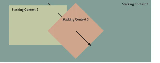
When you set a value other than none to the transform property, a new local coordinate system is established at the element where the transformation is applied. These new coordinate systems are called stacking contexts.
Let’s take a quick look at how stacking contexts work. Each of the coordinate systems we’ve talked about is a 2-dimensional plane. Pretend you can grab one of those planes, and place it on top of another plane along an axis per-pendicular to both planes. Think of it like stacking one piece of paper on top of another (Figure 2.10).
Stacking context 1: Document root
A stacking context is like a new independent layer in your document.
Elements on one stacking context usually don’t respond to elements on another stacking context when they render.
Transforms create a new stacking context, but other elements respond as though they don’t when rendering.
Stacking context 2:
An example is an element with a positive z-index applied.
The new context appears closer to the viewer.
Stacking context 3:
A transform creates a new stacking context. Note
Stacking Context 2
Stacking Context 1
Stacking Context 3
When a new stacking context is created as well as a new containing block for the element, it’s like taking something off of one sheet of paper and moving it to a different sheet of paper.
This applies only to the display of the element and its descendants. Other ele-ments treat the original element(s) as though they were still located on the original stacking context (the original sheet of paper).
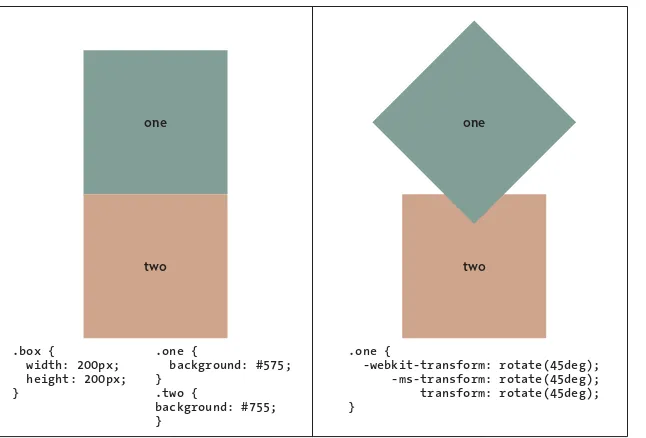
For example, let’s expand the original rotation example so it has two boxes instead of one (Example 2.8).
1. Assign a class of .box to each div, and distinguish them with the addi-tional .one and .two classes.
<div class="box one"></div>
<div class="box two"></div>
2. Give both divs the same dimensions.
.box {
width: 200px;
height: 200px;
}
3. Give each div its own background color.
.one {
background: #575;
}
.two {
background: #755;
}
The code results in a red square displaying directly below a green square.
4. Rotate the green square (.one).
.one {
-webkit-transform: rotate(45deg);
-ms-transform: rotate(45deg);
transform: rotate(45deg);
}
Notice how the red square doesn’t move after the green square rotates (Figure 2.11). As far as the red square is concerned, the green square hasn’t changed. It still displays as it did—right where it was before the transformation. The reason is that a new stacking context was created when you applied the transform.
Even though you might transform an element by rotating it or moving it to a new location, other elements on the page act as though the element was never transformed, and the now transformed element appears to be located on top of other elements around it, making it appear closer to the viewer.
one
two two
one
.box { width: 200px; height: 200px; }
.one {
background: #575; }
.two { background: #755; }
.one {
-webkit-transform: rotate(45deg); -ms-transform: rotate(45deg);
transform: rotate(45deg); }
3-dimensional transforms can have non-zero values for the z-coordinate, result-ing in a transformed element beresult-ing rendered on a different plane than its con-taining element. As you’ll see momentarily, you can use the perspective and
perspective-origin properties to add a feeling of depth to elements and
a composition by making elements that are closer to the viewer appear larger and those farther away appear smaller.
3-dimensional Transforms
The screens that display designs are 2-dimensional. But, imagine a third dimen-sion (the z-axis) moving into and out of the screen (Figure 2.12). You can assume the screen sits at the coordinate 0 along the z-axis and that positive val-ues for the z-coordinate are closer to you and negative valval-ues are farther away.
Despite all this imagining, the elements are still 2-dimensional planes with 0 depth. Rectangles don’t become cubes, and circles don’t become cylinders.
Figure 2.11
origin (0,0) x-axis
y-axis z-axis
Yet by using the following additional properties, you can display elements as though they are aware of some 3-dimensional space, and they’ll appear to the viewer to render in that 3-dimensional space.
perspective
perspective-origin
transform-style
backface-visibility
perspective Property
The perspective property is what turns on the 3-dimensional illusion. When
you set it for an element, every child element inside that parent displays as though it’s in 3-dimensional space. The perspective property takes two values: none
or a length, with none being the default. Length can be any positive number or zero. While you don’t specify the units, they will always be pixels. Setting
perspective to 500 sets it to 500px even though you don’t specify the px.
The smaller the length value, the deeper the perspective will be. It sounds counterintuitive, but a smaller length means deeper perspective. The value represents how far away the z=0 plane is located from the viewer. A lower val-ue creates a flatter (more parallel to the ground) object, which creates a more pronounced perspective effect.
Figure 2.12
The best way to illustrate perspective is with an example. Let’s use the same
.boxdiv we used for the 2-dimensional transform examples (Example 2.9). This time we’ll wrap it inside another div with a class of container.
1. Copy the file you created in the previous example, and give it a new name. Replace the HTML with the following:
<div class="container">
<div class="box"></div>
</div>
2. Modify the .box class by giving it a background color so you can see it. Changes to the code are highlighted. You can remove the .one class from the previous example too if you’d like.
.box {
width: 200px;
height: 200px;
background: #575;
}
3. Modify the width and height of the .container class and add the
per-spective. Changes and additions to the code are highlighted.
Note that the perspective is set on the container of the element that will be transformed in 3-dimensional space and not the element itself.
.container {
width: 200px;
height: 200px;
outline: 1px solid red;
-webkit-perspective: 250;
-ms-perspective: 250;
perspective: 250;
}
If you were to stop now, you wouldn’t see much. You need to transform the
.boxdiv to see how it transforms itself in 3-dimensional space.
Note
4. Rotate the .box around the y-axis.
.box {
-webkit-transform: rotateY(60deg);
-ms-transform: rotateY(60deg);
transform: rotateY(60deg);
}
Because a perspective value has been set, the .box appears to be rotating in 3-dimensional space (Figure 2.13).
.container {
outline: 1px solid red;
-webkit-perspective: 250; -ms-perspective: 250; perspective: 250; }
.box {
-webkit-transform: rotateY(60deg); -ms-transform: rotateY(60deg);
transform: rotateY(60deg); }
When looking at 2-dimensional transforms, you have a single rotate() func-tion. You are dealing with 2-dimensional space with only one way to rotate elements, which is around an axis running perpendicular to the plane of the element—the z-axis.
Now that you’re working with 3-dimensional space, you can rotate elements around any or all of the three axes. Choosing the z-axis won’t do much to show perspective, though. You’re better off rotating around either the x- or the y-axis. In this example, I chose the y-axis.
When working with the perspective property, results aren’t necessarily what you expect. I gave the .container and .boxdivs the same dimensions in the example for a reason—to isolate the perspective and get results that come closer to meeting your expectations.
Figure 2.13
The best way to get a feel for how elements display in perspective is to play around with some values. I encourage you to type the previous example in your code editor, experiment with some of the perspective values, and observe the change in a browser. Remember, the smaller the number, the greater the perspective.
Once you have a handle on the perspective, try changing the values in the
transform function. Try different rotation angles to see what happens. You
can prove the .boxdiv is still a 2-dimensional object by rotating it 90 degrees. It’ll be perpendicular to the screen and disappear since it has no depth.
perspective-origin Property
The perspective-origin property is similar to the transform-origin
property. By default, the perspective-origin is centered on the viewer at
50%50%, and like perspective is set on the container and not the trans-forming element.
-webkit-perspective-origin: 50% 50%;
-ms-perspective-origin: 50% 50%;
perspective-origin: 50% 50%;
The same values that are available for the transform-origin property are
available with the perspective-origin property. Once again, you can set a percent or a length of any measurement type. You can also use the same keywords that are available for the transform-origin property with the same result.
top—0% in the vertical
right—100% in the horizontal
bottom—100% in the vertical
left—0% in the horizontal
center—50% horizontal and 50% vertical
You’re doing the same thing you did before with the transform-origin
property: You’re moving a single point around on the screen. With
transform-origin, that point is the one around which the element transforms. With
perspective-origin, that point represents the single point of single-point
perspective.
The reason the .container and .box have the same dimensions as in the previous example is so the perspective-origin doesn’t throw you off. If the dimensions were different, then 50%50% would be the center of the contain-er and not the centcontain-er of the box, which might not be what you expect. When both are the same dimensions, 50%50% is the center of both.
Experiment with the different values (Example 2.10).
1. Add a perspective-origin to your .container div so the CSS is
as follows:
.container {
width: 200px;
height: 200px;
outline: 1px solid red;
-webkit-perspective: 250;
-ms-perspective: 250;
perspective: 250;
-webkit-perspective-origin: 50% 50%;
-ms-perspective-origin: 50% 50%;
perspective-origin: 50% 50%;
}
Nothing should change because you’re using the default values for the
perspective-origin. Figure 2.14 shows the result of several different
perspective-origins. Try different values on your own to get a better
perspective-origin: 15% 50%; perspective-origin: 75% 50%; perspective-origin: 50% 75%;
2. Adjust the first value (x-coordinate), and see how the result changes.
3. Adjust the second value (y-coordinate), and check the results.
Once you are comfortable, experiment with the dimensions for the container.
4. Increase the .containerwidth. Decrease its height. See what happens. Experimenting with values like this is one of the best ways to get a feel for any code.
transform-style() Property
The transform-style property controls whether or not the children of an
element render in flat 2-dimensional space or if they render in 3-dimensional
space. The transform-style property has only two available values: flat
and preserve-3d.
transform-style: flat;
transform-style: preserve-3d;
When you set transform-style to flat, children of the element appear
flat-tened on the parent element. When set to preserve-3d, they create a new
stacking context and render in their own 3-dimensional space relative to the parent element. Neither affects the parent element.
Figure 2.14
The following properties and values render an element flattened on its parent container, regardless of the value set on transform-style for the parent element.
overflow—Any value other than visible
filter—Any value other than none
clip—Any value other than auto
clip-path—Any any value other than none
isolation—Used value of isolate
mask-image—Any value other than none
mask-box-image-source—Any value other than none
mix-blend-mode—Any value other than normal
This is all easier to see with an example (Example 2.11). Here is HTML for three nested elements: a container, a parent, and a child.
1. Give the .containerdiv dimensions and an outline so you can see it.
2. Add values for the perspective and perspective-origin properties.
.container {
width: 300px;
height: 300px;
outline: 1px solid red;
-webkit-perspective: 500; other CSS can override the value. Some CSS properties require a flattened representation of an element before they can be applied. The W3C offers a list
-webkit-perspective-origin: 50% 50%;
-ms-perspective-origin: 50% 50%;
perspective-origin: 50% 50%;
}
3. Give .parentdiv dimensions and a background so you can see it.
4. Rotate the .parentdiv about the y-axis, and set the transform-style
to preserve-3d. This means its children (in this case the .childdiv)
render in their own 3-dimensional space.
.parent {
width: 300px;
height: 300px;
background: #575;
padding: 50px;
-webkit-transform: rotateY(45deg);
-ms-transform: rotateY(45deg);
transform: rotateY(45deg);
-webkit-transform-style: preserve-3d;
-ms-transform-style: preserve-3d;
transform-style: preserve-3d;
}
5. Give the .childdiv dimensions and a background color, and rotate and translate it about the x-axis and z-axis respectively.
.child {
width: 200px;
height: 200px;
background: #557;
-webkit-transform: rotateX(30deg)