Responsive
DESIGN
WordPress
How to make great responsive
themes and plugins
Joe Casabona
with
W
or
d
Pr
e
s
Responsive
DESIGN
WordPress
How to make great responsive
themes and plugins
Joe Casabona
To report errors, please send a note to: [email protected] New Riders is an imprint of Peachpit, a division of Pearson Education. Copyright © 2014 by Joseph Casabona
Acquisitions Editor: Michael Nolan Project Editor: Nancy Peterson
Development Editor: Eric Schumacher-Rasmussen Copyeditor: Joanne Gosnell
Proofreader: Scout Festa
Technical Reviewer: Stephen N. Mekosh Production Coordinator: David Van Ness Compositor: Danielle Foster
Cover Designer: Aren Straiger Interior Designer: Danielle Foster Indexer: FireCrystal Communications
Notice of Rights
All rights reserved. No part of this book may be reproduced or transmitted in any form by any means, electronic, mechanical, photocopying, recording, or otherwise, without the prior written permission of the publisher. For information on getting permission for reprints and excerpts, contact [email protected].
Image of Treo used courtesy Jonathan Vasata/Shutterstock.
Notice of Liability
The information in this book is distributed on an “As Is” basis, without warranty. While every precaution has been taken in the preparation of the book, neither the author nor Peachpit shall have any liability to any person or entity with respect to any loss or damage caused or alleged to be caused directly or indirectly by the instructions contained in this book or by the computer software and hardware products described in it.
Trademarks
WordPress is a registered trademark of the WordPress Foundation in the United States and/or other countries.
Many of the designations used by manufacturers and sellers to distinguish their products are claimed as trademarks. Where those designations appear in this book, and Peachpit was aware of a trademark claim, the designations appear as requested by the owner of the trademark. All other product names and services identified throughout this book are used in editorial fashion only and for the benefit of such companies with no intention of infringe -ment of the trademark. No such use, or the use of any trade name, is intended to convey endorsement or other affiliation with this book.
ISBN 13: 978-0-321-95741-2 ISBN 10: 0-321-95741-5
9 8 7 6 5 4 3 2 1
Acknowledgments
I’d like to thank the following people, without whom this book wouldn’t be in your hands:
R Stephen Mekosh for not only being a fantastic tech editor and a good friend, but also being the first person to show me both CSS and WordPress.
R Michael Nolan for giving me the chance to write this book and welcoming me to Peachpit Press/New Riders.
R Nancy Peterson and Eric Schumacher-Rasmussen for advice and guidance, editing, keeping me on track, and our weekly talks.
R Joanne Gosnell and Scout Festa for copyediting and proofreading, respec-tively, and for making it seem like I have a good command over grammar and the English language.
R The design team at Peachpit Press for making this book look amazing.
R Jesse Friedman for the wonderful foreword and kind words.
R Jason Coleman, Stephanie Leary, Lisa Sabin-Wilson, and Pippin Williamson for letting me pick their brains on both WordPress and the art of writing a book.
R My family and friends, especially my parents; my brothers Phil, Mike, and Rob; Dave Redding; Rob McManus; Matt Wren; and my wonderful girlfriend, Erin Holman.
Contents
Foreword viii
Introduction x
Chapter 1
What Is Responsive Web Design?
1
Responsive Web Design Origins
2
Breakpoints & Media Queries 3
The Current State of Devices 7
Consider Connection Speeds 8
Wrapping
Up 11
Chapter 2
Creating a Basic WordPress Theme
13
Meet Our Website 16
Template
Structure 16
The
Loop 23
Custom Post Types 26
Plugins and Shortcodes
29
Wrapping
Up 33
Chapter 3
Making Your Theme Responsive:
The Ground Floor
35
Responsive
Techniques 36
Adding the Responsive Layout 42
Chapter 4
Making Your Theme Responsive:
Core
Features 57
Handling Navigation
58
Handling Images 75
Handling Widgets 81
Wrapping
Up 88
Chapter 5
Making Your Theme Responsive:
Blog
Features 91
Handling Comments
92
Handling Archives 103
Wrapping
Up 119
Chapter 6
Using Responsive Theme
Frameworks 121
Some Principles of Reuse to Keep in Mind
122
About WordPress Frameworks
129
Popular WordPress Frameworks
132
Wrapping
Up 140
Chapter 7
Techniques and Tutorials
141
Introduction 142
How to Build a Responsive WordPress
Photo
Gallery 144
How to Build a Responsive WordPress Map Page
Using Google Maps 150
How to Build a Responsive WordPress
How to Build a Responsive WordPress
Contact
Form 161
How to Build a Responsive WordPress
Products
Page 167
Wrapping
Up 177
Appendix
Resources 179
A Few Words to Sum Up
180
Books 181
Meetups 184
Links 185
Foreword
By Jesse Friedman
Today WordPress powers 20% of all websites, and we can look forward to it powering 1 in 4 sites launched in 2014. I launched my first WordPress-powered website in 2005, before all the “cool kids” were doing it. I am very proud to be a veteran developer and strategist for a product used by millions of people all over the world.
Since I launched that first site back in 2005, I have written my own book on devel-oping for WordPress, and I have a few more coming out in spring 2014. I have also contributed to other books and written articles for online publications such as
Smashing Magazine and net Magazine, and I teach both in universities and online. I have also spoken at conferences all over the world, including one where I met Joe Casabona.
I was honored when Joe asked me to write the foreword for this book, because I knew it was going to be great. Joe has a real talent for turning complicated solu-tions into very simple step-by-step direcsolu-tions. WordPress was built to be simple— simple to set up, simple to install, and simple to extend. Still, it can be somewhat challenging to understand for novice designers and developers who are looking to build on basic WordPress functionality.
These challenges prompted me to write my book Web Designer’s Guide to WordPress: Plan, Theme, Build, Launch in 2012 and is exactly why Joe wrote his book this year. We are both veteran developers who want to help grow the WordPress community. The best way to do that is to help educate the community and share our experiences and knowledge around a product we use every day. Joe has done just that with Responsive Design with WordPress. This is a solid book with lots of great examples.
Not to mention you’ll be learning two skills at the same time. You’ll be learning WordPress and, at the same time, gaining experience specifically in Responsive Web Design. This approach will not only help to strengthen your skills in both areas but will also make you an expert in a very profitable niche.
As I mentioned earlier, WordPress will power 25% of all websites launched in 2014. This means that 1 in 4 new sites will need a developer who knows WordPress. What’s more, as of this year more information is being consumed on mobile devices than on traditional computers. If you didn’t have strong skills in Responsive Web Design in 2013, you’re definitely going to need them in 2014 and beyond.
Introduction
I got my first portable device when I was a freshman in high school. It was the Palm m100 and I loved it dearly. It didn’t do much, and, well, at 13 or 14 I didn’t have much to use it for. But having a computer in my pocket? Crazy! As a result, it went everywhere with me (and may have gotten taken away once or twice after I used it in class).
Then I moved to the Compaq iPAQ, which ran Windows and had a color screen. Even crazier, I thought. I could run real programs on this. I even asked about campus Wi-Fi when I was visiting colleges in the early 2000s, when it was just becoming popular. I thought of all the amazing things I could do with a tiny com-puter that came with a pen (stylus) and fit in my pocket. Still, I found myself want-ing more after a while. This brwant-ings me to my first smartphone: the Palm Treo 650 (Figure 0.1).
I would do everything on this phone—make calls, take photos, sync my Google Account to it. It even had a primitive browser called Blazer. I could visit websites from my phone!
Since then, of course, the mobile landscape has changed. The iPhone brought a full-featured browser to mobile devices, capable of everything from CSS to JavaScript. It didn’t solve one problem, though: the problem of the small screen. That’s where Responsive Web Design comes in.
Perhaps you’ve heard of it. It’s apparently pretty popular right now. Lots of people—developers, designers, agencies, and users—are asking about it. And why shouldn’t they? On top of catering to what is a quickly growing market, it’s pretty cool. Responsive Web Design has become one of those things people check for when they visit a site (resizing a webpage is totally the new “check the source for table layouts”).
If you’re designing a website, you ultimately have no control over how it’s viewed; you don’t get to decide where it’s viewed or what it’s viewed on or the connection on which it’s viewed. That might sound scary to some, but to me (and I bet to you, too) it’s quite the contrary. I love solving that problem. That’s not to say it’s not a little daunting. I mean, you need to create a website that is easy to use on mobile but that totally “wows” on the desktop. That’s what Responsive Web Design is all about.
WordPress is pretty great too. It powers millions of webpages. Hundreds of mil-lions, even. As you read in the Foreword, it will run 1 of every 4 websites launched in 2014. It does a lot for us while allowing us to do a lot. So how does WordPress fit in with Responsive Web Design? Well, as it turns out, it can be really helpful when creating responsive themes; it has a lot of really great built-in features that we, as developers, can leverage to create better responsive sites. And that’s just what I’m going to show you how to do.
Who Is This Book for?
I’d like to tell you that this book is for anyone looking to develop WordPress sites, but in order to get into the real heart of why I wrote this book, I need to make a few assumptions about you, dear reader.
So this book is for web developers and WordPress developers who want to take advantage of what WordPress has to offer in order to create great responsive websites. In this book, we are going to cover a wide range of topics and techniques for converting website elements to responsive WordPress theme features.
I will provide a bit of a primer, however. In the first chapter, we will take a closer look at Responsive Web Design: what it is, where it came from, and best practices for using it. Then, there will be a brief overview of WordPress theme develop-ment; this will go over some of the major parts of the WordPress theme—impor-tant files, the Loop, Custom Post Types, plugins, and more. Then, we’ll get into the real fun part.
The real meat of the book—making a responsive WordPress theme—is divided into three parts. Chapter 3 will cover prominent responsive techniques and how to integrate them into the WordPress theme. Chapters 4 and 5 will look at specific components of a WordPress website, including navigation, images, com-ments, widgets, archives, and plugins.
We will wrap up the book by looking at responsive theme frameworks and child themes in Chapter 6, followed by a cookbook-style section full of tutorials for responsive development in Chapter 7.
Why Did I Write This Book?
When I came up with the idea for this book, there were a lot of things floating through my head. Responsive Web Design is always changing; WordPress is always changing. The best practices of a couple of years ago have changed in both fields, and it’s important to get that information out.
Coding Conventions
First of all, any code you come across in the book will be presented in one of two ways. It could be inline, like this: <?phpecho“Hello World!”;?>, or it could be in its own block, which looks like this:
function hello_world(){ $s= “Hello World”; return $s;
}
print hello_world();
Either way, you should be able to recognize it pretty quickly. As far as standards, the WordPress Codex lays out quite a few (http://rwdwp.com/16). I will do my best to adhere to these coding standards.
To denote that the code on the page takes place in the middle of a block of code (that is, there was some code skipped between the first line listed and the next), look for an ellipses (...).
A couple of things I’d like to point out: I will be using HTML5 markup here, but we won’t do anything with the more advanced facets of HTML5, like Web Sockets or Storage APIs.
In most cases, the CSS will use .classes instead of #ids. This should make for cleaner CSS while eliminating the need for really specific selectors. All of my CSS will be formatted like this:
.class-name{ color: #FFFFFF; background: #000000; }
Notice the use of dashes (-) instead of camel case or underscores, and the fact that the closing bracket is also indented. This makes it easier to read the CSS, especially when there is a lot.
Conversely, my PHP function names will always use underscores (_) and be pre-fixed with mf_, like this: mf_get_featured_images().
TIP
Finally, sometimes the layout limitations of a print publication mean that we have to stretch single lines of code over more than one line. In those cases, you’ll see a light gray arrow (p) to indicate that these lines of code should not be broken when you use them. If you’ve got the digital version of this book, you may find that code breaks unpredictably in the text. In that case, it’s important to rely on the downloadable files (www.rwdwp.com) for accuracy.
Other Book Notes
There is a lot of code in the book. Most of the time I will point out where you can find that code. If I don’t, all of it is available on the book’s website, www.rwdwp.com, as well as on GitHub. You will also find a list of all the short URLs and the sites they point to.
As you code throughout the book, you’ll notice that I don’t make much mention of testing before Chapter 6; it’s important to test on at least a couple of devices, especially if you plan on using these techniques in production-ready sites (and I hope you do).
Finally, I tend to use a lot of acronyms, which are usually defined in context. In case they aren’t, here are the most common ones:
R RWD: Responsive Web Design
R WP: WordPress
R RESS: Responsive Design + Server Side Components
Chapter
1
If we are being honest with each other, you’re probably not here to learn about Responsive Web Design (RWD). You know what it is, and you know the justification. The web is always changing; as of this writing, there are more than 6000 screen resolutions on Android devices alone, and our websites need to adapt! There have been countless books written on the topic since the idea emerged in 2009.
You may have read one of those books or blog posts on the topic from countless authors, or perhaps even implemented your own responsive design already. You’re here to learn how to leverage WordPress to improve your responsive designs.
By that same token, we can’t just start in the middle. You’ll need to learn at least some background before we really dig into it. Trust me, I’m doing this for both of us.
This chapter dives into the history of Responsive Web Design starting with the blog post that launched it all, and then moves into best practices. You’ll see the best ways to handle determining and creating breakpoints, other considerations for RWD, and the current state of devices (spoiler alert: There’s a lot of device diversity). Because of this, you should at least be familiar with HTML and CSS and the theory behind fluid grids.
Responsive Web Design Origins
Ethan Marcotte coined the term Responsive Web Design in his article of the same name for the webzine A List Apart (http://rwdwp.com/1). In the article, he says:
The rest, as they say, is history. Mobile is an integral part of society, and people are doing more and more on their phones...but more on that later. Right now, we will talk about implementing RWD and perhaps the most crucial part of a responsive design: the breakpoints.
Breakpoints & Media Queries
Breakpoints and media queries are how we (through CSS) tell the browser when to adjust our designs due to screen size. The media queries themselves aren’t nec-essarily very new; they’ve been around for quite some time and are supported by most browsers (Figure 1.1). Developers use media queries to apply CSS based on specific conditions (e.g., only screens or print, or by browser width). Breakpoints are the browser widths determined by the developer; they are the point at which the layout will change. For example, 1024px can be considered a breakpoint.
The advent of mobile devices has spurred the need for media queries and break-points. Furthermore, we need to keep in mind that this is still an evolving technol-ogy. When Marcotte first introduced Responsive Web Design, there weren’t too many popular devices, so some “common” breakpoints emerged.
Since then, the number of screen sizes has grown exponentially in both directions, and different approaches to breakpoints have been proposed regarding both how the breakpoints are represented and how they are determined. What I’m about to outline are not only considered best practices (at the time of this writing), they’re also the techniques I’ll be discussing throughout the rest of the book.
Em-based Breakpoints
In the previous section, you saw the emergence of “common breakpoints” based on the specific pixel widths of browsers. As early as 2011, developers were notic-ing that these common breakpoints couldn’t be relied upon to establish RWD best practice for two reasons. The first has to do with websites adapting not only to the device but also to the user’s settings. In her article “The ‘Trouble’ with Android” (http://rwdwp.com/2), Stephanie Rieger talks about how it’s impractical not only to design for specific screen sizes, but also to presume we know what the user’s device settings will be. While the browser assumes some defaults for font sizes, margins, and more, users have the ability to change the defaults to better suit their needs. If a user has trouble reading small text, for example, he or she could increase the default size of text. As long as a website is coded properly, the font size will automatically increase with the user’s settings. For this reason, we should move from pixel-based breakpoints to em-based ones.
Web developers have actually been using ems to define element sizes for years. This is because the key to flexible text that will not break with browser settings is text with font sizes based on ems, not pixels. This is very important to remember: pixels are absolute values. If font sizes (and other elements, for that matter) are defined using pixels, they will not change regardless of the user’s preferences.
By using ems for font size, our font is sized properly based on our design as well as the user’s preferences, so if the user zooms his or her browser, our design does not break. This same technique can be applied to breakpoints, where instead of using pixels, we use ems to define where our design changes. This ensures that the website’s layout is flexible and responsive, not only to the width of the browser but also to the user’s settings. In other words, it puts the user in com-plete control of how he or she views the content.
This falls perfectly in line with what RWD is all about: we don’t know what devices users will view our sites on, therefore we should design in such a way that they will look good on any device.
So it makes sense that flexible, em-based breakpoints are the way to go to ensure the greatest amount of flexibility in a layout. However, there is one more thing we need to do with regard to media queries in order to make them as device-agnostic as possible.
Content-based Breakpoints
Going back to the notion of “common” breakpoints, developers would essentially build for three (or so) devices; namely, the desktop, the iPad, and the iPhone. So instead of locking your design to one device, you’re now locking it to three devices. That’s an improvement, but a very minor one given the hundreds of devices now available to consumers. With the constant stream of emerging devices and the quickly diversifying pool of screen resolutions, it’s a near-impossible task to determine which screens you should design for. That’s why what has now emerged as best practice is determining breakpoints based not on device, but on content. Rieger lays out the reasoning for this sort of development in her article.
Converting Px to Em and Percentages
Determining px to em is pretty simple: Em represents 16px, so 1em = 16px. Of course, there are also a lot of resources to help you convert. My favorite is www.pxtoem.com. It will do the conversions both ways, as well as change the base pixel value for you.
Of course, as you drill down (or cascade down, if you will), it won’t be so simple, as elements inherit their styles from the parent elements. This means if the font size is 20px, your base value is
20px, not 16px. But don’t fret! Ethan Marcotte offers a simple mathematical solution for figuring out
your em value:
target/content = result.
So if your base font size is 20px and you want your font size to be 24px, you would calculate 24/20 = 1.2, so your font size would be 1.2em. Similarly, if you want it to be 16px, you would calculate 16/20 = 0.8, or 0.8em.
With layouts, you can do the same with percentages. So if you decide you want your layout to be based on a 960px grid, your content would be 960px. If you want the main content area to be 600px, you
By determining breakpoints based on content, we are finding where our design breaks and fixing it there instead of figuring out the devices on which we want our design to look good. In the screenshot in Figure 1.2, my logo/avatar starts to eat the page, so I need to add a breakpoint there to properly size the image.
Figures 1.3 and 1.4 show another of my websites where the buttons only extend to 50% of the screen at a certain point, completely breaking the design. This is where a breakpoint should go.
In both instances, I need to check to see what the website looks like as I widen the browser window, and then mark down the em value at the point where the web-site’s design changes or looks bad.
Figure 1.3 A small side proj-ect of mine in the mobile view
Figure 1.4 The same project expanded out to about double the width
TIP
For breakpoint checking, I use a Chrome extension called Window Resizer, available at http://rwdwp.com/3
The Current State of Devices
In the last two sections, you looked at how to represent breakpoints in the most flexible way possible. Now it’s time to look at why it’s crucial to determine break-points on content rather than devices. There are over 6,000 screen resolutions on Android alone—something I first heard from Luke Wroblewski in a talk from 2012. A cursory search for “most popular mobile devices” brings up scores of blog posts, articles, and stats outlining the top 10, 20, even 50 mobile devices. Brighthand.com, a smartphone news blog, publishes the 41 top devices according to their last 5 days of traffic. If we look at my collection of devices, most of which connect to the Internet, we have:
Table 1.1
DEVICE SCREEN SIZE* RESOLUTION*
Samsung Galaxy SIV smartphone
5 inches 1920x1080 Google’s Nexus 7 tablet 7.02 inches 1920x1200 Apple’s iPhone 4S smartphone 3.5 inches 640x960
Apple’s new iPad tablet (3rd
generation)
9.7 inches 2048x1536
Sony’s Google TV box (1st
generation)*
55 inches 1920x1080 Microsoft Xbox 360* 55 inches 1920x1080 Sony PlayStation 3* 55 inches 1920x1080 Google Project Glass Prism
Projector**
640x360 Amazon Kindle Ereader 6 inches 600x800
*For devices that connect to TVs, I used my TV’s information.
That’s a lot of devices, and I’m just one guy! If I visit my family’s home, we’d have to add the iPhone 5, the HTC 8.X running Windows Phone, a Kindle Fire (2nd genera-tion), and several other devices my parents and brothers own. StatCounter Global Stats has a graph of the 14 most popular mobile screen resolutions (Figure 1.5).
It would be impractical to try to design for all of these devices or screen resolu-tions, and impossible to predict what the graph would look like a year from now. That is the biggest reason why determining breakpoints based on content and not devices is incredibly important for a good user experience.
Consider Connection Speeds
This is not a comprehensive book about RWD in general, nor is it an overview of mobile development, but in wrapping up this section I want to mention some final aspects of RWD that are important to create a good user experience. After all, a great design or great content will be lost on the user if the overall experience is not good.
Remember: Not everyone is going to be on the fastest Wi-Fi or 4G when viewing your site. Users might be on 3G, weak Wi-Fi, or even Edge. Keep your websites as lean as possible. This means don’t load superfluous JavaScript libraries or massive images if you don’t need to. This is incredibly important because, as Brad Frost points out, 74% of all users will abandon a site if it takes more than 5 seconds to load. While things like jQuery can be helpful, if they are big and don’t add a lot of value, they aren’t worth exploring.
Website performance goes beyond this, however. I’ve seen a lot of sites implement CSS that will hide certain sections of a page, depending on the breakpoint, in order to reveal more ”screen-optimized” sections. While the intention is good, the result may be bad because you’re forcing the user to download extra markup/code.
If someone is using a smartphone, they will never see the HTML for the desk-top, even though they just downloaded it to their device. Things like this can add up, especially if you’re hiding images or other multimedia. This, for me at least, is the most compelling reason to consider a “Mobile First” approach to designing websites.
NOTE
Remember: CSS can weigh a lot. Optimize your style sheets, and com-bine them when you can.
Use Discretion!
If you’re smart about using JavaScript libraries, CSS frameworks, or other extra code, the experience for users won’t be bad. There are a few libraries I use that add value to the website without bogging it down too much. Some questions to ask yourself:
1. Why do I have this library?
2. Is there a better way to accomplish my goal?
3. Do I need everything the library has, or can I trim it down?
4. Some goals I accomplish with JavaScript libraries and snippets:
■ HTML5 support for IE
■ Media Query support for IE
There are other file optimizations you can make to lighten your user’s load. Regarding images specifically, and thinking ahead to of some of the techniques we’ll look at in later chapters, you can run your images through tools that will decrease the file size without removing quality. On a Mac, you can get ImageOptim (http://rwdwp.com/5) . On the PC, there is RIOT (http://rwdwp. com/6). (Figure 1.6)
Finally, as we look at some tools, particularly JavaScript, you will see a size, “after minified and gzipped.” Minifying a file means removing extra spaces, lines, and comments from a file to reduce the size. Another way you can do that is having your server Gzip the files before sending them to the user.
Figure 1.6 An image optimized with ImageOptim. The original is on the left, and the optimized ver-sion is on the right (size reduced by 10%). Photo by Philip J. Casabona
Mobile First!
In Luke Wroblewski’s book Mobile First, he talks about building websites from the smallest screen out. He argues (and I would agree) that it forces you to consider the most important features and UI elements, as you’re designing for a small screen. This will also affect what kind of libraries and effects you use.
This is something you will have to set up on your server. Through a few set-tings you can tell your server to serve up certain files compressed by default. In general, HTML, CSS, and JavaScript should be gzipped. Files like images are already compressed.
Curious about your connection speed? Figuring it out is pretty easy. Just follow these steps!
1. Open your favorite browser, and head to www.speedtest.net or
on your mobile device, download the Speedtest app.
2. Click the Begin Test button
3. Watch as it:
R Pings a server from your machine
R Gets the download speed
R Gets the upload speed
When it comes to websites, you should be interested in the download speeds. At home, you can get around 30mbps (I actually get 70mbps at work). 4G will be around 5mbps, maybe 9 on a good day. 3G, however, can be really low—1mbps, even less. That’s when page weight can really affect the user.
We will really take advantage of WordPress for this sort of thing.
Wrapping Up
That successfully concludes my primer on Responsive Web Design. I hope you found it helpful, because now we are going to get into the real reason you’re here. Together, we are going to answer the question “How can I use WordPress to make great responsive sites?”
From here on out, we’ll look at techniques and implementations in WordPress themes for best RWD practice using built-in WordPress functions, lightweight JavaScript, and server-side detection. The last part of the book will be “cookbook” style tutorials for responsive UIs in WordPress.
TIP
Questions
1. Who coined the term “Responsive Web Design”?
2. Why is it important to use em-based breakpoints over px-based ones?
3. What is the best way to determine breakpoints?
4. What are some other things you need to consider (besides screen size) when creating a responsive website?
Answers
1. Ethan Marcotte coined the term in his article of the same title in A List Apart.
2. Em-based breakpoints are more flexible than px-based ones and adjust with the user’s personal settings.
3. The best way to determine breakpoints is based on the content: selecting a breakpoint when the content starts to look bad.
Chapter
2
Creating
a Basic
WordPress
WordPress did something pretty ingenious with their platform. They completely separated content from function from design. Smartly, WordPress’ themes and plugins let you manage content, look and feel, and features completely indepen-dently of one another. This separation of concerns is something you should keep in mind when developing for WordPress; it’s something that will be covered quite a bit in this chapter. As a matter of fact, in this chapter, you will dive right into cod-ing within WordPress, and it’s important that you remember this separation.
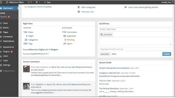
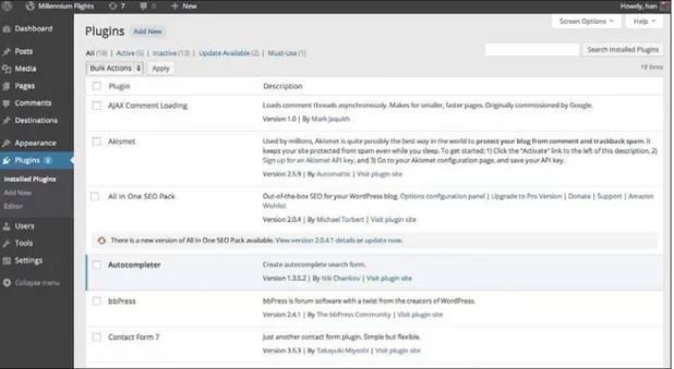
There are tons of files in the WordPress directory, organized nicely and named intuitively. Everything you need to worry about will be in /wp-content/. This is where both the /plugins/ directory and /themes/ directory are kept (Figure 2.1).
Figure 2.1 The WordPress Dashboard shows you recent site activity and stats right when you log in.
site. An important rule of thumb to consider when trying to determine if some-thing belongs in a theme or a plugin is asking yourself, “Would I want to keep this if I redesign the site?” If the answer is (or could ever be) “No,” make it a plugin. If it’s “Yes,” consider if what you’re adding applies strictly to look and feel. If it does, it probably belongs in your theme.
“would I want to keep this if I redesign the site?”
There has been a trend toward feature-loading some commercial WordPress themes so users feel like they are getting more value. But there’s a massive draw-back to this. If you feature-load themes with things that don’t directly affect the design of the site, then site owners and users will lose those features if they do a redesign. Custom Post Types (CPTs), which allow you to add different forms of content to WordPress sites, offer a good example of the potential problems. Let’s say, for example, you have a business CPT built into your theme, which you then use to build a business directory. If you change out or disable that theme, you’ll
lose all of that content. You’d have to copy the CPT out of the theme and into the new one, which may not be an option for some users; if a user doesn’t have direct access to the server, he or she cannot change the theme on the code level. The same goes for features like image sliders, payment gateways, or anything else that doesn’t strictly pertain to design.
With that caveat in mind, it’s time to take a close look at theme development. We will cover four topics: Template Structure, The Loop, Custom Post Types, and Plugins.
Moving forward, the WordPress Codex (or just “The Codex”) is going to be an indispensable resource. It’s the most extensive documentation on WordPress and the number-one site for learning about WordPress APIs. It also has lots of sample code, change logs, and best practices. In short, it’s your best friend as you develop WordPress themes and plugins.
Meet Our Website
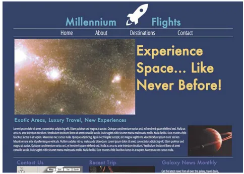
Now is as good a time as any to introduce the site we will be working on for the rest of the book. It’s a website for a space travel agency called Millennium Flights. Throughout the book, we will be taking our HTML/CSS design and converting it to a fully responsive WordPress theme (Figure 2.2). How fun!
Template Structure
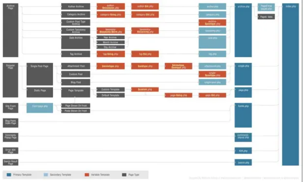
As you develop a theme, which is the blanket name for the entire design of a WordPress site, you create individual templates that control displaying certain aspects of the site, such as posts, pages, CPTs, and so on. Under WordPress’ hood is a very sophisticated template hierarchy that displays content based on how the theme files are named. The only pages that are actually required to make a theme work properly are style.css and index.php, which is the template that
WordPress uses if there are no other templates available in the theme. That said, you can design a multitude of different templates for pages, single posts, category pages, tags, taxonomies, and more. For even more control, you can get specific with pages, tags, categories, and post types. For example, if you had a CPT named “businesses,” you could create a template named single-businesses.php, which would automatically be used to display posts of that type. In the event that you had that CPT but no specific template for it, WordPress would fall back to a different template, single.php, or if single.php doesn’t exist, index.php. You can see the entire fallback structure in Figure 2.3, The WordPress Template Hierarchy.
While we won’t look at every aspect of this hierarchy, let’s cover the basics before we move onto the fun stuff—actually building the responsive theme!
Figure 2.3 The WordPress Template Hierarchy. You can see an interactive version of this flowchart at http://rwdwp.com/9.
TIP
style.css
It makes sense to start with the style.css file for the simple reason that this is where your theme is defined. Aside from the site-specific CSS that goes in here, every style.css file starts with something similar to this block of code:
/*
Theme Name: Millennium Flights
Theme URI: http://www.millenniumflights.com
Description: A custom theme for Millennium Flights, Inc. Version: 1.0
Author: Joe Casabona
Author URI: http://www.casabona.org
Tags: blue, white, two-column, flexible-width
License: GPL
License URI: http://www.gnu.org/licenses/gpl.html
General Comments can go here, but are optional. */
This block tells WordPress everything it needs to know in order to list a theme in the Themes > Appearance section of the WordPress admin. The only thing found on the admin panel that is not mentioned in this comment block is the associated screenshot. That is a separate file called either screenshot.png or screenshot.jpg.
Regarding the CSS for the site, the WordPress Codex makes some recommenda-tions based on general best practices, such as “use valid CSS when possible,” “cut down on browser-specific hacks,” and “include a print.css file.” In addition to these recommendations, I also recommend that you consolidate all of your CSS into
one file.
It’s common practice for developers to separate the CSS into four different files (names may vary): reset.css, master.css, fixes.css, and style.css, which would just call the other three. As mentioned in Chapter 1, responsive web design is about more than just making a website that resizes; it’s about creating a good experi-ence across all platforms. If a user has a limited or slow Internet connection, more requests means slower performance. Instead of using four style sheets, you can use one and remove three requests to the server that eat up bandwidth the user may or may not have.
NOTE
Another Codex recommendation worth noting is a set of some common CSS styles used for aligning images and styling captions, which is helpful if that wasn’t at the forefront of your mind in the design stage. You can find that at http:// rwdwp.com/11. Perhaps even more helpful is wpbeginner’s complete list of WordPress-generated CSS classes, which you can find at http://rwdwp.com/12.
functions.php
Even though I said WordPress themes only need two files—style.css and index. php—I want to save index.php for last. The next three files we’ll look at are going to be instrumental in building a proper index.php, so we’ll get those out of the way first, starting with functions.php.
The functions.php file is a place for your miscellaneous PHP code. You can use it to add features like sidebars, navigation menus, thumbnail support, your own php functions, theme options, and more. As a matter of fact, The Codex describes it as a “plugin” file for your theme. It may not be necessary, but it’s very helpful. I gen-erally use mine to define constants I use throughout the theme as well as some common functions I found myself using over the years. It’s good to keep things organized and not just dump anything and everything in this file, but it can serve as a central place for added functionality.
In this book, functions.php will also be used to do things like server-side detection of screen resolution so you can serve up different templates based on the device the user is using.
A couple of things to note about the functions.php file:
R You can use WordPress Hooks to tap deep into WordPress. You can do things
like modify the RSS widget, add a custom logo to the login screen, change the excerpt length, or even modify the output of the the_content() function.
R You can define your own functions, which will all be applied site wide,
includ-ing in the admin panel. Remember to prefix any functions or classes you write to avoid conflicts. You should do the same thing with plugins and short codes as well.
R When working in functions.php, try to be aware of what you’re adding; remem-ber to ask yourself if you’d want to keep what you’re adding in a redesign. Things can get a bit blurred when working in this particular file.
header.php and footer.php
The header.php and footer.php files will most likely be the template files you call the most frequently in your theme because they contain just about everything that’s not part of the body content. Regarding header.php, anything above the content area will probably go in this file. This includes the HTML, head, and beginning body tags, as well as possibly the site name, search bar, and naviga-tion. You use the function get_header() to call the header in a template file. Similarly, with footer.php, the file includes anything below the content area. This will close out the body and HTML tags, and will most likely include the site footer, Google Analytics, and anything else that might belong at the bottom of the page, before you add the </body> and </html> tags. For this, you use the function
get_footer().
Also most often included in the header.php file is a very important WordPress function: wp_head(). This function will make sure that the webpage loads any scripts, styles, and information from plugins. For example, if there is a plugin for a jQuery slider that uses wp_enqueue_script() to load some JavaScript file (or even if you use wp_enqueue_script() in your functions.php file), WordPress will know to load that JavaScript file in the head because of wp_head(). If you do not call wp_head(), there’s a pretty good chance things will break. It should be added right before the </head> tag.
The footer.php file is the most likely place for wp_head()’s counterpart,
wp_footer(). This function should be called right before the </body> tag and is tasked with loading any scripts, styles, and text that will be added at the bottom of the webpage. Again, if you use wp_enqueue_script() and set that parameter
$in_footer to true, the function will try to load the JavaScript file in the footer. Without wp_footer(), this would not happen.
Aside from the inclusion of these functions, header.php and footer.php look like pretty standard website headers and footers you’d find on any site. As a matter of fact, here is the footer.php file we are using on the Millennium Flights site:
</div> <footer>
<aside class=”group”>
<?php if ( !function_exists( ‘dynamic_sidebar’ ) p|| !dynamic_sidebar(‘Footer’) ) : ?>
<?php endif; /* (!function_exists(‘dynamic_sidebar’) */ ?> </aside>
<p>© <a href=”http://milleniumflights.com”> pMillennium Flights</a>, <?php print date(‘Y’); ?>.</p> </footer>
</div>
<?php wp_footer(); ?> </body>
</html>
Now—with all of your ducks in a row regarding style.css, functions.php, header. php, and footer.php—it’s time for the main event.
index.php
The index.php file is what makes a WordPress site work. As you can see from Figure 2.3 earlier in the chapter, every template page in a WordPress theme falls back to index.php. This means all posts, pages, CPTs, archives, search results, author pages, and other elements will, by default, use the code in index.php if no other template exists. In essence, as long as your index.php page has the right code, you can display every piece of content you enter in the WordPress admin with it.
In the index.php file, you should find three important sections: a call to the header function, wp_head(); a call to the footer function, wp_footer(); and the all-important WordPress Loop, which we’ll talk about in the next section.
Really, just as on any website, the index.php file’s makeup will depend on what you want to have on the site; the big difference here is that it can literally be the makeup of every page on the site. Of course, this generally isn’t the case because theme designers include other templates, but it’s still something to consider when moving forward.
The most important thing to remember is that if you want a custom home page,
do not make it the index.php page. If you do that, you will almost definitely break a page such as the search results (search.php) or the archives page (archives.php). Instead, you should create a page template (perhaps called page-home.php) or take my recommended approach and use the WordPress Template Hierarchy. There are two approaches you can take: home.php and front-page.php. As far as hierarchy goes, home.php will take precedence over index.php, but only on the
NOTE
websites’s home page, so if you want The Loop on the home page to be different from every other page, create home.php and WordPress will take care of the rest. However, if you want a “static” home page (i.e., one that isn’t just a list of the most recent posts), you should use front-page.php. The way WordPress handles the front-page.php page can be demonstrated by a common use case:
1. Create a front-page.php template in your theme.
2. Create a page in the WordPress admin, say with the title “Home Page.”
3. Go to the Settings > Reading page in the WordPress admin, and change “Front Page displays” from “Your latest posts” to “A static page.”
4. Choose Home Page from the drop-down menu.
No matter what page template Home Page is using, front-page.php will now take precedence (Figure 2.4).
Now we have what I consider the most important files in a WordPress theme, but we still need a way of getting our content out of the admin and onto the website. That way is The WordPress Loop.
Figure 2.4
The Loop
The WordPress Loop is nothing less than the life force of any WordPress-powered site. It is how all content is displayed on any template, so it’s imperative to know how it works. Here’s what the WordPress Codex has to say about The Loop (http://rwdwp.com/13):
The Loop
is used by wordPress to display each of your
posts. Using the Loop, wordPress processes each of the
posts to be displayed on the current page and formats
them according to how they match specified criteria
within the Loop tags. Any HtML or PHP code placed in
the Loop will be repeated on each post.
Essentially, WordPress has a set of functions to:
1. Make sure that you have posts to display
2. Display those posts.
3. These particular functions, called Template Tags, allow us to fully customize how you display the information from each post. The content is pulled based on a query that is sent to the page you are accessing; the query is derived from the URL.
While every Loop in a particular template can be different (for example, single.php and page.php can have different Loops), they all have the same basic construct.
Page URLs in WordPress
By default, a WordPress URL will look something like this: http://www.example.com?p=123. In this instance, p is a variable representing a post’s ID.
The Construct
The first thing to know is that a template isn’t necessarily limited to having only one Loop on it, but there is a Loop that will handle the initial query that’s passed to the page. I will refer to this Loop as the “Main Loop” and all other Loops as “Secondary Loops.”
The Main Loop in a template starts out like this:
<?php if ( have_posts() ) : while ( have_posts() ) : the_post(); ?>
What’s going on here? Three WordPress functions are called:
R have_posts() makes sure there are posts to display. If there are no posts,
have_posts() will return false.
R The same function will continually keep track if you still have posts, which is why it’s used as the “while” condition.
R the_post() unpacks the next post in the queue.
Again, since this is the Main Loop you are working with, your posts are based on the query passed to the page. You could actually overwrite the original query by using WP_Query() or get_posts() to get customized information, but we’ll talk about that later. No matter what, as long as that query returns posts,
have_posts() returns true and you enter The Loop.
You’ll end The Loop in this way:
<?php endwhile; else: ?> <?php _e(‘No posts were found. pSorry!’); ?> <?php endif; ?>
You have a simple fallback here in the form of an if/else statement: In the case that have_posts() returns false, it tells the user that there are no posts for them. Inside The Loop, you can do all kinds of things to completely customize the post display. All of the template tags can be found in The Codex, and they are pretty intuitively named so you can get an idea of what is available to you. There are tags for the_title(), the_time(), the_content(), the_excerpt(), the_category(),
All of the tags automatically print the information returned to them, but if you decide you don’t want this information printed automatically, most of these functions have accompanying “get” functions—that is, get_the_title()—which would simply return the value instead of printing it. Here are a few of the tem-plate tags and what you can expect:
R the_content(): This will display the content of the post, which is whatever is entered into the editor on the admin side. On a single template page (e.g., single.php), the entire content will be printed. On a page where multiple posts are displayed, only the content up to <!--more--> will be displayed. If <!--more--> is not added in the post’s content, the entire post will be displayed.
R the_excerpt(): This function gets the first 55 words of the post, appending […] to the end of the string. It accepts no arguments. Both the number of words and the ellipsis (…) can be changed within the functions file using filters.
R the_permalink(): Gets the post’s or page’s absolute URL in the format defined by the WordPress admin panel in Settings > Permalinks.
Multiple Loops
Aside from the Main Loop, there may be times you want to include a second Loop on your page, perhaps to display other posts, secondary content, images, or some-thing else entirely. Luckily, WordPress has some ways to handle this case.
There are actually several ways to do this, including one that’s resoundingly considered “the wrong way.” There’s a function you may come across in The Codex called query_posts() that will, in most cases, modify the posts or display the content you want. However, this is the same function the Main Loop uses, so calling it might cause conflicts with the displayed content. You may end up having two different titles, the wrong content, or other unpredictable issues.
Fortunately, there are two better ways to grab secondary content: WP_Query and
get_posts(). Both do essentially the same thing, but I’ll talk about get_posts()
because it’s a little easier to understand.
NOTE
get_posts() allows us to generate multiple Loops in a single template without changing the page’s main query. The only difference is that you’ll have to set up your Loop a little differently.
<?php
$custom_posts= get_posts(array(‘numberposts’ => 4, p‘category’=> 3, orderby => ‘title’));
foreach ($custom_posts as $custom_post) : psetup_postdata($custom_post); ?>
<h3><?php the_title(); ?></h3> <?php the_excerpt(); ?> <?php endforeach; ?> ?>
You might notice a small change in how you write this Loop versus how you write the Main Loop. That’s because the line you used in the Main Loop,
<?php if (have_posts()) : while (have_posts()) : the_post(); ?>,
is reserved for whatever is retrieved from query_posts(), which should be the default information for the page. Instead, get_posts() will return an array of posts that you store in your own variable, which we’ll traverse for each Loop.
To use the regular template tags that we’ve looked at, you call the function
setup_postdata(), passing to it the current post information (which is now in the variable $custom_post). Then you proceed as normal, using all of the regular template tags.
Custom Post Types
When Custom Post Types (CPTs) were added to WordPress 3.0, I thought they were the coolest feature add in a while. They really transformed WordPress as a Content Management System (CMS), giving developers the ability to add not only posts and pages, but any kind of content you want.
Figure 2.5 The admin for a Destinations Custom Post Type I developed for Millennium Flights. This CPT will list information about the travel destinations offered.
CPTs are based on the way WordPress handles its native post types, of which there are five. Most WordPress users are familiar with posts and pages and can think of them in this way because they are handled similarly. However, there are three other post types:
R Attachments can be anything uploaded to WordPress using the media uploader, such as images, videos, PDFs, or any other supported file format.
R Revisions are drafts or different versions of the post.
R Navigation Menus are the menu items managed through Appearance > Menus in the WordPress admin.
CPTs allow for countless post types; they have been used for business directories, people, real estate listings, courses, homework assignments, and much more. In the example project, we’ll be using CPTs for the destinations Millennium Flights travels to.
NOTE
I won’t get into the nitty-gritty of coding a CPT in this chapter (there is quite a bit of that in Chapter 7), but I will provide some basic functions and helpful tips for coding them.
The function that will create the Custom Post Type for you is named
register_post_type(), and it accepts two arguments: a string for post-type, which will also serve as the slug, and an array of arguments for the post type. The arguments are pretty extensive, allowing you to do anything from define the “single label” (e.g., “Destination”) to change the menu icon and position. You can read all about them on The WordPress Codex at http://rwdwp.com/15.
If you decide you want to have categories or tags (which fall under the blanket term taxonomy), you will do that separate from defining the CPT. Once you
register the CPT, you can register new taxonomies and tell WordPress to add them to any of your post types, including custom ones. You would do this using
register_taxonomy(), which accepts three arguments: a name, an array of post types (listed by slug), and an array of arguments.
When developing CPTs, I would strongly recommend doing the following:
R Keep your CPTs in a separate plugin. As discussed earlier, Custom Post Types are patently content. If you add them to a theme (say, via the functions.php file), as soon as you disable that theme, you lose that CPT.
R Plan out your CPTs. I usually find it helpful to draw out the fields, what they will map to (e.g., Name > Title), and, most importantly, how each field should be used. It’s important to consider text fields versus categories versus tags, for example. If you use the wrong implementation, you may need to hack together a solution or recode the CPT.
R If you can, create a simple framework or template for your CPTs. In the resources section of this book, there is a link to mine on GitHub. I’ve used it for almost all of my CPTs, and it really helps speed up the development process.
Now that you know a bit about CPTs and the fact that they should be in their own plugins, let’s talk about creating plugins.
NOTE
Plugins and Shortcodes
Plugins and shortcodes are a great way for users to easily extend functionality without having to know how to code or modify the Core (don’t do that), and it’s up to us as web developers to make sure the experience with using our plugins is a favorable one. So let’s get right into it. Here are the basics of developing a plugin.
A plugin is defined as a program or set of functions that extends the functionality of a WordPress site. It can be anything from a one-liner to a complex set of files that turn WordPress into an e-commerce site. All plugins go into the /wp-content/ plugins/ folder, and as long as they are defined properly, they show up in the WordPress admin under the Plugins area (Figure 2.6).
All of your plugin files will exist in a folder that you named within wp-content/ plugins/. It is recommended that you give the folder a unique but informative name so it doesn’t conflict with other plugins but is immediately recognizable to users. The same thing goes for the main file, which I generally give the same name as the folder. With the Destinations CPT, I have named the directory /mf-destinations-cpt/ (and similarly, the main file mf-destinations-cpt.php). Just as with functions and classes, I have prefixed my plugin information, which will greatly reduce the chances of a conflict arising. We will be using the prefix mf- for all of our files, folders, functions, classes, and shortcodes.
Within the main file of your plugin directory is the plugin’s definition, much like you have a theme definition in the main file of your theme directory:
/*
Plugin Name: Destinations CPT
Plugin URI: http://millenniumflights.com
Description: This plugin creates a custom post type & template ppage for all of the Destinations Millennium Flights has pto offer.
Author: Joe Casabona Version: 1.0
Author URI: http://casabona.org/ */
You can also include what license is being used (usually it’s the GPL), as well as the text of the license, if you’d like.
Once the plugin is defined, you can start coding! There are some conven-tions developers follow, including everything listed on the WordPress Coding Standards page (http://rwdwp.com/16), which covers a lot of things we’ve talked about, like using prefixes to avoid conflicts, as well as good coding practices, like sanitizing data before adding it to a database.
Hooks, Actions, and Filters
Hooks are pieces of code that allow us to integrate really well with WordPress; there are two types: Actions and Filters.
Actions are functions that are based on some event that is triggered in
WordPress. For example, you can add an action that automatically sends a tweet every time you publish a post by using the hook publish_post. Let’s say you have an imaginary function called mf_send_tweet(). In your plugin (generally right before or after the function definition), you can add this code:
add_action(‘publish_post’, ‘mf_send_tweet’);
This will tell WordPress that as soon as the hook publish_post is triggered, run the function mf_send_tweet(). There is an incredibly long list of hooks for actions, all of which you can find in The Codex at.http://rwdwp.com/17.
Similarly, filters allow us to modify content based on a hook being triggered. Basically, a filter passes some content to the function you specify, you modify that content in some way, then you pass it back for inclusion on the website. For example, let’s consider this code:
function mf_add_signature($content){
$content .= ‘<p><img src=”’. IMAGES .’/sig.png” alt=”Joseph L. pCasabona, Founder” /></p>’;
return $content; }
add_filter( “the_content”, “mf_add_signature” );
Here you have a function that will add a signature image to the end of the content that is passed to the function. This is incredibly important: you also return that content. If you don’t, your filter will not work properly.
Aside from hooks, actions, and filters, you may want to store plugin data for later use. Keep in mind that if you need to store data, there are four ways to do it:
1. Through Custom Post Types, like you are doing with your plugin.
2. Using the WordPress options functions, where you essentially create variables and store them in the wp_options database table. This is recommended for theme options or if you’re storing a relatively small amount of data.
3. Custom taxonomies, which you are also employing in your plugin.
4. Creating a database table. In most cases the three above methods should work just fine, but you do have the option to create a database table. If you do create a table, be sure to follow the instructions from The Codex at http://rwdwp.com/19.
Finally, be sure to include shortcodes and template tags for the major functional-ity of your plugins, and document them. You don’t want your users to have to dig through your code to find functionality to add to their themes or pages. Template tags are easy enough; they are simple functions that you allow users to call (which in PHP is any function not explicitly set to private or protected). Users can call those functions in their own plugins or in their themes. You as the developer can then use those template tags to create shortcodes.
About the GPL
In recent years, there was some heated discussion regarding WordPress themes, plugins, develop-ers, and the GPL, which stands for GNU General Public License. This is what makes WordPress open
source software. There is also a clause in the GPL that states any files using WordPress’ code must
also be released under the GPL. That makes any plugins or themes you release would be mostly open source. There is a small loophole, though.
Since CSS and images do not use any WordPress code, they can be released under whatever
license you’d like. This caused some conflict between purists, who think entire themes and plugins
should be open source, and some developers who were using a dual license: the GPL for WordPress code, and something proprietary for their CSS and images.
Shortcodes
Shortcodes are snippets that users can insert into the WordPress editor to trigger a certain function. Every shortcode will appear in this format: [name_of_shortcode]; WordPress makes creating them incredibly easy. Let’s say you have this function:
function mf_hello_world(){ return “Hello World!”; }
If you wanted to create a shortcode that would add “Hello World” into a post or a page, all you would need to do is add this somewhere in your plugin (probably either above or below the function definition):
add_shortcode(‘mf_hello’, ‘mf_hello_world’);
This would create the shortcode [mf_hello], then call your function when it’s placed in the content. One thing you’ll notice is that you return rather than print the text you want added. That’s because the information returned from the func-tion is what’s injected into the content; printing from a shortcode will not work, because the printed material will likely appear in the wrong place.
You can also get pretty advanced with shortcodes, adding in arguments and more. We will see some of that in Chapter 7.
Wrapping Up
Phew! What a chapter! We looked at WordPress themes, CPTs, plugins, short-codes, and even some bonus content to boot. But we really only just scratched the surface. If you want to get more familiar with WordPress themes, there are some resources listed at the end of the book, including my previous book. Remember— it’s important to know the difference between what belongs in a theme and what belongs in a plugin.
Questions
1. What should you ask yourself when determining if code should go in a theme or a plugin?
2. What function should you never use when getting posts for a Loop?
3. What are the five post types built into WordPress?
4. What is the difference between Actions and Filters?
Answers
1. “Would I want to keep this if I redesign the site?”
2. query_posts()
3. Posts, pages, revisions, attachments, and navigation menus
Chapter
3
Making
Your Theme
So far we’ve looked at Responsive Web Design (RWD), its best practices, and some of the core functionality of WordPress, including themes. Now it’s time to go through the steps of actually making a responsive theme in WordPress.
The first things we will look at in this chapter are various responsive techniques; we’ve already explored Media Queries, but there are also Responsive Design + Server Side Components (RESS), JavaScript, and even a built-in WordPress func-tion that will help along the way. Then we’ll start the groundwork for our respon-sive theme.
RESS will allow us to dynamically call snippets of PHP code, HTML, JavaScript, or even entire templates based on the device being used to access the website. There are several techniques to do RESS, including simple User Agent detec-tion—something that WordPress does with a built-in function. There are also several open source techniques; we’ll look at the most popular, as well as most accurate, technique.
JavaScript offers a lot of tools designed to improve performance by doing some client-side detections on screen size and device, which can be more accurate than doing it server-side, like in RESS. This includes adding browser support, lazy load-ing content, and more.
Responsive Techniques
As you can imagine after reading Chapter 1 and the section above, there are a lot of techniques that web developers can employ to create a favorable responsive experience for their users. Though we looked extensively at Media Queries earlier, let’s start there.
Media Queries
Media Queries will be at the forefront of your effort to make your WordPress website responsive. By having the ability to control the CSS to update the layout based on screen size, you can create a better, more adaptive experience. But you knew that already, so why talk about it again?
RESS
RESS emerged a few years after the idea of RWD. The model focuses less on the browser and more on the backend. This technique allowed developers to run server-side device detection and then serve up content based on it. For example, if you have two vastly different navigation methods—one for desktop and one for mobile—you can use RESS to detect the device and serve up the proper navigation.
HOW RESS WORKS
The basic process of RESS is this: You upload a Wireless Universal Resource FiLe (WURFL) to your server, which then gives you access to device/feature detection functions. These functions compare against a database that is constantly updated to include the latest devices.
There aren’t many good free/open source WURFLs out there, so we are going to use ScientiaMobile (http://rwdwp.com/20), largely considered to be the best source for devices. You’ll see multiple paid options, but you can sign up for a limited free option. There are excellent instructions at http://rwdwp.com/21.
In order to get this sort of device detection up and running:
1. Sign up at ScientiaMobile, and confirm your account.
2. Once your account is confirmed, you will be prompted to generate an API key. Generate the key, and download the PHP Library.
The capability I selected was is_wireless_device. There are several other options, though some require a paid account.
3. Upload the PHP Library to your web server in a folder called /wurfl/.
4. Open /wurfl/examples/MyWurfl.php, and change the variable $api_key to your API key.
5. Navigate to the /wurfl/examples/example.php page on your server. You should see a message regarding the device you’re using.
Once you’ve confirmed that your WURFL library is working, you can work it into your WordPress install. I’ve added it as a plugin that you can download on GitHub (http:// rwdwp.com/22), but since it’s heavily theme dependent, you can also build RESS support right into your theme. Copy the /wurfl/ folder you created earlier into your theme directory. You can delete the /examples/ directory, as you will no longer need it.
NOTE
Now in your functions.php file, add the following lines:
//RESS Goodness
require_once ‘wurfl/Client/Client.php’; function mf_is_mobile_device(){
$config = new WurflCloud_Client_Config(); $config->api_key = ‘YOUR:APIKEY’;
$client = new WurflCloud_Client_Client($config); $client->detectDevice();
return $client->getDeviceCapability(‘is_wireless_device’); }
This creates a simple function that will detect a mobile device and return true
if the device is a smart phone, PDA, or tablet.
WordPress lends itself really well to this sort of “detect and display” method due to its template structure. You can create multiple template files that your theme could call based on RESS results. So imagine you have a mapping like the one shown in Table 3.1:
Table 3.1
DESKTOP/FULL WIDTH MOBILE
sidebar.php sidebar-mobile.php menu.php menu-mobile.php comments.php comments-mobile.php
Between RESS and WordPress’ template tags (like get_sidebar()), building very clean, efficient responsive themes becomes a lot simpler.
WP_IS_MOBILE()
WordPress does have a built-in function to help detect mobile devices called