IJNMT
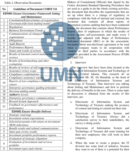
International Journal of New Media Technology
International Journal of New Media Technology International Journal of New Media Technology International Journal of New Media Technology
International Journal of New Media Technology
Engineering | Vol. V | No. 1 | Page 1-57 | June 2018 | ISSN 2355-0082
VOLUME
No. I
V
Analysis and Development of Interface Designon DKI Jakarta & Tangerang‘S Qlue Application based on Don Norman’s 6 Design Principles
Sheila Rizky Novensa, Wira Munggana
Maximal Overlap Discrete Wavelet Transform, Graph Theory And Backpropagation Neural Network In Stock Market Forecasting
Rosalina, Hendra Jayanto
Development of Medical Record With Extreme
Programming SDLC
I Gusti Ngurah Suryantara, Johanes Fernandes Andry
Data Visualization of Poverty Level at Provinces in
Indonesia from the Year 2013-2015
Stevencua, Johan Setiawan
New Traders’ Mood when using Trading Online
Application in Universitas Multimedia Nusantara
Lisa Oviani, Raymond Sunardi Oetama
1-7
41-46 8-12
13-17
COBIT 5.0: Capability Level of Information
Technology Directorate General of Treasury
Dian Utami Setya, Wella
Design and Development of Computer Specification
Recommendation System Based on User Budget
With Genetic Algorithm
Michael, Winarno
Creating A Web-Based Online Flashcard for Korean
Vocabulary Memorization
Marcia Juvanie Chang, Adhi Kusnadi
Design of TTL Based Routing Algorithm on UTAR
Network on Chip Communication Architecture
Wahyudi Khusnandar, Fransiscus Ati Halim, Felix Lokananta 18-24
25-29
47-53
54-57
The Design of Mobile Indoor Robot Guidance
System
Dhanny Kurniawan Haryanto, Kanisius Karyono, Samuel Hutagalung 30-34
i IJNMT, Vol. V, No. 1 | June 2018
EDITORIAL BOARD
Editor-in-Chief
Ni Made Satvika Iswari, S.T., M.T.
Managing Editor
Wella, S.Kom., M.MSI., COBIT5.
Members
Hira Meidia, B.Eng., Ph.D. (UMN)
Dr. Friska Natalia, Ph.D. (UMN)
Dr. Rangga Winantyo, Ph.D. (UMN)
Caesar Ondolan Harahap, Ph.D. (UMN)
Filbert Hilman Juwono, S.T., M.T. (Universitas
Indonesia)
Nur Afny Catur Andryani, M.Sc. (Tanri Abeng
University)
Viny Christiani Mawardi, M.Kom. (Universitas
Tarumanagara)
Dedi Trisnawarman, S.Si., M.Kom. (Universitas
Tarumanagara)
Muhammad Salehuddin, ST., MT. (UMN)
Marcelli Indriana, S.Kom., M.Sc. (UMN)
Wella, S.Kom., M.MSI., COBIT5 (UMN)
Adhi Kusnadi, S.T., M.Si. (UMN)
Fransiscus Ati Halim, S.Kom, M.M. (UMN)
Johan Setiawan, S.Kom., M.M., M.B.A. (UMN)
Wolfgang Xaverius D.J.N., S.T., M.T. (UMN)
Kanisius Karyono, S.T., M.T. (UMN)
Alethea Suryadibrata, S.Kom., M.Eng. (UMN)
Farica Perdana Putri, S.Kom., M.Sc. (UMN)
Ir. Raymond Sunardi Oetama, MCIS. (UMN)
EDITORIAL ADDRESS
Universitas Multimedia Nusantara
Jl. Scientia Boulevard, Gading Serpong
Tangerang, Banten, 15811
Telp. (021) 5422 0808
Faks. (021) 5422 0800
Email: [email protected]
International
Journal
of
New
Media
Technology (IJNMT)
is a scholarly open access,
peer-reviewed, and interdisciplinary journal
focusing
on
theories,
methods,
and
implementations of new media technology.
IJNMT is published annually by Faculty of
Engineering
and
Informatics,
Universitas
Multimedia Nusantara in cooperation with UMN
Press. Topics include, but not limited to digital
technology for creative industry, infrastructure
technology, computing communication and
networking, signal and image processing,
intelligent system, control and embedded system,
IJNMT, Vol. V, No. 1 | June 2018 ii
TABLE OF CONTENT
Analysis and Development of Interface Design on DKI Jakarta &
Tangerang‘S Qlue Application based on Don Norman’s 6 Design Principles
Sheila Rizky Novensa, Wira Munggana
Data Visualization of Poverty Level at Provinces in Indonesia from the Year
2013-2015
Stevencua, Johan Setiawan
New Traders’ Mood when using Trading Online Application in Universitas
Multimedia Nusantara
Lisa Oviani, Raymond Sunardi Oetama
COBIT 5.0: Capability Level of Information Technology Directorate General
of Treasury
Dian Utami Setya, Wella
Design and Development of Computer Specification Recommendation
System Based on User Budget With Genetic Algorithm
Michael, Winarno
The Design of Mobile Indoor Robot Guidance System
Dhanny Kurniawan Haryanto, Kanisius Karyono, Samuel Hutagalung
Creating A Web-Based Online Flashcard for Korean Vocabulary
Memorization
Marcia Juvanie Chang, Adhi Kusnadi
Maximal Overlap Discrete Wavelet Transform, Graph Theory And
Backpropagation Neural Network In Stock Market Forecasting
Rosalina, Hendra Jayanto
Development of Medical Record With Extreme Programming SDLC
I Gusti Ngurah Suryantara, Johanes Fernandes Andry
Design of TTL Based Routing Algorithm on UTAR Network on Chip
Communication Architecture
Wahyudi Khusnandar, Fransiscus Ati Halim, Felix Lokananta
1-7
8-12
13-17
18-24
25-29
30-34
35-40
41-46
47-53
1 IJNMT, Vol. V, No. 1 | June 2018
Analysis and Development of Interface Design
on DKI Jakarta & Tangerang
‘S Qlue
Application based on D
on Norman’s 6 Design
Principles
Sheila Rizky Novensa
1, Wira Munggana
2Department of Information Systems, Faculty of Engineering and Informatics, Universitas Multimedia Nusantara, Tangerang, Indonesia
1[email protected] 2[email protected]
Received on August 28th, 2017 Accepted on June 8th, 2018
Abstract—As government effort to embrace the social media trend, one of it by launching a mobile application called ‘Qlue’. Initial study of user experince showed the result of questionnaire that was consisted of 6 questions from the six design principles from Don Norman regarding the UI of Qlue application, there are 2 things in Qlue that don’t comply with six design principles from Don Norman. The 2 things are constraints and consistency. That was the reason for this research, to analyze and make a user interface for community service application which makes the usability easier based on the six design principles from Don Norman. The comparison between Qlue’s user interface and the user interface was done by distributing the questionnaire that was consisted of 6 questions to the same respondents. Methodology used in this thesis is Task-Centered System Design (TCSD). Started with problem identification, analysis, UI redesign and evaluation. The result of this thesis is an UI that have a constraint which is a warning page that appeared before user finished writing a report and wanted to go back to previous page. The second result is a consistency of all report writing process and interface including buttons and icons. The conclusion of this research is that the revised proposed user interface has solved the problems that appeared on the UI of Qlue application.
Index Terms— Donald Norman, Six Design Principles, , Task-Centered System Design, TCSD, User Interface Analysis, Qlue.
I. INTRODUCTION
The large number of mobile phone users and active internet users through mobile phones is one of the opportunities that companies can use to enhance competitive advantage by developing mobile applications that provide services.
Application services that will be the primary object is an application called Qlue which provides reporting criminal acts that occurred in Indonesia to the local police station as its service. The application is integrated with the local police. Based on a report
from the Central Bureau of Statistics, in 2015, their registration data revealed the number of crimes in Indonesia tends to fluctuate from year to year. In order for such criminal acts to be readily addressed by the local police force, the user may report criminal acts through this application.
Human Computer Interaction theory that match this research is six design principles from Don Norman. These principles contain standards and concepts that aim to allow users to understand the workings and usability for both a website design or a mobile application.
The questionnaire that contains the questions of Don Norman's design principles is distributed to 224
respondents (with Jakarta’s population size 10 million,
confidence level 90%, margin of error 5%) to find things that are inconsistent with Don Norman's 6 design principles in the Qlue application. Based on the results of the questionnaire, there are two design principles that are not met in the Qlue application; which are constraint and consistency. Constraint refers to determining ways of restricting the kind of user interaction that can take place at a given moment. While consistency is the principle that standardized the consistency of a UI visual design.
II. LITERATURE REVIEW
A. Six Design Principles
Through his book Design of Everyday Things, Donald Norman explains the guidelines for making good designs using the objects people use every day [1]. Here are 6 key guidelines proposed by Donald Norman:
IJNMT, Vol. V, No. 1 | June 2018 2 2. Affordances. Affordance is the visual attribute
of an object or control that gives the user a clue of how the object or control can be used.
3. Mapping. Pressing a button or activating a control will usually trigger the system to perform some functions. There is a relationship or mapping between control and its effects.
4. Constraints. Provide limits on what an object might do.
5. Feedback. Feedback is important to help users understand how to interact with objects and what effect our actions have on the system. The purpose of the feedback is to provide confirmation to the user whether an action has been successful or not successfully done.
6. Consistency. Consistency is the key to helping users recognize and apply a pattern. A similar activity should do the same.
B. Task Centered System Design
The method used in this research is Task Centered System Design (TCSD). Figure 1 shows the steps of this study.
Fig 1. Study Process
Task-Centered System Design (TCSD) is a process for identifying user needs [2]. Here are the steps for doing TCSD [3]:
1. Identification; articulation of concrete description of real man doing real task
2. User-Centered Requirement analysis; use these descriptions to determine what kind of users and what tasks the system should perform
3. Design as Scenario; create a prototype display that meets those requirements
4. Walkthrough Evaluation; evaluate the view.
III. RESEARCH METHODOLOGY
A. Task Centered System Design (TCSD)
The study began by making the UI of the application Qlue using Axure program, a leading UI building tool and then proceed with the following steps:
1. Identification; distribution of questionnaires containing questions based on six design principles from Donald Norman on the UI of existing Qlue application.
2. User-Centered Requirement Analysis; analysis of the results of the questionnaire that has been distributed and find part of Qlue application that is incompatible with six design principles of Don Norman.
3. Design as Scenario; a revised UI will be created based on the problems that have been found.
4. Walkthrough Evaluation; distributing questionnaires containing the same questions to the same respondents to get an evaluation of the UI that has been made.
B. Data Retrieval
The data used for this study was obtained by distributing questionnaires containing questions about the use of Qlue community service applications to 224 respondents. Table 1 shows the table of questions with each of the principles represented.
Table 1. Question List
Question Principle
Can you easily find the menu you
would like to access? Discoverability
Do you know the function of a menu or symbol without any explanation stated?
Affordances
Do you have difficulty in operating
the buttons? Mapping
Does this application provide certain restrictions so that users do not make mistakes?
Constraints
Is the feedback provided by this
application useful to you? Feedback Is the appearance of this app
already consistent? Consistency
C. New UI Creation
3 IJNMT, Vol. V, No. 1 | June 2018
is used for user UI testing on the revised UI, testing
are done through their mobile devices’ browser.
IV. ANALYSIS AND DISCUSSION
A. Identification
Based on the results of the questionnaire data that has been distributed, there are 2 questions that have a percentage value indicating that the principle represented by the question is not met in the Qlue
application’s UI. Here are the results of data from both questions.
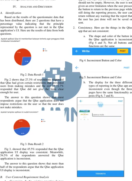
Fig 2. Data Result 1
Fig 2 shows that 27.3% of respondents responded that Qlue had given certain restrictions that prevented users from making mistakes and the rest of 72.7% responded that Qlue did not give the hints clear enough for user.
The answer to this question shows that most respondents argue that the Qlue application does not impose restrictions on the user so that the user does not make mistakes.
Fig 3. Data Result 2
Fig 3, showed that 45.5% responded that the Qlue application UI display was consistent. Meanwhile, 54.5% of the respondents answered the Qlue application is inconsistent.
The answer to this question shows that more than half of the respondents argue that the Qlue application UI display is inconsistent.
B. User-Centered Requirement Analysis
1. Constraints. In the existing reporting feature of the Qlue application, the user is given an error limitation when the user has pressed the post key before filling the textbox for the
contents of the report details, a warning will appear that says that the contents of the report should not be empty. However, the user is not given an error limitation when the user presses the button to return to the previous page while still doing the reporting process, the user can return without any warning that the report that the user has just done will not be saved or sent.
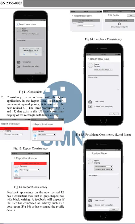
2. Consistency. Here are the things in the Qlue app that are not consistent:
a. The shape and color of the button in the Qlue application is inconsistent (Fig 4 and 5). Not all buttons and functions are the same.
Fig 4. Inconsistent Button and Color
Fig 5. Inconsistent Button and Color
b. The display for the three different types of reporting in the Qlue app are inconsistent even though the three pages have the same functionality as posts (Fig 6, 7 and 8).
IJNMT, Vol. V, No. 1 | June 2018 4 Fig 7. Inconsistent Reporting Menu
Fig 8. Inconsistent Reporting Menu
c. The feedback display given in the Qlue application is inconsistent. In the reporting menu, feedback appears on the user's mobile notification (Fig 9), when the user successfully edits the profile, the feedback will appear
with the display message box (Fig 10).
Fig 9. Inconsistent Post Success Feedback
Fig 10. Inconsistent Post Success Feedback
C. Design The Revised UI
The revised new UI is created using a program called Axure. In order for all the respondents to access this UI, the UI result created is uploaded on the website to share the finished results UI created using axshare.com. Here are a series of screen capture of the UI results on a mobile browser:
5 IJNMT, Vol. V, No. 1 | June 2018 Fig 11. Constraints
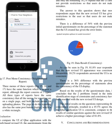
2. Consistency. In accordance with the Qlue application, in the Report Local Issue report, users must upload photos, it is served in the new revised UI. The three warnings (Fig 12 and 13) that exist in this UI have a consistent display of red rectangle with black writing.
Fig 12. Report Consistentcy
Fig 13. Report Consistency
Feedback appearance on the new revised UI has a consistent look that is grey-shaped box with black writing. A feedback will appear if the user has completed an activity such as a post report (Fig 14) or has changed the profile details.
Fig 14. Feedback Consistency
IJNMT, Vol. V, No. 1 | June 2018 6 Fig 16. Post Menu Consistency (Place Review)
Fig 17. Post Menu Consistency (Neighborhood Report)
Three menus of these reports (Fig 15, 16 and 17) have the same function which is to post a report, although the report consists of 3 types. All three types of reports have the same consistency that all the menus for reporting are on a single page, and both include menus for uploading photos. The page to do the reporting also has the same post button display, which is a white rectangle.
D. Evaluation
To compare the UI of Qlue application with the new web-based revised UI, the questionnaire from the initial survey with the link to the web page was distributed to the the same respondents again. Here is the result of data from the questionnaire.
Fig 18. Data Result (Restrictions)
Fig 18 shows that 81.8% of the respondents answered that the new revised UI has given certain
restrictions that prevent users from making mistakes and only the remaining 18.2% replied that the UI does not provide restrictions so that users do not make mistakes.
The answer to this question shows that most respondents argue that the new revised UI has given restrictions to the user so that users do not make mistakes.
There is a difference of 54% with the previous initial questionnaire on the percentage of the statement that the UI created has given the error limits.
Fig 19. Data Result (Consistency)
As can be seen in Fig 19, 81.8% user responded that the new revised UI appearance was consistent. Meanwhile, 18.2% respondents answered the UI is not consistent.
There is a 36% difference with the previous questionnaire on the percentage of statements about the consistency of the UI display.
Based on the results of the questionnaire data, it concludes that the 2 problems found in the initial identification stage of constraints and consistency have been resolved with the new revised UI design.
The initial results on the questions representing the consistency principle, resulted in a 45.5% agrees that the Qlue application UI is consistent, compare to the results of similar questions against the new revised UI, achieve a higher percentage value of 81.8%.
V. CONCLUSIONS AND RECOMMENDATIONS
A. Conclusion
The Qlue application is a part of Jakarta’s Smart
7 IJNMT, Vol. V, No. 1 | June 2018 B. Recommendations
The developer of Qlue application must justify the limit of errors or constraints and the consistency of existing views. The limitation of this research is that it focused only on the interface design part of an application, not the whole experience (like the database configuration or the server infrastructure for a speedy application). However, for other researchers who also want to analyze the UI of an application, it is recommended to also analyze the user experience of the application. Once again, this study did not examine the back-end part of the related application, so the problem discovery process took longer and the problems found were also likely to be inaccurate because they only rely on the results of the questionnaire data. For a comparison between the selected application UI and the UI already created, it is recommended to do so with A/B Testing. With the testing method, the time spent on the problem discovery process will be less and the problems contained in a website or application will be found clearly and accurately.
ACKNOWLEDGMENT
I would like to thank my supervisor Wira Munggana, S.Si., M.Sc. for assistance with this paper and Yustinus Eko S.Kom., M.M who provided insight and expertise that greatly assisted this paper.
REFERENCES
[1] Norman, Don. (2013). The Design of Everyday Things : Revised and Expanded Edition. New York: Basic Books. [2] Lewis, C., & Rieman, J. (1993). Task-Centered User Interface
Design. A Practical Introduction
[3] Greenberg, Saul. (2002). Working Through Task-Centered System Design
[4] Diaper, Dan., & Stanton, Neville A. (2004). THE HANDBOOK OF TASK ANALYSIS FOR HUMAN-COMPUTER INTERACTION. New Jersey: Lawrence Erlbaum Associates.
[5] Difatama,Rizka., Sopiah, Nyimas & Muzakir, Ari (2016). Sistem Informasi Rekam Medis Terpadu Pada Rumah Sakit Pelabuhan Palembang Berbasis Web Menggunakan Metode TCSD (Task Centered System Design), 2-4
IJNMT, Vol. V, No. 1 | June 2018 8
Data Visualization of Poverty Level at
Provinces in Indonesia from
The year 2013-2015
Stevencua
1, Johan Setiawan
2Department of Information Systems Universitas Multimedia Nusantara, Tangerang, Indonesia 1[email protected]
Received on August 30th, 2017 Accepted on June 8th, 2018
Abstract—The aim of this paper is to create a data visualization that can convey information on poverty distribution of every province in Indonesia and to find a connection with education level. The method used is Eight-step data visualization and data mining methodology. Data for this research are taken from BPS from the year 2013 to 2015. Data collected after the data extracted and cleansing is 6000 records. Time needed to convert data from several publications and put it into one Excel file is 2 weeks. Tableau is chosen as tools for creating the Data Visualization. With this tools, data showed in a story dashboard which consists of 3 dashboards. The first dashboard is a mapping of poverty data onto provinces of Indonesia. The second dashboard is a mapping and distribution of education levels on cities and counties in Indonesia. The third dashboard is showing a ranking of areas with the highest percentage level of a citizen of education lower than elementary school in Indonesia. Based on the User Acceptance Test to BPS staff, authors have been able to produce the Story required, and interactive. As a conclusion from Data Visualization has been made, high poverty in certain areas not immediately is directly proportional to the level of education.
Index Terms— Dashboard, Data Visualization, poverty, Tableau.
I. INTRODUCTION
According to the BPS report on 2017, Indonesia is a country that has a land area of 1.913.579 square kilometers which consists of 17.504 islands. Albeit the size that it has, equity in Indonesia has not been going on well. An article from 2017 by Directorate-General of Disadvantage Area Development mentioned that developments have always been focused on Java Island. It is one of the causes of poverty in other parts of the country.
One of the main focus of Indonesia government in this term (2014-2019) is to minimize the gap between regions in every part of the country. According to Minister of Finance Sri Mulyani Indrawati, this can be done by developing infrastructures in underdeveloped
regions or regions that have a high level of poverty on record.
The problem with this large country, the government needs more time to decide which region should become their priority for development. A decentralized governing system Indonesia uses means coordination between central government and regional government is needed in the form of information regarding poverty level or social economic conditions of each region.
With the advanced technology we have right now, it is easy to get such information because the data are open to everyone, such as data from www.data.go.id and www.bps.go.id. Unfortunately, data for the public from BPS is in the publication format (PDF), not in another format such as spreadsheet or text format.
By having open data, information should be easier to obtain and faster to be used to solve poverty problems. Nevertheless, these data are still in the format of publications, in numbers and could only become a meaningful information if managed properly. One of the techniques that can be used in order to convey information better is in the form of data visualization.
To make information regarding these poverty data easier to understand by ordinary people, authors want to create a data visualization that can display poverty data and its relationship with the education level of each province in Indonesia. It aimed to help parties that need a mapping of poverty distribution in Indonesia.
Data used for the visualization are obtained from www.bps.go.id and ranged from the year 2013 to 2015.
The formulation of the problems are as followed:
9 IJNMT, Vol. V, No. 1 | June 2018
How to build a data visualization dashboard that can be used to analyze poverty of all provinces in Indonesia.
II. LITERATURE REVIEW
A. Data Visualization
Data visualization is a technique to transform data or information into visual matter. [1] Usage of data visualization could make data or information that we have become clearer in order to be communicated to others [2].
The goal of data visualization is to get insight from graphics or images interactively, into many aspects that related to some processes that we are interested in. [3].
B. Dashboard
The dashboard is a visual display of important information that is needed to reach a goal, arranged on a single screen so the information can be seen at a glance [4].
C. Database
The database is a collection of related data. The database is designed, developed and filled with data for a specific purpose for a specific group of users [5].
The database is a computer structure that is divided and integrated which stores collection of data from end-user that consists of raw facts and metadata (data of data), where the end-user data are integrated and arranged [6].
D. Data Warehouse
Data Warehouse is a collection of subject-oriented, integrated, always changing, and non-volatile data. The purpose of a data warehouse is to integrate big-sized corporate data into a storage where the user can easily run the query, produce reports, and analyze [7].
As [7] said, some of the benefits of using data warehouse are as follows:
High return on investment
Competitive advantages
Increasing productivity from decision makers
E. Data Mining
Data mining is a process of gathering valid and understandable information from a big database and using it for taking crucial business decisions [7].
F. Data Cleaning
Data cleaning, known also as data cleansing or data scrubbing, is a process of detecting and cleaning errors and inconsistency from data in order to increase
the quality of data that are going to be stored in database or data warehouse [8].
G. Extract, Transform, Load (ETL)
Perta Extract, transform, and load (ETL) process is an essential process in data warehouse development.
As told by the name, this process is divided into three phases, as follows according to [9]:
1. Extract. In this phase, data were extracted from various sources. This phase is quite a challenging aspect because accuracy in extracting data is needed. The goal of this phase is to get data from various sources in order to be combined into a single format that can be used for data transformation.
2. Transform. In this phase, the transformation of data from the original format into a format that can be used for the data warehouse is commenced. There are many ways to do so, such as:
a. Taking some columns from data
b. Interpret encoded values
3. Load. Loading data to final storage (usually a data warehouse). Data can be loaded with various ways such as bulk loading using DBMS software or sequential loading by inserting data each row at a time. Bulk loading is usually recommended because loading data sequentially takes longer time in the process of parsing the statement that is inserted in the query..
H. Poverty Gap Index (P1)
IJNMT, Vol. V, No. 1 | June 2018 10
I. Poverty Severity Index (P2)
Poverty Severity Index gives illustration regarding the distribution of expenditure among poor residents. The higher the index, the level of inequality of the poor residents’ expenditure is higher [10].
J. Poverty Line
The poverty line is a sum of Food Poverty Line and Non-Food Poverty Line. Residents that have expenditure per capita per month lower than the poverty line are categorized as poor residents.
The Food Poverty Line is a value of minimum food expenditure which is equal to 2100 kilocalories per capita per day.
The Non-Food Poverty Line is a minimum requirement for housing, clothes, education, and healthcare [10].
III. RESEARCH METHODOLOGY
The method used in this research is eight-step data visualization and data mining methodology, famous with the name Visual Data Mining project. This method is chosen because it fits with data visualization development process which consists of data mining process and extracts, transforms, load (ETL) process [11].
Fig 1. Eight-step Data Visualization and Data Mining Methodology
This method is divided into three phases, as follows:
1. Project Planning Phase
a. Justify and Plan the Project
b. Identify the Top Business Questions
2. Data Preparation Phase
a. Choose the Data Set
b. Transform the Data Set
c. Verify the Data Set
3. Data Analysis Phase
a. Choose the Visualization or Mining Tool
b. Analyze the Visualization or Mining Model
c. Verify and Present the Visualization or Mining Model
IV. RESULTS
This section consists of results in every phase which are conducted using the eight-step data visualization and data mining methodology.
1. Project Planning Phase
a. Justify and Plan the Project. In this research, a proof-of-concept scope is selected, which means the goal of data visualization is to give value to decision-makers. This visualization can be a reference for governments or related parties to understand poverty condition in Indonesia. The goal is to create a mapping of poverty and educational level data to analyze the relationship between both data.
b. Identify the Top Business Questions. The top business question that is identified and is going to be answered in this research is if there any relationship between poverty level and education level in a region.
2. Data Preparation Phase
a. Choose the Data Set. Data are chosen by doing a process of extracting (first part of ETL process). Data are gathered from publications published by BPS in PDF format.
b. Transform the Data Set. After getting data needed for visualization, the next step is to convert publications in PDF format into Microsoft Excel spreadsheet (XLS). After converting, a process of cleaning data is done by taking only needed columns of a data set and arranging various records into one spreadsheet. After that, we can import this data to Tableau software database, and make some changes into regional data in a spreadsheet. Regional data in the spreadsheet are
11 IJNMT, Vol. V, No. 1 | June 2018
needed to be changed into the geographic role in Tableau software.
c. Verify the Data Set. This activity is to make sure the data set is already well transformed and can be used for visualization. Verification of errors is done here. One of the errors found is where there are record mistakes when a region in 2015
publications don’t exist in 2013 and
2014 publications. The solution is to add those missing regions into the 2013 and 2014 data and move cities accordingly as the latest data. There are also some missing regional data that are not detected in Tableau software during the transformation process of regional data geographical role. In order to fill this unknown data, we have to input regional coordinates (longitude and latitude). To find the coordinates, a supplementary tool is used from the website www.mapcoordinates.net/en which uses Google Maps as base map.
3. Data Analysis Phase
a. Choosing the visualization or data mining tool. The tool used to create a data visualization is Tableau visualization software. The reason of using Tableau is because it has some advantages against another tool like Microsoft PowerBI, as summarized in Table 1.
Table 1. Comparison of Tools
Comparisons Tableau Power BI
Visualization Data
Limits Unlimited 3500 data
Calculations Built-in
Calculations Syntax Compare Several
Categories Yes No
Customize Pop-Up
Content Yes No
Offline Iterations Yes No
Story from Multiple
Dashboards Yes No
b. Analysed the visualization or data mining model. There are three dashboards created as a result, the first is a mapping of poverty data in provinces of Indonesia. The second dashboard is a mapping and distribution of education levels on cities and counties in Indonesia. The third dashboard is showing a
ranking of areas with the highest percentage level of poverty in Indonesia and a ranking of areas with the highest percentage level of citizen with education lower than elementary school in Indonesia.
All three dashboards can filter its data according to area or year, and also can be clicked in maps or bars to filter or highlight single area.
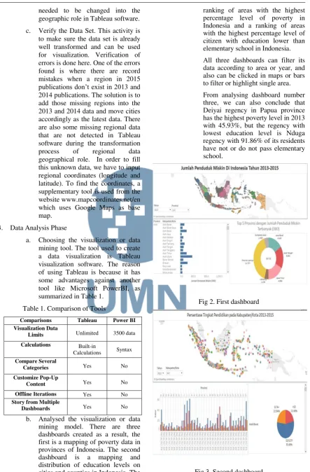
From analysing dashboard number three, we can also conclude that Deiyai regency in Papua province has the highest poverty level in 2013 with 45.93%, but the regency with lowest education level is Nduga regency with 91.86% of its residents have not or do not pass elementary school.
Fig 2. First dashboard
IJNMT, Vol. V, No. 1 | June 2018 12 Another finding is the Southwest
Maluku regency, ranked 24 in highest poverty, is actually ranked 481 out of 511 regencies and cities in Indonesia in low education, which means it has a high education with a rate of not passing elementary school of 7.42%. Although the percentage of each area is of course not the same (considering the number of residents in each area is different and the 100% of the level is not the same).
From this finding, we can see that education level can influence poverty level in some areas but not directly influence it, there are so many other factors that we can put into the equation such as a number of residents, infrastructure conditions that influence goods and services access to the certain area.
Fig 4. Third dashboard
c. Verifying and presenting the visualization or mining model. After the visualization is created, a final verification process is conducted to make sure the visualization has already represented the true value of the data. The verification is done by taking samples of some data in the visualization and match them with the raw data from the publications. A story dashboard is created in order to accommodate the three dashboards in one functional display. User acceptance test is also conducted by reviewing the visualization to a staff of BPS. The visualization has been uploaded to
Tableau Public website and can be seen online.
V. CONCLUSION
The data visualization created can display poverty and educational data interactively using data set that was transformed into Microsoft Excel spreadsheet, from numerical and statistical publications of BPS which were PDF documents before. Data visualization is done using Tableau software to create maps, bars, pie charts, which then combined into a story dashboard consists of three dashboards that show poverty data, education level, and ranking of regions per category.
Data visualization also give information that education level is one of the factors that influence
poverty level in certain regions, however, it doesn’t
have a direct influence. Factors such as a number of
residents’ difference in each region, infrastructure that helps goods and services’ access that influence residents from the underdeveloped regions.
ACKNOWLEDGEMENT
The author thanks, Mr. Johan Setiawan as a supervisor that has been guiding from the beginning.
REFERENCES
[1] Murray, S. (2013). Interactive Data Visualization for The Web: An Introduction to Designing with, Part 3. O'Reilly Media, Inc.
[2] Few, S., & EDGE, P. (2007). Data Visualization: Past, Present, Future. IBM Cognos Innovation Center. Retrieved from Perceptual Edge.
[3] Telea, A. C. (2014). Data Visualization: Principles and Practice, Second Edition. CRC Press.
[4] Few, S. (2013). Information Dashboard Design: Displaying Data for at-a-glance monitoring. Analytics Press.
[5] Elmasri, R., & Navathe, S. B. (2007). Fundamentals of Database Systems. Boston: Pearson/Addison Weasley. [6] Rob, P., & Coronel, C. (2009). Database Systems: Design,
Implementation, and Management. Boston: Course Technology, Cengage Learning.
[7] Connolly, T. M., & Begg, C. E. (2010). Database Systems: A Practical Approach to Design, Implementation, and Management (Fifth Edition). Boston: Pearson Education, Inc. [8] Li, J. (2014). Data Cleaning. In F. M. Hammond, J. F. Malec,
T. G. Nick, & R. M. Buschbacher, Handbook for Clinical Research (p. 101). Demos Medical Publishing.
[9] Ali, F. S. (2014). International Scientific Journal of Management Information Systems. A Survey of Real-Time Data Warehouse and ETL.
[10] Badan Pusat Statistik. (2017). Badan Pusat Statistik. Retrieved from Badan Pusat Statistik: https://www.bps.go.id/ [11] Soukup, T., & Davidson, I. (2002). Visual Data Mining.
13 IJNMT, Vol. V, No. 1 | June 2018
New Traders’
Mood when using Trading
Online Application in Universitas Multimedia
Nusantara
Lisa Oviani
1, Raymond Sunardi Oetama
2Department of Information Systems Universitas Multimedia Nusantara, Tangerang, Indonesia 1[email protected]
Received on August 30th, 2017 Accepted on June 8th, 2018
Abstract—trading online have a brief history of success all due to Internet. However, beginners find some difficulties to make profit. One of the reasons is their moods. This study is focused to explore their moods. Some moods are found has relation with the trading online. Avoiding loss in trading online, some moods should be controlled first before they start trading.
Index Terms— Trading Online, Foreign Exchange.
I. INTRODUCTION
The online commerce application is conducting stock transactions on the internet through various websites. For years, emerging companies have a brief success story due to the Internet. The online transaction processes of finance, including the purchase and sale of bonds, stocks and other investments, all come under online commerce [1].
A previous study shows that some moods impact on judgement accuracy and trading performance. Moods are divided into good, neutral, and bad moods. Traders in a neutral and bad mood can obtain more profits than traders in a good mood. Pleasant mood can reduce the accuracy of judgement, whilst unpleasant mood can increase the judgement accuracy. This problem occurs because traders in a pleasant mood review less information and make quicker decision [2].
This study examines user usability on trading online application on their moods. Moods refer to feelings that tend to be less intense than emotions and that often (though not always) lack a contextual stimulus. Most experts believe that emotions are more fleeting than moods. For example, if someone is rude to you, you will feel angry. That intense feeling or anger probably comes and goes fairly quickly, maybe even in a matter of seconds. When you are in a bad mood, you can feel bad for several hours [3].
User Moods are divided into four quadrants as shown on Fig 1, from Low Arousal to High Arousal, and from Displeasure to Pleasure. UWIST Mood Adjective Checklist (UMACL) is applied in this study [4]. The list contains some moods as followings: Hedonic Tone: Pleased, Cheerful, Optimistic,
Contented, Satisfied, Happy, Low-spirited, Dissatisfied, Gloomy, Depressed, Sad, and Sorry. Anger Items: Impatient, Annoyed, Angry, Irritated, and Grouchy. Tense Arousal Items: Stirred Up, Fearful, Anxious, Jittery, Tense, Stressed, Nervous, Calm, Restful, Relaxed, Unconcerned, Composed, Self-controlled, Peaceful, and Comfortable. Energetic Arousal: Active, Energetic, Industrious, Alert, Fortunate, Vigorous, Bright, Idle, Sleepy, Dull, Unenterprising, Quite, Sluggish, Tired, and Passive.
Users’ moods become interesting for some
previous Human Computer Interaction researchers. Rooij and Jones argued that there is a connection between moods and creativity in Human computer Interaction Study [5]. Visuri, Sarsenbayeva,
Goncalves, Karapanos, and Jones found that users’
moods have an association with the use of smartphone applications [6].
Fig 1. Structural Model of Moods [4]
IJNMT, Vol. V, No. 1 | June 2018 14 situations or cognitions. On the other hand, emotions
typically have particular objects and increase behavioral response tendencies relevant to those objects [7]. Mood can influence the result of trading because decision making and risk taking can be
influenced by mood on investors’ trading behavior [8].
This study is focused on the exploration about new
traders’ moods before and after trading online session.
So the problems that occur are followings:
1. Which moods do significantly change before and after trading session?
2. Which moods do significantly change before and after trading session for traders who make profits?
3. Which moods do significantly change before and after trading session for losing traders?
4. Which moods do significantly correlated with the trading performance?
The purpose of this research is to find an important mood to consider for new traders to start trading online. By knowing the mood, new traders can maintain some mood before trading so that it can reduce the money lost after trading online.
II. METHODOLOGY
A. Data Collection Methods
25 new traders are randomly selected. Traders bring their smartphones. They are asked to download and install the trading software on their smartphones. Before trading, step by step how to trade online is explained using trading software to each trader for about 15 minutes. The software used in the study is iqoption. It is popular binary option trading software in Indonesia.
Fig 2. Data collection flow of process
To measure the moods of each Trader, a questionnaire is filled before and after the trading session. 5 Likert scales are applied in the Questionnaires from 5 that refer strongly agreed to 1 that refers strongly disagreeing. The questions are developed from UMACL list of moods.
Total trading online session is 30 minutes in the same room. The initial capital is $1000. There is no training about trading strategy to win. Traders can use their own strategy to win.
B. Data Analysis Methods
25 students answer the same questions on the questionnaire Q1 before trading session as well as on questionnaire Q2 after trading session. Each questionnaire contains all UMACL moods. Those answers are processed by using SPSS to find some moods that are significantly different before and after trading session. Questionnaire are validated by using SPPS, bivariate-correlation-Pearson, two-tailed, p=0.05. The Reliability test shows Alpha Cronbach=0.8.
Afterwards, both Q1 and Q2 are split according to the result of trading session, either win or lose money. For the winners, SPSS are applied to find some moods that are significantly different before and after trading session. So do the unlucky traders.
Finally, answers from Q1 and Q2 are processed to find their correlation with the trading performance by using SPSS.
III. DISCUSSION
Data is gathered from 25 students who are selected as new Traders by using simple random sampling in Universitas Multimedia Nusantara. 34% of them are females and 66% are males. Their ages are between 18 and 22 as shown on Fig 3. These traders have never been trading before.
First we look at traders’ mood before trading. The
largest mean is found on Peaceful since the Traders have not started the trading session yet. However, the largest variance is found on stressed. It may happen because some Traders take it easily, but some others take it too serious.
15 IJNMT, Vol. V, No. 1 | June 2018 Fig 3. Traders’ Ages
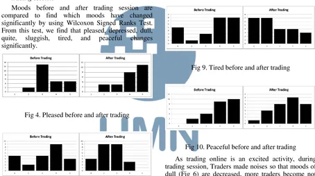
A. Moods that significantly change before and after trading session
Moods before and after trading session are compared to find which moods have changed significantly by using Wilcoxon Signed Ranks Test. From this test, we find that pleased, depressed, dull, quite, sluggish, tired, and peaceful changes significantly.
Fig 4. Pleased before and after trading
Fig 5. Depressed before and after trading
Most Traders are more pleased after trading as the right chart is skewed to the right side (Fig 4). Either they win or lose; trading online is a fun and exciting activity for them. As the trading activity pleases them, the depression is reduced significantly (Fig 5).
Fig 6. Dull before and after trading
Fig 7. Quite before and after trading
Fig 8. Sluggish before and after trading
Fig 9. Tired before and after trading
Fig 10. Peaceful before and after trading
As trading online is an excited activity, during trading session, Traders made noises so that moods of dull (Fig 6) are decreased, more traders become not quite (Fig 7), and sluggish (Fig 8) are also decreased significantly. This excitement also gives Traders some influences to reduce their feel of tired significantly (Fig 9). However, Traders’ moods of peaceful change because influences of the trading results, which are win or loss (Fig 10).
B. Moods that significantly change before and after trading session for traders who make profits
Here, we focus to explain significant changes on the winners’ mood. As shown on table I above, there are five mood that are significantly change which are pleased, active, energetic, vigorous, and sluggish.
IJNMT, Vol. V, No. 1 | June 2018 16 The positive ranks are increased on pleased, active,
energetic, and vigorous. So the winners look more pleased, active, energetic, and vigorous after trading. But winners become less sluggish after trading. All positive moods such as pleased, active, energetic, and vigorous are changed to positive rank after trading and negative mood such as sluggish is changed negatively. In other words, to make a better result on trading online, traders should increase their positive moods and reduce their negative moods when they are trading.
C. Moods that significantly change before and after trading session for losing traders?
Table 2. Losing Traders’ Moods
Here, we focus to explain significant mood changes from losing Traders. As shown on the table above, some moods significantly changes for losing traders which are selfcontrolled, peaceful, sleepy, quite, dull, and tired.
Positive moods such as self-controlled and peaceful are not increased. Losing money makes new Traders untighten their self-controlled and their peaceful mood become reduced. However, negative moods such as sleepy, quite, dull, and tired are reduced too. Losing traders keep trying to make their money back. Subsequently, chasing money makes them not sleepy, not quite, not dull, and not tired.
Winning Traders made changes more on positive moods rather than negative moods. The direction is also correct. The positive moods are increased significantly, and the negative mood is reduced significantly. However, losing traders made changes more negative moods rather than positive moods. The direction is not entirely correct. Not only negative moods are reduced significantly, but some positive moods are also reduced.
D. Moods that significantly correlated with the trading performance?
In this section, we discuss about the moods that havecorrelation with trading results. As shown on Table 3, there are four moods involved here, which are unconcerned, selfcontrolled, unenterprising, and sluggish.
Table 3. Correlated Moods with Trading Performance
Negative correlations are shown on Unconcerned and selfcontrolled. To won the trading online, Traders must reduce their unconcerned during the trading session. Concentration here is very important to be kept in better condition.
It is also strongly suggested for them to untighten strong control to themselves. If the traders are too tight in their selfcontrol, they will only make a small number of actions.
Positive regressions are shown on unenterprising. To win on trading online, they must increase their trading result. However, the direction is different. Loser Traders tend to reduce their mood of sluggish. But winners increase their mood of sluggish. To put a Buying or Selling order in trading only should not in rush. Even though the self-controlled are reduced, but the traders must be very sure to make the order.
IV. SUMMARY
Generally, new traders bring their moods when they use trading online. Their moods consist of good moods and bad moods. New Traders must level up their positive moods and at the same time control their bad moods. Positive moods that are suggested to be managed include pleased and peaceful, active, energetic, vigorous, self-controlled. Whilst some negative moods that are suggested to be managed including depressed, dull, quite, sluggish, tired, sleepy, unconcerned, and unenterprising.
If the trading results can be ignored, we find that the trading online is a fun activity for new Traders. The number of positive moods that occur is less than bad moods. It enlarges some good moods significantly. Traders become more pleased and peaceful after trading since they enjoy their new experience trying the trading application. In addition, this activity can reduce some bad moods. The moods of depression, dull, quite, sluggish, and tired are significantly decreased.
Furthermore, if we connect the changes of Traders’
moods with their trading results, there are only two types of results, either they make some profits or lose their money. There are some differences of mood changes between these two results.
17 IJNMT, Vol. V, No. 1 | June 2018
more pleased, active, energetic, vigorous, but less sluggish.
For new traders who lose money at trading session, more bad moods change significantly rather than good moods. Both positive and negative moods are reduced. Bad moods that change significantly include sleepy, quite, dull, and tired. The positive moods that occur here are self-controlled and peaceful.
And finally, we find that some moods have a correlation with trading results including unconcerned, self-controlled, unenterprising, and sluggish. To win the trading session, new traders must reduce their unconcerned and self-controlled moods whilst they also must increase unenterprising and sluggish moods.
REFERENCES
[1] M. Laveena, S. Jindal, M. Dhiman, “Online Trading : The Future of Stock Market”. International Journal of Economics & Management Sciences, vol. 271, 2015.
[2] K. Au, F. Chan, Denis W., I. Vertinsky, “Mood in foreign
exchange trading: Cognitive processes and performance”,
Organizational Behavior and Human Decision Processes vol. 91, pp. 322–338, 2003.
[3] S. P. Robbins, & T. A. Judge, Organisational Behaviour. Cape Town: Pearson Education, Inc., 2009.
[4] G. Matthews, D. M. Jones, & A.G. Chamberlain. “Refining the measurement of mood: The UWIST Mood Adjective
Checklist”. British Journal of Psychology, vol.8,pp.71-42, 1990.
[5] A. Rooij and S. Jones. “Mood and creativity: an appraisal
tendency perspective”, Proceedings of the 9th ACM
Conference on Creativity & Cognition, pp. 362-365, 2013. [6] A. Visuri, Z. Sarsenbayeva, J. Goncalves, E. Karapanos, and
S. Jones, “Impact of mood changes on application selection”.
Proceedings of the 2016 ACM International Joint Conference on Pervasive and Ubiquitous Computing, pp. 535-540, 2016. [7] O. Fenton, M. Creevy, E. Soane, N. Nicholson, and P.
Willman, “Thinking, feeling and deciding: The influence of
emotions on the decision making and performance of traders”.
Journal of Organizational Behavior, vol.32: pp.1044–1061, 2011.
[8] Y Cohen, C.A. Scherbaum, K. Muller, B. M. Staw, “Mood and the Market: Can Press Reports of Investors' Mood Predict
IJNMT, Vol. V, No. 1 | June 2018 18
COBIT 5.0: Capability Level of Information
Technology Directorate General of Treasury
Dian Utami Setya
1, Wella
2Department of Information System, Faculty of Engineering and Informatics, Universitas Multimedia Nusantara, Tangerang, Indonesia
1[email protected] 2[email protected]
Received on September 7th, 2017 Accepted on June 8th, 2018
Abstract—Information system is one of the most important things that can help every companies to improve the performance of their company. The Directorate Generate of the Treasury is one of the government agencies that already use information systems to support their performance to handle the governance. This research using framework of COBIT 5.0 and doing measurements with Capability Level. EDM 01 (Ensure Governance Framework Setting and Maintenance) and EDM 02 (Ensure Benefits Delivery) are the two main processes of that government needs to do an audit, because they want to make sure that the others process to reach their goals.
Index Terms— Capability Level, COBIT 5.0, Information Systems, Information Systems Auditing, IT Governance.
I. INTRODUCTION
In modern era, there are several progress at the development of the information technology that have some function or feature that getting better. There are several companies use information systems to assist the company in achieving their goals, and helps to improve the performance of the processes that exists at the company [1]. Therefore, the information system have a priority of the security and reliability. To ensure that the system has both of the priority, it is necessary to holding of the information systems auditing to ensure that capability level of their government. This research used framework of COBIT 5.0 and doing measurements with the Capability Level of their governance, that framework issued by ISACA in 2012 is COBIT 5.0. The framework is appropriate to be able to ensure the IT governance of information
technology at the Directorate Generate of the Treasury.
Directorate of Treasury is one of the government agencies that deal with the every activities and transactions carried out by the State. The Directorate using information systems to support their performance. Information systems are handled by the IT section that called with the Directorate of Information Systems and Treasury Technology, where the directorate ensure the system that always running well and always available when their users want to use, and also to manage the entire State Treasury activities. Based on the importance of the information system, then the government want to do the auditing of the information systems to take the measurement of the information technology governance to ensure that their systems can running well without inhibit the performance of some of the business processes at their government.
The main purpose the problems in this study:
1. How capability level of information and technology governance on the Directorate General of the Treasury using framework of the COBIT5.0?
2. How does the recommendation over the results of the measurement capability level has been done of the technology and information Directorate General of the Treasury?
II. LITERATURE REVIEW
A. IT Governance
IT Governance under the Information Technology Governance Institute (ITGI) is part of corporate governance and comprises of leadership, organizational structure and IT governance processes and IT objectives. IT governance is the responsibility of the board of directors (BOD) and executive management [2].
19 IJNMT, Vol. V, No. 1 | June 2018
managing and controlling the company by adding value to the use of technology in it [2].
B. Audit
Audit is a systematic and objective process to ensure the level of submission between the assignment and predefined criteria, the results of the assignment will be communicated to the interested parties [3].
C. Information System Auditing
Information System Auditing is an an evaluation of how the suitably level of between information systems that has been designed and implemented effectively, efficiently, and economically, as well as adequate assets of security mechanisms, and ensuring adequate integrity [4].
D. COBIT 5.0
COBIT or known Control Objective for Information and RelatedTechnology is one of the frameworks that can run an audit information system in detail and depth, an information systems auditor requires a framework that is used to perform an audit on a company with a complex data[5].
COBIT is a framework that used for the audit of information technology created by ISACA (Information Systems Audit and Control Association) and published in 1996 which emphasizes the areas of audit, then in 1998 are published COBIT version 2 that highlight the phase control. In 2000 released COBIT 3.0-oriented management, and in 2005 released COBIT 4.0 which led to IT Governance.
In 2007 COBIT released version 4.1, and in 2012 the most released version COBIT new IE version 5.0 more leads to governance and management for the company's IT assets.
5 five principles that belonging to COBIT 5.0, are:
1. Meeting Stakeholder Needs—It is critical to define and link enterprise goals and IT-related goals to best support stakeholder needs.
2. Covering the Enterprise End to End— Companies must shift from managing IT as a cost to managing IT as an asset, and business managers must take on the accountability for governing and managing IT-related assets within their own functions.
3. Applying a Single Integrated Framework— Using a single, integrated governance framework can help organizations deliver optimum value from their IT assets and resources.
4. Enabling a Holistic Approach—Governance of enterprise IT (GEIT) requires a holistic approach that takes into account many components, also known as enablers. Enablers influence whether something will work.
COBIT 5 features seven enablers for improving GEIT, including principles, policies and frameworks; processes; culture; information and people.
5. Separating Governance From Management— Governance processes ensure goals are achieved by evaluating stakeholder needs, setting direction through prioritization and decision making; and monitoring performance, compliance and progress. Based on the results from governance activities, business and IT management then plan, build, run and monitor activities to ensure alignment with the direction that was set.
Fig 1. COBIT 5.0 Principles
E. Capability Model
On the COBIT 5.0 is no longer using the Maturity Level as on the COBIT 4. But updated into Capability Model that is based on the ISO/IEC 15504. ISO 15504-2 that describes a measurement to be able to do an assessment of the ability of the processes of COBIT framework that defined into six levels that start from a scale of 0 – 5 [6].
III. RESEARCH METHODOLOGY
To conduct this study, this research used multiple research methods to help resolve some of the problems that exist, such methods-are:
A. COBIT 5.0
IJNMT, Vol. V, No. 1 | June 2018 20
3. Determination of priorities against 37 kinds of processes that exist on COBIT 5.0.
4. Collecting some data of some processes that have become priorities to be auditing.
5. Perform a measurement or assessment of the level of capability against the results obtained from the data collection.
6. Specify the target against the level of capability is desired by the company.
7. Provide recommendations over the results have been found in research and data collection that already done.
B. The Stages of Information System Auditing
The next method are using stages of the Information System Auditing according to Hermawan [7], there are four stages in the stage of the Information System Auditing, are:
1. The Stages of Planning. The first stage is the planning stages, at this stage this research determines the objects that will be do the information system auditing, determine the purpose of the audit process of information system, and perform the identification and analysis of the process – the process in accordance with the vision - mission of that company's.
2. The Stages of Preparation. The second stage is the preparation stages, at this stage this research do the collection of information to be processed and analyzed. The first step is provide Enterprise Goals to be sorted based on interests and vision – mission owned by the
3. The Stages of Implementation. The third stage is the implementation stages. Data collecting technique is done by using qualitative data method where this research did environmental observation and observation document that owned by company and adjusted with document which have become standard or provision from COBIT 5.0, then using interview and giving questionnaire to IT division in that company. By doing data collection techniques, this research analyzed
the level of information technology governance capabilities in that company.
4. The Stages of Reporting. The last stage is the reporting stages, at this stage this research evaluate the data that have been obtained from the previous stage. The results will be show with the form of a report containing the findings of the audit activities of the information system that have been conducted and contains recommendations on the results. The document will be given to related parties that can be given as a review and references so that IT governance of that company can improve better.
IV. RESULTS AND DISCUSSIONS
The result of the analysis and discussion against the four stages of information system auditing performed, are:
A. The Stages of Planning
The object on this research is the Director General of Treasury is engaged in public service. This research conducted an audit of the IT Division in the Directorate that called Directorate of information systems and technology of Treasury. Directorate of information systems and technology of Treasury became one of Directorate General of Treasury subdirektorat since 2015. Directorate General of Treasury itself has been established since 2004 where that directorate is engaged in the implementation every activities of the State from that budget, the management of State Treasury, the management of state property, provides a useful system to help serve its users, and so on.
That government provide huge influence against the State Treasury transactions and also to provide services to their users. Therefore it is very important the IT Division in a company to help ensure the system they have in order to be able to walk to the maximum without any obstacles that can interfere with the process of the performance of that company. Based on the importance of the system, certainly the role of the security and reliability of the information system needs to be able to preventing the occurrence of gaps or issues on performance at the company.
Based on the importance of the role of the second well against information systems or information technology governance exists, then this research wanted to do the measurement capabilities of information technology governance in the Directorate General of the Treasury so that audit of information systems can help to find the possibility of gaps in the system or that governance, and also can fix it if found some gap or obstacle which resulted will be inhibit processes or business process in the company.
![Fig 1. Structural Model of Moods [4]](https://thumb-ap.123doks.com/thumbv2/123dok/3243352.1741468/17.595.323.535.286.673/fig-structural-model-of-moods.webp)