Illustrator CS for Dummies
by Ted Alspach
ISBN:076454084xJohn Wiley & Sons
© 2004This reference covers the latest updates to
Adobe Illustrator, including Web graphic tools
and new effects you can apply to your images.
Table of Contents
Illustrator CS For Dummies
Introduction
Part I - Driving People Crazy — Illustrator’s Bum Rap
Chapter 1
- Introducing the World of Illustrator
Chapter 2
- Following the Righteous Path
Chapter 3
- Doing Everyday Things with
Illustrator
Part II - Drawing and Coloring Your Artwork
Chapter 4
- Shaping Up, Basically
Chapter 5
- Getting Your Fill of Fills and Strokes
Chapter 6
- Selecting and Editing Paths
Chapter 7
- Wielding the Mighty Pen Tool
Chapter 8
- Creating Straight and Curved Lines
without the Pen Tool
Chapter 9
- Creating Magnificent Brushstrokes
Chapter 10
- Extreme Fills and Strokes
Chapter 11
- Effectively Keeping Up Appearances,
with Style(s)
Part III - Taking Your Paths to Obedience School
Chapter 12
- Prodding
Chapter 13
- Organizing Efficiently
Part IV - Practically Speaking: Type, Print, and Files
Chapter 14
- Introducing Letters and Such (Type
101)
Chapter 15
- Printing Your Masterpiece
Chapter 16
- Putting Your Art on the Web
Chapter 17
- Moving Files Into and Out of
Illustrator
Part V - The Part of Tens
Chapter 18
- Ten Production-Enhancing Tips
Chapter 19
- Ten (Or So) Ways to Customize
Illustrator
Bonus Chapter 1
- Taking Images Out of the Realm of
Reality
Index
Back Cover
So you thought Illustrator should really be called
“Intimidator?” Not so! Let this book draw you a map
through the jungle of pages, paths, pixels, and Pen
tools, and before you know it, you’ll have your
creations in print, on the Web, or even on a PDA. Then,
just smile mysteriously when folks say “Wow!”
About the Author
Ted Alspach is considered the leading authority on the
history, use, and functionality of Adobe Illustrator. He
has written more than 25 books on graphics and
Illustrator CS For Dummies
Copyright © 2004 by Wiley Publishing, Inc., Indianapolis, Indiana Published by Wiley Publishing, Inc., Indianapolis, Indiana
Published simultaneously in Canada
No part of this publication may be reproduced, stored in a retrieval system or transmitted in any form or by any means, electronic,
mechanical, photocopying, recording, scanning or otherwise, except as permitted under Sections 107 or 108 of the 1976 United States Copyright Act, without either the prior written permission of the Publisher, or
authorization through payment of the appropriate per-copy fee to the Copyright Clearance Center, 222 Rosewood Drive, Danvers, MA 01923, (978) 750-8400, fax (978) 646-8600. Requests to the Publisher for
permission should be addressed to the Legal Department, Wiley
Publishing, Inc., 10475 Crosspoint Blvd., Indianapolis, IN 46256, (317) 572-3447, fax (317) 572-4447, e-mail:
Trademarks: Wiley, the Wiley Publishing logo, For Dummies, the
Limit of Liability/Disclaimer of Warranty: While the publisher and author have used their best efforts in preparing this book, they make no
representations or warranties with respect to the accuracy or
completeness of the contents of this book and specifically disclaim any implied warranties of merchantability or fitness for a particular purpose. No warranty may be created or extended by sales representatives or written sales materials. The advice and strategies contained herein may not be suitable for your situation. You should consult with a professional where appropriate. Neither the publisher nor author shall be liable for any loss of profit or any other commercial damages, including but not limited to special, incidental, consequential, or other damages.
For general information on our other products and services or to obtain technical support, please contact our Customer Care Department within the U.S. at 800-762-2974, outside the U.S. at 572-3993, or fax 317-572-4002.
Wiley also publishes its books in a variety of electronic formats. Some content that appears in print may not be available in electronic books. Library of Congress Control Number: 2003111566
ISBN: 0-7645-4084-X
Manufactured in the United States of America 10 9 8 7 6 5 4 3 2 1
1O/QX/RQ/QT/IN
About the Author
Ted Alspach is the author of more than 30 books on graphics, design, and Web publishing, including Illustrator 11 Bible (published by Wiley Publishing, Inc.), PageMaker 7 for Windows and Macintosh: Visual QuickStart Guide, and PDF with Acrobat 5 Visual QuickStart Guide. Ted is a Group Product Manager at Adobe Systems, Inc.
To all the people who are experimenting with Illustrator for the first time — may this book serve as a guide to the wonders of vector graphics.
Author’s Acknowledgments
The people who deserve the most thanks are the dedicated, incredibly talented staff at Adobe Systems, Inc. that work on Adobe Illustrator. The engineers, quality engineers, product management, UI, program
management, and all the other people worked for more than 11/2 years to produce such a superb product. Extra-special thanks to the Illustrator management team of Lydia Varmazis, Leon Brown, Mordy Golding, Susan Gile, Ning-Ju Nan, Rob Sargent, Teresa Crotty, Pamela Ruhl, John Farmer, Chris Scott, Heather Bowman, Mike Abbott, Brian
Miyakusu, Yvonne Murray, Margot McClaughry, Shane Tracy, and Julie Meridian.
Publisher’s Acknowledgments
We’re proud of this book; please send us your comments through our online registration form located at www.dummies.com/register/. Some of the people who helped bring this book to market include the following:
Acquisitions, Editorial, and Media Development
Project Editor: Paul Levesque
(Previous Edition: Teresa Artman) Acquisitions Editor: Bob Woerner
Copy Editor: Rebecca Senninger
Technical Editor: Tim Plumer
Editorial Manager: Leah Cameron
Editorial Assistant: Amanda Foxworth
Production
Project Coordinator: Regina Snyder
Layout and Graphics: Joyce Haughey, Brent Savage, Rashell Smith, Julie Trippetti, Mary Gillot Virgin
Special Art:
Proofreaders: Charles Spencer, Carl William Pierce, Dwight Ramsey, TECHBOOKS Production Services
Indexer: TECHBOOKS Production Services
Special Help
Publishing and Editorial for Technology Dummies
Richard Swadley, Vice President and Executive Group Publisher
Andy Cummings, Vice President and Publisher
Mary C. Corder, Editorial Director
Publishing for Consumer Dummies
Diane Graves Steele, Vice President and Publisher
Joyce Pepple, Acquisitions Director
Composition Services
Gerry Fahey, Vice President of Production Services
Overview
Welcome to Illustrator CS For Dummies. You’re reading this book
because you want to find out more about Adobe Illustrator. That’s a very smart move because Adobe Illustrator is the industry-standard graphics software. Not only does it outsell all its competitors combined, it’s also the most powerful graphics-creation tool ever created. With Illustrator, all you need to produce graphics like the best you’ve seen in print or on the Web is knowledge and artistic ability. Artistic ability is a challenge that you can handle on your own. The other half — knowledge — is what this book is all about.
Like a tragic hero, the great power of Illustrator is also its terrible curse. With its 30+ palettes, 70+ tools, and scores of menu items, its sheer depth is enough to make the most hardened graphics expert go shaky in the knees. Don’t be fooled by Illustrator’s vastness, however, because you will find a unique, consistent logic underlying it all. After you master a few basics, all the rest falls nicely into place.
About This Book
This book is written to make your journey into Adobe Illustrator flexible and self-paced. Each chapter is as self-contained as possible. You can hop in anywhere you want, with a minimum of flipping to other parts of the book to find out what you missed. If your goal is to find out more about the Pencil tool, for example, you can skip everything else and go directly to Chapter 8 without getting hopelessly lost. On the other hand, if you’re determined to find out as much about the program as possible, you can read the book from cover to cover. I organized the book so that the chapters move from simple to more complex concepts. The early chapters make a good base for understanding the latter ones.
Use this book as both a reference book and an on-site trainer for Adobe Illustrator. To find out more about a specific feature, look for it in the Index or Table of Contents. To get a more in-depth feel for the feature, follow the step-by-step instructions that accompany the information on the major features.
By and large, people get more out of doing than out of reading about doing. Adobe Illustrator is a classic case-in-point. Don’t bother to
memorize anything in this book. Instead, pick up a concept, work with it in Illustrator for a while, and then come back to the book when you’re ready for something new. Above all, have fun with it! Adobe Illustrator is one of the coolest programs on the planet. With a little practice, you can be creating illustrations that knock your socks off.
Note Because I realize that some folks use PCs and some folks use Macs, I try to offer commands for both Windows and Macintosh platforms. Occasionally I offer information specific to one
Why I Wrote This Book
I’ve been using Illustrator since it first came out, back in the infancy of desktop publishing. With each subsequent version, my involvement with the product has dramatically increased to the point where it’s become an absolutely huge part of my life. The following is a brief rundown of the Illustrator versions and my involvement with them:
Illustrator 1.1/88: Illustrator was the first PostScript drawing program, and the EPS file format became a desktop publishing standard. I had an internship with the first service bureau in Central PA; I printed hundreds of Illustrator files to a Linotronic 100.
Illustrator 3.2/4.1: The Illustrator type capabilities and graphing functionality were dramatically enhanced. At this time I was working at a printing company, prepress shop, and a Macintosh VAR as well as training folks at ad agencies on how to use Illustrator (as well as QuarkXPress and Photoshop). I met my wife (an avid Illustrator artist and author herself) by training her on the 3.2 version of Illustrator.
Illustrator 5.0/5.5: Illustrator came with palettes and Photoshop filter support. I wrote the first edition of the Macworld Illustrator Bible, the first fully comprehensive book on Illustrator. I also started beta-testing Illustrator software (a process that has continued in various capacities ever since).
Illustrator 6.0: The Illustrator first-of-its-kind plug-in API allowed the Illustrator development team and third party plug-in
developers to easily add palettes, tools, and menu items. During this time I worked as a writer for Adobe on various materials. I consulted with HSC Software (the makers of Kai’s Power Tools) on KPT Vector Effects, an astonishing and powerful set of
Illustrator 7.0: The first truly cross-platform version of the product was the beginning of the end for previous PC market-leader CorelDRAW. I alpha-tested Illustrator for the first time, and consulted with Extensis for Vector Tools, a fantastic set of
productivity plug-ins for Illustrator. The Illustrator 7 Bible (now cross-platform, like the product) was written for this version.
Illustrator 8:0: This version added a huge set of minor
enhancements, answered long-time customer requests, and broke new ground with brushes and gradient mesh features. I wrote Illustrator Studio Secrets, as well as the fourth installment of the Illustrator Bible. During this time, I began working for Extensis as a product manager for Photoshop and Illustrator plug-ins, including Mask Pro and Intellihance Pro.
Illustrator 9.0: I began working at Adobe as Illustrator Product Manager. Some of the features I worked on included the
Transparency effect, the new Layers palette, and the
Styles/Appearance/Effects features. The other big news for Illustrator was a set of comprehensive tools for creating Web graphics. I wrote the first version of the Illustrator For Dummies
book, as well as the Illustrator 9 Bible.
Illustrator 10: Even more Web functionality was added as well as OS X native capabilities, along with several new production and creativity tools. I began overseeing the Illustrator business as Group Product Manager, working specifically on the new
Envelopes/Distortion set of features. Illustrator 10 For Dummies
and the Illustrator 10 Bible were written during this time.
What You Don’t Need to Read
I love to think that you pore over each and every word I write. I also realize that you have a life. Feel free to skip any information that seems far afield from what you need to know. The stuff that no one should ever
Foolish Assumptions
I’m going to make just the following two basic Foolish Assumptions about you, Gentle Reader:
You have time, patience, and a strong desire to master Adobe Illustrator. Illustrator has a steep learning curve at the start; but after you get the basics, you find the program pretty straightforward. Getting over that first hump is going to take a little endurance and can get pretty frustrating at times. Be patient with yourself and the program. All shall be revealed in the fullness of time. Until then, this book is intended to help you get over that initial learning hump.
How This Book Is Organized
In this book, you find 19 chapters organized in five parts along with 1 bonus chapter online. Each part reflects a major Illustrator concept; each chapter chomps a concept into easily digestible morsels. The whole thing is arranged in a logical order, so you can read straight through if you’re so inclined. Or you can jump in at any point to find the exact information you need. To help you do that, here’s an overview of what you can find in each of those five parts.
Part I: Driving People Crazy — Illustrator’s Bum Rap
Here’s where you get the absolute basics of Illustrator. What it is, what it does, and why it’s worth the effort. The wonders of blank pages, paths, and the beguiling Pen tool all make their debut here. By the time you finish this part, you have a good overview of the entire program.
Part II: Drawing and Coloring Your Artwork
This part is where the fun begins — you roll up your sleeves and start creating illustrations. Whether or not you can draw using old-fashioned paper and pencil (ewww — how twentieth century), wait’ll you see what you can create with Illustrator!
Part III: Taking Your Paths to Obedience School
With Illustrator, you can really unleash your creativity. Unfortunately, unleashed creativity often results in an unruly mess. This part looks at how to tame the mess through changing parts of graphics, organizing graphics into separate layers, and using many other techniques that prove that organization and creativity are not mutually exclusive. You don’t even need a smock.
Part IV: Practically Speaking: Type, Print, and Files
cover everything from the most basic formatting to complex type
treatments. Stick around here, too, for the skinny on posting your art to the Web and moving files in and out of Illustrator.
Part V: The Part of Tens
No For Dummies book is complete without its Top Ten lists, and this book is no exception. Here are lots of tips to help you use Illustrator more
effectively and ways to customize Illustrator (chrome hubcaps optional). Save this part for dessert.
But that’s not all!: A bonus chapter
I tried and I tried but no matter how hard I squeezed, I just couldn’t fit everything into this book. (Kind of like how some people pack a steamer trunk for a weekend getaway lark.) Rather than try to skimp on all I
About All Those Little Icons
Scattered throughout this book you find some nifty little icons that point out bits of information that are especially useful, important, or noteworthy.
New
Feature Check out these special guys for the scoop on what’s newin Illustrator CS. The sky’s the limit when you follow these hot air balloons.
Remember Remember helps you remember to remember. The information you find at these icons is stuff that you use on a regular basis in Illustrator. Write it down on your hand so that you can refer to it at any instant. Just don’t wash that hand! Or better yet, bookmark the page or remember the advice you find there.
Technical
Stuff Look to these icons for utterly fascinating techno-triviathat most people never need to know. This information is the kind you can drop into a conversation at a party to remind people how much smarter you are than everyone else. (Assuming that you plan to go home alone, that is.)
Tip This bull’s-eye points out information that can help you do
something faster, easier, or better; save you time and money; or make you the hero of the beach. Or at least make you a little less stressed during a production crunch!
Road Signs along the Way
You will see some special ways I make text look in this book, such as bold print or shortcut keys or paths for how to find things. Here’s a quick legend for the road signs you should watch for.
When I ask you to type (enter) something — in a text box, for example —
I make it bold. When you see a construction like this — Choose
Where to Go from Here
Chapter List
Chapter 1: Introducing the World of Illustrator Chapter 2: Following the Righteous Path
In this part . . .
Here you meet the main character of the book: Adobe Illustrator CS. You get a look at its illustrious past, its remarkable powers, its place in the universe, and (most importantly) what it can do for you. You probe the difference between vectors and pixels. You hover above the various parts of Illustrator and watch what they do. By the end of this part, you uncover a straightforward and easy-going program behind the complex,
Overview
In This Chapter
Getting a look at how graphic artists use Illustrator Becoming familiar with the Illustrator interface Noting some Mac and Windows differences Creating new documents
Saving your artwork
Printing Illustrator documents
Bailing out of a document (and Illustrator itself)
The first time you run Illustrator, you’ll probably think that Adobe
Intimidator would be a more appropriate name for Adobe Illustrator. The program’s dozens of tools, hundreds of commands, and more than 30 palettes can transform confident, secure individuals into drooling, confused, and frustrated drones.
The situation doesn’t have to be that way, of course. Sure, all that stuff is scary. Even more frightening to some is the prospect of facing the giant white nothingness of the Document window — the endless possibilities, the confusion over where to start. This chapter helps you get past that initial stage and move forward into the mystical state of eagerly awaiting
From Humble Origins to Master of the Graphics
Universe
As its box proudly proclaims, Adobe Illustrator is the “Industry Standard Graphics Software.” But the software didn’t always enjoy that standing. Illustrator evolved from a geeky math experiment into the graphics powerhouse it is today.
A brief history of Illustrator
Until the mid-1980s, computer art was limited to blocky-looking video games, spheroid reflections, and the movie Tron. Then something
happened to change all that (in addition to Jeff Bridges’ refusal to make a sequel) — PostScript, a computer language created especially for
printers. Adobe created PostScript specifically to help printers produce millions of teeny-tiny dots on the page, without running out of memory. (Graphics files were notoriously huge relative to the teeny tiny computers of the day.)
In 1987, Adobe released Illustrator 1.1, which was designed primarily to be a front end for PostScript — a way to make its capabilities actually usable. At that time, the concept of artwork that is scalable to any size
without loss of quality (one world-beating advantage of creating art within Illustrator) was brand new. Illustrator gave companies the opportunity to have electronic versions of their logos that could be printed at any size. In the ten-plus years since Version 1.1, Adobe Illustrator has become the Web-ready, giant application that it is today. Millions of people around the world use Illustrator, and its thousands of features, big and small, meet a wide variety of graphics needs. Oddly enough, the one aspect of
Illustrator that hasn’t changed is the perceived intimidation factor. Version 1.1 had several tools, many menu items, a neurosis-inducing Pen tool, Bézier curves, and that way-scary blank page when you started it up. Version CS still has nearly every feature that 1.1 did and adds a
Illustrator’s place in the cosmos
Professional graphic artists have a toolbox of programs that they use to create the books, magazines, newspapers, packaging, advertisements, and Web sites that you see every day. Any professional will tell you that you need the right tool for the job to do the job well. The right tools (in this case) are software products — drawing programs, paint programs, and products for page layout and Web-authoring. Drawing programs, such as Adobe Illustrator, are the best tools for creating crisp,
professional-looking graphics (such as logos), working with creative type effects, and re-creating photographs from line drawings. Painting programs (often called image editing programs), such as Adobe Photoshop, provide tools to color-correct, retouch, and edit digital photographs and re-create
“natural media” effects, such as hand-painting. Page layout programs, such as Adobe InDesign or QuarkXPress, enable you to combine
graphics that you create in drawing and paint programs with text for print publishing. You can use Web-authoring tools (such as Macromedia
Dreamweaver or Adobe GoLive) to combine graphics, text, sound, animation, and interactivity for presentation on the World Wide Web. Although each tool performs a fairly specific (if wide-ranging) task, there is some crossover between applications. For example, Illustrator has some limited image editing capabilities, but very few people ever use them. Because you can edit images with complete control and freedom in Photoshop, why use the wrong tool for the job? QuarkXPress enables you to run type along a curve, but Illustrator has so many tools for creative type effects that you’d be silly to do them anywhere else.
By using Illustrator on its own, you can create an astonishing variety of graphics and type effects. When you combine it with paint, page layout, and Web-authoring programs, you have the tools you need to create print and Web publications that match the quality of anything you see in the stands or on-screen today.
Illustrator is the de facto standard in graphics creation. While there are two competing programs out there (Macromedia FreeHand and
CorelDRAW), Illustrator is used three times as much as the other two products combined. This is mainly because it’s the best in several ways, from feature breadth and depth to tight integration with other standard applications and formats, including Photoshop and PDF.
Adobe has products in the other categories (two in the page layout
category). One benefit of using Illustrator is that it works very well (as you may expect) with the other Adobe products, most of which have a similar interface and way of working. If you know one Adobe product well,
chances are you’ll have an easy time of figuring out other Adobe products.
Starting Up Illustrator and Revving It a Little
To get Illustrator running, choose Illustrator from the Start menu (Windows) or double-click the application’s icon (Mac). (The latter
method also works in Windows, if you’re a Mac user who happens to be using Windows. Don’t worry; I won’t tell a soul. Honest.)
The Illustrator startup process displays the splash screen — an image to look at while the program is cranking up.
As Illustrator continues the startup process, the flower image disappears and is replaced with something entirely new for Version CS: The
Welcome to Adobe Illustrator dialog box, shown in Figure 1-1. The Welcome to Adobe Illustrator dialog box gives the following options to start using Illustrator:
Figure 1-1: The Welcome to Adobe Illustrator dialog box.
What’s New in Illustrator: This option displays all the new
features in the most recent version, with handy tips on how to get the most out of each new feature.
Cool Extras: This option takes you to special features in the product you may not find otherwise.
New Document: Click this icon to display the New Document dialog box (as shown in Figure 1-2).
Figure 1-2: The New Document Dialog Box
New from Template: Illustrator ships with an amazing array of professional templates to get you started creating all sorts of snazzy documents, from logos to brochures to DVD box artwork.
Open Document: This option takes you straight to the Open dialog box, so you can open existing artwork in Illustrator.
Before you start a new document, you have to answer a few questions in the New Document dialog box about the name, page size, units of
measurement, orientation, and color mode that you plan to use.
What’s in a Name (field)?
Page size, units, and orientation
You set your page size by choosing a predefined size from the Size drop-down menu or by typing values into the Height and Width fields. Your page size truly matters only when you’re printing your document directly out of Illustrator. Otherwise, it just exists as a point of reference — a guide to show you how far things are apart from each other. One great thing about Illustrator: For the most part, size doesn’t matter (no, really). When you create graphics for the Web, you can determine the size of the graphic when you save it. When you’re creating graphics for print, most of the time you’ll be creating graphics to be imported into page layout applications, such as QuarkXPress, PageMaker, or InDesign. In the latter case, although it’s always best to size your image in Illustrator, you can scale the graphic to the size you need it in your page layout. In either case, the Web browser or page layout application recognizes your Illustrator drawing, ignoring the page size.
Page size is good for two things: proofing and conceptualization. Often you’ll want to print your artwork on paper directly from Illustrator to get an idea of what it looks like. In this case, set the Size to the size paper
you’ve loaded in your printer. While creating graphics, keep in mind the size of the page or browser window that you’re creating for — in this case, set the Height and Width to whatever the target output is. For example, if you’re creating for the Web, you may want to set the size to 640 pixels x 480 pixels, which is a fairly standard size for computer
screens, to help you visualize the final artwork. Actually, you can change the size of the artwork to be anything you want, at any time, and that’s one of the great things about creating in Illustrator.
to specify a width of 10 inches or 30 centimeters, just type
(respectively) 10 in or 30 cm in the Width field. If you don’t know the standard abbreviation for a unit of measurement, you can type the whole word out (for example, 10 inches or 30
centimeters). Illustrator understands what you mean and does the conversion for you. And it will do so wherever you enter a unit of measurement, not only in the New Document dialog box. Smart, very smart!
CMYK or RGB?
CMYK or RGB? In Illustrator, this question is a bit more significant than the ubiquitous question, “Paper or plastic?” To understand why you have to answer Illustrator’s question, you need a little more history and some technobabble. (Sorry, I’ll try to keep this brief.)
Illustrator has been around for a long time, back when putting color images on the Web was impossible and interactive multimedia was little more than a buzzword. In those days, the main reason for creating documents in color on the computer was so you could print them out in color. Color printing almost always uses a CMYK process — for Cyan,
Magenta, Yellow, and blacK inks (the K stands for black because RGB has dibs on B, which stands for blue). These four colors, blended in different amounts, produce the full range of colors you see in printed material. So back then, Illustrator used only CMYK colors because nobody needed to do anything in color besides print.
Unfortunately, this new feature didn’t quite please everyone. In fact, it upset some people quite a lot. And left a wake of money wasted,
deadlines blown, marriages ruined, lives lost and empires crushed. (Well, okay, that’s a little exaggeration, but only a little.) CMYK and RGB just didn’t get along.
Printing in color meant using the standard four-color printing process: Every image had its own percentage of cyan, magenta, yellow, and black, so four sets of films were made (one for each of those colors); the final printed image combined the colors. Each set consisted of only four single-color plates (C, M, Y, and K) — and that’s all you’d expect to print out. But if your Illustrator file contained any RGB elements (even a few pixels’ worth), you had big trouble: Three additional films would print out — frequently at a cost of $100 or more per film — for every page that contained any RGB colors. If you weren’t paying attention, one mistake like that could cost thousands of dollars. And a lot of people weren’t paying attention because they’d never had to worry about RGB colors in an Illustrator file before. (You can bet they did after that!) To prevent this sort of uproar from happening again, Adobe wisely removed the
capability to combine CMYK and RGB colors in the same document. That’s why you have to specify CMYK or RGB before you start a new document. Sure, it’s a hassle, but you’re so much better off having this hassle now, rather than spending money for it later!
So which do you choose, CMYK or RGB? You may think it safe to assume that RGB is for multimedia or the Web and CMYK is for print. Okay, that’s a safe assumption, but not necessarily the best assumption. If you aren’t sure where you’re going to output, pick RGB. You can
always change to CMYK later if you’re required to, and you’ll be able to print directly to color printers just fine that way.
For the sake of your creativity, choose RGB when
You’re creating for the Web or for multimedia: In this situation, you’re always creating work that’s going to be viewed in RGB and you’ve no practical reason whatever to use CMYK.
colors: If you don’t have to specify exact CMYK values while you work, choose RGB. (You can convert to CMYK by using
File→Document Color Mode before you print — just don’t forget to, okay?) I know that approach sounds like asking for trouble, but I can give you three good reasons for using RGB this way: Some of Illustrator’s coolest features (including many Photoshop filter effects) only work with RGB color. When you work in RGB, you can use the full range of colors — millions of them — that are possible on the computer. (CMYK only supports mere thousands of colors.) If you’re creating content for both print and the Web, creating the image in RGB gives you the maximum color range possible in both CMYK and RGB.
Some desktop inkjet color printers print well in RGB. For example, Epson six color printers print a wider range (gamut) of colors in RGB than in CMYK.
For the sake of accuracy, choose CMYK when
You need precise CMYK colors: Some artists who create for print use a swatch book of printed CMYK colors. They use only the specific CMYK colors they see in the book because they feel (and rightly so) that this is the only way to get a good idea of what that color will look like when it finally prints. If your designs have to meet such specific requirements, you should always work in CMYK. Some companies specify the exact CMYK colors they want in their publications. If you’re working on a project for one of those companies, use CMYK.
You’re creating for grayscale or black and white print: In RGB, shades of gray exist by default as blends of red, green, and blue. If you’re printing with black ink, this blending is a hassle because you always have to work with three colors instead of one. In CMYK, however, you can create shades of gray as
After you answer the three magic New Document questions (name, page specs, and color choice), click OK and behold: A blank page opens,
inviting you to realize your creative potential. You’re ready to start
Exploring the Illustrator Workspace
Between figuring out what the 250+ menu items actually do and
rearranging palettes (until you have a tiny little area on your document in which you can actually work), you may find the Illustrator environment a bit daunting. (If you do, you’re far from alone.) The next sections are an overview of all the stuff that’s preventing you from getting any work done. (That stuff is what the geeks call the UI — pronounced you eye — for
user interface.)
A graphic handyman’s Toolbox
The Illustrator Toolbox (that alien artifact in Figure 1-3) is the place that most people start when they use Illustrator. After showing you 24 tools, 6 odd-looking buttons, and a gang of giant square things, the Toolbox pretends that’s all there is to it. Actually, the Toolbox has over 50 hidden tools. Call up most tools in Illustrator by clicking (once) the tool you want in the Toolbox. The cursor then changes to either something that looks like the tool, or in the case of special tools (Rectangle, Ellipse, and others) a cross-hair cursor.
Figure 1-3: The Illustrator Toolbox; click and hold the pointer on a toolslot to display all the tools.
Tip Drag over to the little bar to the right of the hidden tools in the toolslot and let go of the mouse button when the little bar becomes highlighted (refer to Figure 1-3). A separate little window appears containing all the tools from the toolslot. You can place this window anywhere on the screen. This procedure can save your sanity if you’re constantly switching between two tools that share a toolslot. To get rid of this toolslot window, click the X (Windows) or the tiny white Close box (Mac) in its upper-left corner.
As you gaze at the Toolbox, notice that it doesn’t have a Close or Expand box along its top. One possible explanation for this is that you go to the Toolbox for just about everything you do in Illustrator, and it’s almost impossible to work without it. If you really want to, though, you can hide the Toolbox by selecting Hide Tools from the Window menu at the top of the screen. To bring back the Toolbox, go to the Window menu again and select Show Tools.
Tip You can hide the Toolbox temporarily — along with your palettes — by pressing the Tab key. Although this feature can be
unsettling if you don’t know about it (if you hit the Tab key by accident, everything disappears except your graphics and the menu bar!), it’s still mighty useful — especially if you’re working on a small computer screen. You can work with everything hidden, hit the Tab key when you need to, select the tool or palette item you need, and get back to work unfettered by the things you aren’t using. This approach is a lot faster than selecting Show or Hide from the Window menu whenever you want to do something different.
Palettes to suit any artist
Illustrator has a ton of palettes. You may think of a palette as something more closely associated with a painter than an illustrator, but
nonetheless, Illustrator has about 30 of them. As with a painter’s palette that holds the paints she uses most, an Illustrator palette provides quick access to the most frequently used commands and features. The
contents of palettes are organized according to what they do. The
Character palette contains commands to format individual pieces or big chunks of text, and the Color palette lets you create and change colors. Although Illustrator has dozens of palettes, you rarely need to have them all open at once. When entering text, for example, you want the
Character palette open, but you probably don’t need the Gradient palette open because the Gradient palette controls only gradients.
Tip Fortunately, Illustrator can both tab and dock palettes to keep them more organized, giving you a wee bit of space in which you can actually draw and edit your artwork. Tabbing lets you stack palettes in one area so they overlap like index cards. Docking
connects the top of one palette to the bottom of another so that both palettes are visible but take up as little space as possible.
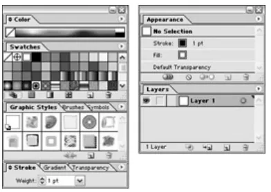
By default, Illustrator displays the palettes shown in Figure 1-4. Notice that some of the palettes are grouped into sets and offer you several tabs. (For instance, the Styles, Swatches, Brushes, and Symbols palettes are tabbed together in one set.) Initially, you see only the Styles palette; the Swatches, Brushes, and Symbols palettes are hidden behind the Styles palette. To see either of those palettes, click the tab for the one you want to view.
Figure 1-4: Palettes are tabbed together in a set.
You can combine palettes by any method that you feel works for you. To move a palette from one set to another, click and drag that palette’s tab from one set into another — or out by itself (which creates a new set). Illustrator doesn’t limit you; you can combine any palette with any set. You can even put all of Illustrator’s palettes into one set if you really want to — but I don’t advise doing so; the tabs would all overlap so you
couldn’t tell what’s what.
bottom of the other palette. A dark line appears on the bottom of the second palette when it’s in docking position. When you release the mouse button, the first palette docks with the second one.
Figure 1-5: The Layers palette docked to the Styles palette.
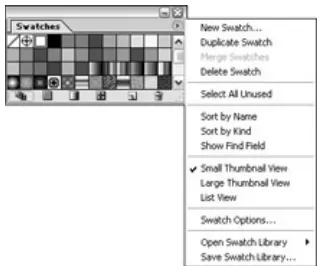
Many Illustrator palettes have their own menus, which pop up when you click the triangle in the upper-right corner of the palette, as shown in Figure 1-6.
Figure 1-6: Palettes also have their own menus.
Items in the palettes’ pop-up menus relate specifically to each palette. This makes them easy to ignore and easy to figure out — after you master the individual palette.
Illustrator menus are organized fairly well. Some menus are immediately obvious. You find commands having to do with type under the Type menu and commands for viewing your document under the View menu. Other menus are a little less intuitive and make sense only after you start using them. For instance, after you realize that any one on-screen “thing” in Illustrator is an object, you discover that items in the Object menu relate to objects. Other menus take a little more work and
experimentation to understand. For instance, the Filter menu and the Effects menu have many items that appear identical, yet do very different things. Believe it or not, all these menus are arranged to make figuring out and using Illustrator as easy as possible.
To use an item in a menu, drag down to that item and release. Something should happen when you do that (no explosions or tsunamis — as far as I know), depending on which menu item you select. Even the way a menu item appears on a menu can be a handy tip — for example, consider the following characteristics:
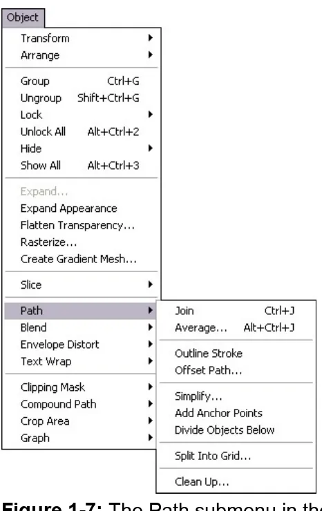
Figure 1-7: The Path submenu in the Object menu.
Keyboard commands: Most menu items in Illustrator have keyboard shortcuts (key combinations listed at the right) that can activate them.
More info needed: An ellipsis (. . .) indicates that when you click the item, a dialog box appears, requesting additional input from you.
Unavailable commands: A grayed-out menu item means Illustrator won’t let you do anything with that item just now.
Mac and Windows issues spring eternal
along for a while? Regardless of which system you use or like, you work in Illustrator pretty much the same way. A few little differences are
important enough to mention, however, especially if you jump between the two systems:
The .ai extension: Windows users often need filename
extensions after their filenames or the system refuses to look at the files. The Illustrator file extension is .ai. That’s right, as in
aieee! but without the eee!. Most file types (on Windows systems) have three-letter extensions; Illustrator uses two. Windows folks should save Illustrator documents with the .ai extension for maximum compatibility with all flavors of Windows. Having the wrong extension on the file can cause problems. If you were to put .aif on there, for example, Windows would try to open the file as a sound file, fail, and give you an error message!
Tip Windows users are accustomed to using two- and three-letter filename extensions. Mac users don’t have to, but they really should get in the habit of doing so. For
starters, that keeps the peace when you send files and lets you instantly identify what the file is. Illustrator lets you save files in an alphabet soup of file formats, such as PDF (.pdf), TIFF (.tif), EPS (.eps), or JPEG (.jpg). Each of these formats has its own unique
properties and purposes. When you see .eps on a file, chances are good that it’s a graphic created for use in a page layout program. When you see .gif, you know it’s a graphic created for display on the Web. File extensions can tell you a lot about your files even before you open them.
Right-click versus Ctrl+click: While in Illustrator, Windows users can right-click most places in Illustrator to display a
contextual menu (see Figure 1-8). Mac users, who don’t have a right mouse button, press the Ctrl key while clicking the mouse button. Contextual menus (clever creatures!) are
and give you options you can apply . . . the following, for example:
Figure 1-8: A contextual menu appears when you Ctrl + Click (Mac) or right-click(Windows).
Right-click (or Ctrl+click) the Ruler, and a context menu shows up, offering to help you change the Ruler’s unit of measurement.
Right-click (or Ctrl+click) text, and you can change the font, size, and a slew of other options.
Click a path, and up come the options related to paths, and so on.
Tip All the items found in contextual menus appear in the regular menus, too, so you never really have to use contextual menus. They’re among those little luxuries (like a steering-wheel-warmer on a cold day) that make Illustrator so nice to use.
Performance: As of 2003, Windows systems have taken a decisive lead over Macs when it comes to performance. The difference is most apparent with graphics applications such as Photoshop and Illustrator, but you’ll notice it with other
applications as well. If you’re thinking of purchasing a new
Defining the Document Area
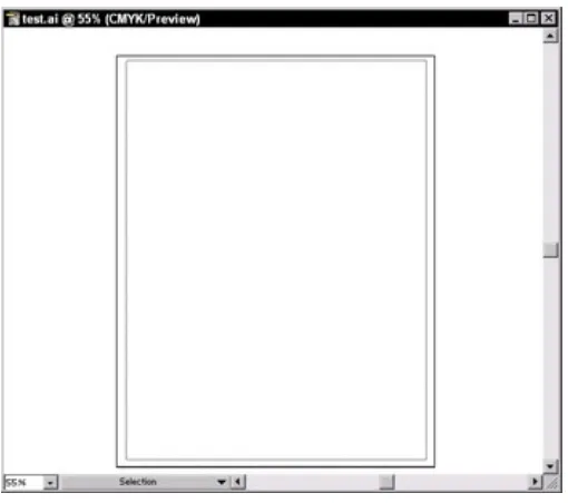
Illustrator uses a traditional art board as a metaphor; it’s what you see when you create a new file (shown in Figure 1-9). You have the page you’re working on (the Artboard), and the table the page sits on (called the Scratch area, but traditional artists will recognize it as a Pasteboard). When you create a new document, the Artboard appears as a rectangle in the middle of a white expanse. (The actual size and shape of the Artboard depends on what you enter for height and width when you create a new document.)
Figure 1-9: The Artboard and the Scratch area — the first two wiseguys you meet when you create a new Illustrator
file.
to large enough paper. If you save your Illustrator artwork as an EPS (Encapsulated PostScript) to bring it into a page layout program (or as a GIF to use on the Web), anything in the Scratch area is saved with it.
Tip If you don’t find the Artboard useful as a guide, you can hide it altogether by choosing View→Hide Artboard.
For printing a document, you may find the Page Tiling feature a little more significant than the Artboard. Illustrator smartly recognizes the printer that your document is currently selected to print to and creates a Page Tile (a rectangle), which is the size and shape of the largest area that the
selected printer can print. You can recognize the Page Tiling feature by a thin, dotted line that appears just inside the Artboard if you set page size to the size of your printer paper.
Opening Existing Documents
To open any existing Illustrator document, choose File→Open and then select the document you want (using the Open dialog box shown in Figure 1-10; Mac dialog boxes look a little different).
Figure 1-10: Use the Open dialog box to select the file you want to open.
Viewing Illustrator Documents
Illustrator provides versatile options for viewing documents — including controls for zooming, scrolling, and hiding (or showing) certain document features. You can get close-up to the smallest areas of your artwork and make changes so minute that they aren’t visible to the human eye — but you feel better knowing that your graphic is microscopically perfect. Or, to get a good feel for your artwork’s effect in the real world, view your
document at the actual size it prints at. Or you can view your on-screen objects as their “skeletons” of essential points and paths, with no strokes or colors to distract you from the true essence of your artwork. A view of any phase is available, from points-and-paths to perfect printout. Bottom line: You have to see what you’re doing to know what you’re doing.
Illustrator offers that capability.
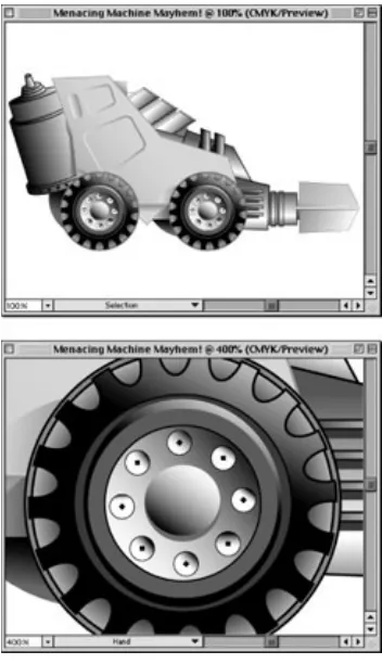
Zooming in and out of artwork
You can view your artwork at actual size (approximately its size when it prints), much larger, or much smaller. Changing the zoom amount
changes only the image’s on-screen appearance — not the image’s actual size, the way it prints, or its appearance in another application. Zooming is like using binoculars to watch a neighbor violate the bylaws of the homeowners’ association. Those unapproved maple saplings (and the sap who’s planting them) don’t actually change size; you just zoom in on them from a discreet distance.
The Zoom tool
The Zoom tool is the magnifying glass in the lower-right corner of the Toolbox. When you click the Zoom tool and move it over the document, a plus sign appears in the center of the magnifying glass. Clicking the
Zoom tool makes the details of your artwork appear larger in the
Figure 1-11: Two views of the artwork: actual size and zoomed to 400 percent. If you print while zoomed in, the image still prints at actual size.
The Zoom tool is actually two tools in one. When you hold down the Alt key (Option on the Mac), the magnifying glass contains a minus sign. Holding down the Alt or Option key and clicking your image with the
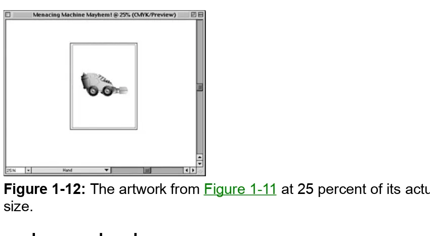
Figure 1-12: The artwork from Figure 1-11 at 25 percent of its actual size.
Speed zoom ahead
Zooming is something Illustrator users do often enough to warrant the multitude of keyboard commands associated with this function. In order of usefulness, the following items represent some of the most useful speed-zoom techniques:
Use any tool to Zoom In: Press Ctrl+Space (z+Space on a Mac) and the tool you’re using changes to the magnifying glass with a plus sign in it. Click the area where you want to zoom in. After you release the keys, the Zoom tool switches back to the tool you were previously using. This shortcut is really handy.
Use any tool to Zoom Out: Press Ctrl+Alt+Space
(z+Option+Space on a Mac), and the tool you’re using changes to the magnifying glass with a minus sign in it. Click the image to zoom out. After you release the keys, the Zoom tool switches back to the tool you were previously using. This shortcut is as handy as the temporary Zoom In tool.
Go to Actual Size: Press Ctrl+1 (z+1 on a Mac) to return to actual size. You can also double-click the Zoom tool to do this.
Zoom in and out: Press Ctrl++ (plus) (z++ [plus] on a Mac) to zoom in one level or Ctrl+- (minus) (z+- [minus] on a Mac) to zoom out one level.
Activate the Zoom In tool: Press Z to change to the Zoom In tool. If you actually read to the bottom of this list, geekiness from someone you know is starting to rub off on you. I strongly advise taking a few days off — away from your computer (and from said geek).
While Zooming: Press the spacebar to move around the current marquee (the dotted lines)
Scrolling around your document
You can use the scroll bars to move around your document, but they limit you to moving horizontally or vertically — and only one of those
directions at a time. If you’re really cool (and you know you are), you can use the Hand tool to move around your document in any direction.
To use the Hand tool, choose it from the Toolbox. Then click and drag anywhere in the document. The artwork moves in the direction you drag. At first, this action may seem slightly awkward — but power corrupts. After a few minutes of pushing your art around, you’ll never want to go back to those nasty scroll bars.
Tip You can use any tool as the Hand tool. To change a tool into the Hand tool, hold down the spacebar while you click the tool. Then click and drag just as you would with the Hand tool. Let go of the spacebar, and the tool you were using returns to its original form. This trick works with any tool except the Text tool. (If you try it with that tool, you just type space after space after space.)
Looking at the guts of your artwork
artwork and objects as a series of outlines, placed images, and text (the view in Outline mode). If you want to view your document in this skeletal form, choose View→ Outline. Outline mode is a great diagnostic tool; it helps you understand how a document was made. Figure 1-13 shows artwork in both Preview and Outline modes. Outline mode also makes it easier to select objects that are very close together.
Figure 1-13: Art in Preview mode and Outline mode.
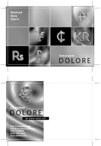
Using Templates
Few things in life are as frightening as a blank page staring you down. Knowing this, the good folks at Adobe have supplied hundreds of
templates to get you started quickly and easily. Templates, such as the one shown in Figure 1-14, provide you with a stylish yet fully
customizable starting point. Because you can change so much in each template, from colors to fonts to objects, your use of a template is sure to be different than your buddy Larry’s use of it. And, as evidenced by his questionable wardrobe, Larry has absolutely no design sense
whatsoever.
Figure 1-14: A template for a stylin’ postcard.
Saving Illustrator Documents
The instant you accomplish something you like, you should save it. And you should save every few minutes, even if you haven’t done something you like, because if you don’t, you lose all the work and have to re-create it if you crash, accidentally quit, or accidentally shut off the power supply to your computer. Unlike applications such as Microsoft Word or Adobe InDesign, Illustrator has no auto-save feature. Anything you don’t save is lost. Just remember that old TLA (three-letter acronym), SOS: Save Often, Silly! Saving only takes a second, and it saves not only your artwork but also your time and sanity.
To save a document, choose File→Save. If you haven’t previously saved the document, the Save As dialog box (shown in Figure 1-15) appears; reward its promptness by naming your file something appropriate, witty, and deep. Or type something hurried-but-meaningful, such as gasdfoiu
or jkl23, so you can challenge yourself later to figure out what that @#*! document is. (Just kidding.)
Figure 1-15: Name your masterpiece in the Save dialog box.
If you’ve already saved your document, the Save command updates the existing file. If you’re not sure whether you previously saved, look at the title bar. If it reads Untitled-1, you probably haven’t saved (only someone with a creepy sense of humor would pick Untitled-1 as a title just to
Changing Your Mind
One of Illustrator’s most powerful features may be strikingly familiar: Edit→ Undo gives you a way to take back the goof you just made. But that’s so common these days; in Illustrator, Edit→Undo is a multiple undo — it makes you the Master of Time! You can take your artwork back
through time, step by step, all the way to when you first opened the
document! If you make a mistake (or several), just choose Edit→Undo (or press z+Z on a Mac, Ctrl+Z with Windows) repeatedly, until you get back to the way things were before they went so wrong. To redo the last thing you undid, select Edit→Redo (or press z+Shift+Z on a Mac, Ctrl+Shift+Z with Windows). (A time machine with a reverse gear — way cool.)
Imagine creating with wild abandon — moving points, changing colors and line thicknesses, running filters — because in Illustrator, you can change your mind after the fact. Think of what you could obliterate from time — the misplaced stroke that looks like a bad tattoo, the missed goal that kept your team from the playoffs, the blind date that went so horribly wrong — well, okay, it only works in Illustrator. At least it works
somewhere.
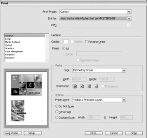
Printing Illustrator Documents
If your computer is hooked up or networked to a printer, you can print just about anything you create in Illustrator. Before you print, however, make sure that your artwork is within the Page Tiling boundaries (that dotted gray rectangle that shows up when you select View→Show Page Tiling). Only items within these boundaries print. The dotted lines on the page indicate the trim area; if your image is outside the dotted lines, it won’t print.
To print your artwork, choose File→Print. The Print dialog box appears (see Figure 1-16). Click OK; soon a sheet of paper emerges from your printer with your artwork on it.
Closing Documents and Quitting Illustrator
Overview
In This Chapter
Understanding how paths and pixels work
Knowing the differences between paths and pixels Determining when to use paths and when to use pixels Using PostScript printing and paths
Creating paths
Being new to Illustrator typically means being new to paths. Paths are the heart and soul of Illustrator — its primary way to create graphics. Nearly all computer-generated graphics are either pixel-based or path-based (also known as vector-based — more on that later). Getting a firm grip on the differences between the two graphics types can help you create
graphics of any type.
Pixel-based images (created in Adobe Photoshop as well as by scanners and digital cameras) use a fixed grid of tiny colored squares (kind of like a tiny mosaic tile) to create images on your screen. Your computer
monitor’s resolution is a measure of how detailed an on-screen image can be, based on how many pixels the screen can provide per square inch. To give you an idea of how small these pixels are, every square inch of the average monitor contains up to 9,216 pixels. Even so,
monitors have a relatively low resolution; they don’t use many pixels per inch compared with high-resolution printing, which can require 90,000 pixels in a square inch or more.
image (that is, the higher the resolution), the smoother and more realistic the picture is.
In addition to their staggeringly small size, the range of colors pixels can have is equally astonishing. A single pixel can display only one color at a time, but that color can be any of 16.7 million.
Path-based (often called vector-based) graphics are much simpler — and in some ways, easier to comprehend — than their pixel-based cousins. Think of an image in a coloring book: A shape is defined by a line. Inside the line, you can add color. By using this simple method of shapes and color, you can create just about any picture you can imagine. In
Whether Paths or Pixels Are Better
You choose between paths and pixels for different reasons. Paths are better for some things and pixels are better for others, and each
approach has its strengths. The key to determining whether to use paths (which Illustrator creates) or pixels (from a program, such as Photoshop) is to be familiar with the capabilities of each method. Figure 2-1 shows path-based artwork next to pixel-based artwork.
Figure 2-1: Path-based artwork (left) and pixel-based artwork (right).
Paths are generally better for type, logos, and precision graphics. Pixels are generally better for photographs, complex backgrounds, textures, and simulated lighting effects. Quite often, however, the proper combination of paths and pixels results in the best final illustration possible.
Determining what combination to use is a lot easier when you’re hip to the advantages and drawbacks of both paths and pixels.
Paths: The ultimate flexibility in graphics
Paths are used to define any shape from a simple square or circle to the shape of South America. Because paths are the outline of these shapes and not the shapes themselves, they take up very little storage space. A path-based square that measures 15 x 15 feet takes up no more room in your computer than a 1-x-1-inch path-based square.
How can such a large square and such a tiny one accompany the same amount of computer memory? Through math, mostly. Looking at how Illustrator draws a square can help you make sense of all this
for each of four points (the corners) — as well as any Fill or Stroke information (what color the square is). Where the points are doesn’t
matter; what matters is that you have four of ’em and they make a square when you connect the dots.
What about complex outlines? A semiaccurate representation of South America with a limited amount of detail probably needs dozens of points to define the shape of the continent. In this case, there’s nary a straight line anywhere — from point to point, it’s nothing but curved lines. And because they need more information to describe them, those curved lines take up about twice as much disk space as straight lines do. Even so, a tiny little 1-inch-high illustration of South America can be enlarged to 15 feet tall and still have exactly the same file size because the illustration still has exactly the same number of points. Only the math that
determines the location of those points has been changed to put them farther apart.
Figure 2-2 shows South America next to a square that physically appears to be about three times as large as South America (well, three times as large as the illustration of South America). Which one is bigger in terms of file size? South America is. It has more detail and, therefore, more points.
Figure 2-2: The South America shape is actually a larger Illustrator file than the square because more points are used to define the
What’s so cool about paths is something I previously alluded to: You can make paths much larger or smaller in physical dimensions without
increasing the file size or losing image quality. You can rotate a path, flip it (reflecting), skew it (shearing), or distort it in a number of ways without changing the file size or detail. (Here’s the secret: All you’re really
changing is the location of the points.) This near-effortless scalability makes Illustrator the perfect choice for creating logos that appear on business cards, letterheads, Web pages, various documents, banners, billboards, or signs.
Pixels: Detail and realism to spare
Pixel-based images are used for photographs because the fine “random” naturalistic detail is virtually impossible to create in a path-based image. Digitized photographs represent the majority of the pixel-based images in use today. The rest are mostly Web graphics and other on-screen
images.
Technical
Stuff Even a low-resolution pixel-based image can have5,184 squares of color per square inch, each of which can be any of 16.7 million different colors. In a path-based image, every different color (with a few
exceptions) must be defined by a separate path. To equal the number of different colors that you can create in a pixel-based image you’d have to draw so many paths that . . . well, imagine covering a
basketball with confetti, one piece at a time. For this reason, pixel-based images are the hands-down choice over path-based graphics if you’re re-creating the continuous tones and irregular patterns found in nature, such as an outdoor scene with a lot of grass, trees, and furry animals.
be obvious from a distance. Same deal with pixel images. You have to add more tiles (pixels), or you see the pixels you already have showing up on-screen as big squares. And when you add pixels, you make the file size larger while reducing the quality (worst of both worlds) because you can’t get away with just tossing in any old pixels. An artisan may be able to add tiles to her mosaic and preserve its image quality, but the
computer is just guessing about what tiles to add (in geek speak, a process called interpolation). There’s just no way to enlarge a pixel-based image without reducing the quality, as shown in Figure 2-3. Likewise, shrinking the image means throwing away pixels, which degrades the image because it then has fewer pixels available for
showing detail. In technical circles, changing the number of pixels in an image is called resampling.
Figure 2-3: The effects of reduc- ing and enlarging the image.
How Paths and Pixels Compare
This is it — the definitive answer you’ve been looking for: Use pixels for photographic manipulation. File sizes are large but smaller than if you tried to create the same photographic image using paths. Pixel-based graphics that need to print or display at large sizes require larger file sizes than the same graphics printed or displayed at smaller sizes. Use path-based graphics to create any type of graphics; their file sizes are typically much smaller than their pixel-based counterparts (and you can always create pixel-based graphics from the path-based ones at a multitude of sizes and resolutions). A path-based graphic can be
displayed or printed at any size, from microscopic to billboard, without any change in file size, yet always at maximum quality. And the best part is that path-based graphics are easily edited, unlike their “every single pixel is a color” pixel counterparts.
A comparison of path and pixel documents
The best way to show advantages of each format is to take a look at the same graphic created with both paths and pixels. The illustration shown in Figure 2-4 is a logo, created with paths, for the country of Oddland to use on all its manufactured goods, as well as on signs, brochures, and other places.
One thing you notice right away is that the logo is text-heavy. Paths represent text fairly well. A big advantage in creating this logo with paths is its scalability; you can enlarge or reduce it to virtually any size without changing the image quality. Compare Figure 2-4 with Figure 2-5, which shows a pixel-based version of the logo. (Looks like a clone, doesn’t it? Looks can be deceiving.)
Figure 2-5: The same Oddland logo, created with pixels and tipping the scales at 1.2MB.
If you use a high enough resolution, the pixel-based logo looks as good as the path-based — but its file size is 1.2MB (almost ten times the size of the path-based logo). Maybe that isn’t a problem if you have a hard drive the size of New Jersey, but watch what happens when you change the size of the logo. If you enlarge the path-based version, you get the image on the left in Figure 2-6.
original size.
All I had room for in Figure 2-6 was a smidgen of the logo — the whole thing would be over 20 inches square — but note how the edges remain perfectly smooth and crisp in the path-based version. And the file size is still only 188K! On the other hand, if you enlarge the pixel-based version, you get the image on the right. Notice the dreaded jagged edges. Worse, the whole logo at this size would become the Giant File That Ate New Jersey — over 25MB in size — more than 100 times the file size of the path version!
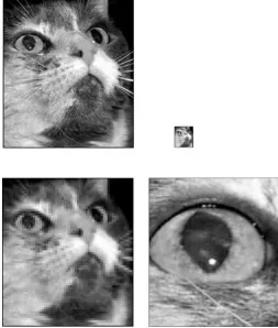
It is very difficult to create artwork approaching photographic realism with paths, but it can be done. An image of Venus, shown in Figure 2-7, was created entirely within Illustrator and consisted entirely of paths.
Figure 2-7: A close-up of Venus.
Figure 2-8: The vectors-only version of Venus’s eye, com-pared to the original Botticelli painting at the same level.
When to use paths and when to use pixels
In Table 2-1, check out some attributes that are best created with paths and some that are best created with pixels.
Table 2-1: What Paths and Pixels Are Especially Good For Use Paths if Your Artwork
Contains Use Pixels if YourArtwork Contains Large amounts of type Photographs
Geometric shapes Complex naturalistictextures
Thin lines Soft-edged random details
Paths and Printing
Illustrator sends paths directly to printers in order to print smooth-edged images. This happy circumstance is one reason that Illustrator can make such good-looking artwork; most printers are designed specifically for printing out path-based images.
Dot-matrix printers of the ’80s gave way to laser printers and inkjets, and with them came a dramatic increase in speed (not to mention blessed quiet).
Which is faster — a square or a square?
For basic shapes, path-based artwork prints much faster than pixel-based artwork. For instance, a 5-x-5-inch path-pixel-based square prints in a fraction of the time that it takes to print the same pixel-based square. Why? The printer needs only the four corner locations for the path-based square. For the pixel-based square, the printer needs to see each and every pixel that’s on the way to the printer. (Imagine trying to count sand grains with tweezers, really fast.)
Printing paths: The evolution of Bézier curves
Printers path in much the same way that Illustrator does — using points connected by lines. Think of a Connect-the-Dot game you did as a kid. Instead of processing each pixel, the Illustrator print code says, “Connect this point to that point, that point to this one over here, and so on.” All it takes is another bit of code to say, “Now fill that shape with solid red” or some other color.
This approach works well for objects with flat sides, but curves are
another matter entirely. You’d need to connect an infinite number of dots to make a perfect curve. Here’s where Illustrator gets really clever.
Instead of using straight lines between points, PostScript uses curves between points: Bézier curves, named after their creator, world-famous mathematician Pierre Bézier (pronounced BEZ-zee-ay).