The Rails View
This is a must-read for Rails developers looking to juice up their skills for a world of web apps that increasingly includes mobile browsers and a lot more JavaScript. ➤ Yehuda Katz
Driving force behind Rails 3.0 and Co-founder, Tilde
In the past several years, I’ve been privileged to work with some of the world’s leading Rails developers. If asked to name the best view-layer Rails developer I’ve met, I’d have a hard time picking between two names: Bruce Williams and John Athayde. This book is a rare opportunity to look into the minds of two of the leading experts on an area that receives far too little attention. Read, apply, and reread.
➤ Chad Fowler
VP Engineering, LivingSocial
Finally! An authoritative and up-to-date guide to everything view-related in Rails 3. If you’re stabbing in the dark when putting together your Rails apps’ views, The Rails View provides a big confidence boost and shows how to get things done the right way.
➤ Peter Cooper
wisdom gained from years’ worth of building maintainable interfaces by two of the best and brightest minds in our business. I have been writing Ruby code for over a decade and Rails code since its inception, and out of all the Ruby books I’ve read, I value this one the most.
➤ Rich Kilmer
Creating a Beautiful and Maintainable User Experience
John Athayde
Bruce Williams
Programmers, LLC was aware of a trademark claim, the designations have been printed in initial capital letters or in all capitals. The Pragmatic Starter Kit, The Pragmatic Programmer, Pragmatic Programming, Pragmatic Bookshelf, PragProg and the linking g device are trade-marks of The Pragmatic Programmers, LLC.
Every precaution was taken in the preparation of this book. However, the publisher assumes no responsibility for errors or omissions, or for damages that may result from the use of information (including program listings) contained herein.
Our Pragmatic courses, workshops, and other products can help you and your team create better software and have more fun. For more information, as well as the latest Pragmatic titles, please visit us at http://pragprog.com.
The team that produced this book includes:
Brian Hogan (editor)
Potomac Indexing, LLC (indexer) Molly McBeath (copyeditor) David J Kelly (typesetter) Janet Furlow (producer) Juliet Benda (rights) Ellie Callahan (support)
Copyright © 2012 Pragmatic Programmers, LLC. All rights reserved.
No part of this publication may be reproduced, stored in a retrieval system, or transmitted, in any form, or by any means, electronic, mechanical, photocopying, recording, or otherwise, without the prior consent of the publisher. Printed in the United States of America.
ISBN-13: 978-1-93435-687-6
Contents
Acknowledgments . . . ix
Preface . . . xi
1. Creating an Application Layout . . . 1
Creating a Basic Layout 2
1.1
1.2 Setting Up a Boilerplate 6
1.3 Building the Page Frame 14
1.4 Adding a Sidebar 23
1.5 Adding Navigation 28
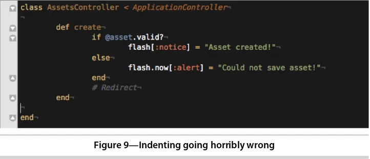
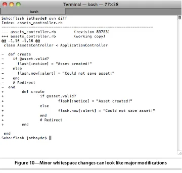
1.6 Displaying Notifications 36
1.7 Validating Our Code 39
1.8 Testing Internet Explorer 42
1.9 Wrapping Up 47
2. Improving Readability . . . 49
Choosing a Templating Language 49
2.1
2.2 Standardizing Coding Practices 51
2.3 Simplifying Complex Output 56
2.4 Working with Models 63
2.5 Displaying Conditional Content 65
2.6 Adding Model DOM IDs for JavaScript 69
2.7 Cleaning Up 71
2.8 Wrapping Up 72
3. Adding Cascading Style Sheets . . . 73
Using the Asset Pipeline 73
3.1
3.2 Learning SCSS 76
3.3 Adding Sprites 88
3.4 Using Web Fonts 92
4. Adding JavaScript . . . 101
4.1 Using JavaScript from Rails 101
4.2 Testing Ajax 110
4.3 Wrapping Up 117
5. Building Maintainable Forms . . . 119
Using Semantic Form Tags 119
5.1
5.2 Building Custom Form Builders 132
5.3 Looking Toward the Future of HTML5 Form Elements 140
5.4 Wrapping Up 142
6. Using Presenters . . . 143
Presenting a Record 144
6.1
6.2 Presenting Multiple Records 153
6.3 Using Presenters for Serialization 158
6.4 Wrapping Up 161
7. Handling Mobile Views . . . 163
Building a Flexible Layout 164
7.1
7.2 The Next Level with Responsive Design (@media
queries) 168
7.3 Using Mobile-Specific Templates 174
7.4 Using jQuery Mobile 179
7.5 Wrapping Up 187
8. Working with Email . . . 189
Building a Mailer 189
8.1
8.2 Handling Email Templates 191
8.3 Testing Locally 195
8.4 Testing Across Clients 196
8.5 Wrapping Up 206
9. Optimizing Performance . . . 207
A/B Testing with Vanity 207
9.1
9.2 Performance Testing and Maintenance 214
9.3 Wrapping Up 228
Part I
—
Appendices
A1. The Rails View Rules . . . 233
A2. Bibliography . . . 235
Acknowledgments
We have many people to thank for making this very ambitious book possible.
First of all, as this is a book about Rails, a lot of credit must go to the creator of the framework, David Heinemeier Hansson, the members of rails-core (past and present), and other contributors. The ideas in this book are distilled from years of discussion and collaboration with the Rails and Ruby communities.
Throughout our careers we’ve drawn inspiration and motivation from a
number of web luminaries, and we would be remiss in failing to mention at least a few of them: Dan Cederholm, Molly Holzschlag, Paul Irish, Jeremy Keith, Steve Krug, Eric Meyer, Jakob Nielsen, Mark Pilgrim, and Jeffrey Zeldman.
We were surprised to learn that a number of people actually volunteered to read the book before it was complete, thereby putting their own sanity at risk.
We’d like to thank these brave souls for their help in identifying issues,
sug-gesting topics, and otherwise vastly improving the text: Derek Bailey, Kevin Beam, David A. Black, David Bock, Daniel Bretoi, Jeff Casimir, BJ Clark, Jeff Cohen, Justin Dell, Joel Friedman, Jeremy Hinegardner, Mark Margolis, Dan Reedy, Sam Rose, Loren Sands-Ramshaw, Diego Scataglini, Tibor Simac, Charley Stran, Mark Tabler, and Lynn M. Wallenstein.
This book simply would not have been completed if not for our amazing editor, Brian Hogan. He continuously challenged our preconceptions and helped to clarify our intent, all with seemingly unbounded patience and class. And we
promise, Brian, we’ll never again utilize utilize in our writing (except for that
time right there).
John would like to thank his supportive wife, Whitney, for her patience and encouragement throughout the process; his parents, grandparents, and extended family for their love and support and for purchasing that Mac SE back in the day with Hypercard installed; all the members of #caboose for their patience and discussion over the years; Justin Hankins and Sara Flemming for all the years of experimenting in HTML, CSS, and Rails with Meticulous; and Amy Hoy for an intense year of business, design, and devel-opment boot camp while running Hyphenated People with him. He also thanks Bruce for agreeing to be a coauthor so that this book could rise to its potential.
Bruce credits the care and support of his wife, Melissa, and his two sons, Braedyn and Jamis, for the uncharacteristic level of determination and
attention he’s managed to focus on this single project, which broke any
number of personal records. Also, Bruce’s life would have turned out very
differently were it not for the love of his mother, Monique, and father, Bruce
(the elder), and a varied and distributed family he’s proud to call his own,
even if they do occasionally call him for tech support. To his coauthor, Bruce offers an equal share of sincere thanks and rampant design skill jealousy. Some things do not change. Finally, Bruce would like to dedicate his work on this book to the memory of his brother, Tristan Eppler.
John Athayde & Bruce Williams
March 2012
Preface
In 2004, Rails was born and the web discovered the MVC (model-view-controller) pattern in earnest, which brought a whole new level of productivity
and fun to a world of developers and designers.
You’ll find no end of books that provide a firm foundation for writing controllers
and models (which benefit greatly from being written top-to-bottom in plain
Ruby), but when it comes to views—that meeting place of Ruby, HTML,
JavaScript, and CSS (not to mention developers and designers)—what’s a
disciplined craftsman to do?
This book aims to widen the discussion of Rails best practices to include solid, objective principles we can follow when building and refactoring views.
By the time you’re finished reading, you’ll understand how you can structure
your front end to be less brittle and more effective and boost your team’s productivity.
Taming the Wild West
For all the advantages that Rails has over traditional, everything-in-the-view
approaches like vanilla PHP or ASP, it’s also fostered a culture of complacency
around how views are structured and maintained.
After all, with all the controller and model logic extracted and the addition of helpers, what could go wrong?
While many of the elements that comprise the view are seen as easy (HTML, for example), the view layer in its entirety is an incredibly complex thing. This complexity can be so daunting that developers and designers just give up and use tables, hackery, and any tweak they can just to make it look somewhat right on the front end.
There are a lot of reasons for this. Many developers are uneasy around the
often goes unpaid, and knowledge of good markup practices can be years behind or even considered irrelevant. After all, it works all right!
Designers can be uneasy around generated code and, without training, see
ERB blocks as a sort of magical wonderland they can’t hope to understand.
Helpers are just black boxes, and the underlying model relationships and controller context that drive our views are just as opaque. Many designers are so visually focused that they, too, disregard the importance and usefulness of correct, modern markup. After all, it looks all right!
It’s easy for the view layer to become a no-man’s-land that no one owns or
adequately polices or a junkyard that no one feels safe to walk through.
In this book we’ll work hard to convince you not to abdicate responsibility for
the view layer. We’ll work together to learn how we can build application views
sustainably from the ground up, discover useful refactoring patterns and helpful tools, and tackle integrating disparate technologies like Ruby, HTML,
and JavaScript into a cohesive unit that’s more than just a stumbling block
between you and the new features you need to implement.
Who Should Read This Book?
If you’re a designer working with Rails or a Rails developer working in the
view layer, this book is for you. We’ll cover the technical issues present in the
view layer, and we’ll also highlight some unique challenges that mixed teams
of developers and designers face when working together.
Ruby and Rails Versions
The Rails View was built on top of Rails 3.2.1 and Ruby 1.9.3 and should be compatible with future stable releases for quite some time. In the event that we have small compatibility issues with future versions, we will post updates
in the online forum on the book’s website.1
Much of the content and code would need to be modified to work with some earlier versions due to our coverage of the Rails 3.1+ asset pipeline and use of the new Ruby 1.9 Hash literal syntax.
You can check your Rails version with the following command:
% rails -v
You can use gem install with the -v option to manually get the appropriate version.
% gem install rails -v 3.2.1
To manage your Ruby versions, we recommend RVM (Ruby Version Manager).2
What Is in the Book?
We’ll learn how to build solid, maintainable views in Rails over the next nine
chapters.
In Chapter 1, Creating an Application Layout, on page 1, we look at how to build the view structure for a new application from the ground up and get our layout files in order to provide a firm foundation for the rest of our application.
In Chapter 2, Improving Readability, on page 49, we look at how we can make our templates easier to read and more naturally convey their intent.
In Chapter 3, Adding Cascading Style Sheets, on page 73, we’ll introduce you to the asset pipeline, explain the new SCSS format, customize the Sprockets configuration, and talk about how we can package assets into reusable units.
In Chapter 4, Adding JavaScript, on page 101, we’ll continue our discussion of the asset pipeline, highlighting CoffeeScript, the Rails UJS drivers, and some organizational techniques for including JavaScript plugins in our applications.
In Chapter 5, Building Maintainable Forms, on page 119, we tackle forms, investigate creating our own form builders, and use some existing libraries to make complex forms easier to build and maintain.
In Chapter 6, Using Presenters, on page 143, we learn some techniques to make displaying complex information as easy and maintainable as possible from the view, building abstractions with our own custom Ruby classes.
In Chapter 8, Working with Email, on page 189, we discover some tips and tricks to make sending rich email less frustrating and designing emails less dependent on trial-and-error.
Finally, in Chapter 9, Optimizing Performance, on page 207, we’ll learn the
basics of measuring and solving application and business performance problems.
How to Read This Book
Each chapter in this book builds upon the content in the previous chapter.
While examples will center around the ArtFlow application that we’ll begin to
build in Chapter 1, Creating an Application Layout, on page 1, chapters can
be read sequentially or by jumping around to focus on a specific problem. You should be able to pull the code from our repository for any given chapter and work with it.
Chapter 1, Creating an Application Layout, on page 1, covers a lot of HTML and CSS that may seem out of place for a Rails book, but we feel these topics are critical to writing good views. Spend some time refreshing yourself on this subject matter even if you are already familiar with it. You may find some surprises in there!
Online Resources
The book’s website has links to an interactive discussion forum as well as to
errata for the book.3 You’ll also find the source code for all the projects we
built. Readers of the ebook can click the gray box above the code excerpts to download that snippet directly.
If you find a mistake, please create an entry on the errata page so we can address it. If you have an electronic copy of this book, use the links in the footer of each page to easily submit errata to us.
Let’s get started by looking at how views work and by digging into how we
deliver those to our application’s visitors.
Creating an Application Layout
The foundation of every Rails application’s view layer is the layout. The layout
provides a consistent, common structure for application pages, it sets the stage for the content our controllers render, and it pulls in the client-side scripts and style sheets that our interface needs to look and behave correctly.
In this chapter we’re going to approach building an application layout from
scratch, converting a design mockup into a real layout file while discovering some new markup and Rails view best practices along the way.
This layout is the first piece of a new application we’re building for a design
studio. The application is called ArtFlow, and it will be used to track designer progress, take client feedback, and act as a digital asset manager for assets after the project is complete.
Often projects live in project management applications (such as Basecamp) or through a string of emails with changes broken up into multiple emails. The logical flow of taking a concept to production will be one part of the
application. After the project is complete and the team has moved on, there’s
a desire by clients to see previous campaigns they’ve run and look at their
creative assets. Often clients will look at how certain pieces performed and base a new job on an existing creative asset. We want to be able to provide an easy way for clients to find those assets and for our design shop clients to see and track them as well (instead of keeping the assets in a folder hidden
on a file server and identified only by the client’s name).
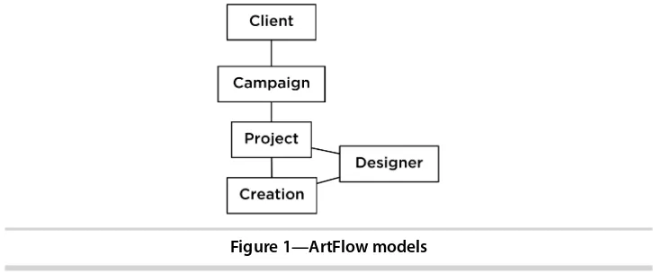
The modeling at this stage of the application will be fairly straightforward and will consist of creations, designers, projects, campaigns, and clients. Creations (the designs themselves) originate from a designer and belong to a project. The project belongs to a client through a campaign. It will be structured
Figure 1—ArtFlow models
All of the view work we’ll be doing to manage these records will sit on top of
our layout, so it’s important we build a good foundation from the beginning.
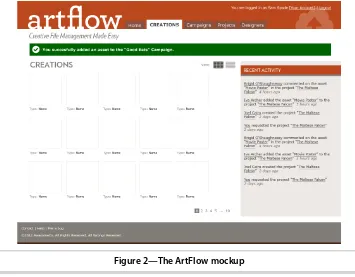
Let’s dive in, starting with the helpful mockup our user interface designer
put together for the application.
1.1
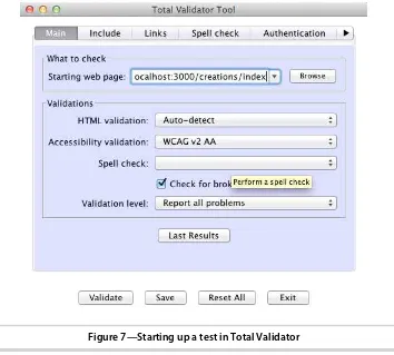
Creating a Basic Layout
It’s Monday morning, and we’ve been tasked to get the basic layout for ArtFlow
put together. Our designer mocked up a nice-looking screen (as seen in Figure
2, The ArtFlow mockup, on page 3) that we will break up into our global
layout and styles. The main layout for our application lives in app/views/
layouts/application.html.erb and the style sheet is located at app/assets/stylesheets/ application.css.
These follow a paradigm for each controller as well. A controller named
projects_controller.rb will look for a file in the layouts directory named
projects.html.erb. We can also override this either on the controller or by the action of telling the controller to render a specific layout. At the controller level we would add layout "{layoutname}", and in an action we would use render
:layout =>"{layoutname}".
In the past versions of Ruby on Rails, we have used HTML4 and XHTML, but Rails 3 generates an HTML5 layout when a new project is created. HTML5 provides some additional, enhanced functionality on browsers that support
it while gracefully degrading on browsers that don’t. We’ll learn more about
this as we build out our application, and the first step is getting familiar with some new tags.
We aren’t going to cover HTML5 in its entirety here. Our editor, Brian Hogan,
Figure 2—The ArtFlow mockup
pick that up. You can also look at Mark Pilgrim’s excellent site,1 and check
out his accompanying book, HTML5: Up and Running [Pil10]. You can also
drink from the fire hose with the HTML5 Specification.2 In addition, there’s
the great resource dedicated to HTML5 called HTML5 Doctor.3 HTML5 is a
specification unto itself, but be careful. People frequently use the acronym
HTML5 to refer to a number of technologies described in different W3C spec-ifications, including HTML5 itself (including canvas, video, web storage, and more), CSS3, Web Sockets, Web Workers, Geolocation, and more.
We’re going to focus on the new tags that we can start using today, and we’ll
touch on some other pieces as we move through the various problems we encounter as we build ArtFlow.
HTML5 and Semantic Markup
Hierarchy and context—these two things are what we’re really creating when
we mark up a document. We build relationships between pieces of content
1. http://www.diveintohtml5.info
that describe the structure of the document and provide hooks for us to style those pieces of content in separate style sheets. Maintaining this separation
of concerns is one of our rules, on page 233.
In the past we’ve been dependent on the <div> element, which has very little
semantic meaning on its own. While there were many semantic HTML elements in earlier versions of HTML, most were very specific and limited in scope (e.g., definition lists).
HTML5 has changed that. Now that we have several new, more semantic HTML elements available for overall page structure, we can provide a greater level of meaning in our documents, make the relationships between pieces of data more apparent, and make the whole document more readable.
There are also many more tags from earlier versions of HTML that we should
also employ in our markup, such as definition lists (<dl>), which in the new
version of the spec are to be used for any key-value pair. When writing HTML,
we should try to add as much semantic meaning as possible, (again) as stated
in our rules, on page 233.
Let’s look at our new HTML5 tags and briefly see what each is used for:
• abbr: An abbreviation or acronym where the title attribute has the full,
spelled-out version or meaning.
• article: A unique item, sometimes in a list. Common examples would be
an article in a magazine or blog or an item on an e-commerce site.
• aside: Akin to a true sidebar within an article in print magazines, this is
not to be used for our sidebar column. Pull quotes, breakout content, and similar objects would fit in this element.
• audio: An audio or sound stream. Various browsers support various codecs,
including .wav, .ogg, and .mp3, depending.
• canvas: A canvas element is used for rendering graphics on the fly within
a page. It is raster/bitmap-based and should not be used for things that
have a better option (e.g., don’t render a heading with canvas).
• datalist: A set of options inside an input when it is a list.
• details: A disclosure widget, where the user can find additional information
or controls; for example, a file transfer window that has a series of key/value pairs about the transfer would be a definition list wrapped in a details element.
• figure: Some kind of content that interrupts the main flow of content, such
as a photo, illustration, chart, etc. that is referenced from the content. The rule of thumb is that you should be able to be remove it from the flow of the content (that is, to another page) without affecting the flow.
• footer: The footer of a given section of a document or of the document itself.
This often contains copyright information, links, contact information, and more.
• header: A heading of a given section of a document or of the document
itself. This will contain various h1 through h6 elements but can also contain
other information.
• hgroup: A wrapper around multiple <header> elements when used adjacent
to each other in a section—a heading and subheading that are related.
• mark: A tag to be used to mark or highlight content for reference purposes
to bring the reader’s attention to something or due to relevance in a search.
• meter: An element that reports a scalar value within a known range, or
anything that could be from 0 to 100 percent (or where there is a known maximum value).
• nav: Navigation for a document or to other documents. Not every group of
links is a <nav> item, however, and it should not be used in places such
as footers, etc.
• output: The result from a calculation.
• progress: The completion progress of a task, either in relationship from 0
to 100 percent or in an unknown state.
• section: A generic document or web app section. It is a themed group and
sometimes has a header and a footer within it.
• summary: A caption or summary of the parent <details> element and its
contents.
• time: A time element, such as a created_at or updated_at column, in our models.
• video: Similar to audio but for a video or movie.
There are also quite a few new HTML5 form elements, which we will discuss in Chapter 5, Building Maintainable Forms, on page 119.
These are all things we would have probably used <div> tags for in the past,
these in our build-out, but we should be aware of them so we can identify the proper tag to use for any content piece we encounter as we build our application.
Beyond Tags: Microformats and ARIA Roles
While the breadth of HTML tags gives us a lot of options to use, we should consider combining these meaningful tags with other techniques such as microformats and ARIA roles to provide as much meaning as possible.
Microformats arose from XHTML as a way to provide more meaning to content
in a web page.4 While there are some well-established microformats, such as
hCard and hAddress, the concepts of a microformat are open-source and commu-nity-based design principles for formatting data.
ARIA roles are part of the WAI (Web Accessibility Initiative), and ARIA stands for accessible rich Internet applications.5 These are attributes added to tags to let the browser better understand the role of an element or group of ele-ments on a page. Whenever you see role="{value}" or aria-value{something]={value}
as we build out our code, it means we’re using ARIA roles to provide more
meaning.
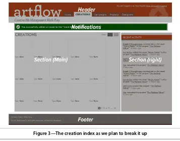
Analyzing the Design
Since the core user interaction with our application is managing creations,
we’ll start with our creation index. This page has many of the elements that
are used site-wide, and since our designer was nice enough to standardize
screens across the app, we’ll be able to build out a good chunk of the design
concept in one place.
Looking at Figure 3, The creation index as we plan to break it up, on page 7,
we see a header, notifications, navigation, a sidebar, and a footer (in addition to our main creation listing). Now that we know how to decompose our
mockup, let’s start converting it into markup—once we have some standard
boilerplate in place.
1.2
Setting Up a Boilerplate
A boilerplate refers to the standard view code that we use in every application
we build. It’s a great way to standardize toolsets and quickly get things moving
early in the development cycle. There are as many different boilerplates as
4. http://www.microformats.org
Figure 3—The creation index as we plan to break it up
there are stars in the sky, but let’s look at the most common example, the
one that Rails generates for us. The standard site-wide layout is located in
app/views/layouts/application.html.erb. <!DOCTYPE html>
<html> <head>
<title>Artflow</title>
<%= stylesheet_link_tag "application" %>
<%= javascript_include_tag "application" %>
<%= csrf_meta_tags %>
</head> <body>
<%= yield %>
</body> </html>
Here is the initial Rails application.html.erb. It says we’re using HTML5 with the
DOCTYPE (which appears simply as <!DOCTYPE html>), loads all the style sheets
Joe asks:
Are Boilerplates Mandatory?
Not at all. They are simply a codified way of doing things, similar to how Rails codifies certain things about how we build web applications. Boilerplates are also something that each team will develop over time and standardize for its particular needs. We have separate boilerplates for our public and internal-facing applications, and we often update them as best practices change and experience shows us a better way.
This file is intentionally sparse, as the core team put in only the HTML that is absolutely needed to make Rails deliver a view to a browser. The team could have put in a full boilerplate of various code pieces, but they left it to us to extend the basics.
Now let’s add in some additional elements that we’ll need, starting with our
charset. Browsers need to map characters to unicode, and giving them a
charset lets each browser do that correctly—otherwise we have nasty little
things showing up in our text. We use UTF-8 because it provides the best features across the most devices and works for XML and HTML. We need to
specify a character encoding or we can have various issues arise in our page.6
<head>
<meta charset="utf-8"> <title>ArtFlow</title> <!-- The rest of our head --> </head>
We sometimes run across documents that use other encodings, such as ASCII or the ISO-8859-1 and its variations. These encodings are fine in English and for specific languages, but the new standards of UTF-8, -16, or -24 support
almost every language in the world. HTML5 spec states that “authors are
encouraged to use UTF-8,” so we’ll use that. UTF-8 makes internationalization
much easier to deal with, and it lets us mix character sets in the same page.
More information is available online.7
This is the same as the much longer (and older style) seen here:
<head>
<meta http-equiv="Content-Type" content="text/html;charset=utf-8"> <title>ArtFlow</title>
<!-- The rest of our head --> </head>
6. http://blog.whatwg.org/the-road-to-html-5-character-encoding
Both work just fine with all the major browsers, and the shorter declaration
is cleaner. Now that we have the charset in place, let’s start to set up our
code base for all the browsers we will support.
Turning on HTML5 for Internet Explorer and Older Browsers
We need to support MSIE 7 and 8 for this application. While large parts of it are being used internally and we can limit the browser support from an IT
perspective, our customers’ clients may be using all sorts of browsers to
access the site. How do we balance providing better semantic markup and code with keeping our sanity while debugging browsers (which we cover in
more depth in Section 1.8, Testing Internet Explorer, on page 42) with
back-wards compatibility?
Modernizr to the Rescue!
Modernizr is a library that uses JavaScript to detect the availability of native support for next-generation web technologies ranging from HTML5 to CSS3
and more.8 It classes the <html> element with this information and allows for
the loading of polyfills to include functionality in browsers without native
support.9 It also contains an HTML5 shiv to enable many of the new tags we
looked at above. This shiv allows them to be styled, but we will need to add
them to our reset/normalize style sheet (which we do in Getting Browsers on
the Same Page, on page 10) in order to get them working the same across all browsers.
Modernizr’s HTML shiv does a few things for us. First, the shiv tells the DOM
(document object model) that there are some new elements that the DOM can address. Some browsers assume that if an element is a tag and the browser
doesn’t know about it, the tag was intended to be something new and the
browser will treat the tag as a generic element. Internet Explorer does not. We could have typed the following for each new element:
<script>document.createElement("blah");</script>
Instead of typing the above for every new HTML element we want to use, this script takes care of creating those elements as well as some other things. It
creates an array of the new tags we want to use and then applies .createElement();
to each. It also applied the IE HTML5 Print Protector so that these elements
will print properly.10
8. http://www.modernizr.com
We will roll our own custom version at http://modernizr.com/download/to only include
the functionality that we need and place it in our assets/javascripts folder. Next
we’ll add this to our manifest file in app/assets/javascripts/application.js (a directory
we talk about in more depth in Chapter 4, Adding JavaScript, on page 101):
artflow/layout/app/assets/javascripts/application.js
//= require modernizr-1.7.custom //= require jquery
//= require jquery_ujs //= require_tree .
For concerns about what we can support today, we can take a look at
http://html5readiness.com/or http://www.caniuse.com/and see which browsers support
which elements (and at what point that support was introduced). While the spec is not yet final, most browsers have some implementation for many of the elements of the HTML5 family of tools.
Once we have this in place, the new HTML5 elements are now addressable in the DOM for both JavaScript and CSS styling. Now we need to make sure all the browsers are starting from a blank slate, stylistically speaking.
Getting Browsers on the Same Page
Now that all our browsers will recognize the HTML tags we’re tossing at them,
we’ll look at another browser problem we have to solve.
Browsers have their own built-in style sheets that they use as basic presen-tation defaults. They also contribute and become the foundation for the styles we add, and as you might expect, these browser presentation defaults are nowhere near consistent. Each browser family will render things differently. List tags are rendered with left margins in one browser and left padding in another. There are extensive subtle presentation changes with elements having different top and bottom margins, line height, indentation, font pre-sentation, and more.
The problem results in a lot of hacks to target specific browsers through
JavaScript. Instead of this, we’re going to get browsers on the same page by
using a technique called reset.
Eric Meyer, who came up with the first reset.css, explains the semantic rationale
as follows:11
There’s another reason we want to reset a whole lot of styles on a whole lot of elements. Not only do we want to strip off the padding and margins, but we also want all elements to have a consistent font size, weight, style, and family. Yes,
Joe asks:
What About Google
’
s Chrome Frame?
The Chrome Frame by Google is a plugin that effectively turns Internet Explorer into Google Chrome if the website it is browsing calls for it.a While this is a great tool, we can’t be sure that our users will have it, nor do we want to force them to download it in order to use our app. We can provide support for it (which we will do in the build-out), but we won’t rely on it for this particular application.
a. http://code.google.com/chrome/chromeframe/
we want to remove the boldfacing from headings and strong elements; we want to un-italicize <em> and <cite> elements.
We want all this because we don’t want to take style effects for granted. This serves two purposes. First, it makes us think just that little bit harder about the semantics of our document. With the reset in place, we don’t pick <strong> because the design calls for boldfacing. Instead, we pick the right element—whether it’s <strong> or <em> or <b> or <h3> or whatever—and then style it as needed. We reset these internal style sheets (or wipe them out) and then assign basic styles (or normalize them) so that we have a nice clean slate from which to
work. While we like Eric Meyer’s sentiment of styling each piece by hand, the
reality is that the majority of the time that we are using certain elements, we
are using them with some default presentation. It’s easy enough to strip off
the styling on the outliers as opposed to writing out every piece every time.
And that is why we are not going to use the HTML5 reset nor the original
reset created by Eric Meyer for this task,12 but a new approach that does it
all at once, called Normalize.css.13 According to its authors, it “preserves useful defaults, normalizes styles for a wide range of elements, corrects bugs
and common browser inconsistencies,” and more.
To see the visual difference in these, we can look at a few experiments that
show the basic differences.14 We end up with some great unified base styles
and we don’t have to spend as much time declaring the basics over and over
again.
We want to pull the raw normalize.css from https://raw.github.com/necolas/normalize.css/ master/normalize.cssand place it into our app/assets/stylesheets directory.
12. http://html5doctor.com/html-5-reset-stylesheet/ or http://meyerweb.com/eric/tools/css/reset/, respectively.
We are also going to remove the line *= require_tree from app/assets/stylesheets/appli-cation.css, as we want to be able to load our files in a specific order.
Let’s take a moment to review the normalize.css file and see what it does. The
file starts by setting up the HTML5 elements properly and then moves on to resetting and standardizing text, link colors (which we will override later), typography, lists, embedded content, figures, forms, and tables. Using this file will help us solve most of our cross-browser rendering issues and
debug-ging nightmares. We’ll look at making more targeted corrections in Section
1.8, Testing Internet Explorer, on page 42.
Let’s get back to our layout in app/views/layouts/application.html.erb. Here’s what it looks like now:
<!DOCTYPE html>
<html> <head>
<meta charset="utf-8"> <title>Artflow</title>
<%= stylesheet_link_tag "application" %>
<%= javascript_include_tag "application" %>
<%= csrf_meta_tags %>
</head> <body>
<%= yield %>
</body> </html>
We need to add a require directive for our normalize style sheet to the
app/assets/stylesheets/application.css manifest so that Rails includes it (see Chapter 3, Adding Cascading Style Sheets, on page 73, for more information on how Sprocket directives and the asset pipeline work), taking care to put it before our other files:
/*
*= require_self *= require normalize */
We’re almost ready to build our page out, but first, let’s quickly look at the
preexisting boilerplates and see if there’s anything we want to use in our
Joe asks:
Can I Use These Techniques Before Rails 3.1?
Before Rails 3.1, style sheets, JavaScripts, images, and other assets lived in the public
folder. The nickname for this became the “junk drawer” of the application. The asset pipeline, which we cover in Section 3.1, Using the Asset Pipeline, on page 73, is such a major improvement that we’re only going to work in that paradigm. If you’re in an older app, there are some ways to work around this.
You can use a tool like Compass to bring in SASS and a tool like Guard or LiveReload to watch your files for changes and convert them to static assets.a We do this in many legacy apps that we have to maintain. We create the file structure in app/assets and then use the SASS gem to convert them as we make SCSS changes:
sass --watch app/assets/stylesheets/application.css: public/stylesheets/application.css
If you’re adventuresome, you can also look at the Sprockets gem, which is what the asset pipeline itself uses, and attempt to bring that back to your legacy app.
a. http://compass-style.org/ and http://livereload.com/, respectively.
Borrowing from the Mega-Boilerplate
There are a few different ultimate awesome kick-butt HTML5 boilerplates out
there that do everything under the sun. Using these arbitrarily is not smart
and in many cases can add cruft to our app that we don’t need. These range
from tools like HTML5 Boilerplate to Twitter’s Bootstrap:15 we will use HTML5
Boilerplate here.
HTML5 Boilerplate is a collection of best practices and patterns pulled from
a lot of large public-facing web projects,16 and it covers almost everything we
can think of that we may need. It’s also heavily commented so that most every
line has a reference to what it does and why it’s included.
We are not going to use this out of the box. It is quite a complex monster and we will start at the beginning by building out the base structure of our page, including the pieces that we need as we move along. Some of the things that we are going to pull over are IE PNG fixes (to make CSS image resizing work in Internet Explorer), the normalize CSS (which we just included) and a clearfix (to help with issues related to floated elements).
There’s an argument against using resets, boilerplates, and conditional
comments that says the following:17
The default CSS rules are sensible and make sense (for example, they format unordered lists correctly)....There are perfectly good CSS hacks that you can use...18 [and] at least they keep your HTML clean from those super-ugly, totally weird conditional comments, which quite mess up your code.
While this is a great approach if you’re only coding for one platform or have
the patience to dig everything up each time, a boilerplate (of your own creation) can save time and therefore money on projects, especially in teams where you can use the same foundation over and over again.
CSS browser-specific hacks can be problematic to maintain and only work
when the entire development team understands them. The likelihood of this
is low. Resetting and normalizing the built-in browser style sheet is the best pragmatic approach to use for both developer sanity and future-proofing our applications.
1.3
Building the Page Frame
We are now going to create our global elements: the header, the sidebar, our
alerts, and the footer. These will include our application’s branding (logo,
taglines, and colors) as well as the primary navigation and utility navigation. Primary navigation refers to the main items, such as projects, creations, home, and other elements that help users move around the site. The utility navigation will support users logging in, logging out, and accessing their accounts.
From a process standpoint, we always want to write the minimal amount of HTML first and then add additional elements as required for layout and interactivity (JavaScript, Ajax, etc.). This helps us keep the code clean and makes us look at semantics and meaning first, as opposed to simply looking at presentation and layout.
To begin with, we are going to place some code in partials. While we normally
don’t want to extract things arbitrarily, putting our header and footer into
partials in the layouts folder makes our layout easier to read, which makes
it easier for us to focus on stepping through our build. We’re going to render
a partial named _header.html.erb. When we render it from
app/views/layouts/applica-tion.html.erb, we refer to it with the directory name since it will be used across
17. http://mir.aculo.us/2010/08/10/pragmatic-html-css/
many controllers. If we don’t specify the directory, Rails will look for the file
in the current controller’s view directory.
<!DOCTYPE html>
<html>
<head>
<meta charset="utf-8"> <title>Artflow</title>
<%= stylesheet_link_tag "application" %>
<%= javascript_include_tag "application" %>
<%= csrf_meta_tags %>
</head>
<body>
<%= render 'layouts/header' %>
<%= yield %>
</body> </html>
Let’s use one of the new HTML5 elements, <header>, to call out our first section. Headers, like most of the new HTML5 elements, need not be unique on a page and are used in various levels of a document’s hierarchy. Since that’s the case, we want to give it a unique ID. For this case, we’ll call it page_header. Let’s change app/views/layouts/_header.html.erb:
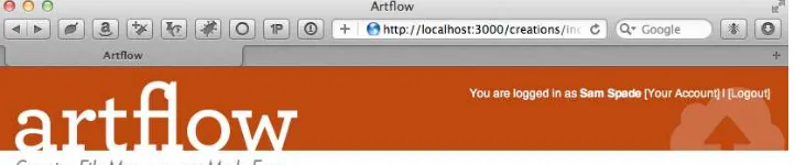
<header id="page_header"> </header>
Next, let’s look at the elements within the header itself. We have a logo
featur-ing our application name, utility navigation, application navigation, and some
miscellaneous branding elements. The logo should link back to the root_url for
the application. A common practice for developers is to put a logo into an
<h1> tag. We will not, as it’s not the headline of the page.19 Always think of the true semantics of the content: the headline is a textual content element, not a graphic. While this may not matter on the home page, when we are inside a page, what is the main headline? Is it the logo, or, in the case of the
application layout that we’re currently building, is it the title of the collection
(e.g., “Assets”)?
The other elements should be <nav> entities with unique IDs. When we add
<header id="page_header" role="banner"> <nav id="utility">
<p>
You are logged in as <strong>Sam Spade</strong>
<%= link_to "[Your Account]", "#" %> | <%= link_to "[Logout]", "#" %>
</p> </nav>
<%= link_to(
image_tag("logo.png", alt: "Artflow", id: "logo"), root_url,
title: "Dashboard") %>
</header>
We’ve also added an ARIA role for the header of banner. This is one of a
prede-fined set of “landmark roles” in the ARIA specification.20 These help with accessibility, and we should get in the habit of using them while we build,
instead of retrofitting later. As for our main nav, we’ll tackle the application
navigation later (see Section 1.5, Adding Navigation, on page 28), as it’s a bit
more complex.
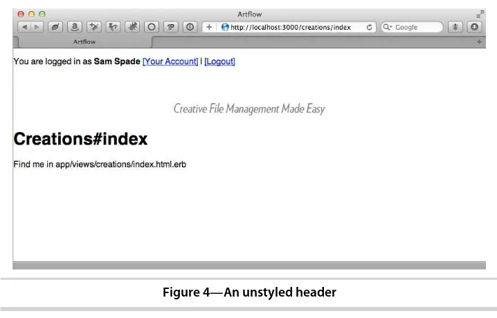
There’s meaning in how we’ve marked up the header, and now we can use
that semantic markup to style the header. Always write the minimum amount
of HTML required to style the page—additional elements are the bane of our
existence as view hackers. Keep it clean! The base HTML (with a reset CSS)
gives us something that looks like Figure 4, An unstyled header, on page 17.
We don’t see the logo because it’s white text in a 24-bit transparent PNG:
white on white.
Bringing the Pretty to the Header
We’ll start with the overall header itself. This will be a mix of images and CSS.
Normally in the day-to-day flow, we’d either be firing up Photoshop to cut our
pieces or we could have our designer send us the pieces. We’ve included the
Photoshop file as well as the precut pieces, so you can experiment the way you prefer.
We have a bunch of elements all inline right now that we need to position to make them look like the final mockup. Our utility navigation shows up in the
HTML before our logo because we are going to use a CSS property called float
to have it sit on the right. float is a property that can cause a lot of headaches,
Figure 4—An unstyled header
many of which we will run into in the course of building this application. The default behavior for an element is to appear in the order in which it appears in the HTML markup. When we float an element to the right, it simply slides to the right in the same place that it would currently be. That would make the top of our element start at the bottom of the logo on the left. To get it to be equal with the logo, we need to put it in the HTML first.
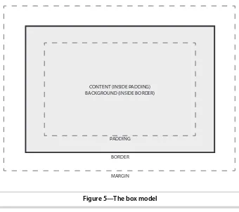
Looking at the header, we see it’s 78 pixels tall and has an inside padding of
about 10 pixels. We would think that making the height attribute 78px would
be the right solution, but we need to remember the box model.21 The box
model refers to the square space that each element takes up. It has width
and height, padding, a border, and a margin. See Figure 5, The box model,
on page 18.
So padding is inside the border and it gets added to the height and width of
the actual element. To get our actual height attribute, we need to subtract the total padding from the measured height. So, that being said, if we want 88px in total height, and we have 10 pixels of padding on all sides, we define height at 68px in order to get the right total (68 + 10 + 10). We add some styling in a new file, layout.css.scss, taking advantage of the nesting support
SCSS gives us,22 as explained in Chapter 3, Adding Cascading Style Sheets,
on page 73:
PADDING
BORDER
MARGIN CONTENT (INSIDE PADDING) BACKGROUND (INSIDE BORDER)
Figure 5—The box model
header#page_header {
background-color: #bc471d; color: #fff;
height: 68px; margin-bottom: 10px; overflow: hidden; padding: 10px 20px;
a, a:link, a:hover, a:active, a:visited {
color:#fef8e7;
text-decoration: none; }
#logo {
position: absolute; top: 15px;
} }
In order to see it, we need to call this file into the asset pipeline. Let’s add
our layout styling to our application.css manifest, right after the reset we added
in Getting Browsers on the Same Page, on page 10:
/*
*= require_self *= require normalize *= require layout */
Now that’s starting to look like a header. We’ve defined link colors, determined
the padding and spacing, placed our logo file, and floated our utility nav right.
We just need to add the branding graphics and we’ll be done. We could use
an <img> tag for the logo, but since we have text overlaying it, we’ll put the image in the background instead. We’ll modify app/assets/stylesheets/layout.css.scss:
header#page_header {
➤ background: #bc471d url('/assets/brandtag.png') bottom right no-repeat;
#tagline {
margin-left: 20px; }
div.container {
overflow: hidden; padding: 0 20px;
}
We’ve changed background-color to simply background and used that advanced
definition instead of manually specifying the background color, position, image, and repeat as four different properties. This is not some new
HTML5/CSS3 trick, but what is called “CSS shorthand.” This allows us to
combine multiple declarations into one line and reduce the verbosity (and size) of our CSS files. In this case, background includes background-color, background-image, background-position, and background-repeat, reducing our CSS from four lines to one.
We now have our header looking correct (Figure 6, The styled header, on page
21). Let’s move on and get our footer in place.
Setting Up Our Footer
Footers have become a whole new domain in web design. They often have multiple columns, lots of information, and lots and lots of links. One could argue that, in many cases, the old site map page has shuffled its way into the footer of every page. Links and icons abound, and the footer can end up as a junk drawer.
On this app, we’re dealing with something far simpler, as there are only two
elements contained inside it for our example: a <ul> and a copyright notice.
Let’s start with our HTML, modifying app/views/layouts/application.html.erb:
<!DOCTYPE html>
<html> <head>
<meta charset="utf-8"> <title>Artflow</title>
<%= stylesheet_link_tag "application" %>
<%= javascript_include_tag "application" %>
<%= csrf_meta_tags %>
</head>
<body>
<%= render 'layouts/header' %>
Figure 6—The styled header
alt: "Creative File Management Made Easy", id: "tagline") %>
<div class="container">
<%= yield %>
</div>
<%= render 'layouts/footer' %>
</body> </html>
Yes, we’ve used a <div>. Our wrapper’s job will be to center the content and
sidebar <section> tags together—it’s purely for presentation purposes, so the
generic quality of the tag is okay. Usually we’d be the first ones to burn a
<div> tag in effigy, but this isn’t the time.
Here’s our footer partial:
artflow/layout/app/views/layouts/_footer.html.erb
<footer id="page_footer"> <ul>
<li><%= link_to "Contact", "" %></li> <li><%= link_to "Help", "" %></li> <li><%= link_to "File a Bug", "" %></li> </ul>
We don’t need to class the <ul> or the <p>, as we can target them specifically
by using the parent element’s unique ID of page_footer and child selectors. If
there were more elements within the footer, we would probably want to address those elements via a class or an ID directly. For now, all we need is this:
artflow/layout/app/assets/stylesheets/layout.css.scss
footer#page_footer {
background-color: #807c77;
border-bottom: 10px solid #4c2719; color: #fff;
border-right: 1px solid #fef8e7; display: inline;
You’ll notice the :last-child pseudo-selector in here. This will select the last
ele-ment that is an <li> and apply styles only to that tag. This is ideal for when
you want a border between rows or columns but not on the last column. A
right border works great until the end, and the :last-child lets us turn it off.
Pseudo-class selectors have been around for a while but are starting to get more support in the mainstream browsers. You can even add it into older
browsers with Selectivizr.23
A nice feature here is that SCSS’s support for nesting makes the structure of our styles mirror the structure of our HTML. For more information on SCSS, see Chapter 3, Adding Cascading Style Sheets, on page 73. It will be easy to
find what we’re looking for if we need to modify the styling later.
We’ve built a solid header and footer that we can expand as our application
grows, but what about the business in between? Next up we build out the
main content portion of our page, making room for a handy sidebar that we’ll
use for secondary navigation and supporting content.
1.4
Adding a Sidebar
We’ve put together a header, and now it’s time to address another important
part of our layout: sidebars. A sidebar sits to the right or left of the main content and has a few potential purposes:
• Quick links, category breakouts, and other navigation
• Additional context-sensitive instructions and information
• Marketing content, advertisements, or other content on every page of the
application (but which doesn’t make sense in the <header> or <footer>)
• Blogrolls, references, or links to other supporting material
ArtFlow needs to display some secondary navigation, form instructions, and contact information on all its pages, so we definitely need to add a sidebar.
But is a sidebar and an aside the same thing? No. An aside is an element that supports your main content, such as a pull quote or related links from
an article. It’s an element that is related to its parent element. For a sidebar,
we should use just a <section> tag and then style the content inside it accordingly. If it’s a list of categories or dates, a <nav> tag might be ideal.
Remember, don’t overdo the semantic approach. Trying to force things into
these new elements is not in the spirit of semantic markup.
Making a Place for Content
When we put together our boilerplate in Section 1.2, Setting Up a Boilerplate,
<!DOCTYPE html>
<html> <head>
<meta charset="utf-8"> <title>Artflow</title>
<%= stylesheet_link_tag "application" %>
<%= javascript_include_tag "application" %>
<%= csrf_meta_tags %>
</head> <body>
<%= render 'layouts/header' %>
<%= image_tag("tagline.png",
alt: "Creative File Management Made Easy", id: "tagline") %>
<div class="container"> <section id="content"> ➤
➤ <%= yield %>
</section> ➤
<section id="sidebar"> ➤
</section> ➤
</div>
<%= render 'layouts/footer' %>
</body> </html>
Getting the sidebar in place is simple enough: we’ll put it to the right of our
content and center our wrapper. This belongs along with the general layout
styling we added in Section 1.3, Building the Page Frame, on page 14:
artflow/layout/app/assets/stylesheets/layout.css.scss
We’ll also create a sidebar.css.scss for the sidebar-specific content. For now, let’s give sections inside the sidebar a light gray background and a bit of padding:
border-bottom-left-radius: 10px; border-bottom: 5px solid #807c77; margin: 10px -10px;
padding: 5px 10px 0 10px; h1#recent {
background: transparent url('/assets/txt_recent-activity.png')
We need to add a require directive for the sidebar to our application.css manifest
to make sure it’s included (for more information on how this works, see
Chapter 3, Adding Cascading Style Sheets, on page 73):
/*
Now that we have an empty sidebar in the right place with a basic style for
its content, let’s figure out how we can add markup to the sidebar from our
action templates.
Filling in the Layout with content_for
From our design, we see that we need a listing of recent creation activity displayed in the sidebar on every page. After putting the list in a partial, we simply render it from a new <section> tag in app/views/layouts/application.html.erb:
<!DOCTYPE html>
<html> <head>
<meta charset="utf-8"> <title>Artflow</title>
<%= stylesheet_link_tag "application" %>
<%= javascript_include_tag "application" %>
<%= csrf_meta_tags %>
</head> <body>
<%= render 'layouts/header' %>
<%= image_tag("tagline.png",
alt: "Creative File Management Made Easy", id: "tagline") %>
<div class="container"> <section id="content">
<%= yield %>
</section>
<section id="sidebar">
<section id="recent_activity"> ➤
<header><h1 class="ir" id="recent">Recent Activity</h1></header> ➤
➤ <%= render partial: 'activity_items/recent' %>
</section> ➤
</section> </div>
<%= render 'layouts/footer' %>
This is great, but we also need to support actions adding more content to the sidebar for context-sensitive information. How do we get additional content
from the action’s rendering process?
If you’ll remember, we’re already pulling content rendered by our actions in
the layout for the main content. This really isn’t any different; the trick here
is to use yield, but this time indicate which content rendered by the action we
want inserted. yield without an argument will retrieve the main content, but
we want the content for the sidebar, so we modify our
app/views/layouts/applica-tion.html.erb: <!DOCTYPE html>
<html> <head>
<meta charset="utf-8"> <title>Artflow</title>
<%= stylesheet_link_tag "application" %>
<%= javascript_include_tag "application" %>
<%= csrf_meta_tags %>
</head> <body>
<%= render 'layouts/header' %>
<%= image_tag("tagline.png",
alt: "Creative File Management Made Easy", id: "tagline") %>
<div class="container"> <section id="content">
<%= yield %>
</section>
<section id="sidebar">
➤ <%= yield :sidebar %>
<section id="recent_activity">
<header><h1 class="ir" id="recent">Recent Activity</h1></header>
<%= render partial: 'activity_items/recent' %>
</section> </section> </div>
<%= render 'layouts/footer' %>
</body> </html>
From a layout perspective, we’re done now. We just need to wire in any actions
that would like to provide content for the sidebar. We do this with a helper
named content_for(), which we can use to add a listing of designers assigned to
a project when viewing the project’s page:
artflow/layout/app/views/projects/show.html.erb
<header><h1>Assigned Designers</h1></header> <ul>
<%= render @project.designers %>
</ul> </section>
<% end %>
<article> <header>
<h1><%= @project.name %></h1> </header>
<!-- Project information --> </article>
We can add as much (or as little) sidebar content as we’d like, and it will be
inserted exactly where we’ve put our yield. We can even check to see if there’s
sidebar content using content_for?(:sidebar), which would be helpful if we wanted
to add a CSS class to the <body> to support easily styling both sidebar and
sidebarless layouts.
We can use the same trick to change the contents of the <title> tag for a page,
which is useful for search indexing. Let’s update the layout in
app/views/lay-outs/application.html.erb: <title>
<% if content_for?(:title) %>
ArtFlow: <%= yield :title %>
<% else %> Artflow <% end %>
</title>
With this in place, we can add text to our title from any page just by using
content_for :title. Neat!
Now we have a sidebar, and actions can insert content into it (and our title), but how do we move between actions? Next we tackle a more complex topic: adding navigation.
1.5
Adding Navigation
Our application would be pretty useless if we didn’t offer our users a way to
move around, wouldn’t it? ArtFlow has a few important sections that our
users need access to, and we’ve identified them as Home, Creations,
Cam-paigns, Designers, and Projects. We’ve been tasked with adding these
Building the Tabs
First, we add an element with the list of links we’ll need in the <header> we
created in Bringing the Pretty to the Header, on page 16.
We modify app/views/layouts/_header.html.erb:
<header id="page_header" role="banner"> <nav id="utility">
<p>
You are logged in as <strong>Sam Spade</strong>
<%= link_to "[Your Account]", "#" %> | <%= link_to "[Logout]", "#" %>
</p>
title: "Dashboard") %>
<nav id="main_nav" role="navigation"> ➤
<ul> ➤
<li><%= link_to 'Home', root_path %></li> ➤
<li><%= link_to 'Creations', creations_path %></li> ➤
<li><%= link_to 'Campaigns', campaigns_path %></li> ➤
<li><%= link_to 'Projects', projects_path %></li> ➤
<li><%= link_to 'Designers', designers_path %></li> ➤
</ul> ➤
➤ </nav> </header>
A <ul> tag is the natural choice here, as our main navigation really is just a list of places to visit in the application. Now we just need to make this list look like tabs running horizontally across the screen. This is a pretty classic style, so we know exactly what CSS to add to our style sheet. We create a