Data-Informed Product Design
Data-Informed Product Design
by Pamela Pavliscak
Copyright © 2015 O’Reilly Media, Inc. All rights reserved. Printed in the United States of America.
Published by O’Reilly Media, Inc., 1005 Gravenstein Highway North, Sebastopol, CA 95472. O’Reilly books may be purchased for educational, business, or sales promotional use. Online editions are also available for most titles (http://safaribooksonline.com). For more information, contact our corporate/institutional sales department: 800-998-9938 or [email protected].
Editor: Angela Rufino
See http://oreilly.com/catalog/errata.csp?isbn=9781491931295 for release details. Cover photo: The Twingle Mind, by Andy Wilkinson via flickr.
The O’Reilly logo is a registered trademark of O’Reilly Media, Inc. Data-Informed Product Design, the cover image, and related trade dress are trademarks of O’Reilly Media, Inc.
While the publisher and the author have used good faith efforts to ensure that the information and instructions contained in this work are accurate, the publisher and the author disclaim all
responsibility for errors or omissions, including without limitation responsibility for damages
resulting from the use of or reliance on this work. Use of the information and instructions contained in this work is at your own risk. If any code samples or other technology this work contains or describes is subject to open source licenses or the intellectual property rights of others, it is your responsibility to ensure that your use thereof complies with such licenses and/or rights.
Chapter 1. Does Design Need Data?
The world is one Big Data problem. Andrew McAfee
Imagine that you are designing a new product or reinventing one that already exists. You have a great idea, a great team, and enough money to get it done. Every step of the way, there are decisions that will have an impact on the design.
There are strategic decisions about who will use the product, how it will fit into these peoples’ lives, or why they would start using your product at all. There also are tactical decisions about what
language speaks to the people using the product, what catches their attention in a positive way, and how to make the experience easier.
There are bottom-line business questions that are critical to the survival of your company, too. Will the people you’ve identified actually use your product? Will they keep using it? Will they recommend it? And these questions, too, are intimately connected to the design. Design is how people will
experience your site, app, or device. This is why design is driving more and more businesses.
Do you trust your gut or do you trust the data? Trusting your gut is appealing; after all, you believe in your idea for a good reason. Thanks to Malcolm Gladwell’s Blink (Back Bay Books), we know that many of our smartest decisions rely on intuition. And, we know that Steve Jobs famously (and
perhaps mythically) eschewed research and certainly did not consult data for every design decision. When it comes to design, using data can seem like overkill. We think of Marissa Mayer testing 41 shades of blue at Google back in the day. Even with the success of Tinder, it seems jarring to hear the founder say, “Data beats emotions.” It seems like we have so much data that we can easily find
ourselves in a state of analysis paralysis.
Yet, we know that data can reveal new insights. As Christian Rudder writes in Dataclysm: Who We Are (Crown), “It’s like looking at Earth from space; you lose the detail, but you get to see something familiar in a totally new way.” Data yields a new perspective. When data is used in the right way, it can reveal to us new things about people, and people are at the core of designing any product.
The choice is not really data or intuition, but data and intuition. Then, the question becomes
something else altogether. Which data? How do we balance data with design practices? And whose data should we use anyway? These questions are the crux of what this report addresses.
This report derives from my experience building a company that uses data to help design better experiences. Our constant goal is to discover something we didn’t know before, and often this
happens when we learn something new about how people fit technology into their everyday lives. As you might guess, there isn’t one right way to design with data. There isn’t a perfect process. But along the way, we’ve learned a lot about how to bring it all together. We’re not alone. All over the world, teams are learning how to integrate data of all kinds into their design practices.
Chapter 2. Designing with All of the Data
To clarify, add data. Edward R. Tufte
There is a lot of hype about data-driven or data-informed design, but there is very little agreement about what it really means. Even deciding how to define data is difficult for teams with spotty access to data in the organization, uneven understanding, and little shared language. For some interactive products, it’s possible to have analytics, A/B tests, surveys, intercepts, benchmarks, and scores of usability tests, ethnographic studies, and interviews. But what counts as data? And more important, what will inform design in a meaningful way?
When it comes to data, we tend to think in dichotomies: quantitative and qualitative, objective and subjective, abstract and sensory, messy and curated, business and user experience, science and story. Thinking about the key differences can help us to sort out how it fits together, but it can also set up unproductive oppositions. Using data for design does not have to be an either/or; instead, it should be yes, and...
Big Data and the User Experience
At its simplest, Big Data is data generated by machines recording what people do and say. Some of this data is simply counts—counts of who has come to your website, how they got there, how long they stayed, and what they clicked or tapped. They also could be counts of how many clicked A and how many clicked B, or perhaps counts of purchases or transactions.
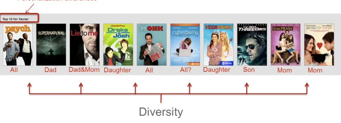
For a site such as Amazon, there are a million different articles for sale, several million customers, a hundred million sales transactions, and billions of clicks. The big challenge is how to cluster only the 250,000 best customers or how to reduce 1,000 data dimensions to only two or three relevant ones. Big Data has to be cleaned, segmented, and visualized to start getting a sense of what it might mean. It is also more complex events such as user event streams, social media activity, information captured by sensors in a mobile app. When we talk about Big Data, we’re often referring to more than just the sheer size of the raw data. Big Data is also the increasingly sophisticated algorithms generating insights, which my colleague Steve Ellis, invoking Einstein, calls “spooky action at a distance.” Netflix is an example of a company that actively employs Big Data for design decisions. Few
offense? Human experience is complex, after all.
Figure 2-1. Netflix top 10 recommendations (Source: Netflix Tech Blog)
Many experts will argue that Big Data, for all its power, can leave big questions unanswered, such as why people take action or why they don’t. Big Data is still mostly about the what, and less about the why, these same experts will argue. What they mean is that Big Data has a harder time understanding the reality of lived human experience in all its complicated glory, and understanding this reality of lived human experience is where the real insights lay.
In puzzling this all out, I’ve found distinguishing between Big Data and thick data to be useful. If Big Data is the archeology of user experience or the study of the traces that people leave behind, thick data is more like anthropology, exploring lives as they are being lived online.
Thick Data and UX
In traditional field research, learning about why people do what they do relies on a kind of
collaboration between researcher and subject. It relies on thoughtful conversation, close observation, and empathy. It’s messy. And, it produces its own kind of data.
Thick data, based on Clifford Geertz’s call for thick description in ethnographic studies, is what many organizations have begun calling the output from this deep, descriptive approach. Lego, for example, used thick data to revamp the brand. Even though preliminary data indicated that kids
wanted toys they could play with instantly, Lego’s action figures were not taking off. So, researchers used a diary study to learn how and why kids play. Categorizing and coding photos, journal entries, and other artifacts revealed patterns that led Lego “back to the brick.”
Analysis of thick data tends to be less systematic and more intuitive. Some researchers transcribe and code the interviews and artifacts, using that as a way to formulate themes, although much design
Relying on small studies for big insights or guiding principles is not at all unusual, though, especially with research that deals with human behavior. Dan Ariely’s hugely influential insights on relativity in pricing emerged from an experiment with 100 MIT students. However, small samples aren’t limited to behavioral studies. FDA drug trials are often conducted with fewer than 50 people. Design
research can provide direction with less than 20 people.
More than just filling in where Big Data leaves off, thick data can provide a new perspective on how people experience designs (see Table 2-1). Big Data gives new insights into what people do on their own, and on a massive scale. Thick data reveals motivations, intent, emotions that might not be
obvious from Big Data.
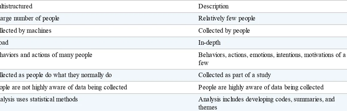
Table 2-1. Big Data and thick data
Big Data Thick data
What, where, when, how How and why
Transactions, customer service logs, analytics, A/B tests, social media posts,
GPS Interviews, contextual research, usability studies
Multistructured Description
A large number of people Relatively few people
Collected by machines Collected by people
Broad In-depth
Behaviors and actions of many people Behaviors, actions, emotions, intentions, motivations of a few
Collected as people do what they normally do Collected as part of a study
People are not highly aware of data being collected People are highly aware of data being collected Analysis uses statistical methods Analysis includes developing codes, summaries, and
themes
Why Not Quantitative and Qualitative?
Quantitative and qualitative is a familiar dichotomy. It’s not a clean division, though. Quantitative includes data from tools such as Google Analytics, in-house studies such as intercept surveys, and even third-party benchmarks such as Forrester CX scores or Net Promoter Scores (NPS). Likewise, survey open-ended questions are often interpreted qualitatively. Some usability tests are highly structured to allow for quantitative-style data to be collected.
Even though numeric and non-numeric seems like a neat opposition, I don’t find it to be that useful. The best data to inform the experience looks at people in situ, doing what they normally do, whether from analytics or ethnographic-style studies. If people are highly aware that they are being studied, the data is inherently different than if they do not. So, that big and thick is a distinction that is more useful when designing experiences.
The more inclusive our definition of data becomes, the more application it has toward product design. Next, we will look at three ways that data can inform product design:
Data can reveal patterns and trends to drive innovation.
We can use data to incrementally improve the product experience.
Data can measure success, whether tracking across time, across versions, or against competitors.
Chapter 3. Data and Innovation
Data are just summaries of thousands of stories—tell a few of those stories to help make the data meaningful.
Chip & Dan Heath
In the design world, data is sometimes perceived as an innovation killer: Big Data looks backward, A/B tests seem to focus on the small stuff, and analytics just skim the surface. There is some truth to all of these observations, but the core issue is not in the data itself; rather, it is in how it’s being used. Discovering new opportunities has long been associated with ethnographic methods. Trend
researchers such as Latitude and GfK use diaries and informants to foster innovation and new product development. Relative newcomers such as Sparks & Honey are combining ethnographic techniques with social media data analysis to identify new opportunities.
A similar evolution is taking place with regard to design. Companies and design agencies are looking for patterns in big datasets in combination with exploratory research to discover gaps or trends.
Pairing thick data with Big Data is also becoming a big part of the planning process to map out customer journeys or round out user profiles or personas.
Large Datasets and Ethnographic Methods
Some organizations are already moving in this direction, using data for inspiration as well as
validation. IDEO’s hybrid insights group combines data from surveys, or other larger datasets, with interviews. The quantitative data is segmented by behaviors to guide further research about a
potential audience.
For example, IDEO looked at data about early adopters of mobile. Rather than focusing attention on the tech geek majority, it looked to the outliers. There it found a small but important group, mostly women, highly socially connected, hyper-efficient. Then, the team found people who fit this profile to interview. Those stories provided tangible ideas for product development. At the same time, the team was confident that there was an emerging market behind the story.
My company, Change Sciences, has developed an app that combines behavioral analytics with survey data to understand what makes a good experience. Looking at the data, we found a strong correlation between leaving a site happy and likelihood to purchase and recommend. To understand what makes people happy about their experiences, we followed up with a diary study and interviews. The
principles of positive design distilled from this research help NBC and other clients design for peak moments.
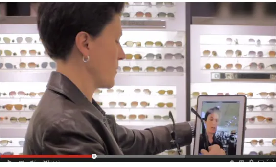
Nordstrom has made it a mission to delight customers through data-driven innovation. The Nordstrom team brings together point-of-sales, analytics, social media, and rewards program data to make the experience more relevant to each individual customer. At the same time, Nordstrom pairs this Big Data approach with getting out of the building and talking to customers, salespeople, and managers. This helped the team release a mobile app for customers to share preferences or online sales history as they enter a store to create a personal shopping experience (see Figure 3-1).
Figure 3-1. Nordstrom’s Lean Research Method (Source: Nordstrom Innovation Lab: Sunglass iPad App Case Study)
Customer Service Data and Interviews
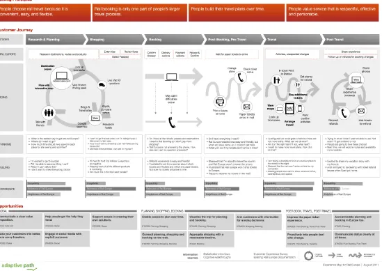
Experience or customer journey maps look at the entire experience beyond a website or app. They are often used as a way to identify new opportunities, by looking at where offline and online intersect and diverge. Adaptive Path combined data sources to map experience for RailEurope (Figure 3-2). It used a customer survey and field research. This approach could have easily accommodated other customer data.
Mailchimp did just that when it developed personas, or representations of its user’s goals,
expectations, motivations, and behaviors. The Mailchimp team started with sign-up and customer service data and then moved to interviews to inform personas.
Analytics data has the potential to enrich—or even validate—personas or experience maps.
demographics, geographic locations, and devices or browsers can uncover patterns and reveal key differences.
Figure 3-2. Adaptive Path’s mixed methods experience map (Source: Adaptive Path)
Hybrid Data for Innovation
Chapter 4. Data to Improve Product
Design
Data! Data! Data! I can’t make bricks without clay! Sir Arthur Conan Doyle
When we think of using data to improve designs, we tend to think of A/B tests. A/B testing is no longer just testing the color of a button or the name of a category; it is an integral part of an iterative process. Moreover, A/B testing isn’t the only way to use data to make improvements. Some
companies are combining A/B tests with other methods, whether it is usability testing or even customer service conversations, to fine-tune the design.
A/B Testing and Usability Testing
Airbnb runs constant experiments that go beyond just a change of a label or a button color. The booking flow is complex. Add in other variables, including users who are not authenticated, people switching from device to device, and a time lag for confirmation, and suddenly gathering data about design decisions takes on a new complexity. Despite the complications, Airbnb regularly uses an in-house A/B testing platform to make improvements such as tweaking the mobile checkout flow or the price filter on the search page (see Figure 4-1). Usability testing is used before, after, or in tandem with A/B testing, depending on the goal.
Figure 4-1. Airbnb’s pricing filter A/B test (Source: Experiments at Airbnb)
tracking it, the full extent of the importance of printing became clear.
Figure 4-2. Etsy’s A/B analyzer (Source: Design for Continuous Experimentation)
Analytics with Usability Testing
Gov UK combines user research and analytics to make improvements to the live site. Data from the live site showed that completion times for one section in an online application, the employment section, accounted for 14 minutes of the process. In usability tests, the reasons for this became clear. Some users were not able to provide all of the required information and some were not able to
determine what was required and what was optional. By grouping the fields by required and optional, the Gov UK team was able to shorten the process.
Analytics and Customer Service
connotation being that by doing so users would get a friend in trouble. The design team changed the automated form to use a phrase like “this photo is embarrassing to me.” The result was that teens reported more problems via the form rather than by talking to customer service.
Data Pairings for Improvements
Chapter 5. Using Data to Measure
Friends don’t let friends measure pageviews, ever. Avinash Kaushik
Although most organizations are tracking a lot of metrics, they might not readily tie back to design decisions. Unique visitors can signal whether your marketing campaign worked, and social mentions can indicate whether you’ve got a great headline, but these metrics do not reveal much about the experience people have had using a site or application. Many metrics are marketing oriented, not experience oriented.
Measuring Ease of Use
Most UX metrics focus on ease of use. The most commonly employed usability metrics are
performance measures such as time-on-task, success rate, or user errors. For the most part, these are measured through a combination of event tracking in analytics alongside usability testing.
At Change Sciences, our platform measures several usability metrics with a combination of custom analytics and video playback. The idea is to help organizations track ease-of-use against iterations of a site over time, and against competitors. Recently, we asked people to find a low-fee checking account on a dozen banking sites. This approach resulted in a success rate for the best site as well as some insights into why success rates for some sites were comparatively low.
UX is about more than just ease of use, of course. It is about motivations, attitudes, expectations, behavioral patterns, and constraints. It is about the types of interactions people have, how they feel about an experience, and what actions they expect to take. UX also comprehends more than just the few moments of a single site visit or one-time use of an application; it is about the cross-channel user journey, too. This is new territory for metrics.
Multisignal or Event-Stream Metrics
Organizations are beginning to develop metrics that go beyond the defaults that off-the-shelf analytics provide. Rather than relying on single signals—the number of pageviews as a proxy for engagement or the number of clicks on a call to action to determine conversion—the trend is now toward using metrics that draw from multiple signals or event streams.
ModCloth has developed a multisignal metric to better design for underserved audiences. The metric combines Net Promoter Score, product reviews, and social media posts to identify and understand people who could be more engaged with the brand. The multisignal approach looks across data types or channels to capture a more nuanced understanding of unmet needs.
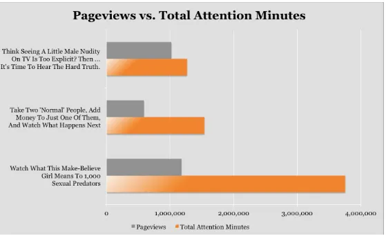
beyond feel-good tallies to how people actually engage with pieces. Event-stream metrics follow interactions in time (see Figure 5-1); for example, the length of time a browser tab is open, how long a video player is running, or the movement of a mouse on a user’s screen. Medium tracks scroll position as part of an event-stream metric for reading. This metrics makes it possible for Medium to get a more meaningful measure for an experience Key Performance Indicator (KPI): total time
reading.
Figure 5-1. Upworthy’s attention minutes (Source: Upworthy Insider)
Emotional Measures
The next phase of product experience measures will likely be emotion metrics. Gallup’s CE11 measures brand attachment by focusing on customer experience, and some of that is aimed at emotions. Lately, in my consulting work, I’ve been using metrics relating to happiness and design. Much of the existing measures for emotion and design rely on people reporting on their own
emotional state, though. Although this is accepted in both academic and consumer research, it requires a large sample size to account for differences.
register excitement as well as ease of use. Still, it’s easy to imagine a future in which physical measures are combined with survey responses to create a multisignal metric for emotional experience.
Frameworks
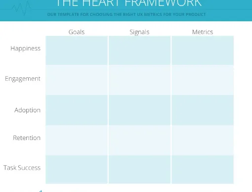
A framework—or a combination of metrics—can give experience design teams a more detailed way to measure and track progress. Google’s HEART framework (see Figure 5-2) combines business and experience metrics. Even though the team doesn’t always apply the entire framework to every project, Google regularly combines measures to get a more nuanced perspective on subjective measures such as happiness as well as objective measures like task success. Google’s approach to measurement relies heavily, but not exclusively, on analytics.
Figure 5-2. Google’s HEART measurement framework (Source: Digital Telepathy)
remaining flexible enough to accommodate new metrics as goals change and new ideas take hold. Using the Walgreens mobile app as an example, an Instagram photo editor maps to the See, or
awareness, phase; transferring prescriptions ties into the Think, or consideration, measures; ordering, of course, is part of a Do metric.
Meaningful Measures
Many things that are important—for example, experience design—are difficult to measure. Global happiness, employee performance, and copyright valuation come to mind. Just because something is difficult to measure doesn’t mean we shouldn’t try. Measuring gives us a sense of where we have been, how we are doing now, and what to focus on in the future.
Chapter 6. A Hybrid Approach
Data needs stories, but stories also need data. Om Malik
Data insights are typically the result of combining sources and methods, but the difficult part can be just getting started. Outlined here is a process that is flexible enough to work in different situations. I’ll walk through the process using a familiar example: looking at short videos on a corporate site.
Step 1: Frame the Question
Even though there is no shortage of data, it’s essential to begin with a question rather than just pour over numbers or play with visualizations, hoping that insight will strike. Before diving too deeply into existing data from analytics—and definitely before framing a new study—the first step is defining the problem.
Understand Assumptions and Biases
Begin with what you think you already know. You need to examine the givens first. This might be a big-picture assumption. For example, a strategic assumption might be that people want to watch a video as a way to learn about an organization. A tactical assumption might be that people understand the word video to mean a short video clip rather than a long-form narrative.
Next, move on to the gaps, the things that you know you don’t know. Maybe you don’t have a clear sense of how another site or application is setting people’s expectations—whether it’s a close
competitor or not. Maybe you don’t know how ease-of-use relates to future desirable behaviors such as returning or sharing. There are many unknowns, but keeping your focus as narrow as possible increases your chances for success.
Bringing in more sources of data can reduce bias, but all data has some kind of bias. We know that data from studies can be biased, even just by selecting something to study in the first place. Because humans design datasets, they can be biased in many of the same ways that studies can be biased. There is no perfect data. You always must ask where data comes from, what methods were used to gather and analyze it, and what cognitive biases you might bring to its interpretation. Then, you need to adjust how you use the data accordingly and determine what importance you should assign it.
Create a Hypothesis
hypothesis might be that more new site visitors than return visitors watch the first 10 seconds of several videos in a row.
Alternatively, you can use the if, then format most of us learned when studying science in junior high school. In that case, the hypothesis might be: If people are new to the site, it is likely that they might watch the first few seconds of several videos rather than one long video to completion. There might be a theory about the because part of that hypothesis, too—for example, because they are trying to figure out what the site is about or because the videos are poorly labeled.
The big question is not usually a yes or no question. It’s more likely a by how much question. Bayes’ Rule provides a framework to update our theories as new evidence emerges. Bayesian thinking
considers not just what the data has to say but what your expertise tells you. This is a bit different from what we all learned in Statistics 101, where we’d calculate frequencies.
Step 2: Start with Data on Hand
After you have a question and are thinking about probabilities, you can finally begin looking at the data. You could certainly run studies to answer some of your questions, but even if you take a lean or guerrilla approach to research, it can still be expensive and time consuming. So, it might be best to begin with whatever data you have on hand that might add a new dimension to answering your question.
Using Analytics
If you are working with an existing site, you can begin with analytics. With Google Analytics, you can answer questions like these:
How many people clicked videos?
How much time did they spend on the site?
What is the ratio of new to returning visitors?
You could even segment new and returning visitors and see patterns in their interactions.
Google Analytics is typically accessible to many team members, and it’s familiar to most people working in technology, so it’s a good place to start. Depending on the question you are trying to answer, there are a few ways to begin. You can get at high-level insights by looking at top referring sources that set expectations, or common paths or behaviors, or even gauge interest through
pageviews and time-on-site. You can also get an initial read on problem areas through bounce rate and search terms.
Visualize the Overview and Details
When working with analytics or any other large dataset, you need an overview that lets you see the overall shape of an experience. This helps you to get a sense of typical paths or interaction patterns. Then, you should look at page-level details. It’s great to see screen recordings if a tool captures them, but for the sake of time, it’s often easier to view the key measures as an overlay on a page. Some analytics tools provide in-page analytics, showing the percentage of clicks for each text or image link. Instead of looking at clicks, you might choose other metrics such as length of playtime for each video. Continuing with our video example, marketing and sales might see the data and say, “Good, visitors see the videos and they are clicking through. Our KPI for more views is showing a two percent increase in views per month. We are on track.” But product designers might wonder: “They’re clicking, but what does that really mean? Is that what they meant to do? What did they do after they clicked the video? Was the time they spent watching the video a positive or negative experience? Are they even paying attention to the video? Where are they focusing their attention? Did the video
increase their engagement?”
So, we can calculate the impact that new data has on the initial hypothesis. In our example, we started out 60 percent certain that new visitors were clicking one video after another more frequently than returning visitors. After looking at analytics for each audience segment, we might say that we’re 90 percent certain. But we’re missing the because part of the hypothesis. It’s time to bring in data from another source to see what we can find out.
Step 3: Add Social Listening
Adding more data sources adds dimension to your data. The two main types of data that you’re likely to have on hand are about what people do and what people say, or their behaviors and words.
Analytics, A/B test results, and clickmaps are behavioral data sources. Social media analytics, customer service logs, and study verbatims are data sources comprising words.
Bringing in social media analytics is a good way to get a sense of people’s attitudes, feelings, or anything else that elaborates on their experience. Free tools such as Topsy and Social Mention can show you how people feel about a brand or hashtag, based on text analysis. You can learn about how important or popular design elements, ideas, or content are to people using your site or app. You can sometimes fill in the gaps with stories from the conversations around a brand or hashtag.
Returning to our video example, we might learn that there is more conversation and stronger positive sentiment around videos with customers. We might also discover that people feel the videos are too long, if we dive in to the conversations. We are getting closer to understanding the experience, but we are still missing part of the picture.
Step 4: Consider a Deep-Dive Study
After understanding the data on hand, or data that is easily gathered using public sources, we can turn to a custom study to grasp context and nuance.
A study will reveal context. Our video example shows what we know about the videos on our site, but we don’t know why people are clicking or how relevant and meaningful the experience is for them. To understand context, we might turn to interviews or ethnographic studies to get a better sense of how videos fit into the needs, goals, and everyday behaviors of the people coming to the site. Deep-dive research can get at emotions. Interviews, and even research tools like fMRI or pulse monitors, can help teams understand the emotions around videos in a way that Big Data sources can’t yet accomplish. If our goal is to evoke positive emotions, a smaller study can reveal those peak moments. We might see, for instance, that people have a stronger emotional response to a video with people walking outside than they do to people working in a kitchen.
Studies will reveal problem areas. For instance, a usability test might tell us that people do not
consistently understand the title of a video or that they simply can’t determine what is a video if there isn’t a play button visible. Eye tracking can show us that people are missing navigation to related content from the video.
When we have context, we can develop design solutions to refine and test. In many cases, more
studies are used to iterate and refine, but sometimes A/B tests will be the next step in a data-informed process.
Step 5: A/B Test Alternatives
An A/B test is a way of understanding which option is best, based on the interactions of thousands of visitors in the context of regular site or app use. The tests ensure that each unique visitor only sees one option, and then—after a sufficient number of people have gone through your test—you can see which version of the design induced more clicks. The test should also measure the confidence level statistically so that you know when you’re done.
An A/B test is most reliable when you only change one detail per test. It doesn’t just have to be a link color or the placement of an image; it can be used to winnow options for a design or to decide
between two very different approaches.
For our videos, we could look at how people begin, by looking at click-through for two different scenarios, one showing a person’s face in the initial still, and the other a more complicated scene. Or, we could focus on the label placement or emphasis. The idea is to keep narrowing the options.
Step 6: Track It
Deciding what to track is not that difficult. The numbers should relate to the problem you’re trying to solve and you should be able to take an action based upon them. For our video example, we would need to see how adjusting the design would impact engagement. That might mean looking at the length of time users played each video and how many videos they played. This data could map to a pattern where people are actually watching the video and taking the desired action.
Step 7: Conclude with More Questions
After you’ve looked at the data, you should always end by asking, “So what?” and “What else?” Designing with data is more of a process than a conclusion. Both the iterative process of design and our natural impulse to balance our expertise with the use of data is consistent with current thinking in data science. For any data to inform design, it must be calibrated to embrace complexity.
Consider Data Pairings
This process moves from data on hand, which is usually high-level, to data gathered to get specifics. No process is one-size-fits-all, though. Depending on the goal, different combinations of data sources might be more actionable.
For acquisitions, you might want to pair analytics and competitive data from a source such as Alexa
or SimilarWeb. To understand content strategy, combining specialized analytics from Chartbeat with intercepts might be the way to go. Understanding the recommendation cycle might require a
Chapter 7. The Future of Data and Design
Maybe stories are just data with a soul. Brené Brown
Computers can write, computers can read, computers can understand images. We might be getting close to a point at which data can actually design. For now, algorithms alone do not create innovative products or solve customer problems. Nonetheless, data can help us toward making improvements and discovering new possibilities. It’s a way to tell the story of the real people using technology. So far, there isn’t one canonical way that works for every team in every organization. And it can be difficult to get started. There isn’t a shared language for talking about data in most organizations. Data use is siloed: the design team is engaged prelaunch on small, tightly focused studies; whereas
marketing, business, and data analytics are looking at data post-launch to monitor KPIs and maximize revenue. Each team has a different frame of reference, and might not be aware of, or simply discount, the data of the other.
There are a few guidelines to begin with, though:
Use data from a variety of sources to inform your design—analytics, A/B tests, social media sentiment, customer service logs, sales data, surveys, interviews, usability tests, contextual research, and other studies.
Include numbers and context. Whether you call them quantitative and qualitative, studies and nonstudies, or Big Data and thick data, you need the numbers and the context to tell the real story.
Ensure that data is sensitive to the complexity of the human experience. Use averages sparingly, infer with caution, corroborate liberally.
Use data to track changes over time, explore new patterns, and dig deeper on problems, rather than just to prove who’s right or wrong.
Decide on meaningful categories with which you can make sense of the data and tell a story about the experience.
Develop a way to share and discuss data in your organization. Begin by defining the basics together.
About the Author
Pamela Pavliscak (pav-li-check) is the founder of Change Sciences, a design research company. She has worked with Adecco, Ally, Audible, Corcoran, Digitas, eMusic, IEEE, NBC Universal, The New York Public Library, McGarry Bowen, Prudential, Sanofi-Aventis, Sealy, VEVO, Wiley, and many other smart companies. She has taught at Parsons School of Design and is an advisor to the Pratt Institute School of Information and Library Science.
Her work is part ethnography, part data science, part behavioral psychology.
When she’s not talking to strangers about their experiences online or sifting through messy data for patterns, Pamela is writing about our conflicted relationship with technology. She’s a popular
speaker, and has presented at SXSW and Collision. She is currently working on a book about positive design.