Exam Ref 70-484:
Essentials of Developing
Windows Store Apps
Using C#
Published with the authorization of Microsoft Corporation by:
O’Reilly Media, Inc.
1005 Gravenstein Highway North Sebastopol, California 95472
Copyright © 2013 by O'Reilly Media, Inc.
All rights reserved. No part of the contents of this book may be reproduced or transmitted in any form or by any means without the written permission of the publisher.
ISBN: 978-0-7356-7684-8
1 2 3 4 5 6 7 8 9 QG 8 7 6 5 4 3
Printed and bound in the United States of America.
Microsoft Press books are available through booksellers and distributors worldwide. If you need support related to this book, email Microsoft Press Book Support at [email protected]. Please tell us what you think of this book at http://www.microsoft.com/learning/booksurvey.
Microsoft and the trademarks listed at http://www.microsoft.com/about/legal/en/us/Intellectual-Property/Trademarks/EN-US.aspx are trademarks of the Microsoft group of companies. All other marks are property of their respective owners.
The example companies, organizations, products, domain names, email addresses, logos, people, places, and events depicted herein are fictitious. No association with any real company, organiza-tion, product, domain name, email address, logo, person, place, or event is intended or should be inferred.
This book expresses the author’s views and opinions. The information contained in this book is provided without any express, statutory, or implied warranties. Neither the authors, O’Reilly Media, Inc., Microsoft Corporation, nor its resellers, or distributors will be held liable for any damages caused or alleged to be caused either directly or indirectly by this book.
Acquisitions Editor: Russell Jones
Developmental Editor: Box Twelve Communications, Inc. Production Editor: Kristen Borg
Editorial Production: Box Twelve Communications, Inc. Technical Reviewer: Damien Foggon
Contents at a glance
Introduction xvii
Preparing for the exam
xx
ChAPTER 1 Design Windows Store apps 1
ChAPTER 2 Develop Windows Store apps 65
ChAPTER 3 Create the user interface 143
ChAPTER 4 Program the user interaction 225
ChAPTER 5 Manage security and data 305
What do you think of this book? We want to hear from you!
Contents
Introduction xvii
Microsoft certifications xvii
Acknowledgments xviii
Errata & book support xviii
We want to hear from you xix
Stay in touch xix
Preparing for the exam
xx
Chapter 1 Design Windows Store apps
1
Objective 1.1: Design the UI layout and structure . . . 1
Evaluating the conceptual design and deciding how the
UI will be composed 2
Designing for the inheritance and reuse of visual elements 4
Designing for accessibility 6
Deciding when custom controls are needed 9
Objective summary 11
Objective review 11
Objective 1.2: Design for separation of concerns (SOC) . . . 12
Planning the logical layers of your solution to meet app
requirements 13
Designing loosely coupled layers 14
Incorporating WinMD components 15
Objective summary 17
Objective 1.3: Apply the MVVM pattern to your
app design . . . 19
Designing and implementing the appropriate data
model to support business entities 19
Designing a viewmodel to support the view based on
your model 25
Developing a view to meet data-binding requirements 25
Creating viewmodels using NotifyPropertyChanged,
ObservableCollection, and CollectionViewSource 27
Objective summary 31
Objective review 31
Objective 1.4: Design and implement Process Lifetime
Management (PLM). . . 32
Choosing a state management strategy 33
Handling the Suspending event and preparing for app
termination 35
Handling the Resuming event 38
Handling the OnActivated events 38
Checking the ActivationKind and previous state 41
Objective summary 44
Objective review 44
Objective 1.5: Plan for an app deployment . . . 45
Planning a deployment based on Windows Store app
certification requirements 45
Preparing an application manifest 48
Signing an application 53
Planning the requirements for an enterprise deployment 54
Objective summary 55
Objective review 56
Chapter summary . . . 57
Answers . . . 58
Objective 1.1: Thought experiment 58
Objective 1.1: Review 58
Objective 1.3: Thought experiment 60
Objective 1.3: Review 60
Objective 1.4: Thought experiment 61
Objective 1.4: Review 61
Objective 1.5: Thought experiment 62
Objective 1.5: Review 62
Chapter 2 Develop Windows Store apps
65
Objective 2.1: Access and display contacts . . . 65
Calling the ContactPicker class 66
Filtering which contacts to display 69
Selecting specific contact data 70
Displaying a set number of contacts 72
Creating and modifying contact information 74
Objective summary 76
Objective review 76
Objective 2.2: Design for charms and contracts . . . 77
Choosing the appropriate charm based on app requirements 78
Designing your app in a charm-aware and
contract-aware manner 82
Configuring the app manifest for correct permissions 91
Objective summary 93
Objective review 94
Objective 2.3: Implement search . . . 95
Providing and constraining search within an app 95
Providing search result previews 100
Providing search suggestions using the SearchPane class 102
Implementing activation from within search 107
Searching for and launching other apps 108
Objective summary 109
Objective review 110
Accepting sharing requests by implementing activation
within the Share charm 114
Limiting the scope of sharing using the DataPackage object 120 Implementing in-app share outside the Share charm 122
Objective summary 123
Objective review 123
Objective 2.5: Manage app settings and preferences . . . 124
Choosing which app features are accessed in AppSettings 124 Adding entry points for AppSettings in the Settings window 125 Creating settings flyouts using the Popup control 127
Adding settings to Popup 129
Storing and retrieving settings from the roaming app
data store 130
Objective summary 132
Objective review 133
Chapter summary . . . 134
Answers . . . 135
Objective 2.1: Thought experiment 135
Objective 2.1: Review 135
Objective 2.2: Thought experiment 136
Objective 2.2: Review 136
Objective 2.3: Thought experiment 137
Objective 2.3: Review 138
Objective 2.4: Thought experiment 138
Objective 2.4: Review 139
Objective 2.5: Thought experiment 140
Objective 2.5: Review 140
Chapter 3 Create the user interface
143
Objective 3.1: Create layout aware apps to handle view states . . . 143
Handling view state events from ViewStateManager 144 Choosing between style patterns for different view states 151
Setting up app orientation in the manifest 154
Objective 3.2: Implement layout controls . . . 157
Implementing the Grid control to structure the app layout 158
Setting the number of rows/columns and size 163
Enabling scroll and zoom capabilities in layout controls 166
Managing text flow and presentation 170
Objective summary 177
Objective review 177
Objective 3.3: Design and implement the app bar . . . 178
Determining what to put on the app bar based on app
requirements 179
Designing the placement of controls on the app bar 182
Styling and positioning app bar items 184
Handling AppBar events 186
Objective summary 188
Objective review 188
Objective 3.4: Design and implement data presentation . . . 189
Choosing and implementing data controls to meet app
requirements 190
Creating data templates to meet app requirements 197
Objective summary 200
Objective review 201
Objective 3.5: Create and manage XAML styles and templates . . . 202
Implementing and extending styles and templates 203
Implementing gradients 209
Modifying styles based on event and property triggers 210
Creating shared resources and themes 212
Objective summary 214
Objective review 214
Chapter summary . . . 216
Answers . . . 217
Objective 3.1: Thought experiment 217
Objective 3.3: Thought experiment 219
Objective 3.3: Review 220
Objective 3.4: Thought experiment 221
Objective 3.4: Review 221
Objective 3.5: Thought experiment 222
Objective 3.5: Review 222
Chapter 4 Program the user interaction
225
Objective 4.1: Create and manage tiles . . . 226
Creating and updating tiles and tile contents 226
Creating and updating badges using the
TileUpdateManager class 236
Responding to notification requests 237
Choosing an appropriate tile update schedule based on
app requirements 244
Objective summary 247
Objective review 248
Objective 4.2: Notify users by using toast . . . 249 Enabling an app for toast notifications 249 Populating toast notifications with images and text
us-ing the ToastUpdateManager class 252
Controlling toast duration 255
Playing sounds with toast notifications 256
Responding to toast events 257
Objective summary 261
Objective review 262
Objective 4.3: Manage input devices . . . 263
Capturing gesture library events 264
Creating custom gesture recognizers 272
Listening to mouse events or touch gestures 274
Managing stylus input and inking 276
Objective summary 278
Objective 4.4: Design and implement navigation in an app . . . 280
Designing navigation to meet app requirements 280
Working with navigation events, properties, and functions 286
Using Semantic Zoom in your app 292
Objective summary 295
Objective review 296
Chapter summary . . . 297
Answers . . . 298
Objective 4.1: Thought experiment 298
Objective 4.1: Review 298
Objective 4.2: Thought experiment 299
Objective 4.2: Review 300
Objective 4.3: Thought experiment 301
Objective 4.3: Review 301
Objective 4.4: Thought experiment 302
Objective 4.4: Review 303
Chapter 5 Manage security and data
305
Objective 5.1: Choose an appropriate data access strategy . . . 306
Choosing the appropriate data access strategy based
on app requirements 306
Managing application data 316
Storing and retrieving data from a remote location 328
Objective summary 330
Objective review 330
Objective 5.2: Retrieve data remotely . . . 331
Using HttpClient to retrieve data from web services 332
Setting the appropriate HTTP verb for REST 337
Consuming SOAP/WCF services 340
Using WebSockets for bidirectional communication 341
Handling the progress of data requests 347
Objective 5.3: Implement data binding . . . 351
Choosing and implementing data-bound controls 353
Binding collections to items controls 356
Implementing the IValueConverter interface 360
Creating and setting dependency properties 361
Validating user input 364
Enabling data filtering, grouping, and sorting in the
user interface 367
Objective summary 369
Objective review 370
Objective 5.4: Manage Windows Authentication . . . 371
Retrieving a user’s roles and claims 372
Storing and retrieving credentials with the PasswordVault class 374
Implementing the CredentialPicker class 376
Objective summary 380
Objective review 380
Objective 5.5: Manage web authentication . . . 382
Using the Windows.Security.Authentication.Web namespace 382 Implementing the WebAuthenticationBroker class 384
Setting up OAuth2 for authentication 386
Setting up single sign-on (SSO) 387
Implementing the CredentialPicker class 388
Implementing credential roaming 389
Objective summary 389
Objective review 389
Chapter summary . . . 391
Answers . . . 392
Objective 5.1: Thought experiment 392
Objective 5.1: Review 392
Objective 5.2: Thought experiment 393
Objective 5.2: Review 394
Objective 5.3: Thought experiment 395
What do you think of this book? We want to hear from you!
Objective 5.4: Thought experiment 397
Objective 5.4: Review 397
Objective 5.5: Thought experiment 398
Objective 5.5: Review 399
Introduction
The Microsoft 70-484 certification exam tests your knowledge of designing and develop-ing Windows Store apps. Readers are assumed to be experienced Microsoft Windows-based application developers, including two or more years creating and modifying touch-enabled interfaces.
The exam expects you to be familiar with the high-level concepts required to build such apps, including C# and the Microsoft Visual Studio 2012 environment. Therefore, this book adopts a high-level approach to teaching application design, and provides numerous code samples that illustrate concepts without step-by-step details of building a Windows Store app in Visual Studio. You should be able to design and build Windows Store apps on your own, while using this book to study for the exam.
Success on the 70-484 exam will prove your knowledge and experience in designing and developing Windows Store apps using Microsoft technologies. This exam guide reviews the concepts described in the exam objectives, such as:
■ Designing Windows Store apps
■ Developing Windows Store apps
■ Creating the user interface
■ Programming the user interaction
■ Managing security and data
This book covers every exam objective, but it does not cover every exam question. Only the Microsoft exam team has access to the exam questions themselves and Microsoft regu-larly adds new questions to the exam, making it impossible to cover specific questions. You should consider this book a supplement to your relevant real-world experience and other study materials. If you encounter a topic in this book that you do not feel completely com-fortable with, use the links you’ll find in text to find more information and take the time to research and study the topic. Great information is available on MSDN, TechNet, and in blogs and forums.
Microsoft certifications
both on-premise and in the cloud. Certification brings a variety of benefits to the individual and to employers and organizations.
MORE INFO ALL MICROSOFT CERTIFICATIONS
For information about Microsoft certifications, including a full list of available certifica
-tions, go to http://www.microsoft.com/learning/en/us/certification/cert-default.aspx.
Acknowledgments
I would like to thank Jeff Riley, Box Twelve Communications, for choosing me to write this book, and Kim Lindros for her work as the developmental editor. Kim’s thorough reviews im-mensely improved the quality of the book. I would like to thank Damien Foggon, the techni-cal reviewer, for his comments and attention to detail while reviewing the book.
I would also like to thank Carole Jelen, Waterside Publications, for the initial discussions and help in setting up the project, and David Wall (www.davidwall.com) for introducing me to Carole and for helping me complete other projects while this book was under way.
Finally, I must thank Tiya and Liana for their understanding and support while I was writing the book through the summer holidays.
Errata & book support
We’ve made every effort to ensure the accuracy of this book and its companion content. Any errors that have been reported since this book was published are listed on our Microsoft Press site at oreilly.com:
http://aka.ms/ER70-484/errata
If you find an error that is not already listed, you can report it to us through the same page.
Please note that product support for Microsoft software is not offered through the ad-dresses above.
We want to hear from you
At Microsoft Press, your satisfaction is our top priority, and your feedback our most valuable asset. Please tell us what you think of this book at:
http://www.microsoft.com/learning/booksurvey
The survey is short, and we read every one of your comments and ideas. Thanks in ad-vance for your input!
Stay in touch
Preparing for the exam
Microsoft certification exams are a great way to build your resume and let the world know about your level of expertise. Certification exams validate your on-the-job experience and product knowledge. While there is no substitution for on-the-job experience, preparation through study and hands-on practice can help you prepare for the exam. We recommend that you round out your exam preparation plan by using a combination of available study materials and courses. For example, you might use this Exam Ref and another study guide for your "at home" preparation, and take a Microsoft Official Curriculum course for the classroom experience. Choose the combination that you think works best for you.
C h A P T E R 1
Design Windows Store apps
The launch of Windows 8 was accompanied with the introduction of Windows Runtime (WinRT), a new framework for building touch-friendly user interfaces (UIs) for Windows Store applications (apps). With WinRT, Windows Presentation Foundation (WPF) and Silver-light developers could leverage their existing XAML and C#/VB.NET skills to build Windows Store apps. In addition to the new framework and an accompanying toolset, Microsoft introduced a new design language called “Microsoft design style.”
The conceptual design of an application is the first stage of designing an application. In the conceptual design, you focus on a set of ideas and concepts about what your app should do, how it will behave when users interact with it, and what it should look like. A well-designed application has logical layers loosely coupled with a UI, which is used for presenting the data. Separating logic from presentation enables the application to be en-hanced or updated without changing the conceptual design.
You can use design patterns such as Model-View-ViewModel (MVVM) to develop main-tainable and extensible applications. Data and state preservation across various states of an application is important in providing a great user experience. After you build and test your application, you need to prepare the app for Windows Store certification. Microsoft provides a set of requirements to help you during the app certification process and deploy-ment in the Windows Store.
Objectives in this chapter:
■ Objective 1.1: Design the UI layout and structure
■ Objective 1.2: Design for separation of concerns (SOC)
■ Objective 1.3: Apply the MVVM pattern to your app design
■ Objective 1.4: Design and implement Process Lifetime Management (PLM)
■ Objective 1.5: Plan for an app deployment
Objective 1.1: Design the UI layout and structure
consis-composed of visual elements and controls, with a clear hierarchy in their layout. You should also consider users with disabilities and preferences, and design your app for accessibility. Reusing UI code in multiple applications will help you to rapidly build Windows Store apps; therefore, you should consider building custom controls and using them in your apps.
This objective covers how to:
■ Evaluate the conceptual design and decide how the UI will be composed
■ Design for the inheritance and re-use of visual elements
■ Design for accessibility
■ Decide when custom controls are needed
Evaluating the conceptual design and deciding how the UI
will be composed
Windows Store apps provide Windows 8 users with a unique way of interacting with their PCs and devices. The apps are unique in their design and functionality; they share a set of important characteristics that are fundamental in their design. To design a compelling user experience in your app with an attractive user interface, it is important to plan your app well. Microsoft provides Windows Store app developers with a set of guidelines to help them in planning their app. The steps you should follow to plan and design your Windows Store app are described in the following sections.
Decide which features will make your app great
You might have an idea to create a blog reader or a weather app. When you check the Win-dows Store, you might find several dozen such apps, but none of them satisfies your needs. Although some apps may be simple to use, they are perhaps lacking in fundamental features such as sharing data with friends. You need to determine which features you think will make your app great and make it stand out from the rest of the apps in the Windows Store. Then, because it’s sometimes difficult to incorporate every feature you want in the first release of your app, prepare a list of must-have features for the first release. Your focus should be on your users and the scenarios in which they will use your app.
Assess user scenarios
You might prioritize these scenarios and implement only a few of them in the first release of your application, adding other scenarios in future updates.
Decide on your app’s features
After you decide on a set of scenarios to implement in your app, explore the Windows plat-form and investigate features to associate with your app’s needs. To provide users with the best experience while using your app, follow the User Experience (UX) guidelines for each feature.
■ Use the right contracts in your app Contracts are agreements between apps that enable your app to interact with other apps. Complex interactions such as sharing content from within your app with your friends or searching with your app are easier to implement with contracts. If your app is a source of media, the Play To contract enables your app to stream media to devices such as televisions.
■ Touch-first design Windows 8 has promoted touch and gestures as the primary form of interaction with Windows Store apps, leaving the keyboard and mouse as alternative methods of interaction. Therefore, you should consider using touch interac-tions, such as rotate, pan, swipe, cross-slide and others, to provide a more visual and informative way to interact with content in your app.
■ Engaging experience Animations, toast notifications, live tiles, and secondary tiles can help users feel deeply immersed and engaged with your app.
■ Use device capabilities whenever possible Modern devices have proximity sen-sors, cameras, accelerometers, and geolocation capabilities that you should consider using in your app.
MORE INFO USER EXPERIENCE (UX) GUIDELINES
See http://msdn.microsoft.com/en-US/library/windows/apps/hh465424 for more informa-tion on UX guidelines.
Design a great user interface for your app
After you establish the features you want to implement in your app, you should start working on the fundamentals of designing the UI. Remember that the UI is the main gateway to your app, enabling users to be immersed and engaged with your app’s features. Microsoft design style provides designers and developers with a set of simple principles to follow while design-ing the UI of Windows Store apps:
on typography. Remember to support landscape, portrait, snapped, and fill views. Your app should look and work appropriately in any of these views.
■ Interact with content Whenever possible, let your users interact with your app’s content directly, without using controls such as tabs for navigation and buttons for ac-tions. Use Semantic Zoom and the app bar instead. Show commands contextually and use charms, which are shown on demand.
■ Be fast and fluid in actions Using touch as the primary form of interaction with app content, design the UI to use gestures such as swipe, pinch-and-zoom, and so on. Pro-vide visual feedback using animations and notifications whenever possible. Design for accessibility as well as for mouse and keyboard actions. Use built-in controls and their touch-optimized behaviors in your UI design. Note that built-in controls are accessible by default, so they lower the challenges and cost in building an accessible app.
■ Snap and scale beautifully Your app will be downloaded and installed in devices and PCs with a variety of resolutions and form factors. Using the Microsoft Visual Studio simulator, test how your app looks and behaves on different form factors. The platform provides automatic scaling based on screen size and resolution. Use Scalable Vector Graphics (SVG) and three resolutions of your app’s assets to provide a crisp and polished UI to support screens with various pixel densities.
■ Make your app feel alive The app tile is the entrance to your application. The app tile can be updated with fresh content regularly, which will draw the attention of the user. Time-sensitive notifications delivered in a live tile enable the user who opts in to receive them a way to feel engaged with your app. Secondary tiles help people book-mark interesting content from your application.
Designing the UI of a Windows Store app can be challenging. You should refer to the design guidelines provided by Microsoft to help you design your app. The guidelines can help you choose the app’s navigation pattern, which commands to use for common interactions such as copy and paste, how to include app branding, as well as how to create a great user experience. In the conceptual design stage, it is useful to create a prototype of the UI. The prototype can be used to validate your app’s design against the design guidelines.
MORE INFO DESIGN GUIDANCE FOR WINDOWS STORE APPS
Microsoft provides designers and developers with a set of design guidelines for Windows Store apps, which are available at http://msdn.microsoft.com/en-us/library/windows/apps/ hh770552.aspx.
Designing for the inheritance and reuse of visual elements
rendered appearance can change, and new properties and methods can be added. This helps you reuse controls within your Windows Store app.
In your app, you can add input validation to a text box or add autocomplete support. The following example shows how to create a control by customizing the TextBox class:
Sample of C# code
using Windows.UI.Xaml.Controls; namespace ContosoApp
{
public class ExtendedTextBox : TextBox {
// Implement your customization here }
}
Instead of extending a control, you might need to customize its visual appearance to meet the requirements of your application. Restyling a control in XAML is similar to using Cascading Style Sheets (CSS) with HTML pages. Styles are used to update the appearance of standard XAML controls. A style is represented by the Windows.UI.Xaml.Style class. A style is used to group together property values you would set individually. The style could then be used on multiple elements in the same page as well as different pages. Styles are declared in resources, in most cases. A style uses a collection of setters to set the target properties of the element. A setter uses a key and sets a value for the key. The following is a sample style for the TextBlock UI element:
Sample of XAML code
<Style x:Key="TextBlockHeaderStyle" TargetType="TextBlock"> <Setter Property="Foreground" Value="White" />
<Setter Property="FontSize" Value="44" />
<Setter Property="TextTrimming" Value="WordEllipsis" /> <Setter Property="TextWrapping" Value="Wrap" /> </Style>
Styles can be extended through inheritance, which avoids code duplication and (often) mistakes. You can extend a style and override setters in the parent style as follows:
<Style x:Key="TextBlockSubheaderStyle" TargetType="TextBlock" BasedOn="{StaticResource TextBlockHeaderStyle}"> <!-- Extending a style -->
<Setter Property="FontStyle" Value="Italic" /> <!-- Overriding a setter in the parent style --> <Setter Property="FontSize" Value="32" /> </Style>
Note that the parent style is referred as a StaticResource in the extended style. To apply these styles on any text block in an app, their keys are explicitly used to refer them. Such styles are called explicit styles.
<Style TargetType="Button">
<Setter Property="Background" Value="Red" /> </Style>
UI elements defined in XAML can contain a collection of resources used by themselves and their children. Resources are dictionaries that contain reusable values, and each value is provided with a unique key that is used to reference the value.
A resource is declared either at the app level, at the page level, or at a specific UI ele-ment—it cannot be declared multiple times in your application. This is because a resource is considered a visual element, and a visual element can be declared only once. Resources are generally reused; therefore, declaring them multiple times will result in an error. If a resource is declared at the app level, it can be used anywhere within the app. If it is declared in a page, it can be used only by the UI elements declared in the page. A resource can be scoped to a UI element, in which case it is available for use within the element by its children.
You can group all the resources you want to share across multiple pages in your applica-tion in a resource dictionary. One or more resource dictionaries declared in their own files are included in the App.xaml file, as follows:
<Application.Resources> <ResourceDictionary>
<ResourceDictionary.MergedDictionaries>
<ResourceDictionary Source="Common/StandardStyles.xaml" /> <ResourceDictionary Source="Common/ControlStyles.xaml" /> </ResourceDictionary.MergedDictionaries>
</ResourceDictionary> </Application.Resources>
Designing for accessibility
When designing your Windows Store app, you should consider app accessibility to serve vari-ous scenarios. This ensures that your application is usable by people with disabilities or other limitations such as mobility, vision, color perception, hearing, speech, cognition, and literacy, which might prevent them from using conventional UIs. Legal requirements might make it mandatory for your application to implement an accessible interface.
To implement accessibility in the design of your Windows Store app, you should follow these guidelines:
■ Screen reading You can expose information such as name, role, and description about the visual elements in your UI. This helps blind or visually impaired users under-stand and access all UI elements and invoke available functionality.
■ Accessible visual experience Visually impaired users require sufficient contrast in the UI. You should use high-contrast themes to accommodate such requirements. You should also consider colorblind users when using colors to convey information through the UI of your application. The Windows Store requires visually accessible UIs to have a minimum text contrast ratio of 4.5:1 against the background.
Consider providing options for your users to select themes that suit their preferences, adjust the font size and color, and adjust the dots per inch (dpi) setting. You can also allow users to select alternative controls and turn off nonessential elements and animations. Keep in mind the Narrator, Magnifier, and Touch Keyboard accessibility features that enable users to interact more comfortably with apps. If you use a custom control in your app, you should provide basic accessibility information for the control. You need to ensure that the control is fully accessible by keyboard, and that the UI meets requirements for visual accessibility.
The Microsoft UI Automation framework is an accessibility framework for Windows. It is integrated within the base classes and the built-in behavior of UI control classes in Windows Store apps built with C#, C++, and Visual Basic. The Windows Store app is treated as a top-level window by UI Automation, and all the content within the app window is reported to and available to a UI Automation client. This enables UI Automation to obtain information about the UI and send input to controls. For example, UI Automation enables screen readers to pro-vide information about the UI to the users, and enables users to manipulate the UI through ways other than standard input.
Before you submit your application to the Windows Store, you should test your app for ac-cessibility. A good test for keyboard accessibility is to disconnect the mouse from your PC and test your app with only the keyboard. You should be able to cycle through all UI elements by using the Tab key. Composite UI elements should be navigable with the arrow keys. You should ensure that interactive UI elements can be invoked by pressing the Enter or Space key. You should also verify that your app uses the contrast ratio properly, and that when a high-contrast theme is used, all the UI elements display correctly. Users can turn on the Make everything on your screen bigger setting in PC Settings, Ease of Access. In such a case, you should ensure that all the controls in the UI are accessible, all text is visible, and no UI elements overlap.
The screen reading experience of your application’s UI can be tested using Narrator. You can start Narrator while your app is running by pressing the Windows logo key and Enter button. Narrator automatically enters touch mode on devices that support more than four contacts. You can navigate through your UI by using single finger flick gestures, a three-finger swipe to the right or left to navigate like using Tab and Shift+Tab, and a three-finger swipe up to read the contents of the entire windows. To have Narrator read items under your finger, drag a single finger up and down or left and right.
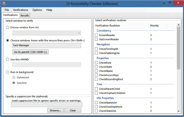
FIGURE 1-1 The Inspect UI accessibility test tool
The UI Accessibility Checker helps you identify problems with your UI at runtime. When you finish developing the UI of your app, use the UI Accessibility Checker to test various us-age scenarios, verify that the runtime accessibility information is correct, and find any issues. Figure 1-2 shows the UI Accessibility Checker being set up to test the accessibility information in an app.
After you have implemented an accessible design for your app, you can mark your app as accessible in the Windows Store, which makes it easier for users with disabilities to discover your app. Windows Store provides an Accessible filter to let users search for apps that have an accessible UI. When you declare your app as accessible, the Accessible tag is added to the description of your app.
MORE INFO MAKING YOUR APP ACCESSIBLE
Read more about accessibility in Windows Store apps at http://msdn.microsoft.com/en-us/ library/windows/apps/xaml/hh452678.aspx.
EXAM TIP
Although you are not expected to explain how a particular tool used for testing accessibil-ity works, it is important to know the various ways of testing accessibilaccessibil-ity in a Windows Store app.
Deciding when custom controls are needed
Custom controls provide you with an option to create UI elements with a unique appearance that are often reusable across multiple apps. As a Windows Store app developer, you might consider building a user control or customize a control such as GridView using a template to extend its visual design. Therefore, you need to consider one of three options when building a control:
■ Custom control
■ User control
■ Create a template and apply it to control element
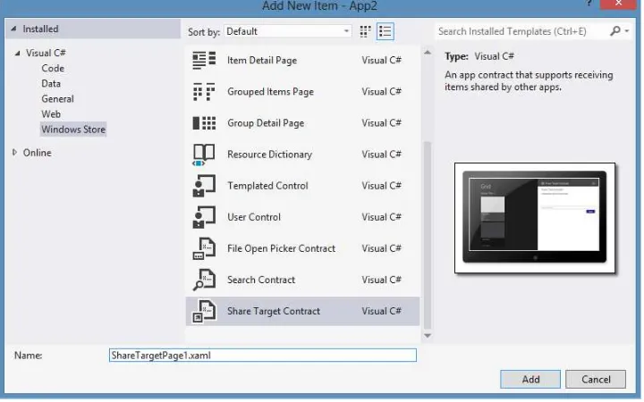
FIGURE 1-3 Creating a user control with Visual Studio
When you add a new user control to your project, an XAML file is added to your project along with a C# code-behind file. The visual representation of the user control is defined in the XAML, and the code-behind file is used to implement the functionality of the control.
A custom control is a reusable UI component you can use in multiple Windows Store proj-ects. You can restyle and re-template a custom control as needed, and package it into its own assembly that can be distributed as a Nuget package, for example. Using custom controls en-ables the flexibility to create a new visual element with custom code that implements various features of the element. Custom controls are derived from either core controls such as Button or control primitives such as Control and Panel.
In Visual Studio, you can add a custom control to your project by using the Templated Control item template in the Add New Item dialog box. This will create an XAML file— themes\generic.xaml—and a class file. The XAML file contains the default styles and tem-plates for your custom control. The location of Generic.xaml is important because the XAML framework loads your custom control automatically.
Thought experiment
Designing a Windows Store app
In this thought experiment, apply what you’ve learned about this objective. You can
find answers to these questions in the “Answers” section at the end of this chapter.
You are implementing a Windows Store app for a popular bistro. The bistro owners
want the app to be easy to use by physically impaired users, and they want the app
rebranded if they choose to use a variant of the app for their other restaurant
businesses.
Use the knowledge you have gained in this objective to select some features that
can be used to make the app easy to rebrand and be accessible to all users.
Objective summary
■ Evaluate the conceptual design of your application with an emphasis on how users will use your app.
■ Compose the UI so it showcases content in your app.
■ Use styles and resources to design the UI so that visual elements can be reused within your app.
■ Consider users with disabilities and impairments when designing and building the UI of your app.
■ Consider using custom controls whenever you find a need to reuse components across
multiple Windows Store apps.
Objective review
Answer the following questions to test your knowledge of the information in this objective. You can find the answers to these questions and explanations of why each answer choice is correct or incorrect in the “Answers” section at the end of this chapter.
1. You have been asked to implement the UI of a Windows Store app. The application requirements make it essential for the app to be fast and fluid, and provide visual feedback to users for their actions at the same time. The designer of the user interface has recommended using animations. How should you implement animations while ensuring app requirements are met?
A. Convince the designer that animations will make the UI complex and unintuitive.
B. Use animations in the controls provided by the platform and in the animation library.
2. You have created an application that aggregates news feeds from multiple sources. You have been asked to ensure your application is accessible by users with disabilities and visual impairments. Which tests should be carried out to ensure the app is acces-sible? (Choose all that apply.)
A. Run the Inspect tool on your application.
B. Run the UI Accessibility Checker on your application.
C. Let the Windows Store run all the relevant tests on accessibility.
D. Test your app with only the keyboard.
E. Install and test your app on as many PCs and devices as possible.
3. Your organization produces a number of Windows Store apps every year. Designers and developers are located in separate geographical locations. They have to collabo-rate on a number of apps for a particular client, ensuring that branding in the apps is consistent and that functionality, such as authentication, is uniform across all apps. As the lead developer, what are your recommendations to ensure consistency in the design and functionality of the apps for the client? (Choose all that apply.)
A. There should be only one project shared between designers and developers. Code in this project can be modified based on the applications’ requirements for the UI.
B. Wherever possible, visual elements specific to the brand should be implemented in styles that are defined in resources in the app level.
C. Components with similar functionality should be developed as custom controls. These controls should be used in the apps.
D. There is no easy way to share code within apps and between designers and devel-opers. No recommendations can be made.
E. Use UX design resources provided by Microsoft for creating the conceptual design of the app.
Objective 1.2: Design for separation of concerns (SOC)
This objective covers how to:
■ Plan the logical layers of your solution to meet app requirements
■ Design loosely coupled layers
■ Incorporate WinMD components
Planning the logical layers of your solution to meet app
requirements
You should design a Windows Store app with maintainability and extensibility in mind. After you finalize the conceptual design of your app, the next step is to plan the logical layers based on your app’s requirements. Traditional software applications employ logical group-ing of components into separate layers that communicate with each other and with other applications. Layers can be considered as logical divisions of components and functionality; they do not take into account physical location of components. Layers help to identify differ-ent kinds of tasks performed by compondiffer-ents, thereby making it easier to create a design that supports the reuse of components.
In a logical layered design, a set of components performing similar tasks is grouped into a layer. Identifying logical layers in a design supports reusability of components as well as maintainability of your application. Figure 1-4 shows the architectural view of a logical layered system.
The three-layer architecture shown in Figure 1-4 consists of the following:
■ Presentation layer This layer is the UI of your application and is responsible for your application’s layout and formatting. You will use XAML with core controls, user con-trols, and custom controls to implement this layer.
■ Business layer This layer is where you implement your application’s core logic or business logic, and your application’s business rules. Other Windows Store apps inter-act with your application via this layer. For example, the business layer can use con-tracts provided by Windows for integration with the platform and other apps to share data.
■ Data layer This layer provides the data repository required by the business layer of your application for storage and retrieval of data. It defines the interface used by the business layer for accessing a database, local settings, or remote web services.
These layers might be located in the same physical tier or they might be separated by physical boundaries. You should consider these layers as loosely coupled, with clearly de-fined interfaces that aid in the interaction between the layers. Loose coupling between the layers ensures your solution is maintainable and extensible, and is robust to any changes in implementation required in future updates. In addition, loose coupling helps with testing the different layers of a solution independent of each other.
Designing loosely coupled layers
When you design the layers of your solution, you should start by focusing on identifying and grouping functionality into layers. At the same time, you should identify the interfaces that help in the interaction between the various layers. After you define the layers and interfaces of your solution, you must consider how your solution will be deployed. At the final stage, you should choose the communication mechanism between various layers of your solution.
While designing loosely coupled layers for a solution, you should have a clear plan to group related functionalities into layers. Having too many layers adds to the complexity of the design, whereas having too few layers affects maintainability and extensibility. You should find a balance between reusability and loose coupling, and consider their impact on perfor-mance and complexity.
IMPORTANT BENEFITS OF A LOOSELY COUPLED DESIGN
In general, the benefits of a loosely coupled design outweigh any degradation of perfor
-mance of your solution.
After you have defined the layers of your solution, you should identify the functionality that spans across layers. Logging, caching of data, data validation, authentication, and autho-rization are some crosscutting concerns that require implementation in separate components. Functionality implemented in such components must be available across multiple layers; therefore, you should ensure these components are available across different physical tiers.
When you define the interface between various layers of your solution, your aim should be to enforce loose coupling between layers. This means that a layer in the solution must not expose its internal implementation to any other layer. A public interface that hides the details of implementation of the layer should be sufficient for other layers to communicate with it.
Communication between various layers of your solution should consider how your solution is deployed. If all the layers of your solution reside in one physical tier, you should choose the communication protocol between the layers accordingly. If your solution interacts with remote web services for data or application logic, you should consider implementing security and encryption in the interfaces that are involved in such communication.
EXAM TIP
You should be comfortable with designing your application and implementing require-ments in the various layers. You should understand the primary function of each layer and where a particular requirement can be implemented in an app.
Incorporating WinMD components
The WinRT platform provides developers with a new way to build reusable software compo-nents—as WinRT types packaged in a WinRT component, also called a WinMD component. In traditional .NET application development, you could create a dynamic-link library (DLL) as a managed class library and use it in one or more applications. This option is still available in Visual Studio. However, you can change the output type of a library project from class library to WinRT component, and the output of such a project is a WinMD file. The main difference between the two types of libraries is that a class library can be accessed only from (managed) C# and Visual Basic applications. A WinRT component can be additionally accessed from Windows Store apps developed with C++ and JavaScript. Thus, a WinRT component allows for language-agnostic software development for Windows Store apps.
WinRT imposes some restrictions on the design and implementation of a WinMD com-ponent. For example, public classes must be sealed, public fields are not allowed, and public data members must be declared as properties. In addition, there are restrictions on the data types passed from within the WinMD component to applications that use the component. You can only pass WinRT-compatible data types when returning values from methods defined in a WinMD component to a consuming application.
advan-using it in a WinMD component. A WinMD component developed in C++ must have at least one activatable or ref class, a class that can be instantiated from any other language such as C#, Visual Basic, or JavaScript. It can contain more than one activatable class as well as other internal classes implementing the functionality per the application’s requirements. An activat-able class must be declared as public ref class sealed. If you choose not to expose a C++ type or a class that is not sealed, you should use the [WebHostHidden] attribute to prevent it from being exposed to consuming JavaScript applications. Note that an activatable class name and namespace name must not contain Unicode characters.
When you call methods implemented in a WinMD component developed in C++ in a JavaScript Windows Store app, you must use camel case in your JavaScript code. For example, for a method CalculateAverageOfNumbers implemented in a WinMD component, you will invoke it as calculateAverageOfNumbers in JavaScript. When you reference C++ namespaces and classes in JavaScript, you should use the same casing as in the C++ implementation. C# and Visual Basic follow their normal casing rules. The following code shows a C++ class defini-tion in a WinMD component and how it is used in JavaScript and C#:
Sample of C++ code
// ref class definition in C++ public ref class Multiplier sealed {
// Class members public:
double MultiplyAndAdd(double inputA, double inputB) {
return (input A + inputB + (inputA * inputB)); }
};
Sample of JavaScript code
// Create an instance of the WinMD class and invoke the method var nativeObject = new CppComponent.Multiplier();
var result = nativeObject.multiplyAndAdd(22.2, 30.1););
Sample of C# code
// Create an instance of the WinMD class and invoke the method var nativeObject = new CppComponent.Multiplier();
var result = nativeObject.MultiplyAndAdd(22.2, 30.1);
If you are creating a component that is meant for use in Windows Store apps developed with Visual Basic or C#, and the component does not contain Windows Store controls, you should consider developing your component as a class library instead of a WinMD compo-nent because the former has fewer restrictions.
You can declare events by using the event pattern provided in the Microsoft .NET Frame-work or other patterns available in WinRT. You can implement an event handler in a C# WinMD component by using the System.EventHandler<TEventArgs> delegate and the WinRT EventHandler<T> delegate. If you declare custom event accessors, you must use the WinRT event pattern.
MORE INFO MAPPINGS BETWEEN .NET FRAMEWORK AND WINRT TYPES, AND WINRT EVENT PATTERNS
A table of .NET Framework mappings of WinRT types is available at http://msdn.microsoft. com/en-us/library/windows/apps/hh995050.aspx. You can read more about the WinRT event pattern at http://msdn.microsoft.com/en-us/library/windows/apps/hh972883.aspx.
Thought experiment
Creating a Windows Store app from an existing desktop app
In this thought experiment, apply what you’ve learned about this objective. You can
find answers to these questions in the “Answers” section at the end of this chapter.
A popular media publishing company has developed a desktop application that uses a number of C++ components. These components use proprietary algorithms that will need significant amounts of time and effort to re-implement in a Windows
Store app.
What are your recommendations for the organization interested in building a Win-dows Store app and make it available for consumers?
Objective summary
■ Plan the logical layers of your solution with maintainability and extensibility of your app in mind.
■ Loosely coupled layers in a solution ensure flexibility of your solution to adapt to any
change of requirements over time.
■ Consider incorporating WinMD components in your solution to harness the power of platform-specific features.
Objective review
1. You have been asked to recommend an option for implementing logging in your app. The logging component should log events in an Extensible Markup Language (XML) file that resides in the local data store of the app and periodically uploads it to a re-mote web service. It should log events from the business layer as well as the data layer. Where should you implement the logging mechanism?
A. Business layer
B. Data layer
C. Presentation layer
D. As a separate component to maximize reuse
2. One of the requirements of the app you are implementing is to support contracts provided by the platform to exchange data between your app and the platform as well as with other apps. In which logical layer of your solution should you implement this feature?
A. Presentation layer
B. Data layer
C. Business layer
D. Application manifest
3. You have been given software that performs bit-rate manipulation of audio streams recorded using a microphone. The software is complex and is written in C++. Your organization does not have the budget to have the software rewritten for a Windows Store app. What are your recommendations for the conceptual design of a Windows Store app that does bit-rate manipulation? (Choose all that apply.)
A. Develop a WinMD component in C++ incorporating the existing software.
B. Develop a Windows Store app and use the C++/WinMD component for bit-rate manipulation.
C. Such an application is impossible to build unless the C++ component is rewritten in C#.
D. Use WinRT APIs (application programming interfaces) to implement the bit-rate manipulation algorithm.
Objective 1.3: Apply the MVVM pattern to your
app design
It is challenging to develop the UI of a modern application while considering code and visual element reuse, separation of concerns, and maintainability. UI design patterns are reusable solutions that can help developers build UIs. You can use the MVVM design pattern to de-velop Windows Store apps that are maintainable, testable, and extensible.
This objective covers how to:
■ Design and implement the appropriate data model to support business entities
■ Design your viewmodel to support your view based on your model
■ Develop a view to meet data-binding requirements
■ Create viewmodels using INotifyPropertyChanged, ObservableCollection, and CollectionViewSource
Designing and implementing the appropriate data model
to support business entities
The data model in a Windows Store app implements the business logic and the mechanism for data access. It is responsible for notifying the viewmodel whenever data changes in the source and for persisting changes from the view in the data source. The model of the MVVM pattern is where the data model for the application is implemented.
Model-View-ViewModel pattern
The Model-View-ViewModel (MVVM) design pattern was introduced by John Gossman in 2005 as a variation of the popular Model-View-Controller (MVC) design pattern. The MVVM pattern helps you build your application with a clean separation of the business and presenta-tion logic from the UI. It provides opportunities for code reuse, and encourages developers and UI designers to collaborate on developing various parts of the application.
MORE INFO MODEL-VIEW-VIEWMODEL PATTERN
For an introduction to the Model-View-ViewModel pattern for building WPF apps, go to
http://blogs.msdn.com/b/johngossman/archive/2005/10/08/478683.aspx.
Win-presentation logic, and the view encapsulates the UI and UI logic. Figure 1-5 illustrates the MVVM pattern and the function of its various layers.
FIGURE 1-5 MVVM layers and their functions
THE VIEW
The view is the visual interface of the application. It comprises a visual element, such as a page or a window, and controls provided by the framework. The layout and styling of the controls is defined in the view. In addition, the view can define animations that are triggered when there is a change in the state of the viewmodel (for example, when there is new data) or when the user interacts with the view. The code-behind of the view can contain the UI logic to present data through the controls in the view or code to directly manipulate the visual elements in the view. In some situations, complex animations that are otherwise difficult to set up in XAML can be expressed in the code-behind. It is recommended that you do not put business or presentation logic in the code-behind of the view; otherwise, UI testing becomes difficult.
The view references the viewmodel through a property called DataContext. This property can be set through XAML or the code-behind of the view. The controls in the view are data-bound to the properties and commands in the viewmodel. For views that do not require any UI logic, data templates can be used to specify the UI elements that will represent an object in the viewmodel. This enables visual designers to define and easily update the visual repre-sentation without changing the object the view bound to or the behavior of the control that is used to display the object.
THE VIEWMODEL
The viewmodel acts as the glue between the view and one or more model classes. In a complex view, you can require more than one model class to provide data. The viewmodel can transform the data so that it can be represented in the view. The viewmodel can combine multiple fields from models in a property that is then bound to a visual element in the view. This helps where a new requirement adds a new field in the data model that is to be com-bined with an existing field. It requires an update in the viewmodel code, but the view does not require a change.
Actions invoked by the user in a view such as tapping a button are typically defined as commands in the viewmodel. Commands provide a clean way to encapsulate user actions so that they are separate from the UI. The ICommand interface provides the mechanism to con-nect the UI with commands that are defined in the viewmodel.
THE MODEL
Business logic and data are encapsulated in the model. A model class defines the data struc-tures based on the application’s data model. The business logic as well as data validation rules are often implemented in the model, although a separate repository for data access, caching, and storage can be used. The model classes are often generated as part of the data access layer or remote service that provides the data for the application.
The model usually implements the INotifyPropertyChanged interface that enables it to be bound to the view. The model can also implement the INotifyDataErrorInfo interface to provide support for data validation. In some cases, when the model doesn’t implement these interfaces, the viewmodel defines the model and implements these interfaces.
Data binding
Data binding is the mechanism that establishes a connection between the application’s UI and business logic. If the model implements the data binding interface, when the data changes its value, it is reflected in the UI element that is bound to the data. Data binding also implies that any changes in the representation of the data in the UI can be used to update the underlying data.
Data binding in the MVVM pattern provides a clean and simple way of connecting UI ele-ments with data. A binding consists of the following:
■ A binding source that provides the data for the visual element in the view. A binding source can be a common language runtime (CLR) object such as a class defined in C# or any WinRT object of a type that has [BindableAttribute] or implements the ICustom-PropertyProvider interface. To meet the app requirements, you can bind a property of a UI element with the value of a property of another UI element.
The binding object shown in Figure 1-6 provides the following information to the binding mechanism:
■ The source and target objects.
■ The direction of data flow, specified by setting the Binding.Mode property to one of the BindingMode enumeration values.
■ The value converter, if the data used in the binding needs to be formatted or modified before it is presented in the UI. A value converter is specified by setting the Converter property of the FrameworkElement to an instance of a class that implements the IValue-Converter interface.
FIGURE 1-6 Data binding between source and target
The BindingMode enumeration describes how the data propagates in a binding. Its mem-bers are OneWay, OneTime, and TwoWay. In a TwoWay binding, changes to the target propa-gate to the source, except if the binding target is the Text property of a FrameworkElement. In such a case, the change is propagated only when the TextBox loses focus. In OneWay binding, the target is updated when data is available in the binding source and changes in the source are propagated to the target. In OneTime binding, the target is updated only once: when the binding is created.
Listing 1-1 shows how to set up binding in XAML and set up the DataContext property for the target in the code-behind file.
LISTING 1-1 Setting up binding (in XAML) and the DataContext property (in C#)
Sample of XAML code
<TextBox x:Name="FirstNameTextBox" Text="{Binding FirstName, Mode=OneWay}" />
Sample of C# code
// Create an instance of the Person
// class that implements INotifyPropertyChanged Person person = new Person();
person.FirstName = “Joseph"; person.LastName = “Samuel";
The binding target is created in the XAML by using the {Binding…} syntax. The binding source is set in the code through the DataContext property of the TextBox in the code shown in Listing 1-1. You can use the ElementName property or the RelativeSource property to specify the binding source. If you need to bind a property of a UI element to a property of another UI element, the ElementName property is useful (for example, when you are chang-ing the diameter of a circle uschang-ing a slider). The RelativeSource property is commonly used to bind one property of an object to another property of the same object, or to define a binding in a style or template.
Design and implement the model
The model in the MVVM pattern is the entity responsible for moving data to and from the data store and implementing the business logic. Although the implementation of the model can vary based on the app requirements, the interface from the model to the viewmodel does not change. In the case of a simple application, the model can contain the implementation for retrieval and storage of data from the file system, in plain text. If the application needs to retrieve data from a remote web service or data store, you can create a repository class to implement the web service client. In that case, the model defines the data structures required to extract the data obtained from the remote web service. The repository can additionally support user authentication and authorization.
Model objects are either exposed through viewmodels or defined in a viewmodel. When model objects are exposed via viewmodels, they need to implement the INotifyProperty Changed interface and (optionally) the INotifyDataErrorInfo interface if it supports validation.
A single-page Windows Store app does not require more than one model class. For more complex applications, multiple models are required to support the business logic. Consider the design of a Windows Store app that enables user to search for photographs from a popular website using their web service. Amateurs and enthusiasts upload photographs and use a simple rating system to mark the photographs in order of popularity. A search term can be provided a string to query the web service. The web service returns the result of such a query as XML or JavaScript Object Notation (JSON) items in an array. Therefore, the model in this case is a data structure that can be used to extract the data from the raw XML or JSON response from the web service.
LISTING 1-2 Using a model class
public class SearchResultItem {
public SearchResultItem(XElement elmt) {
Id = elmt.Element(“Id").Value; Name = elmt.Element(“Name").Value; Description = elmt.Element(“Name").Value; ImageUri = new Uri(elmt.Element(“Url").Value);
The C# code in Listing 1-3 implements the logic to query the remote web service and parse the result into a list in a separate class. The result is sorted so that the photograph with the most number of votes is the first element in the list.
LISTING 1-3 Querying a web service and parsing the results
public static class ContosoImageSearchService {
public static async Task<List<SearchResultItem>> SearchImagesAsync(string searchTerm)
{
HttpClient httpClient = new HttpClient();
Uri searchUri = new Uri(“http://ws.contoso.com/?search=" + searchTerm); List<SearchResultItem> searchResults = new List<SearchResultItem>();
using (HttpResponseMessage response = await
in Windows Store apps. The viewmodel invokes the method to carry out the search through a command implemented with the ICommand interface, which facilitates binding the command with the view.
Designing a viewmodel to support the view based on your
model
The classic definition of the viewmodel is that it is the model for the view. However, this definition is an oversimplification of the role a viewmodel plays in an application. The main features of a viewmodel are these:
■ It provides data that is represented in the view. This data can include properties that are required in the view but are not part of the model.
■ It provides commands that are connected to events of UI elements and are used to invoke an action. The commands are implementations of the ICommand interface.
■ It implements the INotifyPropertyChanged interface, thereby keeping the UI in syn-chronization with the data model.
■ It optionally implements the INotifyDataErrorInfo interface, which enables the view-model to provide feedback through the UI on issues with the data entered by the user.
You need to keep these features of a viewmodel in mind while designing your model, and you might have to simplify the complex object model that represents the data returned from a remote service. You might also need to transform model properties to allow binding in the view; for example, transforming an enumeration into a Boolean that can be used to set the visibility of a UI element. Instead of implementing the logic to carry out the transformation in the viewmodel, you can implement it in a value converter and use in the data binding.
A single-page Windows Store app requires the following presentation logic implemented in the viewmodel:
■ A property that is a list of photographs for the search term.
■ A property that is the search term inserted by the user. It is bound to a text box in the UI.
■ A property that is a command bound to the search button in the user interface.
Developing a view to meet data-binding requirements
In the MVVM pattern, the role of the view is to present the data and enable the user to interact with it. In a Windows Store app, the view can be a UserControl or a Page. The relationship between the view and its data is set up through data binding. The simplest way to set this up is to add a reference to the viewmodel in the DataContext property of the view. You can bind the properties and commands of the viewmodel to the corresponding UI elements in the view.