Examples of the application of statistical process control charts in monitoring ambulance response times, adverse medical device/device events, and the number of patient safety-related deaths are reviewed. Additionally, control charts can detect drift in the process or significant signal from the data pattern more quickly than other statistical tools.
General Introduction
The purpose of this study is to provide an overview of SPC theory and examine the application of SPC charts by providing examples of the application of control charts to common issues in the healthcare industry. This paper provides information on the concept, interpretation and selection of the appropriate control chart; and several examples of the application of control charts for health care performance monitoring are reviewed.
Importance of the Study
Problem Statement
Recently, the application of control chart has received a growing interest in the healthcare sector to monitor, control and improve the performance of the healthcare process. However, since PSC is relatively new to the health care sector and is not commonly included in medical statistics courses or textbooks; there is a need to conduct a research to study the application of control chart in health care.
Aims and Objectives
For example, important variables involving the healthcare sector include waiting time, patient satisfaction rate, infection rate, medical error, mortality rate, emergency service response time, and so on. A control chart is a statistical process control tool developed by Walter Shewart, a physicist, to determine whether a change in a manufacturing process is consistent; that is, to determine whether the process is in a state of control (Owen, 2013).
Scope and Limitation of the Study
Contribution of the Study
The check chart is one of the quality improvement techniques that can be applied to deliver continuous improvement. The last section discusses the type of data and the method for selecting the appropriate control chart.
Statistical Process Control (SPC) Theory
The purpose of this chapter is to provide an overview of the related research and literature relevant to the application of statistical process control (SPC) graphing in healthcare. This chapter first discusses the theory of SPC, then the concept of the control chart.
Concept of Control Chart
If the process includes only common cause variations and no special cause variations, they are listed;. Control charts in Phase I primarily help move the process into a state of control, which is the key stage of process control.
Interpretation of a Control Chart
Woodall (2006) has conducted a research on the use or implementation of control chart in the healthcare industry, he found that the use of control chart in the healthcare industry is different from manufacturing practices in industry. For example, attribute data is more commonly used in the healthcare sector than in the manufacturing sector.
Test Rule for Control Chart
If four of five consecutive points fall outside the one sigma control limits on the same side of the centerline. An obvious cyclic behavior or systematic nature of the plot indicated that there are special causes and that the process is out of control.
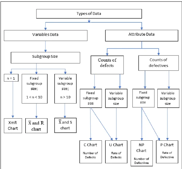
Types of Data
If eight or more consecutive points in a row fall on both sides of the center line.
Selection of the right Control Chart
Control Charts for Variable Data
If the subset size for each data point is equal to one, for example, the waiting time of a patient for a consultation, then the use of the XmR chart (X chart and moving range chart) is recommended. If the subset size for each data point is small (greater than 1 and less than or equal to 10) and equal in size, eg, the waiting time of 7 patients for consultation, then it is generally suggested to use the X̅ and R chart.
Control Charts for Attribute Data
If the subgroup size for each data point is large (more than 10) or unequal in size, for example a waiting time of 20 patients for a consultation, then the use of an X̅ and S chart is generally recommended.
Introduction
Formula and Construction Methods for Variable Data Control Charts .1 XmR Chart
The 𝐗 ̅ and R chart
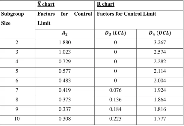
X̅ and R charts are useful when the subgroup size for each data point is constant and small, which is greater than one and equal to or less than 10. To set up an R chart:. ii) Calculate the value of center line (CL), lower control limit (LCL) and upper control limit (UCL). 𝐷3 and 𝐷4 refer to the factors in the 𝑫𝟑 and 𝑫𝟒 column, respectively, corresponding to the subgroup size in Figure 2. iii) Plot the 𝑅𝑖, CL, UCL and LCL values on the same graph and place the graph below the X̅ chart. i) Calculate the mean value of X̅ of each subgroup. ii) Calculate the value of center line (CL), lower control limit (LCL) and upper control limit (UCL). 𝐴2 refer to the factors in the 𝑨𝟐 column corresponding to the subgroup size in Table 3.1. iii) Plot the values of X̅𝑖, CL, UCL and LCL on the same graph and place the graph below the X̅ graph.
The 𝐗 ̅ and S chart
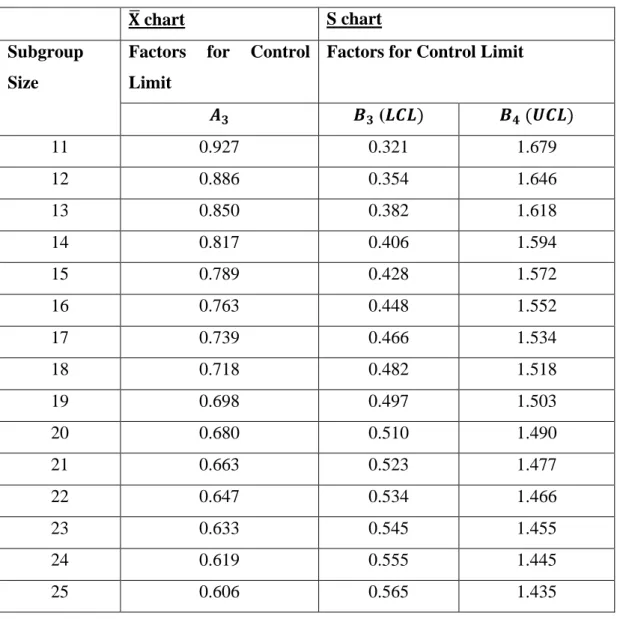
𝐴2 refer to the factors in column 𝑨𝟐 that correspond to the subgroup size in Table 3.1. iii) Plot the X̅𝑖, CL, UCL and LCL values on the same graph and place the graph below on the X̅ graph. To set up the S card:. i) Calculate the mean value X̅ of each subgroup. ii) Calculate the standard deviation (S) for each subgroup. iii) Calculate the value of the center line (CL), the lower control limit (LCL) and the upper control limit (UCL). 𝐵3 and 𝐵4 refer to the factors in the 𝑩𝟑 and 𝑩𝟒 column, respectively, corresponding to the subgroup size in Figure 3. iv) Plot the 𝑆𝑖, CL, UCL and LCL values in the same graph and place the below graph of the X̅ graph. ii) Calculate the value of the center line (CL), the lower control limit (LCL) and the upper control limit (UCL). 𝐴3 refer to the factors in the 𝑨𝟑 column that correspond to the subgroup size in Figure 3. Control limits are calculated using the sample size 𝑛𝑖 in each individual subgroup. Plot the values of X̅𝑖, CL, UCL, and LCL on the same graph and place the graph below on the X̅ graph.
P Chart and NP chart
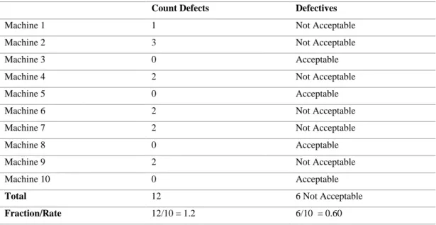
The P-chart is useful if the data is based on defect rate or percentage of defects and the size of the subset varies for each data point. Since the size of the subset varies for each data point, these data points should have a norm rather than a count. The NP plot is useful if the data is based on the number of defects and subset size constants for each data point.
Research Methodology
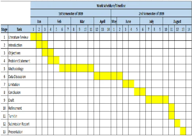
Research Work Schedule
Ambulance Response Time .1 Introduction
Methods
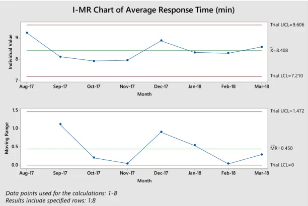
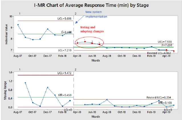
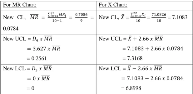
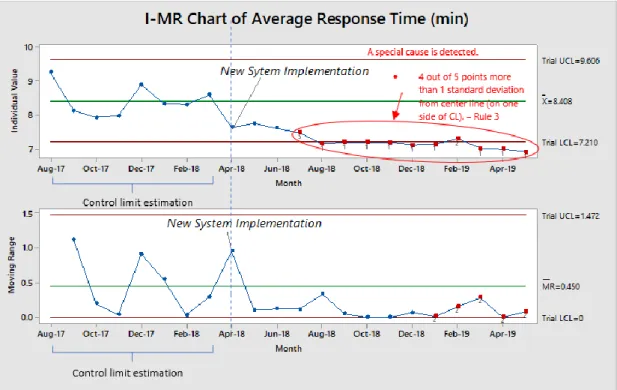
Existing data on average ambulance response time for NHS England Category 1 between August 2017 and May 2019 is extracted from the NHS database on 20 June 2018 using Microsoft Excel 2016. Number of incidents and total response hours (from receiving 999 calls to the vehicle reaching the patient's location) were determined monthly, the average response time is derived by dividing the number of incidents by the total response hours, and all data will be analyzed using Minitab 18. The XmR chart (based on a normal distribution ). to monitor the average average response time of an ambulance and analyze whether the introduction of the new system has improved the process.
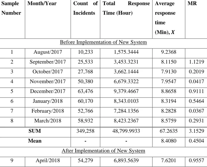
Data Discussion
It showed that the process after implementing the new system is now operating at a new response time level that is significantly better than the test center's benchmark of 𝑋̅=8.408. A hypothesis test can also be performed to test the hypothesis that the average process response time in this new system implementation differs from the average process response time before the implementation. However, Table 4.1 and the XmR graph in Figure 4.4 show that the average ambulance response time standards of 7 minutes were met for the first time during the period March to May 2019 (sample 20 to 22).
Medical Device/Equipment Adverse Events .1 Introduction
Methods
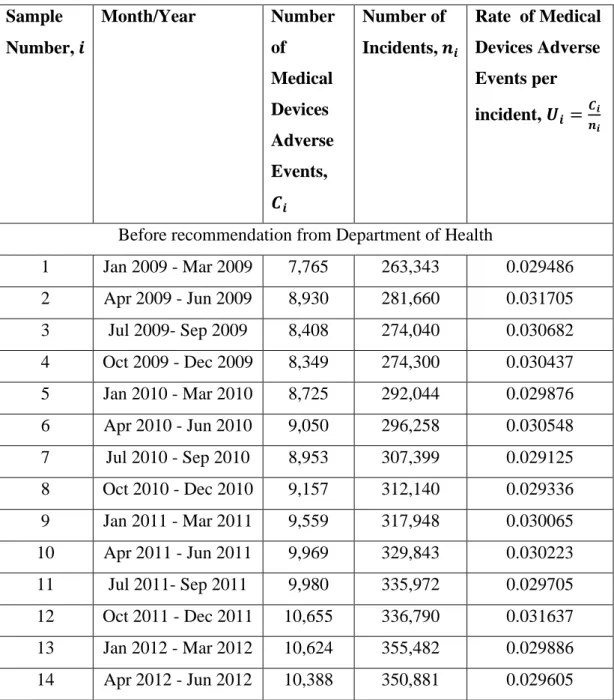
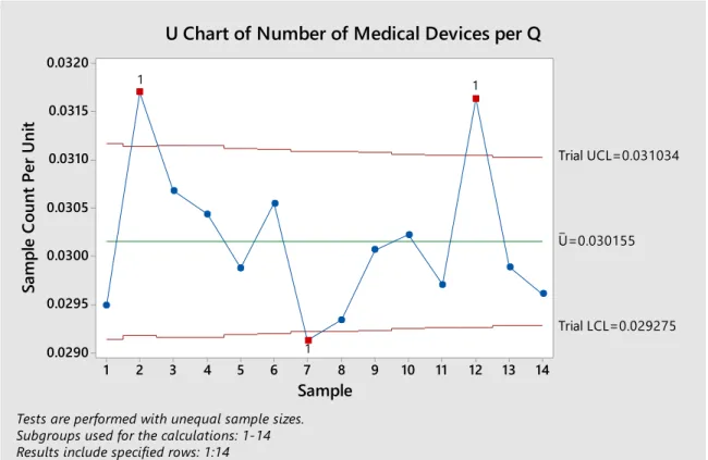
All reported adverse events of medical devices or equipment that occurred in England between January 1, 2009 and September 30, 2018 were pulled from the NRLS database on June 27, 2019 using Excel 2016 and Minitab 18. The procedures for creating the U- map include:. i) Calculate the number of medical device adverse events per incident 𝑈𝑖 in each subgroup. Month/year Number of incidents, 𝒏𝒊. Before recommendation of the Ministry of Health January 1, 2009 -. ii) Plot the 𝑈𝑖, CL, LCL and UCL values on the same graph (Figure 4.5 to Figure 4.11 shows the control chart created by Minitab).
Data Discussion
These data are plotted in Figure 4.7 in line with the U-map developed in Figure 4.6. The revised control limits in Table 4.12 and Figure 4.9 can be used to monitor the further data (sample 24 to 39) and to test whether the second process change (collaboration of NHS and MHRA) has improved the stable process to increase the rate of side effects of medical devices (phase II analysis). These data are plotted in Figure 4.10 in line with the U-map developed in Figure 4.9.
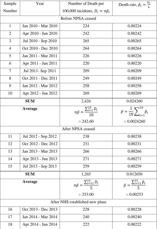
Number of patient-safety-related deaths .1 Introduction
Methods
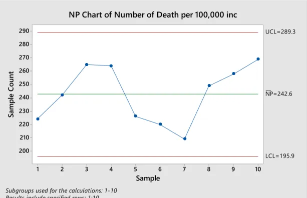
The NRLS has collated and collated data submitted by all NHS organisations, patients, practitioners, nurses and staff, and then published quarterly National Patient Safety Incident Reports. Since the sample size is constant for each data point, the NP plot (based on the binomial distribution) was chosen for monitoring the number of deaths in patient safety-related incidents.
Data Discussion
These data are plotted in Figure 4.13 as an extension of the NP-graph developed in Figure 4.12. These data are plotted in Figure 4.14 as an extension of the NP-graph developed in Figure 4.13. These data are plotted in Figure 4.16 as an extension of the NP-graph developed in Figure 4.15.
Control Chart Methodology Discussion
The control chart in Figure 4.16 does not indicate a lack of control, and this change appears to have no effect on reducing the number of deaths. In contrast, construction of control charts does not require as much data as traditional methods and the charts show how the process changes or shifts over time by plotting the data in chronological order. The ambulance response time example further illustrates that how SPC charts can detect the shift in the process or significant signal from the data pattern more easily and quickly than other traditional statistical tools.
Conclusions
Recommendations for future work
Available at: < https://www.nhs.uk/news/2012/01January/Pages/government-review-advises-on-french-pip-breast-implants.aspx> [Accessed 10 July 2019]. Available at: < https://www.england.nhs.uk/publication/new-ambulance-standards-easy-read-document/ > [Accessed 18 June 2019]. Available at: < https://www.neas.nhs.uk/our-services/accident- emergency/ambulance-response-categories.aspx > [Accessed 22 June 2019].