Designing Web Interfaces
Bill Scott and Theresa Neil
Copyright © 2009 Bill Scott and Theresa Neil. All rights reserved. Printed in the United States of America.
Published by O’Reilly Media, Inc., 1005 Gravenstein Highway North, Sebastopol, CA 95472.
O’Reilly books may be purchased for educational, business, or sales promotional use. Online editions are also available for most titles (safari.oreilly.com). For more information, contact our corporate/institutional sales department: 800-998-9938 or [email protected].
Editor: Mary Treseler
Production Editor: Rachel Monaghan Copyeditor: Colleen Gorman Proofreader: Rachel Monaghan
Indexer: Julie Hawks
Cover Designer: Karen Montgomery Interior Designer: Ron Bilodeau Illustrator: Robert Romano
Printing History:
January 2009: First Edition.
Nutshell Handbook, the Nutshell Handbook logo, and the O’Reilly logo are registered trademarks of O’Reilly Media, Inc. Designing Web Interfaces, the image of a Guianan cock-of-the-rock, and related trade dress are trademarks of O’Reilly Media, Inc.
Many of the designations used by manufacturers and sellers to distinguish their products are claimed as trademarks. Where those designations appear in this book, and O’Reilly Media, Inc. was aware of a trade-mark claim, the designations have been printed in caps or initial caps.
While every precaution has been taken in the preparation of this book, the publisher and authors assume no responsibility for errors or omissions, or for damages resulting from the use of the information con-tained herein.
This book uses Repkover,™ a durable and flexible lay-flat binding.
ISBN: 978-0-596-51625-3
Contents
Foreword
. . . .
ix
Preface
. . . .
xi
Make It Direc
Principle One:
t
In-Page Editing
1.
. . . .
3
Single-Field Inline Edit 4
Multi-Field Inline Edit 8
Overlay Edit 11
Table Edit 15
Group Edit 18
Module Configuration 21
Guidelines for Choosing Specific Editing Patterns 23
Drag and Drop
2.
. . . .
25
Interesting Moments 26
Purpose of Drag and Drop 29
Drag and Drop Module 30
Drag and Drop List 40
Drag and Drop Object 46
Drag and Drop Action 52
Drag and Drop Collection 57
Direct Selection
3.
. . . .
61
Toggle Selection 62
Collected Selection 67
Object Selection 70
Hybrid Selection 72
Keep It Lightweigh
Principle Two:
t
Contextual Tools
4.
. . . .
79
Interaction in Context 79
Fitts’s Law 80
Contextual Tools 81
Always-Visible Tools 81
Hover-Reveal Tools 85
Toggle-Reveal Tools 91
Multi-Level Tools 93
Secondary Menu 98
Stay on the Pag
Principle Three:
e
Overlays
5.
. . . .
105
Dialog Overlay 107
Detail Overlay 112
Input Overlay 119
Inlays
6.
. . . .
123
Dialog Inlay 123
List Inlay 127
Detail Inlay 132
Tabs 134
Inlay Versus Overlay? 136
Virtual Pages
7.
. . . .
137
Virtual Scrolling 137
Contents vii
Scrolled Paging: Carousel 147
Virtual Panning 149
Zoomable User Interface 151
Paging Versus Scrolling 155
Process Flow
8.
. . . .
157
Google Blogger 157
The Magic Principle 158
Interactive Single-Page Process 160
Inline Assistant Process 164
Dialog Overlay Process 168
Configurator Process 171
Static Single-Page Process 174
Provide an Invitatio
Principle Four:
n
Static Invitations
9.
. . . .
181
Call to Action Invitation 181
Tour Invitation 185
Dynamic Invitations
10.
. . . .
191
Hover Invitation 191
Affordance Invitation 196
Drag and Drop Invitation 200
Inference Invitation 209
More Content Invitation 210
The Advantage of Invitations 213
Use Transition
Principle Five:
s
Transitional Patterns
11.
. . . .
217
Brighten and Dim 217
Expand/Collapse 222
Self-Healing Fade 227
Animation 228
Purpose of Transitions
12.
. . . .
233
Engagement 233
Communication 234
React Immediatel
Principle Six:
y
Lookup Patterns
13.
. . . .
253
Auto Complete 253
Live Suggest 257
Live Search 262
Refining Search 268
Feedback Patterns
14.
. . . .
275
Live Preview 275
Progressive Disclosure 284
Progress Indicator 286
Periodic Refresh 292
Principles and Patterns for Rich Interaction
Epilogue:
. . . .
295
Chapter 1
Foreword
In architecture, parti refers to the underlying concept of a building.* Will it be an
aca-demic structure aimed at increasing cross-disciplinary collaboration or a theater flexible enough to support quick set changes? To bring a specific parti to life, architects must not only define its essence but also know how to manage the huge number of considerations that ultimately impact its construction.
Design principles are the guiding light for any architect’s parti. They define and commu-nicate the key characteristics of a building to a wide variety of stakeholders, including cli-ents, builders, city planners, and engineers. Design principles articulate the fundamental goals that all decisions can be measured against and thereby keep the pieces of a project moving toward an integrated whole. But design principles are not enough.
Every aspect of a building from an attic to a Zen garden has a set of opportunities and limitations that can either add to or detract from the main concept or parti. These include standard dimensions, spacing requirements, aesthetics, physical limitations, and more. Architects who want to bring coherent visions to life need to learn the detailed ins and outs of these design considerations so they can select the best solutions from the options available.
This combination of design principles at the top and design considerations at the bottom is what allows architects to fill in the middle with meaningful buildings that enable people and organizations to interact, communicate, and get things done.
Those of us whose parti is bringing rich web applications to life can also benefit from a framework of design principles and considerations to guide us. In these pages, Bill Scott and Theresa Neil give us just that. Through 30 years of designing and developing soft-ware, Bill and Theresa have been the consummate taxonomists—naming, documenting, and sharing in loving detail what makes rich interactions succeed and fail.
The breadth of solutions they have encountered has given them a unique perspective on the design principles behind the most successful rich interactions on the Web. From “make it direct” to “react immediately,” the principles he outlines in this book are your yardstick for measuring the value that rich interactions bring to your web application. Through in-depth descriptions of context and trade-offs, Bill and Theresa support each principle with the design considerations and best practices you need to make informed decisions. Engineers, product managers, marketers, and designers can rally around and continually return to these principles and considerations to ensure that everyone is evalu-ating the impact of design decisions the same way.
This combination of rich web interaction design principles at the top and design consider-ations at the bottom allows web designers to fill in the middle with meaningful structures that enable people and organizations to interact, communicate, and get things done. Just like our friends, the architects.
So, dive in and immerse yourself in the direction and details you need to bring your rich web application partis to life!
—Luke Wroblewski October 2008
Chapter 1
Preface
What Happened
My (Bill’s) first personal computer was a Radio Shack Color Computer (circa 1981)— complete with a chiclet-style keyboard. The first few months the main user inter-face was the command line, typing in COLOR BASIC code.
Later, an upgrade to an Apple IIe brought a nicer keyboard with lots of games. But the interface was basically the same. The command-line and text-driven menu systems ruled the day. When the IBM PC came on the scene it brought more of the same. Lotus 123, which was the state-of-the-art spreadsheet application at the time, was controlled by a set of cryptic keystrokes. Not much of a user experience.
Then an interface revolution started. The Macintosh arrived in 1984, and shortly after its introduction, I brought one home. The mouse opened the door to a brand-new world of interaction. Instead of having to learn archaic commands to navigate through text-based menus, interaction in this new environment happened naturally in a direct, intui-tive manner.
OK, you are probably thinking, so what? That was 1984. This is now. What does this have to do with a book about designing web interfaces?
Everything.
For most of the history of the Web, sites and applications were marked by primitive inter-faces—just like the early desktop era. Most sites were built from two events:
Clicking hyperlinks •
Submitting forms •
Interestingly, the technologies have existed for many years to get around these limitations. But it was only after they became widely available across the most common browsers that developers could count on them in their everyday development. In 2004, Google launched Gmail and Google Maps using a set of techniques later dubbed Ajax by Jesse James Garrett.
The difference was dramatic. The Ajax-enabled Google Maps now interacted more like a desktop application with real-time pan-and-zoom—all with no page refresh. Mapquest, on the other hand, behaved like most other web applications at the time, refreshing the page each time the map was repositioned or zoomed. The contrast was clear between the old world of the Web and the new world as enabled by Ajax.
Why We Wrote This Book
While I got the chance to live through the first interface revolution for the desktop (even writing one of the first games for the Macintosh*), my coauthor Theresa Neil lived through
the second revolution on the Web.
A few years ago our paths crossed at Sabre (parent company of Travelocity). Together we founded a user experience design team and worked to improve dozens of products, per-forming heuristic evaluations and participating in full web application redesigns. From that work, we distilled a number of user interface design patterns as well as anti-patterns (common mistakes to avoid).
From there I went to Yahoo! and got to play an active role in defining the Ajax interface revolution on the Web. One of my contributions at Yahoo! was to publicly launch the Yahoo! Design Pattern Library. As Yahoo!’s Ajax Evangelist, I met and brainstormed with many of Yahoo!’s best minds on what it means to take these new interactions and apply them to the unique context of the Web. As a result, over the last few years, I have given countless talks on this subject, sharing best practices with web developers and designers from around the world.
At the same time Theresa struck out as an interface designer in her own consultancy. In her work she has continued to refine the initial set of design patterns and principles while leading the design for 30+ live rich internet applications—enterprise applications as well as public-facing websites. These patterns have given Theresa and her clients a common vocabulary and a set of standards to work with for new application design and existing system redesign.
This book is an outgrowth of our experience—a distillation of the combined 30+ years that Theresa and I share. After repeated requests, we decided the best way to share this with a larger audience was to put the material into book form.
Preface xiii
What This Book Is About
This book is not about information architecture, although you will find information archi-tecture principles alluded to throughout it. And this book is also not about visual design, although you will find that the backdrop of good visual design is assumed throughout.
This book is about interaction design: specifically, interaction design on the Web. And even more specifically, about rich interaction design on the Web. It is a distillation of best practices, patterns, and principles for creating a rich experience unique to the Web.
By unique I mean that the Web comes with its own context. It is not the desktop. And while over time the lines between desktop and Web blur more and more, there is still a unique aspect to creating rich interactions on the Web. Editing content directly on the page (e.g., In-Page Editing, as we discuss in Chapter 1) borrows heavily from the desktop—but has its own unique flavor when applied to a web page. This book explores these unique rich interactions as set of design patterns in the context of a few key design principles.
Design Patterns
What do we mean by design patterns?
Christopher Alexander coined the term “patterns” in his seminal work A Pattern Lan-guage: Towns, Buildings, Construction (Oxford University Press) to catalog common ar-chitectural solutions to human activities. He described a pattern as:
…a problem which occurs over and over again in our environment, and then de-scribes the core of the solution to that problem…
Patterns were later applied to software in the book Design Patterns: Elements of Reusable Object-Oriented Software (Addison-Wesley), by the Gang of Four (Erich Gamma, Rich-ard Helm, Ralph Johnson, and John M. Vlissides). A few years later design patterns were extended to the realm of user interface design.*
It is the latter form of patterns that we present in this book: interaction design patterns. You will find 75+ patterns illustrating the most common techniques used for rich web interaction. Each design pattern is illustrated by examples from various websites. Since the patterns described are interactive, we use a generous amount of figures to explain the concept. We tease out the nuances for a given solution as well as identify patterns to be avoided (anti-patterns). Best practice sections call out suggestions along the way.
The patterns are presented in the context of six design principles, which form the frame-work for the book:
Principle One: Make It Direct
As Alan Cooper states: “Where there is output, let there be input.” This is the princi-ple of direct manipulation. For examprinci-ple, instead of editing content on a separate page, do it directly in context. Chapters 1–3 in this principle include patterns for “In-Page Editing,” “Drag and Drop,” and “Direct Selection.”
Principle Two: Keep It Lightweight
While working on a redesign of Yahoo! 360 the designer, Ericson deJesus, used the phrase “light footprint” to describe the need to reduce the effort required to interact with the site. A primary way to create a light footprint is through the use of Con-textual Tools. This principle explores the various patterns for these in Chapter 4, “Contextual Tools.”
Principle Three: Stay on the Page
The page refresh is disruptive to the user’s mental flow. Instead of assuming a page refresh for every action, we can get back to modeling the user’s process. We can de-cide intelligently when to keep the user on the page. Ways to overlay information or provide the information in the page flow are discussed in Chapters 5 and 6, “Over-lays” and “In“Over-lays”, respectively. Revealing dynamic content is discussed in Chapter 7, “Virtual Pages.” In the last chapter of this section, Chapter 8, we discuss “Process Flows,” where instead of moving from page to page, we can create in-page flows.
Principle Four: Provide an Invitation
Discoverability is one of the primary challenges for rich interaction on the Web. A feature is useless if users don’t discover it. A key way to improve discoverability is to provide invitations. Invitations cue the user to the next level of interaction. This sec-tion, including Chapters 9 and 10, looks at “Static Invitations,” those offered statically on the page, and “Dynamic Invitations,” those that come into play in response to the user.
Principle Five: Use Transitions
Animations, cinematic effects, and various other types of visual transitions can be powerful techniques. We explore engagement and communication in Chapter 11, looking at a set of the most common “Transitional Patterns,” and Chapter 12 is devot-ed to the “Purpose of Transitions.” A number of anti-patterns are explordevot-ed as well.
Principle Six: React Immediately
Preface xv
Who Should Read This Book
Designing Web Interfaces is for anyone who specifies, designs, or builds web interfaces.
Web designers will find the principles especially helpful as they form a mental framework, defining a philosophy of designing nuanced rich interactions. They will also find the pat-terns a welcome addition to their design toolbox, as well as find the hundreds of provided examples a useful reference. And of course the best practices should provide a nice check-list reminder for various interaction idioms.
Product managers will find the patterns and examples to be excellent idea starters as they think through a new business problem. Though this book does not provide programming solutions, web developers will nevertheless appreciate the patterns, as they can be mapped directly into specific code solutions. For everyone involved, the patterns form a vocabu-lary that can span product management, design, and engineering, which in the end forms the basis for clearer cross-team communication.
You’ll also find that whether you are just starting out or you are a grizzled veteran, the wealth of real-world examples in the context of design principles and patterns will be a benefit to your daily work.
What Comes with This Book
This book has a companion website (http://designingwebinterfaces.com) that serves as an addendum containing updated examples; additional thoughts on the principles, patterns, and best practices; and helpful links to articles and resources on designing web interfaces.
All of the book’s diagrams and figures are available under a Creative Commons license for you to download and use in your own presentations. You’ll find them at Flickr (http:// www.flickr.com/photos/designingwebinterfaces/).
Conventions Used in This Book
This book uses the following typographic conventions:Italic
Used for example URLs, names of directories and files, options, and occasionally for emphasis.
Bold text
Indicates pattern names.
Tip
Using Examples
You can find all of the figure examples on our companion Flickr site (http://flickr.com/ photos/designingwebinterfaces). The figures are available for use in presentations or other derivative works provided you respect the Creative Commons license and provide attri-bution to this work. An attriattri-bution usually includes the title, author, publisher, and ISBN. For example: “Designing Web Interfaces, by Bill Scott and Theresa Neil, Copyright 2009 Bill Scott and Theresa Neil, 978-0-596-51625-3.”
If you feel your use of examples falls outside fair use or the permission given above, feel free to contact us at [email protected].
We’d Like to Hear from You
We have tested and verified the information in this book to the best of our ability, but you may find that features have changed or that we may have made a mistake or two (shocking and hard to believe). Please let us know about any errors you find, as well as your sugges-tions for future edisugges-tions by writing to:
O’Reilly Media, Inc.
1005 Gravenstein Highway North Sebastopol, CA 95472
800-998-9938 (in the United States or Canada) 707-829-0515 (international or local)
707-829-0104 (fax)
We have a web page for this book where we list examples and any plans for future editions. You can access this information at:
http://www.oreilly.com/catalog/9780596516253
You can also send messages electronically. To be put on the mailing list or request a cata-log, send an email to:
To comment on the book, send an email to: [email protected]
For more information about our books, conferences, Resource Centers, and the O’Reilly Network, see our website at:
Preface xvii
Safari Books Online
When you see a Safari® Books Online icon on the cover of your favorite technology book, that means the book is available online through the O’Reilly Network Safari Bookshelf.
Safari offers a solution that’s better than e-books. It’s a virtual library that lets you easily search thousands of top tech books, cut and paste code samples, download chapters, and find quick answers when you need the most accurate, current information. Try it for free at http://safari.oreilly.com.
Acknowledgments
Bill’s Acknowledgments
Writing this book was not just the effort of Theresa Neil and myself. There are many di-rect contributors but even more that indidi-rectly inspired us.
Most importantly I wish to thank Ruth. You are my wonderful wife of 30 years, my friend, and an amazing mother. Without your patience and support I could not have gotten this book finished.
I am deeply indebted to my editors at O’Reilly. Double kudos go to Mary Treseler, who patiently cajoled Theresa and I to complete this work. You provided valuable feedback early in the process. Thanks to the rest of the team that brought this book to life: Rachel Monaghan, Marlowe Shaeffer, Ron Bilodeau, Colleen Gorman, Adam Witwer, and Robert Romano, to name a few.
Anyone who has written a book also knows that the technical reviewers are your criti-cal test market. Thanks for the helpful praise and constructive criticism from Christian Crumlish, Dan Saffer, Luke Wroblewski, Juhan Sonin, Kevin Arthur, and Alan Baumgarten. Though I could not address every issue, I took each comment seriously and they had a significant impact on the finished product.
The YUI team, and in particular Nate Koechley and Eric Miraglia, for the formulation of “Interesting Moments” grids and for the opportunity to tie the patterns to real-world code. My co-evangelists: Douglas Crockford, Iain Lamb, Julien Lecomte, and Adam Platti. My good friend, Darren James, who encouraged me along the way. Thanks to the many talented designers that I got the chance to collaborate with and whose thoughts are found sprinkled throughout this text: Karon Weber, Samantha Tripodi, Ericson deJesus, Micah Laaker, Luke Wroblewski, Tom Chi, Lucas Pettinati, Kevin Cheng, Kathleen Watkins, Kiersten Lammerding, Annette Leong, Lance Nishihira, and many others.
Outside of Yahoo!, my thinking was encouraged and matured by knowing/learning from Dan Saffer (Adaptive Path), Ryan Freitas (Adaptive Path), Aza Raskin (Humanized), Scott Robbins (Humanized), Peter Moerholz (Adaptive Path), and David Verba (Adap-tive Path). A special debt of gratitude to those in the pattern community. Jenifer Tidwell for pointing the way to patterns. For Martijn van Welie for his excellent pattern library. For James Refell and Luke Wroblewski and their work on patterns at eBay. For Christian Crumlish, the current pattern curator at Yahoo! and his clear thinking. Jesse James Garrett, for not only giving Ajax a name, but inviting me to the first Ajax Summit and then taking me on tour with him. Teaching in the Designing for Ajax Workshops gave me the confi-dence to write this book and tested the material in front of a live audience.
And thanks to the many companies and conference coordinators that invited me to speak. Sharing this material with thousands of listeners was invaluable in determining what resonates with most designers and developers. In no particular order (listed with the company that they invited me to speak at): Jared Spool (UIE), Ben Galbraith and Dion Almer (Ajaxian/Ajax Experience), Kathryn McKinnon (Adobe), Jeremy Geelan (SysCon), Rashmi Sinha (BayCHI/Slideshare), Aaron Newton (CNET), Brian Kromrey (Yahoo! UED courses), Luke Kowalski (Oracle), Sean Kane (Netflix), Reshma Kumar (Silicon Val-ley Web Guild), Emmanuel Levi-Valensi (People in Action), Bruno Figueiredo (SHiFT), Matthew Moroz (Avenue A Razorfish), Peter Boersma (SIGCHI.NL), Kit Seeborg (Web-Visions), Will Tschumy (Microsoft), Bob Baxley (Yahoo!), Jay Zimmerman (Rich Web Experience), Dave Verba (UX Week). Other conferences and companies that I must thank: Web Builder 2.0, eBig, PayPal, eBay, CSU Hayward, City College San Francisco, Apple, and many others.
My deep appreciation goes to Sabre Airline Solutions, and especially Brad Jensen, who bet on me and gave me a great opportunity to build a UX practice in his organization; and to David Endicott and Damon Hougland, who encouraged me to bring these ideas to the public. And to my whole team there for helping Theresa and I vet these ideas in the wild. Many patterns in this book were born out of designing products there.
Preface xix
Theresa’s Acknowledgments
I would like to gratefully acknowledge the following folks:
Aaron Arlof, who provided the illustrations for this book. They are the perfect representa-tion of the six principles.
Brad Jensen, my vice president at Sabre Airline solutions, who had me interview Bill in the first place. Without Bill’s mentoring and training I would not be in this field.
Damon Hougland, who helped Bill and I build out the User Experience team at Sabre.
Jo Balderas, who made me learn to code.
Darren James, who taught me how to code.
All of my clients who have participated in many a white board session, enthusiastically learning and exploring the patterns and principles of UI design, especially Steven Smith, Dave Wilby, Suri Bala, Jeff Como, and Seth Alsbury, who allowed me to design their en-terprise applications at the beginning of the RIA revolution. A special thanks to my current colleagues: Scott Boms of Wishingline, Paulo Viera, Jessica Douglas, Alan Baumgarten, and Rob Jones.
Make It Direct
On a recent trip to Big Sur, California, I took some photos along scenic Highway 1. After uploading my pictures to the online photo service, Flickr, I decided to give one of the photos a descriptive name. Instead of “IMG_6420.jpg”, I thought a more apt name would be “Coastline with Bixby Bridge.”
[image:22.504.171.312.270.324.2]The traditional way to do this on the Web requires going to the photo’s page and clicking an edit button. Then a separate page for the photo’s title, description, and other informa-tion is displayed. Once on the editing page, the photo’s title can be changed. Clicking “Save” saves the changes and returns to the original photo page with the new title displayed. Figure P1-1 illustrates this flow.
Web applications have typically led the user to a new page to perform editing Figure P1-1.
In Flickr you can edit the photo title just like this. However, Flickr’s main way to edit photos is much more direct. In Figure P1-2 you can see that by just clicking on “IMG_6420.jpg”, editing controls now encapsulate the title. You have entered the editing mode directly with just a simple click.
Editing directly in context is a better user experience since it does not require switching the user’s context. As an added bonus, making it easier to edit the photo’s title, description, and tags means more meta-information recorded for each photo—resulting in a better searching and browsing experience.
[image:22.504.115.370.475.590.2]In
Make It Direct
The very first websites were focused on displaying content and making it easy to navigate to more content. There wasn’t much in the way of interactivity. Early versions of HTML didn’t include input forms for users to submit information. Even after both input and output were standard in websites, the early Web was still primarily a read-only experience punctuated by the occasional user input. This separation was not by design but due to the limits of the technology.
Alan Cooper, in the book About Face 3: The Essentials of Interaction Design, describes the false dichotomy.
…many programs have one place [for] output and another place [for] input, [treat-ing them] as separate processes. The user’s mental model…doesn’t recognize a difference.
Cooper then summarizes this as a simple rule: Allow input wherever you have output.*
More generally we should make the interface respond directly to the user’s interaction: Make it direct.†
To illustrate this principle, we look at some broad patterns of interaction that can be used to make your interface more direct. The next three chapters discuss these patterns:
Chapter 1, In-Page Editing Directly editing of content.
Chapter 2, Drag and Drop
Moving objects around directly with the mouse.
Chapter 3, Direct Selection
Applying actions to directly selected objects.
* Cooper, Alan et al. About Face 3:The Essentials of Interaction Design (Wiley, 2007), 231.
Chapter 1
In-Page Editing
Content on web pages has traditionally been display-only. If something needs editing, a separate form is presented with a series of input fields and a button to submit the change. Letting the user directly edit content on the page follows the principle of Make It Direct.
This chapter describes a family of design patterns* for directly editing content in a web
page. There are six patterns that define the most common in-page editing techniques:
Single-Field Inline Edit
Editing a single line of text.
Multi-Field Inline Edit
Editing more complex information.
Overlay Edit
Editing in an overlay panel.
Table Edit
Editing items in a grid.
Group Edit
Changing a group of items directly.
Module Configuration
Configuring settings on a page directly.
The most direct form of In-Page Editing is to edit within the context of the page. First, it means we don’t leave the page. Second, we do the editing directly in the page.
The advantage of Inline Edit is the power of context. It is often necessary for users to continue to see the rest of the information on the page while editing. For example, it is helpful to see the photo while editing the photo’s title, as explained in the next section, “Single-Field Inline Edit.”
It is also useful when editing an element that is part of a larger set. Disqus, a global com-ment service, provides inline editing for comcom-ments (Figure 1-1). After posting a comcom-ment and before anyone replies to the comment, an edit link is provided. The editing occurs within the context of the rest of the comments shown on the page.
Tip
If editing needs the context of the page, perform the editing inline.
Disqus allows comments to editing inline within the context of other comments Figure 1-1.
The first two patterns, Single-Field Inline Edit and Multi-Field Inline Edit, describe techniques for bringing direct inline editing into the page.
Single-Field Inline Edit
The simplest type of In-Page Editing is when editing a single field of text inline. The edit-ing happens in place instead of in a separate window or on a separate page. Flickr provides us a canonical example of Single-Field Inline Edit (Figure 1-2).
Non-editing state
Flickr chose to keep the title clear of any edit actions.
The title looks like a title. This provides the highest readability by not cluttering the interface with edit actions or an editable style.
Single-Field Inline Edit 5
Invitation to edit
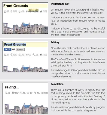
On mouse hover, the background is backlit with yellow. A tool tip invites the user to “Click to edit”.
Invitations attempt to lead the user to the next level of interaction (from mouse hover to mouse click).
Invitations have to be discovered to be useful. Flickr’s bet is that the user will drift his mouse over the title (of his own photo).
Editing
Once the user clicks on the title, it is placed into an edit mode. An edit box is switched into view im-mediately under the title text.
The “Save” and “Cancel” buttons make it clear we are editing the title by providing a familiar interface— the user input form.
A disadvantage to this approach is that the picture gets pushed down to make way for the additional interface elements.
Completion
There are a number of ways to signify that the text is being saved. In this example, the title text is temporarily replaced with the text “saving…”. Upon completion, the new title is shown in the non-editing style.
An alternative approach is to show a busy progress indicator while the change is being made.
Figure 1-2. Flickr provides a straightforward way to edit a photo’s title directly inline
Considerations
The flow is simple. Click on the title to start editing. When you are done, hit the “Save” button, and the title is saved in place. Flickr was one of the first sites to employ this type of in-page editing. As a testament to its usefulness, the interaction style first designed has not changed much over the last few years.
[image:27.504.85.441.69.451.2]Discoverability
Just how discoverable is this feature? In this example, there are a number of cues that in-vite the user to edit. The invitations include:
Showing a tool tip (“Click to edit”) •
Highlighting the background of the editable area in yellow •
Changing the cursor to an edit cursor (I-beam) •
But all these cues display after the user pauses the mouse over the title (mouse hover). Discoverability depends on the user hovering over the title and then noticing these invitations.*
To make the feature more discoverable, invitational cues could be included directly in the page. For example, an “edit” link could be shown along with the title. Clicking the link would trigger editing. By showing the link at all times, the edit feature would be made more discoverable.
But this has to be balanced with how much visual noise the page can accommodate. Each additional link or button makes the page harder to process and can lead to a feature not being utilized due to the sheer volume of features and their hints shown on the page.
Tip
If readability is more important than editability, keep the editing action hidden until the user interacts with the content.
Yahoo! Photos† took this approach for editing titles (Figure 1-3). When showing a group
of photos, it would be visually noisy to display edit links beside each title. Instead, the titles are shown without any editing adornment. As the mouse hovers over a photo title, the text background highlights. Clicking on the title reveals an edit box. Clicking outside of the edit field or tabbing to another title automatically saves the change. This approach reduces the visual noise both during invitation and during editing. The result is a visually uncluttered gallery of photos.
* While the Yahoo! Design Pattern Library (http://developer.yahoo.com/ypatterns/) was being launched, this pattern was not included in the initial set of patterns due to an internal debate over this issue of discoverability. In fact, one of the reviewers, a senior designer and frequent user of Flickr, had only recently discovered the feature. As a result, we withheld the pattern from the public launch.
Single-Field Inline Edit 7
Editing titles in Yahoo! Photos keeps visual clutter to a minimum; it simply turns on a Figure 1-3.
visible edit area during editing
Accessibility
Another concern that arises from inline editing is the lack of accessibility. Accessibility affects a wider range of users than you might first consider. Assistive technologies help those with physical impairments, medical conditions, problems with sight, and many other conditions.
Assistive technologies generally parse the page’s markup to find content, anchors, alter-nate titles for images, and other page structure. If the inline edit feature does not contain explicit markup built into the page (such as an explicit, visible edit link), assistive tech-nologies cannot easily discover the inline edit feature.
In a sense, relying on the mouse to discover features will prevent some users from being able to edit inline. As mentioned before, providing an explicit edit link helps with discov-erability (as shown previously in Figure 1-1). But as a by-product it also makes the feature more accessible.
Tip
Providing an alternative to inline editing by allowing editing on a separate page can improve accessibility.
There is a natural tension between direct interaction and a more indirect, easily accessible flow. It is possible to relieve this tension by providing both approaches in the same inter-face. Flickr actually does this by offering an alternate, separate page for editing (Figure 1-4).
Edit link
Separate page for editing
The “Edit your photo” page provides a standard, form-based interface for editing. Assistive technolo-gies work easily with static pages like this.
Flickr allows you to also
Figure 1-4. edit a photo’s title, description, and tags in a separate page
Multi-Field Inline Edit
In our previous example, a single value was being edited inline. What happens if there are multiple values, or the item being edited is more complex than a string of text and you still would like to edit the values inline?
The pattern Multi-Field Inline Edit describes this approach: editing multiple values inline.
37 Signal’s Backpackit application uses this pattern for editing a note (Figure 1-5). A note consists of a title and its body. For readability, the title is displayed as a header and the body as normal text. During editing, the two values are shown in a form as input text fields with labeled prompts.
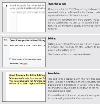
Invitation to edit
Multi-Field Inline Edit 9
Transition to edit
Once you click the “Edit” link, a busy indicator is animated while an edit form for the title and body replaces the textual display of the note.
A slight cross-fade transition and a progress indica-tor are used to cue the user to this switch of con-text. This ties the textual display and the edit form together.
Editing
Editing is very straightforward since it uses a form. It provides the flexibility for other options to be placed in the editing form.
The “Save note”button completes the edit.
Completion
The edit form is replaced with the new title and body. To make it clear that a change occurred, the background is highlighted in yellow. After a few seconds the yellow is faded back down to the nor-mal background color.
Contrast this with Flickr’s technique of showing sta-tus while saving instead of after completion.
Figure 1-5. Backpackit reveals a multi-field form for editing a note’s title and body
Considerations
[image:31.504.85.435.69.432.2]Readability versus editability
Readability is a primary concern during display. But the best way to present editing is with the common input form. The user will need some or all of the following:
Edit controls •
Field prompts •
Help text for user input •
Error handling •
Assistive input (e.g., calendar pop up or drop-down selection field) •
Editing styles (e.g., edit fields with 3D sunken style) •
The edit mode will need to be different in size and layout, as well as in the number and type of components used. This means that moving between modes has the potential to be a disruptive experience.
In our example, the form for editing the note takes up a larger space on the page than when just displaying the note.
Blending display and edit modes
Ideally you would like the two modes to blend together in a seamless manner. Bringing the edit form into the page flow will have an effect on the rest of the page content. One way to smooth out the transition is by a subtle use of animation. Backpackit does this by fading out the display view and fading in the edit view at the same time (see the cross-fade in Figure 1-5).
Another approach is to use the same amount of space for both display and edit modes. In Yahoo! 360, you can set a status message for yourself. Your current status shows up on your 360 home page as a “blast,” represented as a comic book-style word bubble. Visually it looks like a single value, but there are actually three fields to edit: the blast style, the sta-tus, and any web page link you want to provide when the user clicks on your blast. Figure 1-6 shows the blast as it appears before editing.
Yahoo! 360 shows an “Edit Blast” link to invite editing Figure 1-6.
Overlay Edit 11
Figure 1-7. Yahoo! 360 brings the editing into the displayed blast; the difference between display and edit modes is minimized
The size similarity was not an accident. During design there was a concerted effort to make the display mode slightly larger without losing visual integrity, while accommodat-ing the editaccommodat-ing tools in the space of the bubble.
WYSIWYG*
If the two modes (display and editing) are in completely separate spaces, the user may lose a sense of what effect the change will have during display. In Yahoo! 360, you can change the type of bubble and immediately see what it will look like. Switching from a “quote” bubble to a “thought” bubble is reflected while still in editing mode (Figure 1-8). This would not be possible if editing happened in a separate edit form.
Yahoo! 360 immediately displays the new blast type while still in edit mode Figure 1-8.
Overlay Edit
The previous two patterns brought editing inline to the flow of the page. Inline editing keeps the editing in context with the rest of the elements on the page.
Overlay Edit patterns bring the editing form just a layer above the page. While still not leaving the page for editing, it does not attempt to do the editing directly in the flow of the page. Instead a lightweight pop-up layer (e.g., dialog) is used for the editing pane.
There are several reasons for choosing Overlay Edit instead of Inline Edit.
Sometimes you can’t fit a complex edit into the flow of the page. If the editing area is just too large, bringing editing inline can shuffle content around on the page, detracting from the overall experience. A noisy transition from display to edit mode is not desirable.
At other times you might choose to interrupt the flow, especially if the information be-ing edited is important in its own right. Overlays give the user a definite editbe-ing space. A lightweight overlay does this job nicely.*
Tip
An Overlay Edit is a good choice if the editing pane needs dedicated screen space and the context of the page is not important to the editing task.
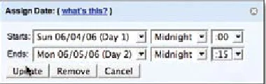
Yahoo! Trip Planner is an online place for creating and sharing trip plans. Trips contain itinerary items that can be scheduled. When scheduled, the itinerary contains the dates the item is scheduled. Each item can be edited in an overlay (Figure 1-9).
Non-editing state
Each itinerary item in Yahoo! Trip Planner can be scheduled.
You can add dates or edit an existing one. The dates scheduled are displayed in a simple read-able format.
Invitation to edit
The “[Edit]”link is the invitation to edit.
It is shown at all times.
Overlay Edit 13
Editing
The edit form is shown in an overlay.
Since scheduling an itinerary item requires several fields of input, the overlay provides a nice place to contain this editing.
Completion
The itinerary item is scheduled after pressing the Update button.
No transitions are used. The presence of the sched-uled date signifies that it has been added.
Yahoo! Trip Planner provides a complex editor in an overlay for scheduling an itinerary Figure 1-9.
item
Considerations
“Sun Jun 4 12:00am—Mon Jun 5 12:00am” is easier to read than a format appropriate for editing (Figure 1-10). Using an editor prevents errors when entering the start and end dates for a specific itinerary item.
[image:35.504.86.443.66.311.2]Yahoo! Trip Planner provides an overlay editor for adjusting itinerary times Figure 1-10.
Since the range of dates is known, Trip Planner uses a series of drop-downs to pick the start and end dates along with the time.
[image:35.504.170.360.429.489.2]Upcoming provides a better experience for choosing time of day Figure 1-11.
The experience of picking a time from a single list (or typing the time in) is more direct than navigating multiple drop-downs.
Why an overlay?
An overlay should be considered when:
The editing module is considerably larger than the display values. •
Opening an area on the page for the editing module would be distracting or push •
important information down the page.
There is concern that the opened information might go partially below the fold. An •
overlay can be positioned to always be visible in the page.
You want to create a clear editing area for the user. •
What you are editing is not frequently edited. Having to click on an edit link, adjust to •
the pop-up location, perform your edit, and close the dialog is a tedious way to edit a series of items. In such cases, opt to either dedicate a space on the page for each item as it is selected, or allow the editing to occur in context to remove some of the time required to deal with an overlay.
What you are editing is a single entity. If you have a series of items, you should not •
Table Edit 15
Best Practices for Inline Edit and Overlay Edit
In-Page Editing provides a nice way to change displayed content and observe the change in context. Here are some best practices to consider:
Keep the editing inline for single fields. •
Use inline when editing one of many in a set. This keeps the context in view. •
Keep the display and editing modes the same size when possible. This will avoid page •
jitter and reduce distraction when moving between the two modes. Make the transition between display and editing as smooth as possible. •
Use mouse hover invitations to indicate editing when readability is primary. •
Avoid using double-click to activate editing. •
Place a bracketed “[edit]” link near the item to be edited if editability is equally important •
or if the quantity of items that can be edited is small. This is a nice way to separate the link from the displayed text without creating visual distractions.
Show the edit in place when editing one item in a series (to preserve context). •
Use an overlay when what is being edited needs careful attention. This removes the likeli-•
hood of accidentally changing a critical value.
Do not use multiple overlays for additional fields. If you have a complex edit for a series of •
elements, use one overlay for all.
When providing an overlay, use the most lightweight style available to reduce the disrup-•
tiveness of the context switch between render and editing state. Use buttons when it might be too subtle to trigger completion implicitly. •
Use explicit buttons for saving and canceling when there is room. •
Whenever possible, allow the overlay to be draggable so that obscured content can be •
revealed as needed.
Table Edit
Editing tables of data is less common in consumer web applications. In enterprise web applications, however, tables reign supreme. The most common request is for the table editing to work like Microsoft Excel, which long ago set the standard for editing data in a grid.
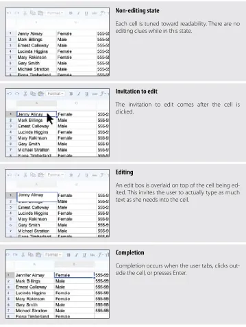
Non-editing state
Each cell is tuned toward readability. There are no editing clues while in this state.
Invitation to edit
The invitation to edit comes after the cell is clicked.
Editing
An edit box is overlaid on top of the cell being ed-ited. This invites the user to actually type as much text as she needs into the cell.
Completion
Completion occurs when the user tabs, clicks out-side the cell, or presses Enter.
[image:38.504.61.420.65.543.2]Editing a spreadsheet in Google Docs is very similar to editing a spreadsheet in Microsoft Figure 1-12.
Table Edit 17
Considerations
Presentation is the primary consideration when displaying a table of data. Editing is sec-ondary. As a result, the editing scaffolding is hidden and only revealed when it’s clear the user wants to edit a cell.
Activation
A single mouse click is required to start editing a cell instead of a mouse hover. This is consistent with keeping the display of the grid uncluttered. Imagine how irritating it would be if every mouse motion revealed an edit box.
Tip
You should generally avoid double-click in web applications. However, when web ap-plications look and behave like desktop apap-plications, double-click can be appropriate.
Rendering versus editing. Google Spreadsheet displays the edit box slightly larger than the cell. This clearly indicates editability and lets the user know that input is not limited to the size of the cell (the edit box actually dynamically resizes as the user types into it). The only is-sue to consider is that the larger edit area covers other table cells. However, this works well in this case since editing is explicitly triggered by a mouse click. If activation had occurred on a mouse hover, the edit mode would have interfered with cell-to-cell navigation.
Best Practices for Table Edit
Here are some best practices for Table Edit:
Bias the display toward readability of the table data. •
Avoid mouse hover for activating cell editing. It makes for the feeling of “mouse traps” and •
makes the interaction noisy.
Activate edit with a single click. While using a double-click may not be totally unexpected •
(since it looks like an Excel spreadsheet), a single click is easier to perform.
Consider allowing extra space during editing either through a drop-down editor or by •
slightly enlarging the edit cell.
As much as possible, mimic the normal conventions of cell navigation that users will al-•
Group Edit
As mentioned before, it is a good idea to keep the differences between the edit mode and the display mode as minimal as possible. In fact, it is a good idea to minimize modes where possible. In honor of this principle, a former manager of mine sported a vanity plate with the phrase “NOMODES”. However, modes cannot be avoided altogether, as they do provide necessary context for completing specific tasks.
If you want to keep the display of items on the page as uncluttered as possible while still supporting editing, consider using a single mechanism to enter a special editing mode:
Group Edit.
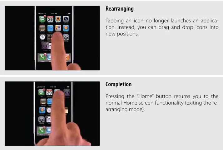
On the iPhone’s home screen, the icons are normally locked down. However, there is a way to switch into a special Group Edit mode that allows you to rearrange the icon’s posi-tions by drag and drop. You enter the mode by pressing down continuously on an icon until the editing mode is turned on (Figure 1-13).
Non-editing state
Tapping icons on the iPhone launches an application.
What we would like is to switch into a mode where we can move the icons around.
Holding down on an icon activates the rearrange mode.
Invitation to rearrange
When the mode is activated, all of the icons begin to wiggle.
Group Edit 19
Rearranging
Tapping an icon no longer launches an applica-tion. Instead, you can drag and drop icons into new positions.
Completion
Pressing the “Home” button returns you to the normal Home screen functionality (exiting the re-arranging mode).
[image:41.504.85.442.68.309.2]The iPhone has a special mode for rearranging applications on the home page—pressing Figure 1-13.
and holding down on an icon places all the applications in “wiggly mode”
Considerations
The Apple technique signifies that we have entered a special editing mode. When the icons become “wiggly,” it is not a large intuitive leap that the icons have become loose and thus we can rearrange them.
Discoverability
Tip
Activation and deactivation should normally follow the same interaction style. This makes it easy to discover the inverse action. This is a principle we call Symmetry of Interaction.
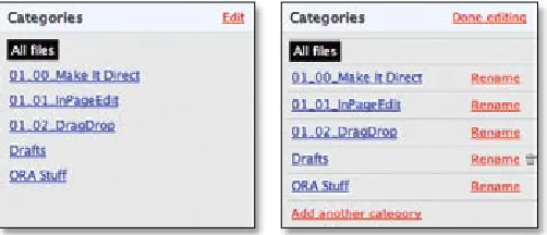
Another example of group editing is in the 37 Signals product, Basecamp (Figure 1-14). When sharing files with Basecamp, you can organize them into various categories. The categories are like folders. Clicking on a category link shows all the files in that “folder.” What if you want to delete a category? Or rename it? At the top of the category section there is a single “Edit” link that turns on editing for the whole area.
[image:42.504.117.368.206.314.2]
37 Signals Basecamp provides a way to toggle a set of items into edit mode Figure 1-14.
Once the Group Edit mode is entered, you can add another category, rename an existing category, or delete empty categories. Notice the “Edit” link toggled to read “Done Editing”. Clicking this link exits the group-editing mode.
Tip
Switching between edit modes should happen instantaneously. There is no point in making the user wait on an animation to finish before he can start editing.
Discoverability versus readability
The advantage of providing a toggling edit mode is that it keeps the display uncluttered with the editing scaffolding. The disadvantage is that it is less discoverable. This tension between discoverability versus readability is common and must be balanced by the needs of the user.
Symmetry of Interaction
Module Configuration 21
Module Configuration
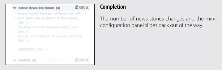
Popular portal sites like Yahoo! and Google’s interactive home page display specific con-tent modules (e.g., Top Stories).
Module Configuration is a common pattern on these types of sites. Instead of modifying modules on a separate page, the sites provide ways to directly configure the amount and type of content that shows in each module. The My Yahoo! home page provides an “Edit” link that allows for Module Configuration (Figure 1-15).
Non-configuration state
A news module contains top news stories. Each mod-ule also has an “Edit” link.
Invitation to configure
The “Edit” link is the invitation to edit.
Activating edit slides in a mini-configuration panel in context with the news stories.
Configuration
Completion
The number of news stories changes and the mini-configuration panel slides back out of the way.
[image:44.504.60.419.71.184.2]Configuring modules on the
Figure 1-15. My Yahoo! page can be done directly in place
Considerations
There are some issues to consider when using Module Configuration.
Visual noise
Putting edit links on each module can be visually noisy. An alternative approach is to use the Group Edit pattern (as we saw in Figure 1-14) to place an edit link at the page level that turns on edit links for each module. When the “Done Editing” link is clicked, the links for each module are hidden. Again the trade-off is between visual noise and discoverability.
Best Practices for Group Edit and Module Configuration
Here are some best practices to keep in mind:
Use an edit toggle when there are a number of items to edit and showing edit scaffolding •
would make the display visually noisy.
Make activation and deactivation as similar as possible (Symmetry of Interaction). Switch-•
ing in and out of an editing mode should operate more like a toggle.
Provide inline edit configuration for modules when configuration is an important feature. •
Provide a way to turn configuration on/off globally for module configuration when this is •
Guidelines for Choosing Specific Editing Patterns 23
Guidelines for Choosing Specific Editing
Patterns
In-Page Edit provides a powerful way to make interfaces direct. Here are some general guidelines to think about when choosing an editing pattern:
Whenever you have a single field on the page that needs editing, consider using the •
Single-Field Inline Edit.
For multiple fields or more
• complex editing, use the Multi-Field Inline Edit. If you don’t need inline context while editing, or the editing is something that de-•
mands the user’s full attention, use Overlay Edit.
For
• grid editing, follow the pattern Table Edit. When dealing with
• multiple items on a page, Group Edit provides a way to balance between visual noise and discoverability.
When providing
• direct configuring to modules, use the Module Configuration
Chapter 2
Drag and Drop
One of the great innovations that the Macintosh brought to the world in 1984 was Drag and Drop. Influenced by the graphical user interface work on Xerox PARC’s Star In-formation System and subsequent lessons learned from the Apple Lisa, the Macintosh team invented drag and drop as an easy way to move, copy, and delete files on the user’s desktop.
It was quite a while before drag and drop made its way to the Web in any serious applica-tion. In 2000, a small startup, HalfBrain,* launched a web-based presentation application,
BrainMatter. It was written entirely in DHTML and used drag and drop as an integral part of its interface.
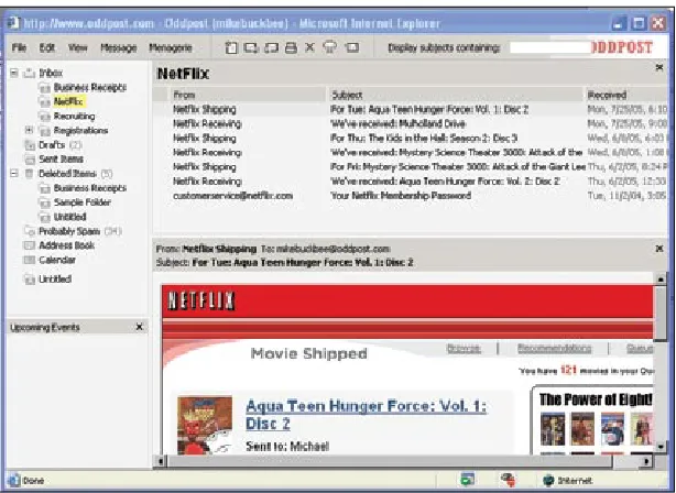
Drag and drop showed up again with another small startup, Oddpost,† when it launched
a web-based mail application (Figure 2-1) that allowed users to drag and drop messages between folders.
* HalfBrain also created a full spreadsheet application written in DHTML prior to this. It included many of the features of Microsoft Excel.
The
Figure 2-1. Oddpost web mail client performed like a desktop mail application and included drag and drop as a key feature
The biggest hindrance was the difficulty in saving the user’s state after a drag was com-pleted without refreshing the page. It was possible, but the underlying technology was not consistent across all browsers. Now that the technologies underlying Ajax* have become
widely known and a full complement of browsers support these techniques, Drag and Drop has become a more familiar idiom on the Web.
Interesting Moments
At first blush, drag and drop seems simple. Just grab an object and drop it somewhere. But, as always, the devil is in the details. There are a number of individual states at which interaction is possible. We call these microstates interesting moments:†
How will users know what is draggable? •
What does it mean to drag and drop an object? •
Where can you drop an object, and where is it not valid to drop an object? •
What visual affordance will be used to indicate draggability? •
* Jesse James Garrett, founder of Adaptive Path, originally defined the term Ajax as “Asynchronous JavaScript and XML.” However, it generally means being able to retrieve information or save state without refreshing the page—an integral ability for any rich interaction.
[image:48.504.87.394.64.288.2]Interesting Moments 27
During drag, how will valid and invalid drop targets be signified? •
Do you drag the actual object? •
Or do you drag just a ghost of the object? •
Or is it a thumbnail representation that gets dragged? •
What visual feedback should be used during the drag and drop interaction? •
What makes it challenging is that there are a lot of events during drag and drop that can be used as opportunities for feedback to the user. Additionally, there are a number of ele-ments on the page that can participate as actors in this feedback loop.
The Events
There are at least 15 events available for cueing the user during a drag and drop interaction:
Page Load
Before any interaction occurs, you can pre-signify the availability of drag and drop. For example, you could display a tip on the page to indicate draggability.
Mouse Hover
The mouse pointer hovers over an object that is draggable.
Mouse Down
The user holds down the mouse button on the draggable object.
Drag Initiated
After the mouse drag starts (usually some threshold—3 pixels).
Drag Leaves Original Location
After the drag object is pulled from its location or object that contains it.
Drag Re-Enters Original Location
When the object re-enters the original location.
Drag Enters Valid Target
Dragging over a valid drop target.
Drag Exits Valid Target
Dragging back out of a valid drop target.
Drag Enters Specific Invalid Target
Dragging over an invalid drop target.
Drag Is Over No Specific Target
Dragging over neither a valid or invalid target. Do you treat all areas outside of valid targets as invalid?
Drag Hovers Over Valid Target
Drag Hovers Over Invalid Target
User pauses over an invalid target without dropping the object. Do you care? Will you want additional feedback as to why it is not a valid target?
Drop Accepted
Drop occurs over a valid target and drop has been accepted.
Drop Rejected
Drop occurs over an invalid target and drop has been rejected. Do you zoom back the dropped object?
Drop on Parent Container
Is the place where the object was dragged from special? Usually this is not the case, but it may carry special meaning in some contexts.
The Actors
During each event you can visually manipulate a number of actors. The page elements available include:
• Page (e.g., static messaging on the page) Cursor
•
Tool Tip •
Drag Object (or some portion of the drag object, e.g., title area of a module) •
Drag Object’s Parent Container •
Drop Target •
Interesting Moments Grid
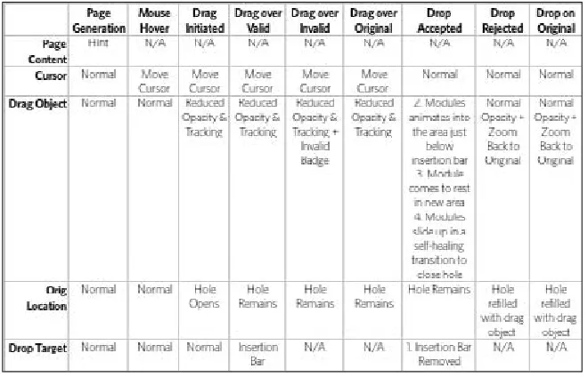
That’s 15 events times 6 actors. That means there are 90 possible interesting moments—each requiring a decision involving an almost unlimited number of style and timing choices.
You can pull all this together into a simple interesting moments grid for Drag and Drop. Figure 2-2 shows an interesting moments grid for My Yahoo!.
Tip
You can use an interesting moments grid to capture any complex interaction.
Purpose of Drag and Drop 29
A simplified interesting moments grid for the original My Yahoo! drag and drop design;
Figure 2-2. * it
provided a way to capture the complexities of drag and drop into a single page
Purpose of Drag and Drop
Drag and drop can be a powerful idiom if used correctly. Specifically it is useful for:
Drag and Drop Module
Rearranging modules on a page.
Drag and Drop List
Rearranging lists.
Drag and Drop Object
Changing relationships between objects.
Drag and Drop Action
Invoking actions on a dropped object.
Drag and Drop Collection
Maintaining collections through drag and drop.
[image:51.504.100.430.66.278.2]Drag and Drop Module
One of the most useful purposes of drag and drop is to allow the user to directly place objects where she wants them on the page. A typical pattern is Drag and Drop Modules
on a page. Netvibes provides a good example of this interaction pattern (Figure 2-3).
Normal display style
Modules are displayed without an explicit cue for drag and drop.
Invitation to drag
Moving the mouse to a module’s header changes the cursor to indicate that the item is draggable.
Dragging
Drag and Drop Module 31
Invitation to drop
Dragging the module opens up a new hole indi-cating where the object will be dropped.
The hole always indicates where the object will go when dropped.
Netvibes allows modules to be arranged directly via drag and drop; the hole cues what will Figure 2-3.
happen when a module is dropped
Considerations
Netvibes allows its modules to be rearranged with drag and drop. A number of interesting moments decide the specific interaction style for this site. Figure 2-4 shows the interesting moments grid for Netvibes.
Interesting moments grid for Netvibes: there are 20 possible moments of interaction; Figure 2-4.
Netvibes specifically handles 9 of these moments
While dragging, it is important to make it clear what will happen when the user drops the dragged object. There are two common approaches to targeting a drop:
Placeholder target •
[image:53.504.86.438.71.189.2] [image:53.504.116.414.306.503.2]Placeholder target
Netvibes uses a placeholder (hole with dashed outline) as the drop target. The idea (il-lustrated in Figure 2-5) is to always position a hole in the spot where the drop would occur. When module 1 starts dragging, it gets “ripped” out of the spot. In its place is the
placeholder target (dashed outline). As 1 gets dragged to the spot between 3 and 4, the
placeholder target jumps to fill in this spot as 4 moves out of the way.
A placeholder target always shows where the dragged module will end after the drop; Figure 2-5.
module 1 is being dragged from the upper right to the position between modules 3 and 4
The hole serves as a placeholder and always marks the spot that the dragged module will land when dropped. It also previews what the page will look like (in relation to the other modules) if the drop occurs there. For module drag and drop, the other modules only slide up or down within a vertical column to make room for the dragged module.
One complaint with using placeholder targets is that the page content jumps around a lot during the drag. This makes the interaction noisier and can make it harder to understand what is actually happening. This issue is compounded when modules look similar. The user starts dragging the modules around and quickly gets confused about what just got moved. One way to resolve this is to provide a quick animated transition as the modules move. It is important, however, that any animated transitions not get in the way of the normal interaction. In Chapter 11, we will discuss timing of transitions in detail.
There is a point in Figure 2-5 where the placeholder shifts to a new location. What deter-mines placeholder targeting? In other words, what deterdeter-mines where the user is intending to place the dragged object? The position of the mouse, the boundary of the dragged ob-ject, and the boundary of the dragged-over object can all be used to choose the module’s new location.
[image:54.504.106.376.157.263.2]Drag and Drop Module 33
In Netvibes, the placeholder changes position only after the dragged module’s title bar has moved beyond the dragged-over module’s title bar. In practice, this means if you are moving a small module to be positioned above a large module, you have to move it to the very top of the large module. In Figure 2-6 you have to drag the small “To Do List” module all the way to the top of the “Blog Directory” module before the placeholder changes position.
In Netvibes, dragging a small module to be placed above a large module requires dragging a Figure 2-6.
large distance; the “To Do List” has to be dragged to the top of the “Blog Directory” module
In contrast, moving the small module below the large module actually requires less drag distance since you only have to get the title bar of the small module below the title bar of the large module (Figure 2-7).
Dragging a small module below a large module requires a smaller drag distance; since the Figure 2-7.
targeting is based on the header of the dragged-over module, the drag distance in this scenario is less than in the previous figure
[image:55.504.139.389.141.285.2] [image:55.504.137.392.378.523.2]The Netvibes approach requires the dragged object’s title to be placed above or below a Figure 2-8.
module before the placement position changes; this results in inconsistent drag distances
A more desirable approach is that taken by iGoogle. Instead of basing the drag on the title bar, iGoogle