Article
Data Display in Qualitative Research
Susana Verdinelli, PsyD
College of Social and Behavioral Sciences Walden University
Minneapolis, Minnesota, United States [email protected]
Norma I. Scagnoli, PhD College of Business
University of Illinois at Urbana-Champaign Champaign, Illinois, United States
© 2013 Verdinelli and Scagnoli.
Abstract
Visual displays help in the presentation of inferences and conclusions and represent ways of organizing, summarizing, simplifying, or transforming data. Data displays such as matrices and networks are often utilized to enhance data analysis and are more commonly seen in quantitative than in qualitative studies. This study reviewed the data displays used by three prestigious qualitative research journals within a period of three years. The findings include the types of displays used in these qualitative journals, the frequency of use, and the
purposes for using visual displays as opposed to presenting data in text.
Keywords: visual display, diagram, matrix, categorization, visualization, qualitative data analysis
Data display has been considered an important step during the qualitative data analysis or the writing up stages (Burke et al., 2005; Coffey & Atkinson, 1996; Dey, 1993; Eisner, 1997; Grbich, 2007; Lofland, Snow, Anderson, & Lofland, 2006; Miles & Huberman, 1994; Radnofsky, 1996; Slone, 2009; Yin, 2011). Data display in a graphic format is a way of portraying information succinctly and efficiently, illustrating details provided in longer textual information. Visual displays provide a multidimensional space to organize data and show connections between different pieces of relevant data (Dey, 1993). A main goal of any diagram is to provide ready access to information and convey a message, a discovery, or a particular perspective on a specific data or topic (Iliinsky, 2010; Lengler & Eppler, 2007). A graphic representation allows the reader to acquire insights, develop an elaborate understanding, or appreciate new knowledge.
Grounded theorists believe that creating visual representations of the emerging theories is an intrinsic and essential step in theory building (Clarke, 2005; Charmaz, 2006; Strauss, 1987; Strauss & Corbin, 1998). This qualitative tradition of inquiry strongly encourages the use of diagrams and figures to synthesize major theoretical concepts and their connections. In qualitative studies, visual displays can be useful and serve several purposes at all stages of analysis, and visual displays, just as with any other form of alternative representation, are used with the purpose of “illuminating rather than obscuring the message” (Eisner, 1997, p. 8). A display may be used to represent exploratory, basic, or initial data, or at the other end of the process of analysis, it could help in showing detailed or causal explanations, and it could even be used as a way of generating research hypotheses and developing theory (Burke et al., 2005; Miles & Huberman, 1994). Therefore, visual displays can be functional in supplementing extended textual passages (e.g., when used to box a significant excerpt of participants’ voices or enlist
participants’ demographic information); in representing a model or links among different key concepts or terms developed in final analysis (e.g., when causal networks or other forms of diagrams represent interrelationships or connections); or in illustrating participatory research and collaborative analysis (e.g., when concept maps are co-generated by subjects and researchers and are used to demonstrate findings). In essence, diagrams not only add life to qualitative data, as Yin (2011) has stated, but they also give readers the possibility of seeing the author’s meaning represented in more ways than just textually.
It has been suggested that to achieve efficiency in helping the reader gain the intended message, a visual display should be as uncomplicated as possible, and it should possess the right balance of important information and minimum detail, avoiding unnecessary off-topic content or
information. Irrelevant data create visual noise, which in turn forces the reader to take a long time to find the essential and meaningful information (Iliinsky, 2010; Morse, 2006). Displays
overburdened with information can become cluttered and inaccessible. Displays with high levels of complexity might overload the reader with information or stimuli; but, too synthetic designs might oversimplify the message. A visual display should eliminate any barrier to the goal of presenting information in a clear and accessible way but yet seek to be engaging and appealing (Dey, 1993).
The display format and shape of the entries may vary considerably and are usually adjusted to the researcher’s needs. In the field of management, a wide variety of graphic displays are commonly used to depict ideas, organize information, reveal an implicit plan, or explain a process. The complexity of a display is a factor to take into account. The amount of relationships and concepts depicted increases the relative complexity. Whereas some displays may require a narrative to support their understanding, others may be more quickly understood without additional
start at any place (Knowlton & Phillips, 2012). Thus, the use of lines, or single- or double-headed arrows, should be carefully used to convey the intended meaning and avoid confusing the reader (Morse, 2006).
The Publication Manual of the American Psychological Association (APA), 6th Edition (American Psychological Association, 2010) described all illustrations other than a table as a figure. Figures included graphs, charts, maps, drawings, and photographs. A broad categorization of figures used with non-quantitative information was grouped under the label of charts. No specific attention was given, however, to the broad spectrum of possible figures used in qualitative research. The definition and in-depth exploration given to quantitative forms of displays in the APA manual is not surprising. The development of visual displays to portray quantitative data has an extensive history that began more than two centuries ago (Tufte, 2001). A core goal of quantitative data display is to provide “a visual one-to-one correspondence of
number to graphical element” (Onwuegbuzie & Dickinson, 2008, p. 204). Statistical graphics are tools for reasoning about quantitative information and provide a means of understanding
causality, showing comparisons, or summarizing a large set of numbers in a coherent way (Tufte, 2006). Although there are some variations, the types and formats of quantitative visual displays are well established; for example, Nicol and Pexman (2010) categorized 11 different kinds of displays: “bar graphs, histograms, line graphs, plots, drawings, combination graphs (which combine graphs or incorporate drawings or photographs with graphs), pie graphs, dendrograms, stem-and-leaf plots, charts, and photographs” (p. 5). In contrast, while sorting through different descriptions of qualitative visual displays we noticed that authors have labeled diagrams in different ways. That is, there was no consistency found in the literature with regards to labeling specific visual displays used in qualitative research. The landmark work of Miles and Huberman (1994) still constitutes to this day the most comprehensive classification system of diagrams and provides the most extensive discussion on this topic.
Although there is an increase in visual display use in qualitative articles (Morse, 2006), scant attention has been paid to the definitions, purposes, effects, and common uses of diagrams in qualitative research publications. Given the potential resource that visual displays provide and considering the underutilization of visual displays in qualitative research (Onwuegbuzie & Dickinson, 2008), the goal of this review was to explore the frequency of use, patterns, purposes, and preferred selected types of data display. We also reviewed the use or nonuse of qualitative data analysis software. Contemporary software supports some innovative means of data display. It is relevant to explore whether there is a link between data display and the use of data analysis software.
We examined the diagrams used in the articles that were published between 2007 and 2009 in the journals Qualitative Health Research (QHR), Qualitative Inquiry (QI), and Qualitative Research
Method
Sample
The sample for this study comprised articles published in three well-known qualitative research journals (QHR, QI, and QR) between 2007 and 2009; those were the most recent issues at the time of data collection. The selection of the sample of articles for this study was done in a three step process. The first step consisted in reviewing all articles and classifying them according to use or nonuse of visuals. The second step was to separate the articles with visual materials that represented data or data analysis from other types of visuals, such as photographs, paper and pencil drawings (i.e., children or adult drawings), and cartography maps. Only visual displays that were data representations were considered because they matched visual displays as defined in this study. Finally, editorial introductions or commentaries were also excluded. A total of 215 articles from the three journals met the criteria to be included in this review.
The three journals were selected because they use qualitative inquiry and use a broad array of methodological approaches. Each of them presents a unique profile and attracts a varied public. The three are published by SAGE Publications, which is one of the largest publishers of qualitative research journals and books.
QHR is an international, interdisciplinary, research-oriented referred journal interested in qualitative methodology that addresses health-related topics. It introduces studies conducted in a wide spectrum of disciplines. QHR mainly publishes empirical field-based studies and theoretical developments. It also includes book reviews, editorials, and commentaries on conceptual and methodological issues pertaining to qualitative research. QHR published 10 issues in 2007 and 12 issues in 2008 and in 2009.
QI is a referred journal focused on methodological issues brought up by qualitative research rather than on the content or results of the research. It is an interdisciplinary journal that presents research from various fields, such as anthropology, communication, cultural studies, education, gerontology, health, psychology, social work, and sociology, among others. It publishes a broad wealth of arts-based studies, including autoethnography, drama, poetry, and self-reflections. QI published 8 issues in 2007 and in 2008 and 10 issues in 2009.
QR is a referred journal oriented to providing a forum for the discussion of qualitative research across the social sciences and cultural studies. It publishes empirical studies as well as articles raising philosophical, theoretical, historical, or ideological debates about qualitative research. QR published 4 issues in 2007 and 5 issues in 2008 and in 2009.
Data Analysis
To reach the stated review goals, the selected articles included in this study were grouped according to year of publication, types of visual displays and purposes for using them, and use or nonuse of qualitative data analysis software. Standard Microsoft Office software, such as Excel, was used to organize and save this information, and social media and collaboration tools were used to share information and work on data analysis. A description of the analysis is as follows:
1. The authors examined the presence or absence of visual displays in the three journals for the period 2007-2009.
2. Based on the literature, definitions, and current conceptualizations of visual displays (Coffey & Atkinson, 1996; Dey, 1993; Eisner, 1997; Grbich, 2007; Lofland et al., 2006; Miles & Huberman, 1994; Radnofsky, 1996; Slone, 2009; Yin, 2011), the diagrams presented in the articles were classified and defined according to their format and purposes. There was a recurrent comparison and re-classification of displays as our analysis progressed.
3. A final rubric with definitions for displays that appeared in these three journals was gradually created, reviewed, and refined.
4. Lastly, the authors identified the use or nonuse of qualitative data analysis software.
Results
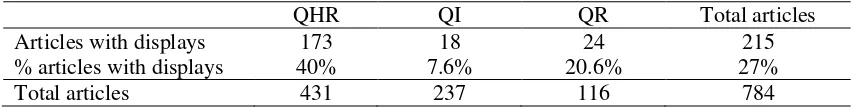
Out of the 784 articles reviewed, only 27% used some type of data display (see Table 1). QHR published 431 articles during the years 2007-2009, QI published 237, and QR published 116. It was found that QHR, QI, and QR published 173, 18, and 24 articles with displays, respectively, within that timeframe.
Table 1
Comparison Between Articles Analyzed and Articles that Included a Visual Display Per Journal
QHR QI QR Total articles
Articles with displays 173 18 24 215
% articles with displays 40% 7.6% 20.6% 27%
Total articles 431 237 116 784
Types of Visual Displays
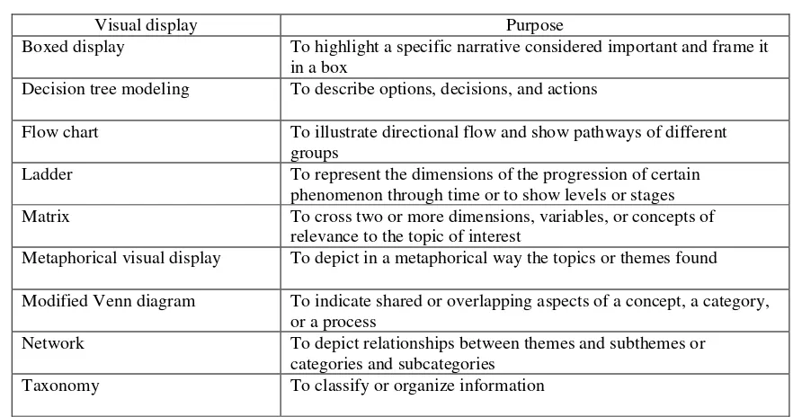
Table 2
Types of Visual Displays and Purposes
Visual display Purpose
Boxed display To highlight a specific narrative considered important and frame it in a box
Decision tree modeling To describe options, decisions, and actions
Flow chart To illustrate directional flow and show pathways of different
groups
Ladder To represent the dimensions of the progression of certain
phenomenon through time or to show levels or stages
Matrix To cross two or more dimensions, variables, or concepts of
relevance to the topic of interest
Metaphorical visual display To depict in a metaphorical way the topics or themes found
Modified Venn diagram To indicate shared or overlapping aspects of a concept, a category, or a process
Network To depict relationships between themes and subthemes or
categories and subcategories
Taxonomy To classify or organize information
Boxed display.
This is, literally, text framed within a box. Researchers used this type of display to highlight a specific narrative considered important enough to extract from the text and frame in a box. It emphasizes the authors’ interests or points of relevance. Boxed displays stand out and are, by far, the simplest form of display. In conducting this review we found that most boxed displays kept the white background color of the article, but some backgrounds were shaded, such as in the case selected (see Figure 1). In the article from which the following example was extracted, Lingard, Schryer, Spafford, and Campbell (2007) used four boxed displays to report their personal
accounts and reflections about the research they were conducting. As a result, this type of display helped them separate the more extensive theoretical conceptualization represented in text format from their personal narratives framed in boxed displays.
Figure 1. Example of a boxed display. Adapted from “Negotiating the Politics of Identity in an
Interdisciplinary Research Team,” by L. Lingard, C. F. Schryer, M. M. Spafford, and S. L. Campbell, 2007,
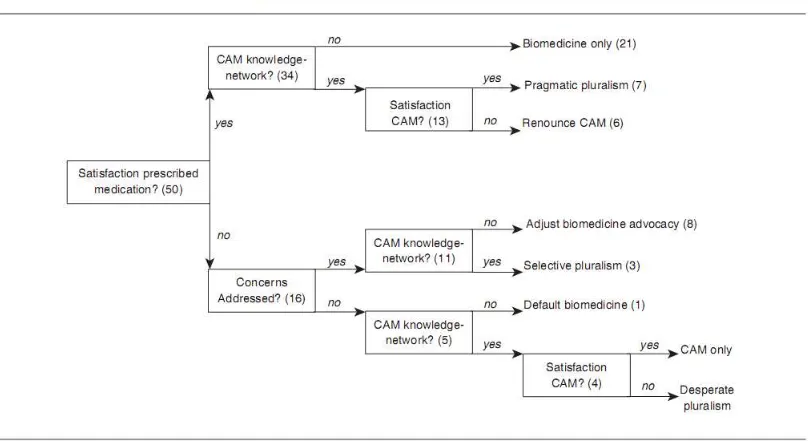
Decision tree modeling.
Gladwin portrayed decision tree modeling as “a way to ground a description of real-world decisions and actions coherently by using multiple examples” (as cited in Miles & Huberman, 1994, p. 186). The beginning or top decision tree modeling usually shows the choice alternatives; the middle shows the decision criteria; and the bottom shows the decision outcome (Miles & Huberman, 1994). In the following example, Freidin (2008) used a display to represent the treatment patterns for complementary and alternative asthma treatments (see Figure 2).
Figure 2. Example of a decision tree modeling. Adapted from “Complementary and Alternative Medicine
for Children’s Asthma: Satisfaction, Care Provider Responsiveness, and Networks of Care,” by B. Freidin, 2008, Qualitative Health Research, 18(1), p. 47. Copyright 2008 by Sage Publications. Reprinted with permission.
Flow chart.
In flow charts, key concepts or terms are arranged “in terms of their relationships through time or in a process rather than as static entities” (Lofland et al., 2006, p. 216). Flow charts usually indicate the alternative paths that different participants follow in a specific process. They depict a stream and they are useful in portraying different routes of action. Data are represented using different symbols (e.g., circles, ovals, rectangles, etc.) and arrows are used to connect and/or show direction of flow. A flow chart may take different forms, but its main characteristic is that it represents pathways, trajectories, and processes.
Figure3. Example of a flow chart. Adapted from “Storying Childhood Sexual Abuse,” C. B. Draucker and D. S. Martsolf, 2008, Qualitative Health Research, 18(8), p. 1039. Copyright 2008 by Sage Publications. Reprinted with permission.
The ladder or step-by-step process.
This diagram represents the dimensions of the progression of certain phenomenon through time. The ladder shows the different phases or steps that participants experience under certain
circumstances. The representation of the steps indicates a leap or change in the process of acquiring something. Similar to flow charts, ladders indicate the progression of a process, but the ladder, in addition, indicates the level of change. Each step in a ladder represents the basis for the next step. Whereas flow charts or networks indicate loops or cycles of processes or experiences, ladders are unidirectional. No formal definition has been given for this type of diagram in the literature. In their book, Miles and Huberman (1994) presented a diagram that they labeled as a “ladder of abstraction,” in which a step by step analytical progress from data to abstraction was depicted.
In the following example, Eriksson, Starrin, and Janson (2008) studied what caused job burnout that led to long term sickness absence (see Figure 4). The authors presented their findings as a ladder with eight steps that denoted the process of emotional deprivation that participants
common or known symbol to visually highlight what is represented. In this case, the use of stairs visually informs the reader that there is an ascending or progressing upward path.
Figure4. Example of a ladder. Adapted from “Long-Term Sickness Absence Due to Burnout: Absentees’
Experiences,” by U. Eriksson, B. Starrin, and S. Janson, 2008, Qualitative Health Research, 18(5), p. 623. Copyright 2008 by Sage Publications. Reprinted with permission.
Matrix.
Matrices are tables based on a “cross-classification of two or more dimensions, variables, or concepts of relevance to the topic or topics of interest” (Lofland et al., 2006, p. 214). Matrices, or tables, are widely used with a variety of purposes that range from enlisting demographic
information to the complex illustration of results.
Figure5. Example of a matrix. Adapted from “Discourse Tracing as Qualitative Practice,” by M. LeGreco and S. J. Tracy, 2009, Qualitative Inquiry, 15(9), p. 1523. Copyright 2009 by Sage Publications. Reprinted with permission.
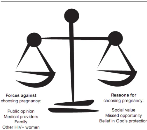
Metaphorical visual display.
This type of display depicts in a metaphorical and, at times, poetic way the nature of the topics or themes found. Metaphorical visual displays represent findings and results by means of a common or consensual sign or symbol embedded in the culture. According to Lengler and Eppler (2007), metaphor visualizations convey complex insights using simple and common templates. These displays have the peculiarity of serving two functions or using two layers of representation. On one level they present the information graphically in a structured and organized way, but in addition, the key features of the metaphor are used to convey a second level of representation, which provides insight or implicit knowledge about the represented information. Similar to networks, metaphorical visual displays illustrate models, theories, or frameworks and represent the connection between themes and subthemes.
Figure 6. Example of a metaphorical visual display. Adapted from “Reproductive Decisions for Women with HIV: Motherhood’s Role in Envisioning a Future,” by D. Barnes and S. Murphy, 2009, Qualitative
Health Research, 19(4), p. 485. Copyright 2009 by Sage Publications. Reprinted with permission.
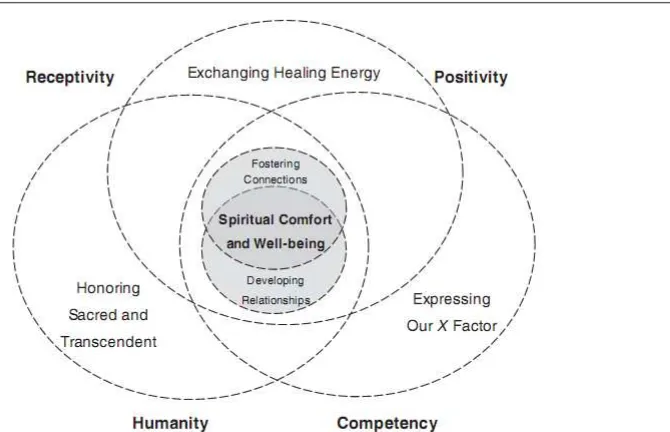
Modified Venn diagram.
John Venn created this type of diagram around 1880 to show all possible relations among groups of things. It consists of overlapping circles with intersections that represent common areas between them (Baron, 1969). Qualitative research articles usually employ a modified version of a Venn diagram to display shared aspects of a concept, a category, or a process. Venn diagrams have also been used to depict a model or conceptual framework.
In the following example, Carr (2008) explored the importance of spiritual nursing care (see Figure 7). The author used a modified Venn diagram to depict the central processes,
Figure 7. Example of a modified Venn diagram. Adapted from “Mapping the Processes and Qualities of Spiritual Nursing Care,” by T. Carr, 2008, Qualitative Health Research, 18(5), p. 696. Copyright 2008 by Sage Publications. Reprinted with permission.
Network.
A network is defined as a “collection of ‘nodes’ or points connected by lines (‘links’)” (Miles & Huberman, 1994, p. 94). Networks allow the focus to be on many variables at a time. In
qualitative studies, networks are commonly used to show frameworks, models, or theories that indicate findings about the phenomenon under study. Network displays show results or
conceptual analysis, and they help to portray the connection or relationship among the theoretical aspects under study. In addition, this type of display illustrates the links between the themes and their categories and subcategories. In the following example, Cheyney (2008) used a network to represent the relationship that existed among the three main and dominant themes that emerged from the data and the relationships among them (see Figure 8).
Figure8. Example of a network. Adapted from “Homebirth as Systems-Challenging Praxis: Knowledge, Power, and Intimacy in the Birthplace,” by M. J. Cheyney, 2008, Qualitative Health Research, 18(2), p. 257. Copyright 2008 by Sage Publications. Reprinted with permission.
Taxonomy.
A taxonomy is a classification organized in a hierarchical structure, ordered by supertype-subtype relationships. The subtype retains all the properties of the supertype, with an additional property or constraint. For example, a rose is a type of flower; thus, every rose is a flower, but not every flower is a rose. Spradley (1980) developed a taxonomic analysis which indicated how a domain is organized and how actors, objects, activities—components—of any system are related to one another. In our review, it was found that taxonomies represent different types of classification and are used to classify or organize information. Authors used taxonomies to illustrate the
Figure 9. Example of a taxonomy. Adapted from “Developing a Theory from Complexity: Reflections on a Collaborative Mixed Method Participatory Action Research Study,” by A. Westhues, J. Ochocka, N. Jacobson, L. Simich, S. Maiter, R. Janzen, and A. Fleras, 2008, Qualitative Health Research, 18(5), p. 703. Copyright 2008 by Sage Publications. Reprinted with permission.
Frequency of Use
We found that the most frequently used visual displays across the three journals were matrices, followed by networks, flowcharts, and boxes (see Table 3). The rest of the displays were also present but with less frequency. It was not uncommon to find that a single article used more than one display. There were a total of 377 displays used in the 215 articles.
Table 3
Frequency of Use of the Different Types of Data Displays Across Journals
Type of display Frequency of use Percentage
Matrix 227 60.2 %
Network 48 12.7 %
Flow chart 35 9.2 %
Boxed display 29 7.7 %
Modified Venn diagram 17 4.5 %
Taxonomy 8 2.1 %
Ladder 6 1.6 %
Metaphorical visual display 4 1.1 %
Decision tree modeling 3 0.8 %
In observing patterns of use across the three journals it was noted that displays such as ladder, metaphorical visual display, and taxonomy were only used in QHR (see Table 4). QI authors used four types of displays, and the most commonly used were matrices and boxes, which were also the most commonly used by authors in QR.
Table 4
Use of the Different Types of Data Displays Per Journal
Type of display Journal Total
QHR QI QR
The frequency of display use of each journal across the three years surveyed kept a similar tendency (see Table 5).
Table 5
Total Use of Displays by Year and Journal
Year Journal Total
The exploration of the use of displays of each journal during each year indicated that QI significantly increased the number of articles that used visual displays (see Table 6). It is important to mention, however, that during 2009 this journal published two more issues than in their previous two years.
Table 6
Number of Articles that Used Displays by Year and Journal
Year Journal Total
QHR QI QR
2007 49 4 10 63
2008 65 5 6 76
Most Commonly Used Display and Purpose of Use
Results indicated that the most commonly used display is the matrix, accounting for almost 60% of total display use. The matrix seems to be the most adaptable and resourceful of all the types of displays, and it was used to represent different aspects of a study. Whereas networks or flow charts were regularly found under the results section of a published article, matrices could be found in any section of an article. As a result, a closer look at the use of matrices during the year 2007 in QHR was conducted to explore its use in more detail. The frequency of and purposes for using matrices were classified according to the main four sections of an empirical article: Introduction and/or Literature Review, Method, Results/Findings, and Discussion (see Table 7). During the year 2007, 25 articles used at least one matrix. Some articles used more than one matrix, adding up to four matrices in a single article. A total of 49 matrices were found in QHR in 2007 and were classified. Theoretical articles were not included in this matrix review as they did not follow the same standard division of sections as empirical articles.
The examination of the purposes for using matrices in QHR in 2007 revealed that most of them were used in the Results/Findings section, which also tended to be the longest section in any qualitative article. The most common use of matrices in the Results/Findings section was to compare participants’ experiences or phenomenon that happened before and after an event, or to group participants’ responses. In addition, matrices were used to compare and contrast groups of participants who experienced a phenomenon or occurrences of a phenomenon expressed in numbers or percentages. In this section, matrices were also used to present
categories/subcategories, themes, dimensions, phases, or core variables of the topic investigated, with their definitions or characteristics and/or with participants’ excerpts, quotations, or vignettes. In some cases, the matrix provided both the definition of the themes and the vignettes that
emerged from the data collected.
Table 7
Purpose and Frequency of Matrix Use in QHR During the Year 2007
Section Subsections Purposes Count % per
section
Introduction Define relevant concepts of the topic explored
2 4%
Method Participants Indicate participants’ characteristics, profiles,
issues, or choices 10
31% Instruments Show the interview guide, and indicate the
general focus of the interviews or some form of triggering stimulus for participants
4
Data Analysis Depiction of steps for data analysis
1
Results/ Findings
Enlist categories/subcategories, themes, dimensions, phases, or core variables found in the topic explored
b) results expressed in terms of numbers and/or percentages, like occurrences of a phenomenon or comparison of groups of participants who experienced a phenomenon
24
Enlist definitions provided by different authors
about one concept 1
Discussion Depict results and make hypothesis or
interpretations 1
4% Enlist definitions provided by different authors
about one concept 1
Total 49 100%
Results on the Use of Computer Assisted Qualitative Data Analysis Software (CAQDAS)
retrieval software with limitations if compared to any of the more popular software; MAXQDA, a strong package for supporting interrelationships among data and memo (Kus Saillard, 2011); and WinMAX and Qualitative Media Analyzer, two applications created to handle mostly data contained in simulations, animation, audio, or video. It is relevant to mention that CAQDAS support the creation of visual representations to portray qualitative results.
Out of the 152 empirical articles with visual displays published in QHR, 49 reported using some type of CAQDAS to process and analyze data. The most common were NVivo (17), ATLAS.ti (15), NUDIST (8), and Ethnograph (6), and the other less common were WinMAX (1),
MAXQDA2 (1), and Qualitative Media Analyzer (1). Only one study published in QR during the analyzed period reported using CAQDAS, specifically ATLAS.ti, and none of the empirical articles published in QI reported using qualitative software. Whether or not authors used CAQDAS to aid them in the development of a visual display is unknown because this was not reported in the articles.
Conclusions
This research study revealed that although visual displays have been used for diverse purposes and have been included in different sections in qualitative research papers, they are underutilized in publications in qualitative research. Our review of published articles during the years 2007-2009 in three valued qualitative journals indicated that less than one third of the journal articles in that period used some form of visual display. Displays have been used for various reasons, such as for the representation of emerging theories, models, or conceptual frameworks; presentation of themes and categories; highlighting of content; display of demographic information or sampling procedures; contrasting or comparing of data sets; and demonstration of the flow or pathways of participants’ experiences, among other uses. They were frequently placed in the Results/Findings section of the articles, but we observed some in other sections of the articles as well. We believe that there is a need to keep expanding the area of visual displays in qualitative research. Like Onwuegbuzie and Dickinson (2008), we support the use of diagrams and visual aids in qualitative research and consider that they are underutilized. As indicated by our own research, we can say that the use of visual displays is also underdeveloped.
Although contemporary society is increasingly moving to more visual forms of communication, our results indicated that this increase is not reflected in articles in qualitative research. Possibly the strict rules about the physical space that a journal article will take in print, or the learning curve involved in using technology tools, are some of the reasons that prevent the development of visual displays. We expect that with the consequent proliferation of online journals and other digital publications, visual displays will be more widely used, giving “the viewer the greatest number of ideas in the shortest time with the least ink in the smallest space” (Tufte, 2001, p. 51).
We also expect that theory and practice related to visual displays will be included in preparation of future qualitative researchers. A review of a sample of courses in qualitative research indicated that the use of visual displays, or related literature, was not listed in any syllabi of psychology graduate-level courses in qualitative methods in 20 United States syllabi and one Canadian syllabus reviewed. A discussion of the use of CAQDAS was only included in two syllabi (Verdinelli & Scagnoli, 2010). None of the scant literature on qualitative visual displays was listed on the reviewed syllabi, which also shows that the area is underutilized and
underdeveloped.
classification that will serve as a blueprint to identify the types of displays used in qualitative research, thus expanding and detailing the diverse types, uses, and capabilities of visual displays. Nine different types of visual displays were found, and the matrix was the most widely used. It proved to be the most versatile type as it could be found in any section of an article, from the Introduction to the Results/Findings and even in the Discussion section. Decision tree modeling and metaphorical visual display were the types of displays used least. Only four metaphorical visual displays were used in QHR and none in QI or QR. Although using metaphors might certainly not apply to every study, the authors found metaphors visually attractive and pleasantly surprising. The use of a metaphorical visual display could strengthen the message and has the potential of being easily remembered because it engages the reader through visual information and implicit knowledge, which connects to a reader’s experience.
Similar to previous findings, results indicated that the use of CAQDAS is relatively low (Shin, Kim, & Chung, 2009). The articles reviewed did not specify if the displays used were
preformatted or designed with the aid of CAQDAS. It was estimated that the increase in the use of this type of software would eventually lead to the use of more displays (Morse, 2006).
References
American Psychological Association. (2010). Publication manual of the American Psychological Association (6th ed.). Washington, DC: American Psychological Association.
Barnes, D., & Murphy, S. (2009). Reproductive decisions for women with HIV: Motherhood’s role in envisioning a future. Qualitative Health Research, 19(4), 481–491.
Baron, M. E. (1969). A note on the historical development of logic diagrams: Leibniz, Euler and Venn. The Mathematical Gazette, 53(384), 113–125. doi:10.2307/3614533
Burke, J. G., O’Campo, P., Peak, G. L., Gielen, A. C., McDonnell, K. A., & Trochim, W. M. K. (2005). An introduction to concept mapping as a participatory public health research method. Qualitative Health Research, 15(10), 1392–1410.
Carr, T. (2008). Mapping the processes and qualities of spiritual nursing care. Qualitative Health Research, 18(5), 686–700.
Clarke, A. E. (2005). Situational analysis: Grounded theory after the postmodern turn. Thousand Oaks, CA: Sage.
Charmaz, K. (2006). Constructing grounded theory. London, United Kingdom: Sage.
Cheyney, M. J. (2008). Homebirth as systems-challenging praxis: Knowledge, power, and intimacy in the birthplace. Qualitative Health Research, 18(2), 254–267.
Coffey, A., & Atkinson, P. (1996). Making sense of qualitative data analysis: Complementary strategies. Thousand Oaks, CA: Sage.
Dey, I. (1993). Qualitative data analysis: A user-friendly guide for social scientists. London, United Kingdom: Routledge.
Draucker, C. B., & Martsolf, D. S. (2008). Storying childhood sexual abuse. Qualitative Health Research, 18(8), 1034–1048.
Eisner, E. W. (1997). The promise and perils of alternative forms of data representation.
Educational Researcher, 26(6), 4–10.
Eriksson, U., Starrin, B., & Janson, S. (2008). Long-term sickness absence due to burnout: Absentees’ experiences. Qualitative Health Research, 18(5), 620–632.
Freidin, B. (2008). Complementary and alternative medicine for children’s asthma: Satisfaction, care provider responsiveness, and networks of care. Qualitative Health Research, 18(1), 43–55.
Grbich, C. (2007). Qualitative data analysis: An introduction. London, United Kingdom: Sage.
Knowlton, L., & Phillips, C. (2012). The logic model guidebook: Better strategies for great results. Thousand Oaks, CA: Sage.
Kuş Saillard, E. (2011). Systematic versus interpretive analysis with two CAQDAS packages: NVivo and MAXQDA. Forum: Qualitative Social Research, 12(1). Retrieved from http://nbn-resolving.de/urn:nbn:de:0114-fqs1101345
LeGreco, M., & Tracy, S. J. (2009). Discourse tracing as qualitative practice. Qualitative Inquiry, 15(9), 1516–1543.
Lengler, R., & Eppler, M. (2007). Towards a periodic table of visualization methods for
management. IASTED Proceedings of the Conference on Graphics and Visualization in Engineering, Clearwater, FL, USA. Retrieved from
http://www.visual-literacy.org/periodic_table/periodic_table.pdf
Lewis, R. B. (1998). ATLAS/ti and NUD•IST: A comparative review of two leading qualitative data analysis packages. Cultural Anthropology Methods, 10, 41–47.
Lewis R. B. (2004). NVivo 2.0 and ATLAS/ti 5.0: A comparative review of two popular qualitative data-analysis programs. Field Methods, 16(4), 439–469.
Lingard, L., Schryer, C. F., Spafford, M. M., & Campbell, S. L. (2007). Negotiating the politics of identity in an interdisciplinary research team. Qualitative Research, 7(4), 501–519.
Lofland, J., Snow, D., Anderson, L., & Lofland, L. (2006). Analyzing social settings. A guide to qualitative observation and analysis. Belmont, CA: Wadsworth/Thomson Learning.
Miles, M. B., & Huberman, A. M. (1994). Qualitative data analysis. Thousand Oaks, CA: Sage.
Morse, J. (2006). Diagramming qualitative theories. Qualitative Health Research, 16(9), 1163– 1164.
Nicol, A., & Pexman, P. (2010). Displaying your findings: A practical guide for creating figures, posters, and presentations. Washington, DC: American Psychological Association.
Onwuegbuzie, A., & Dickinson, W. (2008). Mixed methods analysis and information visualization: Graphical display for effective communication of research results. The Qualitative Report, 13(2), 204–225.
Radnofsky, M. L. (1996). Qualitative models: Visually representing complex data in an image/text balance. Qualitative Inquiry, 2(4), 385–410.
Shin, K. R., Kim, M. Y., & Chung, S. E. (2009). Methods and strategies utilized in published qualitative research. Qualitative Health Research, 19(6), 850–858.
Slone, D. J. (2009). Visualizing qualitative information. The Qualitative Report, 14(3), 489–497.
Strauss, A. L. (1987). Qualitative analysis for social scientists. New York, NY: Cambridge University Press.
Strauss, A., & Corbin, J. (1998). Basics of qualitative research: Techniques and procedures for developing grounded theory (2nd ed.). Thousand Oaks, CA: Sage.
Tufte, E. R. (2001). The visual display of quantitative information. Cheshire, CT: Graphics Press.
Tufte, E. R. (2006). Beautiful evidence. Cheshire, CT: Graphics Press.
Verdinelli, S., & Scagnoli, N. (2010, May). A review of syllabi for a sample of qualitative research methods courses in psychology. Poster presented at The Sixth International Congress of Qualitative Inquiry, Urbana-Champaign, IL, USA.
Westhues, A., Ochocka, J., Jacobson, N., Simich, L., Maiter, S., Janzen, R., & Fleras, A. (2008). Developing a theory from complexity: Reflections on a collaborative mixed method participatory action research study. Qualitative Health Research, 18(5), 701–717.
List of Figures
Figure 1. Example of a boxed display. Adapted from “Negotiating the Politics of Identity in an
Interdisciplinary Research Team,” by L. Lingard, C. F. Schryer, M. M. Spafford, and S. L. Campbell, 2007, Qualitative Research, 7(4), p. 512. Copyright 2007 by Sage
Publications. Reprinted with permission.
Figure 2. Example of a decision tree modeling. Adapted from “Complementary and Alternative Medicine for Children’s Asthma: Satisfaction, Care Provider Responsiveness, and Networks of Care,” by B. Freidin, 2008, Qualitative Health Research, 18(1), p. 47. Copyright 2008 by Sage Publications. Reprinted with permission.
Figure3. Example of a flow chart. Adapted from “Storying Childhood Sexual Abuse,” by C. B. Draucker and D. S. Martsolf, 2008, Qualitative Health Research, 18(8), p. 1039. Copyright 2008 by Sage Publications. Reprinted with permission.
Figure4. Example of a ladder. Adapted from “Long-Term Sickness Absence Due to Burnout: Absentees’ Experiences,” by U. Eriksson, B. Starrin, and S. Janson, 2008, Qualitative Health Research, 18(5), p. 623. Copyright 2008 by Sage Publications. Reprinted with permission.
Figure5. Example of a matrix. Adapted from “Discourse Tracing as Qualitative Practice,” by M. LeGreco and S. J. Tracy, 2009, Qualitative Inquiry, 15(9), p. 1523. Copyright 2009 by Sage Publications. Reprinted with permission.
Figure 6. Example of a metaphorical visual display. Adapted from “Reproductive Decisions for Women with HIV: Motherhood’s Role in Envisioning a Future,” by D. Barnes and S. Murphy, 2009, Qualitative Health Research, 19(4), p. 485. Copyright 2009 by Sage Publications. Reprinted with permission.
Figure 7. Example of a modified Venn diagram. Adapted from “Mapping the Processes and Qualities of Spiritual Nursing Care,” by T. Carr, 2008, Qualitative Health Research, 18(5), p. 696. Copyright 2008 by Sage Publications. Reprinted with permission.
Figure8. Example of a network. Adapted from “Homebirth as Systems-Challenging Praxis: Knowledge, Power, and Intimacy in the Birthplace,” by M. J. Cheyney, 2008,
Qualitative Health Research, 18(2), p. 257. Copyright 2008 by Sage Publications. Reprinted with permission.
Figure9. Example of a taxonomy. Adapted from “Developing a Theory from Complexity: