Eric A. Meyer
CSS Text by Eric A. Meyer
Copyright © 2013 O’Reilly Media. All rights reserved.
Printed in the United States of America.
Published by O’Reilly Media, Inc., 1005 Gravenstein Highway North, Sebastopol, CA 95472.
O’Reilly books may be purchased for educational, business, or sales promotional use. Online editions are also available for most titles (http://my.safaribooksonline.com). For more information, contact our corporate/ institutional sales department: 800-998-9938 or [email protected].
Editors: Simon St. Laurent and Meghan Blanchette Production Editor: Kara Ebrahim
Revision History for the First Edition:
2013-08-21: First release
See http://oreilly.com/catalog/errata.csp?isbn=9781449373740 for release details.
Nutshell Handbook, the Nutshell Handbook logo, and the O’Reilly logo are registered trademarks of O’Reilly Media, Inc. CSS Text, the image of salmon, and related trade dress are trademarks of O’Reilly Media, Inc.
Many of the designations used by manufacturers and sellers to distinguish their products are claimed as trademarks. Where those designations appear in this book, and O’Reilly Media, Inc., was aware of a trade‐ mark claim, the designations have been printed in caps or initial caps.
While every precaution has been taken in the preparation of this book, the publisher and author assume no responsibility for errors or omissions, or for damages resulting from the use of the information contained herein.
ISBN: 978-1-449-37374-0
Table of Contents
Preface. . . v
Text Properties. . . 1
Indentation and Horizontal Alignment 1
Indenting Text 1
Horizontal Alignment 4
Aligning the Last Line 9
Vertical Alignment 10
The Height of Lines 10
Vertically Aligning Text 14
Word Spacing and Letter Spacing 20
Word Spacing 20
Letter Spacing 22
Spacing and Alignment 23
Text Transformation 24
Text Decoration 26
Weird Decorations 28
Text Rendering 31
Text Shadows 32
Handling White Space 34
Setting Tab Sizes 37
Wrapping and Hyphenation 38
Wrapping Text 43
Text Direction 44
Preface
Conventions Used in This Book
The following typographical conventions are used in this book: Italic
Indicates new terms, URLs, email addresses, filenames, and file extensions.
Constant width
Used for program listings, as well as within paragraphs to refer to program elements such as variable or function names, databases, data types, environment variables, statements, and keywords.
Constant width bold
Shows commands or other text that should be typed literally by the user.
Constant width italic
Shows text that should be replaced with user-supplied values or by values deter‐ mined by context.
This icon signifies a tip, suggestion, or general note.
Safari® Books Online
Safari Books Online (www.safaribooksonline.com) is an
on-demand digital library that delivers expert content in both book and
video form from the world’s leading authors in technology and busi‐ ness.
Technology professionals, software developers, web designers, and business and crea‐ tive professionals use Safari Books Online as their primary resource for research, prob‐ lem solving, learning, and certification training.
Safari Books Online offers a range of product mixes and pricing programs for organi‐
zations, government agencies, and individuals. Subscribers have access to thousands of books, training videos, and prepublication manuscripts in one fully searchable database from publishers like O’Reilly Media, Prentice Hall Professional, Addison-Wesley Pro‐ fessional, Microsoft Press, Sams, Que, Peachpit Press, Focal Press, Cisco Press, John Wiley & Sons, Syngress, Morgan Kaufmann, IBM Redbooks, Packt, Adobe Press, FT Press, Apress, Manning, New Riders, McGraw-Hill, Jones & Bartlett, Course Technol‐
ogy, and dozens more. For more information about Safari Books Online, please visit us
online.
How to Contact Us
Please address comments and questions concerning this book to the publisher:
O’Reilly Media, Inc.
1005 Gravenstein Highway North Sebastopol, CA 95472
800-998-9938 (in the United States or Canada) 707-829-0515 (international or local)
707-829-0104 (fax)
We have a web page for this book, where we list errata, examples, and any additional information. You can access this page at http://oreil.ly/csstext-meyer.
To comment or ask technical questions about this book, send email to bookques [email protected].
For more information about our books, courses, conferences, and news, see our website at http://www.oreilly.com.
Find us on Facebook: http://facebook.com/oreilly
Follow us on Twitter: http://twitter.com/oreillymedia
Text Properties
Sure, a lot of web design involves picking the right colors and getting the coolest look for your pages, but when it comes right down to it, you probably spend more of your time worrying about where text will go and how it will look. Such concerns gave rise to
HTML tags such as <FONT> and <CENTER>, which allow you some measure of control
over the appearance and placement of text.
Because text is so important, there are many CSS properties that affect it in one way or another. What is the difference between text and fonts? Simply, text is the content, and fonts are used to display that content. Using text properties, you can affect the position of text in relation to the rest of the line, superscript it, underline it, and change the capitalization. You can even simulate, to a limited degree, the use of a typewriter’s Tab key.
Indentation and Horizontal Alignment
Let’s start with a discussion of how you can affect the horizontal positioning of text within a line. Think of these basic actions as the same types of steps you might take to create a newsletter or write a report.
Indenting Text
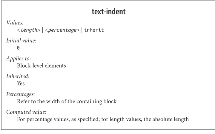
Indenting the first line of a paragraph on a web page is one of the most sought-after text-formatting effects. (Eliminating the blank line between paragraphs is a close sec‐ ond.) Some sites used to create the illusion of indented text by placing a small transparent image before the first letter in a paragraph, which shoves the text over. Thanks to CSS,
text-indent
Values:
<length> | <percentage> | inherit
Initial value: 0
Applies to:
Block-level elements
Inherited: Yes
Percentages:
Refer to the width of the containing block
Computed value:
For percentage values, as specified; for length values, the absolute length
Using text-indent, the first line of any element can be indented by a given length—
even if that length is negative. The most common use for this property is, of course, to indent the first line of a paragraph:
p {text-indent: 3em;}
This rule will cause the first line of any paragraph to be indented three ems, as shown in Figure 1.
Figure 1. Text indenting
In general, you can apply text-indent to any block-level element. You can’t apply it to
If you want to “indent” the first line of an inline element, you can create the effect with left padding or margin.
You can also set negative values for text-indent, a technique that leads to a number of
interesting effects. The most common use is a “hanging indent,” where the first line hangs out to the left of the rest of the element:
p {text-indent: −4em;}
Be careful when setting a negative value for text-indent; the first three words (“This
is a”) may be chopped off by the left edge of the browser window. To avoid display problems, I recommend you use a margin or some padding to accommodate the neg‐ ative indentation:
p {text-indent: −4em; padding-left: 4em;}
Negative indents can, however, be used to your advantage. Consider the following ex‐
ample, demonstrated in Figure 2, which adds a floated image to the mix:
p.hang {text-indent: −25px;}
<imgsrc="star.gif" style="width: 60px; height: 60px; float: left;" alt="An image of a five-pointed star."/>
<p class="hang"> This paragraph has a negatively indented first
line, which overlaps the floated image that precedes the text. Subsequent lines do not overlap the image, since they are not indented in any way.</p>
Figure 2. A floated image and negative text indenting
A variety of interesting designs can be achieved using this simple technique.
Any unit of length, including percentage values, may be used with text-indent. In the
following case, the percentage refers to the width of the parent element of the element
being indented. In other words, if you set the indent value to 10%, the first line of an
affected element will be indented by 10 percent of its parent element’s width, as shown in Figure 3:
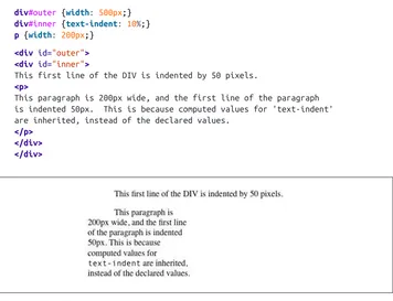
div {width: 400px;} p {text-indent: 10%;}
<div>
<p>This paragraph is contained inside a DIV, which is 400px wide, so the
because percentages are computed with respect to the width of the element.</p> </div>
Figure 3. Text indenting with percentages
Note that this indentation only applies to the first line of an element, even if you insert
line breaks. The interesting part about text-indent is that because it’s inherited, it can
have unexpected effects. For example, consider the following markup, which is illus‐ trated in Figure 4:
div#outer {width: 500px;}
div#inner {text-indent: 10%;}
p {width: 200px;}
<divid="outer"> <divid="inner">
This first line of the DIV is indented by 50 pixels.
<p>
This paragraph is 200px wide, and the first line of the paragraph is indented 50px. This is because computed values for 'text-indent' are inherited, instead of the declared values.
</p> </div> </div>
Figure 4. Inherited text indenting
Horizontal Alignment
Even more basic than text-indent is the property text-align, which affects how the
text-align
CSS 2.1 values:
left | center | right | justify | inherit
CSS3 values:
[ [ start | end | left | right | center ] || <string> ] | justify | match-parent | start end | inherit
Initial value:
In CSS3, start; in CSS 2.1, user agent-specific, likely depending on writing
direction
Applies to:
Block-level elements
Inherited: Yes
Computed value:
As specified, except in the case of match-parent
Note:
CSS2 included a <string> value that was dropped from CSS 2.1 due to a lack of
implementation
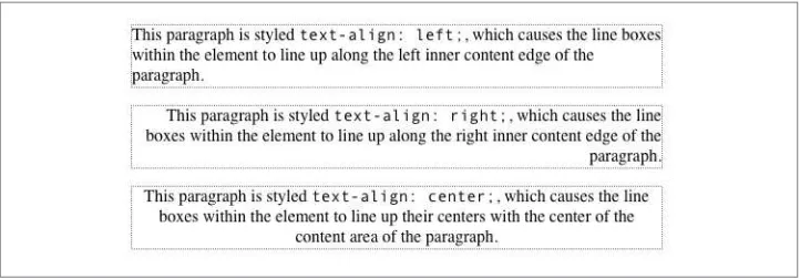
The quickest way to understand how these values work is to examine Figure 5, which
sticks with three of the CSS 2.1 values for the moment.
Figure 5. Selected behaviors of the text-align property
Obviously, the values left, right, and center cause the text within elements to be
such as paragraphs, there’s no way to center an anchor within its line without aligning the rest of the line (nor would you want to, since that would likely cause text overlap).
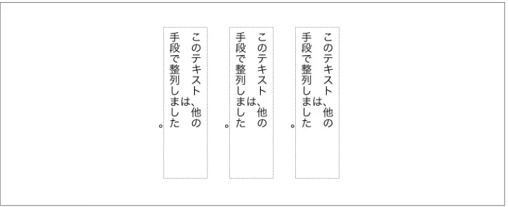
Historically, which is to say under CSS 2.1 rules, the default value of text-align is left
in left-to-right languages, and right in right-to-left languages. (CSS 2.1 had no notion
of vertical writing modes.) In CSS3, left and right are mapped to the start or end edge,
respectively, of a vertical language. This is illustrated in Figure 6.
As you no doubt expect, center causes each line of text to be centered within the ele‐
ment. Although you may be tempted to believe that text-align: center is the same as
the <CENTER> element, it’s actually quite different. <CENTER> affected not only text, but
also centered whole elements, such as tables. text-align does not control the alignment
of elements, only their inline content. Figures 5 and 6 illustrate this clearly in various
writing directions.
Figure 6. Left, right, and center in vertical writing modes
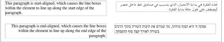
Start and end alignment
CSS3 (which is to say, the “CSS Text Module Level 3” specification) added a number of
new values to text-align, and even changed the default property value as compared
to CSS 2.1.
The new default value of start means that the text is aligned to the start edge of its line
box. In left-to-right languages like English, that’s the left edge; in right-to-left languages such as Hebrew, it’s the right edge. In vertical languages, for that matter, it will be the top or bottom, depending on the writing direction. The upshot is that the default value is much more aware of the document’s language direction while leaving the default behavior the same in the vast majority of existing cases.
In a like manner, end aligns text with the end edge of each line box—the right edge in
LTR languages, the left edge in RTL languages, and so forth. The effects of these values
Figure 7. Start and end alignment
And then there’s the value start end, which is declared like so:
p {text-align: start end;}
This is a fascinating, and so far unsupported, value of text-align. The effect is that the
first line of the element, as well as any line that immediately follows a line break, uses
start alignment. The rest of the lines in the element use end alignment. (It may be dropped from the CSS3 module if nobody starts supporting it.)
Justified text
An often-overlooked alignment property is justify, which raises some issues of its
own. In justified text, both ends of a line of text are placed at the inner edge of the parent
element, as Figure 8 shows. Then, the spacing between words and letters is adjusted so
that each line is precisely the same length. Justified text is common in the print world (for example, in this book), but under CSS, a few extra considerations come into play.
Figure 8. Justified text
The user agent—and not CSS, at least as of mid-2013—determines how justified text should be stretched to fill the space between the left and right edges of the parent. Some browsers, for example, might add extra space only between words, while others might distribute the extra space between letters (although the CSS specification states that “user agents may not further increase or decrease the inter-character space” if the prop‐
erty letter-spacing has been assigned a length value). Other user agents may reduce
String alignment
String alignment is an interesting case, one that has been lurking throughout the history of CSS without actually gaining traction. The easiest way to explain it is to show some
code and the results (Figure 9):
table[summary="Daily Sales"] th {text-align: "/";} table[summary="Daily Sales"] td {text-align: ".";}
<table summary="Daily Sales">
<tr><th>Mon 4/8</th><td>$12,122.13</td></tr> <tr><th>Tue 4/9</th><td>$13,729.10</td></tr> <tr><th>Wed 4/10</th><td>$9,447</td></tr> <tr><th>Thu 4/11</th><td>$10,308.76</td></tr> <tr><th>Fri 4/12</th><td>$999.99</td></tr> </table>
Figure 9. String alignment
As Figure 9 shows, all the cells’ contents are aligned such that the “.” characters line up along a vertical line (since this is a horizontal language). Had the CSS actually been
text-align: "," then the cells would all have lined up on the commas.
The problem, as always, is that string alignment still isn’t supported by browsers, and may be once again dropped from the specification. (Figure 9 was faked, I’m sorry to say.)
Parent matching
There’s one more value to be covered, which is match-parent. This isn’t supported by
browsers, but its intent is mostly covered by inherit anyway. The idea is, if you declare
text-align: match-parent, the alignment of the element will match the alignment of its parent. So far, that sounds exactly like inherit, but there’s a difference: if the parent’s
alignment value is start or end, the result of match-parent is to assign a computed
value of left or right to the element. That wouldn’t happen with inherit, which would
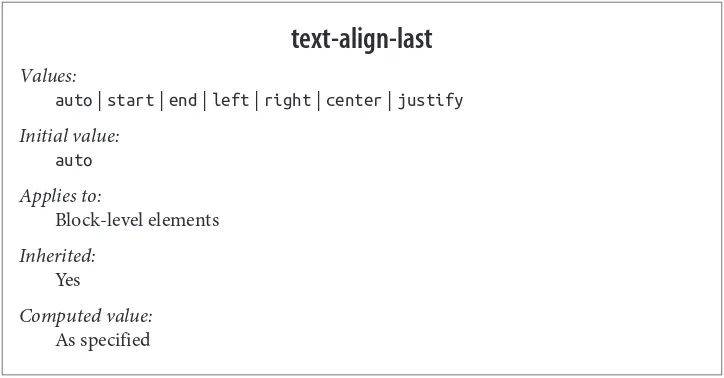
Aligning the Last Line
There may be times when you want to align the text in the very last line of an element differently than you did the rest of the content. For example, you might left-align the last line of an otherwise fully justified block of text, or choose to swap from left to center
alignment. For those situations, there is text-align-last.
text-align-last
Values:
auto | start | end | left | right | center | justify
Initial value: auto
Applies to:
Block-level elements
Inherited: Yes
Computed value: As specified
As with text-align, the quickest way to understand how these values work is to ex‐
amine Figure 10.
Figure 10. Differently aligned last lines
As you can see, the last lines of the elements are aligned independently of the rest of the
elements, according to the elements’ text-align-last values.
A close study of Figure 10 will reveal that there’s more at play than just the last lines of
block-level elements. In fact, text-align-last applies to any line of text that immedi‐
ately precedes a forced line break, whether or not said line break is triggered by the end
of an element. Thus, a line break occasioned by a <br> tag will make the line of text
line of text in a block-level element, since a line break is generated by the element’s closure.
There are two more interesting wrinkles in text-align-last. The first is that if the first
line of text in an element is also the last line of text in the element, then the value of
text-align-last takes precedence over the value of text-align. Thus, the following styles will result in a centered paragraph, not a start-aligned paragraph:
p {text-align: start; text-align-last: center;}
<p>A paragraph.</p>
The second, closely related, wrinkle is that text-align-last is ignored if the element’s
text-align value is start end. In other words, in the following case, the text will not be centered:
p {text-align: START end; text-align-last: center;}
<p>A paragraph.</p>
As of mid-2013, support for text-align-last was limited to a pre‐ fixed Gecko property, -moz-text-align-last.
Vertical Alignment
Now that we’ve covered horizontal alignment, let’s move on to vertical alignment. Since the construction of lines is a very complex topic that merits its own small book, I’ll just stick to a quick overview here.
The Height of Lines
The line-height property refers to the distance between the baselines of lines of text rather than the size of the font, and it determines the amount by which the height of
each element’s box is increased or decreased. In the most basic cases, specifying
line-height is a way to increase (or decrease) the vertical space between lines of text, but this
is a misleadingly simple way of looking at how line-height works. line-height con‐
trols the leading, which is the extra space between lines of text above and beyond the
font’s size. In other words, the difference between the value of line-height and the size
line-height
All elements (but see text regarding replaced and block-level elements)
Inherited: Yes
Percentages:
Relative to the font size of the element
Computed value:
For length and percentage values, the absolute value; otherwise, as specified
When applied to a block-level element, line-height defines the minimum distance
between text baselines within that element. Note that it defines a minimum, not an absolute value, and baselines of text can wind up being pushed further apart than the
value of line-height. line-height does not affect layout for replaced elements, but it
still applies to them.
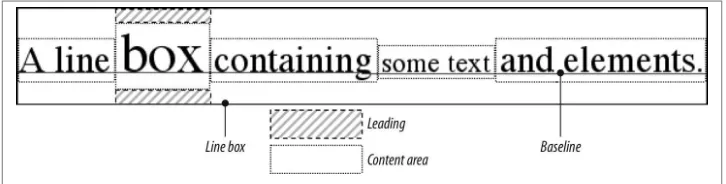
Constructing a line
Every element in a line of text generates a content area, which is determined by the size
of the font. This content area in turn generates an inline box that is, in the absence of
any other factors, exactly equal to the content area. The leading generated by
line-height is one of the factors that increases or decreases the height of each inline box.
To determine the leading for a given element, simply subtract the computed value of
font-size from the computed value of line-height. That value is the total amount of leading. And remember, it can be a negative number. The leading is then divided in half, and each half-leading is applied to the top and bottom of the content area. The result is the inline box for that element.
As an example, let’s say the font-size (and therefore the content area) is 14 pixels tall,
and the line-height is computed to 18 pixels. The difference (4 pixels) is divided in
half, and each half is applied to the top and bottom of the content area. This creates an inline box that is 18 pixels tall, with 2 extra pixels above and below the content area.
This sounds like a roundabout way to describe how line-height works, but there are
Once all of the inline boxes have been generated for a given line of content, they are then considered in the construction of the line box. A line box is exactly as tall as needed to enclose the top of the tallest inline box and the bottom of the lowest inline box.
Figure 11 shows a diagram of this process.
Figure 11. Line box diagram
Assigning values to line-height
Let’s now consider the possible values of line-height. If you use the default value of
normal, the user agent must calculate the vertical space between lines. Values can vary by user agent, but they’re generally 1.2 times the size of the font, which makes line boxes
taller than the value of font-size for a given element.
Most values are simple length measures (e.g., 18px or 2em). Be aware that even if you
use a valid length measurement, such as 4cm, the browser (or the operating system) may
be using an incorrect metric for real-world measurements, so the line height may not show up as exactly four centimeters on your monitor.
em, ex, and percentage values are calculated with respect to the font-size of the element.
The markup is relatively straightforward, and the results are shown in Figure 12:
body{line-height: 18px; font-size: 16px;}
p.cl1 {line-height: 1.5em;}
p.cl2 {font-size: 10px; line-height: 150%;}
p.cl3 {line-height: 0.33in;}
<p>This paragraph inherits a 'line-height' of 14px from the body, as well as
a 'font-size' of 13px.</p>
<p class="cl1">This paragraph has a 'line-height' of 27px(18 * 1.5), so it will have slightly more line-height than usual.</p>
<p class="cl2">This paragraph has a 'line-height' of 15px (10 * 150%), so it will have slightly more line-height than usual.</p>
Figure 12. Simple calculations with the line-height property
Line-height and inheritance
When the line-height is inherited by one block-level element from another, things get
a bit trickier. line-height values inherit from the parent element as computed from
the parent, not the child. The results of the following markup are shown in Figure 13.
It probably wasn’t what the author had in mind:
body {font-size: 10px;}
div {line-height: 1em;} /* computes to '10px' */
p {font-size: 18px;}
<div>
<p>This paragraph's 'font-size' is 18px, but the inherited 'line-height'
value is only 10px. This may cause the lines of text to overlap each other by a small amount.</p>
</div>
Figure 13. Small line-height, large font-size, slight problem
Why are the lines so close together? Because the computed line-height value of 10px
was inherited by the paragraph from its parent div. One solution to the small
line-height problem depicted in Figure 13 is to set an explicit line-height for every ele‐ ment, but that’s not very practical. A better alternative is to specify a number, which actually sets a scaling factor:
body {font-size: 10px;} div {line-height: 1;} p {font-size: 18px;}
When you specify a number, you cause the scaling factor to be an inherited value instead of a computed value. The number will be applied to the element and all of its child
elements, so that each element has a line-height calculated with respect to its own
div {line-height: 1.5;} p {font-size: 18px;}
<div>
<p>This paragraph's 'font-size' is 18px, and since the 'line-height'
set for the parent div is 1.5, the 'line-height' for this paragraph is 27px (18 * 1.5).</p>
</div>
Figure 14. Using line-height factors to overcome inheritance problems
Though it seems like line-height distributes extra space both above and below each
line of text, it actually adds (or subtracts) a certain amount from the top and bottom of
an inline element’s content area to create an inline box. Assume that the default
font-size of a paragraph is 12pt and consider the following:
p {line-height: 16pt;}
Since the “inherent” line height of 12-point text is 12 points, the preceding rule will place an extra 4 points of space around each line of text in the paragraph. This extra amount is divided in two, with half going above each line and the other half below. You now have 16 points between the baselines, which is an indirect result of how the extra space is apportioned.
If you specify the value inherit, then the element will use the computed value for its
parent element. This isn’t really any different than allowing the value to inherit naturally, except in terms of specificity and cascade resolution.
Now that you have a basic grasp of how lines are constructed, let’s talk about vertically aligning elements relative to the line box.
Vertically Aligning Text
If you’ve ever used the elements sup and sub (the superscript and subscript elements),
or used an image with markup such as <img src="foo.gif" align="middle">, then
you’ve done some rudimentary vertical alignment. In CSS, the vertical-align
property applies only to inline elements and replaced elements such as images and form
vertical-align
Values:
baseline | sub | super | top | text-top | middle | bottom | text-bottom | <percentage> | <length> | inherit
Initial value:
Refer to the value of line-height for the element
Computed value:
For percentage and length values, the absolute length; otherwise, as specified
Note:
When applied to table cells, only the values baseline, top, middle, and bottom are recognized
vertical-align accepts any one of eight keywords, a percentage value, or a length
value. The keywords are a mix of the familiar and unfamiliar: baseline (the default
value), sub, super, bottom, text-bottom, middle, top, and text-top. We’ll examine
how each keyword works in relation to inline elements.
Remember: vertical-align does not affect the alignment of content within a block-level element. You can, however, use it to affect the vertical alignment of elements within table cells.
Baseline alignment
vertical-align: baseline forces the baseline of an element to align with the baseline of its parent. Browsers, for the most part, do this anyway, since you’d obviously expect the bottoms of all text elements in a line to be aligned.
If a vertically aligned element doesn’t have a baseline—that is, if it’s an image, a form input, or another replaced element—then the bottom of the element is aligned with the
img {vertical-align: baseline;}
<p>The image found in this paragraph <img src="dot.gif" alt="A dot" /> has its bottom edge aligned with the baseline of the text in the paragraph.</p>
Figure 15. Baseline alignment of an image
This alignment rule is important because it causes some web browsers to always put a replaced element’s bottom edge on the baseline, even if there is no other text in the line. For example, let’s say you have an image in a table cell all by itself. The image may actually be on a baseline, but in some browsers, the space below the baseline causes a gap to appear beneath the image. Other browsers will “shrink-wrap” the image with the table cell, and no gap will appear. The gap behavior is correct, according to the CSS Working Group, despite its lack of appeal to most authors.
See the aged and yet still relevant article “Images, Tables, and Myste‐ rious Gaps” for a more detailed explanation of gap behavior and ways to work around it.
Superscripting and subscripting
The declaration vertical-align: sub causes an element to be subscripted, meaning
that its baseline (or bottom, if it’s a replaced element) is lowered with respect to its parent’s baseline. The specification doesn’t define the distance the element is lowered, so it may vary depending on the user agent.
super is the opposite of sub; it raises the element’s baseline (or bottom of a replaced element) with respect to the parent’s baseline. Again, the distance the text is raised depends on the user agent.
Note that the values sub and super do not change the element’s font size, so subscripted
or superscripted text will not become smaller (or larger). Instead, any text in the sub-or superscripted element should be, by default, the same size as text in the parent ele‐
ment, as illustrated by Figure 16:
span.raise {vertical-align: super;}
span.lower {vertical-align: sub;}
<p>This paragraph contains <span class="raise">superscripted</span>
Figure 16. Superscript and subscript alignment
If you wish to make super- or subscripted text smaller than the text of its parent element, you can do so using the property font-size.
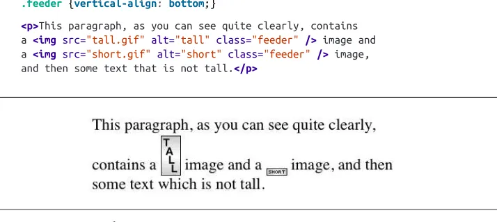
Bottom feeding
vertical-align: bottom aligns the bottom of the element’s inline box with the bottom
of the line box. For example, the following markup results in Figure 17:
.feeder {vertical-align: bottom;}
<p>This paragraph, as you can see quite clearly, contains
a <img src="tall.gif" alt="tall" class="feeder" /> image and a <img src="short.gif" alt="short" class="feeder" /> image, and then some text that is not tall.</p>
Figure 17. Bottom alignment
The second line of the paragraph in Figure 17 contains two inline elements, whose
bottom edges are aligned with each other. They’re also below the baseline of the text.
vertical-align: text-bottom refers to the bottom of the text in the line. For the pur‐ poses of this value, replaced elements, or any other kinds of non-text elements, are ignored. Instead, a “default” text box is considered. This default box is derived from the
font-size of the parent element. The bottom of the aligned element’s inline box is then aligned with the bottom of the default text box. Thus, given the following markup, you
get a result like the one shown in Figure 18:
img.tbot {vertical-align: text-bottom;}
<p>Here: a <imgsrc="tall.gif" style="vertical-align: middle;" alt="tall" />
Figure 18. Text-bottom alignment
Getting on top
Employing vertical-align: top has the opposite effect of bottom. Likewise,
vertical-align: text-top is the reverse of text-bottom. Figure 19 shows how the following markup would be rendered:
.up {vertical-align: top;}
.textup {vertical-align: text-top;}
<p>Here: a <img src="tall.gif" alt="tall image"> tall image, and then
<span class="up">some text</span> that's been vertically aligned.</p> <p>Here: a <img src="tall.gif" class="textup" alt="tall"> image that's been vertically aligned, and then a <img src="short.gif" class="textup" alt="short" />
image that's similarly aligned.</p>
Figure 19. Aligning with the top and text-top of a line
Of course, the exact position of this alignment will depend on which elements are in the line, how tall they are, and the size of the parent element’s font.
In the middle
There’s the value middle, which is usually (but not always) applied to images. It does
not have the exact effect you might assume given its name. middle aligns the middle of
an inline element’s box with a point that is 0.5ex above the baseline of the parent ele‐
ment, where 1ex is defined relative to the font-size for the parent element. Fig‐
Figure 20. Precise detail of middle alignment
Since most user agents treat 1ex as one-half em, middle usually aligns the vertical mid‐
point of an element with a point one-quarter em above the parent’s baseline, though this is not a defined distance and so can vary from one user agent to another.
Percentages
Percentages don’t let you simulate align="middle" for images. Instead, setting a per‐
centage value for vertical-align raises or lowers the baseline of the element (or the
bottom edge of a replaced element) by the amount declared, with respect to the parent’s
baseline. (The percentage you specify is calculated as a percentage of line-height for
the element, not its parent.) Positive percentage values raise the element, and negative
values lower it. Depending on how the text is raised or lowered, it can appear to be
placed in adjacent lines, as shown in Figure 21, so take care when using percentage
values:
sub {vertical-align: −100%;} sup {vertical-align: 100%;}
<p>We can either <sup>soar to new heights</sup> or, instead,
<sub>sink into despair...</sub></p>
Figure 21. Percentages and fun effects
Let’s consider percentage values in more detail. Assume the following:
<divstyle="font-size: 14px; line-height: 18px;">
I felt that, if nothing else, I deserved a
<span style="vertical-align: 50%;">raise</span> for my efforts.
The 50%-aligned span element has its baseline raised nine pixels, which is half of the
element’s inherited line-height value of 18px, not seven pixels.
Length alignment
Finally, let’s consider vertical alignment with a specific length. vertical-align is very
straightforward: it shifts an element up or down by the declared distance. Thus,
vertical-align: 5px; will shift an element upward five pixels from its unaligned placement. Negative length values shift the element downward. This simple form of alignment did not exist in CSS1, but it was added in CSS2.
It’s important to realize that vertically aligned text does not become part of another line,
nor does it overlap text in other lines. Consider Figure 22, in which some vertically
aligned text appears in the middle of a paragraph.
Figure 22. Vertical alignments can cause lines to get taller
As you can see, any vertically aligned element can affect the height of the line. Recall the description of a line box, which is exactly as tall as necessary to enclose the top of the tallest inline box and the bottom of the lowest inline box. This includes inline boxes that have been shifted up or down by vertical alignment.
Word Spacing and Letter Spacing
Now that we’ve dealt with alignment, let’s look at manipulating word and letter spacing. As usual, these properties have some nonintuitive issues.
Word Spacing
The word-spacing property accepts a positive or negative length. This length is add‐
ed to the standard space between words. In effect, word-spacing is used to modify
inter-word spacing. Therefore, the default value of normal is the same as setting a value
word-spacing
For normal, the absolute length 0; otherwise, the absolute length
If you supply a positive length value, then the space between words will increase. Setting
a negative value for word-spacing brings words closer together:
p.spread {word-spacing: 0.5em;}
p.tight {word-spacing: −0.5em;}
p.base {word-spacing: normal;}
p.norm {word-spacing: 0;}
<p class="spread">The spaces between words in this paragraph will be increased by 0.5em.</p>
<p class="tight">The spaces between words in this paragraph will be decreased by 0.5em.</p>
<p class="base">The spaces between words in this paragraph will be normal.</p> <p class="norm">The spaces between words in this paragraph will be normal.</p>
Manipulating these settings has the effect shown in Figure 23.
Figure 23. Changing the space between words
that a document contains words surrounded by one or more whitespace characters. A CSS-aware user agent cannot be expected to decide what is a valid word in a given
language and what isn’t. This definition, such as it is, means word-spacing is unlikely
to work in any languages that employ pictographs, or non-Roman writing styles. The
property allows you to create very unreadable documents, as Figure 24 makes clear. Use
word-spacing with care.
Figure 24. Really wide word spacing
Letter Spacing
Many of the issues you encounter with word-spacing also occur with
letter-spacing. The only real difference between the two is that letter-spacing modifies the space between characters, or letters.
letter-spacing
Values:
<length> | normal | inherit
Initial value:
For length values, the absolute length; otherwise, normal
As with the word-spacing property, the permitted values of letter-spacing include
any length. The default keyword is normal (making it the same as letter-spacing:
0). Any length value you enter will increase or decrease the space between letters by
that amount. Figure 25 shows the results of the following markup:
p {letter-spacing: 0;} /* identical to 'normal' */
p.spacious {letter-spacing: 0.25em;}
<p>The letters in this paragraph are spaced as normal.</p>
<p class="spacious">The letters in this paragraph are spread out a bit.</p> <p class="tight">The letters in this paragraph are a bit smashed together.</p>
Figure 25. Various kinds of letter spacing
Using letter-spacing to increase emphasis is a time-honored technique. You might
write the following declaration and get an effect like the one shown in Figure 26:
strong {letter-spacing: 0.2em;}
<p>This paragraph contains <strong>strongly emphasized text</strong>
that is spread out for extra emphasis.</p>
Figure 26. Using letter-spacing to increase emphasis
If a page uses fonts with features like ligatures, and those features are enabled, then altering letter- or word-spacing can effectively disable them. Browsers will not re-calculate ligatures or other joins when let‐ ter spacing is altered, for example.
Spacing and Alignment
The value of word-spacing may be influenced by the value of the property
text-align. If an element is justified, the spaces between letters and words may be altered to fit the text along the full width of the line. This may in turn alter the spacing declared
by the author with word-spacing. If a length value is assigned to letter-spacing, then
it cannot be changed by text-align, but if the value of letter-spacing is normal, then
inter-character spacing may be changed in order to justify the text. CSS does not specify how the spacing should be calculated, so user agents simply fill it in.
As usual, the child of an element inherits the computed value of that element. You cannot
the computed value (as is the case with line-height). As a result, you may run into
problems such as those shown in Figure 27:
p {letter-spacing: 0.25em; font-size: 20px;}
small {font-size: 50%;}
<p>This spacious paragraph features <small>tiny text that is just as spacious</small>, even though the author probably wanted the spacing to be in proportion to the size of the text.</p>
Figure 27. Inherited letter spacing
The only way to achieve letter spacing that’s in proportion to the size of the text is to set it explicitly, as follows:
p {letter-spacing: 0.25em;}
small {font-size: 50%; letter-spacing: 0.25em;}
Text Transformation
Now let’s look at ways to manipulate the capitalization of text using the property
text-transform.
text-transform
Values:
uppercase | lowercase | capitalize | none | inherit
Initial value: none
Applies to: All elements
Inherited: Yes
The default value none leaves the text alone and uses whatever capitalization exists in
the source document. As their names imply, uppercase and lowercase convert text into
all upper- or lowercase characters. Finally, capitalize capitalizes only the first letter of
each word. Figure 28 illustrates each of these settings in a variety of ways:
h1 {text-transform: capitalize;}
strong {text-transform: uppercase;}
p.cummings {text-transform: lowercase;}
p.raw {text-transform: none;}
<h1>The heading-one at the beginninG</h1>
<p> By default, text is displayed in the capitalization it has in the source
document, but <strong>it is possible to change this</strong> using the property 'text-transform'.
</p>
<p class="cummings">
For example, one could Create TEXT such as might have been Written by the late Poet e.e.cummings.
</p>
<p class="raw">
If you feel the need to Explicitly Declare the transformation of text to be 'none', that can be done as well.
</p>
Figure 28. Various kinds of text transformation
Different user agents may have different ways of deciding where words begin and, as a
result, which letters are capitalized. For example, the text “heading-one” in the h1
element, shown in Figure 28, could be rendered in one of two ways: “Heading-one” or
“Heading-One.” CSS does not say which is correct, so either is possible.
You probably also noticed that the last letter in the h1 element in Figure 28 is still up‐
percase. This is correct: when applying a text-transform of capitalize, CSS only
As a property, text-transform may seem minor, but it’s very useful if you suddenly
decide to capitalize all your h1 elements. Instead of individually changing the content
of all your h1 elements, you can just use text-transform to make the change for you:
h1 {text-transform: uppercase;}
<h1>This is an H1 element</h1>
The advantages of using text-transform are twofold. First, you only need to write a
single rule to make this change, rather than changing the h1 itself. Second, if you decide
later to switch from all capitals back to initial capitals, the change is even easier, as
Figure 29 shows:
h1 {text-transform: capitalize;}
<h1>This is an H1 element</h1>
Figure 29. Transforming an h1 element
Text Decoration
Next we come to text-decoration, which is a fascinating property that offers a whole
truckload of interesting behaviors.
text-decoration
Values:
none | [ underline || overline || line-through || blink ] | inherit
Initial value: none
Applies to: All elements
Inherited: No
As you might expect, underline causes an element to be underlined, just like the U
element in HTML. overline causes the opposite effect—drawing a line across the top
of the text. The value line-through draws a line straight through the middle of the text,
which is also known as strikethrough text and is equivalent to the S and strike elements
in HTML. blink causes the text to blink on and off, just like the much-maligned blink
tag supported by Netscape. Figure 30 shows examples of each of these values:
p.emph {text-decoration: underline;}
p.topper {text-decoration: overline;}
p.old {text-decoration: line-through;}
p.annoy {text-decoration: blink;}
p.plain {text-decoration: none;}
Figure 30. Various kinds of text decoration
It’s impossible to show the effect of blink in print, of course, but it’s easy enough to imagine (perhaps all too easy). Incidentally, user agents are not required to actually blink blink text, and as of this writing, all known user agents were dropping or had dropped support for the blinking effect. (Internet Explorer never had it.)
The value none turns off any decoration that might otherwise have been applied to an
element. Usually, undecorated text is the default appearance, but not always. For ex‐ ample, links are usually underlined by default. If you want to suppress the underlining of hyperlinks, you can use the following CSS rule to do so:
a {text-decoration: none;}
Although I personally don’t have a problem with it, many users are annoyed when they realize you’ve turned off link underlining. It’s a matter of opinion, so let your own tastes be your guide, but remem‐ ber: if your link colors aren’t sufficiently different from normal text, users may have a hard time finding hyperlinks in your documents, particularly users with one form or another of color blindness.
You can also combine decorations in a single rule. If you want all hyperlinks to be both underlined and overlined, the rule is:
a:link, a:visited {text-decoration: underline overline;}
Be careful, though: if you have two different decorations matched to the same element, the value of the rule that wins out will completely replace the value of the loser. Consider:
h2.stricken {text-decoration: line-through;}
h2 {text-decoration: underline overline;}
Given these rules, any h2 element with a class of stricken will have only a line-through
decoration. The underline and overline decorations are lost, since shorthand values replace one another instead of accumulating.
Weird Decorations
Now, let’s look into the unusual side of text-decoration. The first oddity is that
text-decoration is not inherited. No inheritance implies that any decoration lines drawn with the text—under, over, or through it—will be the same color as the parent element.
This is true even if the descendant elements are a different color, as depicted in Figure 31:
p {text-decoration: underline; color: black;}
strong {color: gray;}
<p>This paragraph, which is black and has a black underline, also contains
<strong>strongly emphasized text</strong> which has the black underline beneath it as well.</p>
Figure 31. Color consistency in underlines
Why is this so? Because the value of text-decoration is not inherited, the strong
element assumes a default value of none. Therefore, the strong element has no under‐
line. Now, there is very clearly a line under the strong element, so it seems silly to say
paragraph’s underline, which is effectively “spanning” the strong element. You can see it more clearly if you alter the styles for the boldface element, like this:
p {text-decoration: underline; color: black;}
strong {color: gray; text-decoration: none;}
<p>This paragraph, which is black and has a black underline, also contains
<strong>strongly emphasized text</strong> which has the black underline beneath it as well.</p>
The result is identical to the one shown in Figure 31, since all you’ve done is to explicitly
declare what was already the case. In other words, there is no way to turn off underlining (or overlining or a line-through) generated by a parent element.
When text-decoration is combined with vertical-align, even stranger things can
happen. Figure 32 shows one of these oddities. Since the sup element has no decoration
of its own, but it is elevated within an overlined element, the overline cuts through the
middle of the sup element:
p {text-decoration: overline; font-size: 12pt;} sup {vertical-align: 50%; font-size: 12pt;}
Figure 32. Correct, although strange, decorative behavior
By now you may be vowing never to use text decorations because of all the problems they could create. In fact, I’ve given you the simplest possible outcomes since we’ve
explored only the way things should work according to the specification. In reality, some
web browsers do turn off underlining in child elements, even though they aren’t sup‐ posed to. The reason browsers violate the specification is simple enough: author ex‐ pectations. Consider this markup:
p {text-decoration: underline; color: black;}
strong {color: silver; text-decoration: none;}
<p>This paragraph, which is black and has a black underline, also contains
<strong>boldfaced text</strong> which does not have black underline beneath it.</p>
Figure 33. How some browsers really behave
The caveat here is that many browsers do follow the specification, and future versions
of existing browsers (or any other user agents) might one day follow the specification
precisely. If you depend on using none to suppress decorations, it’s important to realize
that it may come back to haunt you in the future, or even cause you problems in the present. Then again, future versions of CSS may include the means to turn off decora‐
tions without using none incorrectly, so maybe there’s hope.
There is a way to change the color of a decoration without violating the specification. As you’ll recall, setting a text decoration on an element means that the entire element has the same color decoration, even if there are child elements of different colors. To match the decoration color with an element, you must explicitly declare its decoration, as follows:
p {text-decoration: underline; color: black;}
strong {color: silver; text-decoration: underline;}
<p>This paragraph, which is black and has a black underline, also contains
<strong>strongly emphasized text</strong> which has the black underline beneath it as well, but whose gray underline overlays the black underline of its parent.</p>
In Figure 34, the strong element is set to be gray and to have an underline. The gray underline visually “overwrites” the parent’s black underline, so the decoration’s color
matches the color of the strong element.
Text Rendering
A recent addition to CSS is text-rendering, which is actually an SVG property that is
nevertheless treated as CSS by supporting user agents. It lets authors indicate what the user agent should prioritize when displaying text.
text-rendering
Values:
auto | optimizeSpeed | optimizeLegibility | geometricPrecision | inherit
Initial value:
The values optimizeSpeed and optimizeLegibility are relatively self-explanatory,
indicating that drawing speed should be favored over legibility features like kerning and
ligatures (for optimizeSpeed) or vice versa (for optimizeLegibility).
The precise legibility features that are used with optimizeLegibility are not explicitly
defined, and the text rendering often depends on the operating system on which the
user agent is running, so the exact results may vary. Figure 35 shows the results of
optimizeLegibility in various browsers.
Figure 35. Optimized legibility
As you can see in Figure 35, the differences between optimized and non-optimized text
are objectively rather small, but they can have a noticeable impact on readability.
The value geometricPrecision, on the other hand, directs the user agent to draw the
geometricPrecision, those hints are ignored. If it helps, think of it as the user agent drawing the text as though all the text is a series of SVG paths, not font glyphs.
Even by the usual standards of standards, the value auto is pretty vaguely defined in
SVG:
...the user agent shall make appropriate tradeoffs to balance speed, legibility and geo‐ metric precision, but with legibility given more importance than speed and geometric precision.
That’s it: user agents get to do what they think is appropriate, leaning towards legibility. In practice, things are more complicated. As an example, WebKit (as of mid-2013) seems
to treat optimizeLegibility and geometricPecision as the same, while auto is equiv‐
alent to optimizeSpeed. In the former case, WebKit enables a series of font features in
order to increase the legibility; these are disabled for optimizeSpeed and auto. Gecko,
on the other hand, is reported to treat auto as optimizeSpeed for text sizes at or below
20px, and as optimizeLegibility for sizes above 20px.
Text Shadows
CSS2 introduced a property for adding drop shadows to text. It was dropped from CSS
2.1 due to lack of implementation, but the web has moved on and text-shadow is now
very widely supported.
text-shadow
Values:
none | [<color> || <length> <length> <length>? ,]* [<color> || <length> <length> <length>?] | inherit
Initial value:
The obvious default is to not have a drop shadow for text. Otherwise, it’s possible to define one or more shadows. Each shadow is defined by an optional color and three length values, the last of which is also optional.
The first two length values determine the offset distance of the shadow from the text; the first is the horizontal offset and the second is the vertical offset. To define a solid, un-blurred green shadow offset five pixels to the right and half an em down from the
text, as shown in Figure 36, you would write:
text-shadow: green 5px 0.5em;
Negative lengths cause the shadow to be offset to the left and upward from the original
text. The following, also shown in Figure 36, places a light blue shadow five pixels to
the left and half an em above the text:
text-shadow: rgb(128,128,255) −5px −0.5em;
Figure 36. Simple shadows
The optional third length value defines a “blur radius” for the shadow. The blur radius is defined as the distance from the shadow’s outline to the edge of the blurring effect. A radius of two pixels would result in blurring that fills the space between the shadow’s outline and the edge of the blurring. The exact blurring method is not defined, so dif‐ ferent user agents might employ different effects. As an example, the following styles
are rendered as shown in Figure 37:
p.cl1 {color: black; text-shadow: gray 2px 2px 4px;}
p.cl2 {color: white; text-shadow: 0 0 4px black;}
p.cl3 {color: black; text-shadow: 1em 0.5em 5px red, −0.5em −1em hsla(100,75%,
25%,0.33);}
Note that large numbers of text shadows, or text shadows with very large blur values, can create performance slowdowns, particularly in low-power and CPU-constrained situations such as mobile devices. Authors are advised to test thoroughly before deploying public de‐ signs that use text shadows.
Handling White Space
Now that we’ve covered a variety of ways to style the text, let’s talk about the property
white-space, which affects the user agent’s handling of space, newline, and tab char‐ acters within the document source.
All elements (CSS 2.1); block-level elements (CSS1 and CSS2)
Inherited: No
Computed value: As specified
Using this property, you can affect how a browser treats the white space between words and lines of text. To a certain extent, default XHTML handling already does this: it collapses any white space down to a single space. So given the following markup, the rendering in a web browser would show only one space between each word and ignore the linefeed in the elements:
<p>This paragraph has many spaces in it.</p>
You can explicitly set this default behavior with the following declaration:
p {white-space: normal;}
Should you set white-space to pre, however, the white space in an affected element is
treated as though the elements were XHTML pre elements; white space is not ignored,
as shown in Figure 38:
p {white-space: pre;}
<p>This paragraph has many spaces in it.</p>
Figure 38. Honoring the spaces in markup
With a white-space value of pre, the browser will pay attention to extra spaces and
even carriage returns. In this respect, and in this respect alone, any element can be made to act like a pre element.
The opposite value is nowrap, which prevents text from wrapping within an element,
except wherever you use a br element. Using nowrap in CSS is much like setting a table
cell not to wrap in HTML 4 with <td nowrap>, except the white-space value can be
applied to any element. The effects of the following markup are shown in Figure 39:
<p style="white-space: nowrap;">This paragraph is not allowed to wrap, which means that the only way to end a line is to insert a line-break element. If no such element is inserted, then the line will go forever, forcing the user to scroll horizontally to read whatever can't be initially displayed <br/>in the browser window.</p>
Figure 39. Suppressing line wrapping with the white-space property
You can actually use white-space to replace the nowrap attribute on table cells:
td {white-space: nowrap;}
<table><tr>
<td>The contents of this cell are not wrapped.</td> <td>Neither are the contents of this cell.</td>
<td>Nor this one, or any after it, or any other cell in this table.</td> <td>CSS prevents any wrapping from happening.</td>
CSS 2.1 introduced the values pre-wrap and pre-line, which were absent in earlier versions of CSS. The effect of these values is to allow authors to better control white space handling.
If an element is set to pre-wrap, then text within that element has white space sequences
preserved, but text lines are wrapped normally. With this value, line-breaks in the source
and those that are generated are also honored. pre-line is the opposite of pre-wrap
and causes white space sequences to collapse as in normal text but honors new lines.
For example, consider the following markup, which is illustrated in Figure 40:
<p style="white-space: pre-wrap;">
Figure 40. Two different ways to handle white space
Table 1 summarizes the behaviors of white-space properties.
Table 1. White-space properties
Value White space Linefeeds Auto line wrapping
pre-line Collapsed Honored Allowed
normal Collapsed Ignored Allowed
nowrap Collapsed Ignored Prevented
pre Preserved Honored Prevented
Setting Tab Sizes
Since white space is preserved in some values of white-space, it stands to reason that
tabs (i.e., Unicode code point 0009) will be displayed as, well, tabs. But how many spaces
should each tab equal? That’s where tab-size comes in.
tab-size
Values:
<integer> | <length> | inherit
Initial value: 8
Applies to:
Block elements
Inherited: Yes
Computed value:
The absolute-length equivalent of the specified value
By default, any tab character will be treated the same as eight spaces in a row, but you
can alter that by using a different integer value. Thus, tab-size: 4 will cause each tab
to be rendered the same as if it were four spaces in a row.
If a length value is supplied, then each tab is rendered using that length. For example,
tab-size: 10px will cause a sequence of three tabs to be rendered as 30 pixels of white
space. The effects of the following rules is illustrated in Figure 41.
Figure 41. Differing tab lengths
Note that tab-size is effectively ignored when the value of white-space causes white
space to be collapsed (see Table 1). The value will still be computed in such cases, of
Currently, tab-size is supported in WebKit and Gecko (as –moz-tab-size). In both cases, only integer values are supported, not length values.
Wrapping and Hyphenation
Hyphens can be very useful in situations where there are long words and short line
lengths, such as blog posts on mobile devices and portions of The Economist. Authors
can always insert their own hyphenation hints using the Unicode character U+00AD
SOFT HYPHEN (or, in HTML, ­), but CSS also offers a way to enable hyphenation
without littering up the document with hints.
hyphens
With the default value of manual, hyphens are only inserted where there are
manually-inserted hyphenation markers in the document, such as U+00AD or ­. Otherwise,
no hyphenation occurs. The value none, on the other hand, suppresses any hyphenation,
even if manual break markers are present; thus, U+00AD and ­ are ignored.
The far more interesting (and potentially inconsistent) value is auto, which permits the
browser to insert hyphens and break words at “appropriate” places inside words, even where no manually inserted hyphenation breaks exist. This leads to interesting ques‐ tions like what constitutes a “word” and under what circumstances it is appropriate to hyphenate a word, both of which are highly language-dependent. User agents are sup‐ posed to prefer manually inserted hyphen breaks to automatically determined breaks, but there are no guarantees. An illustration of hyphenation, or the suppression thereof,
.cl01 {hyphens: auto;} .cl02 {hyphens: manual;} .cl03 {hyphens: none;}
<p class="cl01">Supercalifragilisticexpialidocious antidisestablishmentarian-ism.</p>
<p class="cl02">Supercalifragilisticexpialidocious antidisestablishmentarian-ism.</p>
Because hyphenation is so language-dependent, and because the CSS specification does not define precise (or even vague) rules regarding how user agents should carry out hyphenation, there is every chance that hyphenation will be different from one browser to the next.
Furthermore, if you do choose to hyphenate, be careful about the elements to which
you apply the hyphenation. hyphens is an inherited property, so simply declaring body
{hyphens: auto;} will apply hyphenation to everything in your document—including textareas, code samples, blockquotes, and so on. Blocking automatic hyphenation at the level of those elements is probably a good idea, using rules something like this:
body {hyphens: auto;}
code, var, kbd, samp, tt, dir, listing, plaintext, xmp,
abbr, acronym, blockquote, q, textarea, input, option {hyphens: manual;}
Of course, if you decide that you want to hyphenate some of these elements, just remove them from the selector. (It can be kind of fun to watch the text you’re typing into a textarea get auto-hyphenated as you type it.)
As of mid-2013, hyphens was supported by all major desktop brows‐ ers, albeit using vendor prefixes, as well as on many mobile brows‐ ers. As noted, such support is always language-dependent.
Hyphens can be suppressed by the effects of other properties, such as word-break, which
affects how soft wrapping of text is calculated in various languages.
word-break
Values:
normal | break-all | keep-all | inherit
Initial value:
When a run of text is too long to fit into a single line, it is “soft wrapped.” This is in
contrast to “hard wraps,” which are things like linefeed characters and <br> elements.
Where the text is soft-wrapped is determined by the user agent (or the OS it uses), but
word-break lets authors influence its decision-making.
The default value of normal means that text should be wrapped like it always has been.
In practical terms, this means that text is broken between words, though the definition of a word varies by language. In Latin-derived languages like English, this is almost always a space between letter sequences (e.g., words). In ideographic languages like Japanese, each symbol is a word, so breaks can occur between any two symbols. In other CJK languages, though, the soft-wrap points may be limited to appear between sequen‐ ces of symbols that are not space-separated.
Again, that’s all by default, and is the way browsers have handled text for years. If you
apply the value break-all, then soft wrapping can (and will) occur between any two
shown, even if the soft wrapping occurs at a hyphenation point (see hyphens, earlier).
Note that values of the line-break property (described next) can affect the behavior of
break-all in CJK text.
keep-all, on the other hand, suppresses soft wrapping between characters, even in CJK languages where each symbol is a word. Thus, in Japanese, a sequence of symbols with no white space will not be soft wrapped, even if this means the text line will exceed the
length of its element. (This behavior is similar to white-space: pre.)
Figure 43 shows a few examples of word-break values, and Table 2 summarizes the effects of each value.
Figure 43. Altering word breaking behavior
Table 2. Word-breaking behavior
Value Non-CJK CJK Hyphenation permitted
normal As usual As usual Yes
break-all After any character After any character No
keep-all As usual Around sequences Yes
If your interests run to CJK text, then in addition to word-break you will also want to
get to know line-break.
line-break
Values:
auto | loose | normal | strict | inherit
Initial value: auto
![table[summary="Daily Sales"] th {text-align: "/";}](https://thumb-ap.123doks.com/thumbv2/123dok/4032565.1975985/16.504.73.433.105.312/table-summary-daily-sales-th-text-align.webp)