Designing and developing instructional recorded demonstration models for non-English speaking learners
Muhammad Fauzan Ansyari
Summary
This report used a design research approach that was aimed to redesign instructional videos for procedures. This project incorporated the minimalism theory, the four components model principles, multimedia learning principles, and recorded demonstration principles as the foundational frameworks.
There were three phases undertaken to achieve such purpose. In phase one, the existing Camtasia Studio 7 video series were analysed and relevant theoretical foundations for instructional videos were examined. Both were used to further guide the design or development of the prototypes. Design guidelines were then generated from the analyses and theories. In phase two, the initial prototype was constructed and tested with target users. In final phase, the effectiveness of the revised model is retested and formatively re-evaluated.
The results revealed that the above-mentioned theories, principles, and guidelines are vital in the design of an effective, efficient, and appealing instruction for users’ performance and support. In other words, an outright violation of those theories, guidelines, and principles can seriously jeopardize the effectiveness of a recorded instructional video for procedures.
1. Introduction
Some recorded instructional videos for procedures are not well designed for effective users’ learning and performance support. In the case of Camtasia getting started studio 7 series tutorials, for examples, raised some complaints from non-English speaking users. These complaints revolved around the question of effectiveness in promoting learning and performance support from those videos.
TechSmith’s getting started series for recording full screen with Camtasia studio has eight tutorial videos for beginners which provide them with the support necessary to enable them benefit from Camtasia studio 7. For detail, visit
http://www.techsmith.com/tutorial-camtasia-current.html. Unfortunately, not all components of those videos support
and problems related to understanding those 8 videos. In other words, those instructional videos neither promote better learning nor meet the educational needs of novices.
Based on the analyses the negative aspects of the videos were classified and summirised into five broad categories namely:-problems with the titles, confusion of goals and sub goals, redundancy, many jargons and the use of ambiguous or unclear terminologies.Some components within those videos are also inconsistent with design theories: minimalism, four-component models, multimedia learning, and recorded demonstration guidelines. In addition, other issues non-English speaking users raised about those tutorial videos further confirmed the ones identified by some other users, except that they added the following in
summary:-1. There is need for a video that describes the general overview about Camtasia Studio 7 at the beginning. They also observed that 8 videos are too much, and should instead be reduced into 4 or 5 videos.
2. The sequencing of some videos was not good. In addition, there was no practical example about how to produce a video from the start until the end. Again, some information is repeated (redundant) and that the pace is too fast in some parts of those videos.
3. Those tutorial videos are too theoretical and that some terms used in them are too technical for novice users. They also cited the videos as having too much information and not goal-oriented. Finally, some videos were also branded as having poor signaling.
2. Design processes and guiding questions
Since this project is aimed at redesigning Camtasia Studio 7, this project adopted a developmental study approach which has a cyclic process of design, formative evaluation and revision (van den Akker, 1999). Therefore, this project has three phases: analysis, prototype development and testing, and prototype revision and retesting (Richey, Klein, & Nelson, 2004). In phase one, the existing Camtasia Studio 7 video series were analysed and relevant theoretical foundations for instructional videos were examined. Both were used to further guide the design or development of the first prototype. Design guidelines were then generated from the analyses and theories. In phase two, the initial video prototype was constructed and tested with novice users. In final phase, the revised prototype was tested and formatively evaluated. Below is a model that describes the design process in this project. The main question guiding all these phases is “what are the
characteristics of an instructional video that helps novice users learn effectively?” This question leads to the following sub-questions to investigate the main question explicitly:
1. How do novice users perceive the paper-based storyboard as a basis for the construction of the first video prototype?
2. How do novice users and an instructional video expert perceive the first prototype of the instructional video?
3. Conceptual foundations
This section addresses the theoretical foundations that support the design and development of our recorded instructional video for a procedure. Those theories include: minimalism, the four components model, multimedia learning, and recorded demonstration.
3.1. Minimalism
Minimalism is heavily an action and leaner oriented theory of
instruction. This theory is often simplified with the axiom ‘less is more ‘. According to Carroll and van der Meij (1987; 1995), minimalism takes the need learners have for meaningful activity and sense making as a primary requirement and resource for effective training and
information. The two scholars also presented four major principles with corresponding specifications (heuristic) meant to guide designers in designing minimalist instruction for novice learners. It also addressed how users who are becoming acquainted with a new application or a tool such as programming language, word processor and so on can be instructed. In summary, Minimalist principles are: choosing an action oriented approach, anchoring the tool in the task domain, supporting error recognition and recovery and finally supporting reading to do, study and locate.
Choose an action oriented approach
According to Carol and van der Meij(1998), people trying to learn a skill are eager to act and are motivated to do something meaningful. Therefore, learning to do something may psychologically necessitate an action. But at the same time from the misconception and errors that users encounter, it is evident that they also need to learn so as to act (Carroll & Rosson, 1987). Therefore, in order to design a usable material, there is need to balance between the learner’s need to act and the learner’s need for knowledge.
Provide the user with an immediate opportunity to act and to support their own actions
Encourage and support user’s exploration and innovation Respect the user integrity and activities
Anchor the tool in the task domain
For most users, an application is a tool they want to use to reach certain objectives in the task domain for which that application has been designed (Carroll & van der Meij, 1998).The tool (application) thus is just a means and not an end in itself. Therefore, to anchor the tool in the task domain, two specifications are provided for designers as given below.
Select and design instructional activities that are real tasks for users
Ensure that the components of the instruction reflect the real task structure
Support error recognition and recovery
According to Carroll and van der Meij(1998), software users make numerous mistakes and correcting those mistakes can be time
consuming and frustrating to them. The two thus emphasize the need to reduce errors and mistakes and streamline recovery, diagnosis and correction to reduce the frustrations and anxiety that may arise as a result of trying to use the software. Thus, they provide four
specifications (heuristics) for designers as listed below. Prevent mistakes whenever possible
Provide error-information when actions are error-prone or when correction is difficult
Provide error information that supports detection, diagnosis and recovery
Support reading to do, study and locate
According to Carroll and van der Meij(1998) user’s behavior during learning has been noted to be flexible. Sometimes they read to study and in some other occasions they only read to locate some information. However, in most instances they read to do. In other words, what they do a task accompanied by an action. From that understanding, Carrol and van der Meij(1998) suggest two specifications (heuristics) for designers as given below to guide their design.
Be brief and do not spell out everything for users Provide closure for chapters
3.2. Four-component model
The four component model is based on systems theory and rhetoric (Van der Meij & Gellevij, 2004). The Systems theory documents the correct procedures that can guide people in performing a rounded-off task in technical documentation and manuals. On the other hand, rhetoric places the logical view of systems theory within a social context (that is, selling oneself, selling the domain and to engage and persuade the user). The Four Components model represents an effort to combine these two perspectives in order to support key design
decisions. The four components in the model areGoals, Prerequisites, Unwanted States, and Actions & Reactions.
Goals: A goal is a state that the user tries to realize. It includes a description explaining what the goal is and why the user should pursue it (“selling the domain”). However, when there are many methods to achieve the same goal, the designer must decide whether to present the alternative methods or not to do so. All in all when two or more alternatives are presented users should be given information about the proper conditions for selecting one over the other.
also a technique to scaffold this learning process and the user’s prior knowledge should always be a key consideration in design.
Unwanted States: Warnings & Problem Solving Information:Users are prone to make mistakes when working with the system hence the term “Unwanted states” in this theory. Van der Meij (2004) splits this unwanted state into two distinct types: warnings and problem-solving information. Warnings are given to prevent certain actions of the user or to alert users about the presence of a more or less serious risk. Since problems can have a considerable impact on user motivation and acceptance, designers are advised to consider presenting problem-solving information to help decrease the amount of time spent by users in attempting to solve problems from their design.
Actions & Reactions: Constructivist models of instruction aim to improve learning by creating situations in which people actively construct their own understanding. In other words, a balance should be made between user support and ‘let go’. According to Van der Meij (2004), users benefit from guided practice. They need direct instructions to act as well as guidance to support their explorations. An equally important principle for the design of the component is Action & Reaction. This is the interaction between user input or action and the feedback they receive after the action.
3.3. Multimedia learning
In general, Mayer (2001, 2003) argues that multimedia learning is in line with how people learn and students learn more deeply from well-designed multimedia presentations than from those presented in only-verbal presentations. As a result, Mayer emphasizes four multimedia instructional design principles. First is themultimedia effectwhich refers to the finding that students learn more deeply from a multimedia explanation presented in words and pictures than in words alone. Secondly, iscoherence effectthat refers to the finding that students learn more deeply from a multimedia explanation when extraneous material is excluded rather than included. Thirdly is thespatial
each other rather than far from each other on the same page or screen and lastly, thepersonalization effectwhich refers to the fact that students learn more deeply from a multimedia explanation when the words are presented in a natural conversational style rather than in formal style.
Mayer (2001) also mentions seven principles for multimedia design. First,students learn better when an explanation is given in words and pictures than solely in words. This is referred to as theMultimedia principle. When words and pictures are presented, students have an opportunity to construct verbal and pictorial mental models and to build connections between them. But, when words only are presented, students have an opportunity to build a verbal mental model but are less likely to build a pictorial mental model and make connections between the verbal and pictorial mental models. In other words, on screen animation, slide shows, and narratives should involve both written and spoken text and still or moving pictures. Simple blocks of text or auditory links alone are less effective than when the text or narration is coupled with visual images.
Second is spatial contiguity principle which states thatstudents learn better when corresponding words and pictures are presented near rather than far from each other on the same page or screen. When corresponding words and pictures are near to each other, learners do not have to use cognitive resources to visually search the page or screen and learners are more likely to be able to hold them both in working
memory at the same time.
presented simultaneously, and when animation and narration are both used, they should coincide meaningfully.
Fourth is coherence principle. It states thatstudents learn better when extraneous material is excluded rather than included.Extraneous material here is the material that competes for cognitive resources in working memory. It also can divert attention from the important material and disrupt the process of organizing the material. In addition, it can prime the learner to organize the material around an inappropriate theme. Therefore, designers should exclude interesting but irrelevant or unnecessary words, sounds, music and pictures in a presentation. Fifth is modality principle which states thatstudents learn better from animation and narration than from animation and on-screen text. Multimedia presentations involving both words and pictures should be created using auditory or spoken words, rather than written text to accompany the pictures. When pictures and words are both presented visually (i.e., as animation and text), the visual/pictorial channel can become overloaded while the auditory/verbal channel remains unused. On the other hand, when words are presented auditory, they can be processed in the auditory/verbal channel, thereby leaving the visual channel to process only the pictures.
Sixth is redundancy principle. This states thatstudents learn better from animation and narration than from animation, narration, and on-screen text. Multimedia presentations involving both words and pictures should present text either in written form, or in auditory form, but not in both. Adding on-screen text to a multimedia presentation is not a good idea when that text matches the narration exactly. Thus, designer should not put redundant text into the learner’s visual channel. The reason
presentation lacks guidance. Also, high-spatial learners possess the cognitive capacity to mentally integrate visual and verbal
representations from effective multimedia presentations while low-spatial learners must devote so much cognitive capacity to holding the presented images in memory that they are less likely to have sufficient capacity left over to mentally integrate visual and verbal presentations. Seventh is individual differences principle which states thatdesign effects are stronger for low-knowledge learners than for high-knowledge learners and for high spatial learners rather than for low spatial learners. The aforementioned strategies are most effective for novices (e.g., low-knowledge learners) and visual learners (e.g., high-spatial learners). Thus, designers should create well-structured multimedia presentations, as they are most likely to help. 3.4. Recorded demonstration
Plaisant and Shneiderman (2005) offer a set of ten guidelines for what they call the design of visually appealing and cognitively effective recorded demonstration. These guidelines include providing procedural instruction rather than conceptual information, keeping segments short, ensuring that tasks are clear and simple, coordinating demonstrations with textual documentation and using spoken narration. Others are, being faithful to the actual user interface, using highlighting to guide attention, ensuring user control, keeping file sizes small, and striving for universal usability.
4. Design guidelines
On the basis of the analyses and the design theories: Minimalism, the four-component model, multimedia learning, and recorded
demonstration, the following are the design guidelines which guide us in redesigning Camtasia Getting Started Series Videos:
1.1. The titles should represent the contents of the videos. 1.2. The titles should be made in gerund forms.
1.3. The videos should use comprehensible terms. 1.4. The tasks should be action-oriented.
1.6. The videos should give clear and real examples. 1.7. The videos should be well-sequenced.
1.8. The videos should only give necessary information and exclude unnecessary information.
1.9. The videos should be around 4 in total. 1.10.The videos should be in slow paces. 2.1. The videos should have action-oriented tasks. 2.2. The videos should present real tasks and examples.
2.3. The videos should provide warning when actions would probably go wrong. 2.4. The videos should be simple, brief, and clear.
3.1. The videos should provide sub-goals with no more than five actions for each. 3.2. The videos should inform the condition/s that must be fulfilled before
actions (prerequisite).
3.3. The videos should provide states to be avoided in certain conditions. 3.4. The videos should present actions in a consecutive order.
4.1. The videos should only give relevant information. 4.2. The videos should be presented in conversational style. 4.3. The narration and visual should be presented simultaneously.
4.4. The videos should be presented in learner-controlled segments rather than as continuous units.
4.5. The videos should use signals to focus users’ attention.
4.6. The words in the videos should be presented as narration rather narration and on-screen text.
5.1. The videos should provide procedural or instructional information. 5.2. The videos should be kept in short segments.
5.3. The videos should provide clear and simple tasks. 5.4. The videos should use spoken narration.
5.5. The videos should maintain the actual user interface. 5.6. The videos should use highlighting to guide attention. 5.7. The videos should have user control over the contents.
5.8. The videos should coordinate demonstrations with textual documentation. 5.9. The videos should be kept in small sizes.
5.10. The videos should strive for universal usability.
5. Prototype development and testing
the first prototype of the instructional video?” This question mainly addressed the practicality of the designed video.
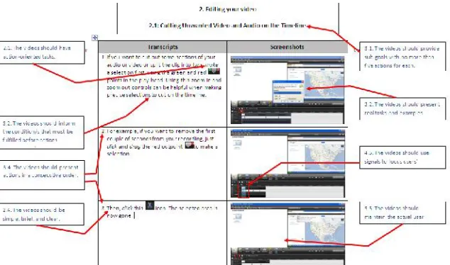
The design guidelines from the foundational theories, minimalism, four components model, multimedia learning, and recorded demonstration, were taken into account. The screenshots below were few examples to demonstrate the design principles used while designing the first video prototype.
The testing involved 4 non-English speaking users. The four participants were each given an opportunity to watch the video. Afterwards, they practised the instruction using Camtasia Studio 7 program to see if it worked in the real practice. At the same time, observations were done by the designers. After doing such activities, they were given a usability questionnaire to complete. The
questionnaire was a modified version from IBM Computer Satisfaction Usability Questionnaire (CSUQ) (Lewis, 1995). In addition to filling in the questionnaire, the participants were also interviewed to elaborate more on the positive, the negative aspects of the prototyped video. They were also asked suggestions to further improve the video.
The results from the questionnaire generally revealed that the participants were satisfied with the ease of video, its simplicity, efficiency, and clarity of the instruction. The effectiveness here was determined by the capability of the participants to practice the
instruction using the software, and all of them were able to use it with ease. In short, all participants were satisfied with the overall
instructional video.
Through the questionnaires and interviews, users also gave the positive, negative and suggestions that informed the revision of the video. Regarding the positive aspects, the entire users reported that the video was brief, clear and that the instruction is well sequenced. They stated that the signaling used and the speed of narration is good and that the language used is also simple and easy to understand. The negative aspects mentioned, on the other hand, are three. First, the signaling used is not consistent; for instance the use of circles. Second, the reason why users need to link or de-link the video and audio track is not well explained and lastly, the zoom used in one scene is big which can make the user loose the context of the interface.
Quite a number of suggestions were put forward by users, such as the need to include text instructional steps to help users follow and remember. Secondly, the type of signaling should be consistent in the entire video and lastly, to inform users that basic computer skill is needed to use the video. In addition, an instructional video expert was involved for appraisal. The instructional video expert was positively impressed with the design. However, two key points and some technical issues were found and required for further improvement. The first main issue concerned about the goals and how to sell them better, and the second was mainly related to the actual tasks presented to the users. The technical issues included the language, the pace or pacing, and some conceptual and procedural information.
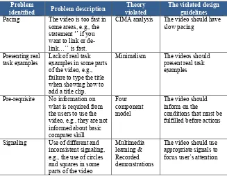
violated. Those violations are detailed in the table below and were used to inform further revisions of the second final video prototype.
Table 1: Summary of violated design guidelines from the first video prototype
Pacing The video is too fast in some areas, e.g., the statement ‘’ if you want to link or de-link…’’ is fast.
CIMA analysis The video should have slow pacing failure to type the title when showing how to the users to use the video, e.g., they are not informed about basic
Signaling Use of different and inconsistent signaling, e.g., the use of circles and squares in some
6. Prototype revision and retesting
This final video prototype was developed from the results of the first video prototype testing. The design guidelines reconsidered for this final prototype construction were related to slow pacing, presenting real task examples, informing on the conditions that must be fulfilled before actions, and using appropriate signals to focus user’s attention.
novice users?” This question mainly addressed the practical effectiveness of the designed video. In other words, it was aimed at assessing whether users could practice the instruction given in real video editing.
This testing involved the previous 4 users from the first video prototype testing. The four users were again each given the second prototype video to watch. Afterwards, they were then each given a video file sample for editing using Camtasia Studio 7 software to establish whether the instructional recorded video was effective in terms of providing learning and performance support for novice users. The effectiveness was assessed through the accomplishment of the tasks that were related to the sub-goals of the video 2. The results showed that all the four participants were satisfied with the improvement of the video compared to the first video prototype. They were all able to edit the sample video file with ease. For instance, they were able to cut put of a clip, link and delink video and audio track, split a clip, remove a clip from the time line, add a title clip, format a title clip, add a transition, and finally remove a transition. In short, the final revised video
prototype was effective in helping the novice users to effectively edit a video file within Camtasia Studio 7 software.
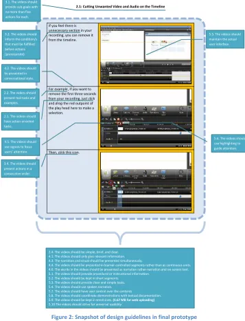
2.1: Cutting Unwanted Video and Audio on the Timeline
If you feel there is unnecessary section in your recording, you can remove it from the timeline.
For example, if you want to remove the first three seconds from your recording, justclick
anddragthe red outpoint of the play head here to make a selection.
2.4. The videos should be simple, brief, and clear. 4.1. The videos should only give relevant information. 4.3. The narration and visual should be presented simultaneously.
4.4. The videos should be presented in learner-controlled segments rather than as continuous units. 4.6. The words in the videos should be presented as narration rather narration and on-screen text. 5.1. The videos should provide procedural or instructional information.
5.2. The videos should be kept in short segments. 5.3. The videos should provide clear and simple tasks. 5.4. The videos should use spoken narration. 5.7. The videos should have user control over the contents
5.8. The videos should coordinate demonstrations with textual documentation. 5.9. The videos should be kept in small sizes.(5.67 MB for web uploading) 5.10.The videos should strive for universal usability.
7. Discussion and conclusion
The aim of this design project was to translate relevant theories into practice through the design and development of a recorded instructional video for a procedure. It incorporated the theories of minimalism, four components model, multimedia learning, and recorded demonstration. The above-mentioned theories are rich foundational bases for recorded demonstration instruction. Minimalism or “less is more” theory as it is commonly referred to, enabled the designers to design an action and leaner-oriented instruction using few and simple words without losing the instructional goals (Hans van der Meij & Carroll, 1995). Moreover, the four component model for a procedure guided the designers in redesigning procedures for the instructional videos (H. van der Meij & Gellevij, 2004). This theory also guided the revision of the goals and sub-goals, stating the conditions that must be satisfied before an action, telling unintended conditions, and the results that come from the actions carried out by users. Furthermore, multimedia learning design
principles helped redesign the user interface, narrating in a
conversational style to engage users, visual, signaling effect, learner control segments, providing only the most necessary information, and synchronized audio and video presentation (Richard E. Mayer, 2001, 2003; R. E. Mayer & Moreno, 2003). Finally, recorded demonstration guidelines contributed to providing clear and simple tasks, maintaining the actual user interface, providing user control over the content, and keeping the video file size small (Plaisant & Shneiderman, 2005). The experiences learned by the designers from the prototype (testing) during this design process revealed that the above theories, principles, and guidelines are vital in the design of an effective, efficient, and appealing instruction for users’ performance and support. In other words, an outright violation of those theories, guidelines, and principles can seriously jeopardize the effectiveness of a recorded instructional video for procedures. Below are the learning points for the designers based on this design process.
users always tend to question why the action is necessary for them. A good example was when the goal to link or delink the video and audio track was not sold in the video prototype one; the users asked why they needed to link or unlink the two tracks. Also, failure to sell the title clip prompted users to ask why they had to use it. Secondly, when the outcome from the users’ action is not well explained, the users get stuck. A good example was when users added a title clip; they were confused about what was going to happen if the reaction on what to do next was not told or given.
Violating minimalism theory also proved catastrophic to the users. For instance, the designers found out that users always wanted simple and clear instruction. When redundant information was presented, it destructed users’ learning due to increased cognitive load. The use of difficult and ambiguous terms also left users more confused and de-motivated to continue learning from the instructional video. Again, when real tasks or examples were not presented, users asked for a demonstration of doing the tasks. This was evident in the first video prototype when the title clip was presented without any texts typed for the users to see how it worked. As a result, they asked for a real
demonstration of how it worked. Another lesson learned was that when errors were prone due to an action, the users expected information to guide them to recover from the errors. This was seen when title clip tab was missing in the interface of Camtasia studio 7 studio software, yet it was presented in the instructional video. As a result, users were stuck and asked where to get it back from.
Multimedia learning principles, such as providing learner control and signaling, were also crucial in the design. For example, when users were given a sample video to edit, they always referred back to the demonstration video and controlled it just to get the information they needed to perform a particular task at that moment. On signaling, the users advised consistent signaling format be used. This is a clear indication that the signaling itself drew their attention to where the action was in the video.
emerged crucial factors. For example, it was noticed in the prototype testing that the demonstration in the video had a title clip tab and the same tab was missing in the users’ interface (Camtasia Studio 7 software), then the users got stuck in the completion of the tasks. In other words, they asked where the title clip tab was because they saw it in the demonstration video interface, but could not find it at the same position in their Camtasia interface. With regard to narration, the first video prototype was narrated by a non-native English speaker users found some shortcomings in terms of clarity. However, when the second prototype was produced using a native English speaker, the users acknowledged clarity. This indicates that the clarity of the spoken narration in a recorded demonstration is vital in promoting learning and performance support.
References
Carroll, J. M., & Rosson, M. B. (1987). The paradox of the active user. In J. M. Carroll (Ed.),Interfacing thought: Cognitive aspects of human computer interaction(pp. 80-111). Cambridge, MA: MIT press.
Carroll, J. M., & van der Meij, H. (1998). Principles and heuristics for designing minimalist instruction. In J. H. Carroll (Ed.), Minimalism beyond the nurnberg funnel(pp. 20-53). Cambridge, MA: MIT Press.
Lewis, J. R. (1995). IBM computer usability satisfaction questionnaires: Psychometric evaluation and instructions for use.International Journal of Human-Computer Interaction, 7(1), 57-78. doi: 10.1080/10447319509526110
Mayer, R. E. (2001).The promise of multimedia learning. New York: Cambridge University Press.
Mayer, R. E. (2003). The promise of multimedia learning: using the same instructional design methods across different media. Learning and Instruction, 13, 125-139.
Mayer, R. E., & Moreno, R. (2003). Nine ways to reduce cognitive load in multimedia learning.Educational Psychologist, 38(1), 43-52. Nieveen, N. (1999). Prototyping to reach product quality. In J. van den
Akker, R. M. Branch, K. Gustafson, N. Nieveen & T. Plomp (Eds.),Design approaches and tools in education and training (pp. 125-135). Dordrecht, the Netherlands: Kluwer Academic Publishers.
Plaisant, C., & Shneiderman, B. (2005, 20-24 Sept. 2005).Show me! Guidelines for producing recorded demonstrations.Paper presented at the IEEE Symposium on Visual Languages and Human-Centric Computing.
Richey, R. C., Klein, J. D., & Nelson, W. A. (2004). Developmental research: Studies of instructional design and development. In D. H. Jonassen (Ed.),Handbook of Research for Educational Communications and Technology(2 ed., pp. 1099-1130). Mahwah, NJ: Lawrence Erlbaum Associates.
education and training(pp. 1-14). Dordrech: Kluwer Academic Publishers.
van der Meij, H., & Carroll, J. M. (1995). Principles and heuristics for designing minimalist instruction.Technical Communication, 42(2), 243-261.