What Readers Are Saying About Web Development Recipes
Solid practices you can take into your everyday web development process. Web designers and developers with a hunger for picking up a collection of quick and expertly described techniques in areas like UI, testing, CSS, and jQuery will love this book. No words are wasted on trivial details; this is a book for proactive web developers who want to pick up some new ideas fast.
➤ Peter Cooper
Editor, Ruby Inside, HTML5 Weekly, and JavaScript Weekly
I know of no other resource that even comes close to exploring so many interesting techniques for modern web development. These are real-world pragmatic recipes that you will actually use in your projects.
➤ Matt Margolis
Manager, application development, Getty Images
Web Development Recipes is one of those rare books that is not only extremely practical but also incredibly useful for a wide range of readers. Everyone in all aspects of web design and development will find numerous tips and tricks that will be immediately useful in their day-to-day work.
➤ Ray Camden
that normally takes years of freelancing. Even seasoned experts could learn some new tricks or explore areas of web development they haven’t touched yet.
➤ Steve Heffernan Creator, VideoJS
This is a design patterns book for modern web development, offering problem statements and solutions that can be applied to nearly any web development platform. It’s a must-have for web developers who need to update their skills with the latest and greatest tools and techniques, and it’s a library of solutions for those who are already up to speed. The authors have done an excellent job of condensing a tremendous amount of information into easy-to-understand, real-world solutions.
➤ Derick Bailey
Web Development Recipes
Brian P. Hogan
Chris Warren
Mike Weber
Chris Johnson
Aaron Godin
The Pragmatic Bookshelf
Programmers, LLC was aware of a trademark claim, the designations have been printed in initial capital letters or in all capitals. The Pragmatic Starter Kit, The Pragmatic Programmer, Pragmatic Programming, Pragmatic Bookshelf, PragProg and the linking g device are trade-marks of The Pragmatic Programmers, LLC.
Every precaution was taken in the preparation of this book. However, the publisher assumes no responsibility for errors or omissions, or for damages that may result from the use of information (including program listings) contained herein.
Our Pragmatic courses, workshops, and other products can help you and your team create better software and have more fun. For more information, as well as the latest Pragmatic titles, please visit us at http://pragprog.com.
The team that produced this book includes:
Susannah Pfalzer (editor) Potomac Indexing, LLC (indexer) Kim Wimpsett (copyeditor) David J Kelly (typesetter) Janet Furlow (producer) Juliet Benda (rights) Ellie Callahan (support)
Copyright © 2012 The Pragmatic Programmers, LLC. All rights reserved.
No part of this publication may be reproduced, stored in a retrieval system, or transmitted, in any form, or by any means, electronic, mechanical, photocopying, recording, or otherwise, without the prior consent of the publisher.
Contents
Acknowledgments . . . ix
Preface . . . xiii
1. Eye-Candy Recipes . . . 1
Recipe 1. Styling Buttons and Links 2
Recipe 2. Styling Quotes with CSS 6
Recipe 3. Creating Animations with CSS3 Transformations 13
Recipe 4. Creating Interactive Slideshows with jQuery 18
Recipe 5. Creating and Styling Inline Help Dialogs 24
2. User Interface Recipes . . . 33
Recipe 6. Creating an HTML Email Template 34
Recipe 7. Swapping Between Content with Tabbed Interfaces 45
Recipe 8. Accessible Expand and Collapse 52
Recipe 9. Interacting with Web Pages Using Keyboard
Shortcuts 59
Recipe 10. Building HTML with Mustache 67
Recipe 11. Displaying Information with Endless Pagination 73
Recipe 12. State-Aware Ajax 79
Recipe 13. Snappier Client-Side Interfaces with Knockout.js 84
Recipe 14. Organizing Code with Backbone.js 93
3. Data Recipes . . . 111
Recipe 15. Adding an Inline Google Map 112
Recipe 16. Creating Charts and Graphs with Highcharts 118
Recipe 17. Building a Simple Contact Form 126
Recipe 18. Accessing Cross-site Data with JSONP 134
Recipe 19. Creating a Widget to Embed on Other Sites 138
Recipe 20. Building a Status Site with JavaScript and
4. Mobile Recipes . . . 153
Recipe 21. Targeting Mobile Devices 154
Recipe 22. Touch-Responsive Drop-Down Menus 159
Recipe 23. Mobile Drag and Drop 163
Recipe 24. Creating Interfaces with jQuery Mobile 170
Recipe 25. Using Sprites with CSS 179
5. Workflow Recipes . . . 183
Recipe 26. Rapid, Responsive Design with Grid Systems 184
Recipe 27. Creating a Simple Blog with Jekyll 193
Recipe 28. Building Modular Style Sheets with Sass 201
Recipe 29. Cleaner JavaScript with CoffeeScript 209
Recipe 30. Managing Files Using Git 216
6. Testing Recipes . . . 227
Recipe 31. Debugging JavaScript 228
Recipe 32. Tracking User Activity with Heatmaps 234
Recipe 33. Browser Testing with Selenium 237
Recipe 34. Cucumber-Driven Selenium Testing 242
Recipe 35. Testing JavaScript with Jasmine 255
7. Hosting and Deployment Recipes . . . 267
Recipe 36. Using Dropbox to Host a Static Site 268
Recipe 37. Setting Up a Virtual Machine 272
Recipe 38. Changing Web Server Configuration Files with Vim 277
Recipe 39. Securing Apache with SSL and HTTPS 283
Recipe 40. Securing Your Content 287
Recipe 41. Rewriting URLs to Preserve Links 291
Recipe 42. Automate Static Site Deployment with Jammit and
Rake 296
A1. Installing Ruby . . . 305
A1.1 Windows 305
A1.2 Mac OS X and Linux with RVM 306
A2. Bibliography . . . 309
Acknowledgments
They say nobody writes a book alone. The truth is that even when you have five authors, you still end up bringing many other people with you for the ride. Without the support of these people, we wouldn’t have this book or the experience we gained from writing it.
Susannah Pfalzer, our wonderful development editor, did an amazing job wrangling five authors and making sure we didn’t skimp on the little things, like complete sentences, introductions, useful transitions, and coherent thoughts. We set out to write a book that would expose the modern web developer to a wide and eclectic collection of tools, but Susannah was always there to make sure we delivered the “why” as well as the “how” and the book is much better for it.
With the five of us scurrying to get things out the door quickly, mistakes and inconsistencies crept in, but thanks to our technical reviewers Charley Stran, Jessica Janiuk, Kevin Gisi, Matt Margolis, Eric Sorenson, Scott Andreas, Joel Andritsch, Lyle Johnson, Kim Shrier, Steve Heffernan, Noel Rappin, Sam Elliott, Derick Bailey, and Kaitlin Johnson, we are proud to have a book that’s so much better than it was when we started.
Special thanks to Dave Gamache for his advice on Skeleton, to Trevor Burn-ham for his feedback on CoffeeScript, to Steve Sanderson for setting us on the right path with Knockout.JS, and to Benoit Chesneau for quickly fixing some issues with the Couchapp installer.
David Kelly made our book cover, and while some of us would have loved to have the version of the cover with bacon on it, we’re all very happy with the design you see instead.
Additionally, we want to thank our other business associates including Erich Tesky, Austen Ott, Emma Smith, Jeff Holland, and Nick LaMuro for their support and feedback throughout the process.
Brian Hogan
This is my third book for the Pragmatic Bookshelf, and while I only wrote a fifth of it, it was still the most challenging. My coauthors each stepped up in their own way at just the right time to make it happen, and I’m proud to share this book with them. Chris, CJ, Mike, and Aaron each brought amazing ideas and examples into this book, and I’m proud of what we have. Thanks, guys!
But even with the extra help this time, I still couldn’t have done this without my wonderful wife, Carissa. Thank you for making sure I had the time to get this done. Thank you for taking care of the little things (and sometimes the big things that I’d forget).
Chris Warren
I can’t thank my awesome wife, Kaitlin, enough for her support and under-standing during many late nights and early mornings of writing and editing. You made some rough days infinitely more bearable.
Thanks to my coauthors for sharing in this experience. I’ve known these guys for a long time, and it was great to tackle writing a book for the first time with friends. Thanks especially to Brian, who has played a huge role in my profes-sional development over the years, for getting me involved in this undertaking.
Finally, thanks to my parents for their encouragement and support when I was growing up, in both writing and programming. I haven’t told you I’ve written this, and I’m excited to place a copy in your hands and show you what I’ve done.
Mike Weber
I’d like to thank Brian Hogan for being my mentor over the years and for getting me started as a web developer and now published author. Without him, I wouldn’t be doing any of this.
I’d also like the thank my other coauthors Chris, CJ, and Aaron for going through this journey with me and helping me along the way.
And finally I’d like to thank my wife, Kaley, for putting up with my late nights away from her so we could finish the book.
Chris Johnson
To my wife, Laura, thank you for supporting me every step of this journey. You gave up spending time with me so I could work on writing, drove on trips so I could work, and gave up many summer activities so I could write.
To my parents, thank you for teaching me to work for things I want and to never give up. Dad, thanks for waiting on your startup so I could finish the book.
Thanks to Brian, Chris, Mike, and Aaron for collaborating on this; you have made me a better writer with your constant feedback and support. You guys kept me going when sections got tough, and I really appreciated that.
To the guys at work, thanks for being a sounding board and tech reviewing the book.
Aaron Godin
Brian, Chris, Mike, and CJ have each been an inspiration to me as well as individuals to look up to. Thanks for pushing me along, even when I was out of touch with it. To Brian especially, thank you for being the best mentor and friend I could hope for.
Thanks to Brian Long for always listening and taking interest. Thank you to Taylor for your caring attitude and motivation; you always were my foundation when things became difficult.
Finally, thank you to my parents, Bill and Cynthia, for your unconditional support, love, and understanding. You both have taught me to keep at the things I enjoy in life. Thank you for preparing me to take on the world and for being the wisdom I need in the most critical of times.
Preface
It’s no longer enough to know how to wrangle HTML, CSS, and a bit of Java-Script. Today’s web developer needs to know how to write testable code, build interactive interfaces, integrate with other services, and sometimes even do some server configuration, or at least a little bit of backend work. This book is a collection of more than forty practical recipes that range from clever CSS tricks that will make your clients happy to server-side configurations that will make life easier for you and your users. You’ll find a mix of tried-and-true techniques and cutting-edge solutions, all aimed at helping you truly discover the best tools for the job.
Who’s This Book For?
If you make things on the Web, this book is for you. If you’re a web designer or frontend developer who’s looking to expand into other areas of web devel-opment, you’ll get a chance to play with some new libraries and workflows that will help you be more productive, and you’ll get exposed to a little bit of that server-side stuff along the way.
If you’ve been spending a lot of time on the backend and you need to get up to speed on some frontend techniques, you’ll find some good recipes here as well, especially the sections on workflow and testing.
One last thing—a lot of these recipes assume you’ve had a little experience writing client-side code with JavaScript and jQuery. If you don’t think you have that experience, read through the recipes anyway and pick apart the provided source code. Consider the more advanced recipes as a challenge.
What’s in This Book?
form that emails results, or how to configure Apache to redirect URLs and serve pages securely. We’ll take you through both the how and the why so you can feel comfortable using these solutions in your projects. Since this is a book of recipes, we can’t go into a lot of detail about more complex system architecture, but you’ll find some suggestions on where to go next in each recipe’s “Further Exploration” section.
We’ve organized the recipes into chapters by topic, but you should feel free to jump around to the topics that interest you. Each chapter contains a mix of beginner and intermediate recipes, with the more complex recipes at the end of each chapter.
In Chapter 1, Eye-Candy Recipes, on page 1, we cover some ways you can use CSS and other techniques to spice up the appearance of your pages.
In Chapter 2, User Interface Recipes, on page 33, you’ll use a variety of tech-niques to craft better user interfaces, including JavaScript frameworks like Knockout and Backbone, and you’ll look at how to make better templates for sending HTML emails.
In Chapter 3, Data Recipes, on page 111, you’ll look at ways you can work with user data. You’ll construct a simple contact form, and you’ll take a peek at how to build a database-driven application using CouchDB’s CouchApps.
In Chapter 4, Mobile Recipes, on page 153, you’ll take user interfaces a step further and look at ways you can work with the various mobile computing platforms. You’ll spend some time with jQuery Mobile, look at how to handle multitouch events, and dig a little deeper into how to determine how and when to serve a mobile version of a page to your visitors.
In Chapter 5, Workflow Recipes, on page 183, we’ll show you ways you can improve your processes. We’ll investigate how SASS can make your life easier when managing large style sheets, and we’ll introduce you to CoffeeScript, a new dialect for writing JavaScript that produces clean, compliant results.
In Chapter 6, Testing Recipes, on page 227, you’ll create more bullet-proof sites by using automated tests, and we’ll show you how to start testing the Java-Script code you write.
Finally, we’ll turn our attention to moving into production in Chapter 7, Hosting and Deployment Recipes, on page 267. We’ll walk you through building a virtual machine so you have a testing environment to try things before you set up your real production environment, and we’ll cover how to set up secure sites, do redirects properly, and protect your content. We’ll also show you
how to automate the deployment of websites so you won’t accidentally forget to upload a file.
What You Need
We’ll be introducing you to many new technologies in this book. Some of these are fairly new and somewhat subject to change, but we think they’re com-pelling and stable enough to talk about at an introductory level. That said, web development moves quickly. We’ve taken steps to ensure you can still follow along, by providing copies of the libraries we use in these recipes with the book’s source code.
We’ve tried to keep the prerequisites to a minimum, but there are a few things you’ll want to get set up before you dig in.
HTML5 and jQuery
We’ll use HTML5-style markup in our examples. For example, you won’t find any self-closing tags in our markup, and you’ll see some new tags like <header>
and <section> in some of the examples. If you’re not familiar with HTML5, you may want to read HTML5 and CSS3: Develop with Tomorrow’s Standards Today [Hog10].
We’ll also use jQuery, because many of the libraries we introduce in these recipes rely on it. In most cases, our code examples will fetch jQuery 1.7 from Google’s content delivery network. There are a couple of cases where libraries will require specific versions of jQuery, and we’ll be sure to point those out.
The Shell
You’ll work with various command-line programs in these recipes whenever possible. Working on the command line is often a huge productivity boost, because a single command can replace multiple mouse clicks, and you can write your own scripts to automate these command-line tools. The shell is the program that interprets these commands. If you’re on a Windows machine, you’ll use the command prompt. If you’re on OS X or Linux, that’s the Terminal.
Shell commands will look something like this:
$ mkdir javascripts
Ruby
Several recipes in this book require that you have the Ruby programming language installed. We’ll be using some tools that require Ruby to run, such as Rake and Sass. We’ve included a short appendix that walks you through installing Ruby, which you can find in Appendix 1, Installing Ruby, on page 305.
QEDServer
Several of the recipes in this book make use of an existing product manage-ment web application. You can work with this application by installing QEDServer,1 a stand-alone web application and database that requires very
little setup. QEDServer works on Windows, OS X, and Linux. All you need is a Java Runtime Environment. Whenever you see us refer to our “development server,” we’re talking about this. It gives us a stable web application backend for our demonstrations, and it gives you a hassle-free way to work with Ajax requests on your local machine.
The examples of this book will run against the version of QEDServer that we’ve bundled with the book’s code examples, which you should download from the book’s website.
To use QEDServer, you start the server with server.bat on Windows or ./server.sh on OS X and Linux. This creates a public folder that you can use for your workspace. If you create a file called index.html in that public folder, you can view it in your web browser by visiting http://localhost:8080/index.html.
A Virtual Machine
Several chapters in this book use a Linux-based web server with Apache and PHP. You’ll learn how to set up your own copy of this server in Recipe 37, Setting Up a Virtual Machine, on page 272, but we’ve provided a virtual machine that’s already configured, which you can get from http://www.webdevelop-mentrecipes.com/. You’ll need the free VirtualBox2 application to run the
virtual machine.
Online Resources
The book’s website3 has links to an interactive discussion forum as well as a place to submit errata for the book. You’ll also find the source code for all the
1. A version for this book is available at http://webdevelopmentrecipes.com/. 2. http://www.virtualbox.org/
3. http://pragprog.com/titles/wbdev/
projects we build. Readers of the ebook can click the box above the code ex-cerpts to download that snippet directly.
We hope you enjoy this book and that it gives you some ideas for your next web project!
CHAPTER
1
Eye-Candy Recipes
A solid application is great, but a couple of extra touches on the user interface can make a huge difference. If they’re easy to implement, that’s even better.
Recipe 1
Styling Buttons and Links
Problem
Buttons are an important element in our interaction with websites, and styling them so they match the look of our site can make a big difference in the overall design. Sometimes we want to use links and input buttons within the same context, such as a button to submit and a link to cancel a form, but we want those elements to match up visually. Additionally, it’d be great if we could have some stylistic control over our form buttons without having to create a graphic each time we needed one.
Ingredients
• A CSS3-compliant web browser, such as Firefox 4, Safari 5, Google Chrome 5, Opera 10, or Internet Explorer 9
Solution
Using CSS to style form elements or links is common enough, but by using a class and a few CSS rules, we create a style sheet that will make links and buttons match, giving us a consistent style across our elements without having to resort to using buttons for links or links to submit forms.
Since we want to achieve a common button appearance, we’ll start by creating a simple HTML page with a link and a button on it.
Download cssbuttons/index.html <p>
<input type="button" value="A Button!" class="button" /> <a href="http://pragprog.com" class="button">A Link!</a> </p>
Note that each has a class of button assigned to it. We’re going to use this class to style both the link and the input elements so that you can’t tell one from the other on the page.
First we’ll apply the basic CSS attributes for both.
Download cssbuttons/css-buttons.css font-weight: bold;
background-color: #A69520; text-transform: uppercase; font-family: verdana; border: 1px solid #282727;
The result looks like this:
With just these basic attributes, we already have some consistency between the objects, as the following buttons show, but we’re far from done. The font sizes don’t match up, and padding is different. It’s easy to tell that these are not the same type of element.
font-size: 1.2em; line-height: 1.25em; padding: 6px 20px;
By setting the font-size, line-height, and padding on the class, we override anything already set on the link and input elements. There are a still a few inconsistencies to address that give away that these two elements are not in fact the same.
cursor: pointer; color: #000;
text-decoration: none; cursor: pointer; color: #000;
text-decoration: none;
By default buttons do not cause the cursor to change from an arrow to a pointer, while links do. So, we have to choose one or the other and apply it to both. Additionally, links pick up the default link color on the page, and linked text is underlined.
Zooming in on our buttons in the browser reveals that, while they’re extremely close to the same height, the link is slightly smaller. This discrepancy will be clearer to users zooming in on mobile devices, so we want to make sure it’s addressed.
input.button { line-height:1.22em; }
We give a slightly larger line-height to input elements with a class of button. This tweaks the height slightly, bringing it in line with our link. There’s no magic to finding out the necessary height to set here; just zoom in on the elements in your browser and play with the line-height until the buttons match up. This removes the last discrepancies from our buttons, allowing us to focus on their overall look, which we could improve by rounding the corners and adding a bit of a drop shadow, like this:
border-radius: 12px;
-webkit-border-radius: 12px; -moz-border-radius: 12px; box-shadow: 1px 3px 5px #555; -moz-box-shadow: 1px 3px 5px #555; -webkit-box-shadow: 1px 3px 5px #555; border-radius: 12px;
-webkit-border-radius: 12px; -moz-border-radius: 12px; box-shadow: 1px 3px 5px #555; -moz-box-shadow: 1px 3px 5px #555; -webkit-box-shadow: 1px 3px 5px #555;
We’re adding three lines each for the radius and shadow attributes to ensure that the effect is seen in as many browsers as possible. Just the first line of each grouping (border-radius and box-shadow) is enough for modern browsers with CSS3 support, but -webkit-* and -moz-* increase compatibility with some older versions of Safari and Firefox, respectively.
For a final touch on the overall look of our buttons, let’s add a subtle gradient for texture. We’ll use this to our advantage shortly when we set the look of the buttons when they’re pressed.
background: -webkit-gradient(linear, 0 0, 0 100%, from(#FFF089), to(#A69520)); background: -moz-linear-gradient(#FFF089, #A69520);
background: -o-linear-gradient(#FFF089, #A69520);
background: linear-gradient(top center, #FFF089, #A69520);
background: -webkit-gradient(linear, 0 0, 0 100%, from(#FFF089), to(#A69520)); background: -moz-linear-gradient(#FFF089, #A69520);
background: -o-linear-gradient(#FFF089, #A69520);
background: linear-gradient(top center, #FFF089, #A69520);
buttons. Note the -o-* prefix for Opera support, which isn’t needed in the last set of CSS attributes.1
Finally, we want to add style to handle click events so that there is a visual indicator that the button has been pressed. Users expect that indication, and it can be disconcerting if it’s not there. Although there are numerous ways to convey that the button has been pressed, the simplest is to reverse the gradient.
.button:active, .button:focus { color: #000;
background: -webkit-gradient(linear, 0 0, 100% 0, from(#A69520), to(#FFF089));
background: -moz-linear-gradient(#A69520, #FFF089); background: -o-linear-gradient(#A69520, #FFF089);
background: linear-gradient(left center, #A69520, #FFF089); }
There are several ways that we could reverse the gradient, but the easiest way to do it consistently across the different browsers is to swap the colors in each. By setting this background on .button:active and .button:focus, we ensure that, whether the link or the input button is clicked, the change happens.
CSS-styled links and input buttons allow us to style otherwise disparate ele-ments and use them in the proper manner—links for navigating between pages and input buttons for submitting data—while presenting a consistent interface and not relying on JavaScript to make a link submit a form or a button outside of a form redirect to a page. This avoids breaking functionality in older browsers and lowering the overhead in understanding how a page is working.
Further Exploration
If a button is not available to the user, you could remove it from the interface, or you could add a disabled class to it. What would that class look like? Once you have a disabled button style that you like, what else would you need to do to truly disable it? Form inputs have a disabled attribute, but for links you’re going to need to use JavaScript.
Also See
• Recipe 2, Styling Quotes with CSS, on page 6
• Recipe 28, Building Modular Style Sheets with Sass, on page 201
1. For help getting your gradient just right, check out http://www.westciv.com/tools/ gradients/.
Recipe 2
Styling Quotes with CSS
Problem
Quotations from experts and praise from customers carry a lot of weight, so we often draw attention to these quotations visually. Sometimes we’ll offset the margins a bit, increase the font size, or use large curly quotes to really make the quotation stand out. On a website, we want to do that in a simple and repeatable fashion, while keeping the presentation of the quotation sep-arate from the code.
Ingredients
• A web browser that supports HTML5 and CSS3
Solution
We typically use CSS to separate our presentation from content, and styling quotations shouldn’t be any different. Modern browsers support some more advanced properties we can use to make our quotations stand out, without adding much additional markup to the page.
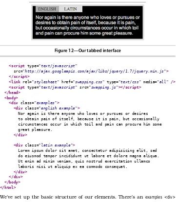
While we’ll focus on styling quotations in this recipe, the techniques discussed can be applied in many other situations as well. For example, by combining the CSS we’ll write with the code in Recipe 7, Swapping Between Content with Tabbed Interfaces, on page 45, we can further customize the style of our dif-ferent examples, tweaking colors to help distinguish between difdif-ferent sets of data. We can also apply the ideas in Recipe 25, Using Sprites with CSS, on page 179 to add background images to our quotes or examples.
We’ve been asked to add some short customer reviews for the product pages of our store. They’ll be only a couple of sentences long, but each product page will have several quotes, and we’ll want them to stand out from the product description. First, let’s look at the HTML and CSS techniques we’ll pull together to make this happen.
Download cssquotes/quote.html <html>
<head>
<link rel="stylesheet" href="basic.css"> </head>
<body>
<blockquote> <p>
Determine that the thing can and shall be done, and then we shall find the way.
</p> </blockquote>
<cite>Abraham Lincoln</cite> </body>
</html>
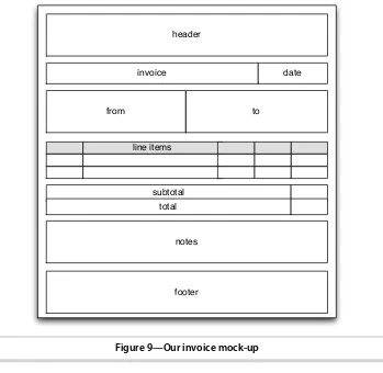
Now that we have good semantic markup for our quotes, we’ll start styling them. First we’ll do a simple approach; we’ll put a border around the quote and increase the size of the text while putting a bit less emphasis on the author’s name and sliding it to the right, like in Figure 1, A basic quote style, on page 8.
<blockquote> and the <cite>. We use an adjacent sibling selector on the <cite> tag to make sure we are styling it only if it comes immediately after a block-quote; otherwise, we’ll leave other <cite> tags alone. Beyond that, we change the color of the author’s name, adjust the padding to line everything up as we’d like, and end up with a simple but good-looking quote.
Figure 1—A basic quote style
Now that we have our basic quote style established, we can start to get fancier. Rather than using a border, let’s add a large “ to the front of the quote to draw the eye and make it obvious what we’re displaying, like Figure 2, With quotes added by CSS, on page 9.
Download cssquotes/quotation-marks.css blockquote {
width: 225px; padding: 5px; }
blockquote p { font-size: 2.4em; margin: 5px; z-index: 10; position: relative; }
blockquote + cite { font-size: 1.2em; color: #AAA; text-align: right; display: block; width: 225px; padding: 0 50px; }
blockquote:before { content: open-quote; position: absolute; z-index: 1;
Figure 2—With quotes added by CSS
left: 10px; font-size: 12em; color: #FAA; font-family: serif; }
blockquote:after { content: close-quote; position: absolute; z-index: 1;
bottom: 80px; left: 225px; font-size: 12em; color: #FAA; font-family: serif; }
blockquote + cite:before { content: "-- ";
}
This style inserts quotation marks behind our text, adds a – before the author’s name, and removes the black border. To achieve this effect, we’re using the
:before and :after selectors, which allow us to insert content when specified tags are encountered on the page. Using the content attribute, we can specify what that content should be, whether it’s open-quote and close-quote codes or a string.
With the quotes in place, we added a few more attributes, most of which are self-explanatory, such as color, font family, and font size. Be sure to pay attention to the z-index attributes that were added, as well as the position:relative;
attribute on blockquote p. Using the position attributes plus z-index lets us place the quotation marks behind the quote, so we don’t need any extra space for the marks; plus, it looks cool to have the text overlaying them. We also position our blockquote:after along the bottom so that no matter how long the quote gets, the quotation mark stays at the end.
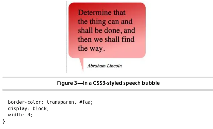
For our last style, we’ll go all out and style the quotes to look like speech bubbles, taking advantage of some of cool CSS3 attributes to round the corners of the box and add a gradient to the background color, making our quote look like Figure 3, In a CSS3-styled speech bubble, on page 11.
background: -webkit-gradient(linear, 0 0, 20% 100%, from(#C40606), to(#faa));
Figure 3—In a CSS3-styled speech bubble
border-color: transparent #faa; display: block;
width: 0; }
Thanks to CSS3, we don’t need images to put our quote inside a speech bubble. We start by setting a background color on the blockquote. This will be displayed in all browsers, even ones that don’t support the CSS3 effects we’re applying. Next we apply a background that has a gradient using the linear-gradient attribute and then we round the corners of the element by using the
border-radius attribute.
Because different browsers use different syntax for linear-gradient and border-radius, we have to use multiple lines to get the same (or similar) effects across browsers. -moz and -webkit prefixes indicate code specifically for Firefox and WebKit-based browsers (e.g., Safari and Chrome), respectively. Finally, we add the CSS3 standard attribute, which covers all of our bases.
Very few changes take place in the blockquote p and blockquote + cite styles; we adjust sizes on a few attributes, but overall things stay the same. Font colors and sizes, as well as padding, can easily be adjusted here to better fit the style of the site.
Our final style element is the blockquote:after, which creates the bottom triangle of our speech bubble. We set the content to an empty string because there’s no need for actual content here; we just want it for its borders. By setting the border widths to different thicknesses between the top and bottom, and left and right, we create a triangle. Multiple values can be set on any CSS attribute that can specify values for each side, in the clockwise order from top, right, bottom, left. We use this to set the sizes of the borders as well as the
colors, with transparent borders on the top and bottom and color on the right and left.
Further Exploration
What other styles can you come up with for quotes? In our final example, we created a speech bubble. Swapping a border from right to left on the
block-quote:after flips it on the vertical axis, but what would we have to do to move the author’s name and the triangle to the top of the bubble?
Internet Explorer’s gradient filter can create the same effects we used in our final quote style, but the process is a bit different. Gradients are applied directly to the object, rather than on the background-image as with the other browser. Using the documentation on this2 from Microsoft, can you add support for older versions of IE?
Also See
• Recipe 1, Styling Buttons and Links, on page 2
• Recipe 25, Using Sprites with CSS, on page 179
• Recipe 7, Swapping Between Content with Tabbed Interfaces, on page 45
• Recipe 28, Building Modular Style Sheets with Sass, on page 201
Recipe 3
Creating Animations with CSS3 Transformations
Problem
For many web developers, Flash has been the go-to tool for developing sites with animations, but these animations aren’t visible from the iPad, iPhone, and other devices that don’t support Flash. In cases where the animation is really important to our customers, we’ll need a non-Flash workaround.
Ingredients
• CSS3 • jQuery
Solution
With the advent of CSS3 transitions and transformations, we now have the option to define animations natively, without having to use plug-ins like Flash. These animations will work only with newer mobile browsers and the latest versions of Firefox, Chrome, Safari, and Opera, but the logo itself will be visible for all users, even if they don’t see the animations. To make the animation work in other browsers, we would continue to rely on the Flash version.
Our current client’s website originally had its logo done in Flash so that a “sheen” could be seen crossing the logo when the user loaded the page. He just got a new iPad, and he’s frustrated that his animation doesn’t display but even more worried that his logo doesn’t show up. While the missing effect wouldn’t break the entire site, the missing logo does remove some of the site’s branding. We’re going to make the logo visible in all browsers and add back the animation for browsers that support CSS3 transformations.
Let’s start with the markup for the header that contains our logo. We’ll add a class to the <img> tag so we can access it from the style sheet later.
Download csssheen/index.html <header>
<div class="sheen"></div>
<img src="logo.png" class="logo"> </header>
To get this effect, we’re going to create a semitransparent, angled, and blurred HTML block that moves across the screen once the Document Object Model (DOM) is loaded. So, let’s start by defining our header’s basic style. We want a blue banner that crosses the top of our content. To do this, we give our header the desired width and position the logo in the upper-left corner of our header.
With our basic layout in place, we can add the decorative elements for the animation. Let’s first create the blurred HTML element, but since this is an extra effect and has absolutely nothing to do with the content of our site, we want to do it with as little extra HTML markup as possible. We’ll make use of the <div> with the “sheen” class that we defined in our markup to make this work.
Download csssheen/style.css header .sheen {
height: 200px; width: 15px;
background: rgba(255, 255, 255, 0.5); float: left;
-moz-box-shadow: 0 0 20px #FFF; -webkit-box-shadow: 0 0 20px #FFF;
box-shadow: 0 0 20px #FFF;
Figure 4—The “sheen” is visible and unstyled.
If we look at our page now (Figure 4, The “sheen” is visible and unstyled, on page 15), we see that we’ve added a thin, white, transparent line that’s taller than our header. We’re off to a great start. Now we want to reposition the sheen element so that it’s blurred, starts left of the header, and is slightly angled.
This is where things get a little tricky. Because the various browsers are still deciding how to support transformations and transitions, we have to add the specific browser prefixes to ensure that each browser picks up on the style change. So even though, for what we’re doing at least, each style declaration has exactly the same arguments, we need to add the various prefixes to ensure that each browser applies the style. We also want to add a nonprefixed style definition so our style will work when the CSS3 spec is agreed upon. For example, you’ll see that we don’t declare an -o-box-shadow style because newer versions of Opera don’t even recognize that style anymore, and Firefox 4+ no longer uses the -moz-box-shadow style but still recognizes it and converts it to just box-shadow. However, we still keep the -moz-box-shadow style in place to sup-port Firefox 3. In the code, on page 14, we had to sacrifice clean code for functionality.
With our styles in place, we’re almost ready to animate our sheen element. Next we’ll add the transition declarations, which we’ll use for controlling the animation. For now, we’ll have to rely on browser-specific prefixes.
Download csssheen/style.css header .sheen {
-moz-transition: all 2s ease-in-out; -webkit-transition: all 2s ease-in-out;
-o-transition: all 2s ease-in-out;
transition: all 2s ease-in-out;
}
The transition definition takes three arguments; the first tells the browser which CSS attributes should be tracked. For our example, we only want to track the left attribute since we’re animating the sheen as it travels across the
header. This can also be set to all to control the transition of any attribute changes. The second parameter defines how long the animation takes, in seconds. This value can be a decimal, like 0.5s, up to multiple seconds for a longer transition when slower changes are desired. The final argument is the name of the timing function to use. We just use one of the default functions, but you can define your own as well. Ceaser3 is a tool that we could potentially use to define our own function.
Next, we need to add a style declaration that defines where we want the sheen to end up. In this case, it should end on the right side of the header. We could attach this to the hover event:
header:hover .sheen { left: 900px; }
But if we did, then the sheen is going to go back to its starting spot when the user hovers away from the header. We want to make this a one-time deal, so we’re going to have to use a little bit of JavaScript to change the state of the page. We’ll add a special class to our style sheet called loaded, which positions the sheen all the way at the end of the logo, like this:
Download csssheen/style.css header.loaded .sheen {
left: 900px; }
Then we’ll use jQuery to add that class to the header, which will trigger the transition.
$(function() { $('header').addClass('loaded') })
When looking at Figure 5, The “sheen” is styled but still visible outside of the header, on page 17, you may be thinking that all you’re doing is moving a blurry bar across the screen. But now that we’re done styling the sheen, we can clean up the overall look by adding a single style tweak. We’ll add a style of overflow: hidden;, which will hide the part of the sheen that hangs over the header.
Download csssheen/style.css header {
overflow: hidden; }
Figure 5—The “sheen” is styled but still visible outside of the header.
With all of our styles in place, we can trigger the entire animation just by changing a CSS class on an element. We no longer have to rely on a JavaScript animation suite or Flash for adding smooth animations to our websites.
This approach has the added advantage of saving our users’ bandwidth. Although this doesn’t affect most users, we don’t always know when a user might visit our site from an iPad or another mobile device using cellular cov-erage. This approach means less files to download and therefore faster load times for our visitors. We should always keep site optimization in mind when developing websites.
In browsers that don’t support these new style rules, our site will simply display the logo image. By separating style from content, we get the benefit of backward compatibility and better accessibility for users with screen readers, because the <img> tag contains the alternative text.
To make the animation work on all browsers, we could simply use this solution as a fallback to the original Flash solution, placing our <img> within the <object>
tag that embeds the Flash movie.
Further Exploration
We covered only a few of the transformations and transitions that are available to us. There are other transformation options available like scaling and skewing. We can also get more fine-grained control over how long each transformation takes, or even which transformations we actually want to transition. Some browsers also give you the ability to define your own transi-tions. The built-in control that we’re finally getting over animations is very exciting and well overdue.
Also See
• Recipe 1, Styling Buttons and Links, on page 2
• Recipe 2, Styling Quotes with CSS, on page 6
• Recipe 28, Building Modular Style Sheets with Sass, on page 201
Recipe 4
Creating Interactive Slideshows with jQuery
Problem
Just a few years ago, you’d probably create a Flash movie if you wanted to have an animated slideshow on your website. Simple tools would make this an easy process, but maintaining the photographs in the slideshow often means rebuilding the Flash movie. Additionally, many mobile devices don’t support Flash Player, which means they can’t see the slideshows at all. We need an alternative solution that works on multiple platforms and is easy to maintain.
Ingredients
• jQuery
• The jQuery Cycle plug-in4
Solution
We can build a simple and elegant image slideshow using jQuery and the jQuery Cycle plug-in. This open source tool will give our users a nice slideshow and only requires a browser with JavaScript support.
There are many JavaScript-based image cycling plug-ins, but what sets jQuery Cycle apart from the rest is its ease of use. It has many built-in transition effects and provides controls for the user to navigate through images. It’s well-maintained and has a very active developer community. It’s the perfect choice for our slideshow.
Our current home page is somewhat static and boring, so our boss wants us to build a slideshow showcasing the best of our company’s photographs. We’ll take some sample photographs and build a simple prototype to learn how the jQuery Cycle plug-in works.
We’ll start by creating a simple home page template that will hold our image slideshow named index.html, containing the usual boilerplate code:
Download image_cycling/index.html
Next, we’ll create an images folder and place a few sample images our boss gave us to use for the slideshow, which you can find in the book’s source code folder under the image_cycling folder.
Next, we add jQuery and the jQuery Cycle plug-in to our <head> section right below the <title> element. We also need to add a link to a file called rotate.js, which will contain all of the JavaScript we’ll need to configure our image
<script type="text/javascript" src="rotate.js"></script>
Then, we add a <div> with an ID of slideshow and add the images inside, like this:
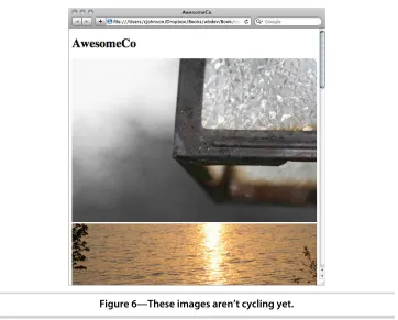
When we look at our page in the browser, we will see something like Figure 6, These images aren't cycling yet, on page 20. This also shows us what our page will look like if the user does not have JavaScript. We see that all of the content is available to the user so they don’t miss out on anything.
We haven’t added the functionality to trigger the jQuery Cycle plug-in, so we just see the images listed in order. Let’s add the JavaScript to initialize the
Figure 6—These images aren’t cycling yet.
plug-in and start the slideshow. Let’s create the file rotate.js and add this code, which configures the jQuery Cycle plug-in:
Download image_cycling/rotate.js $(function() {
$('#slideshow').cycle({fx: 'fade'}); });
The jQuery Cycle plug-in has many different options. We can make the images fade, fade with zooming, wipe, or even toss as they transition. You can find the full list of options on jQuery Cycle’s website.5 Let’s stick with the fade function because it is simple and elegant. We defined it with the snippet inside of the cycle() call.
fx: 'fade'
Now that we have all the pieces in place, let’s look at our page again. This time we see only one image, and after a few seconds, we begin to see the images rotate.
Adding Play and Pause Buttons
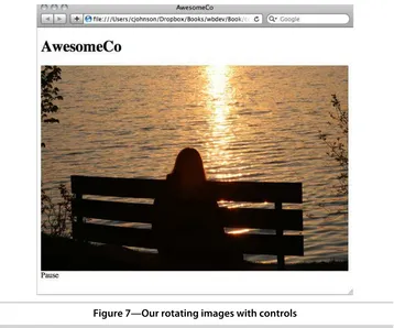
We now have a working slideshow. We show our boss the final product, and she says “That’s great, but I would really like to have a Pause button to let customers pause the slideshow on an image they like.” Lucky for us, the jQuery Cycle plug-in has this ability built right in.
We’ll add these buttons to the page with JavaScript, since they’re needed only when the slideshow is active. This way, we don’t present useless controls to users who don’t have JavaScript support. To do this, we’ll create two functions: setupButtons() and toggleControls(). The first function will add our buttons to the page and attach click() events to each. The click events will tell the slideshow to either pause or resume. We’ll also want the click() events to call
toggleControls(), which will toggle the buttons so only the relevant one is shown.
Download image_cycling/rotate.js var setupButtons = function(){
var slideShow = $('#slideshow');
var pause = $('<span id="pause">Pause</span>'); pause.click(function() {
slideShow.cycle('pause'); toggleControls(); }).insertAfter(slideShow);
var resume = $('<span id="resume">Resume</span>'); resume.click(function() {
slideShow.cycle('resume'); toggleControls();
}).insertAfter(slideShow);
resume.toggle(); };
var toggleControls = function(){ $('#pause').toggle(); $('#resume').toggle(); };
Notice that we are setting variables to our jQuery selectors. This allows us to manipulate the DOM in a much more succinct manner. We are also taking advantage of the way jQuery returns a jQuery object for almost all methods performed on a jQuery object, so we can chain our insertAfter() function onto our click() binding.
To trigger the setupButtons() function, we’ll need to add a call to it below our cycle()
call in the jQuery ready function.
Download image_cycling/rotate.js $(function() {
$('#slideshow').cycle({fx: 'fade'}); setupButtons();
});
Let’s check out the page in the browser again. We can see the Pause button show up on the page like in Figure 7, Our rotating images with controls, on page 23. Once our slideshow starts, we can click the Pause button, and we’ll see the Resume button replace the Pause button as the transitions stop. When we click the Resume button, the images will begin to change again.
Further Exploration
This slideshow was easy to implement, and with all of the options that are provided at the plug-in’s website,6 we can extend the slideshow to include
even more functionality.
To enhance the visual experience, the cycle plug-in has many transition set-tings, such as a shuffle, a toss, or an uncover transition. We can change our slideshow to use any of these by changing the value of the fx: option in our
cycle() call. We can also cycle other elements besides images, including more complex HTML regions. These are just some of the possibilities baked into the Cycle plug-in, so go explore and try them.
Also See
• Recipe 3, Creating Animations with CSS3 Transformations, on page 13
• Recipe 35, Testing JavaScript with Jasmine, on page 255
Figure 7—Our rotating images with controls
Recipe 5
Creating and Styling Inline Help Dialogs
Problem
We have a page with a lot of links to short, supplemental content elsewhere on our site. Just linking to these pages works, but it breaks the flow of reading to open the new browser while we’re in the middle of a paragraph, so it would be great to display the content inline in a stylish way and leave the page only if absolutely necessary.
Ingredients
• jQuery • jQuery UI7 • jQuery Theme 8
Solution
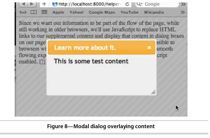
Since we want our information to be part of the flow of the page while still working in older browsers, we’ll use JavaScript to replace HTML links to our supplemental content and display that content inline on our page. Doing this will allow the content to remain accessible to browsers without JavaScript, while giving a more styled and smooth flowing experience to users with modern browsers and JavaScript enabled. And when we load this content, we will make it look good by displaying it with any of the jQuery animations, plus the regular and modal dialogs, such as Figure 8, Modal dialog overlaying content, on page 25.
Before we get to the JavaScript, let’s create a basic page that will load jQuery, jQuery UI, and a jQuery theme plus give us our first link for our inline content.
Download inlinehelp/index.html <html>
<head>
<link rel="stylesheet" href="jquery_theme.css"
type="text/css" media="all" />
7. http://jqueryui.com
Figure 8—Modal dialog overlaying content
<script type="text/javascript"
src='http://ajax.googleapis.com/ajax/libs/jquery/1.7/jquery.min.js'> </script>
<script type="text/javascript"
src='http://ajax.googleapis.com/ajax/libs/jqueryui/1.8.14/jquery-ui.min.js'> </script>
<script type="text/javascript" src='inlinehelp.js'></script> </head>
<body> <p>
This is some text.
<a href="test-content.html"
id="help_link_1"
class="help_link"
data-style="dialog"
data-modal='true'> Learn more about it. </a>
</p> </body> </html>
We expect to add this functionality quite frequently throughout our site, so implementing it should be as easy as possible. Once everything is done, our helper links will look like this:
<a href="a.html" id="help_a" class="help_link" data-style="dialog"> More on A
</a>
<a href="b.html" id="help_b" class="help_link" data-style="dialog"
data-modal="true"> More on B
</a>
<a href="c.html" id="help_c" class="help_link" data-style="clip"> More on C
</a>
<a href="d.html" class="help_link" data-style="fold"> More on D
</a>
Note that we are using data- attributes to declare the style and modal settings. This is part of the HTML5 specification, which allows custom data attributes on HTML elements. This lets us set information on our elements while maintaining valid markup.
The following code is an example of a simple setup for the script we’re going to write, setting just a few options and then calling our displayHelpers() function. Once it’s all set up, all we’ll need to do to make a link display its contents inline will be to set a class on it, along with optionally setting an animation style and specifying if dialog boxes should be modal.
Download inlinehelp/inlinehelp.js $(function() {
var options = {
helperClass:"help_dialog"
}
displayHelpers(options); });
Using jQuery’s ready() function, we make sure that the page has completely loaded before we start to manipulate the DOM. This ensures that everything is present on the page and we don’t miss anything when our code starts to run. We set a couple of options here, which aren’t required but help make our new links and dialog boxes look good. We then pass them in to the display-Helpers() and start to update the page there.
Download inlinehelp/inlinehelp.js
function displayHelpers(options) { if (options != null) {
setIconTo(options['icon']);
else {
setIconTo(); setHelperClassTo(); }
$("a.help_link").each(function(index,element) {
if ($(element).attr("id") == "") { $(element).attr("id", randomString()); } appendHelpTo(element);
});
$("a.help_link").click(function() { displayHelpFor(this); return false; }); }
We start off by setting the icon or text that will be used to indicate there’s something for the user to check out. We’re going to expect these links to be relevant to the content around them, so it’s OK to remove the actual text. We’ll also set a class for our dialog boxes so that we can style them.
Download inlinehelp/inlinehelp.js function setIconTo(helpIcon) {
isImage = /jpg|jpeg|png|gif$/ if (helpIcon == undefined)
{ icon = "[?]"; }
else if (isImage.test(helpIcon))
{ icon = "<img src='"+helpIcon+"'>"; } else
{ icon = helpIcon; } }
The setIconTo() function starts off by seeing whether there was a help_icon option passed at all. If there wasn’t, we’ll use the default option of [?]. If something was passed, we check whether it’s a path to an image by seeing whether the string ends with any common image extensions. If it does, we want to insert that in to an <img> element. Otherwise, we can display the text as it was passed. If it turns out that we were passed a full <img> element anyway, it’s no problem; it’ll still be displayed.
Next we want to set the class for the dialog boxes so that they’ll be styled when they’re displayed, either by our own CSS or by using a jQuery UI theme.
Download inlinehelp/inlinehelp.js
function setHelperClassTo(className) { if (className == undefined)
{ helperClass = "help_dialog"; } else
{ helperClass = className; } }
The setHelperClassTo() function checks to see whether a class was set in the options to use for the dialog boxes. If it was, we use it, but if not, we use our default of help_dialog.
We also want to make sure each link has an ID, because we will use this to associate the link with its respective dialog <div>. If a link doesn’t have an ID, we should add one.
Download inlinehelp/inlinehelp.js
$("a.help_link").each(function(index,element) {
if ($(element).attr("id") == "") { $(element).attr("id", randomString()); } appendHelpTo(element);
});
To ensure that IDs are present, we load any links on the page with the class
help_link and inspect them to make sure they have an ID attribute set. If there isn’t one, we generate a random string and use it as the ID.
Download inlinehelp/inlinehelp.js function randomString() {
var chars = "0123456789ABCDEFGHIJKLMNOPQRSTUVWXTZabcdefghiklmnopqrstuvwxyz"; var stringLength = 8;
var randomstring = '';
for (var i=0; i<stringLength; i++) {
var rnum = Math.floor(Math.random() * chars.length); randomstring += chars.substring(rnum,rnum+1); }
return randomstring; }
The randomString() function is a simple function that generates a random eight-character string containing letters and numbers. This should provide enough IDs to cover any links on the pages that don’t have IDs on them already.
After ensuring that an ID is present, we call the appendHelpTo() function, which inserts our icon into the link and prepares the dialog elements that will hold the contents of the linked pages.
Download inlinehelp/inlinehelp.js
Line 1function appendHelpTo(element) {
- if ($(element).attr("title") != undefined) {
title = $(element).attr("title");
-var helperDiv = document.createElement('div');
-$(element).attr("id") + "_" + $(element).attr("data-style")); helperDiv.setAttribute("class",
-10
$(element).attr("data-style") +" "+ helperClass);
-helperDiv.setAttribute("title", title);
helperDiv.setAttribute("style", "display:none;");
-When appendHelpTo() is called, it starts by inserting a <div> that will contain the contents of our linked page when the link is clicked. We give it an ID that is a combination of the link’s ID plus the class that was set in the options at the beginning. We also set a few classes: the class as we specified in the options plus a class that will indicate the animation style to use. The final thing to do is to set the style of the <div> to display:none; because we don’t want it to show up on the page until the link is clicked.
Line 3 of appendHelpTo() replaces the HTML of the original link with our icon, turning all of the links into inline [?]s or whatever was set in the options.
Download inlinehelp/inlinehelp.js
$("a.help_link").click(function() { displayHelpFor(this); return false; });
And now we call the final line of displayHelpers(), which gathers all elements with a class of help_link and overrides the normal response when one is clicked, instead calling the displayHelpFor() function and then returning false so that the normal click event does not fire.
Download inlinehelp/inlinehelp.js
function displayHelpFor(element) { url = $(element).attr("href");
helpTextElement = "#"+$(element).attr("id") + "_" + $(element).attr("data-style");
if ($(helpTextElement).html() == "") { $.get(url, { },
function(data){
$(helpTextElement).html(data);
if ($(element).attr("data-style") == "dialog") {
activateDialogFor(element, $(element).attr("data-modal"));
displayHelpFor() starts by getting the URL from the recently clicked link so we know what page we want to display. Next we build up the ID of the <div> that we inserted into the page earlier. This is where we will place the content from the URL of our link. But before we go to the trouble of loading that content,
we should make sure we haven’t already loaded it. If the <div> is empty, then we haven’t loaded any content into it yet. If we have, there’s no need to load it a second time, so we call the toggleDisplayOf() function. By not loading the content multiple times, we save the user from having to wait for the page to load again, and we reduce our own bandwidth costs.
However, if the content has not yet been loaded, we use jQuery’s get() function to load the URL via Ajax and insert its content in to the <div>. Having done that, we check to see the requested style of inline text. If we are using the dialog style, we call the activateDialogFor() function, which prepares the dialog window in the DOM and sets any modal options as well.
Download inlinehelp/inlinehelp.js
function activateDialogFor(element,modal) { var dialogOptions = { autoOpen: false }; if (modal == "true") {
$("#"+$(element).attr("id")+"_dialog").dialog(dialogOptions); }
This registers the dialog element with the page so that we are able to access it. After activation, we ensure that the dialog is closed by setting the autOpen:
false option. We do this because we want to open it using the toggleDisplayOf()
function so that we are being consistent with our other dialogs.
Download inlinehelp/inlinehelp.js
function toggleDisplayOf(element) { switch(displayMethodOf(element)) {
case "dialog":
Download inlinehelp/inlinehelp.js
function displayMethodOf(element) {
helperClassRegex = new RegExp(" "+helperClass); if ($(element).hasClass("dialog"))
{ displayMethod = "dialog"; } else
{ displayMethod = $(element).attr("class").replace(helperClassRegex,""); } return displayMethod;
}
In toggleDisplayOf(), we finally display our new content. First we use the
dis-playMethodOf() function to figure out how to display the content. We can use any animation method from the jQuery UI Effects library or the Dialog library, so first we check to see whether our link has a style of dialog. If it does, we return that; otherwise, we get the class of the link and remove our named class, which should leave us with just the animation style to use when dis-playing the content.
Back in toggleDisplayOf(), we use the display method to determine how to display or hide the content. If it’s a dialog, we check to see whether it is already open using one of jQuery’s helpers, isOpen, and open or close the dialog as is appro-priate. If we were unable to determine the animation style, we default to slide
and toggle the display of the element. Finally, if we do have a display_method, we toggle the visibility of our content using that method.
Once this code is in place, we can easily add new inline elements to our pages while giving us a great way to maintain compatibility with all browsers. Plus, our code is implemented loosely enough to handle any new animations that come along without having to make any changes beyond handling compatibil-ity with new versions of jQuery.
Further Exploration
There are a few things that would be very nice to declare as options when we first initialize our code, specifically, the class for our helper links and the default animation. Right now both of those attributes are hard-coded, so we’ll need to make sure there’s still a default value if nothing is set, similar to how we set the class for our content <div>s or the icon text/image.
Right now we toss out the text of the original link and replace it with our icon. What could we do with it instead of discarding it completely? Setting it as a title would give our users some indication of what the page is about when they hover over the link and keep our page more in line with its original setup.
Also See
• Recipe 29, Cleaner JavaScript with CoffeeScript, on page 209
CHAPTER
2
User Interface Recipes
Recipe 6
Creating an HTML Email Template
Problem
Building HTML emails is a bit like traveling back in time—a time before CSS, when everyone used tables for layout and <font> tags reigned supreme. A lot of the best practices we’ve come to know and love just aren’t usable in HTML emails simply because the email readers don’t handle them. Testing a web page on multiple browsers is easy compared to the amount of testing we have to do when we create an email that will be read in Outlook, Hotmail, Gmail, or Thunderbird, not to mention the various mail applications on mobile devices.
But our job isn’t to complain about how difficult things are going to be; our job is to deliver results. And we have a lot of work to do. Not only do we need to produce readable HTML emails, we need to ensure we don’t get flagged as spam.
Ingredients
• A free trial account on Litmus.com for testing emails
Solution
Designing HTML emails means discarding many current web development techniques because of the constraints of email clients. While staying aware of these limitations, we also need to avoid techniques that might get us marked as junk messages, and we need to easily test our email on multiple devices. We need to build something that is usable, readable, and effective on multiple platforms, and the best approach is going to be using good old trusty HTML with table-based layouts.
HTML Email Basics
For starters, many web-based clients, like Gmail, Hotmail, and Yahoo often strip out or ignore style sheet definitions from the markup. Google Mail actu-ally removes styles declared in the <style> tag, in an attempt to prevent styles in emails from colliding with the styles it uses to display its interface. We also can’t rely on an external style sheet, because many email clients won’t auto-matically fetch remote files without first prompting the user. So, we can’t really use CSS for layout in an HTML email.
Google Mail and Yahoo either remove or rename the <body> tag in the email, so it’s best to wrap the email in another tag that can stand in for the <body>. Some clients choke on CSS shorthand declarations, and so any definitions we do use need to be spelled out. This example:
#header{padding: 20px;}
might be ignored by older clients, so instead, we need to expand it:
#header{
padding-top: 20px; padding-right: 20px; padding-bottom: 20px; padding-left: 20px; }
Desktop clients such as Outlook 2007 and Lotus Notes can’t handle back-ground images, and Lotus Notes can’t display PNG images. That might not seem like a big deal at first, but there are millions of enterprise users who use that as their primary client.
These aren’t the only issues we’ll run into, but they are the most prevalent. The Email Standards Project1 has comprehensive lists of issues for the various
email clients.
Partying Like It’s 1999
When it comes down to it, the most effective HTML emails are designed using the most basic HTML features:
• They’re built with simple HTML markup with minimal CSS styling. • They’re laid out with HTML tables instead of more modern techniques. • They don’t use intricate typography.
• The CSS styles are extremely simplistic.
In short, we’ll need to develop emails as if the last ten years of web develop-ment didn’t happen. With that in mind, let’s code up a very simple email
1. http://www.email-standards.org/