User’s Guide
SAS
®SAS® Stat Studio 3.1: User’s Guide
Copyright © 2008, SAS Institute Inc., Cary, NC, USA ISBN 978-1-59994-318-3
All rights reserved. Produced in the United States of America.
For a hard-copy book: No part of this publication may be reproduced, stored in a retrieval system, or transmitted, in any form or by any means, electronic, mechanical, photocopying, or otherwise, without the prior written permission of the publisher, SAS Institute Inc.
For a Web download or e-book: Your use of this publication shall be governed by the terms established by the vendor at the time you acquire this publication.
U.S. Government Restricted Rights Notice: Use, duplication, or disclosure of this software and related documentation by the U.S. government is subject to the Agreement with SAS Institute and the restrictions set forth in FAR 52.227-19, Commercial Computer Software-Restricted Rights (June 1987).
SAS Institute Inc., SAS Campus Drive, Cary, North Carolina 27513. 1st electronic book, March 2008
1st printing, March 2008 SAS®
Publishing provides a complete selection of books and electronic products to help customers use SAS software to its fullest potential. For more information about our e-books, e-learning products, CDs, and hard-copy books, visit the SAS Publishing Web site at
support.sas.com/publishing or call 1-800-727-3228. SAS®
Chapter 1. Introduction . . . 1
Chapter 2. Getting Started: Exploratory Data Analysis of Tropical Cyclones . . . 11
Chapter 3. Creating and Editing Data . . . 25
Chapter 28. Multivariate Analysis: Canonical Correlation Analysis . . . 389
Chapter 32. Variable Transformations . . . 437
Chapter 33. Running Custom Analyses . . . 465
Chapter 34. Configuring the Stat Studio Interface . . . 471
Appendix A. Sample Data Sets . . . 487
Appendix B. SAS/INSIGHT Features Not Available in Stat Studio . . . 499
The following release notes pertain to SAS Stat Studio 3.1.
• Stat Studio requires SAS 9.2.
• The phase 1 release of SAS 9.2 does not support running SAS as a remote workspace server. Consequently, Stat Studio for the phase 1 release of SAS 9.2 provides access only to the SAS Workspace Server installed on the same computer as Stat Studio. The local SAS server is called “My SAS Server” in Stat Studio.
• An updated release of Stat Studio is included with the phase 2 release of SAS 9.2. This version enables access to remote SAS Workspace Servers.
Introduction
What Is Stat Studio?
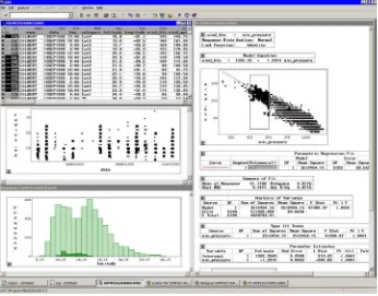
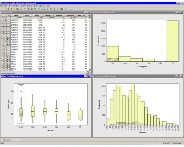
Stat Studio is a tool for data exploration and analysis.Figure 1.1shows a typical Stat Studio analysis. You can use Stat Studio to do the following:
• explore data through graphs linked across multiple windows • subset data
• analyze univariate distributions • fit explanatory models
• investigate multivariate relationships
Figure 1.1. The Stat Studio Interface
• the flexibility of the SAS/IML matrix language • the analytical power of SAS/STAT procedures • the data manipulation capabilities of Base SAS
• dynamically linked graphics for exploratory data analysis
The programming language in Stat Studio, which is calledIMLPlus, is an enhanced version of the IML programming language. IMLPlus extends IML to provide new language features such as the ability to create and manipulate statistical graphics and to call SAS procedures.
Stat Studio requires that you have a license for Base SAS, SAS/STAT, and SAS/IML. Stat Studio runs on a PC in the Microsoft Windows operating environment.
Related Software and Documentation
This book is one of three documents about Stat Studio. In this book you learn how to use the Stat Studio GUI to conduct exploratory data analysis and standard statistical analyses.
A second book,Stat Studio for SAS/STAT Users, is intended for SAS/STAT program-mers. In it, you learn how to use Stat Studio in conjunction with SAS/STAT in order to explore data and visualize statistical models. In particular, you learn to call proce-dures in other SAS products such as SAS/STAT or Base SAS by using the SUBMIT statement.
The third source of documentation is the Stat Studio online Help. You can display the online Help by selectingHelp◮Help Topicsfrom the main menu. The online Help includes documentation for all IMLPlus classes and associated methods. Stat Studio is closely related to the SAS/IML software. The language used to write programs in Stat Studio is calledIMLPlus. This language consists of IML functions and subroutines, plus additional syntax to support the creation and manipulation of statistical graphics. The Stat Studio program windows color-code keywords in the IMLPlus language.
Most IML programs run without modification in the IMLPlus environment. The Stat Studio online Help includes a list of differences between IML and IMLPlus.
Exploratory Data Analysis
Data analysis often falls into two phases: exploratory and confirmatory. The ex-ploratory phase “isolates patterns and features of the data and reveals these forcefully to the analyst” (Hoaglin, Mosteller, and Tukey 1983). If a model is fit to the data, exploratory analysis finds patterns that represent deviations from the model. These patterns lead the analyst to revise the model, and the process is repeated.
In contrast, confirmatory data analysis “quantifies the extent to which [deviations from a model] could be expected to occur by chance” (Gelman 2004). Confirmatory analysis uses the traditional statistical tools of inference, significance, and confidence. Exploratory data analysis is sometimes compared to detective work: it is the process of gathering evidence. Confirmatory data analysis is comparable to a court trial: it is the process of evaluating evidence. Exploratory analysis and confirmatory analysis “can—and should—proceed side by side” (Tukey 1977).
How Many Observations Can You Analyze?
Stat Studio provides the data analyst with interactive and dynamic statistical graphics. By definition, interactive graphics must respond quickly to the changes and manipu-lations of the analyst. This quick response restricts the size of data sets that can be handled while still maintaining interactivity.
Wegman(1995) points out that the number of observations you can analyze depends on the algorithmic complexity of the statistical algorithms you are using. For ex-ample, if you have nobservations, computing a mean and variance is O(n), sort-ing is O(nlogn), and solving a least squares regression onp variables isO(np2). Furthermore, visualization of individual observations is limited by the number of pixels that can be represented on a display device.
Wegman’s conclusion is that “visualization of data sets say of size 106 or more is clearly a wide open field.” More recently,Unwin, Theus, and Hofmann(2006) dis-cuss the challenges of “visualizing a million,” including a chapter dedicated to inter-active graphics.
Summary of Features
Stat Studio provides tools for exploring data, analyzing distributions, fitting paramet-ric and nonparametparamet-ric regression models, and analyzing multivariate relationships. In addition, you can extend the set of available analyses by writing programs.
To explore data, you can do the following:
• identify observations in plots
• select observations in linked data tables, bar charts, box plots, contour plots, histograms, line plots, mosaic plots, and two- and three-dimensional scatter plots
• exclude observations from graphs and analyses • search, sort, subset, and extract data
• transform variables
• change the color and shape of observation markers based on the value of a variable
To analyze distributions, you can do the following:
• compute descriptive statistics • create quantile-quantile plots
• create mosaic plots of cross-classified data
• fit parametric and kernel density estimates for distributions • detect outliers in contaminated Gaussian data
To fit parametric and nonparametric regression models, you can do the following:
• smooth two-dimensional data by using polynomials, loess curves, and thin-plate splines
• add confidence bands for mean and predicted values • create residual and influence diagnostic plots
• fit robust regression models, and detect outliers and high-leverage observations • fit logistic models
• fit the general linear model with a wide variety of response and link functions • include classification effects in logistic and generalized linear models
To analyze multivariate relationships, you can do the following:
• calculate correlation matrices and scatter plot matrices with confidence ellipses for relationships among pairs of variables
• examine relationships between a nominal variable and a set of interval variables with discriminant analysis
• examine relationships between two sets of interval variables with canonical correlation analysis
• reduce dimensionality by computing common factors for a set of interval vari-ables with factor analysis
• reduce dimensionality and graphically examine relationships between categor-ical variables in a contingency table with correspondence analysis
To extend the set of available analyses, you can do the following:
• write, debug, and execute IMLPlus programs in an integrated development en-vironment
• add legends, curves, maps, or other custom features to statistical graphics • create new static graphics
• animate graphics
• execute SAS procedures or DATA steps from within your IMLPlus programs • develop interactive data analysis programs that use dialog boxes
• call computational routines written in IML, C, FORTRAN, or Java
Comparison with SAS/INSIGHT
Stat Studio and SAS/INSIGHT have the same goal: to be a tool for data exploration and analysis. Both have dynamically linked statistical graphics. Both come with pre-written statistical analyses for analyzing distributions, regression models, and multivariate relationships.
Figure 1.2. A SAS/INSIGHT Analysis
However, there are three major differences between the two products. The first is that Stat Studio runs on a PC in the Microsoft Windows operating environment. It is
clientsoftware that can connect to SAS servers. The SAS server might be running on a different computer than Stat Studio. In contrast, SAS/INSIGHT runs on the same computer on which SAS is installed.
A second major difference is that Stat Studio is programmable, and therefore exten-sible. SAS/INSIGHT contains standard statistical analyses that are commonly used in data analysis, but you cannot create new analyses. In contrast, you can write pro-grams in Stat Studio that call any licensed SAS procedure, and you can include the results of that procedure in graphics, tables, and data sets. Because of this, Stat Studio is often referred to as the “programmable successor to SAS/INSIGHT.”
A third major difference is that the Stat Studio statistical graphics are programmable. You can add legends, curves, and other features to the graphics in order to better analyze and visualize your data.
Stat Studio contains many features that are not available in SAS/INSIGHT. General features that are unique to Stat Studio include the following:
• Stat Studio can connect to multiple SAS servers simultaneously.
• Stat Studio can run multiple programs simultaneously in different threads, each with its ownWORKlibrary.
• Stat Studio sessions can be driven by a program and rerun.
The following list presents features of Stat Studio data views (tables and plots) that are not included in SAS/INSIGHT:
• Stat Studio provides modern dialog boxes with a native Windows look and feel. • Stat Studio provides a line plot in which the lines can be defined by specifying
a singleXandYvariable and one or more grouping variables.
• Stat Studio supports a polygon plot that can be used to build interactive regions such as maps.
• Stat Studio provides programmatic methods to draw legends, curves, or other decorations on any plot.
• Stat Studio provides programmatic methods to attach a menu to any plot. After the menu is selected, a user-specified program is run.
• Stat Studio supports arbitrary unions and intersections of observations selected in different views.
Stat Studio also provides the following analyses and options that are not included in SAS/INSIGHT:
• Stat Studio detects outliers in contaminated Gaussian data.
• Stat Studio fits robust regression models and detects outliers and high-leverage observations.
• Stat Studio supports the generalized linear model with a multinomial response. • Stat Studio creates graphical results for the analysis of logistic models with one
continuous effect and a small number of levels for classification effects. • Stat Studio provides parametric and nonparametric methods of discriminant
analysis.
• Stat Studio provides common factor analysis for interval variables. • Stat Studio provides correspondence analysis for nominal variables.
Features of SAS/INSIGHT that are not included in Stat Studio are presented in Appendix B, “SAS/INSIGHT Features Not Available in Stat Studio.”
Typographical Conventions
This documentation uses some special symbols and typefaces.
• Field names, menu items, and other items associated with the graphical user interface are in bold; for example, a menu item is written as File◮Open◮ Server Data Set. A field in a dialog box is written as theAnchor tickfield. • Names of Windows files, folders, and paths are in bold; for example,
C:\Temp\MyData.sas7bdat.
• SAS librefs, data sets, and variable names are in Helvetica; for example, the
agevariable in thework.MyDatadata set.
• Keywords in SAS or in the IMLPlus language are in all capitals; for example, the SUBMIT statement or the ORDER= option.
This documentation is full of examples. Each step in an example appears in bold.
=⇒This symbol and typeface indicates a step in an example.
References
Gelman, A. (2004), “Exploratory Data Analysis for Complex Models,”Journal of Computational and Graphical Statistics, 13(4), 755–779.
Hoaglin, D. C., Mosteller, F., and Tukey, J. W., eds. (1983),Understanding Robust and Exploratory Data Analysis, Wiley series in probability and mathematical statistics, New York: John Wiley & Sons.
Tukey, J. W. (1977),Exploratory Data Analysis, Reading, MA: Addison-Wesley. Unwin, A., Theus, M., and Hofmann, H. (2006),Graphics of Large Datasets, New
Getting Started: Exploratory Data
Analysis of Tropical Cyclones
This chapter describes how you can use Stat Studio for exploratory data analysis. The techniques presented in this section do not require any programming. This example shows how you can use Stat Studio to explore data about North Atlantic tropical cyclones. (Acycloneis a large system of winds that rotate about a center of low atmospheric pressure.) The data were recorded by the U.S. National Hurricane Center at six-hour intervals. The data set includes information about each storm’s location, sustained low-level winds, and atmospheric pressure, and also contains variables indicating the size of the storm. The cyclones from 1988 to 2003 are included. A full description of theHurricanesdata set is included inAppendix A, “Sample Data Sets.”
The analysis presented here is based onMulekar and Kimball(2004) andKimball and Mulekar(2004).
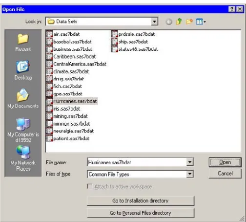
Opening the Data Set
=⇒Open theHurricanesdata set.
This data set is distributed with Stat Studio. To use the GUI to open the data set, do the following:
1. SelectFile◮Open◮Filefrom the main menu. The dialog box inFigure 2.1 appears.
2. ClickGo to Installation directorynear the bottom of the dialog box. 3. Double-click on theData Setsfolder.
Figure 2.1. Opening a Sample Data Set
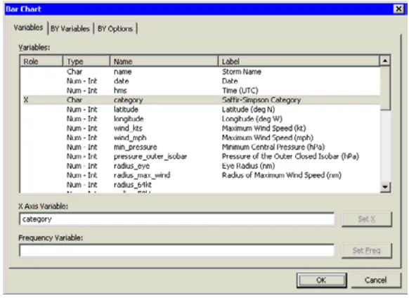
Creating a Bar Chart
Thecategoryvariable is a measure of wind intensity, corresponding to the Saffir-Simpson wind intensity scale inTable 2.1.
Table 2.1. The Saffir-Simpson Intensity Scale
Category Description Wind Speed (knots) TD Tropical Depression 22–33
TS Tropical Storm 34–63 Cat1 Category 1 Hurricane 64–82 Cat2 Category 2 Hurricane 83–95 Cat3 Category 3 Hurricane 96–113 Cat4 Category 4 Hurricane 114–134 Cat5 Category 5 Hurricane 135 or greater
In this section you create a bar chart of thecategoryvariable and exclude observations that correspond to weak storms.
=⇒Select Graph◮Bar Chart from the main menu.
The bar chart dialog box inFigure 2.2appears.
=⇒Select the variablecategory, and click Set X.
Figure 2.2. Bar Chart Dialog Box
=⇒Click OK.
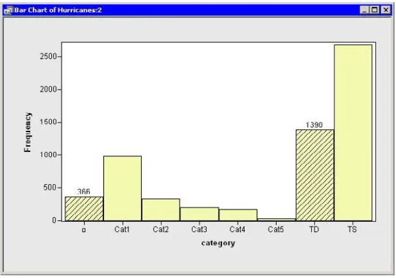
The bar chart inFigure 2.3appears.
Figure 2.3. A Bar Chart
The bar chart shows the number of observations for storms in each Saffir-Simpson intensity category. In the next step, you exclude observations of less than tropical storm intensity (wind speeds less than 34 knots).
=⇒In the bar chart, click on the bar labeled with the symbol.
these data, “missing” is equivalent to an intensity of less than tropical depression strength (wind speeds less than 22 knots).
=⇒Hold down the CTRL key and click on the bar labeled “TD.”
When you hold down the CTRL key and click, youextendthe set of selected observations. In this example, you select observations with tropical depression strength (wind speeds of 22–34 knots) without deselecting previously selected observations. This is shown inFigure 2.4.
Figure 2.4. A Bar Chart with Selected Observations
The row heading of the data table includes two special cells for each observation: one showing the position of the observation in the data set, and the other showing the status of the observation in analyses and plots. Initially, the status of each observation is indicated by the marker (by default, a filled square) and aχ2 symbol. The presence of a marker indicates that the observation is included in plots, and the
χ2symbol indicates that the observation is included in analyses (seeChapter 4, “The Data Table,” for more information about the data table symbols).
=⇒In the data table, right-click in the row heading of any selected observation, and select Exclude from Plots from the pop-up menu.
Figure 2.5. Data Table Pop-up Menu
=⇒In the data table, right-click in the row heading of any selected observation, and select Exclude from Analyses from the pop-up menu.
Notice that theχ2symbol is removed from observations with relatively low wind speeds. Future analysis (for example, correlation analysis and regression analysis) will not use the excluded observations.
=⇒Click in any data table cell to clear the selected observations.
Creating a Histogram
In this section you create a histogram of thelatitudevariable and examine relationships between thecategoryandlatitudevariables. The figures in this section assume that you have excluded observations with low wind speeds as described in the“Creating a Bar Chart”section on page 12.
=⇒Select Graph◮Histogram from the main menu.
The histogram dialog box inFigure 2.6appears.
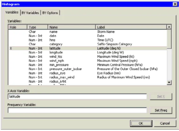
=⇒Select the variablelatitude, and click Set X.
Figure 2.6. Histogram Dialog Box
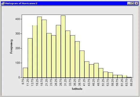
A histogram (Figure 2.7) appears, showing the distribution of thelatitudevariable for the storms that are included in the plots. Move the histogram so that it does not cover the bar chart or data table.
Figure 2.7. Histogram of Latitudes of Storms
Stat Studio plots and data tables are collectively known asdata views. All data views aredynamically linked, meaning that observations that you select in one data view are displayed as selected in all other views of the same data.
You have seen that you can select observations in a plot by clicking on observation markers. You can add to a set of selected observations by holding the CTRL key and clicking. You can also select observations by using aselection rectangle. To create a selection rectangle, click in a graph and hold down the left mouse button while you move the mouse pointer to a new location.
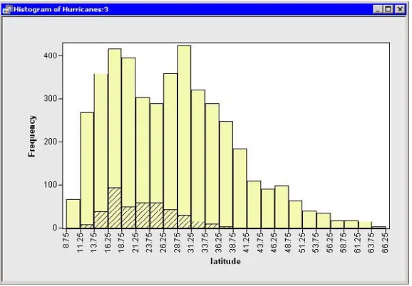
=⇒Drag out a selection rectangle in the bar chart to select all storms of category 3, 4, and 5.
Figure 2.8. Selecting the Most Intense Storms
Note that these selected observations are also shown in the histogram inFigure 2.9. The histogram shows the marginal distribution oflatitude, given that a storm is greater than or equal to category 3 intensity. The marginal distribution shows that very strong hurricanes tend to occur between 11 and 37 degrees north latitude, with a median latitude of about 22 degrees. If these data are representative of all Atlantic hurricanes, you might conjecture that it would be relatively rare for a category 3 hurricane to strike north of the North Carolina–Virginia border (roughly36.5◦north
latitude).
Creating a Box Plot
The data set contains several variables that measure the size of a tropical cyclone. One of these is theradius–eyevariable, which contains the radius of a cyclone’s eye in nautical miles. (The eye of a cyclone is a calm, relatively cloudless central region.) Theradius–eyevariable has many missing values, because not all storms have well-defined eyes.
In this section you create a box plot that shows how the radius of a cyclone’s eye varies with the Saffir-Simpson category. The figures in this section assume that you have excluded observations with low wind speeds as described in the“Creating a Bar Chart”section on page 12.
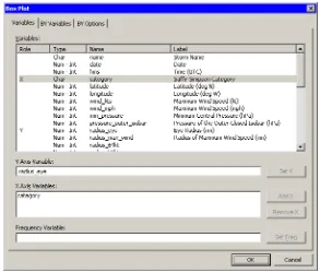
=⇒Select Graph◮Box Plot from the main menu.
The box plot dialog box appears as inFigure 2.10.
Figure 2.10. Box Plot Dialog Box
=⇒Select the variableradius–eye, and click Set Y.
=⇒Select the variablecategory, and click Add X.
=⇒Click OK.
A box plot appears. Move the box plot so that it does not cover the data table or other plots.
storms have similar distributions, while the most intense hurricanes (Cat5) in this data set tend to have eyes that are small and compact. The box plot also indicates considerable spread in the radii of eyes.
Recall that theradius–eyevariable contains many missing values. The box plot displays only observations with nonmissing values, corresponding to storms with well-defined eyes. You might wonder what percentage of all storms of a given Saffir-Simpson intensity have well-defined eyes. You can determine this percentage by selecting all observations in the box plot and noting the proportion of
observations that are selected in the bar chart.
=⇒Drag out a selection rectangle in the box plot around the category 1 storms.
In the bar chart inFigure 2.11, note that approximately 25% of the bar for category 1 storms is displayed as selected, meaning that approximately one quarter of the category 1 storms in this data set have nonmissing measurements forradius–eye.
Figure 2.11. Proportion of Category 1 Storms with Well-Defined Eyes
=⇒Drag the selection rectangle to select eye radii in other categories.
The selected observations displayed in the bar chart reveal the proportion of storms in each Saffir-Simpson category that have nonmissing values forradius–eye. Note in particular that very few tropical storms have eyes, whereas almost all category 4 and 5 storms have well-defined eyes.
Creating a Scatter Plot
In this section you examine the relationship between wind speed and atmospheric pressure for tropical cyclones. The National Hurricane Center routinely reports both of these quantities as indicators of a storm’s intensity. The figures in this section assume that you have excluded observations with low wind speeds as described in the“Creating a Bar Chart”section on page 12.
=⇒Select Graph◮Scatter Plot from the main menu.
The scatter plot dialog box appears as inFigure 2.12.
Figure 2.12. Scatter Plot Dialog Box
=⇒Select the variablewind–kts, and click Set Y.
=⇒Select the variablemin–pressure, and click Set X.
=⇒Click OK.
Figure 2.13. Wind Speed versus Minimum Pressure
Modeling Variable Relationships
In this section you model the relationship between wind speed and atmospheric pressure for tropical cyclones. The scatter plot inFigure 2.13shows a strong negative correlation between wind speed and pressure. To compute the correlation between these variables, you can run Stat Studio’s correlation analysis. The results in this section assume that you have excluded observations with low wind speeds as described in the“Creating a Bar Chart”section on page 12.
Note:You can select from theAnalysisorGraphmenu only when theactive windowis a data table or a graph. Click on a window’s title bar to make it the active window.
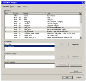
=⇒Select Analysis◮Multivariate Analysis◮Correlation Analysis from the main menu.
The correlation dialog box appears as inFigure 2.14.
=⇒Click on thewind–ktsvariable. Hold down the CTRL key, click on the
min–pressure, and click Add Y.
Figure 2.14. Correlations Analysis Dialog Box
=⇒Click the Plots tab.
=⇒Clear the Pairwise correlation plot check box.
=⇒Click OK.
SeeChapter 25, “Multivariate Analysis: Correlation Analysis,” for more information about the correlations analysis.
An output window appears (Figure 2.15), showing the results from the CORR procedure. The output shows that the Pearson correlation betweenwind–ktsand
min–pressureis –0.92533.
Suppose you want to compute a linear model that relateswind–ktsto
min–pressure. Several choices of parametric and nonparametric models are available from theAnalysis◮Model Fittingmenu. If you are interested in a response due to a single explanatory variable, you can also choose from models available from theAnalysis◮Data Smoothingmenu.
Note:If the scatter plot ofwind–ktsversusmin–pressureis the active window prior to your choosing an analysis from theAnalysis◮Data Smoothingmenu, then the data smoother is added to the existing scatter plot. Otherwise, a new scatter plot is created by the analysis.
=⇒Activate the scatter plot ofwind–ktsversusmin–pressure. Select
Analysis◮Data Smoothing◮Polynomial Regression from the main menu.
The polynomial regression dialog box appears as inFigure 2.16.
Figure 2.16. Polynomial Smoother Dialog Box
=⇒Select the variablewind–kts, and click Set Y.
=⇒Select the variablemin–pressure, and click Set X.
=⇒Click OK.
Figure 2.17. Least-Squares Regression
The output from the REG procedure indicates an R-square value of 0.8562 for the line of least squares given approximately by
wind–kts = 1222−1.177×min–pressure. The scatter plot shows this line and a 95% confidence band for the predicted mean. The confidence band is very thin, indicating high confidence in the means of the predicted values.
References
Kimball, S. K. and Mulekar, M. S. (2004), “A 15-year Climatology of North Atlantic Tropical Cyclones. Part I: Size Parameters,”Journal of Climatology, 3555–3575. Mulekar, M. S. and Kimball, S. K. (2004), “The Statistics of Hurricanes,”STATS,
Creating and Editing Data
The Stat Studio data table displays data in a tabular view. You can create small data sets by entering data into the table. You can edit cells to examine “what-if”
scenarios. You can add new variables or observations, and cut and paste between cells of the data table and the Microsoft Windows clipboard.
Entering Data
This section describes how you can use the data table to enter small data sets. You learn how to do the following:
• enter new variables • enter observations
• copy, cut, and paste to and from the Windows clipboard
Example: Creating a Small Data Set
The data in this example are quarterly sales for two employees, June and Bob.
=⇒Create a new data set by choosing File◮New◮Data Set from the main menu.
A dialog box prompts you for the name of the first variable. The first variable will contain the name of the sales staff. Fill in the dialog box (shown inFigure 3.1) as described in the following steps.
=⇒TypeEmployeein the Name field.
The contents of this box must be a valid SAS variable name as specified in the section“Adding Variables”on page 28.
=⇒In the Type field, selectCharacter.
Figure 3.1. Creating a Character Variable
The second variable will indicate the quarter of the financial year for which sales are recorded. The only valid values for this numeric variable are the discrete integers 1–4. Thus you will create this next variable as a nominal variable.
=⇒Create a new variable by choosing Edit◮Variables◮New Variable from the main menu.
Fill in the dialog box (shown inFigure 3.2) as described in the following steps.
=⇒TypeQuarterin the Name field.
=⇒SelectNominalfrom the Measure Level menu.
=⇒Click OK.
Figure 3.2. Creating a Nominal Numeric Variable
The third variable will contain the revenue, in thousands of dollars, for each salesperson for each financial quarter.
=⇒Create a third variable by choosing Edit◮Variables◮New Variable from the main menu.
Fill in the dialog box (shown inFigure 3.3) as described in the following steps.
=⇒In the Label field, typeSales (Thousands).
=⇒In the Format list, select DOLLAR. Type4in the W field.
=⇒Click OK.
Figure 3.3. Creating a Numeric Variable with a Format
Now you can enter observations for each variable. Note that the new data set was created with one observation containing a missing value for each variable. The first observation should be typed in the first row; subsequent observations are added as you enter them.
Entering data in the data table row marked with an asterisk (✳) creates a new observation. When you are entering (or editing) data, the ENTER key takes you down to the next observation. The TAB key moves the active cell to the right, whereas holding down the SHIFT key and pressing TAB moves the active cell to the left. You can also use the keyboard arrow keys to navigate the cells of the data table.
=⇒Enter the data shown inTable 3.1.
Note:When you enter the data for theSalesvariable,do nottype the dollar sign. The actual data is{34,29, . . . ,32}, but because the variable has a DOLLAR4. format, the data table displays a dollar sign in each cell.
Figure 3.4. New Data Set
At this point you can save your data.
=⇒Select File◮Save as File from the main menu. Navigate to the Data Sets subdirectory of your personal files directory and save the file as sales.sas7bdat.
Note:The default location of thepersonal files directoryis given in the section“The Personal Files Directory”on page 485. When you want to open your data later, you can selectFile◮Open◮Filefrom the main menu. The dialog box that appears has a button near the bottom that saysGo to Personal Files directory. For this reason, it is convenient to save data in your personal files directory.
Adding Variables
When you add a new variable, the New Variable dialog box appears as shown in Figure 3.5. You can add a new variable by choosingEdit◮Variables◮New Variablefrom the main menu.
Figure 3.5. The New Variable Dialog Box
The following list describes each field of the New Variable dialog box.
Name
specifies the name of the new variable. This must be a valid SAS variable name. This means the name must satisfy the following conditions:
• must be at most 32 characters
• must begin with an English letter or underscore • cannot contain blanks
• cannot contain special characters other than an underscore Label
specifies the label for the variable. Type
specifies the type of variable: numeric or character. Measure Level
specifies the variable’smeasure level. The measure level determines the way a variable is used in graphs and analyses. A character variable is always
nominal. For numeric variables, you can choose from two measure levels: Interval The variable contains values that vary across a continuous range.
For example, a variable measuring temperature would likely be an interval variable.
Nominal The variable contains a discrete set of values. For example, a variable indicating gender would be a nominal variable.
Format
Informat
specifies the SAS informat for the variable. For many informats you also need to specify values for theW(width) andD(decimal) fields associated with the format. For more information about informats see theSAS Language
Reference: Dictionary.
Note: You can type the name of a format into theFormatorInformatfield, even if the name does not appear in the list.
Adding and Editing Observations
To add a new observation, type data into any cell in the last data table row. This row is marked with an asterisk (✳).
When you are entering (or editing) data, the ENTER key takes you down to the next observation. The TAB key moves the active cell to the right, whereas holding down the SHIFT key and pressing TAB moves the active cell to the left. You can also use the keyboard arrow keys to navigate the cells of the data table.
It is possible to perform operations on a range of cells. If you select a range of cells, then you can do the following:
• Delete the contents of the cells with the DELETE key.
• Cut or copy the contents of the range of cells to the Windows clipboard, in tab-delimited format. This makes the contents of the cells available to all Windows applications (Excel, Word, etc.).
• Paste from the Windows clipboard into the selected range of cells, provided that the data on the clipboard is in tab-delimited format. You can paste numeric data into cells in a character variable (the data are converted to text), but you cannot paste character data into cells in a numeric variable.
Typing in a cell changes the data for that cell. Graphs that use that observation will update to reflect the new data.
The Data Table
The Stat Studio data table displays data in a tabular view. You can use the data table to change properties of a variable, such as a variable’s name, label, or format. You can also change properties of observations, including the shape and color of markers used to represent an observation in graphs. You can also control which observations are visible in graphs and which are used in statistical analyses.
Context Menus
The first two rows of the data table are column headings (also called variable headings). The first row displays the variable’s name or label. The second row indicates the variable’s measure level (nominal or interval), the default role the variable plays, and, if the variable is selected, in what order it was selected. Subsequent rows contain observations.
The first two columns of the data table are row headings (also called observation headings). The first column displays the observation number (or some other label variable). The second column indicates whether the observation is included in plots and analyses.
The effect of selecting a cell of the data table depends on the location of the cell. To select a variable, click on the column heading. To select an observation, click on the row heading.
Figure 4.1. Data Table with the Variables Menu
Variable Properties
You can change the properties of a variable by using theVariablesmenu, as shown inFigure 4.2. You can access theVariablesmenu by clicking on the column heading and selectingEdit◮Variablesfrom the main menu. Alternatively, right-clicking on a variable heading (seeFigure 4.1) selects that variable and displays the same menu. You can use theVariablesmenu to do the following:
• change properties of existing variables • set the role of an existing variable • create a new variable
• change the set of variables that are displayed in the data table • change the set of selected and unselected variables
One variable property that might be unfamiliar is therole. You can assign three default roles:
Label The values of the variable are used to label clicked-on markers in plots. Frequency The values of the variable are used as the frequency of occurrence for
each observation.
Weight The values of the variable are used as weights for each observation.
There can be at most one variable for each role. A variable can play multiple roles.
Figure 4.2. The Variables Menu
The following list describes each item on the variable menu.
Properties
displays the Variable Properties dialog box, described in the section“Adding Variables”on page 28. The dialog box enables you to change most properties for the selected variable. However, you cannot change the type (character or numeric) of an existing variable.
Interval/Nominal
changes the measure level of the selected numeric variable. A character variable cannot be interval.
Label
makes the selected variable the label variable for plots. Frequency
makes the selected variable the frequency variable for analyses and plots that support a frequency variable. Only numeric variables can have a Frequency role.
Weight
makes the selected variable the weight variable for analyses and plots that support a weight variable. Only numeric variables can have a Weight role. Ordering
a Nominal Variable” on page 155 for further details. TheOrderingsubmenu is shown inFigure 4.3. You can order a variable in the following ways: Standard specifies that categories are arranged in ASCII order by their
unformatted values. In ASCII order, numerals precede uppercase letters, which precede lowercase letters.
by Frequency specifies that categories are arranged according to the descending frequency count of formatted values in each category. by Format specifies that categories are arranged in ASCII order by their
formatted values.
by Data specifies that categories are arranged according to thedata orderof formatted values. The data order is determined by traversing the values of a variable, starting from the first observation. The first (nonmissing) value you encounter is ordered first, the next unique (nonmissing) value of the variable is ordered second, and so on. Sorting the data table does not affect this ordering; it is based on the original order of observations. by Frequency (unformatted) specifies that categories are arranged
according to the descending frequency count of unformatted values in each category.
by Data (unformatted) specifies that categories are arranged according to the data order of unformatted values. Sorting the data table does not affect this ordering; it is based on the original order of observations. Custom specifies that this variable was ordered by calling the
DataObject.SetVarValueOrder method. See the Stat Studio online Help for details about this method.
Sort
displays the Sort dialog box. The Sort dialog box is described in the section “Sorting Observations”on page 37.
New Variable
displays the New Variable dialog box (Figure 3.5) to create a new variable as described in the section“Adding Variables”on page 28.
Delete
deletes the selected variables. Display Name/Display Label
toggles whether the column heading displays the name of variables or displays their labels.
Hide
hides the selected variables. The variables can be displayed at a later time by selectingShow All. Hidden variables cannot be selected.
Show All
Invert Selection
changes the set of selected variables. Unselected variables become selected, while selected variables become unselected.
Generate –OBSTAT– Variable
creates a new character variable called–OBSTAT– that encodes the current state of each observation. The values of the–OBSTAT–variable are described in the following paragraphs.
Figure 4.3. The Ordering Menu
The–OBSTAT–variable is a character variable of length 20. It was introduced in SAS/INSIGHT software as a way to capture the state of observations, including the color and shape of markers and whether an observation is selected. The first few characters encode the state of binary options such as whether an observation is selected. A character is ‘1’ if the corresponding property is true and ‘0’ if the related property is false. The properties are described in the following list:
Character 1 stores whether the observation is selected.
Character 2 stores whether the observation is included in plots. Character 3 stores whether the observation is included in analyses. Character 4 stores whether the observation has a label.
Value Shape
Characters 6–20 store the RGB value of the fill color for an observation marker. The RGB color model represents colors as combinations of the colors red, green, and blue.
Each component is a five-digit decimal number between 0 and 65535. Characters 6–10 store the red component. Characters 11–15 store the green component. Characters 16–20 store the blue component.
If you read a data set for which there is no associated DMM file, and if that data set contains a variable named–OBSTAT–, then the state of each observation is determined by the corresponding value of the–OBSTAT– variable.
If an–OBSTAT–variable already exists when you selectGenerate –OBSTAT– Variablefrom the variable menu, then the values of the variable are updated with the current state of the observations.
The–OBSTAT–variable is often used to analyze observations with certain properties by using a SAS procedure. To use the–OBSTAT–variable outside Stat Studio, you can do the following:
1. Create an–OBSTAT–variable by selectingGenerate –OBSTAT– Variable from the variable menu.
2. Save the augmented data set to a libref such as SASUSER.
3. Use the following DATA step to extract each observation property into its own variable:
/* Create numerical variables from an _OBSTAT_ variable. */ data MyData;
set sasuser.MyData;
4. Use a WHERE clause to analyze only observations with a given set of properties.
Sorting Observations
This section describes how to sort a data table by one or more variables.
You can selectEdit◮Variables◮Sortfrom the main menu to open the Sort dialog box. Alternatively, you can right-click on a variable heading to select that variable and display the same menu, shown inFigure 4.2. The Sort dialog box is shown in Figure 4.4.
The first time the Sort dialog box is created, any variables that are selected are automatically placed in theSort bylist. Subsequently, the Sort dialog box remembers theSort bylist from the last sort.
Figure 4.4. The Sort Dialog Box
The following list describes each item in the Sort dialog box.
Variables
lists the variables in the data set that are not yet in theSort bylist. Select variables in this list to transfer them to theSort bylist.
≫
transfers the selected variables from theVariableslist to theSort bylist. ≪
removes selected variables from theSort bylist. Sort by
lists the variables to sort by. Up
moves a selected variable up one space in theSort bylist. Down
Ascending
marks the selected variables in theSort bylist to be sorted in ascending order. Descending
marks the selected variables in theSort bylist to be sorted in descending order.
To carry out the sort operation, clickOK.
If a nominal variable has a nonstandard ordering, as described in the section “Variable Properties”on page 32, then the sort dialog box indicates that fact by marking the variable name with an asterisk.
Observation Properties
This section describes how to change properties of observations. You can do the following:
• select observations
• change the shapes and colors of markers associated with observations • change whether certain observations are included or excluded from plots and
from analyses
The row heading to the left of the data table gives the status of each observation. The heading indicates whether an observation is selected, which shape and color is used to represent the observation in plot, and whether the observation is included in analyses.
You can change the properties of selected observations by using theObservations menu. You can access theObservationsmenu by selectingEdit◮Observations from the main menu. Alternatively, right-clicking on the row heading of a selected observation displays the sameObservationsmenu, shown inFigure 4.5.
Figure 4.5. The Observations Menu
Include in Plots
includes the selected observations in graphs. Exclude from Plots
excludes the selected observations from graphs. Include in Analyses
includes the selected observations in statistical analyses. Exclude from Analyses
excludes the selected observations from statistical analyses. Marker Properties
displays the Marker Properties dialog box, shown inFigure 4.8. Label by Observation Number
sets the label that is displayed in the left-most column of the data table to be the observation number. The observation number is also set as the default label that is displayed when you click on an observation marker in a graph. Label by Variable
displays the Label by Variable dialog box, shown inFigure 4.9. Invert Selection
changes the set of selected observations. Unselected observations become selected, while selected observations become unselected.
Delete
deletes the selected observations. Examine Selected Observations
displays the Examine Selected Observations dialog box, shown inFigure 4.14. You can use this dialog box to view and compare the selected observations.
Selecting Observations
You can select observations in a data table by clicking on the row heading to the left of the data table. You can drag to select contiguous observations. You can click while holding down the CTRL key to select new observations without losing the ones already selected.Figure 4.6shows selected observations.
Figure 4.6. Selected Observations
Clicking in any of the four cells in the upper-left corner of the data table does the following:
• Right-clicking in a cell brings up theObservationsmenu shown inFigure 4.5. Consequently, this is a safe place to right-click when you want to change properties of the selected observations, but no selected observations are currently visible.
• Click in the upper-left or lower-right cell to deselect all observations and variables.
• Click in the upper-right cell to deselect all observations and select all variables.
• Click in the lower-left cell to deselect all variables and select all observations.
If no observations are selected, the lower-left cell displays the total number of observations in the data table. If observations are selected, the lower-left cell displays (in brackets) the number of selected observations.
If no variables are selected, the upper-right cell displays the total number of variables in the data table. If variables are selected, the upper-right cell displays (in brackets) the number of selected variables.
Figure 4.7illustrates two possibilities. The left portion of the figure indicates a data table that has 2,322 selected observations; none of the 36 variables are selected. The right portion of the figure indicates that 6 variables are selected, but none of the 6,188 observations are selected.
Changing Marker Properties
You can change the markers used to represent observations. You can use marker shapes and colors to represent observations that share common properties. Marker shapes often used to discriminate observations with different values of a categorical variable (for example, male versus female). Marker colors can also be used for this purpose, or can represent a continuous variable.Chapter 9, “General Plot
Properties,” describes coloring markers by a continuous variable.
SelectEdit◮Observations◮Marker Propertiesfrom the main menu to open the Marker Properties dialog box, shown inFigure 4.8.
Figure 4.8. The Marker Properties Dialog Box
The following list describes each item in the dialog box.
Shape
sets the marker shape for the observations. Outline
sets the marker outline color for the observations. Fill
sets the marker fill color for the observations. Sample
shows what the marker with the specified shape and colors looks like. Apply to
specifies the set of observations whose markers will change. By default, changes are applied to only the selected observations.
Changing Observation Labels
You can change the label displayed in the left-most column of the data table. Observation numbers are shown by default.
Figure 4.9. The Label by Variable Dialog Box
TheHide Label Variablecheck box hides the label variable, because its values are displayed in the left-most column of the data table. This is especially useful if the label variable is one of the first variables in the data table.
Including and Excluding Observations
You can choose which observations appear in plots and which are used in analyses. To include or exclude observations, first select the observations. From theEdit ◮Observationsmenu, you can then selectInclude in Plots,Exclude from Plots, Include in Analyses, orExclude from Analyses.
The row heading of the data table shows the status of an observation in analyses and plots. A marker symbol indicates that the observation is included in plots;
observations excluded from plots do not have a marker symbol shown in the data table. Similarly, theχ2symbol is present if and only if the observation is included in analyses. If an observation is excluded from analyses but included in plots, then the marker symbol changes to the×symbol.
For example,Figure 4.10shows what the data table would look like if you excluded some observations. In this example, the second observation was included in plots but excluded from analyses. The third observation was excluded from plots but included in analyses. The fourth observation was excluded from both plots and analyses.
Examining Data
This section describes how to do the following:
• find observations that satisfy certain conditions • examine selected observations
• copy selected observations into a separate data set
In analyzing data, you might want to find observations that satisfy certain
conditions. For example, you might want to select all sales to a particular company. Or you might want to select all patients with high blood pressure.
After you have found the observations, you can examine the observations or copy them to a new data set.
Finding Observations
You can select observations in the data table by using the Find dialog box. (For a way to graphically and interactively select observations that satisfy multiple constraints, seeChapter 11, “Techniques for Exploring Data.”) You can open the Find dialog box (shown inFigure 4.11) by selectingEdit◮Findfrom the main menu.
Figure 4.11. The Find Dialog Box
The following list describes each item in the Find dialog box.
Variable
chooses the variable whose values are examined. The list includes each variable in the data set.
Operation
Value
specifies the value used to select observations. Apply variable’s informat to value
applies the variable’s informat to the contents of theValuefield. If the variable does not have an informat, then this item is inactive.
Apply format to each value during search
applies the variable’s format to the variable and then compares the formatted data to the contents of theValuefield. If the variable does not have a format, then this item is inactive.
Match case
specifies that each observation is compared to the contents of theValuefield in a case-sensitive manner. If the variable is numeric, then this item is inactive. Use tolerance of
specifies that a tolerance,ǫ, is used in comparing each observation to the contents of theValuefield. Table 4.1specifies howǫis used. If the chosen variable is a character variable, then this item is inactive.
Clear existing selection
specifies that all observations are searched, but only the observations that match the search criterion are selected.
Search within existing selection
specifies that only the observations that are selected are searched. You can use this option to perform logical AND operations.
Add to existing selection
specifies that all observations are searched, but observations that were selected prior to the search remain selected. You can use this option to perform logical OR operations.
For numeric variables, letvbe the value of theValuefield and letǫbe the value of theUse tolerance offield. (If you are not using a tolerance, thenǫ= 0.)Table 4.1 specifies whether an observation with valuexfor the chosen variable matches the query.
Table 4.1. Find Operations for Numeric Variables
To remember whether missing values match the query, recall that SAS missing values are represented as large negative numbers.Table 4.1is consistent with the WHERE clause in the SAS DATA step.
For character variables, comparisons are performed according to the ASCII order of characters. In particular, all uppercase letters [A–Z] precede lowercase characters [a–z]. Letvbe the value of theValuefield and letv≺xindicate thatvprecedesx
in ASCII order.Table 4.2specifies whether an observation with valuexfor the chosen variable matches the query.
Table 4.2. Find Operations for Character Variables
Operation Values Found Missing Selected?
Equals x=v No Is missing xis missing Yes
Contains xcontainsv No
Does not contains xdoes not containv Yes Begins with xbegins withv No
To help remember whether character missing values match the query, think of the character missing value as being a zero-length string that contain no characters. Table 4.2is consistent with the WHERE clause in the SAS DATA step.
As a first example,Figure 4.11shows how to find observations in theHurricanes
data set whoselatitudevariable is contained in the interval[28,32]. This is a quick way to find observations with latitudes between 28 and 32 in a single search.
A second example is shown inFigure 4.12. This search finds observations for which thedatevariable strictly precedes 07AUG1988. Note that thedatevariable has a DATE9. informat, so you can use that informat to make it more convenient to input the contents of theValuefield. (Without the informat, you would need to search for the value 10445, the SAS date value corresponding to 06AUG1988.) Note that the
Figure 4.12. Searching for Dates
A related example is shown inFigure 4.13. This search finds all observations for which thedatevariable contains the text “AUG”. Note that to perform this search you must checkApply format to each value during search. This forces the Find dialog box to apply the DATE9. format to thedatevariable, which means
comparing strings (character data) instead of numbers (numeric data). You can then selectContainsfrom theOperationlist. Each formatted string is searched for the value “AUG”.
Examining Selected Observations
You can examine a set of selected observations. To do this, selectEdit
◮Observations◮Examine Selected Observationsfrom the main menu.Figure 4.14shows the dialog box that appears. By clicking on observation numbers in the left-hand list (or by using the UP and DOWN arrow keys), you can examine each selected observation in turn.
Figure 4.14. Examining Selected Observations
Copying Selected Data
You can subset your data by copying selected observations or variables to a separate data set. (You can select variables without losing selected observations by holding down the CTRL key while you click.) You can then analyze or save this new data set.
Figure 4.15. Copying Selected Data
Saving Data
If you save data after changing variable or observation properties, then the changes are saved as well. Most variable properties (for example, formats) are saved with the SAS data set, whereas observation properties (for example, marker shapes) are saved in a separatemetadata file. The metadata file is stored on the client PC and has the same name as the data set, but with admmextension.
For example, if you save a data set namedMyDatato your PC, then a file named MyData.dmmis also created in the same Windows folder as theMyData.sas7bdat file.
If you have changed the data and try to exit Stat Studio, you are prompted to save the data set if you have done any of the following actions:
• edited cells in the data table
• changed a variable’s properties (name, label, format, informat) • changed a variable’s measure level (nominal, interval)
• sorted a data set
• added or deleted a variable • included or excluded observations
Properties of Data Tables
When a data table is the active window, you can do the following:
• create additional copies of the data table
• change the default properties of data tables in the current workspace
You can selectWindows◮New Windowfrom the main menu to create a copy of the current data table. (The new table might appear on top of the existing data table, so drag it to a new location, if necessary.) This second data table can be scrolled independently from the first. This is useful, for example, if you are interested in examining several variables or observations whose positions in the data table vary widely. You can examine different subsets of the data simultaneously by using two or more tabular views of the same data.
By default, if you sort one data table, then other data tables are also sorted in the same order. This is because a sort typically changes the order of the underlying data. (As mentioned in the section“Saving Data”on page 48, when you exit Stat Studio you are prompted to save the data if you have sorted it.) However, there might be instances when it is useful to view the same data, but sorted in a different order. To accomplish this, you canlocally sorta data table.
To locally sort a data table, selectEdit◮Propertiesfrom the main menu, which displays the dialog box inFigure 4.16.
TheOrderingtab has the following items:
Changes in observation order affect
gives you two choices. If you selectActual data, then sorting the data table results in a global sort that reorders the observation. If you selectThis view only, then sorting the data table results in a local sort that does not reorder the observations but only changes the view of the data in the current data table. Default sort order
gives you two choices. Your selection ofAscendingorDescending determines the default order in which variables are sorted.
TheSelectionstab has a single item, as shown inFigure 4.17. If you selectScroll selected observations into view, then the data table automatically scrolls to a selected observation each time an observation is selected. To manually scroll a selected item into view, use the F3 key.
Keyboard Shortcuts in Data Tables
Some keys in a data table are associated with certain actions, as shown inTable 4.3. Table 4.3. Keys and Actions in Data Tables
Key Action
ESC When editing data, abort the current edit and deselect cells. ESC Deselect any selected observations and variables.
F1 Display the online Help system.
F3 Move the active cell to the row of the next selected observation. SHIFT+F3 Move the active cell to the row of the previous selected
observa-tion.
F10 If observations are selected, display theObservations menu. If variables are selected, display the Variables menu. If observa-tions and variables are selected, display the Observations menu followed by theVariablesmenu.
TAB Move the active cell to the right. SHIFT+TAB Move the active cell to the left. ENTER Move the active cell down one row. ALT+RIGHT ARROW
ALT+LEFT ARROW
Toggle selection of a variable without changing the active cell.
ALT+DOWN ARROW ALT+UP ARROW
Toggle selection of an observation without changing the active cell.
SHIFT+ALT+RIGHT ARROW
SHIFT+ALT+LEFT ARROW
Toggle selection of a variable and move the active cell to the next or previous variable.
SHIFT+ALT+DOWN ARROW
SHIFT+ALT+UP ARROW
Toggle selection of an observation and move the active cell to the next or previous observation.
SHIFT+RIGHT ARROW
SHIFT+LEFT ARROW
Extend the selection of a range of cell columns.
SHIFT+DOWN ARROW
SHIFT+UP ARROW
Extend the selection of a range of cell rows.
HOME Edit the active cell and place the cursor at the beginning of the cell. END Edit the active cell and place the cursor at the end of the cell. CTRL+SPACEBAR Clear selected observations and variables.
CTRL+HOME Set the active cell to the first row and first column. CTRL+END Set the active cell to the last row and last column. CTRL+INSERT Display the New Variable dialog box.
In addition, the data table supports the arrow keys for navigating cells, and supports the standard Microsoft control sequences shown inTable 4.4.
Table 4.4. Standard Control Sequences in Data Tables Key Action
CTRL+A Select all observations.
CTRL+C Copy contents of selected cells to Windows clipboard. CTRL+F Display the Find dialog box.
CTRL+P Print the data table.
CTRL+V Paste contents of Windows clipboard to cells.
CTRL+X Cut contents of selected cells and paste to Windows clip-board.
Exploring Data in One Dimension
You can explore the distributions of nominal variables by using bar charts. You can explore the univariate distributions of interval variables by using histograms and box plots.
Bar Charts
This section describes how to use a bar chart to visualize the distribution of a nominal variable. A bar chart shows the relative frequency of unique values of a variable. The height of each bar is proportional to the number of observations with each given value.
Example
In this section you create a bar chart of thecategoryvariable of theHurricanes
data set. Thecategoryvariable gives the Saffir-Simpson wind intensity category for each observation.
Thecategoryvariable is encoded according to the value ofwind–kts, as shown in Table 5.1.
Table 5.1. The Saffir-Simpson Intensity Scale
Category Description Wind Speed (knots) TD Tropical Depression 22–33
TS Tropical Storm 34–63 Cat1 Category 1 Hurricane 64–82 Cat2 Category 2 Hurricane 83 –95 Cat3 Category 3 Hurricane 96 –113 Cat4 Category 4 Hurricane 114 –134 Cat5 Category 5 Hurricane 135 or greater
Thecategoryvariable also has missing values, representing weak intensities (wind speed less than 22 knots).
=⇒Open theHurricanesdata set.
Figure 5.1. Selecting a Bar Chart
A dialog box appears as inFigure 5.2.
=⇒Select thecategoryvariable, and click Set X.
=⇒Click OK.
Note: The bar chart also supports an optional frequency variable.
Figure 5.2. The Bar Chart Dialog Box
A bar chart appears (Figure 5.3), showing the unique values of thecategory
Figure 5.3. A Bar Chart
Thecategoryvariable has missing values. The set of missing values are grouped together and represented by a bar labeled with thesymbol.
You can click on a bar to select the observations contained in that bar. You can click while holding down the CTRL key to select observations in multiple bars. You can drag out a selection rectangle to select observations in contiguous bars.
You can create bar charts of any nominal variable, numeric or character.
Bar Chart Properties
This section describes theBarstab associated with a bar chart. To access the bar chart properties, right-click near the center of a plot, and selectPlot Area Propertiesfrom the pop-up menu.
TheBarstab controls attributes of the bar chart. TheBarstab is shown inFigure 5.4.
Fill
sets the fill color for each bar. Fill: Use blend
sets the fill color for each bar according to a color gradient. Outline
sets the outline color for each bar. Outline: Use blend
Fill bars
specifies whether each bar is filled with a color. Otherwise, only the outline of the bar is shown.
Show labels
specifies whether each bar is labeled with the height of the bar. Y axis represents
specifies whether the vertical scale represents frequency counts or percentage. “Other” threshold (%)
sets a cutoff value for determining which observations are placed into an “Others” category.
Figure 5.4. Plot Area Properties for a Bar Chart
For a discussion of the remaining tabs, seeChapter 9, “General Plot Properties.”
Bar Charts of Selected Variables
If one or more nominal variables are selected in a data table when you selectGraph ◮Bar Chart, then the bar chart dialog box (Figure 5.2) does not appear. Instead bar charts are created of the selected nominal variables.
You can also select nominalandinterval variables and selectGraph◮Bar Chart. A bar chart appears for each nominal variable; a histogram appears for each interval variable.
If a variable in the data table has a Frequency role, it is automatically used as the frequency variable for the plots; the frequency variable should not be one of the selected variables.
Variables with a Weight role are ignored when you are creating bar charts.
Histograms
This section describes how to use a histogram to visualize the distribution of a continuous (interval) variable. A histogram is an estimate of the density of data. The range of the variable is divided into a certain number of subintervals, or bins. The height of the bar in each bin is proportional to the number of data points that have values in that bin. A histogram is determined not only by the bin width, but also by the choice of an anchor (or origin).
Example
In this section you create a histogram of thelatitudevariable of theHurricanes
data set. Thelatitudevariable gives the latitude of the center of each tropical cyclone observation.
=⇒Open theHurricanesdata set.
=⇒Select Graph◮Histogram from the main menu, as shown inFigure 5.5.
Figure 5.5. Selecting a Histogram
A dialog box appears as inFigure 5.6.
=⇒Select thelatitudevariable, and click Set X.
=⇒Click OK.
Figure 5.6. The Histogram Dialog Box
A histogram appears (Figure 5.7), showing the distribution of latitudes for the tropical cyclones in this data set. The histogram shows that most Atlantic tropical cyclones occur between 10 and 40 degrees north latitude. The data distribution looks bimodal: one mode near 15 degrees and the other near 30 degrees of latitude.
Figure 5.7. A Histogram
Histogram Properties
This section describes theBarstab associated with a histogram. To access the histogram properties, right-click near the center of a plot, and selectPlot Area Propertiesfrom the pop-up menu.
TheBarstab controls attributes of the histogram. TheBarstab is shown inFigure 5.8.
Fill
sets the fill color for each bar. Fill: Use blend
sets the fill color for each bar according to a color gradient. Outline
sets the outline color for each bar. Outline: Use blend
sets the outline color for each bar according to a color gradient. Fill bars
specifies whether each bar is filled with a color. Otherwise, only the outline of the bar is shown.
Show labels
specifies whether each bar is labeled with the height of the bar. Y axis represents
specifies whether the vertical scale represents frequency counts, percentage, or density.
Figure 5.8. Plot Area Properties for a Histogram