L
ITERATURE
R
EVIEW
Design process of the user interface in
games
A
CKNOWLEDGEMENTSI would like to thank Alexandria Neonakis, Lead UI / UX designer and artist at Naughty Dog for her support and guidance as well as David Ballard for providing me with the
opportunity to talk with her.
Further appreciation must also be shown to the author of Level Up, Scott Rogers for his insight into user interface design from a ground level as well as Stephen J. Eskilson, author of Graphic Design: A History. (Both books can be found at heading 5.0 – Further Reading Material)
Further appreciation must go to Richard Merrick, UI / UX Designer at Rebellion Studios (Sniper Elite 3), as well as Liam Wong (Graphic Designer / 2D Artist) of Ubisoft Montreal (Far Cry 4) for their continued help and direction with reading material and advice on industry practises.
This document outlines some of the elements attributed with user interface design and designer motivations on approaching design decisions
C
ONTENTS
Acknowledgements... 1
Abstract... 1
1.0 - Introduction... 3
1.1 Terminology... 3
User interface (UI)... 3
User experience (UX)... 3
Loot Rush... 3
2.0 – Literature... 4
2.1 – Diegetic... 4
2.2 – Meta... 5
2.3 – Spatial... 6
2.4 – Non-Diegetic... 7
2.5 – What is considered bad UI...9
2.6 – UI for touch devices...10
2.7- User Experience meets world immersion...11
3.0 - Summary... 12
4.0 - Bibliography... 13
4.1 – Figure Referencing... 14
4.2 – Game and Media References...15
1.0 - I
NTRODUCTION
This report consists of presenting a link between the user interface design and the philosophy of such elements in a game. This involves: preliminary research, iterative design, art tests and logical problem solving (from the perspective of the player).
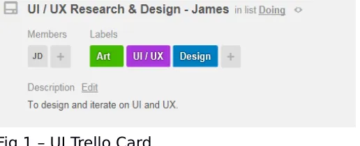
Fig 1 shows the tasks related to this literature review that is assigned to a team member in Trello. This includes: research, design, iteration and player related problem solving.
This document is the second assignment for the Research Methods module; its purpose is to highlight further research into user interface design within games and the processes involved. This research will be applied to the overall project.
Before discussing and exploring the concepts of user interface design it seems foremost relevant to define certain terminology.
1.1T
ERMINOLOGYDuring the course of this report references will be made to terminology outside the norm.
U
SER INTERFACE(UI)
“UI, or User Interface, refers to the methods (keyboard control, mouse control) and
interfaces (inventory screen, map screen) through which a user interacts with your game”[ CITATION Qui13 \l 2057 ].
U
SER EXPERIENCE(UX)
Jakob Nielsen defines the user experience as “An exemplary user experience is to meet the exact needs of the customer, without fuss or bother”[ CITATION NieNA \l 2057 ]. Erik Flowers reiterates Neilsen’s notion by defining UX as “The Intangible design of a strategy that brings us to a solution”[ CITATION Flo12 \l 2057 ].
L
OOTR
USHLoot Rush is the game for Research Methods, GAM6000 Dissertation project of Team 5.
2.0 – L
ITERATURE
One of the foremost responsibilities of a UI designer is to deduce what style of design works best for the project. This can be broken down into four primary categories: Diegetic, Meta, Spatial and Non-diegetic. (Stonehouse, 2014).
2.1 – D
IEGETICDiegetic UI is a mixture of feeding the player information while constricting itself to formats that feed the games narrative. Stonehouse defines this as “UI that is fiction or geometry that the player interacts with”. He also makes the point that this can sometimes be cumbersome to the player with it having “slow response times”[ CITATION Sto14 \l 2057 ].
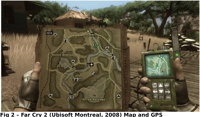
An example of a game that uses this style is Far Cry 2 (Ubisoft, 2008) In Far Cry 2 the player is required to explore the open / sandbox world to acquire variations of in-game economy. The only process that enables the player to accurately find said economy is by accessing the map and GPS locator. [See Fig 2]
Far Cry 2’s map and GPS system matches the “slow response times” that Stonehouse referred to. The player has to constantly pick the geometry out of their pocket and place it back to access the map and GPS.
Due to the quick nature of Loot Rush it seemed out of place to give it a UI system that is generally reserved for narrative driven games with a focus on immersion as opposed to pick up and play arcade style.
2.2 – M
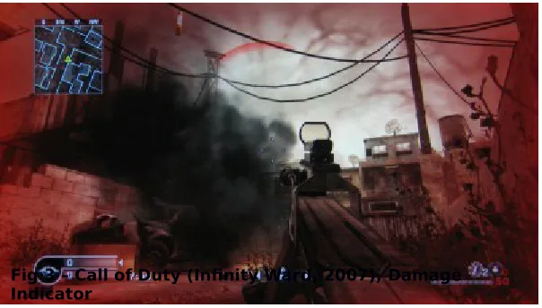
ETAMeta UI is a middle-ground between diegetic and non-diegetic UI. The Call of Duty franchise uses this format for health. [See Fig 3]
The purpose of this is to eliminate as much static UI as possible. Instead of having a health bar the player’s screen will flash red and fade in and out when damage is taken. This effectively and efficiently negates the need for a health bar while still enforcing the game’s narrative of war, damage taken, danger etc. (It’s also worthy to note that the colour red is almost always used in instances of danger).
In terms of Loot Rush it would make thematic sense for the act of loot collection itself to contain aspects of meta UI while also paying attention to colour theory and psychology. For example, using an armour pick up as a yellow aura as opposed to something physical such as the player attaching armour geometry.
Scott Rogers states a similar idea for a game to achieve a minimalist look. Design should consist of “glows or attention-drawing effects on items to make them stand out to the player” He goes on to say designers should “opt for full screen-sized effects over smaller or subtle ones. It never hurts to overemphasize.”[ CITATION Rog10 \l 2057 ].
2.3 – S
PATIALSpatial UI is a system that would accompany Loot Rush well, as its core principles are “breaking the narrative in order to provide more information to the player than the in game character should be aware of” (Stonehouse, 2013).
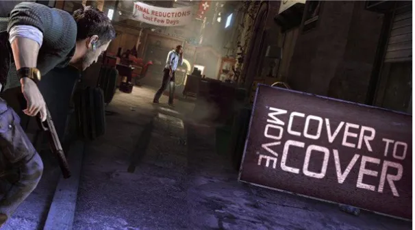
Fig 4 – Splinter Cell Conviction spatial UI
Figure 3 shows how pertinent information can be signaled to the player while not deterring from the narrative. Stonehouse states that “spatial elements can be beautiful pieces when they work with the geometry of the world”.
While film being an entirely different art form the use of spatial interfaces works equally as well but without the need for player movement or human participation. Figure 5 shows Sherlock (BBC). To make his thought processes understandable and more intriguing to the viewer they are displayed in such a manner.
Fig 5 – Sherlock uses of spatial UI to convey information
A spatial approach for Loot Rush seems more than appropriate but audience demographic becomes an opportune focus point with this approach.
UI Designer of Naughty Dog, Alexandria Neonakis says that “dependent on the project. Cinematic AAA console games require minimal, clean UI. Kids games need readability and ease of comprehension to come first, so a subtle clean UI isn't necessarily the right
Depending on the age range and varying cultures the game will be played, it’s essential to focus on how said cultures interpret wording. When thinking about age it’s of the up most importance to ensure it eligible to the reader.
Apple’s developer guidelines suggest that developers “Use terminology that you’re sure your users understand”[ CITATION App14 \l 2057 ].
2.4 – N
ON-D
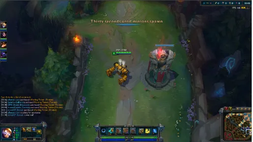
IEGETICNon-Diegetic UI is where the UI stands (generally) on a 2D plane and no in-game characters are aware of said UI.
Games requiring instant response to the player’s action with a high ratio of information being given at once generally adopt this form of UI. League of Legends (Riot Games, 2009) uses this form of interface.
Fig 6 – League of Legends UI screengrab
While League of Legends is defined as a MOBA (Multiplayer Online Battle Arena) the similar style of UI is often seen in MMO (Massively Multiplayer Online) games where the player needs immediate information given to them at all time. Alexandria Neonakis (UI Designer, Naughty Dog) supports the argument further by saying;
“MMO's require a lot of information on the screen at exactly the right time. So those would be all about organizing a lot of elements for fast recall”[ CITATION Neo14 \l 2057 ].
With a game like Loot Rush the player needs to have constant awareness of their cooldown timers and other usable abilities at a glance. This sometimes might be better suited to having UI elements directed on the players avatar / character as opposed to a surrounding 2D HUD (Heads up display) plane.
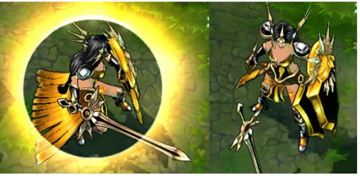
An example of this would be League of Legend’s champion Leona.
Fig 7 – Leona using W ability in League of Legends
Whenever the player hits W to engage Leona’s shield the player is shown a circle of light around the champion instead of the surrounding HUD elements, this enables to the player to keep focused on the action instead of looking away and potentially missing something. With Loot Rush a concept was to display a golden key above whichever player picked it up, this way the player wouldn’t have to look around the HUD to check, their eyes could stay focused on the level and continue with the intended experience.
To create a strong UI one must first understand what makes a bad one.
Daniel Burns defines a bad UI as “Unresponsive, Unintuitive, Inconsistent design and lacking to zero direction”[ CITATION Bur14 \l 2057 ].
Desi Quintans makes an example of Oblivion when focusing on poor UI decisions, noting that “It’s a combination of wasted space, improper scaling, and inappropriate
controls”[ CITATION Qui13 \l 2057 ].
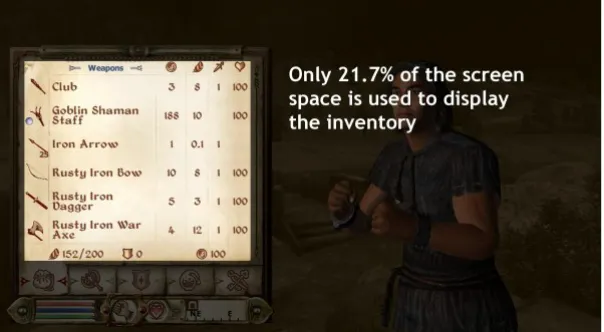
Fig 8 – Oblivion inventory screen
The mention of improper scaling and wasted space go hand in hand when referring to Oblivion’s (Bethesda, 2006) inventory system. For a scene / menu that is dedicated to the players inventory only 21.7% of the screen space is actually dedicated to controlling the inventory [see Fig 9]
Fig 9 – Oblivion inventory screen with percentage ratio
the player as well as looking at Daniel Burns’s core list of bad UI principals and seeing “unintuitive “in the list you can see how Oblivion’s (Bethesda, 2006) combination of the two in the inventory system can lead to a negative experience.
2.6 – UI
FOR TOUCH DEVICESWith some thought being given towards Loot Rush working on a touch device it’s important to observe trends within UI design on such a device, devices including: iPad (Apple, 2008) and Surface (Microsoft, 2012).
With the consistent viewpoint that UI should be “easy to navigate” and have a focus “information being easy to find” coming from the likes of Desi Quintans, Alexandria Neonakis and the Apple design team behind iOS8 (Apple, 2014) it’s fundamental to keep these basic principals in mind.
Touch screen games “work best when they only support one input at a time”[ CITATION Cre13 \l 2057 ]. Games genres such as: ‘turn based’ (Final Fantasy Tactics), ‘tower defense’ (Field Runners 2) and ‘card games’ (Hearthstone). These games all support a single touch philosophy, players using their devices in various scenarios; standing, sitting, walking etc won’t find the UI navigation too intensive and in turn the UX will remain intact and
therefore not inflicting on the players overall experience.
“Controls for touch are often at their best when they mimic human motions we already understand: flicking, pulling, sliding etc.”[ CITATION Cre13 \l 2057 ].
Two of the most profitable touch screen games are Angry Birds (Rovio, 2009) and Clash of Clans’ (Supercell, 2012) adhere to that mentality, Angry Birds requires the player to make two movements to play the game, swiping to navigate the screen and a pulling motion to move the in-game avatars. The interim between games also adheres to a “minimal load times” philosophy mentioned by Desi Quintans in his guide to good UI. Daniel Burns states that “Slow is evil. We’re talking seconds, but it can make a huge difference in whether the user sticks around” [ CITATION Bur14 \l 2057 ].
With the addition of a supplementary touch version to Loot Rush appearing on iPad or Surface devices it’s imperative that we stick to such practices that have been seen before it in successful games. The success of a game and an accomplished UI design almost go in hand in hand with touch screen games.
2.7- U
SER
E
XPERIENCE
MEETS
WORLD
IMMERSION
“The world of Left behind (Naughty Dog, SCE, 2013) had to feel familiar – a place two teenage girls could explore – but different from the main game in order to compliment the specific story we were telling. These logos populated the Boston and Colorado
malls.”[ CITATION Nau14 \l 2057 ]. [See Fig 10]
Fig 10 – Twisted – Used in Left Behind as Ice Cream shop logo
With the world of Loot Rush there will be experimentation into what sort of lifestyle can be conveyed through the UI and graphic design within the world.
If levels were to contain shops or castles then the UI could continue the aesthetic of the levels. Broken wood environments could hold up the UI, castle brick could have engraved UI elements on them.
3.0 - S
UMMARY
Throughout the reading material referenced within the literature review and in the further reading material section (5.0) It's made clear that a deep focus must be made to
While the content in the literature review holds a valuable grasp on approaching UI and UX further reading must be undertook to fully appreciate and understand the level of work required in a piece of work that takes it from concept to completion.
Further reading should be done into design areas such as: Typography, colour theory, consumer and player psychology and layout. All areas could have individual literature reviews due to the expansive history of their subject area. A book that encompasses each of these elements in extensive detail is Graphic Design, A History (Eskilson, 2014). [More information on the book can be found in the 5.0 - Further Reading Material.
4.0 - B
IBLIOGRAPHY
Apple, 2014. Developer.Apple. [Online] Available at:
https://developer.apple.com/library/ios/documentation/UserExperience/Conceptual/Mobile HIG/FeedbackCommunication.html#//apple_ref/doc/uid/TP40006556-CH56-SW1
Burns, D., 2014. The Difference Between Good UI and Bad UI. [Online]
Available at: http://www.dburnsdesign.com/blog/2014/05/the-difference-between-good-ui-and-bad-ui/
[Accessed 2 January 2014].
Credits, E., 2013. Extra Credits: Designing for a Touch Screen. [Online] Available at: https://www.youtube.com/watch?v=NBHircZu5EI
[Accessed 28 December 2014].
Dog, N., 2014. The Art of Naughty Dog. First ed. Santa Monica: Dark Horse. Flowers, E., 2012. UX is not UI. [Online]
Available at: http://www.helloerik.com/ux-is-not-ui [Accessed 22 December 2014].
Neonakis, A., 2014. UI Design [Interview] (15 December 2014). Nielsen, J., N/A. The Definition of User Experience. [Online]
Available at: http://www.nngroup.com/articles/definition-user-experience/ [Accessed 22 December 2014].
Quintans, D., 2013. GameDevelopment. [Online]
Available at: http://gamedevelopment.tutsplus.com/tutorials/game-ui-by-example-a-crash-course-in-the-good-and-the-bad--gamedev-3943
[Accessed 21 December 2014].
Rogers, S., 2010. Level Up The Guide To Great Video Game Design. First ed. Chichester: John Wiley & Sons Limited.
Stonehouse, A., 2014. User interface design in video games. [Online] Available at:
http://www.gamasutra.com/blogs/AnthonyStonehouse/20140227/211823/User_interface_d esign_in_video_games.php
[Accessed 23 Decemeber 2014].
4.1 – F
IGURE
R
EFERENCING
Fig 3 – Call of Duty, damage indicator. 2014. . [ONLINE] Available
at:http://static.giantbomb.com/uploads/original/0/118/217676-cod4hurt.jpg. [Accessed 18 December 2014].
Fig 4 - Splinter Cell Conviction spatial UI. 2014. . [ONLINE] Available
at: http://www.thewanderlust.net/blog/wp-content/uploads/2010/03/conviction.jpg. [Accessed 19 December 2014].
Fig 5 Sherlock uses of spatial UI to convey information. 2014. . [Screenshot] Not Available [Accessed 20 December 2014]. NOTE: Taken as screenshot by self
Fig 6 - League of Legends UI screengrab. 2014. . [Screenshot] Not Available [Accessed 23 December 2014]. NOTE: Taken as screenshot by self
Fig 7 - Leona using W ability in League of Legends. 2014. . [Screenshot] Not Available [Accessed 23 December 2014]. NOTE: Taken as screenshot by self
Fig 8 - Oblivion inventory screen. 2015. . [ONLINE] Available
at:https://31.media.tumblr.com/25263aebb00f3523f8b0ad654280ca2e/tumblr_inline_nc2fhalTYS1rt xsfs.jpg. [Accessed 03 January 2015].
Fig 9 - Oblivion inventory screen ratio. 2015. . [ONLINE] Available
at:https://31.media.tumblr.com/25263aebb00f3523f8b0ad654280ca2e/tumblr_inline_nc2fhalTYS1rt xsfs.jpg. [Accessed 03 January 2015].
Fig 10 - Twisted – Used in Left Behind as Ice Cream shop logo. 2015. . [ONLINE] Available
at:https://31.media.tumblr.com/25263aebb00f3523f8b0ad654280ca2e/tumblr_inline_nc2fhalTYS1rt xsfs.jpg. [Accessed 03 January 2015].
4.2 – G
AME
AND
M
EDIA
R
EFERENCES
Infinity Ward 2003, Call of Duty, Video Game: PC, California: Activision Blizzard
Ubisoft Montreal 2010, Splinter Cell Conviction, Video Game: Xbox 360, PS3, Montreuil: Ubisoft
Bethesda 2006, Oblivion, Video Game: Xbox 360, PS3, PC, California: 2K Games
Blizzard 2013, Hearthstone, Video Game: PC. iPad, California: Blizzard Entertainment
Square 1997, Final Fantasy Tactics, Video Game: Playstation, Tokyo, Japan: SCE
Subatomic Studios 2012, Field Runners 2, Video Game: iOS, Windows, Android, Playstation Vita, California: Apple Inc.
Rovio 2009, Angry Birds, Video Game: iOS, Google Play, Espoo, Finland: Rovio Entertainment
SuperCell 2012, Clash of Clans, Video Game: iOS, Android, Helsinki, Finland: SuperCell
Naughty Dog 2013, The Last of Us & Left Behind, Video Game: PS3, PS4, Japan, Tokyo: SCE
BBC 2010, Sherlock, TV Show: BBC, London: BBC
5.0 – F
URTHER
R
EADING
M
ATERIAL
Below is a collection of reading material that was read through that didn’t make it into the final references section but still lead to interesting reads and research surrounding the art and design process linked with UI design.
Alexandira Neonakis Portfolio –
http://alexneonakis.com/301442/5001745/gallery/the-last-of-us
http://www.forbes.com/sites/ewanspence/2014/02/12/clash-of-clans-developer-reports-829-million-in-revenue-and-a-desire-to-support-the-finnish-community/
The Lack of Design in ‘Design work’ –
http://blog.intercom.io/the-dribbblisation-of-design/?
utm_source=twitter&utm_medium=paid_social&utm_content=ugly&utm_campaign=design+-+thought+leader+-+blog
Video Game user interface design diegesis theory –
http://devmag.org.za/2011/02/02/video-game-user-interface-design-diegesis-theory/
Game UI Discoveries: What Players Want -
http://www.gamasutra.com/view/feature/4286/game_ui_discoveries_what_players_.php
Creating immersive experiences with diegetic interfaces -
http://www.cooper.com/journal/2010/08/diagetic_interfaces.html
Beyond the HUD –
http://publications.lib.chalmers.se/records/fulltext/111921.pdf
How we made The Last of Us’s Interface work so well –
http://kotaku.com/how-we-made-the-last-of-uss-interface-work-so-well-1571841317
Colour management and UI Design –
http://betterin2d.com/2014/12/07/colour-management/
Design Patterns –
Tuts+ -http://tutsplus.com/tutorials/search?utf8=%E2%9C%93&search%5Btopic %5D=Web+Design&search%5Bterms%5D=&button=
Scott Rogers – Level Up – Design book –
http://www.amazon.co.uk/Level-Up-Guide-Great-Design/dp/1118877160/ref=sr_1_2? ie=UTF8&qid=1420338110&sr=8-2&keywords=level+up
Stephen J. Eskilson – Graphic Design, A History –