Full Terms & Conditions of access and use can be found at
http://www.tandfonline.com/action/journalInformation?journalCode=vjeb20
Download by: [Universitas Maritim Raja Ali Haji], [UNIVERSITAS MARITIM RAJA ALI HAJI
TANJUNGPINANG, KEPULAUAN RIAU] Date: 13 January 2016, At: 17:50
Journal of Education for Business
ISSN: 0883-2323 (Print) 1940-3356 (Online) Journal homepage: http://www.tandfonline.com/loi/vjeb20
The Readability of Typefaces and the Subsequent
Mood or Emotion Created in the Reader
John E. Gump
To cite this article: John E. Gump (2001) The Readability of Typefaces and the Subsequent Mood or Emotion Created in the Reader, Journal of Education for Business, 76:5, 270-273, DOI: 10.1080/08832320109599647
To link to this article: http://dx.doi.org/10.1080/08832320109599647
Published online: 31 Mar 2010.
Submit your article to this journal
Article views: 83
View related articles
and the
The Readability of Typefaces
Subsequent Mood or
Emotion Created in the Reader
JOHN E. GUMP
zyxwvutsrqponmlkjihgfedcbaZYXWVUTSRQPONMLKJIHGFEDCBA
Eastern Kentucky University Richmond, Kentucky
he increasing popularity of desk-
T
top publishing and availability of over a thousand typefaces is necessitat- ing greater awareness of the unique sig- nals that certain typefaces may send to a reader. The document processor must decide whether he or she wishes to cre- ate a rigid or formal mood, a razzle-daz- zle appearance, a classy or elegant look, a friendly look, or a traditional or con-temporary look.
zyxwvutsrqponmlkjihgfedcbaZYXWVUTSRQPONMLKJIHGFEDCBA
A student’s choice oftypeface for an academic paper may likewise be important. If typefaces do affect readability and impart general attitudes (Searfoss, 1993), readers also may be interested in recognizing the nuances of typeface design. The current study was prompted by such issues regarding readability of typefaces and their possible effects on readers.
I tested the following three hypothe-
ses:
H,: The majority of subjects will agree on the readability factor for each of 10 selected typefaces.
H,: The majority of subjects will agree on the most accurate mood or emotion created by each typeface.
H,: There will be no consensus among the subjects regarding the type- face perceived as (a) overall easiest to read, (b) most difficult to read, or (c) the favorite.
To clarify the research on readability and the possible psychological effects
270
zyxwvutsrqponmlkjihgfedcbaZYXWVUTSRQPONMLKJIHGFEDCBA
JournalzyxwvutsrqponmlkjihgfedcbaZYXWVUTSRQPONMLKJIHGFEDCBA
of Education for Business ABSTRACT. Does typeface affectreadability and a reader’s mood or emotion? In this study, I surveyed a sample of students and faculty on their perceptions of the readability of, and emotion imparted by, 10 typefaces. I
found that the majority of subjects agreed on the readability factor of 10 typefaces. My expectation that the majority of subjects would agree on the best-fit mood or emotion created by each of the typefaces was con- firmed for four of the typefaces and refuted for six. Finally, I found a lack of consensus regarding the (a) overall easiest-to-read, (b) most-difficult-to- read, and (c) favorite typeface.
of typefaces, I provide the following
definitions of terms used to identify the
standard parts of letters (Stopke
zyxwvutsrqponmlkjihgfedcbaZYXWVUTSRQPONMLKJIHGFEDCBA
& Sta- ley, 1994, p. 3):Ascender. Vertical extension above the body of a letter, as in “b.”
Descender. Vertical extension below the body of a letter, as in “p.”
x-Height. Height of lowercase letters excluding ascenders and descenders, as in “x.”
Counter or bowl.
zyxwvutsrqponmlkjihgfedcbaZYXWVUTSRQPONMLKJIHGFEDCBA
Pocket of contained space found within some letters, as in“e.”
Stem. Main vertical stroke of a letter, as in “L.”
Hairline. Contrasting thin stroke common in some typefaces, as in the
case of the right half of the letter “U” being thinner than the left half.
Serif. Short cross-stroke at the top and bottom ends of a letter. Serif is also a classification of type; the opposite is sans serif, meaning without serifs. Typeface Appearances
Stopke and Staley have identified cer- tain letter characteristics that contribute to different appearances:
1. Contemporary look: no serifs, uni- form stems and strokes, high x-height, and short ascenders and descenders, as in Helvetica.
2. Traditional look: serifs, small x-
height, and tall ascenders and descen- ders, as in Goudy.
3. Trendy or “postmodern” look: strongly condensed or extended coun- ters and high ascenders, as in Futura Condensed.
4. Elegant or “classy” look: angled counters and letterforms, hairline accents, small x-height, and tall ascen- ders and descenders, as in Palatino Ital- ic and Bodoni.
5. Friendly appearance: rounded counters and letterforms, as in New Century Schoolbook.
6. Serious and newsy appearance:
slightly squeezed counters and vertical emphasis in letterforms, as in Times Roman.
Legibility Studies
zyxwvutsrqponmlkjihgfedcbaZYXWVUTSRQPONMLKJIHGFEDCBA
Even though Williams (1992, p. 49) differentiates between legibility (charac- ter recognition) and readability (reading blocks of text), the speed of reading seems to be the most satisfactory mea- sure of legibility, according to Tinker
(1963, p.
zyxwvutsrqponmlkjihgfedcbaZYXWVUTSRQPONMLKJIHGFEDCBA
66). Seven research reports on the relative legibility of lowercase lettersshowed fairly consistent trends (Tinker, p. 35): The letters “d,” “m,” “p,” “q,” and “w” had high legibility; the letters
‘3,”
“r,” “v,” “x,” and “y” had medium legi- bility; and the letters “c,” “e,” “i,” “n,”and
zyxwvutsrqponmlkjihgfedcbaZYXWVUTSRQPONMLKJIHGFEDCBA
“1” had low legibility. Four reports revealed a tendency of letters of low leg-ibility to be confused with other letters: and “1” with
‘3”
(Tinker, p. 35).Tinker stated that a distinguishing characteristic, white space within the letter outline, and size were the most important factors for increased legibili- ty; and that increasing simplicity of out- line, modifying serifs, omitting use of hairlines, and emphasizing distinguish- ing characteristics help with letters of low legibility. Stopke and Staley also included rounded or oval letterforms and a comfortable contrast between the heights of capital and lowercase letters as characteristics that enhance readabil- ity (1994, p. 6).
L & c I ) with ‘‘e3,;
zyxwvutsrqponmlkjihgfedcbaZYXWVUTSRQPONMLKJIHGFEDCBA
‘ 6 1zyxwvutsrqponmlkjihgfedcbaZYXWVUTSRQPONMLKJIHGFEDCBA
? 9 with 6 3 > 9 ; “n” with <Aa”.,
zyxwvutsrqponmlkjihgfedcbaZYXWVUTSRQPONMLKJIHGFEDCBA
No
Rigid Friendly Plain Elegant opinion
No. Typeface name
zyxwvutsrqponmlkjihgfedcbaZYXWVUTSRQPONMLKJIHGFEDCBA
n % n % n % n % n % ~ - _ _ _ _ _ _ _I
zyxwvutsrqponmlkjihgfedcbaZYXWVUTSRQPONMLKJIHGFEDCBA
Method
I developed a survey instrument to test my three hypotheses relating to the readability of 10 typefaces and the pos- sible effects that they have on readers. The typefaces, which were identified by number rather than font name, were the following: Arial, Cooper Light, Mono- spaced, Bernhard Modern, Square 72 1 ,
Times New Roman, Courier New, Alter- nate Gothic 2, Engravers’ Gothic, and Stymie. The following message was presented in each typeface:
Imagine an entire page of this font. How
would it strike you? Well, here’s a famil-
iar sentence to let you see all the letters:
“The quick brown fox jumps over the lazy dog.” THANKS!
The subjects rated each typeface as either “easy to read” or “hard to read,” and checked the “best-fit” mood or emotion created by each typeface.
Mood was selected from the following possible choices: rigid, friendly, plain, elegant, or “no opinion.” At the bottom of the survey page, the subjects gave their selection of the typeface that was (a) overall easiest to read, (b) overall most difficult to read, and (c) his or her favorite. The 84 respondents returning
usable surveys included students (5 1.5% female and 48.5% male) in three high school classes and one college class and faculty (56.3% female and 43.8% male) from both institutions. Surveys in which the mood selection information was incomplete were con- sidered unusable. However, I did use surveys in which the respondent had omitted choices for overall easiest-to- read, most-difficult-to-read, or favorite typefaces.
Findings
H,: The majority of subjects will agree on the readability factor of 10 typefaces.
The first hypothesis was supported, as shown in Table 1. (On all the tables, the list of typefaces is in the sequence used on the survey instrument.) A majority agreed that nine typefaces were easy to read, and that one (Alter- nate Gothic 2, a sans-serif style) was hard to read. Strongest agreement was found for Arial (sans serif), Cooper Light (serif), Square 721 (sans serif), and Stymie (serif), with over 92% rating each of these typefaces as easy to read. The typeface that came closest to an even split on the readability factor was Bernhard Modern (serif) with 54.8%
TABLE 1. Readability of 10 Typefaces as Perceived by Students and Teachers ( N = 84)
Easy to read Hard to read
No. Typeface name n % n %
1 Arial 83 98.8 1 1.2 2 Cooper Light 82 97.6 2 2.4 3 Monospaced 57 67.9 27 32.1 4 Bernhard Modern 46 54.8 38 45.2
5 Square 721 79 94.0 5 6.0
6 Times New Roman 75 89.3 9 10.7 7 Courier New 63 75.0 21 25.0 8 Alternate Gothic 2 23 27.4 61 72.6
10 Stymie 78 92.9 6 7. I
9 Engravers’ Gothic 55 65.5 29 34.5
1 Arial
2 Cooper Light
3 Monospaced
4 Bernhard Modern
5 Square 721 6 Times New Roman 7 Courier New
8 Alternate Gothic 2 9 Engravers’ Gothic 10 Stymie
2 2.4 19 22.6 55 65.5 1 1.2 7 8.3 3 3.6 33 39.3 35 41.7 5 6.0 8 9.5 38 45.2 9 10.7 23 27.4 1 1.2 13 15.5 13 15.5 7 8.3 2 2.4 53 63.1 9 10.7
10 11.9 27 32.1 31 36.9 2 2.4 14 16.7 6 7.1 27 32.1 30 35.7 8 9.5 13 15.5
44 52.4 7 8.3 6 7.1 6 7.1 21 25.0 23 27.4 21 25.0 15 17.9 8 9.5 17 20.2 2 2.4 43 51.2 16 19.0 12 14.3 1 1 13.1 22 26.2 8 9.5 38 45.2 0 - 16 19.0
I
May/June 2001 271
[image:3.612.218.568.310.738.2]rating it as easy to read and
zyxwvutsrqponmlkjihgfedcbaZYXWVUTSRQPONMLKJIHGFEDCBA
45.2% ashard to read.
H,: The majority of subjects will agree on the “best-fit” mood or emotion created by each typeface.
The second hypothesis was confirmed for four of the typefaces and refuted for six. As shown on Table 2, the majority of
the subjects agreed on the best-fit mood or emotion created by the following four typefaces: Arial (65.5% selected
“plain”); Bernhard Modern (63.1%
selected “elegant”); Alternate Gothic 2 (52.4% selected “rigid”); and Stymie
(5 1.2% chose “friendly”). These four
typefaces were evenly divided between serif (Bernhard Modem and Stymie) and sans serif (Arial and Alternate Gothic 2).
The top-rating mood or emotion fell below the majority standard for the other six typefaces. For four of these, the sec- ond most selected mood was “friendly”: Cooper Light, Square 721, Times New
Roman, and Engravers’ Gothic.
H,: There will be no consensus among the subjects regarding the typefaces selected as (a) overall easiest to read, (b) most difficult to read, or (c) the favorite. The third hypothesis was supported. In Tables 3 to 5, I present these data and
include the mood/emotion selected for each typeface.
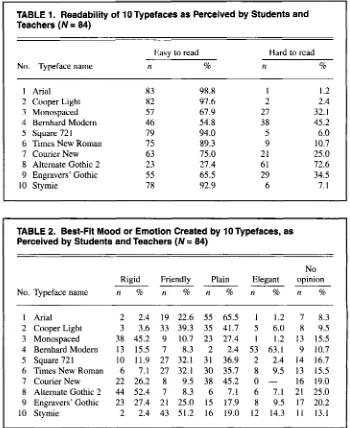
Because none of the subjects chose either Bernhard Modem or Alternate Gothic 2 as the easiest-to-read typeface,
they were omitted from Table 3. Each of
the other eight was chosen by 4.8% to 20.2% of the respondents. The two
typefaces most frequently rated as the easiest to read were Arial (selected by
17 respondents, 58.8% of whom rated it
as “plain”) and Cooper Light (selected by 15 respondents, evenly divided between those rating it as “plain” and those rating it as “friendly”).
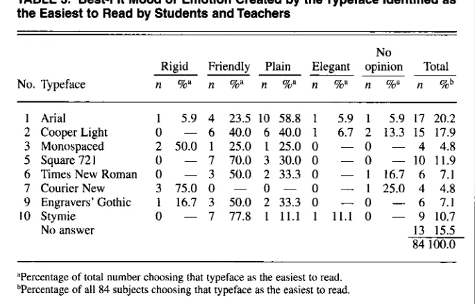
Because none of the subjects chose Cooper Light, Times New Roman, or Stymie as the most difficult-to-read typeface, they were omitted from Table 4. Although there was no overall
majority regarding this item, 45.2% of
the respondents chose Alternate Gothic
2 as the hardest to read, with a majority
of those respondents rating it as “rigid.” Thirteen respondents did not choose a most difficult-to-read typeface; if those nonresponses are eliminated, then Alter-
nate Gothic 2 would have a majority
zyxwvutsrqponmlkjihgfedcbaZYXWVUTSRQPONMLKJIHGFEDCBA
272
zyxwvutsrqponmlkjihgfedcbaZYXWVUTSRQPONMLKJIHGFEDCBA
Journal of Education for Business (53.5%) among the respondents whodid complete this item.
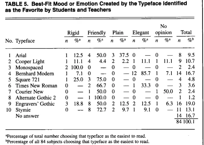
In selecting their “favorite,” at least one respondent selected each of the typefaces, but only three typefaces were chosen by more than 10 subjects (see Table 5). Engravers’ Gothic was chosen as the favorite by 16 subjects (19.0%),
and half of them rated it as “friendly.” Bernhard Modem was chosen as the favorite by 14 subjects, with a majority
of these rating it as “elegant.”
Comparison With Related Research
The finding that Alternate Gothic 2 was considered hard to read concurs
with Stopke and Staley’s (1994, p. 7)
finding that condensed typefaces may hamper readability because they squeeze letterforms. As a condensed typeface, Alternate Gothic 2 appeared to
be the darkest, prompting one subject to comment that it was in bold (but it was not).
The finding that a majority of the respondents rated Engravers’ Gothic (the small capitals typeface) as easy to read contradicts Tinker (1963, p. 65),
who found that readers prefer lowercase letters and that all uppercase letters retard reading speed. Stopke and Staley also agreed that lowercase letters are more conversational and easier to read
TABLE 3. Best-Fit Mood or Emotion Created by theTypeface Identified as the Easiest to Read by Students and Teachers
No
Rigid Friendly Plain Elegant opinion Total
zyxwvutsrqponmlkjihgfedcbaZYXWVUTSRQPONMLKJIHGFEDCBA
~
~
-
-
~
~
No. Typeface
zyxwvutsrqponmlkjihgfedcbaZYXWVUTSRQPONMLKJIHGFEDCBA
n %a n %azyxwvutsrqponmlkjihgfedcbaZYXWVUTSRQPONMLKJIHGFEDCBA
n %” n n %a n %b1 Arial 2 Cooper Light
3 Monospaced
5 Square721
6 Times New Roman
7 Courier New
9 Engravers’ Gothic
10 Stymie
No answer
1 5.9 4 23.5 10 58.8 1 5.9 1 5.9 17 20.2
2 50.0 1 25.0 1 25.0 0 - 0 - 4 4.8
0 - 6 40.0 6 40.0 1 6.7 2 13.3 15 17.9
0 - 7 70.0 3 30.0 0 - 0 - I 0 11.9
0 - 3 50.0 2 33.3 0 - 1 16.7 6 7.1 3 75.0 0 - 0 - 0 - 1 25.0 4 4.8
1 16.7 3 50.0 2 33.3 0
-
0 - 6 7.113 15.5 84 100.0
0 - 7 77.8 1 1 1 . 1 I 1 1 . 1 0 - 9 10.7
I
“Percentage of total number choosing that typeface as the easiest to read. bPercentage of all 84 subjects choosing that typeface as the easiest to read.
I
TABLE 4. Best-Fit Mood or Emotion Created by the Typeface Identified as
the Most Difficult to Read by Students and Teachers
zyxwvutsrqponmlkjihgfedcbaZYXWVUTSRQPONMLKJIHGFEDCBA
( N = 84)No
Rigid Friendly Plain Elegant opinion Total
~~~~~~
No. Typeface n %a n %a n ?ha n %” n %a n %b
1 Anal 0
--
0 - 1 100.0 0 - 0 - 1 1.23 Monospaced 8 88.9 0 - 1 11.1 0 - 0 - 9 10.7 4 Bemhard Modern 3 20.0 1 6.7 0 - 9 60.0 2 13.3 15 17.9
5 Square 721 0 - 1 50.0 1 50.0 0 - 0 - 2 2.4 7 Courier New 0 - 0 - 2 50.0 0 - 2 50.0 4 4.8
8 Alternate Gothic 2 22 57.9 2 5.3 3 7.9 2 5.3 9 23.7 38 45.2 9 Engravers’ Gothic 1 50.0 0 - I 50.0 0 - 0 - 2 2.4
No answer 13 15.5
84 100.0
aPercentage of total number choosing that typeface as the easiest to read. bPercentage of all 84 subjects choosing that typeface as the easiest to read.
[image:4.612.227.569.185.732.2] [image:4.612.223.565.279.498.2] [image:4.612.223.566.444.715.2]TABLE 5. Best-Fit Mood or Emotion Created by the Typeface Identified
as the Favorite by Students and Teachers
zyxwvutsrqponmlkjihgfedcbaZYXWVUTSRQPONMLKJIHGFEDCBA
No
Rigid Friendly Plain Elegant opinion Total
--ppp-
No. Typeface
zyxwvutsrqponmlkjihgfedcbaZYXWVUTSRQPONMLKJIHGFEDCBA
nzyxwvutsrqponmlkjihgfedcbaZYXWVUTSRQPONMLKJIHGFEDCBA
%“zyxwvutsrqponmlkjihgfedcbaZYXWVUTSRQPONMLKJIHGFEDCBA
n %“ n %a n %“ n %” n %b 12 3 4
5
6
7
zyxwvutsrqponmlkjihgfedcbaZYXWVUTSRQPONMLKJIHGFEDCBA
8
9
10
Arial Cooper Light Monospaced Bernhard Modem Square 72 1
Times New Roman Courier New Alternate Gothic 2 Engravers’ Gothic Stymie
No answer
1 12.5 4 50.0 3 37.5 0 - 0 - 8 9.5
1 11.1
zyxwvutsrqponmlkjihgfedcbaZYXWVUTSRQPONMLKJIHGFEDCBA
4 4.4 2 2.2 1 11.1 1 11.1 9 10.72 1 0 0 . 0 0 - 0 - 0 - 0 - 2 2.4
1 7.1 0 - 0 - 12 85.7 1 7.1 14 16.7
1 25.0 3 75.0 0 - 0 - 0 - 4 4.8
0 - 2 66.7 0 - 1 33.3 0 - 3 3.6
0 - 1 50.0 0 - 0 - 1 50.0 2 2.4 0 - 1100.0 0 - 0 - 0
-
1 1.2 3 18.8 8 50.0 2 12.5 2 12.5 1 6.3 16 19.0 0 - 8 72.7 2 9.7 1 9.1 0 - 11 13.1 14 16.7 84 100.1aperentage of total number choosing that typeface as the easiest to read. bPercentage of all 84 subjects choosing that typeface as the easiest to read.
than all capital letters, but they.reported that small capitals give a prestigious and dignified look to a text.
Although not close to a majority, the greatest agreement on the easiest-to- read typeface was found for Arial, a sans-serif typeface. As Arial is very sim- ilar to Helvetica, this finding supports Stopke and Staley’s statement that Hel- vetica is a popular contemporary type- face and the most readable sans-serif one (1994, p. 6). On the other hand, Searfoss (1993, pp. 4 1 4 2 ) stated that the sans-serif typefaces tend to take on a blocky appearance, leading to monoto- nous viewing and type boredom.
The typeface most frequently chosen as the favorite was another sans-serif one, Engravers’ Gothic, which was rated as “friendly” by half of those subjects. However, it was rated as “rigid” by 27.4% of the total 84 subjects-probably an effect of the blocky appearance men- tioned by Searfoss. The second greatest agreement on the favorite typeface was on Bernhard Modern, a serif typeface, with 85.7% of those respondents and 63.1% of the total 84 respondents rating it as “elegant.” The tall ascenders and small x-height of this typeface are two of the characteristics that create an elegant
look, according to Stopke and Staley (1994, p. 4), whose finding was con- firmed in the present study.
Two other notable findings were that the two monospaced typefaces-Mono- spaced and Courier New (both serif styles)-were perceived as rigid or plain by most of the subjects. The fact that most text copy today is proportion- al may account for these ratings, as well as the fact that the “spread-out’’ look requires more fixation pauses to read such copy.
Critical Evaluation
Several factors may have influenced the results of this study. First, the whole idea of subtle differences in typefaces, or the notion of evocation of a mood or emotional response to a typeface, may have been new to the subjects. Second, the respondents may have differed on the meanings that they assigned to the subjective terms “rigid,” “friendly,” “plain,” and “elegant.” Third, the design of the instrument may have influenced the results. The rating sheet (one page) was quite full and might have been overwhelming to some subjects. Ten typefaces might have been too many to
evaluate at one time, and the sequence in which the typeface examples fol- lowed each other may have influenced how a typeface was viewed. Better choices may also exist for the “best-fit” mood or emotion rating.
Studies of this kind, however, do have merit. Just as the written word conveys meaning and develops a feeling about the message on a conscious level, a typeface imparts a similar impression on an unconscious level (Searfoss, 1993, p. 48). Type styles can exhibit a businesslike, ceremonial, or artistic atti- tude. Searfoss cautioned document processors to remember four basic things when choosing a type style and typeface (p. 52):
First, the type styles used in a document make a dramatic impression on the read- er. Second, recognition and usage of type
style categories are important in the selec- tion of the typefaces used in a document’s preparation. Third, cultural biases influ- ence which typefaces are considered acceptable for specific applications. Fourth, in the final analysis, the choice of type style and typeface remains with the user. It really is up to you.
Given the wide variety of choices available, students and employees might be wise to consider the impact of type- faces if they want to impress or influ- ence an instructor, a client or customer, or a supervisor.
REFERENCES
Searfoss, 0. (1993). The computer
zyxwvutsrqponmlkjihgfedcbaZYXWVUTSRQPONMLKJIHGFEDCBA
font hook.Stopke, J., & Staley, C. (1994). A n eye for o p e .
Tinker, M. A. (1963). Legibility of print. Ames,
Williams, R. (1992). The PC is
zyxwvutsrqponmlkjihgfedcbaZYXWVUTSRQPONMLKJIHGFEDCBA
not a typewriter.Berkeley, CA: Osborne McGraw-Hill.
Ann Arbor, MI: Promotional Perspectives.
IA: Iowa State University Press.
Berkeley, CA: Peachpit Press.
SUGGESTED READINGS
Brown, A. (1999, January 22). Type-smitten. New
Statesman, pp. 41-42,
Delfino, E. (1997). Font facts and a printing primer. Online, September/October, pp. 81-83. Folkers, R. (1997, September 22). Character mat-
ters. U S . News & World Report, p. 12.
Karch, R. R. (1959). How to recognize type faces.
Bloomington, LL: McKnight & McKnight. Treadaway, M. (1991, August 9). Finding the right
type. Times Educational Supplement,p. 27.