Building Mobile Applications
with Java
Joshua Marinacci
Building Mobile Applications with Java
by Joshua Marinacci
Copyright © 2012 Joshua Marinacci. All rights reserved. Printed in the United States of America.
Published by O’Reilly Media, Inc., 1005 Gravenstein Highway North, Sebastopol, CA 95472.
O’Reilly books may be purchased for educational, business, or sales promotional use. Online editions are also available for most titles (http://my.safaribooksonline.com). For more information, contact our corporate/institutional sales department: (800) 998-9938 or [email protected].
Editors: Shawn Wallace and Mike Hendrickson
Production Editor: Teresa Elsey Cover Designer:
Karen Montgomery Interior Designer: David Futato
Illustrators: Robert Romano and Rebecca Demarest
Revision History for the First Edition: 2012-03-08 First release
See http://oreilly.com/catalog/errata.csp?isbn=9781449308230 for release details.
Nutshell Handbook, the Nutshell Handbook logo, and the O’Reilly logo are registered trademarks of O’Reilly Media, Inc. Building Mobile Applications with Java, the image of a pigmy piculet, and related trade dress are trademarks of O’Reilly Media, Inc.
Many of the designations used by manufacturers and sellers to distinguish their products are claimed as trademarks. Where those designations appear in this book, and O’Reilly Media, Inc., was aware of a trademark claim, the designations have been printed in caps or initial caps.
While every precaution has been taken in the preparation of this book, the publisher and authors assume no responsibility for errors or omissions, or for damages resulting from the use of the information con-tained herein.
ISBN: 978-1-449-30823-0
[LSI]
Table of Contents
Preface . . . v
1. Greetings, Mobile App Developers . . . 1
2. Getting Started with GWT . . . 3
What Is GWT? 3
Installing GWT 3
Building a Twitter Search App 8
Calling Twitter with JSONP 9
Next Steps 12
3. Getting Started with PhoneGap . . . 13
Packaging a webOS App 14
Installing the webOS SDK 14
Building PerchSearch for webOS 14
Debugging Your webOS App 16
Packaging an Android App 17
Setting Up the Android Emulator 17
PerchSearch for Android 18
Packaging an iOS App 21
Installing Xcode and PhoneGap 21
PerchSearch for iOS 22
4. Customizing Your App for Mobile . . . 25
CSS Overview 25
Styling GWT with CSS 26
Adapting to Device Screen Sizes 28
Adjusting Layout for Mobile 30
5. Building a Pure Mobile App with GWT Mobile UI . . . 35
Designing the Wine Journal 35
Feature List 36
Navigation Choices 36
GWT Mobile UI 37
Building the Screens 37
Wine List Screen 38
Wine Details Screen 40
The AddWinePage 41
Saving the Wine Data 43
Getting the User’s Location 45
Taking Photos 47
Polish 48
Next Steps 48
6. Advanced Mobile Optimizations . . . 49
Optimizing the Experience 49
Simplify, Simplify, Simplify 49
Cat Mapper Example 50
Other Ways to Simplify 51
Flatten Your Menus 52
Polish, Polish, Then Polish Some More 52
Improving Download Time 53
7. Box2D and Canvas . . . 55
Working with Canvas 56
Physics with Box2D 58
Building the Game Level 62
Building a Blob with Joints 63
Drawing the World 65
Hooking Up the Accelerometer 68
8. Next Steps . . . 71
Preface
I have always thought of Java as a way of coding and an ecosystem, not just a language and virtual machine. When you code in Java you are part of a mature culture with amazing tools and expertise. When I joined the webOS team nearly two years ago I knew HTML and CSS very well, but very little JavaScript. Over time I have become pretty good at JavaScript but my newfound knowledge still can’t compare to my fifteen years of mad Java skillz. With Java, and the mature Java tools, I can knock out code in half the time. I didn’t want to give up my existing skills to play in the new world of smart devices.
I know I am not the only Java developer facing the job of building cross-platform mobile apps. The Java ecosystem is so big that any solution for using Java in new ways can be immediately used by millions of hard working developers. So I began to research the available options and found GWT and PhoneGap, two brilliant open source projects that let us take Java to new and exciting places. My research turned into a few proto-types, then a few developer talks, a webcast, and finally the book you are reading now. Even before I began to write I knew I wanted to create a book that was both very hands on and also very short. We are busy people who need tools that work now. We don’t have time to spend learning the framework of the week. That meant I had to leave a lot out. GWT is a mature but still growing technology. To truly cover GWT itself would require an entire 500-page book unto itself. To even cover the mobile parts would be beyond what this text could cover. So I decided to focus just on what you need to get started and be productive right away. After reading this book you will be ready to build your own apps and, if you desire, jump into the rich world of third party libraries and tools. The last chapter lists a few to help you get started.
Conventions Used in This Book
The following typographical conventions are used in this book:
Italic
Indicates new terms, URLs, email addresses, filenames, and file extensions.
Constant width
Used for program listings, as well as within paragraphs to refer to program elements such as variable or function names, databases, data types, environment variables, statements, and keywords.
Constant width bold
Shows commands or other text that should be typed literally by the user.
Constant width italic
Shows text that should be replaced with user-supplied values or by values deter-mined by context.
This icon signifies a tip, suggestion, or general note.
This icon indicates a warning or caution.
Using Code Examples
This book is here to help you get your job done. In general, you may use the code in this book in your programs and documentation. You do not need to contact us for permission unless you’re reproducing a significant portion of the code. For example, writing a program that uses several chunks of code from this book does not require permission. Selling or distributing a CD-ROM of examples from O’Reilly books does require permission. Answering a question by citing this book and quoting example code does not require permission. Incorporating a significant amount of example code from this book into your product’s documentation does require permission.
We appreciate, but do not require, attribution. An attribution usually includes the title, author, publisher, and ISBN. For example: “Building Mobile Applications with Java by Joshua Marinacci (O’Reilly). Copyright 2012 Joshua Marinacci, 978-1-449-30823-0.” If you feel your use of code examples falls outside fair use or the permission given above, feel free to contact us at [email protected].
Safari® Books Online
Safari Books Online (www.safaribooksonline.com) is an on-demand digital library that delivers expert content in both book and video form from the world’s leading authors in technology and business.
Technology professionals, software developers, web designers, and business and cre-ative professionals use Safari Books Online as their primary resource for research, problem solving, learning, and certification training.
Safari Books Online offers a range of product mixes and pricing programs for organi-zations, government agencies, and individuals. Subscribers have access to thousands of books, training videos, and prepublication manuscripts in one fully searchable da-tabase from publishers like O’Reilly Media, Prentice Hall Professional, Addison-Wesley Professional, Microsoft Press, Sams, Que, Peachpit Press, Focal Press, Cisco Press, John Wiley & Sons, Syngress, Morgan Kaufmann, IBM Redbooks, Packt, Adobe Press, FT Press, Apress, Manning, New Riders, McGraw-Hill, Jones & Bartlett, Course Tech-nology, and dozens more. For more information about Safari Books Online, please visit us online.
How to Contact Us
Please address comments and questions concerning this book to the publisher: O’Reilly Media, Inc.
1005 Gravenstein Highway North Sebastopol, CA 95472
800-998-9938 (in the United States or Canada) 707-829-0515 (international or local)
707-829-0104 (fax)
We have a web page for this book, where we list errata, examples, and any additional information. You can access this page at:
http://shop.oreilly.com/product/0636920021063.do
To comment or ask technical questions about this book, send email to:
For more information about our books, courses, conferences, and news, see our website at http://www.oreilly.com.
Find us on Facebook: http://facebook.com/oreilly
Follow us on Twitter: http://twitter.com/oreillymedia
Watch us on YouTube: http://www.youtube.com/oreillymedia
Acknowledgments
I would like to thank my editor, Shawn, who has kept this project focused, even as the my own schedule slipped many times due to unexpected events. I would also like to thank my two tech reviewers, Chuq and Cooper, who gave me great feedback and verified my approach. And finally I must thank my wife, Jen, who encouraged me to
write even as we are raising our new baby son, Jesse. His will be a world full of rich and fascinating mobile devices. I hope this book will fill them with fun and exciting things.
CHAPTER 1
Greetings, Mobile App Developers
Greetings, welcome, and guten tag. If you’ve picked up this book, it’s probably because you were attracted to the idea of building mobile apps for non-Java platforms with Java. You might not be familiar with GWT and PhoneGap. That’s okay. I’ll explain it all as we go forward. The important thing is that we are here to create great mobile apps. The actual technology used to build software doesn’t really matter to the end user. People just want quality apps that look great and perform well. Unfortunately, the technology does matter when it comes down to actually building apps. Different plat-forms have their own toolchains and preferred languages. iPhone and iPad apps are largely written in Objective-C. Android apps are written in Google’s variant of Java. Windows Metro style apps use C#, C++, or Visual Basic. Add in webOS, BlackBerry (both old and new OSes), the Nook (older Android), and Kindle Fire (forked Android), and now we’ve got a problem.
To support all users we have to write our app at least three times, possibly many more if you count emerging TV platforms. And that’s the good news. The bad news is that it will only get worse. Mobile platforms are dividing not converging. Even among the Android family there are several major versions in widespread use, and the upgrade rate is sadly low.
So what is an enterprising app developer to do? You want to write an app once, not over and over again. We need a single platform that will work everywhere. Fortunately we already have such a platform: the Web. I’m not speaking about the Web as a network of computers which host HTML content. I’m speaking about the Web technologies HTML, JavaScript, and CSS. Virtually every OS has a web browser, which means it has a way to render HTML and JavaScript. In almost every case there is a way to build a local installable app using HTML and JavaScript. Great! We have a single platform. Problem solved. What now?
Well, if it were that easy we wouldn’t need this book. Every OS is different. They each have different support for HTML standards, JavaScript APIs, and native packaging systems. Plus, you would have to write everything in JavaScript rather than the Java code you are likely familiar with. You would have to give up static typing, the large
ecosystem of Java libraries, and the great IDE experience we all enjoy. Well, that’s why you bought this book.
There are two amazing open source tools which will solve the problem for us: GWT and PhoneGap. GWT allows you to write Java but compile into cross-platform, works everywhere, JavaScript and HTML. PhoneGap provides native packaging for each OS, along with API wrappers for device features like the camera, accelerometer, and GPS radio. By their powers combined we can fulfill the dream: write once in a powerful and well supported statically typed language, Java, then produce native apps for every plat-form with a single codebase. Is the dream too good to be true? As we shall see, it is indeed quite real.
CHAPTER 2
Getting Started with GWT
What Is GWT?
Before we get into building mobile apps let’s get to know GWT. GWT, or the Google Web Toolkit, is a set of tools, libraries and plugins. GWT was first released as an open source project by Google in 2006. They built it as a stable platform for their own web based applications that had to run across 100% of browsers, even the old broken ones. At its core, GWT is a special compiler that can transform Java to JavaScript, along with a minimal runtime. It lets you write mostly standard Java code, then compile it to JavaScript for running in a web browser or other HTML environment. Once compiled there is no Java code left. The generated code runs entirely in the user’s web browser as JavaScript, no applets required. GWT has its own runtime consisting of a minimal set of standard Java APIs like List and String. These are implemented in JavaScript so that your code can call them even when converted. You can see the full list of emulated Java APIs at http://code.google.com/webtoolkit/doc/latest/RefJreEmulation.html. GWT isn’t just a compiler though. It is also a set of cleverly designed compile steps and runtime libraries that handle browser differences. The compiler can generate different output for each browser, ensuring that the code runs properly no matter what browser the user has, even IE6! The compiler knows how to optimize object references, take advantage of JavaScript language tricks, and reduce memory usage. Much like a tradi-tional compiler it produces code much better than you could write by hand. Even better, the compiler improves over time to take advantage of the evolving browser landscape. Your code will get better without having to rewrite a single line.
Installing GWT
Before we dive into mobile let’s build a basic GWT application. First you will need to download the SDK from http://code.google.com/webtoolkit/download.html.
You will also need to have Java and Ant installed. If you are a Java developer reading this book then you likely already have these installed. There are special versions of
GWT that work with the popular Java IDE Eclipse, including nice debugger integration. However, since the point of this book is to understand what GWT and PhoneGap are really doing underneath the hood, I won’t use anything IDE-specific. Instead I will work with the standalone GWT SDK from the command line. The core SDK is just a set of command line utilities, the jars, and a visual console logger. Just know that once you learn how it really works you may wish to install optimized tools for your favorite IDE or Google’s GWT visual designer.
To install GWT, first download the right version for your platform then unzip the gwt-2.4.zip file. The exact filename may be different if you downloaded a version other than 2.4. At the time of this writing, 2.4 was the latest stable version. Move the resulting gwt-2.4.0 directory to wherever you normally work on projects.
From the command line run
gwt-2.4.0/webAppCreator -out MyFirstApp com.mycompanyname.MyFirstApp
This is the first step to creating any new GWT project. It will generate a new project directory with the package and name specified. It doesn’t really matter where you create the project. GWT will set up the correct links between your project and the GWT libs. The webAppCreator will create a new directory filled with a default app. Let’s take a quick look at the directory structure:
• MyFirstApp, the directory containing your new app
• MyFirstApp/src contains the Java source for the app. The generated source will use the package name specified above. For example, src/com/mycompanyname/MyFirst App.java
• MyFirstApp/war, the directory containing the web resources for your app. Anything in here will be bundled into a final WAR file for deploying on a Java Servlet Con-tainer. (Don’t worry, the servlet part isn’t required. Hold on a sec). This is where you will put additional images, CSS files, and other web resources.
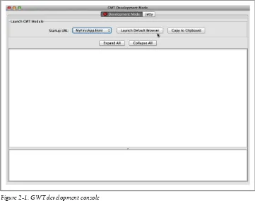
• MyFirstApp/build.xml An Ant build script to build, test, and compile the app. To test your app run ant devmode from inside the MyFirstApp directory. This will open the GWT visual logging tool (see Figure 2-1). From here you can launch your desktop web browser, monitor logging, and view exception stack traces. One nice feature of the GWT tool is that it will watch for changes in your code on disk, then recompile and relaunch the app whenever you reload in the browser. This way you can just flip be-tween code and your web browser without any extra compiling or building step.
The first time you run the tool and launch your browser it will ask you to install a special browser plugin. This plugin creates the link between your browser and the logging tool. I recommend using the Chrome web browser for GWT development as I have found it to provide the best support.
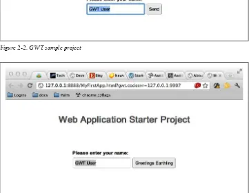
The default generated app is pretty simple (Figure 2-2). It has a text field and a button. When you type text into the text field and click the button it will kick off a request to the server and report the results. This is just a demonstration of having both client side and server side GWT components.
Now let’s change something and watch the app update.
Open up src/com/mycompanyname/client/MyFirstApp.java in your favorite program-ming editor. If you want a nice pure text editor for coding I recommend the excellent open source JEdit from jedit.org. Change the text inside the button to Greetings Earth-ling (it should be on line 41). Save the file. Now switch to your browser and press the reload button. You should see the updated text in the button (Figure 2-3).
Now let’s look back at the code to see what it’s really doing. Open up MyFirst-App.java in your text editor. Pretty much the entire app is contained here. MyFirstApp implements EntryPoint. EntryPoint is a GWT interface defining an onModuleLoad method. This method is called by GWT to start up the app. It is in this method where you create all of your widgets and do other setup. Let’s look at the first few lines
public void onModuleLoad() {
final Button sendButton = new Button("Greetings Earthling"); final TextBox nameField = new TextBox();
Figure 2-1. GWT development console
nameField.setText("GWT User"); final Label errorLabel = new Label();
GWT uses Java classes to represent widgets on screen. Widgets are UI controls like buttons, panels, drop downs, tables, and lists. The first four lines in the code above create the widgets for this app. The Button class is an on screen button. The TextBox is a single-line text entry field. The Label represents a single line of text. If you have done any Swing programming this will feel very familiar. Notice that the code calls name
Figure 2-2. GWT sample project
Figure 2-3. Modified sample project
Field.setText("gwt user"). GWT follows the Java Beans naming convention so set Text will set the text property of the nameField object.
The next line, addStyleName adds a CSS style class to the widget. Don’t worry about this now. We will explore CSS in the mobilization chapter.
// We can add style names to widgets sendButton.addStyleName("sendButton");
// Add the nameField and sendButton to the RootPanel // Use RootPanel.get() to get the entire body element RootPanel.get("nameFieldContainer").add(nameField); RootPanel.get("sendButtonContainer").add(sendButton); RootPanel.get("errorLabelContainer").add(errorLabel);
The last three lines above add the three widgets to objects inside of the root panel. The RootPanel represents the actual web page. The default generated app has a few divs in the web page named nameFieldContainer, sendButtonContainer, and errorLabelCon-tainer. The widgets will be added to these divs. Look at war/MyFirstApp.html to see the divs.
You don’t have to use prefab divs in your HTML, though. You could instead add them directly to the root panel or nest them inside of another panel. For example, if you wanted to put the widgets in a vertical panel, where the widgets are all arranged in a vertical column, you could do it like this:
VerticalPanel vertPanel = new VerticalPanel(); vertPanel.add(nameField);
vertPanel.add(sendButton); vertPanel.add(errorLabel); RootPanel.get().add(vertPanel);
Notice that I changed RootPanel.get(“somename”) to RootPanel.get(). This will get the root panel itself instead of one of the nested divs.
GWT supports mapping into parts of the markup or taking over the entire page. This gives you a choice of how to build your application. For mobile apps I prefer to take over the entire page and only use markup and CSS for styling.
The next few lines of MyFirstApp.java make the name field be focused when the user first opens the web page, then selects all of the text within the name field. This means the user will overwrite the selected text when they start typing.
// Focus the cursor on the name field when the app loads nameField.setFocus(true);
nameField.selectAll();
The rest of the MyFirstApp class creates a remote procedure call to the server, then displays the results in a dialog box. I won’t cover this part because we will never be using GWT’s own remote procedure call system in this book. GWT was originally designed to be run on Java EE app servers. It will generate both server and client side components with a nice mapping between them. For our apps, however, we are only
interested in the client part, which is the part that will actually be installed on to the device. If you write an app which does some server communication to your own server then you may find GWT’s server side infrastructure useful. I have found that I prefer to use generic server infrastructure that serves up standard XML or JSON rather than something specific to GWT. It’s really up to you what you should use.
Though I’m skipping the remote procedure call stuff I want to point your attention to line 79: closeButton.addClickHandler(). GWT has event listeners for the different widg-ets. Buttons can receive click events. To do something when the click happens you must add a ClickHandler to the button. That is what the code below does.
// Add a handler to close the DialogBox
closeButton.addClickHandler(new ClickHandler() { public void onClick(ClickEvent event) {
It creates an anonymous implementation of ClickHandler, then adds it to the button. When the user clicks on the button the onClick method of the handler will be called. Put whatever code you want to be executed inside the onClick method. In the code above it hides the dialog box and enables the sendButton.
The various Handler interfaces in GWT are similar to the Listener pattern used in Swing and other standard Java GUI toolkits. There is one important difference, though: there is no removeClickHandler method. All addHandler methods return a HandlerRegistra-tion object with a removeHandler() method. This makes it very easy to manage your listeners. Just dump the registration objects into an array list somewhere. When you are ready to shut down your app, or a component, loop through the list and call re-moveHandler() on all of the objects. This will clean up your memory without having to know which listeners when to which object.
Building a Twitter Search App
Now that we know how GWT works let’s build our own small app called PerchSearch. It will be a simple one screen app to search for Twitter tweets containing a particular keyword. This app will do basic networking, have a text field and button, and a list of labels for the tweets. Once we have the app working we can restyle it to look a bit better on a mobile device.
To build the app I first created a new project like this:
gwt-2.4.0/webAppCreator -out PerchSearch com.joshondesign.perchsearch.PerchSearch
Then I deleted most of the generated code in PerchSearch.java, leaving an empty class like this:
public class PerchSearch implements EntryPoint { public void onModuleLoad() {
} }
The app needs a text field for the user to type in a search term, a button to start the search, an error label, and a panel to store the results. To keep things simple let’s put them one below the next in a vertical panel.
final TextBox queryField = new TextBox();
final VerticalPanel resultsPanel = new VerticalPanel();
public void onModuleLoad() {
VerticalPanel panel = new VerticalPanel();
queryField.setText("puppy"); panel.add(queryField);
final Button searchButton = new Button("Search Twitter"); panel.add(searchButton);
final Label errorLabel = new Label(); panel.add(errorLabel);
panel.add(resultsPanel);
RootPanel.get().add(panel);
searchButton.addClickHandler(new TwitterHandler()); }
The last line adds a custom click handler, TwitterHandler, to the search button. This handler will do the actual API call to Twitter and process the results.
Calling Twitter with JSONP
Twitter provides a JSON API to search for recent tweets based on keywords. When you request a specific URL with a keyword Twitter will return the list of tweets as a JSON file.
JSON, or JavaScript Object Notation, is a way of encoding data as light weight Java-Script arrays and hashtables. For example, a list of first and last names might look like this:
[
{ "first":"Jon", "last":"Stewart" }, { "first":"Jason", "last":"Jones" }, { "first":"Samantha", "last":"Bee" }, ]
If you call the URL http://search.twitter.com/search.json?q=puppy you will get back a very long list that looks like this:
{"completed_in":0.166,"max_id":141224447708364801, ...
"results":[
{"created_at":"Mon, 28 Nov 2011 18:38:26 +0000", "from_user":"foobar","from_user_id":098709874523, "text":"I love my puppy"},
{"created_at":"Mon, 28 Nov 2011 18:38:24 +0000", "from_user":"misterman","from_user_id":445388888, "text":"My puppy rolled around on the floor. }, ...
In short, you get a giant blob of structured data. I’ve trimmed it down a bit to make it easier to understand. From this blob we can easily pull out the parts we want. There’s a problem, though; we can’t actually request this API from a web page.
For security reasons a web page can only make a network request to the server that the web page came from. Since our app will not live on any server, but rather on the end user’s device, we can’t make a request to anywhere! To get around this limitation en-terprising developers invented something called JSONP. JSONP is the same as JSON except the server wraps the result in a call to a method that is defined in the page. This is called a callback method. Instead of loading the request directly using something like XmlHttpRequest, it will use the URL as JavaScript source code to be added to the top of the page like this:
<script src="http://search.twitter.com/search.json?q=puppy&callback=mycallback"></ script>
This essentially tricks the browser into making the API call in the guise of loading source, which is allowed by the security model, then invoking your callback method with the resulting data. It sounds a bit tricky, and it is actually, but we don’t have to worry about it. GWT handles all of the details for us using a nice class called the
JsonpRequestBuilder. You just give it a URL and a callback, GWT does the rest. Here’s what the code looks like.
class TwitterHandler implements ClickHandler { public void onClick(ClickEvent event) {
String url = "http://search.twitter.com/search.json?q="+queryField.getText(); JsonpRequestBuilder jsonp = new JsonpRequestBuilder();
jsonp.requestObject(url, new AsyncCallback<JavaScriptObject>() { public void onFailure(Throwable throwable) {
I know it looks a bit hairy but it is actually pretty straight forward. The URL is defined in url then it creates a new JsonpRequestBuilder. It calls requestObject using the URL
and an anonymous AsyncCallback object. When the callback succeeds it will call on-Success with a JavaScriptObject. With this object in hand we can start pulling out the parts we want.
If you look at the raw output of the Twitter API call in your browser you can paw through it to find what you want. The raw output can be difficult to read so you might want to use a JSON formatter like: http://jsonformatter.curiousconcept.com/.
The list of tweets is an array stored with the results key. Within each tweet we want the
text property, which contains the actual text of the tweet. The code to process the list looks like this:
JSONObject js = new JSONObject(o);
JSONArray results = js.get("results").isArray(); resultsPanel.clear();
for(int i=0; i<results.size(); i++) {
String text = (results.get(i).isObject()).get("text").toString(); Label label = new Label(text);
resultsPanel.add(label); }
For each item in the results it adds a new Label with the text to the resultsPanel. Notice the call to resultsPanel.clear() before the loop. This removes the old labels before adding new ones.
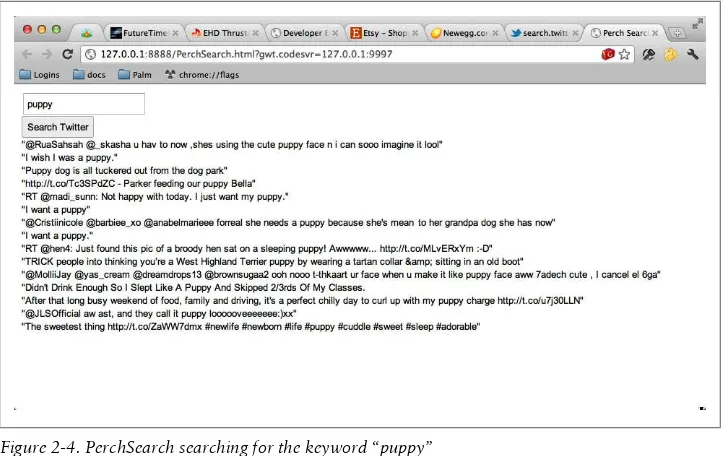
This is what the final app looks like in the web browser (Figure 2-4). You can get the full source from the book’s web page.
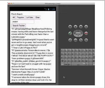
Figure 2-4. PerchSearch searching for the keyword “puppy”
Not the prettiest app in the world, but it works quite well, and with very little code. Go ahead and try it. Type in puppy to see what cute things people are saying about puppies. Now type in lolcat to have more fun. Yeah, that’s better.
Next Steps
We have used GWT to build an app which runs in a web browser. To run it on a mobile device we could just load it up in the mobile browser. However, this won’t feel very much like a native app. It won’t have an icon or live in the device’s app launcher. Also the app itself will look ugly and hard to read on a smaller mobile screen. In the next chapter we will look at a tool to convert the web page into a real app that looks and feels right on a mobile device.
CHAPTER 3
Getting Started with PhoneGap
PhoneGap is an open source collection of build scripts and native wrappers for multiple mobile platforms. PhoneGap generates a native executable from your app for each platform it supports. This native executable is code which can actually be installed on a real device as a native app. The end users will never know that you coded it in Java-Script rather than Objective C or whatever the native SDK uses. For iOS devices it will be an Objective C Xcode project. For Android it will be an Android stub app written in Java. For webOS the apps are mostly HTML already so PhoneGap provides a simple make file to assemble the app. On each platform the native wrapper will open an em-bedded HTML renderer (usually called a web view) to run the rest of your app. PhoneGap also provides a set of consistent JavaScript hooks to native APIs like the accelerometer, camera, and GPS. These are APIs which typically aren’t available when running as a web page loaded from the Internet. PhoneGap wraps the native APIs to provide a consistent cross-device platform for you to code against. This means you can access device features while only having to write your app once.
PhoneGap is an open source project started by the team at Nitobi, hosted at http:// phonegap.com/. During the writing of this book Adobe began to use PhoneGap as a component in some of their tools, then eventually bought the Nitobi company and transferred official ownership of PhoneGap to Apache. The transition to Apache is currently in progress and may be complete by the time you read this. As part of the Apache Foundation, PhoneGap will gain even more features and community support under its new name: Apache Cordova.
PhoneGap has three major advantages over direct platform coding:
1. You can code using HTML and JavaScript rather than the native language. 2. You can use the same code and APIs across all platforms.
3. You can code using web technology but still have the app run locally and offline, unlike a pure web app loaded from a remote server.
Packaging a webOS App
Let’s start learning how to use PhoneGap by turning our Twitter app from the previous chapter into a native webOS app. I’ve chosen webOS as the first example because it is the easiest to get started with on any platform, and all of the tools are free. It involves the least transformation from original code to native executable, so it will be easier to debug as well. From there we will move on to Android and iOS.
Installing the webOS SDK
First, download and install VirtualBox from:
https://www.virtualbox.org/
then the webOS SDK from:
https://www.virtualbox.org/
You need VirtualBox because webOS’s emulator is really just an x86 build of the entire OS distributed as a VirtualBox image. This makes it very easy to manage multiple ver-sions of the OS: just switch images. Leveraging VirtualBox also means you can do webOS development on Mac, Windows, or Linux. Since it is a real OS emulator rather than a simulator it will give you a better idea of how the app will work on a real device. You can even install apps directly into the emulator from the command line.
Now download the newest version of PhoneGap from:
http://phonegap.com/
Version 1.2 is the latest release as of the time of this writing. You will download a ZIP file containing a bunch of directories, one for each platform. For the webOS app make a copy of the webOS directory and rename it to PerchSearch-webos. Start the webOS emulator. From the command line go to the PerchSearch-webos directory and run:
make
This will build the default webOS app and launch it in the emulator. You should see the default app come up in the emulator. It will look like Figure 3-1.
Building PerchSearch for webOS
The PhoneGap app structure is pretty simple. It has a copy of PhoneGap (with scripts to build it) and a directory called framework/ The contents of your app go in there. The GWT app we created put its generated code in PerchSearch/war. Copy everything from the PerchSearch/war into +framework/.
Now open the framework/appinfo.json file and change main to point to Perch-Search.html.
"main": "PerchSearch.html",
Now edit PerchSearch.html to add a script tag that will load PhoneGap. Put it right before the line that loads perchseach.nocache.js.
<script type="text/javascript" language="javascript" src="phonegap-1.0.0.js"></script> <script type="text/javascript" language="javascript" src="perchsearch/
perchsearch.nocache.js"></script>
Now run make again and you should see the app pop up in the emulator (Figure 3-2).
Figure 3-2. PerchSearch running in the webOS emulator
That’s all you have to do to make a GWT app run on webOS. PhoneGap takes care of assembling the final webOS app, packaging it into an IPK file, and installing it in the
Figure 3-1. Default PhoneGap app in the webOS emulator
emulator. If you had a real webOS device attached to your computer via USB (and the device was in Developer Mode) then it would launch on the real device instead. You will probably want to customize your app, such as changing the name from the default. You can do this by editing the framework/www/appinfo.json file. This file con-tains most of the metadata for a webOS app. Change the id line to use the package name of your app. Change the vendor to your name or company. Leave type as web. (webOS has other kinds of apps besides web based ones). And finally change the title to the “PerchSearch”.
You can also change the icon by replacing icon.png with your own 64×64 pixel PNG-encoded icon. You may need to delete and reinstall the app from the webOS emulator to see the updated icon in the webOS app launcher screen.
My final appinfo.json file looks like this:
{
If there are problems with the webOS version of your app you will want to debug it. First, try to fix any issues through the browser rather than on webOS. The browser will always have far superior HTML debugging capabilities, especially when coupled with the GWT plugin.
Once you have exhausted the capabilities of using your desktop browser you can try running the app in your mobile browser. Remember, it’s just a fancy web page so the mobile browser can run 99% of it. You may want to turn on advanced logging, including an on-screen console. You can do this by editing PerchSearch.gwt.xml and adding the following lines:
<!-- logging setup -->
<inherits name="com.google.gwt.logging.Logging"/> <set-property name="gwt.logging.logLevel" value="ALL"/>
<set-property name="gwt.logging.popupHandler" value="ENABLED" />
This will let you view the log messages from the GWT console or on-screen. If the problem really is on the JavaScript side, say a bug in PhoneGap itself, then you can use webOS’s own logging system. Once the app is running you can view the log remotely using palm-log -f com.foo.bar.myapp. This is similar to the Unix command tail. It will follow the log file on (the device or emulators’) disk in your terminal. This will print the actual JavaScript errors with line numbers.
Packaging an Android App
Running your GWT app on Android is very similar to the process we used for webOS. First you need to download the Android SDK, which includes the command line tools, GUI tools, and its own device simulator. Download the correct SDK for your platform from this page:
http://developer.android.com/sdk/index.html
Unzip the download and put it wherever you store your tools. This SDK app is actually a shell which lets you manage multiple versions of the Android SDK. You will need to run the android application in the tools directory to launch this shell and pick the version of the Android platform you want to work with. I chose Android 4.0, which is the latest version released for phones. You need to install both the SDK and the ARM API for your desired Android release.
If you have any troubles I suggest following Google’s Android excellent quick start guide:
http://developer.android.com/sdk/installing.html
Setting Up the Android Emulator
Note: if you have trouble downloading with HTTPS (perhaps due to some proxy in the way) you can change the settings in the GUI to use HTTP instead.
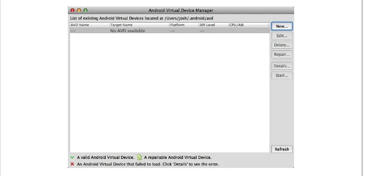
To test an app you must set up the Android emulator (Figure 3-3). The SDK comes with its own emulator based on QEMU, but you must set it up before you run it the first time. Run the graphical Android tool called android in the sdk/tools directory then create a new virtual device. Select the menu item Tools→Manage AVDs…
Figure 3-3. Setting up the Android device emulator
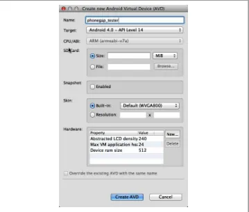
Pick a name for your new virtual device, something like phonegap_tester. The name must not have spaces. Choose the SDK you’ve installed and leave the defaults for the rest of the options. Then click create avd to create the virtual device. Now you can launch the emulator (Figure 3-4). For example, from the command line run ./emulator @phonegap_tester if you named your virtual device phonegap_tester.
Figure 3-4. Create new Android emulator
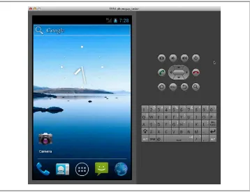
It will take a while to boot up since it is emulating the entire Android OS and device hardware. Once it’s booted you can compile and run your apps in the emulator (Figure 3-5).
PerchSearch for Android
Similar to what we did for webOS, copy the Android/Sample directory from where you saved PhoneGap to your development directory (probably next to where you put the phonegap-palm directory). Rename the directory to something like perchsearch-android.
Now you need to let the project know where you have installed the android SDK and choose the version of the API you want. You do this by running the following command:
android update project --path <project path> --target <android version>
I have downloaded the Android 4.0.3 SDK, so I will use the target release of android-15. You can see a list of installed releases with
android list targets
For example, on my computer I did this:
~/bin/android-sdk-macosx/tools/android update project path perchsearch-android --target android-15
Now go into the project directory and build and install the application into the emulator with
ant clean debug install
This command will fully build the app and install it in the emulator but it will not actually launch the app. Instead you must manually go to the emulator and click on the app’s icon to start it. Sometimes ant install will fail to find the emulator. If that happens just run it again. Now you should have the standard PhoneGap app running
Figure 3-5. Android Emulator running
in the Android emulator (Figure 3-6). If ant clean debug install failed to actually install the app then try restarting the emulator and run it again.
Figure 3-6. PhoneGap running in Android emulator
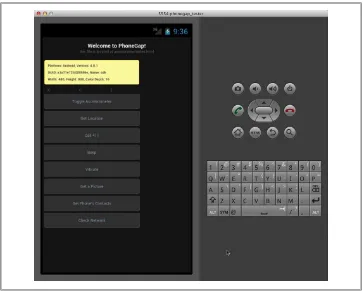
To make our own app ready for Android we do the same thing we did with webOS: copy the contents of PerchSearch/war/ to the perchsearch-android/assets/www direc-tory. Also rename PerchSearch.html to index.html. To rebuild the app run ant clean debug install again. Each time you change your source code you will need to copy it over to the www directory and recompile. The app looks like Figure 3-7 in the Android emulator.
Note: If the plain PhoneGap template works but your app loads only as a white screen in the Android emulator then you may have stumbled across a new bug. In Android 4+ the webkit implementation introduced a new security feature that can break apps which use iframe. By default GWT will use an iframe as part of the generated code. Disable this by adding <add-linker name="xs" /> to your gwt.xml file and recompile the GWT project. Now it should work in Android 4+.
You can view the debugging log with this command:
~/bin/android-sdk-macosx/platform-tools/adb logcat
Packaging an iOS App
Packaging a GWT app for iOS is similar to what we did for webOS and Android. You need the native iOS development tools, Xcode, as well as the latest version of Phone Gap, which includes a special template for building iOS apps. Xcode is Apple’s C/C+ +/Objective-C IDE. It only runs on Mac OS X so you will need a Mac to compile and build iOS apps.
Installing Xcode and PhoneGap
Apple recently moved all of their downloads into the Mac App store, so you can easily get Xcode for free from there. If you don’t have the Mac App store client installed you can get installation instructions on http://www.apple.com/. You will need the latest ver-sion of Snow Leopard or Lion (Mac OS X 10.6 or 10.7). When you download Xcode
Figure 3-7. PerchSearch running in the Android emulator
it won’t actually download Xcode itself but rather a giant installer bundle which you will need to run once to really install Xcode. Previously you had to install the iOS SDK separately, but it is now built into Xcode 4.
Next open the PhoneGap-1.3.0.dmg file that came with your PhoneGap download and run the PhoneGap-1.3.0.pkg installer. This will build and run PhoneGap’s own Xcode installer to put PhoneGap templates into Xcode. You only need to do this step once. Now you are ready to build a new Xcode project.
Start Xcode and select File → New Project. Under the iOS “Application” section choose the PhoneGap-based Application icon and click next. Now enter a name for your ap-plication (Product Name) and Company Identifier. I used “PerchSearch for iPhone” and “Josh On Design.”
Right click on PerchSearch for iPhone in the left hand Project navigator view. Select
Add Files to “PerchSearch for iPhone….” Choose the www directory from the file chooser and make sure create folder references for any added folders is selected. Then click add. This will add the www directory to your project. This directory already has a simple PhoneGap project in it so now you can click the run button in the upper left to run it. The iPhone simulator should start and you should see the default PhoneGap app. Now we can bring over the GWT code.
PerchSearch for iOS
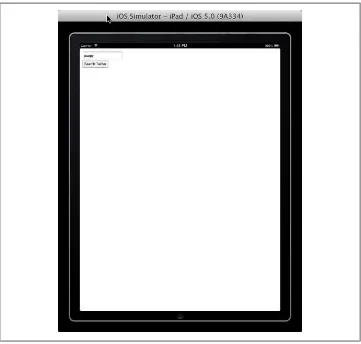
This goes just like before. Copy the contents of PerchSearch/var to the www directory of your new iPhone project. Press build and run. It should look like Figure 3-8. It looks just like we expect. Now try typing into the search box. You will see the iPad keyboard come up automatically. But when you press the search button nothing hap-pens. This exact same code runs fine in the web browser so there must be a particular issue with the iPad. Let’s figure out why.
In the View menu of Xcode select the Navigators → Show Log Navigator menu option or press command 7. The left hand pane will switch to show the list of recent log files. Click on the first item in the list. This will show the most recent log file in the main menu. The log shows a few warning messages about PerchSearch then an error that looks like this
2011-12-30 11:11:45.377 PerchSearch for iPhone[13595:15503] ERROR whitelist rejection: url='http://search.twitter.com/search.json?
q=puppy&callback=__gwt_jsonp__.P0.onSuccess'
As it turns out iOS will not let apps arbitrarily access any site on the web. iOS apps use a whitelist to ensure only valid sites are accessed. You can add twitter.com to the whitelist by opening up the PerchSearch for iPhone/Supporting Files/PhoneGap.plist file in the Xcode sidebar. Then add a new entry under the External Hosts section. Insert * twitter.com, without any http or leading dot. It will look like Figure 3-9.
Now do a clean build (Product → Clean) then run the app again. This time the twitter search will work.
Congratulations! You have now ported a GWT app to webOS, Android and iOS. Up-dating the code for each project is simple: after making changes to your GWT project build it with ant build then copy the contents of PerchSearch/war to the appropriate www directory of each project. That’s all there is to it.
For each platform PhoneGap will build a native executable or package which can be installed on an emulator, a real device, and submitted to that platform’s app store.
Figure 3-8. iPad emulator running PerchSearch
Figure 3-9. Figure editing the PhoneGap.plist file
CHAPTER 4
Customizing Your App for Mobile
So far we have gotten our example app onto a mobile device, but that doesn’t really make it ready for mobile. Mobile devices are different than desktop computers. Not only do they have smaller screens but they are also usually touch driven. Fingers are bigger than a mouse cursor. Certain actions, like scrolling, are easier to do with a finger, whereas other actions like opening drop down menus are harder or impossible to do without a mouse.
Finally, mobile devices typically have a slower network connection and less processing power than a full blown desktop or laptop. You must take all of these complications into account in order to create a great mobile experience, and that is before we even consider mobile specific features like GPS and accelerometers.
In this section we will take a look at the ways mobile devices are different and how to adapt content and applications to these new constraints.
CSS Overview
Fundamentally GWT builds apps with the technology of web pages. Even though we almost never have to touch the HTML markup directly, GWT is using HTML, Java-Script, and CSS underneath. Most modern web sites use HTML only to represent the content of a page or application. The visuals and styling are controlled using a separate document called a Cascading Style Sheet, or CSS file. A CSS file controls the drawing of each element on the screen. It controls both how it is drawn: the colors, backgrounds, fonts, and effects; as well as where it is drawn: the layout and sizing. CSS is a powerful technology that can completely transform HTML content for different target devices. As a quick review, here is what CSS looks like:
div {
font-size: 200%; }
div.foo {
color: blue; }
A CSS file consists of a list of rules. Each rule has two parts: the selector and the
properties. The selector determines what the rule affects. The selector div will apply the rule only to div elements. A selector of div.foo will apply the rule only to divs with a css class of “foo”. For example:
<div> not affected by div.foo </div>
<div class="foo"> *IS* affected by div.foo </div>
The second part of a CSS rule is the list of property settings. A property is some attribute of an element, such as its color, font, width, or background image. Different elements support different properties and in different ways, though mostly this will be hidden for us by GWT.
The combination of selectors and properties let us style any element in any way we choose with a very compact syntax. For example: to color all text inside of a bold element b with red and give it a solid one-pixel black border, we can use this style:
b {
color: red;
border: 1px solid black; }
Styling GWT with CSS
So how does this apply to GWT? Remember that every GWT widget ultimately be-comes an element in a web page, usually a DIV. GWT helpfully adds CSS style classes to every widget based on that widget’s Java class name. With this style class we can hang any style we want.
Suppose we want to make every text field in the app have a thick green border. We can do this with the following style:
.gwt-TextBox {
border: 5px solid green; }
Now that we have the mechanics of CSS working, let’s use CSS to restyle PerchSearch from last chapter.
To demonstrate the power of CSS I added a bit more to the UI of the PerchSearch app from the previous chapter. I added a header at the top and a navigation bar on the side. If I load it directly onto a 1024×768 tablet, it looks like Figure 4-1.
The basic UI is functional but ugly. Fortunately we can easily add some style. First I added style names to the header, sidebar, and labels for each tweet using the addStyle Name method on the widgets.
//in the init code
header.addStyleName("header");
...
nav.addStyleName("nav"); ...
//in the tweet handler onSuccess callback label.addStyleName("tweet");
Now we can hang some style on the UI. I want the header to be larger and centered. The navigation buttons should be plain blue with white text instead of the standard button look. The actual tweet text should be bigger with a more spacing and subtle border. To do all of this I added the following code to the PerchSearch.css file in the war directory.
.header {
font-size: 200%; text-align: center; }
.nav .gwt-Button { width: 100%;
margin: 3px 0px 3px 0px; color: white;
background: none;
background-color: rgb(160,200,250); border: 0px solid black;
}
.tweet {
color: black; padding: 0.3em; font-size: 130%; margin: 2px;
border: 1px solid #e0e0e0;
Figure 4-1. Functional but ugly default UI
background-color: #fafafa; }
Notice the buttons are styled with the selector .nav .gwt-Button. This is a compound selector. It means that the properties will only affect elements marked with gwt-But ton that are also inside of an element marked with nav. This restricts the style changes to only the navigation buttons. The button next to the text field won’t be affected. The final result is in Figure 4-2.
Figure 4-2. The reskinned interface
Adapting to Device Screen Sizes
The next consideration for any mobile app is screen size. Mobile devices have smaller screens with higher DPI than desktop monitors and they are usually viewed closer to the eye than a desktop. To account for this the web browser on most smart phones assumes a screen width of 960 pixels rather than the actual pixel width of the device (for example, 320px in portrait mode on the original iPhone). The browser allows the user to zoom in and out of the screen dynamically. This is great for random pages on
the web but for a mobile app you want greater control over how the user sees your content.
The first adjustment we can make is to force the page to render at the same size as the physical screen. We can do this by adding a meta tag to the head section of the page. For a GWT app this means adding the following to the war/PerchSearch.html file.
<meta name="viewport" content="width=device-width; initial-scale=1.0; user-scalable=no;" />
By setting width=device-width it will tell the browser to make one pixel on your page equal one real pixel on the device. The third command, user-scalable=no, disables user scaling. Since we have the page at exactly the right width the user shouldn’t have to scale. Instead we will make our text the right size for a mobile device. This only disables
scaling, though. The user can still pan around. However, as long as we make sure there is no content sticking off the edge page the user will only need to pan up and down, which is the easiest gesture for a mobile device with a touch screen.
So far we have restyled PerchSearch to run on a tablet at 1024×768, which is close enough to a desktop to work in both places. However, if we put it on a standard iPhone in portrait mode then we will have only 320 pixels across to work with. It will look like
Figure 4-3.
Not horrible but the sidebar really takes away from the tweets. We could change the fonts and layout to work on the phone, but then it would look wrong on the tablet again. We need a way to specify style for each device, preferably without hard coding it to specific brands of devices.
Fortunately CSS has a solution: media selectors. You can designate a block of CSS rules to apply only to a particular size of screen. For example, if we want to make the fonts smaller on a phone but larger on a tablet we can use this CSS.
@media screen and (max-width: 1024px) { .header {
font-size: 200%; }
}
@media screen and (max-width: 320px) { .header {
The beauty of this approach is that the browser will ignore anything that doesn’t match the current device. If you are on a phone then the rules in the 320px block will override the rules from the 1024px block. If you are on a tablet then you will get the 1024px block and the 320px block will be completely ignored. The text-align rule is not inside any block so it will always apply.
CSS media queries support conditions based on width, height, orientation, aspect ratio, and other device features. (See the full CSS spec here for details http://www.w3.org/TR/ css3-mediaqueries/ ). Using media queries lets you completely customize the look of your app for each device size without changing your actual app code at all, and again it degrades gracefully on older devices.
Adjusting Layout for Mobile
Now that leads us into the next problem: layout. It is very common to create websites which have two or three columns. The left and right columns usually have navigation or sidebars while the center column contains the same information. Squishing this onto a mobile screen is never going to look good, as we can see on the iPhone screenshot. The user will either have to zoom out to see everything or pan to the left and right to see the navigation.
A better solution is to change the layout dynamically to fit the device. You can use the traditional three column layout on a desktop, but switch to two columns (nav + con-tent) for a tablet and one column on a phone, putting the navigation and sidebar above
Figure 4-3. PerchSearch running on iOS
or below the content. Thanks to CSS media selectors we can do this entirely with our style sheets, not changing the app code at all.
To adjust PerchSearch for a phone sized device we will make it fit into one column by moving the navigation to be between the header and content. To not waste vertical space we will also make the navigation be horizontal. To determine which CSS to use we need to know what markup GWT has generated for us.
If you use a desktop web browser with a page inspector like Chrome you can see the generated markup. The markup for the main DockLayoutPanel of PerchSearch looks like this:
<div style="position: absolute; left: 0px; top: 0px; right: 0px; bottom: 0px; "><div style="position: absolute; z-index: -32767; top: -20ex; width: 10em; height: 10ex; "> </div><div style="position: absolute; overflow-x: hidden; overflow-y: hidden; left: 0px; top: 0px; right: 0px; bottom: 0px; "><div style="position: absolute; left: 0px; right: 0px; top: 0px; bottom: 0px; " class="dock"><div style="position: absolute; z-index: -32767; top: -20ex; width: 10em; height: 10ex; "> </div><div
style="position: absolute; overflow-x: hidden; overflow-y: hidden; left: 0em; top: 0em; right: 0em; height: 3em; "><div class="gwt-Label header" style="position: absolute; left: 0px; right: 0px; top: 0px; bottom: 0px; ">PerchSearch</div></div><div style="position: absolute; left: 0em; top: 3em; bottom: 0em; width: 5em; "><div class="nav" style="position: absolute; left: 0px; right: 0px; top: 0px; bottom: 0px; "><button type="button" class="gwt-Button">All</button><button type="button"
class="gwt-Button">Puppies</button><button type="button" class="gwt-Button">Lol Cats</ button><button type="button" class="gwt-Button">Clear</button></div></div><div style="position: absolute; overflow-x: hidden; overflow-y: hidden; left: 5em; top: 3em; right: 0em; bottom: 0em; "><table cellspacing="0" cellpadding="0"
style="position: absolute; left: 0px; right: 0px; top: 0px; bottom: 0px; "><tbody><tr><td align="left" style="vertical-align: top; "><input type="text" class="gwt-TextBox"></td></tr><tr><td align="left" style="vertical-align: top; "><button type="button" class="gwt-Button">Search Twitter</button></td></tr><tr><td align="left" style="vertical-align: top; "><div class="gwt-Label"></div></td></ tr><tr><td align="left" style="vertical-align: top; "><table cellspacing="0" cellpadding="0"><tbody></tbody></table></td></tr></tbody></table></div></div></div></ div>
Uh oh. That’s not good. DockLayoutPanel generates many extra divs with lots of inline styles. That’s going to be very hard to override with CSS. We need another solution. To tackle this problem we will use a technique called “tags first GWT”. For some applications you don’t care about the markup and can use whatever GWT generates. For other applications, like mobile ones, we want to specify some of the markup first, then tell GWT to work with what we created. GWT does this very easily using the RootPanel.
Normally we call RootPanel.get().add(panel) to add a panel to the root of the page. RootPanel optionally lets us specify an id of the HTML element we want to use instead of defaulting to the root of the page. With this technique we can insert GWT markup inside of our own custom page.
Let’s start by modifying the main app page in war/PerchSearch.html. Previously the body was empty. Now let’s create our own set of divs, one for each major chunk of the app.
<div id="dock_container">
<div id="header_container"></div> <div id="nav_container"></div> <div id="content_container"></div> </div>
Now modify the Java code to use these nice clean divs. First I removed all references to the dock panel.
final Button searchButton = new Button("Search Twitter"); panel.add(searchButton);
final Label errorLabel = new Label(); panel.add(errorLabel);
panel.add(resultsPanel);
Now I can add the header, panel, and nav to the page specifically where I want them using RootPanel.get:
RootPanel.get("header_container").add(header); RootPanel.get("nav_container").add(nav); RootPanel.get("content_container").add(panel);
The app now has nice clean markup but no layout at all; just some unstyled divs. Now we can jump back into the CSS. For the desktop version we want the header on top, the navigation on the left, and the content in the center adjacent to the nav and below the header.
left: 11em; top: 4em; }
I left the header alone since it looks fine. For the nav and content containers I made them be absolutely positioned then hard coded a width, left, and top value. The nav-igation will be 10 ems wide and 4 em from the top of the page to make room for the header. The content_container div will be 11ems from the left to make room for the navigation, and also 4 ems down. Notice that I’m using em’s instead of pixels. This makes sure the page scales nicely with the user’s preferred font.
The above CSS is now the default. When the screen is narrower than 480px we want the layout to change. That’s what this CSS does:
@media screen and (max-width: 480px) { #nav_container {
If the screen is narrower then the navigation will stretch completely across the screen using width:100%. The content moves further down and all the way to the left using top: 7em and left:0em. We also set the width of the navigation buttons to auto. Before they were 100% wide, meaning they would each be as wide as the screen. Instead we want them to be sized automatically based on the text in them, which is what auto does. I also tweaked the margins a tiny bit to make them look prettier. The final results on a phone look like Figure 4-4.
In all of this talk about screen size we have assumed that a particular device always has the same size but that’s not always true. Many devices can actually be rotated using an accelerometer, which is the device equivalent of resizing the browser window. You can create conditional styles to deal with this by sticking with the width media selector. The width will usually be updated when the user rotates the device. If you want to do something special just for portrait or landscape mode, rather than depending on the screen width you can do it with these media selector:
@media all and (orientation:portrait) { }
@media all and (orientation:landscape) { }
CSS is incredibly powerful. It can restyle almost anything on the page using a very simple syntax and degrades gracefully. All web renderers will ignore any CSS properties
they don’t understand. This lets you add advanced features like animations for recent browsers and devices but still fall back gracefully to standard features on less sophis-ticated browsers.
Thanks to our tags first approach we can completely restyle the app without modifying code at all. This did require a bit of extra work to set up the tags , however. In the next chapter we will take a different approach to making apps ready for mobile.
Figure 4-4. PerchSearch using the tags first approach.
CHAPTER 5
Building a Pure Mobile App with
GWT Mobile UI
So far we have used GWT to build a standard desktop web app then optimized it for mobile using CSS tricks. This approach will work for many projects, especially if you are repurposing existing content. However, if you want to make an app that really
feels native then you need something more.
Native mobile apps typically have touch centric controls like scrolling lists, large but-tons, navigation tabs, and animated screen to screen transitions. We could build these from scratch in GWT by using a lot of hand written CSS and Java code, but why do that when there are already great libraries out there which will do the job for us. For the next project we will use one such library: GWT Mobile UI.
GWT Mobile UI is an open source collection of GWT widgets specifically designed for mobile devices. It has input widgets (buttons and sliders) as well as different panels for mobile style layouts. It also has a nice framework for animated transitions from one screen to the next. With this framework in our toolkit we can create a mobile app that feels completely native without having to reinvent the wheel.
For this project I’m going to build an app I’ve always wanted: a wine journal. My wife and I love to try different wines but I always forget which ones we liked and where we drank them. I own a paper wine journal but I always forget to bring it with me when we go out to eat. Sounds like a job for a mobile app.
Designing the Wine Journal
Before we start building the app let’s plan what the app will look like. Upfront planning will ensure we have all of the pieces we need before starting to build it.
Feature List
The finished app will have the following features:
Wine List
First we need a list of the wines I have tried. Mobile apps should to conserve space because mobile devices have small screens. The wine list should just show the name of the wine, the kind, and the rating.
Wine Details
If you click on a wine in the list it should take you to a new screen which shows the full details of the wine: vineyard, where the wine was bought/drunk, a photo of the label, rating, etc.
Add Wine
Initially the user won’t have any wines, so they need a screen to add a new one. This should be a list of input fields for the name, variety, rating, etc. Since this is a mobile device which likely has a camera and GPS we should take advantage of device features whenever possible.
Navigation Choices
So that’s it for the three main screens. We also need a way of navigating from one screen to another. Since looking at your list of wines is the most common thing someone will do the wine list should be the first screen you see when you start the app. That way you don’t have to navigate anywhere to get to the most common thing.
To get to the wine details you just click on a wine. It would be nice to have some sort of transition to the wine details screen so the user has a sense of what is happening. Once you are on the wine details screen you need a way to get back, so there should be a back button at the top of the screen. You could put the back button anywhere, but the top left is the standard that most mobile devices are moving towards.
To get to the add wine screen we need an add button. The standard place for this is a header or footer containing action buttons. When you get to the add screen you should be able to have a button to actually complete adding the wine, and another for cancel-ing. But where should these buttons go? I suggest the back button goes in the top left, just like on the wine details screen. This is a good place for it because it fits what other mobile apps do and is consistent with the wine details screen.
The add button could go in the upper right. Many apps do this, but I think it should go at the bottom below the entry fields. This has two advantages. First, you get to the add button right when you need it: after you’ve filled in the last field. Second, the add button will probably be hidden by the bottom of the screen until you have scrolled down far enough to fill out the form fields. This means it is hidden until you really need it. If the user accidentally gets to the add wine screen then the only action button they