1 |
P a g e
“STATISTICAL”
Subjects: English Profession
Compiled By
Group Of 12
GLADYS LUMEMPOUW
JEZZITHA SUMAMPOUW
YULIANA MAWU
MANADO STATE UNIVERSITY
FACULTY OF MATHEMATICS AND NATURAL SCIENCE
MATH DEPARTMENT
2 |
P a g e
PREFACE
Praise we pray toward the presence of God Almighty, who upon his grace we can
complete the preparation of a paper entitled "STATISTICAL". Writing this paper is one of the
tasks to accomplish the task subjects "English Profession. "
In writing this paper the author feels there are still many shortcomings both in
technical writing and content, taking into account the capabilities of the author. To that
criticism and suggestions from all parties is the author of hope for the sake of improving the
manufacture of this paper.
Hopefully, this material can be useful and contributions for the needy, especially for
writers that is expected to achieve goals
Tondano, Maret 2011
3 |
P a g e
TABLE OF CONTENTS
TITLE PAGE ……….
1
PREFACE ………
2
TABLE OF CONTENTS ………
3
BAB I PRELIMINARY ………
4
BAB II CONTENT
Chart Data Presentation Form ………
5
1. Circle Diagram ………
5
2. Stem Diagram ……….
6
3. Line Diagram ………
6
4. Pictogram ………..
7
Frequency Distribution ………
7
1. Stem Leaf Diagram ………
8
2. Relative Frequency and Cumulative Frequency ………
8
3. Histograms and Frequency Polygons ………..
10
4. Ogif ………
11
Presentation of Data Size Be Descriptive Statistics ………
11
1. Calculate Average (Mean) ………
11
2. Average Data Group ………..
12
3. Mode ……….
13
4. Mode Data Group ………..
13
5. Median ………
14
6. Single Data quartile ………..
14
7. Data Group quartile ……….………
14
Exercise Problem
………
16
Answer Key……….
18
Translation ………..
22
BAB III COVERING ………..
40
4 |
P a g e
BAB I
PRELIMINARY
In daily life activities, we often encounter a lot of things we can describe in a form of
data. Information obtained data must be processed first into an easily readable and the data
analyzed. However, how the presentation of data that we can of course different, according
to the needs and desires of presenters data.
Basically the application of statistical science is divided into two parts, namely
descriptive statistics and inductive statistics. Descriptive Statistics of trying to explain or
describe the various characteristics of data, such as how average - rating, how much the
data varies and so forth. And in this paper we will discuss about the presentation of data in
the form of diagrams, frequency distribution and Presentation of Data Size Be Descriptive
Statistics.
5 |
P a g e
BAB II
CONTENT
STATISTICS
Statistics is a science that studies how the collection, processing, presentation, data analysis, and making conclusions from the properties of the data. Data is the correct explanation or evidence that can be used as a basis for the analysis or conclusions.
Data collection can be derived as follows:
- Primary data; own original data obtained directly
- Secondary data: data obtained from the data already collected another side. Presentation of Data in Chart Form
1. Circle diagram
Pie charts are illustrated with diagrams that divide the circle so that the ratio of width according to the number of data.
Example:
The following data shows the high school athlete of the archipelago.
TYPE OF EXERCISE AMOUNT Soccer 60 Basketball 50 Volleyball 45 Badminton 25 Table tennis 20
Serve the above data using pie charts Completion:
To create a pie chart, we first determine the percentage and angle of the center circle sector.
TYPE OF
EXERCISE AMOUNT PERCENTAGE CENTRAL ANGLE
Soccer 60 x 100 % = 30 % x = 108 Basketball 50 x 100 % = 25 % x = 90 Volleyball 45 x 100 % = 22,5 % x = 81 Badminton 25 x 100 % = 12,5 % x = 45 Table tennis 20 x 100 % = 10 % x = 36 200
6 |
P a g e
The data above can be presented in pie charts.
2. Stem Diagram
Bar chart is a diagram that depicted in two mutually perpendicular lines that form the stem and the height is proportional to the amount of data.
Example:
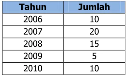
Table
Data on Kasuang Accident Victims
- Bar chart is usually arranged vertically. Time (in years) placed on the horizontal axis and the number of victims expressed by rods whose height corresponds to the number of victims at a certain time, as shown in the picture below
3. Line Diagram
How to serve it as a line. Good line drawing used in the present development of a sustainable data. Example: 30% 25% 23% 13% 10%
PIE CHARTS
Soccer Basketball Volleyball Badminton 0 5 10 15 20 25 2006 2007 2008 2009 2010 A m ou n t Year Data Accident Victims Year Amount 2006 10 2007 20 2008 15 2009 5 2010 107 |
P a g e
The advantage of a company within 5 years (2006-2010)
- Diagram of lines of data, shown in the following figure
4. Piktogram
In this diagram, statistical data presented by using a symbol or picture, and every picture has a certain value.
Example:
Many PERUM-built Dwelling House in the period 2001 – 2005
Year Houses 2001 100 2002 200 2003 300 2004 400 2005 500
- The data is if expressed in terms of piktogram, will be as follows
2001 2002 2003 2004 2004 Ket : = 100 Frequency Distribution
Grouping the data presented in a table called a frequency distribution. 0 2,000,000 4,000,000 6,000,000 8,000,000 10,000,000 2006 2007 2008 2009 2010 A m o u n t Year Advantage Year Advantage (Rp) 2006 3.000.000 2007 5.000.000 2008 8.000.000 2009 7.000.000 2010 9.000.000
8 |
P a g e
1. Stem Leaf Diagram
The following table shows the results of height measurement football players
163 167 167 171 172 170 174 176 175 181
161 168 169 173 172 172 176 175 177 180
166 166 168 174 173 173 178 177 176 183
Data in the table, akn grouped in intervals of 160-169, 170-179, 180-189. To facilitate the grouping, it can be done by a method which leaves a bar chart, as shown in the following table.
Diagram Stem Leaves From the above Table Data
Stem Leaf Frequency
16 136677889 9
17 012223334455666778 18
18 013 3
explanation :
Column bars express the number of hundreds of data, while the leaf column stating the number of data units are known. While the frequency column stated a lot of data on each line in the stem-leaf columns.
If the data is to presented in the form of group (interval), then serve it as the following table
Height (cm) Frequency 160 – 164 2 165 – 169 7 170 – 174 10 175 – 179 8 180 – 184 3
Presentation of data as the table above is called frequency distribution.
Description:
a. The group - the group of data 160-164, 165-169, 170-274, 175-179, 180-184 called class intervals.
b. Each class interval is limited by the value of the lower limit and upper limit. Lower limit value: 160, 165, 170, 175, 180
Value upper limit: 164, 169, 174, 179, 184
c. Bottom of the class edge is the lower limit minus 0.5 Edge of the class is the upper limit of 0.5 added class
d. Length class interval (p) = upper class edge - the edge of the lower class e. Midpoint of the interval class = ½ (lower limit + upper limit)
2. Relative Frequency and Cumulative Frequency a. Relative frequency distribution
Distribution of relative frequency is the frequency distribution of the relative
frequency of each class can be obtained by stating the percentage frequency of that class against the total number of frequencies.
9 |
P a g e
Height data Football Players
Height (cm) Frequency Relative Frequency
160 – 164 2 x 100% = 6,67% 165 – 169 7 x 100% = 23,33% 170 – 174 10 x 100% = 33,33% 175 – 179 8 x 100% = 26,67% 180 – 184 3 x 100% = 10,00%
b. Cumulative Frequency Distribution
Cumulative frequency distribution of two kinds, namely:
- Distribution of frequency less than, namely: the total frequency of all values less
than the lower limit of the class in each class interval and taken to the edge of the upper class.
- Distribution of frequencies of more than, namely: the total frequency of all values
greater than the lower limit of the class in each class interval and taken to the bottom of the class edge.
Example:
Make a cumulative frequency distribution table is less than and more than, the following data: Height (cm) Frequency 160 – 164 2 165 – 169 7 170 – 174 10 175 – 179 8 180 – 184 3
- Distribution of cumulative frequency of less than
Height (cm) cf “ less than“
< 159,5 0 < 164,5 2 < 169,5 9 < 174,5 19 < 179,5 27 < 184,5 30
- Cumulative frequency distribution over
Height (cm) cf “ more than“
> 159,5 30 > 164,5 28 > 169,5 21 > 174,5 11 > 179,5 3 > 184,5 0
10 |
P a g e
3. Histograms and Frequency Polygons
Presentation of data is grouped according to the frequency distribution can be expressed by a graph called a histogram. Frequency is usually expressed with the vertical axis and the class interval indicated by a horizontal axis.
Example:
Height data Football Players
Height (cm) Frequency 160 – 164 2 165 – 169 7 170 – 174 10 175 – 179 8 180 – 184 3
Such data can be expressed by a histogram as shown below
If the midpoints of each box at the top of the histogram associated with each other, it will obtain a diagram that looks like a polygon (polygon), so that the resulting diagram is called frequency polygon, as in the picture below
In the same way as above, the cumulative frequency distribution can be expressed with the cumulative frequency polygon is less than and more than like the following picture: 0 2 4 6 8 10 12 160-164 165-169 170-174 175-179 180-184 Fr e q u e n cy Class Interval
Histogram
160-164 165-169 170-174 175-179 180-184 0 2 4 6 8 10 12 160-164 165-169 170-174 175-179 180-184 fr e q u e n cy intervalPOLYGON FREQUENCY
high of body11 |
P a g e
4. OgifFrom a cumulative frequency distribution table can dibuatsuatu graph is called a cumulative frequency graph or often called ogif. If the dots that make up less than cumulative
frequency polygon associated with the smooth curve, formed ogif positive. Meanwhile, if the dots that make up more than a cumulative frequency polygon is connected with smooth curves, then formed ogif negative
SERVING SIZE DATA INTO DATA DESCRIPTIVE STATISTICS 1. Calculate Average (Mean)
Mean is the value - average of a set of data. The average count (usually abbreviated with the average) data: : x1, x2, x3, x4,. . . , xn is defined by:
Mean =
Example:
Determine the average of the data: 60, 70, 80, 65, 85. Completion:
̅
=
=
72A data score 1, 1, 2, 2, 2, 3, 3, 4, 4, 4, can be displayed with the presentation of a more practical way is as the following table:
0 10 20 30 40 159.5 164.5 169.5 174.5 179.5 184.5 cu m u lativ e fr e q u e n cy interval
Cumulative Polygon More Than
0 5 10 15 20 25 30 35 159.5 164.5 169.5 174.5 179.5 184.5 cu m u lativ e fr e q u e n cy interval
Positive Ogif
0 5 10 15 20 25 30 35 159.5 164.5 169.5 174.5 179.5 184.5 cu m u lativ e fr e q u e n cy intervalNegative Ogif
0 10 20 30 40 159.5 164.5 169.5 174.5 179.5 184.5 cu m u lativ e fr e q u e n cy interval12 |
P a g e
Score 1 2 3 4 Frequency 2 3 2 3
To calculate the average data over the course more systematic if done in a way such as the following table: Score ( ) i i 1 2 2 2 3 6 3 2 6 4 3 12 10 26
The average calculated using the formula:
̅
∑ ∑ Description: ̅ = average i = data to-i i = frequency of i∑
= n = size of data
Thus, these data mean is:
̅
∑∑ =
= 2,6
2. Average Data Group
To calculate the average group of data that have been grouped in the frequency distribution, the data represented by the midpoint of the interval data. In general to calculate the average group data is by use following formula:
̅
∑
∑
Description:
i = the midpoint of the i-th class interval
̅
= average Example: Interval Central Point ( i) Frequency ( i)21 – 25 23 2 46 26 – 30 28 8 224 31 – 35 33 9 297 36 – 40 38 6 228 41 – 45 43 3 129 46 - 50 48 2 96 30 1020
13 |
P a g e
Completion:average data are:
̅
∑∑
=
3. Mode
Mode of a data is a value that appears most or have the highest frequency. Example:
Determine the mode of data: a. 2, 3, 4, 2, 4, 5, 4, 2, 2 b. 7, 3, 8, 5, 7, 7, 5, 1, 5
Completion:
a. Is the mode number 2, because the number 2 appears most as many as 4 times. b. Modus is number 5 and 7, because the number 5 and 7 have the highest frequency
that is 3.
Data that has one mode is called unimodal, which has two modes is called bimodal, data that have more than two modes is called multimodus.
4. Mode Data Group
In general, the data group mode can be determined by the following formula:
(
)
Description:
Tb = lower edge class P = length of class
L ₁ = class frequency mode - the previous frequency
L ₂ = Mous class frequency - the frequency of subsequent class Example:
Determine the mode of the data in the following table:
Interval Frequency 21 – 25 2 26 – 30 8 31 – 35 9 36 – 40 6 41 – 45 3 46 – 50 2 Completion:
The highest frequency lies in the class interval 31-35, so the mode is located between 31-35.
P = 5 ;
= 9 – 8 = 1 ;
=9 – 6 = 3
( )
( )
= 30.5 + 1.25 = 31.75
14 |
P a g e
5. MedianThe median is the middle value of the presentation of data.
If the amount of data is odd, then the median =
If the amount of data is even, then the median = (
)
Example:
Determine the median of the following data a. 1, 2, 3, 4, 5
b. 2, 4, 6, 8, 10, 12 Completion:
a. Median = = = 3
b. Median =
(
)
=
( 6 + 8 ) = 7
6. Single Data quartile
Quartile is the value - the value that divides the sorted data into four equal parts. Value - the value is expressed with Q1 (bottom quartile), Q2 (middle quartile = median), Q3 (upper quartile), which means that 25% of data lies below the Q1, 50% of data lies below the Q2 and 75% of data lies below Q3.
To find Q1 way is to determine the median of all data that is less than Q2 and Q3 to look for, how to determine the median of all data that is more than Q2.
Example:
Determine all quartiles of data 4, 5, 5, 6, 7, 8, 9
Completion:
Bottom quartile Q1 = 5 Middle quartile Q2 = 6 Upper quartile Q3 = 8 7. Quartile Data Group
For the quartile in our first group of data for the frequency distribution of "less than". To determine the quartile of the data group can use the following formula:
(
)
(
)
(
)
15 |
P a g e
Description: Q = quartiles Tb = bottom edges
F = frequency of class before the class quartile f = frequency in quartile class
Example:
Find all quartiles in the table below
Interval Frequency Cumulative Frequency
21 – 25 3 3 26 – 30 9 12 31 – 35 4 16 36 – 40 10 26 41 – 45 3 29 46 - 50 11 40 Completion:
Many of the data is 40 means Q1, Q2, Q3, respectively - each is rated to-10, 20 and 30. Value - the value of the individual - each located in the class interval 26-30, 36-40, and 46-50.
- = 25.5, n = 40, = 3, = 9, P = 5 ( ) = ( ) 5 = + - = 35.5, n = 40, = 16, = 10, P = 5 ( ) = ( ) 5 = - = 45.5, n = 40, = 29, = 11, P = 5 ( ) = ( ) =
16 |
P a g e
Exercise Problem
1. Many Indonesian students who received scholarships to study abroad are as follows Country of Many Students
Destination
Countries
Many Students
France 216
England 113
Japan 86
Netherlands 143
Germany 162
Draw a diagram of data on top of the circle!
2. The table below shows the behavior terentu brand shoes in a shop in the period August - December 2010
Moon August September October November December
Many Shoes 842 780 864 920 562
Serve the above data using bar charts!
3. Many brands of notebooks sold in stores kyky books in the period from July to December 2010 is as follows
Moon July August September October November December
Many Books 5000 3000 2000 2000 1000 4000
Draw the above data using line diagrams
4. The table below shows the number of villagers in 1990, 1995, 2000, 2005, 2010
Year 1990 1995 2000 2005 2010
Total Population
(inhabitants) 500 1000 2500 3000 4000
Serve the above data using the pictogram
5. The table below shows the many orchid flowers are exported by a country for 6 years, from 2001 to 2006
Year 2001 2002 2003 2004 2005 2006
Many Flowers (In Thousands)
6 4 7 7 5 6
Draw upon data in two different diagrams
6. The table alongside shows the students' body weight (in kilograms) in a class Western Agency (in kg)
25 34 31 35 28 36 33 28 37 35 39 38 36 31 35 37 30 33 26 34 39 40 29 32 35 36 41 36 27 33 36 35 31 38 29 45 34 36 25 33 34 32 36 33 44 32 34 30 39 40 37 43 42 38 41 39 a. Make a leaf bar chart for these data
b. Make a frequency distribution with a width of grade 3
7. The table below shows the travel time (in minutes) in the 5 km race between a high school in a region
17 |
P a g e
Time (min) 15 – 18 19 – 22 23 – 26 27 – 30 31 – 34 35 – 38
Many participants
8 16 24 40 64 32
Paint scattered histograms and polygons on the travel time 8. The table below shows the weight of PMR in suau high school.
Weight (kg) Many Students
36 – 40 3
41 – 45 10
46 – 50 16
51 – 55 5
56 – 60 2
Make a cumulative frequency distribution table is less than and more than a cumulative frequency distribution.
9. Arrange the frequency distribution of body weight data of students based on the following cumulative frequency table.
Weight (kg) <40 <44 <48 <52 <56 <60 <64
Many students 0 3 11 31 46 52 55
10. Determine the arithmetic average (mean), median and mode from the following data a. 12, 14, 17, 19, 15, 16, 18, 19
b. 1, 2, 3, 4, 9, 8, 7, 1, 1 c. 2, 5, 4, 7, 1, 5, 5, 3
11. Determine the arithmetic average (mean) and the mode of the following data
Score 2 5 8 11 14
Frequency 2 6 10 4 3
12. Determine the arithmetic average (mean) and the mode of the following data
Score 52 56 60 64 68 72 76 80
Frequency 3 6 10 20 30 20 8 3
13. Find all quartiles of the following data a. 2, 3, 10, 11, 12, 4, 5, 6, 7, 8, 9 b. 7, 7, 8, 8, 12, 13, 13, 8, 9, 9, 10, 11
14. The table below is the data speed of vehicles (km / h) in a city. Compute the lower quartile (Q1), median (Q2), and upper quartile (Q3)
Speed Frequency 50 – 54 5 55 – 59 6 60 – 64 7 65 – 69 9 70 – 74 10 75 – 79 8 80 – 84 6 85 – 89 5 90 - 94 4
18 |
P a g e
842 780 864 920 562 0 200 400 600 800 1000august September october November december
0 1000 2000 3000 4000 5000 6000 m any boo ks moon
ANSWER KEY
1. 2. 3. 30% 15% 12% 20% 23% France England Japan Netherlands Germany DestinationCountries
Many Students
Percentage central angleFrance 216 30% 108° England 113 15% 56.5° Japan 86 12% 43° Netherlands 143 20% 31.5° Germany 162 23% 81° 720
19 |
P a g e
0 2 4 6 8 2001 2002 2003 2004 2005 2006 A l ot o f in te re st ( in t ho usan ds) year 0 2 4 6 8 2001 2002 2003 2004 2005 2006 A l ot o f in te re st ( in th ou san ds) year 0 20 40 60 80 15 - 18 19 - 22 23 - 26 27 - 30 31 - 34 35 - 38 m any pa rti cipa nt s time (minute)Histogram
4. 1990 1995 2000 2005 2010 Ket : = 500 5. 6. a . b. Frequency Distribution Interval Frequency 25 – 27 4 28 – 30 6 31 – 33 12 34 – 36 17 37 – 39 10 40 – 42 4 43 – 45 3 7.Stem Leaf Frequency
2 55678899 8
3 00111122233333444445555566666667778889999 41
20 |
P a g e
0 20 40 60 80 15 - 18 19 - 22 23 - 26 27 - 30 31 - 34 35 - 38 m any p ar ti cipan ts time (minute)Poligon
8.
Cumulative frequency distribution table is less than
weight (kg)
Cumulative
frequency
< 35.5 0 < 40.5 3 < 45.5 13 < 50.5 29 < 55.5 34 < 60.5 36Cumulative frequency distribution table is more than
weight (kg)
Cumulative
frequency
> 35.5 36 > 40.5 33 > 45.5 23 > 50.5 7 > 55.5 2 > 60.5 09.
Frequency Distribution Table
weight (kg) Many students
40 – 44 3 45 – 48 8 49 – 52 20 53 – 56 12 57 – 60 6 61 - 64 3 10. A.
̅
= = 16.25 Median = 12, 14, 15, 16, 17, 18, 19, 19 = 16.5 Mode = 19 B.̅
= = 4 Median = 1, 1, 1, 2, 3, 4, 7, 8, 9 = 3 Mode = 121 |
P a g e
C.̅
= = 4 Median = 1, 2, 3, 4, 5, 5, 5, 7 = 4.5 Mode = 5 11.̅
= ∑ ∑=
= = 6,68 Mode = 8 12.̅
= ∑ ∑=
= = 67 Mode = 68 13. A. 2, 3, 4, 5, 6, 7, 8, 9, 10, 11, 12 Q1 = 2, Q2 = 7, Q3 = 10 B. 7, 7, 8, 8, 8, 9, 9, 10, 11, 12, 13, 13 Q1 = 8, Q2 = 9, Q3= 1214. -
Lower quartile Q
1class interval is located at 60 - 64
n = 60, F1 = 11, f1 = 7, p = 5
(
–)
= 59.5 + ( )5 = 59.5 + 2.85 = 62.35-
Interval class middle quartile Q
2located at 70-74.
n = 60, F = 27, f2 = 10, p = 5
(
)
= (
) 5
=
- Interval class upper quartile Q
3is located at 75-79.
n = 60, F3 = 37, f3 = 8, p = 5
(
)
= (
)
=
22 |
P a g e
TRANSLATION / TERJEMAHAN
STATISTIKA
Statistika merupakan suatu ilmu yang mempelajari cara pengumpulan, pengolahan, penyajian, analisis data, dan pengambilan kesimpulan dari sifat-sifat data. Data adalah keterangan atau bukti yang benar yang dapat dijadikan dasar untuk membuat analisa atau kesimpulan.
Pengumpulan data dapat diperoleh dengan cara sebagai berikut : - Data primer; data asli yang diperoleh sendiri secara langsung
- Data sekunder; data yang diperoleh dari data yang telah dikumpulkan pihak lain. Penyajian Data Dalam Bentuk Diagram
1. Diagaram Lingkaran
Diagram lingkaran adalah diagram yang digambarkan dengan membagi-bagi lingkaran sehingga perbandingan luasnya sesuai dengan banyaknya data.
Contoh :
Berikut ini menunjukkan data olahragawan SMU Nusantara.
JENIS OLAHRAGA JUMLAH Sepak bola 60 Basket 50 Voli 45 Bulu tangkis 25 Tenis meja 20
Sajikan data diatas dengan menggunakan diagram lingkaran Penyelesaian :
Untuk membuat diagram lingkaran, terlebih dahulu kita tentukan besar persentase dan sudut pusat sektor lingkaran
Jenis OR Jumlah Persen Sudut Pusat
Sepak bola 60 x 100 % = 30 % x = 108 Basket 50 x 100 % = 25 % x = 90 Voli 45 x 100 % = 22,5 % x = 81 Bulu tangkis 25 x 100 % = 12,5 % x = 45 Tenis meja 20 x 100 % = 10 % x = 36 200
23 |
P a g e
2. Diagram Batang
Diagram batang yaitu diagram yang digambarkan dalam dua garis yang saling tegak lurus berupa batang dan tingginya sebanding dengan banyaknya data.
Contoh :
Tabel
Data Korban Kecelakaan di Kasuang
Tahun Jumlah 2006 10 2007 20 2008 15 2009 5 2010 10
- Diagram batang biasanya disusun secara vertikal. Waktu (dalam tahun) diletakkan pada sumbu horisontal dan jumlah korban dinyatakan dengan batang-batang yang tingginya sesuai dengan jumlah korban pada kurun waktu tertentu, seperti yang ditunjukkan pada gambar berikut
3. Diagram Garis
Cara penyajiannya dalam bentuk garis. Diagram garis baik digunakan dalam menyajikan perkembangan data yang berkelanjutan.
Contoh : 30% 25% 22% 13% 10%
Diagram Lingkaran
Sepak Bola Basket Voli Bulu Tangkis Tenis Meja 0 5 10 15 20 25 2006 2007 2008 2009 2010 Ju m lah Tahun Data Korban Kecelakaan24 |
P a g e
Keuntungan sebuah perusahan dalam tempo 5 tahun ( 2006 – 2010)
Tahun Kentungan (Rp) 2006 3.000.000 2007 5.000.000 2008 8.000.000 2009 7.000.000 2010 9.000.000
- Diagram garis dari data tersebut, ditunjukkan pada gambar berikut
4. Piktogram
Pada diagram ini, data statistik disajikan dengan menggunakan lambang atau gambar, dan setiap gambar memiliki nilai tertentu.
Contoh :
Banyak Rumah Tinggal yg dibangun PERUM dalam periode 2001 – 2005
Tahun Banyak Rumah
2001 100
2002 200
2003 300
2004 400
2005 500
- Data tersebut jika dinyatakan dalam bentuk piktogram, akan menjadi seperti berikut
2001 2002 2003 2004 2004 Ket : = 100 0 2,000,000 4,000,000 6,000,000 8,000,000 10,000,000 2006 2007 2008 2009 2010 Ju m lah Tahun Keuntungan
25 |
P a g e
Distribusi Frekuensi
Pengelompokan data yang disajikan dalam suatu tabel dinamakan dengan distribusi
frekuensi.
1. Diagram Batang Daun
Tabel berikut ini, menunjukkan hasil pengukuran tinggi pemain sepak bola
163 167 167 171 172 170 174 176 175 181
161 168 169 173 172 172 176 175 177 180
166 166 168 174 173 173 178 177 176 183
Data dalam tabel tersebut, akn dikelompokkan dalam interval-interval 160-169, 170-179, 180-189. Untuk memudahkan pengelompokkan tersebut, maka dapat dilakukan dengan
suatu metode yaitu diagram batang daun, seperti diperlihatkan dalam tabel berikut
Diagram Batang Daun Dari Data Tabel diatas
Batang Daun Frekuensi
16 136677889 9
17 012223334455666778 18
18 013 3
Ket :
Kolom batang menyatakan angka ratusan dari data, sedangkan kolom daun menyatakan angka satuan dari data yang diketahui. Sementara kolom frekuensi menyatakan banyak data pada tiap-tiap baris dalam kolom batang-daun.
Jika data tersebut ingin disajikan dalam bentuk berkelompok (interval), maka penyajiannya
seperti tabel berikut
Tinggi (cm) Frekuensi 160 – 164 2 165 – 169 7 170 – 174 10 175 – 179 8 180 – 184 3
Penyajian data seperti tabel di atas disebut distribusi frekuensi.
Keterangan :
a. Kelompok – kelompok data 160 – 164, 165 – 169, 170 – 274, 175 – 179, 180 – 184 disebut
interval kelas.
b. Setiap interval kelas dibatasi oleh nilai batas bawah dan batas atas.
Nilai batas bawah : 160, 165, 170, 175, 180 Nilai batas atas : 164, 169, 174, 179, 184
c. Tepi bawah kelas adalah batas bawah dikurangi 0,5
Tepi atas kelas adalah batas atas kelas ditambahi 0,5
d. Panjang interval kelas (p) = tepi atas kelas – tepi bawah kelas e. Titik tengah interval kelas = ½ ( batas bawah + batas atas)
2. Frekuensi Relatif dan Frekuensi Kumulatif a. Distribusi frekuensi relatif
Distribusi frekuensi relatif adalah distribusi frekuensi yang frekuensi relatif masing-masing kelasnya dapat diperoleh dengan menyatakan persentase frekuensi kelas tersebut terhadap jumlah seluruh frekuensi.
26 |
P a g e
Contoh :
Data Tinggi Badan Pemain Sepak Bola
Tinggi (cm) Frekuensi Frekuensi Relatif
160 – 164 2 x 100% = 6,67% 165 – 169 7 x 100% = 23,33% 170 – 174 10 x 100% = 33,33% 175 – 179 8 x 100% = 26,67% 180 – 184 3 x 100% = 10,00%
b. Distribusi Frekuensi Kumulatif
Distribusi frekuensi kumulatif ada dua macam, yaitu :
- Distribusi frekuensi kurang dari, yaitu : total frekuensi dari semua nilai yang lebih kecil dari batas bawah kelas pada masing-masing kelas intervalnya dan diambil terhadap tepi atas kelas.
- Distribusi frekuensi lebih dari, yaitu : total frekuensi dari semua nilai yang lebih besar dari batas bawah kelas pada masing-masing kelas intervalnya dan diambil terhadap tepi bawah kelas.
Contoh :
Buatlah tabel distribusi frekuensi kumulatif kurang dari dan lebih dari, dari data berikut:
Tinggi (cm) Frekuensi 160 – 164 2 165 – 169 7 170 – 174 10 175 – 179 8 180 – 184 3
- Distribusi frekuensi kumulatif kurang dari
Tinggi (cm) Fk “ kurang dari “
< 159,5 0 < 164,5 2 < 169,5 9 < 174,5 19 < 179,5 27 < 184,5 30
Distribusi frekuensi kumulatif lebih dari
Tinggi (cm) Fk “ lebih dari“
> 159,5 30 > 164,5 28 > 169,5 21 > 174,5 11 > 179,5 3 > 184,5 0
27 |
P a g e
3. Histogram dan Poligon Frekuensi
Penyajian data yang dikelompokkan menurut distribusi frekuensi dapat dinyatakan dengan
grafik yang disebut histogram. Frekuensi biasanya dinyatakan dengan sumbu tegak dan
interval kelas dinyatakan dengan sumbu mendatar. Contoh :
Data Tinggi Badan Pemain Sepak Bola
Tinggi (cm) Frekuensi 160 – 164 2 165 – 169 7 170 – 174 10 175 – 179 8 180 – 184 3
Data tersebut dapat dinyatakan dengan histogram seperti pada gambar berikut
Bila titik-titik tengah dari tiap kotak dibagian atas pada histogram saling dihubungkan, maka
akan diperoleh diagram yang bentuknya menyerupai poligon (segi banyak), sehingga
diagram yang dihasilkan dinamakan poligon frekuensi, seperti pada gambar berikut
0 2 4 6 8 10 12 160-164 165-169 170-174 175-179 180-184 Fr e ku e n si Interval Kelas
Histogram
160-164 165-169 170-174 175-179 180-184 0 2 4 6 8 10 12 160-164 165-169 170-174 175-179 180-184 fr e ku e n si intervalPOLIGON FREKUENSI
tinggi…28 |
P a g e
Dengan cara yang sama seperti diatas, distribusi frekuensi kumulatif dapat dinyatakan dengan poligon frekuensi kumulatif kurang dari dan lebih dari seperti gambar berikut :
4. Ogif
Dari suatu table distribusi frekuensi kumulatif dapat dibuatsuatu grafik yang dinamakan grafik frekuensi kumulatif atau yang sering disebut ogif. Jika titik-titik yang membentuk polygon frekuensi kumulatif kurang dari dihubungkan dengan kurva mulus maka, terbentuk ogif positif. Sedangkan jika titik-titik yang membentuk polygon frekuensi kumulatif lebih dari dihubungkan dengan kurva mulus, maka terbentuk ogif negatif.
PENYAJIAN DATA UKURAN MENJADI DATA STATISTIK DESKRIPTIF 1. Rataan Hitung (Mean)
Mean adalah nilai rata – rata dari sekumpulan data yang ada. Rataan hitung (biasa
disingkat dengan rataan) data : x1, x2, x3, x4,. . . , xn didefinisikan dengan :
Mean =
Contoh :
Tentukan rataan dari data : 60, 70, 80, 65, 85.
Penyelesaian
̅
=
=
72 0 10 20 30 40 159.5 164.5 169.5 174.5 179.5 184.5 fr e ku e n si k u m u latif intervalPoligon Kumulatif Lebih Dari
0 5 10 15 20 25 30 35 159.5 164.5 169.5 174.5 179.5 184.5 fr e ku e n si k u m u latif interval
Ogif Positif
0 5 10 15 20 25 30 35 159.5 164.5 169.5 174.5 179.5 184.5 fr e ku e n si k u m u latif intervalOgif Negatif
0 10 20 30 40 159.5 164.5 169.5 174.5 179.5 184.5 frek ue ns i k um ula tif interval29 |
P a g e
Suatu data skor 1, 1, 2, 2, 2, 3, 3, 4, 4, 4, dapat ditampilkan dengan penyajian yang lebih praktis yaitu seperti table berikut :
Skor 1 2 3 4 Frekuensi 2 3 2 3
Untuk menghitung rataan data di atas tentunya lebih sistematis jika dilakukan dengan cara seperti table berikut :
Skor ( ) i i 1 2 2 2 3 6 3 2 6 4 3 12 10 26
Rataannya dihitung dengan menggunakan rumus :
̅
∑
∑
Keterangan : ̅ = rataan i = data ke-i i = frekuensi dari i
∑
= n = ukuran data
Jadi, rataan data tersebut adalah :
̅
∑∑ =
= 2,6
2. Rataan Data Berkelompok
Untuk menghitung rataan berkelompok suatu data yang telah dikelompokkan dalam distribusi frekuensi, data diwakili oleh titik tengah dari interval data. Secara umum untuk menghitung rataan data berkelompok adalah dengan mengghunakan rumus berikut :
̅
∑
∑
Keterangan :
i = titik tengah interval kelas ke-i
̅
= rataanContoh :
Interval Titik Tengah ( i) Frekuensi ( i)
21 – 25 23 2 46 26 – 30 28 8 224 31 – 35 33 9 297 36 – 40 38 6 228 41 – 45 43 3 129 46 - 50 48 2 96 30 1020
30 |
P a g e
Penyelesaian:
rataan data tersebut adalah
: ̅
∑∑
=
3. Modus
Modus dari suatu data adalah nilai yang paling banyak muncul atau mempunyai frekuensi tertinggi.
Contoh :
Tentukan modus dari data :a. 2, 3, 4, 2, 4, 5, 4, 2, 2 b. 7, 3, 8, 5, 7, 7, 5, 1, 5
Penyelesaian :
a. Modusnya adalah angka 2, karena angka 2 paling banyak muncul yaitu sebanyak 4 kali.
b. Modusnya adalah angka 5 dan 7, karena angka 5 dan 7 mempunyai frekuensi tertinggi yaitu 3.
Data yang mempunyai satu modus disebut unimodal, yang mempunyai dua modus
disebut bimodal, data yang mempunyai lebih dari dua modus disebut multimodus.
4. Modus Data Berkelompok
Secara umum modus data berkelompok dapat ditentukan dengan rumus berikut :
(
)
Keterangan :
Tb = tepi bawah kelas P = panjang kelas
=
frekuensi kelas modus – frekuensi sebelumnya=
frekuensi kelas mous – frekuensi kelas sesudahnya Contoh :Tentukan modus dari data pada tabel berikut :
Interval Frekuensi 21 – 25 2 26 – 30 8 31 – 35 9 36 – 40 6 41 – 45 3 46 – 50 2 Penyelesaian :
Frekuensi yang paling tinggi terletak pada kelas interval 31 – 35, jadi modusnya terletak di antara 31 – 35. P = 5 ;
= 9 – 8 = 1 ;
=9 – 6 = 3
(
)
(
)
= 30.5 + 1.25
= 31.75
31 |
P a g e
Jadi, modus data pada tabel tersebut adalah 31,75 5. Median
Median adalah nilai tengah dari penyajian data.
Jika jumlah datanya ganjil, maka median =
Jika jumlah datanya genap, maka median =
(
)
Contoh :
Tentukan median dari data berikut ini a. 1, 2, 3, 4, 5
b. 2, 4, 6, 8, 10, 12
Penyelesaian :
a. Median = = = 3
b. Median =
(
)
=
( 6 + 8 ) = 7
6. Kuartil Data Tunggal
Kuartil adalah nilai – nilai yang membagi suatu data terurut menjadi empat bagian yang sama. Nilai – nilai itu dinyatakan dengan Q1 (kuartil bawah), Q2 (kuartil tengah =
median), Q3 (kuartil atas), yang artinya 25% data terletak dibawah Q1, 50% data terletak
dibawah Q2 dan 75% data terletak dibawah Q3.
Untuk mencari Q1 caranya adalah dengan menentukan median dari semua data yang
kurang dari Q2 dan untuk mencari Q3, caranya dengan menentukan median dari semua data yang lebih dari Q2.
Contoh :
Tentukan semua kuartil pada data 4, 5, 5, 6, 7, 8, 9
Penyelesaian :
Kuartil bawah Q1 = 5 Kuartil tengah Q2 = 6
Kuartil atas Q3 = 8
7. Kuartil Data Berkelompok
Untuk kuartil pada data berkelompok terlebih dahulu kita buat distribusi frekuensi “kurang dari”. Untuk menentukan kuartil dari data berkelompok dapat menggunakan rumus berikut ini :
(
)
(
)
(
)
Keterangan :32 |
P a g e
Q = kuartil Tb = Tepi bawah
F = frekuensi kelas sebelum kelas kuartil
f = frekuensi pada kelas kuartil
Contoh :
Carilah semua kuartil pada tabel di bawah ini
Interval Frekuensi F. Kumulaif
21 – 25 3 3 26 – 30 9 12 31 – 35 4 16 36 – 40 10 26 41 – 45 3 29 46 - 50 11 40 Penyelesaian :
Banyak data adalah 40 berarti Q1, Q2, Q3 masing – masing adalah nilai ke-10, 20 dan 30.
Nilai – nilai tersebut masing – masing terletak pada interval kelas 26 – 30, 36 – 40, dan 46 – 50. - = 25.5, n = 40, = 3, = 9, P = 5
(
)
= (
) 5
= +
- = 35.5, n = 40, = 16, = 10, P = 5
(
)
= (
) 5
=
- = 45.5, n = 40, = 29, = 11, P = 5
33 |
P a g e
(
)
= (
)
=
34 |
P a g e
Latihan Soal
1. Banyak mahasiswa Indonesia yang mendapat beasiswa belajar di luar negeri adalah sebagai berikut
Negara Tujuan Banyak Mahasiswa
Perancis 216
Inggris 113
Jepang 86
Belanda 143
Jerman 162
Gambarlah data di atas dengan diagram lingkaran!
2. Tabel di bawah ini menunjukkan sepatu merk terentu yang laku di sebuah took dalam periode Agustus – Desember 2010
Bulan Agustus September Oktober November Desember
Banyak Sepatu 842 780 864 920 562
Sajikan data di atas dengan menggunakan diagram batang!
3. Banyak buku tulis merk kyky yang terjual di took buku dalam periode Juli – Desember 2010 adalah sebagai berikut
Bulan Juli Agustus September Oktober November Desember
Banyak Buku 5000 3000 2000 2000 1000 4000
Gambarlah data di atas dengan menggunakan diagram garis
4. Tabel di bawah ini menunjukkan jumlah penduduk desa dalam tahun 1990, 1995, 2000, 2005, 2010
Tahun 1990 1995 2000 2005 2010
Jumlah Penduduk (jiwa) 500 1000 2500 3000 4000
Sajikan data di atas dengan menggunakan piktogram
5. Tabel di bawah ini menunjukkan banyak bunga anggrek yang diekspor oleh suatu negara selama 6 tahun, dari 2001 sampai 2006
Tahun 2001 2002 2003 2004 2005 2006
Banyak bunga
(dalam ribuan) 6 4 7 7 5 6
Gambarlah data di atas dalam dua diagram yang berbeda
6. Tabel di samping menunjukkan berat badan siswa (dalam kg) di suatu kelas Barat Badan (dalam kg)
25 34 31 35 28 36 33 28 37 35 39 38 36 31 35 37 30 33 26 34 39 40 29 32 35 36 41 36 27 33 36 35 31 38 29 45 34 36 25 33 34 32 36 33 44 32 34 30 39 40 37 43 42 38 41 39
35 |
P a g e
b. Buatlah distribusi frekuensi dengan lebar kelas 3
7. Tabel di bawah ini menunjukkan waktu tempuh (dalam menit) dalam lomba lari 5 km antar SMA di suatu daerah
Waktu (menit) 15 – 18 19 – 22 23 – 26 27 – 30 31 – 34 35 – 38
Banyak Peserta 8 16 24 40 64 32
Lukislah histogram dan poligon tentang tebaran waktu tempuh tersebut 8. Tabel di bawah ini menunjukkan berat badan anggota PMR di suau SMU.
Berat Badan (kg) Banyak Siswa
36 – 40 3
41 – 45 10
46 – 50 16
51 – 55 5
56 – 60 2
Buatlah tabel distribusi frekuensi kumulatif kurang dari dan distribusi frekuensi kumulatif lebih dari.
9. Susunlah distribusi frekuensi dari data berat badan siswa berdasarkan tabel frekuensi kumulatif berikut ini.
Berat (kg) <40 <44 <48 <52 <56 <60 <64
Banyak Siswa 0 3 11 31 46 52 55
10. Tentukan rataan hitung (mean), median dan modus dari data berikut ini a. 12, 14, 17, 19, 15, 16, 18, 19
b. 1, 2, 3, 4, 9, 8, 7, 1, 1 c. 2, 5, 4, 7, 1, 5, 5, 3
11. Tentukan rataan hitung (mean) dan modus dari data berikut ini
Skor 2 5 8 11 14
Frekuensi 2 6 10 4 3
12. Tentukan rataan hitung (mean) dan modus dari data berikut ini
Skor 52 56 60 64 68 72 76 80
Frekuensi 3 6 10 20 30 20 8 3
13. Carilah semua kuartil dari data berikut ini a. 2, 3, 10, 11, 12, 4, 5, 6, 7, 8, 9 b. 7, 7, 8, 8, 12, 13, 13, 8, 9, 9, 10, 11
14. Tabel di bawah ini adalah data kecepatan kendaraan bermotor (km/jam) di suatu kota.
Hitunglah kuartil bawah (Q1), median (Q2), dan kuartil atas (Q3)
Kecepatan Frekuensi 50 – 54 5 55 – 59 6 60 – 64 7 65 – 69 9 70 – 74 10 75 – 79 8
36 |
P a g e
842 780 864 920 562 0 200 400 600 800 1000Agustus September Oktober November Desember
0 1000 2000 3000 4000 5000 6000 Jumla h Bu ku Bulan 80 – 84 6 85 – 89 5 90 - 94 4
KUNCI JAWABAN
15. 16. 17. 30% 15% 12% 20% 23% Perancis Inggris Jepang Belanda JermanNegara Tujuan Banyak Mahasiswa Persen Sudut Pusat
Perancis 216 30% 108° Inggris 113 15% 56.5° Jepang 86 12% 43° Belanda 143 20% 31.5° Jerman 162 23% 81° 720
37 |
P a g e
0 2 4 6 8 2001 2002 2003 2004 2005 2006 Jumla h bu nga (d al am ri bua n) Tahun 0 2 4 6 8 2001 2002 2003 2004 2005 2006 Jumla h bu nga (d al am ri bua n) Tahun 0 20 40 60 80 15 - 18 19 - 22 23 - 26 27 - 30 31 - 34 35 - 38 Ba nya k pe se rta Waktu (menit)Histogram
18. 1990 1995 2000 2005 2010 Ket : = 500 19. 20. a . b. Distribusi Frekuensi Interval Frekuensi 25 – 27 4 28 – 30 6 31 – 33 12 34 – 36 17 37 – 39 10 40 – 42 4 43 – 45 3 21.Batang Daun Frekuensi
2 55678899 8
3 00111122233333444445555566666667778889999 41
38 |
P a g e
0 20 40 60 80 15 - 18 19 - 22 23 - 26 27 - 30 31 - 34 35 - 38 Ba nya k P es erta Waktu (menit)Poligon
22. Tabel distribusi frekuensi kumulatif kurang dari Berat Badan (kg) F. Kumulatif < 35.5 0 < 40.5 3 < 45.5 13 < 50.5 29 < 55.5 34 < 60.5 36
Tabel distribusi frekuensi kumulatif lebih dari Berat Badan (kg) F. Kumulatif > 35.5 36 > 40.5 33 > 45.5 23 > 50.5 7 > 55.5 2 > 60.5 0
23. Tabel Distribusi Frekuensi Berat Badan (kg) Banyak Siswa 40 – 44 3 45 – 48 8 49 – 52 20 53 – 56 12 57 – 60 6 61 - 64 3 24. A.
̅
= = 16.25 Median = 12, 14, 15, 16, 17, 18, 19, 19 = 16.5 Modus = 19 B.̅
= = 439 |
P a g e
Median = 1, 1, 1, 2, 3, 4, 7, 8, 9 = 3 Modus = 1 C.̅
= = 4 Median = 1, 2, 3, 4, 5, 5, 5, 7 = 4.5 Modus = 5 25.̅
= ∑ ∑=
= = 6,68 Modus = 8 26.̅
= ∑ ∑=
= = 67 Modus = 68 27. A. 2, 3, 4, 5, 6, 7, 8, 9, 10, 11, 12 Q1 = 2, Q2 = 7, Q3 = 10 B. 7, 7, 8, 8, 8, 9, 9, 10, 11, 12, 13, 13 Q1 = 8, Q2 = 9, Q3= 1228. - Interval kelas kuartil bawah Q1 terletak pada 60 – 64.
n = 60, F1 = 11, f1 = 7, p = 5
(
–)
= 59.5 + ( )5 = 59.5 + 2.85 = 62.35- Interval kelas kuartil tengah Q2 terletak pada 70 – 74.
n = 60, F = 27, f2 = 10, p = 5
(
)
= (
) 5
=
- Interval kelas kuartil tengah Q2 terletak pada 75 – 79.
n = 60, F3 = 37, f3 = 8, p = 5