METHODS
Measuring environmental quality: an index of pollution
Neha Khanna *
Department of Economics and En6ironmental Studies Program,Binghamton Uni6ersity,Library Tower1004,P.O.Box6000, Binghamton,NY13902-6000,USA
Received 14 January 2000; received in revised form 1 May 2000; accepted 9 May 2000
Abstract
This paper develops an index of pollution based on the epidemiological dose-response function associated with each pollutant, and the welfare losses due to exposure to pollution. The probability of damage is translated into welfare losses, which provides the common metric required for aggregation. Isopollution surfaces may then be used to compare environmental quality over time and space. An Air Pollution Index (API) is computed using 1997 data for the criteria pollutants under the Clean Air Act (CAA). The results are compared with the EPA’s Pollutant Standards Index (PSI). Two significant differences emerge: unlike the PSI, the API facilitates a detailed ranking of regions by air quality and API values may contradict PSI results. Some regions with PSI values of 100 – 200 are considered less polluted under the proposed methodology than those with PSI values between 50 and 100. The key reason for the difference is that PSI values are determined entirely by the gas with the highest relative concentration whereas the API value is based on the ambient concentrations of all pollutants. © 2000 Elsevier Science B.V. All rights reserved.
Keywords:Dose-response functions; Epidemiology; Welfare; Isopollution lines; Pollutant Standards Index; Environmental quality; Air pollution
www.elsevier.com/locate/ecolecon
1. Introduction
In the past decade or so, there has been a fundamental shift in the approach to pollution control. More and more, there seems to be an emphasis on the use of voluntary pollution reduc-tion programs rather than the tradireduc-tional com-mand and control approach, or even the use of
market-based instruments such as taxes and trad-able permits. While there is some debate about whether the voluntary approach complements or substitutes the more traditional approaches, it is clear that the availability of reliable environmen-tal information is crucial (Tietenberg, 1998; Kennedy et al., 1994).
The correct measure of pollution has important and direct policy ramifications. Whether a region is polluted or not, or how high the pollution level is, determines the political and the economic re-* Tel.: +1-607-7772689; fax:+1-607-7772681.
E-mail address:[email protected] (N. Khanna).
sources devoted to pollution alleviation and the efficacy of environmental regulations. Further-more, voluntary pollution reduction programs take the availability of such information as their starting point. Yet measuring environmental qual-ity remains a difficult task as it lies at the interface of epidemiology, public health, and economics. Providing emissions or concentration information alone is insufficient. Not only is it meaningless to the non-expert, it does not facilitate an easy com-parison of different pollutants which might have very different impacts on populations and materials.
A seminal study on the economic consequences of controlling environmental quality was the EPA’s Costs and Benefits of Reducing Lead in Gasoline (EPA, 1984). This study clearly demon-strated the link between the lead content in gaso-line, blood lead, and several pathophysiological effects including anemia, mental retardation, severe kidney disease, and even death at very high exposure. In doing so, the study established the concept of a society-wide dose response function. EPA (1997) further built upon this study by deter-mining the aggregate dose-response functions for all six criteria pollutants under the Clean Air Act (CAA).
However, economic and policy analysis is con-cerned with the impacts of actions or states on human welfare. Thus, when measuring environ-mental quality, the physical impacts of pollution must be translated into their welfare impacts. Some recent literature on the economic impacts of environmental change attempts to make this link. For instance, the integrated assessment and other economic models of climate change link increases in temperature to welfare through the loss in economic output (for example, Mendelsohn and Nordhaus, 1994; Nordhaus, 1994). However, these studies are purely economic in their ap-proach. The relation between environmental change and the loss in economic output is empiri-cal, without incorporating the underlying epi-demiological or physical basis. While EPA (1997) estimates both the dose-response functions and the welfare benefits of reduced exposure to the CAA gases, it stops short of providing a rule for measuring overall air quality.
Two recent indices deserve special mention in this context. These are the Virginia Environmen-tal Quality Index (VCUCES, 1999) and the Envi-ronmental Sustainability Index (YCELP, 2000). Both indices propose a very broad based index of environmental quality which is defined as the weighted sum of a set of sub-indices. In the case of the VEQI, the sub-indices are formulated as the weighted sum of ambient concentrations of vari-ous pollutants, where the weights are determined empirically through a survey of environmental experts using the Delphi technique. The ESI is defined as the average value of 21 environmental factor scores. The scores are, in turn, the average of a scaled value for several environmental fac-tors. The great advantage of both indices is their ability to easily encompass a wide range of envi-ronmental factors and pollutants. However, both indices suffer from the same drawback: in neither case is the link between the pollutants, their phys-ical impacts, and the final index value clearly established.
This paper defines and empirically illustrates an index of pollution that has its foundations in epidemiology as well as in micro-economics. It builds upon EPA (1997) and the Pollutant Stan-dards Index (PSI), the index used by the EPA to track air quality, and hence the effectiveness of the CAA. The PSI provides a good starting point as it attempts to aggregate pollutants in terms of their physical impacts on human health. However, as the paper will show, there remains room for substantial improvement. In some cases, the pro-posed index yields results in contradiction to the PSI. In this sense, the PSI might not be a reliable measure of air quality in the US.
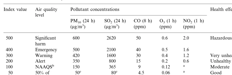
Table 1
PSI values and health descriptors
Pollutant concentrations
Index value Air quality Health effects descriptord
level
NO2(1 h)
O3(1 h)
PM10(24 h) SO2(24 h) CO (8 h)
(ppm) (ppm) (mg/m3) (mg/m3) (ppm)
2.0 Hazardous
500 Significant 600 2620 50 0.6
harm
1.6
400 Emergency 500 2100 40 0.5
1.2
300 Warning 420 1600 30 0.4 Very unhealthy
0.6
200 Alert 350 800 15 0.2 Unhealthy
0.12 a Moderate
100 NAAQSb 150 365 9
Good
a
50 50% of 50c 80c 4.5 0.06
NAAQSb
a
0 0 0 0 0
aNo index values reported at concentrations below ‘Alert’ levels. The applicable short term NAAQS for NO
2is 0.053 ppm (EPA
1998, table 2.1, p. 7).
bNational Ambient Air Quality Standards. cAnnual primary NAAQS.
dRefers to human health only. For more details, see EPA (1994).
Source: EPA (1998), (p. 62).
of pollution on all populations and materials. The limited current focus helps keep the empirical analysis tractable.
The paper is organized as follows. Following Section 1, Section 2 critically reviews the method-ology underlying the PSI. Section 3 presents an improved index of environmental pollution. Sec-tion 4 illustrates the index with data on air quality indicators for 135 counties and Metropolitan Statistical Areas in the United States and com-pares the results with the PSI. Section 5 concludes with suggestions for further research.
2. The PSI
The PSI measures daily air pollution levels due to the five gases for which the EPA has estab-lished National Ambient Air Quality Standards (NAAQS). These are large particulate matter (PM10), sulphur dioxide (SO2), carbon monoxide (CO), ground level ozone (O3), and nitrogen diox-ide (NO2). The index combines the NAAQS with an epidemiological function to determine a de-scriptor of human health effects due to short-term exposure (24 h or less) to each pollutant (EPA,
1994, 1998). It translates the short-term concen-trations of the five gases into a number between 0 and 500 that indicates the source of the highest level of pollution experienced on each day. In other words, the daily index value is determined by the gas with highest concentration relative to the society-wide dose response function. PSI val-ues and the associated health descriptors are shown in Table 1.1The EPA tracks air quality by the number of days per year for which PSI values exceed 100 in urban areas with populations greater than 200 000.
The PSI provides a good rule for determining whether a region is polluted or not. If the ambient concentration of any one of the five pollutants exceeds its NAAQS, the PSI value exceeds 100 and the region may be considered polluted. How-ever, the EPA also uses the PSI to determine how polluted a region is vis-a`-vis other regions, and how the air quality of regions changes over time. For these purposes, the PSI is problematic.
1There is no PSI value for lead since the EPA does not have
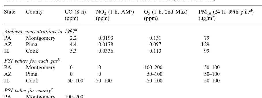
Table 2
1997 ambient concentrations and Pollutant Standards Index (PSI) values (selected counties)
SO2(24 h)
O3(1 h, 2nd Max) PM10(24 h, 99th p’iled)
State County CO (8 h) NO2(1 h, AMc)
(ppm) (ppm) (ppm) (mg/m3) (mg/m3)
Ambient concentrations in1997a
2.2 0.0193 0.131 79
PA Montgomery 65.5
IL Cook 5.3 0.0336
PSI6alues for each gasb
0 0 100–200 50–100
PA Montgomery 0
IL Cook 50–100 50–100
PSI6alue for countyb
100–200 PA Montgomery
AZ Pima 50–100
IL Cook 50–100
a Source: EPA (1998), Table A-12, pp. 122–139. The data for SO
2are reported in ppm. They were converted tomg/m3using the
EPA’s conversion factor of 1 ppm=2620mg/m3(D. Mintz, personal communication, March 29, 1999).
bOwn calculations based on Table 1. cArithmetic mean.
d99th percentile.
Consider the three counties shown in Table 2. The data in this table represent the composite average of 1997 readings for these counties at various monitoring sites. They are interpreted to represent the air quality on a typical day in each of these counties.2
PSI values are calculated on the basis of Table 1. According to this index, Cook and Pima Counties are equally polluted whereas Mont-gomery County has worse air quality. However, note that the PSI is in the 50 – 100 range for all five gases in the case of Cook County, but only for two gases in case of Pima. Furthermore, the ambient concentrations of all gases except O3 are lower in Montgomery County as compared to the other two counties. Yet, according to the PSI, Montgomery is the most polluted of the three counties since the index value is determined entirely by its O3 concentration, which puts it in the 100 – 200 range regardless of the ambient concentration of the other gases.
The aim of the paper is to develop an index that is based on the level of each pollutant, their individual physical impacts, and the consequent welfare losses while building upon the framework established under the PSI. The welfare losses provide the common metric in terms of which of the ambient concentrations of different environ-mental indicators may be aggregated into an over-all pollution index.
3. An improved pollution index
To construct the index, environmental indicators are first aggregated into the appropriate attribute; attributes are then aggregated into the overall pollution index. Thus, ifXi
n(X
i
nR+) denotes the ambient concentration of each indicator i (i=
1, 2, . . .,I) in regionn(n=1, 2, . . .,N), the index
). Here s denotes the set of environmental attributes (s=1, 2, . . .,S),As
nrefers to a particular
attribute for regionn, andf(·) andg(·) are contin-uous functions with well defined first and second order partial derivatives. Note that In may be
defined directly in terms of the indicators as In
=
f(g(Xin))=h(Xin),InR+.
2EPA cautions that these data should not be used to rank
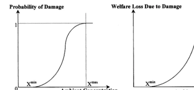
Fig. 1. A hypothetical damage function.
When is a region considered polluted? Follow-ing the rule implied by the PSI, a region is pol-luted when any environmental indicator exceeds the threshold below which damages from expo-sure to it are not significant. This is indicated by Ximin in Fig. 1. An environmental indicator is a
pollutant when Xin\Ximin. A region is polluted if
Xin\Ximin for any i. This implies that the index
value is independent of ambient concentration of indicator i if and only if Xin5Xi
min
. When all environmental indicators are at or below their respective minimum levels, the region is not pol-luted and the index value is zero. That is,
In=
Á Ã Í Ã Ä
f(g(Xin,Xjn))\0 ifXin\Ximin,Xjn\Xjmin, i"j
f(g(Xjn))\0 ifXin5Xmini ,Xjn\Xjmin, i"j
0 ifXin5XiminÖi
.
To determine the severity of pollution, the physical impacts due to exposure are combined with their welfare consequences. Panel A of Fig. 1 depicts an epidemiological dose-response func-tion.3
It relates the probability of damage to ambient concentrations. The figure suggests that at the lower range of ambient concentrations probability of damage rises rapidly. Eventually, as
the probability of damage approaches 1, the growth rate of probability declines.
Now consider panel B of the same figure. This shows the loss in welfare due to increased expo-sure to an environmental indicator. EPA (1997) (see in particular figure 18) found some evidence of rapidly rising welfare losses due to increased exposure to the criteria pollutants under the CAA. Under the formulation, welfare losses are modeled as a smoothly convex function of ambi-ent concambi-entrations over the interval (Ximin,Ximax).4
At low ambient concentrations welfare losses in-crease at an increasing rate following the rapid rise in the probability of damage. At higher con-centrations, even though the marginal probability of damage begins to taper off, welfare continues to decline rapidly since the absolute probability of damage is high. However, the function is discon-tinuous at Xi
max
. Once damage is near certain, marginal welfare losses taper off. This might be because almost all the populations or materials in the region are afflicted by the damage. In this case, the index may be set at some arbitrarily high level indicating severe pollution. The index does not particularly distinguish between these regions since the marginal welfare loss due to increased ambient concentrations is minimal.
3EPA (1997) used a similar functional form to estimate the
change in probability of adverse health effects due to increased exposure to the criteria pollutants under the CAA. An exam-ple is the rising probability of shortness of breath or chest tightness as ambient SO2concentrations increase.
4Since the attributes are themselves sub-indices of
Fig. 2. Concave isopollution lines. Once ambient concentrations of environmental
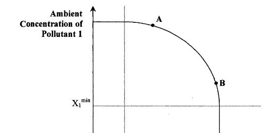
indicators are translated into their welfare im-pacts, the standard micro-economic concept of substitutability can be invoked (Bourguignon and Chakravarty, 1998). This allows one to use the construct of isopollution lines and surfaces in order to compare environmental quality over time and space. An isopollution surface is the hyper-plane defined by all regions with identical envi-ronmental quality. Its two-dimensional analog is an isopollution line.
Consider a region that is polluted with respect to one indicator only. That is, Xin\Xi
min and Xjn5Xjmin, for all i"j, (i,j=1, 2, . . .,I). Then
the isopollution lines and surfaces will be parallel to the Xi axis: the environmental quality in this
region is determined by the ambient concentration of indicatori only.
In the more general case, suppose there are two pollutants,X1 andX2.5
Suppose also thatX1minB X1m BX1n and X2m\X
2
n\X2min. In other words, region n is more polluted in terms of indicator 1 while the opposite is true for region m. Finally, assume that the environmental quality in these two regions is the same so that the numerical value of the environmental pollution index for these regions is identical. Then the isopollution line connecting these regions will be concave in the (X1,X2) pollutant space.
The concavity of the isopollution lines arises from the strictly convex damage function shown in panel B of Fig. 1, and the decreasing marginal rate of substitution between pollutants. First note that isopollution lines must be downward sloping. If pollutant 1 decreases, then pollutant 2 must increase in order for the environmental quality to remain unchanged. Next, suppose that X1 is at some high level whereas X2 is at some relatively low level, as shown by point A in Fig. 2. At this point, the welfare impact due to a marginal change in the concentration of indicator 1 is high, whereas that due to a change in the concentration of indicator 2 is low. Thus, a marginal decrease in X1 may be ‘substituted’ by a relatively larger increase in X2, while maintaining the level of environmental quality. The opposite will be true in the case of point B. In the limiting case, the isopollution lines may be negatively sloped straight lines implying perfect substitution, or in-verted L-shaped lines implying perfect comple-mentarity.
A final property of the pollution index relates to scale effects. It is assumed that the index displays non-decreasing returns to scale: a propor-tional increase in the level all pollutants results in a proportional, or more than proportional, in-crease in the index value.
The properties outlined above are intuitive and general. A function that satisfies these properties is the constant elasticity of substitution (CES) function with appropriate sign restrictions. There-fore, this function is used to aggregate the
indica-5This assumption is not restrictive since the results can be
tors into attributes and further into the overall index as shown in the following equation.
In=
Here Di(·) represents the society-wide
dose-re-sponse function. The weights vi reflect society’s
relative valuation of the marginal damage due to pollutanti. Consider exposure to carbon monox-ide (CO), which may cause angina and eventually heart attacks. Then vCO represents the relative welfare change due to the change in the probabil-ity of a heart attack caused by a unit change in the ambient concentrations of CO. By analogy, theds represent the relative change in welfare due to the marginal changes in environmental attributes.
The nested CES functions reflect the double aggregation procedure suggested at the beginning of this section. It is assumed that the elasticity of substitution between environmental indicators,rs,
is the same for all indicators that make up at-tribute As, but varies across attributes. This is
different fromr1, which is the (constant) substitu-tion elasticity between the different attributes. If desired, the individual indicators could be directly aggregated into the overall pollution index.
4. Air quality in the US
In this section, the proposed methodology is illustrated by computing an index of air pollution using 1997 data for 74 counties and 61 Metropoli-tan Statistical Areas (MSAs) in the US. Data for the five criteria pollutants included in the PSI, namely, PM10, CO, NO2, O3, and SO2, are used. EPA (1997) identified the dose-response functions for these pollutants. However, to keep the analy-sis simple and directly comparable with the PSI, the following normalization rule is assumed, where the threshold values for each gas are based on the PSI:
mincorresponds to the ambient concentration
below which there are no perceptible damages. Therefore, Ximin=50% of NAAQS for each gas.
The health-effects descriptor for this range is ‘good’ indicating no general health effects for the population (EPA, 1994).6
Xi
max
for each gas is set equal to the concentration corresponding to a PSI value of 500 and ‘hazardous’ health effects. PSI values above 400 may result in the premature death of the ill and elderly people, and healthy people might experience adverse symptoms that affect normal activity.
An advantage of the CES function is that the scale effects parameter and the elasticity of substi-tution can vary over the domain of the function while retaining the general properties identified in Section 3 (Bourguignon and Chakravarty, 1998). The pollutant space is divided into five areas and the elasticity of substitution varies by area.7 The general rule followed is that as a region becomes more polluted it gets harder to substitute
de-6By using the PSI-based values we focus on short-term
human health effects alone, ignoring any other damage to materials and populations.
7A clarification regarding the nomenclature. Regions
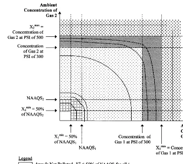
Fig. 3. Defining areas of air pollution.
creases in the ambient concentration of one indi-cator for increases in the ambient concentration of another, while maintaining the level of air quality. This follows from the rapidly increasing welfare losses at higher ambient concentrations of each gas. Thus, the absolute value of r increases as ambient concentrations increase.
This is depicted in Fig. 3.8
To be consistent with the PSI methodology, a region belongs to the area corresponding to the gas with the highest relative ambient concentration, regardless of all
other gases. Constant returns to scale are assumed for all areas. Also, due to lack of data equal weights are assumed for all gases.9 Parameter values are summarized in Appendix A.
Area 0 is not polluted since ambient concentra-tions of all indicators are below the level at which damage occurs. By definition, the index value is zero in this area.
Area 1 is a low pollution area. Here the PSI value lies between 50 and 100 and the health effects are ‘moderate’ with few or no health effects
8The two-dimensional case is used to facilitate the graphical
presentation. The logic is easily extended to the case of many gases.
9The VEQI study (VCUCES, 1999) surveyed 28 experts to
determine the weights for S02, O3, and NO2. The values
for the general population (EPA, 1994). In this area, r is set at its limiting value= −1. This implies perfect substitution between the environ-mental indicators, and negatively sloped straight line isopollution contours. Of course, in the two gases-case, when the ambient concentration of one gas is below 50% of the NAAQS, the index value is independent of that gas and the isopollu-tion lines become parallel to the corresponding axis.
Area 2 is the area where PSI values fall between 100 and 300. In this range, the air quality is considered ‘very unhealthy’ and there are wide-spread symptoms in the general population. There is imperfect substitution between the gases and
r= −2.
In area 3, air quality is ‘hazardous’. At least one gas has an ambient concentration such that the PSI value is between 300 and 500, and no gas has exceeded its Xi
max concentrations. r is set at
B−2.5.
The most severely polluted area is area 4 where one or more of the gases records ambient concen-trations beyond the level at which PSI=500. For all practical purposes, welfare losses in this area are determined entirely by this gas. Therefore, the isopollution lines become parallel to the relevant Xi axis as shown in Fig. 3 andr−.
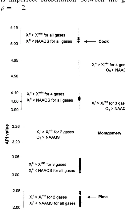
The computed Air Pollution Index (API) values for each county and MSA in the data set are presented in Fig. 4 in ascending order of API value. The least polluted regions are those where only one gas has ambient concentrations in excess of 50% of its NAAQS. Generally, this gas is O3, though in Colorado Springs PM10 exceeds 50
mg/m3. At the next level are counties and MSAs
with index values around 2. Typically, ambient concentrations of PM10 and O3 exceed the threshold defined by 50% of their respective NAAQS. In regions with index values around 3, three gases exceed this threshold.
In each of the above cases, counties and MSAs fall in area 1 as defined in Fig. 3.10
When index values are around 3.2, ambient O3concentrations exceed the corresponding NAAQS and regions fall in area 2 of the pollution space. In addition, the ambient concentration of one other gas, typically PM10, exceeds the correspondingXi
min. The index
value jumps to approximately 3.9 when the ambi-ent concambi-entration of a second gas exceeds 50% of its NAAQS value and O3remains above 0.12 ppm. Regions with four gases recording ambient con-centrations above their respectiveXiminvalues have
index values between 4 and 5. Regions in area 1 have index values closer to 4 and those in area 2, i.e. with ambient O3concentrations exceeding 0.12 ppm, have index values close to 4.5. Some of the most polluted regions in the data set fall in area 1 and record ambient concentrations for all five gases above 50% of their respective NAAQS. The API values for these regions are just above 5.
Fig. 4. Air Pollution Index (API) and Pollutant Standards Index (PSI) compared.
10There is only one region, Honolulu County, that falls in
Fig. 4 compares the API with the PSI. A striking difference between the two indices is that unlike the PSI, which does not distinguish between regions with index values within broad ranges, the API can furnish a detailed ranking by index value. Such a ranking would affect the implementation of an environmental policy that distributes resources to alleviate pollution. In the current data set there are only three pairs of counties/MSAs with identical API values. These are Chittenden and Min-neapolis-St. Paul (rank 4), Milwaukee – Waukesha and Washington, DC (rank 33), and Fort Worth-Arlington and Jersey City (rank 36).
In general, regions with PSI values between 50 and 100 have lower API values, indicating relatively lower pollution, than regions with PSI values between 100 and 200. Recall, however, that PSI values are determined by the highest relative ambi-ent concambi-entration alone, ignoring all other gases. Some cases, therefore, contradict this conclusion. Consider the regions with API values just above 4. By the PSI, these counties and MSAs would be less polluted than those with API values between 3.2 and 4.
These contradictory results are reinforced by considering Pima, Montgomery, and Cook coun-ties. Their API values are 2.04, 3.22, and 5.04, respectively. Even though Cook County is in area 1, it is regarded as one of the most polluted regions in the data set, with ambient concentrations for all five gases exceeding 50% of their respective NAAQS. The PSI would consider Cook County less polluted than Montgomery, and equally polluted as Pima County, which has a much lower API value.
5. Conclusions and suggestions for further research
This paper develops an index of environmental pollution based on the welfare losses associated with damages from exposure to pollution. The probability of damage is translated into welfare losses which provide the common metric to aggre-gate different pollutants. Isopollution surfaces are then used to compare environmental quality over time and space. To illustrate the concept, an API is computed for selected counties and Metropolitan
Statistical Areas in the United States using 1997 data for five gases under the CAA. In doing so, the author builds upon the methodology developed by the EPA under the PSI.
The results are significantly different from those obtained using the PSI. The PSI classifies regions into broad categories of air quality on the basis of the highest relative ambient concentration. The classification is independent of the number of gasses that exceed the relevant threshold. Thus regions with ambient concentrations for five gases in the 50 – 100 range are considered just as polluted as the those with only one gas in the same range. And regions where even one gas has an ambient concentration in the 100 – 200 range are classified as more polluted. In contrast, the API values are based on the ambient concentrations ofall pollu-tants simultaneously. Two significant differences emerge: not only does the API facilitate a detailed ranking of regions by air quality, it also yields results in contradiction to the PSI. Regions with PSI values of 100 – 200 are considered less polluted than some regions with PSI values of 50 – 100.
The methodology developed in this paper builds upon the PSI. However, there remains substantial room for further research. One area relates to the welfare weights. The current analysis assumes equal weights for each of the indicators determining air quality. Furthermore, the weights are independent of the probability of damage. Neither of these assumptions are necessarily true. It is quite possible that these weights are non-linear functions of the probability of damage, and that the curvature of the functions vary across indicators and attributes. In addition, the welfare weights might be location specific. Perhaps willingness-to-pay type studies would determine the welfare weight functions.
population size and other demographic characteris-tics relevant to pollution reduction.11The founda-tion for this has been established by the literature on poverty measurement.12
The numerical values of the index function parameters are crucial (Ravallion, 1998). The spe-cific values assumed forXiminandXimax, as well as the
delineation of the pollution space into areas and the parameter values within each area, will determine the extent of the pollution problem. They might also alter qualitative comparisons by affecting the rank-ings. In turn, these might affect the quantity and geographical distribution of resources devoted to pollution reduction. While the values assumed in this paper seem reasonable, further research is required before any consensus can be reached. An immediate extension would be the use of the empir-ically estimated dose-response functions such as those available in EPA (1997).
Finally, the present paper computes a very nar-rowly defined index of air quality focussing only on the short-term human health impacts of five gases under the CAA. Obviously, the analysis must be ex-tended substantially in order to make a truly mean-ingful statement about air quality in the US. Long-term human health impacts and impacts on non-human populations and materials must be included, as also other sources of air pollution. The analysis would also benefit greatly if it were extended to include other environmental attributes leading to an overall index of environmental pollution.
Acknowledgements
This paper has benefited from the suggestions and comments of several people. Luc Christiaensen
introduced me to the literature on poverty mea-surement. Martina Vidovic provided able research assistance, Weifeng Weng and Yuri Titkov ver-ified mathematical results. David Mintz answered several questions regarding the data. Duane Chap-man, Jon Conrad, Barry Solomon, Brent Haddad, Kenneth Richards, and two anonymous reviewers provided useful comments on an earlier draft. Any remaining errors are my responsibility.
Appendix A. Parameter values for the Air Pollution Index (API)a
Numerical Parameter
Value
0.2 Relative welfare weight (d)
1 Returns to scale (n)
Elasticity of substitution (r)
Area 1 −1
11Note that a population weighted index serves a very
different purpose than the index developed in this paper. The current index is designed to convey individual risk. A popula-tion-weighted index is a better means for capturing overall damages useful in making efficient resources allocation deci-sions. I thank an anonymous reviewer for pointing out this fundamental difference.
12Ravallion (1994, 1998) and Foster et al. (1984) are only
2620 SO2 (24 h, mg/m
3)
50 CO (8 h, ppm)
0.6 O3 (1 h, ppm)
NO2 (1 h, ppm) 2.0
aNone of the regions in the current data set fell in Areas 3
and 4; thus, no specific numerical values forrare specified.
References
Bourguignon F., Chakravarty, S.R., 1998. The Measurement of Multidimensional Poverty. Draft manuscript. Ecole des Hautes Etudes en Sciences Sociales and DELTA. Document number 98-12, Paris, July, p. 32.
United States Environmental Protection Agency (EPA), 1984. Costs and Benefits of Reducing Lead in Gasoline: Final Regulatory Impact Analysis. EPA-230-05-85-006. Office of Policy Analysis. Washington, DC, February.
EPA, 1994. Measuring Air Quality: The Pollutant Standards Index. EPA 451/K-94-001. Office of Air Quality Planning and Standards, Research Triangle Park, NC, February. EPA, 1997. The Benefits and Costs of the Clean Air Act,
1970 – 1990. Office of Air and Radiation, October. EPA, 1998. National Air Quality and Emissions Trends Report,
1997. EPA 454/R-98-016. Office of Air Quality Planning and Standards, Research Triangle Park, NC, December.
Foster, J., Greer, J., Thorbecke, E., 1984. A Class of Decom-posable Poverty Measures. Econometrica 52 (3), 761 – 766.
Kennedy, P.W., LaPlante, B., Maxwell, J., 1994. Pollution policy: the role of publicly provided information. J. Envi-ron. Econ. Manage. 26 (1), 31 – 43.
Mendelsohn, R.O., Nordhaus, W.D., 1994. The impact of global warming on agriculture: a Ricardian approach. Am. Econ. Rev. 84 (4), 753 – 771.
Nordhaus, W.D., 1994. Managing the Global Commons: The Economics of Climate Change. MIT Press, Cambridge, MA.
Ravallion, M., 1994. Poverty Comparisons. Harwood Aca-demic, Philadelphia.
Ravallion, M., 1998. Poverty Lines in Theory and Practice. Living Standards Measurement Study. Working Paper number 133. World Bank, Washington, DC.
Tietenberg, T., 1998. Disclosure strategies for pollution con-trol. Environ. Resource Econ. 11 (3 – 4), 587 – 602. Virginia Commonwealth University Center for Environmental
Studies (VCUCES), 1999. The Virginia Environmental Quality Index. Final report submitted to the Virginia En-vironmental Endowment, July.
Yale Center for Environmental Law and Policy (YCELP), 2000. Pilot Environmental Sustainability Index. An Initia-tive of the Global Leaders for Tomorrow Environment Task Force, World Economic Forum. Annual Meeting 2000, Davos Switzerland, January, 31, p. 39.