800 East 96th Street, Indianapolis, Indiana, 46240 USA
Jennifer Kyrnin
Sams
Teach Yourself
24
in
Hours
HTML5
Sams Teach Yourself HTML5 Mobile Application Development in 24 Hours
Copyright © 2012 by Pearson Education, Inc.
All rights reserved. No part of this book shall be reproduced, stored in a retrieval system, or transmitted by any means, electronic, mechanical, photocopying, recording, or otherwise, without written permission from the publisher. No patent liability is assumed with respect to the use of the information contained herein. Although every precaution has been taken in the preparation of this book, the publisher and author assume no responsibility for errors or omissions. Nor is any liability assumed for damages resulting from the use of the information contained herein. ISBN-13: 978-0-672-33440-5
ISBN-10: 0-672-33440-2
Library of Congress Cataloging-in-Publication Data:
Kyrnin, Jennifer.
Sams teach yourself HTML5 mobile application development in 24 hours / Jennifer Kyrnin. p. cm.
Includes bibliographical references and index. ISBN 978-0-672-33440-5 (pbk. : alk. paper)
1. HTML (Document markup language) 2. Mobile computing—Programming. 3. Application software—Development. I. Title.
QA76.76.H94K97 2012 006.7’4—dc23
2011036380 Printed in the United States of America
First Printing: November 2012
Trademarks
All terms mentioned in this book that are known to be trademarks or service marks have been appropriately capitalized. Sams Publishing cannot attest to the accuracy of this information. Use of a term in this book should not be regarded as affecting the validity of any trademark or service mark.
Warning and Disclaimer
Every effort has been made to make this book as complete and as accurate as possible, but no warranty or fitness is implied. The information provided is on an “as is” basis. The author and the publisher shall have neither liability nor responsibility to any person or entity with respect to any loss or damages arising from the information contained in this book or programs accompanying it.
Bulk Sales
Sams Publishing offers excellent discounts on this book when ordered in quantity for bulk pur-chases or special sales. For more information, please contact
U.S. Corporate and Government Sales 1-800-382-3419
For sales outside of the U.S., please contact
Contents at a Glance
Preface. . . xiv
Part I: Building Web Pages and Applications with the Open Web Standard
HOUR 1 Improving Mobile Web Application Development with HTML5. . . 12 New HTML5 Tags and Attributes with Mobile Development. . . 15
3 Styling Mobile Pages with CSS3. . . 33
4 Detecting Mobile Devices and HTML5 Support. . . 49
5 JavaScript and HTML5 Web Applications. . . 67
6 Building a Mobile Web Application. . . 85
7 Upgrading a Site to HTML5. . . 105
8 Converting Web Apps to Mobile. . . 119
Part II: Learning the HTML5 Essentials
HOUR 9 Adding Meaning with HTML5 Sectioning and Semantic Elements. 141 10 Drawing with the HTML5 Canvas Element. . . 16311 Fonts and Typography in HTML5. . . 187
12 Audio and Video in HTML5. . . 205
13 HTML5 Forms. . . 223
14 Editing Content and User Interaction with HTML5. . . 245
15 Microformats and Microdata. . . 261
16 Working with HTML5 Drag-and-Drop Functionality. . . 275
17 HTML5 Links. . . 293
Part III: HTML5 for Mobile and Web Applications
HOUR 18 Web Application APIs and Datasets. . . 30919 WebSockets, Web Workers, and Files. . . 323
20 Offline Web Applications. . . 341
21 Web Storage in HTML5. . . 355
23 Adding Location Detection with Geolocation. . . 387
24 Converting HTML5 Apps to Native Apps. . . 405
Appendixes
A Answers to Quizzes. . . 423B HTML Elements and Attributes. . . 437
C HTML5 and Mobile Application Resources. . . 447
Index . . . .449 iv
Table of Contents
Preface . . . xiv
Part I: Building Web Pages and Applications with the Open Web Standard
HOUR 1: Improving Mobile Web Application Development with HTML51
Understanding How We Got to HTML5. . . 1Learning What’s Different with HTML5. . . 3
Defining Web Applications. . . 4
Using the Open Web Standard. . . 4
Using HTML5 with iOS and Android Devices. . . 6
Writing Mobile Websites. . . 7
Summary. . . 11
Q&A. . . 12
Workshop. . . 13
HOUR 2: New HTML5 Tags and Attributes with Mobile Development
15
The New HTML5 Tags. . . 15The New HTML5 Attributes. . . 24
Changes to HTML 4 Tags and Attributes . . . 25
Changes to HTML Syntax in HTML5. . . 27
Mobile Support of HTML5 Tags and Attributes . . . 28
Benefits of HTML5 for Mobile Web Development. . . 29
Summary. . . 30
Q&A. . . 30
Workshop. . . 31
HOUR 3: Styling Mobile Pages with CSS3
33
Quick Introduction to CSS. . . 33What CSS3 Adds to the Party. . . 42
Summary. . . 46
Q&A . . . 46
Workshop. . . 47
HOUR 4:
Detecting Mobile Devices and HTML5 Support
49
Choosing What HTML5 Elements to Use . . . 50Android and iOS Support for HTML5 . . . 50
Detecting HTML5 Functions. . . 52
Degrading Gracefully. . . 58
Using CSS3 Media Queries to Detect Mobile Browsers. . . 60
Testing Your Applications . . . 63
Summary. . . 64
Q&A . . . 64
Workshop. . . 65
HOUR 5:
JavaScript and HTML5 Web Applications
67
What is JavaScript? . . . 67What is jQuery? . . . 72
Using jQuery Mobile . . . 79
Summary. . . 82
Q&A . . . 82
Workshop. . . 83
HOUR 6:
Building a Mobile Web Application
85
Building a Site that Works on All Devices . . . 85Deciding on What Type of Application You Want. . . 86
Building the Application in HTML . . . 89
Using CSS to Make the HTML Look Good. . . 91
Adding Mobile Meta Tags for More Effective HTML5 Pages. . . 96
Optimizing Your Site for Mobile. . . 99
Summary. . . 102
Q&A . . . 102
Workshop. . . 103 vi
HOUR 7: Upgrading a Site to HTML5
105
Deciding When and How to Upgrade from HTML 4. . . 105
HTML5 Features that Work Right Now. . . 111
The State of HTML5 Browser Support. . . 112
Adding HTML5 Features as Extras on Your Site. . . 113
HTML5 Features that Turn Your Site into a Killer Mobile Application . . . 115
Summary. . . 116
Q&A . . . 116
Workshop. . . 118
HOUR 8: Converting Web Apps to Mobile
119
Choosing a Web Editor . . . 120Testing Your Application. . . 121
Evaluating Your Content. . . 123
Changing the Visual Design for Mobile. . . 124
Checking for HTML5 and CSS3. . . 130
Supporting Multiple Devices . . . 132
Evaluating Finished Apps on Other Devices . . . 133
Getting an Application to Work on Older Browsers . . . 134
Summary. . . 138
Q&A . . . 139
Workshop. . . 139
Part II: Learning the HTML5 Essentials
HOUR 9: Adding Meaning with HTML5 Sectioning and Semantic Elements141
What Are Sectioning Elements? . . . 141Using the New Sectioning Elements. . . 142
Marking Up HTML Semantically. . . 154
Summary. . . 159
Q&A . . . 159
Workshop. . . 160
Contents
HOUR 10: Drawing with the HTML5 Canvas Element
163
Using the Canvas Element. . . 163
Drawing Shapes on the <Canvas> Element. . . 165
Writing Fonts and Text on the Canvas. . . 177
Displaying Images. . . 179
How Is Canvas Different from SVG or Flash . . . 182
Summary. . . 183
Q&A . . . 184
Workshop. . . 185
HOUR 11: Fonts and Typography in HTML5
187
Defining the Elements of Typography . . . 187Using Proper Typographical Entities . . . 196
Understanding Web Open Font Format (WOFF). . . 198
Summary. . . 202
Q&A . . . 202
Workshop. . . 203
HOUR 12: Audio and Video in HTML5
205
Why Use HTML5 for Audio and Video vs. Flash. . . 205Choosing Video Formats for the Best Compatibility. . . 207
Choosing Audio Codecs for the Widest Support. . . 208
The New HTML5 Media Elements. . . 210
Useful Attributes to Extend Your Media . . . 212
Creating Fallback Options for Internet Explorer . . . 216
Creating Custom Controls with API Methods . . . 217
Summary. . . 219
Q&A . . . 220
Workshop. . . 220
HOUR 13: HTML5 Forms
223
New Usability Features in HTML5 Forms . . . 223HTML5 Input Types . . . 228
Other New Form Elements. . . 235 viii
Form Validation. . . 237
Summary. . . 241
Q&A . . . 242
Workshop. . . 242
HOUR 14: Editing Content and User Interaction with HTML5
245
The New contenteditableAttribute . . . 245TheexecCommandMethod. . . 247
Adding Spellcheck to Web Pages. . . 251
Hiding Elements . . . 252
Additional UI Components of HTML5 . . . 253
Browser Support of UI and Editing Features . . . 255
Summary. . . 257
Q&A . . . 258
Workshop. . . 258
HOUR 15: Microformats and Microdata
261
Using Microformats . . . 261Using Microdata . . . 267
Using RDFa. . . 269
Deciding Which Format to Use. . . 270
Mobile and Microformats . . . 271
Summary. . . 272
Q&A . . . 273
Workshop. . . 274
HOUR 16: Working with HTML5 Drag-and-Drop Functionality
275
Implementing Drag and Drop . . . 275Drag-and-Drop Events . . . 276
Drag-and-Drop Attributes . . . 279
Helpful CSS Extensions. . . 280
Building a Drag-and-Drop Interface . . . 280
Using Drag and Drop on iOS. . . 287
Contents
Summary. . . 290
Q&A . . . 290
Workshop. . . 291
HOUR 17: HTML5 Links
293
How Links Have Changed in HTML5. . . 293Link Types and Relationships. . . 299
Using the New Link Types. . . 300
Summary. . . 306
Q&A . . . 306
Workshop. . . 307
Part III: HTML5 for Mobile and Web Applications
HOUR 18: Web Application APIs and Datasets309
Creating Web Applications . . . 309Datasets and data-*Attributes . . . 318
Summary. . . 320
Q&A . . . 320
Workshop. . . 321
HOUR 19: WebSockets, Web Workers, and Files
323
Two-Way Communication with WebSockets. . . 323Running Scripts in the Background with Web Workers. . . 326
Handling Client-Side Files with the File API . . . 331
Summary. . . 337
Q&A . . . 338
Workshop. . . 339
HOUR 20: Offline Web Applications
341
Building Offline Apps and Converting Apps to Work Offline. . . 341The Cache Manifest. . . 343
Using DOM Events and Properties for Offline Apps . . . 347
Debugging the Application Cache . . . 351 x
Summary. . . 352
Q&A . . . 352
Workshop. . . 353
HOUR 21: Web Storage in HTML5
355
What Is Web Storage?. . . 356Web SQL and Indexed DB. . . 361
Summary. . . 370
Q&A . . . 371
Workshop. . . 372
HOUR 22: Controlling the Browser History with the History API
373
Why Control the Browser History? . . . 373History API Methods. . . 375
Using the History API. . . 375
Dangers and Annoyances of the History API . . . 383
Summary. . . 384
Q&A . . . 385
Workshop. . . 386
HOUR 23: Adding Location Detection with Geolocation
387
What Is Geolocation?. . . 387Privacy and Geolocation. . . 394
Creating a Mobile Geolocation Application . . . 396
Summary. . . 401
Q&A . . . 401
Workshop. . . 402
HOUR 24: Converting HTML5 Apps to Native Apps
405
Comparing the Difference Between Native and HTML5 Apps . . . 405Converting to Native Apps . . . 408
Creating Application Icons . . . 414
Testing Your Applications . . . 416
Selling Your App in the App Stores . . . 418
Contents
Options Other Than Converting to Native Apps . . . 419
Summary. . . 419
Q&A . . . 420
Workshop. . . 421
Part IV: Appendixes
APPENDIX A: Answers to Quizzes423
Hour 1, “Improving Mobile Web Application Development with HTML5” . . . 423Hour 2, “New HTML5 Tags and Attributes with Mobile Development” . . . 423
Hour 3, “Styling Mobile Pages with CSS3” . . . 424
Hour 4, “Detecting Mobile Devices and HTML5 Support” . . . 424
Hour 5, “JavaScript and HTML5 Web Applications”. . . 425
Hour 6, “Building a Mobile Web Application” . . . 425
Hour 7, “Upgrading a Site to HTML5”. . . 426
Hour 8, “Converting Web Apps to Mobile”. . . 426
Hour 9, “Adding Meaning with HTML5 Sectioning and Semantic Elements” . . . 427
Hour 10, “Drawing with the HTML5 Canvas Element”. . . 427
Hour 11, “Fonts and Typography in HTML5” . . . 428
Hour 12, “Audio and Video in HTML5”. . . 428
Hour 13, “HTML5 Forms” . . . 429
Hour 14, “Editing Content and User Interaction with HTML5”. . . 429
Hour 15, “Microformats and Microdata”. . . 430
Hour 16, “Working with HTML5 Drag-and-Drop Functionality”. . . 430
Hour 17, “HTML5 Links”. . . 430
Hour 18, “Web Application APIs and Datasets”. . . 431
Hour 19, “WebSockets, Web Workers, and Files” . . . 431
Hour 20, “Offline Web Applications”. . . 432
Hour 21, “Web Storage in HTML5”. . . 432 xii
Hour 22, “Controlling the Browser History with the History API”. . . 433
Hour 23, “Adding Location Detection with Geolocation” . . . 434
Hour 24, “Converting HTML5 Apps to Native Apps” . . . 434
APPENDIX B: HTML Elements and Attributes
437
HTML5 Elements . . . 437
HTML5 Attributes. . . 442
APPENDIX C:
HTML5 and Mobile Application Resources
447
Books. . . 447Websites. . . 448
This Book’s Website . . . 448
Index
449
Preface
The web is changing very quickly these days. New browser versions are being released every few months rather than every few years, and new devices are entering the marketplace all the time. For a web developer, staying up to date on the latest trends and technology is important, and the trending technology right now is HTML5.
In fact, some news outlets are claiming that HTML5 and mobile applications are two of the fastest-growing areas of job creation. According to Freelancer.com and iTWire, requests for freelancers knowing HTML5 rose by 34% in the first quarter of 2011, while general HTML jobs rose only by 7%. They also noted that Android jobs rose by 20%, and iPhone jobs rose by 9%.1 HTML5 and mobile applications are where the jobs are, and this book can help
you learn all about HTML5 and the application programming interfaces (APIs) that relate to it. After 24 hours, you will be able to build complex web applications and convert them into native mobile applications.
HTML5 Is More Than HTML
This book covers more than HTML tags and attributes. Although these things are the basis of the HTML5 specification, when people talk about HTML5 they often include many other programming interfaces that are not strictly part of the HTML5 specification, like geoloca-tion or the History API. This book covers the basics of HTML5 and how it has changed from previous versions of HTML. It also introduces you to some of the technologies that are lumped in with HTML5, including:
.
Drawing with the canvaselement.
Adding streaming media with the videoandaudioelements.
Editing pages online and checking spelling.
Using drag-and-drop functions on web applications.
Building more user-friendly forms.
Creating semantic divisions with new elements, such as article,section, and navThis book covers several other specifications beyond HTML5, including:
.
Web Open Font Format (WOFF) web fonts.
Microformats and Microdata.
WebSockets.
Web Workers.
Files API.
Web Storage.
Offline Web Applications API.
History API.
GeolocationWeb Pages Are for More Than Computers
HTML used to be used primarily in web browsers on computers, but now, with the advent of smartphones and tablet computers, more people are accessing web pages on mobile devices.
Every hour of this book provides examples of how the lesson’s contents apply both to web browsers and mobile devices and shows you techniques for getting your applications to look better on mobile devices.
With this book, you will learn how to create applications that work on the most popular mobile smartphones and tablets out there: Android and iOS (iPhone, iPad, and iPod touch devices). Screenshots from both Android and iOS devices appear throughout as well as tips and warnings about how the different devices perform.
How to Use This Book
This book is divided into 24 lessons. Each lesson covers a specific topic related to HTML5 or an API that is part of the Open Web Standard. Each lesson takes about an hour to
complete.
xvi
Sams Teach Yourself HTML5 Mobile Application Development in 24 Hours
Organization of This Book
This book is divided into three sections:
.
Part I, “Building Web Pages and Applications with the Open Web Standard,” teaches you the basics of HTML, CSS, and JavaScript, and teaches you how to build a basic web application for mobile and non-mobile devices. After reading this section, you will know how to build a basic website with HTML, CSS, and JavaScript..
Part II, “Learning the HTML5 Essentials,” covers some of the more important new fea-tures of HTML5. You will learn more about new HTML5 elements to help you build better applications..
Part III, “HTML5 for Mobile and Web Applications,” describes some of the more useful APIs and tools for mobile application development and goes into detail about how to create mobile applications.Conventions Used in This Book
Code samples are written in mono fontwithin the text of the book, while blocks of code will be called out separately, for example:
This is a block Of code
Some code examples that are too long to display as one line in the book use the ➥symbol
to indicate that these lines should be all on one line, like this:
<link rel=”stylesheet” href=”styles-320.css”
➥media=”only screen and (max-width:320px)”>
This book has three types of sidebars:
By the Way notes provide additional information about the topics that are discussed in the hour.
Did you Know? tips share interesting facts or tidbits about the related content.
Watch Out! warnings alert you of things that can cause problems for your applications.
By the
Way
Did you
Know?
Watch
▼
Preface
xvii
You can also use the Try It Yourself sections to help you practice what you’ve learned in the hour.
Try It Yourself
Nearly every hour will have at least one step-by-step tutorial called “Try It Yourself” to help you use what you’ve learned.
Q&A, Quiz, and Exercises
Every hour ends with a short question-and-answer section to help with follow-up questions that occur as a result of reading the hour. You can also take a short quiz on the hour (Appendix A provides the answers) as well as do some suggested exercises to help you get more out of what you learned and apply this knowledge to your own applications.
Where to Go to Learn More
Appendix C includes more websites and books you can access to learn more about HTML5 and mobile web applications. This book also has a companion website at www.
html5in24hours.com/ where you can go to see the examples, view and download the source code for each hour, view and report errata about the book, and continue to learn and ask questions about HTML5 mobile applications.
xviii
Sams Teach Yourself HTML5 Mobile Application Development in 24 Hours
About the Author
Jennifer Kyrninhas been teaching HTML, XML, and web design online since 1997. She has built and maintained websites of all sizes from small, single-page brochure sites to large, million-page databased sites for international audiences. She lives with her husband, son, and numerous animals on a small farm in Washington state.
Dedication
To Mark and Jaryth, you helped me find time I didn’t know I had. I love you.
Acknowledgments
I would like to thank all the people at Sams for the opportunity to write this book and work with you. I would particularly like to thank Trina MacDonald and Olivia Basegio for keep-ing me movkeep-ing and the book on track as well as my two fabulous technical editors Pascal Rettig and Evan Burchard for all the great suggestions and corrections. Any technical errors you find in the book are mine alone; they probably tried to stop me.
Reader Services
xixWe Want to Hear from You!
As the reader of this book, youare our most important critic and commentator. We value your opinion and want to know what we’re doing right, what we could do better, what areas you’d like to see us publish in, and any other words of wisdom you’re willing to pass our way.
You can email or write me directly to let me know what you did or didn’t like about this book—as well as what we can do to make our books stronger.
Please note that I cannot help you with technical problems related to the topic of this book, and that due to the high volume of mail I receive, I might not be able to reply to every message.
When you write, please be sure to include this book’s title and author as well as your name and phone or email address. I will carefully review your comments and share them with the author and editors who worked on the book.
E-mail: [email protected] Mail: Mark Taub
Editor-in-Chief Pearson Education 1330 6th Avenue New York, NY 10019 USA
Reader Services
Understanding
1HOUR 1
Improving Mobile Web
Application Development
with HTML5
What You’ll Learn in This Hour:
.
How HTML has grown and changed since it was invented
.Where HTML5 fits in with the other versions of HTML
.
What the Open Web Standard is and how it relates to HTML5
.How a web application differs from typical web pages
.How to build a very simple HTML5 web page
.
Why you want to use HTML5 for your mobile applications
HTML5 is the latest version of HTML, and although adoption on desktop browsers such as Internet Explorer is slow, mobile devices are jumping on the bandwagon in record numbers. Nearly every smartphone and tablet device sold today supports HTML5, and those numbers are growing.
In this hour you will learn how HTML5 came into being and how it has changed the landscape for web designers and developers as well as the customers viewing your pages. You’ll learn to build a simple HTML5 document and why HTML5 is the language you should know if you want to design and develop mobile applications.
Understanding How We Got to HTML5
In March 1989, Sir Tim Berners-Lee wrote a proposal that suggested using hypertext to link related documents together over a network. After collaborating with others at CERN, hypertext eventually became HTML or Hypertext Markup Language.
2
HOUR 1:
Improving Mobile Web Application Development with HTML5
Up until around 1993, the only browser available was a text-only browser called Lynx. Then Mosaic came out with features such as images, nested lists, and forms. Most designers these days take these things for granted, but back in the early 1990s many people browsed the web in a black-and-white (or green-and-black), text-only environment. Getting a browser to support images was very exciting.
It wasn’t until 1994 that the HTML working group was set up by the IETF (Internet Engineering Task Force). In July it released a working draft of HTML 2. Later that year, the W3C, or World Wide Web Consortium, was formed at MIT to act as a standards body for HTML. HTML 3 was released as a draft in 1995, and HTML 3.2 was endorsed as a standard in 1997. HTML 4 was published as a recommendation in 1999.
XML and XHTML
After 1999 things began to change. The W3C no longer felt that HTML should remain as it was. Instead, they wanted to make it more machine-readable, more consistent, and much stricter. So, rather than working on a new version of HTML, they began turning HTML into a strict markup language called XHTML.
XHTML was created as a version of HTML 4.01 that was rewritten in XML
(eXtensible Markup Language). It was developed in 1998 as a way to create markup languages that are machine readable. XHTML documents must be well formed and valid. In fact, the W3C wanted all browsers that read XHTML to stop rendering the page if the page’s HTML was not valid or well-formed.
XML is still used by many companies. For example, many content management sys-tems (CMSs) use XML on the back end to manage large websites; many books are written in DocBook, which is an XML language for publishing; and ePub books use XML to create ebooks.
Well-Formed Versus Valid
A document that is well-formed has the declaration statement at the top— including the specification, all attributes are surrounded by quotation marks, all elements are closed, and there is only one container element. A document that is valid is one that is checked against the specification and has no errors.
By the
Way
HTML5 is Born
Learning What’s Different with HTML5
3who has ever validated a page knows that just because a page isn’t valid doesn’t mean browsers won’t be able to display it. In fact, web browsers have no problem displaying technically invalid HTML.
Because of these difficulties, a group of web designers and developers as well as browser makers and others got together in 2004 and formed the Web Hypertext Application Technology Working Group (WHATWG). They started building the HTML5 specification to address the needs of designers, developers, and browser mak-ers. Finally, in 2008, the W3C decided to scrap XHTML development in favor of reintegrating with the HTML5 community, and added the HTML5 specification into the W3C framework.
Learning What’s Different with HTML5
HTML 4 is the last recommendation developed by the W3C alone. Most web pages right now are built in HTML 4 because it is widely supported by web browsers and editors.
XHTML was created by rewriting the HTML 4.01 specification as XML, which means that all tags must be closed, the XHTML tags must be written in all lowercase, all attributes must have quotation marks around them, and tags must be nested with-out overlapping.
Nesting Tags Correctly
When you nest two HTML tags, you should think of them as a stack of bowls—one inside the other. Always close the nested tag first, and then close the outer tag. Incorrect:
This text is <em>italic, and this is <strong>bold and italic</em></strong>
Correct:
This text is <em>italic, and this is <strong>bold and italic</strong></em>
HTML5 goes back to a less restrictive version of HTML. End tags are no longer required for all elements, you can write in upper- or lowercase, and attributes don’t need to have quotations around them all the time.
4
HOUR 1:
Improving Mobile Web Application Development with HTML5
A New HTML5 Doctype
HTML5 has a new streamlined doctype that is very easy to remember—
<!doctype html>. Nothing else is required. It doesn’t even have to be written in all caps.
Did you
Know?
Defining Web Applications
Applications are software programs that are used on a local computer to do various tasks. The most commonly used applications are web browsers (such as Internet Explorer or Firefox), document editors (such as Word), and email clients (such as Outlook or Thunderbird). These programs are very similar to one another because they all run on the same operating system. They have features such as
. A similar look and feel, such as the menus at the top
. Functionality such as drag-and-drop, saving to the hard drive, and interactivity
Web applications are web pages that are attempting to look and act like desktop applications. They are written to run inside a web browser, rather than directly on the computer. This means that they are limited by the functions that the web brows-er can and cannot do:
. Web applications rely on the web browser for functionality that would otherwise have to be coded (such as the back button, rendering the page, and so on).
. Web applications are limited the same way a browser is limited. They can’t save data to the hard drive, they have only limited scripting functions, and they can’t interact directly with the computer operating system.
Web applications, unlike desktop applications, are not limited to one operating sys-tem. A web application runs in a browser, and so anywhere a browser will run, the web application will run.
Using the Open Web Standard
▼
Using the Open Web Standard
5Did you
Know?
Many people think HTML5 includes more than it does. In fact, features such as the History API (discussed in Hour 22, “Controlling the Browser History with the History API”), local storage (Hour 21, “Web Storage in HTML5”), and geolocation (Hour 23, “Adding Location Detection with Geolocation”) are all separate specifications that work with HTML5 to create a suite of tools you can use to build web pages, web applications, mobile applications, and more. These all are part of the Open Web Standard.
Some of the specifications in this standard include:
. HTML5
. CSS3
. Web Fonts
. HTML Canvas
. SVG
. Web storage
. Geolocation
By using standards-based specifications for your web applications, you will know that your pages and applications will work for a wider audience, and that your pages and applications will last longer.
Try It Yourself
Building Your First HTML5 Document
HTML5 is, at its heart, HTML, which is what you use to build web pages. So before you can get started on the applications that you’ll develop in later hours, you need to know how to build a web page.
You start by writing some HTML, which is very easy to write. All you need is a text editor.
Finding Your Computer’s Text Editor
6
HOUR 1:
Improving Mobile Web Application Development with HTML5
Watch
Out!
After you have a text editor up and running, you can begin writing your HTML, which is defined by tags that are written inside of less-than (<) and greater-than (>) signs.
1. Open your text editor and type the following:
<!doctype html> <html>
<head>
<title>This is my first HTML5 page</title> </head>
<body>
<h1>My First HTML Document</h1> <p>This is my first HTML5 document. </body>
</html>
2. Save your file as mypage.html.
Check That File Extension
Make sure to check the extension of your HTML file in your file system. Notepad will often convert it to a .txt file if you aren’t careful. If it does, simply close Notepad and replace the .txt extension with .html.
3. Now open this page in your favorite web browser (by browsing to it in the File menu) to test that your page displays correctly. If it doesn’t display correctly, you’ll need to check that you opened the right file and that you wrote the HTML correctly.
As you can see from the missing closing tags, the HTML is not nearly as strict as XHTML, and the first line (the doctype or DTD) is simple to use and easy to remember.
Using HTML5 with iOS and Android
Devices
Many designers are reluctant to get started using HTML5 on their web pages because Internet Explorer has relatively little support for it. In fact, only Internet Explorer 9 has decent HTML5 support. Other computer browsers, such as Firefox, Chrome, Opera, and Safari, all have good support for most HTML5 features.
Writing Mobile Websites
7Watch
Out!
Testing Is Critical
If you plan to create pages and applications for iOS and Android devices as well as desktop browsers, always test your documents in Internet Explorer 8. This browser (and IE 7) still has the lion’s share of the browser market, and if your page or application doesn’t work with it, your page or application won’t work for most people browsing the web. If you don’t have a Windows machine you can use an online tool such as Browsershots (http://browsershots.org/) to test in Inter-net Explorer and other browsers.
But what about mobile devices running on Android and iOS, such as a Xoom tablet or iPad? They all come with HTML5 support pretty much out of the box because they each run a browser (Safari on iOS and Chrome on Android) based on WebKit, which has excellent support for HTML5.
The best thing about designing web pages and applications using HTML5 for Android and iOS is that what you are creating will work on future devices. Right now operating systems exist that run on tablets and phones and to some extent tele-visions. But these operating systems are moving into other devices such as cars, pic-ture frames, and even refrigerators.
Writing Mobile Websites
In some ways, writing websites for mobile devices is a lot easier than it used to be. Although a lot more devices are out there, including smartphones and not-so-smart phones, tablets, internet TV devices, and even some picture frames, the devices are converging in what HTML5 features they support, and even in their sizes and shapes (to some extent).
When you’re creating a mobile website, the first thing to remember is that a mobile website is just a website. The best websites are built for every browser and operating system, or as many as possible.
However, you should still consider some basic questions when building a website that is intended for mobile devices:
. What is the screen size and resolution of the mobile device?
. What content do your mobile users need?
. Is your HTML, CSS, and JavaScript valid and compact?
. Should your site have a separate domain for mobile users?
8
HOUR 1:
Improving Mobile Web Application Development with HTML5
Watch
Out!
What is the Screen Size and Resolution of the
Mobile Device
When you’re working with mobile devices, obviously the screen size is going to be smaller than on a desktop. In general, with smartphones, you have to prepare for a few standard sizes:
. 128 x 160 pixels—Phones such as the Fujitsu DoCoMo F504i
. 176 x 220 pixels—Phones such as the HP iPAQ 510
. 240 x 320 pixels—Smartphones such as Blackberry 8100 or the HTC Elf
. 320 x 480 pixels—PDAs such as the Garmin-AsusA50 or the Palm Pre Tablets add to the mix by having not only an increased screen size, but also having a variation in how they can be viewed. For example, most tablets (and some smart-phones for that matter) can be viewed in portrait or landscape mode. This means that sometimes you might have a 1024-pixels-wide screen to work with, and other times 800 pixels wide or less.
However, in general, the tablets provide a lot more screen space for you to play with on mobile devices. You can assume you have around 1024–1280 pixels by 600–800 pixels for most tablet devices.
Browsing most websites in their standard format on an iPad is easy because the brows-er is as clear and easy to use as on a computbrows-er monitor. Plus, with the zooming capa-bilities on both iOs and Android, making small, harder-to-read areas bigger is easy.
What Content Do Your Mobile Users Need?
When you are designing a site for mobile devices, remember that users don’t always want to access the same content as someone browsing on a desktop.
For example, mobile customers are often, well, mobile. In other words, they may be in motion or away from their home or office and have a very specific need or desire when they visit your site. For example, when visiting a restaurant website on a mobile phone, a user riding in a car might need to quickly find the location of the restaurant and the phone number. If the mobile site doesn’t have the phone number and location front-and-center, the user might quickly give up on the site.
Don’t Limit the Content
Writing Mobile Websites
9Did you
Know?
Content for mobile sites shouldn’t be limited, however. In fact, the W3C recommends “...making, as far as is reasonable, the same information and services available to users irrespective of the device they are using.”1
This doesn’t mean that you can’t change the format or location of your content, but getting to the same content on a mobile device as on a computer should be possible.
Is Your HTML, CSS, and JavaScript Valid and
Compact?
You don’t have to worry about writing well-formed XHTML for mobile devices, but sticking to correct, standards-based HTML, CSS, and JavaScript ensures that your pages are visible by the largest number of devices. Plus, by validating your HTML, you will know it is correct.
1Mobile Web Best Practices. www.w3.org/TR/mobile-bp/#OneWeb.
The W3C Validator
The W3C has a validator located at http://validator.w3.org/ that you can use to check HTML, XHTML, and other markup languages. But you can also validate CSS and RSS, and even find broken links on your pages from this site. Don’t be afraid to check your site in the validator periodically. You may be surprised at what you find.
Beyond writing valid HTML, you should consider avoiding a few things if you are writing web pages for mobile devices:
. HTML tables—Avoiding tables as much as you can in mobile layouts is best because of the small size of the screen. Scrolling horizontally is difficult and makes the tables hard to read.
. HTML tables for layout—You shouldn’t use HTML tables for layout of web pages in general, but on mobile devices they can make the pages load slow-er and look bad, especially if the table doesn’t fit in the browsslow-er window. Plus, when you use tables for layout, you almost always use nested tables, which make the pages load slower and are much more difficult for mobile devices to render.
10
HOUR 1:
Improving Mobile Web Application Development with HTML5
By the
Way
. Graphics for layout—Like using tables for layout, adding invisible graphics to add spaces and affect layout typically make many older mobile devices choke or display the page incorrectly. Plus, they add to the download time.
. Frames and image maps—Many mobile devices don’t support these fea-tures in HTML. In fact, HTML5 no longer includes frames (other than the iframe) as a part of the specification because of the usability issues involved.
Fewer Limitations for iOS and Android
Although avoiding tables, popup windows, and image maps in mobile pages is best, if you are focusing on mobile pages for iOS or Android, you can rest easy. Both of these handle them without trouble. Frames, however, are not part of HTML5, and you should not rely on their being supported in iOS or Android.
Also remember that mobile users often have to pay a fee for their bandwidth, so your web pages should be as small (in KB) as you can make them. The fewer HTML tags and CSS properties you use and server requests you make, the better browsing will be for mobile users.
Should Your Site Have a Separate Domain for
Mobile Users?
Many websites have a separate subdomain for their mobile site. This makes finding the mobile site without having to bother with the regular domain easy for mobile users. These domains are typically something like m.example.com.
Having a separate mobile domain offers several advantages:
. It makes your mobile site easier to find.
. You can advertise the mobile URL separately from the normal URL, giving you more reach.
. Having a separate mobile domain enables people on tablets or smart-phones to switch to the full site just by switching domains.
. Detecting mobile users and sending them to a separate domain is much easier than scripting changes to your CSS for mobile users.
Summary
11What Testing Does Your Mobile Site Need?
Be prepared to test your site on as many mobile devices as you possibly can. Although you can use your browser to test or emulate things such as screen size, you won’t see some of the horrible things that can go wrong if you don’t test on mobile devices directly, such as the following:
. Packet size limitations by mobile carriers preventing your page or images from loading
. Images loading incorrectly or not at all
. Inability to scroll horizontally (which is nearly impossible to do on some phones)
. Device-specific features not working that you were relying on
. File formats not being supported
You likely don’t have an unlimited budget for buying mobile phones (and their associated cellphone plans), so what do you do? Here are some suggestions:
. Use emulators—Both online and offline emulators are available for many different mobile devices. Most are free to use and they give you at least a start at testing your site for mobile devices.
. Rent time on devices—Services exist that will allow you to rent time on multiple phones. You can justify the cost by getting a sense of how the phones handle your applications.
. Buy some phones—This might seem like an expensive option, but if you are planning on doing a lot of mobile web development, it could be a rea-sonable investment.
. Get help from friends and co-workers—This is one of the least expensive ways to test your site—simply ask to borrow phones or tablets from people you know. You just need to put your site on a live web server.
Ultimately, if you are going to do mobile development, you should have at least one mobile device you can test your pages on directly. The more devices you can test on, the better your sites will be.
Summary
12
HOUR 1:
Improving Mobile Web Application Development with HTML5
XHTML 1, and HTML5 as well as what web applications are and how they relate to the Open Web Standard. You learned how to write a basic HTML web page and why HTML5 fits in so well with mobile devices. You also learned some powerful tips for building mobile web pages.
The most important things to remember from this hour are the best practices for building a website for mobile users:
. Focus first on building a website or application for every user, not just mobile ones.
. Determine who your mobile users are and what they are looking for, and present that content to them first, but not only that content.
. Build a site that uses standards-based technology so that your applications are more future proofed.
. Always test your sites and applications in as many web browsers and devices as you can.
Q&A
Q.
I am not familiar with HTML, and I’m worried that I will have trouble building
an HTML5 application. Do I need to know HTML 4 before I learn HTML5?
A. Although knowing HTML 4 will make moving forward easier for you, learning HTML5 is a fairly straightforward process. Although this book focuses mostly on HTML5, by copying the code samples provided and looking at the source files for the companion website (www.html5in24hours.com/), you should be able to figure it out.
Q.
I already have a website, and I want to make sure that mobile users can get the
most out of it. How do I make sure that I am providing what mobile users need?
A. The best way to do this is to ask them. Surveys asking your customers how they access your site and what parts are most useful to them are a good indicator of what they want. But you can also look at your web statistics. If you don’t have analytics on your website, I recommend installing one such as Google Analyt-ics or Piwik to track what people are looking at on your site. After you know what the popular pages are, you can ensure those pages are easy to access in your mobile version.
Workshop
13click on, where they leave, and so on). With this method, even if you can’t get direct customer feedback you can see what features they are currently using and adjust your site accordingly.
Q.
You mentioned using a content management system for maintaining a
mobile site. Do you have any you can recommend?
A. I use WordPress with the WordPress Mobile Pack to maintain a lot of sites for mobile and non-mobile users.
Workshop
The workshop contains quiz questions to help you process what you’ve learned in this chapter. Try to answer all the questions before you read the answers. See Appendix A, “Answers to Quizzes,” for answers.
Quiz
1. Who decided to initiate HTML5 and why?
2. What is the first line in an HTML5 document?
3. Why is HTML5 so well suited to mobile application development?
Exercises
1. Create an HTML5 page. Your page should have a title, headline, and at least two or three paragraphs of text in it as well as the HTML5 doctype. Hour 3, “Styling Mobile Pages with CSS3,” covers more about how to use CSS for styling the layout and look of your page.
The New HTML5 Tags
15HOUR 2
New HTML5 Tags and
Attributes with Mobile
Development
What You’ll Learn in This Hour:
.
How to use the many new tags and attributes in HTML5
.
Other changes in HTML5
.
Mobile support for HTML5
.
Reasons to use HTML5 for mobile web applications
HTML5 has many new tags and attributes that you can use for building web pages and applications. In this hour you will learn about many of the new HTML5 fea-tures and how they work on mobile devices. The new smartphones and tablets are driving the adoption of HTML5, and this chapter tells you what you can do to be a part of the revolution.
The New HTML5 Tags
HTML5 adds a lot of new features to the HTML specification, but the easiest ones to understand are the brand-new tags. These are HTML elements that have never been a part of HTML in the past.
New Layout Tags
▼
16
HOUR 2:
New HTML5 Tags and Attributes with Mobile Development
These tags are:
. <article>—Anindependentportion of the document or site.
. <aside>—Content that is tangential to the main part of the page or site.
. <figcaption>—Caption for a figure.
. <figure>—A figure or quotation pulled out of the flow of text.
. <footer>—The footer of a document or section.
. <header>—The header of a document or section.
. <hgroup>—A group of headings.
. <nav>—A navigation section.
. <section>—A generic section that cannot be defined by one of the above types.
You use these tags to define specific areas of your HTML documents. They provide you with ways to attach CSS styles (often called hooks for CSS) and give some semantic meaning to the parts of your pages.
Providing Meaning with Semantic Tags
Semantic tags tell the browser or user agent (a technical term for a tool that can parse web pages) something about the contents of the tag. In other words, rather than just defining where a block of text should appear in the page flow, a seman-tic tag such as <article>tells the browser that the contents are part of a stand-alone article.
By the
Way
Using these new layout tags is easy. In fact, many web pages already use <div>tags for the same purpose as these tags. For example, in many web designs you might see a<div id=”header”>section of the page. Now, with HTML5, you can just write
<header>.
Try It Yourself
Converting to New Layout Tags
You probably have a lot of web pages that have a markup similar to this:
<!DOCTYPE HTML PUBLIC “-//W3C//DTD HTML 4.01 Transitional//EN” “http://www.w3.org/TR/html4/loose.dtd”>
The New HTML5 Tags
17<title>My HTML 4 2-Column Page</title> <link type=”text/css” href=”styles.css”> </head>
<body>
<div id=”main”> <div id=”header”>
<h1>My HTML 4 2-Column Page</h1> </div>
<p>Lorem ipsum dolor sit amet, consectetuer adipiscing elit, nibh euismod tincidunt ut laoreet dolore magna aliquam erat volutpat. Ut minim veniam, quis nostrud exerci tation ullamcorper suscipit lobortis nisl ea commodo consequat. Duis autem vel eum iriure dolor in hendrerit in esse molestie consequat, vel illum dolore eu feugiat nulla facilisis at accumsan et iusto odio dignissim qui blandit praesent luptatum zzril dolore te feugait nulla facilisi.</p>
</div>
As you can see, there is a header, called <div id=”header”>, a footer
<div id=”footer”>, a navigation area <div id=”nav”>, and an area for the main contents of the page <div id=”contents”>.
You can easily convert these <div>tags into HTML5 sectioning content tags:
<!doctype html> <html lang=”en”> <head>
<title>My HTML 4 2-Column Page</title> <link type=”text/css” href=”styles.css”> </head>
<body>
<section id=”main”> <header>
18
HOUR 2:
New HTML5 Tags and Attributes with Mobile Development
By the
Way
</nav>
<section id=”contents”>
<p>Lorem ipsum dolor sit amet, consectetuer adipiscing elit, nibh euismod tincidunt ut laoreet dolore magna aliquam erat volutpat. Ut minim veniam, quis nostrud exerci tation ullamcorper suscipit lobortis nisl ea commodo consequat. Duis autem vel eum iriure dolor in hendrerit in esse molestie consequat, vel illum dolore eu feugiat nulla facilisis at accumsan et iusto odio dignissim qui blandit praesent luptatum zzril dolore te feugait nulla facilisi.</p>
</section> </section> <footer>
<p>© 2011 J Kyrnin</p> </footer>
</body> </html>
Using the idAttribute
One thing you should note is that the new HTML5 elements,<header>,
<footer>,<nav>and so on, represent more than just the page’s header, footer, and navigation. A page can have several of these elements, so adding an id attribute (for example,<nav id=”mainNav”>) is often helpful to help style the document. Hour 9 describes these elements in more detail.
Additional Semantic Elements
You can use a number of semantic elements in HTML5 to define specific items in your documents. Semantic elements let the browser or user agent know that the con-tents of the tag have a specific meaning beyond the meaning of the text itself. Hour 9 covers these tags in more detail. Here are the new semantic tags in HTML5:
. <details>—Control for adding more information.
. <figcaption>—Caption for a figure.
. <figure>—A figure or quotation pulled out of the flow of text.
. <mark>—Content that has been highlighted or marked.
. <meter>—A scalar gauge.
. <output>—Results from a script or form.
. <progress>—Progress indicator.
. <summary>—Summary or legend for a detailselement.
The New HTML5 Tags
19Watch
Out!
. <time>—Date or time.
. <wbr>—Optional line break.
One of the easiest new semantic elements to understand is the <time>element. This tag says that anything inside it is a time or a date. Calling out times and dates enables user agents to do things such as add calendar links automatically. Although no browser currently supports the <time>tag, Figure 2.1 shows how this tag might be used.
Semantic Tags May Not Do Anything
One of the most common complaints about semantic tags is that they don’t do anything. These tags are intended to provide additional information about the con-tents, and user agents may choose to simply leave them alone. This does not mean that the tags are useless. They provide hooks for CSS to style your pages more efficiently and they allow for the possibility that user agents will do some-thing with them in the future. Plus, while your browser may not do anysome-thing with the tag, another browser might be using it extensively.
Don’t add content just to use semantic tags. Instead, when you see a section of your document that has a semantic meaning, enclose it in that semantic tag.
New Multimedia Tags
Some of the most talked about new tags in HTML5 are the multimedia tags. The fol-lowing tags let you add multimedia elements right into your HTML:
. <audio>—Embedded sound files.
. <canvas>—Embedded dynamic graphics.
FIGURE 2.1
20
HOUR 2:
New HTML5 Tags and Attributes with Mobile Development
FIGURE 2.2
A simple page with a
<canvas>tag creating a big blue square on an Android tablet.
. <embed>—To add other technologies that don’t have a specific HTML5 element.
. <source>—The source files for embedded sound and video.
. <track>—Supplementary media tracks for embedded sound and video.
. <video>—Embedded video files.
The<canvas>tag lets you draw vector images right inside your HTML page (as well as other things). This gives you the ability to add custom fonts to your pages, create simple and very complex games, animate vector graphics, and control all these things from within the HTML itself. You don’t need any plug-ins or extra XML files. As you can see in Figure 2.2, the iOS browsers already support the <canvas>tag.
The HTML for Figure 2.2 is just one line:
<canvas id=”simple-square” width=”800” height=”800”></canvas>
Adding some additional JavaScript in the <head>creates the square:
<script type=”text/javascript”> function drawSquare () {
var canvas = document.getElementById(‘simple-square’); if (canvas.getContext) {
var context = canvas.getContext(‘2d’);
context.fillStyle = “rgb(13, 118, 208)”; context.fillRect (2,2,798,798);
The New HTML5 Tags
21Watch
Out!
// put code for browsers that don’t support canvas here alert(“This page requires an HTML5 compliant browser to render correctly. Other browsers may not see anything.”)
} } </script>
Don’t Forget to Load Your Script
If you use the preceding script to add a <canvas>square to your web page, don’t forget to change your <body>tag to load the script to <body
onload=”drawSquare”>. Otherwise, your <canvas>will remain blank.
Hour 10, “Drawing with the HTML5 Canvas Element,” covers the <canvas>tag in more detail.
HTML5 has some other interesting additions to the language. For example, now the
<embed>tag is a valid part of the specification. Up until HTML5, the <embed>tag was supported by most browsers but was not valid HTML, so you couldn’t use it if you needed your pages to validate.
HTML5 also introduces the <audio>and<video>tags to embed audio and video files directly in your HTML just like you would an image with the <img>tag. You can use the <track>and<source>tags to support these new multimedia tags.
Did you
Know?
Embed Any Type of Video or Audio
The great thing about HTML5 multimedia is how flexible it is. You can use the <video>and<audio>tags to embed any type of video or audio file that you can save on a computer. Not all types will play natively in the browsers, but this flexi-bility means that when formats improve, your web pages won’t need to change to a new tag.
Hour 12, “Audio and Video in HTML5,” goes into more detail about HTML5 video and audio support.
New Form Features
HTML5 forms have a lot more functionality than HTML 4 forms did. You can now collect form field data of many different types beyond the standard text fields, drop-down menus, and other types common to HTML 4 forms.
22
HOUR 2:
New HTML5 Tags and Attributes with Mobile Development
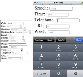
<keygen>tag you can generate public-private key pairs to keep your forms secure. And best of all, the <input>tag now has 13 new types for collecting specific data:
. <input type=color>
. <input type=date>
. <input type=datetime>
. <input type=datetime-local>
. <input type=email>
. <input type=month>
. <input type=number>
. <input type=range>
. <input type=search>
. <input type=time>
. <input type=tel>
. <input type=url>
. <input type=week>
The new input types will work in every browser out there. Even if they don’t do any-thing special with the tags, all browsers will display a form text field for collecting data. As you can see in Figure 2.3, browser support is still growing, but using types such as <input type=”tel”>will provide additional functionality for those browsers and user agents that can support it.
You will learn a lot more about HTML5 forms in Hour 13, “HTML5 Forms.”
Improved International Support
Five new tags in HTML5 help improve the support for non-English language docu-ments. These tags are
. <bdi>
. <meta charset>
. <rp>
. <rt>
The New HTML5 Tags
23FIGURE 2.3
On the left is a form in Safari and on the right the same form (zoomed in) on an iPod touch.
The<bdi>tag lets you change the direction of text that is written in HTML. So if you have a document written in English (a left-to-right directional language) and you want to add some Hebrew (a right-to-left directional language), you can surround the Hebrew with the <bdi>tag to indicate that the direction has changed for that span of text.
The<meta charset>tag lets you define the character encoding that your web page is using. For example, to define your HTML as using the utf-8character set, you would write:
<meta charset=”utf-8”>
Finally, if you write HTML with double-byte languages such as Chinese and
Japanese, you may already be familiar with ruby characters. These are small glosses placed next to the characters, usually to indicate pronunciation. The <ruby>tag indicates the span of ruby characters and can include <rt>for ruby text and <rp>
for parentheses around the ruby text. Here is an example using pseudo-code:
24
HOUR 2:
New HTML5 Tags and Attributes with Mobile Development
The New HTML5 Attributes
Many of the new attributes in HTML5 extend the tags they are associated with. A bunch of new event attributes enable you to associate scripts to many more actions as they happen on your web page. Plus, you can use new global attributes that apply to all HTML5 elements.
An attribute is written in HTML after the tag name, separated by a space, inside the greater-than and less-than signs. If the attribute can have a value, that value is attached to the attribute by an equal sign. If spaces exist in the value, then you should surround the whole value with quotation marks. For example:
<elementname attributename=value>
Or:
<element name=”value value”>
Boolean attributes are also available in HTML5 that don’t require a value. Instead, if they are present, the attribute is applied, and if they are absent the attribute is not applied. Following is an example:
<elementname attribute>
The most well-known Boolean attribute in HTML 4 is the checkedattribute on checkboxes:
<input type=checkbox checked>
Event attributes indicate an event that might happen when the page is loaded. The new HTML5 event attributes include:
. onabort—Fires when an action is aborted.
. onbeforeonload,onbeforeonunload, and onunload—Fires just before an element loads or unloads and as an element unloads.
. oncontextmenu—Fires when the context menu is triggered.
. ondrag,ondragend,ondragenter,ondragleave,ondragstart, and
ondrop—These fire when various drag-and-drop actions occur.
. onerrrorandonmessage—These fire when errors or messages are triggered.
. onscroll—This fires when the user scrolls the browser scroll bar.
Changes to HTML 4 Tags and Attributes
25You can use these event attributes on nearly every element in HTML5, which gives you much flexibility in how your web applications react to events.
HTML5 also adds a bunch of new global attributes that you can apply to nearly every HTML element. The new global attributes are:
. contenteditable
. contextmenu
. draggable
. dropzone
. hidden
. spellcheck
Contenteditableandspellcheckallow you to set some elements to be editable inside the browser, and while they are edited, the browser can check the spelling. Hour 14, “Editing Content and User Interaction with HTML5,” describes these ele-ments in more detail.
Draggableanddropzoneprovide elements that can be dragged and places to drag them to. Hour 16, “Working with HTML5 Drag-and-Drop Functionality,” covers more about using drag-and-drop within your applications.
Thecontextmenuattribute allows you to define a menu that appears only when you right-click or mouse over an element. Hour 17, “HTML5 Links,” provides you more information about this attribute.
Thehiddenattribute has the same action as writing display: hidden;in CSS, but it also allows you to semantically describe an element that is currently not relevant to the page, such as a form element that only is required if they fill out other fields in a specific way. This feature is most useful for accessibility, because screen readers would not read out the contents of an element that is hidden, but they might if only the CSS was hiding it.
Changes to HTML 4 Tags and Attributes
A number of changes have been made to existing tags and attributes in HTML 4 to give them a wider functionality or to change their function, more clearly define their meaning and scope, or to provide a semantic definition.
26
HOUR 2:
New HTML5 Tags and Attributes with Mobile Development
. <b>—Text that would normally be displayed as bold.
. <i>—Text that would normally be displayed as italics.
. <hr>—A paragraph-level thematic break in the text.
. <s>—Content that is no longer accurate or relevant.
. <small>—Small print such as in legal documents.
A few tags have had their meaning changed or had a new use added:
. You can now write the <a>tag with no attributes. In this situation it is con-sidered a placeholder for a link.
. The<address>tag is now part of sectioning content (see Hour 9).
. The<cite>tag now represents the title of a work, but you cannot use it to mark up the name of a person.
. With the <menu>tag you can create toolbars and context menus. A few elements have also had features or descriptions changed or removed:
. The<dl>tag is now a list of name=value pairs, and should not be used for displaying dialog like a script.
. When displaying the <label>element, user agents should not move the focus from the label to the control unless that is standard behavior for the platform.
. The<strong>element now indicates importance rather than strong emphasis.
. You can no longer include <object>elements inside the <head>element. Most HTML 4 attributes have remained the same, but you no longer have to have thetypeattribute on <script>and<style>tags, unless you are using non-standard scripts (that is, not JavaScript) or style sheets (that is, not CSS).
A few attributes exist that, while allowed, HTML5 strongly recommends you find alternate solutions for, as described in the following situations:
. If you include the borderattribute on an <img>tag to turn off the border, you must give it a value of “0.” Using CSS, such as img {border: none;}
Changes to HTML Syntax in HTML5
27. If you use the languageattribute on a <script>tag, it must say
“javascript” (case insensitive) and cannot conflict with the typeattribute. Simply leaving out this attribute is better because it has no useful purpose.
. If you use the nameattribute on an <a>tag, you should change that to use theidattribute instead because the name attribute is obsolete.
. If you write complex tables and want to provide a summary using the
summaryattribute, you still can. However, putting that summary in the sur-rounding text, inside a table <caption>, inside a <details>element of the caption, or inside a <figure>or<figcaption>that the table is also a part of is better because it is more accessible.
. If you use images with the widthattribute, you can no longer use percent-ages for the width.
Also, you should no longer use a few elements and attributes; they are considered obsolete in HTML5. This hour won’t go over all of them in detail, but if the element or attribute you are considering using is not in the HTML5 elements and attributes list in Appendix B, you should consider using another option.
The most noticeable omissions are
. <frame>,<frameset>, and <noframes>—Frames are no longer in HTML5, so you cannot use these.
. <basefont>,<big>,<center>,<font>,<strike>,<tt>, and <u>—These tags have been removed because they are purely presentational and their function is better handled by CSS.
. <acronym>—This tag was removed because it was confusing. Use <abbr>
for abbreviations instead.
. <applet>—This tag has been made obsolete in favor of<object>. Similarly, the<dir>tag has been dropped in favor of<ul>. These were dropped because the replacement element is more accessible or easier to use.
Changes to HTML Syntax in HTML5
28
HOUR 2:
New HTML5 Tags and Attributes with Mobile Development
The biggest change that most people will notice is the doctype. As mentioned in Hour 1, “Improving Mobile Web Application Development with HTML5,” it has been radically simplified. All you need to write is
<!doctype html>
Plus it can be in all lowercase, uppercase, or even mixed case if you like.
If you use an HTML generator that can’t use the short doctype, you can add a doc-type legacy string to the docdoc-type, as follows:
<!DOCTYPE html SYSTEM ‘about:legacy-compat’>
Like HTML 4 (not XHTML), you can write your tags in any case you want. The
<html>tag is the same as <HTML>and<hTmL>. Most designers use lowercase because it’s easier to read. You also don’t have to quote attributes unless a space exists in the value. However, if you think you’re ever going to convert your HTML to XHTML, consider using lowercase tag names and attributes and continue to quote all your attributes.
Mobile Support of HTML5 Tags and
Attributes
Older mobile devices, such as non-smart phones and older PDAs, don’t have support for HTML5 and probably never will. But the reality is that mobile devices are mov-ing beyond those devices at a break-neck speed.
The majority of smart phones and tablets being put out today have good (if not per-fect) HTML5 support. Both Android and iOS devices (as well as phones and tablets by Nokia, Palm, and Rim) use browsers based on the WebKit browser, which has good HTML5 support that gets better every day.
Interestingly, Windows mobile devices are the one holdout in this category. As recently as August 2010, Microsoft was saying it was not going to support HTML5 in its Windows 7 mobile devices. But that changed in March 2011, when Microsoft stat-ed that an HTML5 browser was on track for release to its mobile platform.