For your convenience Apress has placed some of the front
matter material after the index. Please use the Bookmarks
Contents at a Glance
About the Author ...
xiii
About the Technical Reviewers ...
xv
Acknowledgments ...
xvii
Introduction ...
xix
Part 1: Building Models in Power Pivot
■
...
1
Chapter 1: Introducing Power Pivot
■
...
.3
Chapter 2: Importing Data into Power Pivot
■
...
19
Chapter 3: Creating the Data Model
■
...
53
Chapter 4: Creating Calculations with DAX
■
...
71
Chapter 5: Creating Measures with DAX
■
...
87
Chapter 6: Incorporating Time Intelligence
■
...
113
Chapter 7: Data Analysis with Pivot Tables and Charts
■
...
133
Part 2: Building Interactive Reports and Dashboards with Power View
■
...
159
Chapter 8: Optimizing Power Pivot Models for Power View
■
...
161
Chapter 9: Creating Standard Visualizations with Power View
■
...
179
vi
Part 3: Exploring and Presenting Data with Power Query
■
and Power Map ...
215
Chapter 11: Data Discovery with Power Query
■
...
217
Chapter 12: Geospatial Analysis with Power Map
■
...
235
Chapter 13: Mining Your Data with Excel
■
...
255
Chapter 14: Creating a Complete Solution
■
...
275
Introduction
Self-service business intelligence (BI) is all the rage. You have heard the hype, seen the sales demos, and are ready to give it a try. Now what? If you are like me, you have probably already checked out a few web sites for examples, given them a try, and learned a thing or two. But you are still left wondering how all these tools fit together and how you go about creating a complete solution, right? If so, this book is for you. It takes you step by step through the process of analyzing data using the various tools that are at the core of Microsoft’s self-service BI offering.
At the center of Microsoft’s self-service BI offering is Power Pivot. I will show you how to create robust, scalable data models using Power Pivot; these will serve as the foundation of your data analysis. Since Power Pivot is the core tool you will use to create self-service BI solutions, it is covered extensively in this book. Next up is Power View. I will show you how to use Power View to easily build interactive visualizations that allow you to explore your data to discover trends and gain insight. In addition, I will show you how Power Pivot allows you to create a data model that will take full advantage of the features available in Power View.
Two other tools that are becoming increasingly important to have in your BI arsenal are Power Query and Power Map. Quite often, you will need to take your raw data and transform it in some way before you load it into the data model. You may need to filter, aggregate, or clean the raw data. I will show you how Power Query allows you to easily transform and refine data before incorporating it into your data model. While analyzing data, you may also be required to incorporate locational awareness with visualizations into a map. Power Map uses Microsoft’s Bing mapping engine to easily incorporate data on an interactive map. I will show you how to use Power Map to create interesting visualizations of your data.
One additional topic that I have included is Excel’s table analysis tools. These tools allow you to run some interesting data analysis including analyzing key influencers, identifying data groupings, and forecasting future trends. Although these tools are not part of Microsoft’s self-service BI tool set, I think they are worth covering. They will get you thinking about the value of predictive analytics when you are analyzing your data.
Introducing Power Pivot
The core of Microsoft’s self-service business intelligence (BI) toolset is Power Pivot. The rest of the tools, Power View, Power Query, and Power Map, build on top of a Power Pivot tabular model. In the case of Power View this is obvious because you are explicitly connecting to the model. In the case of Power Query and Power Map it may not be as obvious because the Power Pivot tabular model is created for you behind the scenes. Regardless of how it is created, to get the most out of the tool set and gain insight into the data you need to know how Power Pivot works.
This chapter provides you with some background information on why Power Pivot is such an important tool and what makes Power Pivot perform so well. It instructs you on the requirements for running Power Pivot and how to enable it. The chapter also provides you with an overview of the Power Pivot interface and provides you with some experience using the different areas of the interface.
After reading this chapter you will be familiar with the following: Why use Power Pivot?
Exploring the Data Model Management interface
•
Why Use Power Pivot?
You may have been involved in a traditional BI project consisting of a centralized data warehouse where the various data stores of the organization are loaded, scrubbed, and then moved to an OLAP (online analytical processing) database for reporting and analysis. Some goals of this approach are to create a data repository for historical data, create one version of the truth, reduce silos of data, clean the company data and make sure it conforms to standards, and provide insight into data trends through dashboards. Although these are admirable goals and are great reasons to provide a centralized data warehouse, there are some downsides to this approach. The most notable is the complexity of building the system and implementing change. Ask anyone who has tried to get new fields or measures added to an enterprise-wide warehouse. Typically this is a long, drawn-out process requiring IT involvement along with data steward committee reviews, development, and testing cycles. What is needed is a solution that allows for agile data analysis without so much reliance on IT and formalized processes. To solve these problems many business analysts have used Excel to create pivot tables and perform ad hoc analysis on sets of data gleaned from various data sources. Some problems with using isolated Excel workbooks for analysis are conflicting versions of the truth, silos of data, and data security.
4
and analyze the data using pivot tables and pivot charts. You can create quick proofs of concepts that can be easily promoted to become part of the enterprise wide solution. Power Pivot also promotes one-off data analysis projects without the overhead of a drawn-out development cycle. When combined with SharePoint, Power Pivot, workbooks can be secured and managed by IT, including data refresh scheduling and resource usage. This goes a long way to satisfying IT’s need for governance without impeding the business user’s need for agility.
Here are some of the benefits of Power Pivot: Functions as a free add-in to Excel
•
Easily integrates data from a variety of sources
•
Handles large amounts of data upward of tens to hundreds of millions of rows
•
Uses familiar Excel pivot tables and pivot charts for data analysis
•
Includes a powerful new Data Analysis Expressions (DAX) language
•
Has data in the model that is read only, which increases security and integrity
•
When Power Pivot is hosted in SharePoint, here are some of its added benefits: Enables the sharing and collaboration of Power Pivot BI Solutions
•
Can schedule and automate data refresh
•
Can audit changes through version management
•
Can secure users for read-only and updateable access
•
Now that you know some of the benefits of Power Pivot, let’s see what makes it tick.
The xVelocity In-memory Analytics Engine
The special sauce behind Power Pivot is the xVelocity in-memory analytics engine (yes, that is really the name!). This allows Power Pivot to provide fast performance on large amounts of data. One of the keys to this is it uses a columnar database to store the data. Traditional row-based data storage stores all the data in the row together and is efficient at retrieving and updating data based on the row key, for example, updating or retrieving an order based on an order ID. This is great for the order entry system but not so great when you want to perform analysis on historical orders (say you want to look at trends for the past year to determine how products are selling, for example). Row-based storage also takes up more space by repeating values for each row; if you have a large number of customers, common names like John or Smith are repeated many times. A columnar database stores only the distinct values for each column and then stores the row as a set of pointers back to the column values. This built-in indexing saves a lot of space and allows for significant optimization when coupled with data compression techniques that are built into the xVelocity engine. It also means that data aggregations (like those used in typical data analysis) of the column values are extremely fast.
Another benefit provided by the xVelocity engine is the in-memory analytics. Most processing bottlenecks associated with querying data occur when data is read off of or written to a disk. With in-memory analytics, the data is loaded into the RAM memory of the computer and then queried. This results in much faster processing times and limits the need to store pre-aggregated values on disk. This advantage is especially apparent when you move from 32-bit to 64-bit operating systems and applications, which are becoming the norm these days.
Enabling Power Pivot for Excel
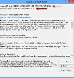
Power Pivot is a free add-in to Excel available in the Office Professional Plus and Office 365 Professional Plus editions. If you are using Excel 2010, you need to download and install the add-in from the Microsoft Office web site. If you are using Excel 2013 (the version covered in this book), the add-in is already installed and you just have to enable it. To check what edition you have installed, select the File menu in Excel and select the Account tab as shown in Figure 1-1.
Figure 1-1. Checking for the Excel version
6
Once you have determined you are running the correct version, you can enable the Power Pivot add-in by going to the File menu and selecting the Options tab. In the Excel Options window select the Add-Ins tab. In the Manage drop-down select Com Add-Ins and click the Go button (see Figure 1-3).
You are presented with the Com Add-Ins window (see Figure 1-4). Select Microsoft Office PowerPivot for Excel 2013 and click OK.
8
Now that you have enabled the Power Pivot add-in for Excel, it is time to explore the Data Model Manager.
Exploring the Data Model Manager Interface
Once you enable Power Pivot, you should see a new Power Pivot tab in Excel (see Figure 1-5). If you click on the Manage button it launches the Data Model Management interface.
Figure 1-5. Launching the Data Model Manager Figure 1-4. Selecting the Power Pivot add-in
Figure 1-6. The Data Model Manager interface
10
There are two views of the data model in the Data Model Manager, the data view and the diagram view. When it first comes up, it is in the data view mode. In the data view mode you can see the data contained in the model. Each table in the model has its own tab in the view. Tables can include columns of data retrieved from a data source and also columns that are calculate using DAX. The calculated columns appear a little darker than the other columns. Figure 1-8 shows the Full Name column, which is derived by concatenating the First Name and Last Name columns.
Figure 1-9. The measures grid area in the Data Model Manager Figure 1-8. A calculated column in the Data Model Manager
There are four menu tabs at the top of the designer: File, Home, Design, and Advanced. If you do not see the Advanced tab, you can show it by selecting the File menu tab and selecting Switch To Advanced Mode. You will become intimately familiar with the menus in the designer as you progress through this book. For now, suffice to say that this is where you initiate various actions such as connecting to data sources and creating data queries, formatting data, setting default properties, and creating KPIs (Key Performance Indicators). Figure 1-10 shows the Home menu in the Data Model Manager.
Figure 1-10. The Home menu tab in the Data Model Manager
12
Now that you are familiar with the various parts of the Data Model Manager, it is time to get your hands dirty and complete the following hands-on lab. This lab will help you become familiar with working in the Data Model Manager.
HANDS-ON LAB—EXPLORING POWER PIVOT
In the following lab you will
Enable the Power Pivot add-in.
•
Analyze data using pivot tables.
•
Explore the Data Model Manager.
•
1. Open Excel 2013.
2. On the File menu select Account (see Figure 1-1).
3. Click About Excel so that you are using the Professional Plus edition and check the version
(32-bit or 64-bit).
4. On the File menu select Options and then select the Add-Ins tab. In the Manage drop-down
select Com Add-Ins and click the Go button.
5. In the Com Add-Ins window, check the Power Pivot add-in (see Figure 1-4).
6. After the installation, open the
Chapter1Lab1.xlsxfile located in the Lab Starters folder.
7. Click on Sheet1. You should see a basic pivot table showing sales by year and country as
shown in Figure 1-12.
Figure 1-12. Using a pivot table
14
9. Below the field list are the drop areas for the filters, rows, columns, and values. You drag and
drop the fields into these areas to create the pivot table.
10. Click on the All tab at the top of the PivotTable Fields window. Expand the Product table in the
field list. Find the Product Category field and drag it to the Report Filter drop zone.
11. A filter drop-down appears above the pivot table. Click on the drop-down filter icon. You
should see the Product Categories.
12. Change the filter to Bikes and notice the values changing in the pivot table.
13. When you select multiple items from a filter it is hard to tell what is being filtered on. Filter on
Bikes and Clothing. Notice when the filter drop-down closes it just shows “(Multiple Items).”
14. Slicers act as filters but they give you a visual to easily determine what is selected. On the
Insert menu click on the Slicer. In the pop-up window that appears, select the All tab and then
select the Category hierarchy under the Product table as in Figure 1-14.
15. A Product Category and Product Subcategory slicer are inserted and are used to filter the
pivot table. To filter by a value, click on the value button. To select multiple buttons, hold
down the Ctrl key while clicking (see Figure 1-15). Notice that since these fields were set up
as a hierarchy, selecting a product category automatically filters to the related subcategories
in the Product Subcategory slicer.
Figure 1-14. Selecting slicer fields
16
16. Hierarchies are groups of columns arranged in levels that make it easier to navigate the data.
For example, if you expand the Date table in the field list you can see the Calendar hierarchy
as shown in Figure 1-16. This hierarchy consists of the Year, Quarter, and Month fields and
represents a natural way to drill down into the data.
Figure 1-16. Using hierarchies in a pivot table
17. If you expand the Internet Sales table in the field list you will see a traffic light icon. This
icon represents a KPI. KPIs are used to gauge the performance of a value. They are usually
represented by a visual indicator to quickly determine performance.
18. Under the Power Pivot menu select the Manage Data Model button.
19. In the Data Model Manager select the different tabs at the bottom to switch between the
different tables.
20. Go to the ProductAlternateKey column in the Products table. Notice that it is grayed out. This
means it is hidden from any client tool. You can verify this by switching back to the Excel
pivot table on sheet 1 and verifying that you cannot see the field in the field list.
21. In the Internet Sales table click on the Margin column. Notice this is a calculated column.
It has also been formatted as currency.
22. Below the Sales Amount column in the Internet Sales table notice there is a measure
called Total Sales Amount. Click on the measure and notice the DAX
SUMfunction is used to
calculate the measure.
23. Switch the Data Model Manager to the diagram view. Observe the relationships between the
tables.
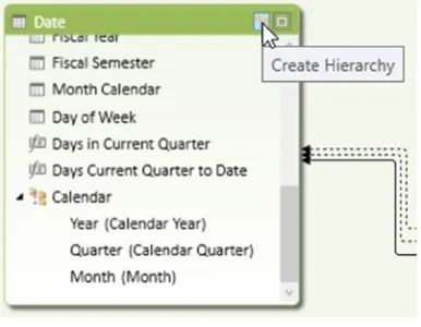
25. Click on the Date table in the diagram view. Notice the Create Hierarchy button in the upper
right corner of the table (see Figure 1-18). This is how you define hierarchies for a table.
Figure 1-17. Exploring relationshipsFigure 1-18. Creating a hierarchy
18
Summary
Importing Data into Power Pivot
One of the first steps in creating the Power Pivot model is importing data. Traditionally when creating a BI solution based on an OLAP cube, you need to import the data into the data warehouse and then load it into the cube. It can take quite a while to get the data incorporated into the cube and available for your consumption. This is one of the greatest strengths of the Power Pivot model. You can easily and quickly combine data from a variety of sources into your model. The data sources can be from relational databases, text files, web services, and OLAP cubes, just to name a few. This chapter shows you how to incorporated data from a variety of these sources into a Power Pivot model.
After completing this chapter you will be able to Import data from relational databases.
•
Import data from text files.
•
Import data from a data feed.
•
Import data from an OLAP cube.
•
Reuse existing connections to update the model.
•
Importing Data from Relational Databases
20
Although one-to-many relationships are the most common, you will run into another type of relationship that is fairly prevalent—the many-to-many. Figure 2-2 shows an example of a many-to-many relationship. A person can have multiple phone numbers of different types. For example they may have two fax numbers. You cannot relate these tables directly. Instead you need to use a junction table that contains the primary keys from the tables. The combination of the keys in the junction table must be unique.
Figure 2-1. A one-to-many relationship
Notice that the junction table can contain information related to the association; for example, the PhoneNumber is associated with the customer and phone number type. A customer cannot have the same phone number listed as two different types.
One nice aspect of obtaining data from a relational database is that the model is very similar to a model you will create in Power Pivot. In fact, if the relationships are defined in the database, the Power Pivot import wizard can detect these and set them up in the model for you.
The first step to getting data from a relational database is to create a connection. On the Home tab of the Model Designer there is a Get External Data grouping (see Figure 2-3).
Figure 2-3. Setting up a connection
22
After selecting a data source, you are presented with a window to enter the connection information. The connection information depends on the data source you are connecting to. For most relational databases the information needed is very similar. Figure 2-5 shows the connection information for connecting to a SQL Server. Remember to click the Test Connection button to make sure everything is entered correctly.
After setting up the connection the next step is to query the database to retrieve the data. You have two choices at this point: You can choose to import the data from a list of tables and views or you can write a query to import the data (see Figure 2-6). Even if you select to import the data from a table or view under the covers, a query is created and sent to the database to retrieve the data.
24
If you choose to get the data from a list of tables and views, you are presented with the list in the next screen. From your perspective a view and a table look the same. In reality, a view is really a stored query in the database that masks the complexity of the query from you. Views are often used to show a simpler conceptional model of the database than the actual physical model. For example you may need a customer’s address. Figure 2-7 shows the tables you need to include in a query to get the information. Instead of writing a complex query to retrieve the information, you can select from a view that combines the information in a virtual Customer Address table for you. Another common use of a view is to secure columns of the underlying table. Through the use of a view the database administrator can hide columns from various users.
By selecting a table and clicking the Preview & Filter button (see Figure 2-8), you can preview the data in the table and filter the data selected.
26
In Figure 2-9 you can see the preview and filter screen.
One way you can filter a table is by selecting only the columns you are interested in. The other way is to limit the number of rows by placing a filter condition on the column. For example, you may only want sales after a certain year. Clicking on the drop-down next to a column allows you to enter a filter to limit the rows. Figure 2-10 shows the SalesOrderHeader table being filtered by order date.
28
When working with large data sets it is a good idea, for performance reasons, to only import the data you are interested in. There is a lot of overhead in bringing in all the columns of a table if you are only interested in a few. Likewise, if you are only interested in the last three years of sales, don’t bring in the entire 20 years of sales data. You can always go back and update the data import to bring in more data if you find a need for it.
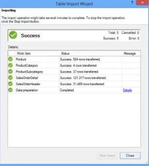
After filtering the data you click Finish on the Select Tables And Views screen (see Figure 2-8). At this point the data is brought into the model and you see a screen reporting the progress (see Figure 2-11). If there are no errors you can close the Table Import Wizard.
When the wizard closes, you will see the data in the data view of the Model Designer.
Note
■
Remember that Power Pivot is only connected to the data source when it is retrieving the data. Once the data
is retrieved the connection is closed and the data is part of the model.
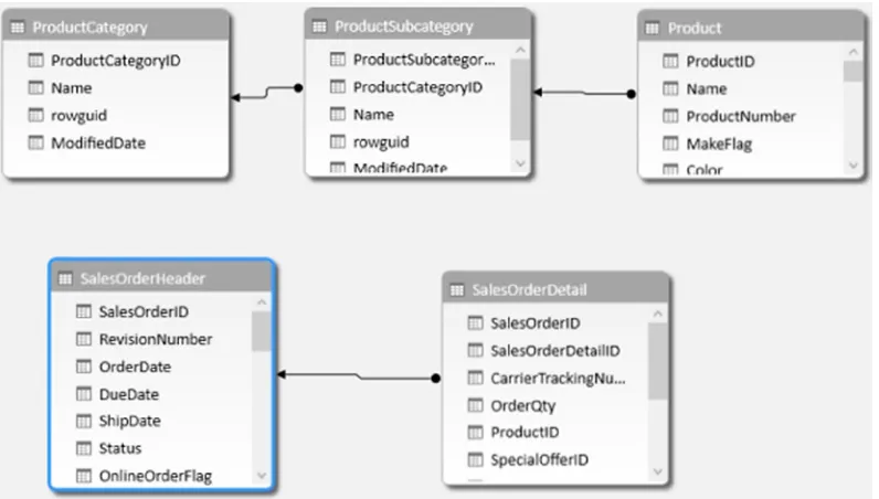
If you switch to the diagram view of the Model Designer you will see the tables, and if the table relationships were defined in the database you will see the relationships between the tables. In Figure 2-12 you can see relationships defined between the product tables and one defined between the sales tables, but none defined between the SalesOrderDetail table and the Product table. You can create a relationship in the model even though one was not defined in the data source (more about this later).
30
Although selecting from tables and views is an easy way to get data into the model without needing to explicitly write a query, it is not always possible. At times you may need to write your own queries; for example, you may want to combine data from several different tables and no view is available. Another factor is what is supported by the data source. Some data sources do not allow views and may require you to supply queries to extract the data. In these cases, when you get to the screen that asks how you want to retrieve the data, select the query option (Figure 2-6).
Once you select the query option you are presented with a screen where you can write in a query (see Figure 2-13). Although you may not write the query from scratch, this is where you would paste in a query written for you or one that you created in another tool such as Microsoft Management Studio or TOAD. Don’t forget to name the query. It will become a table in the model with the name of the query.
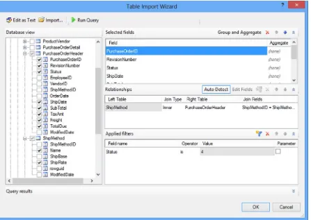
If the data source supports it, you can launch a pretty nice query designer by clicking in the lower right corner of the query entry window (see Figure 2-13). This designer (see Figure 2-14) allows you to select the columns you want from the various tables and views. If the table relationships are defined in the database it will add the table joins for you. You can also apply filters and group and aggregate the data. One confusing aspect of the query designer is the parameter check box.
32
Note
■
Parameters are not supported in the Power Pivot model and checking the box will give you an error message
when you try to close the query designer.
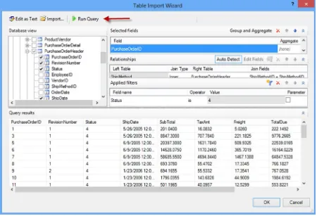
After you are done designing the query, you should always run it to make sure it works the way you intended (see Figure 2-15).
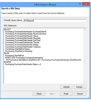
Once you are satisfied with the query, selecting the OK button returns you to the previous screen with the query text entered. You can modify the query in this screen and use the Validate button to ensure it is still a valid query (see Figure 2-16). Clicking Finish will bring the data and table into the model.
34
Now that you know how to import data from a database, let’s see how you can add data to the model from a text file.
Importing Data from Text Files
There are many times when you need to combine data from several different sources. One of the most common sources of data is still the text file. This could be the result of receiving data as an output from another system; for example, you may need information from your company’s ERP (enterprise resource planning) system, which is provided as a text file. You may also get data through third-party services that provide the data in a CSV (comma-separated value) format. For example, you may use a rating service to rate customers and the results can be returned in a CSV file.
Importing data into your model from a text file is similar to importing data from a relational database table. First you select the option to get external data from other sources on the Home menu, which brings up the option to connect to a data source. Scroll down to the bottom of the window and you can choose to import data from either an Excel file or a text file (see Figure 2-17).
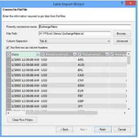
Selecting the text file brings up a screen where you enter the path to the file and the file delimiter. Each text file is considered a table and the friendly connection name will be the name of the table in the model. Once you supply the connection information, the data is loaded for previewing and filtering (see Figure 2-18).
36
Selecting the drop-down next to the column header brings up the ability to limit the rows brought in based on a filter criteria (see Figure 2-19).
Figure 2-18. Previewing the data
The main difference between importing data from a text file and importing data from an Excel file is that the Excel file can contain more than one table. By default each sheet is treated as a table (see Figure 2-20). Once you select the table you have the option to preview and filter the data just as you did for a text file.
Figure 2-20. Selecting a table in an Excel file
38
Because the data feed contains not only the data but also the metadata (description of the data), once you make the connection, Power Pivot provides you with the ability to preview and filter the data, as shown in Figure 2-22.
Figure 2-21. Connecting to a data feed
Importing Data from a Data Feed
A couple of interesting data feeds you can consume are data from Reporting Services reports and SharePoint lists. These applications can easily expose their data as data feeds that you can consume as a data source. In addition, many database vendors such as SAP support the ability to expose their data as data feeds.
Importing Data from an OLAP Cube
Many companies have invested a lot of money and effort into creating an enterprise reporting solution consisting of an enterprise-wide OLAP repository that feeds various dashboards and score cards. Using Power Pivot, you can easily integrate data from these repositories. From the connection choices in the connection window (Figure 2-17), choose the Microsoft SQL Server Analysis Services connection under Multidimensional Services. This launches the connection information window as shown in Figure 2-23. You can either connect to a multidimensional cube or a Power Pivot model published to SharePoint. To connect to a cube, enter the server name and the database name. To connect to a Power Pivot model, enter the URL to the Excel workbook (in a SharePoint library) and the model name.
40
Once you are connected to the cube you can enter an MDX query to retrieve the data (see Figure 2-24). Remember to validate the query to make sure it will run.
If you do not know MDX, you can use a visual designer to create it, as shown in Figure 2-25. One of the nice features of the designer is the ability to preview the results.
42
When you are done designing the query, it is entered in to the MDX statement box, shown in Figure 2-24, where you can finish importing the data.
Reusing Existing Connections to Update the Model
There are two scenarios where you want to reuse an existing connection to a data source. You may need to retrieve additional data from a data source; for example, you need to get data from additional tables or views or issue a new query. In this case, you would choose the existing connections button located on the Home tab (see Figure 2-26).
Figure 2-25. Designing an MDX query
In the Existing Connections window, select the connection and click the Open button (see Figure 2-27). This will launch the screens (which depend on the connection type), covered previously, where you go through the process of selecting the data you want to import.
Figure 2-27. Opening an existing connection
The other scenario is when you want to change the filtering or add some columns to an existing table in the model. In this case, you need to select the table in the data view mode of the designer, and on the Design tab, select Table Properties (see Figure 2-28).
44
The Edit Table Properties window allows you to update the query used to populate the table with data. You can either update the table in the Table Preview mode (Figure 2-29) or Query mode (Figure 2-30). When in Query Editor mode you can also launch the query designer to update the query.
Now that you have seen how to import the data from various data sources into the Power Pivot data model, it is time to get some hands-on experience importing the data.
HANDS-ON LAB—LOADING DATA INTO POWER PIVOT
In the following lab you will
Import data from an Access database.
•
Import data from a text file.
•
1. Open Excel 2013 and create a new file called
LabChapter2.xlsx2. On the Power Pivot tab, click on the Manage Data Model button (see Figure 2-31).
This launches the Power Pivot Model Designer window.
46
3. On the Home tab in the Get External Data grouping, click on the From Database drop-down
(see Figure 2-32). In the drop-down select From Access. This launches the Table
Import Wizard.
Figure 2-31. Opening the Model Designer window
Figure 2-32. Launching the Table Import Wizard
Figure 2-33. Connecting to an Access database
5. You have two options for importing the data: You can select from a list of tables and views or
chose to write a query to select the data. Select from a list of tables and views.
6. In the Select Tables And Views window, select Customers and click on the row to highlight it.
At the bottom of the window, select the Preview & Filter button to preview and filter the data
(see Figure 2-34).
Figure 2-34. Selecting tables to import
48
8. From the Employees table select the following: ID, Last Name, First Name, and Job Title.
9. From the Orders table select these: Order ID, Employee ID, Customer ID, Order Date, Shipped Date,
Shipper ID, Payment Type, and Paid Date. On the Status ID column, click the drop-down to filter the
data. Uncheck status 0 and status 2. Status 3 represents a status of closed (see Figure 2-36).
Figure 2-35. Filtering table columnsFigure 2-38. Using a query to get data
10. When you are done selecting the tables, click the Finish button to import the data. After importing,
close the wizard. You should see each table as a tab in the Data View window (see Figure 2-37).
Figure 2-37. Tables in the Data View window
11. You are now going to select the order details using a query. In the Power Pivot Model
Designer select the Home Tab. In the Home tab select the Existing Connections button. In the
connections window select the Access Northwind connection and click Open.
12. This time, select Write A Query That Will Specify The Data To Import.
50
14. In the Table Import wizard, click the Finish button to import the data. After importing, close
the wizard. You should see that an OrderDetail table tab has been added.
15. The final table you are going to import is contained in a tab-delimited text file. On the Home
tab in the Get External Data section, click the From Other Sources button. In the data sources
list select Text File and click Next.
16. In the connection information change the connection name to
Product
. In the File Path
browse to the
ProductList.txtfile in the LabStarters folder. Select a tab column separator
and check the Use First Row As Column Headers box. Click the Finish button to import the
data (see Figure 2-39).
Figure 2-39. Importing data from a text file
17. After importing, close the wizard and you should see that a Product table tab has been added.
Summary
53
Creating the Data Model
Now that you know how to get data into the Power Pivot model, the next step is to understand what makes a good model. This is very important when dealing with data in Power Pivot. A good model will make Power Pivot perform amazingly fast and allow you to analyze the data in new and interesting ways. A bad model will cause Power Pivot to perform very slowly and at worst give misleading results when performing the data analysis. Traditional Excel pivot tables are based on a single table contained in an Excel sheet. Power Pivot pivot tables are based off of multiple tables contained in the data model. This chapter guides you through the process of creating a solid model that will become the foundation for your data analysis. In addition, you will look at how to present a user-friendly model to client tools. This includes renaming tables and fields, presenting appropriate data types, and hiding extraneous fields.
After completing this chapter you will be able to Explain what a data model is
•
Create relationships between tables in the model
•
Create and use a star schema
•
Understand when and how to denormalize the data
•
Fundamentally a data model is made up of tables, columns, data types, and table relations. Typically data tables are constructed to hold data for a business entity; for example, customer data is contained in a customer table and employee data is contained in an employee table. Tables consist of columns that define the attributes of the entity. For example, you may want to hold information about customers such as name, address, birth date, household size, and so on. Each of these attributes has a data type that depends on what information the attribute holds—the name would be a string data type, the household size would be an integer, and the birth date would be a date. Each row in the table should be unique. Take a customer table, for example; if you had the same customer in multiple rows with different attributes, say birth date, you would not know which was correct.
Once you have the tables of the model identified, it is important that you recognize whether the tables are set up to perform efficiently. This process is called normalizing the model. Normalization is the process of organizing the data to make data querying easier and more efficient. For example, you should not mix attributes of unrelated entities together in the same table—you would not want product data and employee data in the same table. Another example of proper normalization is not to hold more than one attribute in a column. For example, instead of having one customer address column, you would break it up into street, city, state, and zip. This would allow you to easily analyze the data by state or by city. The spread sheet shown in Figure 3-2 shows a typically non-normalized table. If you find that the data supplied to you is not sufficiently normalized, you may have to ask whoever is supplying the data to break the data up into multiple tables that you can then relate together in your model.
Figure 3-1. Using a time stamp to track changes
Figure 3-2. A non-normalized table
Once you are satisfied the tables in your model are adequately normalized, the next step is to determine how the tables are related. For example, you need to relate the customer table, sales table, and product table in order to analyze how various products are selling by age group. The way you relate the different tables is through the use of
keys. Each row in a table needs a column or a combination of columns that uniquely identifies the row. This is called the primary key. The key may be easily identified, such as a sales order number or a customer number that has been assigned by the business when the data was entered. Sometimes you will need to do some analysis of a table to find the primary key, especially if you get the data from an outside source. For example, you may get data that contains potential customers. The fields are name, city, state, zip, birth date, and so on. You cannot just use the name as the key because it is very likely that you have more than one customer with the same name. If you use the combination of name and city, you have less of a chance of having more than one customer identified by the same key. As you use more columns, such as zip and birth date, your odds get even better.
55
It is important that you are aware of the keys used in your sources of data. If you can retrieve the keys from the source, you are much better off. This is usually not a problem when you are retrieving data from a relational database, but if you are combining data from different systems, make sure you have the appropriate keys.
Once you have the keys between the tables identified you are ready to create the relationships in the Power Pivot model.
Creating Table Relations
There are a few rules to remember when establishing table relationships in a Power Pivot model. First, you cannot use composite keys in the model. If your table uses a composite key, you will need to create a new column by concatenating the composite columns together and using this column as the key. Second, you can only have one active relationship path between two tables, but you can have multiple inactive relationships. Third, relationships are one to many; in other words, creating a relationship between the customer table (one side) and the sales table (many sides) is okay. Creating a direct relationship between the customers table and the products table is not allowed, however, because the customer can buy many products and the same product can be bought by many customers. In these cases you create a junction table to connect the tables together.
To create a relationship between two tables in the Power Pivot model you open up the Data Model Manager and switch to the diagram view. Right click on the table that represents the many side of the relationship and select Create Relationship. This launches the Create Relationship window. Select the related lookup table (the one side) and the key column. Figure 3-4 shows creating a relationship between the Sales table and the Store table. By default the first relationship created between the tables is marked as the active relationship.
Figure 3-5 shows the resulting relationship in the diagram view. If you click on the relationship arrow, the two key columns of the relationship are highlighted.
Figure 3-5. Viewing a relationship in the diagram view Figure 3-4. Creating a table relationship
57
Sometimes the active relationship is not so obvious. Figure 3-7 shows an active relationship between the Sales table and the Date table and another one between the Sales table and the Store table. There is also an inactive relationship between the Store table and the Date table. If you try to make this one active, you get the same error message shown in Figure 3-6. This is because you can trace an active path from the Date table to the Sales table to the Store table.
Figure 3-6. Trying to create a second active relationship between two tables
Figure 3-7. An indirect active relationship
When you try to create a relationship between the tables you get the error shown in Figure 3-9.
Figure 3-9. Getting a duplicate value error Figure 3-8. The Product and Sales tables
In this example the ProductNumber is supposed to be unique in the Product table but it turns out there are duplicates. In order to fix this, you would have to change the query for the Product table data to ensure that you are not getting duplicates.
Now that you know how to create table relationships in the model, you are ready to look at the benefits of using a star schema.
Creating a Star Schema
When creating a data model it is important to understand what the model is being used for. The two major uses of databases are for capturing data and for reporting/analyzing the data. The problem is that when you create a model for efficient data capture, you decrease its efficiency to analyze the data. To combat this problem, many companies split off the data capturing database from their reporting/analysis database. Fortunately, when creating the data model in Power Pivot, we only need to tune it for reporting.
59
The fact table contains quantitative data related to the business or process. For example, the Sales table in Figure 3-10 contains measurable aspects of a sale, such as total costs, sales amount, and quantity. Fact tables usually contain many rows and have a date or time component that records the time point at which the event occurred. The dimension tables contain attributes about the event. For example, the Date table can tell you when the sale occurred and allows you to roll up the data to the month, quarter, or year level. The Product table contains attributes about the product sold and you can look at sales by product line, color, and brand. The Store table contains attributes about the store involved in the sale. Dimension tables usually do not contain as many rows as the fact table but can contain quite a few columns. When you ask a question like “Which bikes are selling the best in the various age groups?” the measures (sales dollar values) come from the fact table whereas the categorizations (age and bike model) come from the dimension tables.
The main advantage of the star schema is that it provides fast query performance and aggregation processing. The disadvantage is that it usually requires a lot of preprocessing to move the data from a highly normalized transactional system to a more denormalized reporting system. The good news is that your business may have a reporting system feeding a traditional online analytical processing (OLAP) database such as Microsoft’s Analysis Server or IBM’s Cognos. If you can gain access to these systems, they are probably the best source for your core business data.
In order to create a star schema from your source data systems, you may have to perform some data denormalization, which is covered in the following section.
Understanding When to Denormalize the Data
Although transactional database systems tend to be highly normalized, reporting systems are denormalized into the star schema. If you do not have access to a reporting system where the denormalization is done for you, you will have to denormalize the data into a star schema to load your Power Pivot model. As an example, Figure 3-11 shows the tables that contain customer data in the Adventureworks transactional sales database.
In order to denormalize the customer data into your model, you need to create a query that combines the data into a single customer dimension table. If you are not familiar with creating complex queries, the easiest way to do this is to have the database developers create a view you can pull from that combines the tables for you. If the query is not too complex, you can probably create it yourself when you import the data. For example, Figure 3-12 shows a customer table and a geography table.
61
You can combine these into one customer dimension table using the following query.
SELECT c.CustomerKey, c.BirthDate, c.MaritalStatus, c.Gender, c.YearlyIncome, c.NumberChildrenAtHome, c.EnglishOccupation, c.HouseOwnerFlag, c.NumberCarsOwned, c.CommuteDistance,
g.City, g.StateProvinceName, g.EnglishCountryRegionName, g.PostalCode FROM Customer AS c INNER JOIN
Geography AS g ON c.GeographyKey = g.GeographyKey
Although you do not have to be a query expert to get data into your Power Pivot model, it is very beneficial to know the basics of querying the data sources, even if it just helps to ask the right questions when you talk to the database developers.
Creating Linked Tables
One thing to remember about the data contained in the Power Pivot model is that it is read only. For the most part this is a good thing. You want to make sure that the data only gets changed in the source system. At times, however, as part of the data analysis, you will want to make adjustments on the fly and see how it affects the results. One example that happens fairly often is bucket analysis. For example, say you want to look a continuous measure such as age in discrete buckets (ranges) and you need to adjust the ranges during analysis. This is where linked tables shine.
To create the linked table you first set up the table on an Excel sheet. After entering the data, you highlight it and click on the quick analysis menu (see Figure 3-13). Under the Tables tab click on the Table button.
Once the table is created, it is a good idea to name it before importing it into the Power Pivot data model. You can do this by selecting the table and then entering the table name under the Tables tab in the Table Tools Design popup window (see Figure 3-14).
Figure 3-15. Adding the table to the model Figure 3-13. Creating an Excel table
Once you have the table named, select it, and on the Power Pivot tab, select Add To Data Model (see Figure 3-15).
Figure 3-14. Renaming an Excel table
63
Creating Hierarchies
When analyzing data it is often helpful to use hierarchies to define various levels of aggregations. For example, it is common to have a calendar-based hierarchy based on year, quarter, and month levels. An aggregate like sales amount is then rolled up from month to quarter to year. Another common hierarchy might be from department to building to region. You could then roll cost up through the different levels. Creating hierarchies in a Power Pivot model is very easy. In the diagram view of the Model Designer select the table that has the attributes (columns) you want in the hierarchy. You will then see a Create Hierarchy button in the upper right corner of the table (see Figure 3-16). Click on the button to add the hierarchy and rename it. You can then drag and drop the fields onto the hierarchy to create the different levels. Make sure you arrange the fields so that they go from a higher level down to a lower level.
Figure 3-16. Creating a hierarchy
Creating hierarchies is one way to increase the usability of your model and help users instinctively gain more value in their data analysis. In the next section you will see some other things you can do to the model to increase its usability.
Making a User-Friendly Model
As you are creating your model one thing to keep in mind is making the model easy and intuitive to use. Chances are that the model may get used by others for analysis. The model may also be used for a wide variety of client reporting and analysis tools such as Power View, Power Map, and Reporting Services. There are properties and settings you can use that allow these client tools to gain more functionality from the model.
One of the most effective adjustments you can make is to rename the tables and columns. Use names that make sense for business users and not the cryptic naming convention that only makes sense to the database developers. Another good practice is to make sure the data types and formats of the columns are set correctly. A field from a text file may come in typed as a string when in reality it is numeric data. In addition you can hide fields that are of no use to the user, such as the surrogate keys used for linking the tables.
You can use some other settings to create good models for the various client tools. You will revisit this topic in more detail in Chapter 10, “Optimizing Tabular Models for Power View.”
The following hands-on lab will help you solidify the topics covered in this chapter.
HANDS-ON LAB—CREATING A DATA MODEL IN POWER PIVOT
In the following lab you will
Create table relations.
1.
Open Excel 2013 and create a new file called
LabChapter3.xlsx.
2.
Using the Table Import Wizard in the Power Pivot data model, connect to the
Adventureworks.accdb
file in the LabStarters folder.
3.
Select the tables and fields listed and import the data.
Source Table Name
Friendly Name
Fields
DimDate Date DateKey
Figure 3-17. Sorting one column by another column
65
Source Table Name
Friendly Name
Fields
DimCustomer Customer CustomerKey
Table
Column
Friendly Name
Hide
5.
Switch the Power Pivot window to diagram view. You should see the Date, Customer, and
Internet Sales. The Customer table and the Internet Sales table have a relationship defined
between them. This was discovered by the Table Import Wizard.
6.
Drag the DateKey from the Date table and drop it on the OrderDateKey in the Internet Sales
table. Similarly, create a relationship between the DateKey and the ShipDateKey. Double click
on this relationship to launch the Edit Relationship window (see Figure 3-18). Try to make
this an active relationship. You should get an error because you can only have one active
relationship between two tables in the model.
Figure 3-18. Creating the table relationship
67
8.
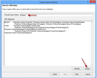
In the Specify A SQL Query window, change the query friendly name to Product and click the
Design button.
9.
In the designer click the Import button. Open the
ProductQuery.txtfile in the lab starter folder.
Click the red exclamation mark (!) to run the query (see Figure 3-19). This query combines
data (i.e., denormalizes) from the Product, ProductCategory, and ProductSubcategory tables.
Figure 3-19. Running the query
11.
After importing the data, hide the ProductKey and update the column names as follows:
Table
Column
Friendly Name
Hide
Product ProductKey X ProductAlternateKey Product Code
WeightUnitMeasureCode Weight UofM Code SizeUnitMeasureCode Size UofM Code EnglishProductName Product Name ListPrice List Price Size
SizeRange Size Range Weight
Color
EnglishProductCategoryName Category EnglishProductSubcategoryName Subcategory
12.
Create a relationship between the Internet Sales and the Product tables using the ProductKey.
Your final diagram should look like Figure 3-20.
69
Figure 3-22. The Quick Analysis Tables tab13.
To create a linked table, enter the data shown in Figure 3-21 into an empty spread sheet
tab in Excel.
Figure 3-21. The linked table data
14.
Select the cells, right click, and in the Quick Analysis context menu, select the Table tab
and click the Table button (see Figure 3-22). In the Table Tools Design tab, rename the table
SalesTerritory.
15.
On the Power Pivot tab, click the Add To Data Model button. Once the table is in the model,
change the name to Sales Territory, hide the SalesTerritoryKey, and create a relationship to
the Internet Sales table.
17.
Create a Calendar hierarchy named
Calendar
in the Date table using Year, Quarter,
and Month.
18.
Switch to the data view in the designer and select the Date Table tab. Select the Month
column and set its Sort By Column to the Month No. column.
19.
When done save and close Excel.
Summary
When working in Power Pivot it is very important to understand what makes a good model. A good model will make Power Pivot perform incredibly fast and allow you to easily analyze large amounts of data. Unlike traditional Excel pivot tables, which are based on a single table contained in an Excel sheet, Power Pivot pivot tables are based off of multiple tables contained in the data model. This chapter guided you through the process of creating a solid model that will become the foundation for your data analysis. In addition, you saw how to present a user-friendly model to client tools.
Now that you have a solid foundation for your model, you are ready to extend the model with custom calculations. The next chapter introduces the Data Analysis Expressions (DAX) language and explains how to create calculated columns in the data model. It includes plenty of examples to help you create common calculations in the model.
71
Creating Calculations with DAX
Now that you know how to create a robust data model to base your analysis on, the next step is to add to the model any calculations required to aid your exploration of the data. For example, you may have to translate code values into meaningful descriptions or parse out a string to obtain key information. This where Data Analysis Expressions (DAX) comes into play. This chapter introduces you to DAX and shows you how to use DAX to create calculated columns to add to the functionality of your model.
After completing this chapter you will be able to Use DAX to add calculated columns to a table.
•
Implement DAX operators.
•
Work with text functions in DAX.
•
Use DAX date and time functions.
•
Use conditional and logical functions.
•
Get data from a related table.
•
Use math, trig, and statistical functions.
•
What Is DAX?
DAX is a formula language used to create calculated columns and measures in the Power Pivot model. It is a new language developed specifically for the tabular data model Power Pivot is based on. If you are familiar with Excel’s formula syntax, you will find that the DAX syntax is very familiar. In fact some of the DAX formulas have the same syntax and functionality as their Excel counterparts. The major difference, and one that you need to wrap your head around, is that Excel formulas are cell based whereas DAX is column based. For example, if you want to concatenate two values in Excel, you would use a formula like the following:
=A1 & " " & B1
This is very similar to the DAX formula:
=[First Name] & " " & [Last Name]
where the First Name and Last Name are columns in a table in the model (see Figure 4-2).
Figure 4-1. Entering a formula in Excel
Figure 4-2. Entering a formula in Power Pivot
Figure 4-3. Using cells in different rows
The difference is that the DAX formula is applied to all rows in the table whereas the Excel formula only works on the specific cells. In Excel you need to re-create the formula in each row.
What this means is although you can do something like this in Excel:
=A1 & " " & B2
73
When creating DAX formulas it is important to consider the data types and any conversions that may take place during the calculations. If you do not take these into account you may experience errors in the formula or unexpected results. The supported data types in the model are whole number, decimal number, currency, Boolean, text, and date. DAX also has a table data type that is used in many functions that take a table as an input value and return a table.
When you try to add a numeric data type with a text data type you get an implicit conversion. If DAX can convert the text to a numeric value it will add them as numbers, if it can’t you will get an error. On the other hand, if you try to concatenate a numeric data type with a text data type, DAX will implicitly convert the numeric data type to text. Although most of the time implicit conversions give you the results you are looking for, they come at a performance cost and should be avoided if possible. For example, if you import data from a text file and the column is set to a text data type but you know it is in fact numeric, you should change the data type in the model.
When creating calculations in DAX you will need to reference tables and columns. If the table name does not contain spaces, you can just refer to it by name. If the table name contains spaces, you need to enclose it in single quotes. Columns and measures are enclosed in brackets. If you just list the column name in the formula, it is assumed that the column exists in the same table. If you are referring to a column in another table, you need to use the fully qualified name, which is the table name followed by the column name. The following code demonstrates the syntax:
=[SalesAmount] - [TotalCost]
=Sales[SalesAmount] - Sales[TotalCost]
='Internet Sales'[SalesAmount] - 'Internet Sales'[TotalCost]
Here are some other points to keep in mind when you are working with DAX:
DAX formulas and expressions cannot modify or insert individual values in tables.
•
You cannot create calculated rows by using DAX. You can create only calculated columns
•
and measures.
When defining calculated columns, you can nest functions to any level.
•
The first thing to understand when creating a calculation is what operators are supported and what the syntax to use them is. In the next section you will investigate the various DAX operators.
Implementing DAX Operators
DAX contains a robust set of operators that includes arithmetic, comparison, logic, and text concatenation. Most of these should be familiar to you and are listed in Table 4-1.
Table 4-1. DAX Operators
As an example of the arithmetic operator, the following code is used to divide the Margin column by the Total Cost column to create a new column, the Margin Percentage.
=[Margin]/[TotalCost]
It is very common to have several arithmetic operations in the same calculation. In this case you have to be aware of the order of operations. Exponents are evaluated first followed by multiplication/division and then addition/ subtraction. You can control order of operations by using parentheses to group calculations; for example, the following formula will perform the subtraction before the division.
=([Sales Amount]-[Total Cost])/[Total Cost]
The comparison operators are primarily for if statements. For example, the following calculation checks to see if a store’s selling area size is greater than 1000. If it is, it is classified as a large store, if not, it is classified as small.
=IF([Selling Area Size]>1000,"Large","Small")
The logical operators are used to create multiple comparison logic. The following code checks to see if the store size area is greater than 1000 or if it has more than 35 employees to classify it as large.
=IF([Selling Area Size]> 1000 || [Employee Count] > 35,"Large","Small")
When you start stringing together a series of logical conditions it is a good idea to use parentheses to control the order of operations. The following code checks to see if the store size area is greater than 1000 and if it has more than 35 employees to classify it as large. It will also classify it as large if it has annual sales of more than $1,000,000 regardless of its size area or number of employees.
=IF(([Selling Area Size]> 1000 && [Employee Count] > 35) || [Annual Sales] > 1000000,"Large","Small")
Category
Symbol
Use
Comparison operators
= Equal to > Greater than < Less than
75
When working with DAX calculations you may need to nest one formula inside another. For example, the following code nests an IF statement inside the false part of another IF statement. If the employee count is not greater than 35 it jumps to the next if statement to check if it is greater than 20.
=IF(Store[EmployeeCount]>35,"Large",IF(Store[EmployeeCount]>20,"Medium","Small"))
DAX contains many useful functions for creating calculations and measures. These functions include text functions, date and time functions, statistical functions, math functions, and informational functions. In the next few sections you will look at using the various function types in your calculations.
Working with Text Functions
A lot of calculations involve some kind of text manipulation. You may need to truncate, parse, search, or format the text values that you load from the source systems. DAX contains many useful functions for working with text. The functions are listed in Table 4-2 along with a description of what they are used for.
Table 4-2. DAX Text Functions
Function
Description
BLANK Returns a blank.
CONCATENATE Joins two text strings into one text string.
EXACT Compares two text strings and returns TRUE if they are exactly the same, FALSE otherwise.
FIND Returns the starting position of one text string within another text string.
FIXED Rounds a number to the specified number of decimals and returns the result as text.
FORMAT Converts a value to text according to the specified format.
LEFT Returns the specified number of characters from the start of a text string.
LEN Returns the number of characters in a text string.
LOWER Converts all letters in a text string to lowercase.
MID Returns a string of characters from a text string, given a starting position and length.
REPLACE Replaces part of a text string with a different text string.
REPT Repeats text a given number of times. Use REPT to fill a cell with a number of instances of a text string.
RIGHT Returns the last character or characters in a text string, based on the number of characters you specify.
SEARCH Returns the number of the character at which a specific character or text string is first found, reading left to right.
SUBSTITUTE Replaces existing text with new text in a text string.
TRIM Removes all spaces from text except for single spaces between words.
UPPER Converts a text string to all uppercase letters.