Other web design resources from O’Reilly
Related titles Head Rush Ajax
Ajax Hacks™ Learning Web Design HTML and XHTML
Pocket Reference Creating Web Sites: The
Missing Manual Cascading Style Sheets:
The Definitive Guide
CSS Pocket Reference Head First HTML with
CSS and XHTML CSS Cookbook™ Dreamweaver 8: The
Missing Manual
oreilly.com oreilly.comis more than a complete catalog of O’Reilly books. You’ll also find links to news, events, articles, weblogs, sample chapters, and code examples.
oreillynet.comis the essential portal for developers inter-ested in open and emerging technologies, including new platforms, programming languages, and operating systems.
Conferences O’Reilly brings diverse innovators together to nurture the ideas that spark revolutionary industries. We specialize in documenting the latest tools and systems, translating the innovator’s knowledge into useful skills for those in the trenches. Visit conferences.oreilly.com for our upcoming events.
Third Edition
WEB DESIGN
IN A NUTSHELL
Jennifer Niederst Robbins
Web Design in a Nutshell, Third Edition by Jennifer Niederst Robbins
Copyright © 2006, 2001, 1999 O’Reilly Media, Inc. All rights reserved. Printed in the United States of America.
Published by O’Reilly Media, Inc., 1005 Gravenstein Highway North, Sebastopol, CA 95472. O’Reilly books may be purchased for educational, business, or sales promotional use. Online editions are also available for most titles (safari.oreilly.com). For more information, contact our corporate/institutional sales department: (800) 998-9938 or[email protected].
Editor: Steve Weiss
Developmental Editor: Linda Laflamme Technical Editors: Tantek Çelik and
Molly E. Holzschlag Production Editor: Mary Brady Copyeditor: Linley Dolby
Proofreader: Sada Preisch Indexer: Lucie Haskins Cover Designer: Edie Freedman Interior Designer: David Futato Cover Illustrator: Lorrie LeJeune Illustrator: Christopher Reilley
Printing History:
January 1999: First Edition. September 2001: Second Edition. February 2006: Third Edition.
Nutshell Handbook, the Nutshell Handbook logo, and the O’Reilly logo are registered trademarks of O’Reilly Media, Inc. TheIn a Nutshell series designations,Web Design in a Nutshell, the image of a least weasel, and related trade dress are trademarks of O’Reilly Media, Inc.
Many of the designations used by manufacturers and sellers to distinguish their products are claimed as trademarks. Where those designations appear in this book, and O’Reilly Media, Inc. was aware of a trademark claim, the designations have been printed in caps or initial caps.
While every precaution has been taken in the preparation of this book, the publisher and author assume no responsibility for errors or omissions, or for damages resulting from the use of the information contained herein.
This book uses RepKover™, a durable and flexible lay-flat binding.
ISBN-10: 0-596-00987-9 ISBN-13: 978-0-596-00987-8
v
Chapter 1
Table of Contents
Foreword
. . .xv
Contributors
. . .xvii
Technical Reviewers
. . .xix
Preface
. . .xxi
Part I. The Web Environment
1. Web Standards
. . .3
What Are Standards? 3 Current Web Standards 6 Standards-Driven Design 9 For Further Reading 11
2. Designing for a Variety of Browsers
. . . .12
Browser History 12
Browser Roll-Call 14
Gathering Usage Statistics 19
Learning from Browser Statistics 20
Dealing with Browser Differences 22
Know Your Audience 25
vi | Table of Contents
3. Designing for a Variety of Displays
. . .27
Designing for Unknown Monitor Resolutions 28
Fixed Versus Liquid Web Pages 30
Designing “Above the Fold” 37
Mobile Devices 37
4. A Beginner’s Guide to the Server
. . .42
Servers 101 42
Unix Directory Structures 46
File Naming Conventions 50
Uploading Documents (FTP) 50
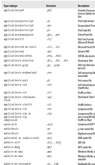
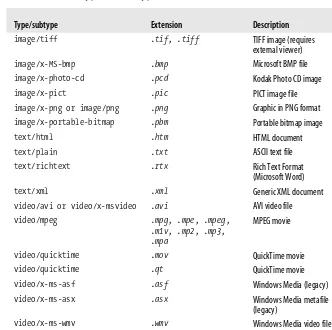
File (MIME) Types 53
5. Accessibility
. . .56
Types of Disabilities 56
Overview of Assistive Technology 57
Who Is Responsible for Accessibility? 59
Web Content Accessibility Guidelines 60
Web Content Accessibility Guidelines 2.0 (WCAG 2.0) 64
Standards Variations and Section 508 64
Web Accessibility Techniques 65
Testing for Accessibility 68
6. Internationalization
. . . .72
Character Sets and Encoding 73
Character References 78
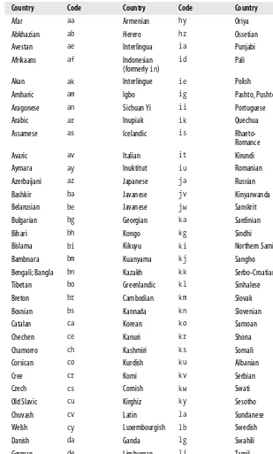
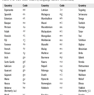
Language Features 80
Style Sheets Language Features 84
For Further Reading 85
Part II. The Structural Layer: XML and (X)HTML
7. Introduction to XML
. . . .89
XML Basics 90
How It Works 91
XML Document Syntax 93
Well-Formed XML 96
Table of Contents | vii
XML Namespaces 103
XML on the Web 104
Web-Related XML Applications 105
Where to Learn More 112
8. HTML and XHTML Overview
. . . .113
The Role of HTML 114
Markup Basics 115
Introduction to XHTML 119
Which Standard Is Right for You? 122
Well-Formed XHTML 123
Web Authoring Tools 126
Good Authoring Practices 128
9. Document Structure
. . . .130
Minimal Document Structure 130
Document Type Declaration 132
The Root Element 135
The Document Header 136
The Document Body 142
10. Text Elements
. . . .144
Choosing Text Elements 145
The Building Blocks of Content 146
Inline Elements 149
Deleted and Inserted Text 152
Generic Elements (div and span) 153
Lists 156
Presentational Elements 161
Character Entity References 167
11. Creating Links
. . . .169
Simple Hypertext Links 169
Linking Within a Document 171
Targeting Windows 173
Alternative Protocols 173
Linking Documents with link 175
12. Images and Objects
. . . .178
Inline Images 178
viii | Table of Contents
Embedded Media 192
Java Applets 201
Inline (Floating) Frames 203
13. Tables
. . . .205
Table Uses 206
Basic Table Structure 207
Row Groups 213
Columns and Column Groups 214
Table Presentation 216
Accessible Tables 220
Responsible Layout Tables 226
14. Frames
. . . .232
Introduction to Frames 232
Basic Frameset Structure 234
Frame Function and Appearance 239
Targeting Frames 241
Frame Design Tips and Tricks 244
15. Forms
. . . .247
The Basic Form Element 248
Form Controls 250
Accessibility Features 263
disabled and readonly 267
Affecting Form Appearance 267
Part III. The Presentation Layer: Cascading Style Sheets
16. Cascading Style Sheets Fundamentals
. . . .273
CSS in a Nutshell 273
The Benefits of CSS 274
How CSS Works 275
Rule Syntax 275
Adding Styles to a Document 278
Key Concepts 283
Specifying Values 291
Browser Support 293
Table of Contents | ix
17. Selectors
. . . .297
Type (Element) Selector 297
Contextual Selectors 298
Class and ID Selectors 299
Attribute Selectors 301
Pseudoselectors 302
18. Font and Text Properties
. . . .307
Typography on the Web 307
Font Family 310
Font Size 312
Other Font Settings 318
Text Transformation (Capitalization) 322
Text Decoration 323
Line Height 325
Text Alignment Properties 327
Text Spacing 332
Text Direction 335
19. Basic Box Properties
. . . .337
The Box Model, Revisited 338
Width and Height 341
Margins 344
Borders 347
Padding 352
20. Color and Backgrounds
. . . .355
Foreground Color 355
Background Color 357
Background Images 358
21. Floating and Positioning
. . . .368
Normal Flow 368
Floating 369
Positioning Basics 375
Absolute Positioning 385
Fixed Positioning 389
x | Table of Contents
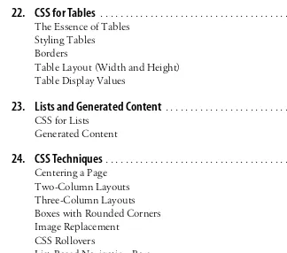
22. CSS for Tables
. . . .392
The Essence of Tables 392
Styling Tables 396
Borders 398
Table Layout (Width and Height) 401
Table Display Values 403
23. Lists and Generated Content
. . . .406
CSS for Lists 406
Generated Content 412
24. CSS Techniques
. . . .419
Centering a Page 419
Two-Column Layouts 421
Three-Column Layouts 424
Boxes with Rounded Corners 432
Image Replacement 436
CSS Rollovers 440
List-Based Navigation Bars 443
CSS Techniques Resources 446
25. Managing Browser Bugs: Workarounds,Hacks,and Filters
. . . .448
Working with “Troubled” Browsers 448
The Browsers 449
Hack and Workaround Management 101 459
Part IV. The Behavioral Layer: JavaScript and the DOM
26. Introduction to JavaScript
. . . .465
A Little Background 465
Using JavaScript 466
JavaScript Syntax 468
Event Handling 484
The Browser Object 486
Where to Learn More 487
27. DOM Scripting
. . . .488
A Sordid Past 488
Out of the Dark Ages 489
Table of Contents | xi
Manipulating Documents with the DOM 491
Working with Style 501
DOM Scripting in Action 502
Supplement: Getting Started with Ajax 507
Part V. Web Graphics
28. Web Graphics Overview
. . . .515
Web Graphic File Formats 515
Image Resolution 517
Color on the Web 519
Web Graphics Production Tips 524
29. GIF Format
. . . .529
8-Bit Indexed Color 530
LZW Compression 531
Interlacing 533
Transparency 534
Minimizing GIF File Sizes 536
Designing GIFs with the Web Palette 541
30. JPEG Format
. . . .544
24-Bit Color 544
JPEG Compression 545
Progressive JPEGs 547
Creating JPEGs 548
Minimizing JPEG File Size 548
31. PNG Format
. . . .552
When to Use PNGs 552
PNG Features 554
Platform/Browser Support 558
Creating PNG Files 559
PNG Optimization Strategies 561
For Further Reading 563
32. Animated GIFs
. . . .564
How They Work 564
xii | Table of Contents
Tools 565
Creating Animated GIFs 566
Optimizing Animated GIFs 570
Part VI. Media
33. Audio on the Web
. . . .575
Basic Digital Audio Concepts 575
Using Existing Audio 577
Preparing Your Own Audio 578
Streaming Audio 581
Audio Formats 583
Choosing an Audio Format 590
Adding Audio to a Web Page 590
34. Video on the Web
. . . .595
Basic Digital Video Concepts 595
Compression 596
Video File Formats 598
Adding Video to an HTML Document 603
35. The Flash Platform
. . . .609
Using Flash on Web Pages 610
Creating Flash Movies 612
ActionScript 615
Adding Flash to a Web Page 616
Integrating Flash with Other Technologies 622
The Flash Player 623
Flash Resources 625
36. Printing from the Web
. . . .626
Browser Print Mechanisms 626
Cascading Style Sheets for Print 627
Portable Document Format (PDF) 634
Table of Contents | xiii
Part VII. Appendixes
A. HTML Elements and Attributes
. . . .641
B. CSS 2.1 Properties
. . . .684
C. Character Entities
. . . .722
D. Specifying Color
. . . .733
E. Microformats: Extending (X)HTML
. . . .742
Glossary
. . . .747
xv
Chapter 2
Foreword
I recall sitting at my desk many years ago, struggling with a piece of HTML markup, when someone walked by and dropped off a floppy disk. Written in block letters across the label was “Netscape .9b”—a pre-release beta version of what would soon become the most widely used browser of that time. I installed it and clicked around my company’s web site, and I remember thinking to myself, “Huh. My job just completely changed.”
Up to that point in the nascent history of the World Wide Web, there had really been only one browser to worry about. Nearly everyone used Mosaic, and as long as my pages were also functional in a text-only browser like Lynx, I could safely forget about that aspect of web design. But suddenly there was competition. And with competition came new concerns about rendering, feature support, and bugs. That would prove to be one of innumerable watershed events in more than a decade of growth and evolution of the Web as a world-changing technological platform. Soon after Netscape shipped its browser, my job would completely change over and over again. First came fonts and colors; then frames, JavaScript, database-driven dynamic web applications, XML, Cascading Style Sheets, Flash, semantic markup—and all of those innovations have iterated through countless new versions. If there’s one thing that is certain in the life of a web designer, it’s that every day something you thought you knew will change. And then change again.
xvi | Foreword
simply the output of a web server. And the IT department found itself in the posi-tion of building pages and even occasionally using Photoshop. Those were crazy times.
By the mid ’90s, the Web had moved from IT to marketing. Every company needed a web site if they expected to survive, and there was a mad scramble to develop an “interactive strategy.” This was the era of the transitional web designer—when people with experience in more traditional media design came to the Web and tried to bend it to fit. No control of typography? Build the whole page as an image. Page layout not up to our standards? We’ll hack on tables and invisible GIFs until things look exactly like they should. The Web didn’t respond very well to this onslaught. The cornerstones of digital design—usability, content reuse, accessibility—buckled under the hubris of graphic artists.
But today holds both tremendous opportunity and significant trepidation for those who call themselves web designers. The legacy of the so-called “Browser Wars” is behind us; we have a strong and stable platform for building with increasing sophistication. A foundation of accepted and well-implemented industry standards offers a constancy we once could only dream of. But at the same time, the Web has factions of innovation racing off in countless directions. Good designers now worry as much about semantics, device-agnosticism, and Ajax-style interactions as they do about color, typography, and layout. It is an understandably intimidating time.
The weight of this book in your hands is a testimony to that complexity. And if it seems daunting, at least take comfort in the fact that the author could not possibly be a more capable guide. Jennifer Robbins has been designing web sites longer than anyone else I know. For years she has been the one we’ve all turned to for reassurance and clarity as our industry propels itself into the future.
There is nobody I would trust more than Jennifer to show us where we’ve been, and where we’re heading next. You should, too.
xvii
Chapter 3
Contributors
Tantek Çelik
Tantek Çelik contributed Appendix E,Microformats: Extending (X)HTML. He is also a Lead Technical Editor for this book. His bio is listed on the Technical Reviewers page.
Derek Featherstone
Derek is a well-known instructor, speaker, and developer with expertise in web accessibility consulting and training. He advises many government agencies, educa-tional institutions, and private sector companies, providing them with expert accessibility testing, and review and recommendations for improving the accessi-bility of their web sites to all people. As a member of the Web Standards Project (webstandards.org), Derek serves on two task forces: Accessibility/Assistive Devices and DOM Scripting. He is a dedicated advocate for standards that ensure simple, affordable access to web technologies for all. Derek wrote Chapter 5,Accessibility. Aaron Gustafson
xviii | Contributors Todd Marks
xix
Chapter 4
Technical Reviewers
Lead Technical Editors
Tantek Çelik
Tantek Çelik is Chief Technologist at Technorati (www.technorati.com) where he leads the design and development of new standards and technologies. Prior to Technorati, he was a veteran representative to the World Wide Web Consortium (W3C) for Microsoft, where he also helped lead the development of the award-winning Internet Explorer for Macintosh. As cofounder of the microformats.org community and the Global Multimedia Protocols Group (gmpg.org), as well as Steering Committee member of the Web Standards Project (WaSP, www. webstandards.org) and invited expert to the W3C Cascading Style Sheets working group, Tantek is dedicated to advancing open standards and simpler data formats for the Web.
Molly E. Holzschlag
Molly E. Holzschlag is a well-known web standards advocate, instructor, and author. She is Group Lead for the Web Standards Project (WaSP) and an invited expert to the GEO working group at the World Wide Web Consortium (W3C). Among her thirty-plus books is the recentThe Zen of CSS Design(PeachPit Press, coauthored with Dave Shea. The book artfully showcases the most progressive csszengarden.com designs. A popular and colorful individual, you can catch up with Molly’s blog at—where else?—molly.com.
Technical Reviewers
xxi
Chapter 4
Preface
If you think you can take a web design book written in 2001 and “tweak” it for release in 2006, guess again. I know...I tried.
In my first draft of the XHTML chapters, I took the content from the last edition and just added some pointers to Cascading Style Sheet alternatives forfontand a few other elements and attributes. After all (I figured), the (X)HTML Recommen-dations hadn’t changed since 1999, right?
As it turned out, while I was busy doing things like designing corporate identities and having babies (just one baby, actually), a major sea change had taken place in the web design world. My little pointers to CSS alternatives amounted to “band-aids on a gaping wound,” as so aptly noted by Molly Holzschlag in her tech review of those initial chapters. I had fallen out of step with contemporary web design, and I had some catching up to do.
I learned that while it was true that the Recommendation was the same, whathad changed was how the professional web design community was using it. Designers were actuallycomplyingwith the standards. They were no longer using (X)HTML as a design tool, but as a means of defining the meaning and structure of content. Cascading Style Sheets were no longer just something interesting to tinker with, but rather a reliable method for handling all matters of presentation, from fonts and colors to the layout of the entire page. That ideal notion of “keeping style separate from content” that I had been writing about for years had not only become a possibility, it had become a reality.
I spent the next several months immersing myself in the world of standards-driven web design: reading every book I could get my hands on, exploring oceans of online resources, and of course, poring over the details of the W3C (X)HTML and CSS Recommendations themselves.
xxii | Preface
measurable advantages of designing standards-compliant sites. The (X)HTML chapters have all been rewritten from scratch, in a way that promotes the proper semantic use of each element and radically downplays presentational HTML and how elements are rendered by default in browsers. There are now 10 chapters on CSS (the prior edition had only one). Two new chapters on JavaScript and the DOM, written by Aaron Gustafson, treat these topics in a more detailed and useful manner than the previous editions ever offered.
All other sections of the book have been brought up to date as well, reflecting some significant advancements (such as approaches to accessibility, support for the PNG graphic format, and print-specific style sheets, to name a few) as well as minor shifts (such as the guidelines on web graphics and multimedia production) that have taken place since the last edition.
The tale of transformation does not end with the book. This author has been transformed as well. Knowing what I know now, I shudder when I look at that first draft of the book. I shudder more when I look at my sites with their layers of nested tables, spacer-GIFs, and meaningless markup. Am I ashamed? Not espe-cially...I was no different from most other web designers in the late ’90s. You have to learn sometime, and for me, writing this book was my wake-up call.
I suspect that for every new web designer who comes along who has never used a table for layout, there are many more like me who need to relearn their craft. That’s to be expected in a medium as new and quickly evolving as the Web. I’ve written this book to be the definitive resource for designers who are onboard with standards-driven web design as well as those who are still making the transition. Now, if you’ll excuse me, I have some sites to redesign.
What’s in the Book
This Nutshell book focuses on frontend matters of web design and development: markup, style sheets, image production, multimedia, and so on. Ironically, despite its title, there is little in the way of “design” advice, per se. Rather, it strives to be a thorough reference for all the technical details and requirements that we face in our day-to-day work designing and developing web content.
The book is divided into six parts (plus appendixes), each covering a general subject area.
Part I: The Web Environment
Preface | xxiii Part II: The Structural Layer: XML and (X)HTML
This part of the book is about document markup, commonly referred to as thestructural layerbecause it provides the foundation upon which presenta-tion (styles) and behaviors (scripting) are applied. I highly recommend starting with Chapter 7,Introduction to XML, as it covers critical concepts that guide the way (X)HTML is handled in contemporary web design. Chap-ters 8 through 15 focus on HTML and XHTML markup, including detailed descriptions of all the elements and the way they should be used in stan-dards-based web design.
Part III: The Presentation Layer: Cascading Style Sheets
Part III provides a thorough guide to using CSS for controlling the presenta-tion of web content with a focus on visual media. It begins with an overview of the fundamentals (Chapter 16) and an introduction to CSS selectors (Chapter 17). Chapters 18 through 23 provide detailed descriptions of all the visual properties in the CSS 2.1 specification. Finally, examples of how CSS is used in the real world are provided in CSS Techniques (Chapter 24) and Managing Browser Bugs: Workarounds, Hacks, and Filters (Chapter 25). Part IV: The Behavioral Layer: JavaScript and the DOM
Part IV is all about adding interactivity to your pages with JavaScript. Chapter 26 is an introduction to JavaScript, covering, syntax, control struc-tures, object-orientation, and the whys and hows of unobtrusive scripting. Chapter 27 introduces the Document Object Model and shows you how to tap into it to manipulate both content and design. As a supplement to Chapter 27, we’ve included a brief introduction to Ajax techniques that will help you on your way to building rich Internet applications.
Part V: Web Graphics
The chapters in Part V contain essential information on working with RGB color and choosing the appropriate graphic file formats. The chapters dedi-cated to GIF, JPEG, and PNG graphics offer practical tips for graphic production and optimization based on the compression schemes used by each format. The Animated GIFschapter is a further examination of GIF’s animation capabilities.
Part VI: Media
Because the Web is not limited to text and images, Part VI is included to provide a basic introduction to adding audio, video, and Flash movies to web pages. There is also a chapter on printing from web pages using print-specific CSS style sheets as well as an introduction to the PDF format for document distribution.
Appendixes
xxiv | Preface
Using Code Examples
This book is here to help you get your job done. In general, you may use the code in this book in your programs and documentation. You do not need to contact O’Reilly for permission unless you’re reproducing a significant portion of the code. For example, writing a program that uses several chunks of code from this book does not require permission. Selling or distributing a CD-ROM of examples from O’Reilly books does require permission. Answering a question by citing this book and quoting example code does not require permission. Incorporating a significant amount of example code from this book into your product’s documen-tation does require permission.
We appreciate, but do not require, attribution. An attribution usually includes the title, author, publisher, and ISBN. For example: “Web Design in a Nutshell, by Jennifer Niederst Robbins. Copyright 2006 O’Reilly Media, Inc., 0-596-00987-9.” If you feel your use of code examples falls outside fair use or the permission given above, feel free to contact the publisher at[email protected].
Conventions Used in This Book
The following typographical conventions are used in this book: Constant width
Used to indicate code examples, code references in text (including tags, elements, variables, and so forth), and keyboard commands.
Constant width italic
Used to indicate replaceable text in code. Constant width bold
Used to highlight the code that is being discussed. Italic
Used to indicate filenames, directory names, URLs, and glossary terms. This icon designates a tip, suggestion, or a general note that is an important aside to its nearby text.
This icon designates a warning relating to the nearby text.
CSS Property Conventions
Preface | xxv Value:[<family-name>,]* <family-name>
Value:<uri> [ mix || repeat ]? | auto | none | inherit
Value:[ <border-style> || <border-width> || <border-color> ] | inherit Value:[<color>|transparent]{1,4}|inherit
The notation indicates the value options and requirements, but it is not always intuitive. The various conventions are explained briefly here.
• Words that appear on their own (for example,inherit) are keyword values that must appear literally, without quotes.
• When punctuation such as commas and slashes (/) appear in the option, they must be used literally in the value as indicated.
• Words in brackets give a type of value (such as<color>and<uri>) or a refer-ence to another property (as in<border-style>).
• If a vertical bar separates values (for example,X | Y | Z), then any one of them must occur.
• A double vertical bar (X || Y) means that X, Y, or both must occur, but they may appear in any order.
• Brackets ([...]) are for creating groups of values.
Every word or bracketed group may be followed by one of these modifiers: • An asterisk (*) indicates the preceding value or group is repeated zero or
more times.
• A plus (+) sign indicates that the preceding value or group is repeatedoneor more times.
• A question mark (?) indicates that the preceding value or group is optional. • A pair of numbers in curly braces ({X,Y}) indicates that the preceding value or
group is repeated at least X and at most Y times.
Given these syntax rules, the examples above would be interpreted like this: Value:[<family-name>,]* <family-name>
The value may be a font family name, preceded by zero or more additional font family names, each followed by a comma.
Value:<uri> [ mix || repeat ]? | auto | none | inherit
The value may be one of the keyword optionsauto,none, andinherit, or it may be a URI followed (optionally) by the keywordsmix,repeat, or both. Value:[ <border-style> || <border-width> || <border-color> ] | inherit
The value may be the keyword inherit, or it may be any combination of values forborder-style,border-width, andborder-color, in any order. Value:[<color>|transparent]{1,4}|inherit
xxvi | Preface
How to Contact Us
Please address comments and questions concerning this book to the publisher: O’Reilly Media, Inc.
1005 Gravenstein Highway North Sebastopol, CA 95472
(800) 998-9938 (in the United States or Canada) (707) 829-0515 (international/local)
(707) 829-0104 (fax)
There is a web page for this book, which lists errata and additional information. You can access this page at:
http://www.oreilly.com/catalog/wdnut3/
To comment or ask technical questions about this book, send email to: [email protected]
For more information about books, conferences, software, Resource Centers, and the O’Reilly Network, see the O’Reilly web site at:
http://www.oreilly.com
Safari® Enabled
When you see a Safari® Enabled icon on the cover of your favorite technology book, it means the book is available online through the O’Reilly Network Safari Bookshelf.
Safari offers a solution that’s better than e-books. It’s a virtual library that lets you easily search thousands of top tech books, cut and paste code samples, download chapters, and find quick answers when you need the most accurate, current information. Try it for free athttp://safari.oreilly.com.
Acknowledgments
As always, this book is a product of the efforts of a small army of people. First, I want to thank my executive editor, Steve Weiss, who kept the big wheels rolling and bought me more time when life got in the way of deadlines. A standing ovation goes to Linda Laflamme, the developmental editor, who kept numerous plates spinning and went above and beyond the call of duty repeatedly without complaint. She was my ally and hero, and I could not have managed this book without her.
Preface | xxvii positive support and the feeling that I could always rely on him for help. In my most defeated moments, that kept me going.
It’s tough writing a book about everything, and I know when I’m out of my league. I consider myself very fortunate to have chapters contributed by some of the top experts in their respective fields. Thanks go to Derek Featherstone for bringing real-world experience and advice to his “Accessibility” chapter and to Todd Marks, a leading author on Flash and Dreamweaver for his solid chapter, “The Flash Platform” (Chapter 35). Last, but by no means least, I want to say a special and heartfelt thanks to Aaron Gustafson who gallantly and competently saved the day more than once. His three consecutive chapters (Chapter 25, Managing Browser Bugs: Workarounds,Hacks,and Filters,” Chapter 26, Introduc-tion to JavaScript,” and Chapter 27, DOMScripting”) are like an information-packed drum solo in the middle of the book. He also contributed by reviewing chapters and always being available to answer the “CSS question of the day.” Thanks also go to the other really smart people who applied their areas of exper-tise in reviewing miscellaneous chapters: Bill Sanders, for taking on Flash and all of Part II, Jeremy Keith for his careful review of the JavaScript and DOM chap-ters, Jason Carlin for reviewing CSS chapters and being my go-to guy for CSS information (as well as what music I should be listening to), and Matthew Klaus-chie, who knows more than a thing or two about video on the Web.
I want to acknowledge the fine help I received with the figures for this book. Travis Young created the streamlined CSS examples and screenshots for Chapters 18 through 23. A round of applause goes to illustrator Chris Reilley, who took my raw materials and spun them into gold. I’ve worked with Chris on all my books and am always impressed by his top-notch work.
Producing a book of this size is no small feat, and to do so in record time faced with rounds of later-than-last-minute changes is worthy of applause. Thanks go to my attentive copyeditor, Linley Dolby, and the rest of the production team for bearing with me and making the book look great.
I want to say thanks to Alan, Courtney, Dan, Danielle, Jessica, Jillian, Kate, Megan, Melanie, and the whole gang at Starbucks in Seekonk, MA for pouring the gallons of iced chai that fueled the writing of this edition and doing so in a way that made me feel at home. Thanks also to Jamie, Diane, Joanna, and the other women at Rumford Day Nursery for taking good care of my little boy so his mama could work overtime without worrying. And thank you Seekonk Public Library for getting wireless Internet.
As always, I’d like to thank my Mom, Dad, Liam, and Audrey for the boundless support and inspiration they each provide. Endless thanks and at least a few foot-rubs go to my husband, Jeff Robbins, who put up with a lot this year. I am fortu-nate to have a husband who will go into “Super-dad” mode to free up my evenings and weekends for writing. Jeff also updated Chapter 33, Audio on the Web. Finally, I thank my darling Arlo for the joy he brings me every single day and for reminding me of what is important.
I
3
Chapter 1Web Standards
1
Web Standards
A great sea change has taken place in web development in the last six or seven years (and since the last edition of this book). Standards compliance is the name of the game in web design these days. After years of browser competition, HTML hacking, and other practices born out of the lack of guiding principles, we are all finally recognizing the benefits of abiding by the rules. That means using clean and logical HTML or XHTML for marking up content, Cascading Style Sheets for all matters of presentation, and a single Document Object Model for scripting. As of this writing, we are still in a period of transition. New approaches need to be learned; old habits need to be shaken. Eventually, standards-based design will be second nature. The good news is that the developers of the tools we use to view and create web pages are making strides toward full standards support. With everyone on the same page, web production has the potential to be more effi-cient, less costly, and forward compatible.
This chapter introduces the current web standards and the way they impact web design.
What Are Standards?
4 | Chapter 1: Web Standards
ISO (International Organization for Standardization)
The ISO is a true standards organization that manages more than 10,000 standards, including everything from information systems and character sets to the dimensions of 220-size film and the grain size of coated adhesives. Their seal of approval helps keep commerce and information technologies compatible world wide.
IETF (Internet Engineering Task Force)
The IETF is an international community of network designers, operators, vendors, and researchers concerned with the evolution of the Internet as a whole. It publishes Request for Comments (RFCs) that define how things are done over the Internet, including FTP, TCP/IP, HTTP, and email.
Ecma International
Previously known as ECMA (European Computer Manufacturers Associa-tion), this is a European association for standardizing information and communication systems. Ecma International manages information tech-nology standards, including ECMAScript, the standardized version of JavaScript.
The Unicode Consortium
This body manages the Unicode standard for multilingual character sets. ANSI (American National Standards Institute)
The ANSI covers a wide range of true standards including ASCII, the Amer-ican Standard Code for Information Interchange.
The Standards Process
The Internet was built on standards. Because the Internet isn’t owned and oper-ated by one person or company, decisions regarding how best to accomplish tasks have traditionally been made by a cooperative effort of invention, discussion, and finally adoption ofthe way to handle a particular task.
Since even before the Web, Internet standards such as protocols, naming systems, and other networking technologies have been managed by the IETF. The process begins when a need for functionality is identified (email attachments, for example) and a person or group proposes a system to make it work. After a discussion phase, the proposal is made public in the form of an RFC. Once the kinks are worked out and agreed upon, the technology becomes the standard. This, of course, is a greatly simplified explanation. If you are interested in learning more about the standards approval process or in finding out what new technologies are currently in develop-ment, the IETF site (www.ietf.org) provides an excellent overview.
A Bumpy Beginning
What Are Standards? | 5
Web Standards
To gain control of the browser market, the Netscape browser popped up on the scene with its own set of proprietary HTML tags that vastly improved the appear-ance of web pages. Microsoft eventually responded with its own set of tags and features to compete with Netscape, and thus the Browser Wars were born. Both companies are guilty of give-the-people-what-they-want mentality with little regard for how that would impact the medium in the long term. The problem only got worse as web design grew beyond simple HTML to encompass richer web technologies such as Cascading Style Sheets, JavaScript, and DHTML.
As a result, we have inherited a slew of tags and technologies that work only in one browser or another as well as elements (<font>being the most notorious) that do nothing to describe the structure of the document. This flew in the face of the original intent of HTML: to describe the structure of a document’s contents, not its visual presentation. While web standards are better established now, the W3C is still compensating for years’ worth of bogus code still in use.
It didn’t take long for the development community to say, “Enough is enough!” and demand that browser creators slow down and abide by the Recommenda-tions set forth by the W3C. The champion of this effort is the Web Standards Project (WaSP, www.webstandards.org), a collective of web developers estab-lished in 1998. They pushed hard on the browser developers, tool developers, and the design community to get on the same page. Their actions seem to be paying off, as over the past several years, the standards effort has certainly gained steam.
Standards Support Today
The good news is that the current version browsers have gotten their acts together in supporting the available HTML and XHTML markup standards. Some browser-specific tags are still rattling around out there, but at least they aren’t creating any new ones. The new challenge is consistent support for Cascading Style Sheets. Fortunately, the full Level 1 specification is supported by the latest browsers (and the vast majority of browsers in use). Unfortunately, there is still a bit of chaos around the implementation of Level 2 features such as absolute posi-tioning, and no browser currently supports every available property and value in the CSS 2.1 Recommendation. Nearly every browser out there, even the stan-dards-conformant versions, are known to have quirks and bugs, but all eyes turn to Microsoft Internet Explorer for consistent support, because it makes up the lion’s share of web traffic. Browser bugs and the workarounds necessary for dealing with them are treated in detail in Chapter 25.
The Advantages of Standards
We’re all still waiting for that ideal day when all browsers faithfully adhere to the W3C Recommendations, but that’s no reason to put off creating standards-compliant content yourself. Standards offer wonderful benefits that you can begin taking advantage of right away.
Accessibility
6 | Chapter 1: Web Standards
assistive devices such as screen readers for the visually impaired. By creating well-structured and logically marked up documents according to the guidelines for accessibility, you provide a better experience for the greatest number of users. See Chapter 2 for a look at issues related to competing browsers. Chapter 5 discusses ways in which the current web standards are being developed with accessibility in mind.
Forward compatibility
Future standards will build on current standards; therefore, content that is strictly compliant today will enjoy longevity into a day when deprecated elements and attributes are no longer supported. Everyone will need to part with their table-based layouts eventually. Why not start building sites the right way immediately? Simpler and faster development
For years, web developers have needed to jump through hoops to compensate for the differences in browser support, sometimes resorting to creating several different versions of the whole site to cater to browser support quirks. Properly marking up the structure of documents and the strategic use of style sheets enables you to create one version of your content that serves all your visitors. And because the document controlling visual style is separate from the content, the design and editorial development can happen in tandem, potentially shortening production schedules. By cutting time from development schedules, standards compliance can make good business sense.
Faster download and display
Documents that use nonstandard HTML to control presentation (such as tables, font tags, and transparent images) tend to get bloated. Stripping out these elements and using style sheets for controlling presentation typically results in much smaller files that download more quickly and may add up to significant bandwidth savings. On top of that, modern browsers render pages faster in stan-dards mode than in backward-compatible mode. Faster pages mean happier visitors. For additional information on the benefits of style sheets, see Chapter 16.
Current Web Standards
Okay, so standards are great, but what standards are we talking about? This section looks at the current standards for the structural, presentational, and behavioral aspects of web design.
Current Web Standards | 7
Web Standards
edition of Web Design in a Nutshell is organized according to this new mental model of web design.
The following is a summary of web technology Recommendations (what the W3C calls its final published standards) as of this writing. You can check in with further developments of these technologies at the W3C site (www.w3.org).
Structural Layer
After years of browser developers getting jiggy with tag creation, the web commu-nity is returning to HTML’s original intent as a markup language: to describe the structure of the document, not to provide instructions for how it should look. The structural markup of the document forms the foundation on which the presenta-tional and behavioral layers may be applied.
These are the current standard languages for structural markup: XHTML 1.0 (Extensible Hypertext Markup Language) and XHTML 1.1
XHTML 1.0 is simply HTML 4.01 rewritten according to the stricter syntax rules of XML. XHTML 1.1 finally does away with deprecated and legacy elements and attributes and has been modularized to make future expan-sions easier. XHTML 2.0 is currently in development. The last version of HTML was HTML 4.01, which is still universally supported by today’s browsers, but is not forward compatible. Part II looks at these languages in detail. Links to the full XHTML 1.0, XHTML 1.1, and HTML 4.01 specifica-tions can be found on this page:www.w3.org/MarkUp/.
XML 1.0 (Extensible Markup Language)
XML is a set of rules for creating new markup languages. It allows developers to create custom tag sets for special uses. See Chapter 7 for more informa-tion, or go to the source atwww.w3.org/XML/.
Presentation Layer
Now that all presentation instructions have been removed from the markup stan-dard, this information is the exclusive job of Cascading Style Sheets. Style sheets standards are being developed in phases, as follows.
Cascading Style Sheets (CSS) Level 1
This style sheet standard has been a Recommendation since 1996 and is now fully supported by current browser versions. Level 1 contains rules that control the display of text, margins, and borders.
CSS Level 2.1
This Recommendation is best known for the addition of absolute positioning of web page elements. Level 2 reached Recommendation status in 1998, and the 2.1 revision is a Candidate Recommendation as of this writing. Support for CSS 2.1 is still inconsistent in current browser versions.
CSS Level 3
8 | Chapter 1: Web Standards
You can find links to all three CSS specifications on this page:www.w3.org/Style/ CSS. Style sheets are discussed further in Part III in this book.
Behavioral Layer
The scripting and programming of the behavioral layer adds interactivity and dynamic effects to a site.
Object models
The Document Object Model (DOM) allows scripts and applications to access and update the content, structure, and style of a document by formally naming each part of the document, its attributes, and how that object may be manipu-lated. In the beginning, each major browser had its own DOM, making it difficult to create interactive effects for all browsers.
Document Object Model (DOM) Level 1 (Core)
This version covers core HTML and XML documents as well as document navigation and manipulation. The DOM Level 1 Specification can be found atw3c.org/TR/REC-DOM-Level-1/.
DOM Level 2
Level 2 includes a style sheet object model, making it possible to manipulate style information. Links to the core and other modules of the DOM Level 2 Specification are available atwww.w3.org/DOM/DOMTR.
Scripting
Netscape introduced its web scripting language, JavaScript, with its Navigator 2.0 browser. It was originally called “Livescript” but was later co-branded by Sun, and “Java” was added to the moniker. Microsoft countered with its own JScript while supporting some level of JavaScript in its Version 3.0 browser. The need for a cross-browser standard was clear.
JavaScript 1.5/ECMAScript 262
The W3C is developing a standardized version of JavaScript in coordination with the Ecma International, an international industry association dedicated to the standardization of information and communication systems. According to the Mozilla site, Netscape’s JavaScript is a superset of the ECMAScript standard scripting language, with only mild differences from the published standard. In general practice, most developers simply refer to “JavaScript,” and the standard implementation is implied.
The full specification can be found at www.ecma-international.org/publications/ standards/Ecma-262.htm.
Other XML-Based Technologies
Standards-Driven Design | 9
Web Standards
mix and match XML modules within a single document, for example: XHTML, SVG, and MathML.
SVG 1.1 (Scalable Vector Graphics)
This is an XML language for defining two-dimensional vector and mixed vector/raster graphics. SVG is discussed briefly in Chapter 7. For in-depth information, read the specification atwww.w3.org/TR/SVG11/.
MathML 2.0 (Mathematical Markup Language)
Just as it sounds, this is an XML language for defining the elements of mathe-matical notation, in both structure and content, for mathematics to be communicated and processed on the Web. More information and the specifi-cation can be found atwww.w3.org/Math/.
SMIL 1.0 (Synchronized Media Integration Language) and SMIL 2.0
SMIL is an XML language for creating multimedia presentations that combine images, text, audio, and video in timed displays. More information and specifications can be found atwww.w3.org/AudioVideo/.
Standards-Driven Design
Now that standards-compliant browsers are used by the vast majority of web visi-tors (see Chapter 2 for statistics), it is definitely time for designers and developers to start creating standards-compliant content. The following sections present some quick tips for making the transition to standards-based design.
Separate Presentation from Structure
For web designers and developers, the biggest mind shift towards making stan-dards-compliant sites is keeping presentation separate from structure.
It was difficult to recognize HTML as a structural language when it was full of elements and attributes (likebgcolor,align, and of course,font) that define how elements look on the page. The W3C has deprecated those elements in the HTML 4.01 Recommendation and removed them entirely from XHTML 1.1. What remains is a markup language suited for the original purpose of logically describing the meaning of content elements (semantic markup) and establishing the basic hierarchical outline (or structure) of the document. The way the docu-ment is visually (or aurally, in the case of speech browsers) presented should be handled entirely by style sheets.
Following are some guidelines that will get you on the right track for designing with web standards.
Don’t choose an element based on how it looks in the browser.
10 | Chapter 1: Web Standards Don’t leave elements undefined.
Don’t merely typeset a page using<font>and<br>tags to create the appear-ance of headings or lists. Again, consider the meaning of the text and mark it up accordingly. Documents with meaningful semantic markup make sense to the greatest number of viewing devices, including web browsers, cell phones, or screen readers.
Avoid deprecated elements and attributes.
There is a well-supported CSS property to replace every element and attribute that has been deprecated in the HTML 4.01 Specification. Using a style sheet will give you greater control and can potentially make future changes easier. Avoid using tables for layouts.
Ideally, tables should be used exclusively for tabular data. It is now entirely possible to create rich page layouts using CSS alone with no tables. Chapter 24 includes several examples of multicolumn layouts along with references to CSS design showcases online. In addition to being semantically incorrect, nested tables result in bloated files and take browsers several passes to display. For those accustomed to thinking in terms of tables, it requires relearning page layout from the ground up, but now is the time to start the process.
Use a DOCTYPE Declaration
Every HTML or XHTML document should begin with a DOCTYPE declaration that tells the browser which language your document was written in. An example of a DOCTYPE declaration for a document written in strict XHTML 1.0 looks like this:
<! DOCTYPE html PUBLIC "-//W3C//DTD XHTML 1.0 Strict//EN" "http://www.w3.org/TR/xhtml1/DTD/xhtml1-strict.dtd">
Not only is it the correct thing to do according to the W3C, but current browsers have the ability to switch into different rendering modes (e.g., “Standards” “Almost standards,” “transitional,” and “quirks”) based on the DOCTYPE. Omit-ting the DOCTYPE may adversely affect the way your page renders in the browser. Available DOCTYPE declarations and DOCTYPE switching are discussed in more detail in Chapter 9.
Validate Your Markup
You can’t play fast and loose with the strict standards the way you could with old HTML. Code written incorrectly may render strangely or not at all. While HTML was always meant to be validated, it is now more important than ever to validate your markup before you publish your content on the Web.
Some HTML editors, like BBEdit by BareBones Software, have built-in validators. You may also use the W3C’s free validation tools for HTML/XHTML (validator. w3.org) and CSS (jigsaw.w3.org/css-validator).
For Further Reading | 11
Web Standards
lines. Try fixing early mistakes and then validating again; chances are, the error list will reduce.
Error messages can also be confusing. The W3C has published a list of common error messages and how to interpret them atvalidator.w3.org/docs/errors.html.
For Further Reading
If this introduction to standards has left you hungry for more detail, you can find plenty of in-depth discussions on the bookshelves and the Web.
Books
Additional books regarding accessibility, HTML, XHTML, CSS (including invalu-able books by CSS guru, Eric Meyer) are listed at the ends of the appropriate chapters of this book. For more information on standards, consider these two volumes.
Designing with Web Standards, by Jeffrey Zeldman (New Riders)
This is the place to start if you need guidance and practical advice regarding making the switch to standards. Not only is it extremely thorough and infor-mative, it’s actually really fun to read.
Web Standards Solutions: The Markup and Style Handbook (Pioneering Series), by Dan Cederholm (Friends of Ed)
This book offers practical advice on how to create web content with stan-dards, including multiple solutions to common issues.
Web Resources
With so many professionals in the online community learning to design with stan-dards, it’s no surprise there are plenty of tips, tutorials, and resources available. The Web Standards Project (www.webstandards.org)
The Web Standards Project is an organization founded in 1998 to push the industry toward standardization. This site provides numerous compelling articles and helpful resources.
A List Apart (www.alistapart.com)
A List Apart is an online magazine by and for web designers with hundreds of excellent articles on a variety of topics.
“Developing with Web Standards; Recommendations and Best Practices” (www. 456bereastreet.com/lab/developing_with_web_standards/)
This article contains lots of practical information and links to additional online resources. It was essential for the creation of this chapter. Roger Johansson’s 456bereastreet.com site is a recommended resource for issues regarding standards.
The World Wide Web Consortium (www.w3.org)
12
Chapter 2A Variety of Browsers
2
Designing for a Variety
of Browsers
Most web authors agree that the biggest challenge (and headache) in web design is dealing with a multitude of browsers and their varying support of web stan-dards. Does a page that is designed to be functional on all browsers necessarily need to be boring? Is it possible to please everyone? And if not, where do you draw the line? How many past browser versions do you need to cater to with your designs?
The situation is better than it was a few years ago, but the struggle is not over. For instance, you can now be confident that at least 99% of users have browsers that support nearly all of HTML 4. Unfortunately, there are still inconsistencies in the way Cascading Style Sheets are implemented. And of course, older browser versions that pre-date the current standards take a long time to fade away entirely. This chapter provides background information, statistics, and current wisdom from professional web designers that may help you deal with browser differences. It focuses on the traditional graphical computer-based browsers that developers generally keep in mind. Web browsing clients for mobile devices are discussed in Chapter 3, and assistive browsing devices for the disabled are addressed in Chapter 5.
Browser History
Browser History | 13
A Variety of
Browsers
If you are interested in the history of browsers and the Web, take a look at the thorough timeline and the old browser emulators at Deja Vu (www.dejavu.org).
1991 to 1993: The World Wide Web is born.
Tim Berners-Lee started his hypertext-based information management at the CERN physics research labs. Text-only pages could be viewed using a simple line-mode browser.
1993: NCSA Mosaic is released.
The Mosaic browser was created by Marc Andreessen, a student at the National Center for Supercomputing Applications (NCSA). Although it was not the first browser to allow graphics to be placed on the page, it was certainly the most popular due to its cross-platform availability. The ability to add images to documents was one of the keys to the Web’s rapid rise in popularity. Mosaic also supported sound, video, bookmarks, and forms. All web pages at this time were displayed in black text on a gray background. 1994: Netscape 0.9 is released.
Marc Andreessen formed Mosaic Communications Corp. (which later became Netscape Communications) and released the Netscape 0.9 browser. The early browsers werenotfree (except to students and teachers). To offer a superior experience over such freely available browsers as Mosaic and thereby attract customers, Netscape created its own HTML tags without regard for the traditional standards process. For example, Netscape 1.1 included tags for changing the background color of a web page and formatting text with tables.
1996: Microsoft Internet Explorer 3.0 is released.
Microsoft finally got into the Web game with its first competitive browser release, complete with its own set of tags and features. It was also the first browser to support style sheets, which at the time were an obscure authoring technique.
1996 to 1999: The Browser Wars begin.
For years, the web development world watched as Netscape and Microsoft battled it out for browser market dominance. The result was a collection of proprietary HTML tags and incompatible implementations of new technolo-gies, such as JavaScript, Cascading Style Sheets, and Dynamic HTML. On the positive side, the competition between Netscape and Microsoft also led to the rapid advancement of the medium as a whole.
14 | Chapter 2: Designing for a Variety of Browsers 2000: Internet Explorer 5 for the Mac is released.
This is significant because it is the first browser to fully support the HTML 4.01 and CSS 1 Recommendations, setting the bar high for other browsers in terms of standards compliance. It is also the first browser to fully support the PNG format with alpha transparency.
2000: Netscape is sold to AOL.
This was regarded as Netscape’s official loss to Microsoft in the Browser War. Entwined in the operating system of every PC running the Windows operating system, Internet Explorer was a formidable foe. Netscape lost important ground by releasing bloated all-in-one applications and taking several years off to rewrite its browser from scratch for the Netscape 6 release. As of this writing, Netscape is just a blip on the browser usage charts at a mere 1% for all combined versions, compared with approximately 90% for all combined versions of Internet Explorer.
2003: The Mozilla Foundation is formed.
Open source Mozilla code continued development under the newly formed Mozilla Foundation (funded in part by AOL).
2005: Mozilla’s Firefox browser is released.
Firefox 1.0 caused much fanfare in the development community due to its strong support of web standards and its improved security over Internet Explorer. Firefox is important because it was the first browser to make a significant dent in Microsoft’s share of the browser market.
Browser Roll-Call
It is critical that professional web developers be familiar with the most popular browsers in current use and not just the ones on their own desktops. This section provides basic information about the browsers that web developers care about
Rendering Engines
A rendering engine, also known as a layout engine, is the code that tells the browser how to display web content and available style information in the browser window. The rendering engine is responsible for the size of an unstyled h1heading or how a horizontal rule looks on the page. It’s also the key to the correct implementation of CSS and other web standards.
The first separate and reusable rendering engine was Gecko, released by the Mozilla developers in 1998. It was notable for its small size and excellent support for standards. Now web developers pay attention to underlying rendering engines as a key to understanding a browser’s performance.
Browser Roll-Call | 15
A Variety of
Browsers
most, whether because of total share of web usage (Internet Explorer 6 for Windows) or because its technology and standards support is important to the development community (Opera). The browsers listed here make up more than 99% of total usage as of this writing.
There are scores of less common browsers, some with loyal follow-ings, as well as older browser versions that are still in use. Unfortu-nately, it is not possible to list them all in this chapter. Evolt.org, a site for the web development community, keeps a complete archive of browsers old and new atbrowsers.evolt.org.
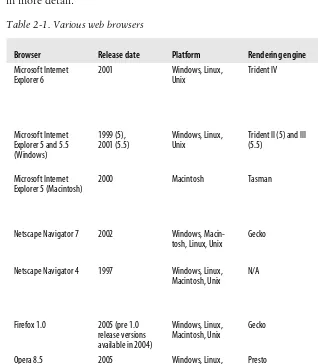
Table 2-1 lists the browsers and their release dates, platforms, rendering engines, and level of standards support, while the following sections describe each browser in more detail.
Table 2-1. Various web browsers
Browser Release date Platform Rendering engine Standardssupport Microsoft Internet
Explorer 6 2001 Windows, Linux,Unix Trident IV CSS 1, some CSS 2,some CSS 3, ECMA-Script, DOM (with
2001 (5.5) Windows, Linux,Unix Trident II (5) and III(5.5) Most CSS 1, someCSS 2 (with bugs), partial support of ECMAScript/DOM Microsoft Internet
Explorer 5 (Macintosh) 2000 Macintosh Tasman CSS 1, some CSS 2,some CSS 3, ECMA-Script, DOM (buggy and not complete) Netscape Navigator 7 2002 Windows,
Macin-tosh, Linux, Unix Gecko CSS 1, most CSS 2,ECMAScript, DOM
Netscape Navigator 4 1997 Windows, Linux,
Macintosh, Unix N/A Some basic CSS 1,JavaScript,noDOM because it was written after NN4’s release Firefox 1.0 2005 (pre 1.0
release versions available in 2004)
Windows, Linux,
Macintosh, Unix Gecko CSS 1, most CSS 2,some CSS 3, ECMA-Script, DOM Opera 8.5 2005 Windows, Linux,
Macintosh, Unix Presto CSS 1, most CSS 2,ECMAScript, DOM (Opera 7 was the first version with DOM support)
Safari 2002 Macintosh OS X KHTML most CSS 1, some
16 | Chapter 2: Designing for a Variety of Browsers
Microsoft Internet Explorer 6
Internet Explorer 6 is the browser that comes with Windows XP, although it is also available for older Windows versions. As this book goes to press, Version 6 alone currently accounts for more than half of all web usage. Unfortunately, it is also notorious for inconsistent standards support. Microsoft has plans to release IE 7, which promises better security (the Achilles’ heel of previous versions) and better standards support, with special attention to Cascading Style Sheets Level 2.1. For information on designing for Internet Explorer, visit Microsoft’s Internet Explorer Developer Center (part of its MSDN online developer’s network) at msdn.microsoft.com/ie/default.aspx. Additional information is available on the Microsoft product pages atwww.microsoft.com/windows/ie/.
Microsoft Internet Explorer 5 and 5.5 (Windows)
Released in early 1999, IE 5 was the first major browser with XML support. Because it is tied to several older Windows versions, it still accounts for 5 to 10% of browser usage as of this writing.
Microsoft Internet Explorer 5 (Macintosh)
Internet Explorer 5 for the Macintosh was released in 2000 and offered never before seen high levels of standards compliance and features that even IE 6 for Windows has yet to match. Microsoft stopped development with Version 5.2.3 but still offers free downloads of the latest versions of IE 5/Mac for OSX (5.2.3) and OS 9 (5.1.7).
Netscape Navigator 7
This latest version of Navigator was released in 2002, with additional 7.x releases in 2003 and 2004. It is essentially the Mozilla browser wrapped in the Netscape brand. It accounts for a startlingly small share of web traffic (less than 1%). Netscape’s previous meaningful release was Version 6, which was years in the making, had numerous problems with standards and failed to gain back the market share gobbled up by Internet Explorer during its overlong development. A beta of Version 8 is available as of this writing.
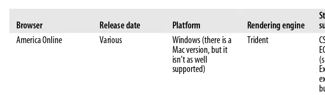
America Online Various Windows (there is a Mac version, but it isn’t as well supported)
Trident CSS 1, some CSS 2, ECMAScript, DOM (same as Internet Explorer, but expect additional buggy behavior)
Lynx 1993 Unix, Windows,
Macintosh N/A N/A
Table 2-1. Various web browsers (continued)
Browser Roll-Call | 17
A Variety of
Browsers
For information about the Netscape browser, go tobrowser.netscape.com. Starting in October 2004, Netscape shut down its online developer resources. Mozilla.org is trying to gain rights to archive and publish those documents.
Netscape Navigator 4
Netscape Navigator and Communicator 4 was once the king of the browser world. Now its user base has dwindled to a fraction of a percent. Even so, web developers may consider a site’s performance in Navigator 4 because it is typical of browsers with minimal support for current standards such as Cascading Style Sheets. Also, web developers can assume that users who still use Netscape 4 really have no alternative, for instance, because it is installed by their organization or is built into an application. While designers generally don’t worry about matching layouts exactly in Netscape 4, it is critical that no content gets lost and that advanced CSS or scripting techniques don’t crash the browser.
Firefox 1.0
Firefox (previously Firebird) is an open source browser based on Mozilla code. Its popularity exploded in the development community for being small, fast, and highly standards compliant. It also offers features such as tabbed browsing, pop-up blockers, integrated Google search, and better security than Internet Explorer, enabling Firefox to be the first browser to take a bite out of IE’s market share. Because it is open source, many useful extensions have been created for it (see the sidebar, “Web Developer Extension for Firefox”).
Download and find out more about Firefox at the Mozilla web site, www. mozilla.org.
Opera 8.5
Opera is a lean and mean browser created by Opera Software in Oslo, Norway. Opera is respected for its exact compliance with HTML and CSS standards,
Web Developer Extension for Firefox
Web developers are raving about the Web Developer extension for Firefox created by Chris Pederick. The extension adds a toolbar to the browser with tools that enable you to analyze and manipulate any page in the window. For example, you can edit the style sheet for the page you are viewing or apply your own. You can get information about the HTML and graphics on the page. It also allows you to validate the CSS, HTML, and accessibility of a web page. Download the Web Developer extension at chrispederick.com/work/firefox/ webdeveloper/.


![[OWS Common] Define XML and JSON schema for a web linking structure based on RFC 5988](data:image/gif;base64,R0lGODlhAQABAIAAAP///wAAACH5BAEAAAAALAAAAAABAAEAAAICRAEAOw==)