Find a complete correlation to the current AP® Statistics curriculum framework at www.highschool.bfwpub.com/tps6e.
About the Authors
In recognition of his outstanding work as an educator, Josh was named one of five finalists for Arizona Teacher of the Year in 2011. Josh is also the co-author of the popular level text Statistics and Probability with Applications.
Content Advisory Board and Supplements Team
She has taught AP® statistics for 10 years and served as an AP® reader for 7 years. Leigh has taught AP® Statistics for 13 years and has served as an AP® Statistics Reader for the past 8 years.
Acknowledgments
Josh's willingness to take on half the chapters in this edition pays tribute to his unwavering commitment in. A final note from Josh: I have thoroughly enjoyed working with Daren Starnes on this edition of TPS.
Sixth Edition Survey Participants and Reviewers
John Powers, Cardinal Gibbons High School, Fort Lauderdale, FL Jessica Quinn, Mayfield Senior School, Pasadena, CA. Jenny Thom-Carroll, West Essex Senior High School, North Caldwell, NJ Tara Truesdale, Ben Lippen School, Columbia, SC.
Fifth Edition Survey Participants and Reviewers
Andre Mathurin, Bellarmine College Preparatory, San José, CA Brett Mertens, Crean Lutheran High School, Irvine, CA. Sara Moneypenny, East High School, Denver, CO Mary Mortlock, The Harker School, San José, CA.
Fourth Edition Focus Group Participants and Reviewers
Casey Koopmans, Bridgman Public Schools, Bridgman, MI David Lee, Sun Prairie High School, Sun Prairie, WI. Luke Wilcox, Hoërskool East Kentwood, Grand Rapids, MI Thomas Young, Woodstock Akademie, Putnam, CT.
To the Student
Statistical Thinking and You
The main ideas of statistics, like the main ideas of any important subject, took a long time to discover and therefore take some time to master.
TPS and AP ® Statistics
See how the book can help you succeed in the AP® Statistics course and exam. READ THE TEXT and use the features of the book to help you grasp the big ideas.
READ THE TEXT and use the book’s features to help you grasp the big ideas
LEARN STATISTICS BY DOING STATISTICS
EXERCISES: Practice makes perfect!
REVIEW and PRACTICE for quizzes and tests and the AP ® STATISTICS EXAM
Use TECHNOLOGY to discover and analyze
Overview: What Is Statistics?
Statistics Is the Science of Learning from Data
Data Beat Personal Experiences
Do Cell Phones Cause Brain Cancer?
Where the Data Come from Matters
Are You Kidding Me?
Who Talks More—Women or Men?
Always Plot Your Data
Do People Live Longer in Wealthier Countries?
Variation Is Everywhere
Have Most Students Cheated on a Test?
Data Analysis
INTRODUCTION Statistics: The Science and Art of Data
Organizing Data
The numbers in the household column in the data table are only labels for the individuals in that data set. The distribution of a variable tells us what values the variable takes and how often it takes these values.
CHECK YOUR UNDERSTANDING
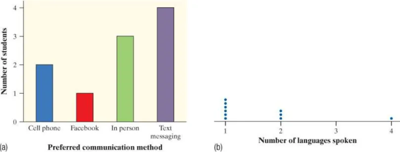
We can see that 6 students speak one language, 3 students speak two languages and 1 student speaks four languages.
From Data Analysis to Inference
As the activity illustrates, the logic of the conclusion rests on asking, "What are the chances?" Probability, the study of random behavior, is the subject of Chapters 5-7.
Introduction Summary
Introduction Exercises
- Skyscrapers Here is some information about the tallest buildings in the world as of
- Protecting wood What measures can be taken, especially when restoring historic wooden buildings, to help wood surfaces resist weathering? In a study of this question, researchers
- Medical study variables Data from a medical study contain values of many variables for each subject in the study. Some of the variables recorded were gender (female or male); age
- Ranking colleges Popular magazines rank colleges and universities on their “academic quality” in serving undergraduate students. Describe two categorical variables and two
- Social media You are preparing to study the social media habits of high school students
- Analyzing Categorical Data
SMS messages Mobile phone SMS messages SMS messages SMS messages We can summarize the distribution of this categorical variable with a frequency table or a relative frequency table. Of course, it would be difficult to create a frequency table or a relative frequency table for quantitative data that takes on many different values, such as the ages of people attending a Major League Baseball game.
Displaying Categorical Data: Bar Graphs and Pie Charts
To the left of the vertical axis, indicate whether the graph shows the frequency (number) or relative frequency (percent or proportion) of individuals in each category. Our eyes respond to the area of the bars as well as their height.
Analyzing Data on Two Categorical Variables
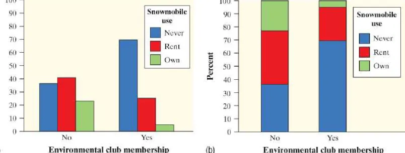
These percentages or proportions are known as marginal relative frequencies because they are calculated using the values at the edges of the two-way table. What proportion of people in the sample are not members of an environmental club and never use snowmobiles.
Relationships Between Two Categorical Variables
Summary
The distribution of a categorical variable lists the categories and indicates the frequency (number) or relative frequency (percentage or proportion) of individuals who fall into each category. You can use a pie chart or bar chart to show the distribution of a categorical variable.
Beware of graphs that mislead the eye. Look at the scales to see if they have been distorted
- Technology Corner
Exercises
- Buying cameras The brands of the last 45 digital single-lens reflex (SLR) cameras sold on a popular Internet auction site are listed here. Make a relative frequency bar graph for
- Disc dogs Here is a list of the breeds of dogs that won the World Canine Disc
- Cool car colors The most popular colors for cars and light trucks change over time. Silver advanced past green in 2000 to become the most popular color worldwide, then gave way
- Spam Email spam is the curse of the Internet. Here is a relative frequency table that summarizes data on the most common types of spam: 10
- Hispanic origins Here is a pie chart prepared by the Census Bureau to show the origin of the more than 50 million Hispanics in the United States in 2010. 11 About what percent of
- Binge-watching Do you “binge-watch” television series by viewing multiple episodes of a series at one sitting? A survey of 800 people who binge-watch were asked how many
- Support the court? A news network reported the results of a survey about a controversial court decision. The network initially posted on its website a bar graph of the data similar
- Superpowers A total of 415 children from the United Kingdom and the United States who completed a survey in a recent year were randomly selected. Each student’s country
- Python eggs How is the hatching of water python eggs influenced by the temperature of the snake’s nest? Researchers randomly assigned newly laid eggs to one of three water
- Superpower Refer to Exercise 24
- Superpower Refer to Exercise 24
- Body image Refer to Exercise 25
- Python eggs Refer to Exercise 26
- Far from home A survey asked first-year college students, “How many miles is this college from your permanent home?” Students had to choose from the following options
- Who goes to movies? The bar graph displays data on the percent of people in several age groups who attended a movie in the past 12 months. 21
- Marginal totals aren’t the whole story Here are the row and column totals for a two-way table with two rows and two columns
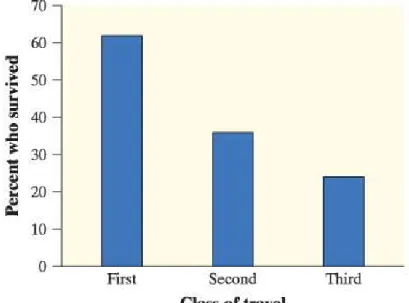
- Women and children first? Here’s another table that summarizes data on survival status by gender and class of travel on the Titanic
- Simpson’s paradox Accident victims are sometimes taken by helicopter from the
Approximately how fast were the cars going when they crashed into each other?" For another 50 randomly assigned subjects, the words "hit" were replaced with "hit". The remaining 50 subjects - the control group - were not asked to estimate speed. Do you feel that you are overweight, underweight or about right?” The two-way table summarizes the data on perceived body image by gender.16. Find the distribution of superpower preference for the students in the sample from each country (ie, the United States and the United Kingdom).
Displaying Quantitative Data with Graphs
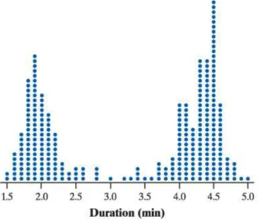
Dotplots
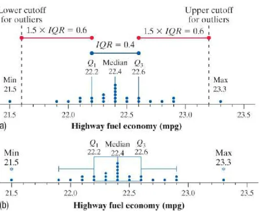
Start the horizontal axis at a convenient number equal to or less than the minimum value and place ticks at equal intervals until you reach or exceed the maximum value. PROBLEM: The Environmental Protection Agency (EPA) is charged with determining and reporting fuel economy ratings for automobiles. To estimate fuel economy, the EPA conducts tests on multiple vehicles of the same make, model, and year.
Describing Shape
A distribution is skewed to the right if the right side of the graph is much longer than the left. A distribution is skewed to the left if the left side of the graph is much longer than the right. The distribution of statistics quiz scores is skewed to the left with one peak at 20 (a perfect score).
Describing Distributions
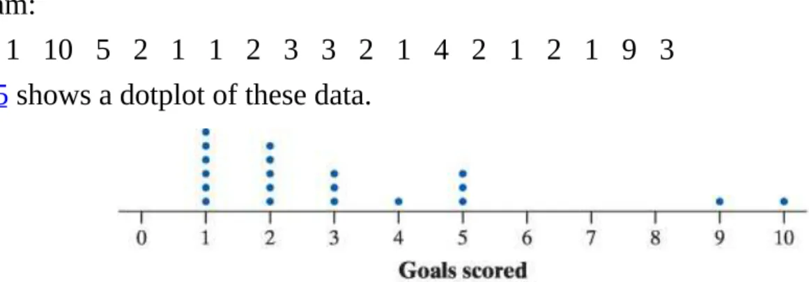
Shape: The distribution of goals scored is skewed to the right, with a single peak at 1 goal. Shape: The distribution of highway fuel economy ratings is roughly symmetrical, with a single peak at 22.4 mpg. Be sure to include context when discussing the variable of interest, highway fuel economy estimates.
Comparing Distributions
The distribution of household sizes for the South African sample is skewed to the right, with one peak at 4 persons and a clear gap between 15 and 26. Variability: Household sizes for South African students vary more (from 3 to 26 persons). ) as for the UK Note that in the previous example we discussed the household size distribution for only two samples of 50 students.
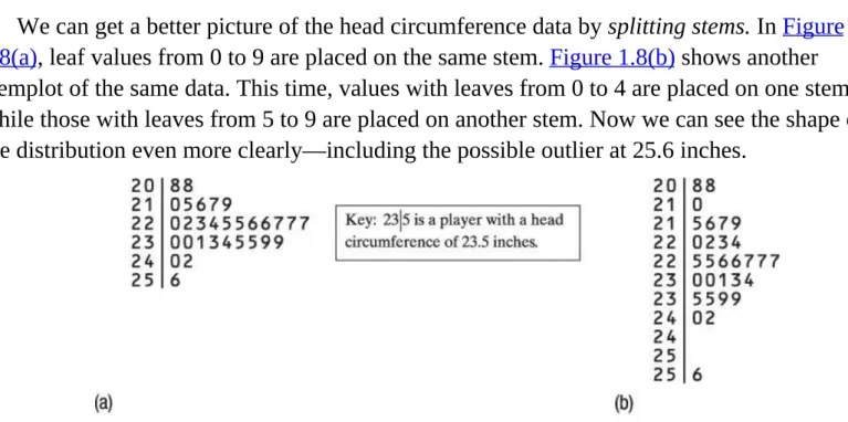
Stemplots
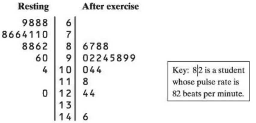
Also, the distribution of pulse rates for these 19 students is skewed to the right (toward the larger values). Now we can see the shape of the distribution even more clearly—including the possible outlier of 25.6 inches. You can use a back-to-back stem plot with common stems to compare the distribution of a quantitative variable in two groups.
Histograms
Technology Corner MAKING HISTOGRAMS
Press WINDOW and enter the values shown for Xmin, Xmax, Xscl, Ymin, Ymax and Yscl. Many people believe that the distribution of IQ scores follows a "bell curve," like the one shown. The IQ scores of 60 fifth grade students randomly selected from one school are shown here.24.
Using Histograms Wisely
Summary
- Technology Corner
Some distributions have simple shapes, such as symmetric, skewed to the left, or skewed to the right. When examining a graph of quantitative data, look for a general pattern and any obvious deviations from that pattern. When comparing distributions of quantitative data, be sure to compare shape, center, variability, and possible outliers.
Exercises
- Easy reading? Here are data on the lengths of the first 25 words on a randomly selected page from Toni Morrison’s Song of Solomon
- Fuel efficiency The dotplot shows the difference (Highway − City) in EPA mileage ratings, in miles per gallon (mpg) for each of 24 model year 2018 cars
- Pair-a-dice The dotplot shows the results of rolling a pair of fair, six-sided dice and
- Feeling sleepy? Refer to Exercise 45. Describe the shape of the distribution
- Easy reading? Refer to Exercise 46. Describe the shape of the distribution
- Fuel efficiency Refer to Exercise 48. Describe the distribution
- Healthy streams Nitrates are organic compounds that are a main ingredient in fertilizers
- Enhancing creativity Do external rewards—things like money, praise, fame, and grades
- Healthy cereal? Researchers collected data on 76 brands of cereal at a local
- pg 38 Snickers ® are fun! Here are the weights (in grams) of 17 Snickers Fun Size bars from a single bag
- South Carolina counties Here is a stemplot of the areas of the 46 counties in South Carolina. Note that the data have been rounded to the nearest 10 square miles (mi 2 )
- Shopping spree The stemplot displays data on the amount spent by 50 shoppers at a grocery store. Note that the values have been rounded to the nearest dollar
- Where do the young live? Here is a stemplot of the percent of residents aged 25 to 34 in each of the 50 states
- Traveling to work How long do people travel each day to get to work? The following table gives the average travel times to work (in minutes) for workers in each state and the
- Country music The lengths, in minutes, of the 50 most popular mp3 downloads of songs by country artist Dierks Bentley are given here
- Returns on common stocks The return on a stock is the change in its market price plus
- Paying for championships Does paying high salaries lead to more victories in
- Strong paper towels In commercials for Bounty paper towels, the manufacturer claims that they are the “quicker picker-upper,” but are they also the stronger picker-upper? Two
- Birth months Imagine asking a random sample of 60 students from your school about their birth months. Draw a plausible (believable) graph of the distribution of birth months
- Risks of playing soccer (1.1) A study in Sweden looked at former elite soccer players, people who had played soccer but not at the elite level, and people of the same age who
Is the variability in the sugar content of the grains on the three shelves similar or different? Which of the following best describes the shape of the height distribution. Which of the following is the best reason to choose a stem plot instead of a histogram to show the distribution of a quantitative variable.
Describing Quantitative Data with Numbers
Measuring Center: The Mean
Calculate the average number of goals scored per game by the team in the other 18 games that season. The preceding example illustrates an important weakness of the mean as a measure of center: the mean is sensitive to extreme values in a distribution. What is the relationship between the location of the pencil and the average of the five data values and 6.
Measuring Center: The Median
Now move another penny so that the ruler balances again without moving the pencil. Now move the remaining two pennies from the 6 inch mark so that the ruler still balances with the pencil in the same place. 20 data values (an even number), the median is the average of the middle two values in the sorted list.
Comparing the Mean and the Median
If the distribution is highly skewed, the mean will be drawn in the direction of. The median salary for MLB players in 2016 was about $1.5 million — but the average salary was about $4.4 million. Will you use the mean or median to summarize the typical weight of a pumpkin in this contest.
Measuring Variability: The Range
Here is the number of goals scored in 20 games played by the USA in 2016. In everyday language, people sometimes say things like, "Data values range from 1 to 10." The correct statement is: “The number of goals scored in 20 games played by the USA in 2016. Without the possible deviations at 9 and 10 goals, the spread of the distribution would be reduced to 5 − 1 = 4 goals.
Measuring Variability: The Standard Deviation
The standard deviation measures the typical distance of the values in a distribution from the mean. When referring to the standard deviation of a population, we use the symbol σ (Greek sigma with lowercase letters). The value obtained before the square root of the standard deviation calculation is known as the variance.
Measuring Variability: The Interquartile Range (IQR)
The first quartile Q1 is the median of the data values that are to the left of the median in the ordered list. The third quartile Q3 is the median of the data values that are to the right of the median in the sorted list. Note that the IQR is simply the range of the "middle half" of the distribution.
Numerical Summaries with Technology
Output from statistical software We used Minitab statistical software to calculate descriptive statistics for the boys’ shoes data. Minitab allows you to choose which
Identifying Outliers
There are no data values less than -4.25, but the match in which the team scored 10 goals is an outlier. The game in which the team scored 9 goals is not identified as an outlier by the 1.5 × IQR rule. For example, in a chart of net worth, Bill Gates would likely be an outlier.
Making and Interpreting Boxplots
Draw whiskers - lines that extend from the edges of the box to the smallest and largest data values that are not outliers. Explain why the mean and IQR would be a better choice for summarizing the center and variability of the distribution of pumpkin weights than the mean and standard deviation. But a data box hides this important information about the shape of the distribution.
Comparing Distributions with Boxplots
- Technology Corner MAKING BOXPLOTS
- Summary
- Page 73
- Technology Corners
- Exercises
- Pulse rates Here are data on the resting pulse rates (in beats per minute) of 19 middle school students
- Pulse rates Refer to Exercise 88
- Electing the president To become president of the United States, a candidate does not have to receive a majority of the popular vote. The candidate does have to win a majority
- Birthrates in Africa One of the important factors in determining population growth rates is the birthrate per 1000 individuals in a population. The dotplot shows the birthrates per
- Shakespeare The histogram shows the distribution of lengths of words used in Shakespeare’s plays. 42
- Quiz grades Refer to Exercise 87
- Pulse rates Refer to Exercise 88
- Wrap-Up
The standard deviation sx gives the typical distance of the values in a distribution from the mean. What would you guess, the shape of the distribution is based only on the computer output. Explain why the median and IQR would be better choices for summarizing the center and variability of the distribution of electoral votes than the mean and standard.
FRAPPY! FREE RESPONSE AP ® PROBLEM, YAY!
Review
In this section, you learned how to create three different types of graphs for quantitative. To measure the center of a distribution of quantitative data, you learned how to calculate the mean and median of a distribution. To measure the variability of the distribution of quantitative data, you learned to calculate the range, standard deviation, and interquartile range.
What Did You Learn?
Review Exercises
R1.6 Density of the Earth In 1798, the English scientist Henry Cavendish measured the density of the Earth several times by carefully working with a torsion balance. The variable recorded was soil density as a multiple of water density. Identify the aspect of the distribution that one graph reveals but the other does not.
AP ® Statistics Practice Test
Multiple Choice Select the best answer for each question
The age of the houses in the sample generally ranges around 16 years from the average age. Because not all questionnaires are returned, researchers decided to investigate the relationship between response rate and company size. Some results for the low concentration of herbicide show a smaller percentage of weeds than some results for the high concentration.
Free Response Show all your work. Indicate clearly the methods you use, because you will be graded on the correctness of your methods as well as on the accuracy and
Project American Community Survey
See the code sheet on the book's website for details on how each variable is recorded. Note that all categorical variables are coded to have numerical values in the table. For example, you can compare the distribution of the number of people in a household (NPF) by region.
Modeling Distributions of Data
INTRODUCTION
Describing Location in a Distribution
Find and interpret the standardized score (z-score) of an individual value in a distribution of data. From the dot plot we can see that Emily's score is above the mean (equilibrium point) of the distribution. We can also see that Emily did better on the test than most of the other students in the class.
Measuring Location: Percentiles
Using the point score, we see that Emily's 43 is the fifth highest score in the class. These students' scores are also in the 48th percentile because 12 of the 25 students in the class earned lower scores. As you saw in part (b) of the example, Maria's score of 38 placed her in the 48th percentile of the distribution.
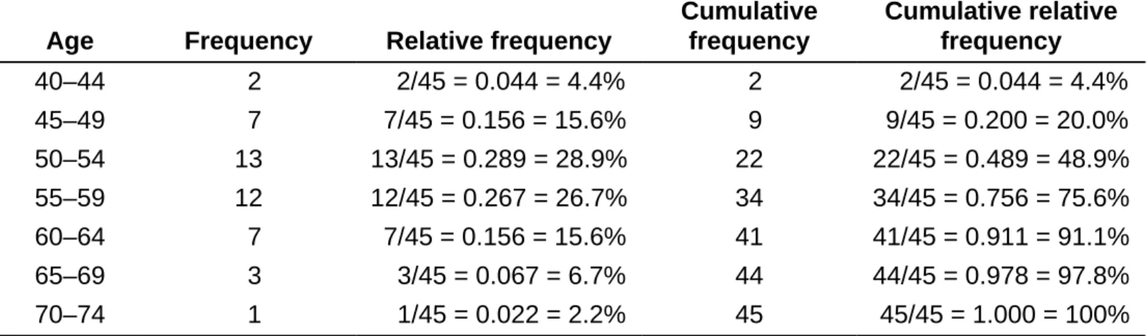
Cumulative Relative Frequency Graphs
For the cumulative relative frequency column, divide the entries in the cumulative frequency column by 45, the total number of presidents. The rightmost point in the graph is plotted above age 75 and has a cumulative relative frequency of 100%. A cumulative relative frequency plot can be used to describe an individual's position within a distribution or to locate a specified percentile of the distribution.