The purpose of this chapter is to become familiar with the questionnaire and the types of analyzes that can be performed on the data. In this chapter you will learn how to code the data for SPSS, set up an SPSS database, and enter data from 30 questionnaires.
Getting a copy of SPSS
For the entire 10-11 session module, this book could be supplemented with additional material covering more advanced analysis (eg ANOVA and regression analysis) or students could design (and carry out) their own study (in groups) based on the analysis covered in the book. This requires students to write a structured report presenting the "most relevant analyses," along with some discussion of the results, critical reflections on the survey, and recommendations for further research.
Acknowledgements
This begins with a formal lecture introducing the questionnaire, data set and related analysis (Chapter 1), and then students (in pairs) work through the materials at their own pace, continuing with independent study. Again, this begins with a brief introduction to the questionnaire, data set, and types of analysis, with guided instructions for specific exercises from each of the chapters.
A questionnaire and what to do with it: types of data and
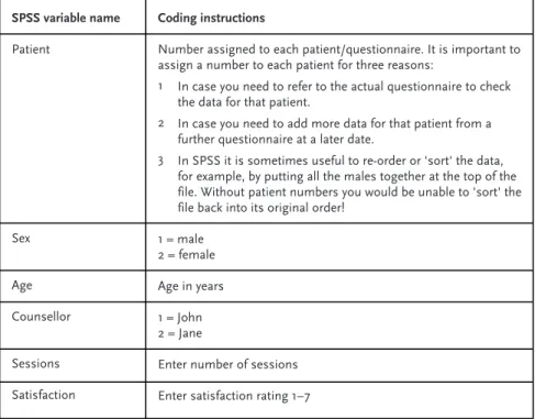
The questionnaire
As Robson points out: 'The desire to use open-ended questions appears to be almost universal among novice survey researchers, but is usually extinguished with experience. In the counseling questionnaire, you may also notice that the question asking for the age of patients may have provided a list of age groups, for example.
What types of analyses can we perform on this questionnaire?
- Descriptive statistics
- Relationships and differences in the data
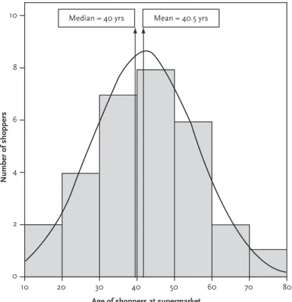
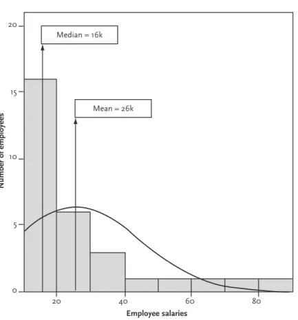
We have also seen that the validity of reporting the mean or median depends on the distribution of the data. Obviously, the most appropriate measure of central tendency should be used – the mean or the median – and this will depend on the distribution of the data.
Summary
- Exercises
- Types of data
- Measures of central tendency
- Correlation
- Independent and dependent variables
- What type of analysis?
- Notes
What do you think would be the most representative measure of central tendency for the following data. a) the number of days students at the university took to return overdue library books; What type of analysis would you conduct to examine the following? a) the relationship between gender and preference for a cat or dog as a pet;.
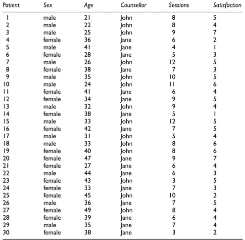
Coding the data for SPSS, setting up an SPSS database
- The dataset
- Coding the data for SPSS
- Setting up an SPSS database
- Defining the variables
- Adding value labels
- Entering the data
- Exercises
- Viewing value labels
- Sorting the data
For example, if the data forms part of a database where you need to retain the names of individuals. Then move to the next cell (press the right arrow on your keyboard) and enter the data for each patient according to the data in Table 2.1.
Notes
5 To get the data back in its original order, go back to Data/Sort cases. Double-click (left mouse button) on Patient to sort the data back into the original order. And note that we would not have been able to do this if we had not numbered each patient/questionnaire.).
Descriptive statistics
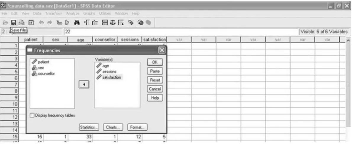
Frequencies
When we have missing data, the values for percentage and valid percentage are different. This is because the percentage column calculates percentages for all data - including missing data.
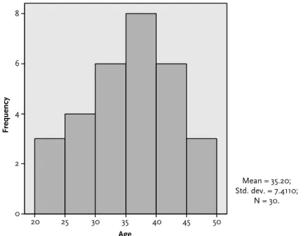
Measures of central tendency for interval variables
Since these values for the mean and median are very similar, this tells us that our data are not skewed toward one end of the scale (as we discussed in detail in Chapter 1). The mean/median age, number of sessions and satisfaction rating along with the range of values for each of these variables.
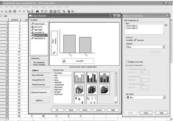
Using graphs to visually illustrate the data
- Bar charts
- Histograms
- Editing a chart
- Boxplots
- Navigating the Output Viewer
Also on the right side of the graph there is information about the mean, standard deviation (discussed later) and number of students you might want to remove. Finally, I produced the following version of the histogram - after editing the labels and removing the data on the right side of the graph. Then, from the menu at the top of the screen, click Edit and Copy Chart.
Summary
Ending the SPSS session
Exercises
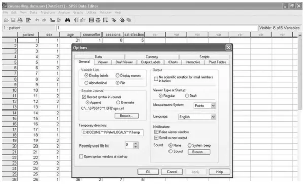
If you click on the PivotTables tab, you can choose the format of your tables. You may want to choose smallfont.tlo to save paper when printing the results of many analyses. So if you want to import a table from SPSS into a file that you submit to a journal, you can use one of the academic formats shown in Table 3.5.
Notes
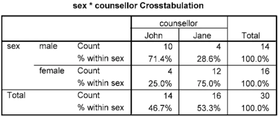
Cross-tabulation and the chi-square statistic
- Introduction
- Cross-tabulating data in the questionnaire
- The chi-square statistical test
- Levels of statistical significance
- Re-coding interval variables into categorical variables
- Summary
- Exercises
- Re-code counselling sessions into categories
- Re-code satisfaction ratings into categories
- Can you do a chi-square with just this data?
- Notes
What the chi-square statistic does is calculate the odds that this distribution occurs by chance. The SPSS Output Viewer should produce the crosstab table and a table showing chi-square and related tests. But then you'll also add that the chi-square statistic showed that this was statistically significant: χ2= 6.467, p = .011.
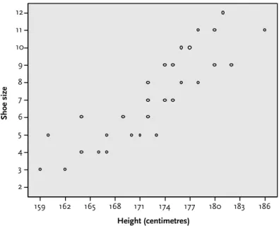
Correlation: examining relationships between
Introduction
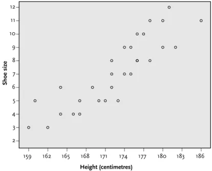
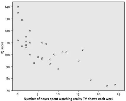
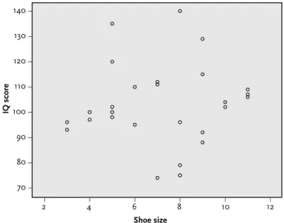
Examining correlations in the questionnaire
- Producing a scatterplot in SPSS
- The strength of a correlation
- The coefficient of determination
This should produce the following output table, showing that the Pearson correlation between sessions and satisfaction is 0.53. But what does this 'strong correlation' of 0.53 actually mean in terms of 'predicting' one value over another. This is called the coefficient of determination (r2) and provides a measure of the extent to which one variable 'predicts' the other by simply squaring the correlation value.
- Summary
- Exercises
- Produce scatterplots and correlations for the other interval variables
- The importance of sample sizes in correlation
- The importance of ‘outliers’ in correlation
- Explain the following correlations 3
- Notes
We must therefore conclude that satisfaction rates are related to the number of counseling sessions, but that this explains only 28 percent of the variance; there are other factors at play. What do the results show in terms of (a) the strength and direction of any correlations; and (b) the statistical significance of the results. Highlight the 30 cases for age, right-click and copy, then move your cursor to the end of the age data column (row 31) and paste the data you copied.
Examining differences
- Introduction
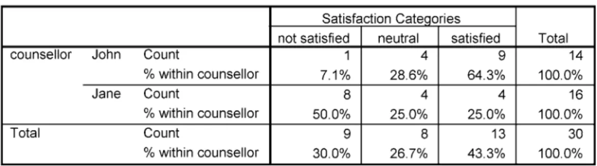
- Comparing satisfaction ratings for the two counsellors
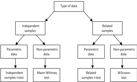
- Independent or related samples?
- Parametric or non-parametric test?
- Comparing the number of sessions for each counsellor
- Summary
- Exercises
- Checking for other significant differences
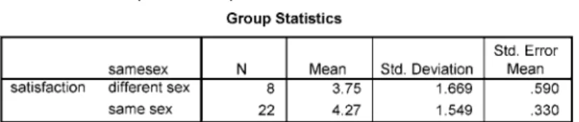
- Create a new variable to analyse same-sex satisfaction ratings
- Notes
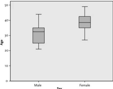
1 From the menu at the top of the screen, click Analyze, then Compare Means, then Independent Samples t-test. This is shown graphically in the boxplots (below), where we can see that the spread of scores is slightly wider in the ratings for Jane. This means that we can only be confident that the difference in the two advisors' ratings is at least 0.28, which is not much.
Reporting the results and presenting the data
Introduction
Structuring the report
The abstract
The introduction
3 Materials: What materials were used in the study to conduct the research and collect the data. It was either posted to the participants, who completed it and then returned it, or it was completed in the presence of the researcher. Remember, the reader must be able to replicate your process based on the details you provide in the report.
Results
The key to the method section is clarity and specificity, so that a reader can replicate the method and procedure of your study from the information you provide in the report. The reader should not turn the page and suddenly be confronted with a figure floating in the air: introduce the figure in the text and then explain it. I have included some examples of graphs from previous assignments in the last section of this chapter that serve to illustrate how not to present data.
Discussion
This makes the text more interesting than simply listing a bunch of analyses; it turns the report into a story with twists. Graphs, figures and tables must be understandable without reference to the text, so they must be clearly numbered and captioned, and fully labeled with all units of measurement. Within the text, you should guide the reader through the table or figure and draw attention to the relevant data.
Conclusion
Appendices
How not to present data
If we were to glance at just the two bars, it would appear that there are at least three times as many full-time students as there are part-time students. But if you look at the Y-axis, you'll see that there are actually only twice as many: six part-time and 12 full-time. 3 There are no numbers or percentages with the pie chart (although the table provides these).
Concluding remarks
Answers to the quiz and exercises
Recoding counselling sessions into categories
From Section 2 of Chapter 3, we know that the number of counseling sessions ranged from 3 to 12 (running a simple frequency analysis will confirm this). From the scatterplot we can see that there appears to be a weak negative correlation between age and the number of sessions. Try running the Pearson correlation between age and number of sessions again, but this time with twice as many cases for each of these variables.
Explain the following correlations
Here's a hint: first you'll need to create a new variable (using Transform/Compute) that records whether or not the patient saw a counselor of the same gender. 3 In the Numeric Expression field, enter the rule you will need for the new variable that will record whether or not the patient saw a consultant of the same gender. 5 Click OK and your new variable (samesex) will appear in Data View (I removed the decimal places):.
Glossary
Depending on the distribution of the data, the mean, median or mode can be used. The power of a statistical test to detect a difference may depend on the sample size (the larger the better) and the magnitude of the effect/difference being examined. In more formal terms, it refers to a rejection of the null hypothesis (no difference), when in fact it is true.
Index
Written for the complete beginner, the book is the ideal companion when doing quantitative data analysis with SPSS for the first time. The book uses a simple example of quantitative data analysis that would be typical for the health field to take you step by step through the process of data analysis. Quantitative Data Analysis Using SPSS is the ideal text for any students in health and social sciences with little or no experience of quantitative data analysis and statistics.
QUANTITATIVE DATA ANALYSIS USING SPSS
This accessible book is essential reading for those looking for a short and simple guide to basic data analysis. The data from these questionnaires is provided to you for analysis and the book walks you through the process required to analyze this data. Correlation: examining relationships between interval data Examining differences between two sets of scores Reporting results and presenting data.
AN INTRODUCTION