This article is part of the National Minimum Wage Research Initiative (NMW-RI) conducted by CSID in the Faculty of Economics and Business at the University of the Witwatersrand. 1 This paper is part of the National Minimum Wage Research Initiative (NMW-RI) conducted by CSID in the Faculty of Economics and Business at the University of the Witwatersrand.
Introduction
Datasets
Finally, in discussing how to create a measure of "low-wage" work and household poverty, we draw on the third and most recent wave (2012) of the National Income Dynamics Study (NIDS) ( National Income Dynamics Study, 2013). The latter does not include workers from the agricultural sector, and does not include firms with a turnover of less than R1 million.3 We feel confident that the QLFS datasets provide us with sufficient representation of the labor market in general, and the bottom parts of the wage distribution in particular, to use as the core data set in this paper.
The role of wages in household income, inequality and poverty
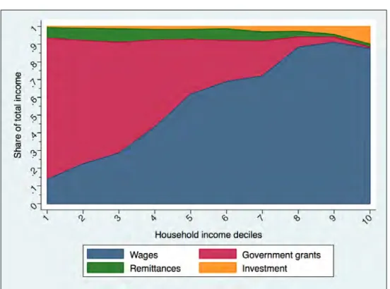
With a Gini coefficient of 0.66, South Africa is one of the most unequal societies in the world. In contrast, more than 90% of people living in the top three deciles live with at least one wage earner.
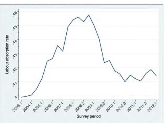
Key Labour Market Trends Over Time
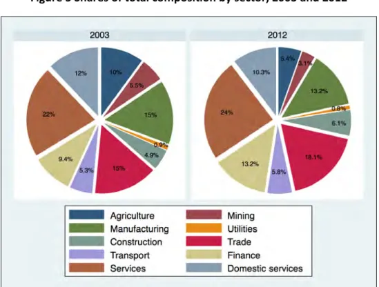
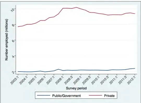
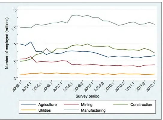
Industry composition
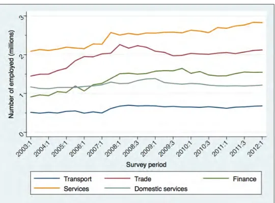
The trends in Figure 4, which also shows the composition of the labor force by sector, are generally upward. The impact of the 2008/2009 financial crisis on employment in the private sector is clearly visible in the figure.
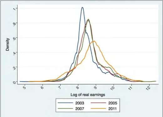
Earnings
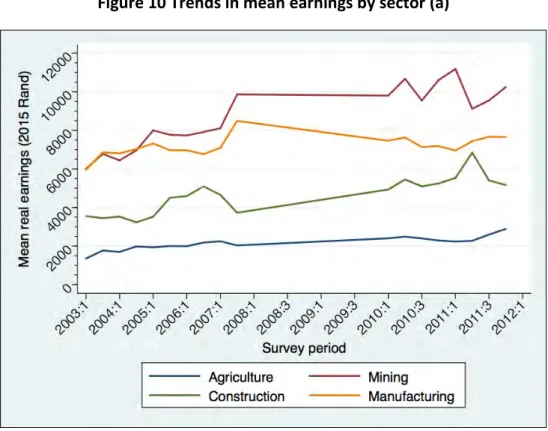
In contrast to Figure 10 and Figure 12, which show trends in average incomes, the next two figures show trends in the median, by sector. The real median in the industry grew from R3 750 to R4 197, and this was also much slower than the growth in the real average.
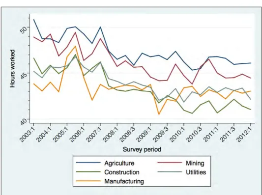
Hours worked
Average earnings in Gauteng are always above earnings in the other provinces, which are more aggregated at the start of the period than at the end of it. Workers in the private sector tended to work between 3 and 4 hours more per week than their counterparts in the public sector, as shown in Figure 21. Differences in the average number of hours worked per week by population group and gender are shown in Figure 22 and Figure 23.
African and Asian/Indian workers tended to work more hours per week than white and people of color workers, although this difference decreased somewhat over time. In terms of gender, men worked on average four to five hours more per week than women, and this may go some way to explaining the gender gap in earnings discussed earlier.
Hourly wages
Inequality and the distribution of wages
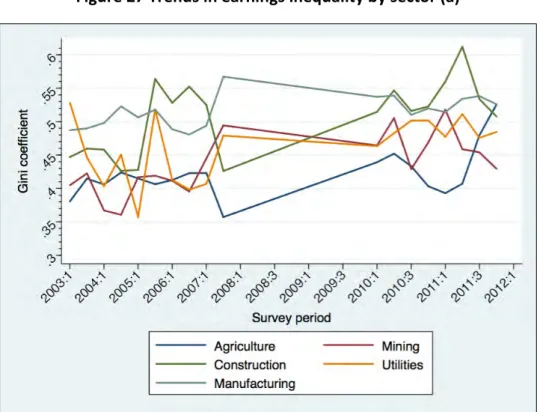
This increase in inequality occurred at the same time as a significant increase in the real average (114% in agriculture and 45% in construction). This suggests that real wage increases in these two sectors have not benefited everyone equally. Inequality in the service sector decreased over time, but this will not have a large impact on overall income inequality, due to the relatively low proportion of workers employed in that sector.
The distribution of Gini coefficients was wider at the beginning of the period than at the end. This speaks to the patterns in Figure 29, which show that inequality within each sector has become more pronounced over time, even as inequality between sectors has declined. This explains why the overall Gini coefficient of wages has remained almost constant, even though the dynamics within each sector have tended towards greater inequality.
The financial sector has always been the most unequal, while domestic services have been the most equal. The latter is the sector with the lowest average wages, as shown in the previous paragraph. The key finding from these figures is that many of the labor market sectors started and ended the period with high levels of inequality.
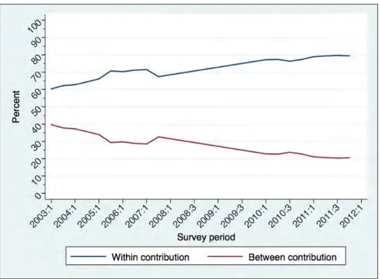
Inequality decomposition
We now consider the wage shares that accumulate for each decile in the earnings distribution over time. The lower half of the labor market is evident, as the total share reaches 60%. The share of wages going to the highest-paid decile alone is about 40%, and this is slightly more than double the share going to the top 10% of the earnings distribution (the ninth decile).
Interestingly, the share of total income that goes to the top decile in the household income distribution (as opposed to the income distribution) is about 60% (Leibrandt et al., 2010). A higher number of wage earners per family in the top decile, as well as the relatively high percentage of this decile in investment income (see Figure 1) are possible explanations. For example, in the mid-2000s, the 90/10 income ratio for Brazil, another highly unequal society, was approximately 7 (Arnal and Förster, 2010).
Earnings inequality for African and colored workers was generally higher than inequality for the Asian/Indian and white groups. If we extend the x-axis to the left to the beginning of the post-apartheid period (not shown), we see that most of the growth in inequality occurred between 1995 and 2000. Third, income inequality within the African population very high. and wages for Africans are far below those of whites on average.
The contemporary labour market
Composition
Earnings
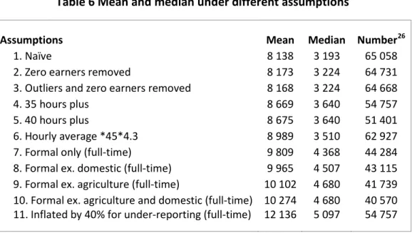
Limiting the sample to reflect only the earnings of people in the formal sector25 reduces the sample size to less than 45,000, and increases the mean and median to R9,809 and R4,368 respectively. Applying a uniform adjustment to the entire income distribution in the QLFS data is a simple way to scale up the data to the QES, although it is almost certainly too simplistic because, for example, the degree of underreporting may be related to the level of income. Wittenberg (2014a) notes that the average QLFS wage for the mining sector is approximately 40% lower than mining wages in the QES.
We follow one of the attempts in Wittenberg (2014a) to “close the gap” between the QLFS and QES wage figures by inflating the QLFS wage figures by 40% while acknowledging “the doubt that the error could be of this magnitude”. This crude adjustment raising the average to R12 136, which is almost R2 000 higher than the next highest level in the table, while the median of R5 097 is also the highest in the table.The earnings distribution in the agricultural sector lies far to the left of the other distributions.
In the second figure, the household service distribution is also far to the left of the others, and the earnings pattern in the service sector is higher than the others. 26 “Number” refers to the number of observations in the LMDSA 2014 dataset used to calculate the means and medians under different assumptions. The average of wages in the public sector was almost R5 000 higher than the average in the private sector, and this difference was slightly lower at the median.
Inequality
Low-wage workers or the “working poor”
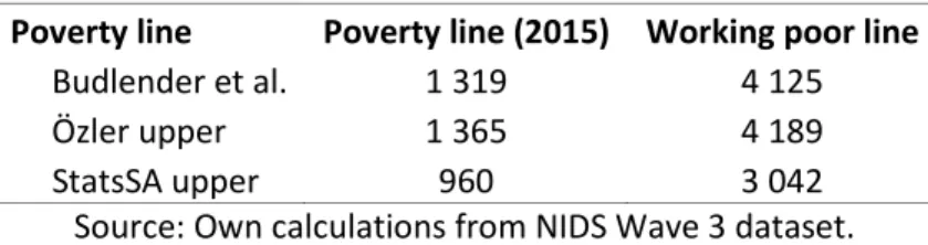
The line also enforces a strict cutoff — a household that has an income per per capita on R1 above the poverty line is considered non-poor. There can be very little difference between this household and a poor household where the income per per capita is R1 below the poverty line. The question at the heart of our definition of a worker-poor line is the following: "What wage level would it take, on average, to bring a household living below the poverty line that has at least one worker up to the poverty line?".
The lower poverty line is the food poverty line and the average amount that households with total expenditure equal to the food poverty line spend on non-food items (basic necessities). The upper poverty line is the food poverty line and the average amount that households with food expenditure equal to the poverty line spend on non-food items. This average is then added to the average poverty gap per recipient for each household—a sum sufficient to bring the per capita household income in each of those households up to the poverty line.
31 The household poverty gap, in this case, is the total amount of money required to lift a poor household up to the poverty line. The working-poor line of R4 125 is a way of combining information on individual earnings, household size and poverty into a single number to calculate the wage needed for an average poor household with at least one earner up to the poverty line too expensive The "working poor" line we present here does not serve as a recommendation, but it is useful to consider that R4 125 is the average monthly wage that would bring poor workers and their dependents up to the poverty line .
Where would potential national minimum wages bind?
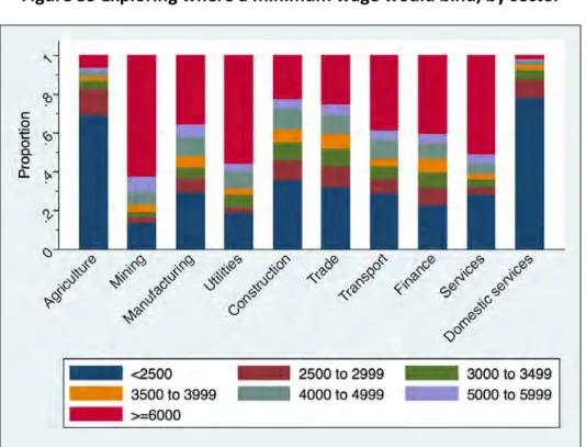
The size of each differently colored block in the figures that follow represents the proportion of workers in each subdivision in each earnings category.36. Figure 35 shows that a national minimum wage of R3 000, for example, would cover 82% of workers in the agricultural sector and 87% of those working in domestic services. Contrast this with the mining sector, where a minimum wage of R5 000 per month would bind only 35% of workers.
Wages in the construction and trade sectors look very similar to each other, with around 60% of workers earning under R4 000 in both. 46% of workers in the financial sector earn more than R5 000 per month and the corresponding percentage for those employed in construction is 28%. Figures calculating the various possible rates of under-reporting are provided in the appendix and are available from the author.
The formal sector lines look very similar to the previous figure, which is not surprising given that more than 80% of workers in our restricted sample are employed in the formal sector. Lower wages in the informal sector are reflected in the fact that more than half of workers earn less than R2500 in all industries shown except finance. A minimum wage of R5,000 would be binding on at least 90% of men and women in agriculture and manufacturing.
Conclusion
Growth, employment and inequality in Brazil, China and South Africa: An overview”, in OECD, Tackling inequalities in Brazil, China, India and South Africa:. Wage Trends in Post-Apartheid South Africa: Constructing an Earnings Series from Household Survey Data”. -apartheid development in light of the long-term legacy”, Chapter 10 in Aron, J., Kahn, B. Eds.), South African Economic Policy under Democracy.
Methodological report on rebasing of national poverty lines and development of trial provincial poverty lines”.