ISSN: 1693-6930
accredited by DGHE (DIKTI), Decree No: 51/Dikti/Kep/2010 161
Augmented Reality Prototype for Visualising Large
Sensors’ Datasets
Folorunso Olufemi A.*1, Mohd Shahrizal S.2, Ikotun Abiodun M.3
1,2
UTMVicubeLab, Dept. of Graphics and Multimedia, Universiti Teknologi Malaysia, Malaysia
3
Department of Computer Technology, Yaba College of Technology, Lagos, Nigeria e-mail: femi_folorunso@yahoo.com*1, shah@fsksm.utm.my2, abiodun_ikotun@yahoo.com3
Abstrak
Makalah ini membahas pengembangan realitas tertambah (AR) berbasis purwarupa sistem visualisasi yang mendukung identifikasi, lokalisasi, dan visualisasi untuk kumpulan data sensor kebocoran minyak. Sensor mengirim banyak kumpulan data multi-variabel yang penting selama situasi normal dan ketika terjadi kebocoran yang menjadikan proses eksplorasi dan visualisasi data sangat rumit dan membingungkan. Oleh karena itu sebuah model untuk mengelola data dan meningkatkan dukungan komputasi dibutuhkan untuk eksplorasi yang efektif disajikan dalam makalah ini. Tantangan dari metode pendekatan ini adalah untuk mengurangi ketidakefisienan data. Makalah ini menyajikan sebuah model untuk peningkatan informasi komputasi untuk setiap atribut data dan menentukan sebuah atribut awal. Atribut awal yang terkomputasi kemudian digunakan untuk pengembangan antarmuka visualisasi ilmiah berbasis AR yang secara otomatis mengidentifikasi, melokalisasi dan memvisualisasi semua data yang diperlukan dan berkaitan dengan wilayah permasalahan yang menjadi perhatian dan terpilih secara khusus pada jaringan. Sistem arsitektur dan persyaratan antar muka yang penting dan diperlukan untuk visualisasi data di sajikan pula dalam makalah ini.
Keywords: realitas tertambah, sensor data-model, sensor kebocoran kumpulan data, visualisasi ilmiah
Abstract
This paper addressed the development of an augmented reality (AR) based scientific visualization system prototype that supports identification, localisation, and 3D visualisation of oil leakages sensors datasets. Sensors generates significant amount of multivariate datasets during normal and leak situations which made data exploration and visualisation daunting tasks. Therefore a model to manage such data and enhance computational support needed for effective explorations are developed in this paper. A challenge of this approach is to reduce the data inefficiency. This paper presented a model for computing information gain for each data attributes and determine a lead attribute.The computed lead attribute is then used for the development of an AR-based scientific visualization interface which automatically identifies, localises and visualizes all necessary data relevant to a particularly selected region of interest (ROI) on the network. Necessary architectural system supports and the interface requirements for such visualizations are also presented.
Keywords: augmented reality, scientific visualization, sensor data-model, sensor leakages datasets
1. Introduction
embedded technologies in LDSs includes the volume or mass balance, the rate of change in flow or pressure, the hydraulic modelling, the pressure point analysis and the ATMOSPIPE
currently being used by Shell. Added to this, some private companies provide customised software solutions along with necessary hardware devices so that the oil companies can effectively monitor pipeline network performance. Earlier methods employed for detection is by manual inspection which has been found human-intensive and cost ineffective. This paper presents a prototype of AR to automatically detect leakages on the pipeline network and superimposed the computer-generated data onto a visual display devise that can help the oil companies to reduce extra time used for such identification and locaisation of leakages along a network of known dimension without a compromise of data reliability.
Researchers over years have tried to develop AR-based applications to support various types of datasets in several domains such as in architecture, engineering, and education. For example, [2] developed a method for visualizing terabytes texture data from digital photographs and latter presented tools for analysing the data in the real time using the Atelier3D framework. This framework, principally used by many visualisation applications such as in movies was developed over many years, it became popular because many tools used to analyze 3D data are dispersed and mostly sometimes are inappropriate for the specific context of large datasets like the ones obtained from sensors. For most sensors’ datasets, development of model is usually an accepted approach. These models usually have relatively simple structures, so, visibility culling of the data is rarely the main issue [2]. Model simplification by using quadric error metrics [3] was a popular approach, other methods such as that which renders hierarchies of points instead of meshes by [4] and the meshes vertices order technique by [5] were also developed, although this has been found disadvantageous when the rendering quality is of utmost significance [6]. The main challenge in large data visualization therefore is to be able to adapt in real-time the resolution of the rendered data to the resolution of the display [2].
Visualization techniques generally are focused on reducing the voluminous data into manageable ‘data figments’ displayable by common display devises and allows extensive exploration without a compromise of image resolution and or quality when it is desired. Visualisation of large datasets especially the ones that has a link with information browsing was developed by [7]. However, because their model could only be used with static datasets, it is inapplicable for sensors’ applications. In a position paper on sensor data visualization on outdoor augmented reality, [8] presented the visualisation of carbon monoxide (CO) sensor data as an example of visualisation approach that supports dynamic sensor data with inputs from a ‘data importer’ using the SiteLens system earlier proposed by them. The method employed involves the use of mobile sensors which can be used for displaying datasets as sensed on the scene in real time. Problems such as information overload, detecting the presence of hidden information and filtering visualizations are often the aftermaths of such visualisation method. Some researchers such as [9] and [10] had attempted solutions to the problem although the latter’s approach was more of data selection and filtering. The benefits of this is real time interactivity and this is something the industries making use of pipeline to transport materials really need. In architecture, the PDA-based augmented reality integrating speech (PARIS) that allows interactivity with the system by voice was developed by [11]. This paper presents a model for computing information gain for each data attributes and determine a lead attribute.The computed lead attribute is then used for the development of an AR-based scientific visualization interface which automatically identifies, localises and visualizes all necessary data relevant to a particularly selected region of interest (ROI) on the network.
2. AR-Based Visualisation Approach
Many manufacturers and designers of sensors have developed techniques for cleaning and correction of error for wireless sensor datasets examples are found in [13] and [15]. Some systems uses models of sensor datasets to accurately and efficiently answer wireless sensor network queries with defined confidence intervals [16]. For example, TinyDB provides a declarative means of acquiring data from a sensor network. Application Level Events (ALE) defines an interface for building middleware for some applications; ALE defines concepts similar to what is described as temporal and spatial data granules. The Context Toolkit (CT) advocates an architectural approach to hiding the details of sensor devices [17] .Visual data mining VDM incorporates the users in data extraction process [18]. There is also the regression method which was applied to sensor networks for inference purposes by [19] which was basically an approach that involves building and maintaining complex models.
Current hardware technologies have developed means of storing these vast amounts of sensors’ datasets. Even if all the entire display pixels are used for displaying the datasets, only a limited fraction of this could be rendered which greatly limits the capacity for intensive visual exploration of the entire database. Hidden data patterns are a problem both to the data user and visualisation experts. Towards the wake of this last decade, emphasis on data exploration became a research problem, people now seek patterns in datasets more intuitively and wish to have certain level of interactions. Scholars have proposed techniques for representing datasets and interacting with them, [21]-[22] Immersive Virtual Reality (IVR) emerged as a way forward that gives any user the ability to interactively explore and understand complex phenomena by mapping the numeric datasets into virtual shapes, providing means to interact with these data-shapes by manipulating their orientations and gaining insight into the hidden structures within the datasets during analysis [23]. The limitation of the IVR technology is that it requires arbitrary vectors in the datasets before the transformation into the 3D glyphs [24]. If the exploration of very large datasets must be successful therefore, it is necessary to integrate humans as part of the data analysis process. It will be important to combine the best features of humans and computers [14]. Hence, the AR-based visualisation approach proposed in this paper seems to be a way forward.
3. Research Method
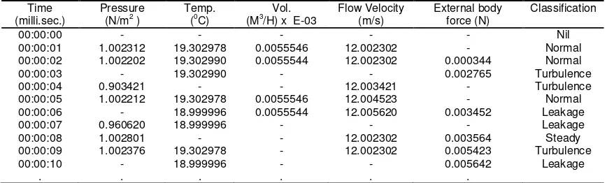
During a typical flow in pipelines the sensors captures a vast amount of data that represents the instantaneous situation of the flowing material. Naturally, computerised systems such as the leakage detection systems (LDSs) can help to visualise the flowing material but not with the associated data attributes. The data attributes and their respective orders are very important for such visualizations. Generally, some data points in real life have no inherent order while for others, order is a significant issue. All vectors of a typical pipeline sensor’ datasets are ordered and aggregated, or simply ordinals. Sometime continuous and most of the time intimately intra connected with missing and erroneous data points (see example in Table 1) or what is described in this paper as outliers.
Table 1. Showing typical reading extracted from a sensor-Velocity Volume Vane Thermo Anemometer manufactured by KOREC DIRECT®
Time (milli.sec.)
Pressure (N/m2 )
Temp. (0C)
Vol. (M3/H) x E-03
Flow Velocity (m/s)
External body force (N)
Classification
00:00:00 - - - Nil
00:00:01 1.002312 19.302978 0.0055546 12.002302 - Normal
00:00:02 1.002202 19.302990 0.0055544 12.002302 0.000344 Normal
00:00:03 - 19.302990 - - 0.002765 Turbulence
00:00:04 0.903421 - - 12.003421 - Turbulence
00:00:05 1.002212 19.302978 0.0055546 12.004523 - Normal
00:00:06 - 18.999996 0.0055544 12.005620 0.003452 Leakage
00:00:07 0.960620 18.999996 - - - Leakage
00:00:08 1.002801 - - 12.002302 0.003564 Steady
00:00:09 1.002376 19.302978 - 12.002302 0.005423 Turbulence
00:00:10 - 18.999996 - - 0.005642 Leakage
. . . .
The questions are: what combination of these datasets attributes represents what situation on the network? And which data attribute could be used as test attribute for such classification without compromising data integrity? To answer these questions data classification method using the decision tree algorithm proposed by [25] is applied. The data above is classified into 5 different possible states on the pipeline network which are: Steady, Leakage, Turbulence, Normal and the Nil or (unclassified state). Further, boundaries (Courtesy Annual report 2005-2006 of the Nigerian National Petroleum Corporation, NNPC) are set for each state with respect to each attributes as shown in Table 2.
Table 2. Showing typical attributes boundaries
Pressure (p) Temperature (t) Volume (v) Flow Vel. (f) Ext. Force (e) Boundaries p ≤ 0.97 t ≤ 12.1 v ≤ 0.0054 f < 12.0 e < 0.003
0.98 ≤ p ≤ 1.3 12.2 ≤ t ≤ 20.0 v ≥ 0.0055 f ≥ 12.0 0.003 ≤ t ≤ 0.005
p ≥ 1.4 t ≥ 21 - - e ≥ 0.006
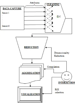
As shown in Figure 1, the proposed data model supports five activities that occur in different phases during a typical visualization of sensor’s flow datasets. The five activities are Data capture, Data cleaning and classifications, Dimensionality reduction, Data aggregation, and Data visualization. Data captured from various sensors positioned at different locations along the pipeline network are injected into the system directly. Data cleaning and classification begins by pruning the data of emptiness, repeated values and generating a decision tree for the data using the basic algorithm for inducing a decision tree by [25].
[image:4.595.166.428.369.727.2]To address the issues of uncertainties in the captured datasets in the developed interface, the uncertainty treatment algorithm (UTa-algorithm) that was developed earlier [26] is applied.Human involvement is noted as part of the third to fifth activities to reducing the data dimension, aggregating and visualising the ROI particular to a user.
Let S be a set of sensor data samples captured at different locations on the network and si be the number of sample S in class Ci, if there are Ci distinct classes into which the data
could be classified, then to compute the information gain by each sensor data, It is necessary to first compute the expected information needed to classify the given data. The information needed is defined by:
(1)
Where pi = si/s is the probability that an arbitrary sensor data belong to a class Ci . Log base 2
has been used because the data are encoded in bits.
Using the Table 1, (m=5) since there are five possible distinct classes/states. Let C1=
Steady, C2= Leakage, C3= Turbulence, C4= Normal and C5= Nil states. Then from Table 1, it
implies that C1= 1, C2= 3, C3= 3, C4= 3 and C5= 1.
Therefore
(
ଵ, . . ,
ହ) = −
ଵଵଵ
log
ଶ ଵଵଵ
−
ଷ
ଵଵ
log
ଶ ଷଵଵ
−
ଷ
ଵଵ
log
ଶ ଷଵଵ
−
ଷ
ଵଵ
log
ଶ ଷଵଵ
−
ଵ
ଵଵ
log
ଶ ଵଵଵ
ଵ, . . ,
ହ= 2.163
The next thing is to compute the entropy of each sensor data attribute. Beginning with pressure and continuing with other attributes such as temperature, volume, flow velocity and the external body force. (Note that time has been ignored. Its impact will be discussed latter).
When pressure = “p ≤ 0.97”,
s11=0 , s21=1, s31=1, s41=0 and s51=0 . Therefore using eq.1, I (s11, s21,… s51) = 1.000
When pressure = “0.98 ≤ p ≤ 1.3”,
s12=1 , s22=0, s32=1, s42=3 and s52=0 . Similarly, I (s12, s22,… s52) = 1.371
When pressure = “p ≥ 1.4”,
s13=0 , s23=0, s33=0, s43=0 and s53=0 . Similarly, I (s13, s23,… s53) = 0.000
Therefore, if the captured sensors data is partitioned based on the pressure attribute, the expected information needed E(p) could be computed using:
=
∑
௦భೕା⋯ା௦ೕ௦
ୀଵ
ଵ…
(2)With k=3 (the number of possible boundaries for data attribute pressure) and m=5 (the number of attributes). Therefore,
=
2
7
ଵଵ,
ଶଵ, …
ହଵ+
5
7
ଵଵ,
ଶଵ, …
ହଵ+
0
7
ଵଵ,
ଶଵ, …
ହଵ= 1.265
(
) =
ଵ, . . ,
ହ−
(
)
or
=
.
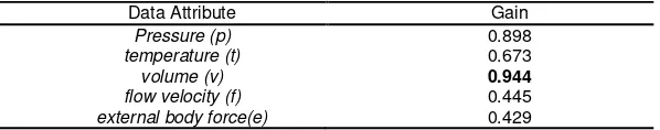
The Gains computed for other attributes are presented in Table 3. Data Attribute
volume (v) with the greatest Gain (0.944) is then chosen as the test attribute for classifying the
sensors data. This approach for data classification is tainted with problems of noises and
outliers. Often, statistical means is often an approach to dealing with these problems [25]. In the
programming logic of the developed AR-based interface described in this paper, a slightly different approach - the Minimum Description Length (MDL) principle in [25] is adopted to prune the attributes simply because of its insensitivity to the sampled sensor datasets.
Table 3. Showing computed Gains for all the listed attributes
Data Attribute Gain
Pressure (p) 0.898
temperature (t) 0.673
volume (v) 0.944
flow velocity (f) 0.445
external body force(e) 0.429
4. Results and Discussions
Using AR in visualisation is still in the development phase and such visualization solutions generally depend on design decisions. There are three things that must be in mind when designing an AR application for visualization; Combination of both the real and the virtual data, real-time data Interactivity and registration in 3D [27]. One of the challenges in the modelling was to reduce inefficiency caused by the following factors: noises from external sources, sensors’ measurement inaccuracies, random errors generated by the hardware, and computing imprecision that is included in the model. These exceptions or outliers are generally ignored during visualisation but their effects could become very significant if appropriate measures are not taken. One way forward to meeting this challenge is to develop an AR-based data visualization interface which can automatically detect selected location along the network and visualize only the necessary datasets relevant to the particular location. In this section, the interface requirements and the architecture that is required for such interface are also discussed.
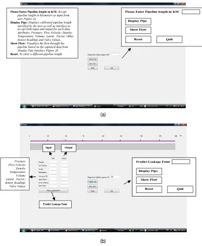
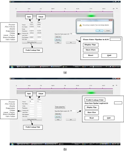
4.1 Interface Requirement 1: The visualization interface shall model the pipeline network system in a way that users can specify the overall length (an assumption here is that the pipeline has no bends or Ts although this is the situation in real life pipeline networks) of the entire network. Visualization of the sensors’ datasets requires that the whole length of the network should be known and that it should be displayed and calibrated. In this model, a user specifies the length of the pipeline network to be model and the interface automatically displays and calibrates the pipeline in kilometres (km) as shown in Figure 2 a and b.
4.2 Interface Requirement 2: The interface shall select and visualize only the necessary attributes-region of Interest (ROI) of the captured sensors’ datasets. Various types of sensors generate different kinds of attributes. No single sensor device could generate all the required attributes, the user through the interface selects the attributes particular to the governing sensor device. The interface as shown in Figure 2(b) is designed to select only the required attribute for the visualisation. For a typical visualization, not all the attributes are needed the test attribute is simply determined by procedure “find_test_attribute” embedded in the program logic making use of the basic algorithm for inducing a decision tree by [25] discussed earlier in this paper.
processed data for the region must be rendered. To achieve this, the interface shall be structured to provide interactivity with the data reduction, data aggregation and the data visualization stages of the model. This will ensure that only the ROI is displayed and the rest data are ‘hid’ from the scene.
(a)
(b)
Figure 2. Interfaces snapshots for capturing (a) and displaying (b) the pipeline length
4.4 Interface Requirement 4: The interface shall be made in such a way that it could detect and report the exact leakage location on the network. Leakages localisation is principal to the heart of this kind of visualization, the interface shall be built to use the selected ROI sensor datasets to effectively predict and localize the leakage point on the pipeline based on the available datasets. Automatic identification and localisation of the leakage point on the pipeline network can easily facilitate the process of correcting the pipeline network anomaly as well as guiding the user throughout the data exploratory process. Currently the methods available for
Please Enter Pipeline length in KM: Accept
pipeline length in kilometers as input from user Figure 2a
Display Pipe: Displays calibrated pipeline length
specified by the user as well as interface to accept both input and output for each data attributes: Pressure; Flow Velocity; Density; Temperature; Volume; Latent Factor; Other Sensor Readings and Valve Values.
Show Flow: Visualizes the flow through the
pipeline based on the captured data from Display Pipe interface Figure 2b.
Reset: To enter a different pipeline length
Please Enter Pipeline length in KM
Display Pipe
Show Flow
Reset Quit
Predict Leakage Point
Display Pipe
Show Flow
Reset Quit
Pressure Flow Velocity Density Temperature Volume Latent Factor; Sensor Readings Valve Values
Predict Leakage Point
such localization essentially make use of the results from the LDSs which are often corrected offline. The time lag between the data capture and the localisation times in these systems could become significant for time sensitive cases of localisation. Examples of problems arising from such delayed localisation are those of the Ejigbo pipeline explosion in Nigeria that claimed thousands of life and the August 19, 2000 event of a Natural gas pipeline rupture and fire near Carlsbad, New Mexico. This explosion killed 12 members of the same family.
(a)
(b)
Figure 3. Interfaces snapshots for reading the captured datasets from the excel worksheets (a) and displaying the localised leakage point (b) on the pipeline network.
Input from the sensors are normalised into a native Microsoft Excel format with each attribute represented by the columns and the instantaneous data captures as the rows.
Please Enter Pipeline Length in KM
Display Pipe
Show Flow
Reset Quit Predict Leakage Point
Pressure Flow Velocity Density Temperature Volume Latent Factor; Sensor Readings Valve Values
Predict Leakage Point
Input Output
Pressure Flow Velocity Density Temperature Volume Latent Factor; Sensor Readings Valve Values
Predict Leakage Point
Input Output
Please Enter Pipeline in KM
Display Pipe
Show Flow
Because of the (maximum rows) limitation of Excel, the captured data are automatically and periodically handled by a data screening module before a data-spill occurs. The native limit set in the interface was 20,000 data inputs. The retrieved data are then processed and visualized by proper modules, building the necessary pipeline network models and superimposing in 3D AR space of the OpenGL-based rendering engine so that users can intuitively interact and with the entire network.
4.5 Results
A separate module ‘leakage_detection_R1’ is designed to report leakage datasets if one is encountered. Figures 3 aand b shows an illustration with pipeline length 290km. After the rendering of the calibrated pipeline and data captured through appropriate modules, the interface reports that a leak is reported at kilometre 218.06 (±1.05) from the pipe origin. Manual analysis of the data produced the error at kilometre 220km. The margin of the error is generally considered insignificant because repeated trials yielded results within the data boundaries (216.85, 221.23). To clear any doubts, a separate module ‘leakage_predictor_R1’ activated by a button “Predict Leakage” on the interface to predict the leakage points based on the ‘means of nearby points’ commonly used by most statistical packages including the SPSS v 16 for predictions is incorporated. The ‘leakage_predictor_R1’ returned values within the range 217.20 to 219.30 which falls within the acceptable data boundaries for the specific set of data.
5. Conclusions
This paper presents a model for computing information gain for each data attributes and determine a lead attribute.The computed lead attribute is then used for the development of an AR-based scientific visualization interface which automatically identifies, localises and visualizes all necessary data relevant to a particularly selected region of interest (ROI) on the network. The necessary interface requirements to support efficient data capture, rendering and visualization were also discussed. An AR-based data visualization interface can improve localisation of leakage points along the pipeline network as well as reducing the operational costs associated with ‘pigging’. Using this AR-based approach improves access time to data without a compromise of data reliability. The interface to retrieve data stored only in 2D data formats using the native Microsoft Excel worksheets was also designed.
Application and incorporation of 3D data input formats and extension of this work to handling atmospheric and geo-data are the future directions of this work.
Acknowledgements
This work is jointly supported by the UTMVicubeLab, FSKSM, Universiti Teknologi Malaysia and the Yaba College of Technology, Yaba, Lagos, Nigeria. Thanks to the Nigerian National Petroleum Corporation (NNPC) for the release of necessary data to test run the interface application when needed.
References
[1] Gross M. Visual computing, the integration of computer graphics. Visual Perception and Imaging. Springer, Berlin, 1994.
[2] Louis B, Godin G, Blais F, Beraldin JA, Massicotte P, Poirier G. Visualizing and analyzing
large and detailed 3d datasets. Visual Information Technology Group, Institute for
Information Technology, National Research Council of Canada. Ottawa, Ontario, Canada. 2005:1-9.
[3] Hoppe H. New quadric metric for simplifying meshes with appearance attributes. Proceedings IEEE Visualization 1999. New York: IEEE Computer Society Press. 1999:59– 66.
[4] Levoy M, Pulli K, Curless B, Rusinkiewicz S, Koller D, Pereira L, et al. The Digital Michelangelo Project: 3D scanning of large statues. Proceedings of ACM SIGGRAPH, Computer Graphics Proceedings. Annual Conference Series. ACM. 2000: 31–144.
[5] Yoon SE, Lindstrom P, Pascucci V, Manocha D. Cache-oblivious mesh layouts. ACM
[6] Reitmayr G, Schmalstieg D. Collaborative Augmented Reality for Outdoor
Navigation and Information Browsing. Proceedings of Symp. Location Based Services and
TeleCartography. 2004: 31-41.
[7] Zwicker M, R¨as¨anen J, Botsch M, Dachsbacher C, Pauly M. Perspective accurate
splatting. Proceedings of the Graphics Interface Conference. Canadian Human- Computer
Communications Society. Waterloo, Ontario, Canada. 2004: 247– 254.
[8] White S. Interaction with the Environment: Sensor Data Visualization in Outdoor
Augmented Reality. International Symposium on Mixed and Augmented Reality (ISMAR).
Basel, Switzerland. 2009: 39-48.
[9] Julier S, Lanzagorta M, Baillot Y, Rosenblum L, Feiner S, Höllerer T, Sestito S. Information
filtering for mobile augmented reality. Proceeding of the ACM and IEEE ISAR.
Washington, DC. 2000: 3-11.
[10] White S, Feiner S. SiteLens: situated visualization techniques for urban site visits. Proceedings of the ACM CHI. Boston, MA, USA. 2009: 1117-1120.
[11] Goose S, Güven S, Zhang S, Sudarsky S, Navab N. PARIS: Fusing Vision-based Location
Tracking with Standards-based 3D Visualization and Speech Interaction on a PDA.
Proceedings of IEEE DMS 2004 International Conference on Distributed Multimedia Systems. San Francisco, CA. 2004: 75-80.
[12] Elnahrawy E, Nath B. Cleaning and querying noisy sensors. 2nd ACM international conference on Wireless sensor networks and applications. San Diego. 2003: 15-18.
[13] Bychkovskiy V, Megerian S, Estrin D, Potkonjak MA. Collaborative approach to in-place
sensor calibration. 2nd International Conference on Information Processing in Sensor
Networks (IPSN). Palo Alto, CA. 2003.
[14] Keim DA, Kriegel HP. Issues in Visualizing Large Databases. International Conference on Visual Database Systems (VDB-3). Lausanne, Schweiz, März. in: Visual Database Systems, Chapman and Hall Ltd., 1995.
[15] Fishkin KP, Jiang B, Philipose M, Roy S. I Sense a Disturbance in the Force: Unobtrusive
Detection of Interactions with RFID-tagged Objects. In Ubicomp, IRS-TR-04-013 Intel
Research Seattle tech memorandum. Tokyo, Japan. June, 2004: 1-17.
[16] Deshpande A, Guestrin C, Madden S, Hellerstein J, Hong W. Model-Driven Data
Acquisition in Sensor Networks. Proceedings of Conference on Very Large Data Bases
(VLDB) Conference. Toronto, Canada. 2004; 30: 588-599.
[17] Beatty JC, Ware C. Using colour dimensions to display data dimensions. Human Factors. 1988; 30(2): 127-142.
[18] Keim DA. Information visualisation and visual data mining. IEEE Transaction on
Visualisation and Computer Graphics. 2002; 7(1):100-107.
[19] Paskin MA, Guestrin C, McFadden J. A robust architecture for distributed inference in
sensor networks. The Fourth International Conference on Information Processing in Sensor
Networks (IPSN). Los Angeles, CA. 2005: 1-8.
[20] Beatty JC, Ware C. Using colour dimensions to display data dimensions. Human Factors. 1988; 30(2): 127-142.
[21] MacAdam DL. Geodesic chromaticity diagram based on variance of colour matching by 14 normal observers. Applied Optics Journal. 1971,(10)4:1-7.
[22] MacAdam DL. Visual sensitivities to colour differences in daylight. Journal of the Optical
Society of America. 1942. (32)5: 247-274.
[23] Dam AS, Forsberg DH, La-Viola LJJ, Simpson RM. Immersive VR for scientific visualization-a progress report. IEEE Computer Graphics and Applications. 2000; 20(6): 26- 52.
[24] Sangole A, Knopf GK. Visualisation of randomly ordered numeric data sets using spherical self-organisng feature maps. Elsevier Journal of Computer and Graphics. 2003; 27(6): 963-976.
[25] Jiawei H, Kamber M. Data Mining: concepts and techniques. Massachusetts: Morgan Kaufmann Publishers. 2001: 104-118.
[26] Olufemi AF, Shahrizal M, Kari S. An algorithm for treating uncertainties in the visualization
of pipeline sensors datasets. First Int’l Visual Informatics Conf (IVIC ’09). Kuala Lumpur,
Malaysia. 2009: 561-572.
[27] Azuma RT. A Survey of Augmented Reality. Presence: Teleoperators and Virtual