Android UI
Fundamentals
Jason Ostrander
Android UI
Fundamentals
Android UI Fundamentals: Develop and Design
Jason Ostrander
Peachpit Press
1249 Eighth Street Berkeley, CA 94710 510/524-2178 510/524-2221 (fax)
Find us on the Web at www.peachpit.com
To report errors, please send a note to [email protected] Peachpit Press is a division of Pearson Education. Copyright © 2012 by Jason Ostrander
Editor: Cliford Colby
Development editor: Robyn Thomas Production editor: Myrna Vladic Copyeditor: Scout Festa Technical editor: Jason LeBrun Cover design: Aren Howell Straiger Interior design: Mimi Heft Compositor: Danielle Foster Indexer: Valerie Haynes Perry
Notice of Rights
All rights reserved. No part of this book may be reproduced or transmitted in any form by any means, electronic, mechanical, photocopying, recording, or otherwise, without the prior written permission of the publisher. For information on getting permission for reprints and excerpts, contact [email protected].
Notice of Liability
The information in this book is distributed on an “As Is” basis without warranty. While every precaution has been taken in the preparation of the book, neither the author nor Peachpit shall have any liability to any person or entity with respect to any loss or damage caused or alleged to be caused directly or indirectly by the instructions contained in this book or by the computer software and hardware products described in it.
Trademarks
Android is a trademark of Google Inc., registered in the United States and other countries. Many of the designations used by manufacturers and sellers to distinguish their products are claimed as trademarks. Where those designations appear in this book, and Peachpit was aware of a trademark claim, the designa-tions appear as requested by the owner of the trademark. All other product names and services identiied throughout this book are used in editorial fashion only and for the beneit of such companies with no intention of infringement of the trademark. No such use, or the use of any trade name, is intended to convey endorsement or other ailiation with this book.
ISBN 13: 978-0-321-81458-6 ISBN 10: 0-321-81458-4
To my lovely wife, Susan,
I could write an entire book thanking people for their help along the way. Instead, I’ll have to settle for this short paragraph:
Thanks to Chris H. for pushing me to consider writing a book and giving me endless encouragement and support. To Clif C. for giving me the chance to write this book. To Robyn T. for keeping me on schedule despite my best eforts. To JBL for ixing my code and rocking a mean bass guitar. To Scout F. and Myrna V. for working tirelessly when I was late getting chapters to them. To Lucas D. and Rob S. for reading early chapters and giving me valuable feedback. To the entire team at doubleTwist for their dedication to making great Android software. To the Android team at Google for creating a great platform. To my family for their continuing support despite my dropping of the face of the earth. To Peachpit for giving me the opportunity to write this for you. And to you, the reader, for giving me the chance to teach you in whatever small way I can.
Bio
Jason Ostrander is a web and mobile software developer working at Silicon Valley startup doubleTwist, where he makes syncing media to Android phones simple. Prior to that, he solved networking problems at energy management startup Sentilla and defense company Northrop Grumman. Jason holds an MS in electrical engineering from UCLA. He lives with his wife in San Francisco’s Mission District, where he spends his time searching for the perfect chile relleno.
Contents v
Introduction . . . .viii
Welcome to Android. . . .x
Part 1 BAsIc ANDROID UI Chapter 1 GeTTING sTARTeD . . . .2
Hello World. . . .4
Basic Structure of an Android App. . . .9
Android UI Basics . . . .14
Tools . . . .22
Wrapping Up . . . .32
Chapter 2 cReATING YOUR FIRsT APPLIcATION . . . .34
Creating an App . . . .36
Getting Started with Android Views . . . .37
Arranging Views. . . .41
Displaying a List . . . .52
Understanding Activities. . . .57
Preventing ANRs . . . .64
Finishing the TimeTracker App . . . .71
Wrapping Up . . . .73
Chapter 3 GOING FURTheR . . . .74
Supporting Multiple Screen Sizes . . . .76
Handling Notiications . . . .84
Handling Events . . . .92
Creating Menus. . . .96
Implementing the Time Tracker . . . .102
Wrapping Up . . . .107
Part 2 The vIew FRAmewORk
Chapter 4 BAsIc vIews . . . .110
Creating a Basic Form . . . .112
Displaying Images . . . .124
Creating Maps and Displaying Websites . . . .130
Wrapping Up . . . .136
Chapter 5 ReUsABLe UI . . . .138
Abstracting Your Layouts. . . .140
Abstracting Styles and Themes . . . .148
Using Fragments. . . .153
Wrapping Up . . . .162
Chapter 6 NAvIGATION AND DATA LOADING . . . .164
Introducing the Action Bar. . . .166
Navigating Your App. . . .172
Loading Data into Views. . . .181
Wrapping Up . . . .186
Chapter 7 ANDROID wIDGeTs . . . .188
Creating a Basic Widget . . . .190
Creating a Collection Widget. . . .206
Contents vII
Part 3 ADvANceD UI DeveLOPmeNT
Chapter 8 hANDLING GesTURes . . . .214
Listening to Touch Events. . . .216
Responding to Gestures . . . .224
Wrapping Up . . . .229
Chapter 9 ANImATION . . . . 230
Creating Drawable Animations. . . .232
Creating View Animations . . . .235
Creating Property Animations . . . .246
Wrapping Up . . . 255
Chapter 10 cReATING cUsTOm vIews . . . . 256
Understanding How Android Draws Views. . . .258
Creating a Custom View. . . .259
Adding Custom Attributes to Your Custom Views . . . .267
Creating Compound Components. . . .274
Wrapping Up . . . .279
Chapter 11 cReATING ADvANceD GRAPhIcs . . . .280
Using Canvas . . . .282
Using RenderScript. . . .289
Using OpenGL . . . .294
Wrapping Up . . . .301
Chapter 12 LOcALIzATION AND AccessIBILITY . . . .302
Making Your App Available in Multiple Languages . . . 304
Making Your App Accessible . . . .309
Wrapping Up . . . .315
There is a revolution happening in the technology industry. Touchscreen interfaces, combined with low-cost and ubiquitous smartphones, have created a perfect storm for disruptive innovation. Android is at the forefront of this change, bringing a free and open-source platform on which developers can create the next generation of applications. With free development tools and an open market, anyone can develop applications that reach a worldwide market. But why choose to develop for Android?
Android now runs on the majority of smartphones in the United States. And it’s quickly expanding into new markets and device types. The last year has seen the introduction of hundreds of Android-based tablets, including the hit Kindle Fire. Google has ported Android to TVs with its Google TV platform, and many manufacturers are beginning to ship TVs with Android built in. Boeing has selected Android as the entertainment platform for its new Dreamliner jet. Ford is integrat-ing Android into its in-dash SYNC entertainment system. And Android is quickly gaining traction in the developing world, especially in Africa, where the need for low-cost handsets is greatest.
Yet for all of the platform’s promise, the majority of Android applications still lack the visual polish of their iOS counterparts. This book aims to address that issue by providing developers with a solid foundation for building app UIs. It will cover the basics of UI development on Android, teach best practices for creating lexible layouts, and give you tips on how to optimize your UI for smooth, luid performance. I created this book in the hope that it will help developers to create beautiful applications.
Who am I? I’ve been developing software professionally for almost ten years, and I’ve focused on embedded and mobile software for the last ive. In my day job, I work for one of the top Android development companies and write code that millions of people use every day.
Android development can be diicult at times, and the challenges of supporting such a diversity of devices can be daunting. But with a good idea, a solid under-standing of the framework, and a little persistence, anyone can create a great app that is used by millions of people.
I hope you’ll enjoy reading this book as much as I enjoyed writing it for you.
introdUCtion Ix Who this Book is For
This book is aimed at beginning Android developers who are interested in creating great user interfaces. You are expected to know basic Java programming and XML syntax. The focus of this book is on UI. While you don’t need to have experience writing Android software, many basic Android concepts are only described in passing. It will help you to have a rudimentary knowledge of Android development.
Who this Book is Not For
This book is not a general introduction to programming for Android. While it is intended for beginning Android developers, the focus is on user interface tools and programming. In particular, this book will not cover basic Android concepts such as intents, services, or content providers. Further, this book will not be an introduction to the Java programming language or to XML. You should know how to program and how to read XML.
hoW You Will learN
Throughout this book, you’ll learn by creating an actual app, a simple time tracker. Each chapter includes detailed examples of real Android code that you will compile and run. All code for the book can be found at the book’s website: www.peachpit.com/androiduifundamentals.
What You Will learN
You’ll learn how to create user interfaces for Android applications. From the most basic concepts, like activities and views, all the way to advanced graphics using RenderScript, this book covers everything you will use to build the user interface of your apps.
a Note aBout aNdroid VersioNs
welcome
to
Android
Throughout this book, you’ll be writing your code using the Eclipse integrated
develop-ment environdevelop-ment (IDE). You’ll need to install the Android software developdevelop-ment kit
(SDK), along with the Android Developer Tools (ADT) plugin. This setup includes several
other utilities to help you develop and test your application. Aside from the SDK, none of
these tools are required, but they will make your application development easier.
the tools
The following tools are used throughout this book to build, test, and analyze your applications.
Android sdK
The Android SDK is required to build and deploy Android applica-tions. The SDK contains the tools you’ll use to test and debug your applica-tion. It also contains tools for creating lexible layouts. You can download the Android SDK at http:// developer.android.com/.
eClipse
WelCome to Android xI
Android sdK mAnAger
The Android SDK Manager is used to download and install the Android SDK. You will also use the SDK Manager to install add-on features like sample code, third-party emulators, and the compatibility library. The Android SDK Manager can also be used to create and launch emulated Android devices, called Android Virtual Devices. The Android SDK Manager can be found in the SDK tools/ directory as android.
HierArCHy vieWer
This tool displays a graphical representation of your layout hierarchy and can help you debug layout performance issues by spotting overly complex layouts. It’s also a good tool for under-standing how Android layout works. You can ind this tool in the SDK tools/ directory as
hierarchyviewer.
ddms
Part 1
BASIc
1
3
Android is a powerful mobile operating system, built
using a combination of the Java programming language
Before you create a basic Hello World app, you must download and install the Android developer tools available at developer.android.com. You will need to install the Android software development kit (SDK), Eclipse, and the ADT plugin. Follow the directions provided on the developer website to set up the Eclipse develop-ment environdevelop-ment. All examples in this book use Android SDK Release 13 and the Eclipse Helios release.
When ready, create the Hello World application using the following steps:
1. Start Eclipse.
2. Open the Java perspective by choosing Window > Open Perspective > Java.
3. Choose File > New > Android Project.
4. Leave all the defaults. Name the project Example and click Next (Figure 1.1).
FIGURe 1.1 The Android project
creation wizard
5. Set the Build Target option to Android 4.0 (Figure 1.2). You’ll build to Android version 4.0 (API version 15) for all code in this book. Click Next.
6. Enter the package name com.example (Figure 1.3).
7. Click Finish, and the project will be created for you.
8. Run your app by right-clicking the Example project in the left-hand Package Explorer pane and selecting Run As > Android Application.
FIGURe 1.2 The Android
project build target (left)
FIGURe 1.3 The Android
project properties (right)
9. Select Yes when prompted to create a new Android Virtual Device (AVD). This will open the AVD Manager (Figure 1.4). Click the New button and conigure it as shown in Figure 1.5. Click Create AVD when inished.
10. In the AVD Manager, select the AVD you just created and click Start. When prompted, click Launch. The emulator will start.
11. Once the emulator has loaded, close the AVD Manager, and the Android Device Chooser will open (Figure 1.6). Select the running emulator, and click OK.
FIGURe 1.5 Android Virtual Device (AVD) creation dialog
FIGURe 1.6 The Android Device Chooser
Congratulations, you now have a running Android application (Figure 1.7).
running the exAmple aPP oN a pHone
If you want to run the Example app on your phone, follow these steps:
1. On your phone’s home screen, press Menu > Settings > Applications. Select the “Unknown sources” checkbox to enable installation from your computer.
2. Open the Development menu and select the “USB debugging” checkbox.
3. Plug your phone into your computer.
4. now close the emulator on your computer and run your application
FIGURe 1.7 Hello World app
BasiC
structure
oF
aN
Android App
The Eclipse IDE created an initial project structure for you when you started a new Android project. This project contains all the elements you need to build your application, and you should generally place all your work in this project. It’s possible to create a library project for code-sharing between applications, but for most apps this is unnecessary. This section covers the basic structure of the project folder and where you should place your code, layouts, and resources.
Folder struCture
Expand the Example project folder in the Package Explorer and take a look at the project structure. Android uses a standard Java application layout. Table 1.1 sum-marizes the project structure.
TABLe 1.1 Android Project Folder Structure
item exPlaNatioN
src/ This folder contains your app’s Java source code. It follows the standard Java package conventions. For example, a com.example.Foo class would be located in the folder
src/com/example/Foo.java.
res/ This folder contains all the resources of your app and is where you declare the layout using XML. This folder contains all layout iles, images, themes, and strings.
gen/ This folder is auto-generated when you compile the XML layouts in res/. It usually contains only a single ile, R.java. This ile contains the constants you need to reference the resources in the res/ folder. Do not edit anything in this folder.
assets/ This folder contains miscellaneous iles needed by your application. If your app needs a binary asset to function, place it here. To use these iles, you need to open them using the Java File application programming interfaces (APIs).
AndroidManifest.xml The manifest contains essential information about your app that the Android system needs. This includes the activites and services your app uses, the permissions it requires, any intents it responds to, and basic info like the app name.
default.properties Lists the Android API build target.
aNdroid maNiFest
The Android manifest contains all the information about your app’s structure and functionality. It includes all the activities your app uses, the services it provides, any database content it makes available via a content provider, and any intents it processes.
<?xml version=”1.0” encoding=”utf-8”?>
<manifest xmlns:android=”http://schemas.android.com/apk/res/android”
package=”com.example”
android:versionCode=”1”
android:versionName=”1.0”>
<uses-sdk android:minSdkVersion=”14” />
<uses-feature android:name=”android:hardware.bluetooth”/>
<supports-screens android:anyDensity=”true”/>
<application android:icon=”@drawable/icon” p android:label=”@string/app_name”>
<activity android:name=”.ExampleActivity”
android:label=”@string/app_name”>
<intent-filter>
<action android:name=”android.intent.action.MAIN” />
<category android:name=”android.intent.category. p LAUNCHER” />
</intent-filter>
</activity>
</application>
The manifest is where you declare the physical hardware features your app needs to run. For example, if your app requires a touchscreen device to operate properly, you would include the following line in the manifest:
<uses-feature android:name=”android.hardware.touchscreen” p android:required=”true” />
Declaring these hardware features as required by your application allows the Android Market to properly ilter applications based on a user’s hardware conigu-ration. Users with non-touchscreen phones would not be able to download an app that requires a touchscreen to properly function.
You should strive to make your application as broadly compatible as possible. List features your app uses, but use code to dynamically determine their availability and gracefully degrade the user experience in your app.
The manifest is where you declare the permissions required by your app. Unlike hardware requirements, all the permissions necessary to run your application must be declared in the manifest. There are no optional permissions.
The manifest is where you declare the icons and labels used by your application. You can assign these attributes to many of the XML elements in the manifest. The most important is the top-level <application> element. This is what will represent your application on the device home screen and app drawer. However, the icon/label combination doesn’t just apply to the <application> element. You can use them on the permissions element, which displays when the user accepts your application to install. You can place them on the <activity> element, and the user will see them in the process monitor. These elements are inherited by any sub-components. Hence, if the <application> icon and label are set, but the <activity> and <intent>
icons and labels are not set, then those elements will use the <application> icon and label by default. This setup allows you to use component-speciic icons and labels for informing the user of your application’s functions.
Note: users are very unforgiving of applications that request overly broad permissions. this is especially true of location permissions. Carefully consider the needs of your application, and don’t request permissions that you don’t need.
Lastly, the manifest is where you declare your supported Android API versions. It’s important that you declare the API level properly, because attempting to refer-ence unsupported APIs will result in your application crashing. This is also a good way to prevent your app from being installed on newer API releases that you may not have tested yet. See Table 1.2 for more information on API levels.
TABLe 1.2 Android API Level Declaration
item exPlaNatioN
android:minSDKVersion Declares the minimum API level required by your appli-cation. Devices running Android versions lower than this will not be able to install your application.
android:targetSDKVersion Declares the version of your application you are build-ing against. This is what determines the features avail-able to your app. If this difers from the minSDKVersion, you may need to use Java relection to access APIs that are unavailable on the lower version.
android:maxSDKVersion Declares the maximum SDK your application supports. Use this to prevent installation on newer devices that you may not be ready to support.
resourCes
The res/values/ folder is where you place constant values used in your layout. You should place all colors, dimensions, styles, and strings in this folder. In the example Hello World app, there is a single strings.xml ile containing all the user-visible strings used in the app:
<?xml version=”1.0” encoding=”utf-8”?>
<resources>
<string name=”hello”>Hello World, ExampleActivity!</string>
<string name=”app_name”>Example</string>
</resources>
You should never use string literals in your Java code or XML layouts. Always declare any user-visible strings in the strings.xml ile. This makes it easier to localize your resources later. When using these strings in your app, you reference them by the name attribute of the string element.
The res/layout/ folder also contains the XML iles that declare your applica-tion layout. Android UI can be created using either XML or Java code. It’s recom-mended to use XML for layouts, because it provides a good separation between UI and application logic. Folder names are used to separate layouts for diferent device conigurations.
aNdroid
ui BAsics
The user interface (UI) is the connection between your app and your users. In fact, to the user, the UI is the app. The Android UI framework is powerful enough to cre-ate complex UIs with graphics and animations, but it also has enough lexibility to scale from small-screen handheld devices to tablets to TVs. This section covers the basics of Android UI development so you can start to create great UIs for your apps.
home sCreeN aNd NotiFiCatioN Bar
To create Android apps, irst you should understand the basic UI of the Android OS itself. The irst screen an Android user encounters is the home screen (Figure 1.8). The home screen consists of sliding pages containing app launcher icons and widgets. You can press the launcher icons to start the corresponding applications. Widgets are like mini applications that present small chunks of data, such as weather or unread email counts. At the bottom of the screen are quick-launch icons for opening the phone dialer or email client. This also contains the launcher for the
FIGURe 1.8 The Android home
A key component of the Android UI is the notiication tray (Figure 1.9). You access the tray by touching the status bar at the top of the screen and sliding your inger down. Android displays a list of all notiications in the notiication tray: new mail notiications, currently playing music, system status info, and any long-running tasks such as downloads. Tapping a notiication in the list typically opens the app that generated the notiication.
FIGURe 1.9 The Android
notiication tray
Note: You should be aware that the user could replace the stock android home screen with an alternative home screen. Generally, these alternatives follow the same ui conventions as the stock android home screen. however, a few alternative home screens use radically different ui conventions, so it’s a good idea not to rely on any particular home screen feature in your app.
xml laYout
Android deines user interfaces using a combination of XML layout iles and Java code. You can use Java to specify all layouts, but it’s generally preferable to use XML to take advantage of Android’s automatic resource selection. This allows you to declare layouts for diferent hardware conigurations, and the Android system will select the most appropriate layout automatically.
Here is the code in the Hello World application’s main.xml ile.
<?xml version=”1.0” encoding=”utf-8”?>
<LinearLayout xmlns:android=”http://schemas.android.com/apk/res/ p android”
android:orientation=”vertical”
android:layout_width=”match_parent”
android:layout_height=”match_parent”
>
<TextView
android:layout_width=”match_parent”
android:layout_height=”wrap_content”
android:text=”@string/hello”
/>
</LinearLayout>
The irst line is basic XML boilerplate, listing the version and encoding. This is always the same and must be included at the beginning of every layout ile. The next line deines one of Android’s basic container types, the LinearLayout. This view arranges its child views linearly inside it. You will learn more about
LinearLayouts in the next chapter.
The LinearLayout is a simple container for displaying multiple sub-views in a linear fashion. For example, a series of items could be displayed inside a
LinearLayout as a list. The android:orientation attribute declares the direction in which the sub-views are arranged. In this case, the layout uses the vertical orientation, and all sub-views will be arranged vertically. Finally, the width and
height of the layout are declared to ill the entire parent view (more on this later). Inside the LinearLayout is a single TextView. As the name implies, this view is used for displaying text to the user. The text attribute of the TextView declares the text displayed in that TextView. In this case, it’s referencing a string deined in the strings.xml ile. Android uses the @ symbol to reference other resources. You could have declared a string here, but it’s better to declare all user-visible strings in the strings.xml ile to aid localizing the app later. Also, you can change the text dynamically using Java code.
Each element in the layout is a view. A view is anything that can be drawn on the screen. Every text ield, list item, web view, map, colorful spinning wheel, or button is represented by a view. The Android framework provides many views for you, such as the ListView and the TextView, but developers will need to create the more complex views that contain animations and special behavior.
the aCtiVitY Class
Let’s take a look at the source code for the Hello World application in the ile
src/com/example/ExampleActivity.java. In the manifest, you declared this activity and set it as the main activity to launch for the app. The Activity class is the main building block of Android applications. It represents a single screen of the application. Every screen your application contains will have an activity that represents it. In some cases, the content contained in an activity will be swapped without changing the activity (when using fragments, which you’ll learn about later). For efective Android development, it’s critical to understand the life cycle of the Activity class, because it has the most direct efect on the user experience. tip: even when you plan to set the text of a TextView in code,
it’s a good idea to declare a default string. that way, you can see what your layouts will look like with full text.
package com.example;
import android.app.Activity;
import android.os.Bundle;
public class ExampleActivity extends Activity {
/** Called when the activity is first created. */
@Override
public void onCreate(Bundle savedInstanceState) {
super.onCreate(savedInstanceState);
setContentView(R.layout.main);
}
}
Android activities use a callback structure for creating UI events. The framework calls the appropriate overridden method during the creation or destruction of the activity. In the example activity, only a single method is implemented: onCreate. This method is called when an activity is irst created. Typically this is where the setup of the activity takes place. This is where you create your views and set up any adapters you need to load your data. It’s not strictly necessary to override any of the activity methods but onCreate.
The example just sets the view for the activity. It does this by calling
setContentView(R.layout.main). This references the R.java ile that the Android developer tools built for you. In this case, it tells the system to load the main.xml
ile located in one of the layout directories. The Android runtime selects the most appropriate main.xml ile (there is only one in this case) and loads it.
The R.java ile allows you to reference the generated ID of resources stored in the res/ folder. To reference layout iles, use R.layout.file_name; to reference strings, use R.string.string_name; and so on.
Activities are short-lived objects. They are created and destroyed frequently. Each time the user rotates their phone, the activity that is currently displayed is destroyed and re-created. In addition, the Android system may destroy an activity if the device is running short of memory or resources. It’s important to design your activities with the understanding that they can be killed at any time.
Take care to save any state the user might value. If your activity is destroyed, you don’t want to frustrate your users by making them re-enter text. You will learn more about how to save activity states in the next chapter.
hardWare ButtoNs
Android devices prior to version 3.0 have four hardware buttons: Home, Back, Menu, and Search. Android version 3.0 and above have made the hardware buttons optional. In their place, Android presents onscreen software buttons that replicate the functionality of hardware buttons (Figure 1.10).
The Home button takes the user to the phone home screen. It’s not generally available to applications, unless the app is a home-screen replacement.
The Back button is meant to navigate back in the Android activity stack. This allows the user to easily jump into an app and them immediately return to the previous screen.
FIGURe 1.10 Android tablet
software buttons
tip: to ensure that your app is a good android citizen, always allow the user to return to a previous application if they have
jumped straight into your app (for example, by pressing a notification or handling an intent created by another application). don’t force the user to back out of many screens of your app to return to their previous task.
The Menu button displays a context-dependent list of options (Figure 1.11). Use the options menu for displaying infrequently used options for your application. On Android tablets and phones running version 3.0 or greater, this button is not available, and options are instead presented on the action bar. You’ll learn about the diferences between Android 4.0 devices and previous versions of Android in a later chapter.
FIGURe 1.11 The options menu
on the Android home screen
Finally, the Search button exists to provide a quick interface for launching a search on Android. Not all applications use this button, and in many applications, pressing this button does nothing.
In addition to these buttons, it is also possible to perform an alternative action on some hardware buttons. These actions are activated by long-pressing on the buttons. For example, long-pressing the Menu button will activate the software keyboard. Your application can take advantage of this feature to provide iltering in lists.
Note: Not all android devices have all of these buttons. in particular, android 4.0 devices omit the search button, making it impossible for users to search in applications. take care to evaluate the necessity of
search to your application, and provide a button in your ui if search is an essential feature.
tools
The Android SDK includes a suite of tools to assist in developing your apps. The suite consists of SDK tools and platform tools. The SDK tools, including ADT, are platform independent and are used regardless of which Android version you are developing against. The platform tools are speciic to Android versions and are generally installed when updating the SDK to a new version. Let’s focus on the SDK tools, speciically those used to develop the UI of an Android app.
aNdroid deVeloPer tools
The primary tool for developing Android apps is the Eclipse IDE using the ADT plugin. Eclipse is a powerful, multi-language development environment with features such as code completion, inline documentation, and automatic refactoring. You can use Eclipse to develop your application, debug it using the standard Eclipse Java debugger, and even sign a release package for publishing on the Android Market. There are many tools included in ADT, and you should familiarize yourself with all of them. Here, I’ll focus on the tools that aid in creating the user interface of Android applications. Chief among these is the graphical layout editor.
tHe grApHiCAl lAyoUt editor
The graphical layout editor allows you to drag and drop views to create your UI. In early versions of ADT, the graphical layout editor was sparse and not very helpful. Luckily, the latest version is quite powerful and can be used to create complex layouts containing compound components and animations.
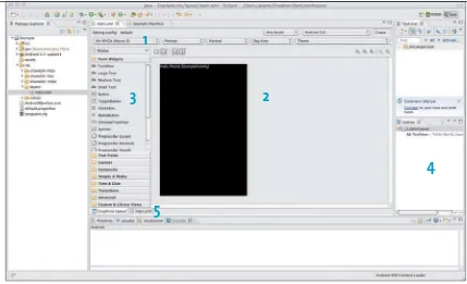
Figure 1.12 shows the various components of the graphical layout editor.
1 The Coniguration drop-down menu lets you change the way the layout is displayed. This is a quick way to view your UI for diferent hardware conigurations, such as phones and tablets.
1
2
3
4
5
3 The Palette contains the basic building blocks of Android user interfaces. This is where you can ind the basic layout containers, the form controls (including buttons and text inputs), and even advanced features like transi-tion animatransi-tions. You can drag each of these components onto the Canvas to create your UI. When you drag components onto the Canvas, they will snap to the edges of the existing blocks, helping to align your layout.
4 The Outline displays an overview of your layout, with all components listed in a hierarchy. This makes it easy to see how the components are nested. It also makes inding hidden or invisible components easier. You can use this view to quickly reorder the components of your layout.
[image:36.531.67.496.111.372.2]5 At the bottom of the graphical layout editor are tabs for switching to a standard XML view of your UI. While you can accomplish a lot using the graphical layout editor, it’s recommended that you tweak your inal layouts by hand-coding the XML.
FIGURe 1.12 The graphical
layout editor
The graphical layout editor is very powerful, and you should spend some time getting to know the options available within it. Let’s experiment with the editor by adding a few buttons and text boxes to the layout.
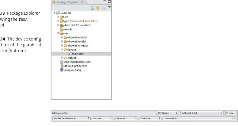
1. In the Eclipse Package Explorer, expand the res/layout folder of the project.
2. Right-click the ile named main.xml and select Open With > Android Layout Editor (Figure 1.13).
This will display the graphical layout editor. You may need to set up a device coniguration before you can start editing. At the top of the window are the controls for specifying the Android version, theme, locale, screen size, and orientation of the device.
3. Conigure the options as seen in Figure 1.14. You may need to close main.xml
[image:37.531.66.460.114.324.2]and reopen it for the changes to take efect.
FIGURe 1.13 Package Explorer
pane showing the res/
folder (top)
FIGURe 1.14 The device
4. Now try dragging a TextView onto the layout, just below the existing
TextView.
Notice that you can place the view only above or below the existing view. Remember the LinearLayout container from before? It was set up with a vertical orientation, so you can arrange views only vertically within it. Now try changing the size of the TextView.
5. Make it ill the width of the window.
6. Add a Button below your newly created TextView, and expand it to ill the width of the window.
[image:38.531.69.217.111.351.2]You should now have something that looks like Figure 1.15. As you can see, the graphical layout editor makes it possible to quickly create complex layouts with very little efort.
FIGURe 1.15 Hello World layout
with an extra text view and button
aNdroid Virtual deViCes
Android is designed to run on a wide range of hardware. It’s important to test your code extensively before release to ensure that your app is compatible with most Android devices. This is where the Android Virtual Devices, or AVDs, come in. An AVD is an emulated Android device. It’s not just a simulator; it actually runs the full Android framework, just as an actual device would. This is an important distinction, and it makes the emulator a far better representation of real-world devices than a simulator.
Because AVDs are emulated devices, they run the standard Android graphics stack. This can be very slow for high-resolution AVDs such as tablets. Google is working on improving this, but for now it’s recommended to test your layouts in the graphical layout editor and only use the emulator for inal veriication. Of course, you can always use an actual Android device.
You already created an AVD when you ran the Hello World application. You did this using the AVD Manager. Using the AVD Manager, you can create a range of emulated devices with diferent hardware characteristics, including
J Screen size and default orientation
J Hardware support, such as accelerometers and gamepads
J The Android OS version
J SD card storage, emulated using your hard disk
In addition, many handset manufacturers make device-speciic AVDs available to aid in testing on their hardware. You should create a range of virtual devices and test on all of them to ensure that your application has maximum device compatibility.
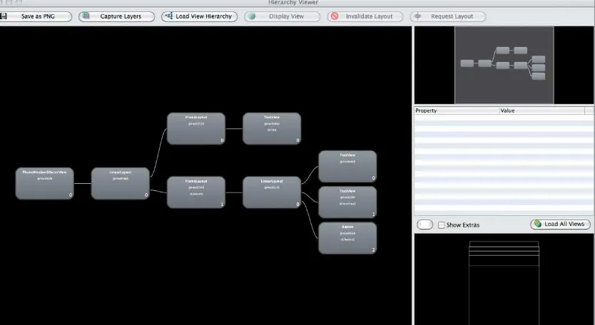
hierarChY VieWer
When developing any application, it is important that the app feel very responsive. Often, an unresponsive app is due to slowdowns in drawing the UI. To assist in debugging these situations, Android includes a tool called the Hierarchy Viewer. As the name suggests, this program will display the full layout hierarchy of your app, allowing you to optimize and debug potential issues.
Use the Hierarchy Viewer by running the tools/hierarchyviewer executable in the Android SDK directory.
1. Run hierarchyviewer now and select the Hello World app.
2. Click the Load View Hierarchy button, and you will see something like
[image:40.531.78.495.115.343.2]Figure 1.16.
FIGURe 1.16 The Hierarchy
Viewer displaying the modiied Hello World app layout
Note: For security reasons, the hierarchy Viewer will connect only to devices running developer versions of android. in practice, you will be able to use hierarchy Viewer only with the emulator or a phone that has been hacked to enable root access.
There are four primary components in the Hierarchy Viewer:
J The left sidebar displays all connected devices, along with the running
processes on each device. This is where you select your application.
J The Tree View displays a graphical representation of your UI layout. You
can see exactly how many components make up your layout. Large layouts with many nested components will take much longer to draw than simple layouts. If you look closely, you will see colored circles on some components. These give you an at-a-glance indication of the time taken to draw the view and its children. Green is faster, red is slower. You can click a view to get more information about its draw time, along with a small preview of the view as it appears onscreen.
J The Tree Overview provides a quick zoomed-out view of the entire
hierar-chy, giving you a quick feel for the complexity of the layout. This pane also provides quick navigation around the Tree View pane.
J The Layout View shows an outline of the actual displayed application. This helps
to orient the view components to the actual displayed UI. By clicking around in this pane, you can see which components make up each portion of the display.
If you look closely at the hierarchy displayed for the Hello World application, you may notice that it contains more components than are listed in the main.xml
ile. Here’s a quick explanation:
J The topmost component is the PhoneWindow. This represents the display
of the device. It is always present and is the base container for the entire display, excluding the notiication bar.
J There is a LinearLayout directly below the PhoneWindow. This is not the
LinearLayout in our main.xml. Rather, this layout is drawn by the system to display the title bar above the content. Notice the extra FrameLayout and
TextView? That is the title bar of the app. If you run the app with no title bar, then this layout would be removed.
The hierarchy view is especially useful for debugging nested LinearLayouts. If you start creating layouts with many layers of LinearLayouts, consider switching to a RelativeLayout to reduce complexity.
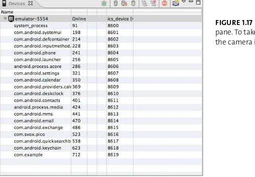
takiNG sCreeNshots With ddms
[image:42.531.73.327.114.291.2]The Dalvik Debug Monitor Server (DDMS) is a powerful tool for capturing the state of your application, including heap usage, running thread counts, object alloca-tions, and logs. While these features are outside the scope of this book, DDMS also has a very important function that all app developers will need: It allows you to take screen shots of your application. To run DDMS, in Eclipse choose Window > Open Perspective > Other > DDMS. Select your device in the Devices pane, then click the camera icon (Figure 1.17). This will open the Device Screen Capture window. From here you can rotate the image, refresh it to recapture the screen, and save it.
FIGURe 1.17 The DDMS Devices
pane. To take a screenshot, click the camera icon.
Note: android version 4.0 and above has the ability to take screenshots without using ddms. simply hold the power and volume down buttons at the same time, and a screenshot will be saved to your device image gallery.
other tools
In addition to the common Android UI tools, there are some lesser-known tools that are useful for perfecting your app UI.
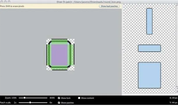
drAW9pAtCH
Images used in Android applications are often stretched to it the available area on a device. This can distort the image, resulting in ugly graphics. Android uses an image called a 9-patch to handle scaling without distortion. For example, all buttons in Android are 9-patch graphics that stretch but maintain proper round-ing on their corners (Figure 1.18). A 9-patch image is simply a standard image ile with an additional 1-pixel border. By coloring the pixels in this border black, you can indicate which parts of the image should stretch as the image is scaled up. The Android SDK provides the draw9patch command-line tool for creating these images.
lAyoUtopt
[image:43.531.152.458.113.297.2]Optimizing layouts by hand can be a tedious job. The layoutopt tool can do some of the work for you by analyzing your layouts and displaying ineiciencies in the view hierarchy. This command-line tool takes a list of XML layout iles, or a directory of iles, and outputs the results of its analysis. While this isn’t suicient
FIGURe 1.18 An example of the
aNdroid Asset studio
creating image resources for diferent screen densities is necessary but tedious. Luckily, there is an excellent tool that will create these resources for you. called the Android Asset Studio, this tool will take an uploaded image and create density-speciic versions. It can also be used for creating launcher icons, menu bar icons, action bar icons and tab icons. For now, you can ind the Android Asset Studio at this address:
http://android-ui-utils.googlecode.com/hg/asset-studio/dist/index.html
The Android Asset Studio is part of the Eclipse ADT plugin and can be accessed by selecting File>new>Android Icon Set.
monKey
When creating applications, it’s important to thoroughly test every aspect of the user experience. It can be diicult to truly test a UI, because the developer of the app is familiar with the interface and won’t try to do things that are unexpected or just plain weird—things like pressing multiple buttons at the same time while rotating the phone. This is where the Monkey tool comes in. The Monkey runs a speciied number of iterations and randomly hits areas of the screen, changes the orientation of the device, presses volume and media keys, and generally just does crazy things. This is often a simple way of rooting out unexpected errors.
WraPPiNG
up
This chapter introduced the Android framework by having you create the standard Hello World application and explore the tools available for building user interfaces on Android. Along the way, you learned that
J The AndroidManifest.xml ile declares all the features used by your
applica-tion. Use the manifest to prevent your app from running on unsupported hardware.
J Images and layouts are separated into folders that allow the Android system
to select the best resources for the device’s current coniguration at runtime.
J The Activity class is the primary building block of Android applications.
Understanding its life cycle is key to building great apps.
J The graphical layout editor provides a quick and easy way to create your
applications.
J You should use the Hierarchy Viewer tool to debug performance issues in
your views.
2
creAting
YOUr
35
Over the course of this book, you’ll develop a simple
time-tracking app. This app will eventually have all the
To get started, create a new project called TimeTracker. This will be your app project throughout the book. In this chapter, you’ll work through some simple layouts and build a minimally functional application. Figure 2.1 shows what you’ll have built by the end of this chapter.
This book won’t cover much of the back-end logic and will instead focus on the user interface code. However, all the code is available on the book’s website, www.peachpit.com/androiduifundamentals, for you to download.
FIGURe 2.1 The time-tracking
app you’ll build by the end of this chapter
getting stArted
With
Android Views
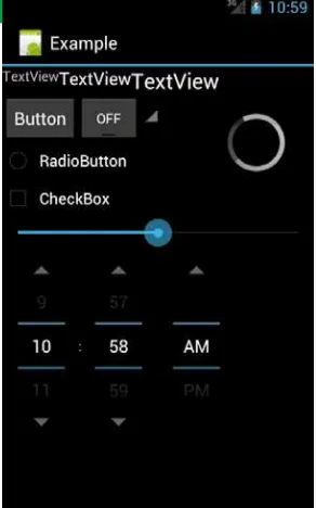
An Android application’s UI is composed of a hierarchy of View objects. Each view represents an area on the screen. A Button, for example, represents a rectangular area that can be pressed by the user. Android apps arrange views in layout contain-ers, also known as ViewGroups. Views have attributes that specify their look and arrangement within the container. The Android framework provides many views and containers. Figure 2.2 shows a few of the common view elements available. However, there are many more, and you should spend some time using the graphical layout editor to discover all the available views. It’s also possible to create custom views by subclassing a View class. You’ll learn more about this later in the book.
CommoN VieW attriButes
To control how the views of your UI are arranged and displayed onscreen, Android provides a number of View attributes—you saw some of them in Chapter 1. View
[image:50.531.71.217.115.349.2]attributes exist as ields in View classes and are accessed using getter and set-ter methods. They are also speciied as XML attributes in XML layout iles. The
FIGURe 2.2 Some common form
widgets available to your app
attributes follow the form android:attribute_name, where attribute_name is the actual name of the attribute. All system attributes use the android: preix. Here, we’ll go over the most important attributes and behaviors, covering a few confusing aspects along the way.
HeigHt And WidtH
Every view in Android is required to have a height and width. These are speciied using the layout_height and layout_width attributes. Values for width and height are speciied by using exact dimensions or by using the special symbolic values
wrap_content or match_parent. Android API version 8 renamed fill_parent to
match_parent, but fill_parent is still allowed for backward compatibility. You should use match_parent in your layout iles because fill_parent is now deprecated. With wrap_content, the view will take only as much space as it needs to con-tain any content inside it. Using match_parent will make the view expand to ill the entire inside of its parent view. Alternatively, specifying an exact dimension will make a view take exactly that much space onscreen. So, for example, you can create a view with a width of 48px, and it will take exactly 48 pixels of space on the display. In general, you’ll ind that match_parent and wrap_content are the most useful for creating your layouts.
It can be tempting to use exact dimensions when creating your layouts. You should avoid this urge and instead use the more lexible wrap_content and match_parent. For example, you could have two views: one taking up a quarter of the screen and the other taking the remaining space. This will make your views lexible enough to it any screen size.
Note: android uses special dimension units called density-independent pixels, or dp. this is one way that android handles varying screen sizes
Margin
Padding
mArgins And pAdding
When creating your layouts, you’ll want to add space around your views. This increases the usability of your app by increasing the target size of tappable areas. It can also add visual appeal to your app. Android uses two attributes for creating the space around views: layout_margin and padding. Margins create space on the outside of a view, which will separate the view from the surrounding views. Padding creates space inside a view. Figure 2.3 shows the diference between them. You can use attributes to set the dimensions of padding and margin for all sides of a view or for just a single side.
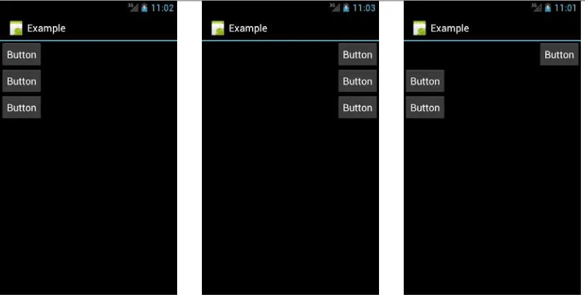
grAvity
By default, Android will place views on the left side of the screen. To change this, you use the gravity attribute. The gravity attribute controls the default position of a view’s children inside that view. For example, you can use the gravity attri-bute on a linear layout to position its child views on the right side of the screen. By default, layout containers have gravity set to left. Most other views have their default gravity set to center.
FIGURe 2.3 The diference
between padding and margin
Note: When setting gravity, you must account for the size of the views. the gravity attribute only positions child views inside the parent view. if the parent view takes up half the screen, then gravity will position children only in that half of the screen. if you are trying to use gravity
and not getting the results you expect, check the size of your views.
Similar to the gravity attribute is the layout_gravity attribute. While gravity afects the position of the children of a view, layout_gravity speciies the posi-tion of a view to its parent. Taking the example of a linear layout again, if you keep the gravity at its default value, all views will be positioned on the left side of the screen. You can then set the layout_gravity attribute of one of the child views to right, and that single view will be positioned on the right side of the screen.
Figures 2.4, 2.5, and 2.6 show three screens: default gravity, gravity set to right, and one button’s layout_gravity set to right.
more options
[image:53.531.36.462.112.330.2]There are many more optional view attributes. Some of them are speciic to par-ticular views, like setting the source of an ImageView or the text of a TextView. Some are available on every view but have a default value, like the background used for images. Some can even be used to create animations for your views. You should explore these attributes and get familiar with the basics. You’ll learn about more attributes throughout this book, but there are too many to cover them all.
FIGURe 2.4 A linear layout
with default gravity
FIGURe 2.5 A linear layout
with gravity set to right
FIGURe 2.6 A linear layout
with default settings; the irst
ArrAnging
VieWs
The Android view hierarchy starts with a layout container. These containers hold the child views and arrange them relative to each other. There are several container types with diferent characteristics, optimizing them for diferent situations.
FramelaYout
The simplest layout container is the FrameLayout. This container does not arrange child views at all. It simply presents each view, one on top of the other. The order of the views is based on their declaration in the XML ile: Views declared later in the ile are drawn on top. Use this layout whenever you want to create overlapping views.
FrameLayout is especially useful when creating customized tappable elements. You can use the FrameLayout to pair a button with an ImageView, setting the button background to be transparent. This gives you more control over the padding and scaling of button images than just setting a background does.
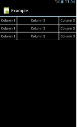
taBlelaYout
[image:54.531.73.202.115.326.2]The TableLayout displays data in a tabular format (Figure 2.7). It arranges sub-views into rows and columns, with each row contained in a TableRow container. A TableLayout will have as many columns as the TableRow with the most cells. Unlike the children of most views, the children of a TableLayout cannot specify a
FIGURe 2.7 An example of a table layout.
Cell borders are not normally displayed.
layout_width. This is handled by the TableLayout and will be set for you. Cells can be marked to span multiple columns and expand or shrink to ill available space.
You should use this layout only when displaying a table of data. In other cases, use a LinearLayout, a RelativeLayout, or the new GridLayout.
liNearlaYout
FIGURe 2.8 A linear layout with three buttons demonstrating layout_weight
Note: a somewhat confusing aspect of using layout_weight is its relationship to the layout_height and layout_width attributes. the weight will generally override the height and width, but not always. if you plan to use the layout_weight
attribute, set the corresponding height or width to 0dp. that way, the view size will be controlled by the weight and nothing else.
The linear layout is simple to use and perfect for the first version of the TimeTracker app. Remember Figure 2.1? Here is how you create that UI:
1. Open the TimeTracker project you created earlier.
2. Open the res/main.xml ile that was created automatically. Replace its content with the following XML layout:
<?xml version=”1.0” encoding=”utf-8”?>
<LinearLayout xmlns:android=”http://schemas.android.com/ p apk/res/android”
android:layout_width=”match_parent” p android:layout_height=”match_parent”
android:orientation=”vertical”>
<TextView android:id=”@+id/counter” android:text=”0”
android:layout_height=”wrap_content” p android:textAppearance=”?android: p attr/textAppearanceLarge”
android:gravity=”center” android:padding=”10dp”
android:layout_width=”match_parent” p android:textSize=”50dp”></TextView>
<LinearLayout android:layout_height=”wrap_content”
android:layout_width=”match_parent” p android:orientation=”horizontal”>
<Button android:text=”@string/start” p android:id=”@+id/start_stop”
android:layout_height=”wrap_content” p android:layout_width=”0dp”
android:layout_weight=”1”></Button>
<Button android:text=”@string/reset” p android:id=”@+id/reset”
android:layout_weight=”1”></Button>
</LinearLayout>
<ListView android:layout_weight=”1” p android:layout_width=”fill_parent”
android:layout_height=”0dp” p android:id=”@+id/time_list”>
</ListView>
</LinearLayout>
This XML code uses a linear layout to arrange three children: a text view to hold the current time, another linear layout that will hold the two buttons, and a list view that displays a list of all previous times. The buttons are arranged using a second linear layout with orientation set to horizontal. Note that you set the layout_width of both buttons to 0dp and the layout_weight to 1. This makes the buttons expand to ill the width of the layout and divide that space equally. The list view will display a list of times with a custom layout for each row. You’ll learn more about using list views in the next section.
relatiVelaYout
The other common layout container is the RelativeLayout. Relative layouts are more lexible than linear layouts, but they are also more complex. As its name implies, the relative layout arranges child views based on their position relative to the other views and to the relative layout itself. For example, to place a text view just to the left of a button, you would create the text view with the attribute
toLeftOf=”@id/my_button”. This lexibility allows you to create very complex UIs within this one container.
tip: Views that reference other views in a relative layout must be declared after the referenced view.
Figure 2.9 shows some buttons arranged in a relative layout. Buttons 1, 2, 3, 4, and 5 are positioned relative to the parent RelativeLayout container. The corner buttons have attributes aligning them with the top, bottom, left, and right of the relative layout. The center button is aligned with the center of the relative layout, and the remaining buttons are positioned relative to the center button. Table 2.1
[image:59.531.150.293.117.357.2]lists the attributes available for views inside a RelativeLayout, as well as how they are used.
FIGURe 2.9 A relative layout
with buttons arranged in corners and center
TABLe 2.1 XML Attributes for RelativeLayout
attriButes desCriPtioN
layout_alignParentTop, layout_alignParentBottom,
layout_alignParentRight, layout_alignParentLeft
These attributes will align the view with the parent. Use these to ix the view to the sides of the RelativeLayout
container. The value can be true or false.
layout_centerHorizontal, layout_centerVertical,
layout_centerInParent
Use these attributes to center a view horizontally or vertically or to directly center a view within the parent
RelativeLayout. The value can be true or false.
layout_alignTop, layout_alignBottom,
layout_alignRight, layout_alignLeft
These attributes are used to align the view with another view. Use these to line up views in the layout. The value must be the id of another view.
layout_alignBaseline This attribute sets all the edges of a view to align with the speciied view. This is useful when you have overlapping views and need them to exactly match. The value must be the id of another view.
layout_above, layout_below, layout_leftOf,
layout_rightOf
Use these attributes to position a view relative to another view. This attribute sets rules on the view to ensure that it never crosses the boundary set by the edge of the target view. The value must be the id of another view.
It can be tricky to master using the relative layout, but it will pay of when you create more-complex UIs. Remember that if you ind yourself creating multiple nested linear layouts, you should consider using a relative layout to optimize the drawing of your UI.
Note: You cannot have a circular dependency in a relative layout. so, for example, you cannot set the width of the RelativeLayout to
wrap_content and use alignParentTop on one of the child views. this will generate an error, and your R.java file will not be generated.
GridlaYout
Android 4 brought a new layout container called GridLayout. As its name implies, it arranges views into a grid of columns and rows. This layout makes it easier to create the common “dashboard”-style UI seen in apps like Google+. You would normally create such a UI using a TableLayout, but GridLayout allows you to create the same layout with a latter hierarchy. This improves performance by reducing the number of views that Android has to draw. GridLayout has also been designed to support drag-and-drop creation of UIs using the graphical layout edi-tor. Developers will be able to create complex and eicient layouts just by using a
GridLayout and the layout editor.
[image:61.531.138.295.112.352.2]Figure 2.10 shows an example layout created using the GridLayout container. In this layout are four buttons arranged into rows and columns. The XML to cre-ate that layout is:
FIGURe 2.10 GridLayout
<?xml version=”1.0” encoding=”utf-8”?>
<GridLayout xmlns:android=”http://schemas.android.com/ p apk/res/android”
android:layout_width=”match_parent”
android:layout_height=”match_parent”
android:columnCount=”3” >
<Button
android:id=”@+id/button1”
android:layout_column=”1”
android:layout_row=”1”
android:text=”Button” />
<Button
android:id=”@+id/button2”
android:layout_column=”1”
android:layout_gravity=”bottom”
android:layout_row=”2”
android:text=”Button” />
<Button
android:id=”@+id/button3”
android:layout_column=”2”
android:layout_row=”2”
android:text=”Button” />
<Button
android:id=”@+id/button4”
android:layout_column=”2”
android:layout_row=”3”
android:text=”Button” />
Unlike a TableLayout, a GridLayout does not need explicit TableRow elements. The buttons themselves declare the rows and columns in which they should appear. By default, this layout will not include any space between the buttons. To add space, you can use the traditional margin and padding parameters, or you can use a new view that was introduced in Android 4: Space. This view simply adds a gap between the elements of a layout. When using drag and drop to create a layout in the graphical layout editor, spaces are automatically inserted to achieve the desired appearance. Here are the Spaces created by the layout editor for the layout in Figure 2.10:
<Space
android:layout_width=”58dp”
android:layout_height=”1dp”
android:layout_column=”0”
android:layout_gravity=”fill_horizontal”
android:layout_row=”0” />
<Space
android:layout_width=”128dp”
android:layout_height=”1dp”
android:layout_column=”1”
android:layout_gravity=”fill_horizontal”
android:layout_row=”0” />
<Space
android:layout_width=”134dp”
android:layout_height=”1dp”
android:layout_column=”2”
android:layout_gravity=”fill_horizontal”
<Space
android:layout_width=”1dp”
android:layout_height=”83dp”
android:layout_column=”0”
android:layout_gravity=”fill_horizontal”
android:layout_row=”0” />
<Space
android:layout_width=”1dp”
android:layout_height=”180dp”
android:layout_column=”0”
android:layout_gravity=”fill_horizontal”
android:layout_row=”2” />
<Space
android:layout_width=”1dp”
android:layout_height=”173dp”
android:layout_column=”0”
android:layout_gravity=”fill_horizontal”
android:layout_row=”3” />
</GridLayout>
displAying
a
list
One of the most common view types you’ll use to develop an app is the ListView. This view presents a vertically scrolling list of items. Each row generally holds some text but will often include other views, such as ImageViews and Buttons (a good example of this is the Contacts app). Use a ListView whenever you have a list of data to present to the user. This view is so common that Android actually provides built-in activities that just display a list.
listaCtiVitY
A ListActivity will bind to a default view containing a ListView. There is no need to call setContentView in the activity’s onCreate method, because the ListActivity
is already set to a ListView by default (though you can deine a custom view if you choose). The ListActivity class also contains a few convenience methods for retrieving and setting the list data and for handling item selection. Although it’s not necessary to use a ListActivity to display a list, you should consider using it whenever you want to display a list of data to the user.
Android DEFAULT lAyouts
The ListActivity actually sets its content to a special layout built into the Android OS. This layout contains a single ListView as its content. There are other built-in layouts you can use when creating your app, a number of which are contained in the android.R.layout class. Here are two that you could use with a ListView:
J android.R.layout.simple_list_item_1 is used to display a single line of
text in a row of a ListView.
J android.R.layout.two_line_list_item displays two lines of text per row
of a list.
xml laYout
Displaying screens of lists is convenient, but sometimes you need to display more than just a list. In those cases, you can create a standard layout and use a list view to show the list. List views are deined the same way as other views in Android:
<ListView android:layout_width=”match_parent”
android:layout_height=”match_parent” android:id=”@+id/list”>
</ListView>
List views have a few special attributes that you can use for more complex layouts. The irst is the android:entries attribute. Use this attribute when you have a static, unchanging list of values to populate the list view. Using the entries
attribute, you can simply reference a resource and not have to programmatically populate the list. Attributes for altering the appearance and behavior of the divid-ers between rows are also available. In general, you should stick with the defaults and not deviate from the platform look and feel.
roW lAyoUt
Creating the layout for a list row is the same as for an activty: You create an XML ile with a layout container and several views. Each row will contain that layout, allowing you to set values for text and images. The Android platform provides several default row layouts. These are generally suicient for the list views that you will create. However, you can also create custom layouts for the rows of the list. To create a custom layout, you simply create a new layout ile and use it when binding data to the list view.
The time-tracking app will require a custom layout for its list view. In the res/
folder, create a new layout ile called time_row.xml:
<?xml version=”1.0” encoding=”utf-8”?>
<LinearLayout xmlns:android=”http://schemas.android.com/ p apk/res/android”
android:id=”@+id/time_row” android:orientation=”horizontal”
android:layout_width=”match_parent” p android:layout_height=”wrap_content”
android:gravity=”center” android:paddingLeft=”10dp”
android:paddingRight=”10dp” android:paddingBottom=”20dp”
android:paddingTop=”20dp”>
<TextView android:id=”@+id/lap_name” p android:layout_height=”wrap_content”
android:text=”Lap 1” android:layout_weight=”1” p android:layout_width=”0dp” />
<TextView android:id=”@+id/lap_time” p android:layout_height=”wrap_content”
android:text=”00:00:00” android:layout_weight=”1”
android:layout_width=”0dp” android:gravity=”right” />
</LinearLayout>
This ile uses a simpl