Normalization Strategies for Enhancing Spatio-Temporal Analysis of Social Media Responses
during Extreme Events: A Case Study based on Analysis of Four Extreme Events using
Socio-Environmental Data Explorer (SEDE)
Jayakrishnan Ajayakumar a, Eric Shook b, Victoria K. Turnera
a Department of Geography, Kent State University, 325 S.Lincoln Street, 413 McGilvrey Hall, PO Box 5190, Kent OH 44242 -
(jajayaku, vturner5)@kent.edu
b Department of Geography, Environment & Society, University of Minnesota, 267 19th Ave S 414 Social Science Building,
Minneapolis, MN 55455 – [email protected]
KEY WORDS: social media, normalization, spatio-temporal analysis
ABSTRACT:
With social media becoming increasingly location-based, there has been a greater push from researchers across various domains including social science, public health, and disaster management, to tap in the spatial, temporal, and textual data available from these sources to analyze public response during extreme events such as an epidemic outbreak or a natural disaster. Studies based on demographics and other socio-economic factors suggests that social media data could be highly skewed based on the variations of population density with respect to place. To capture the spatio-temporal variations in public response during extreme events we have developed the Socio-Environmental Data Explorer (SEDE). SEDE collects and integrates social media, news and environmental data to support exploration and assessment of public response to extreme events. For this study, using SEDE, we conduct spatio-temporal
social media response analysis on four major extreme events in the United States including the “North American stormcomplex” in December 2015, the “snowstorm Jonas” in January 2016, the “West Virginia floods” in June 2016, and the “Hurricane Matthew” in
October 2016. Analysis is conducted on geo-tagged social media data from Twitter and warnings from the storm events database provided by National Centers For Environmental Information (NCEI) for analysis. Results demonstrate that, to support complex social media analyses, spatial and population-based normalization and filtering is necessary. The implications of these results suggests that, while developing software solutions to support analysis of non-conventional data sources such as social media, it is quintessential to identify the inherent biases associated with the data sources, and adapt techniques and enhance capabilities to mitigate the bias. The normalization strategies that we have developed and incorporated to SEDE will be helpful in reducing the population bias associated with social media data and will be useful for researchers and decision makers to enhance their analysis on spatio-temporal social media responses during extreme events.
1. INTRODUCTION
Recent advances in location-based technologies have enabled social media services to collect large volumes of spatio-temporal footprints produced by users from all over the world. Social networking services such as Twitter, YouTube, Flickr, and Facebook, when used along with GPS enabled handheld devices such as mobile phones and tablets, and desktops with (Katz-Bassett et al., 2006), provides near real-time contextual information about events in various spatio-temporal scales, which could be vital for researchers and policy makers (Kaplan and Haenlein, 2010). The potential of social media to provide near real-time spatial information has been of particular interest to researchers from the domain of disaster management (Hughes and Palen, 2009). Studies have shown that the public often utilizes social media to fill the information gap that occurs when emergency responders follow a traditional model for public information release (Jin et al., 2014). Among different social media platforms, Twitter, a microblogging tool, is widely used to analyze public response during extreme events such as natural disasters. The short length of tweets (140 characters) made them a social medium well suited for communicating real-time information during disasters (Hughes and Palen, 2009). In emergencies, tweets could provide information about first-person observations or bring relevant knowledge from external sources (Kongthon et al., 2012). Twitter has been identified as a mechanism for resource mobilization and collaboration as well as platform for sharing life safety information (Sutton et al.,
2014). Disaster-specific Twitter research include descriptive
studies that focus on Twitter adoption and use in mass convergence events (Hughes and Palen, 2009), mechanisms of information production, distribution and organization (Starbird, and Palen, 2010; Vieweg, Hughes, Starbird, and Palen 2010; Chew and Eysenbach, 2010), and public participation and citizen reporting across a variety of hazard types (Sutton, 2010).
Studies based on demographics and other socio-economic factors (Mislove et al., 2011; Malik et al., 2015) suggests that social media based studies could be highly skewed based on the variations of demographics and population density with respect to place. In-order to tackle this issue, normalization strategies should be developed to account for the variations in population density. In this study we look at the enhancements that were incorporated to the Socio Environmental Data Explorer (SEDE) (Shook and Turner, 2016), which was developed to collect, organize, and explore social media data as well as environmental data. The normalization strategies that we develop and incorporate to SEDE will be useful for researchers and decision makers to identify, visualize, and analyze spatio-temporal social media responses to extreme events with reduced population bias. The second section of this paper discusses related work, while the third section will have technical and design details about SEDE. The fourth section will have details about the experimental setup, including the four extreme events, the fifth section will include the results, followed by relevant discussions, and the last section will have the concluding remarks.
∗Corresponding author
2. BACKGROUND
2.1 Social media and extreme events
The spatio-temporal distribution of disaster-related messages helps with real-time monitoring and assessment of extreme events. Thomson et al. (2012), in their work categorizes tweets and measures tweet proximities comparing different sources of information and assessing reliability of Twitter for the Fukushima nuclear power plant incident. In their analysis of tweets posted during a wildfire event in France, Longueville et al. (2009) posited that the temporal dimensions revealed from the time-stamped tweets were accurate and well synchronized with the actual invents. Their analysis also revealed that apart from the geographical information in the form of explicit coordinates, geo- tagged tweets also consisted of spatial terms, direct place names, coded place names, and location paring. Spatio-temporal information from tweets were also used for developing event-based systems. Sakaki et al. (2010) introduced an earthquake detection based on geo-located tweets. Earle et al. (2012) used semantic and temporal tweet frequency analysis to monitor earthquakes in China, Japan and Indonesia. Stefanidis et al. (2013) analysed geo-tagged tweets to extract ambient geospatial information for crisis event detection in Egypt.
Geo-tagged tweets have also been used to analyse “situational
update” information, which is communicated by people during
mass emergency situations. Vieweg et al. (2010) compared two different natural disasters including Grassfires of April 2009 that happened in Oklahoma and Red River Floods of April 2009 in Minnesota, and identified that Twitter communication during various extreme events can have subtle and prominent
differences. They detailed about how the spatio-temporal information from Twitter has the potential to provide on the ground information during mass emergency situation. Research work by Sutton et al. (2008) on the 2007 Southern California Wildfires shows how Twitter can be an important source for peer to peer informal communication, which is common during
extreme events that they have termed as “backchannel
communications”. Olteanu et al. (2015) did a comprehensive study on Twitter communication during 26 different natural hazards. Their study, classified tweets based on crisis dimension, and content dimension.
2.2 Geovisual Analytic Systems
Geovisual Analytic Systems can be of great value to emergency responders for searching and interpreting important messages during extreme events. Apart from providing spatio-temporal information, such systems can provide aggregated overviews that summarize information about a situation and support the interactive exploration of the data. Discovering, capturing and displaying events from social media data source can be a major challenge (MacEachren et al., 2011), which requires
sophisticated algorithms and high data storage and efficient computing capabilities. Croitoru et al. (2013) developed a
framework “Geosoical gauge” for harvesting, processing,
modelling, and integrating social media feeds. MacEachren et al. (2011) developed a geo-twitter analytics application SensePlace2 that supports overview and detail maps of tweets, place-time-attribute filtering of tweets and analysis of spatio-temporal events. Tsou et al. (2015) developed a social media analytics and research testbed (SMART) dashboard for monitoring Twitter messages and tracking information diffusion in different cities. SMART could be used to filter tweets from cities, remove redundant tweets, and analyse social media data from a spatio-temporal perspective. Even though there had been
a wide array of web-based systems developed to analyse and visualize social media data, the problem of visualizing highly biased social media data is still an open challenge. These visualization issues are not exclusive for social media data and previous studies based on conventional data sources such as census have suggested visualizations techniques such as Cartograms (Gastner and Newman, 2004) to alleviate the population density bias.
2.3 Bias in Social media data
Even though being a rich source of spatio-temporal data, social media data sources such as Twitter are biased towards urban perspectives at the expense of rural ones (Hecht and Stephens, 2014). Mislove et al. (2011) found a direct association between county population in U.S. and Twitter adoption rates.
Demographic statistics of Twitter users’ geographic census blocks were computed by O’Connor et al. (2010) and Eisenstein
et al. (2011), while Malik et al. (2015) used census
demographics in spatial error model. These papers draw similar conclusions, showing that the distribution of geotagged tweets over the US population is not random, and that higher usage is correlated with urban areas, high income, more ethnic minorities, and more young people. In their work on mapping geo-tweets that were posted during Hurricane Sandy (Shelton et al., 2014), the authors caution about potential bias towards places that are large content producers, and the uneven spatial distribution of tweets. They used aggregations based on hexagonal cells to overcome the bias. By analyzing and mapping 1.5 billion geo tweets Leetaru et al. (2013) found Twitter data are highly skewed towards places with high population density. A detailed demographic based study on geo-tagged tweets from London by Longley, Adnan and Lansley (2015), revealed bias in Twitter usage in terms of gender, age, and ethnicity. Malik et al. (2015) used statistical analysis to assess the population bias in geotagged tweets. Their study revealed the non-random distribution users who send geotagged tweets compared across the entire population. They were also able to demonstrate the coastal effects, where being located on the east or west coast of the US predicts more geotag users. Allen et al. (2016) in their work on using Twitter data for surveillance of influenza used census data to normalize tweet count for individual cities. Li et al. (2013) used socio-economic and demographic data from American Community Survey (ACS) to compare Twitter and Flickr usage patterns across contiguous United States. Their study revealed that tweet density is highly dependent on the percentage of well-educated people with an advanced degree and a good salary who work in the areas of management, business, science, and arts.
3. SOCIO-ENVIRONMENTAL DATA EXPLORER (SEDE)
The Socio-Environmental Data Explorer (SEDE) (Shook and Turner, 2016) was developed to collect and integrate social media, news and environmental data to support exploration and assessment of social response to real and potential risk events. Apart from the capabilities of a Geovisual analytic system, SEDE provides structured access to various environmental datasets such as weather warnings from National Oceanic and Atmospheric Administration (NOAA) and extreme event warnings from Federal Emergency Management Agency (FEMA), which is quintessential for triangulating the inferences obtained from social media data. This integration of social media and environmental data helps scientists, and stakeholders to explore the opportunities and challenges of using social ISPRS Annals of the Photogrammetry, Remote Sensing and Spatial Information Sciences, Volume IV-4/W2, 2017
media datasets along with traditional data sources such as the extreme weather data.
The SEDE system is modularly designed to collect spatio-temporal information from social media and environmental data sources. Separate modules are seamlessly integrated into SEDE to handle data collection, pre-filtering and pre-processing of social media data, database storage, and filtering, mining and visualizations (Shook and Turner, 2016). The data collector module is designed to collect social media data from sources such as Twitter and environmental data sources such as NOAA and FEMA. The filters developed as a part of the unsupervised pre-filtering stage, extract spatial, temporal and other attribute related information from diverse data sources and upload the extracted data to the spatio-temporal database, which is the core component of SEDE. The web-based data explorer tools help end users to analyse and visualize social media data based on spatio-temporal and textual queries.
Even though SEDE has the capability to extract, and visualize social media and environmental data, it requires further enhancements for normalizing the data for visualization and spatial analysis, in-order to prevent erroneous and spurious results due to variations in tweet densities across space. These variations are driven by multiple factors including population density, economic status, rural and urban divide, and other factors such as age and ethnicity (Li et al., 2013; Eisenstein et al., 2011). It is critical to address the bias related issues in SEDE, as erroneous results could lead to larger discrepancies, when validations and comparisons of social media data are conducted in SEDE with traditional data sources.
Environmental data in the form of warnings and notifications that are collected in SEDE could also be used to triangulate the results obtained from social media data, which could improve the robustness of the system. Traditional environmental data sources such as weather warnings and notifications include spatial data in the form of geographical coordinates or regions, which could be used along with geolocated tweets to improve the contextual information as well as to provide validations. The temporal information associated with the weather warnings including tornado touchdowns, or flash flooding, could be used with timestamped tweets to conduct longitudinal analysis. Time based comparisons could also be made to assess the lag or lead between the weather notifications and the Twitter response.
3.1 Enhancements in SEDE
SEDE was developed to seamlessly integrate large volumes of social media, and environmental data. Currently the central database for SEDE holds around 2.5 billion geo-tagged tweets from all over the world starting from 08-Sep-2015. Tweets are collected continuously using the Twitter streaming API and around 4 million tweets are collected every day. Location and textual based filters are developed to extract out English tweets from United States, which are constantly aggregated to a separate data table. SEDE is highly modularized according to Model View Control (MVC) architecture and separate modules are maintained for visualization, textual processing, and spatial analysis. Continuous streaming of social media data sources such as Twitter and environmental data sources such as NCEI and NOAA warnings are abstracted out from the web interface and run as background tasks. Apart from the data streaming background tasks, separate background task is maintained to continuously label and process incoming English tweets from United States, based on the state, county, and city of origin. This is done based on spatial lookups from census data, which
is already loaded in SEDE. For improving response time on spatio-temporal queries, a spatio-temporal index based on the state, city, and county along with time is maintained. In order to address the issue of variations in tweet density due to
population, and to triangulate the results based on environmental data we have developed two new modules.
3.1.1 Normalization Module: The Normalization module in SEDE is developed to provide standardized social media data for visualization, based on tweet counts, Twitter users, and traditional sources such as census population. Background tasks that assigns state, city, and county information for tweets, also updates the total tweets and total unique users for each spatial aggregation on a daily basis. Thus, along with traditional data sources such as census, SEDE is able to provide tweet based population statistics such as total tweets and total users for different spatial and temporal scales. The Standardized Tweet Ratio (STRregion) for a region is calculated using the observed
tweets for each region (OTregion), and the expected tweets for
each region (ETregion) as in equation (1). The expected tweets
for region is calculated using the total tweets from the region (TTregion), the total tweets for all the region∑ TTi i and total observed tweets for all regions∑ OTi i. Similarly, Standardized User Ratio (SURregion) for a region could be calculated using the
observed users for a region (OUregion), and the expected users
from a region (EUregion), which could be calculated using the
total users from a region (TUregion), total users from all regions
(∑ TUi i) and total observed users from all regions (∑ OUi i). For calculating total users from a region, either census population (TUcensus) (equation 2), or total aggregated Twitter users from
the region (TUtwitter) could be used (equation 3). User based
normalizations have the advantage of reducing the bias created due to highly tweeting users such as celebrities or automatic bots.
3.1.2 Socio-Environmental Validation module: Apart from providing structural access to social media data, SEDE also captures environmental data from sources such as NCEI and NOAA. The background tasks running on SEDE extracts spatio-temporal data, along with information about type of event, primary source of information and damages due to event from environmental data sources such as NCEI and stores them to SEDE data tables. The Socio-Environmental Validation module, using spatio-temporal queries, extracts event based information from the data tables and help to ascertain the validity of the social media data. With the inherent noise associated with social media data, keyword based queries to extract extreme events based tweets could result in unexpected patterns in geolocated tweets, which could be further
investigated using the ground truth information obtained through the Socio-Environmental Validation module. Apart from validation, the module could be used to assess the lag or lead between the public response times in social media to ISPRS Annals of the Photogrammetry, Remote Sensing and Spatial Information Sciences, Volume IV-4/W2, 2017
extreme events and the weather notifications from traditional sources such as NCEI and NOAA. This feature could be useful to assess the efficacy of social media data during extreme events. In order to understand the effects of normalization on social media data, and to assess the efficiency of the new modules that were developed in SEDE to support normalization, we have selected four extreme events for our study.
4. EXPERIMENTAL SETUP
Twitter data collected across multiple natural hazard events such as tornadoes, blizzards, and storms provide opportunities for comparing and contrasting different events. The case study events for analysis are shown in Table 1. The December 2015 North American Strom Complex started as a weak disturbance on 25-Dec-2016 and later produced tornado outbreaks, winter storm, and blizzard in areas of southwestern United States. There were 59 fatalities and an estimated damage of 1.2 million dollars due to the event. Winter Storm Jonas or January 2016 United States blizzard was a historic blizzard that produced up to 3ft of snow in Mid-Atlantic and Northeast United States. There were 55 fatalities, with Virginia, Pennsylvania, New Jersey, New York, North Carolina, South Carolina, and Washington D.C getting affected the most. The West Virginia flood of 2016 occurred between June 23, and 24, which resulted in 23 deaths across West Virginia and nearby parts of Virginia. The flooding was a result of 8 to 10 inches of rain falling over a period of 12 hours. Hurricane Matthew was a powerful and devastating tropical cyclone that wrought widespread
destruction across West Atlantic including countries such Haiti, Cuba, Dominican Republic, and the southeastern United States. In United States, the storm killed around 47 people with major impact in North Carolina, Florida, Georgia, and South Carolina.
The four events were selected based on their varying spatial extents, and nature of impact for a broader study. Temporal ranges for each of these events where obtained from the FEMA
disaster declaration website. For this analysis, we have utilized the query features in SEDE to extract event related tweets from a set of around 1 billion English tweets from the 48 contiguous states in United States stored in the SEDE database. A keyword based filtering is used to extract out tweets relevant to the four events. Even though there are robust methods to extract relevant
keywords from large corpus of textual data including Bayesian filters, for this study, we use basic keywords such as Tornado, Blizzard, Storm, Snow, Flood and Hurricane. Keyword based extractions have been used in previous works (Hannon et al., 2010). For this study, we have selected states as the spatial scale for applying the normalization techniques. For the three normalization strategies total tweets and users for each states were collected and aggregated using SEDE.
Name of
Hurricane US East Coast
09-28-16 to 10-10-16
Hurricane
Table 1. Four extreme events with type, spatio-temporal extent and keyword details
5. RESULTS
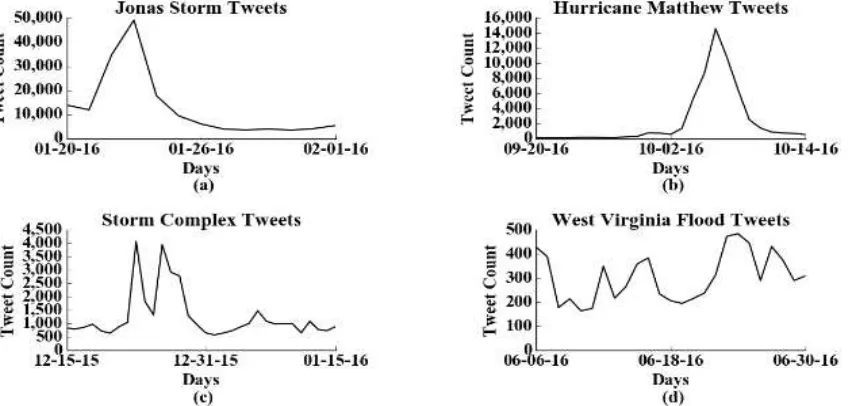
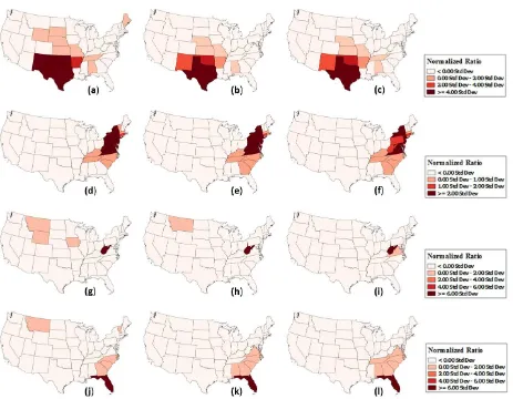
In order to assess the rate of Twitter usage during the events we have generated time plots of the tweet count for each events using SEDE (Figure 1).To understand the tweeting activity with respect to locations, we have used the mapping functionalities of SEDE. For map-based illustrations, we have selected 26-Dec-2015 for North American storm complex, 23-Jan-2016 for Jonas
snowstorm, 24-Jun-2016 for West Virginia floods, and 6-Oct-2016 for Hurricane Matthew as these were the days when the Twitter activity peaked for each events. A set of unnormalized choropleth maps based on tweet count, and normalized choropleth maps based on total tweet count, total Twitter user Figure 1. Time plot of event related tweets for (a) Juno storm (b) Hurricane Matthew (c) North American Storm Complex (d) West Virginia Floods
population, and census population for the four events were created using SEDE.
5.1 North American Storm Complex
The time plot for the event (Figure 1(c)) suggests there had been multiple days during which there was a surge in event related tweets. Since the event started from 25-Dec-2016, we could discard the initial peak in tweet counts that happened on 23-Jan-2016 due to tornadoes in Mississippi and Tennessee. Within the event timeframe, the event related tweets peaked during 26-Dec-2016, when there were massive tornado outbreaks in Oklahoma and Texas. At this time New Mexico, southeastern Colorado, western Oklahoma and West Texas also had storms and blizzards. From the unnormalized map for the event on 26-Dec-2016 (Figure 2), it could be seen that apart from Texas and Oklahoma, other relevant states, which had tornadoes and storm such as Arkansas, and states that had blizzards such as New Mexico and Colorado was underrepresented. It could also be seen that states such as California and Illinois, which did not have any tornadoes, or storm got overrepresented because of the population bias. The normalized maps for the event (Figure 7(a)-(c)) clearly shows a reduction in population bias. For the tweet normalized map (Figure 7(a)), Texas, New Mexico and Oklahoma are clearly shown to have high intensity in event related tweeting with respect to the total tweets produced from these states. Some of the states such as Maine, and Wyoming, which did not have tornadoes or storm, also got represented in the map, which might be due to the highly unstable variances created, when calculating ratios for less common events. This
issue is generally referred to as the “small number problem”
(Diehr, 1984). The small number problem is reduced in the based maps (Figure 7(b)-(c)). These population-based maps have the advantage of reducing bias created due to highly tweeting users. We could see that states such as Maine and Wyoming that was prominent in tweet based normalization, was removed in user-based normalizations.
Figure 2. Unnormalized map for Storm Complex Event that happened on 26-Dec-2015
5.2 Winter Storm Jonas
From the time plot for Jonas storm tweets (Figure 1(a)) it could be seen that, event related tweeting was higher between 20-Jan-2016 and 25-Jan-20-Jan-2016, with 23-Jan-20-Jan-2016 having the highest peak. As the storm affected densely populated areas in East Coast including New York, New Jersey, Maryland, and Pennsylvania, it could be seen that the tweet count is substantially higher when compared to the other three events. The unnormalized map (Figure 3), even though represents New York and Pennsylvania to be having high aggregation of event related tweets, states such as California and Florida which did not had any snow storms or blizzards are over represented in the map. The normalization strategies (Figure 7(d)-(f)), reduced the population bias, and states that were highly affected including
New Jersey, Delaware, Virginia, West Virginia, and Massachusetts became prominently represented in the map.
Figure 3. Unnormalized map for winter storm Jonas that happened on 23-Jan-2016
5.3 West Virginia Floods
The time plot (Figure 1(d)) of West Virginia floods reveals the consistent and localized nature of floods. This could be attributed to the low number of event related tweets compared to other events. From the time plot (Figure 1(d)) it could be seen that the highest peaks of tweeting activity were during 23-Jun-2016 and 24-Jun-23-Jun-2016 when West Virginia and parts of Virginia was struck by floods. Highly populated states such as California, Texas, and Florida got overrepresented in the unnormalized map (Figure 4) due to the inherent population bias. The normalized maps (Figure 7(g)-(i)) shows some interesting variations. From the tweet normalized map (Figure 7(g)) it could be seen that along with West Virginia, three more states including Montana, Wyoming, and Iowa are also prominent in the map. While Iowa had floods during that period, Montana and Wyoming did not have any floods and were only having two and one flood related tweets respectively. This again indicates the problem of “small numbers” when the normalization variables are highly unstable. Tweet map normalized by Twitter users (Figure 7(h)), reduces this effect. Normalization by census data (Figure 7(i)) completely reduces
the problem of “small numbers” and represents the relevant states West Virginia and Virginia, which had floods during that day.
Figure 4. Unnormalized map for West Virginia floods that happened on 24-Jun-2016
5.4 Hurricane Matthew
Time plot for hurricane Matthew (Figure 1(b)) suggests that the event related tweets gradually build up from 03-Oct-2016, had a peak in 06-Oct-2016, and waned down after 07-Oct-2016. The gradual buildup of event related tweets might be due to pre-warnings about the hurricane as it approached the United States through Haiti. Major events such as Disney World shutdown,
and “state of emergency” declaration in multiple states
including Florida, North Carolina and Georgia could be attributed to the high tweeting rates during the event. The unnormalized map (Figure 5) for the event shows the ISPRS Annals of the Photogrammetry, Remote Sensing and Spatial Information Sciences, Volume IV-4/W2, 2017
prominence of event related tweets from Florida where the hurricane had its most devastating impacts. However, along with impacted states such as Florida, North Carolina, and Georgia, other highly populated states such as Texas,
California, and New York are also prominently represented due to the high population bias. The tweet normalized map (Figure 7(j)), even though reduces the population bias, does not handle
the “small number” problem, as states such as Montana and Vermont with twelve and eleven tweets respectively are dominantly represented in the map. The user-normalized maps (Figure 7(k)-(l)) reduces this problem effectively.
Figure 5. Unnormalized map for Hurricane Matthew that happened on 06-Oct-2016
6. DISCUSSIONS
The results from our study reveals that different normalization strategies are required to reduce the inherent bias associated with social media data (Mislove et al., 2011; Malik et al., 2015). Any count based or unnormalized representation of Twitter data could result in population density based maps as suggested by the close correlation of Twitter users to state population (r2=.95) (Figure 6). This became evident from the unnormalized maps for the four events. Each of the normalization strategies that we have applied had variations with respect to the nature of events. Even though tweet based normalizations, reduces population
bias, it compounds “small number” problem. This could be
assessed by the dominant representation of states such as Montana and Wyoming, which had minimal number of tweets when compared to other states. Apart from population bias, users who frequently tweet such as celebrities and bots could also induce biasness to results, which tweet-based normalization does not handle. Normalizations based on Twitter users, and census provided the best results for our event based experiments. For local events such as flooding, census based normalization tend to be the best option. This was evident from the census-based normalization for West Virginia (Figure 7(i)), which perfectly represented West Virginia and Virginia having the larger impact of the floods. Both census based and Twitter user-based normalizations were effective in reducing “small
number” problems. This became evident from the normalized maps for West Virginia floods and hurricane Matthew, when the over representation of states with minimal tweets were reduced. From the entire experiment we could deduce that, population based normalization strategies tend to perform well when compared to tweet based normalizations. Census based normalizations tend to perform slightly better than Twitter user based normalizations in dealing with high variations in tweeting density.
Figure 6. A Twitter user to population data comparison. The coefficient of determination (r2) was .95 indicating high correlation between the data.
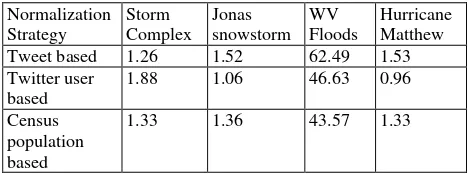
In order to compare and contrast between the three normalization strategies quantitatively, we calculated the variance for the standardized ratio across all the 48 states for the four events (Table 2). From the variance data, it could be identified that all the normalization-based strategies tend to perform similarly for storm complex, Jonas snowstorm and hurricane event. For the West Virginia flood, a larger variance in the standardized ratio could be due to the local nature of the
event and paucity of tweets. The problem of “small numbers”
could be a key issue, which can cause unstable variances as suggested by previous studies (Diehr, 1984; Jones and Kirby, 1980).
Normalization Strategy
Storm Complex
Jonas snowstorm
WV Floods
Hurricane Matthew Tweet based 1.26 1.52 62.49 1.53 Twitter user
based
1.88 1.06 46.63 0.96
Census population based
1.33 1.36 43.57 1.33
Table 2. Variance of standardized ratio across 48 states when the three normalization strategies are used
7. CONCLUSION
The aim of this study was to identify and examine various normalization strategies for highly biased social media data. We identified three normalizations strategies including
normalization based on total tweets, total Twitter users and census population, and utilized the Socio-Environmental Data Explorer (SEDE) to assess our strategies. The three
normalization strategies were tested across for different extreme events with varying spatio-temporal extent and different social media attention. Our studies revealed that due to the high correlation with the number of Twitter users and census population, normalization strategies are quintessential to identify and remove population bias. Our experiments also revealed that along with normalization, issues such as the
problem of “small numbers” could get compounded, which
might produce erroneous and spurious patterns. Based on the four event based experiments we found that user based normalization strategies such as normalization by Twitter users and census population tend to produce better results and help to
alleviate “small number” problem to a greater extent. As a part of future works, we will try to tackle the problem of “small numbers” quantitatively by including probability mapping
(Choynowski, 1959), chi-square mapping (Jones and Kirby, ISPRS Annals of the Photogrammetry, Remote Sensing and Spatial Information Sciences, Volume IV-4/W2, 2017
1980), and Bayesian smoothing (Clayton and Kaldor, 1987) in SEDE. In addition, we intend to extend our strategies to finer spatial scales such as counties and cities, which would be more appropriate for local-scale events such as flooding.
REFERENCES
Allen, C., Tsou, M.-H., Aslam, A., Nagel, A., Gawron, J.-M., 2016. Applying GIS and Machine Learning Methods to Twitter Data for Multiscale Surveillance of Influenza. PloS one 11, e0157734.
Chew, C., Eysenbach, G., 2010. Pandemics in the age of Twitter: content analysis of Tweets during the 2009 H1N1 outbreak. PloS one 5, e14118.
Choynowski, M., 1959. Maps based on probabilities. Journal of the American Statistical Association 54, 385–388.
Clayton, D., Kaldor, J., 1987. Empirical Bayes estimates of age-standardized relative risks for use in disease mapping.
Biometrics 671–681.
Croitoru, A., Crooks, A., Radzikowski, J., Stefanidis, A., 2013. Geosocial gauge: a system prototype for knowledge discovery
from social media. International Journal of Geographical Information Science 27, 2483–2508.
Crooks, A., Croitoru, A., Stefanidis, A., Radzikowski, J., 2013. # Earthquake: Twitter as a distributed sensor system.
Transactions in GIS 17, 124–147.
De Longueville, B., Smith, R.S., Luraschi, G., 2009. Omg, from here, i can see the flames!: a use case of mining location based social networks to acquire spatio-temporal data on forest fires, in: Proceedings of the 2009 International Workshop on Location Based Social Networks. ACM, pp. 73–80.
Diehr, P., 1984. Small area statistics: large statistical problems. American Public Health Association.
Earle, P.S., Bowden, D.C., Guy, M., 2012. Twitter earthquake detection: earthquake monitoring in a social world. Annals of Geophysics 54.
Eisenstein, J., Smith, N.A., Xing, E.P., 2011. Discovering sociolinguistic associations with structured sparsity, in: Proceedings of the 49th Annual Meeting of the Association for Computational Linguistics: Human Language Technologies-Volume 1. Association for Computational Linguistics, pp. 1365–1374.
Figure 7. Maps based on normalization strategies for the four events. Tweet normalized maps for Storm Complex (a), winter storm Jonas (d), West Virginia Floods (g), and Hurricane Matthew (j). Twitter user normalized maps for Storm Complex (b), winter storm Jonas (e), West Virginia Floods (h), and Hurricane Matthew (k). Census normalized maps for Storm Complex (c), winter storm Jonas (f), West Virginia Floods (i), and Hurricane Matthew (l).
Gastner, M.T., Newman, M.E., 2004. Diffusion-based method for producing density-equalizing maps. Proceedings of the National Academy of Sciences of the United States of America 101, 7499–7504.
Hannon, J., Bennett, M., Smyth, B., 2010. Recommending twitter users to follow using content and collaborative filtering approaches, in: Proceedings of the Fourth ACM Conference on Recommender Systems. ACM, pp. 199–206.
Hecht, B., Stephens, M., 2014. A Tale of Cities: Urban Biases in Volunteered Geographic Information. ICWSM 14, 197–205.
Hughes, A.L., Palen, L., 2009. Twitter adoption and use in mass convergence and emergency events. International Journal of Emergency Management 6, 248–260.
Jin, Y., Liu, B.F., Austin, L.L., 2014. Examining the role of social media in effective crisis management: The effects of
crisis origin, information form, and source on publics’ crisis
responses. Communication research 41, 74–94.
Jones, K., Kirby, A., 1980. The use of chi-square maps in the analysis of census data. Geoforum 11, 409–417.
Kaplan, A.M., Haenlein, M., 2010. Users of the world, unite! The challenges and opportunities of Social Media. Business horizons 53, 59–68.
Katz-Bassett, E., John, J.P., Krishnamurthy, A., Wetherall, D., Anderson, T., Chawathe, Y., 2006. Towards IP geolocation using delay and topology measurements, in: Proceedings of the 6th ACM SIGCOMM Conference on Internet Measurement. ACM, pp. 71–84.
Kongthon, A., Haruechaiyasak, C., Pailai, J., Kongyoung, S., 2012. The role of Twitter during a natural disaster: Case study of 2011 Thai Flood, in: Technology Management for Emerging
Technologies (PICMET), 2012 Proceedings of PICMET’12:
IEEE, pp. 2227–2232.
Leetaru, K., Wang, S., Cao, G., Padmanabhan, A., Shook, E., 2013. Mapping the global Twitter heartbeat: The geography of Twitter. First Monday 18.
Li, L., Goodchild, M.F., Xu, B., 2013. Spatial, temporal, and socioeconomic patterns in the use of Twitter and Flickr. cartography and geographic information science 40, 61–77.
Longley, P.A., Adnan, M., Lansley, G., 2015. The geotemporal demographics of Twitter usage. Environment and Planning A 47, 465–484.
MacEachren, A.M., Jaiswal, A., Robinson, A.C., Pezanowski, S., Savelyev, A., Mitra, P., Zhang, X., Blanford, J., 2011. Senseplace2: Geotwitter analytics support for situational awareness, in: Visual Analytics Science and Technology (VAST), 2011 IEEE Conference on. IEEE, pp. 181–190.
Malik, M.M., Lamba, H., Nakos, C., Pfeffer, J., 2015. Population bias in geotagged tweets, in: Ninth International AAAI Conference on Web and Social Media.
Mislove, A., Lehmann, S., Ahn, Y.-Y., Onnela, J.-P., Rosenquist, J.N., 2011. Understanding the Demographics of Twitter Users. ICWSM 11, 5th.
O’Connor, B., Balasubramanyan, R., Routledge, B.R., Smith, N.A., 2010. From tweets to polls: Linking text sentiment to public opinion time series. ICWSM 11, 1–2.
Olteanu, A., Vieweg, S., Castillo, C., 2015. What to expect when the unexpected happens: Social media communications across crises, in: Proceedings of the 18th ACM Conference on Computer Supported Cooperative Work & Social Computing. ACM, pp. 994–1009.
Sakaki, T., Okazaki, M., Matsuo, Y., 2010. Earthquake shakes Twitter users: real-time event detection by social sensors, in: Proceedings of the 19th International Conference on World Wide Web. ACM, pp. 851–860.
Shelton, T., Poorthuis, A., Graham, M., Zook, M., 2014. Mapping the data shadows of Hurricane Sandy: Uncovering the
sociospatial dimensions of “big data.” Geoforum 52, 167–179.
Shook, E., Turner, V.K., 2016. The socio-environmental data explorer (SEDE): a social media–enhanced decision support system to explore risk perception to hazard events. Cartography and Geographic Information Science 43, 427–441.
Starbird, K., Muzny, G., Palen, L., 2012. Learning from the crowd: collaborative filtering techniques for identifying on-the-ground Twitterers during mass disruptions, in: Proceedings of 9th International Conference on Information Systems for Crisis Response and Management, ISCRAM.
Starbird, K., Palen, L., 2010. Pass it on?: Retweeting in mass emergency. International Community on Information Systems for Crisis Response and Management.
Stefanidis, A., Crooks, A., Radzikowski, J., 2013. Harvesting ambient geospatial information from social media feeds. GeoJournal 78, 319–338.
Sutton, J., Spiro, E.S., Johnson, B., Fitzhugh, S., Gibson, B., Butts, C.T., 2014. Warning tweets: Serial transmission of messages during the warning phase of a disaster event. Information, Communication & Society 17, 765–787.
Sutton, J.N., 2010. Twittering Tennessee: Distributed networks and collaboration following a technological disaster. ISCRAM.
Sutton, J.N., Palen, L., Shklovski, I., 2008. Backchannels on the front lines: Emergency uses of social media in the 2007 Southern California Wildfires. University of Colorado.
Thomson, R., Ito, N., Suda, H., Lin, F., Liu, Y., Hayasaka, R., Isochi, R., Wang, Z., 2012. Trusting tweets: The Fukushima disaster and information source credibility on Twitter, in: Proceedings of the 9th International ISCRAM Conference. pp. 1–10.
Tsou, M.-H., Jung, C.-T., Allen, C., Yang, J.-A., Gawron, J.-M., Spitzberg, B.H., Han, S., 2015. Social media analytics and research test-bed (SMART dashboard), in: Proceedings of the 2015 International Conference on Social Media & Society. ACM, p. 2.
Vieweg, S., Hughes, A.L., Starbird, K., Palen, L., 2010. Microblogging during two natural hazards events: what twitter may contribute to situational awareness, in: Proceedings of the SIGCHI Conference on Human Factors in Computing Systems. ACM, pp. 1079–1088.