Jurusan Desain Komunikasi Visual, Fakultas Seni dan Desain –Universitas Kristen Petra
IN VISUAL COMMUNICATION DESIGN GOAL
Case Study: Kuta Beach Bali-Indonesia and Haeundae Beach Busan-Korea
Listia Natadjaja
Lecturer of Visual Communication Design Lecturer, Art and Design Faculty Petra Christian University, Surabaya
E-mail: [email protected]
ABSTRACT
As we know there are many resorts in Indonesia especially in Bali. Each resort needs a sign system for information and safety. We need a field study from other countries to compare our sign system condition, so we can get some description of how to create an effective sign system and what we should do to make a better environment. This case study represents two famous beaches in two countries which are Kuta Beach in Bali–Indonesia and Haeundae Beach in Busan-Korea. Through a study of another sign system, hopefully we can create an effective sign system that meets the Visual Communication Design Goal. Each area has a unique character, so a sign system can be developed by looking at the environment and local culture to reach a global understanding.
Keywords: resort, sign system, effective, visual communication design goal.
ABSTRAK
Seperti yang kita ketahui ada begitu banyak tempat rekreasi di Indonesia utamanya di Bali. Tiap-tiap tempat rekreasi memerlukan sistem tanda untuk informasi dan keselamatan. Diperlukan suatu studi lapangan untuk membandingkan kondisi sistem tanda antar negara, sehingga didapatkan beberapa gambaran bagaimana menciptakan suatu sistem tanda yang efektif dan apa yang perlu dilakukan untuk membuat lingkungan yang lebih baik. Studi kasus yang diambil mewakili dua tempat rekreasi yaitu pantai yang terkenal di masing-masing negara yaitu pantai Kuta Bali-Indonesia dan pantai Haeundae di Busan-Korea. Dengan mempelajari sistem tanda yang berbeda, diharapkan dapat diciptakan suatu sistem tanda yang efektif untuk mencapai tujuan desain komunikasi visual. Tiap-tiap lokasi memiliki karakter yang unik, jadi sistem tanda dapat dikembangkan dengan melihat lingkungan dan budaya lokal untuk mencapai pengertian secara global.
Kata kunci: tempat rekreasi, sistem tanda, efektif, tujuan desain komunikasi visual.
INTRODUCTION
Visual design attempts to solve communication
problems in a way that is at once functionally effective and aesthetically pleasing. By communication, we mean the full process by which the behavior of one goal-seeking entity comes to be affected by that of another through the reciprocal exchange of message or sign over some mediating physical channel. Research in communication theory has investigated the statistical properties of communication channel, the structure of language systems, the psychological and social characteristics of message senders and receivers, and the effectiveness of various coding techniques (Cholin, 1978). The goal of communica-tion oriented design is to develop a message that can be accurately transmitted and correctly interpreted, and which will produce the desired behavioral outcome after it has been understood by its recipient (Mullet, 1995:1-2).
This paper’s purpose is to qualitatively research and to evaluate our sign system for resorts especially in Kuta beach in Bali-Indonesia and Haeundae beach Busan-South Korea. This comparison is mostly to improve the sign system that is not effective to reach the Visual Communication Goal. By comparing these two places, hopefully we can get an overview for other places and reevaluate what we have and act on developing our sign system.
INFORMATION DESIGN
One of the most important but least recognized aspects of the design profession is the organization and presentation of information. Designers need to make information accessible and available to every-one.
has the efficient communication of information as its primary task, and this implies a responsibility that the content be both accurate and unbiased in its presentation. Information design tries to present all the objective data required to enable the user to make some kind of decision. The information designer has been described as a ‘transformer’ of information whether of raw data, a set of actions or a process into a visual model capable of revealing its essence in terms which a particular audience can grasp easily (Wildbur & Burke, 1998:6). Information consists of differences that make a difference. Excellence design consists of complex ideas communicated with clarity, precision, and efficiency and that is just as true of the new media of the old
(Edward, 1990).
KUTA BEACH AND HAEUNDAE BEACH
Both of these resorts are beaches. These two beaches have their unique environment. The sign systems that they have are different. Kuta beach is located in Bali Island Indonesia and Haeundae beach is located in Busan South Korea.
Kuta Beach
Indonesia has a lot of recreational places; one of the famous recreational places is Kuta beach, located in Bali Indonesia. The beach of Kuta is one of the first favorite beaches discovered by tourists. Lying on the western shore of the isthmus leading to Badung Peninsula, Kuta has earned a reputation as a beach paradise, attracting surfers and swimmers of all ages and nationalities (Denpasar, 2005). The beauty of the shore and the hospitality of Balinese people make this location famous. Behind the beauty of the scenes, tourists sometimes need some information about the place. Information center is not adequate to accommodate all of the information needed. Visual Design can help people to be informed about the place and moreover about safety information.
Based on a field study there are many information systems that have to be redesigned. Some of them are not legible, not eye-catching, wrongly placement and not well maintained.
Haeundae Beach
Named after the alias of the great writer Choe, Chi–Won in the Shilla dynasty, Haeundae is the biggest and the most famous beach in South Korea.
Looking at the length, the shore is shorter than Kuta Beach. It is located near the city of Busan; the character of this beach is different from Kuta beach.
Once known only for its hot springs, the narrow strip of sand around Haeundae has become Korea’s most popular beach. During the summer vacation, espe-cially on weekends, the area becomes a wall of humanity. Even during the colder seasons, people still flock here to walk along the boardwalk, fly kites in the ocean breeze, and look for shells in the sand. The area hotels do a brisk business for weddings and birthdays. Some also have casinos for foreign guests (Life, 2005).
The interesting part of the beach is the sign system that they have. Well organized sign systems are seen a lot in South Korea, but the focus research is in recreational place, and one of it is in Haeundae Beach.
TYPES OF SIGN DESIGN
Sign design is at something of a crossroads, both artistically and technologically (Sign,1995). There are many types of sign design which are ground signs, projecting signs and hanging signs, pole mounted signs and post mounted signs, sign system, wall mounted signs, specialty signs. The type of sign design is differentiating based on the material, placement of sign, function and the process of mounted. Among the six types of signs there are two sign system that will be discussed in this paper that is pole mounted signs, post mounted signs and sign system.
Retail establishments make the most prodigious use of pole- and post- mounted signs. Situated most often at roadsides or in parking lots, these signs are often, but not always, illuminated from an interior source. Many of the non-electric signs rely on exterior spot lights to draw attention to them in evening hours. In all cases, however, these signs identify their accompanying establishments from a greater distance than ground, hanging, or projecting signs.
VISUAL COMMUNICATION DESIGN GOAL
As the goal of all communication is “to induce the audience is belief about the past…, the present…, or the future,” audience considerations are integral components of the process of visual communication. During that process, the designer attempts to persuade the audience to adopt a belief demonstrated or suggested through the two-dimensional object. The purpose of this persuasion is to accomplish one of the following goals: to induce the audience to take some action; to educate the audience (persuade them to accept information or data); or to provide the audience with an experience of the display or exhibition of a value for approval or disapproval, values with which an audience may wish to identify or may wish to reject of the relationship between audience and communication goals. All goals occur to some degree in one design, but a particular goal is dominant. An exploration of the relationship between audience and communication goals will reveal how belief is shaped through design (Tylor, 1992:104-109).
Visual Communication Design goals should persuade the audience to act, educating the audience, providing the audience with an experience through the display of values and shaping belief. The implemen-tations of persuading the audience to act are persuading an audience to obey the rule, swim at the right place and right time is inducing that audience to take an action. In an attempt to persuade, the designer develops an argument within the two dimensional space that defines and represents an audience’s future experience.
The second communication goal is to educate the audience or to persuade the audience to accept and interpret information. Information can be seen as valueless, as not reflecting a particular belief system. But all communication involves an interpretation of information, an interpretation based on data, perspec-tive, analysis, and judgment (Carey, 1989:195). Educational materials are no exception; information is interpreted and communicated according to the paradigms of academic communities. Educating the audience often includes making an argument that the information is “fact,” that it is “true.”
Third goal is providing the audience with an experience through the display of values. Though all design creates some type of experience for the audience, experience is rarely the primary communi-cation goal. If the goal of a design is experiential, then it is often interpreted as a focus on the esthetic moment (Dewey, 1958). Experience, is a display of values, however, and esthetics is simply one of any number of values. When an experience is the goal of
an agent, the design displays or exhibits particular values for the audience to consider. The audience may identify with the values or they may condemn or reject the values.
The last but important is finally the goal can shaping belief. The goal of visual communication is to persuade an audience to adopt a new belief. However, this necessitates a reference to existing beliefs through formal devices. In developing an argument, a designer does not have a choice of referencing beliefs or not referencing beliefs; the choice lies in what beliefs are referenced. In making this choice, existing belief will be affected (maintained, rejected, or transformed) and a new belief will be shaped. The designer, of course, cannot combine just any set of beliefs with a subject to reach the communication goal. Communication is directed toward a specific audience and that audience comes to the argument with particular cultural beliefs and understanding. The audience is a dynamic participant and the argument and the designer must discover the argument that will persuade a particular audience.
EFFECTIVE VISUAL DESIGN
Effective design depends critically on meaningful global structure. Effective visual design accounts for optical qualities of every design elements and provides compensation where necessary. The goal of effective design is to create apparent visual relationships between conceptually related elements. Optical adjustment ensures that these relationships arise when, and only when, the conceptual relationship makes it appropriate (Mullet, 1995:118-122). Effective visual design establishes structural relationship wherever possible within an image or composition.
Visual design is grounded in perceptual, rather than physical phenomena, so compensation for the peculiarities of human vision is often required. Proper visual alignment depends critically on careful optical adjustment to compensate for differences in shape and contour of the elements being aligned. Effective design respects the capabilities and limitations of visual language, which, at its most basic level, concerns the primitive visual distinctions that are available in human vision (Mullet, 1995:51-54).
display component parts. Unfortunately this is one of the most difficult problems in visual design and the one that requires the most practice to develop. Altering even a single attribute of one part in a complex composition can have significant impact on the balance, the unity, and ultimately the harmony of the whole. When a single element is too large or too small, too light or too dark, too prominent or indistinct, the entire design suffers. There are many ways that elements can be manipulated to produce the desired global effect.
Scaledescribes the relative size or magnitude of a given design element in relation to other design elements and the composition as a whole. Grillo describes scale as, “the feeling of a design fitting its space and its surrounding.”(Jacques, 1960). Scale is never meaningful in an absolute sense if nothing else; it is defined in relation to the human viewer. Achieving the right balance between point and counterpoint, between pattern and focus, between figure and ground, depends on careful manipulation of the graphical qualities of each element in the display. The magnitude of the differences required to establish these balances are governed by the principles of contrast.
Contrastresults from noticeable differences along a common visual dimension that can be observed between elements in a composition. Contrast provides the basis for visual distinction, which are the building blocks of meaning in a visual message. The dimensions along which visual contrasts can be drawn include shape, size, color, texture, position, orien-tation, and movement. Effective visual design consists of selecting for each part and for the whole composition- the visual treatment that most effectively realizes communication goal. Visual design, however, is lifeless when its only concern is for communication efficiency. Scale and contrast must be modulated to produce the right balance between interesting visual dynamics and pleasing, harmonious proportion.
Proportion described by Grillo as “a rapport between two dimensions,” deals in ratios rather than fixed sizes. It determines the balance and harmony of the relation between elements. Proportion is the metric that guides the choice of scales in a contras relationship. Classical systems of proportion codify relationships known to please the mind as well as the eye. In practice most designers manipulate proportion on the basis of a highly developed perceptual sensitivity acquired through years of experience, rather than through mechanical techniques, but classical system such a the Golden Rectangle are inevitable starting point.
Regardless of its source, the effective use of scale, contrast and proportion confers many benefits like: differentiation that contrast is essential for different-tiating elements from one another–for allowing form to emerge from the void. Second is emphasis. Scale and contrast can be used to emphasize important elements or areas in the composition. Third is activity. Scale and contrast move the viewer’s eye through the composition in a predictable sequence that can be used to support a particular communication goal. The last, it can develop the interest. Scale and contrast add visual interest to a composition by juxtaposing elements with strongly opposed visual qualities to create tension, drama and excitement.
Effective design balances contrast with regularity. The interplay between global and local readings produces a dynamic visual identity that is stable, yet active and visually interesting (Mullet, 1995:43).
KUTA BEACH SIGNAGE SYSTEM
One of the functions of the sign system at Kuta beach is to give information about safety regulations of swimming in the ocean. The placement of the signage as seen on figure 1 is in front of the parking lot. It is explained that swimmers should swim between the red yellow flags. The sign is written in three languages: Bahasa Indonesia, English and Japanese. These three languages are written based on consideration that the most tourists are from Indonesia, English speaking countries and Japan.
Figure 1. Safety Swimming Area
The signage which is located in front of the parking lot is easy to be forgotten by the swimmers and does not really grasp the attention of the visitor.
Figure 2. Signage is Placed in front of the Parking Lot
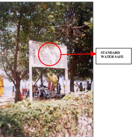
Along the side, there is another signage which mentions about standard water safety (see figure 3). It is written in two languages: Bahasa Indonesia and English. The size of the signage is consistent but the use of language is not.
Figure 3. Standard Water Safety Sign
At the back of the signage system where people use to hang out, there is no sign. It is left without any finishing. It is not effective functionally nor aesthetically. See figure 4.
Another problem that exists in Kuta beach is low maintenance of the sign, at figure 5 there is a frame without any signage.
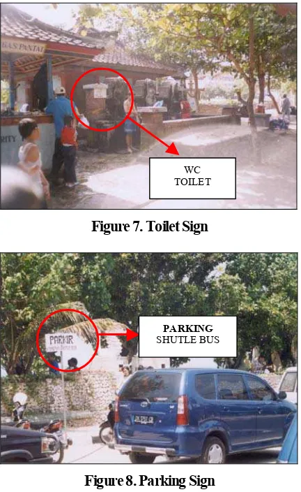
Security Posts should be easily found, but in this case the location is not easily seen. It is located between two rest rooms. The signage is not well made for the rest room, besides it is not eye-catching (see Figure 6 & 7).
Figure 4. Back Side of Signage
Figure 5. Not Well Maintained Signage
Figure 6. Security Post
The other sign along the sidewalk is a parking sign for the shuttle bus. Parking sign for shuttle bus is not seen well. The size of the parking lot also not adequate for a shuttle bus, anyway there are many motorcycles and cars parking without noticing the signage.
Most of the material that is used for the signage construction is wood. One of the natural resources for the tropical country is wood, so this material is suitable to be used but not long lasting for a sign system located near the beach.
STANDARD WATER SAFE
EMPTY SIGN
Figure 7. Toilet Sign
Figure 8. Parking Sign
HAEUNDAE BEACH SIGN SYSTEM
Haeundae beach has different circulation system for its entrance. Most of the visitors come to the beach by public transportation. That is why the sign system is important and very useful to put in front of the gate. The big map describing about the whole area of the beach and the surrounding could attract the attention of the visitors.
Figure 9. Map of Haeundae Beach and Surroun-ding
On figure 10 it’s seen that the Haeundae tourist map is written in Korean and English. The size is big enough to be seen from 2 meters away.
Figure 10. Map Written in Two Languages: Korean and English
Figure 11. Forbidden Sign
The forbidden signage has been placed along the beach. It is written on both sides, so visitors can see the signage easily. The size is not too big and not too high; it is the same height as human eyes and suitable for children’s eyes. It says that for everyone’s enjoyment, the following are not allowed on the beach.
The design is simple with stainless steel construction. Korea is the number one steel production country. They use steel source for many items, like spoons and chopsticks, elevator buttons, door handles, etc. They explore their natural resources.
WC TOILET
PARKING
SHUTLE BUS
HAEUNDAE TOURIST MAP
THE HAEUNDAE FINEST TOURIST ATTRACTION
For everyone’s enjoyment, The following are not allowed
Sometimes material can form the style of the design. Signs and images are fragments of experience that reflect our perception of material objects. Material objects, in turn, become instruments of action. Signs, things, and actions are organized in complex instruments by a unifying idea or thought (Buchanan, 1992).
Good design is simple, bold, and direct. It ensures that significant design elements will be noticed by removing insignificant elements wherever possible (Mullet, 1995:37).
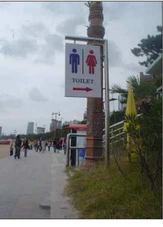
The signage of the rest room is very eye catching (Figure 12). It’s easy to find because it is placed on the left side of the side walk. It is simply designed with the universal icon, so everybody from every country could understand the signage very easily. In Korea most signage are always written in Korean, in case of this toilet sign, everybody will understand, because it is a common icon.
Figure 12. Toilet Sign
From the portrait we can see that most of the design style is simple. Simplicity does not mean want or poverty. It does not mean the absence of any décor, or absolute nudity. It only means that the décor should belong intimately to the design proper, and that anything foreign should be taken away (Jacques, 1960). Simplicity plays central role in all timeless designs. The most powerful designs are always the result of a continuous process of simplification and refinement. The benefits of simplicity are functional as well as aesthetic in nature:
Approachability. Simple designs can be rapidly apprehended and understood well enough to support immediate use or invite further exploration.
Recognizability. Simple designs can be recog-nized more easily than their more elaborate counter-parts. Because they present less visual information to the viewer, they are more easily assimilated, understood, and remembered.
Immediacy. Simple designs have greater impact than complex designs, precisely because they can immediately recognized and understood with a minimum of conscious effort. The most powerful symbols in human culture are always reduced to their absolute minimal form.
Usability. Improving the approachability and memorability of a product necessarily enhances usability as well. Simple designs that eliminate unnecessary variation or detail make the variation that remains more prominent and informative (Mullet, 1995:18).
Understatement can be a difficult quality to grasp through conscious effort. Apart from the obvious focus on economy, the elements in the design must be unified to produce a coherent whole, the parts (as well as the whole) must be refined to focus the viewer’s attention on their essential aspects, and the fitness of solution to the communication problem must be ensured at every level (Mullet, 1995:19).
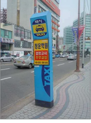
Figure 14. Taxi Stop Area
Bus for city tour can parked very conveniently along the sidewalk in front of the beach. The sign system not only informs about the parking lot but also the schedule of the city tour and the other surrounding area. Figure 13.
Besides the shuttle bus parking lot (see figure 14), there is an area for stopping the taxi. It is very convenient and it makes the traffic well organized. The bus parking sign material is made of fiber with steel combination and the taxi stop area is made of fiber which is long lasting and strong.
After comparing the two sign systems, we need to evaluate them. Below is a table with details that can describe the weaknesses and the strengths of the two sign systems based on the fact in the field. Good design and bad design have their own effect to the audience. In fact, according to Paul Rand the public is more familiar with bad design than good design. It is in effect, conditioned to prefer bad design, because that is what it lives with. The new becomes threatening, the old reassuring (Rand, 1993).
SIGNAGE SYSTEM COMPARISON
Table 1. Sign System Comparation Table
Remark Kind Of
Signage
Kuta Beach Design Haeundae
Beach
Design
Location Safety
Swimming - Not interesting
- At the beach
Parking Sign - Certain place along street in front of the beach.
Material Generally
Parking Sign
LanguageGenerally - Indonesia
- English - Japanese
- Korean
CONCLUSION
Both of the beaches have their own beauty. It can be seen by looking at the characteristic of each beach. Kuta beach is more tropical and filled with coconut trees. There are many accesses to reach the beach. Heaundae beach is smaller than Kuta beach; it is located in front of the high buildings near the city. There is one main gate through the beach. Environ-ment, location, and size of the beach can be powerful sources to shape the characteristic of the beach. The man made material that can shape that characteristic is the sign system.
There are many rules that have to be studied according to make an effective sign system to reach the visual communication design goal. The sign system should be scaled, contrasted, proportioned, differentiated, and emphasized on something, on points of activities and interests. Simple and eye catching are also important factors. The icons and languages for the instructions should be understood globally. Materials can be explored from natural sources; there are no rules to use a certain material. But the most important thing is how to make the material long lasting and always in good condition. Good planning and consistency of the location, shape, material and language that are used is important to determine the effectiveness of the sign system. Maintenance should be followed after the installation of the sign system. The goal of visual communication design can be reached by attaining universal understanding of the sign system.
I strongly suggest that this kind of research should be continuously made. It can be developed to a real project implementation. We need sign systems that are well planned, well coordinated and well maintained. Our natural resources are one of our assets for tourism, but it is not enough without adequate information that make tourists journey safe and enjoyable. With a good sign system that can grasp global understanding, hopefully the goal of visual communication design can be reached and our tourism can increase gradually in the long term.
REFERENCES
Buchanan, Richard. (Spring 1992).Wicked Problem in Design Thinking, The Idea of Design. Volume 8, number 2 pp.5-22.
Carey, James W. (1989). Communication as Culture: Essays on Media and Society. Boston: nwin Hyman, Inc.
Colin, Cherry. (1978). On Human Communication- a Review, a Survey, and a Criticism (3th ed.). New York: John Wiley and Sons.
Dewey, John. (1958). Art Expenence. New York: Capricorn Books
Denpasar Government Tourism. (2005). Last Access January 25, 2006 1:29:53 AM. BaliVision.com. http://www.balivision.com/Article_Resources/ kuta.asp
Edward R, Tufte. (1990). Envisioning Information. Cheshire, Connecticut: Graphic Press.
Jacques, Grillo Paul. (1960). Form, Function, and Design. New York: Dover. Originally public-shed as, What is Design?, Chicago: Paul Theobold and Co.
Life in Asia. (2005). Life in Korea. 1997-2005.
http://www.lifeinkorea.com/Travel2/pusan/146
Mullet,Kevin., Sano, Darrell. (1995). Designing Visual Interfaces. USA: SunSoft Press A Prentice Hall Title.
Rand, Paul. (1993). Paul Rand: A Designer’s Art.
New Haven: Yale University Press.
Sign Design Gallery 2. (1995). USA: Rockport Publishers, Rockport Massachusetts.
Tylor, Ann C. (Fall 1992). Shaping Belief: The Role of Audience in Visual Communication. The Idea of Design, Volume 9, number 1 pp.104-109.