1 IJNMT, Vol. V, No. 1 | June 2018
ISSN 2355-0082
Analysis and Development of Interface Design
on DKI Jakarta & Tangerang
‘S Qlue
Application based on D
on Norman’s 6 Design
Principles
Sheila Rizky Novensa
1, Wira Munggana
2Department of Information Systems, Faculty of Engineering and Informatics, Universitas Multimedia Nusantara, Tangerang, Indonesia
1[email protected] 2[email protected]
Received on August 28th, 2017
Accepted on June 8th, 2018
Abstract—As government effort to embrace the social media trend, one of it by launching a mobile application
called ‘Qlue’. Initial study of user experince showed the
result of questionnaire that was consisted of 6 questions from the six design principles from Don Norman regarding the UI of Qlue application, there are 2 things
in Qlue that don’t comply with six design principles from Don Norman. The 2 things are constraints and consistency. That was the reason for this research, to analyze and make a user interface for community service application which makes the usability easier based on the six design principles from Don Norman.
The comparison between Qlue’s user interface and the
user interface was done by distributing the
questionnaire that was consisted of 6 questions to the same respondents. Methodology used in this thesis is Task-Centered System Design (TCSD). Started with problem identification, analysis, UI redesign and evaluation. The result of this thesis is an UI that have a constraint which is a warning page that appeared before user finished writing a report and wanted to go back to previous page. The second result is a consistency of all report writing process and interface including buttons and icons. The conclusion of this research is that the revised proposed user interface has solved the problems that appeared on the UI of Qlue application.
Index Terms— Donald Norman, Six Design Principles, , Task-Centered System Design, TCSD, User Interface Analysis, Qlue.
I. INTRODUCTION
The large number of mobile phone users and active internet users through mobile phones is one of the opportunities that companies can use to enhance competitive advantage by developing mobile applications that provide services.
Application services that will be the primary object is an application called Qlue which provides reporting criminal acts that occurred in Indonesia to the local police station as its service. The application is integrated with the local police. Based on a report
from the Central Bureau of Statistics, in 2015, their registration data revealed the number of crimes in Indonesia tends to fluctuate from year to year. In order for such criminal acts to be readily addressed by the local police force, the user may report criminal acts through this application.
Human Computer Interaction theory that match this research is six design principles from Don Norman. These principles contain standards and concepts that aim to allow users to understand the workings and usability for both a website design or a mobile application.
The questionnaire that contains the questions of Don Norman's design principles is distributed to 224
respondents (with Jakarta’s population size 10 million,
confidence level 90%, margin of error 5%) to find things that are inconsistent with Don Norman's 6 design principles in the Qlue application. Based on the results of the questionnaire, there are two design principles that are not met in the Qlue application; which are constraint and consistency. Constraint refers to determining ways of restricting the kind of user interaction that can take place at a given moment. While consistency is the principle that standardized the consistency of a UI visual design.
II. LITERATURE REVIEW
A. Six Design Principles
Through his book Design of Everyday Things, Donald Norman explains the guidelines for making good designs using the objects people use every day [1]. Here are 6 key guidelines proposed by Donald Norman:
IJNMT, Vol. V, No. 1 | June 2018 2
ISSN 2355-0082
2. Affordances. Affordance is the visual attribute of an object or control that gives the user a clue of how the object or control can be used.
3. Mapping. Pressing a button or activating a control will usually trigger the system to perform some functions. There is a relationship or mapping between control and its effects.
4. Constraints. Provide limits on what an object might do.
5. Feedback. Feedback is important to help users understand how to interact with objects and what effect our actions have on the system. The purpose of the feedback is to provide confirmation to the user whether an action has been successful or not successfully done.
6. Consistency. Consistency is the key to helping users recognize and apply a pattern. A similar activity should do the same.
B. Task Centered System Design
The method used in this research is Task Centered System Design (TCSD). Figure 1 shows the steps of this study.
Fig 1. Study Process
Task-Centered System Design (TCSD) is a process for identifying user needs [2]. Here are the steps for doing TCSD [3]:
1. Identification; articulation of concrete description of real man doing real task
2. User-Centered Requirement analysis; use these descriptions to determine what kind of users and what tasks the system should perform
3. Design as Scenario; create a prototype display that meets those requirements
4. Walkthrough Evaluation; evaluate the view.
III. RESEARCH METHODOLOGY
A. Task Centered System Design (TCSD)
The study began by making the UI of the application Qlue using Axure program, a leading UI building tool and then proceed with the following steps:
1. Identification; distribution of questionnaires containing questions based on six design principles from Donald Norman on the UI of existing Qlue application.
2. User-Centered Requirement Analysis; analysis of the results of the questionnaire that has been distributed and find part of Qlue application that is incompatible with six design principles of Don Norman.
3. Design as Scenario; a revised UI will be created based on the problems that have been found.
4. Walkthrough Evaluation; distributing questionnaires containing the same questions to the same respondents to get an evaluation of the UI that has been made.
B. Data Retrieval
The data used for this study was obtained by distributing questionnaires containing questions about the use of Qlue community service applications to 224 respondents. Table 1 shows the table of questions with each of the principles represented.
Table 1. Question List
Question Principle
Can you easily find the menu you
would like to access? Discoverability
Do you know the function of a menu or symbol without any explanation stated?
Affordances
Do you have difficulty in operating
the buttons? Mapping
Does this application provide certain restrictions so that users do not make mistakes?
Constraints
Is the feedback provided by this
application useful to you? Feedback Is the appearance of this app
already consistent? Consistency
C. New UI Creation
3 IJNMT, Vol. V, No. 1 | June 2018
ISSN 2355-0082
is used for user UI testing on the revised UI, testing
are done through their mobile devices’ browser.
IV. ANALYSIS AND DISCUSSION
A. Identification
Based on the results of the questionnaire data that has been distributed, there are 2 questions that have a percentage value indicating that the principle represented by the question is not met in the Qlue
application’s UI. Here are the results of data from both questions.
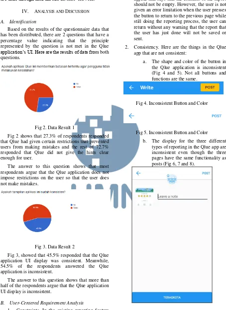
Fig 2. Data Result 1
Fig 2 shows that 27.3% of respondents responded that Qlue had given certain restrictions that prevented users from making mistakes and the rest of 72.7% responded that Qlue did not give the hints clear enough for user.
The answer to this question shows that most respondents argue that the Qlue application does not impose restrictions on the user so that the user does not make mistakes.
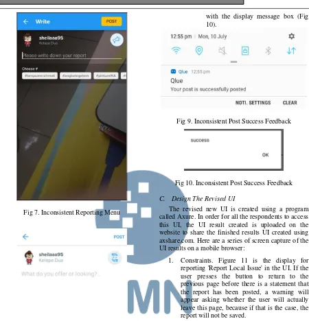
Fig 3. Data Result 2
Fig 3, showed that 45.5% responded that the Qlue application UI display was consistent. Meanwhile, 54.5% of the respondents answered the Qlue application is inconsistent.
The answer to this question shows that more than half of the respondents argue that the Qlue application UI display is inconsistent.
B. User-Centered Requirement Analysis
1. Constraints. In the existing reporting feature of the Qlue application, the user is given an error limitation when the user has pressed the post key before filling the textbox for the
contents of the report details, a warning will appear that says that the contents of the report should not be empty. However, the user is not given an error limitation when the user presses the button to return to the previous page while still doing the reporting process, the user can return without any warning that the report that the user has just done will not be saved or sent.
2. Consistency. Here are the things in the Qlue app that are not consistent:
a. The shape and color of the button in the Qlue application is inconsistent (Fig 4 and 5). Not all buttons and functions are the same.
Fig 4. Inconsistent Button and Color
Fig 5. Inconsistent Button and Color
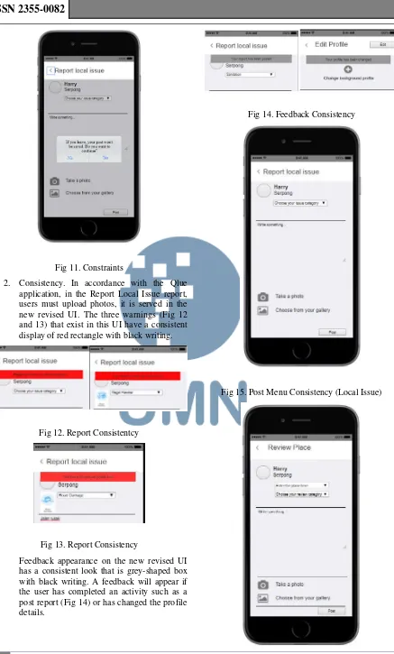
b. The display for the three different types of reporting in the Qlue app are inconsistent even though the three pages have the same functionality as posts (Fig 6, 7 and 8).
IJNMT, Vol. V, No. 1 | June 2018 4
ISSN 2355-0082
Fig 7. Inconsistent Reporting Menu
Fig 8. Inconsistent Reporting Menu
c. The feedback display given in the Qlue application is inconsistent. In the reporting menu, feedback appears on the user's mobile notification (Fig 9), when the user successfully edits the profile, the feedback will appear
with the display message box (Fig 10).
Fig 9. Inconsistent Post Success Feedback
Fig 10. Inconsistent Post Success Feedback
C. Design The Revised UI
The revised new UI is created using a program called Axure. In order for all the respondents to access this UI, the UI result created is uploaded on the website to share the finished results UI created using axshare.com. Here are a series of screen capture of the UI results on a mobile browser:
5 IJNMT, Vol. V, No. 1 | June 2018
ISSN 2355-0082
Fig 11. Constraints
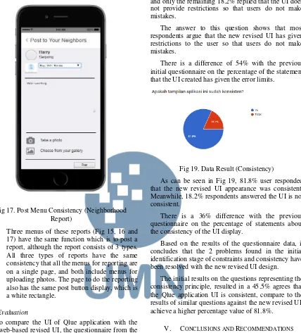
2. Consistency. In accordance with the Qlue application, in the Report Local Issue report, users must upload photos, it is served in the new revised UI. The three warnings (Fig 12 and 13) that exist in this UI have a consistent display of red rectangle with black writing.
Fig 12. Report Consistentcy
Fig 13. Report Consistency
Feedback appearance on the new revised UI has a consistent look that is grey-shaped box with black writing. A feedback will appear if the user has completed an activity such as a post report (Fig 14) or has changed the profile details.
Fig 14. Feedback Consistency
IJNMT, Vol. V, No. 1 | June 2018 6
ISSN 2355-0082
Fig 16. Post Menu Consistency (Place Review)
Fig 17. Post Menu Consistency (Neighborhood Report)
Three menus of these reports (Fig 15, 16 and 17) have the same function which is to post a report, although the report consists of 3 types. All three types of reports have the same consistency that all the menus for reporting are on a single page, and both include menus for uploading photos. The page to do the reporting also has the same post button display, which is a white rectangle.
D. Evaluation
To compare the UI of Qlue application with the new web-based revised UI, the questionnaire from the initial survey with the link to the web page was distributed to the the same respondents again. Here is the result of data from the questionnaire.
Fig 18. Data Result (Restrictions)
Fig 18 shows that 81.8% of the respondents answered that the new revised UI has given certain
restrictions that prevent users from making mistakes and only the remaining 18.2% replied that the UI does not provide restrictions so that users do not make initial questionnaire on the percentage of the statement that the UI created has given the error limits.
Fig 19. Data Result (Consistency)
As can be seen in Fig 19, 81.8% user responded that the new revised UI appearance was consistent. Meanwhile, 18.2% respondents answered the UI is not consistent.
There is a 36% difference with the previous questionnaire on the percentage of statements about the consistency of the UI display.
Based on the results of the questionnaire data, it concludes that the 2 problems found in the initial identification stage of constraints and consistency have been resolved with the new revised UI design.
The initial results on the questions representing the consistency principle, resulted in a 45.5% agrees that the Qlue application UI is consistent, compare to the results of similar questions against the new revised UI, achieve a higher percentage value of 81.8%.
V. CONCLUSIONS AND RECOMMENDATIONS
7 IJNMT, Vol. V, No. 1 | June 2018
ISSN 2355-0082
B. Recommendations
The developer of Qlue application must justify the limit of errors or constraints and the consistency of existing views. The limitation of this research is that it focused only on the interface design part of an application, not the whole experience (like the database configuration or the server infrastructure for a speedy application). However, for other researchers who also want to analyze the UI of an application, it is recommended to also analyze the user experience of the application. Once again, this study did not examine the back-end part of the related application, so the problem discovery process took longer and the problems found were also likely to be inaccurate because they only rely on the results of the questionnaire data. For a comparison between the selected application UI and the UI already created, it is recommended to do so with A/B Testing. With the testing method, the time spent on the problem discovery process will be less and the problems contained in a website or application will be found clearly and accurately.
ACKNOWLEDGMENT
I would like to thank my supervisor Wira Munggana, S.Si., M.Sc. for assistance with this paper and Yustinus Eko S.Kom., M.M who provided insight and expertise that greatly assisted this paper.
REFERENCES
[1] Norman, Don. (2013). The Design of Everyday Things :
Revised and Expanded Edition. New York: Basic Books.
[2] Lewis, C., & Rieman, J. (1993). Task-Centered User Interface
Design. A Practical Introduction
[3] Greenberg, Saul. (2002). Working Through Task-Centered
System Design
[4] Diaper, Dan., & Stanton, Neville A. (2004). THE
HANDBOOK OF TASK ANALYSIS FOR HUMAN-COMPUTER INTERACTION. New Jersey: Lawrence Erlbaum Associates.
[5] Difatama,Rizka., Sopiah, Nyimas & Muzakir, Ari (2016).
Sistem Informasi Rekam Medis Terpadu Pada Rumah Sakit Pelabuhan Palembang Berbasis Web Menggunakan Metode TCSD (Task Centered System Design), 2-4
[6] Rahman, Arif., Junaedi, Danang, S.T., M.T, & Sumawi,